
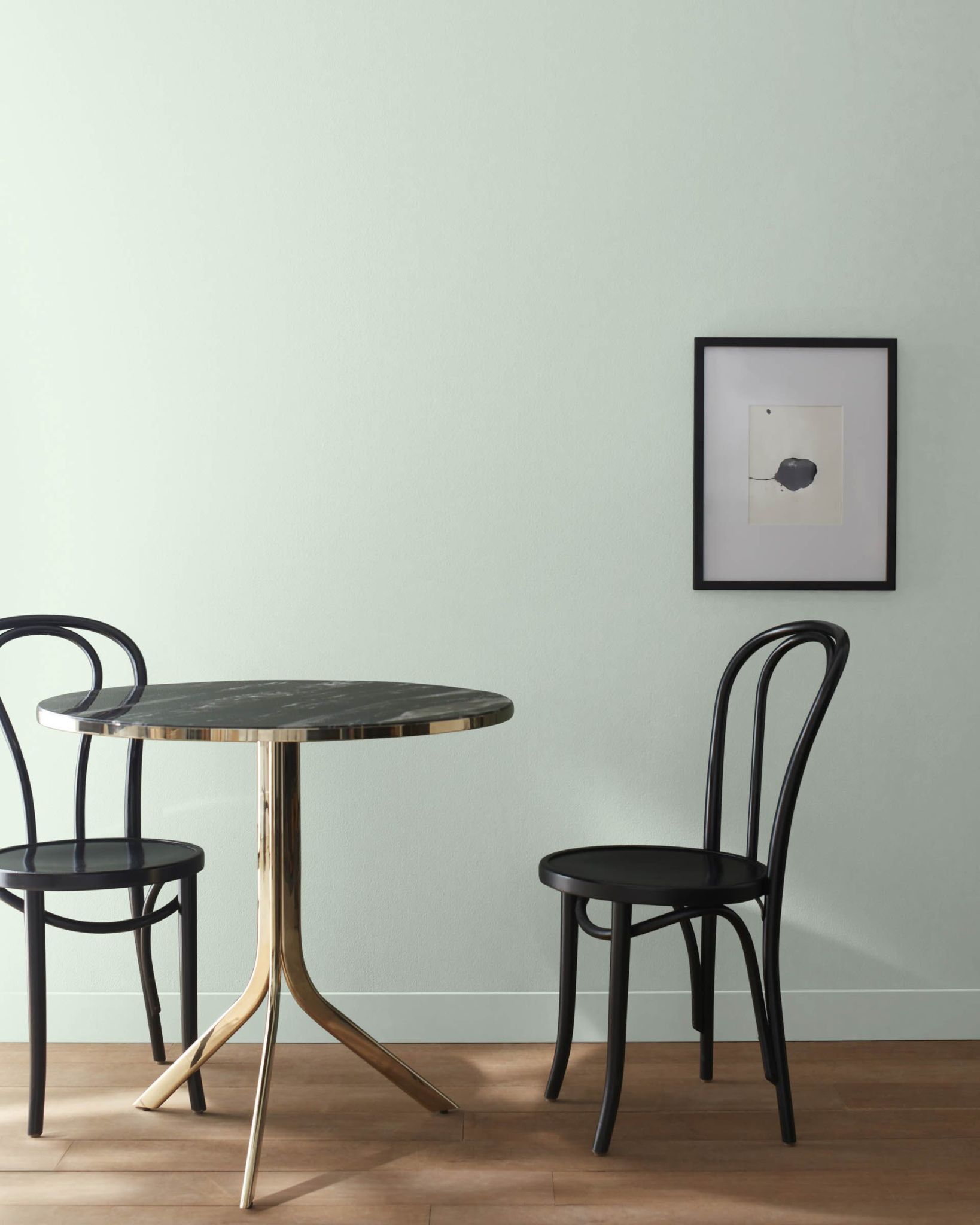
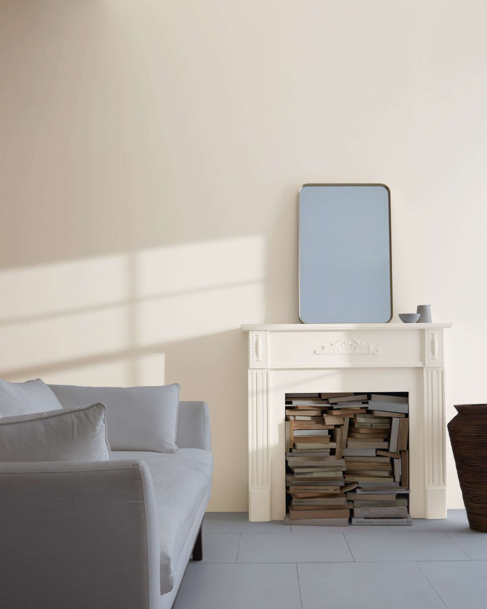
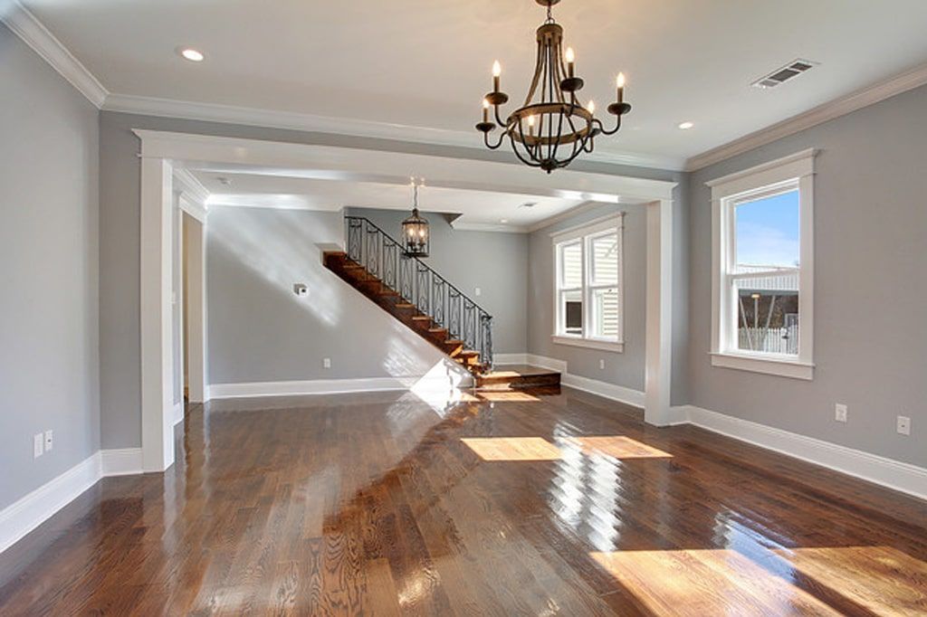
In this article, I will be sharing with you 26 amazingly outstanding green gray paint colors that would add the perfect finishing touch to your space.
All of the colors listed here are well-researched and produced by two of the best brands in paint production; Sherwin Williams and Benjamin Moore, these companies have made quite a reputation for themselves over the years due to never-ending quality.
Are you ready to transform your space? Let’s jump right in!
Table of Contents
What Is The Shade Green-Gray?

Green-gray is a shade of color obtained from the combination of green and gray. This combination produces a unique shade of dark color that is perfectly soothing and blends attractively into designs to give out a captivating natural vibe.
Is Green-Gray Shade Paint For You?
Color psychology tells us that the gray color symbolizes neutrality and balance while the green color represents positivity, fruitfulness, and wealth. This refreshing color palette of versatile hue does not only give us an attractive shade to look at, but it also gives out a sense of freshness and tranquility.
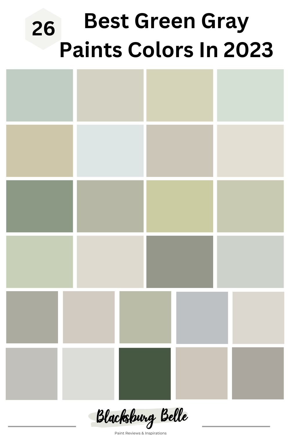
Best Green Gray Paint Colors In 2023: List
1. Benjamin Moore Sage Tint 458
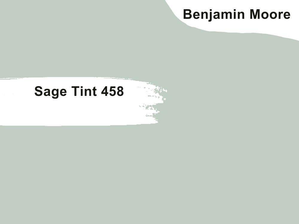
| RGB | 193 204 192 |
| LRV | 58.24 |
| Matching colors | Chantilly lace, sage mountain, icicle |
| Undertones | Blue |
This is an artful expression of colors that float between green and gray with an undertone of blue presenting a tender sea foam green. The blue undertone blends beautifully into the 50-50 green-gray combination to help give it a spark of brightness without overpowering the cool subtle tone of the color.
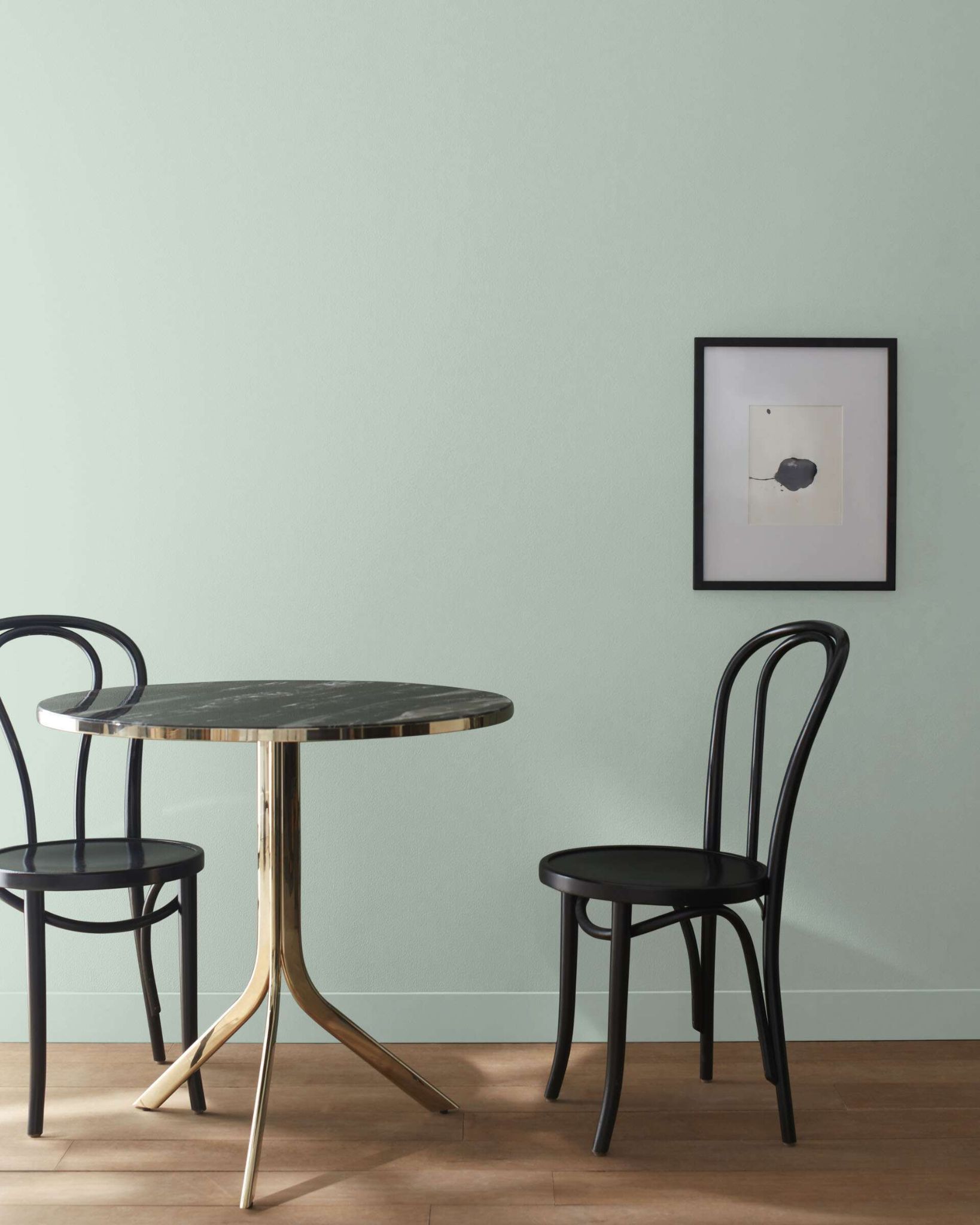
It is a neutral and versatile color that blends easily with almost every color. This shade gives a contagious calmness and peaceful feeling making the room or space where it is being used feel intimate, residential, and comfortable.
2. Benjamin Moore Sweet Spring 1500
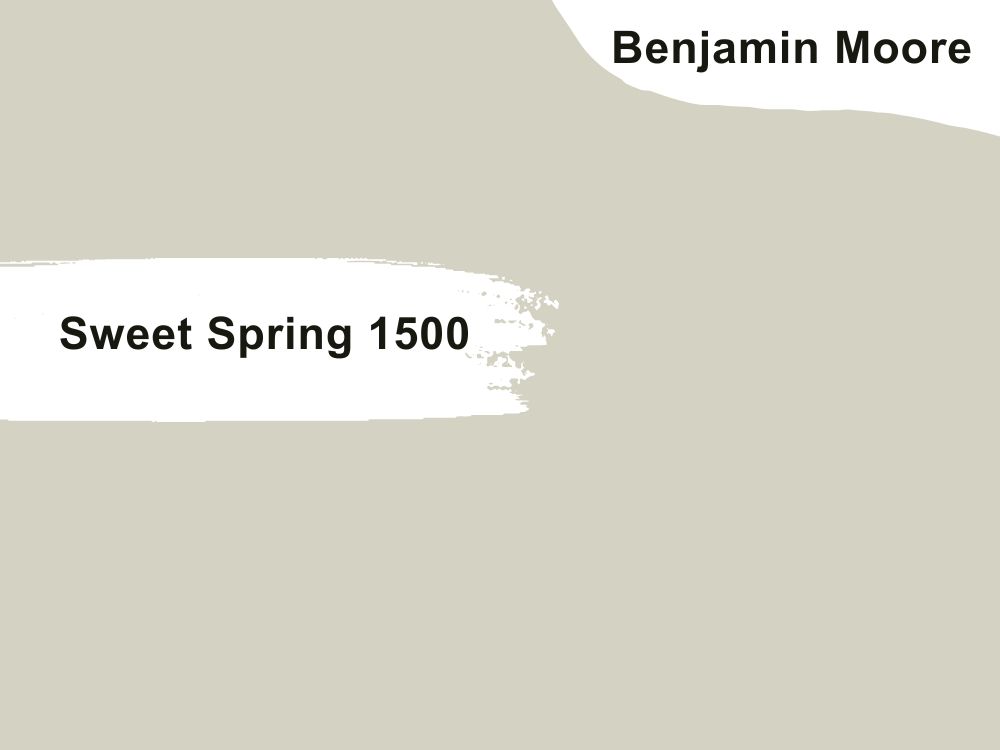
| RGB | 213 208 192 |
| LRV | 63.38 |
| Matching colors | Swiss coffee, Cambridge green, feather down |
| Undertones | Green |
Benjamin Moore’s sweet spring 1500 is a color with an LRV (Light Reflection value) of 63.38.
This color is simply a gray with a green undertone. It serves as a neutral color and a perfect natural background for a display of colors.
This is a warm shade of green-gray with an effortless charm. What this color does is mostly serve spring and freshness all year round. It is a coordinating color that helps to blend out and balance other colors placed around it.
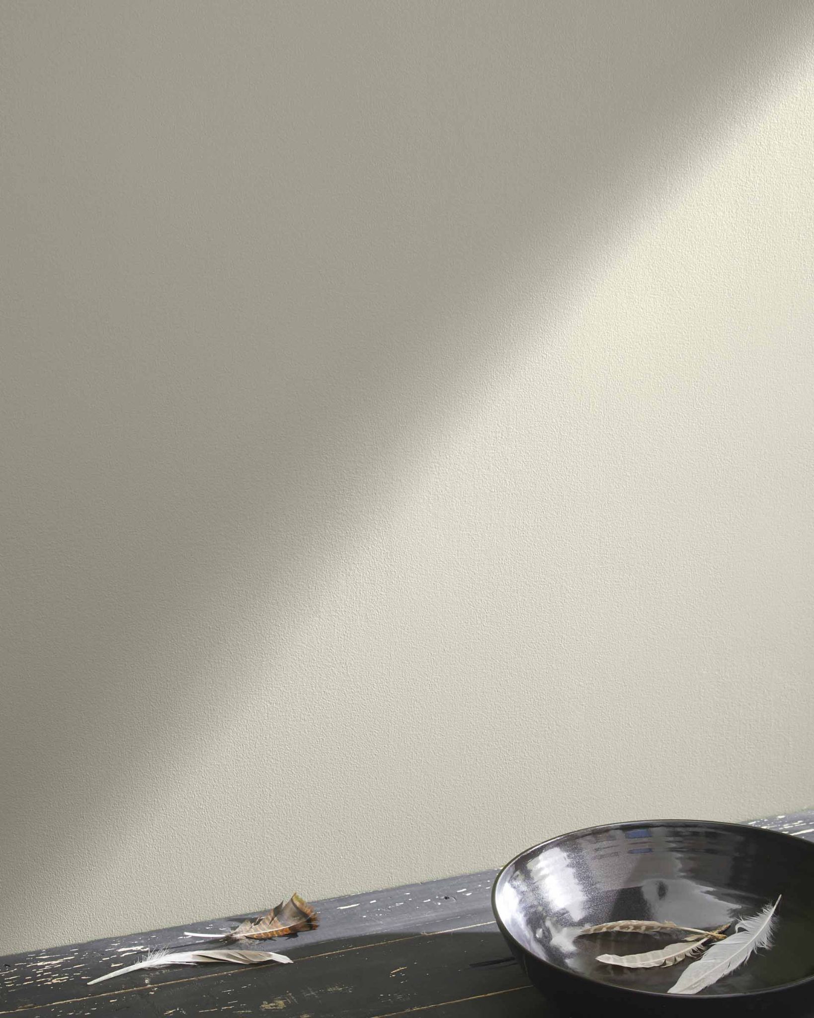
3. Benjamin Moore Spa AF-435
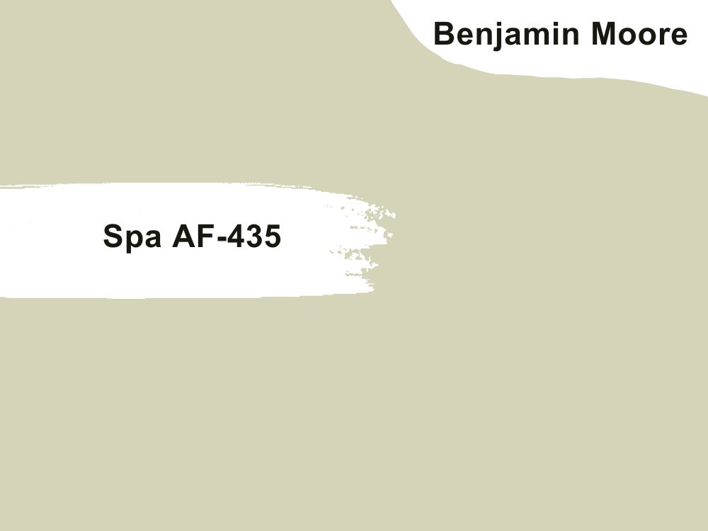
| RGB | 215 208 183 |
| LRV | 63.58 |
| Matching colors | Flora, vintage charge, paper mache |
| Undertones | Green-gray |
This is a calming shade of green-gray with a light reflection value of 62.58. This Color dishes out an appealing green that screams “You are welcome to my home, take a seat and feel at home.” Its alluring gentleness and instant calmness create a sense of hospitality and peace wherever it is applied.
It is a neutral color that can work for almost every part of your interior and exterior decoration. Spa AF-435 shows off magnificently when paired with colors like flora, vintage charge, and paper Mache.
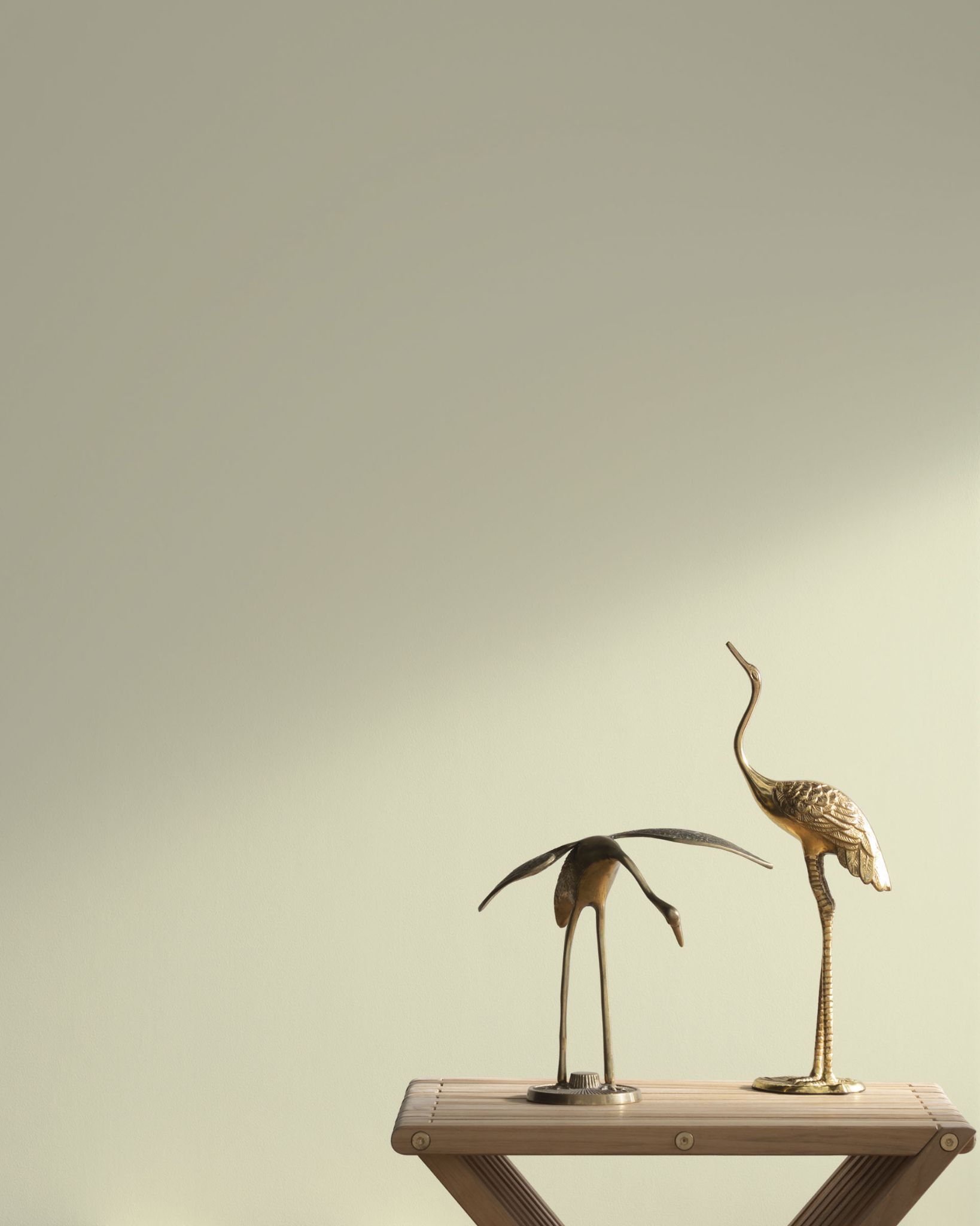
4. Benjamin Moore North Shore Green 456
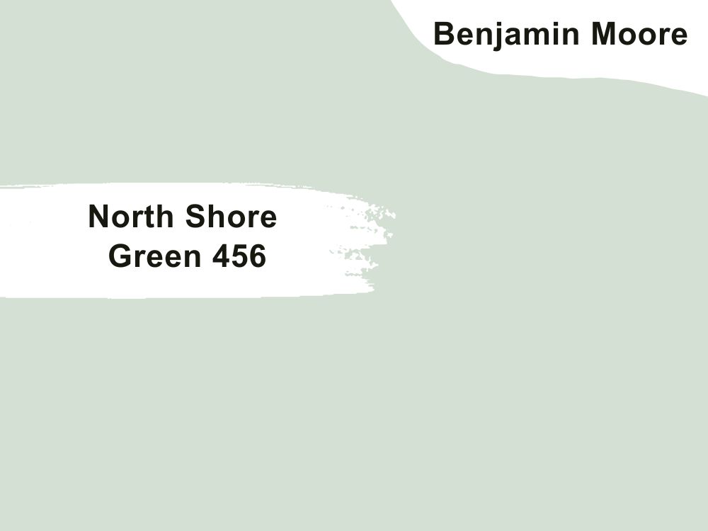
| RGB | 214 222 211 |
| LRV | 71.24 |
| Matching colors | Aloe Vera, forest valley green, secret |
| Undertones | Blue |
That tranquil feeling you get at the beach, when you have a free mind and your bills have been sorted out by somebody else is exactly what this shade of color gives out. Who wouldn’t want to wake up to this feeling every day? This shade of hue compliments every type of house and design house, ranging from traditional to contemporary.
Also, if you are looking towards giving your plain room a little more aesthetic, this is the perfect color to show off your creative skills with. It is versatile and finds a way to blend not just itself with other colors, but also to make other colors around it to look coordinated. Aloe Vera, forest valley green or secret when matched with north shore green 456 creates an irresistible appearance.
5. Benjamin Moore Richmond Gray HC-96
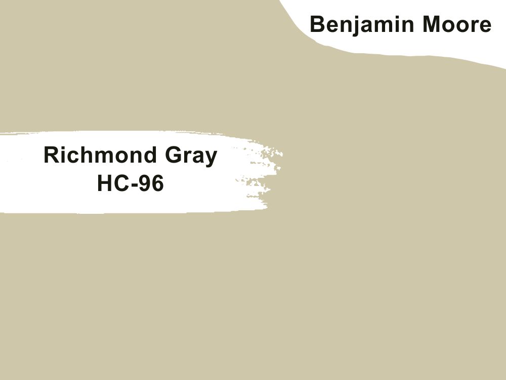
| RGB | 210 197 168 |
| LRV | 56.13 |
| Matching colors | White heron, Templeton gray ,gothic green |
| Undertones | Beige |
This distinct shade of color is one that gives the vintage and sophisticated vibe; it is made up of a mixture of beige and green-gray and portrays a blend of tradition and elegance in the most majestic way possible, giving out a refined classic hue. Light has a lot to do with the appearance of a paint color.
In north-facing light circumstances, the cool blue-tinted light or exposure will cause Richmond gray to appear more muted. In south-facing light circumstances, warm yellow southern light will make Richmond gray appear very shiny or gleaming. In east-facing light circumstances, the warm yellow eastern light will cause Richmond gray to appear as more very light in the morning and then have a cooler shade of gray towards the afternoon.
In west-facing light circumstances, being characterized by having cooler light in the morning and intense warm-toned light within the day; Richmond gray will appear gray in the mornings and move towards the soft green towards the afternoon.
6. Benjamin Moore Sky 2131-70
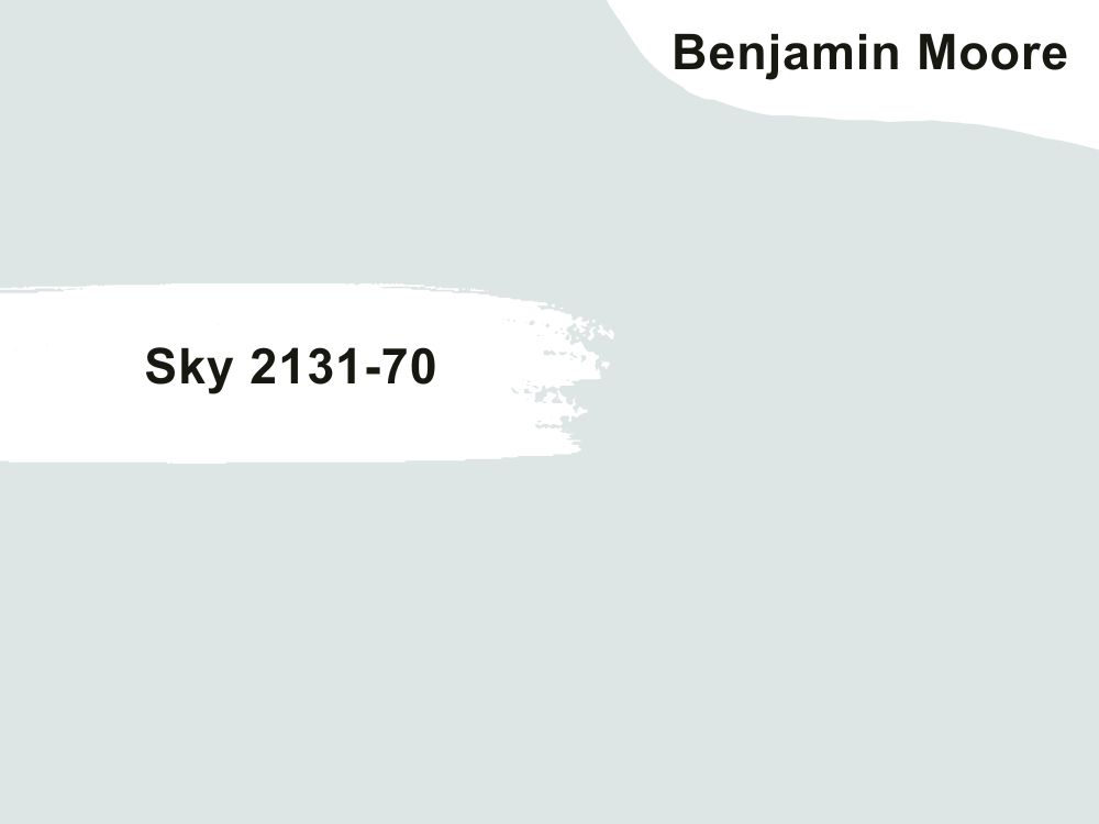
| RGB | 222 228 227 |
| LRV | 76.58 |
| Matching colors | White heron, gossamer blue, cotton balls |
| Undertones | Blue, silver |
Sky 2131-70 looks like a particularly light-blue offers a range of cool emotions, it gives the appearance of a partially cloudy day, and carries a soothing emotion. Designers often recommend this shade of hue for interiors, especially for spaces one would consider private; like the bedroom and the spaces where you meditate.
The blue undertone gives a supporting hand to the silver undertone and together they help the color not to look dull and stale. Benjamin Moore’s Sky 2131-70 is best paired with white heron, gossamer blue, and cotton balls.
In the presence of dim light, the gray becomes darker while the blue and silver undertones combine to give out a cozy splash of shine.
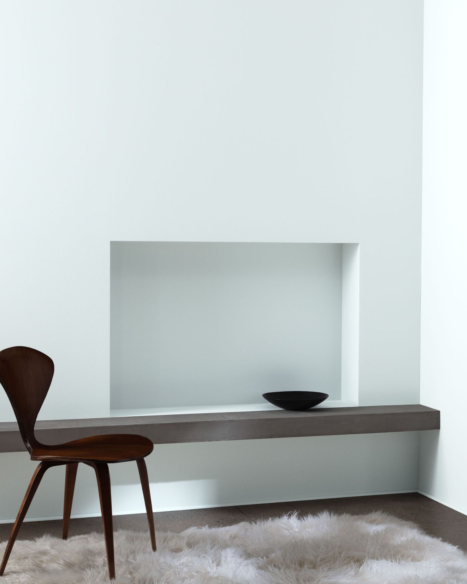
7. Benjamin Moore Revere Pewter HC172
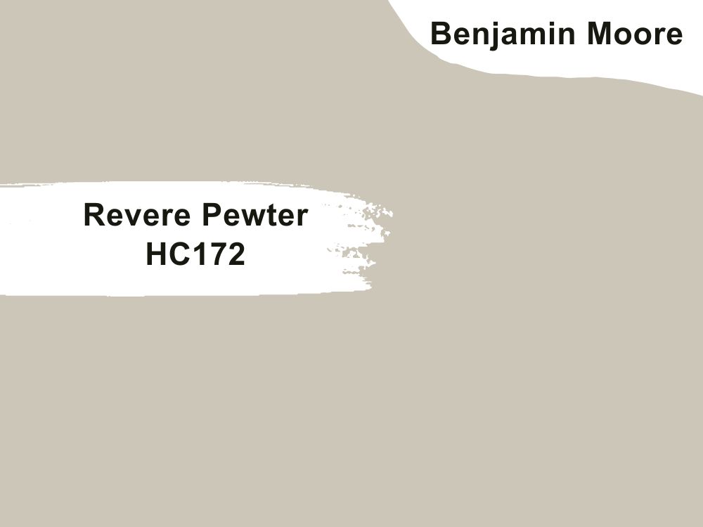
| RGB | 204 196 184 |
| LRV | 55.98 |
| Matching colors | Off-white, white |
| Undertones | Violet |
This is another color that goes well with almost everything and is yet not a neutral color. Revere pewter has a light reflection value of 55. Let me tell you one very tricky thing about shade, it might look like it is not the perfect shade you are looking for, but wait till it sits majestically on your walls, leaving you nothing short of addicted.
This shade is made up of green, gray, and violet undertones. It looks its best in rooms with warm light and pairs off well with clean white or off-white colors
The gray helps the green not to be too vibrant, hence creating a greenish gray color, while the violet undertones help the greenish gray color not to be too dull. This together creates a consistency of perfectly allying colors that give a warm fuzzy shade of goodness.
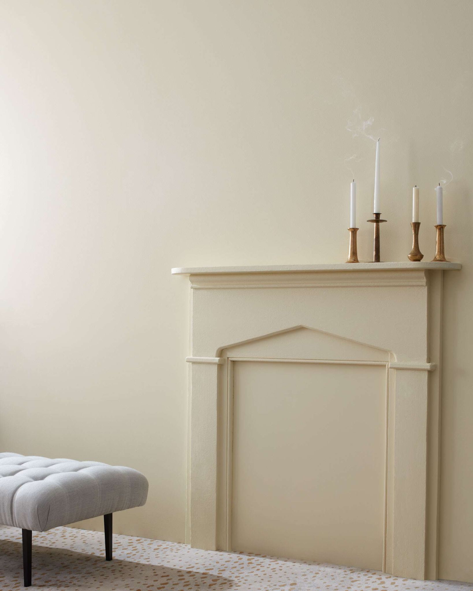
8. Benjamin Moore Gray Mist OC-30
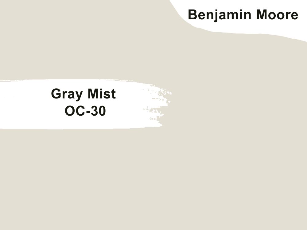
| RGB | 225 219 207 |
| LRV | 72.83 |
| Matching colors | Kensington blue, sea salt |
| Undertones | Soft green, violet, blue |
This is a gray paint with a hint of green. This is the perfect hue for someone that wants a very neutral gray paint. It has a very high light reflectance value of almost 80, telling us that it is a very light shade of green-gray. Gray mist looks close to off-white, but when placed beside off white, the difference becomes very clear. This color shows off very beautifully in the presence of much light.
This color is an ideal choice for people who want off white walls but do not want to risk it looking yellow. It also pairs off beautifully with both earthy and modern finishes.
9. Benjamin Moore High Park 467
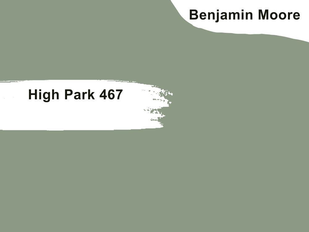
| RGB | 140 153 133 |
| LRV | 30.43 |
| Matching colors | Cascade mountain, Kensington blue, steam |
| Undertones | Greige |
This is a medium green gray shade of timeless and elegant goodness. It serves a very sophisticated look accompanied by a very relaxing vibe. It is also versatile in nature and can work for both interior and exterior decorations.
This paint finishes off very smoothly giving a very admirable final look as it blends itself and coordinates itself with colors around it very well.
10. Benjamin Moore October Mist 1945
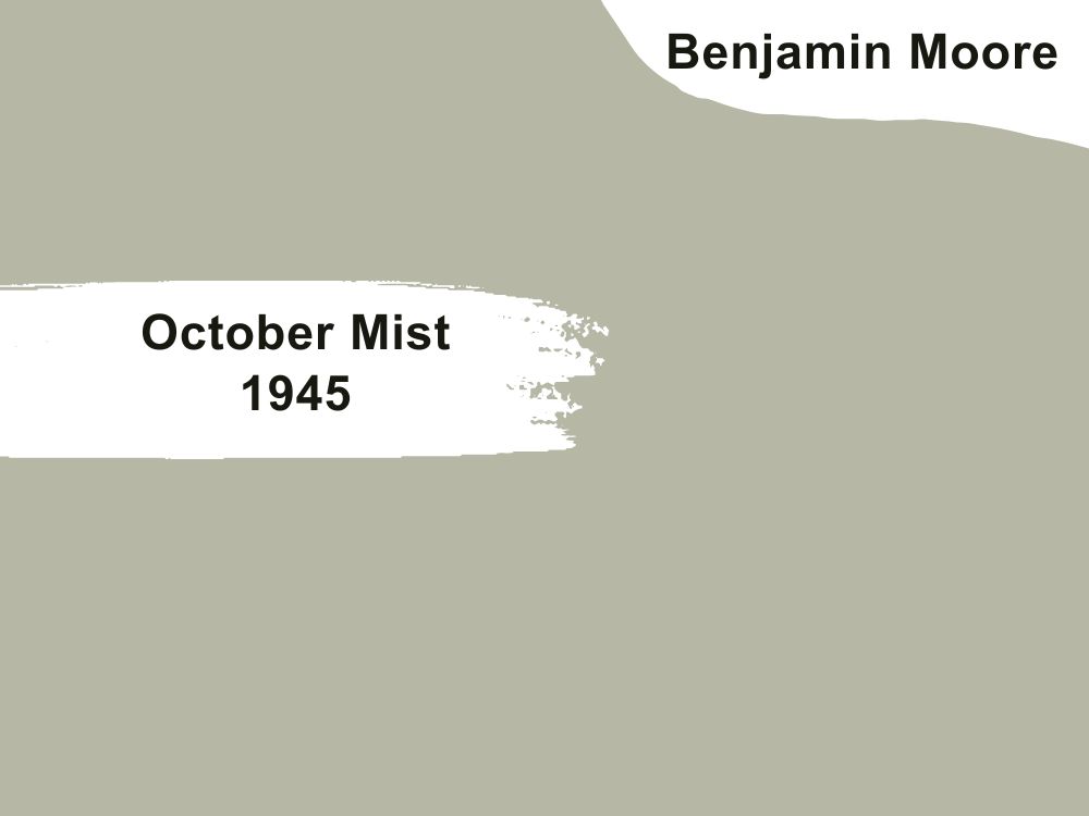
| RGB | 182 184 165 |
| LRV | 46.54 |
| Matching colors | White dove, cloud white ,hale navy |
| Undertones | Beige |
Behold, an exquisite shade that embodies the essence of nature—a captivating fusion of earthy elements and a gentle mid-toned green-gray hue, delicately infused with a subtle warmth. October Mist, adorned with a bewitching undertone of beige, acquires a nuanced neutrality that transcends the realms of vibrant greens or somber grays.
This remarkable interplay of hues bestows upon the paint a soft and soothing character, effortlessly carrying the torch of tranquility and balance within its graceful embrace.
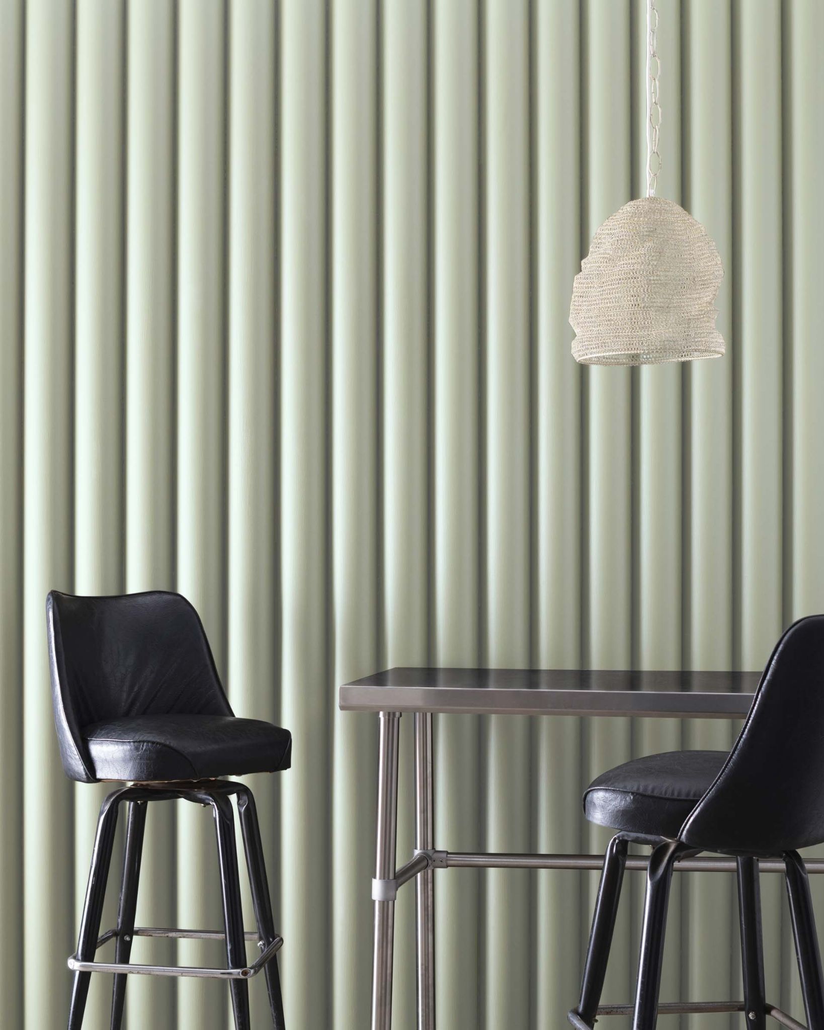
11. Benjamin Moore Fermwood 2145-40
| RGB | 182 184 165 |
| LRV | 56.76 |
| Matching colors | Wildflower, distant gray, dark linen |
| Undertones | Beige |
This is a color with warm undertones that releases a calming comfort, it releases a different kind of warmth far from what all the other warm green-gray colors. It is a bold color that stands out among many other colors, creating serenity and a friendly atmosphere.
It has a light reflection value of approximately 57 showing us that it is of a bit of a light color and would reflect some amount of light. This paint would look ideal in a kitchen or even the master bedroom, it’s got a warm and nice color.
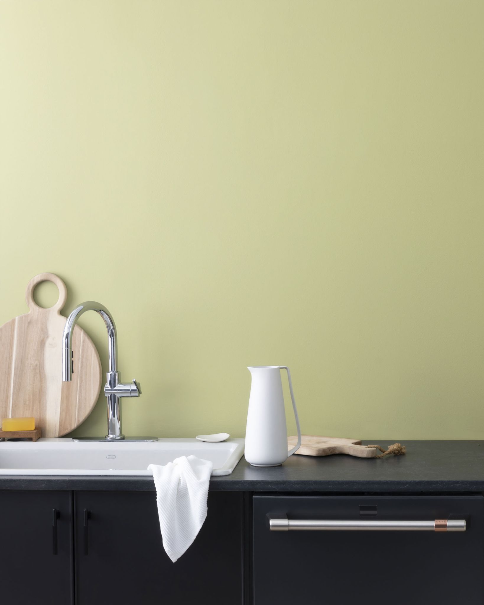
12. Benjamin Moore Soft Fern 2144-40
| RGB | 200 203 177 |
| LRV | 56.67 |
| Matching colors | White dove, wolf gray, swiss coffee |
| Undertones | Gray and brown |
An ethereal amalgamation of gentle pale green and graceful gray, this color exudes a profound sense of strength while proudly showcasing its remarkable versatility. The soft fern hue stands as a resplendent choice, transcending boundaries and lending itself flawlessly to a myriad of interior and exterior decorative endeavors.
From the tranquil sanctuaries of residential spaces to the sleek grandeur of contemporary structures and offices, its allure knows no bounds. With a light reflection value of 56.67, this captivating shade effortlessly establishes harmonious partnerships, finding perfect companionship with the likes of white dove, wolf gray, and Swiss coffee, creating captivating palettes that breathe life into every setting.
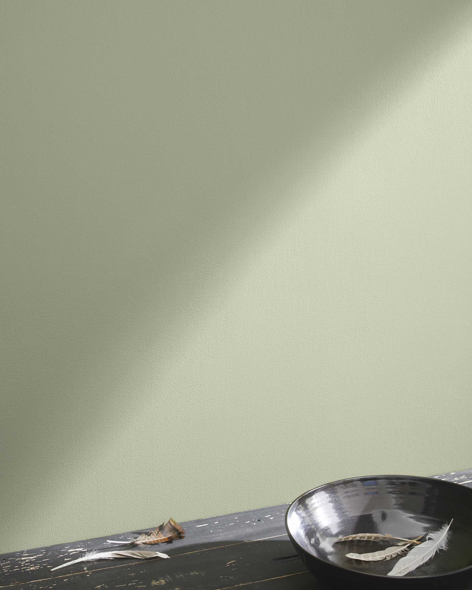
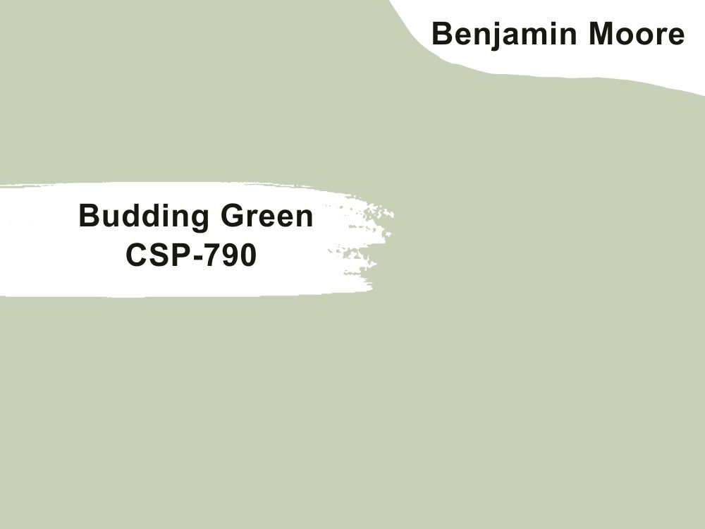
13. Benjamin Moore Budding Green CSP-790
| RGB | 203 206 182 |
| LRV | 56.67 |
| Matching colors | White dove, wolf gray, swiss coffee |
| Undertones | Gray and brown |
This extraordinary choice of paint offers genuine pleasure for those seeking a green shade intertwined with a subtle touch of gray. Embracing the very essence of spring’s tender embrace and the awakening vigor of summer, it bestows a serene atmosphere that elicits feelings of ease, coziness, and heartfelt welcome.
With its innate gentleness, it crafts a rich fabric of emotions that carries individuals to a realm of serenity and unity, beckoning all who lay eyes upon it to indulge in its calming aura.
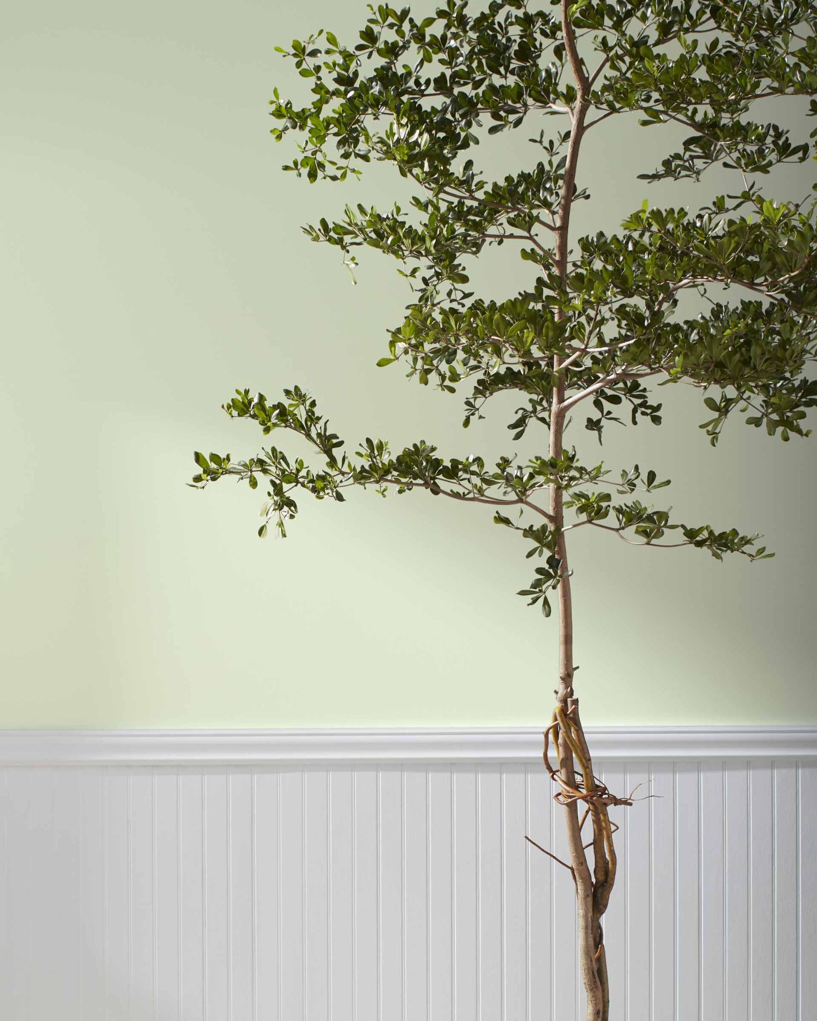
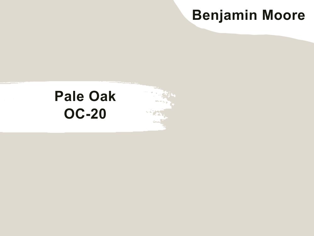
14. Benjamin Moore Pale Oak OC-20
| RGB | 222 216 205 |
| LRV | 68.64 |
| Matching colors | Chantilly lace |
| Undertones | Pink, gray |
This green-gray Paint carries the softest and coziest hint of warmth. It balances beautifully between warm and cool. Note that, in rooms with a lot of natural exposure, pale oak will read off as close to off white, so it is recommended to pair it with colors with Chantilly lace to help increase depth.
The pink undertones help to make the color very flexible so it can fit into any part of your decoration. It also helps the color not to look dull and stale on the walls. It still shows up lovingly even in low and full light.
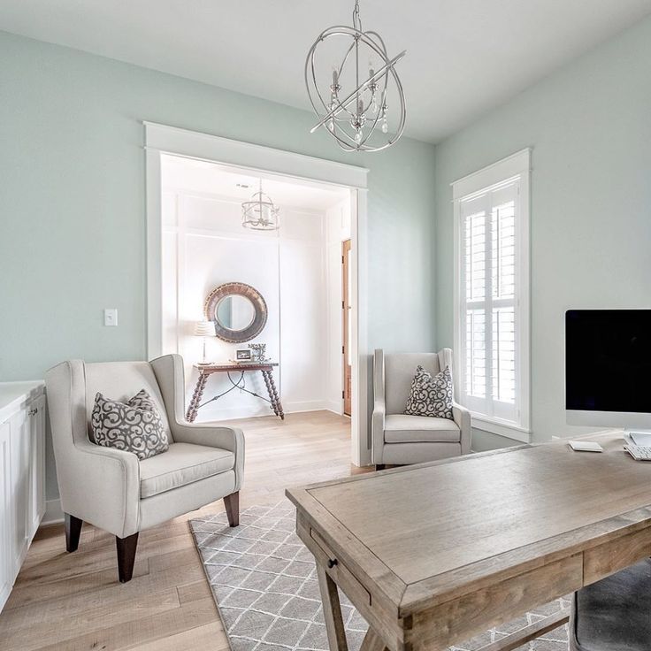
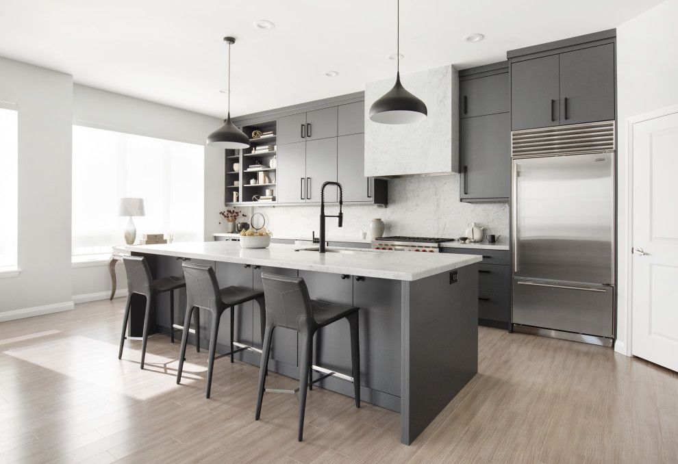
15. Sherwin Williams Evergreen Fog SW 9130
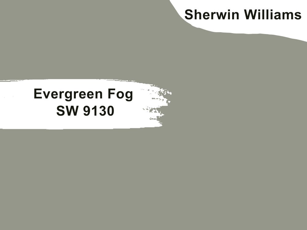
| RGB | 150 153 140 |
| LRV | 31.15 |
| Matching colors | Brown, tan, gray |
| Undertones | Blue |
Everybody’s favorite green-gray combination. This color gives the feeling of spring all the time. This gorgeously soft green-gray color is more on the mid-tone to dark side. Chameleon gray as it is commonly called by decoration experts because of its ability to change its appearance based on the direction, position, and nature of light it is being exposed to. If used for exterior decoration, the gray becomes very noticeable when it is shaded
This shade of green-gray is the ultimate sweetheart when it comes to both interior and exterior decoration; it sits gorgeously on every kind of house, ranging from traditional to contemporary. This is the shade of color for people wanting to effortlessly give their traditional homes a brilliant non-traditional look. This cool green–gray can act as a gorgeous main color or accent hue.
16. Sherwin Williams Sea salt SW 6204
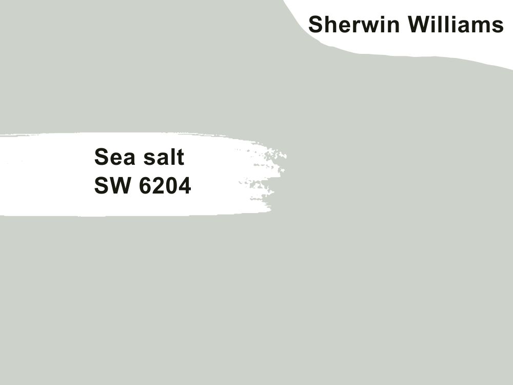
| RGB | 204 209 200 |
| LRV | 62.82 |
| Matching colors | Gray mist, alabaster |
| Undertones | Blue |
Sea salt has a reflection value of approximately 63, this shows that even if this color doesn’t reflect much light, it also doesn’t absorb much light as well, it is somewhere between the middle. Another color that gives the everyday sitting and relaxing on the beach vibe is sea salt SW6204.
This color carries a softness that releases a very calming effect. The mysterious thing about this color is that though it is on the muted side, it is not a boring color.sea salt is full of charisma and has a huge sense of humor. It is not a neutral color yet it is versatile. The versatility comes from the gray color in it that tones down the effect of the green color in the mix and the blue undertone.
It is not a vibrant or dark color, yet it is full of life. Sea salt in a room with a good amount of natural light won’t look the same as being in a room with little or no good exposure to natural light. This is telling us that light and direction have a lot to do with how this color appears.
17. Sherwin Williams Escape Gray SW 6185
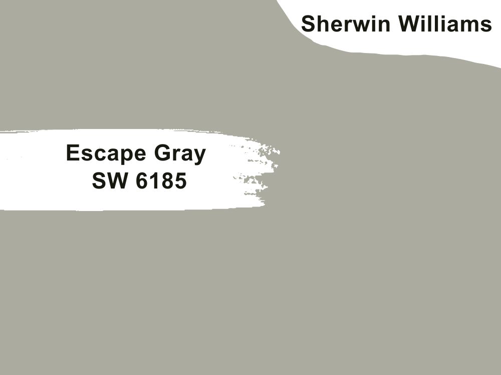
| RGB | 170 171 157 |
| LRV | 40.10 |
| Matching colors | Aged white, elephant ear, ethereal white |
| Undertones | Blue |
I am perfection is what this color screams, this is what decorators call the sweet temptation, this shade of green-gray gives out the most luxurious mixture of hue smoothly. It has a light reflection value of 40.10 and a blue undertone. The undertones become very visible in low light making the color give out an alluring and captivating green with sparks of gray during the day.
This color brings light and life to every space it comes in contact with, it is mostly the center of attraction when placed beside any other color, including very vibrant colors. And it tends to share its contagious nature when placed around dull-looking colors. This shade goes well for every type of interior decoration.
18. Sherwin Williams Agreeable Gray SW 7029
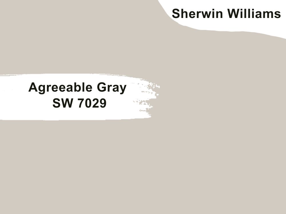
| RGB | 209 202 192 |
| LRV | 60 |
| Matching colors | Alabaster, cloud white, peach fuzz |
| Undertones | Beige, blue |
Agreeable gray is an iconic warm, very inviting shade of the green-gray combination of colors and it has a beige undertone, with a light reflection value of 60 showing us that it is more on the lighter side. This warm shade of color shows that it tends to maintain its normal warmth regardless of the colors paired with it. However, it can look like a greige, or a gray with spikes of green depending on the intensity of light on it as well as the direction the light comes from.
In north facing rooms, agreeable gray will appear a bit muted. In south facing rooms, agreeable gray will show off its warmth elegantly. In west facing rooms, agreeable gray will show off more of its warmth all afternoon In east facing rooms, agreeable gray will show off as cooler in the morning. NB: In cooler lighting situations it is going to remain cool.
Agreeable gray has the complimenting feature of it being very versatile and adaptable. Because of this, it can be used for both interior and exterior decoration and also for any part of the house including the bathrooms, kitchen cabinets, and basements. Agreeable gray can also be paired with both light and darker shades.
19. Sherwin Williams Softened Green SW 6177
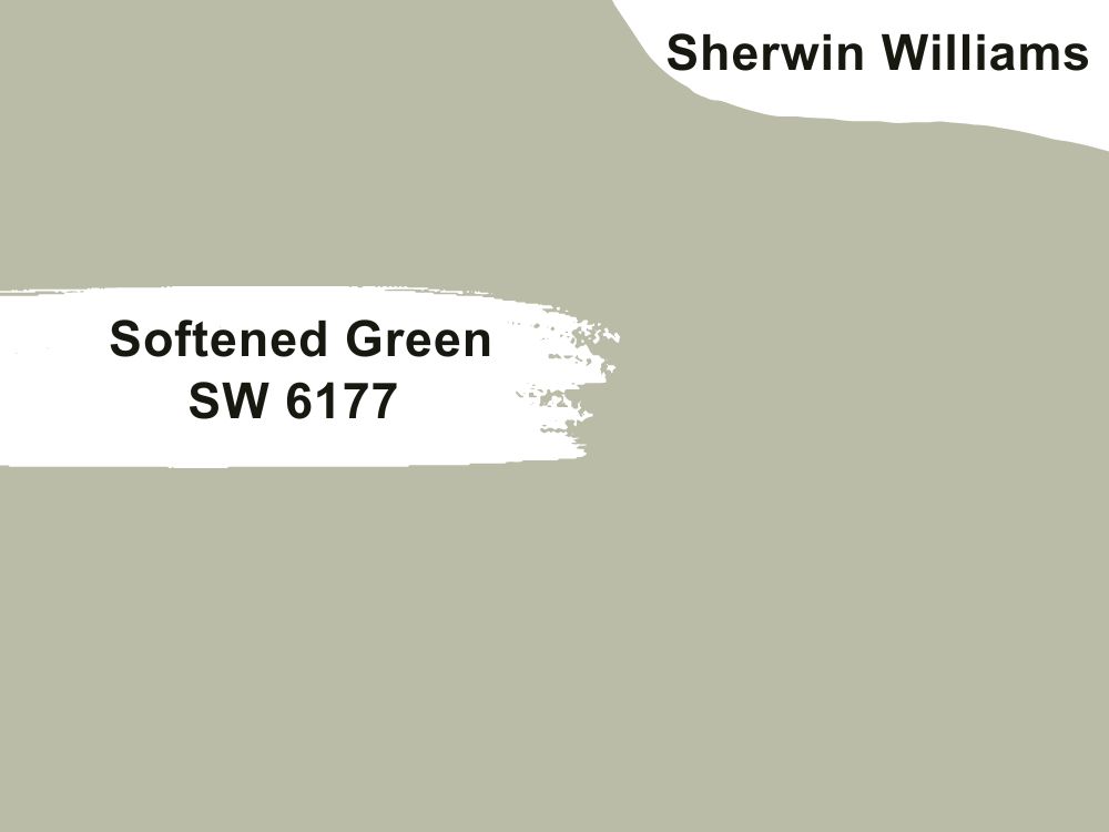
| RGB | 187 188 167 |
| LRV | 49 |
| Matching colors | Sagey, queen Anne’s lace |
| Undertones | blue |
Not too green and not too gray color paints are timeless and neutral for almost every space and softened green is a typical example. Softened green SW 6177 is a dark yet cool green with a mixture of gray and a refined blue undertone. The presence of these blue undertones gives softened green a calming, relaxing, and serene superiority.
This brings undiluted elegance to any space it is placed in. This shade is smooth and very inviting, it is definitely one of those colors that steal your heart and you can’t get your eyes off it. This shade is perfect for both your interior and exterior. It gives your living room a very homely look and makes your bedroom look more intimate.
When it comes to adapting to different kinds of lights, softened gray has a very strong spot here. It can appear as minty green in natural light; while in artificial light, it can take on a warmer look. This color is a great option for rooms with mixed lighting.
20. Sherwin Williams Lazy Gray SW 6254
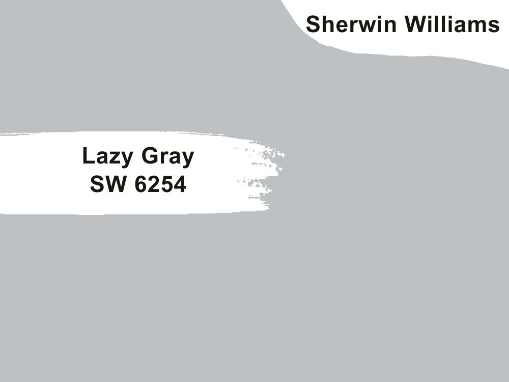
| RGB | 192 195 195 |
| LRV | 53 |
| Matching colors | Beige, tan, brown |
| Undertones | Blue |
Lazy gray has a light reflection value of 53, this tells us that it is in the middle of the reflection scale and won’t reflect much light. This is a soft mid toned green –gray paint.
Let us keep it in mind that lazy green might take the appearance of green, gray, or blue depending on the type of lighting and the direction the light is coming from.
In north facing rooms, lazy gray will appear a bit muted.. In south facing rooms, lazy green will appear gleaming. In east facing rooms, lazy green will show off its colors the most. and west facing rooms will absorb the exposure, creating a blue like appearance.
21. Sherwin Williams Drift of Mist SW 9166
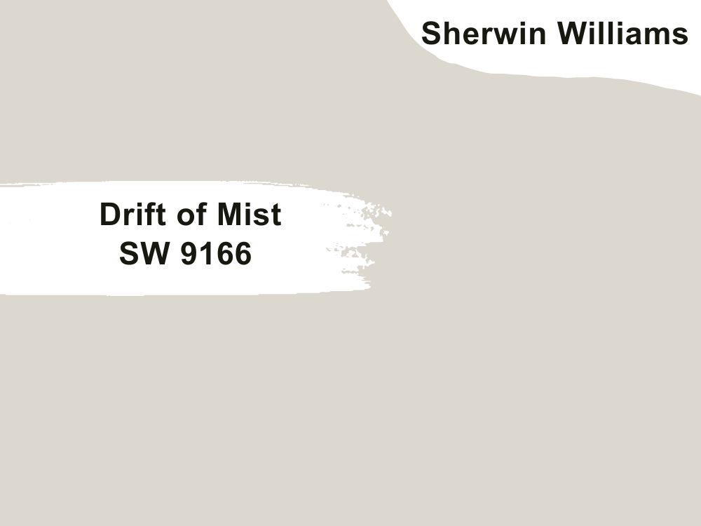
| RGB | 225 222 212 |
| LRV | 69 |
| Matching colors | Army green, taupe |
| Undertones | Green |
This is a bright neutral balanced (between warm and cool) gray with an airy appearance. It has a light reflection value of 69 meaning it will reflect quite a good amount of light. This beautiful shade has an inbuilt uniqueness that makes it not look too dark in places with low light
In north facing rooms where the light entering the room tends to be blue like in color, cool colors like drift of mist will seem to be muted. In south facing rooms where there is consistent warm light through the day, drift of mist will intensify in color and seem brighter. In west facing rooms where the best light exposure is gotten in the evenings, the drift of mist will tend to get more overwhelmed by the intense orange/ yellow light.
In the east facing rooms where the light is warmer in the mornings and cooler in the afternoon and evenings, the drift of mist will balance off the light comfortably.

22. Sherwin Williams Light French Gray SW 0055
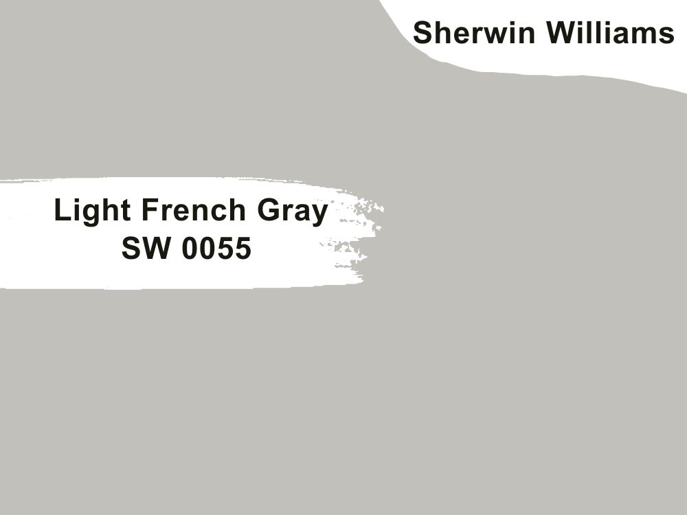
| RGB | 195 194 187 |
| LRV | 53 |
| Matching colors | Alabaster, distance, white dove |
| Undertones | Vague purple, green, blue |
This is a pale gray hue with green undertone; it has a light reflection value of 61. The color portrays balance at its highest point, having a very good equilibrium of both warm and cool tones.
Light French gray however, is one that will need a lot of light to look its best. Lighting has a lot to do with how this color reacts. It can have a blue undertone depending on the cardinal direction of the space or room. In north facing rooms where the light entering the room tends to be blue like, colors like light French gray will absorb the light, releasing a very deep pop of color In south facing rooms where there is consistent warm light through the day, light French gray will intensify in color, and seem brighter.
West facing rooms where the best light exposure is gotten in the evenings, light French will tend to be overpowered by the intense orange/ yellow light. While in the east facing rooms where light is warmer in the mornings and cooler in the afternoon and evenings, light French gray will balance off the light beautifully.
23. Sherwin Williams Fleur De Sel SW 7666
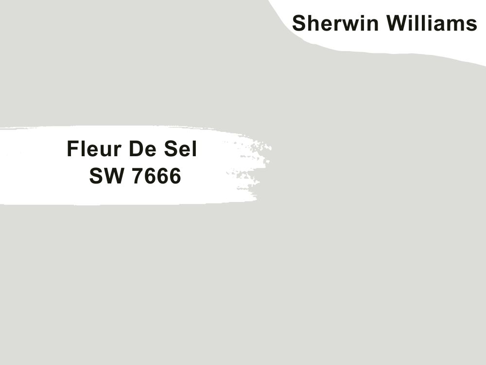
| RGB | 195 194 187 |
| LRV | 72 |
| Matching colors | Alabaster, distance, white dove |
| Undertones | Vague purple, green, blue |
Interesting name right? This pale green color with a green undertone is nothing but ordinary and immediately takes your mind to the seaside; it is a bright and dreamy shade of gray that releases a calming hue. This cool shade of hue is versatile which makes it work for every part of the house and any type of house.
Its green-blue undertones create the cool feeling that the paint gives out. This paint shows off its undertones depending on light and direction. In really spacious and well-illuminated spaces, the vague purple can be seen and in north facing lights the blue undertones are very visible.
24. Sherwin Williams Courtyard SW 6440
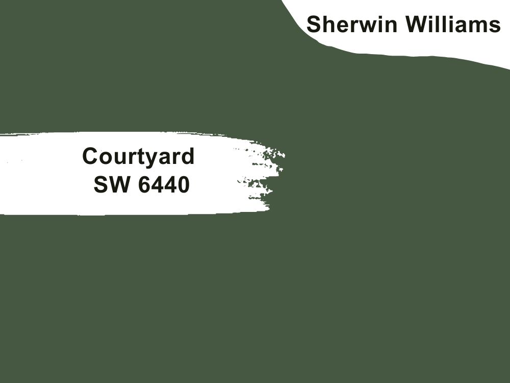
| RGB | 71 88 66 |
| LRV | 9 |
| Matching colors | Spinach white, origami white, fawn brindle |
| Undertones | Green |
This is a paint shade that works perfectly for both interior and exterior decorations. It has a light reflection value of 9 and pairs well with colors like spinach white and origami white. As you can see it is a darker shade of Green Gray and almost looks like deep green.
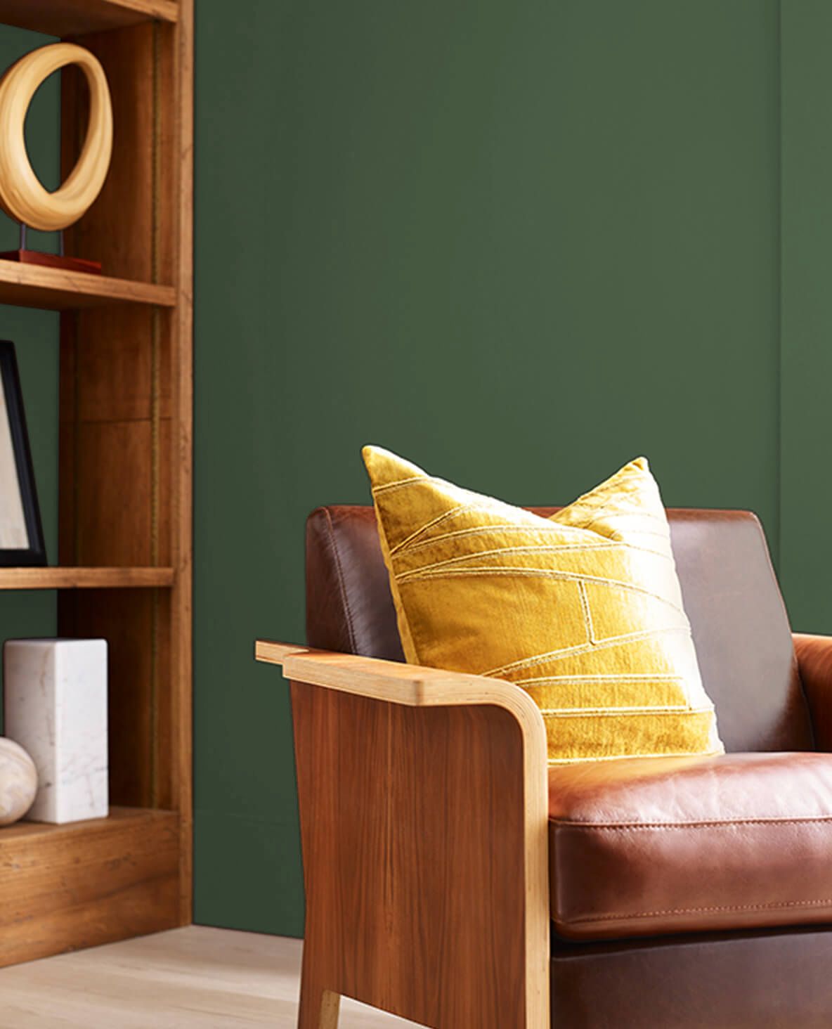
While this paint still has its spot among the magnificent shades of Green, it also has a subtle touch of gray that makes it outstanding for use in any space. I will highly recommend using the paint for a kitchen or living room
25. Sherwin Williams Worldly Gray SW 7043
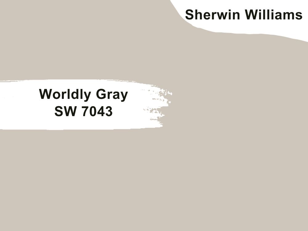
| RGB | 206 198 187 |
| LRV | 57 |
| Matching colors | Pure white, sea salt |
| Undertones | Green, violet |
A fantastic gray! Like most design professionals call it. This soft neutral gray is a life giver; it breathes life into any space yet comes with comforting peace and sophistication. This is mainly gray with green undertones and a sprinkle of violet. This color surprisingly carries a beautiful neutral undertone.
Worldly has a light reflection value of 57 showing that it isn’t the lightest green-gray yet it still isn’t the darkest.
In North facing rooms, worldly gray will look a bit cooler and almost look like gray .
In south facing rooms, worldly gray will look brighter and lighter, showing its warmth elegantly. In an east facing room, the warm palette will help to balance the lack of natural light during the evenings as they have the most illumination in the mornings.
26. Sherwin Williams Dorian Gray SW 7017
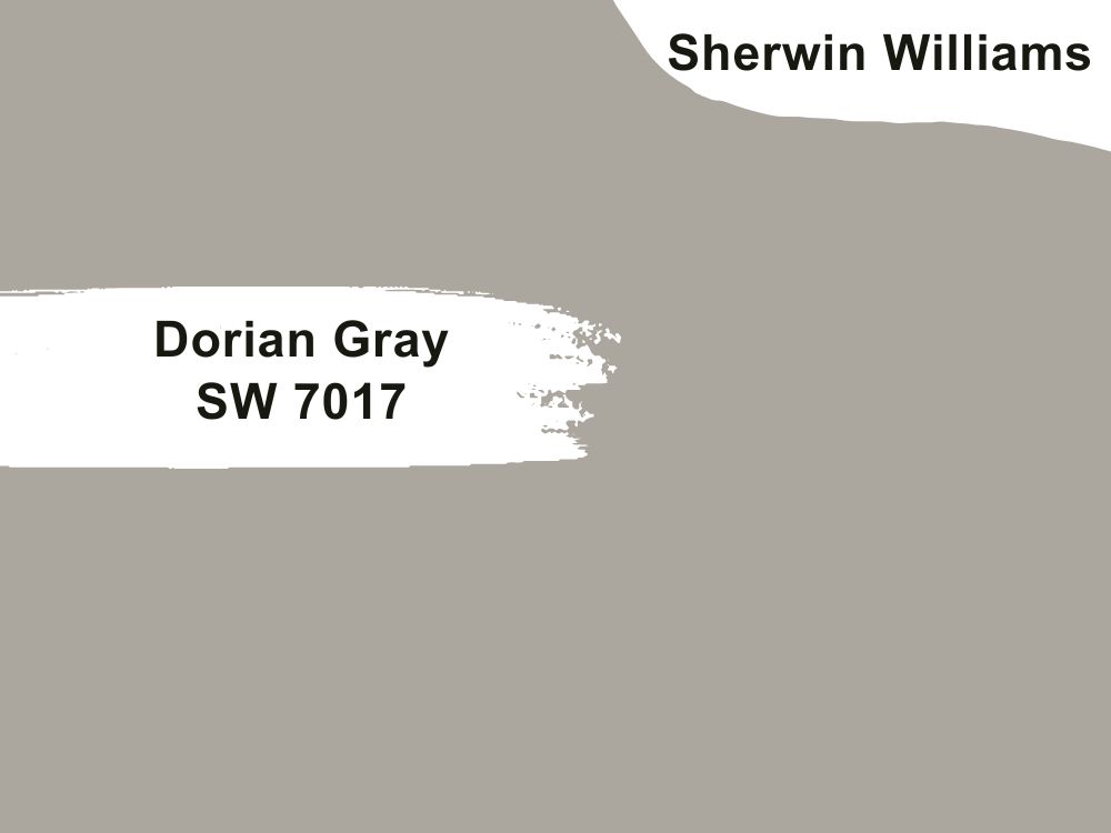
| RGB | 172 167 158 |
| LRV | 39 |
| Matching colors | Sea pearl, swiss coffee, shoji white |
| Undertones | Purple |
This is a versatile neutral mid-tone gray-green tone. It is soft yet very strong. It has a light reflection value of 39 which shows that it doesn’t reflect much light. This color has some form of depth and is highly sophisticated yet still has an alluring and addictive softness. It is an excellent versatile paint that stays neutral most of the time.
Dorian shows some undertones under certain lighting. In unstable lighting situations, you will see some form of purple.
Conclusion
There is a green-gray paint for everyone and every mood. Green gray paints never disappoint and they find a way of blending into not just your walls but your heart perfectly, unlike beige paints, green gray paints give you a neutral tone with lots of sophistication. Have you found an ideal paint to choose from yet? If yes was the answer to that question, we would love to know which one you picked and why, feel free to use the comment section below to share your views. Thanks for stopping by.
 10 Best Sherwin Williams White Paint Colors (Trend 2023)
 10 Best Sherwin Williams Farmhouse Paint Colors (Trend 2023)
 17 Best Sherwin Williams Teal Paint Colors (Trend 2023)
 25 Best Blue Gray Paint Colors for Your Home Interiors
 21 Best Cream Paint Colors for 2023
 21 Best Wall Colors That Go With A Cream Kitchen (Cabinets & Trims)
