
What colors do you envision when you hear the word “neutral”? Are you a stickler for the traditional white, black, and gray, or are you open to the creative possibilities of other colors? If you plan to remodel your space to fit the 2023 trend, your answer should be the latter.
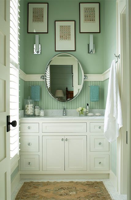
Benjamin Moore’s Budding Green keeps this bathroom nature-centered and pairs excellently with white accents
After the last three years of recovering from the global COVID-19 pandemic, interior design has become more critical than ever.
As more people begin to work from home, many houses now double as offices hence the need for colors that fit corporate and personal purposes. The Dean of Yale School of Architecture, Deborah Berke, described this theme by asking,
“What three things can happen in this room?”
2023 is the year of bold colors as people lean into positive energy making neutrals like blush, beige, sage, and navy the leading colors for whole-house paintings.
Table of Contents
Steps for Choosing the Right Neutral Paint for the Whole House
Most designers are unfamiliar with neutral colors like green, blush, beige, sage, and navy, but at the end of this guide, that won’t be you. Once you follow these six steps, you’ll have no problem choosing suitable neutral paints for your whole house.
Step 1: Analyze The Space and Lighting
As a whole house color, your chosen neutral must have a harmonizing tone that fits every other shade you introduce into your space. Hence, you must analyze the area and its natural lighting to know the perfect neutral.
If you already have furniture inside or fixtures outside (like trees, outdoor furniture, and children’s toys), the chosen paint color must blend with their hues and vibes. Small spaces with little to no natural light need neutrals with high Light Reflectance Value (LRV).
However, if your space is ample and you want to make it cozy, use a medium to low LRV neutral color. That doesn’t mean you can’t mix high and low LRV shades in one space, but it must be proportionate else you’ll mess up the energy flow and geometry.
Step 2: Measure The Room Size And Position
Measuring the room’s size and position extends “Step One” as it’s the physical manifestation of space and lighting analysis. Use a tape to measure your room and exterior’s dimensions to know how much paint you need and the ideal shade.
Note the sun’s entry points through the window and doors to determine the room’s position. Use a compass by standing in your doorway and comparing the needle’s direction to the sun’s reflection.
If you have a North-facing window/door, prepare for a consistent glow to keep your wall paint looking natural throughout the day. South-facing rooms get the most morning light and the highest chance of highlighting the room with the undertones.
Rooms with high afternoon traffic should be in the East wing for the brightest natural light. However, you’ll need additional lighting in West-facing rooms with the least morning light because the sun doesn’t reflect inside until it’s ready to set.
Step 3: Evaluate Your Lighting Options
Don’t fret over poor illumination; you can supplement it with artificial light. There’s an art to lighting, however, like painting — warm light intensifies colors while cool light dims their surroundings.
Hence, using warm-warm and cool-cool lighting and colors is advisable, but that doesn’t mean you can’t cross the designs. Using cool light against a warm neutral paint will reduce the color’s vibrance, whereas warm light makes cool hues appear intenser.
Step 4: Conduct Sample Area Testing
Your assessment is incomplete without conducting a real-time test on the area you’ll paint neutral. Every color has at least one undertone, which remains latent until it’s teased with external circumstances — lighting or the interaction with other colors in the environment.
Prepare for this change using physical samples from your paint brand because digital replicas aren’t always 10/10. You can get customized peel & stick strips of all popular paint vendors from Samplize.
These 12” x 12” reusable adhesive stickers are $5.95 a pop, while bundles of eight cost $35. It’s clean, economical, and more accurate than the standard swatches.
Alternatively, you can use free color chips if you buy from Sherwin-Williams or easy-to-wash Color-to-Go lightweight paints.
Step 5: Analyze the Long-Term Value of a Paint Color
Once you’ve tested your chosen neutral paint in real-time, the next step is to consider its time value. It’s best to use mid-tone to dark neutrals for the long-term as they’re easy to maintain, unlike high LRV shades that need constant attention and care.
Also, note that the finish adds to the long-term value as some textures are easier to clean than others.
Step 6: Apply Finishing Touches
Whole-house painting can be fun and vibrant regardless of the color you choose, depending on the finish. Traditionally, many designers prefer matte finishes like flat and eg-shel for their durability, airy, and easy-to-maintain surface.
However, you can add texture with shiny finishes like satin, luster, silk, and gloss as the base of half-walls, cozy living rooms, or bedroom paintings, especially for standard to large-sized spaces. The only catch is that shiny paints conduct more heat than their matte counterparts.
Understanding Neutral Paints
Neutral paints are hues with subtle outlooks that blend seamlessly with other shades without looking out of place. The traditional neutrals are colorless due to high saturation and intensity, but modern neutrals have more color.
The new neutrals have fast become the trending hues for 2023. This year, designing is about expressing your style and personality and standing out with bright colors.
Learn more about the different types of trending neutrals and their tints below.
What Are The Undertones?
When you use a paint color that appears different from the advertised shade, that’s a result of undertones – secondary color(s) from the mixture of red, green, and blue pigments into pure black paint.
The RGB value helps you recreate each unique shade and know the colors in its surroundings. This saturation and shadows often place the neutral paint on a light reflectance value (LRV) scale of 3 – 97 because no paint color is without undertones.
Colors leaning towards lower numbers are dark, while those on the high end of the scale are light, leaving the median colors mid-tone.
Types of Neutral Paints
The beauty of modern neutral paints lies in their versatility, as they range from low to high LRV. It’s easy to select a shade once you filter neutral colors by type, and there are four broad groups —- Cool, Warm, Light, and Dark.
Cool Neutral Paints
Cool neutral paints inspire serenity, relaxation, and peace in modern homes. It’s often clean and crisp with faint undertones from the cold end of the color wheel — green, blue, and purple.
This year, it’s out with the old and in with the new cool neutrals of green, blue, and purple, which keep your home looking fresh and exciting. Ensure the shades you choose have neutral undertones like brown, gray, and tan to maintain the colorless balance.
You can also explore two-toned cool colors like blue-greens, bluish-purples, and purple greens. Trending cool neutral paints include Benjamin Moore’s Budding Green, Sherwin-Williams Nettle, Behr’s Campfire Ash, and Farrow & Ball’s Hague Blue.
Warm Neutral Paints
Make your home cozy with the intense shade of warm neutral paints like Sherwin-Williams Earthy Ochre, Benjamin Moore’s Deep Ochre, Behr’s Perfect Taupe, and Farrow & Ball’s Templeton Pink. These colors have warm undertones ranging from red to beige and orange.
Warm neutral colors are vibrant and cheerful, keeping you positive throughout the day and maintaining your spunk as the sun dwindles into dusk and night.
Light Neutral Paints
Cool or warm neutral paint colors with high LRVs ranging from 75 to 93 are light. They brighten spaces whether inside or outside without supplementary lighting. It’s best to use these shades in small to standard-sized rooms to give the illusion of wideness.
Light neutrals on the other hand are ideal backdrops for exploring creativity as they blend with dark, pastel, and mid-tone hues. This neutral type also contains warm-cool dual-tones like greige, which keep your style traditional with a modern touch.
To complete the homely theme, add texture with floorings, furniture, and drapery. Popular light neutral colors include Benjamin Moore’s Hibiscus, Sherwin-Williams Natural Tan, and Behr’s Blank Canvas.
Dark Neutral Paints
Although dark neutral paint colors with low LRVs (35 to 3) are typically used as accent walls and furniture, they add elegance as lower half walls and shrink large rooms as complete wall colorings.
Brighten the moodiness of dark neutral paint colors with medium to light LRV hues while they keep the aura grounding. They’re, however, tricky to style because of their definitive undertones.
When using dark neutral paints, we recommend that you pair them with similar hues, contrasting tones, or analog themes, all in lighter tones. Popular shades include Benjamin Moore’s Deep Ochre, Sherwin-Williams Turkish Coffee, and Farrow & Ball’s Wine Dark.
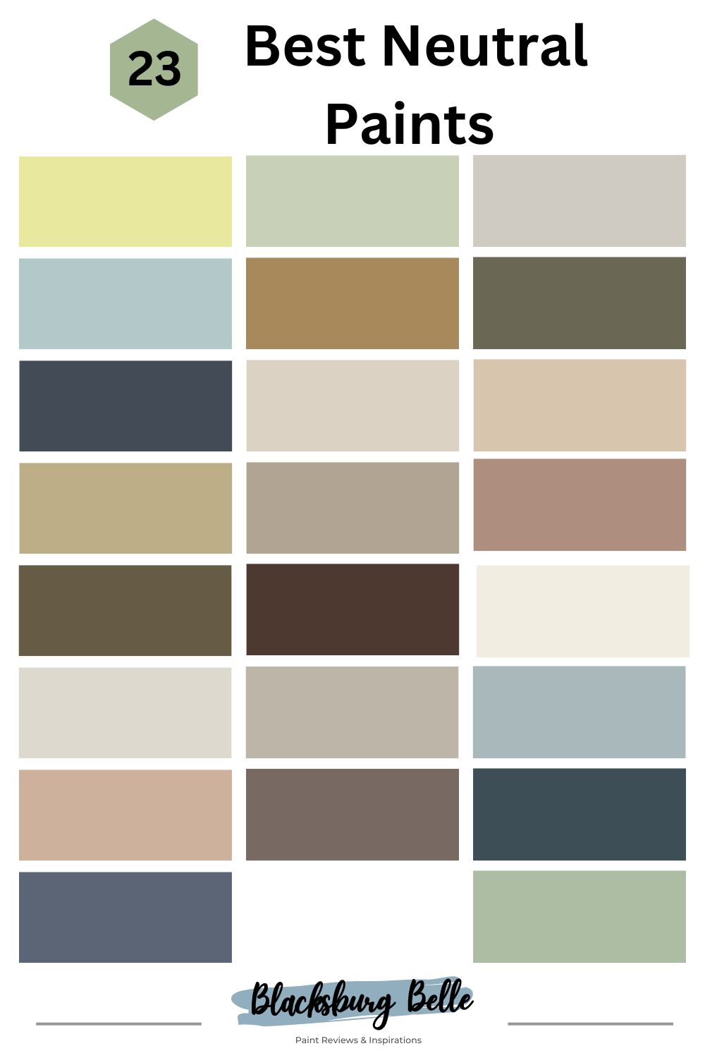
23 Best Neutral Paint Colors By Brand (2023 Trends)
Warm or cool, light or dark, neutral paint colors come in different shades as you’ve seen but this list narrows down the trending shades from the best brands in America.
Here we’ve put together six colors from Benjamin Moore, seven from Sherwin-Williams with four and five hues from Farrow & Ball and Behr. These make 23 of the best neutral paint colors in 2023.
Benjamin Moore Paint Color Brand
As one of the oldest American paint manufacturers, Benjamin Moore has solidified itself as a staple brand. Apart from its pedigree, BM paints boast of high quality paints that cover spaces in one swipe.
A gallon costs about $42.99 – $46.99 depending on the line as the higher quality Regal line costs $65 per gallon.
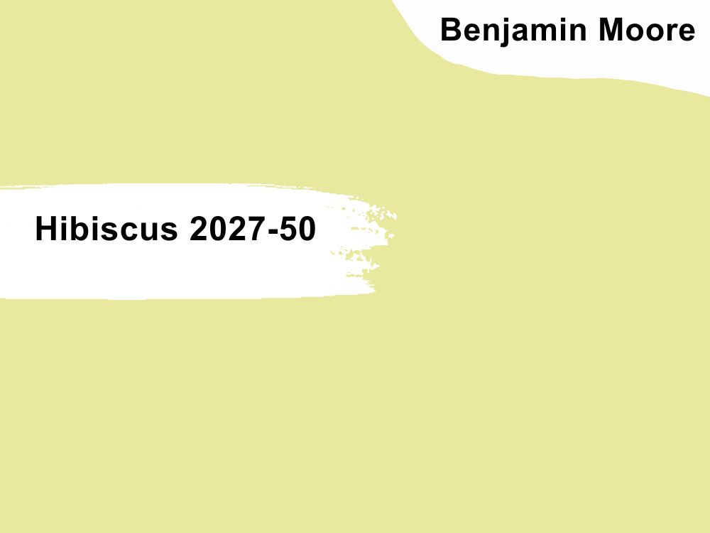
1. Hibiscus (2027-50)
Hibiscus walls open up small living rooms yet maintain a cozy aura
Open up your space with the vibrance and cheeriness of Hibiscus (2027-50), a bold yellow-green color. Its bold yet subtle presence lightens up a room so much that BM doesn’t recommend it as an exterior hue.
This color has an LRV of 75.11 and is part of the Color Preview collection. Pair Hibiscus with darker green hues for a nature-themed look, red (Ruby Dusk) for an analogous look, brown-purple (Amazon Soil) for contrast, and pastels like Wales Green.
Use Hibiscus neutral paint in your living room, bedroom, adjoining rooms, and kitchens for a vibrant aura.
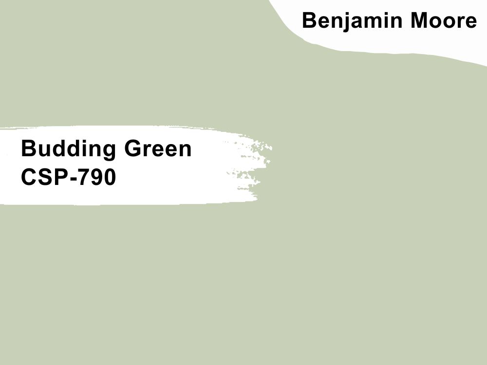
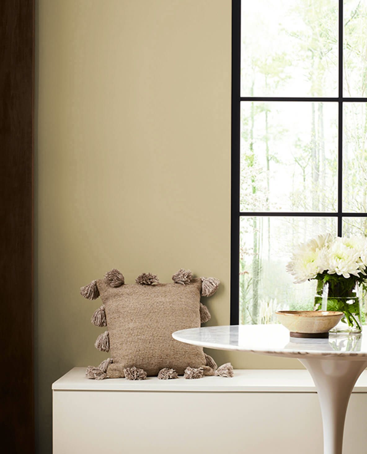
2. Budding Green (CSP-790)
Get work done peacefully in the cool presence of Budding Green walls
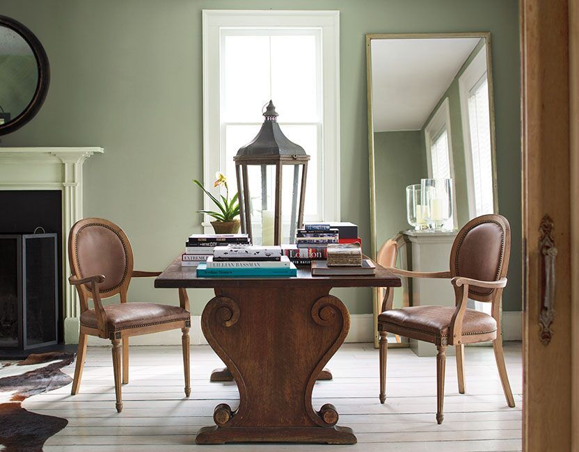
Use Budding Green (CSP-790) to keep your bedroom, living room, and kitchen looking like a warm Spring morning fresh out of a fairytale. This sage green hue is a mid-light tone with an LRV of 59.65 and is part of the Color Stories collection for creative designers.
BM suggests it’s strictly an interior paint, but you can use it outside if paired with a darker green like Jungle Canopy and inside with beige and off-white trims. Paint Budding Green in your family room, children’s bedroom, kitchen, basement, bathroom, and laundry room.
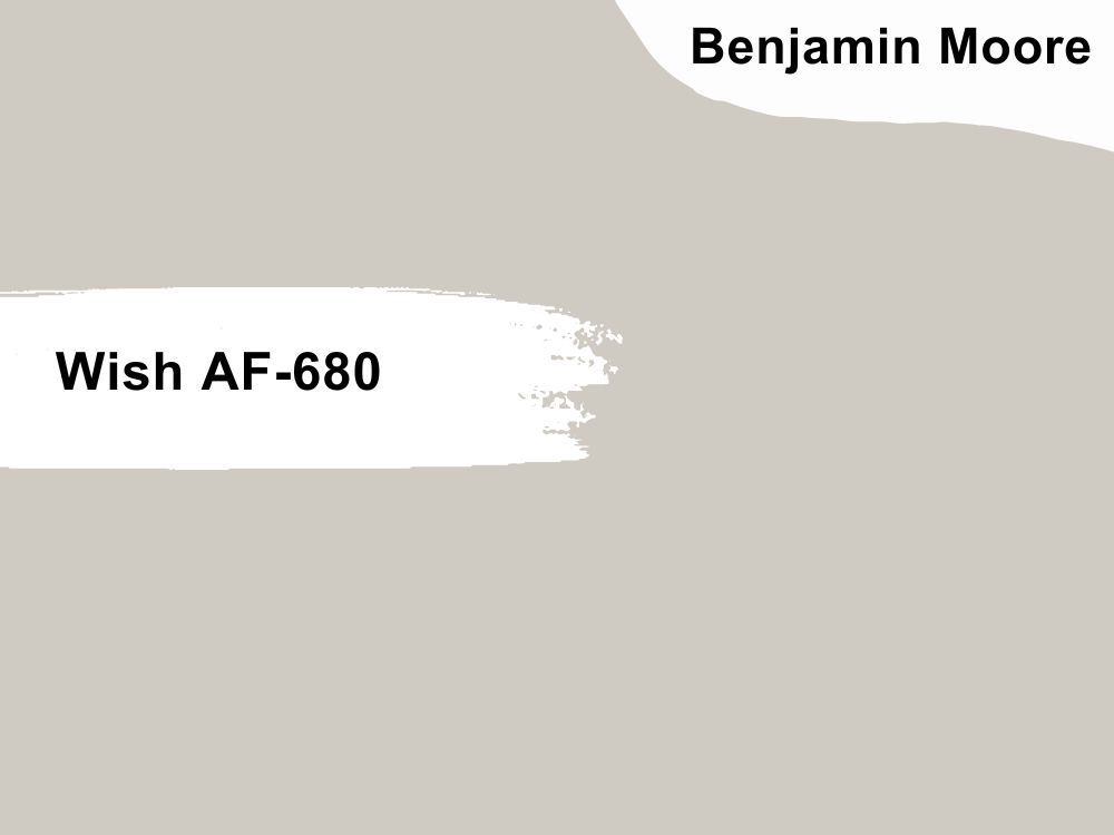
3. Wish (AF-680)
Wish walls make you feel like every day is a fresh start
Although the theme for this year is out with the old and in with the new, that doesn’t mean you can’t fuse tradition with modernity using greige paints like Wish AF-680. This mid-tone neutral hue has a warm beige tint beneath its gray surface, making a cozy taupe tone.
The Benjamin Moore Wish paint color has a 58.58 LRV soft presence making it ideal for living rooms, kitchens, and dining rooms. Pair the color with darker neutrals like Chambourd (plum), charcoal (Iron Mountain), and warm brown colors (Northwood Brown).
4. Gossamer Blue (2123-40)
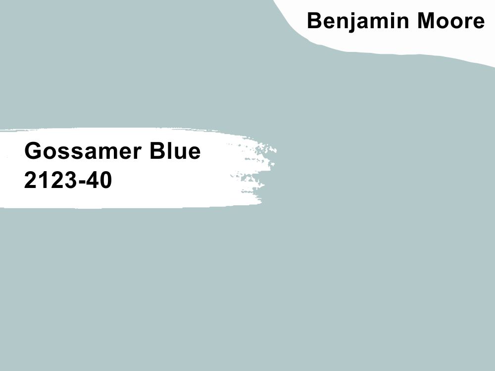
Bring the Ocean indoors with Gossamer Blue walls
Get a mix of green, blue, and gray in Gossamer Blue’s (2123-40) cool timeless look as you create a perpetual summer haze in your home. It’s a mid-toned neutral with an LRV of 55.04 and a filmy blue exterior that keeps you calm throughout the day.
We recommend you use Gossamer Blue on the walls of your bathroom, kitchen, bedroom, living room, and hallways. Depending on the theme, pair the color with wooden floors or gray tiles. The former suits the vintage era and is for contemporary styles.
5. Deep Ochre (1048)
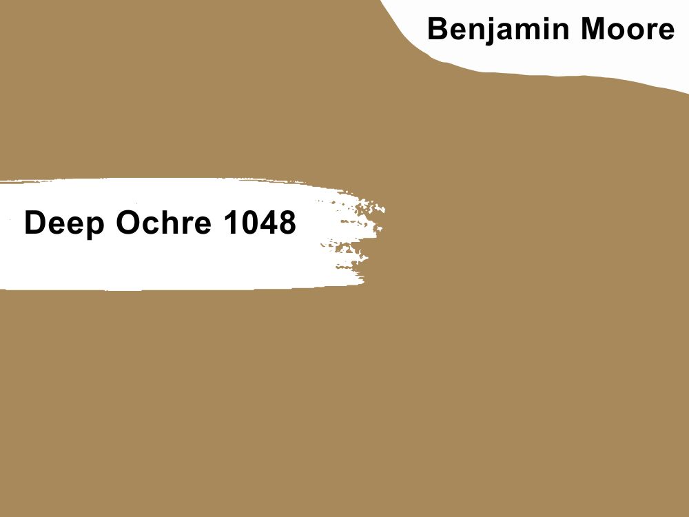
Connect to the Earth with Deep Ochre walls
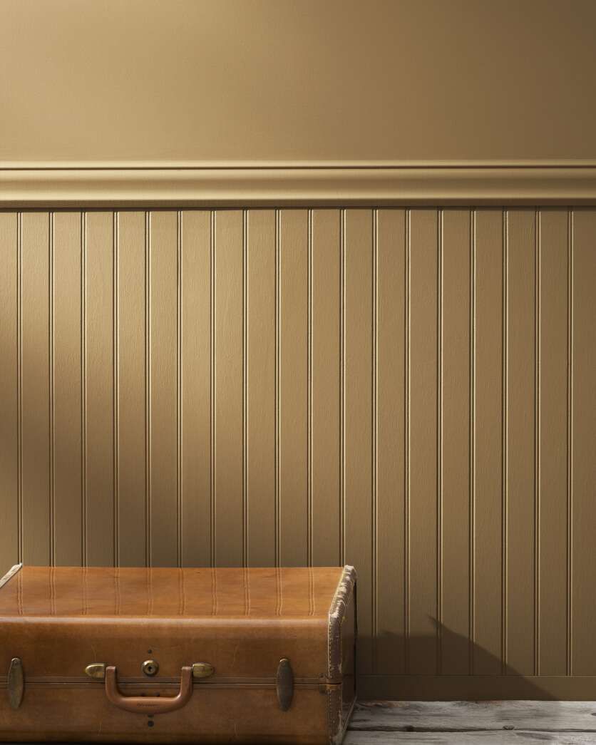
If you’re looking for a dual-toned earthy color, choose Deep Ochre (1048), a soft tan by day and warm bronze by night. This medium-dark paint with an LRV of 26.68 exudes warmth with its reflection.
Due to Deep Ochre’s potential for turning into a warm brown, it’s best to use it in large spaces and pair it with light neutrals like Mayonnaise and Fossil. Paint this homely shade in your family room, dining room, and as a bedroom lower-half wall.
Accentuate Deep Ochre’s warmth with wooden floorboards and leather furniture.
6. Army Green (2141-30)
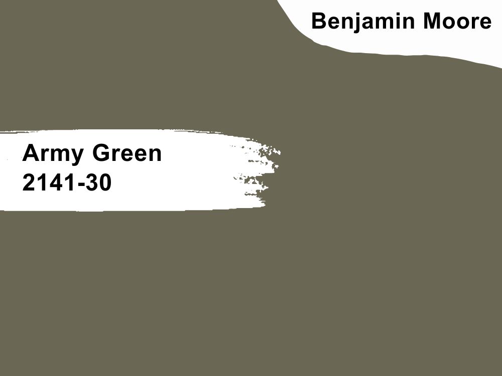
Army Green brings the forest’s serenity and nature-filled presence into this living room
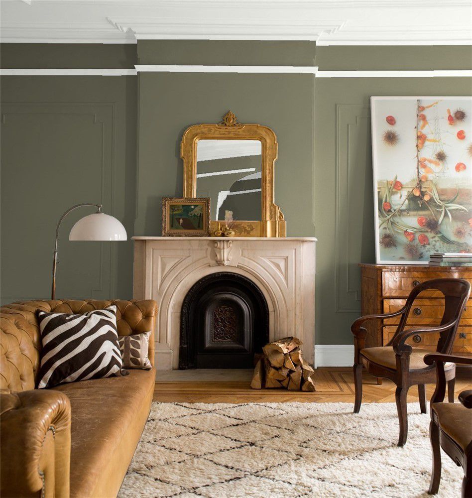
Stay true to nature with the elegant and earthy tone of Army Green (2141-30). Color your interior walls with its muted 15.39 LRV tone and ensure it gets ample lighting to accentuate its rich brown tints.
You will be able to maintain Army Green’s moodiness with a gray pair or highlight its warmth with off-white and beige trims. This color will always remind you of a serene walk amongst the trees in a forest on a cool Fall evening.
7. Hale Navy (HC-154)
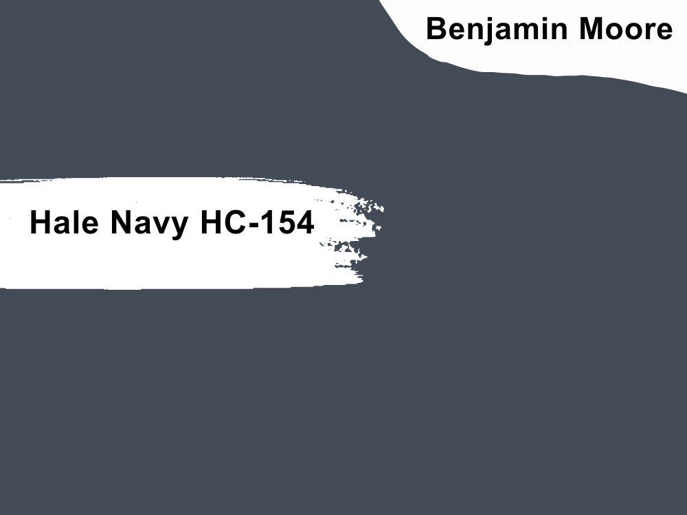
Hale Navy is elegant as a wall or furniture color but needs natural light to shine
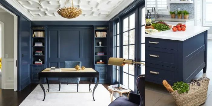
Being bold means replacing a dependable black with a beautiful navy blue like Hale Navy (HC-154). This 8.36 LRV paint is a historical color and one of the brand’s bestsellers for its versatility.
Hale Navy has a charcoal overtone, with its blue hue appearing as a tint under cool lighting. Use this color with light gray and blue paints for monochrome themes or warm tans and beiges like Lenox Tan for contrast.
A good place to use the Hale Navy will be in your bathroom, hallways, exteriors, and lower half-walls in the living room, highlighted with wooden trims.
Sherwin-Williams Paint Color Brand
Sherwin-Williams is as old as Benjamin Moore in America and rivals the brand in quality and price. You’ll get maximum coverage, consistency and long-term value with this brand albeit its paints being lightwear.
A gallon costs $69.99 – $74.99 for the economic collections but you can save a couple of dollars if you use coupons like the 30% for online purchases. Here are some of the best neutral paints from Sherwin Williams this 2023.
8. Natural Tan (SW 7567)
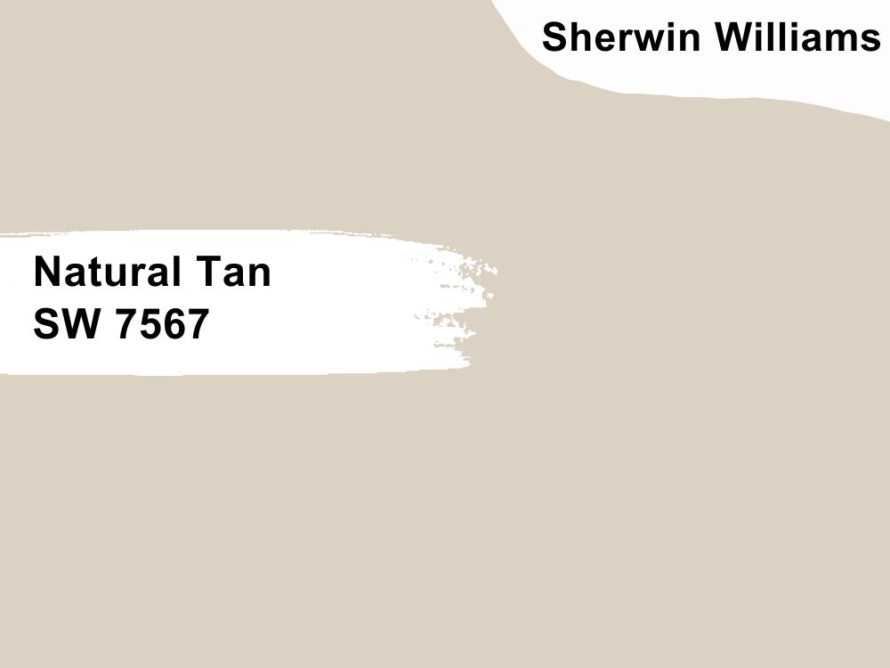
Make every meal homely with Natural Tan walls in the dining room
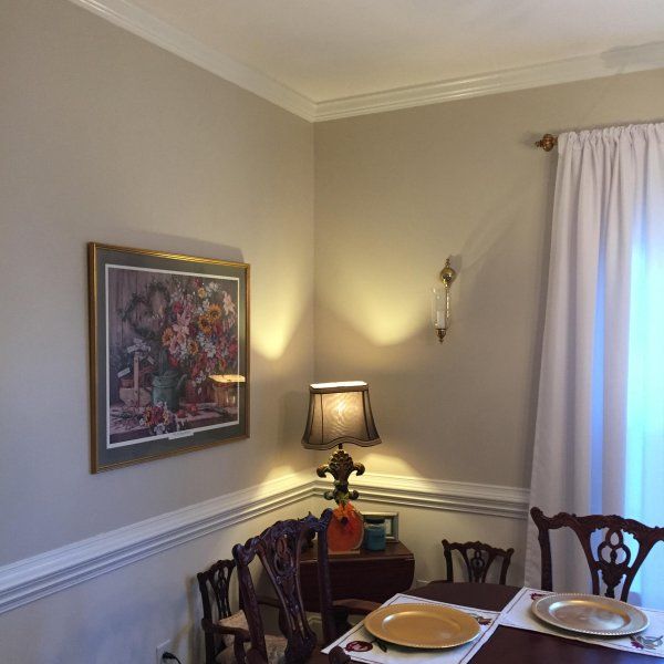
Create an airy vibe with the mid-toned 65 LRV yellow hue of Natural Tan (SW 7567). This pastel color has a green-gray undertone that cools its warm overtone.
That combination makes Natural Tan a restful paint color that blends with greenery and other natural trim like wood. Pastel yellows are timeless background paints suitable for interior and exterior coloring, whether in a living room, guest room, or outside panel.
9. Kilim Beige (SW 6106)
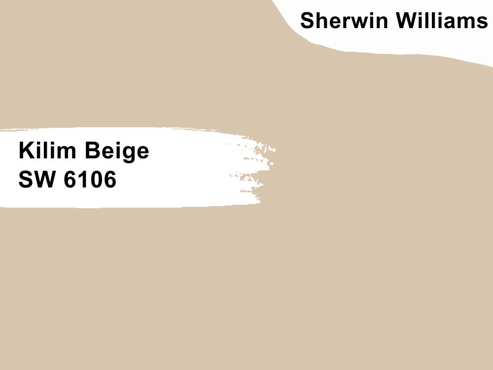
Open up your space with Kilim Beige’s cozy latte look
Kilim Beige (SW 6106) is a beautiful beige color that reminds you of a cream-filled coffee cup on a sunny morning. It’s the epitome of warmth with its bold orange undertone and soft 57 LRV and looks even better with tan wooden furniture.
Use Kilim Beige in your living room, kitchen, and dining rooms to keep people cheerful. Complete the glow with warm lighting and golden trims from sconces to lampstands, chandeliers, and knobs.
10. Earthy Ochre (SW 9532)
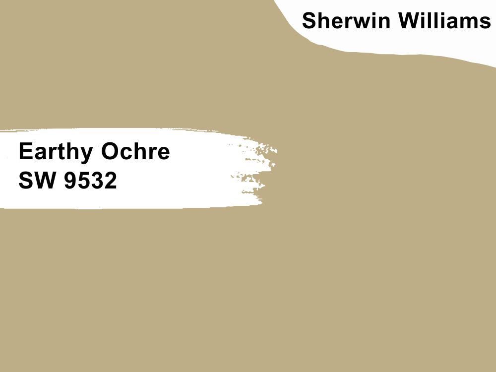
It’s a perpetual summer vacation with the warmth of Earthy Ochre walls in your home
Earthy Ochre (SW 9532) is a sandy tan mid-toned neutral with an LRV of 43. This color is suitable for coloring whole walls as its soft tone binds brighter colors, whether red, blue, or yellow.
Paint Earthy Ochre inside and outside for a minimalist and traditional theme, and highlight the color with wooden ceilings, floorboards, and doors.
11. Perfect Khaki (SW 9612)
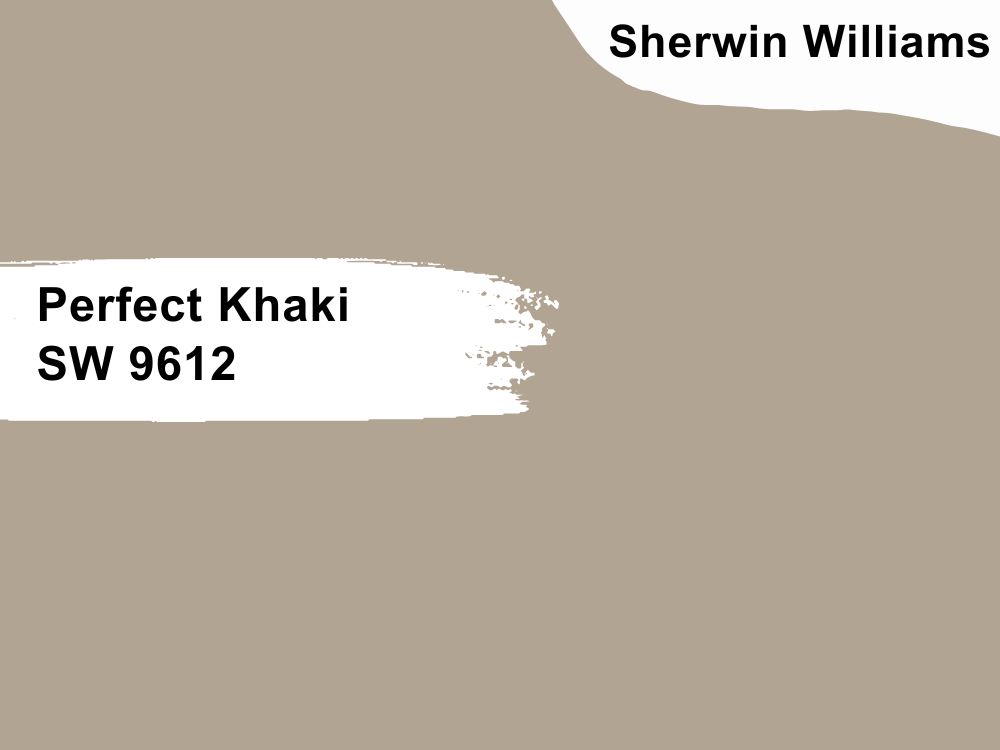
Say “Welcome” with Perfect Khaki entryways as the morning sunlight wakes your senses
Gray may be out of style for 2023, but greige/taupe tones like Perfect Khaki (SW 9612) stay trendy for their versatility. Its medium-dark outlook (38 LRV) blends into the background rather than stands out when used in small quantities.
Perfect Khaki keeps your guests feeling welcomed as they wait in the lounge, eat in the dining room, shower in your bathroom, and sleep in your bedroom. We recommend using white trims to keep it clean and darker gray colors for a relaxed, moody ambiance.
12. Redend Point (SW 9081)
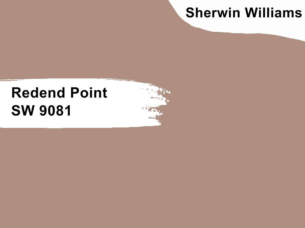
Red is fun and subtle with Redend Point’s pastel beauty
Sherwin-Williams’ color of the year is Redend Point (SW 9081). This pastel red color translates as blush with an earthy undertone. It epitomizes the 2023 trend, encouraging homeowners to be bold in color choices.
This blush paint is medium-dark with an LRV of 30, making it an ideal binder for darker or lighter hues. You can keep your living room, bathroom, and poolside airy with white trims and furniture and fuse a traditional aura with chestnut wood floorboards and tan leather.
13. Nettle (SW 9535)
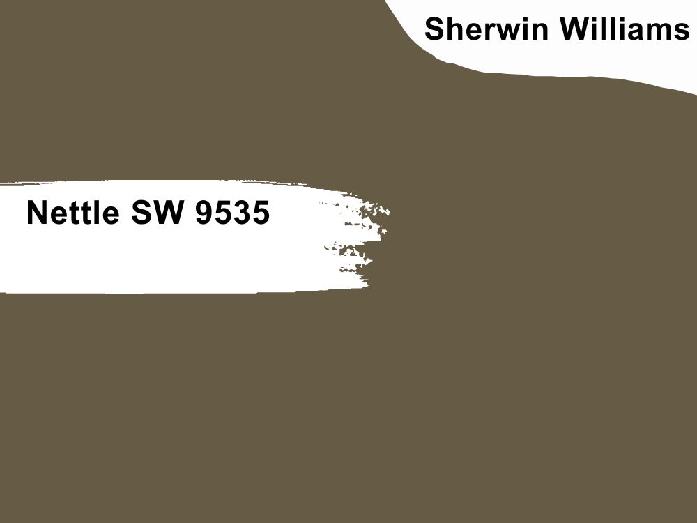
Create your home spa with the rich dark earthy shade of Nettle walls
Heat your sauna, bathroom, and adjoining hallways with Nettle (SW 9535), a moody dark brown paint. Despite being a low LRV color with a reflection strength of 11, Nettle isn’t for exterior coloring. Instead, you can use it everywhere inside your home or office (preferably office) as it is a color of form and function.
14. Turkish Coffee (SW 6076)
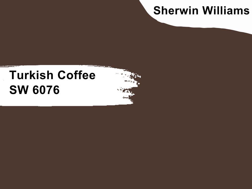
Too much Coffee doesn’t exist as long as it’s Turkish Coffee walls in your break room
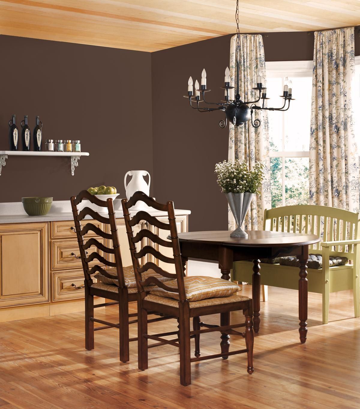
Use Turkish Coffee (SW 6076) for a warmer dark ambiance in your home thanks to the bright yellow tint enveloping its brown overlay.
This brown paint is elegant and sophisticated, making it ideal for entertaining guests in a grand dining hall or attending to clients in an office. Brighten the moody hue with light tans, blush, and beiges.
Behr Paint Brand
If you’re painting on a budget, look no further than Behr. Its paint colors are of average quality and thick upon application but affordable.
There are over 3000 shades by Behr, and you can get a gallon for $45 or less, depending on the shade. However, prepare to repaint every three to five years due to the low quality of each pigment.
15. Blank Canvas (DC-003)
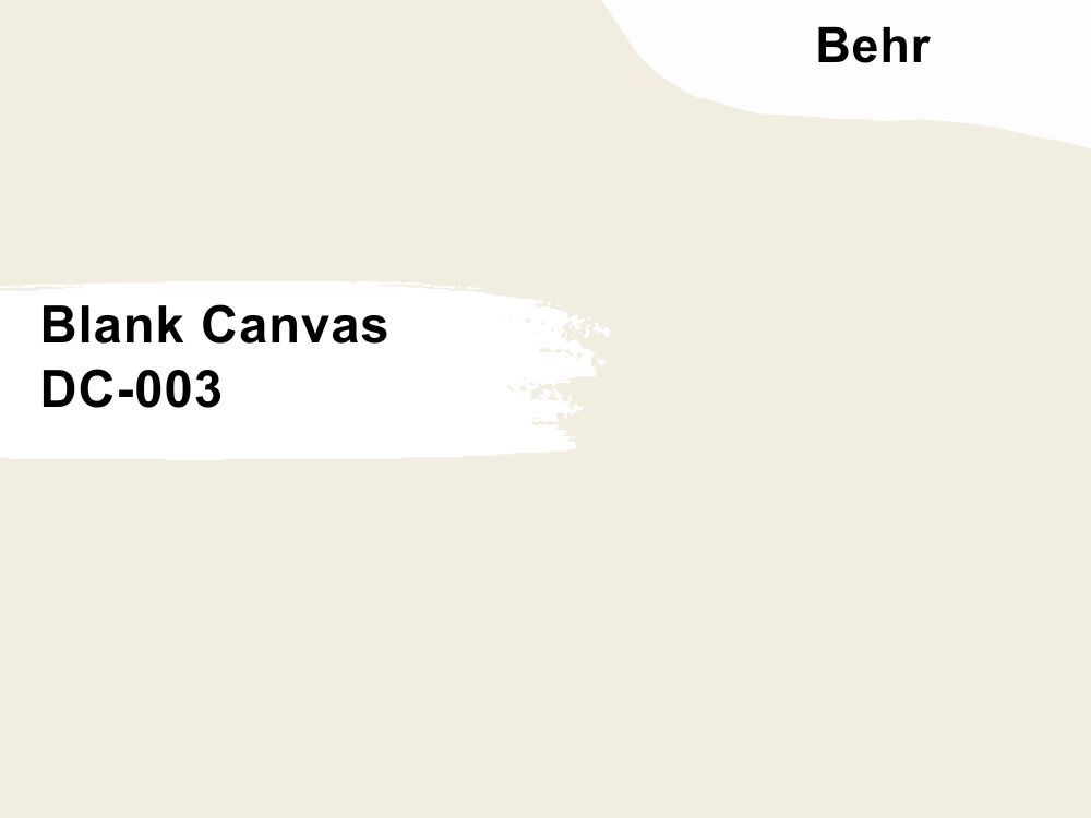
Welcome your guests with the warmth of Blank Canvas walls paired with natural wooden furniture
This year, Behr’s champion hue is a welcoming, warm white paint with a twist on the classic crisp neutral. There’s no more versatile color than white in the wheel, and you can use Behr’s Blank Canvas (DC-003) anywhere.
Despite having a high LRV of 84, Blank Canvas’ bright orange undertone makes it a homely color, and it gets warmer with rustic wooden furniture and potted plant decor.
16. Campfire Ash (N320-1)
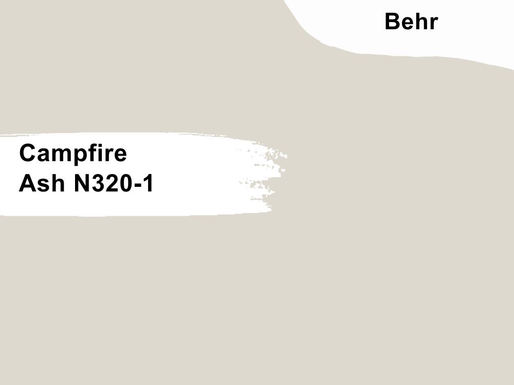
Campfire Ash is an ideal gender neutral hue for bedrooms
Lean into the filmy presence of green-gray with Campfire Ash N320-1, a neutral hue with a medium-light LRV of 69. It’s a cool misty pastel hue with a warm brown tint that brightens the space in dim lighting.
Interior designers favor Campfire Ash in entryways, living rooms, and hallways as the tone promises a refreshing stay inside the house. Pair this color with its undertones (green and brown) in darker shades as accent walls and furniture.
17. Perfect Taupe (PPU18-13)
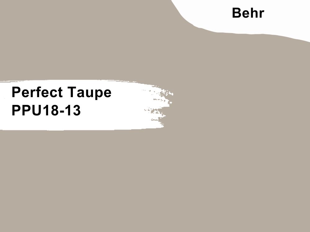
Open your room with the mist presence of Perfect Taupe for a clean neutral look
The overwhelming brown tint in Perfect Taupe (PPU18-13) makes it an exception to the “no taupes for 2023” rule. It’s a flat neutral gray with a warm overlay and dusty tint, making it warm instead of cool.
Pair Perfect Taupe with other pastel colors for a muted theme, or tune-up its vibrancy with high LRV bright tans matching its 42 reflection strength.
18. Half Sea Fog (N470-3)
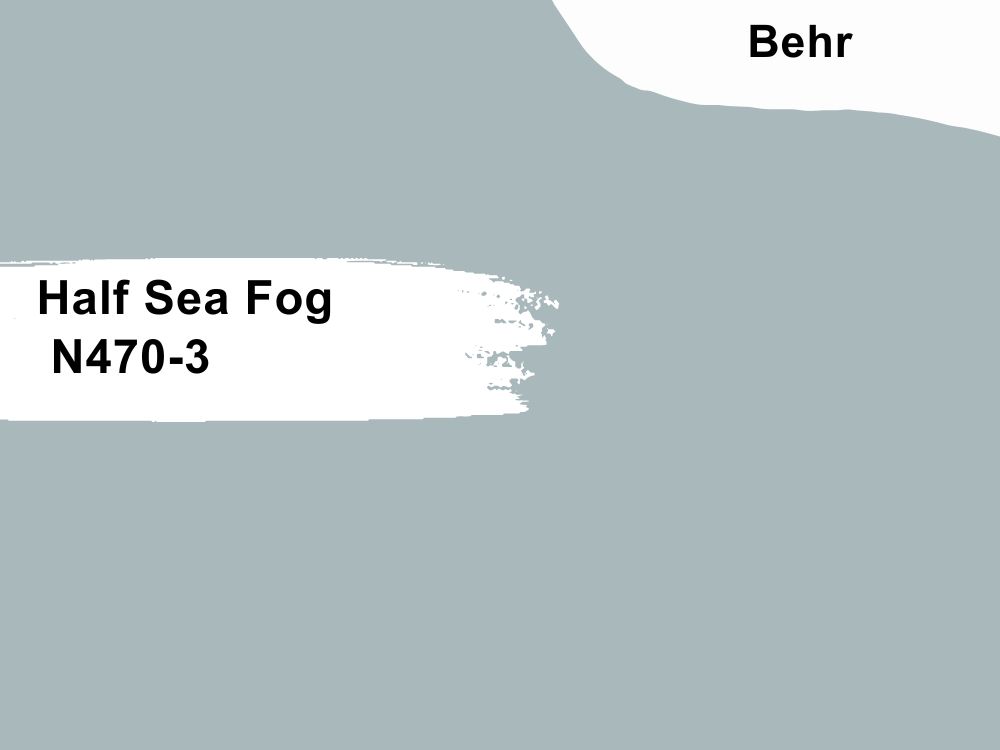
Create a beachy ambiance in your study with Half Sea Fog walls and shelves
Make your home look like a walk along the beachside with Half Sea Fog (N470-3), a muted dusty blue shade with an LRV of 46. This blue neutral works inside and outside, especially as the backdrop for blue monochrome themes.
Half Sea Fog keeps you relaxed and calm and stabilizes your mood throughout the day like a breezy walk along the ocean. Introduce warmth with light wood trims, or keep the space clean and airy with white and gray decorations.
Farrow & Ball Paint Brand
Nature enthusiasts would love Farrow & Ball for producing eco-friendly clay-based paints. Despite its lack of emulsion, this brand creates rich, absorbent pigments that are easy to maintain.
You can get a gallon for $38.30 – $64 depending on the shade, finish, and collection.
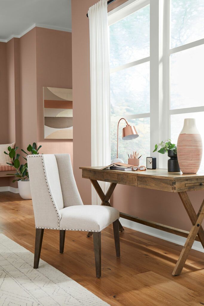
19. Templeton Pink (No. 303)
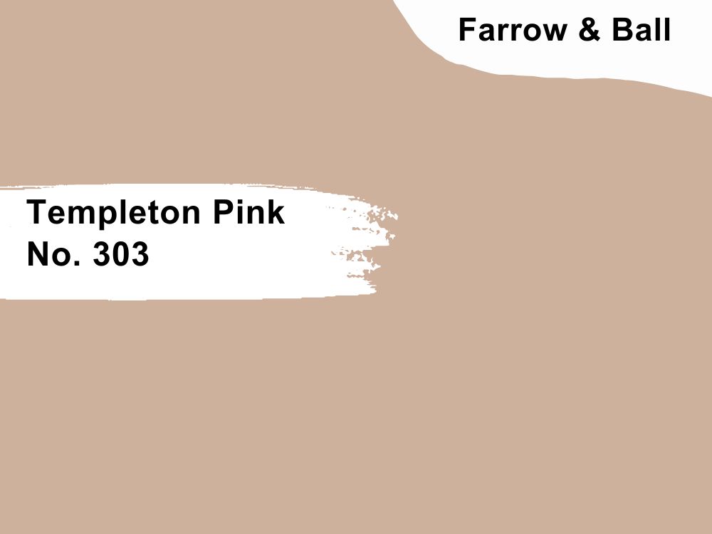
Templeton Pink is the new beige as its red tint creates an exciting ambiance
Farrow & Ball unveiled Templeton Pink No. 303 as a new 2023 color, so why not explore it? This is the color for you if you want a fainter and warmer shade of Sherwin-Williams’ Redend Point.
Its rich brown undertone makes Templeton Pink a viable historical color as it overshadows the blush tone in dim lighting. Use it in North-facing living rooms to keep this consistency or South-facing parlors for a brighter and warmer note.
Pair Templeton Pink with deeper pink to boost its medium tone and white trims to highlight its pink note.
20. London Clay (No. 244)
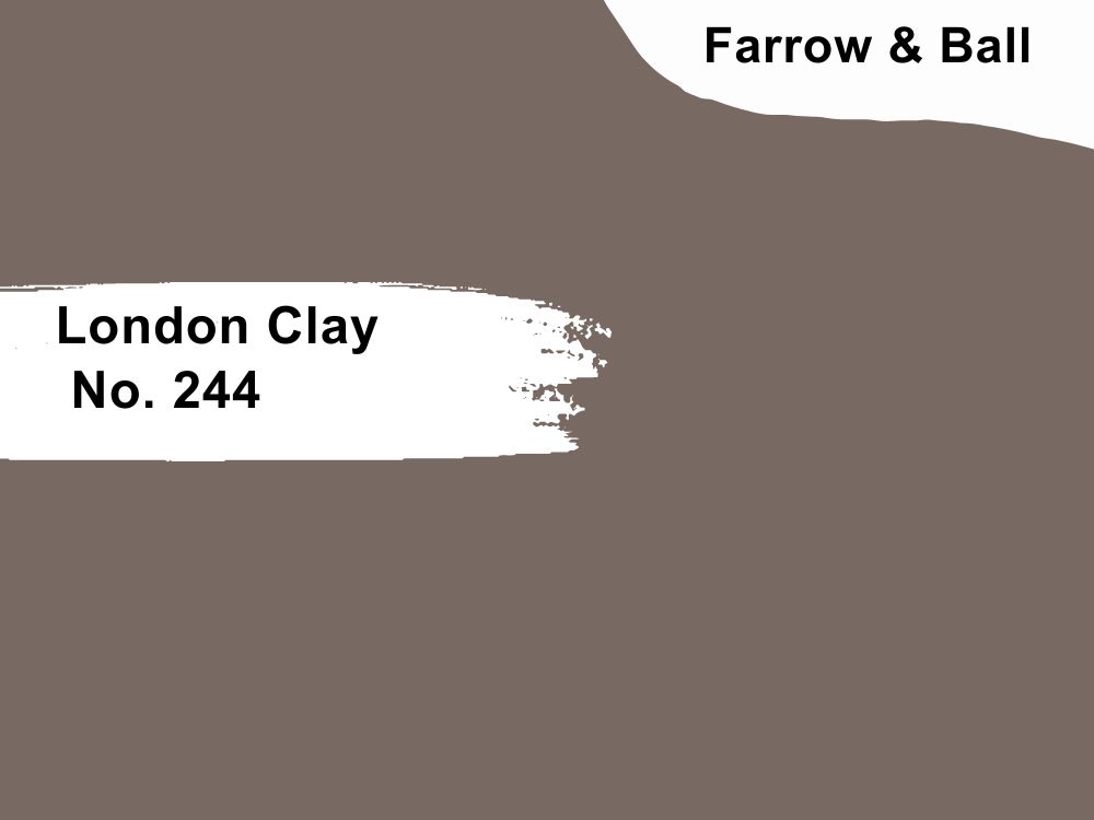
Add character to your dark brown walls with London Clay’s Magenta tint
Warm gray-brown paints like London Clay are coming back in style this year as more designers embrace the charismatic vibe in their dining rooms, living rooms, and bedrooms. You can keep the mood clean with white trims and furniture or use beiges and off-whites.
London Clay’s unique magenta undertone makes it an ideal pair for royal and bold colors like plum, purple and deep pinks.
21. Hague Blue (No. 30)
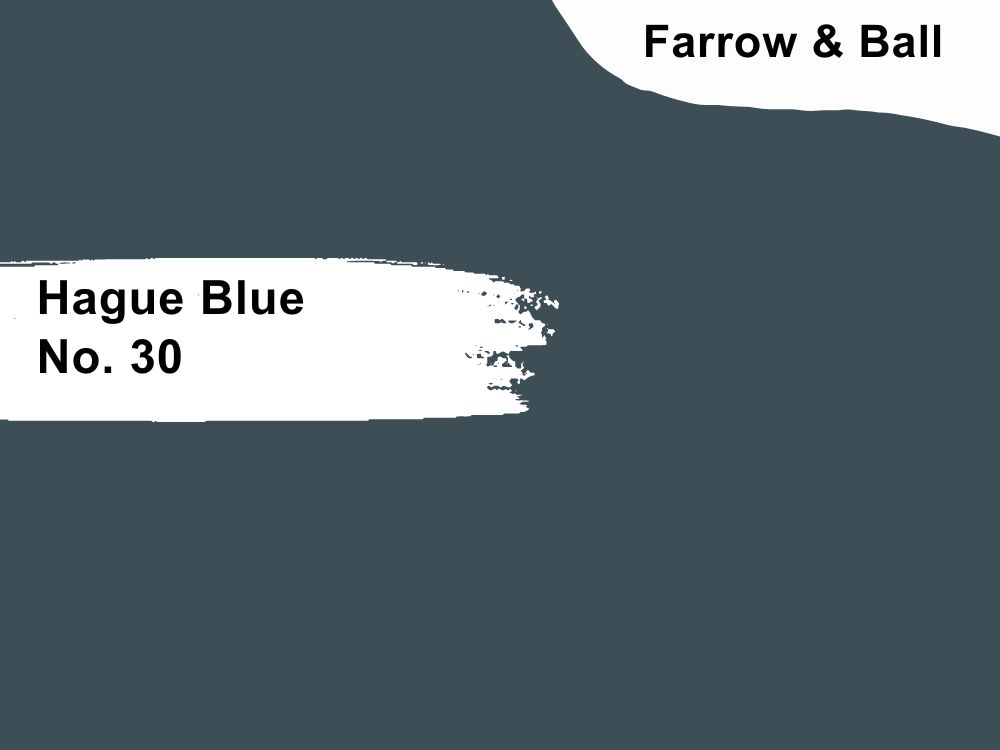
Make a bold statement with Hague Blue navy walls and bright furniture in your living room
Navy blues like Hague Blue No. 30 are elegant neutrals because they’re slightly picky and demand only the most sophisticated hues as pairs. This cool color has an LRV of 7 and a faint green undertone that turns it teal under low lighting.
Highlight Hague blue with bright yellow cushions, throw pillows, and carpets against wooden floors and leather settees. Use it in your study, bedroom, living room, and kitchen for an eclectic design.
22. Wine Dark (No. 308)
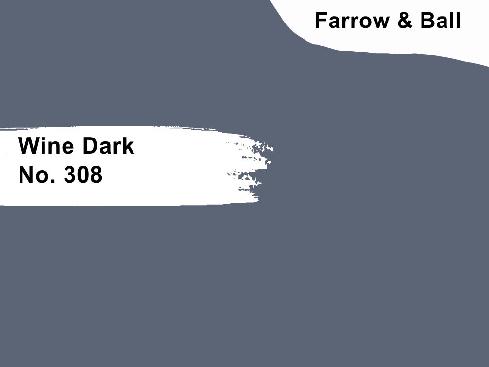
Make your home regal with the sophistication of Wine Dark walls
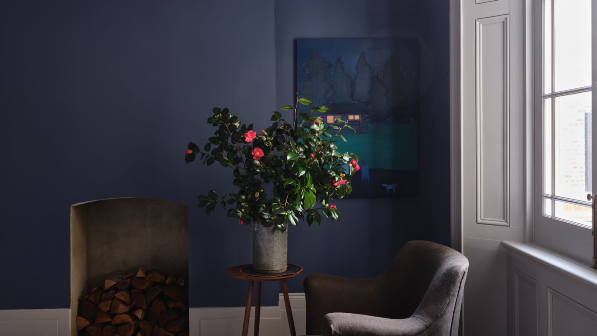
Create a moodier vibe with the new Wine Dark No. 308 paint in your living room and study while your brown chairs and fireplaces warm the atmosphere. Farrow & Ball designed this deep navy tone in tribute to Homer’s Midnight Skies.
Art and Literature lovers shouldn’t miss the chance for poetic justice and beautifying Wine Dark walls with the best art pieces.
23. Whirlybird (No. 309)
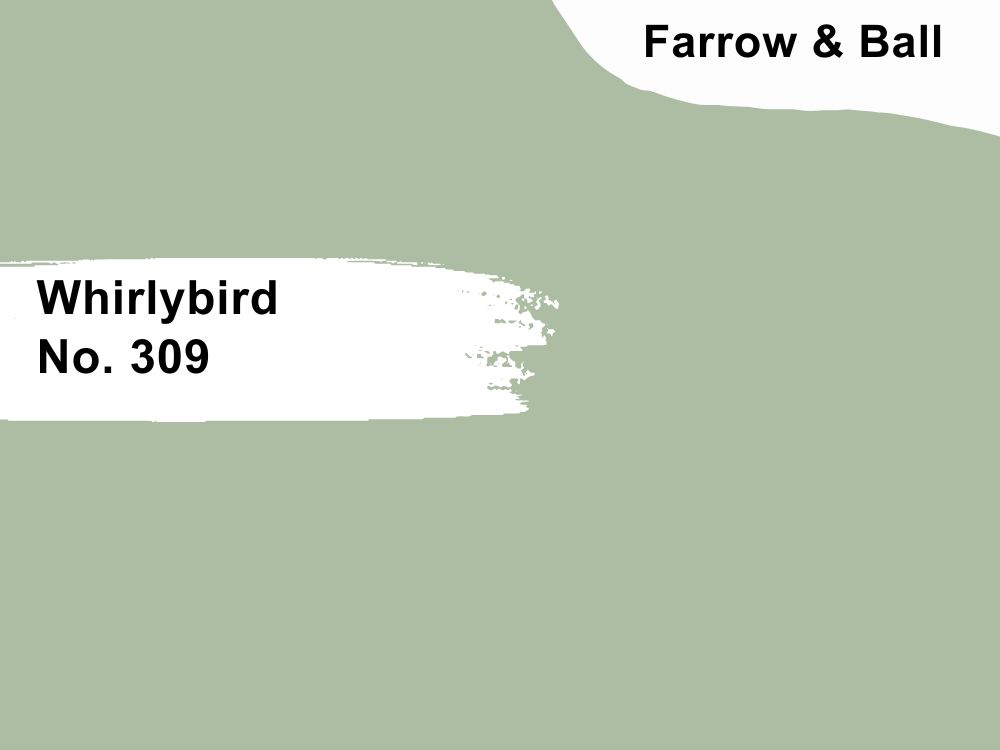
Get inspired daily with the calming shade of Whirlybird walls in your kitchen
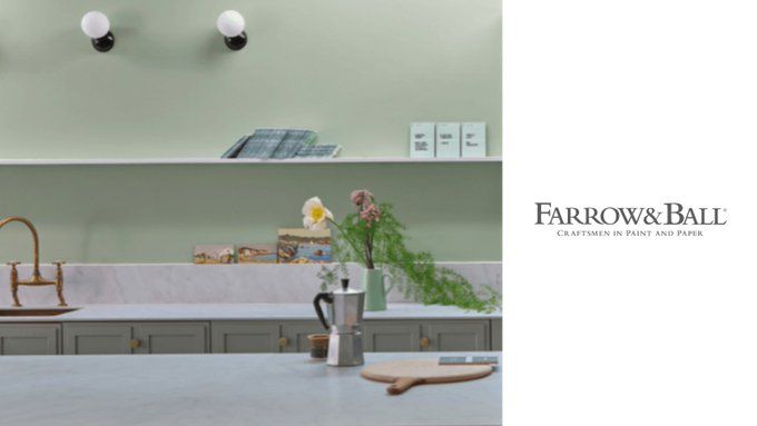
Mint green walls like Whirlybird No. 309 inspire hope and new beginnings due to their refreshing appearance. Break your daily fast with this color on your kitchen and dining room walls, and add floral motifs around the house for a classic home ambiance.
Conclusion
Neutral paints will forever be in style, but the trending shades change yearly. 2023 is the year to speak up with your interior design, and this guide gave you a road map for making the best decision.
There’s paint for every personality type without compromising your value, like using Farrow & Ball to stay eco-friendly, Behr for budget renovations, and BM or SW for high-quality splurges.
Don’t compromise your sanctuary by decorating without the necessary tools; follow this guide and see your dream become a reality.
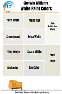 10 Best Sherwin Williams White Paint Colors (Trend 2023)
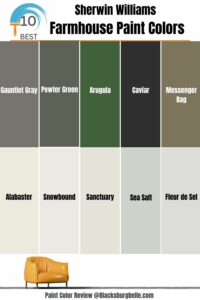 10 Best Sherwin Williams Farmhouse Paint Colors (Trend 2023)
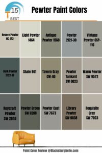 15 Best Pewter Paint Colors: Comparisons and Suggestions
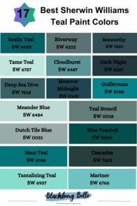 17 Best Sherwin Williams Teal Paint Colors (Trend 2023)
 25 Best Blue Gray Paint Colors for Your Home Interiors
 21 Best Cream Paint Colors for 2023
