
It is 2023 and off white paints are the new choice for homeowners, and it’s living up to the expectations. This color is also readily available on the market by different brands. This article will help you discover the best off white paints around and even serve inspirations you can follow in case you decide to follow the bandwagon.
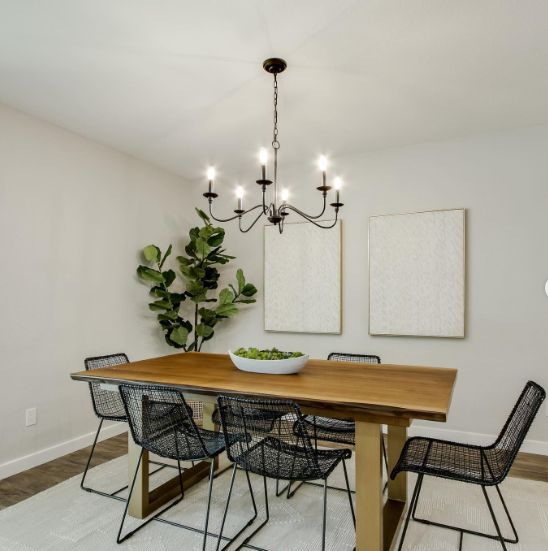
Table of Contents
What is Off White Paint Color?
While white has been associated with purity and many pristine qualities, white isn’t far off. This breathtaking color is a few shades away from white and usually has more interesting undertones like yellow, pink, beige, or gray.
Off white works as a neutral backdrop for paint jobs if the homeowner can’t handle the intensity and sharpness of white color, and it’s much more welcoming, thanks to the strong undertones they carry.
Benefits Of Using Off White Paint for Your Space
White paints have a truckload of pros for you to enjoy. That may be why they’re so popular and widely accepted in the interior design sphere, whether as a main wall color or an accent wall- it’s the color of choice for any undecided homeowner.
White is softer than the white color, and it’s a better alternative to the harshness of pure white color. It’s also extremely versatile, thanks to the presence of rich undertones that expands the range it covers.
Regardless of its undertones, whether warm or cool, you’re assured that off white is a neutral that will light up any room, balance out dark colors, and beautifully work with other lighter colors on the palette.
Off white carries this in-built elegance that’s soft, vintage and fits into any aesthetic- the word is classy. You can amplify the appearance of your off white by adding gold or navy blue.
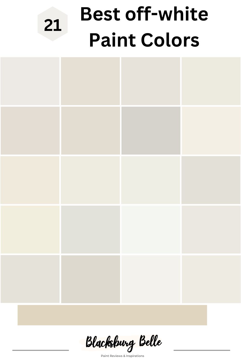
21 Best Off White Paint Colors
Check out these 21 most capable and popular off white paint colors from renowned brands across America. We’ve included pictures from real people and real situations so you draw
Sherwin Williams Brand
With over 1700 paint colors to choose from, Sherwin Williams have solidified its place as a trusted name in the American interior design sphere, and it’s no surprise you find them on this list.
1. Snowbound
Sherwin Williams Snowbound is definitely far from white, but that’s not the best part. It’s the fact that this has a very clean undertone that ultimately picks on surrounding influences that makes it super interesting to work with, but you can still find a bit of gray in it.
Snowbound has an LRV of 83, and it’s right in the middle of both warm and cool intensities, which also means they can be used anywhere in the house or even as a neutral, upon which you can layer other fun colors.
See how pretty this color looks in the image; even though it appears washed out, the white trims help keep a clean contrast thanks to the sun’s heat. The gray surely comes to play in this living room; we love the beige and browns going on in this space and adding a bit of warmth to the coolness.
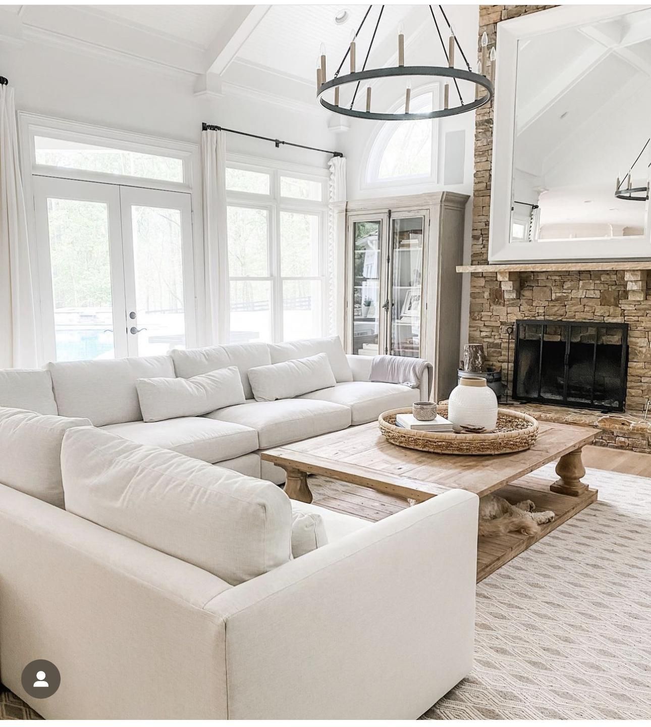
2. Shoji White
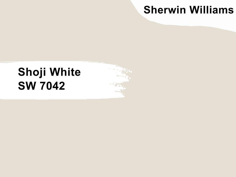
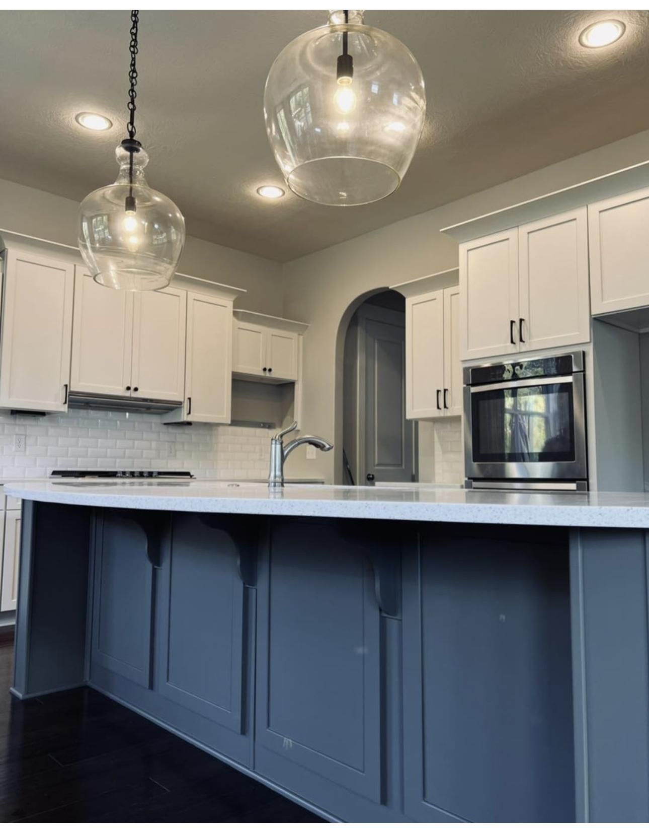
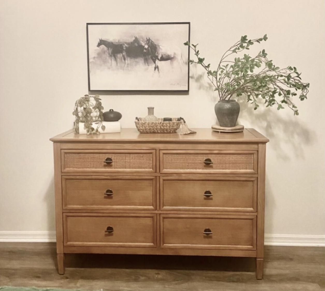
Shoji White instantly captivates your attention with the name, but this subtle off white does much more. The creaminess of the color is so strong; you can almost feel it in your mouth; it also may be the reason for its near exit from the white family.
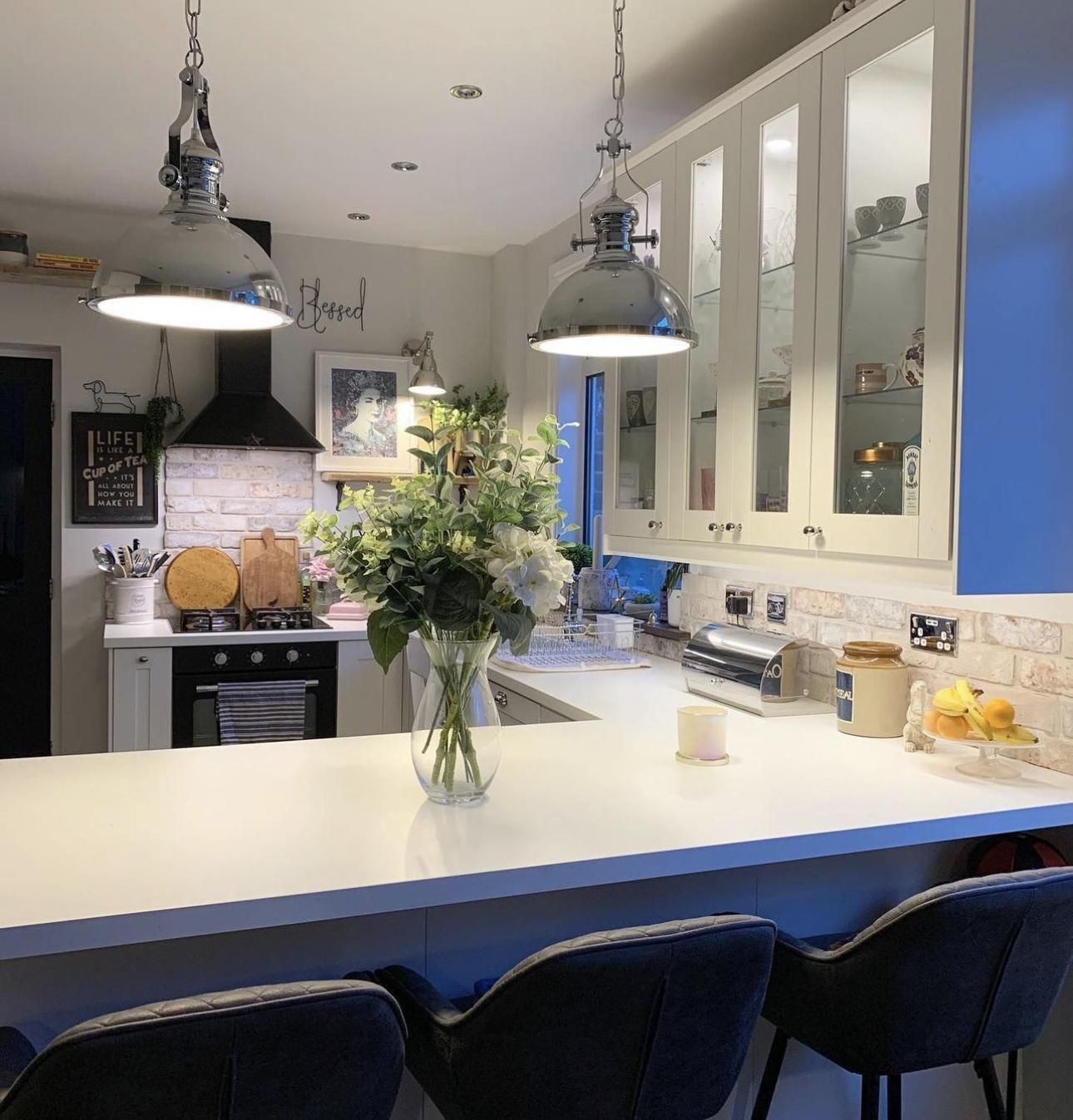
Expect the warm orange and pink undertones to have a field day in this color. Give your kitchen the Midas touch with a Shoji White wall and white cabinetry. Release more creaminess when you pair this color with wooden details, like in the second image.
3. Toque White
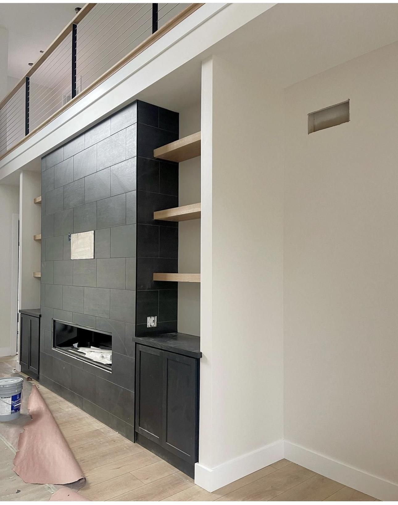
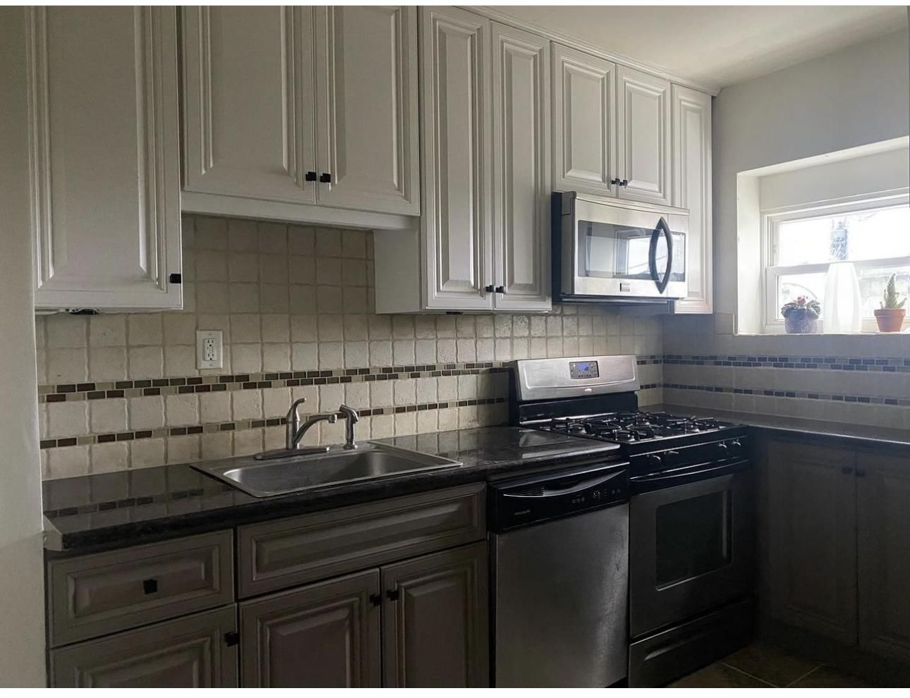
Toque White is relatively unpopular in the Sherwin-Williams circle but nonetheless functional. It has cute purple undertones that won’t overpower its beauty but add extra flair, which keeps people obsessed.
It has an LRV of 76, which means it’s on the high side and would reflect a great deal of light; and also open up your small space like the second image, where you can almost mistake it for pure white on the kitchen cabinet.
Due to the coolness of purple, the northern blue light adds impressive depth to this hue, introducing black to the mix for more edginess.
4. Alabaster
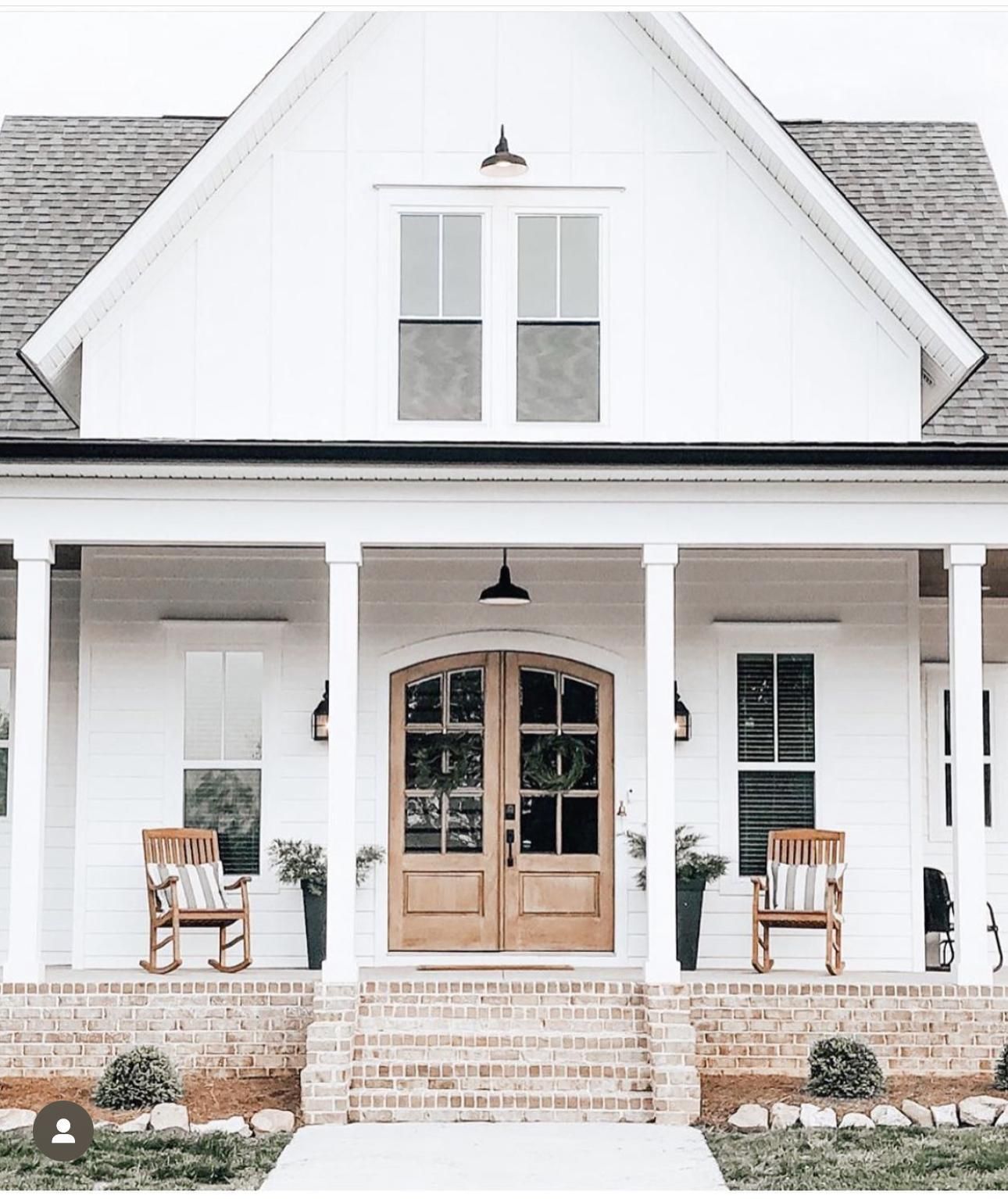
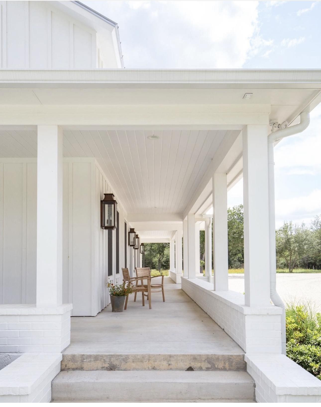
Alabaster is one of the popular off whites from the house of Sherwin Williams, but this didn’t happen by chance or some sheer stroke of luck. If you’ve used this color, you’d know it’s quite a hard worker.
This color has soft hints of yellow that take center stage when paired with cool whites like the cabinetry in the first image, thanks to its LRV of 82 , making it project even with little light in sight. Like every color applied on the home exterior, Sherwin Williams Alabaster appears pretty washed out here but more in tune with its neutral side and welcomes the beautiful brown tones of the chairs, doors, and steps.
In case you were wondering, black is an excellent choice for pairing with Sherwin Williams Alabaster; just take a long, hard stare at the roof for more answers.
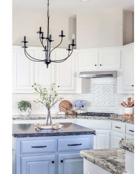
5. Aesthetic White
Aesthetic White really upgrades the aesthetics of your space the moment it lands on the walls. It’s a great alternative for people who prefer to be on the lowkey side of life, especially if they can’t handle the brightness of true whites.
This paint color has an LRV of 73 and quite violet undertones, adding a lot of calmness to your space upon usage. Aesthetic White stood right in the middle of traditional and modern decor when the homeowners paired this cool color with polished wooden tones in the first image.
It’s a bit violet in the second image, given that this area receives less light than the first image. Thanks to the smart idea of white trim color, we really see this color for it truly is- a gem!
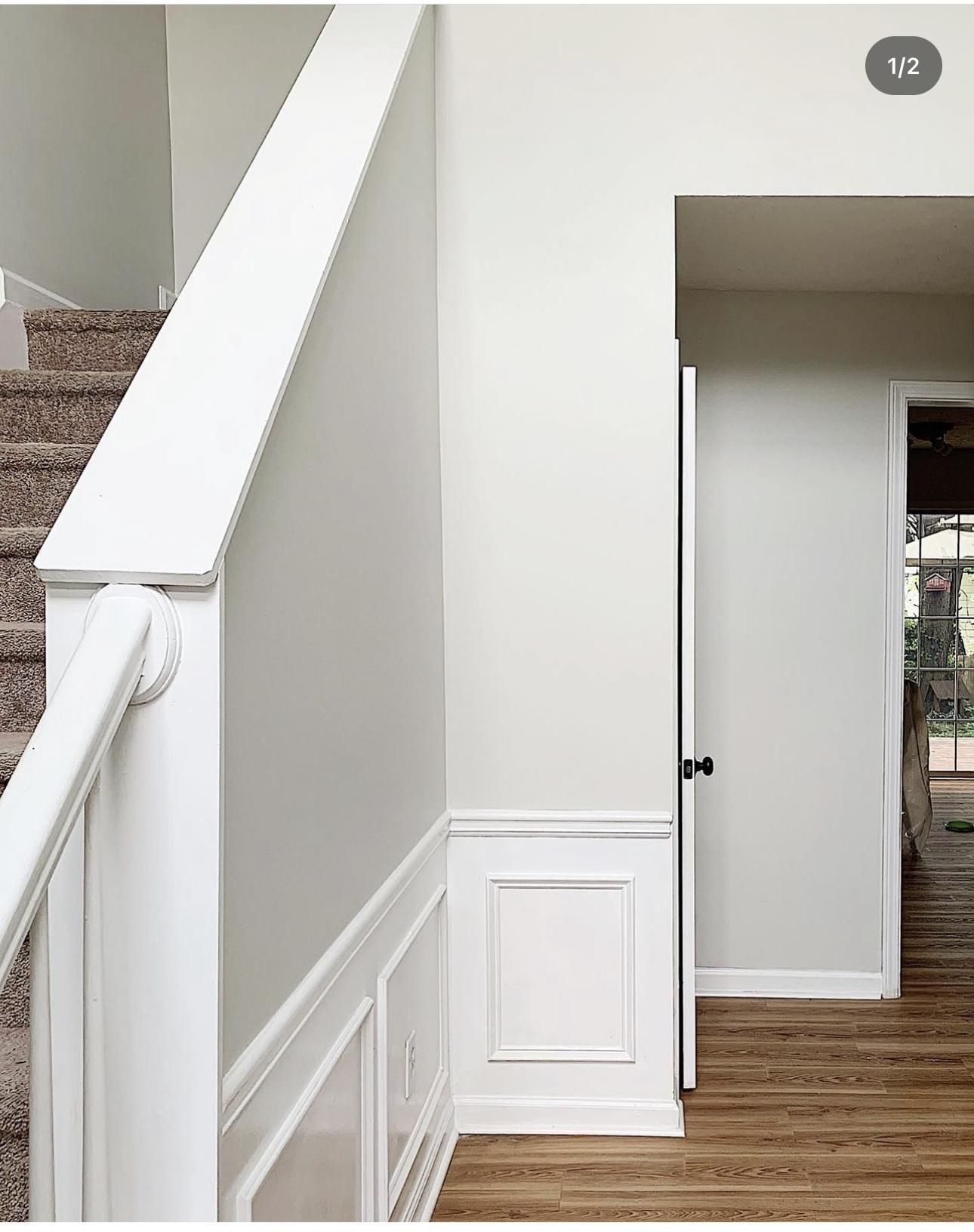
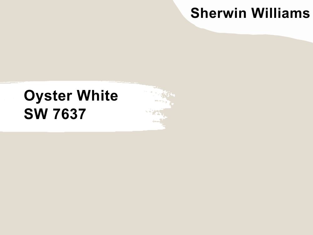
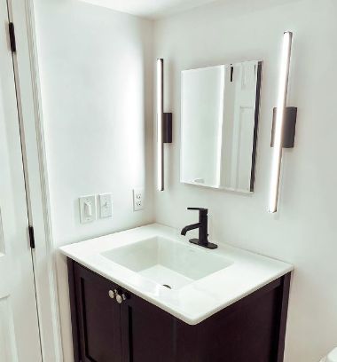
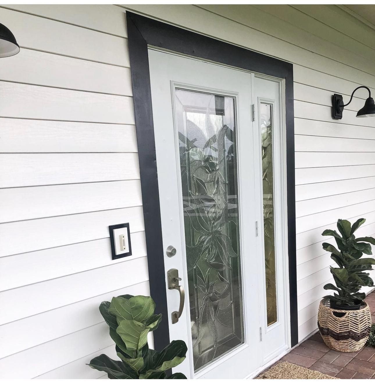
6. Oyster White
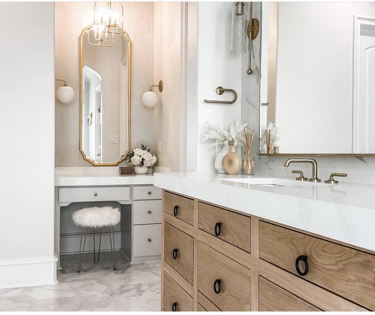
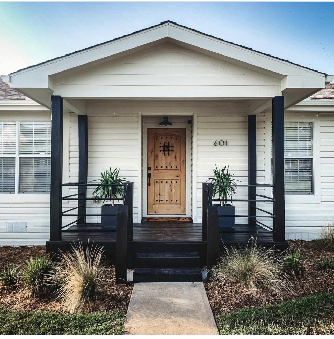
Sherwin Williams Oyster White reminds you of a great day at sea with its beige and green undertones. Technically, this color is cool, but the beige undertones add a bit of warmth (which is absolutely okay). Oyster White has an LRV of 74 and will brighten up your space any time of the day.
Oyster White takes this bathroom to a totally new level while still keeping things soft enough for a memorable shower; take a leaf from the first image and throw in wooden tones while accessorizing- the beige is in Oyster White for a reason.
Go bold and use this color on your exterior like the second image, be unconventional by opting for black trims and watch the greens in it mimic the surrounding trees and grass.
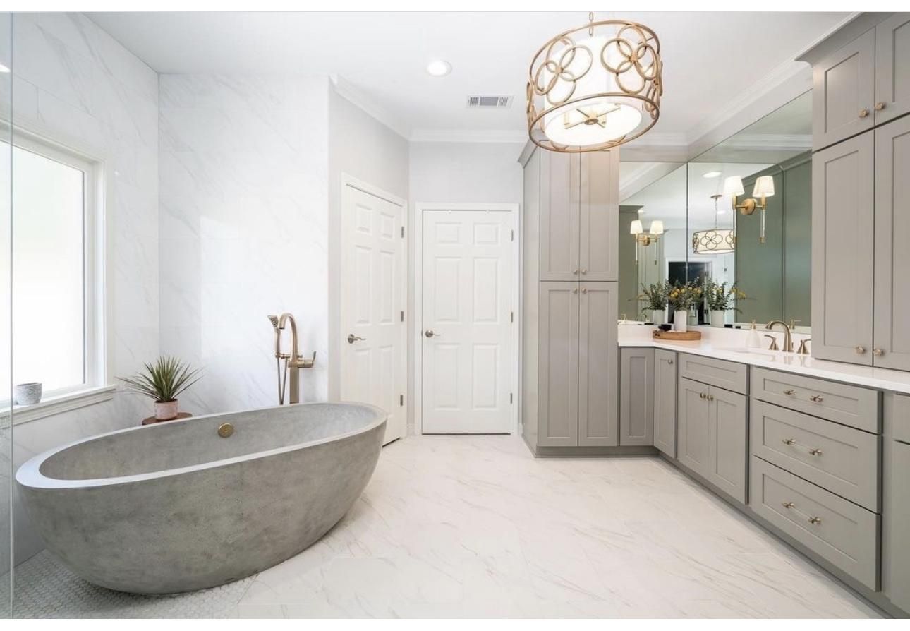
7. Crushed Ice
Sherwin Williams Crushed Ice literally reminds you of the coolness of ice with a subtle green undertone to it. This color has an LRV of 66, putting it directly in the middle of all the drama and making it a perfect fit for all spaces.
Sherwin Williams Crushed Ice is fair and pretty in this bathroom, especially flanked by the light gray cabinetry and that gorgeous bath tub.
It showcases more depth in the second image and the choice of a cool bright white for the trim just brings everything together. A gray wooden floor is not a bad idea for you to introduce while at it.
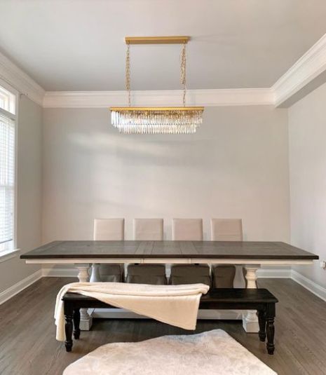
8. White Flour
Need the perfect color for your farmhouse or traditional home, Sherwin Williams White Flour’s creaminess is the right fit and even leaves the cherry on the top with its creaminess and warmth, so you’re rest assured there’re no dull moments around.
This versatile color has an LRV of 87 with some pink and yellow undertone that takes turns when displaying. Have a blast showcasing your mid-century or ranch-style home with the subtle touch of Sherwin Williams White Flour. Pair it with some black details for more depth and dimension.
White Flour is flawless when used indoors and paired with enough wooden accents; we love these wooden-inspired blinds and how they bring out the yummy, yellowy goodness in color. The orange carpet adds a sense of interest and cheer to the neutral side of white flour.
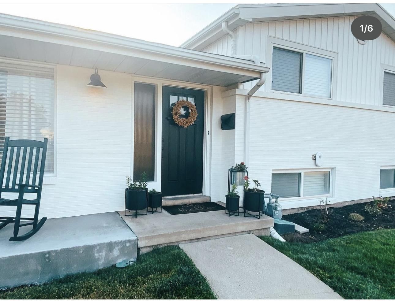
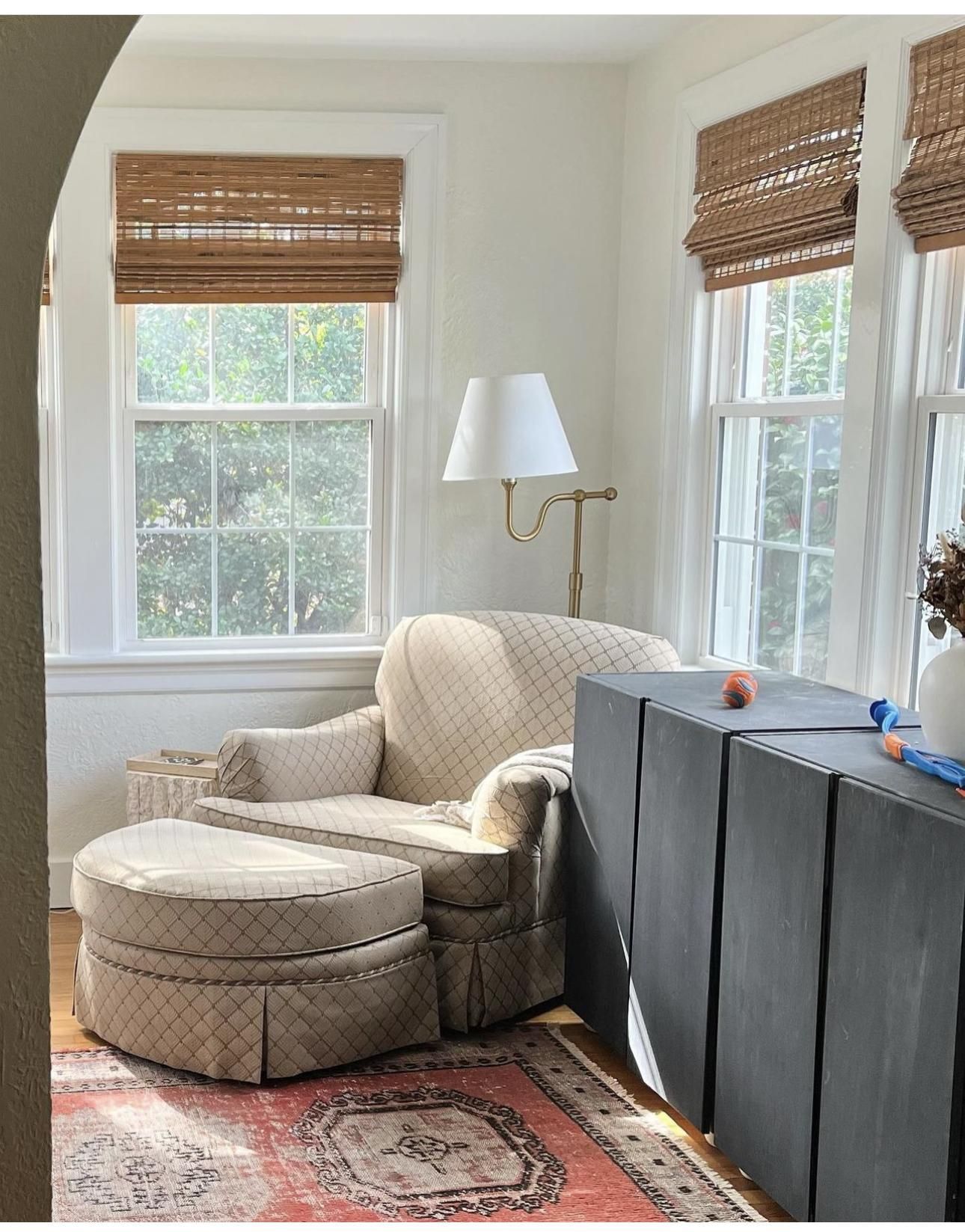
9. Dover White
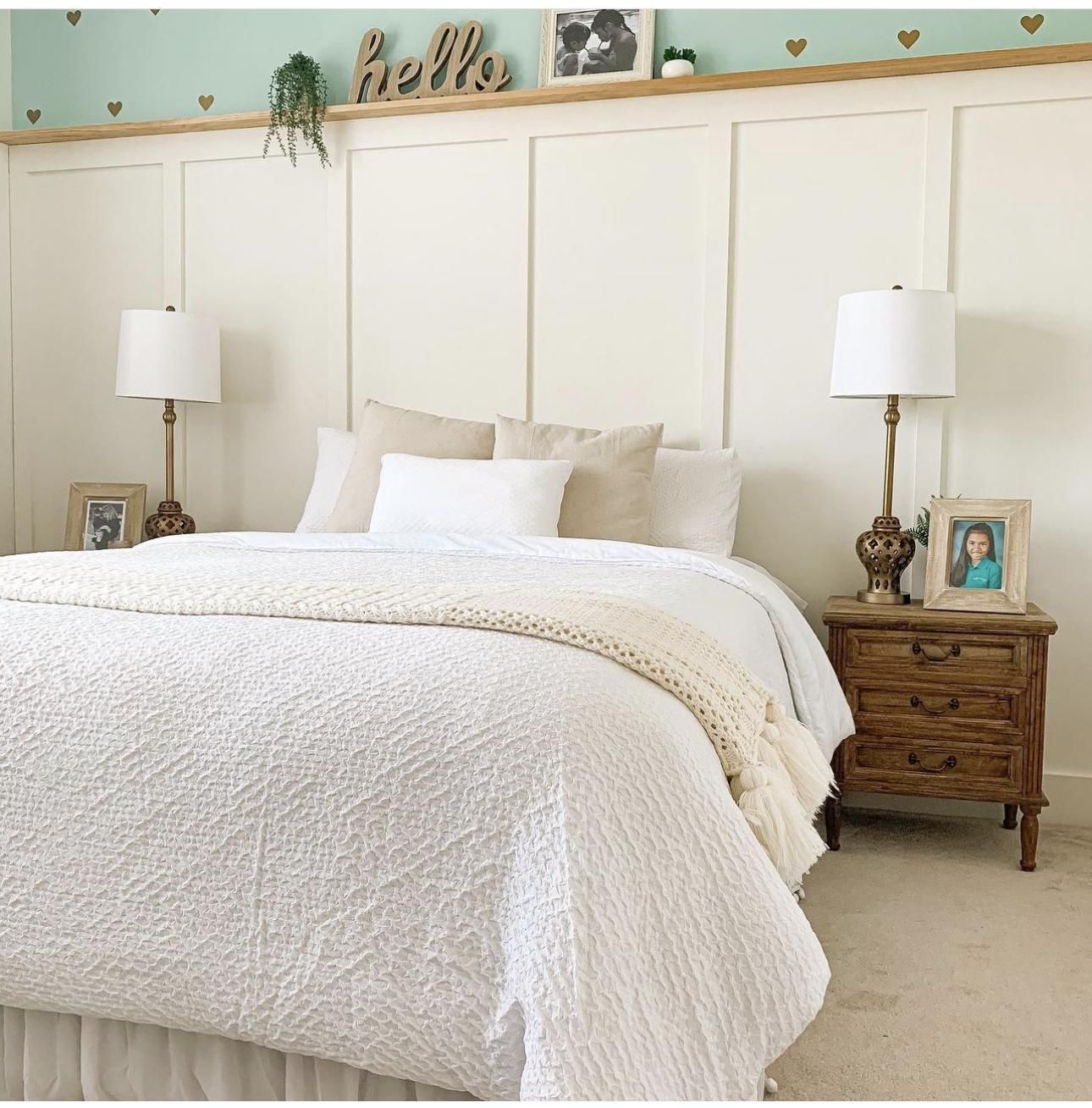
Dover White is a warm off white with an LRV of 82 and a creamy yellow base. So if you pair it with tan or brown, just like the bedroom in the second image, you’ll experience the creaminess on a larger scale.
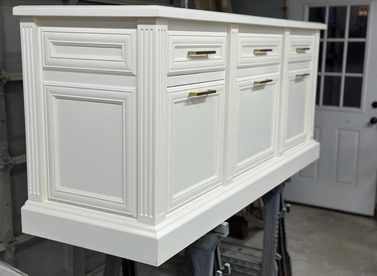
We took a different approach with the first image, perhaps to show you that the longer you can go with Sherwin Williams Dover White is endless. This color works beautifully on the vintage drawer and lets it transition into the modern aesthetic category. We love the gold accent and how much it works with the warmth of Dover White.
Benjamin Moore Brand
Benjamin Moore paints are of high quality. They have a quick drying time, and smooth finish. Little wonder they’re widely sought after and exactly why you’ll find their colors on this list.
10. Swiss Coffee
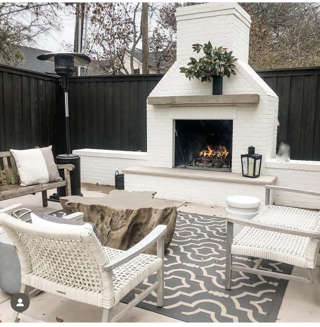
Benjamin Moore Swiss Coffee with an LRV of 81.91 brings back memories of a good old cup of coffee, thanks to its creaminess and soft yellow undertones that add warmth to your space. This shade is very welcoming to multiple paint colors.
It’s a great choice for that cozy outdoor lounge like the image; add blacks and beige to really appeal to the yellow details in this color. Swiss Coffee is a great indoor color as it showcases the warmth it’s known for. We love the carpet and bright brown door (notice how the ray of the sun subtly reminds us that this color is actually off white and not brown).
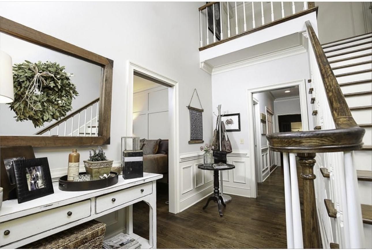
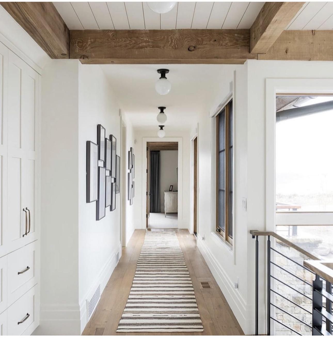
11. White Dove
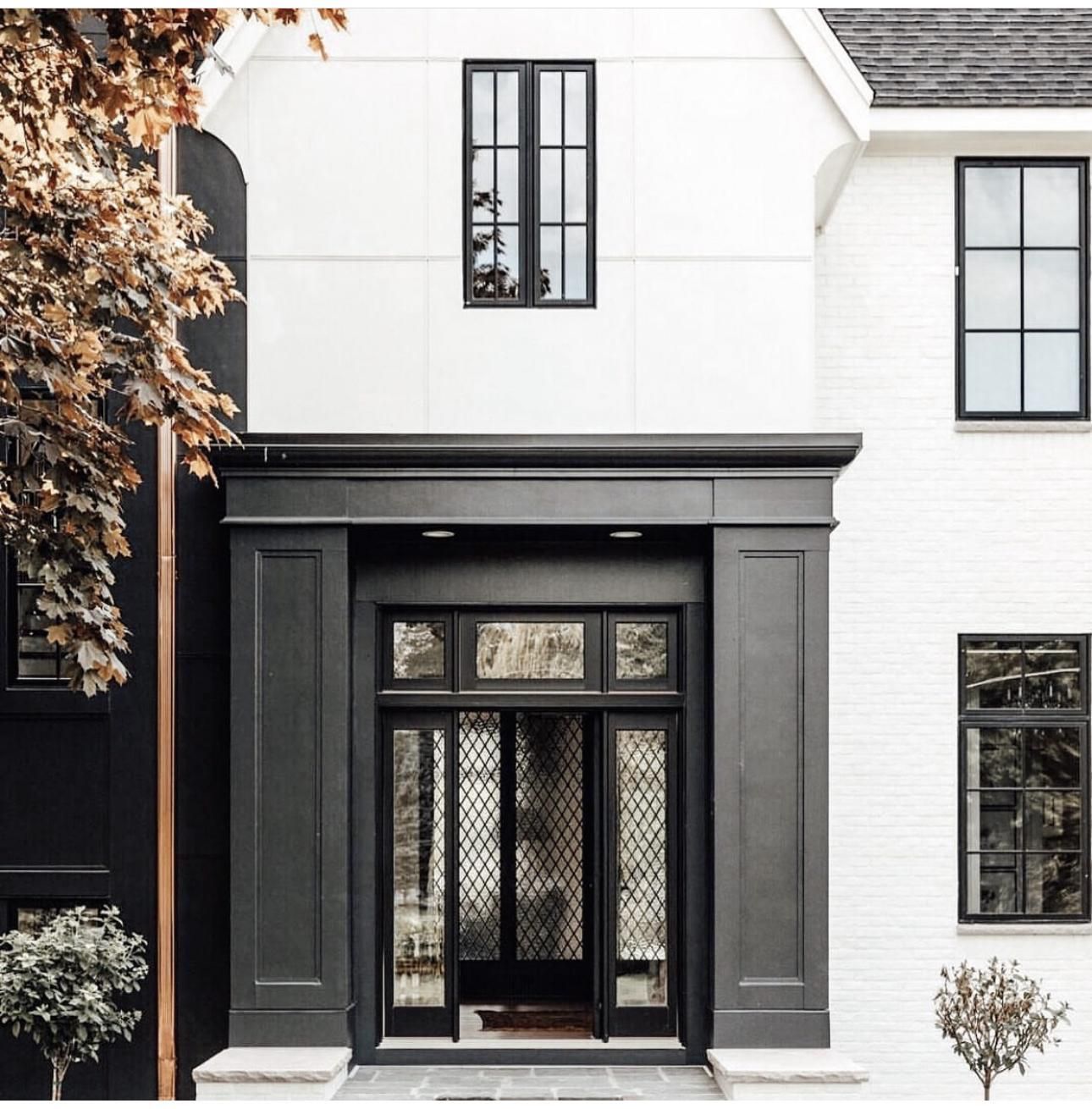
The term is as soft as dove comes to the white with this color. Benjamin Moore White Dove is timeless, classy, and works well with many other colors. White Dove is on the high side with an LRV of 83.16, which is why it looks washed out on the outer walls of this home; pairing it with the black wall is such a great idea as it further draws a sharp contrast between the two gorgeous colors.
Even in the loneliest hallways, you can deny the beauty of Benjamin Moore White Dove. This space looks well put together, especially with the wooden floor files and black railing that happen to be the perfect accessory for the space.
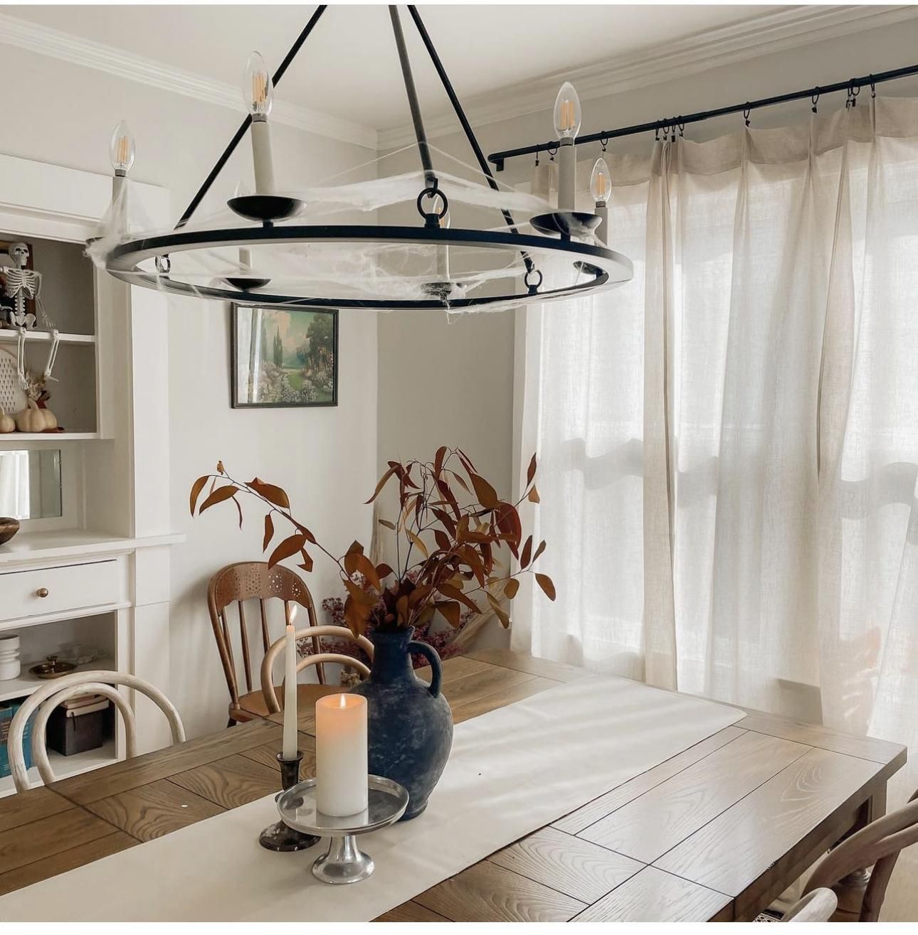
12. Classic Gray
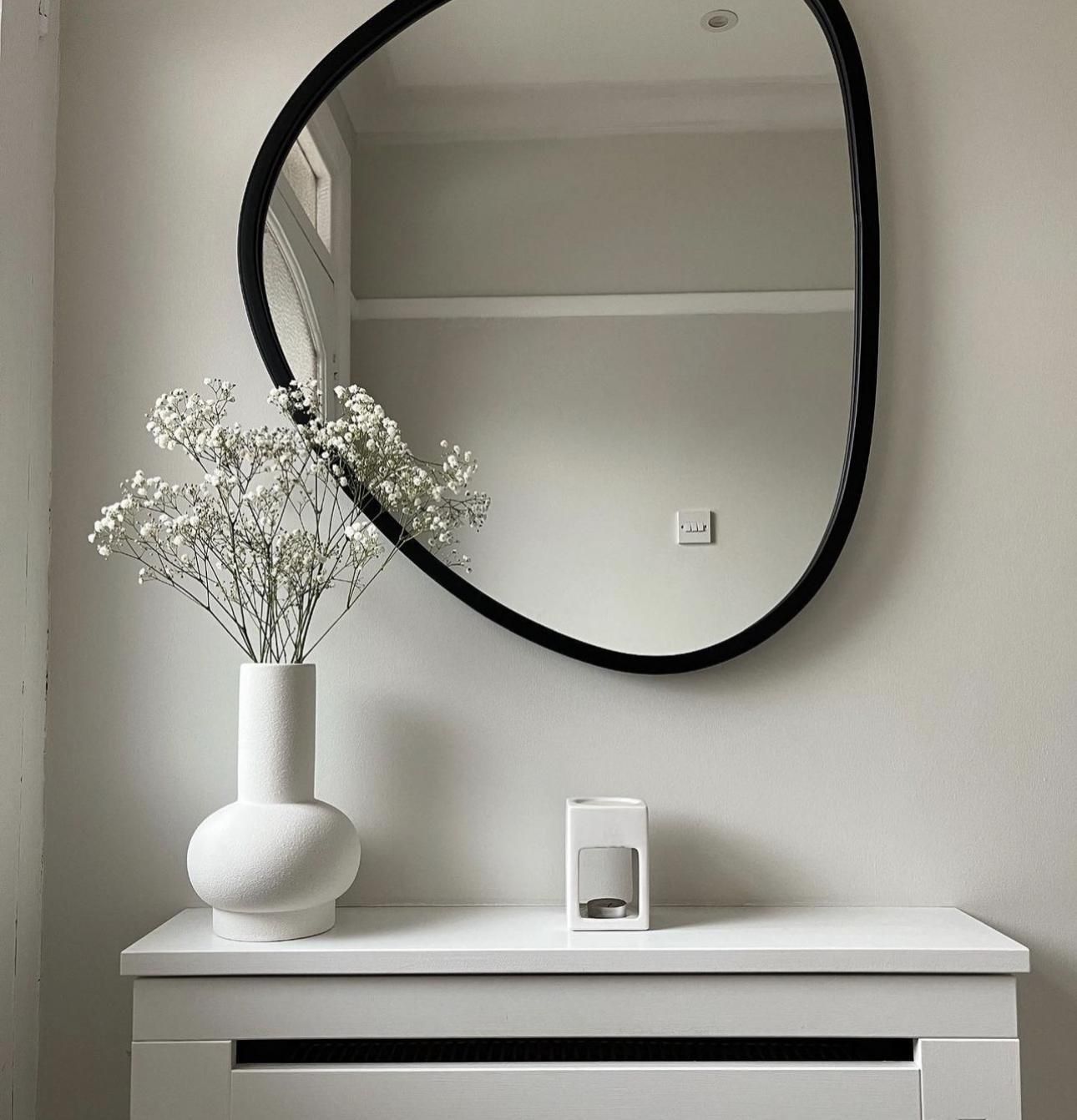
Benjamin Moore Classic Gray is an excellent choice for home walls as it is warm with rich gray undertones that add a fresh wind of coolness to it, so you don’t have to worry about the greens and blues with this one.
Classic Gray has an LRV of 73 which means it’ll open up your space and serve as a great contrast beside a white color, just like the first image; the black details around the mirror instantly lift this color out of the shadows.
Create a classic dining space like the second image by adding tones of beige and brown. You can add warmer lights for more character.
13. Timid White
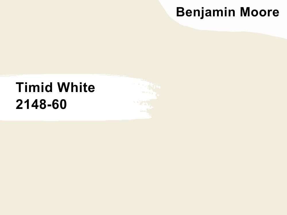
Benjamin Moore’s Timid White is a stunning off-white color that is poised with the uncanny ability to create a soothing and inviting atmosphere in your space. As a delicate blend of white and beige with a hint of gray undertones, it offers a soft and subtle ambiance that is perfect for those looking to create a calm and serene environment.
The LRV is approximately 67 which makes it a relatively light and bright color. Timid White is a great choice for you if you’d like to create a well-lit and inviting atmosphere in your space. Benjamin Moore’s Timid White is a sublime choice for people who would love to create a peaceful, inviting space with a versatile and timeless off-white hue.
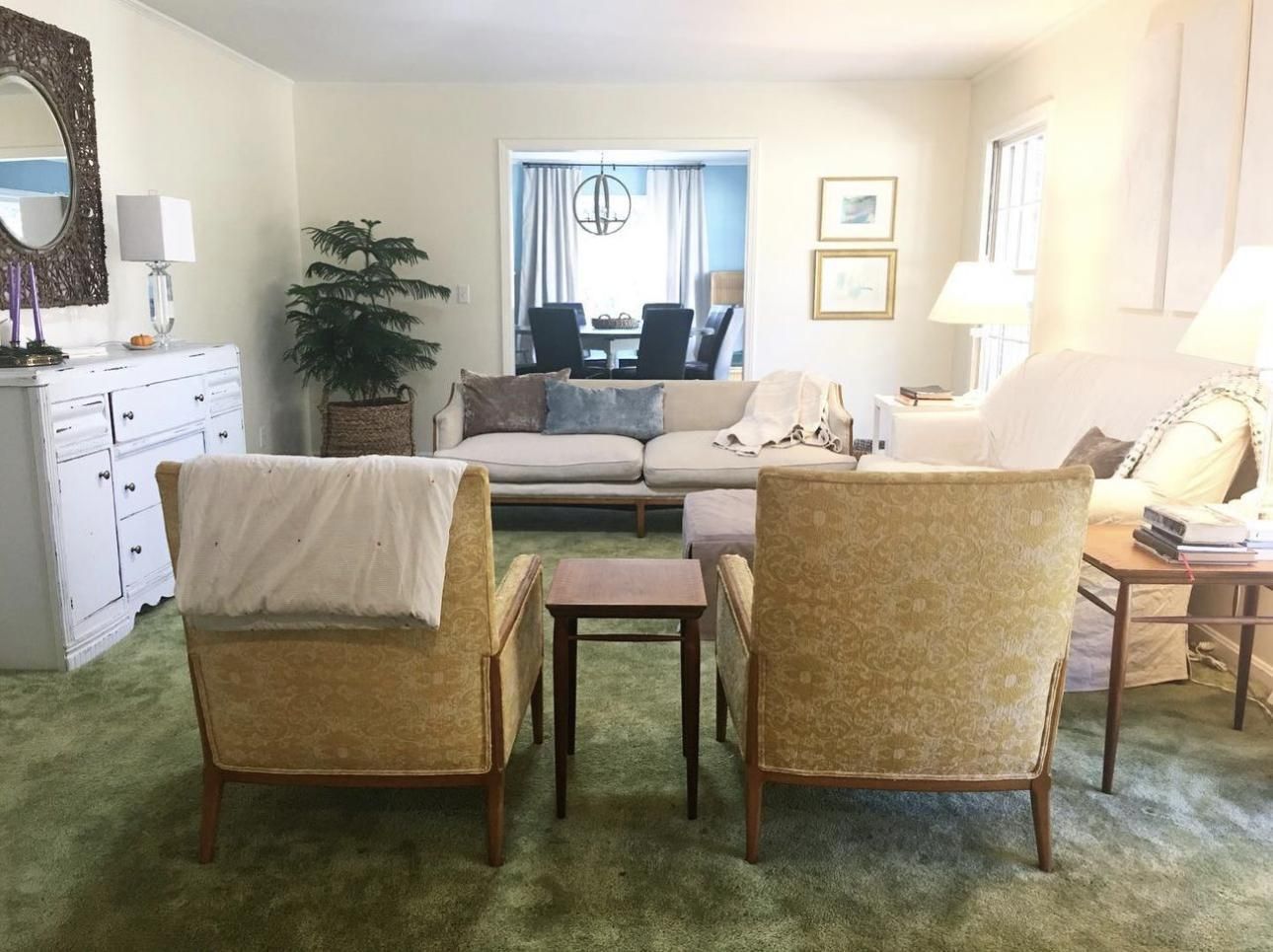
14. Silver Satin
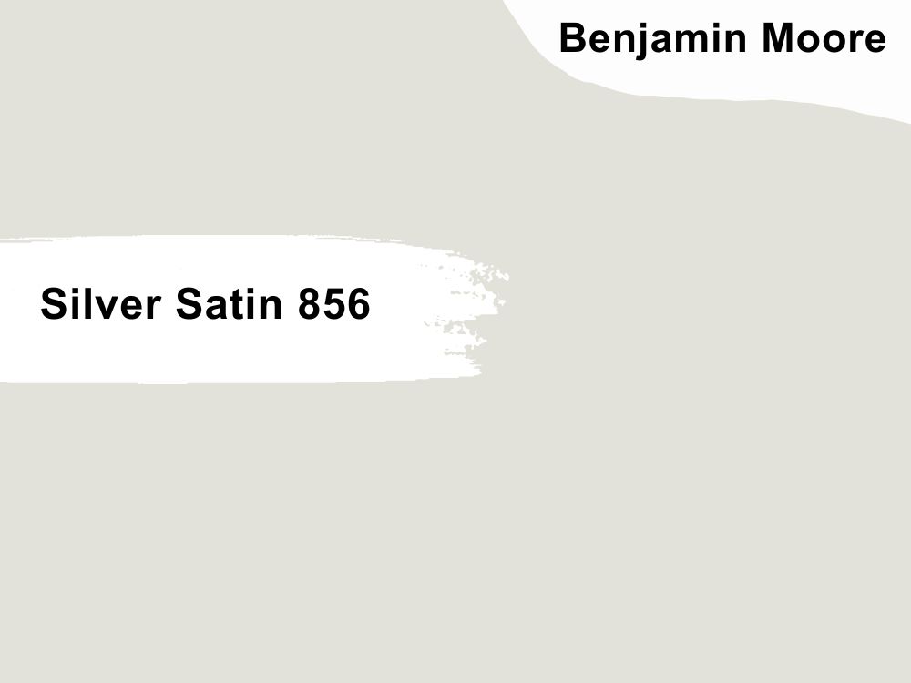
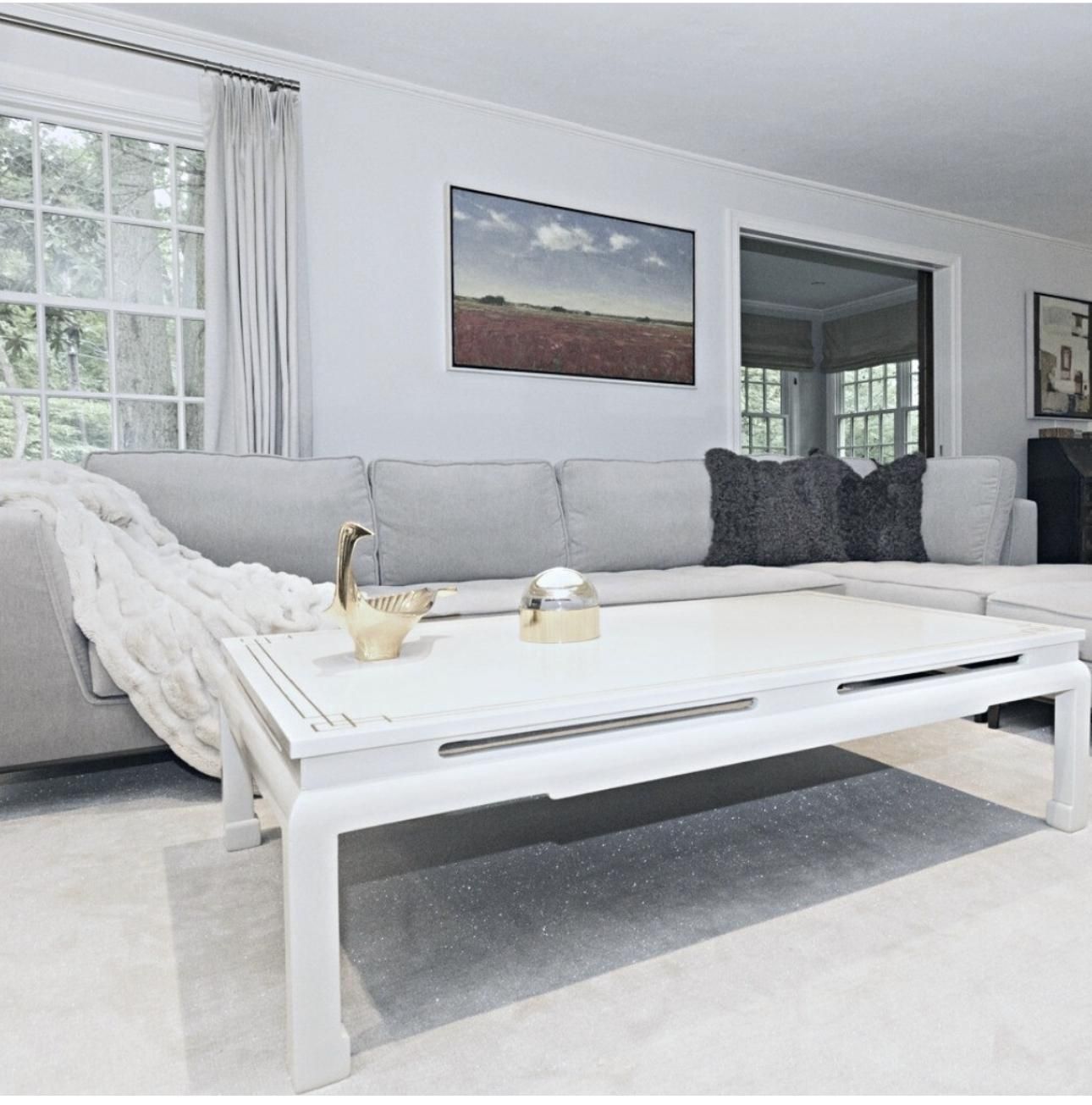
In your excitement, you can mistake this color for light gray (really, there’s not much difference between off white and gray, given that Silver Satin has rich gray undertones itself). This warm off white has an LRV of 79, which makes it great for small spaces.
Silver Satin shows off its gray side when paired with darker grays, like the case of this living room. You can decide to explore its brown side with matching pink and beige details. This color mirrors its environment so much, which is why you’ll have little to no problem accessorizing.
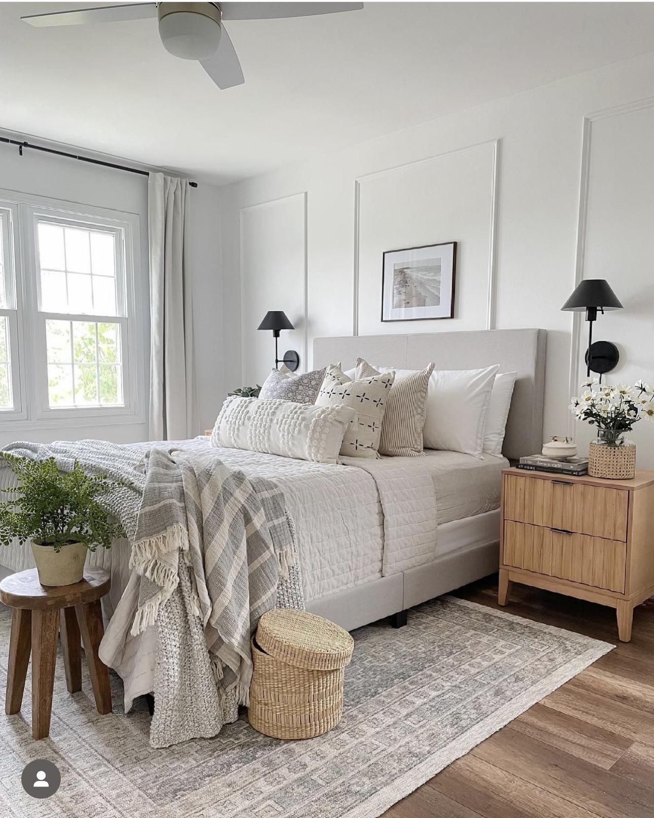
15. Chantilly Lace
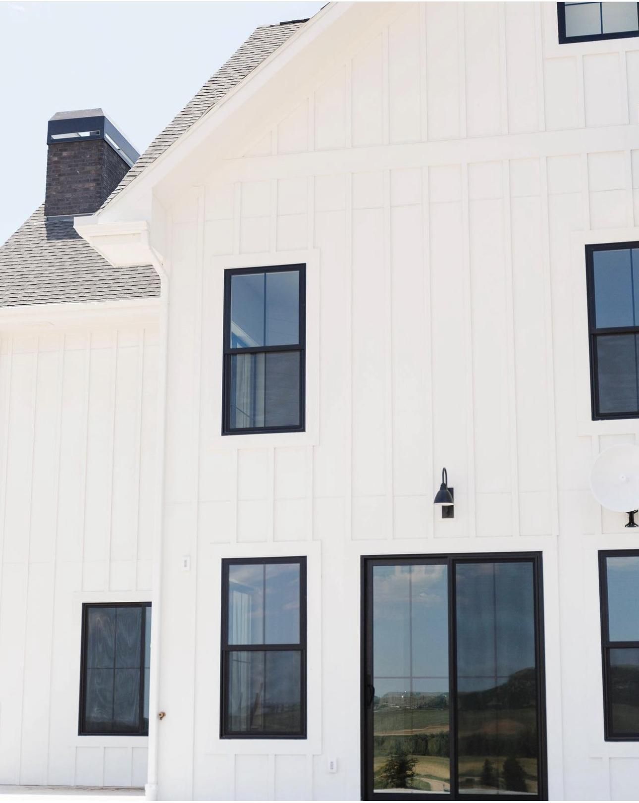
What other color is more precious, delicate, and soft than Chantilly Lace? To be very frank, we can’t count much. This color is darling! From the charming name to the breathtaking blue undertones that give it that crispiness and fresh feel to its LRV of 79, you can’t do any wrong with this.
Most days, you don’t even see the blue undertones, leaving it as a pure neutral that can work with any color. Pair it with rich black tones on your exterior and watch your home become the hottest spot in town.
Indoors, you can see the blue cast it leaves in and how the off white bedding works hand in hand with the composition. Wooden textures and tones are okay.
Behr Brand
One thing users of Behr paint colors agreed on is that they’re not suitable for novice and require a high level of professionalism during application. Asides that, Behr paints are excellent options for people seeking a cheaper alternative to BM and SW.
16. Behr Cameo White
Behr Cameo White is a pristine creamy off white with red undertones. This color serves coolness under low lighting and then welcomes you to the bright side of life during the day, thanks to its LRV of 81.
That bathroom wall in the first image demonstrates how creamy and soft Cameo White can get, especially when you throw in other colors like gray, brown, and white. Cameo White is the perfect alibi for a minimalist setting, like this gorgeous living room wall. Follow the picture inspiration to the letter by also adding warm white and brown accessories to your walls.
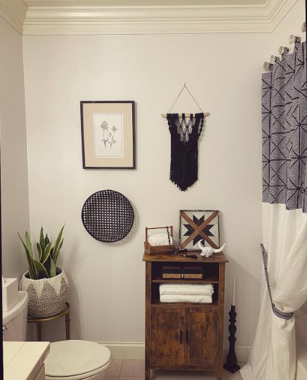
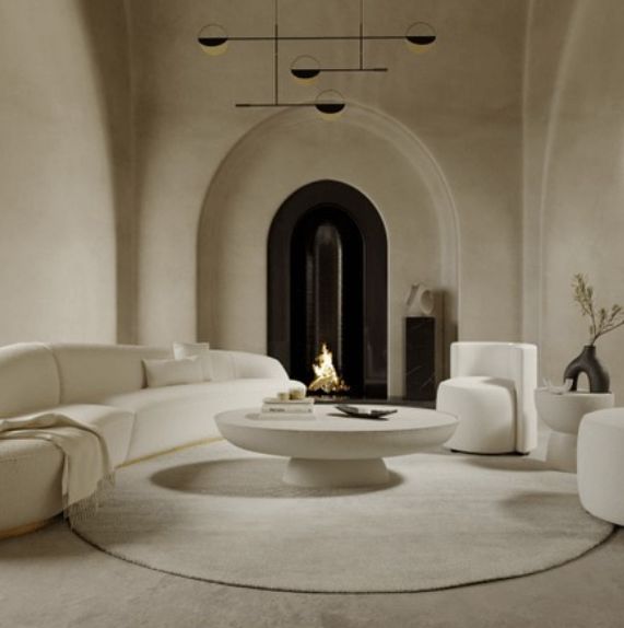
17. Painter’s White
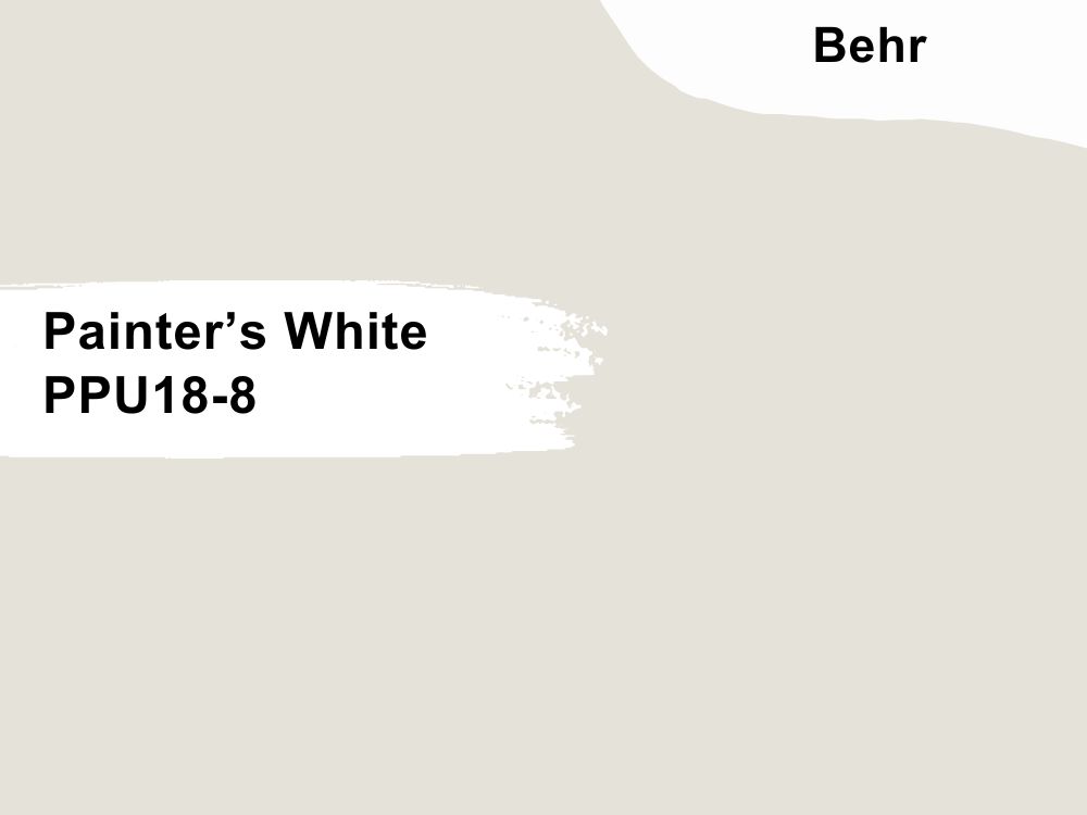
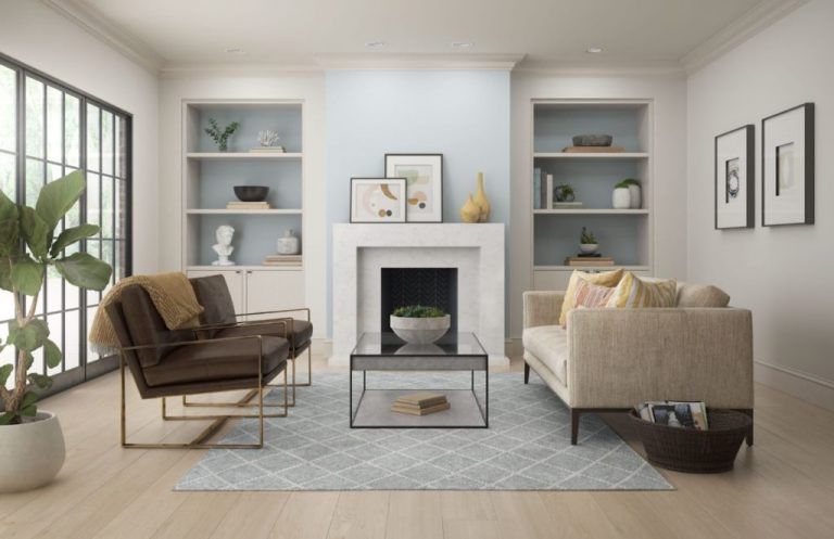
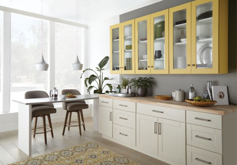
Behr painter’s white is a soft off white color with an LRV of 76 and sharp gray undertones. This color shuttles between warm and cold, which means you can tone things down or turn it up a notch with your desired accessories and get a promising result.
Painter’s White shows up as the right backdrop for this cozy living room with a large flow of natural light which makes the space brighter. Take a relaxing nap in this space with your favorite blanket.
Yes to this contemporary kitchen as Painter’s White sits pretty on one end of the wall and works seamlessly with the yellow cabinetry and the charcoal gray accent wall. The clean colored cabinet adds some minimalist vibe into the space.
18. Campfire Ash
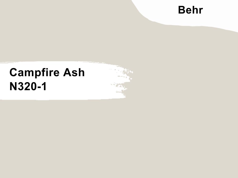
Behr Campfire Ash is a great off white color that adds a pop of color to your home and adds a bit of warmth on top of that. You can best believe that this color will not make your space feel cold and boring.
This greige color has winks of green in it and an LRV of 69, but you may not get to see that if you use it in a space with a low light reception. Behr Campfire Ash also works well with shades of blue, browns, and other colors to create a lively traditional living room.
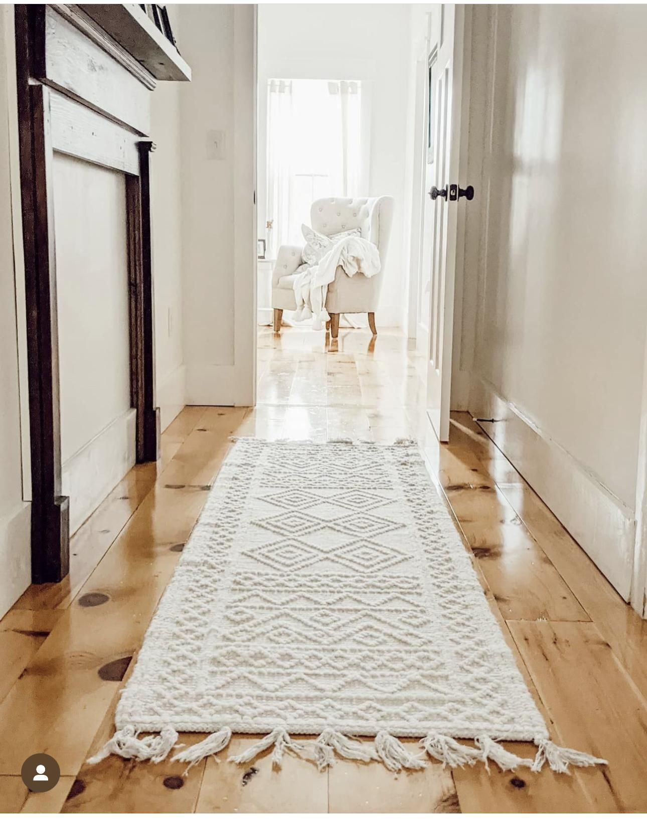
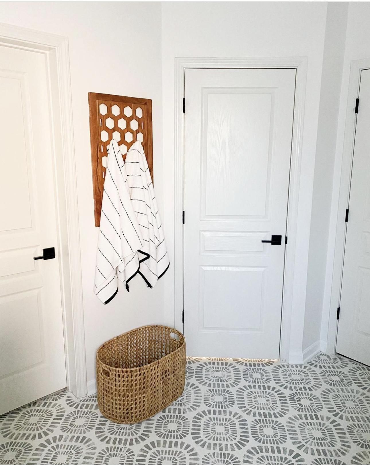
19. Bit Of Sugar
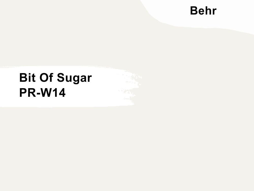
Behr Bit of Sugar is literally the sweetest off white you can find, with an extremely high LRV of 89. It’s a multi-tasker in the sense that this unique hue fits into both traditional and modern color schemes.
Behr Bit of Sugar has cool gray-beige undertones that make it a balanced color that appeals to both the warm and cool sides of the spectrum. Create the ideal farmhouse using Behr Bit of Sugar as the ultimate backdrop by layering wooden tones and bright whites like the first image.
The second image shows how much Bit of Sugar embraces life’s modern and minimalistic side. Its neutral properties allow you to pair it with warmer and darker hues to add life and personality.
20. Silky White
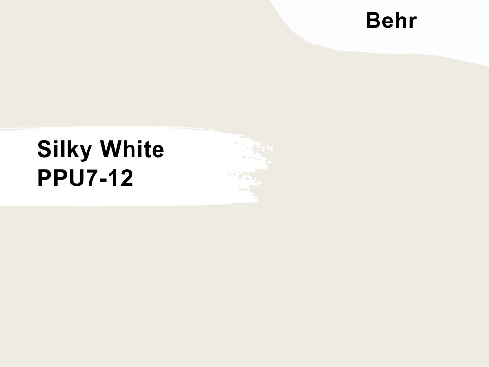
Last but not least, the ultimate crescendo of this compilation is Behr Silky White in all its rich goodness. This warm off white color is a great neutral for your home with an LRV of 83, enough to reflect endless light.
You may find tints of green in this color, making it cast a cool touch on your home walls like the first image. The brown accents from the drawers are adorable with this color, and you can just see the play in real-time.
Black accents, however, draw a more subtle shade on the intensity and brightness of Behr Silky White in the second image. Throw in some faux leaves, a chic raffia pot, and bright white trims for extra sauce and appeal.
Farrow & Ball Brand
Farrow & Ball paint colors are loved by many due to its luxurious range that covers both contemporary and traditional palette. The brand has also built a strong reputation of creating water-based, eco-friendly paints in a variety of finishes.
21. Off White
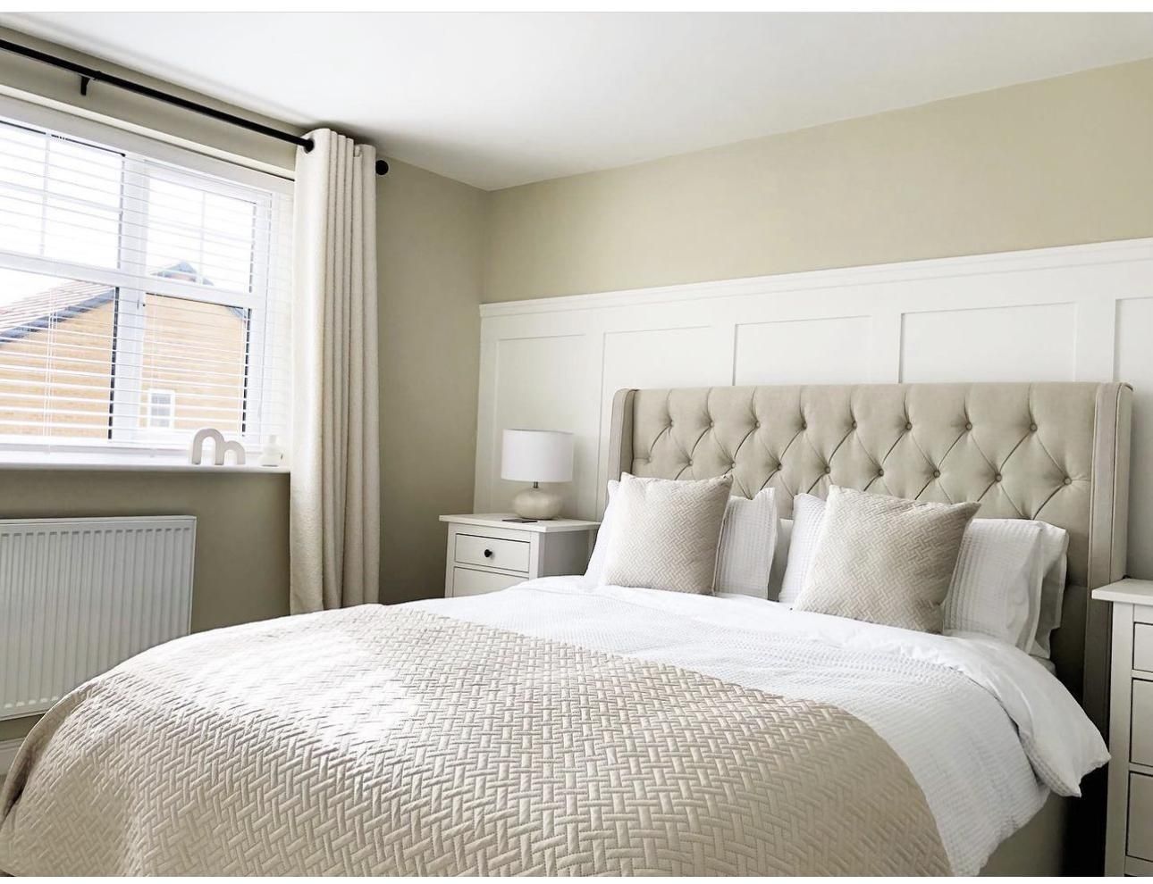
Here’s an interesting fact about Farrow and Ball Off White, the chalky middle tone is one of the original Farrow and Ball paint colors, which means it’s a classy and timeless piece. This color has rich green undertones that keep it soft yet strong enough to work with complex wooden tones.
off whites are excellent colors for the bedroom because they’ve mastered the art of being there but not doing too much. The first image is a beautiful interpretation of how much depth this color holds, causing it to flaunt its deep green undertones when placed alongside whites and beiges.
The kitchen is an important place in the house, and any decision with it at the center must be carefully thought out, as it may make or break your mood going forward. Farrow and Ball Off White takes the attention away from the business of the kitchen and adds a softer touch, so all the other accessories have a place to thrive and be admired.
What Colors Go with Off White?
It’s no news that off white passes as a neutral in most cases, but it gets tricky due to the introduction of different undertones that play a huge role in the final outcome of the hue on your walls.
This doesn’t mean you still can’t go all the way or experiment with a wide range of bright, warm, and cool colors, but this section is necessary to guide your final decisions. Pair your off white with Maroon, Gold, Black, Navy Blue, Pink, and even Bright Red.
Note: Light reflective value is an important terminology when it comes to picking paints. They refer to the amount of light your preferred color can reflect or absorb. Yes, lighting is that important as it helps determine the final outcome of your paint color.
The LRV scale runs from 0-100, with 0 being the darkest and 100 being the lightest. While a true black-and-white doesn’t exist, the scale has been adjusted to begin from 3-97.
Conclusion
Take this article as the complete indoctrination into the awesome world of off white paint colors across all brands and how they turn your space around. While you’re at it, do not forget the most important step, which is sampling your paint color before sticking to one shade.
Wondering how? Well, SAMPLIZE paint strips are tested and trusted to do that for you. Gone are the days of going through a whole literal bucket just to get a feel of what your paint may look like; now, a simple strip in your desired color can do that for you.
SAMPLIZE strips are efficient, affordable, and accessible. Leave them on for a few days and in different rooms to understand how they react.
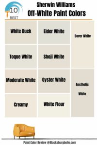 10 Best Sherwin Williams Off-White Paint Colors (Trend 2023)
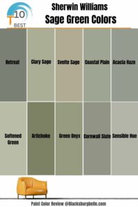 10 Best Sherwin Williams Sage Green Colors
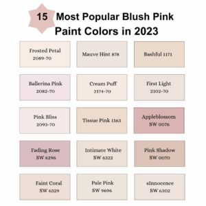 15 Most Popular Blush Pink Paint Colors in 2023
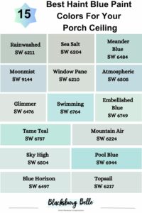 15 Best Haint Blue Paint Colors For Your Porch Ceiling (Trend 2023)
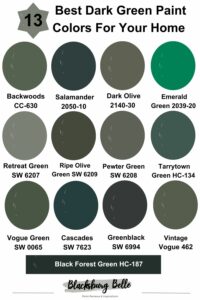 13 Best Dark Green Paint Colors For Your Home
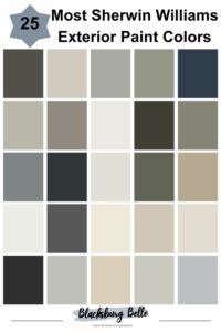 25 Most Popular Sherwin Williams Exterior Paint Colors
