
Off-white paint colors are all the rave in interior design. They usually go well with other paint colors, they’re easy to style, they give off an effortlessly put-together vibe, and, most importantly, they feel very cozy. With so many great pros, it’s no wonder everyone wants to get their hands on off-white paint.
This article serves as a guide to the homeowner who wants to cop the off-white look but can’t make heads or tails of what off-white paint color will look good in their homes.
Table of Contents
What are Off-White Paint Colors?
For one, they aren’t pure white paint colors, although they might appear so. Off-white paint colors are white colors that have a slight tinge of grey or some yellow in their undertones. They usually have lesser LRVs than full whites.
In many modern homes, people use them in a wide variety of designs. They are used for both the exterior and the interior of homes, as a cabinet color and even as a trim color.
Off-white paint colors tend to have high light reflectance values compared to other paint colors, but this value can vary.
Types of Off-White Paint Colors
Off-white paint colors can be classed based on their temperature. They fall into two categories: cool and warm.
Cool Off-White Paint Colors
Cool off-white paint colors are paint will have lots of blues, greens, and purples in their undertones. Cool off-whites feel fresh and cozy, like a quiet Christmas morning.
With cooler-toned colors, it’s best to use them in spaces that get enough light. In fact, the more light they get, the better. That’s because cool-toned colors have the tendency to look dull and ashy in a space that doesn’t get good lighting.
So if you have many open spaces, cool off-white paints are definitely the way to go.
Warm Off-White Paint Colors
Warm paint colors generally have undertones of yellow, pinks/reds, orange, and maybe a smidgen of warm green in the mix. Throw in some sunlight and watch a warm off-white paint glow as its yellow undertones are highlighted. Its warmth and illumination will uplift your mood and make you feel very welcome.
However, too much light can cause these colors to look more yellow than actually white or washed out, and this might cause a clash with the general look you were going for.
Before picking a warm off-white consider the lighting and how well it will look when paired with other colors.
Pros and Cons of Using Off-White
Without a doubt, off-white paint colors are absolutely stunning paint colors. Aside from the many pros of this magnificent color, it’s not without its own baggage.
Pros
Starting off strong, here are the pros of using off-white:
Trendy
Off-whites are in right now. They look modern, chic, clean, and effortless. Using an off-white paint color in your house will definitely get heads turning. This color will stand the test of time taste-wise. If you ever reconsider selling your property, you won’t have to do much to market your home as everything will still look new and modern.
Not as stark as white
Let’s be honest, one of the things that turn people off of white paint is how stark it can look, especially in bright or harsh lighting. Off-white paint is the perfect balance of white and warmth. It’s the best of both worlds. Using off-white feels like using white without the fear of your home looking sterile or clinical.
Coziness
There’s just something about a good off-white paint that feels cozy. Maybe it’s its warmth or the fact that it feels clean and fresh, like freshly laundered sheets. Whatever it is, stepping into an off-white room immediately makes you feel right at home.
Versatility
Considering most design palettes sometimes, off-white might not only be the best choice, but it might also be your only choice. From cabinets to doors or even as trims, off-whites generally look good on any surface. It goes well with almost every interior design and depending on the type of off-white you’re using, you get a whole lot of possibilities when it comes to complementary colors.
Cons
Tricky Pairings
The perfect color palette has contrast, undertones, and layers that add depth and intrigue to your design. Anything outside this might feel rigid and static. Various cohesive elements come together to form a perfect contrast.
If you choose an off-white paint color as a cabinet color, most of the time, you’ll have to use a color that creates a stark contrast. This can get tricky as you don’t want something that will seem too dark and make your off-white too dull. Neither do you want something too light that will wash out your paint color.
Finding that special sweet spot is key, but it might be difficult for a novice designer.
How to Pick the Right Off-White Paint Color
Truth be told, it’s very hard to go wrong with a white or an off-white. They’re just so versatile. However, you do still want the off-white paint that is good for your space. Otherwise, you might end up with an undertone or a temperature that completely throws you off.
Understand the Different Tints
You don’t need to be an expert to know that there is more than one shade of a particular color. That’s why some white colors can be whiter than others. off-white can come in a wide variety of tints; yellowish, reddish, etc. You should be aware of this and ask for different samples to know which one you like the most.
Other Elements in the Room
When picking any paint color, you should also consider the other elements that will be present in the room. They can include; furniture, drapery, and other design elements. Consider the colors of these elements. Then you should get an off-white that matches their warmth. And if they’re cool, off-whites that read cool will do.
Do a Swatch Test
Never make your final decision at the shop. Order some swatches and go home to test them out for yourself. Check them in different lighting and see which one suits your home best. When you’ve made your final decision, then you can purchase.
Room Size
Designers often use paint colors to alter the perception of a room. To provide the homeowner with the desired spatial experience, paint colors can be used to either shorten, lengthen or even make a room appear larger than it actually is.
Whites and off-whites are bright paint colors, and as such, they are used to create a sense of space and add highlights to a room. They have also been said to remove visual clutter from a room, giving a clean finish.
On the other hand, darker paint colors can give a sense of depth and dimension or neutralize an intensely brightly lit room.
Depending on what you want your room to look like, paint colors are your best friends.
Lighting (Natural and Artificial)
Lighting is another factor that affects color choice. Every paint color has a property known as a Light Reflectance Value (LRV).
A paint color’s LRV describes the amount of light that can be reflected by the paint color. Meaning will the color reflect more light than it absorbs or vice versa?
LRV has a scale of 0-100 with 0 being pitch dark and thus can’t reflect any light and 100 being pristine white and can reflect light the strongest.
That’s why lighting is very important because the amount of light a room receives can break or make the paint color’s look. There are instances where homeowners fell in love with a certain white or off-white color but were taken aback when they used it in their room and it was completely washed out due to the intense light, or it looked dull and ashy from not getting enough light.
Room Orientation/Room Function
Believe it or not but the position of the room still determines how a color will appear.
In a North-facing room, you might notice your paint color will appear cooler. Meaning if that particular color was already cool or had cool undertones, to begin with, it will look crispy and icy. However, using a warm color in a North-facing room can tone down its warmth and make it feel just right.
The reverse is the case for a South-facing room. In a South-facing room, colors tend to look warmer, meaning those with warm undertones can look even warmer than usual. But when you pair the warmth of a south-facing room with a cool color, it can make the room feel very welcoming and cozy.
Overall Decor (Theme, Underlying Color, Complementary Color)
When you’re choosing a paint color or any element of your interior design, you tend to aim for cohesiveness. Of course, cohesiveness doesn’t mean everything has to be matchy-matchy. However, at the very least, every part of your home design, paint, decor, etc., should be cohesive and look nice paired together.
That’s why when picking a paint color, you should bear in mind what theme you’re going for. Also, think about the complementary colors you might use such as cabinet colors, door colors, or even an accent wall.
Long or Short Term?
Many paints tend to change over time most of them fade and start to look duller than they used to. Take, for example, white paint colors or off-whites, these paint colors are notorious for fading to a faint yellow over the years.
Of course, the likelihood of this happening could be for various reasons, one of which is regularly having smoke in your room, as it can age the paint.
So if you’re planning on sticking to your paint color for the long haul, then you should consider how it will look a few years from now, and if that’s a look you won’t mind having to see until you can at least get a fresh coat.
Swatch Tests (in Natural and Artificial lights)
Before buying a color it’s always advisable to get a swatch test to see how the color will appear on that wall. A swatch test might not be able to give you the full picture, but it does give you an idea of how the finished look will be.
So if you’re getting a swatch test done, be sure to try it with different lighting to know how well it will reflect light.
Trim Color
Your trim color is also worth considering. The perfect trim color can completely elevate the entire look of your home. It can enhance your paint color and Make everything look put together and effortless.
Sherwin Williams has some paint colors that are often used as trim colors e.g High Reflective White and if you decide to go with the manufacturer’s choice, it’s important you know which color will look too stark against it and which will look perfect.
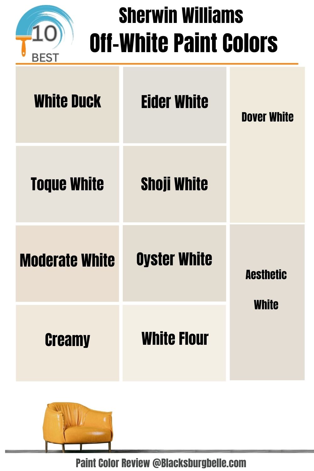
10 Best Sherwin Williams Off-White Paint Colors
1. Sherwin Williams White Duck (SW 7010)
Sherwin Williams White Duck is one of the best choices for a warm neutral tone off-white paint color. It has a unique blend of cream and greige that contribute to its warm neutral tone (this is because greige is a combination of warm and cool while cream has a warm yellow undertone to it.
The paint color has an LRV of 74 which makes it a very bright color but not so bright that it becomes washed out.
In a north-facing window where the light is cooler, you might notice White Duck will lean more to its greige side, and in a south-facing window, it will become more of a cream without being too yellow.
| Paint Color | LRV | RGB Value | Undertones | Reading |
| White Duck | 74 | R: 229 G: 223 B: 210 | Creamy | Cool |
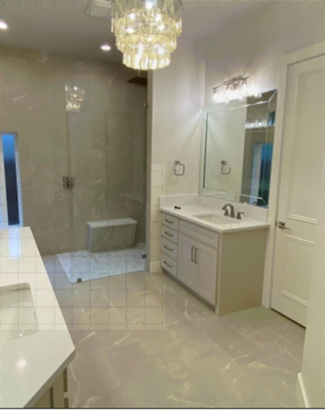
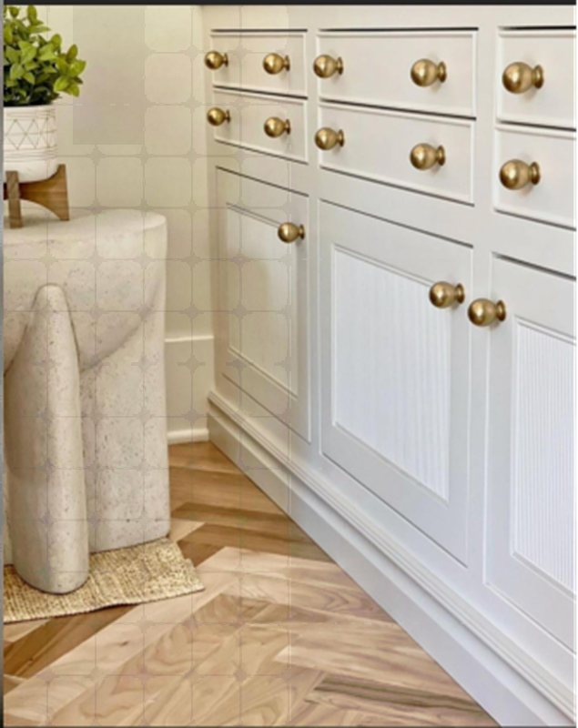
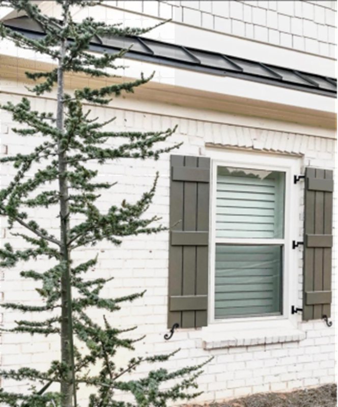
 White Duck makes for a very attractive cabinet color.
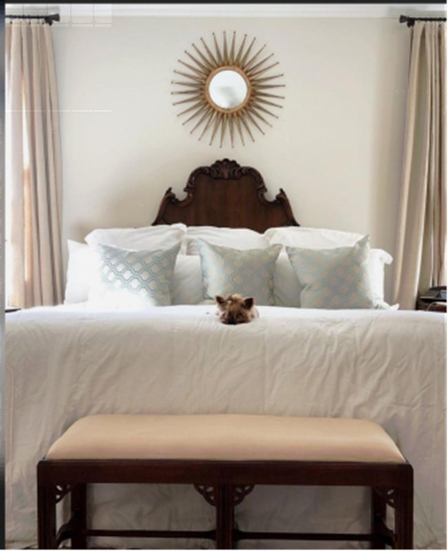
Paired with the darker curtains and brown furniture makes this room look homely and cohesive.
2. Sherwin Williams Eider White (SW 7014)
Sherwin Williams Eider White is definitely one of its most popular paint colors from the white family.
It’s a warm off-white paint color. In a north-facing room, Eider White tends to lean more toward its gray side due to the cool light filtering in. On the other hand, it will look warmer in a south-facing room. In a poorly lit room, this color can come off as very dull or flat.
Eider White being greige has some warm gray and violet undertones. With an LRV of 73, it’s definitely within the off-white range but not so much so that it loses its gray side.
| Paint Color | LRV | RGB Value | Undertones | Reading |
| Eider White | 73 | R: 226 G: 222 B: 216 | Gray and little Violet | Warm |
 The perfect powder room with Eider White Walls paired with Sherwin Williams Pure White to create a lovely and very classy design.
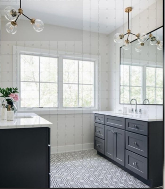
The contrast created with the dark cabinets makes this design look very appealing.
3. Sherwin Williams Dover White (SW 6385)
Sherwin Williams Dover White is often considered white due to how bright it is but that’s not the case. Dover White is described as a soft white or better put, a bright off-white.
Dover White is a warm paint color with a creamy yellow undertone to it. If it’s paired with cool tones, you might see the creamy yellow start to pop. Under bright lighting as well, you can really see the yellows.
The paint color has a very high LRV of 83 and its brightness and softness add to its general appeal
| Paint Color | LRV | RGB Value | Undertones | Reading |
| Dover White | 83 | R: 240 G: 234 B: 220 | Yellow | Warm |
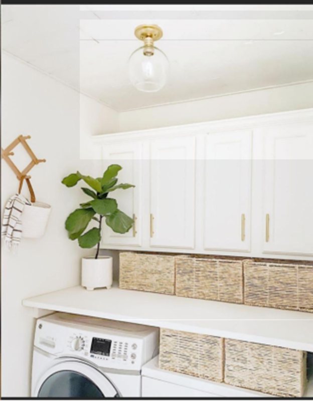 Dover White gives the laundry room a very fresh and clean look.
 The creamy white walls makes the walls look expansive. And the bright lighting makes the creamy yellow pop.
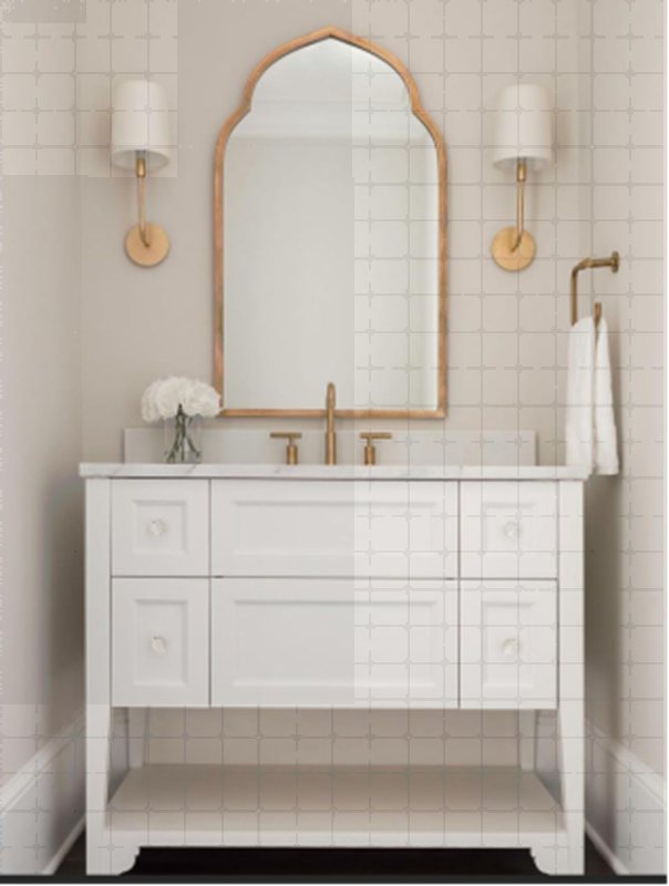
4. Sherwin Williams Aesthetic White (SW 7035)
Sherwin Williams Aesthetic White is a soft off-white paint color with a beige quality to it. The paint color lacks strong undertones and as such it’s susceptible to picking up other reflections from its surroundings.
That is why you should be cautious when pairing it with other colors or using it on your walls. It has been known to grab some pinks, greens, and a lot more. You can take advantage of this by pairing it with a very bright trim color like Sherwin Williams High Reflective White and you have some great contrast.
| Paint Color | LRV | RGB Value | Undertones | Reading |
| Aesthetic White | 73 | R: 227 G: 221 B: 211 | Subtle Violet | Cool |
 Here Aesthetic White was paired with an even brighter paint color to provide a nice and appealing contrast.
 The gray undertones can really be seen in this image
5. Sherwin Williams Toque White (SW 7003)
Sherwin Williams Toque White is a warm-toned off-white color. It’s one of the lesser-known off-whites from the manufacturer but it still manages to stand out in its own way.
With its soft purple undertone, this color doesn’t overwhelm instead it’s a nice cool off-white.
Try this bright off-white to bring that cool and sophisticated appeal that ropes people in.
Toque White has an LRV of 76 which makes it just within the off-white paint color range.
| Paint Color | LRV | RGB Value | Undertones | Reading |
| Toque White | 76 | R: 231 G: 226 B: 218 | Subtle Violet | Cool |
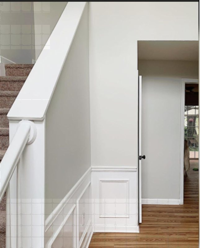
 SW Torque White is used on the kitchen cabinets. The low light makes it look more Like a white than an off-white.
 Under bright light, Torque White leans towards it’s purple undertones as seen on the walls.
6. Sherwin Williams Shoji White (SW 7042)
Sherwin Williams Shoji White is a creamy off-white paint color that almost falls out of the white family because of its creaminess. It is a very versatile color like most whites and very easy to use in home designs.
This off-white color is actually a very pale shade of beige and can even look greige or almost white depending on the lighting.
It has a warm orange undertone and if you look close enough, maybe you’ll notice a slight pink to it.
| Paint Color | LRV | RGB Value | Undertones | Reading |
| Shoji White | 74 | R: 230 G: 223 B: 211 | Orange and little Pink | Warm |
 SW Shoji White used as an entrance wall color. Under the bright light, you can see a little bit of the biege.
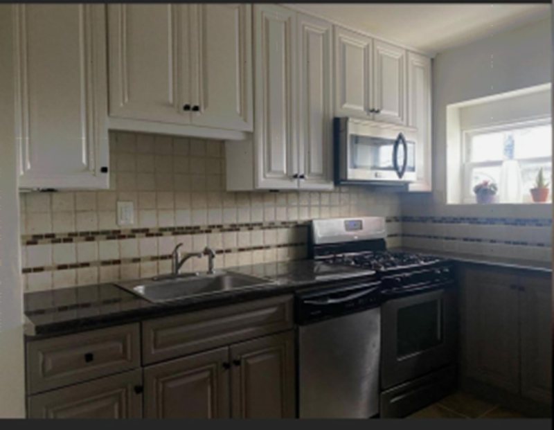
 SW Shoji White as a cabinet color
7. Sherwin Williams Creamy (SW 7012)
Sherwin Williams Creamy is an off-white with a very generous amount of yellow. Although it doesn’t really fit into the white category, it has a surprisingly high LRV of 81.
The paint color has soft yellow undertones that reinforce its creamy look. SW Creamy pairs wonderfully well with other warm paint colors with soft hues. It is quite easy for the paint color to look cozy and welcome.
However, Sherwin Williams Creamy will always command attention in any space.
| Paint Color | LRV | RGB Value | Undertones | Reading |
| Creamy | 81 | R: 239 G: 232 B: 219 | Soft Yellow | Warm |
 SW Creamy is used on the walls and it fits in well with the whiter cabinets and the natural elements of the decoration.
 SW Creamy is used on the walls and it creates a contrast paired with an even whiter paint color.
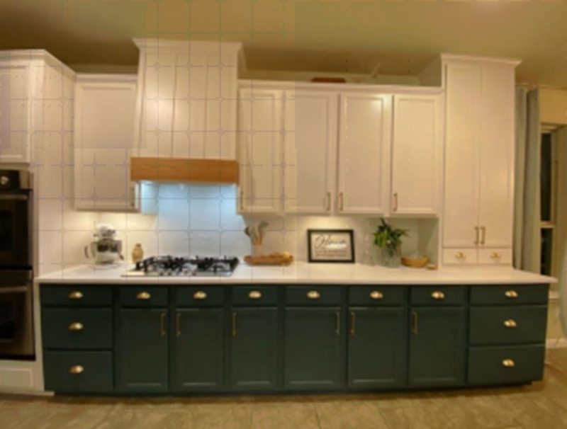
8. Sherwin Williams Moderate White (SW 6140)
Sherwin Williams Moderate White is a cream off-white paint color. However, it does differ from other paint colors due to the presence of orange undertones that pushes it toward beige.
Asides from its normal undertone, you might also notice a little bit of pink as well. They all contribute to its warmth and coziness in both interior and exterior living spaces.
| Paint Color | LRV | RGB Value | Undertones | Reading |
| Moderate White | 74 | R: 233 G: 222 B: 207 | Orange and little Pink | Warm |
 Here is Moderate White as a wall color
 Outdoors with cool lighting, Moderate White appears more white with no strong presence of an undertone
9. Sherwin Williams Oyster White (SW 7637)
Sherwin Williams Oyster is what is described as a soft off-white. It’s a very versatile color as its soft mild tones look great for practically every surface.
SW Oyster is muted with some beige-green undertones, but it’s still considered a warm color by some. The bright off-white pairs nicely with various colors and works exceptionally well with SW Analytical Gray.
| Paint Color | LRV | RGB Value | Undertones | Reading |
| Oyster White | 74 | R: 226 G: 221 B: 208 | Orange and little Pink | Warm |
 With more light, Oyster White appears brighter and more vibrant like a pure white
 Even in low lighting, Oyster White doesn’t appear dull or gray like a white paint color . But rather it looks soft and warm.
10. Sherwin Williams White Flour (SW 7102)
Sherwin Williams White Flour is a cozy, off-white, neutral paint color. It adds a nice warm glow to many living spaces. Adding this color to your home, especially your bedrooms, will make every waking hour feel like a sunny day.
The paint color has airy vibes that suit both interior and exterior spaces. Despite its deep yellow and pink undertone, Sherwin Williams White Flour remains as versatile as other colors on this list.
| Paint Color | LRV | RGB Value | Undertones | Reading |
| White Flour | 87 | R: 244 G: 239 B: 229 | Yellow and Pink | Warm |
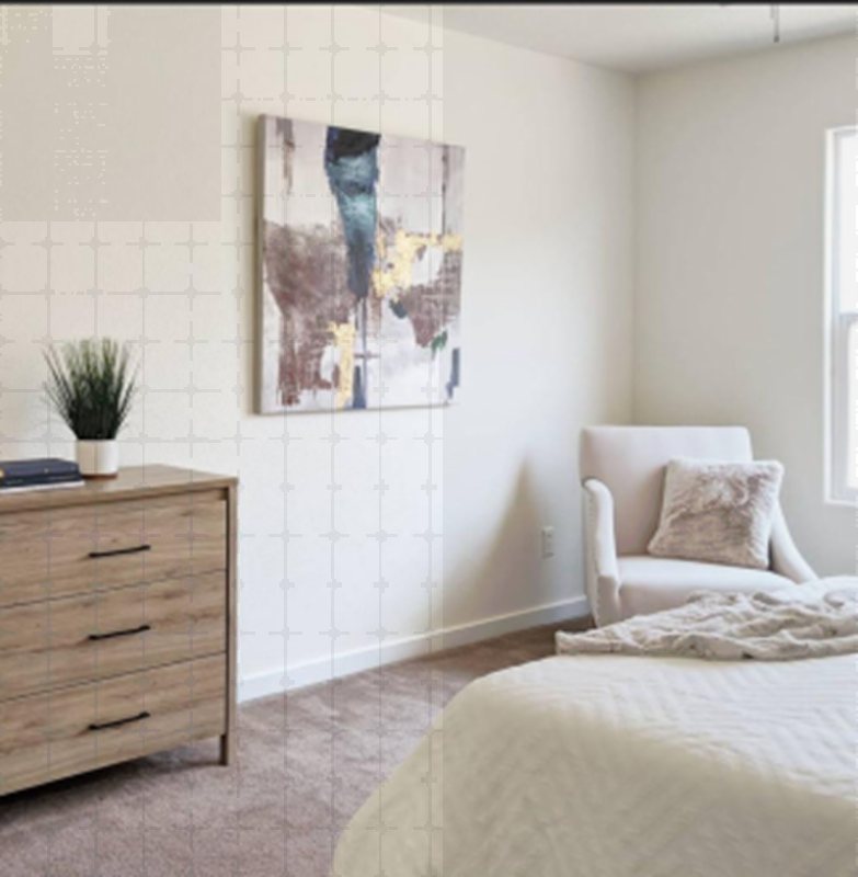
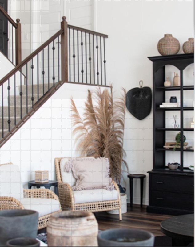 SW White Flour looks immaculate on the walls of the living room and it pairs well with the earthen tones from the furniture
 Outdoors, with low lighting, White Flour still has that warmth to it. And when compared with the white sofa, it’s more of an off-white.
Conclusion
off-white paint colors seem to have come here to stay, and truth be told, we can see why. From their versatility to their warmth and cozy feeling, it’s very hard to go wrong with this paint color family.
If you’re choosing an off-white paint, it’s important you take note of its properties and other elements of your home to get the perfect off-white color that works for you.
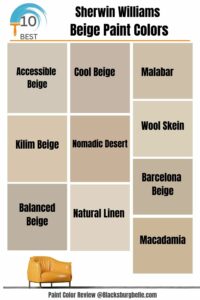 10 Best Sherwin Williams Beige Paint Colors (Trend 2023)
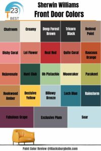 23 Perfect Sherwin-Williams Front Door Colors (2023 Trends)
 31 Best Light Blue Paint Colors: Review and Inspiration
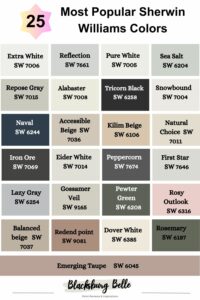 25 Most Popular Sherwin Williams Colors in 2023
 15 Best Creamy White Paint Colors For 2023
 13 Best Gray Paint Colors for Kitchen Cabinets in 2023
