
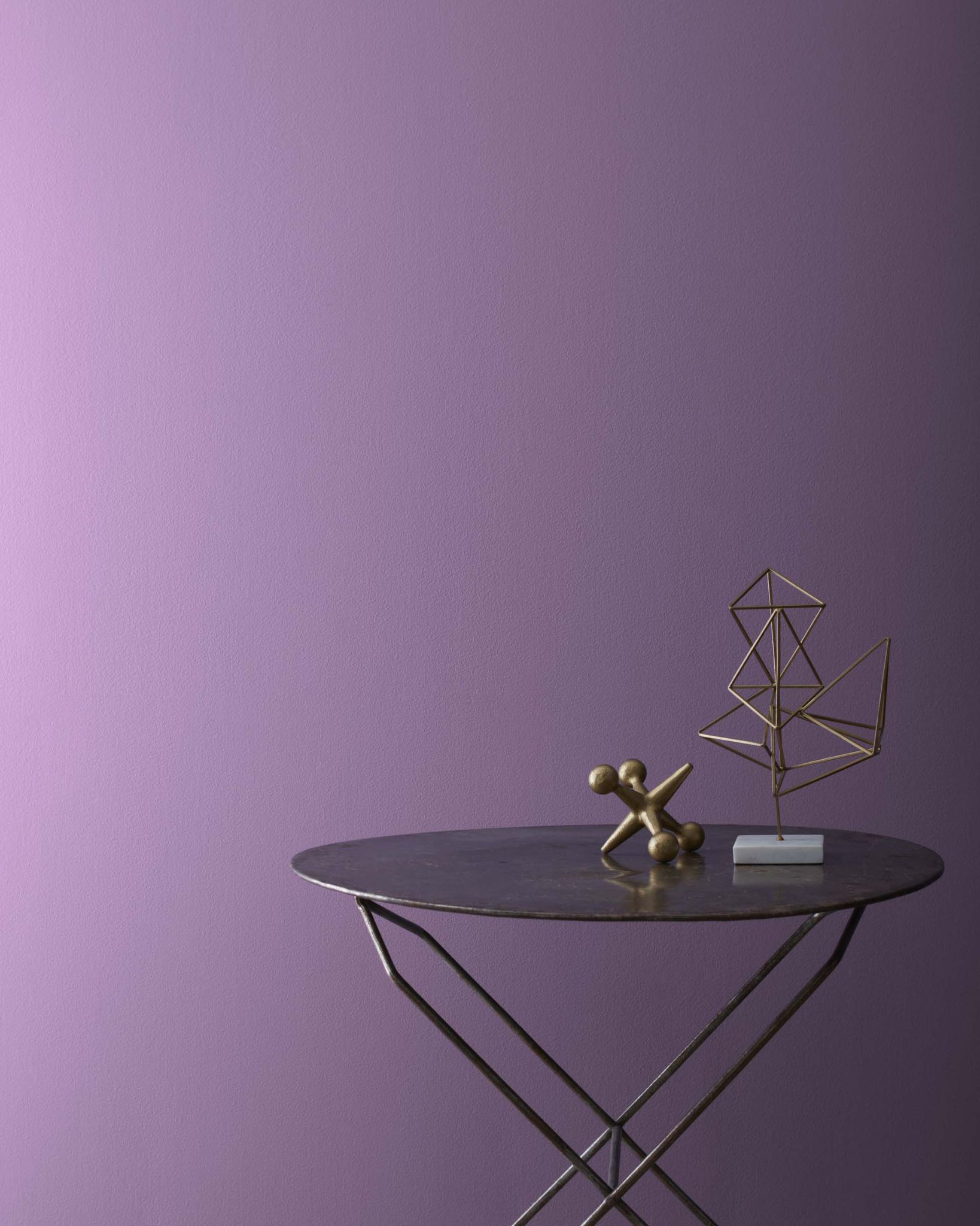
There are only a few colors as vibrant and beautiful as purple, and it is one of the best colors to grace your home. But with so many fabulous shades and hues, how do you select the most suitable ones for your home?
Finding the best purple paint colors for your home should not be tedious. And because we know how saturated and deep purple can be, we have selected the 13 best ones from Sherwin Williams and Benjamin Moore. Read on to pick the colors that fit your decor.
Table of Contents
What Colors Combine to Produce Purple Paint Color?
Blue and red combine to produce purple. That is why you will find that red and blue have higher concentrations on the red, green, and blue color code when the main color is purple. The amount of red or blue you add to the paint will determine the shade produced. Also, the shades of blue and red combined are vital to the final results.
But while this is factual, you can add white, yellow, gray, or black to get various shades. Much like getting light, medium, or dark purple with different shades of red and blue, you can achieve different tones of the same color with the amount of gray, white, yellow, or black.
For example, add white or gray to a mixture of red and blue to get a light purple paint color. The same is true when you add yellow, although the resulting purple paint color may look slightly different from the one where you add white. Also, the shade of yellow added can significantly affect the purple color. However, black makes the purple paint color darken to give you deep purple shades.
What Undertones Are Common with Purple Paint Colors?
Purple paint colors typically have blue or red undertones. If a purple paint color has blue undertones, it leans toward the cool end of the spectrum. Red undertones make the purple paint color have warm tones.
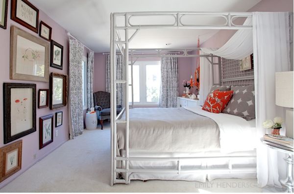
Where Can You Use Purple Paint Colors?
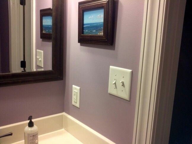
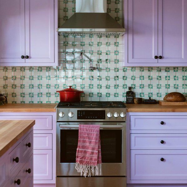
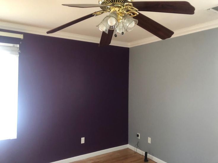
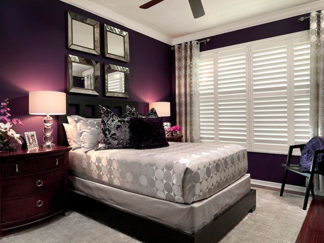
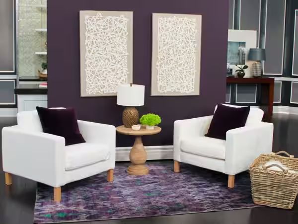
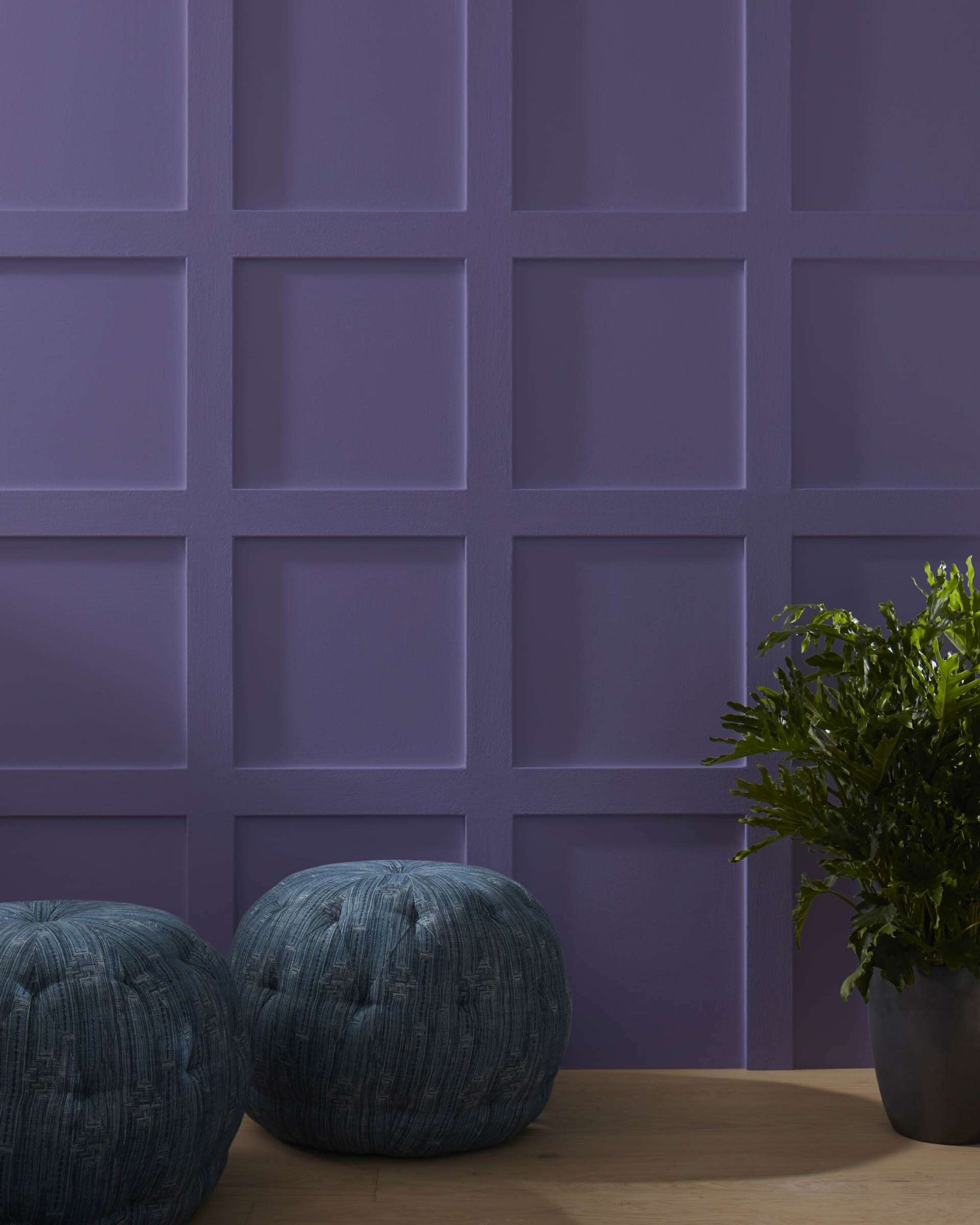
Purple is versatile, especially when it is light purple. But you must be sure of the chosen shade before deciding where it will be most suitable. You can even use different shades for different rooms or walls in one room. You only need to know how best to use them.
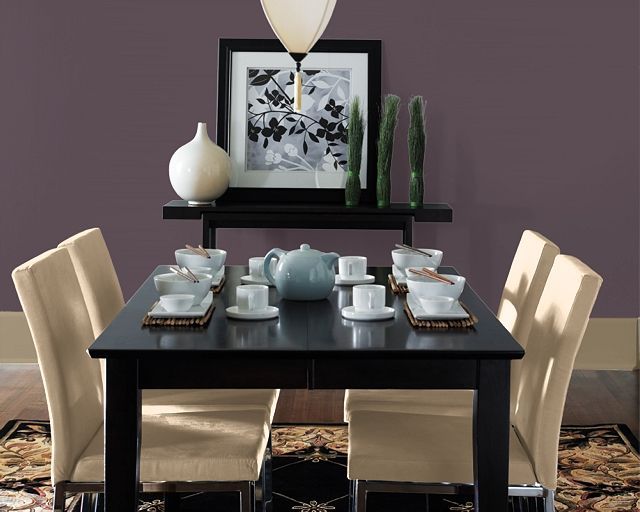
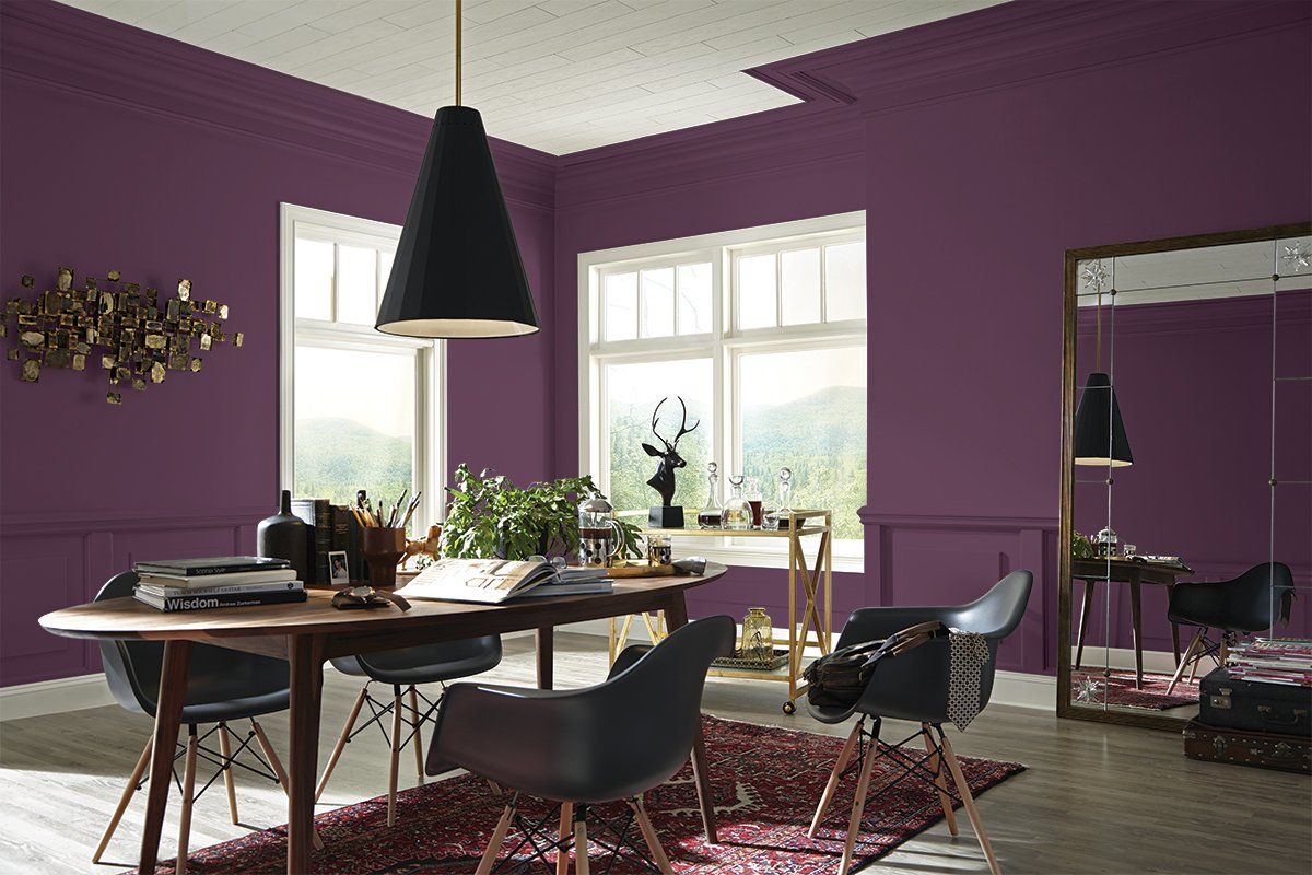
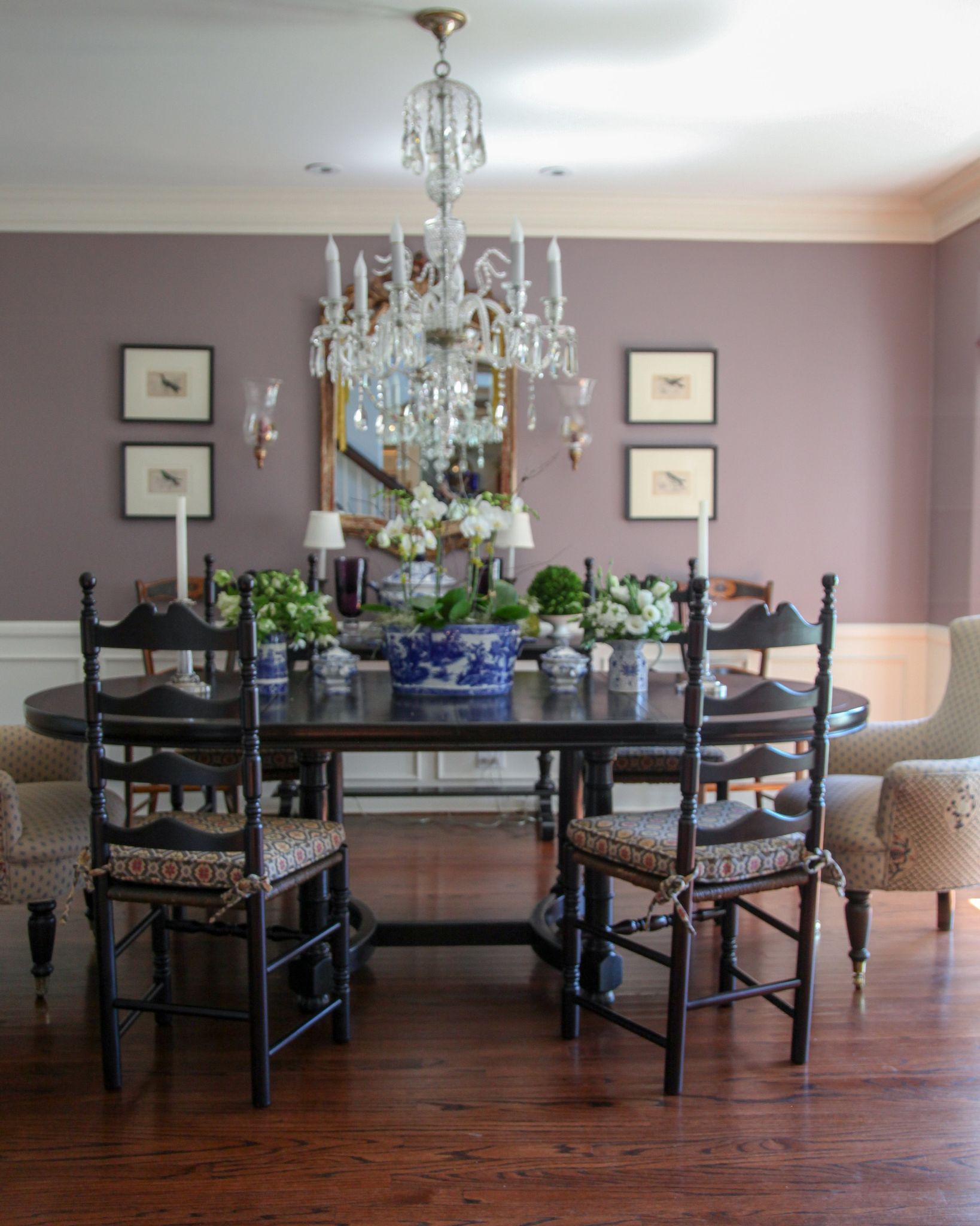
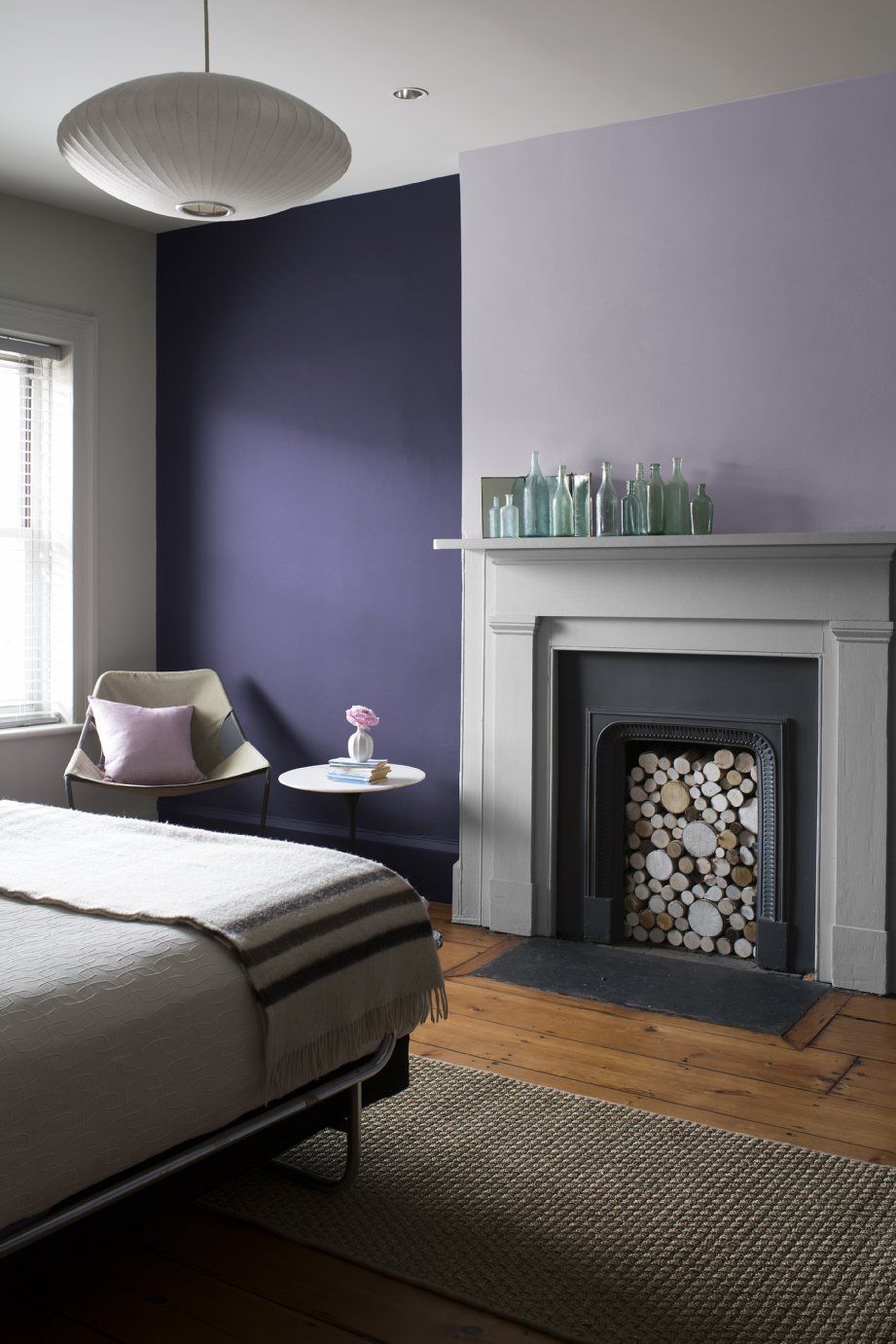
For example, light shades like lilac and lavender work well in bedrooms or powder rooms. They are also excellent choices for nurseries. For dining rooms and living rooms, consider darker hues like aubergine or plum for a stately look. Depending on the look you are going for, deep hues can work on cabinets.
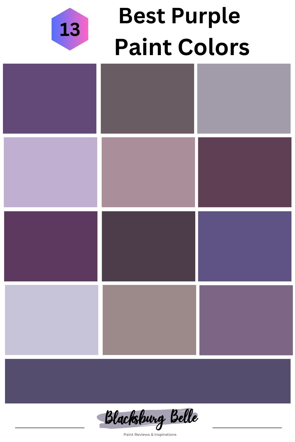
13 Best Purple Paint Colors that Suit Your Home
The following are the best purple paint colors from Sherwin Williams and Benjamin Moore to give you a stately and sophisticated decor:
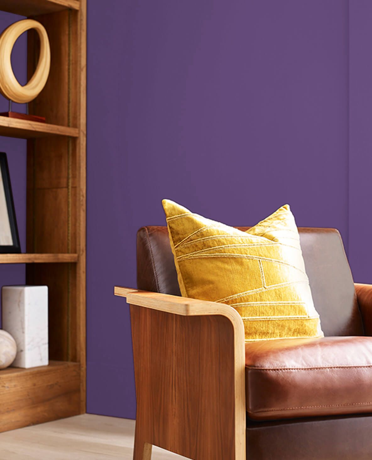
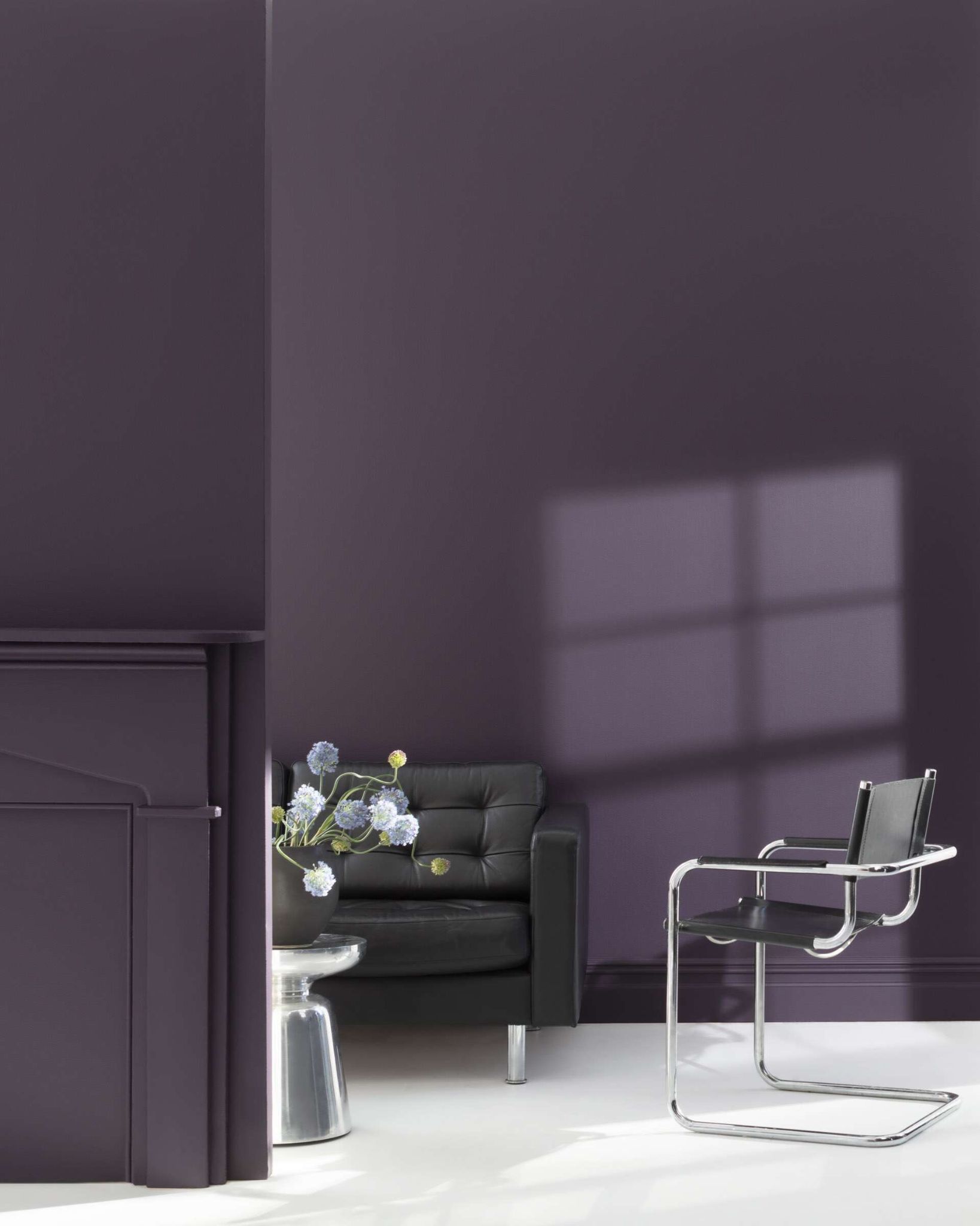
1. Impulsive Purple SW 6832
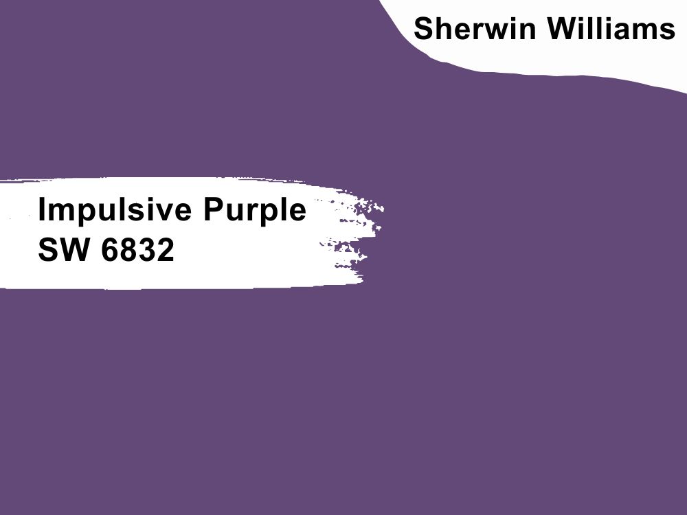
Bold purple paint color with gray undertones
Go bold or go home with this paint color. It is not every day you find purple that fits any decor, especially if it has a cool color scheme. Although it is bold, Impulsive Purple works well in living rooms, dining rooms, and bedrooms. But you must pair it with soft neutrals to mute its vibrance.
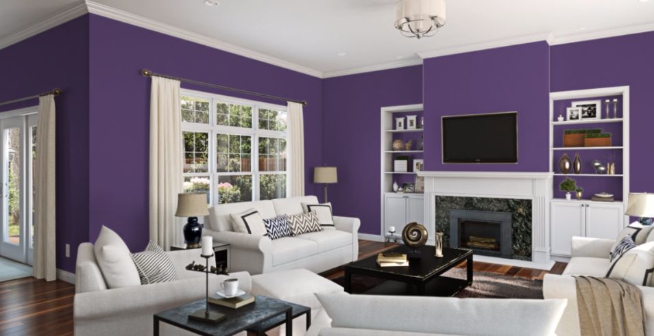
With an LRV of 9, which is a testament to its deep shade, and an RGB color code of 98, 73, and 119 respectively, consider pairing it with colors like Extra White, Original White, and Knitting Needles.
2. Expressive Plum SW 6271
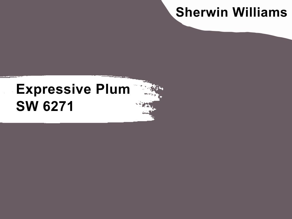
Cool purple paint color with blue-gray undertones
Some experts call this color smokey blue, and it can appear so in some types of lighting. But in natural light, it is more plum with blue-gray undertones than smokey blue. Whatever color you want it to be, Expressive Plum is such a deep and soothing color that adds character to any room.
It has an LRV of 12 and an RGB color value of 105, 92, and 98 respectively. This code shows that Expressive Plum has more red than any other of the primary colors. So, coordinate it with Chatura Gray, Gauzy White, and Original White for the best results.
3. Ash Violet SW 6549
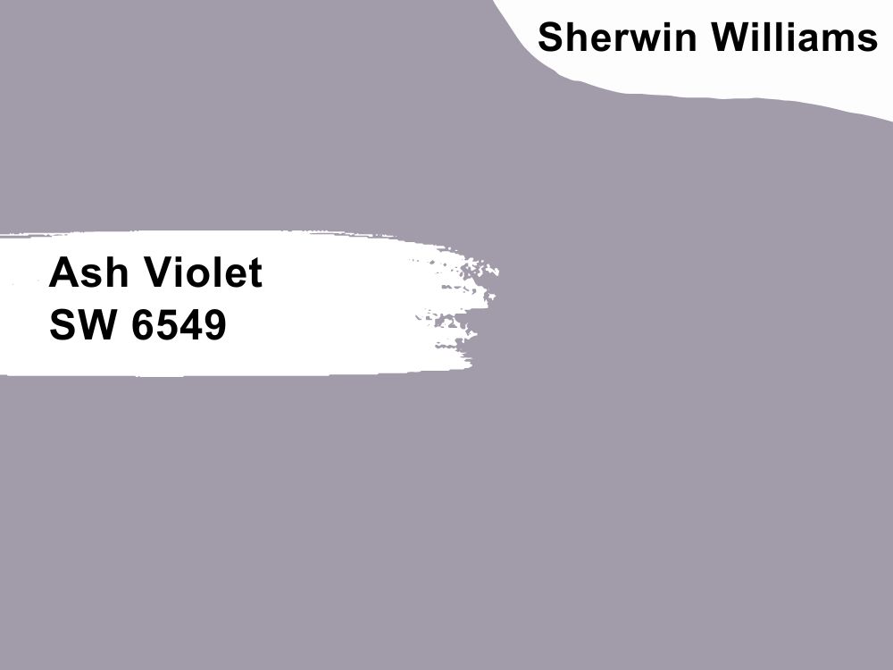
Mid-tone purple paint color with blue undertones
The mid-tone color is a great addition to decor that already has bold colors. It is a soft color that mellows saturated paint colors, so it may work well with deep purple hues or bold blues and yellows. With blue undertones, the color takes on a slightly lilac look that makes any room airy.
Ash Violet has an RGB color balance of 162, 155, and 170 respectively, and an LRV of 34. This means it can reflect more light than other purple paint colors on our list. So, match it with bright colors like Bellini Fizz, Ibis White, and Original White.
4. Magical SW 6829
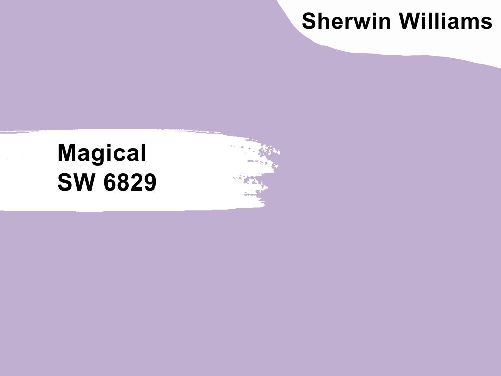
Cool purple paint color
Magical is a light and playful purple that may not be a great fit for every room. But if you have a private space, nursery, or playroom, consider using this color and white to create even more playfulness and airiness. And if you are bold, you can use it on cabinets and doors for a unique look.
Magical has an LRV of 46 and an RGB color code of 192, 175, and 208 respectively, which means it has more blue in it than any other color. You can coordinate it with Cornwall Slate, Shell White, and Original White, as MyDomaine shows in this bedroom decor.
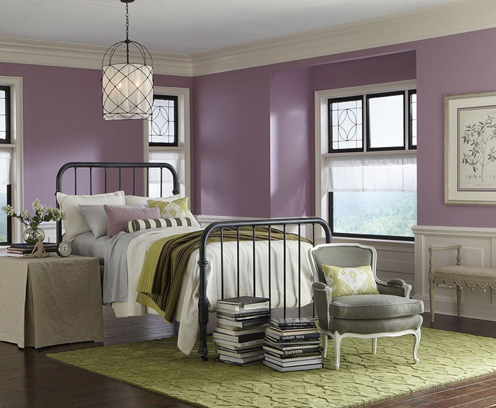
5. Thistle SW 6283
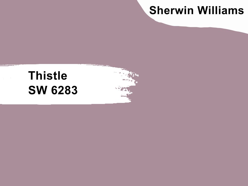
Purple paint color with cool tones
You may notice a bit of gray in this purple paint color in north-facing rooms. In other words, in dim light, the paint color may look darker than it actually is. But in south-facing rooms, Thistle appears brighter with violet tones. It is a great color for any room, including bedrooms and living rooms.
Match it with colors like City Loft, Sassy Green, and Ibis White from Sherwin Williams. These colors and other light hues make this color pop wherever you use it. Thistle has an RGB color code of 170, 142, and 154 respectively.
6. Mature Grape SW 6286
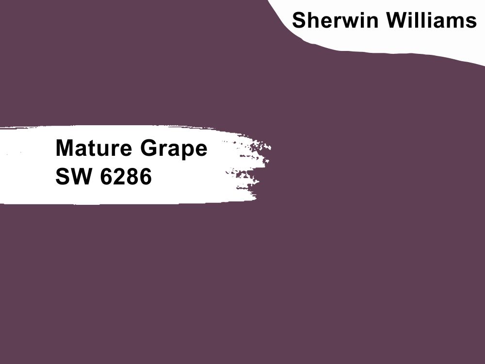
Deep purple paint color with a cool tone
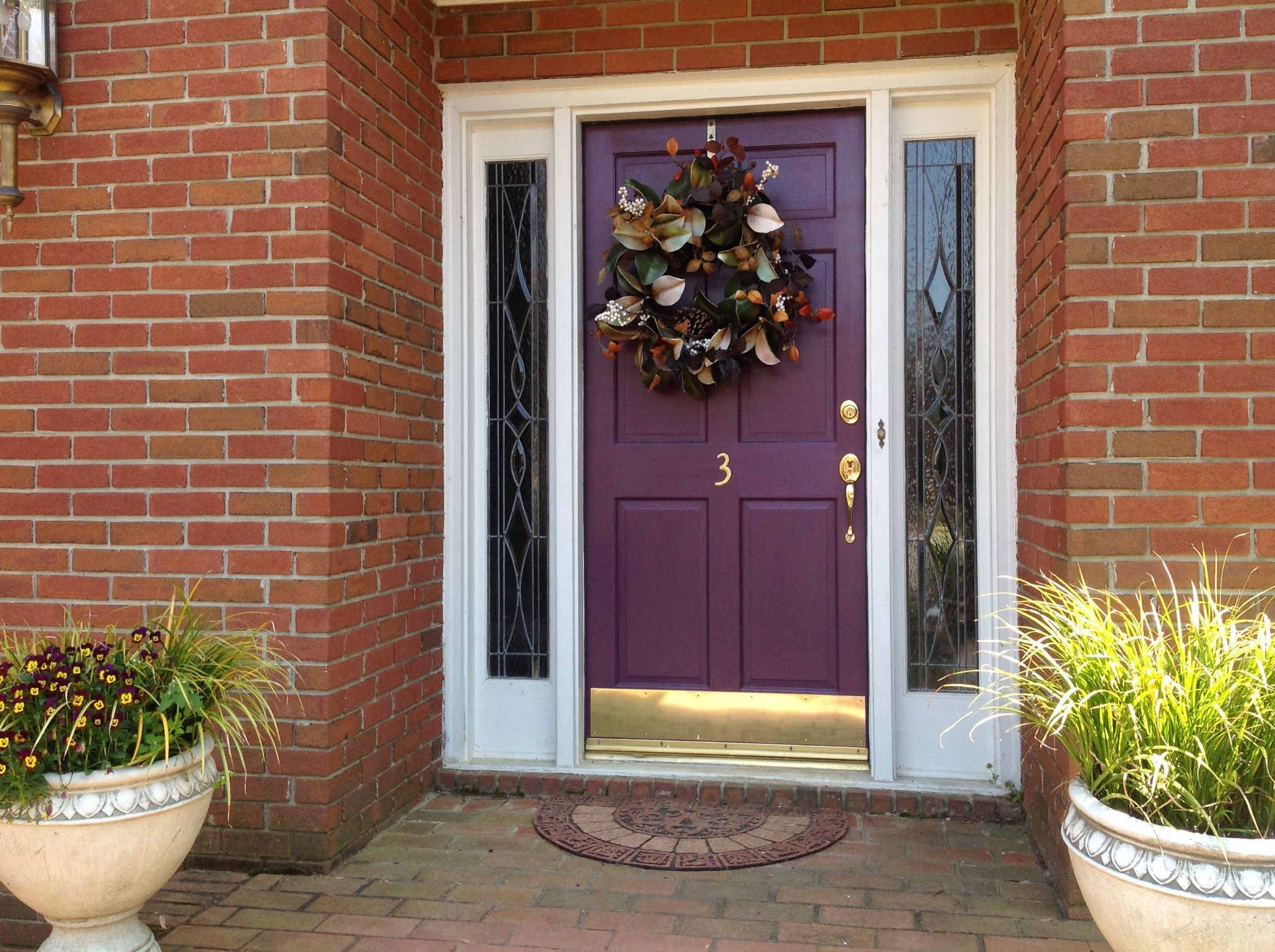
Purple is never a boring color, and why should it be when it is such a royally beautiful color? And with so many shades, like the Sherwin Williams Mature Grape, you are sure to find what you need. This deep purple paint color can work on entire walls or accents, especially if you have other pieces in your decor to make it pop.
If you are bold, it can work as your front door or entryway color, even if there is nothing else to match it. You do not have to fit in with everything else if you have something beautiful to show off. Pair Mature Grape with colors like Universal Khaki, Natural Choice, and Ibis White. It has an LRV of 7 and an RGB color code of 95, 63, and 84 respectively.
7. Kimono Violet SW 6839
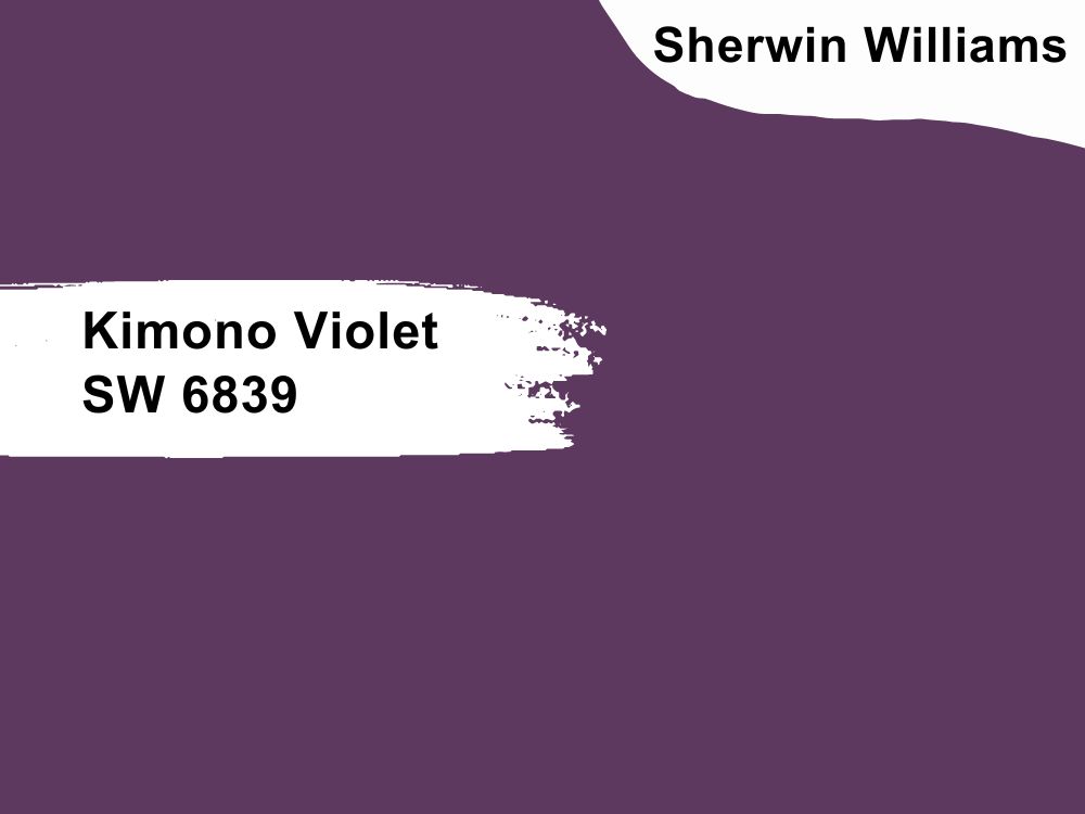
Deep purple paint color with cool tones
Kimono Violet is close in shade to Mature Grape but looks slightly brighter, although it has a lower LRV of 6. If you are unsure of the other deep purple color, consider swapping it with this one for the same look and feel. Remember to place each color side by side to see how they work with other colors in your decor.
With an RGB color code of 93, 57, and 95 respectively, this color has more blue in it than red or green. Because of this, pair it with colors such as Felted Wool, White Heron, Ibis White, and other bright neutrals for the best results.
8. Black Raspberry 2072-20
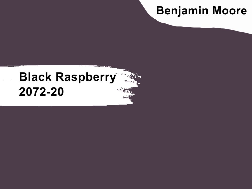
Dark purple paint color with brown undertones
If you want a rich color with an earthy feel without compromising on gorgeousness, Black Raspberry is one color to try. It is bold, rich, stately, and sophisticated, regardless of other elements in the room.
White and gray are some of the best neutrals to pair with this deep color. But wood tones and other browns look spectacular with it. With an LRV of 6.78 and an RGB color code of 77, 61, and 75 respectively, coordinate it with colors like Windham Cream, Simply White, Foggy Morning, and White Opulence.
9. Mauve Bauhaus 1407
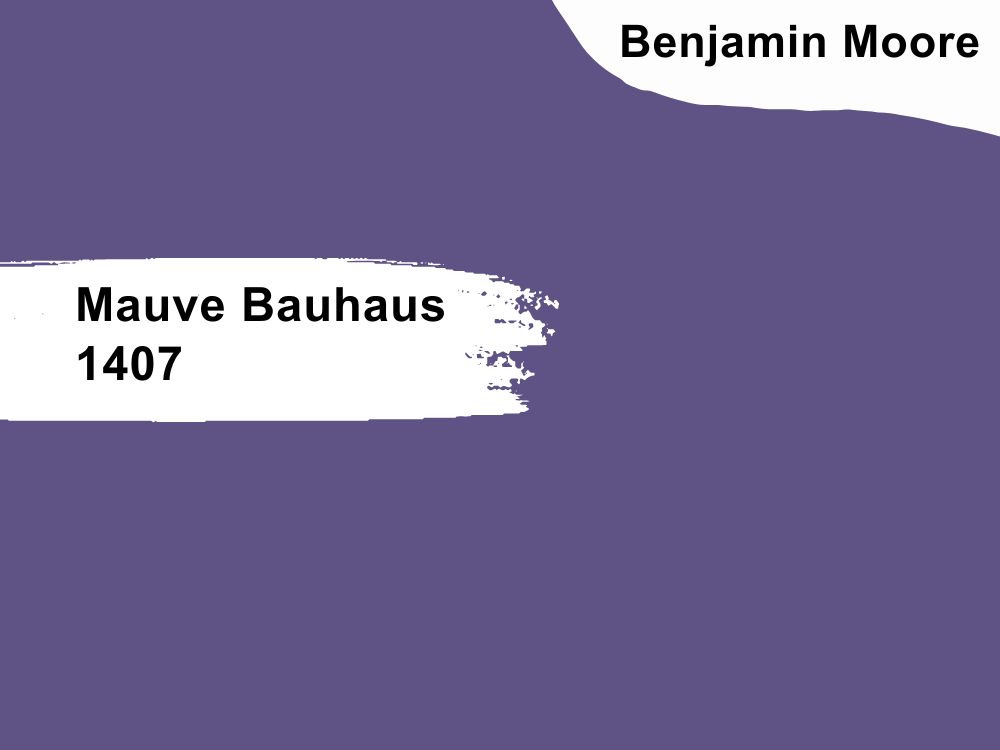
Cool purple paint color with blue undertones
This is a clear purple color that appears playful and light. Although it is deep, it is not somber or overwhelming. Neutral tones like gray and white pair well with it, but you can also try getting creative with other colors to see how they work with this vibrant color.
It is not exactly the best color for the exterior of your house, but who says you cannot be unique? It has an LRV of 12.79 and an RGB color code of 94, 83, and 132 respectively. Match it with colors like Rhine River, Ylang Ylang, Seapearl, and Mountain Peak White.
10. French Lilac 1403
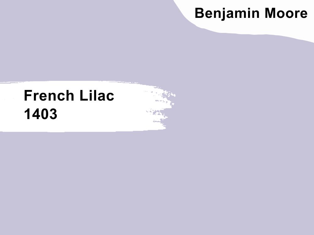
Light purple paint color with blue undertones
If you want a pastel to complement other pastels, deep purples, or vibrant pinks, look no further than French Lilac. As the name suggests, it is a lilac shade of purple that softens every decor and adds a freshness like no other color.
With an LRV of 56.14, French Lilac reflects enough light to keep a room bright and does not change its tone. It also has an RGB color code of 199, 195, and 217 respectively. Coordinate it with other Benjamin Moore colors like Bachelor Blue, Balboa Mist, Cloud White, and White Dove.
11. Wet Concrete 2114-40
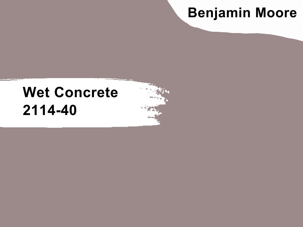
Deep mauve paint color with gray and brown undertones
Perhaps it is the obvious gray in it, but Wet Concrete has the look of a neutral. Although there is a clear pop of color, you can try it as a neutral in your decor and pair it with white, light gray, and earthy tones.
Coordinate it with Black Horizon, which is a deep color, to bring out its beauty. Alternatively, use light colors like Classic Gray, Chantilly Lace, and Icicle to brighten the muted color. It has an LRV of 27.45 and an RGB color code of 156, 137, and 137 respectively, an almost perfect neutral.
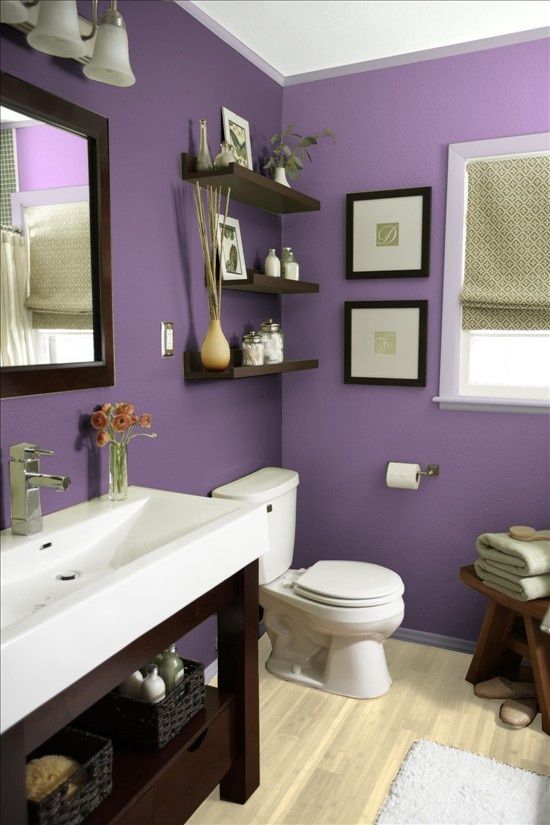
12. Cupid’s Dart 1385
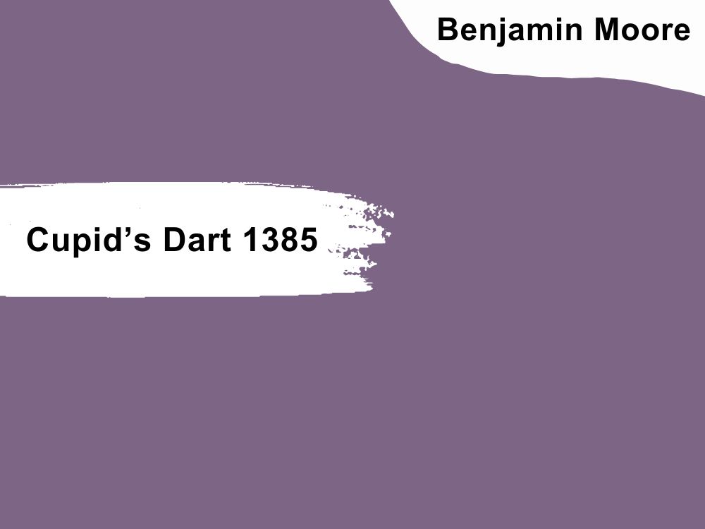
Bright purple paint color with a slightly red undertone
Like Cupid’s arrow, this paint color pierces through your heart to draw you in with its playfulness and lightness. The slightly red tone makes it a bit somber but we like that hint of color, especially in the right lighting. Check out how Christian Astorga uses Cupid’s Dart in this powder room.
La Paloma Gray, Gray Sky, Classic Gray, and White Heron are some of the best colors from Benjamin Moore with which to coordinate Cupid’s Dart. However, you can try other colors in your palette to see how the decor goes. This beautiful color has an RGB color code of 125, 102, and 133 respectively, and an LRV of 17.05.
13. Dark Lilac 2070-30
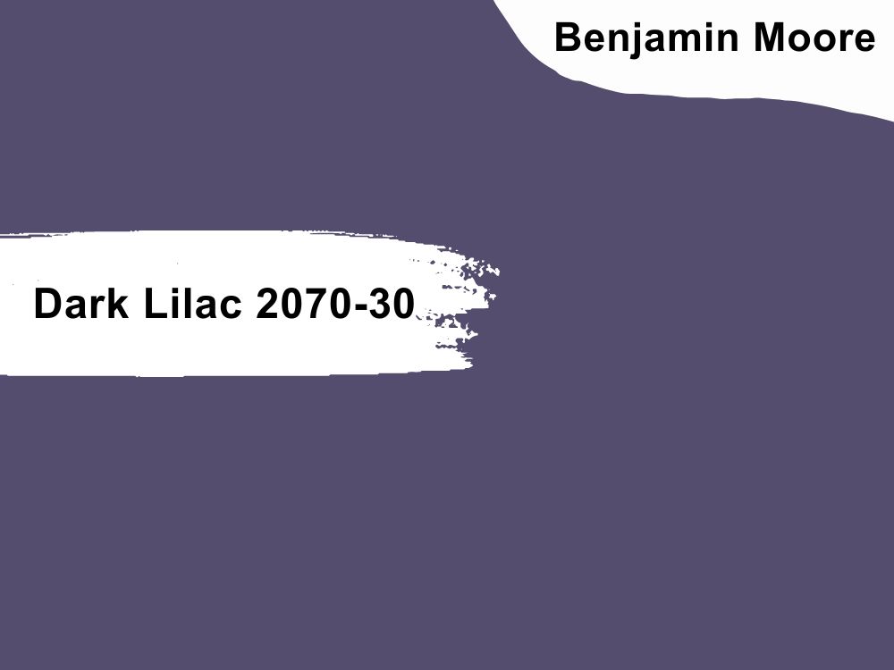
Cool purple paint color with gray undertones
This rich color reminds you of a beautiful garden or a stately room. Accent walls look amazing with this color, especially when combined with white or light gray. Wood tones also work well with it if you keep it minimal and cool.
Coordinate it with Oystershell, White Christmas, Linen Sand, and Mountain Peak White to get excellent results. Dark Lilac has an RGB color code of 84, 77, and 109 and an LRV of 10.44.
Conclusion
Purple is one of the most beautiful colors you can use for your decor, whether inside or outside. And while there are many shades available on the market, we have reduced the number to the 13 best ones, from dark to light.
Pick one from Sherwin Williams and Benjamin Moore, or combine more than one of the colors on this list. Light and dark hues go well together, even if you add other neutrals and vibrant colors.
We absolutely love purple and would love to see more decor ideas with this color. Share your experience and decor pictures with us in the comments section.
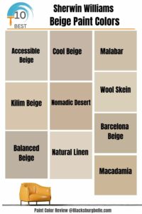 10 Best Sherwin Williams Beige Paint Colors (Trend 2023)
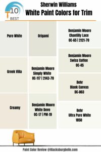 10 Perfect White Paint Colors for Trim (Trend 2023)
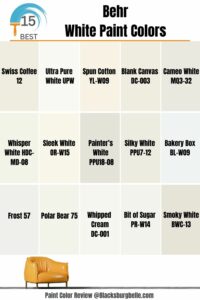 15 Best Behr White Paint Colors Popular and Trending in 2023
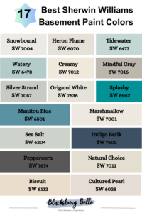 17 Best Sherwin Williams Basement Paint Colors (Trend 2023)
 23 Best Sherwin-Williams Gray Paint Colors (Trend 2023)
 18 Best Navy Blue Paint Colors For 2023
