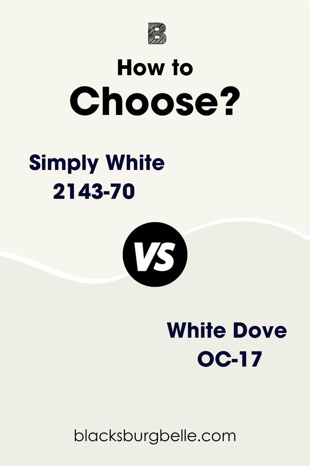
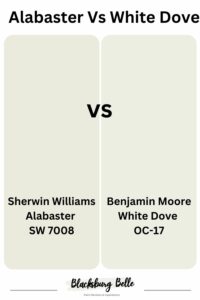
Looking for the best white paint colors to add to your color palette? Simply White and White Dove are some bright whites to consider. However, there seems to be no difference between them. So, how do you pick between Benjamin Moore’s Simply White vs White Dove?
Simply White has more yellow in it and appears slightly creamier than White Dove. It is also brighter than White Dove. In other words, White Dove is muted and looks less creamy because of the gray in it. So, it appears less warm than Simply White.
Before I go into great detail, let me show you when to use each white paint color. If you are wondering how to tell the difference between them, these points will help you make an informed decision.
Table of Contents
When to Use Benjamin Moore Simply White vs White Dove
This section is more about when and where to use Simply White or White Dove than any other thing. After all, the whole point of looking for a paint color is to decorate. So, here are a few points for when and where to use each.
Use Simply White if:
- You want a warm white that doesn’t look stark
- You don’t mind a bit of yellow or green in your white paint color
- Bright whites are ideal for your decor
Use White Dove if:
- A muted white blends perfectly with your color scheme
- A bit of gray in your white doesn’t put you off
- You like a balance of warm and cool in a white paint color
The infusion of gray in White Dove makes it a little cool in some rooms. When placed beside Simply White which reads warm or a true white like Chantilly Lace, White Dove shows some gray and looks cool. However, it is slightly warm despite the gray in it.
Note that not all grays are cool; some are warm grays. If the facts above answer the questions you have, the problem is solved. But I would love to show you more details to explain these colors further.
Benjamin Moore Simply White vs White Dove: Visualizing the Differences
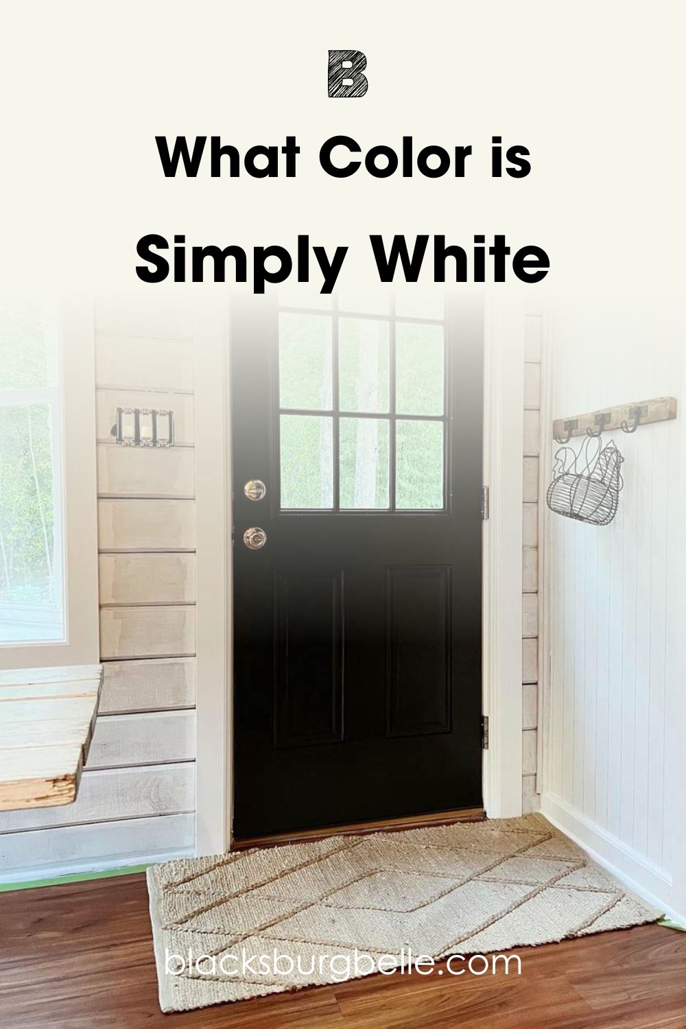
Let’s take a look at the different white paint colors in this guide. Here is a picture of Simply White paired with a front door painted in Tricorn Black from Sherwin Williams:
And this is a picture of White Dove:
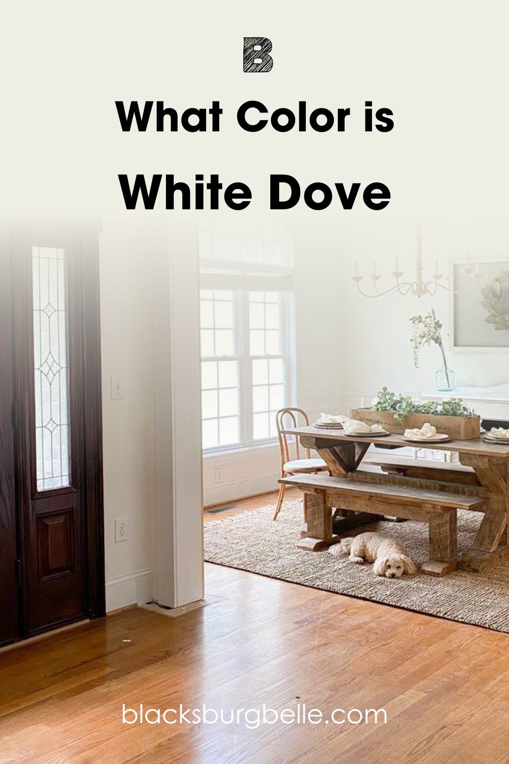
Both white paint colors look warm and creamy. But Simply White shows a little more creaminess than White Dove. This may be because of the lighting in each room, but remember how I said that Simply White has more yellow in it, while White Dove has some gray in it.
While both paint colors look bright and white in dim rooms or cold lighting, you will find that Simply White exudes more warmth and brightness than White Dove. On the other hand, White Dove can give you crispiness and freshness when the lighting is right.
Comparing Benjamin Moore Simply White vs White Dove: A Quick Overview
Let’s quickly analyze some of the basics of these paint colors and see what other areas they differ. You may be unfamiliar with LRVs and RGBs, but they determine how bright colors are, and what hues or undertones they have.
| Simply White | White Dove | |
| RGB | 246, 246, 237 | 239, 238, 229 |
| LRV | 89.52 | 83.16 |
| Undertone | Yellow-green | Gray-yellow |
| HEX Value | #F6F6ED | #EFEEE5 |
Emotional Effects: Benjamin Moore Simply White vs White Dove
Did you know that white can make or mar your decor and feelings, as bland as it may appear? By now, you should know that can have different tones and hues. There are true whites that show no tones but are neutral. But white paint colors can also have purple, gray, yellow, red, green, blue, and other hues peeking through.
As a result, consider how you will feel a few weeks or months after using any white paint color of your choice. If it appears too buttery or creamier than you expect, it defeats the purpose of having beautiful decor.
What do Simply White and White Dve feel like in a room? Simply White is the warmer and deeper of the two paint colors. And because it is warm, it creates a soft and cozy ambiance where you can relax and unwind. It is not overwhelmingly warm, so you don’t feel choked.
White Dove is also warm but exudes less warmth than Simply White. It can also feel a little cool when paired with warm colors. It can be a balanced color when necessary. Consequently, it can create serenity and freshness that Simply White cannot. It can also show a hint of warmth in certain lighting.
LRV of Benjamin Moore Simply White vs White Dove: Which Reflects More Light?
The LRV of color is one of its most important aspects because it determines how much light the color reflects or absorbs. LRV means light reflectance value, and it uses a scale of 0 to 100. True blacks have an LRV of 0, while pure whites have an LRV of 100.
No paint color is a true black without any hue and absorbs all light. And none is pure white so it has full reflectivity. All paint colors are within the range of 2.5 to 94. This gives you an idea of the brightness of the paint colors under review.
Simply White has an LRV of 89.52. This value is close to the brightest end of the scale and refers to how bright the color is. It is one of the brightest whites on the market.
On the other hand, White Dove has an LRV of 83.16. It is also a bright white, just not as bright as Simply White. In other words, Simply White reflects more light than White Dove. keep this in mind when selecting one.
A brightly-lit room works well with either paint color. But White Dove will look muted compared to Simply White. Rooms with cold light will also benefit from these bright whites, but White Dove may look too cool, while Simply White may appear slightly warmer.
Undertones of Benjamin Moore Simply White vs White Dove: Are They the Same?
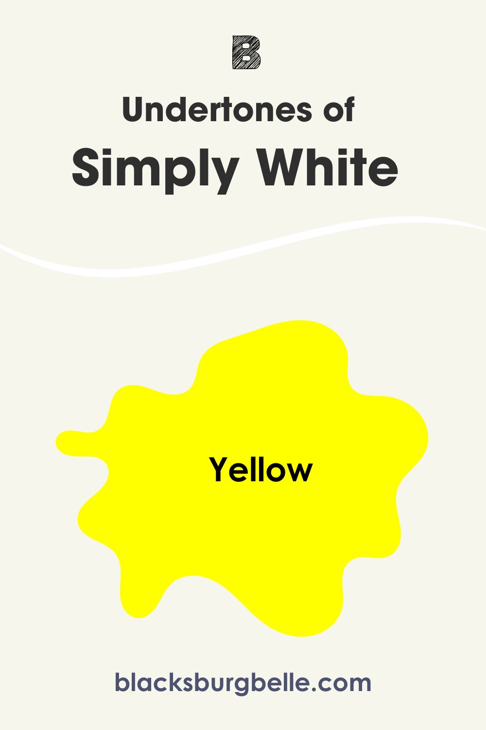
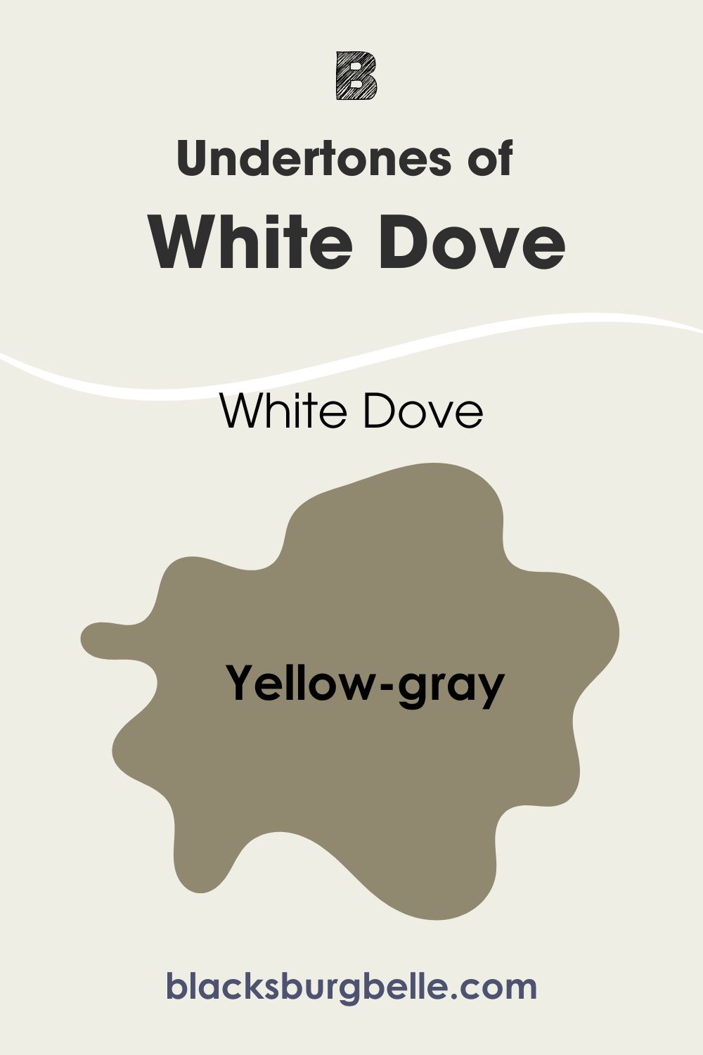
The undertones of Simply White and White Dove are similar in some ways but differ in other ways. Whereas Simply White has slightly yellow undertones that may look creamy in some lighting, White Dove has slightly yellow-gray undertones.
White Dove is slightly more complex than Simply White. It can be warm or cool because of the gray and light yellow in it. Some may see more cream than yellow, and they are not wrong. The color is so little and barely there, but Simply White has an obvious yellow hue.
A Closer Look at the Undertones of Simply White
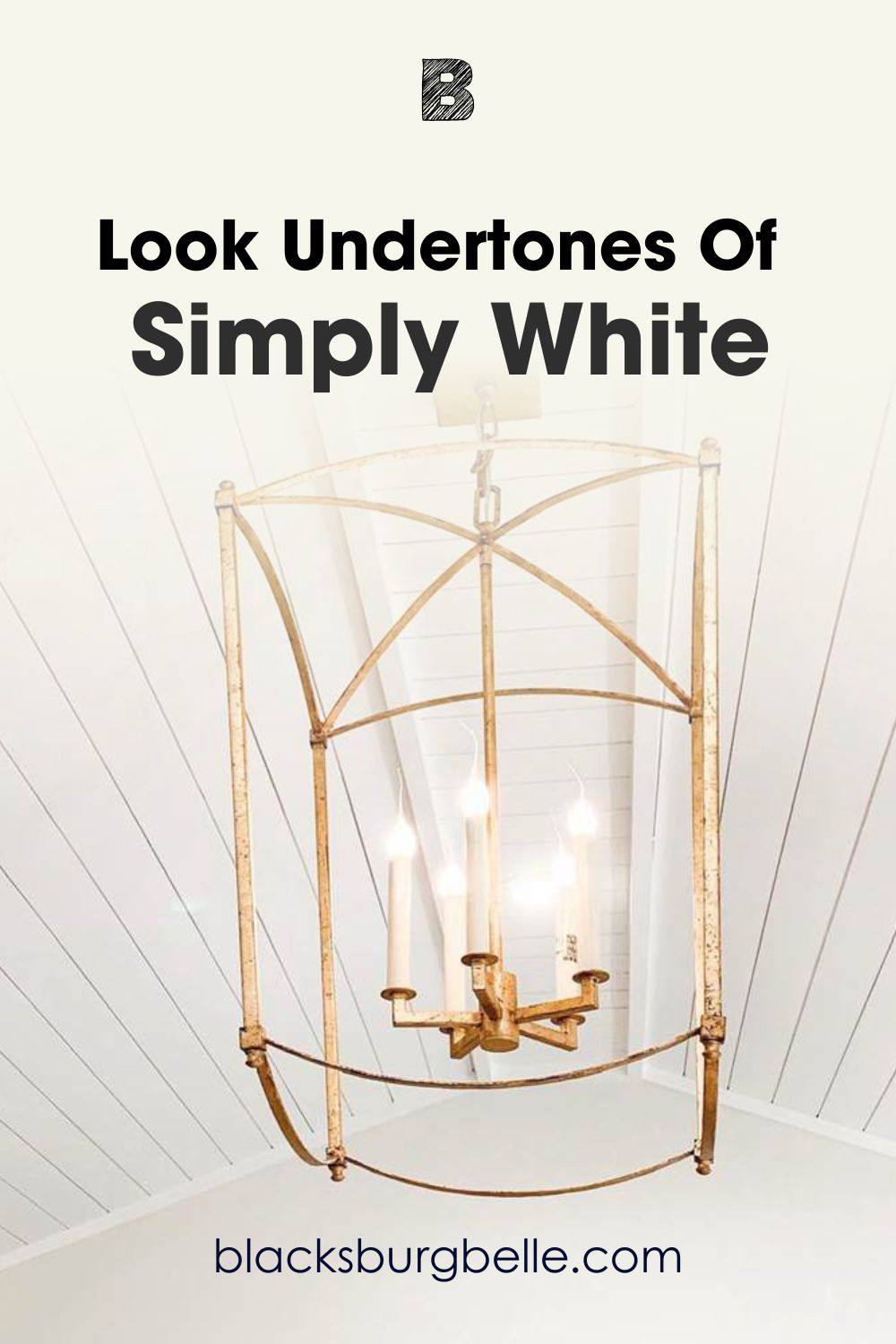
Let’s take a peek at the undertones of Simply White and how it may appear in a real space. You may get a better idea of how well it works. Here is Simply White on this ceiling showing a lot of warmth:
A Closer Look at the Undertones of White Dove
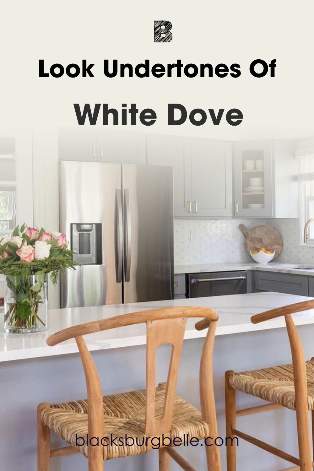
In contrast, here is White Dove used in this kitchen. It shows a bit of warm gray despite the lighting from the window. It is slightly cooler than Simply White in the picture above.
Simply White can also show a hint of green in some settings. This is because it is pretty close to the green on the color wheel, so when there are green elements around it, it reveals more green than cream or yellow.
White Dove is more laid-back in this aspect, remaining solid and muted than Simply White. Like many other colors, it has the penchant to change its tone and color, but it is pretty neutral and more accepting of other colors than Simply White, especially vibrant colors.
Benjamin Moore Simply White vs White Dove: Are They Warm or Cool?
Simply White and White Dove are warm white paint colors. But Simply White is the warmer white with more obvious yellow undertones than White Dove. However, it can hint a bit cool when it shows green hues since green is a cool color.
White Dove shows great promise of warm and cool tones, depending on the room and the person looking at it. Colors and hues can be subjective when it comes to perspective. Undoubtedly, White Dove has a mixture of yellow and gray, which makes it easy to balance between warm and cool tones.
That is why it fits perfectly with warm color schemes or cool color schemes. On the other hand, Simply White usually works best with warm color schemes.
Benjamin Moore Simply White vs White Dove Complementary Colors
All colors work better with other colors and perform best with specific colors. As the name suggests, complementary colors are those, when you combine them with the primary hues, produce black or white.
They are usually opposite each other on the color wheel, which means that the complementary colors for Simply White and White Dove should be opposite them on the wheel.
However, while both colors under review are white, they are not your typical white. This is because of their undertones. So, what are the best complementary colors for Simply White and White Dove?
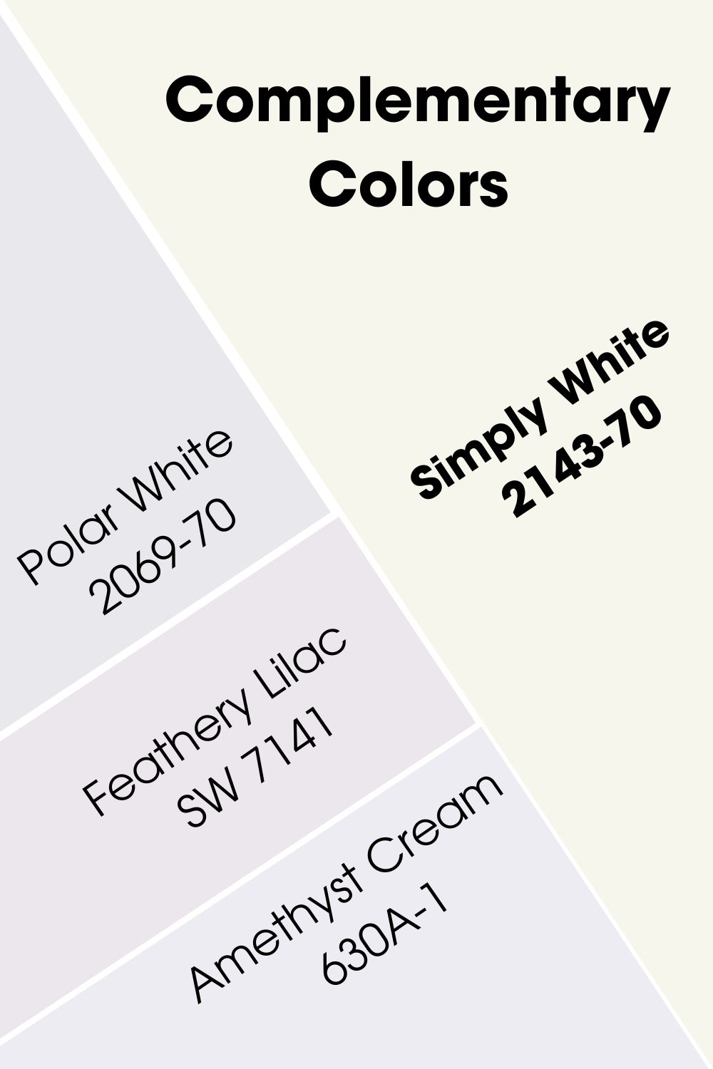
The best complementary color for Simply White is Benjamin Moore’s Polar White 2069-70. The paint color is white but has lavender tones in it. Sherwin Williams’ Feathery Lilac SW 7141 and Behr’s Amethyst Cream 630A-1 are also great options for complementary colors.
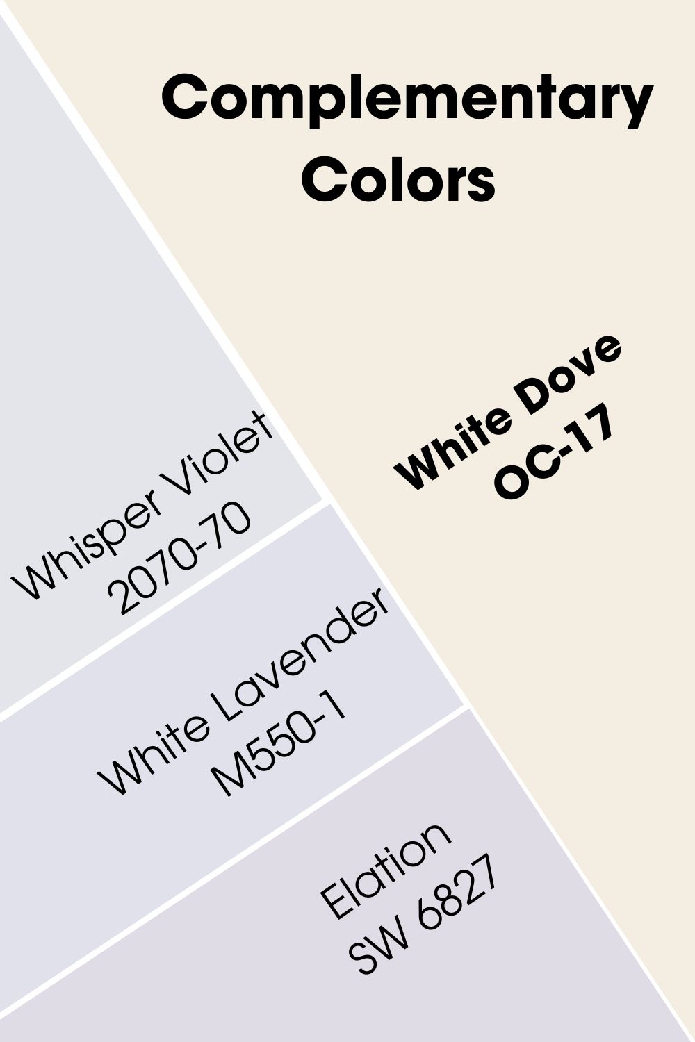
White Dove is slightly different, although the difference is not very obvious. The best color that complements it is Benjamin Moore’s Whisper Violet 2070-70. Others include Behr’s White Lavender M550-1 and Sherwin Williams’ Elation SW 6827.
Benjamin Moore Simply White vs White Dove Color Palettes
Color palettes usually include different types of colors that blend well with the primary hue. They can be contrasting, complementary, analogous, or matching colors, among others. What colors can you include in the color palettes for Simply White and White Dove? Let me help you a bit.
Color Palette for BM Simply White
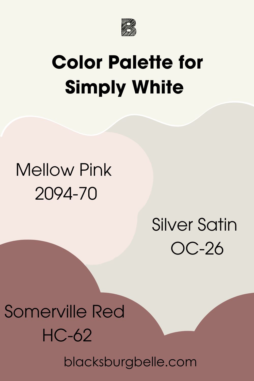
Mellow Pink, Silver Satin, and Somerville Red are some colors that match well with Simply White. These colors leave the door open to add other colors but don’t overdo it to avoid chaos.
- Mellow Pink 2094-70: A mixture of pink and gray that creates beauty and adds softness to your decor with Simply White
- Silver Satin OC-26: A white paint color with hints of lavender-gray for some coolness in your decor
- Somerville Red HC-62: Add some contrast to a room with a combination of this dusty wine red and Simply White
Color Palette for BM White Dove
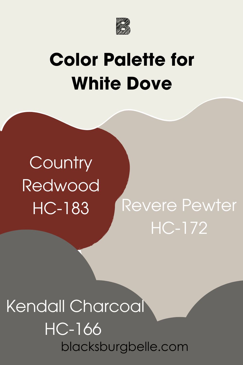
Country Redwood, Revere Pewter, and Kendall Charcoal make good colors for this palette. As with Simply White, this is only a guide in the right direction to pick appropriate colors to match White Dove when decorating.
- Country Redwood HC-183: Burgundy paint color with a hint of orange that brings an earthiness to the decor and contrasts with White Dove
- Revere Pewter HC-172: This is a neutral paint color that balances warm and cool tones, so it works well with White Dove
- Kendall Charcoal HC-166: A dark gray paint color with rich undertones that pair well with different colors, including White Dove
Benjamin Moore Simply White vs White Dove on Cabinets
Cabinets look amazing when painted white, whether it is warm or cool white. So, what do Simply White and White Dove look like on cabinets? I’m excited to show you!
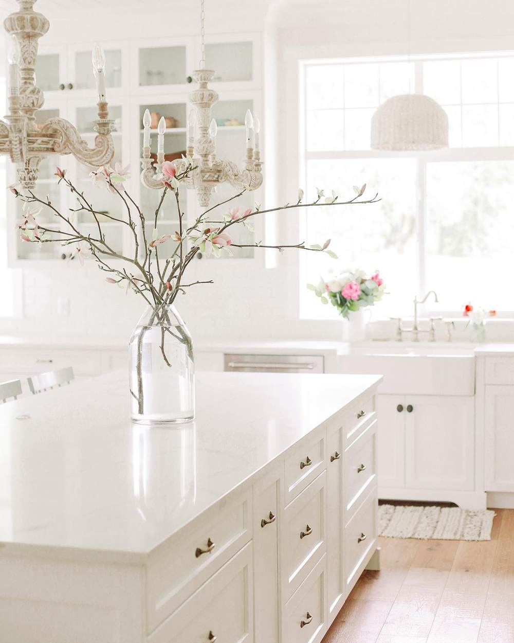
BM Simply White on Cabinets
Simply White looks almost pure white in this beautiful kitchen. It is as if it has no undertones or warmth in it. Remember I said colors can change in different rooms? This is one proof of it.
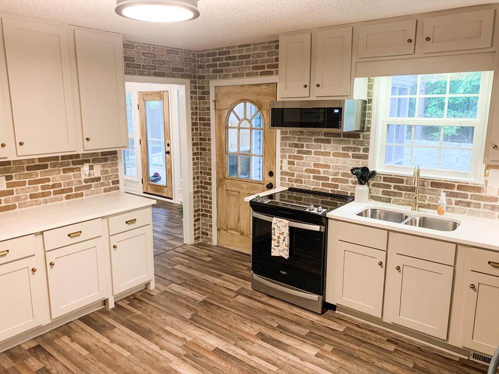
BM White Dove on Cabinets
On the flip side, White Dove looks amazingly warm and deeper than it usually appears. But I can tell you that it is mostly because of the warm artificial lighting.
Benjamin Moore Simply White vs White Dove on Doors
White doors are also as classic as white cabinets. And the best part is that you can paint them any shade of white and use different colors for the trim. Let me show you doors painted in Simply White and White Dove
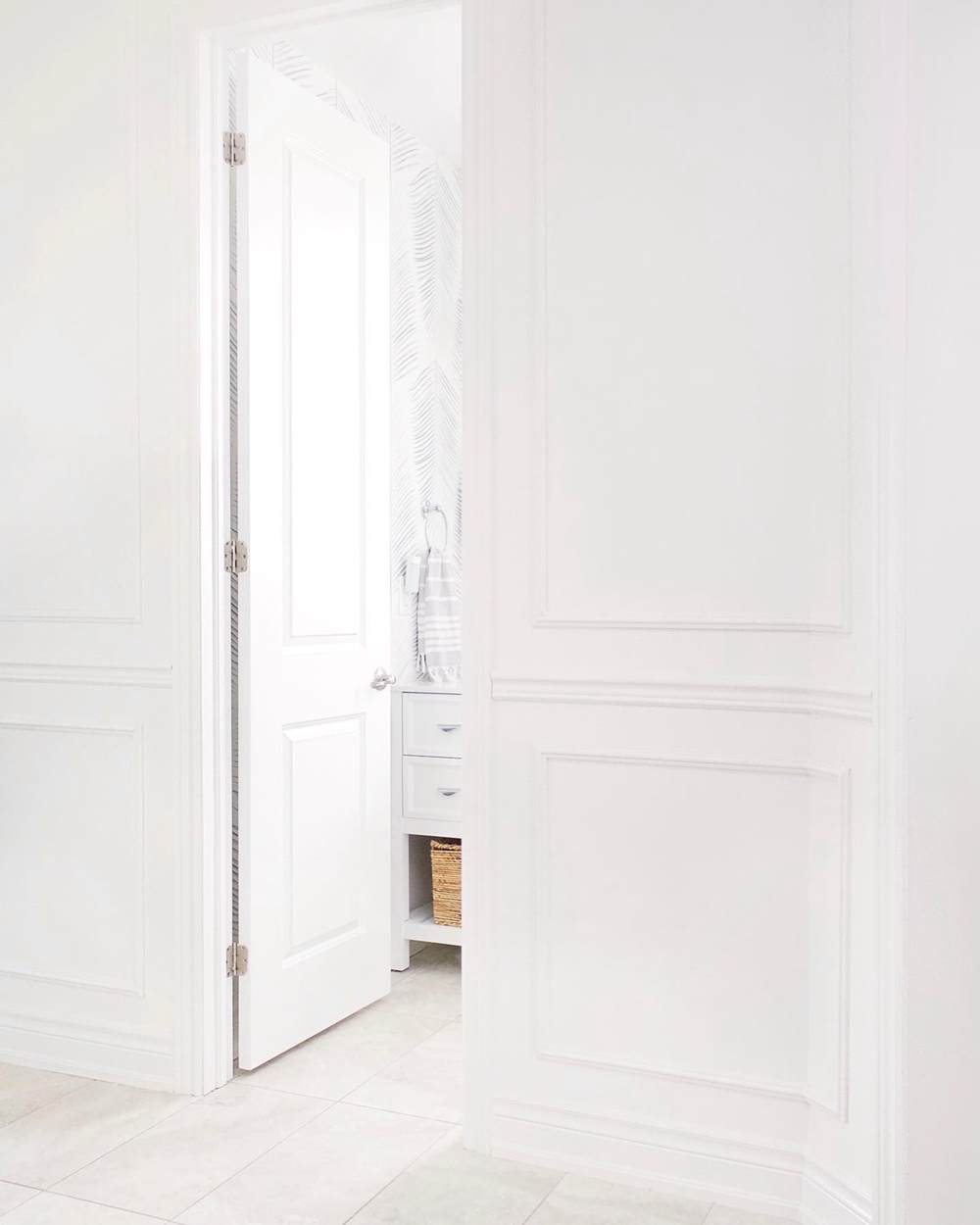
BM Simply White on Doors
This paint color looks like a true white color in this picture. It is such beautiful decor that I want to try it. Who doesn’t like pristine and serene?
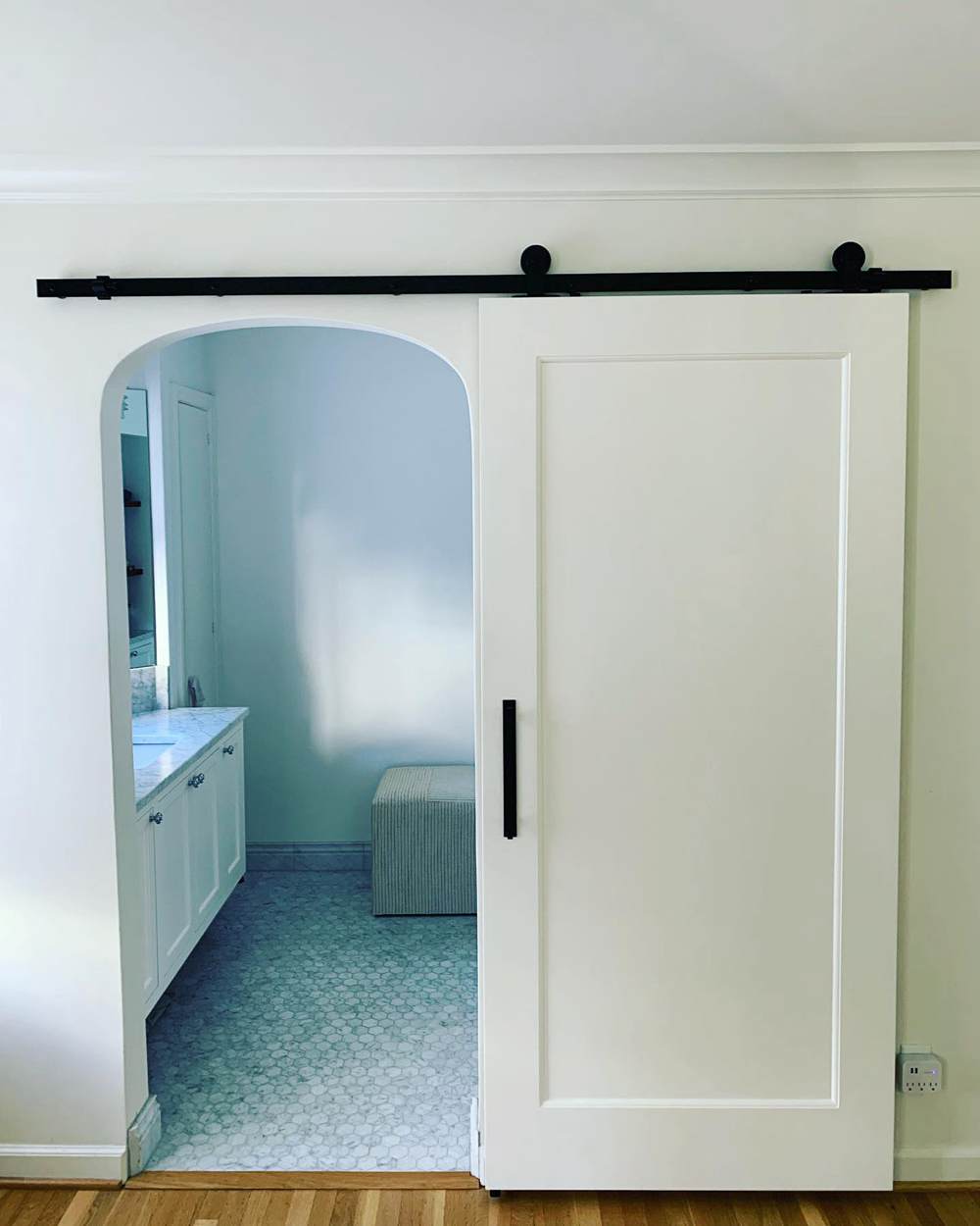
BM White Dove on Doors
Now, here is White Dove looking warmer and creamier than Simply White. It is still a beautiful color to try on doors and trim.
Benjamin Moore Simply White vs White Dove on Exterior Walls
While they are bright paint colors, Simple White and White Dove still perform well on exterior walls. But just how well do they perform? Let’s find out.
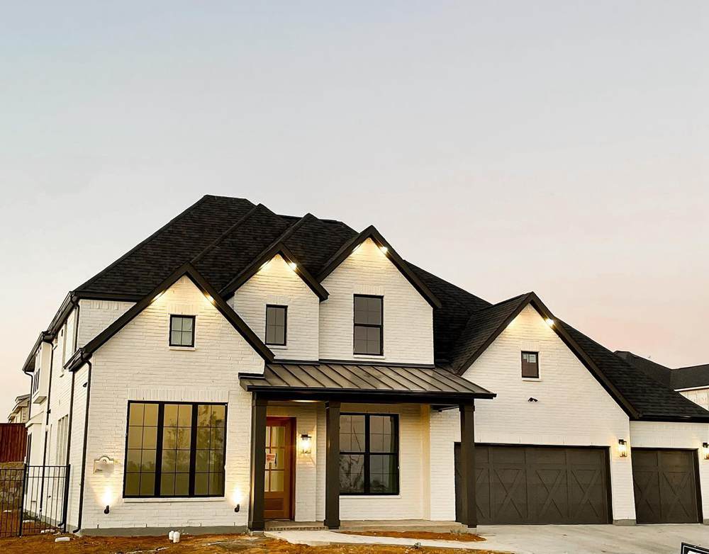
BM Simply White on Exterior Walls
This gorgeous house is done in Simply White. The black roofing is such a stunning complement to the color.
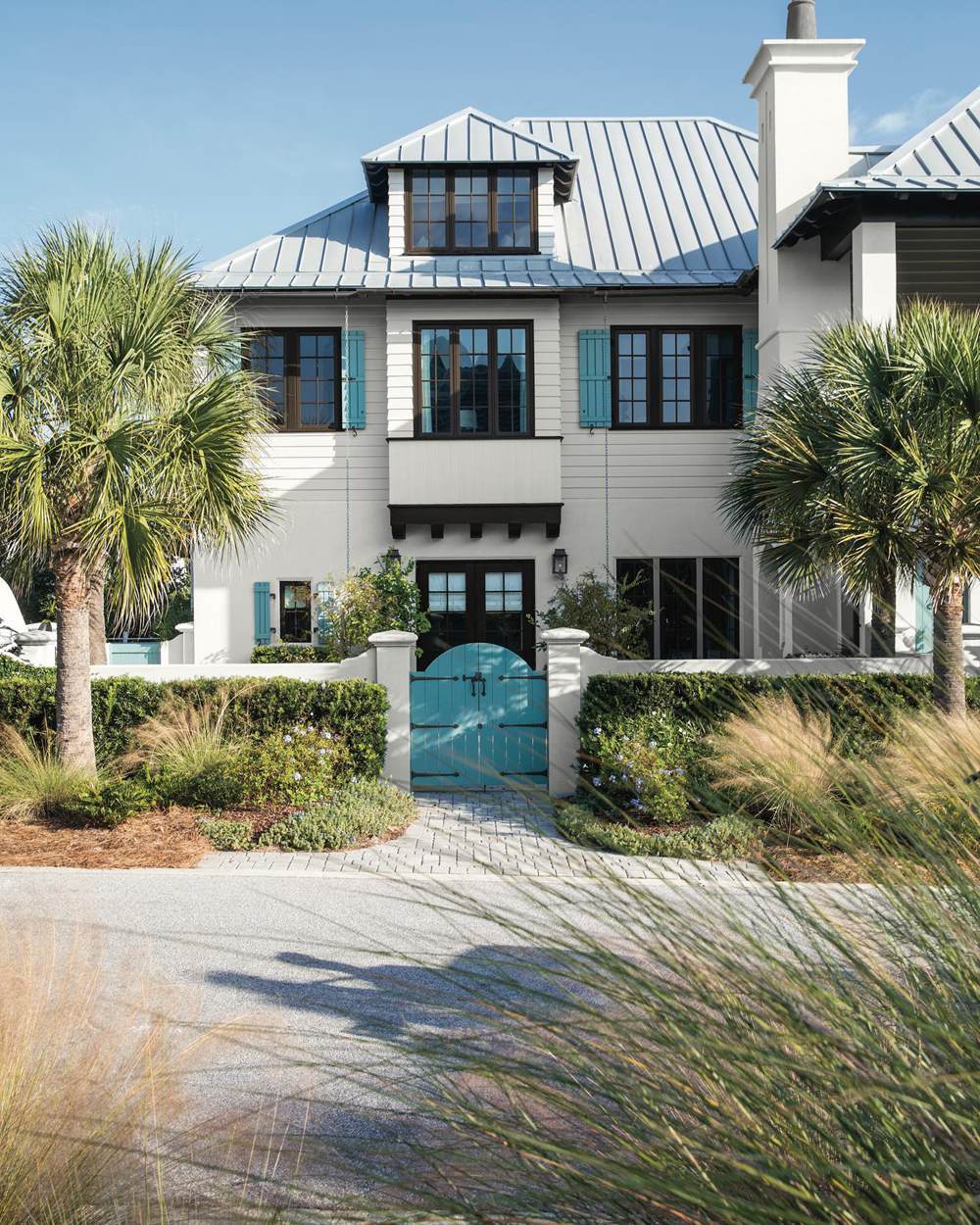
BM White Dove on Exterior Walls
And here is White Dove looking slightly creamy and bright in the sunlight. The shadows don’t deem the color.
Benjamin Moore Simply White vs White Dove on Interior Walls
Let me show you what these white paint colors look like on interior walls. After all, you may be more concerned about that than any other place.
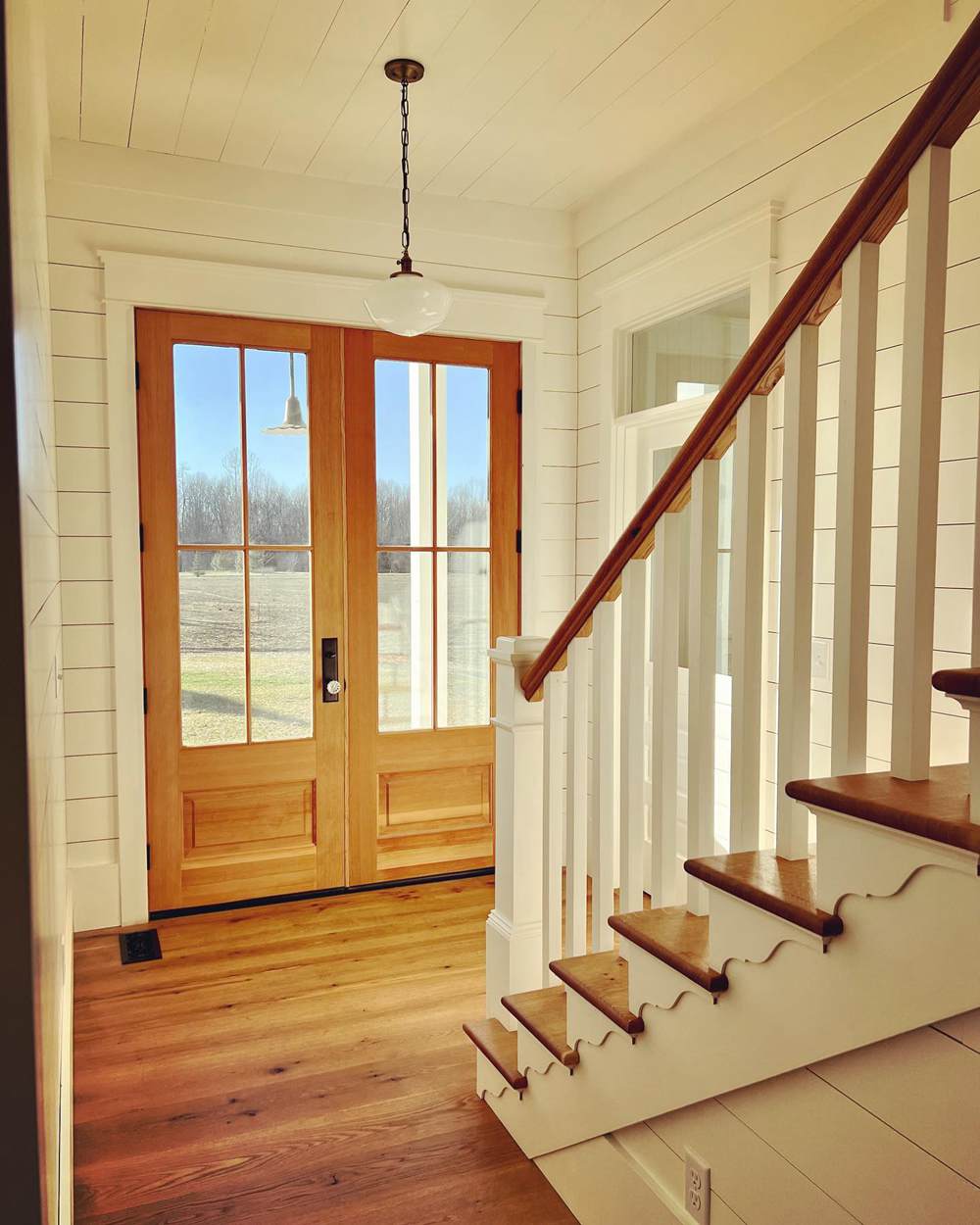
BM Simply White on Interior Walls
This entryway is beautiful and welcoming because of the warmth from Simply White. The wood tones accentuate it, giving a warmer tone.
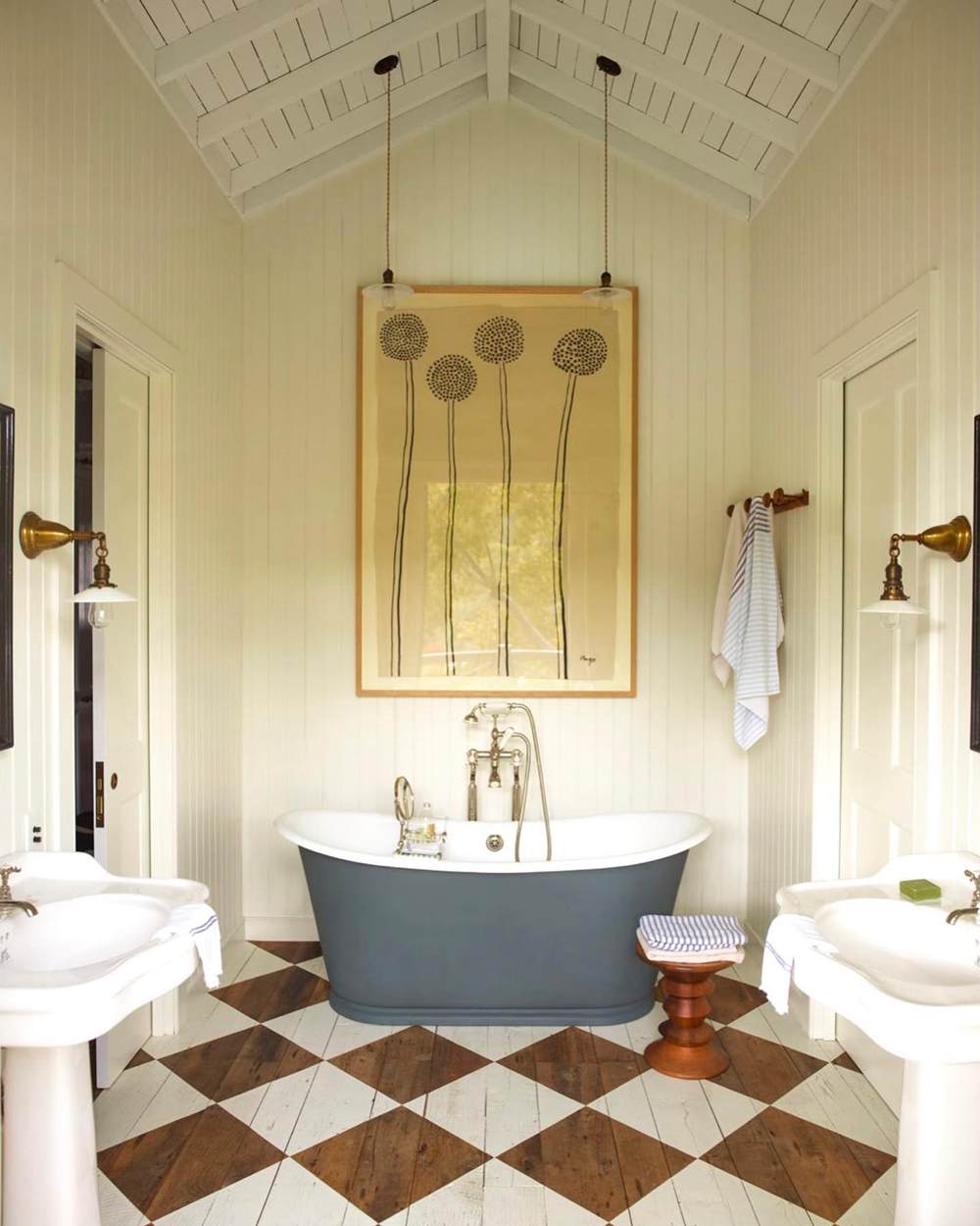
BM White Dove on Interior Walls
And White Dove also looks warm and inviting in this bathroom. While it appears to be in shadows, the clear shade and warmth of the color are undeniable.
Benjamin Moore Simply White vs White Dove with Various Colors
I always like to show how colors respond to other colors when used in a particular room. This is especially necessary when the main color is white or another light shade. Some colors are quick to pick up vibrant hues, making them change their colors in certain lighting.
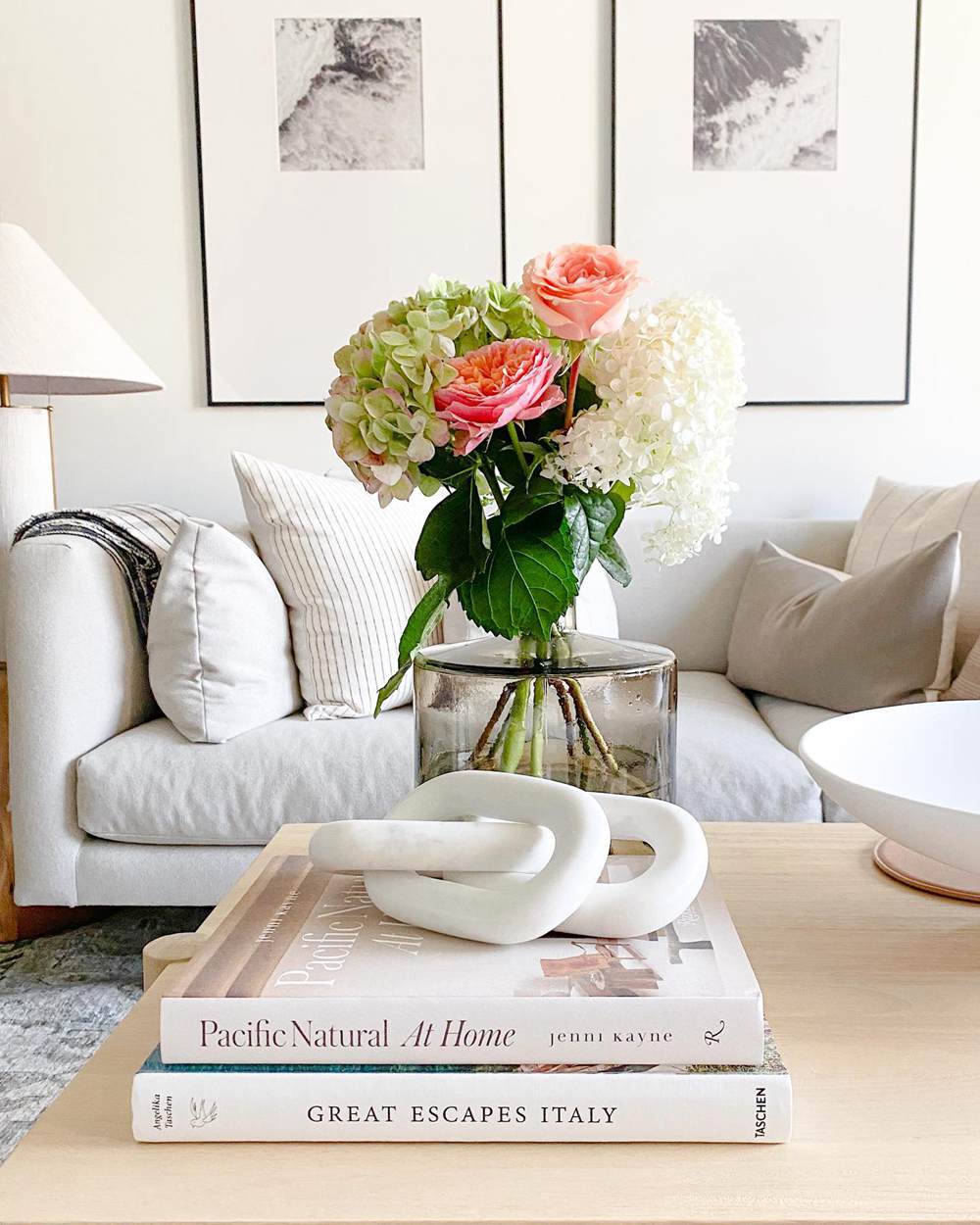
BM Simply White with Various Colors
The colors are not excessive but are vibrant enough to draw attention. This is Simply White as a backdrop for flowers with different colors.
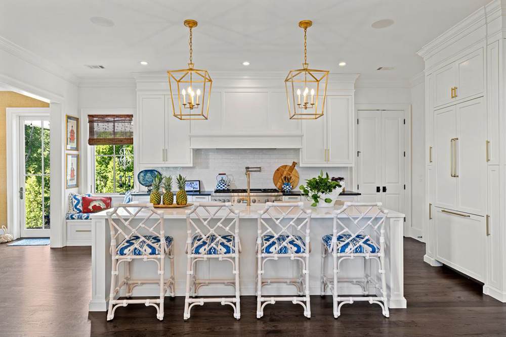
BM White Dove with Various Colors
Wondering what White Dove will look like with other colors? This kitchen has many vibrant hues, but White Dove does not seem to pick them.
Benjamin Moore Simply White vs White Dove Under Natural Lighting
These white paint colors can change under different lighting conditions. In the next couple of pictures, you will see how bright and white they appear.
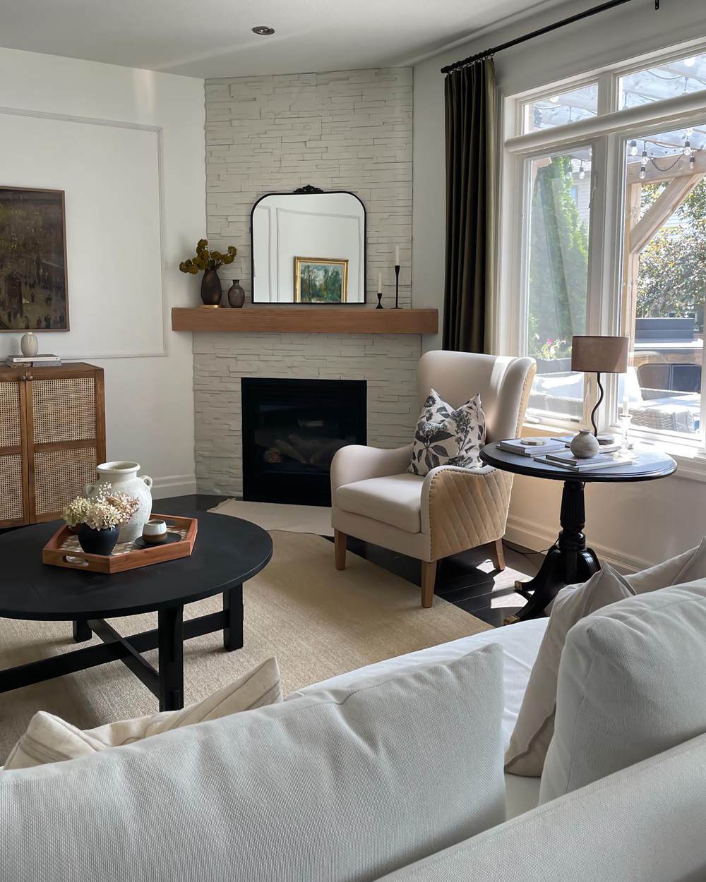
BM Simply White Under Natural Lighting
Simply White still looks slightly warm, but the light from the window makes it look very bright. It helps that it has a high LRV.
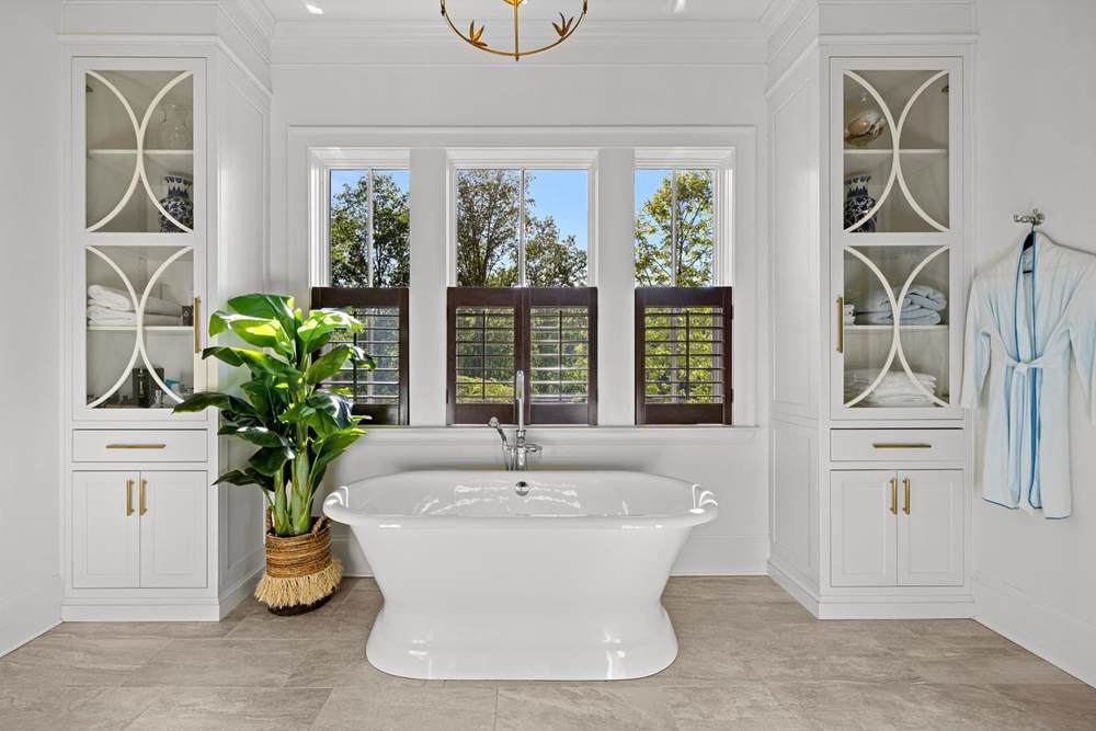
BM White Dove Under Natural Lighting
White Dove looks even brighter in this bathroom, although it has a lower LRV than Simply White. This may be because of the specific elements around it.
Benjamin Moore Simply White vs White Dove Under Artificial Lighting
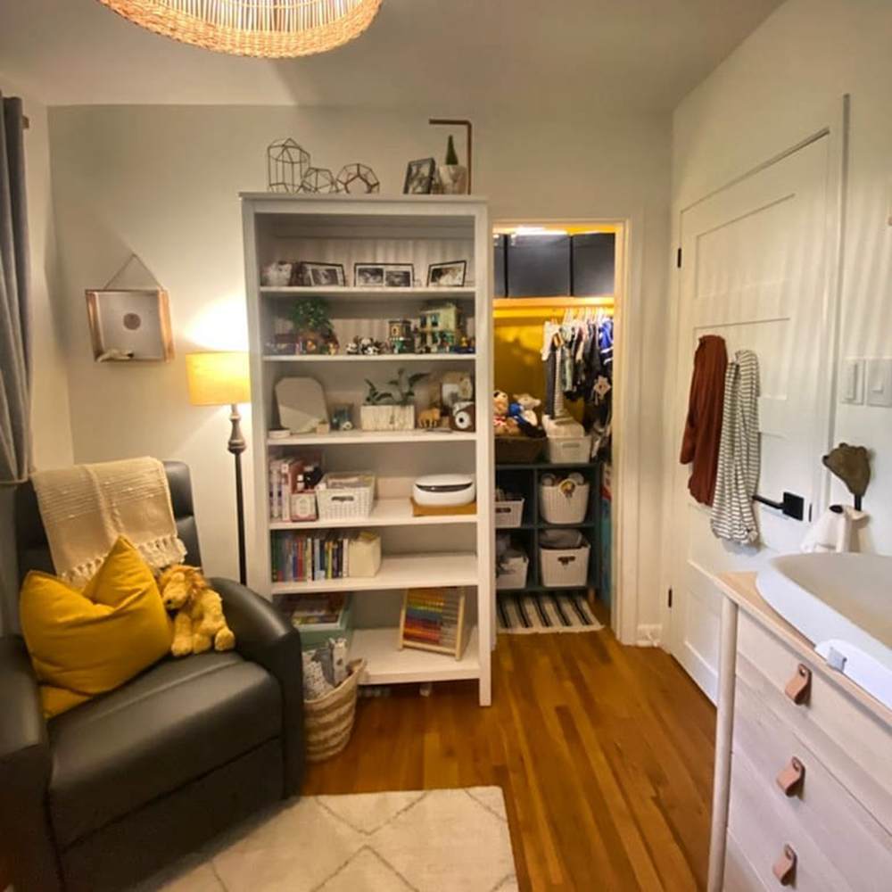
There is usually a difference between paint colors under natural and artificial lighting, whether or not they are bright. If you plan to use either of these white paint colors in a room without enough natural light, you may want to see them in artificial lighting.
BM Simply White Under Artificial Lighting
This room has good lighting, and Simply White seems to hold up well despite the shadows. It doesn’t look too warm or too bright.
BM White Dove Under Artificial Lighting
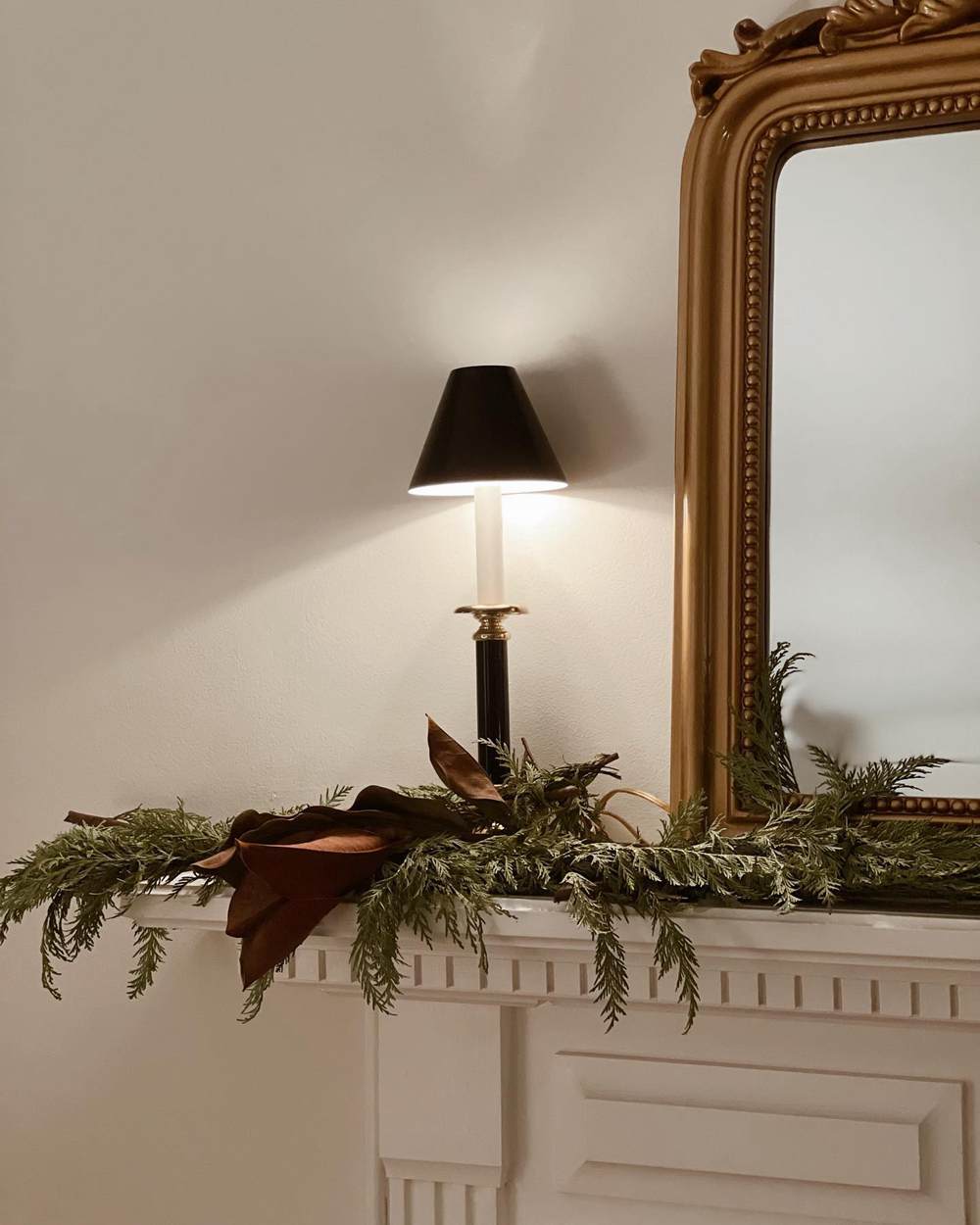
White Dove looks more cream than white in this next picture. It may be because of the shadows, but it shows some warmth and a touch of creaminess.
Lighting Conditions
Every room or space has a specific exposure that determines the light that filters into it. The exposures follow the cardinal directions: north, south, east, and west.
Rooms with northern exposure have no direct sunlight. So, they usually have cold light, which means they need warm colors to cheer them. Rooms with southern exposure have an abundance of direct sunlight. Warm colors also work, but you may want to add some cool tones for a good balance.
Rooms with western exposure have cold light in the mornings and warm light in the evenings. And rooms with eastern exposures have warm light in the mornings and cold light in the evenings. These rooms can flow with any tone – warm or cool – but it is always best to keep things warm.
Artificial lighting can also make or mar the paint color you choose. That is why I carefully picked pictures that show how these may work in your decor. The bottom line is to remember the lighting conditions in any room where you plan to use Simply White or White Dove.
Conclusion
This guide unpacks the details of Benjamin Moore Simply White vs White Dove, comparing them to show you the differences and similarities. If you have been torn between these white paint colors, follow this guide to see how each one works.
You will also find the undertones of Simply White, which are yellow-green, and those of White Dove, which are gray-yellow. Use Simply White for warm color schemes and White Dove for cool or warm color schemes.
Do you have further questions or insight into these colors? Have you used them and want to share pictures with me? I look forward to hearing from you in the comments section.

