
Do you know how people say you can never get it wrong when you use white paint colors? Well, you can if you pick colors and add a white paint color with clashing undertones. That is unless you choose a balanced white like Sherwin Williams Alabaster SW 7008.
If you are in the market for a bright white paint color that doesn’t sacrifice color or warmth, you have it in Alabaster. It is one of the most popular and well-used paint colors from the white and off-white collections from Sherwin-Williams.
And I want to take you on a journey of discovery to know all about this paint color. Whether you want a perfect base or neutral for other colors in your decor, Alabaster is the way to go. The best part of it all? It is far from boring! Let’s get right to it without further ado.
Table of Contents
When to Choose Alabaster SW 7008
I know you are eager to learn all there is to know about Alabaster, and we are all in this together. But there is a crucial aspect that ties everything together and gets you rolling. And that aspect is the best time and place to use this paint color. After all, that is why you’re here.
Looking for a perfect living room color?
Alabaster looks amazing in the living room because of its warmth and hint of color. It can work as a standalone color or blend with other colors.
Do you need a neutral?
While it is typically an off-white paint color, Alabaster balances warm and cool tones in many cases. So, you don’t have to worry about clashing colors.
Ideal trim color?
Alabaster is one of the best colors to use on trim because of its versatility and neutrality.
Do cabinets need a touch-up?
Sometimes, you want to switch things up in your kitchen, especially when you are tired of the paint color. One of the places to start is the cabinets, and Alabaster can completely change the look and feel of the kitchen just by being on the cabinets.
There are many sides to Alabaster, and that is why I’m excited to show more about this beautiful color. Let’s go on to find out more about it.
What Color Is Alabaster?
Specific names for paint colors are not randomly selected. Brands deliberately look for these names, and they are usually associated with something real or natural. And that is the case for Alabaster.
Alabaster is a naturally-occurring mineral in the form of a rock or stone. It has a peculiarly beautiful shade of white and is popularly used for carving sculptures and in construction work for many centuries.
This rock can occur in many forms or be designed in many ways. But here is a real picture of what the real alabaster may look like when it is mined.
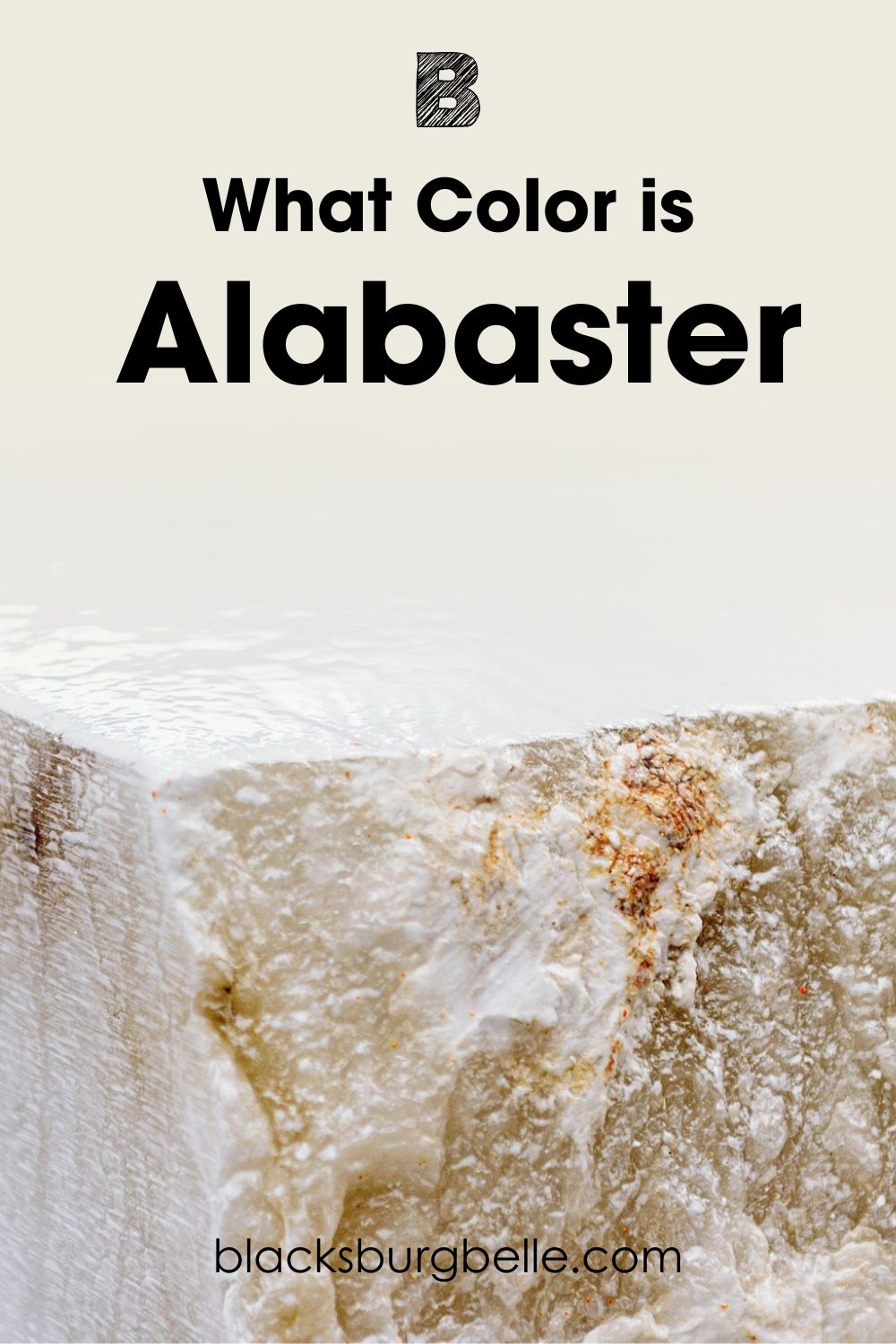
This is a pretty clear representation of what the real alabaster color should be. So, you can understand why Sherwin Williams picked this name for it.Alabaster SW 7008 is a bright off-white paint color with warm undertones. It is a trustworthy color that wraps everything in warmth and coziness while exuding a glow that makes up for any deficiency. Like the alabaster stone, the paint color can show some complexity, but I will get to that later.
A Snapshot of the Specifications of Sherwin Williams Alabaster
I know many paint colors look just about the same as Alabaster. However, none is the same; Alabaster is in a world of its own. So, I created a chart detailing the specifications of the paint color for better and easier reference.
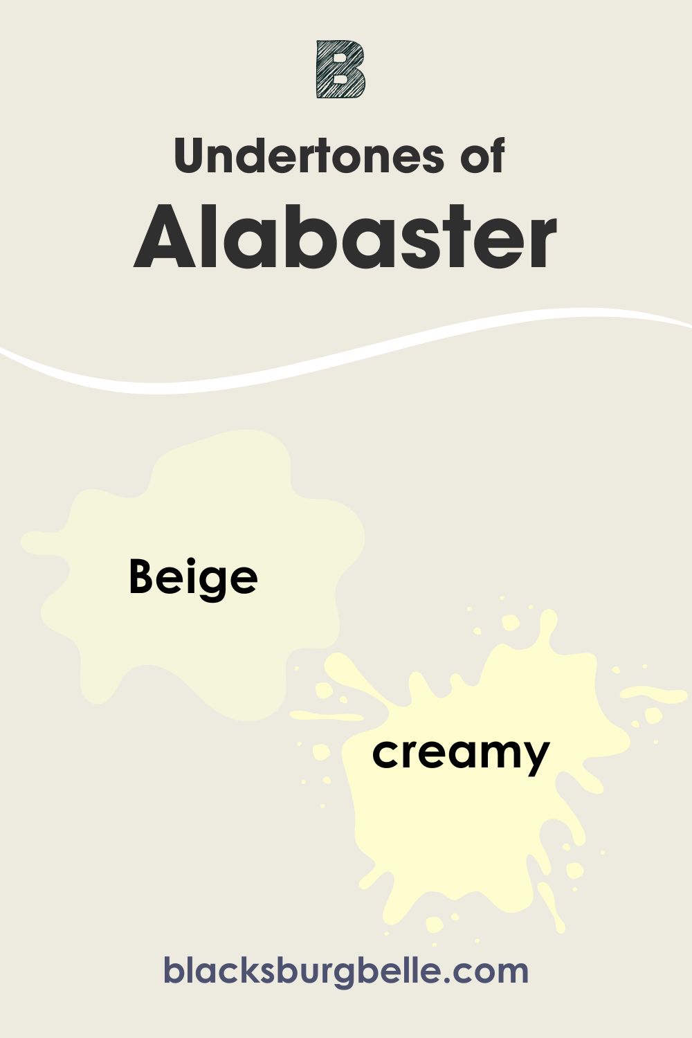
| Alabaster SW 7008 | |
| RGB | 237, 234, 224 |
| LRV | 82 |
| Undertones | Beige |
| HEX Code | #EDEAE0 |
Sherwin Williams Alabaster: Looking at the LRV
You are not alone if you have never heard of LRV. It is not a common term unless you are in the world of paint colors. However, it means light reflectance value and is a term that refers to the brightness of color, and it uses a scale that goes from 0 to 100.
Truly black colors have an LRV of 0, while truly white colors are 100. Since there are no pure blacks or whites in the paint color world, we typically use the range of 2.5 to 94 to measure the brightness of paint colors. This should explain how bright the color under review is.
Alabaster has an LRV of 82, as the chart above shows. This is a pretty high value and places the paint color in the family of bright whites. However, it is not high enough to be a pure or true white, like High Reflective White or Chantilly Lace. You can classify it as an off-white.
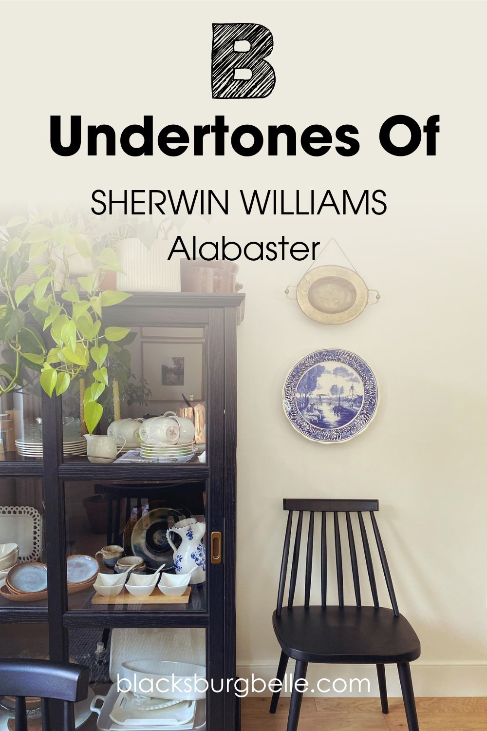
Sherwin Williams Alabaster: Examining the Undertones
The undertones of any paint color are probably the most vital aspect. They determine the tone and what other colors work well with the primary hue. The same is true of Alabaster and even more important because of how complex it is.
Typically, Alabaster has beige undertones. When used alone, it may appear only subtly creamy and bright. But when paired with a truly bright and pure white, it has slightly creamy yellow undertones or may look beige. At other times, the undertones appear greige. Complex, right?
These are characteristics that make it neutral and versatile. But don’t take my word for it. Let me show you a picture of Alabaster at work so you can decide for yourself. See how much beige and warmth it shows? It’s amazing!
This picture has good lighting, and I deliberately picked it to show you that Alabaster is a truly warm and off-white paint color. However, I would also like you to know that the lighting does not always mean that the color will turn out this way. The surrounding elements and other colors can also change its appearance. Moreover, user perception is crucial.
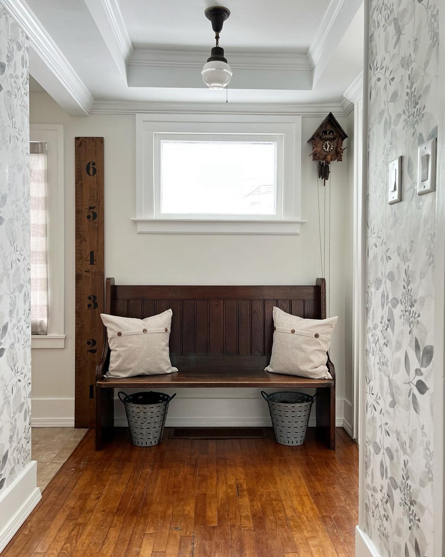
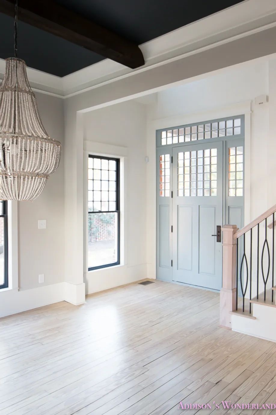
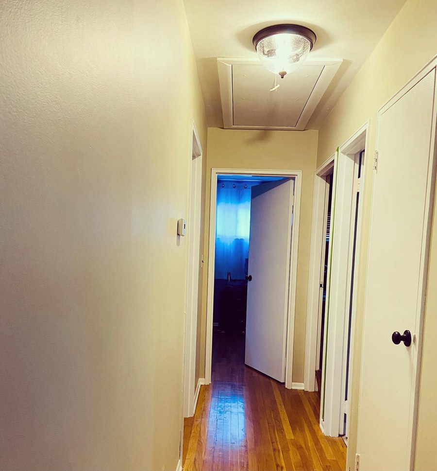
Does Alabaster Change in Different Rooms?
As I already mentioned, Alabaster can take a different hue in different settings. This depends on the specific decor and color scheme in any room, including the lighting. For example, the paint color looks pretty different and gray in this entryway picture:
But in this next room, Alabaster looks more like light beige than an actual white paint color:
Will Alabaster Appear Yellow in a Room?
Because of its warm undertones, it is not strange for you to wonder whether or not Alabaster will appear too yellow. I also had the same concerns when I first encountered the color, and my conclusion is that Alabaster never looks yellow in a room.
Like the picture above, the most you will get with the paint color is a soft beige hue. It exudes a lot of warmth when there is bright natural lighting, but nothing that pushes it toward an obvious yellow hue.
However, color depends on perception. While I don’t see yellow, you may see a hint of it. This is especially true if you use it with a classic cool white, which will expose its warm undertones. Also, the colors around it may contribute to making it look a little yellow.
Does Lighting Play a Role?
Every paint color responds to light, some more than others. Alabaster may not change much with lighting, but it still has an effect. While it is a warm color, it can show traces of coolness if the lighting reveals the gray hue in it.
If you want obvious warmth, bright natural lighting may be your best bet in making this happen. Artificial white light may tone down the warmth a bit, but artificial yellow light may switch up the warmth. Muted cold light may only make it appear cooler than it usually is.
This is Alabaster under bright artificial white lights:
And here is the same Alabaster under yellow artificial lights:
Is Sherwin Williams Alabaster Warm or Cool?
Alabaster SW 7008 is a warm off-white paint color, which makes it ideal for warm color schemes. But sometimes, you can find that the paint color exhibits some neutrality that makes it perfect for different color schemes.
Nevertheless, it is perfect for any decor that needs a backdrop of warm white to complete its look. It makes a room inviting, comforting, and a haven when used.
What Paint Colors Are the Same as or Similar to Sherwin Williams Alabaster?
No two paint colors are the same; that is the beauty of colors. That is why Alabaster stands alone in its world. You will not find another color that is the same as it is. However, some colors are pretty similar, and I will list some of them below:
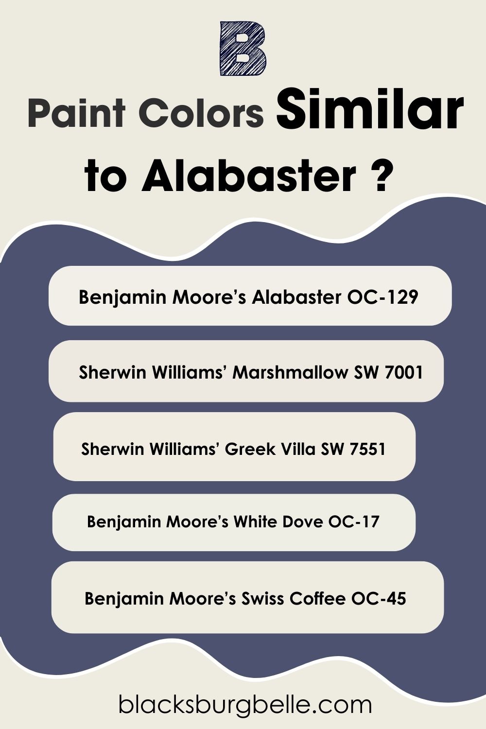
- Benjamin Moore’s Alabaster OC-129
- Sherwin Williams’ Marshmallow SW 7001
- Sherwin Williams’ Greek Villa SW 7551
- Benjamin Moore’s White Dove OC-17
- Benjamin Moore’s Swiss Coffee OC-45
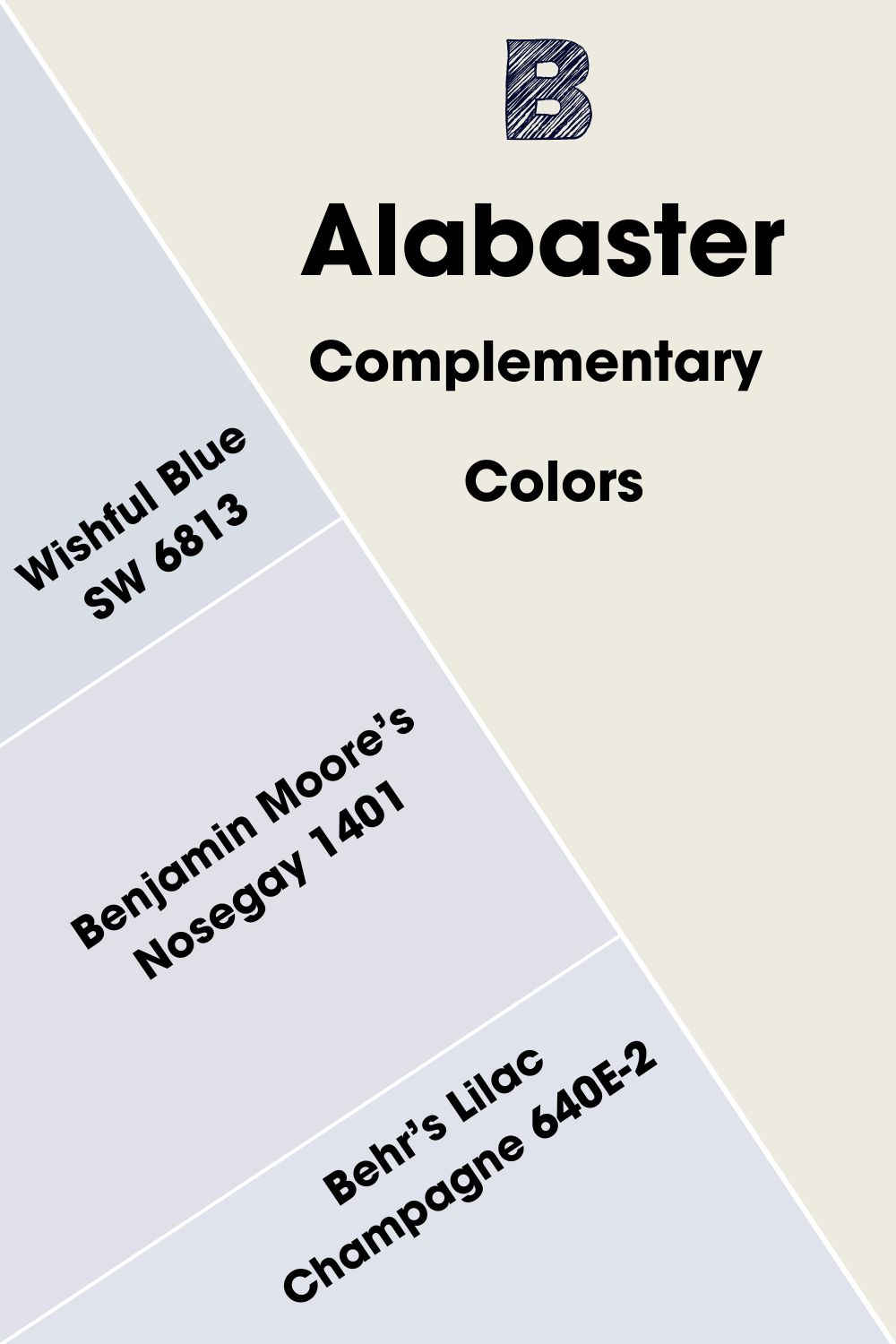
Sherwin Williams Alabaster Complementary Colors
Complementary colors are opposite each other on the color wheel. They don’t have to match; simply check which colors sit opposite each other on the wheel. They typically cancel each other out to create black or white.
Common complementary colors include violet and teal, purple and yellow, red and green, and blue and orange. These pairs may look off, but they are handy in creating striking visual art and graphics that send specific messages or fulfill a need.
The complementary color is a light cyan blue, and the closest to it from Sherwin Williams is Wishful Blue SW 6813. You can also try Benjamin Moore’s Nosegay 1401 or Behr’s Lilac Champagne 640E-2.
Sherwin Williams Alabaster Coordinating Colors
Coordinating colors are those that blend well with each other in a given color scheme. They are usually alike in hue or may have similar undertones. That way, they can create a smooth flow of colors in your decor without clashing.
So, what are the best-coordinating colors for Sherwin Williams Alabaster? Because of its nature, Alabaster has several coordinating colors, but I’ve picked three of them to guide you in choosing.
- Sherwin Williams Cocoa Whip SW 9084: It is a deep shade of brown with a hint of orange and enough warmth to work with Alabaster. Its deep color makes it perfect to blend with Alabaster for the trim.
- Sherwin Williams Pink Shadow SW 0070: A dusty blush pink color with a touch of red that brings softness and beauty when used with Alabaster, especially because it is also warm.
- Sherwin Williams Jadite SW 6459: Move away from the norm by using this dark green paint color on the accent and Alabaster on the trim or other walls for striking results.
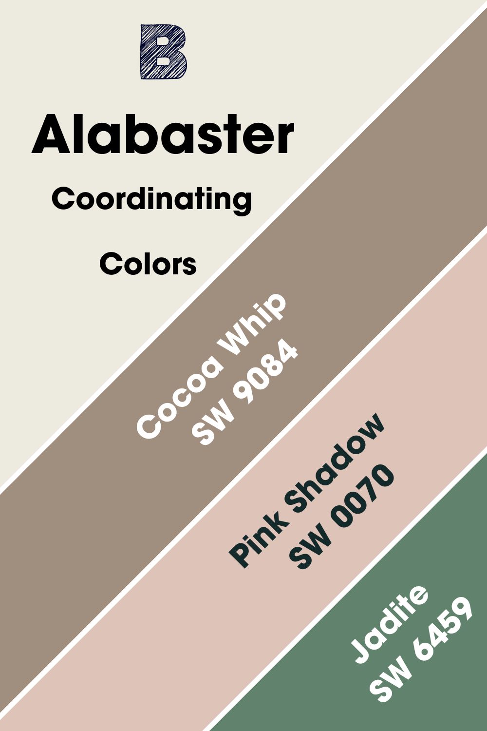
The colors you choose should make the decor flow instead of seeing clashing colors. You don’t have to go way out of your comfort zone; keep it simple and you will be glad you did.
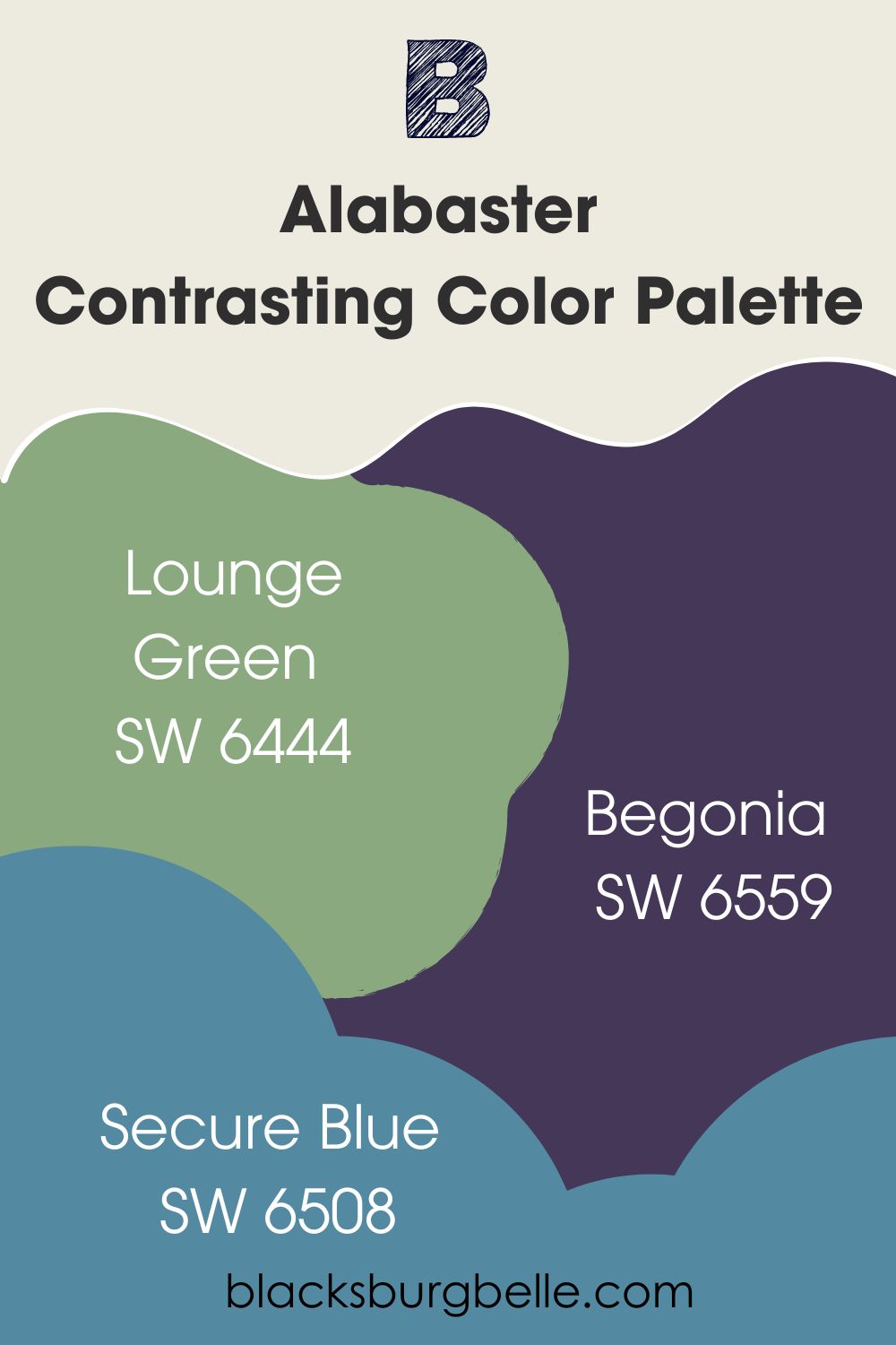
Sherwin Williams Alabaster Color Palettes
Since it is a pretty versatile color, Alabaster can make the perfect backdrop for many other colors, including vibrant ones. So, I’m going to create different palettes that work excellently with Alabaster to get you started.
Contrasting Color Palette
- Lounge Green SW 6444: It is a medium green that has a hint of yellow and warms up a space like Alabaster
- Begonia SW 6559: A muted shade of rose with a touch of red that directly contrasts Alabaster and provides vibrance in a space
- Secure Blue SW 6508: This is blue with an aquamarine feel that slightly tones down the warmth of Alabaster without clashing with it
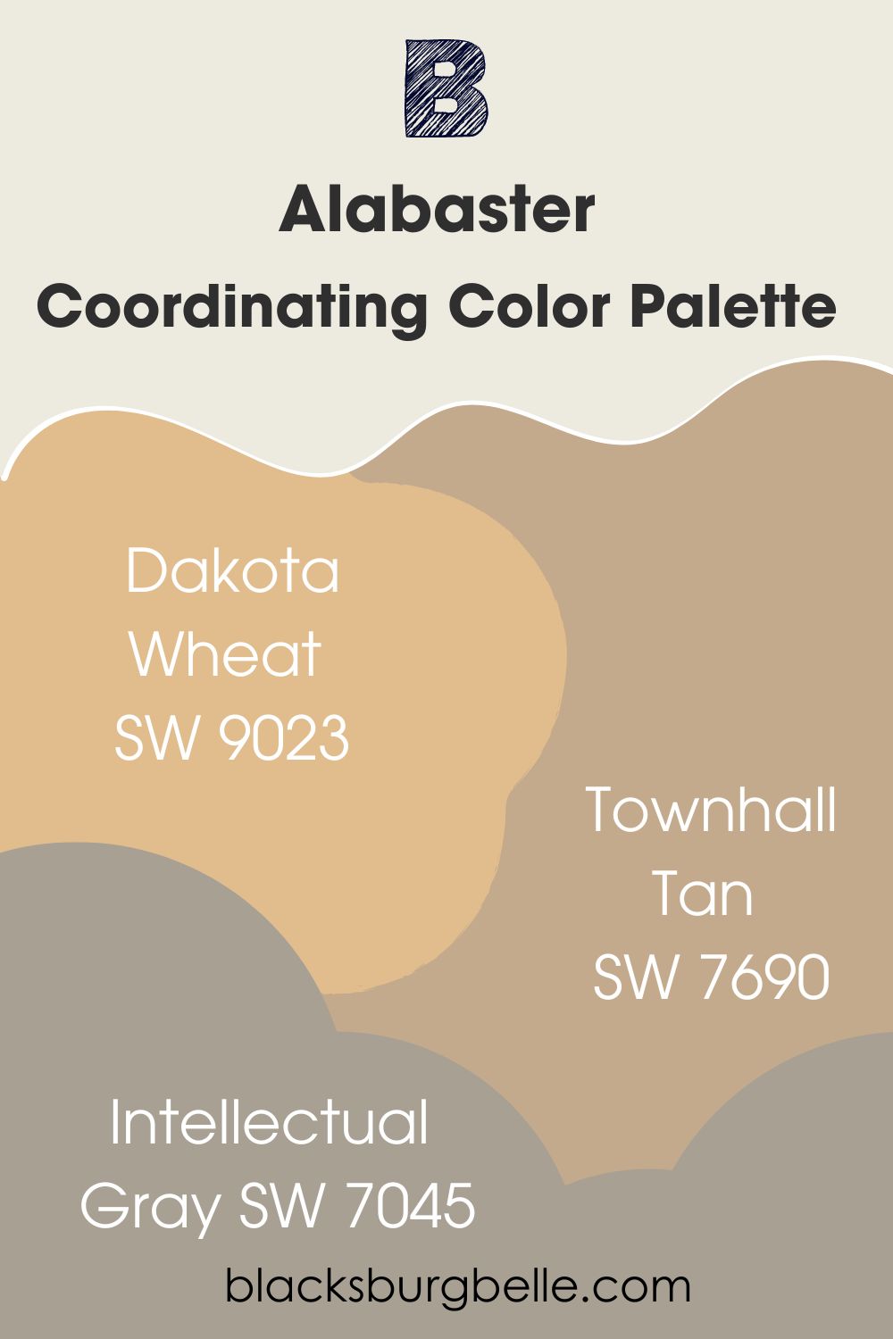
Coordinating Color Palette
- Dakota Wheat SW 9023: A wheat-hued paint color with enough warmth to stand alone but pairs well with Alabaster
- Townhall Tan SW 7690: It is close to Dakota Wheat in color but appears to have more depth, producing a similar result when paired with Alabaster
- Intellectual Gray SW 7045: A medium gray paint color with warm undertones that perfectly complement those of Alabaster
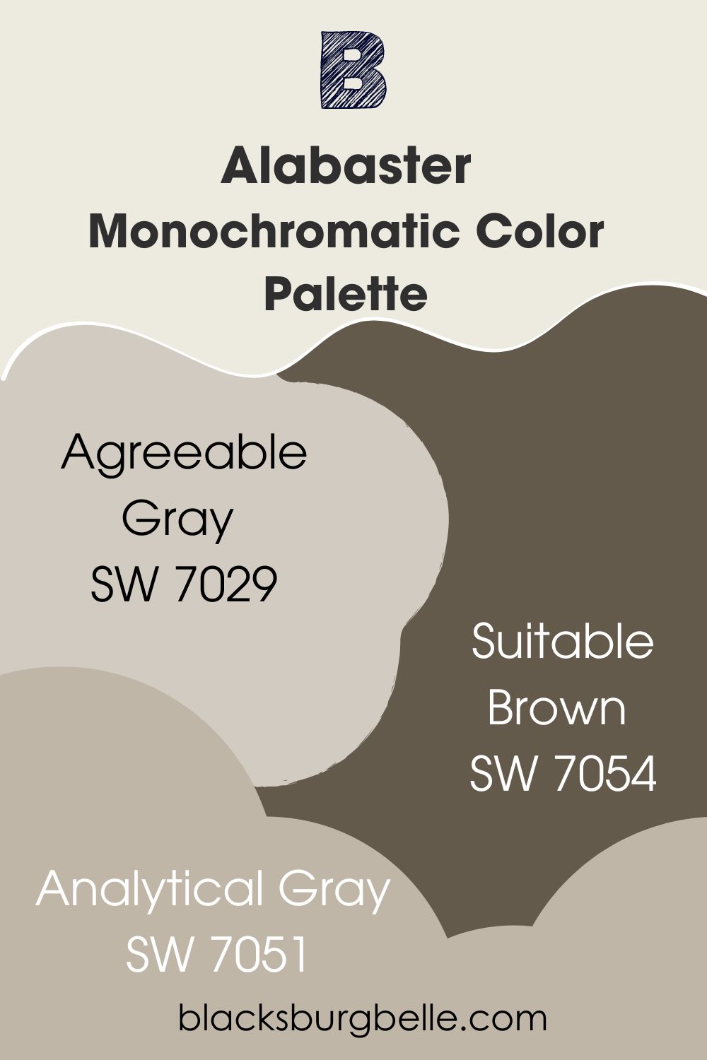
Monochromatic Color Palette
- Agreeable Gray SW 7029: A neutral that works well with everything and is loved by every color, including Alabaster
- Suitable Brown SW 7054: Also called Oak Leaf Brown, this paint color is deep and warm with earthy tones that are perfect for Alabaster tones
- Analytical Gray SW 7051: A warm stone gray with neutral tones that bring positive energy into any space
Sherwin Williams Alabaster vs Other Similar Paint Colors
How does Alabaster perform against other colors, especially similar ones? Let’s compare some of them to see how closely related or dissimilar they are.
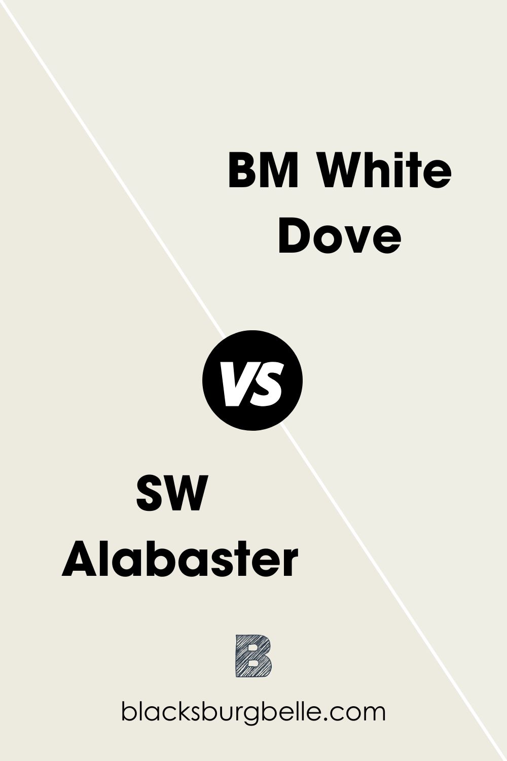
SW Alabaster vs BM White Dove
Sherwin Williams Alabaster is very similar to Benjamin Moore’s White Dove, but there are also differences. Where Alabaster has an LRV of 82, White Dove has an LRV of 83.16. Besides, Alabaster has beige undertones, while White Dove has yellow-green undertones.
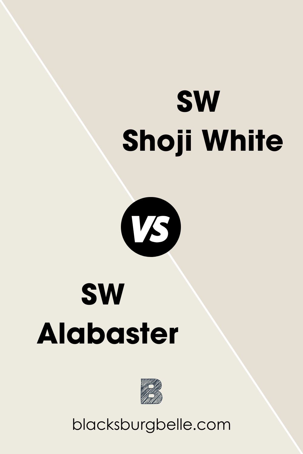
SW Shoji White vs SW Alabaster
Shoji White is not as bright as Alabaster, looking more greige or taupe than white. When paired with Alabaster, it appears muted and dark.
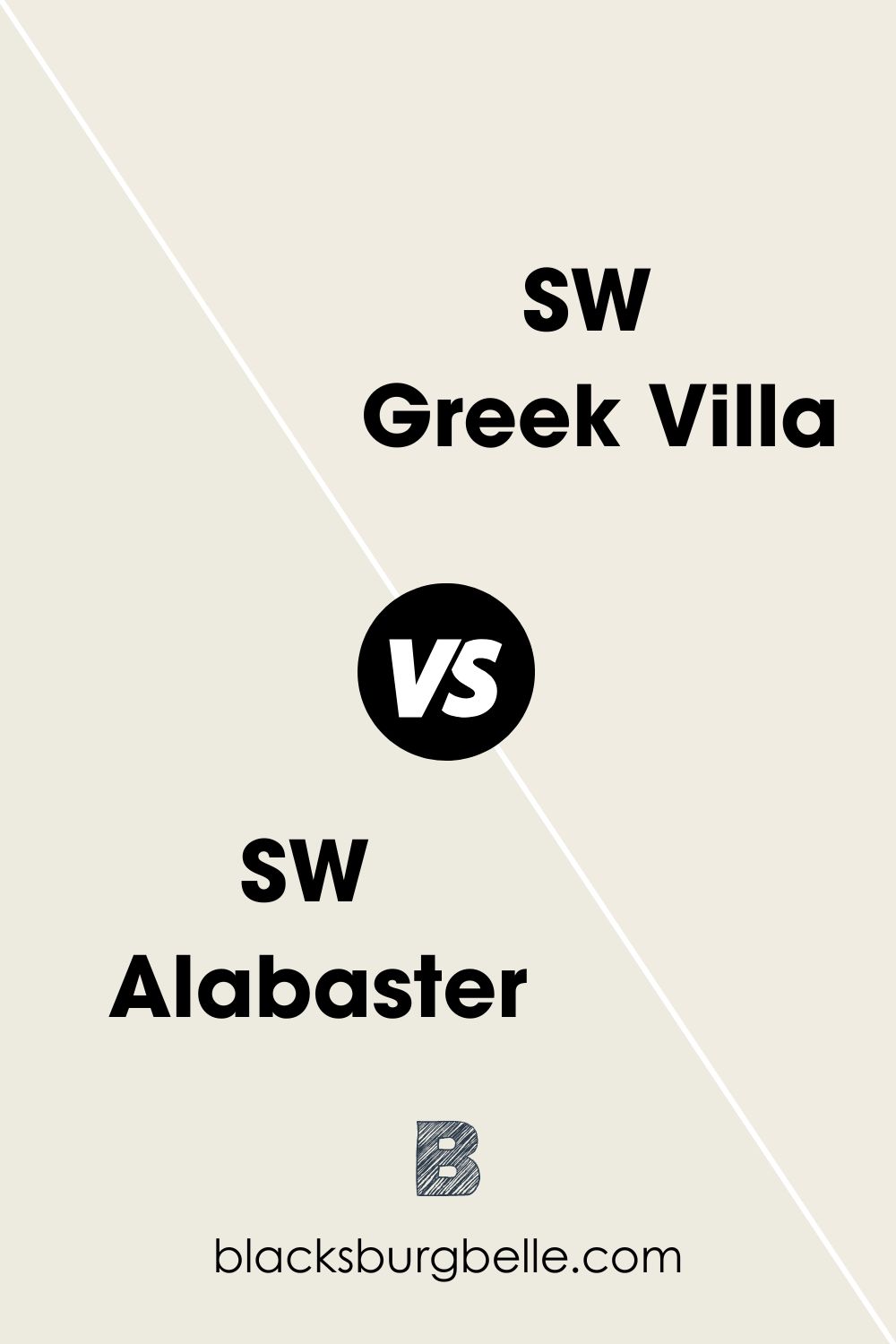
SW Greek Villa vs SW Alabaster
Both paint colors are creamy, warm, and cozy. But Greek Villa is brighter and reflects more light than Alabaster with an LRV of 84.
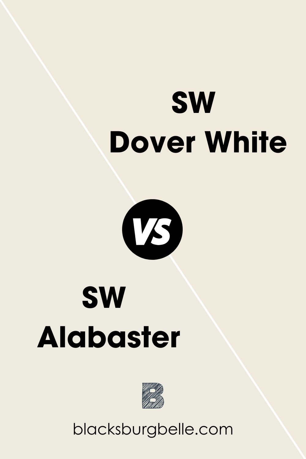
SW Alabaster vs SW Dover White
These two are also pretty similar except for their undertones and LRVs. Dover White is the brighter of the two, with an LRV of 83, and has more warmth because of its golden yellow undertones.
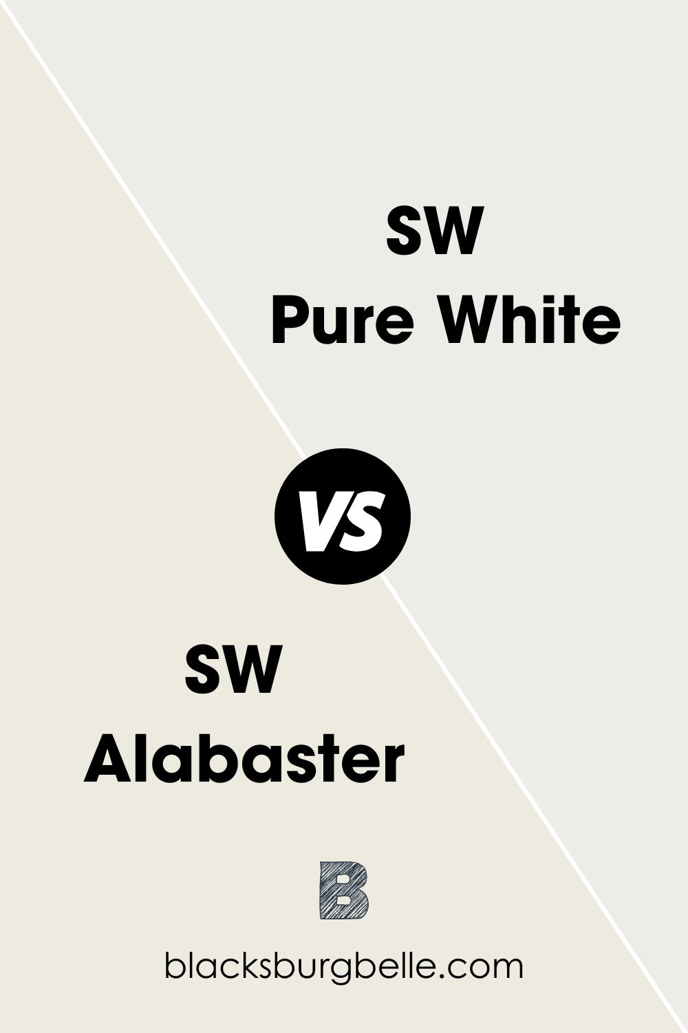
SW Alabaster vs SW Pure White
Pure White is brighter and less warm than Alabaster. It has an LRV of 84 with creamy undertones that are barely there.
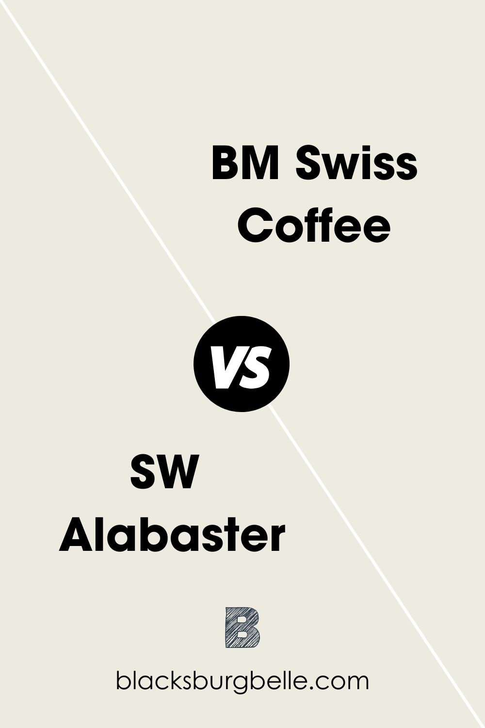
SW Alabaster vs BM Swiss Coffee
Swiss Coffee by Benjamin Moore is truly warm with yellow-beige undertones. Alabaster appears bright and white beside it because it has a lower LRV of 81.91.
SW Creamy vs SW Alabaster
You can confuse one for the other because they have almost the same undertones of beige. However, Alabaster is slightly brighter than Creamy and has a bit more gray in it.
SW Snowbound vs Sw Alabaster
Snowbound is brighter than Alabaster with an LRV of 83, although they are both warm whites. Moreover, it has reddish-pink undertones, whereas Alabaster has warm beige undertones.

SW Alabaster vs SW Westhighland White
Westhighland White is noticeably brighter than Alabaster with an LRV of 86 and has neutral tones. It can fit more colors and not show other hues better than Alabaster.
SW Oyster White vs SW Alabaster
Oyster White is the darker of the two paint colors. It also exudes more warmth than Alabaster in most settings.
SW Eider White vs SW Alabaster
Eider White has an LRV of 73, much lower than that of Alabaster. It is also less warm than Alabaster because it has gray undertones that make it appear cool.
SW Origami White vs SW Alabaster
Origami White looks more like light gray than white, and this may be because of its undertones. Because of this, it reads cooler in most rooms than Alabaster does.
Does Benjamin Moore Have an Equivalent of Sherwin Williams Alabaster?
Benjamin Moore has a white paint color named Alabaster. It has a code of OC-129 and looks almost the same as SW Alabaster.
But it has pink undertones and is not as warm as Alabaster by Sherwin Williams. More importantly, it is significantly less popular than its sibling from Sherwin Williams.
Where Can You Use Sherwin Williams Alabaster?
This is probably the best part of this guide because you get to see spaces and rooms where Alabaster works best. Before I show you pictures, I want to emphasize the need to use this paint color with other warm colors.
For example, if you use Alabaster on the trim, use a warm color on the wall, and vice versa. Otherwise, Alabaster may look too yellow or red, depending on the color paired with it. But when you pair it right, Alabaster may look whiter and brighter than it usually does.
Best Trim Color for SW Alabaster Walls
The best color for trim, if you paint your walls in SW Alabaster, is Sherwin Williams Pure White. It has similar undertones with Alabaster but is a brighter white. So, it will stand out without clashing with the wall color.
What Ceiling Color Goes with Alabaster Walls?
Most ceilings are white, so you can keep it simple and use Alabaster for both the walls and the ceiling. However, if that is outside your style, try to use a similar shade but with a brighter appearance. High Reflective White and Pure White are great for the ceiling.
And if you are bold and adventurous, try a deep and warm color instead of the usual white. Try a medium gray, dark brown, black, or navy. They are neutral and safe options that add something different and striking.
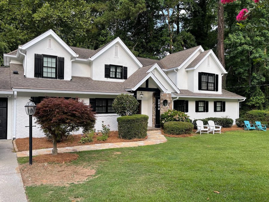
What Color Goes with SW Alabaster Exterior?
So, this house looks regal and sophisticated because of the combination of black and light colors. It combines SW Alabaster on the stucco, SW Extra White on the trim, and SW Tricorn Black on the windows.
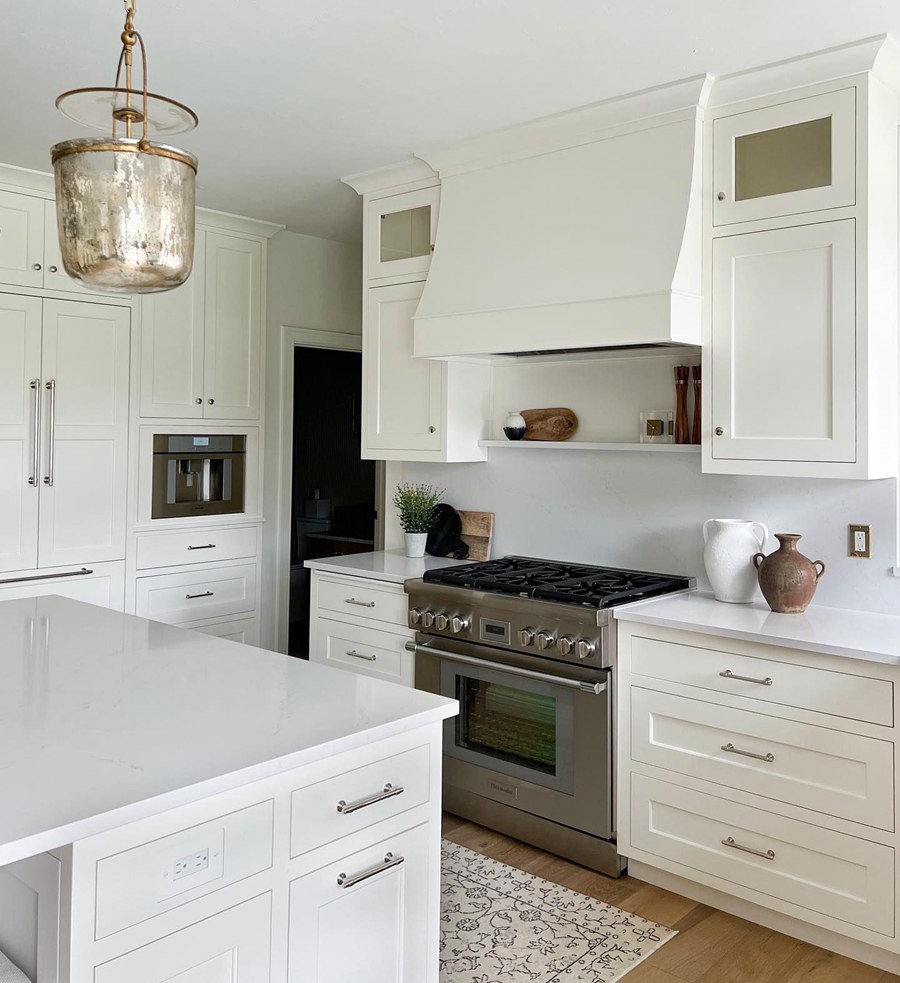
Sherwin Williams Alabaster on Kitchen Cabinets
Warm whites look great on kitchen cabinets, as the next picture will show you. However, you must pair it with a warm wall color, whether or not it is neutral.
Sherwin Williams Alabaster on Exteriors
You already know that white is a good color for exteriors, but how does Alabaster perform on exterior walls? Let’s take a quick look!

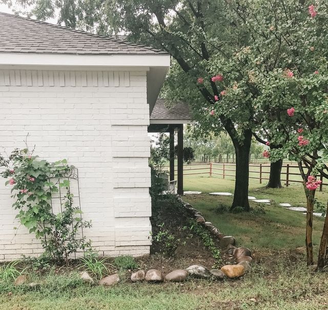
Sherwin Williams Alabaster on Exterior Brick
Does brick look good when painted with Alabaster? If you are thinking of going this route, you have come to the right place to see if it is a good choice.
Sherwin Williams Alabaster on Doors
Doors are often neglected, but when done right, they can change how much you like a room. After all, they are the first things you see before entering a house, room, or any space. How about Alabaster on doors? Decide for yourself.
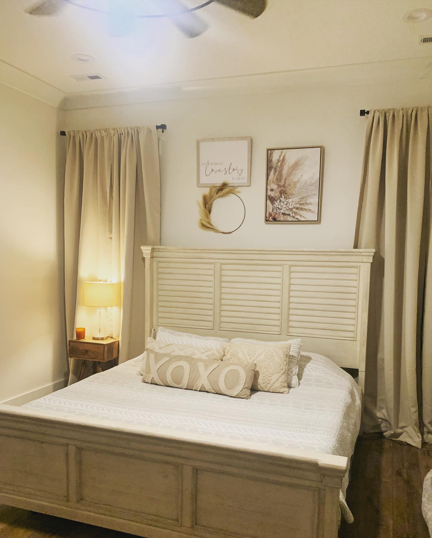
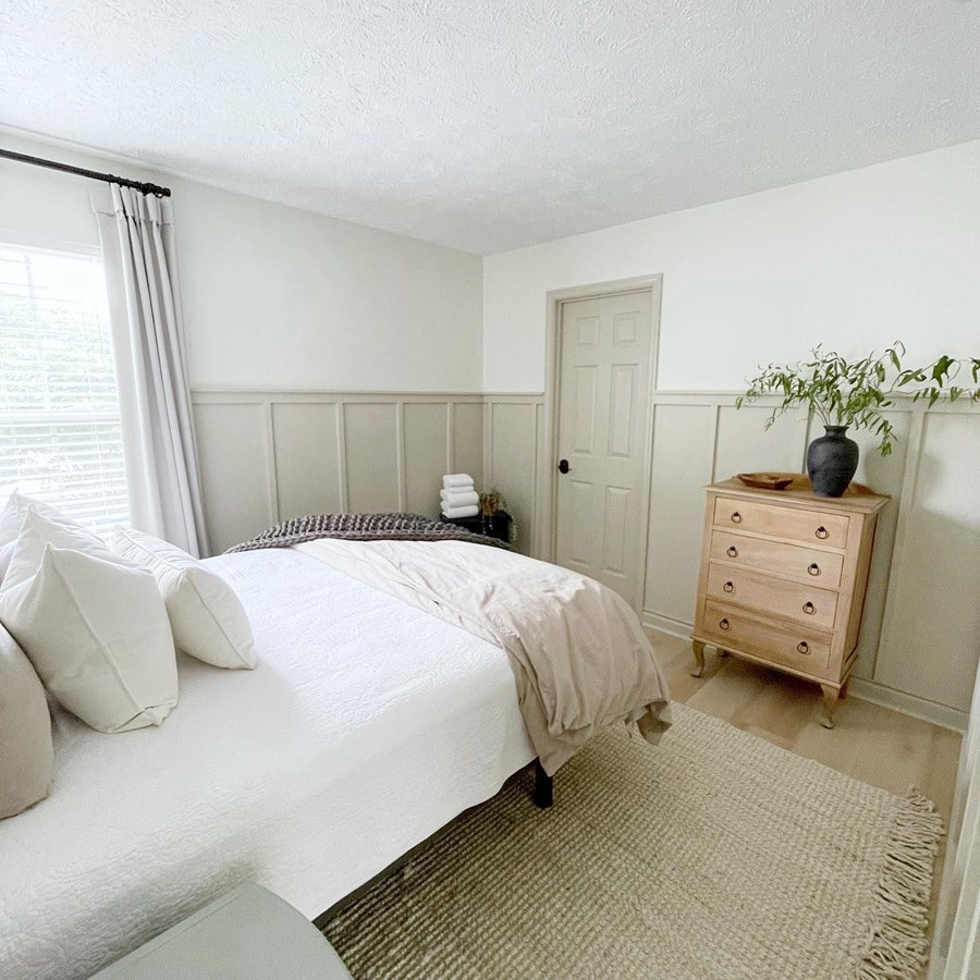
Sherwin Williams Alabaster on Bedroom Walls
This freshly-done bedroom uses Alabaster on the walls and Accessible Beige on the trim. While both are light colors, the combination is still stunning, bright, and airy.
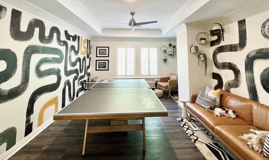
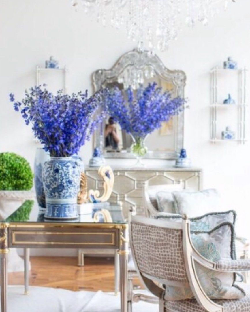
Sherwin Williams Alabaster with Various Colors
This next picture does not use too many colors along with Alabaster. It is mostly blue, but I want you to see how Alabaster picks a little of the blue, making it appear a little too white and cool.
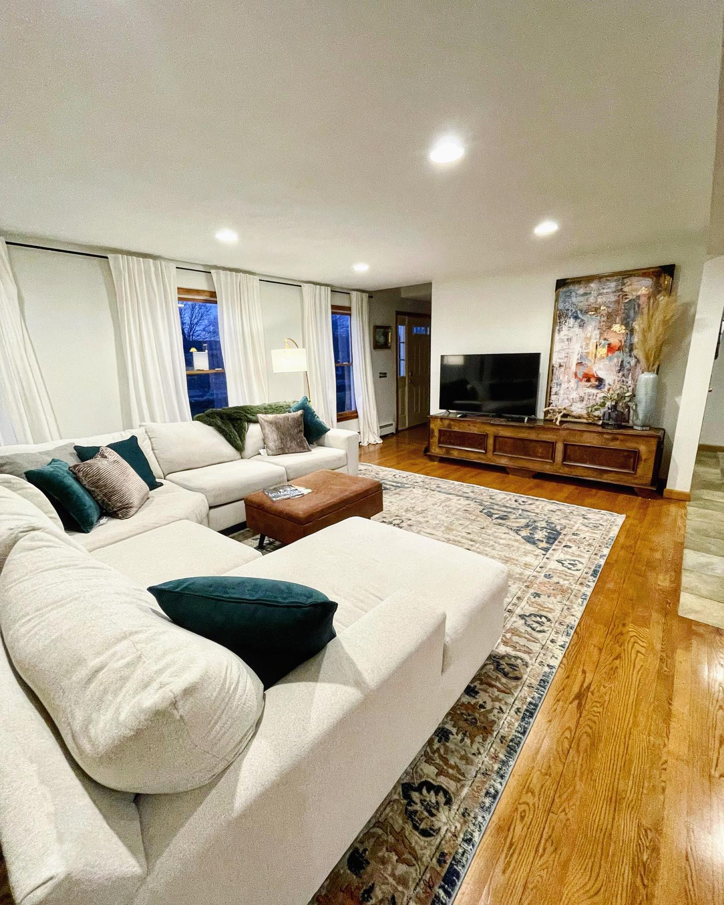
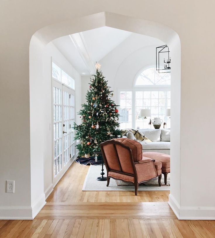
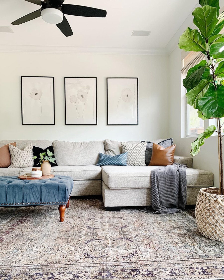
Sherwin Williams Alabaster in Living Rooms
The picture you’ll see next is an example of what Alabaster looks like in a living room. That is not to say that it cannot look different, especially with different lighting conditions.
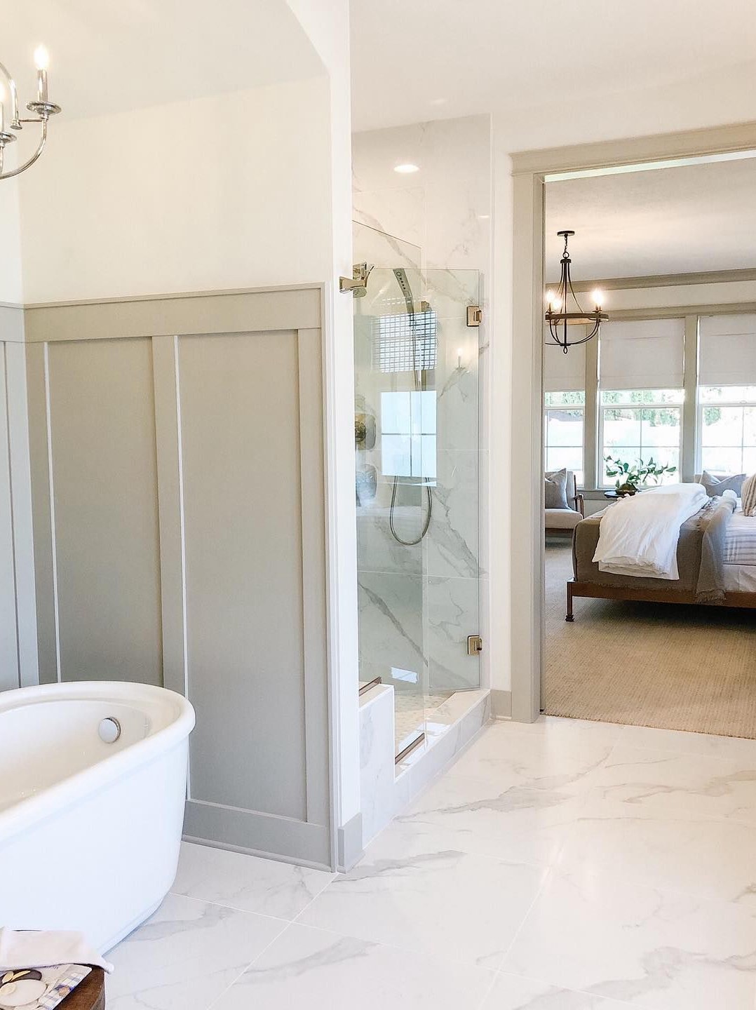
Sherwin Williams Alabaster Used on Bathroom Walls
Keep it bright and white in your bathroom with Alabaster. Since white is the go-to color for bathrooms, although the trend is shifting to bolder colors, how about using a warm white with a hint of color?

Sherwin Williams Alabaster on Window Frames
If you have a dark or deep-colored wall color, whether it is interior or exterior, you will need light trim and window frames. And one of the best trim colors for warm dark or deep shades is Alabaster. The next picture of SW Iron Ore and Alabaster is an example of how striking such a combination can be.
There may be other places where you can plan to use Alabaster around your house. These are examples to show you some of the best places to try this paint color.
Conclusion
Sherwin Williams Alabaster SW 7008 is a warm white paint color that usually reads off-white. With beige undertones, it appears creamy in many rooms and with the right lighting. Sometimes, it can look slightly cool, especially when paired with warmer whites, and other times, it looks warmer than usual.
I created this guide to show you its undertones, how lighting affects it, suitable color palettes, and how it performs in different spaces. If you have been undecided about going for Alabaster, I believe you are now armed with the information you need to decide.
However, don’t hesitate to reach me in the comments section if you have further questions. I’ll be glad to answer them and discuss how you can apply this paint color. Remember to use samples before deciding, and know that I’m rooting for you!
 Sherwin Williams Incredible White (Palette, Coordinating & Inspirations)
 Sherwin Williams Black Fox (Palette, Coordinating & Inspirations)
 Sherwin Williams Naval (Palette, Coordinating & Inspirations)
 Sherwin Williams Shiitake (Palette, Coordinating & Inspirations)
 Sherwin Williams Tricorn Black (Palette, Coordinating & Inspirations)
 Sherwin Williams Silvermist (Palette, Coordinating & Inspirations)
