
Are you in the market for a dark blue color? Shopping for blue paint colors can be confusing when you need something that features a deep navy look but also has a different appearance from what everyone else is using. But today is your lucky day because I have a perfect match for you: the Sherwin Williams Gale Force.
What I call a chameleon color, Gale Force SW 7605, changes depending on the pieces around it and the lighting in the room. This makes it pretty compelling for house owners planning to implement a dynamic appearance.
Well, who doesn’t want to fully understand the color they are going for before they remove their wallet and pay for it? So, I will dig deep into Gale Force SW 7605 to help you understand it. As an added benefit, I will compare and contrast colors resembling Sherwin Williams Gale Force.
Are you ready? Let’s Dive into the world of Blue!
Table of Contents
What Color is Sherwin Williams Gale Force (SW 7605)?
| Manufacturer | Sherwin Williams |
| LRV | 6 |
| RGB | R: 53 G: 69 B: 78 |
| Hex Value | #35454e |
| Color Collections | Timeless Color Wall, 2017 Holistic |
Sherwin Williams Gale Force is considered a dark, moody blue paint color. The color, however, seems to combine gray and navy blue. This gives the paint color a smoky gravy navy appearance that pairs nicely with other decorations in a room.
On the CMYK scale, the Gale Force boasts a combination of Cyan: 32, Magenta: 12, Yellow: 0, and Key (black): 69. With black dominating on the CMYK scale, Gale Force has one of the lowest reflective abilities.
RGB of Sherwin Williams Gale Force
Discussing color thoroughly without considering the RGB scale is nearly impossible. RGB is a scale that runs from 0 to 255, with the values representing the amount of Red, Green, and Blue mixed to form a specific paint color.
In this case, since we are discussing Gale Force, Red is the lowest, with a value of 53, followed by Green: 69, and finally, Blue, which has a value of 78. Since Blue seems to dominate in this case, this could be why Gale Force SW 7605 is bluer.
LRV of Sherwin Williams Gale Force
Different paint colors will reflect varying amounts of light. To precisely indicate the amount of light a specific color can reflect, interior designers devised a scale for it—this scale we know today as the LRV (Light Reflectance Value).
Pure black, which reflects virtually zero light, is at the bottom of this scale which runs from 0 to 100. Pure white holds the 100 value for its ability to reflect the most light.
As you would expect, Gale Force is too dark to reflect much light. Therefore, on the LRV scale, Sherwin Williams Gale Force has a value of 6.
Is Sherwin Williams Gale Force Warm or Cool?
This dark-grayish azure paint color boasts a luminance of 28%. Additionally, It carries a hue value of 202 degrees, indicating that it is a cold color.
Gale Force may work well in rooms with hot colors. This is because its coldness may help you balance out extreme warmth, keeping the room in the middle, not too warm and not too cold.
What Are Sherwin Williams Gale Force Undertones?
Gale Force SW 7605 boasts a slightly green undertone. However, this undertone is so subtle that you won’t see it unless you have the Gale Force painted in a room with the proper orientation.
Interestingly, in addition to showing its green undertone, the color may also take the appearance of other items in the room, blending in perfectly and not shifting all the attention to itself.
Sherwin Williams Gale Force Color Strip
Sherwin Williams boasts a series of dark blue colors that come close to Gale Force SW 7605 in appearance. Understanding how these colors compare and contrast to Sherwin Williams Gale Force can make choosing your colors easier when shopping.
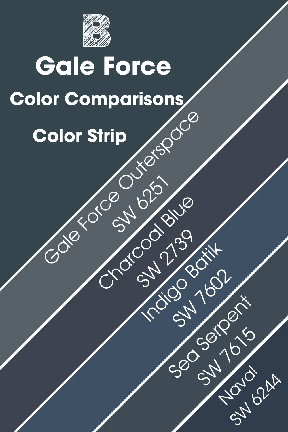
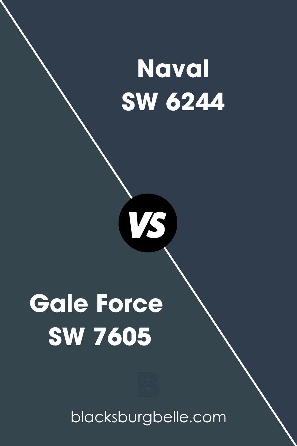
Sherwin Williams Gale Force vs Naval SW 6244
Naval is a blue paint that blends luxury and richness and is absolutely full of splendor and pretty luxe. Like Gale Force, this color boasts a bold appearance and darker tone.
Regarding its ability to reflect light, Gale Force and Naval are not too far from each other. Gale Force is 2 points higher at an LRV value of 6, while Naval sits at 4. The two colors would work well in a room with significant light—due to their inability to reflect a lot of light; they can make a dark room look too bland.
Reminiscent of the midnight sky, the Naval does not feature the green undertone in Gale Force SW 7605. Instead, Sherwin Williams Naval has a slight gray undertone displayed when you place the color in the proper lighting.
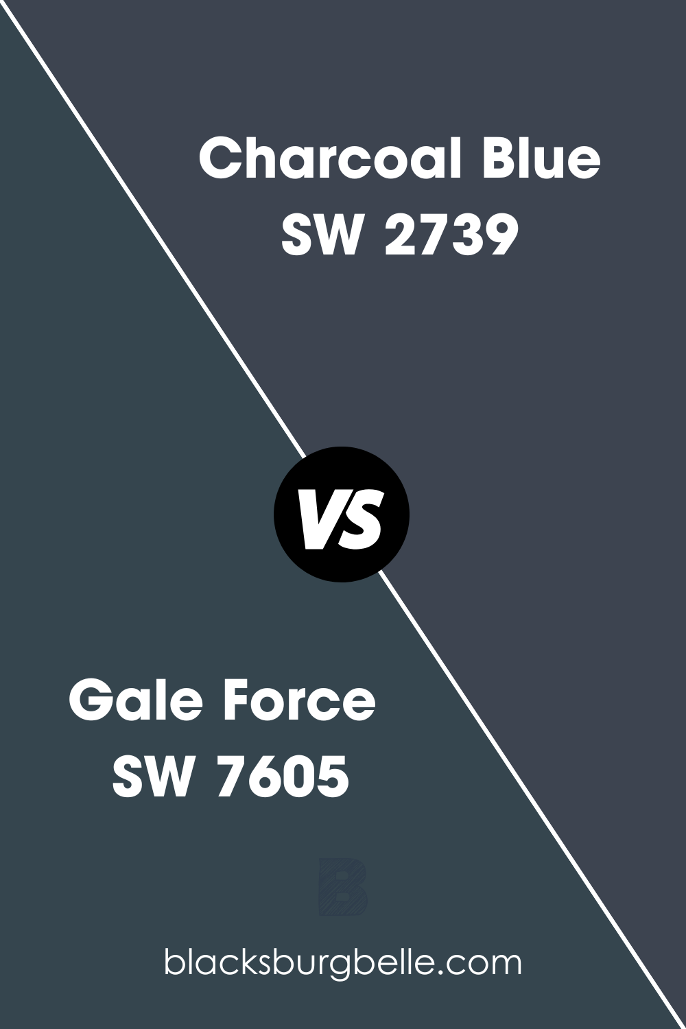
Sherwin Williams Gale Force vs Charcoal Blue (SW 2739)
Charcoal Blue SW 2739 is another color closely resembling Gale Force SW 7605. The two colors are bold and dark and have that luxurious and rich look.
Due to their appearance, these two colors can be used in almost similar scenarios. For example, Gale Force is often used in upscaling ocean-view bungalows and beachside villas.
Their high level of similarities explains why Charcoal Blue, like Gale Force, also has an LRV of 6—the two colors reflect the same amount of light. Charcoal Blue combines blue and gray, although Blue tends to dominate, with gray being an undertone. This is different from Gale Force which has a green undertone.
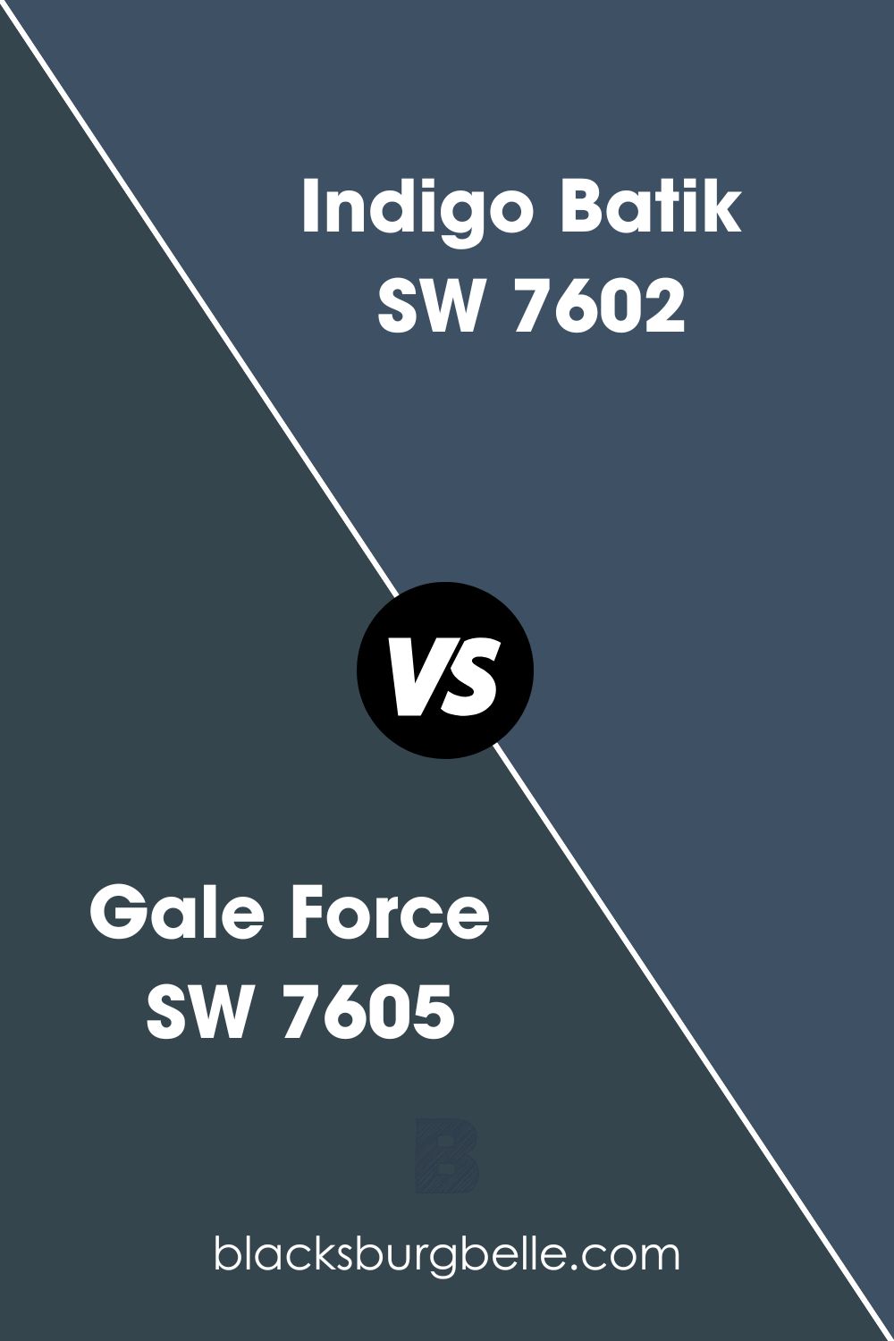
Sherwin Williams Gale Force vs Indigo Batik (SW 7602)
Indigo Batik is an authentic yet bold color that is dark-toned, exhibiting a similar tone to navy. One of the main differences between Gale Force and Indigo Batik is their ability to reflect light—on the LRV scale, Indigo Batik is 2 points higher than Gale Force, with a value of 8.
On the RGB scale, Indigo Batik is a combination of Red: 62, Green: 80, and Blue: 99. When looking at the two colors in terms of their undertones, they are pretty different—while your Gale Force will have a green undertone, Sherwin Williams Indigo Batik has a navy-blue undertone.
While Gale Force is a cold cooler, Indigo Batik is right in the middle. Indigo Batik is an ideal fusion of cool and warm.
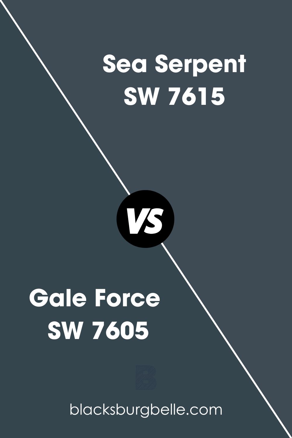
Sherwin Williams Gale Force vs Sea Serpent (SW 7615)
Gale Force SW 7605 and Sea Serpent SW 7615 are on the bottom of the LRV scale, with a difference of 1 point. While Gale Force has an LRV value of 6, Sea Serpent is just above it with a value of 7. Both colors, therefore, cannot be used in a room without enough light.
Gale Force SW 7605 and Sea Serpent SW 7615 have an almost similar arrangement in their color combination on the RGB scale. The Sea Serpent mixture has Red: 62, Green: 75, and Blue: 84.
The two paint colors are pretty similar in their undertones. Both colors have a green undertone that blends in with a blue undertone. In addition, both colors are cold, making them perfect for outdoor areas that feature items with hotter shades.
Sherwin Williams Gale Force Outerspace (SW 6251)
Just like Sherwin Williams Gale Force, Outspace SW 6251 is also a steely, timeless, and classic blue. The Outerspace color boasts gray-blue undertones that exhibit a sleek, calm, and crisp vibe when used outdoors. Gale Force, on the other hand, boasts a subtle green undertone that is not always visible.
Although it is still in the darker region and does not reflect much light, Outerspace SW 6251 at least reflects twice the amount of light Gale Force reflects, with an LRV of 12. Both colors, however, are dark and bold and can bring your walls together, giving you the feeling of a compact space.
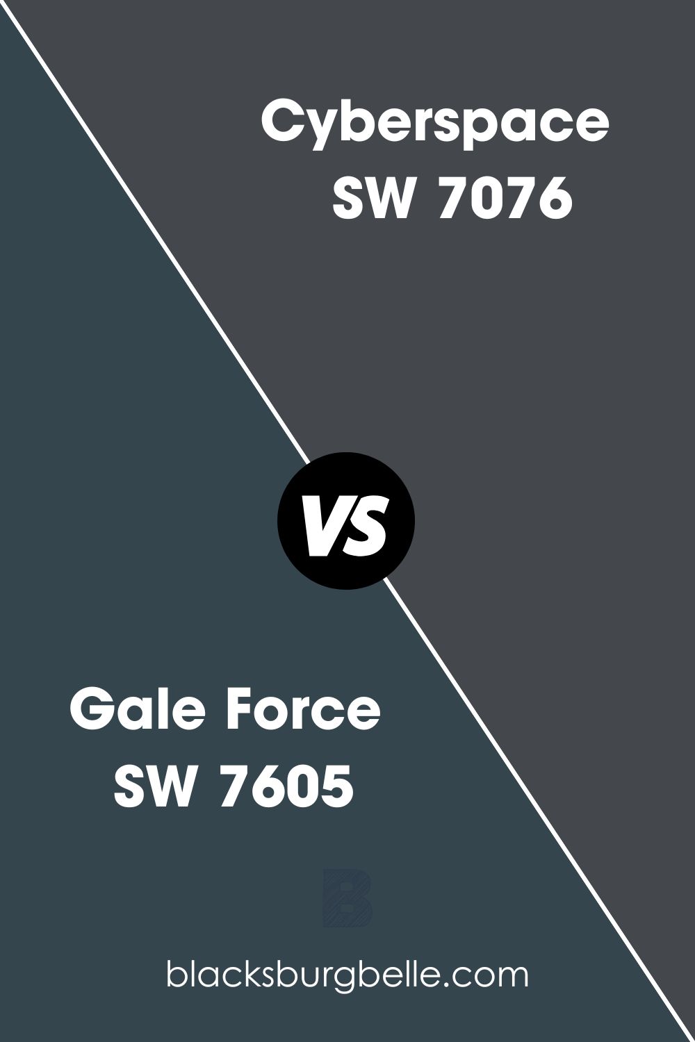
Sherwin Williams Gale Force vs Cyberspace (7076)
Just like Gale Force, Sherwin Williams Cyberspace is also a cool color. The only difference is that Cyberspace creates an illusion of coziness and warmth with its added depth.
Like Gale Force SW 7605, Cyberspace is also very dark—both colors have an LRV of 6. However, Cyberspace boasts a navy-blue appearance and has a gray undertone that calms it down. This is quite different from Sherwin Williams Gale Force, which only has a green undertone.
If you paint a dark room, Cyberspace and Gale Force will look a bit bland. However, you can make a difference if you hit the two colors with some interior lighting—this should make the colors more attractive.
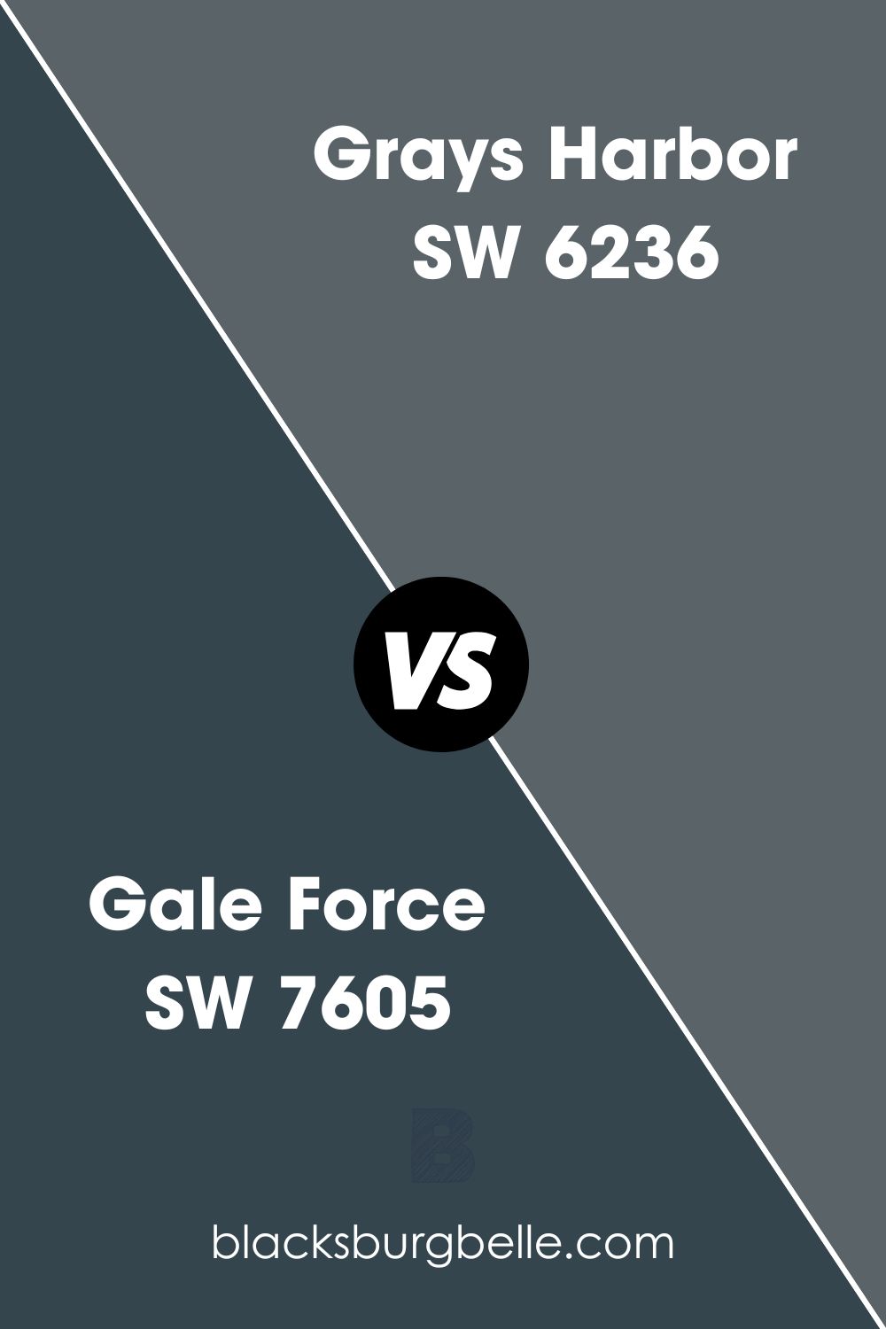
Sherwin Williams Gale Force vs Grays Harbor (SW 6236)
Sherwin Williams Grays Harbor allows you to implement a dark blue-gray appearance in rooms, creating the impression of an authentic midnight sky appearance. This appearance is not too different from the look you can implement with Sherwin Williams Gale Force.
One difference between Gale Force and Grays Harbor is that the latter reflects two times more light than the former, with an LRV of 12. Both colors, however, own the chameleon appearance—they change based on their environments, with the colors displaying undertones in well-light rooms and taking the appearance of the items surrounding them in rooms.
Both Gale Force and Grays Harbor are cool colors that can make the space feel cool, crisp, refined, and dramatic. The colors can also make your look balanced, bold, and compact.
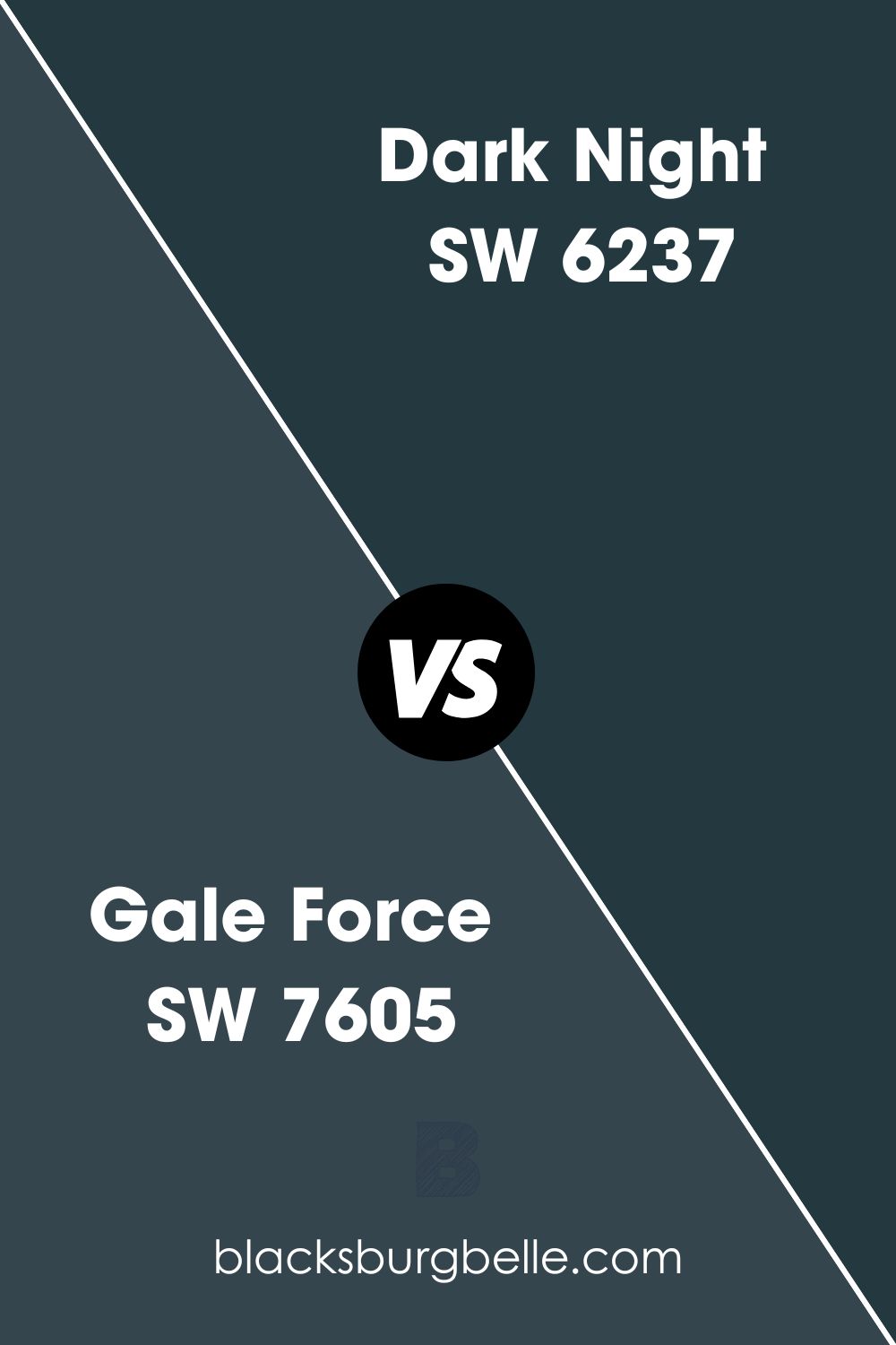
Sherwin Williams Gale Force vs Dark Night (SW 6237)
Sherwin Williams Dark Night is a bold dark blue paint that carries deep green undertones. The green undertones in Dark Night are pretty notable in various aspects. While Gale Force and Dark Night have a green undertone, their only difference is that Gale Force’s undertone is more subtle than Dark Night’s.
On the LRV scale, Dark Night is lower than Gale Force—with an LRV of 4, its reflective abilities are much lower than those of Gale Force. Gale Force and Dark Night are cold colors, making them a perfect fit for warm areas.
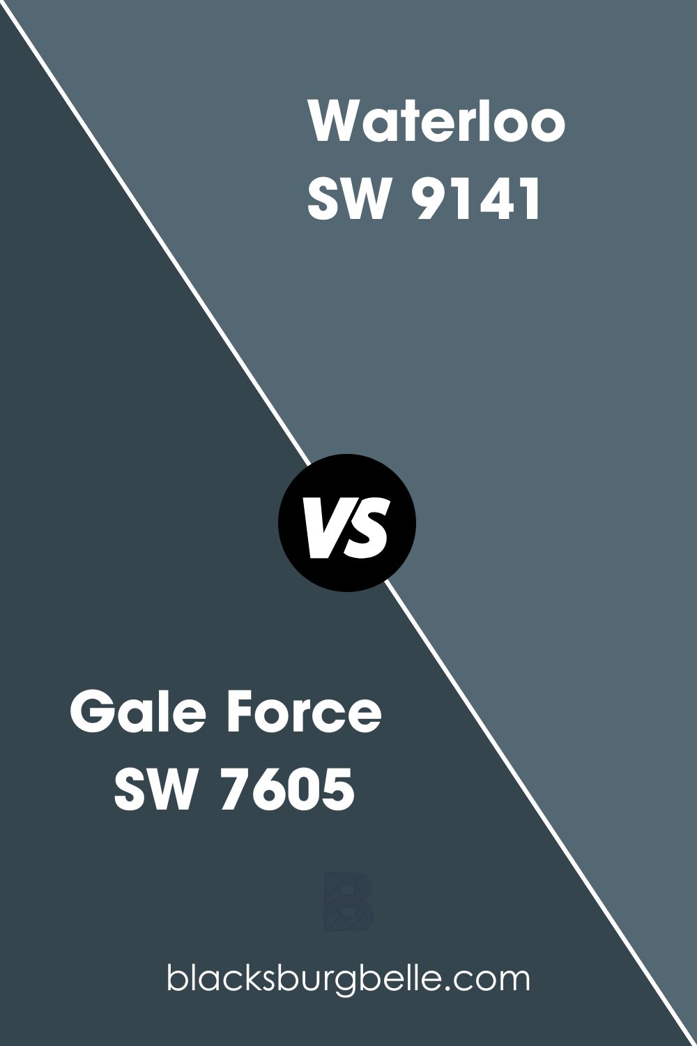
Sherwin Williams Gale Force vs Waterloo (SW 9141)
If you would like to depart from the midnight sky often displayed by Gale Force and go for a color that mimics the deep oceans, Waterloo SW 9141 could be an ideal option.
Quite mesmerizing and enchanting, the Blue in Sherwin Williams Waterloo SW 9141 is subtle and muted. However, like Gale Force, Waterloo is still on the darker side—this explains why Waterloo has an LRV of 13, which is 7 points higher than that of Gale Force.
Much like Gale Force, SW Waterloo is quite bold. Waterloo works well for adding depth and character to the walls.
Coordinating Colors for Gale Force
The fact that Gale Force is a pretty dark color does not mean it is impossible to pair it with other colors. This darkish blue paint color pairs nicely with a wide variety of colors—below, we will look at its most popular coordinating colors:
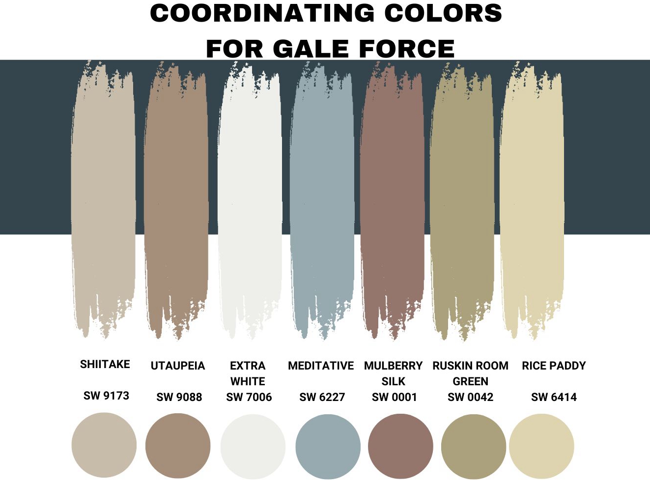
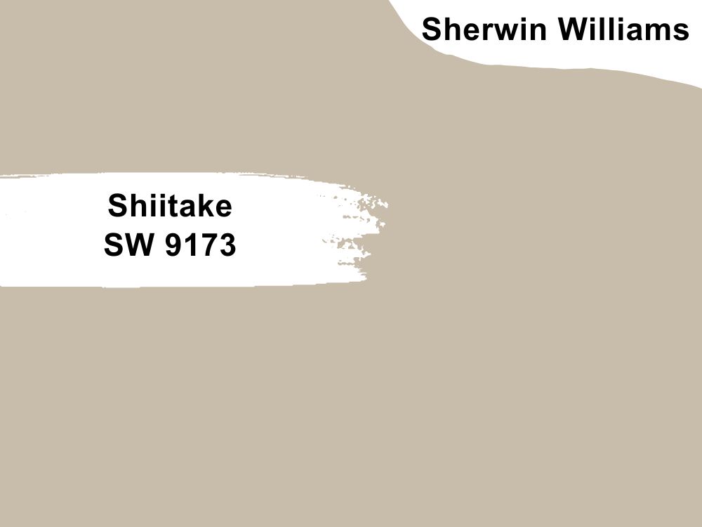
Sherwin Williams Shiitake SW 9173
As we noted earlier, Sherwin Williams Gale Force is a cold color. For this reason, you may want to pair it with a shade of beige to bring some warmth to your house. Whenever I have come across walls with the Shiitake SW 9173 paint color, they have looked warm, but not so warm that it ends up overwhelming the home.
SW Shiitake is an attractive beige shade that balances coolness and warmth. This paint symbolizes calmness, serenity, and restfulness, which is why I have used it in most of my resting areas.
The color sits in the middle on the LRV scale with a value of 51. Therefore, it is perfect for use with Gale Force which sits way down on this same scale.
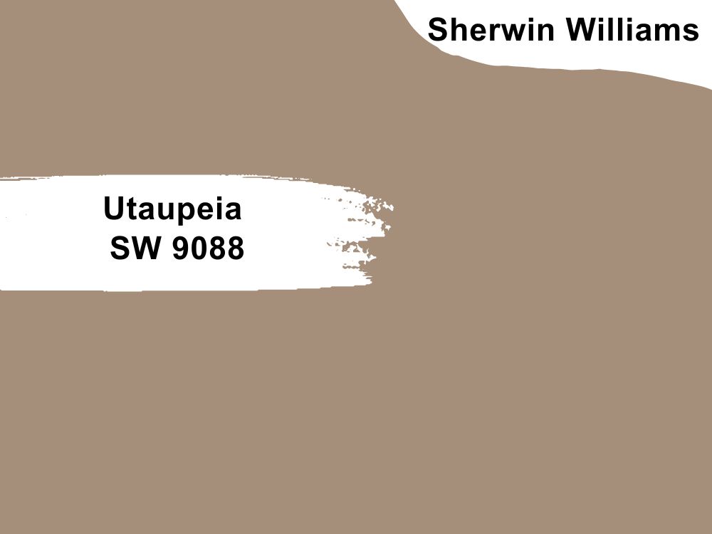
Sherwin Williams Utaupeia SW 9088
Compared to the previous coordination color, Utaupeia SW 9088 is much lower on the Light Reflectance Value scale, with a value of just 29. However, when you compare it with the pairing color—Sherwin Williams Gale Force—it is 23 points higher. This suggests that it might be able to create a balance in a not too well-light room.
The color is also warm, although not so warm that it overwhelms your room. It balances out the coldness in Gale Force SW 7605.
This paint color has a dose of beige and gray in it. This can make it stand out in any room, although using it alone in a poorly lit room may not be the path to follow in your interior design project—since it does not reflect much light, it could make a dark room boring.
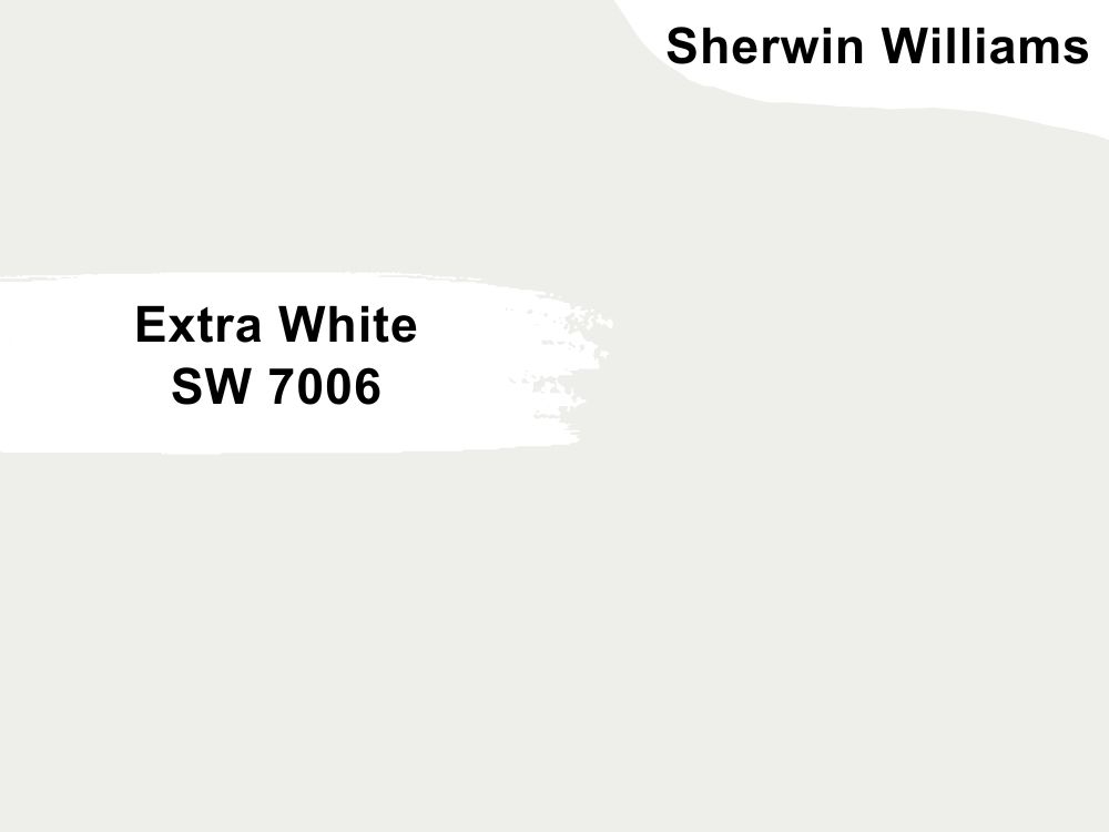
Sherwin Williams Extra White SW 7006
As its name suggests, Extra White is a white paint color. However, it has a muted blue undertone. But while it is easy to assume that the color will always show a flash of blue, this is not the case—in some cases, the undertone is invisible, which allows the color to resemble a true white.
Extra White boasts a high LRV, sitting at 86. This is perfect for pairing with Sherwin Williams Gale Force which has an LRV as low as 6. Additionally, if you pair the two in a dark room, the colors can balance the lighting in the room.
Extra White is a warm color. Although the SW 7006 does feature a cool undertone in the form of blue, it still maintains much of its warmth, letting it balance out the coldness in Gale Force.
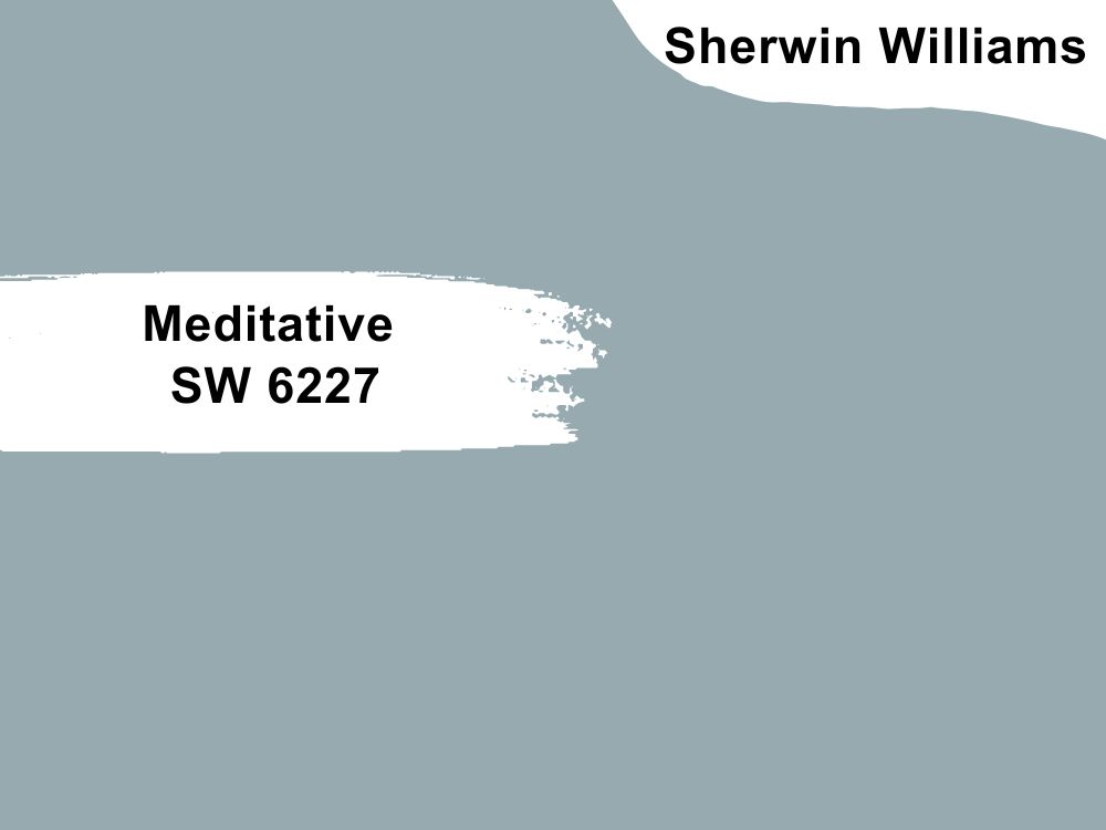
Sherwin Williams Meditative SW 6227
Like Gale Force, Meditative SW 6227 belongs to the Blue Color family. On the RGB scale, this paint color boasts a combination of Red: 150, Green: 170, and Blue: 176.
On the CMYK color model, Meditative features a combination of 31.0% Key (black), 0.0% yellow, 3.4% cyan, and 14.8% magenta. Regarding its ability to reflect light, this color is much more reflective, boasting a Light Reflectance Value of 38.4%. As a result, the paint color may have the ability to create interest in a dark room where Gale Force has been used.
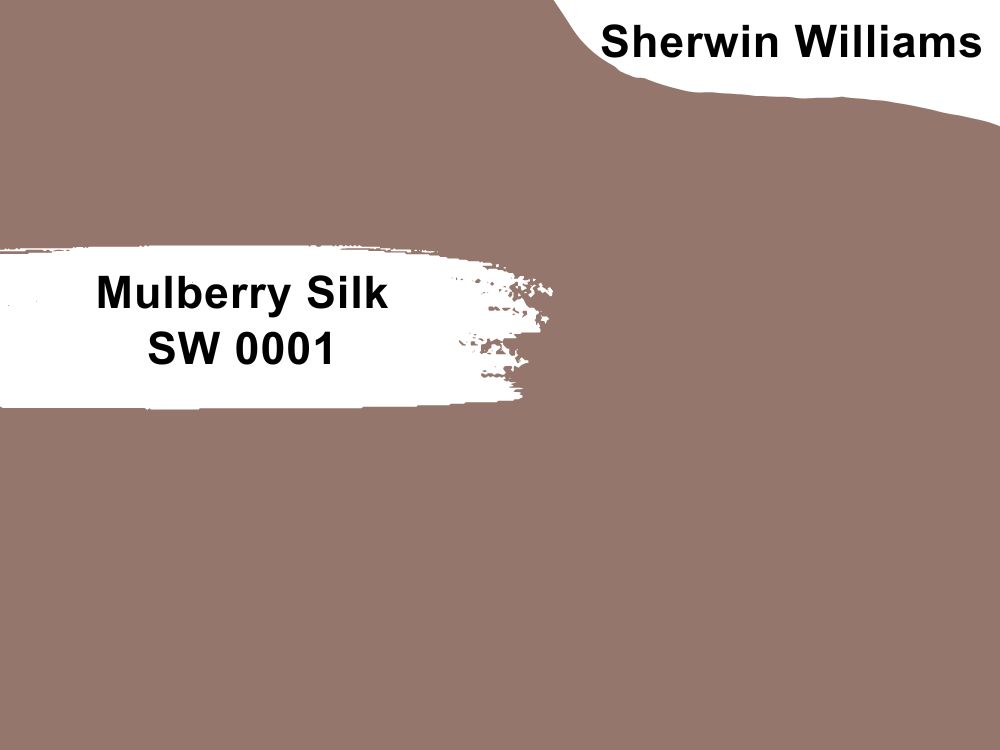
Sherwin Williams Mulberry Silk SW 0001
Most interior designers advise against combining two cold colors in a room—they will be too dull for you. Luckily, while Gale Force is outright cold, Mulberry Silk S001 boasts a hue value of 15%, which shows that it is warm. Used in a room with Gale Force, the two colors will balance each other out.
Sherwin Williams Mulberry Silk SW 0001 is a grayish-red color that features a luminance of 52%. The paint color has an RGB of Red: 148, Green: 118, and Blue: 108.
With an LRV of 20, Sherwin Williams Mulberry Silk falls on the dark side. However, it is a little bit higher than Gale Force. However, the fact that the two colors are not too reflective suggests that you may want to keep them in a well-light room to avoid the dull appearance.
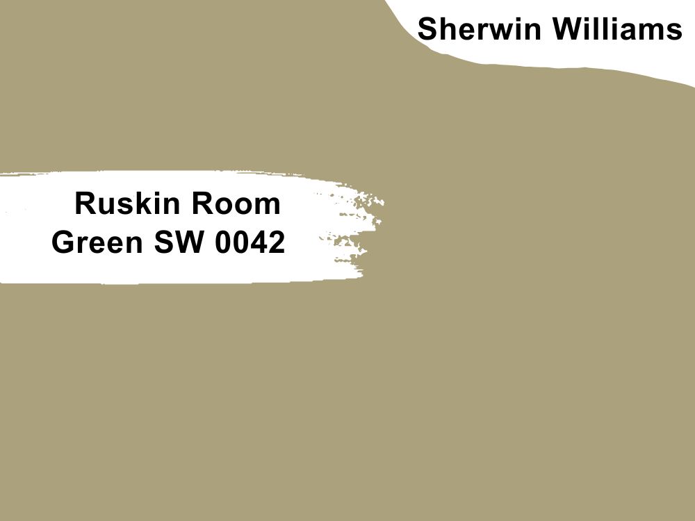
Sherwin Williams Ruskin Room Green SW 0042
This color combines grayish and yellow tones to achieve a luminance of approximately 66%. In addition, the color boasts a hue of 46%, showing that this is a warm color. The simple fact that it is warm means that it may be able to balance the coldness in your Gale Force.
On the RGB scale, this color has Red: 172, Green: 161, and Blue: 125. Surprisingly, Ruskin Room Green SW 0042 is not as reflective as you would expect—with an LRV of 36, the color does not reflect much light. However, it would be an excellent addition to a medium-lit room where you plan to use the darker Sherwin Williams Gale Force.
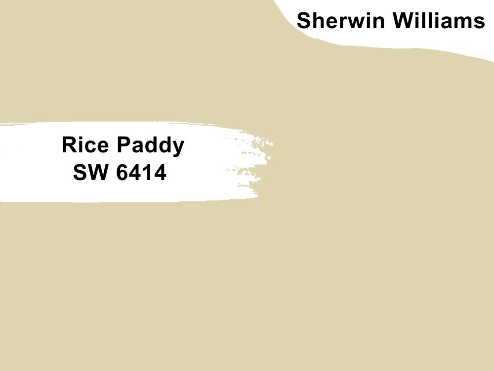
Sherwin Williams Rice Paddy SW 6414
Rice paddy features a luminance of 85% and boasts a bright pastel yellow color. The color has a hue of 46%, meaning it is pretty warm, although not too warm. It is capable of balancing out the coldness of Gale Force.
The color sits in the yellow color family (hue). The color boasts a combination of Red: 223, Green: 212, and Blue: 176.
Although the color is still in the off-white category, it is interesting to note that its LRV is pretty high. It could be an ideal color for adding some character when used in a dark room with Gale Force.
Sherwin Williams Gale Force Complementary Color
When you combine two complementary colors, they cancel each other out. As a result, they lose their hue, turning into a grayscale color and producing either black or white. However, they display the most significant contrast if you paint the two colors on a neutral surface side by side.
For Sherwin Williams Gale Force, the color that’s getting extremely close to being complementary is paco, a color with a hex code of #4E3E35. On the RGB Scale, this complementary color has Red: 78, Green: 62, and Blue: 53. Paco has a hue of 21.6 degrees, meaning it’s a warm color, which is the opposite of Gale Force, which is cold.
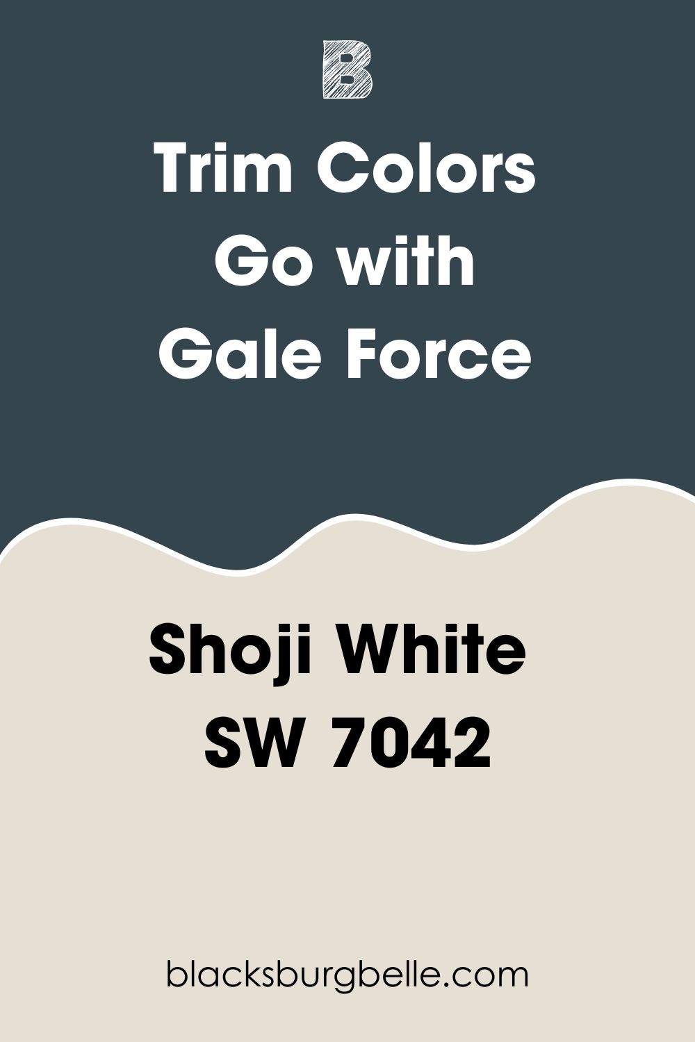
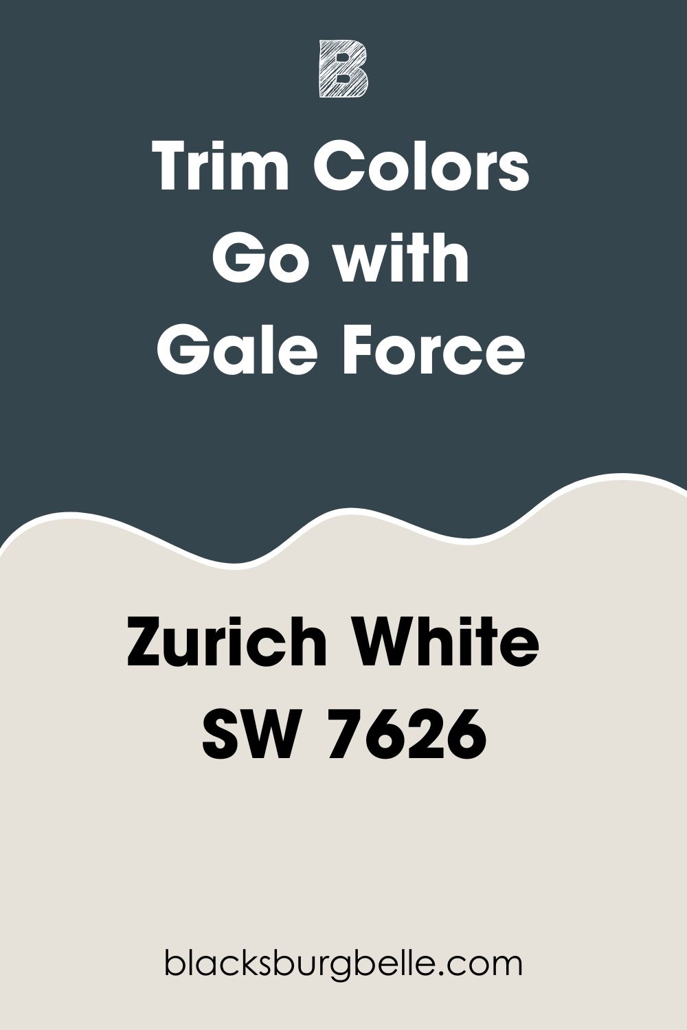
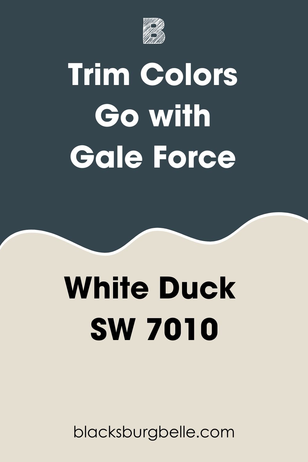
What Trim Colors Go with Sherwin Williams Gale Force?
The best trim colors to pair with dark blues like Gale Force are light neutrals such as Shoji White (SW 7042), Zurich White (SW 7626), and White Duck (SW 7010). Below, we will take a deeper look at these colors:
Sherwin Williams Shoji White (SW 7042)
Shoji White could work if you find it hard to decide between greige and cream for your trim. This paint color is an attractive blend of greige and cream, which makes it warm. However, while you will enjoy Shoji White’s warmth when you put it on your trims, its greige-beige base tones down this warmth to create a balance.
In addition, if you trim a south-facing room, your trim will look warmer, while a north-facing room will have a more muted warmth on the trims.
Sherwin Williams Zurich White (SW 7626)
This paint fits perfectly in the greige expectation, mainly when used on indoor trims. The paint color boasts a straighter white with a hint of gray, although it is not too tan or too beige.
Sherwin Williams Zurich White puts an airy, light vibe on your trims. You can also use this color on your exterior trims—when used outside; it shows up lighter and brighter than you would expect.
Sherwin Williams White Duck (SW 7010)
For neutral yet versatile colors, you will almost always find White Duck on the top 5 lists of most interior designers. This paint color boasts the perfect depth and unique blend, making it an ideal choice for trims on Gale Force.
This neutral and warm color is a perfect hybrid of greige and cream. It balances coolness and warmth in the right lighting conditions, fitting right in the middle.
Sherwin Williams Gale Force Benjamin Moore Version
If you are looking for a Benjamin Moore version of Sherwin Williams Gale Force, The BM Miramichi CC-752 could be what you need. Like Gale Force, the Benjamin Moore Miramichi is also on the dark end of the LRV scale, with a value of 5.3—this is just 0.7 points lower than Gale Force, which has an LRV of 6.
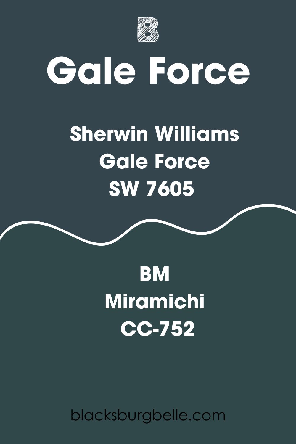
Miramichi CC-752 boasts a mix of Red: 48, Green: 72, and Blue: 74. The main difference between this color and Gale Force is that the green undertone in Miramichi shines more than the undertone in Gale Force.
Both colors, however, are cold and tend to perform well in well-lit rooms. On the other hand, if you place Gale Force or Miramichi in a dark room, you will have a dull look.
How Does Light Affect Sherwin Williams Gale Force?
Just like many colors, Sherwin Williams Gale Force’s appearance changes depending on the light hitting it. Gale Force will appear bluer and brighter in a yellow, warm, south-facing or west-facing light.
If you move this paint color to a cooler, north-facing room, Gale Force will appear darker Blue and may show a tinge of its green undertone.
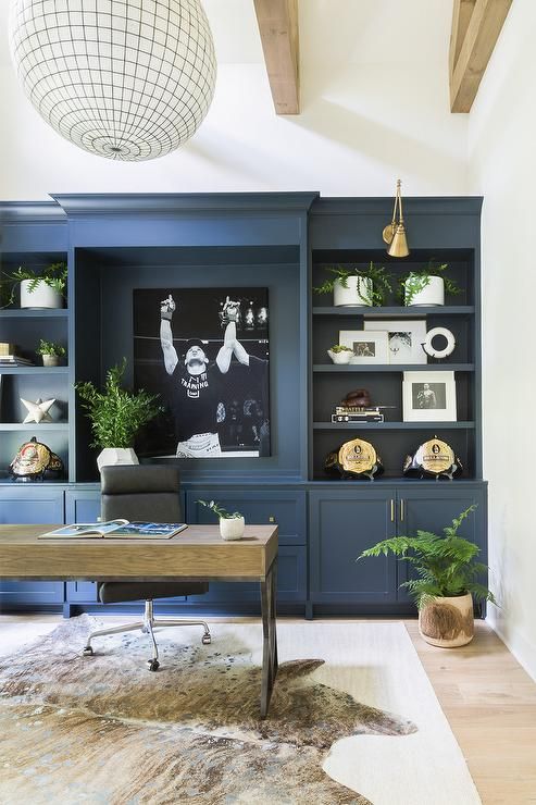
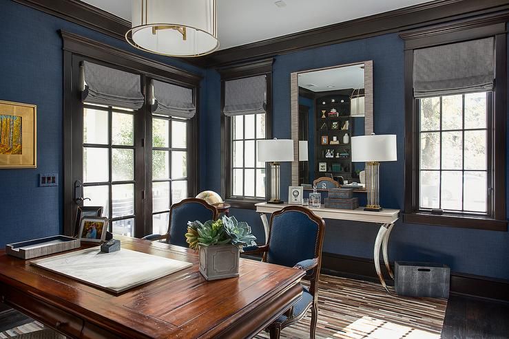
Best Rooms to Paint Gale Force
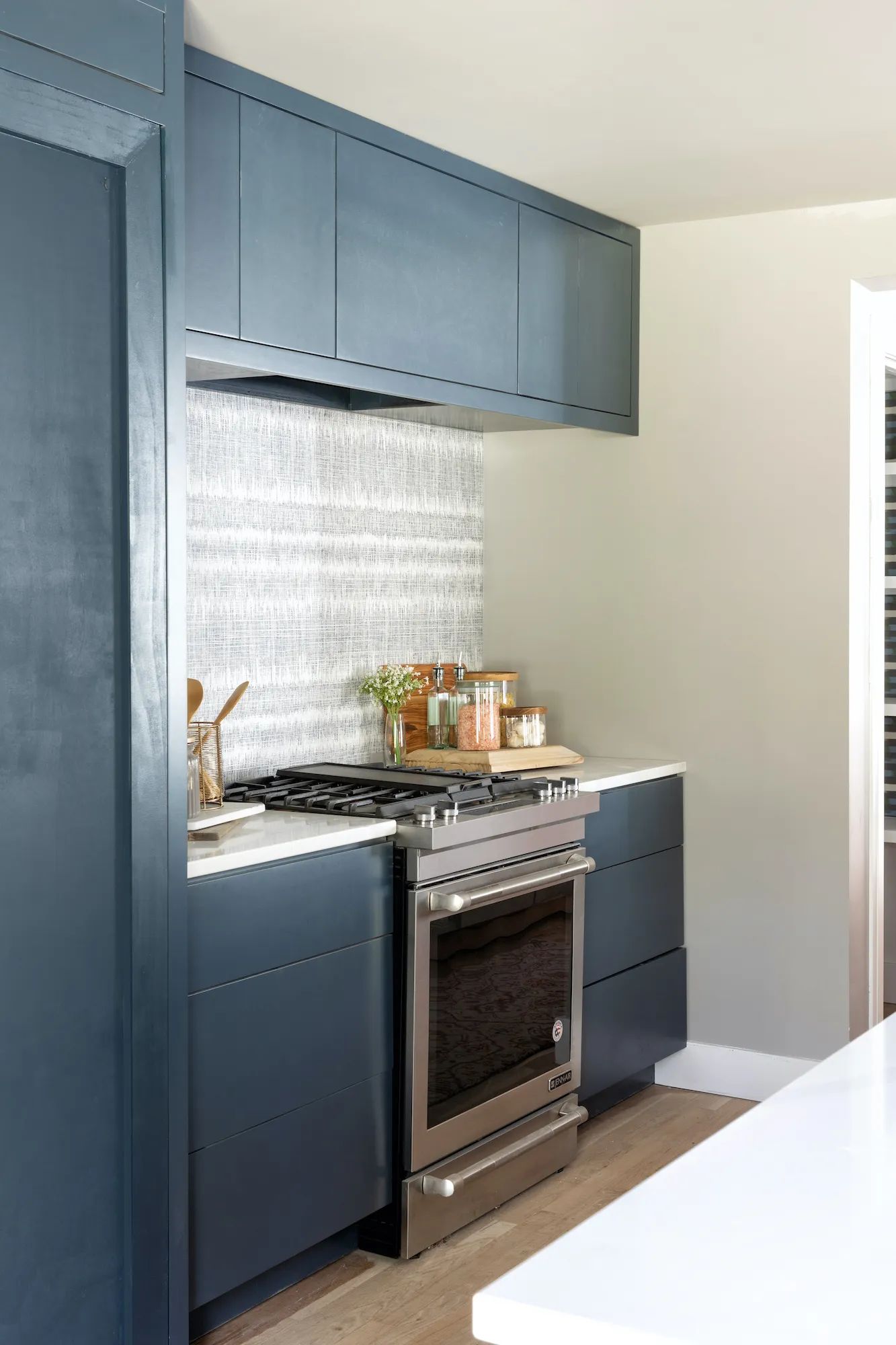
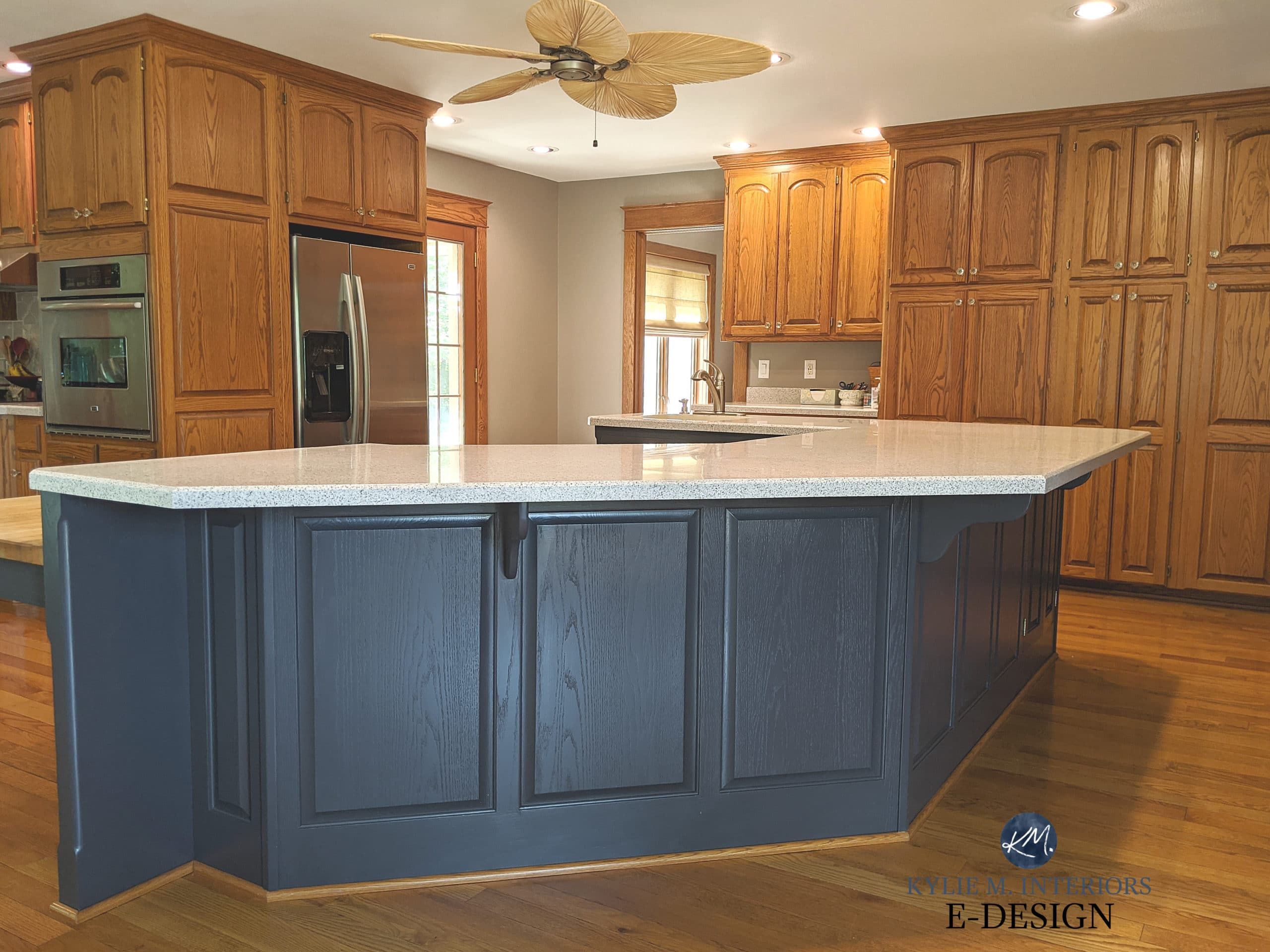
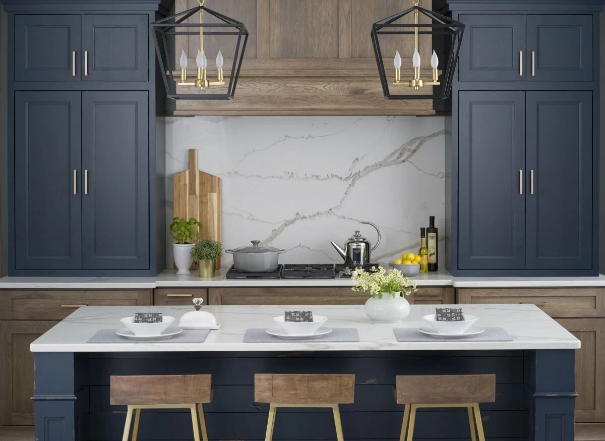
Sherwin Williams Gale Force Kitchen
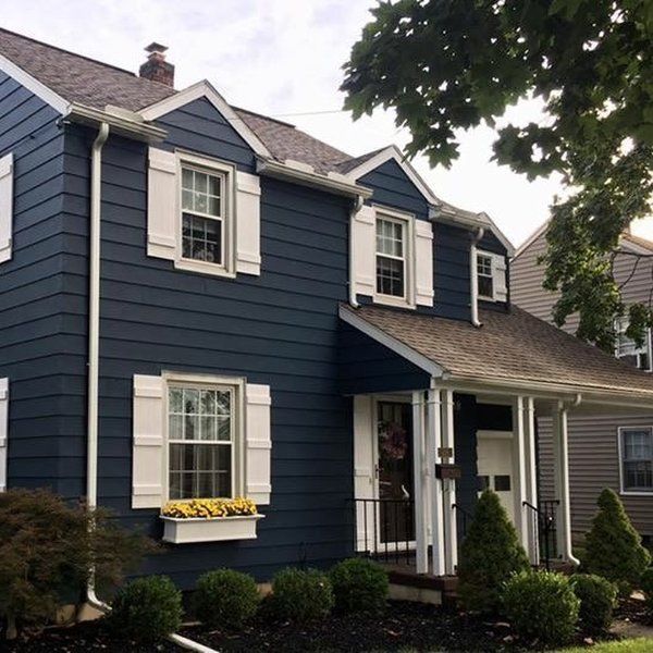
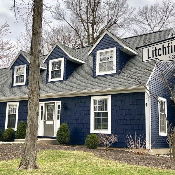
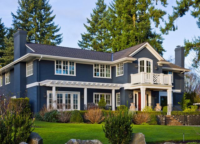
Sherwin Williams Gale Force Outdoors
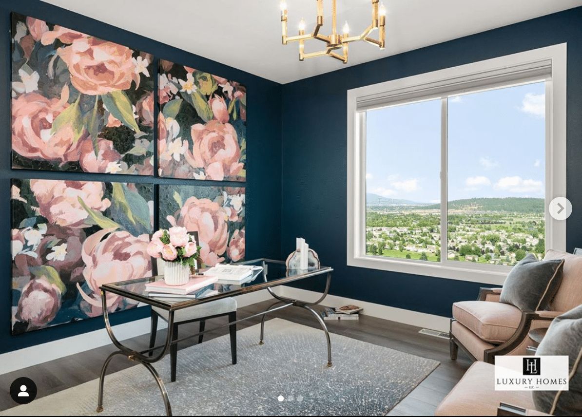
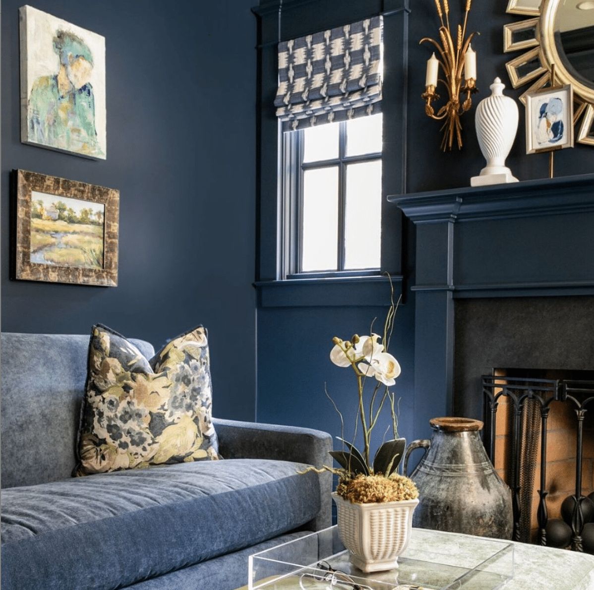
Sherwin Williams Gale Force Living Room
Overview
Sherwin Williams Gale Force is one of the darkest colors with a hint of blue. With an LRV of just 6, this color may not perform well in a dark room. However, its performance improves when you move it to a well-lit room.
Gale Force does not just perform well indoors. It also works well for outdoor spaces. A low reflective ability and boldness make it stand firm without getting washed out by the intense light outdoors.
Gale Force SW 7605 can be considered a chameleon. The color tends to blend well with the color it finds in a specific room—it does not hog all the attention. In addition, the color allows its green undertone to shine through in the proper lighting, making it stand out even more.
We hope this article has answered all the questions you may have had about Sherwin Williams Gale Force SW 7605. If there is a question we did not answer to your satisfaction, please let us know in the comments.
 Sherwin Williams North Star (Palette, Coordinating & Inspirations)
 Sherwin Williams Cascades (Palette, Coordinating & Inspirations)
 Sherwin Williams Clary Sage (Palette, Coordinating & Inspirations)
 Sherwin-Williams Tidewater (Palette, Coordinating & Inspirations)
 Sherwin Williams Coastal Plain (Palette, Coordinating & Inspirations)
 Sherwin Williams Alabaster SW 7008: Review & Inspiration
