
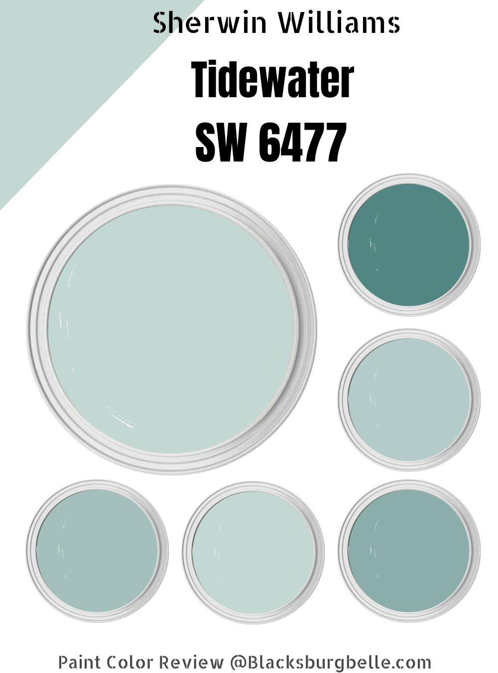
 Sherwin Williams Tidewater is a perfect choice to bring the feeling of a coastal getaway into your home. It is a gorgeous shade of aqua blue that adds a tranquil and fresh feeling to any room in the home.
This exquisite color evokes a serene beachy nature which creates a calming atmosphere, whether you are in the kitchen, bathroom, or bedroom. It appears blue, but it is a harmonious blend of blue, green, and gray undertones that creates a light and airy feeling in any home.
In this guide, you will learn more about its color combinations, design properties, hue texture in pictorial contexts, and the impact it has on home design, which will help you understand why the Sherwin Williams Tidewater is so popular for home decor, interior, and exterior fittings.
Without further ado, let’s delve into the amazing world of Sherwin-Williams Tidewater.
Table of Contents
What Color is Sherwin-Williams Tidewater?
| Manufacturer | Sherwin Williams |
| LRV | 65 |
| RGB | Red 195 | Green 215 | Blue 211 |
| Hex Value | #c3d7d3 |
| Color Collections | Light, beachy ocean blue with a warm green undertone |
RGB of Sherwin-Williams Tidewater
The RGB color code of Sherwin-Tidewater is RGB (195, 215, 211) with a close mix proportion due to its light texture.
The blue hue is more noticeable in the tidewater color because it is a member of the blue color family and has a higher proportion than red, as reflected in its RGB ratio of 195:215:211.
The hexadecimal color code (color number) for Tidewater (SW 6477) is #C3D7D3 to get a more accurate tone of the shade. Moreover, does its higher blue proportion and color saturation make it light or dark? Keep scrolling to find out.
Light Reflective Value (LRV) of Sherwin-Williams Tidewater
Tidewater has a light hue because of its close saturation mix of constituent colors and consistent blend. With a Light Reflectance Value (LRV) of 65, it is neither too bright nor too dark, making it an ideal color for both interior and exterior applications.
This LRV is in the middle of the 0-100 scale, rendering Tidewater a light color that is both versatile and aesthetically pleasing.
Is it a Warm or Cool Color?
Although Tidewater is often associated with a cool serene beachy color of coastal living, it is in fact a warm color mix, owing to its undertones and even color mix. It is a light and airy color that can be used in both bright and muted color schemes in a variety of room settings.
What other color undertones do Tidewater’s color hues have, and how do they affect the overall color blend? Find out in the next section.
What are the Undertones?
Tidewater is a warm and inviting shade of blue with undertones of green and gray that are perfectly balanced to create a subtle color hue that works well in many different home designs.
The green and gray undertones are what give its unique look and feel, making it stand out from other shades of blue. Due to this composition, the Sherwin-Williams Tidewater is neither too dark nor too bright; instead, it has a comforting feel that makes any room warm and inviting.
Check out the different colors for the undertones.

Sherwin-Williams Tidewater Color Strip
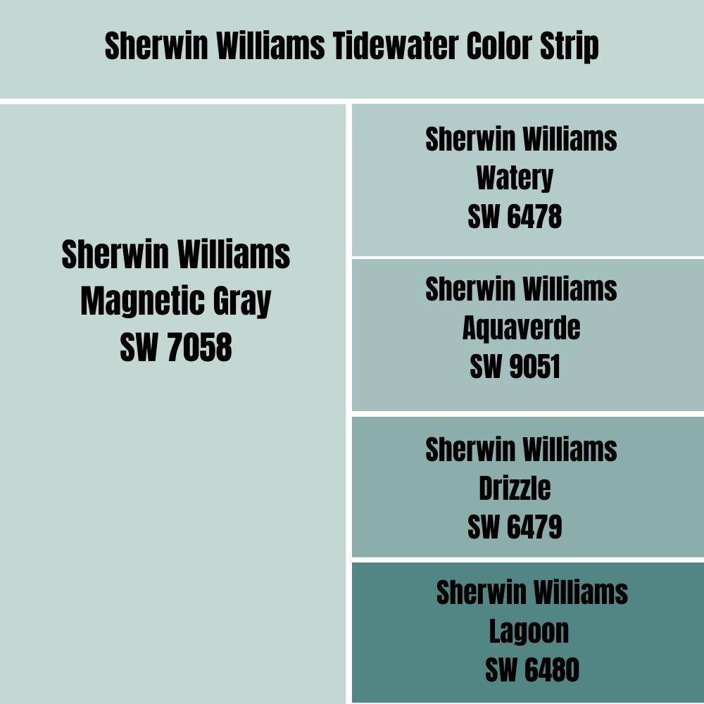
A color strip is a collection of related colors graded according to different LRVs ranging from light to dark tone that is useful for monochrome decoration. Since tidewater is a light color, the colors on its strip are also light, ranging from light blue to light green and gray undertones.
The LRV values of the different strips give a visual impression of how much light the colors reflect.
| Color Code | Color Name | Location Number | LRV | Color Tone |
| SW 6477 | Tidewater | 170-C1 | 65 |  |
| SW 6478 | Watery | 170-C2 | 57 |  |
| SW 9051 | Aquaverde | 170-C3 | 49 |  |
| SW 6479 | Drizzle | 170-C4 | 39 |  |
| SW 6480 | Lagoon | 170-C5 | 20 |  |
Sherwin-Williams Tidewater (SW 6477)
The dominant color combination for this color strip is Tidewater by Sherwin Williams. It has a light color and an LRV of 65, which makes it ideal for brightening up any room. Its beachy appearance and warm feel exude serenity and tranquility.
Tidewater evokes the pale blue-green waters of the Gulf of Mexico which makes it the perfect addition to a space that you want to feel like a luxurious coastal escape and makes one feel at ease.
Another interesting aspect of the Tidewater is that, despite its green and gray undertones, it appears blue when examined closely. Also, it will not overwhelm a room with its pale color scheme but adds a subtle yet luxurious color touch to any environment.
Sherwin-Williams Watery (SW 6478)
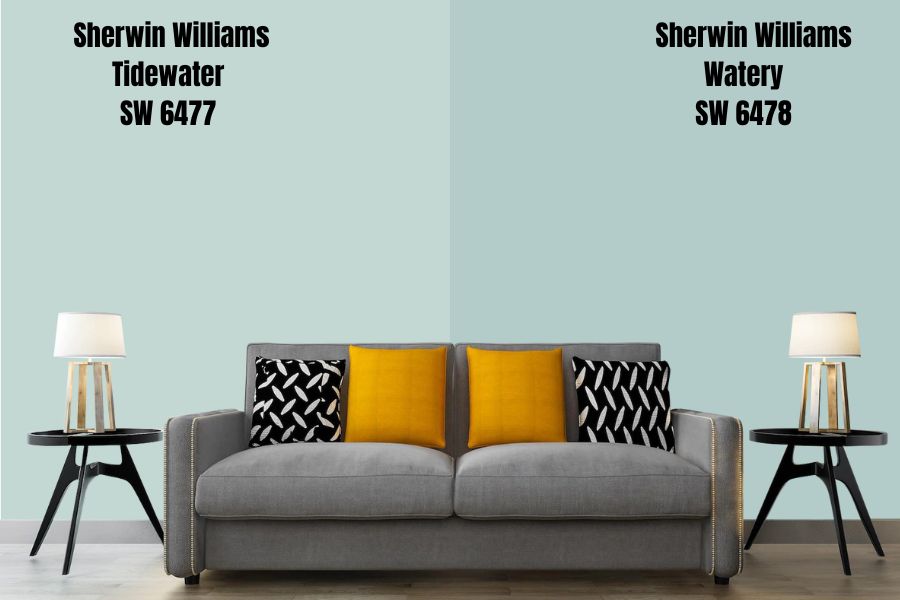
Sherwin-Williams Watery is the next color specter in the Tidewater strip series. As the name implies, it is a pale blue that resembles ocean water. It has an LRV of 57, indicating that it is a light color, but it is still very bold and bright.
This color is warmed by green undertones to create an inviting atmosphere that is perfect for calming spaces such as bedrooms, bathrooms, and living areas. With this color hue, you can be sure of creating a soothing, restful environment that brings the beauty of oceanic waves to your environs.
Sherwin-Williams Aquaverde (SW 9051)
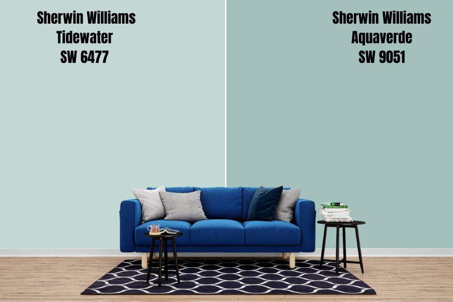
The Aquaverde is an aqua blue color with a darker blue shade than the previous colors. It is ideal for relaxation and has a high tranquil effect. It has an RGB proportion of 163/ 192/ 189, with a higher green content in its mix, giving it a warm texture.
One unique feature of this paint is its ability to adapt to any kind of lighting, from natural daylight streaming in through windows to the cool and dim light of a nightlight. It adopts a lovely luminescence that emits a pleasant glow, adding a subtle elegance to any room.
Sherwin-Williams Drizzle (SW 6479)
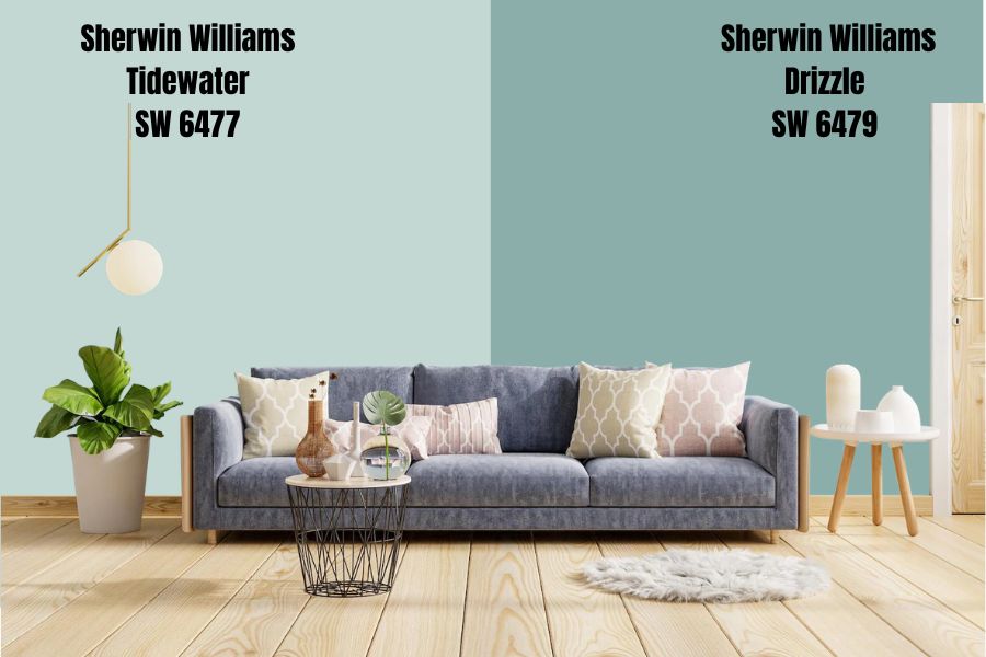
Sherwin-Williams added poise and beauty to this design with the Drizzle color, which is an exquisite shade of blue that has an almost ethereal effect in the room.
Due to its ability to blend with almost any color scheme, it is an excellent choice for those looking to achieve a modern, sophisticated, yet simple look in their space.
What I like best about this color strip is its blue midtone with a green touch that illuminates a space while remaining lively and calm at the same time, which explains why the Drizzle is ideal for hallways and wall exteriors due to its aesthetic value.
Sherwin-Williams Lagoon (SW 6480)
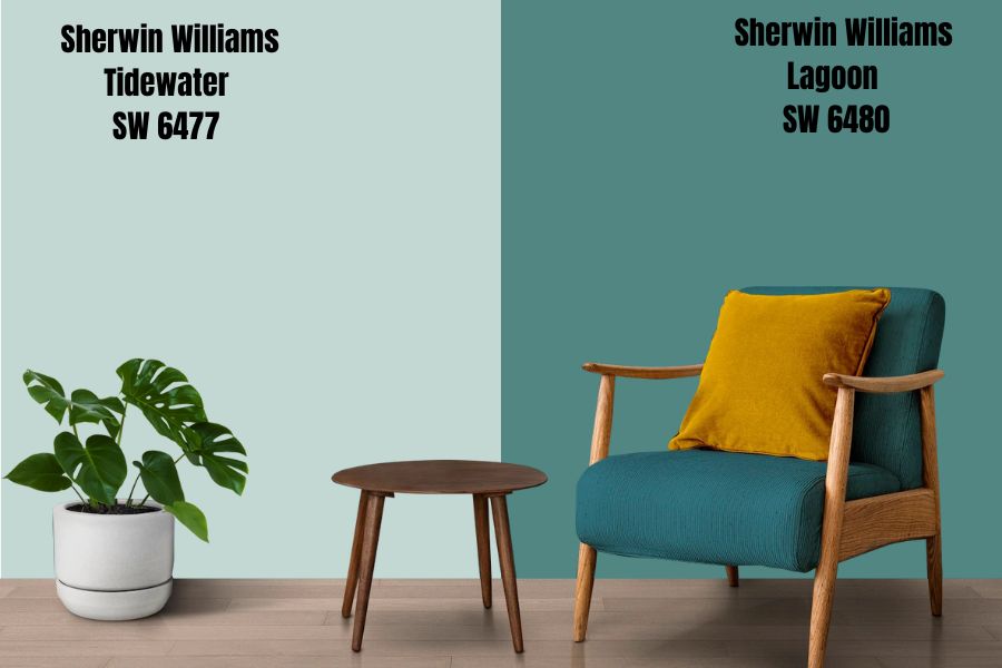
The Sherwin-Williams Lagoon is a soft and natural blue-green color at the end of the light color strip that is sure to bring a sense of calm to any living space.
It has a low LRV of 20, which means it absorbs light well, making it ideal for use in darker, more enclosed spaces like hallways and bathrooms.
The lagoon is also a great color for bringing out natural elements like wood furniture and stone tile, creating a warm and welcoming atmosphere. With this color, you can be sure of a timeless look and feel that will be comfortable for years to come.
Sherwin-Williams Tidewater Color Palette
Color palettes are fascinating because they can create a one-of-a-kind atmosphere in any room. It is a powerful home decorating tool that enables you to design a space that is cohesive and tailored to your personal style.
However, if not done correctly, it can disrupt the harmony of a room and create a sense of unbalance, which you do not want.
In the following sections, you will learn how to use the top three paint color palettes to transform any space and create a beautiful, stylish room.
Coordinating Colors for Tidewater
The subtle nature of the Tidewater makes it difficult to choose a suitable enhancing color, but with the right amount of saturation, these coordination colors help to create a sense of harmony and balance in any design.
To get you started, we’ll go over each of the three basic color palettes—Monochrome, Contrast, and Complementary Decorations—in more detail.
Monochrome Decoration with Tidewater
Monochromatic colors share a common hue angle but have unique tints and shades. A monochromatic color palette can be created by retaining the exact hue of the base color (Tidewater) and then adjusting the saturation and lightness.
The primary monochromatic decoration for Tidewater includes Glimmer (SW 6476) and Shell White (SW 8917). They complement its color and add visual appeal while remaining true to the monochromatic design concept.
Other monochromatic colors that can be used include the previously mentioned strips – Watery (SW 6478), Aquaverde (SW 9051), and Drizzle (SW 6479), which are ideal for adding feeling to the monochromatic palette and giving the space more fluidity.
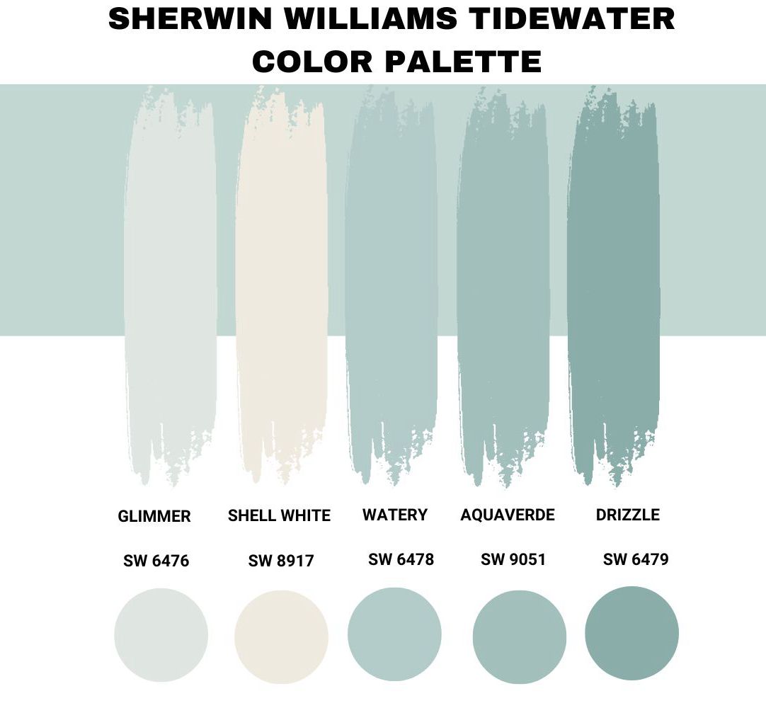
Check out the images below to get a better idea of how these colors work together.
Contrasting Decoration for Tidewater
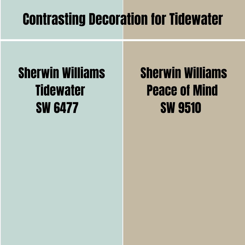
The contrasting Tidewater colors add more vibrancy and vigor to it but still give a soft texture.
The most common examples are Neon White, Smoky Black, Old Burgundy, and Eggplant. These colors add depth and texture to the original design, creating a pleasing contrast between the vibrant blues and greens of Tidewater.
If you crave a darker monochromatic theme to compliment Tidewater, Endless Sea (SW 9510) can be used. It has a dark-blue hue that complements Tidewater but adds a bit more drama and detail to the overall design.
Tidewater Complementary Colors
Tidewater’s complementary colors enhance its beauty by adding dimension to the design. The typical complimentary colors include Languid Lavender, Opal, and Pale Silver.
Unlike the contrasting colors, they are also a light shade, and they serve as a visual link between Tidewater and the other colors in the palette, giving any design project an inviting appearance and feel.
Additionally, you don’t need to be concerned about the triadic and tetradic Tidewater colors because these complimentary colors model their color palette and provide remarkably similar results.
You can see how these complementary colors can make a staggering variety of different color combinations in the pictorial examples below.
What Trim Colors Go With Sherwin-Williams Tidewater?
Tidewater’s best trim colors are organic green, brown, and ocean blue. They provide an earthy backdrop that complements the warm, blue-gray hues of Tidewater and helps to bring out the natural beauty of the color.
The effect they create makes the space feel cozy and inviting, while still maintaining a sense of balance with the rest of the room.
Sherwin-Williams Tidewater Color Comparison
What if Tidewater doesn’t cut it out for you, or if you require a darker shade? Are there any other options? Thankfully, yes! Here’s a quick rundown of some other Tidewater alternatives that might just give you the look you’re after.
The following alternatives are also made by Sherwin-Williams and offer similarly beautiful shades of coastal blue.
Sherwin-Williams Tidewater vs. Sherwin-Williams Sea Salt (SW 6204)
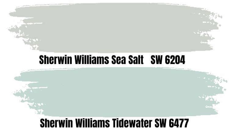
Sea Salt is one of the most popular Sherwin-Williams colors and is frequently confused with Tidewater. It is a good choice for anyone looking for a more muted and subtle color shade.
It may come as a surprise that, despite its bluish appearance, this color belongs to the green family. It’s a cool, muted green with blue undertones that can appear gray depending on the trim, which is why it’s labeled a chameleon color.
And if you want a coastal feel like Tidewater, this color has the perfect beachy blue-green hue to make you feel more relaxed and inspired every day. It has the hex code #CDD2CA and is a soft color that will complement Tidewater by adding a warm and inviting vibe to your home.
Sherwin-Williams Tidewater vs. Sherwin-Williams Watery (SW 6478)
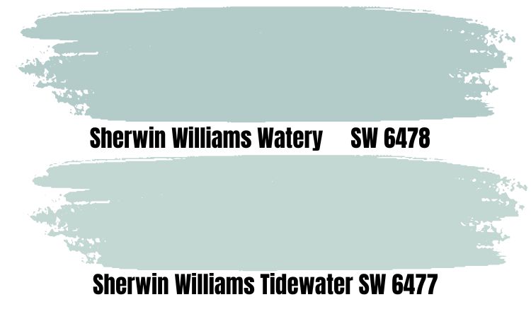
Second to Tidewater in its strip series, Watery produces a slightly darker shade of blue that is great for creating a space with a cooler and more calming atmosphere. It is sometimes confused with Tidewater due to its close similarities, but it has more depth and a bluish shade than its base color.
So why would you choose Watery over Tidewater? If you’re looking for something slightly darker and bluer, Watery is the way to go. And you would prefer this color if you wanted to make a bold statement in your home décor, as it stands out more than the subtle shade of Tidewater.
Sherwin-Williams Tidewater vs. Sherwin-Williams Tradewind (SW 6218)
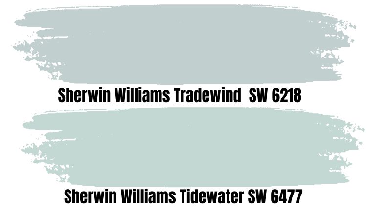
Another very similar blue color to Tidewater, Tradewind is a bit more muted in comparison, featuring a softer green undertone than Tidewater. It has calm gray undertones that make it feel more serene and inviting. Its hex value is #C2CFCF.
It may appear a little bit duller than Tidewater, but it still gives off that same crisp, clean, and airy vibes, making it an excellent choice for beach-themed or coastal-inspired spaces. This color is particularly soothing and calming, making it an excellent alternative to Tidewater for a bedroom or living room.
Sherwin-Williams Tidewater vs. Sherwin-Williams Waterscape (SW 6470)
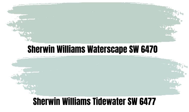
Waterscape is another aqua blue paint color in the green family. It is more subtle than other colors in its family, making it ideal for softer spaces for chilling and relaxing.
The primary distinction between Tidewater and Waterscape is that the latter is a bright and energizing color, whereas the former is a softer, more subdued hue. The two colors work well together and can be used to create a space that is both calming and energizing.
Waterscape has an LRV of 62, so it reflects less light than Tidewater, which has an LRV of 65, making it more energetic and vibrant.
Sherwin-Williams Tidewater vs. Sherwin-Williams Rainwashed (SW 6211)
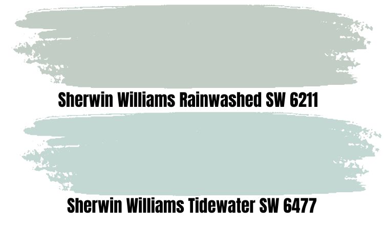
Rainwashed is a naturally calming color from Sherwin-Williams, with a soft blue-green hue that evokes the feeling of being at the beach. It’s an excellent choice for your home’s walls because it exudes a peaceful, calming aura that can make even the most stressful days bearable.
The colors of Rainwashed portray rain falling from a soft blue-green sky and gentle ocean waves, creating a soft and restful atmosphere – I believe this is what inspired its name.
Additionally, this Sherwin-Williams artistry hue is a much cooler green-blue than Tidewater with vivid details. It has more grey undertones than Tidewater, making it feel more soothing and refreshing.
Tidewater Benjamin Moore Color Comparison
One of the most intriguing aspects of the Sherwin-Williams Tidewater is that it has a number of alternatives, including Benjamin Moore’s pool of color paints, which can produce a unique similitude.
To cut to the chase, here are four of Benjamin Moore’s top tones that can produce a similar coastal effect as Sherwin-Williams Tidewater.
All pictures from Benjamin Moore.
Ocean Air (2123-50)
The closest Benjamin Moore color to Tidewater is Ocean Air. This blue-green color instantly reminds you of a beautiful summer day spent on the beach, which is nearly identical to the feeling you get from Tidewater.
Juxtaposing with Tidewater, it has a similar RGB (211, 225, 225) value, but a slightly higher LRV of 73, allowing it to reflect more light and feel slightly brighter.
Sylvan Mist
Another similar oceanic color to Tidewater, Sylvan Mist is a medium light hue that brings to mind the serene beauty of a peaceful lake. Due to its more subtle grey undertones, this color is cooler than Tidewater.
It belongs to the Blue color family and has an LRV of nearly 54. Sylvan Mist’s hexadecimal color code is #B7C6BE, and its RGB value is RGB (183, 198, 190).
Polar Ice (1660)
Polar Ice is a stunning color, with its frosty and crisp appearance. It’s a cool blue that adds a wintery chill and a soothing touch to any room. With an LRV of 74, which is higher than Tidewater’s, this color easily brightens up any environment.
The hexadecimal color code of Polar Ice is #D4E2E4, and the RGB color code is RGB (212, 226, 228).
In Your Eyes (715)
With its gentle color blend and a glimmer of blue peeking through, In Your Eyes catches the feeling of oceanic waves. It has the hexadecimal code #DAE5E2 and the RGB value of RGB (218, 229, 226).
It appears as a complement color to Tidewater because the icy blue hues blend seamlessly with the crisp white undertones, creating a calming and tranquil atmosphere.
Tidewater Benjamin Moore Version
Tidewater does not have a Benjamin Moore equivalent, but Behr does, and it is a near-perfect match for anyone looking for a suitable alternative.
Behr Tidewater (M450-2) is a light, bluish-gray paint color with a subtle green undertone that is identical to the Sherwin-Williams version. It has a higher LRV of 71, which makes it 6% lighter than SW 6477 and an excellent choice for any room that requires a bright and airy feel.
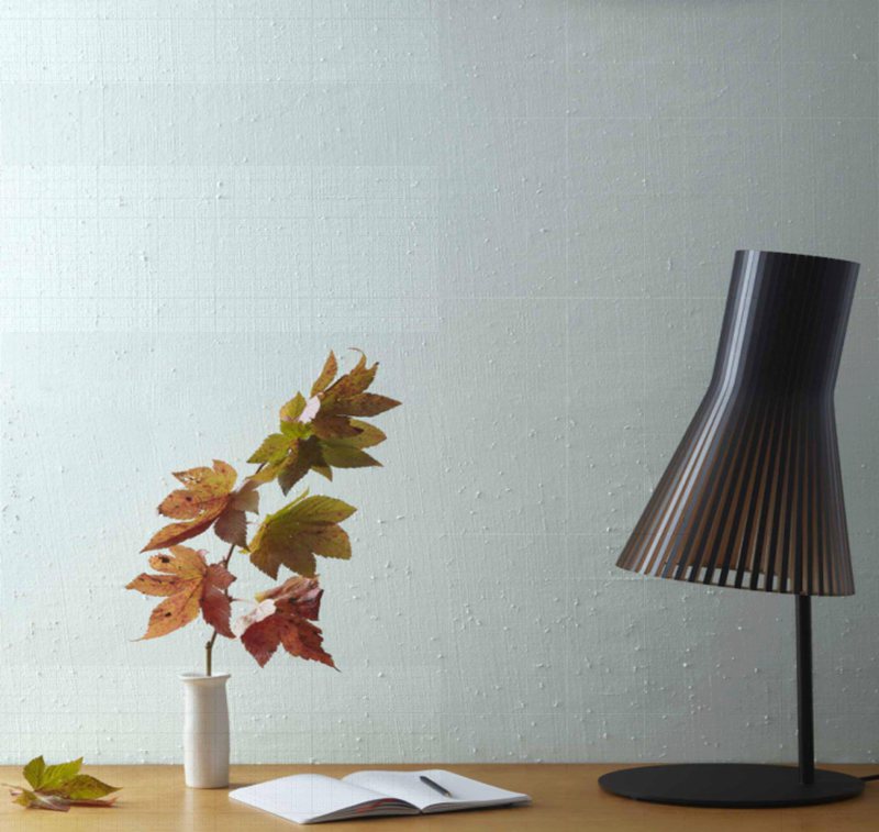
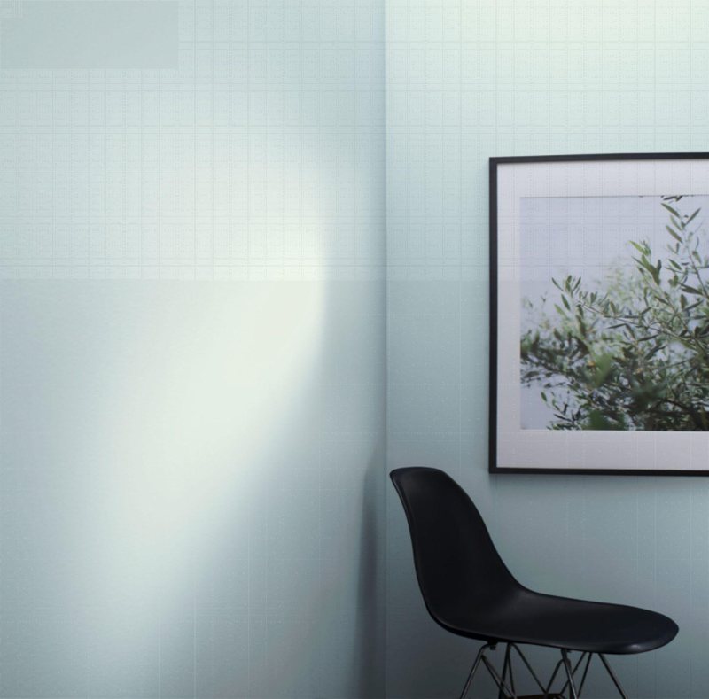
How Does Light Affect the Color?
Tidewater is a light color on its own, so its interplay with light either brightens or dims its shade. And this is heavily dependent on the position of your room in relation to the light source.
Due to the position of the sun, rooms in the south have a greater proclivity to absorb more light than those in the north. Tidewater appears bluish-green in low light but returns to its natural shade when exposed to light.
To that end, curtains, blinds, and other window treatments can be used to control the amount of light that enters a room, allowing people to personalize their living space.
Best Rooms To Paint Tidewater
Tidewater is an excellent paint color for both indoor and outdoor spaces because it is a versatile, soft blue that goes well with warm accents. It has the advantage of being adaptable, from coastal cottages and farmhouses to more modern homes and commercial spaces.
For more details on how Tidewater can be integrated to suit a variety of house decors, check out some of the best rooms to paint Tidewater:
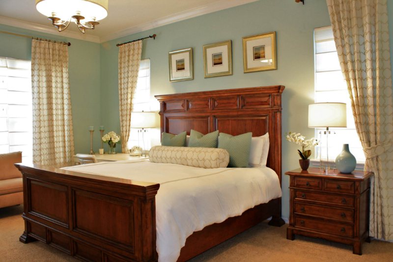
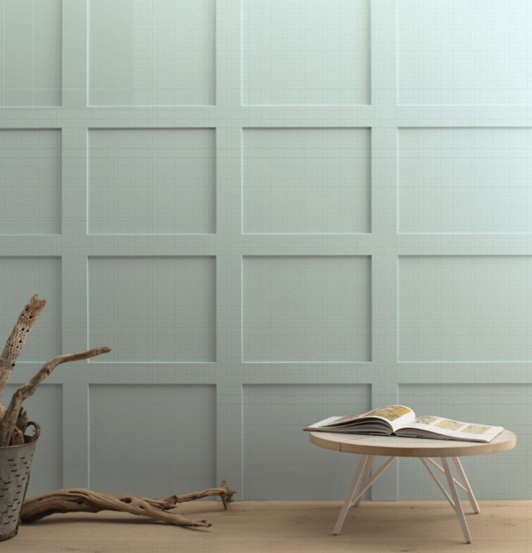
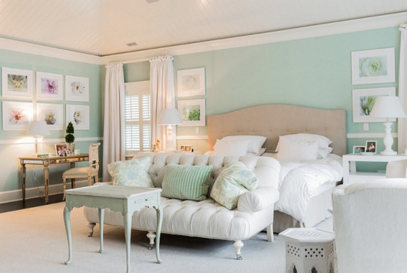
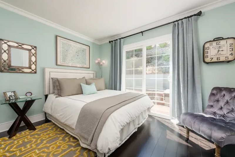
Tidewater Bedroom
For a simplistic bedroom design, Tidewater can do the trick. A simple swath of this color on your bedroom walls will create a soothing atmosphere, allowing for restful nights of sleep and relaxation.
Tidewater is renowned for its calming effects and beachy vibes, creating a cozy and subtle atmosphere that is ideal for your bedroom.
For ideas, look at some of the examples of Tidewater being used in bedrooms below.
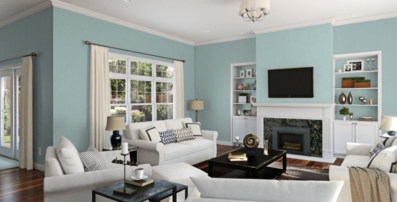
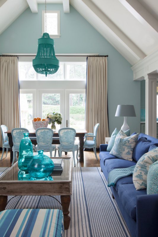
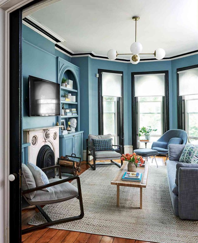
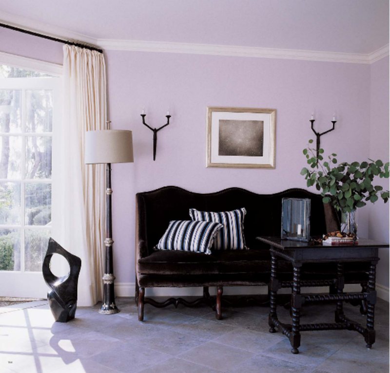
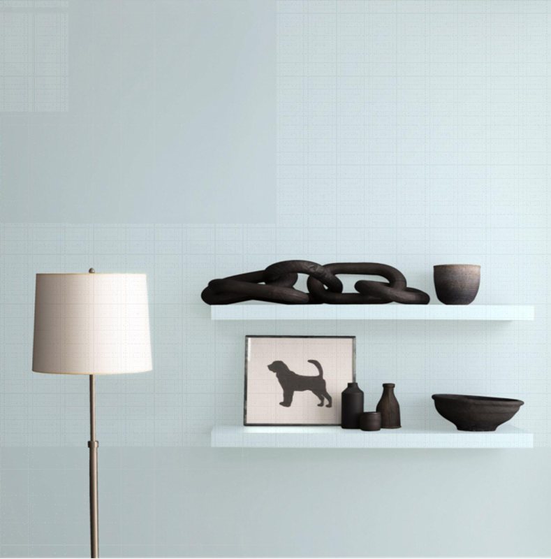
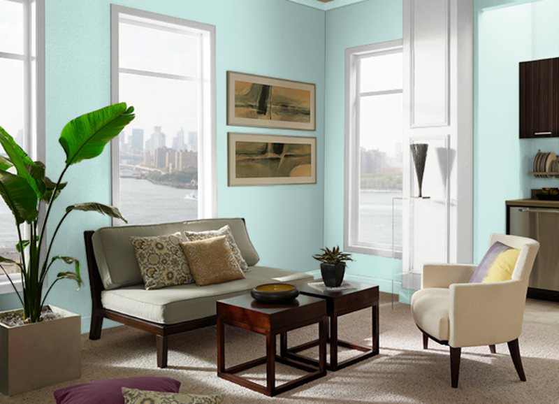
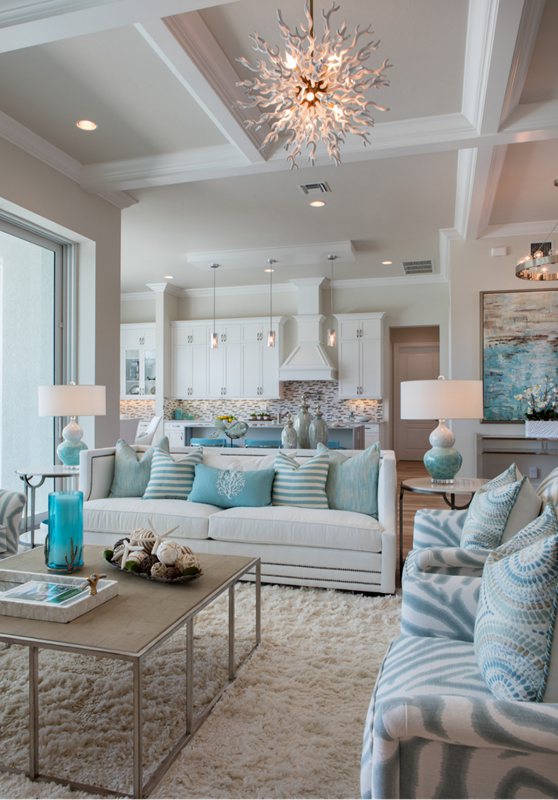
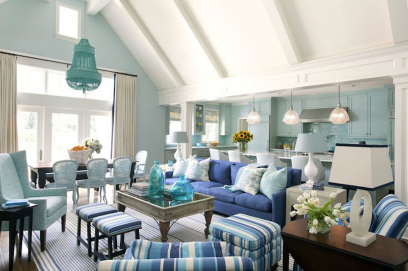
Tidewater Living Room
A little escape from reality, the Tidewater living room hue provides a soft atmosphere that allows one to relax and de-stress after a long day. Its soft blue and green tones create the ideal tranquil atmosphere for a living room.
Furthermore, if you want to add more energy to your living room, you can accent Tidewater with some of the coordinating colors that were discussed earlier to add more details and depth to its light texture.
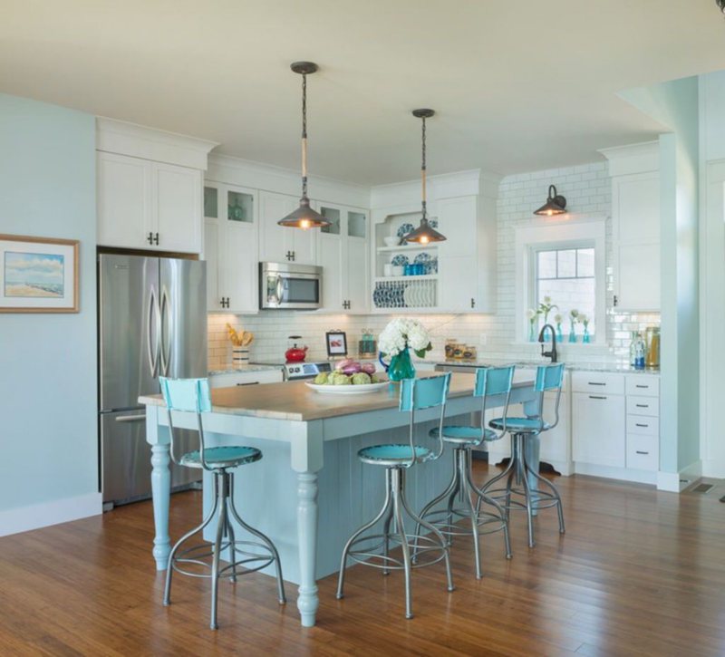
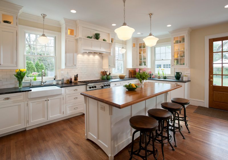
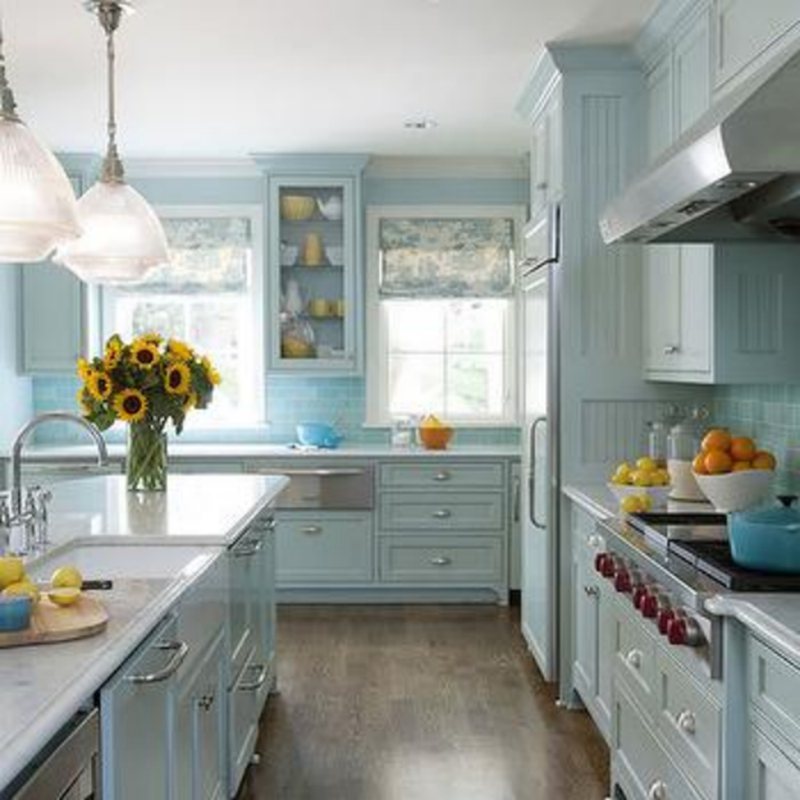
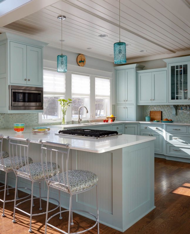
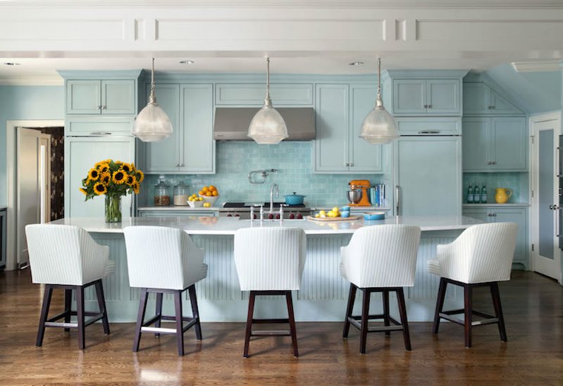
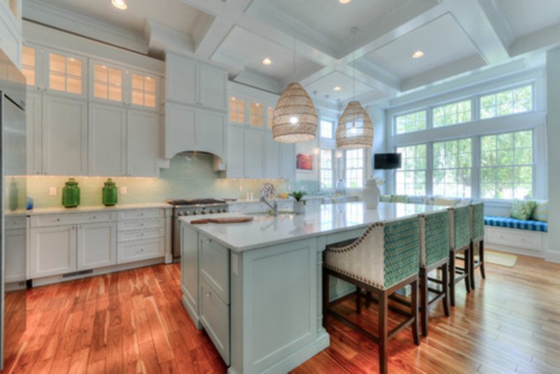
Tidewater in the Kitchen
Where can this color possibly go wrong? I can’t think of anywhere else, even in the kitchen, because Tidewater is such a versatile color that it can be both elegant and refreshing, pairing perfectly with the light wood grain cabinetry.
I like it in the kitchen because it creates a beach-like hangout scenario every time you walk into the room, making you feel calm and refreshed.
Tidewater Dining Room
Even more fascinating, Tidewater can be used to create a romantic atmosphere in the dining room for dinner parties. You don’t need to book expensive halls when you have the perfect shade of blue to set the tone for a memorable event.
Its coastal blue-green with gray undertones creates a mellow vibe that is ideal for a family dinner, romantic evening, or intimate gathering.
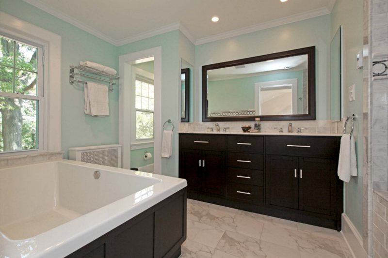
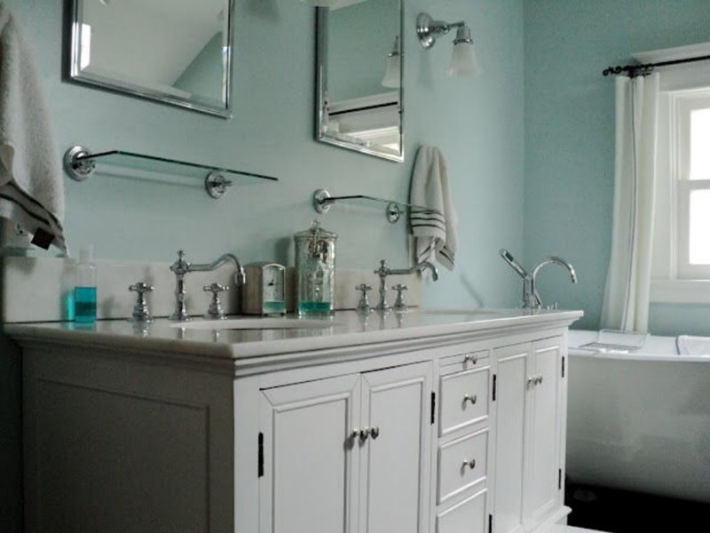
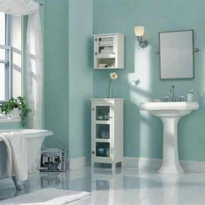
Tidewater Bathrooms
Although not the first color choice that comes to mind for a bathroom decor, Tidewater still has it charm in this space. You can create a classic, calming bathroom atmosphere by pairing Tidewater walls with crisp white cabinetry and white fixtures.
If that doesn’t work for you, try a combination of Tidewater and light blues, such as Watery or Drizzle, for a light and inviting atmosphere.
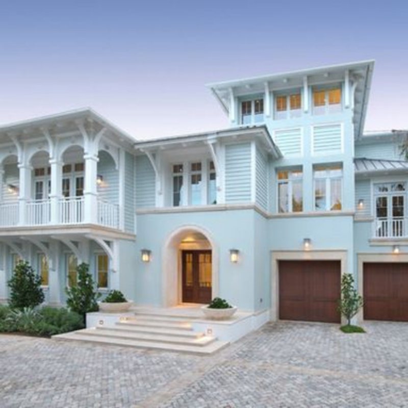
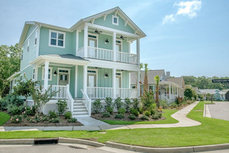
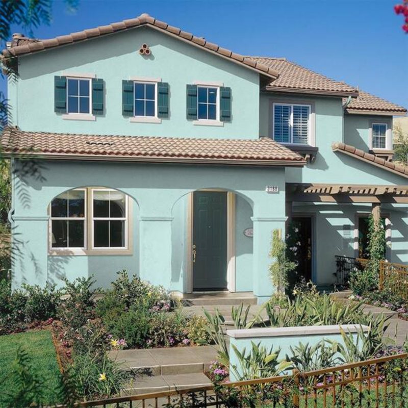
Tidewater Exteriors
As earlier stated, Tidewater can be used both for interior and exterior spaces. Once applied to an exterior wall, Tidewater can help create a welcoming atmosphere for your home.
Although using Tidewater for exterior fittings may not bring out the dark visibility, you can complement it with dark-colored exterior fixtures and furniture to bring out the contrast of Tidewater in all its brilliance.
Check out the images below to see how a Tidewater exterior wall can add beauty and elegance to your home.
Sampling Tidewater
Tidewater, like all Sherwin-Williams paints, can be sampled in four ways: with a color chip, with a peel-and-stick strip, with the Color-to-Go option, or with a Samplize peel-and-stick patch.
Is anyone superior to the other? They are all good sampling techniques that provide accurate color representations, but Color-to-Go is frequently the most viable choice.
Final Thoughts
Now that we have successfully explored the amazing world of Sherwin-Williams Tidewater, we can see that it’s truly a one-of-a-kind hue that can bring character and flair to any room.
Not only do its beachy undertones add vibrancy to a home, but its color-matching techniques and tranquil effects make it an excellent choice for homeowners looking for the perfect shade.
 Sherwin Williams Sea Salt (Palette, Coordinating & Inspirations)
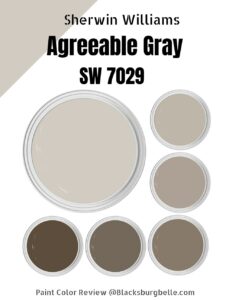 Sherwin Williams Agreeable Gray (Palette, Coordinating & Inspirations)
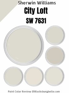 Sherwin Williams City Loft (Palette, Coordinating & Inspirations)
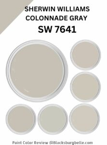 Sherwin Williams Colonnade Gray (Palette, Coordinating & Inspirations)
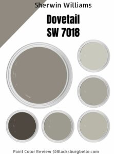 Sherwin-Williams Dovetail (Palette, Coordinating & Inspirations)
 Sherwin Williams Cityscape (Palette, Coordinating & Inspirations)

My room is a little nippy… can you tell https://snip.ly/6327oi