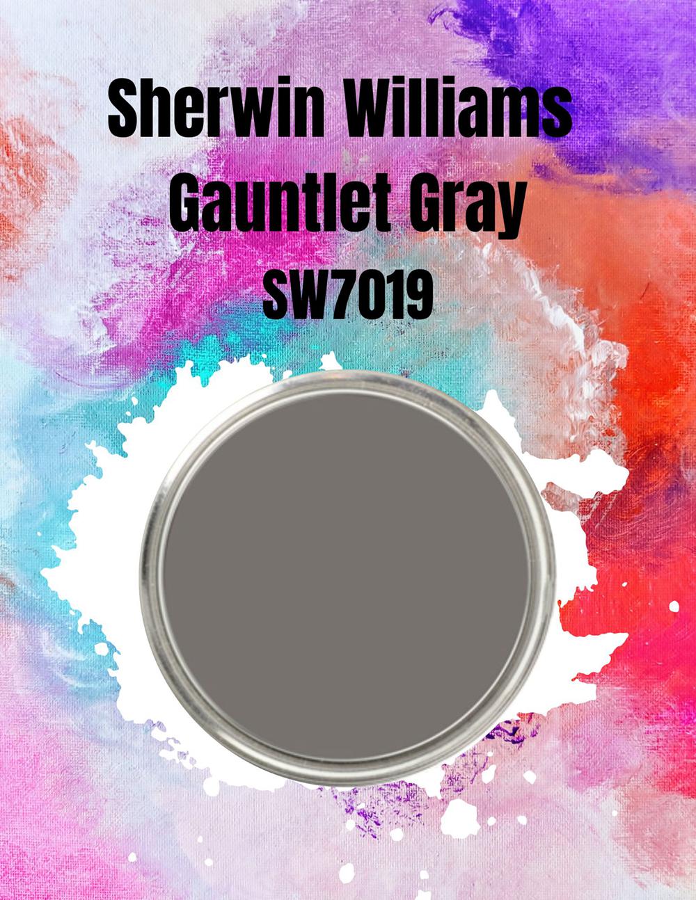
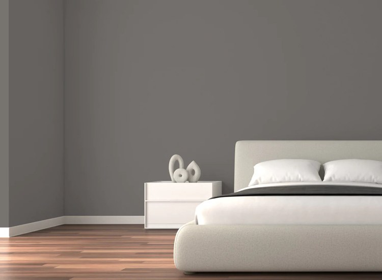
Sherwin-Williams Gauntlet Gray wall paint (SW7019) sits at the top spot as one of the Top 50 colors used by its customers. It’s no surprise that the dark shade is on the list as it’s one of the neutral tones suitable for interior and exterior spaces.
Choosing a wall paint is more than selecting a color as it sets the tone for the portion it covers, be it an interior or exterior space. Before buying, here’s everything you need to know about Sherwin-Williams Gauntlet Gray, code SW7019.
Table of Contents
What Type Of Color Is The Gauntlet Gray?
Gauntlet Gray is a medium-dark shade between warm and dull custom-made by Sherwin-Williams. Under natural light, it may appear brighter or darker depending on the sun’s direction.
It’s the neutral shade you choose when you don’t want something too dark or too light.
It’s all about the light. No matter your paint color, you need a good lighting position to get the best out of your space. Before we continue, let’s assess lighting and how it works.
Light Reflectance Value (LRV) of a Paint Color?
Now let’s discuss the Light Reflectance Value (LRV), which is the paint color’s ability to absorb or reflect natural and artificial light. That tells you the lightness and darkness of your paint on a scale from 0 – 100, with 0 being the darkest (black) and 100 being the lightest (white).
Paints with zero LRV absorb light and heat, while 100% LRV colors aren’t light absorbent; hence it bounces back into reflect.
This information helps you when choosing the right paint based on the purpose of the space it’ll serve. Also, it influences your interior decoration when choosing furniture and lighting.
You’ll find this info on the back of your paint samples or in the description column on the website, like with Sherwin-Williams’ paints.
Stick around to learn how best to pair Gauntlet Gray.
Light Reflectance Value of Gauntlet Gray Paint
View this post on Instagram
A room with North-facing windows painted Gauntlet Gray would retain its natural shade as it receives the little light. It’ll be like turning on a fluorescent bulb in the room, even without windows.
Once the sun sets, it appears darker because of the dimming ray’s interaction with the paint.
West-Facing Light and Gauntlet Gray
View this post on Instagram
The sun rises in the East, so its rays shine bright in the west in the opposite direction. Thus, Gauntlet Gray in a West-facing windowed room gets the best illumination, appearing brighter than its natural state in the mornings until late afternoon.
West-facing light is often cool in the morning and becomes warm as noon breaks, turning the Gauntlet Gray shade to a taupe-toned color.
South-Facing Light and Gauntlet Gray
View this post on Instagram
South-facing windows receive the brightest light because they come directly from above. The Gauntlet Gray space reflects the warmest shade in this case. Its brown, a.k.a. taupe, undertones are strongest underneath this light.
East-Facing Light and Gauntlet Gray
View this post on Instagram
The sun rises in the East, but its rays shine in the opposite direction. The sunlight is a bright yellow into the morning and turns a blue tint as it sets. At best, you’d get some dim light action in a Gauntlet Gray room with an East-facing window or wall positioned in the East.
The inadequate lighting does little to change the shade of gray, so it’s your best shot at maintaining its original hue. However, the color’s tint becomes a shadow as the sun sets by late afternoon towards the evening.
Note that Sherwin-Williams’ Gauntlet Gray is a warm color, so the hue can’t automatically become a deep gray shade regardless of the sun or light’s interaction with it. If you already got the color and want to darken it, you can try curtains.
More on that later.
Decorating With Gauntlet Gray Walls
Decorating Gauntlet Gray walls requires using all the knowledge you’ve gathered so far, from undertones to LRV. Now that you know the LRV and have chosen the appropriate position for the painted wall let’s talk about all the colors that go with Gauntlet Gray Paint.
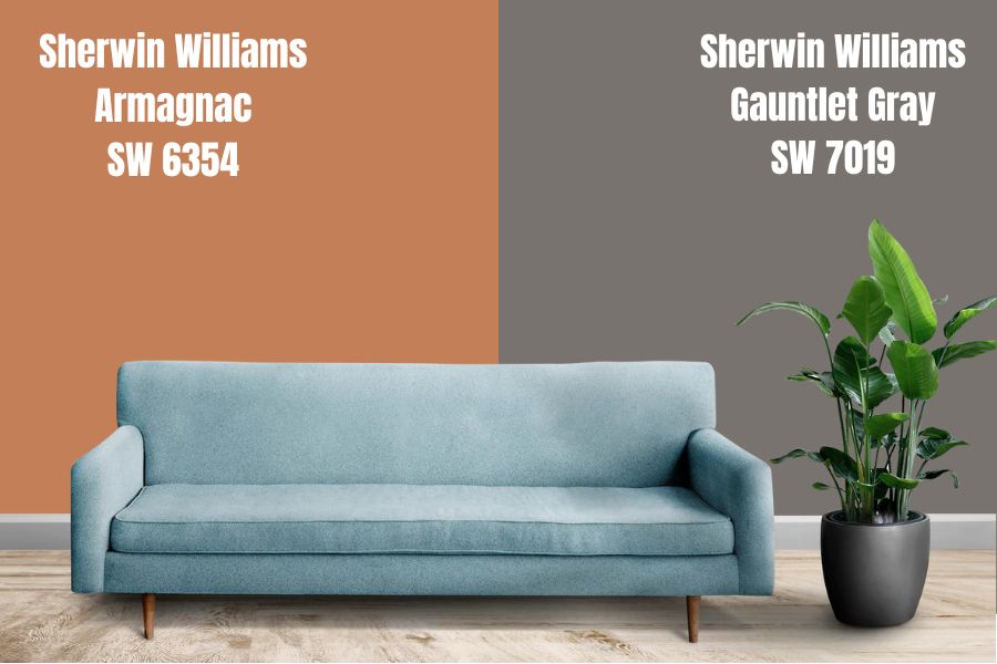
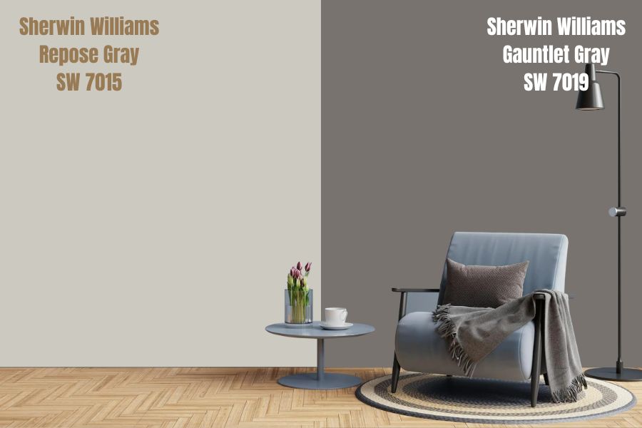
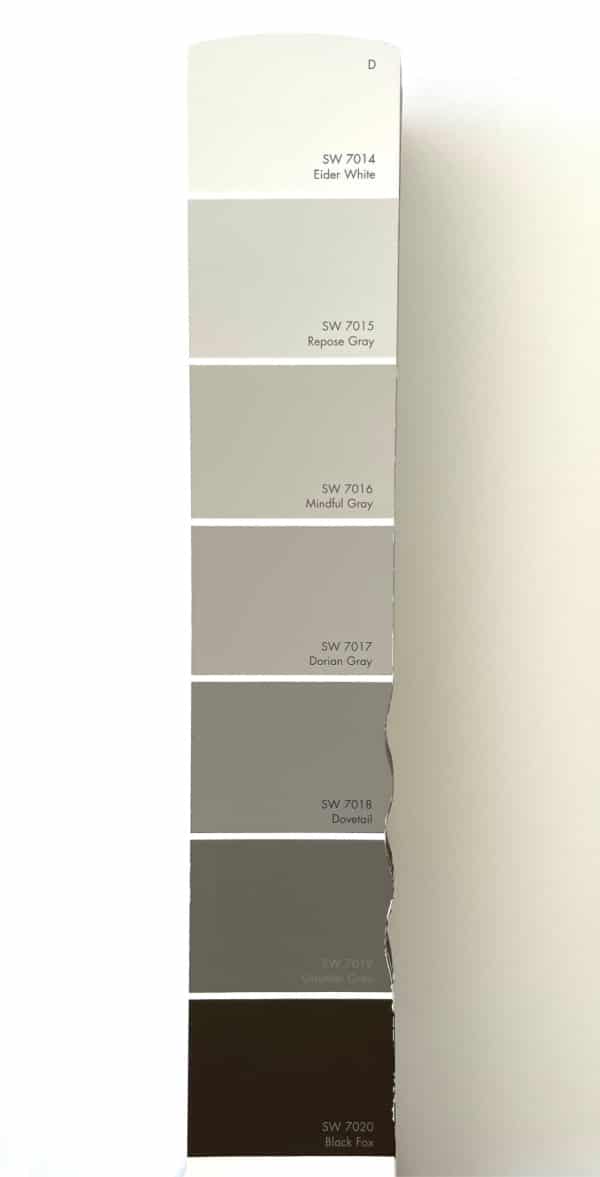
Sherwin-Williams suggests three colors for coordinating Gauntlet Gray – Armagnac, Repose Gray, and Eider White.
We’ll describe those colors and then explain how they complement Gauntlet Gray. Before we proceed, kindly remember the undertones – green, violet, and taupe.
Gauntlet Gray and Armagnac
Armagnac is SW 6354, a shade of orange suitable for interior and exterior painting, with an LRV of 28. Its base material is latex, and it has brown and yellow undertones. Its brighter LRV is a great way to open up the space and accommodate more light.
That’s a good combination for kids’ rooms without messing up your home’s aesthetic, per Sherwin-Williams. However, we don’t advise pairing them since Armagnac isn’t bright enough to open up the Gauntlet Gray color.
Gauntlet Gray and Repose Gray
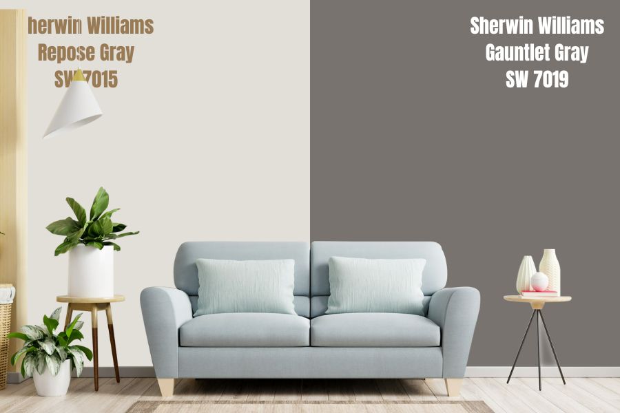
Repose Gray is SW 7015 with an LRV of 58 – a very bright gray leaning towards White. Like the Gauntlet Gray, it also has violet and green undertones, making it a balance coordinator as it contrasts seamlessly with the SW 7019 shade.
Gray on Gray is a no-no for some people because they believe it’s cold, but it can be the best decision you make with the right coordination. Firstly, this combo appeals to minimalists who want a more varied shade in their homes.
Secondly, maintaining a monochromatic vibe is a great opportunity to keep things less busy yet still fun. If it works with clothing, there’s no reason it shouldn’t work with paints on walls.
With Gauntlet Gray and Repose Gray, the light will move from a lit section to a shady area without factoring in lighting interactions. This shade is great for living rooms.
Gauntlet Gray and Eider White
If you want to open up your space to the brightest light (since Gauntlet Gray would only absorb the rays), the best bet is a high LRV paint, and what’s higher than White? Eider White is SW 7014 and has an LRV of 73 – that’s very bright.
It’s also one of the Top 50 colors on Sherwin-Williams’ website, so that’s quality guaranteed. Besides its popularity as a shade, white colors are universal paints because they’re neutral, like all gray shades.
Since Sherwin-Williams’ Gauntlet Gray is a medium dark tone, it goes seamlessly with Eider White, a light color. There’s a contrast, and an unnoticeable blend like you’d get with two light tones.
Watch Kylie M Interiors describe Gauntlet Gray
Gauntlet Gray by Sherwin-Williams and other Brand Alternatives
Sometimes, you may not get what you want from the same brand exactly, so you opt to mix it up. Besides the texture difference that can trip up your décor, there’s nothing wrong with using paints from different brands.
First, we’ll list some brands that are as good as Sherwin-Williams. Then, we’ll pick similar colors to the Gauntlet Gray and coordinating Colors. Keep reading because you’re almost there.
Unfortunately, only one brand contends with Sherwin-Williams in terms of quality, and that’s Benjamin Moore.
Benjamin Moore Paint
Improovy ranked Benjamin Moore slightly better than Sherwin-Williams in 2021, especially for interior painting. The professional review says it’s a case of preference more than quality, like pitting Pepsi against Coca-Cola.
Benjamin Moore offers flat, matte, gloss, semi-gloss, and satin finishes, while Sherwin-Williams has
Sherwin-Williams is more affordable by a small margin, as the average gallon costs $4 less than Benjamin Moore’s at $53. The top-of-the-line Emerald paint at Sherwin-Williams retails between $85.49/gallon – $111.49/gallon, while Benjamin Moore’s Aura retails at $89.99/gallon.
It’s less accessible than Sherwin-Williams, and therein lies its weakness. Unless you order online, only some JCLicht stores sell all Benjamin Moore paint lines, while Sherwin-Williams owns its stores and sells all its products. The only limit in SW stores is the sample type.
Other paints you can try include;
- Behr Paint Cooperation (BPC)
- Kelly-Moore
- PPG Industries
- Valspar
Comparing Gauntlet Gray To Other Gray Shades
Sherwin-Williams’ Gauntlet Gray is one of many gray shades the company makes. Let’s compare it to other gray shades to be sure it’s the one for you.
Gauntlet Gray VS. Peppercorn (SW 7674)
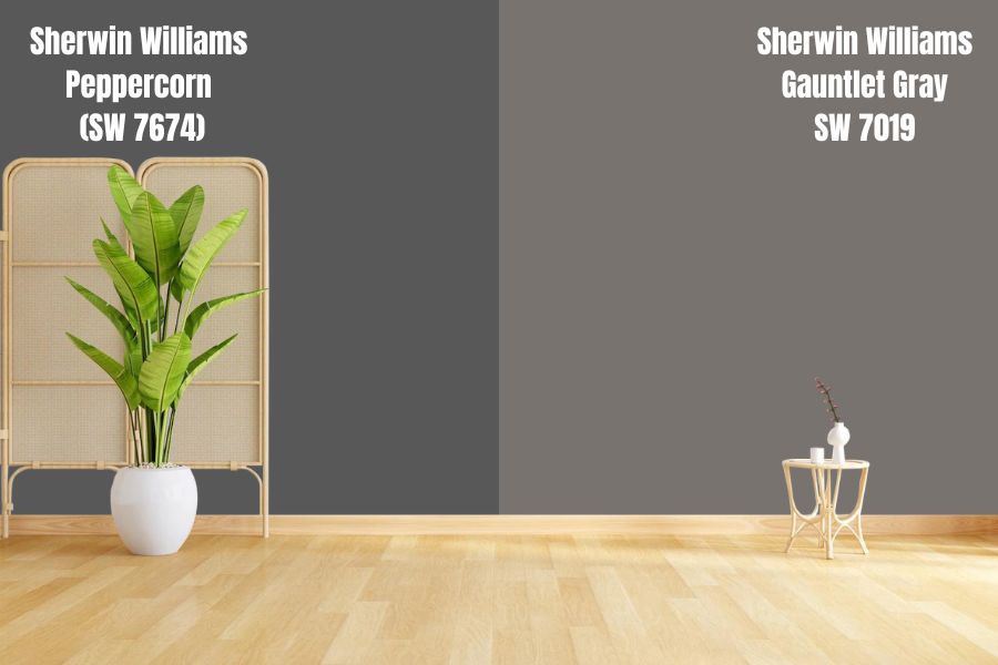
Peppercorn (SW 7674) is a Sherwin-Williams Gray on the dark spectrum used for interior and exterior painting. It’s best suited for outer coloring except if you’re into dark shades for your bedroom, kitchen, and living room.
The shade has an LRV of 10, meaning it absorbs light and would hardly give any reflection. Peppercorn is the color you choose when you want something dark but not black. Despite its shadowy tone, this color gives a calming vibe, especially if you love dark rooms.
Although it has slight violet, navy, and green undertones, they’re not as strong as the Gauntlet Gray. Reflecting light typically won’t alter the shade or highlight any other tone. What you see is what you get with Peppercorn making it a True Gray color.
As a true gray, Peppercorn can go anywhere from the living room walls to the exterior, trimmings, accents, and columns. If you coordinate it with Gauntlet Gray, you won’t be sorry.
They’d serve as perfect contrasts, with the former’s LRV 10 cooling the latter’s LRV 27. Since they have similar undertones, you can also use the Gauntlet Gray as a base paint for priming before coating with the Peppercorn.
Gauntlet Gray VS. Kendall Charcoal (HC-166)
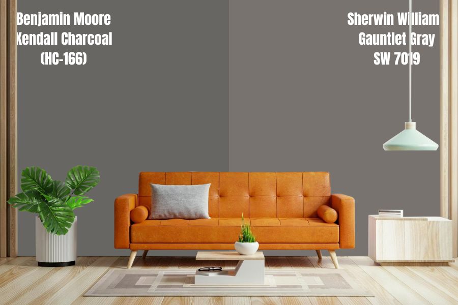
Benjamin Moore’s Kendall Charcoal is another dark warm gray shade with LRV 19.96. It’s not as dark as Peppercorn or as bright as Gauntlet Gray. Charcoal is a favorite neutral because it sits on the fence between the dark and medium dark.
Think of it as an early night or daybreak cloud – between 6:30 a.m. to 6:35 a. m./ 6:30 p. m. to 6:35 p.m. It’s that cloak of darkness before the sun rises or sets. Kendall Charcoal is a masculine shade due to its overpowering dark hues and would be perfect for a man cave.
Underneath a south-facing light, Kendall Charcoal opens up a space and highlights its undertone’s warmth. Besides, it stays a solid gray with no brightness unless you open it up with a high LRV hue.
Gauntlet Gray is no high LRV paint, but it’ll add balance to Benjamin Moore’s Kendall Charcoal without overly brightening the space with shades of white or yellow. If you pair this color with high LRVs, it should be as highlights, accents, or trims to avoid a sharp contrast.
Kendall Charcoal’s undertone is a firm green with no hints of other gray undertones like violet or blue. So, you may coordinate this color with shades of green or neutrals and grays with green undertones like Gauntlet Gray.
Although you can use Kendall Charcoal inside and outside, it’s best for the latter. If you want a Sherwin-Williams shade like this, look no further than Grizzle Gray.
Gauntlet Gray VS. Grizzle Gray (SW 7068)
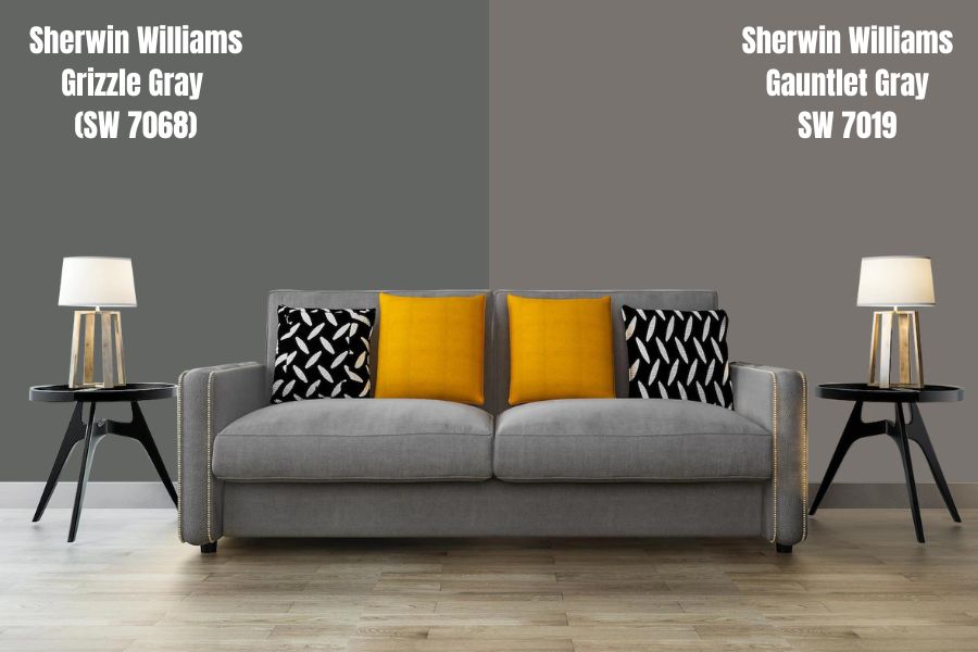
There’s a slim to zero possibility of finding exact shades of the same paint from different brands, but Sherwin-Williams Grizzle Gray (SW 7068) is a close shave to Benjamin Moore’s Kendall Charcoal.
It has an LRV of 13, considerably less than BM’s charcoal, but it has the same effect. Grizzle Gray has an undertone of green and light blue, whereas Kendall Charcoal is pure green.
Pairing this shade with Gauntlet Gray won’t give you any sharp contrasts; instead, it’ll blend almost into one color. That’s how much they look similar, so combining them is not best, but you can use Grizzle Gray as an alternative to Gauntlet Gray.
Gauntlet Gray VS. Westchester Gray (SW 2849)
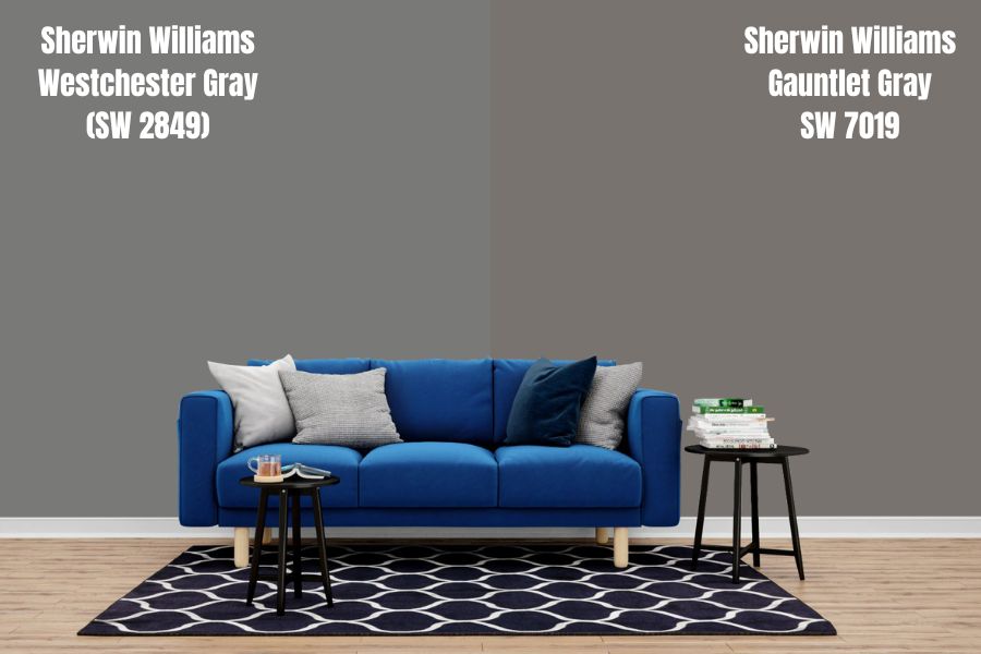
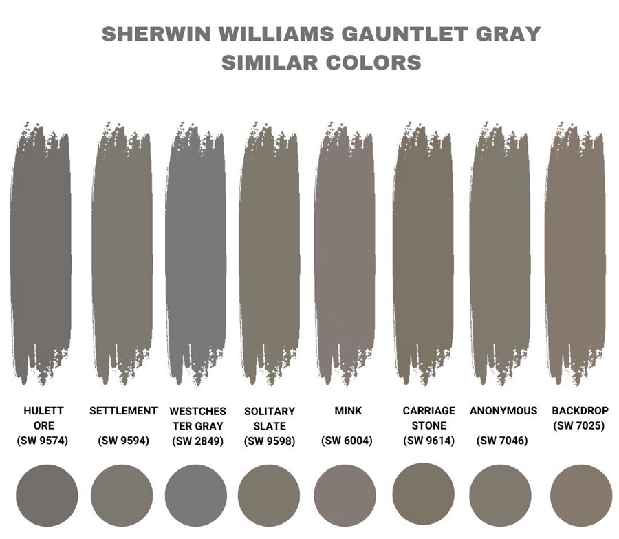
Westchester Gray (SW 2849) by Sherwin-Williams has an LRV of 19, making it a warm dark shade. Its undertones lean more into blue than green making it appear a different, brighter hue underneath the right light (Learn more about lighting above).
Although it has these undertones, Westchester Gray is closer to a pure gray than many other variants. At best, the light interaction would give you a lighter gray, and at worst, you’d get notes of blue, as earlier stated.
Gauntlet Gray and Westchester Gray go well as complimentary colors, but remember that they’re on the same medium-dark spectrum. Unless you use it as significant pairs like side-by-side walls, you won’t get the best from both colors.
If you want a sharp contrast, you’re better off pairing Gauntlet Gray with another shade on the brighter or darker side of the scale or another high LRV color related to its core undertones, like Urbane Bronze.
Gauntlet Gray VS. Urbane Bronze
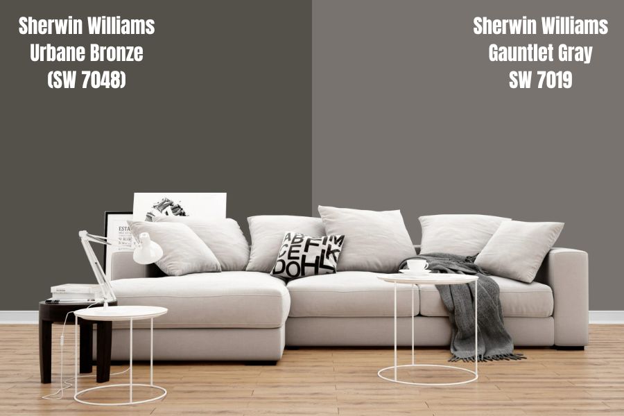
Urbane Bronze (SW 7048) tethers on the brink of brown because of its deep taupe undertone. Its shade confuses new buyers such that they think it’s brown and this fascination made it the 2021 color of the year.
The earthy-toned gray became a trend as it made the perfect balance of neutrals – you get gray paint without compromising your nudes. There’s a catch, though; this taupe gray has an undertone of green under bright light hence the “Earthy” tag.
Due to its primarily dark tone, with an LRV of 8, it’s best to use this color for your home exteriors and any other serious space, such as the study, home office, and kitchen. If you’re into dark interiors, you can also extend its use to other parts of your home, like the living and bedrooms.
However, if you’re into light spaces, Urbane Bronze is best used as an accent meaning a dash here, and there is all you need. Painting one wall, this shade adds an edge to your interior without dulling the entire mood in the room.
Gauntlet Gray kitchen walls work well with Urbane Bronze-painted accessories like islands and cabinets. It’s all about the contrast when working with these two polarizing shades of the same base family.
Urbane Bronze and Gauntlet Gray make a great marriage on exterior trims with darker shades on the trimming. The former does better on versatility than the latter because it carries a more neutral undertone.
Overall, Urbane Bronze works best with warm undertones, so even though you can make it work with Gauntlet Gray, it’s better not to pair them. You’re better off pairing your Gauntlet Gray with warm and light neutrals or colors with those undertones.
Gauntlet Gray VS. Amherst Gray (HC-167)
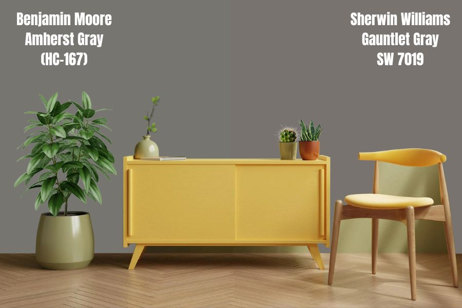
Amherst Gray (HC-167) is a Benjamin Moore shade warmer and lighter than Sherwin-Williams Gauntlet Gray at LRV 17.12. It’s only 0.8% lighter than the Gauntlet Gray, making it a poor option for pairing as it’ll only blend into the other color.
Unlike Gauntlet Gray, Amherst Gray leans towards a slight green undertone and has little to no taupe, purple, or blue. The undertone difference makes Gauntlet Gray more versatile than Amherst Gray. It’s a great option for interiors and exteriors like its counterpart.
This shade pairs best with bright colors like White in its different variations. Avoid darker tones unless you want to use them as highlights or accents since they still sit on the same spectrum, albeit on opposite ends.
Always account for the green undertone before marrying the Amherst Gray with other colors to avoid clashes under bright light. If you’re looking for a Sherwin-Williams alternative to this Benjamin Moore paint, look no further than Westchester Gray.
Gauntlet Gray VS. Dovetail (SW 7018)
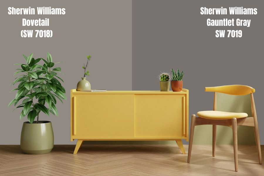
Sherwin-Williams’ Dovetail is one of the truly neutral shades produced by Sherwin-Williams. It has an LRV of 26 and is the most-popular medium-toned shade by the company.
It’s a warm-toned shade that does well highlighting the glow of other colors despite being a gray paint. That doesn’t mean it lacks an undertone instead, it’s more muted than most Gray paints including Gauntlet Gray.
Dovetail has violet highlights underneath the right-facing light, and sometimes green undertones. It’s a great option for exterior and interior painting as it blends flawlessly with other colors. Remember it’s a neutral tone.
Benjamin Moore’s Metropolis is the closest to Dovetail by Sherwin-Williams if you want an alternative.
Gauntlet Gray VS. Chelsea Gray
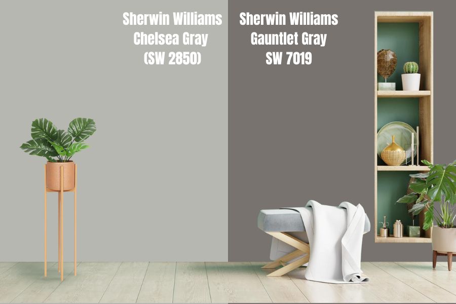
Chelsea Gray is one of the few colors with counterparts on two competing brands. Sherwin-Williams (SW 2850) and Benjamin Moore’s (HC-168) look nothing alike, as the SW paint is lighter than the BM one.
Benjamin Moore’s Chelsea Gray has an LRV of 22.16, while Sherwin-Williams Chelsea Gray is on the lighter side of the spectrum scale at 47. The former is closer to Gauntlet Gray than the latter, but it’s still not the same.
SW 2850 has a green undertone but serves as a great complementary shade. HC-168, on the other hand, has taupe and violet with green undertones. Both tones are good for interior and exterior painting, but the darker paint works better.
Use the Sherwin-Williams Chelsea Gray to open up your space or as a contrasting color with your Gauntlet Gray. It’s a lighter shade, so it’ll bounce off more light into the area it covers. Look for colors with at least double its LRV (35+) for light and half its LRV (8-9) for dark pairings.
Having assessed these many Grays with Gauntlet Gray, the best pairings on this list are Repose Gray, Armagnac, Eider White (per the company), Peppercorn for subtly, and Urbane Bronze for sharp contrasts (per our review).
Use Hextoral to compare your preferred colors side-by-side before buying.
How To Sample Gauntlet Gray Paint
With all that you’ve learned about coordinating paint colors, it’d please you to learn there’s a way to sample the colors before purchasing. There’s always a disclaimer on the website saying colors appear differently based on lighting and other factors, so it’s best to compare physically.
Sherwin-Williams Color Samples
Sherwin-Williams has three sample options for customers – the Peel-and-Stick adhesive painting strip, Color Chips, and Color to Go.
Peel-And-Stick
The Peel-and-Stick is an adhesive reusable paint strip to help you compare the paint colors to your preferred surface. It’s an 8″ x 8″ strip sample available in selected stores and on-demand if you buy online.
Peel-and-Stick is the best option for painted walls because the adhesive has non-transferable paint and won’t damage the existing one on removal.
There’s a 99 Peel-and-Stick samples and three order cap per day for every customer.
Color Chips
Instead of the Peel-and-Stick sample, you can request Color Chips, but Sherwin-Williams permits only 10/order. The chips are 2″ x 3″ and best if you’re only concerned about comparing colors. They’re available in Sherwin-Williams walk-in stores and on the website.
All color chips have a satin sheen, but it’s still an accurate representation of the hue you want. They’re only available in 50 continental US states and Canada, minus the region of Quebec. If you want to take it further, the best bet is using Color to Go.
Color To Go
Sherwin-Williams recommends Color To Go paint samples that are more similar to your potential paint. Coat your walls with this paint to see a real-life application and its results.
Note that it’s the same color as the Stick-and-Peel, but this gives an actual liquid result when you use the Sherwin-Williams paint. The downside, however, is the liquid Color to Go may leave a residue if not properly removed.
Color to Go doesn’t have a uniform price as it differs based on size and color. One Quart of Gauntlet Gray with a deep base is $10.19. Unfortunately, only some colors are available for sampling via Color to Go, but you can use alternative samplers.
The company’s policy says it responds on the same day for orders placed in the USA before 2:00 p.m. EST. Also, you need an active mail service as Sherwin-Williams uses USPS first-class mail for delivery.
Reach out to customer service via phone at 1-800-474-3794 or fill out an inquiry form on its website.
Samplize Color Samples
Samplize is a universally acceptable sampling brand that allows you to buy the paint color you want in a Peel-and-Stick sample. The company uses paint colors from popular brands to create its samples. Think of it as a sticker tattoo for your walls.
You can get as many as you want and place them side-by-side under different lighting conditions to see if it’s what you imagined.
The best part about Samplize is that you can remove it many times, leaving no residue on the wall or spot, thanks to its adhesive formula. Unlike Sherwin-Williams’ satin sheen, Samplize uses Eggshell overglazing. You can get one Samplize for $5.95.
What Textures Work Best with Gauntlet Gray?
Once you’re done with your color samplings and settled on a shade, the next step is choosing your textures. That means your furniture, finishes, textiles, and any other object that’ll occupy your space.
It may seem like an unnecessary part of decorating to the untrained eye, but textures contribute to overall aesthetics. The wrong texture makes your paint job look tacky and empty.
Mixing Textiles
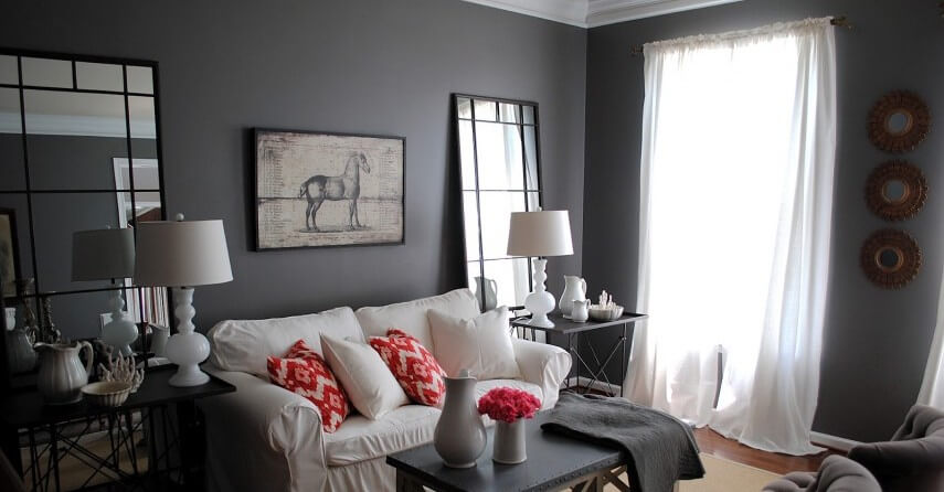
As a medium dark tone, Gauntlet Gray does best with coordinated textures to create a warm and inviting space. Don’t use a single material when decorating your room, as it gives the same effect as a plain wall.
Since Gauntlet Gray is a warm dark tone, you can add some edge to it by using contrasting textures like quilt, suede, and rattan. If you’re choosing metal, lean towards opposite spectrums to avoid blending, and do the same with wood.
For instance, use Armagnac as an anchor for your wood or other brighter LRV colors to open up the room.
Color Coding With Patterns
Choose either cool or warm to avoid clashes. For a cool palette, think of colors close to the water – Blue, Purple, and Aqua. Think of sunrise/sunset colors – Red, Yellow, and Green for a warm palette. See the picture above for reference on tones that qualify on either side of the spectrum.
For neutral tones, pick colors related to the undertones in Gauntlet Gray to liven up your space. Remember, they’re Violet, Blue, Green, and Taupe.
When selecting patterns, focus on the size and number of colors. Use the smallest colors to highlight the room by pairing plain furniture of that color with the patterned pieces.
Foliage
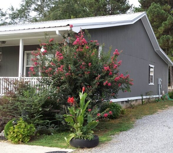
All foliage works against Gauntlet Gray walls but bears in mind the light-facing position of your wall or room. It’ll determine which plant thrives best on the position and the undertone you’re likely to get.
Some indoor plants that thrive in low light include Silver Satin, Cast Iron (North-Facing Light), Lucky Bamboo, and Aglaonema Chinese Evergreen. Outdoor plants that thrive in South-Facing Light include Bougainvillea, Ice Plant, and Verbena.
If your wall has an East-Facing light, you may invest in Anemones. They add a nice touch to your exterior.
Conclusion
You’re ready to repaint your home and start your new décor journey. Don’t forget to sample all your paints before buying. It’ll only cost you a few dollars and save you from the mistake of guessing wrong.
We hope we’ve answered all your questions, but if you still have more, check out the FAQs below.
Frequently Asked Questions
Q: Is Gauntlet Gray Good for Visually Impaired People?
The Americans with Disability Act Accessibility Guidelines (ADAAG) recommends high LRV colors for visually impaired people. It ranges from 70% above, and Gauntlet Gray is a solid 17.20%.
Hence, if you’re decorating a room for visually impaired people or with them in mind, you shouldn’t choose the Gauntlet Gray paint. A better alternative is the Sherwin-Williams White SW 7757, made specifically for interiors.
Q: Is Gray a Neutral Color?
Gray is a neutral color, but hundreds of shades with different undertones alter its neutrality in certain conditions, one being lighting. Before choosing a gray shade, review its undertones to avoid cases of the color changing under extreme sunlight.
Some grays are true neutrals because they don’t change tone regardless of the environment. Examples include Mindful Gray, Sherwin-Williams’ most popular shade, and Repose Gray. For Benjamin Moore, you can buy Silver Chain and Stonington.

