
Have you ever walked into a room and felt like the walls were closing in on you? Or maybe you’ve seen a color online and just knew it would be the perfect fit for your home? If so, then you understand the power of paint color. Choosing the wrong shade can make your space feel cramped and uninviting, but choosing the right one can brighten up any room and give it a whole new look and feel.
Are you considering painting your home’s interior with Sherwin Williams Iron Ore (SW 7069)? If so, you’re in for a treat! This rich, dark paint color is perfect for creating a cozy and inviting atmosphere. Read on to learn more about this fabulous paint color and find out why it might be the perfect choice for your home.
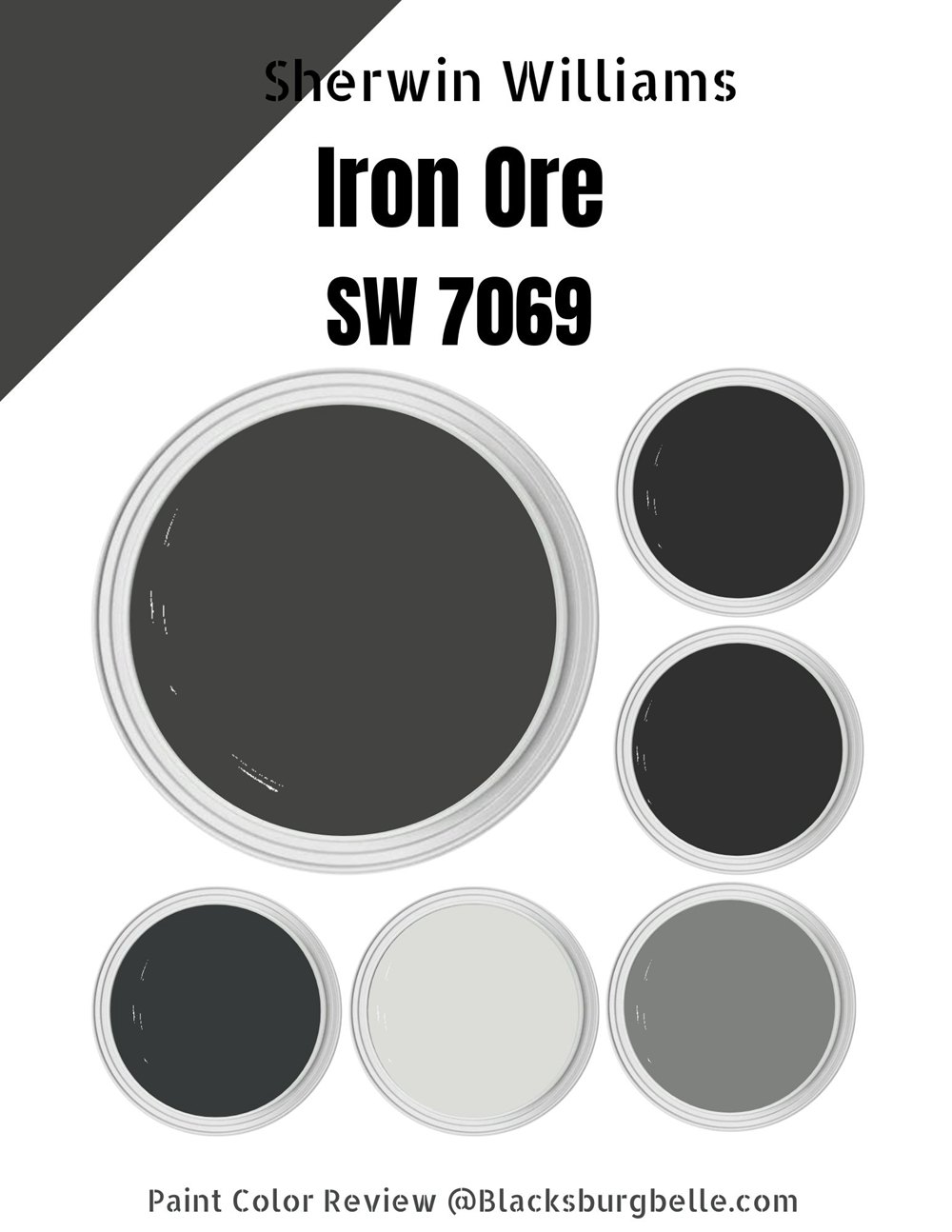
Table of Contents
What Color is Sherwin Williams Iron Ore (SW 7069)?
| Manufacturer | Sherwin Williams |
| LRV | 6 |
| RGB | R: 67 G:67 B:65 |
| Hex Value | #434341 |
| Color collections | 2022 Opus, Nurturer, Pottery Barn, Pottery Barn Kids, Pottery Barn Teen, Top 50 Colors, Rejuvenation – Spring/Summer 2022 |
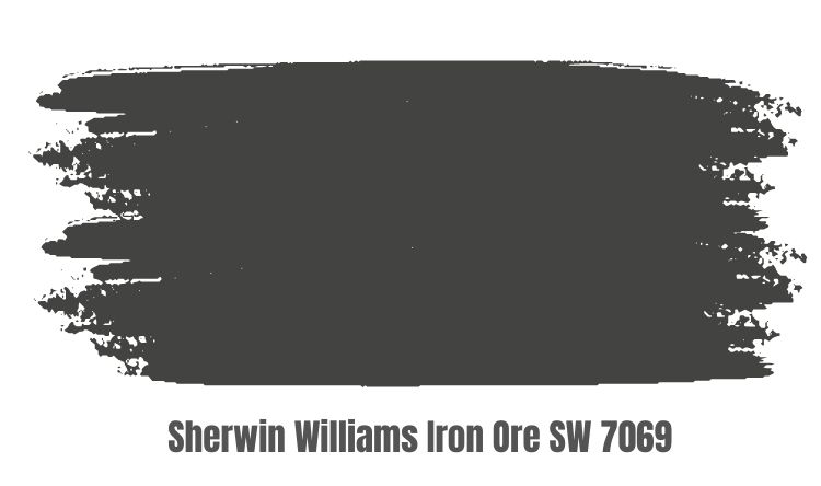
Sherwin Williams Iron Ore is one of the most popular shades in the company’s extensive paint collection. Sherwin Williams Iron Ore is a unique and versatile soft black paint that is perfect for adding depth and drama to any space. Much softer than other shades of black, this color is perfect for creating a sophisticated and elegant aesthetic.
At first glance, Sherwin Williams Iron Ore seems like a rather unremarkable black paint color. It is dark, moody, and decidedly understated. However, when you take a closer look, you quickly realize that this soft black paint color has a depth and complexity that sets it apart from other shades. It packs a sensory punch in the space, making every surface feel warm and alive.
The subtle variations in tone give the room an unusual sense of depth and dimensionality, which brings a sense of energetic vibrancy to the overall aesthetic. With its rich, tactile qualities and impactful presence, Sherwin Williams Iron Ore is the perfect paint color for anyone looking to make a statement in their home.
RGB of Sherwin Williams Iron Ore
When it comes to color, RGB is one of the most important metrics that we can consider. This three-digit code represents the amount of red, green, and blue present in a given color, which makes it an essential tool for determining tone and texture. With a red value of 67, a green value of 67, and a blue value of 65, this paint color has an intensity that draws the eye and evokes feelings of excitement and passion.
LRV of Sherwin Williams Iron Ore
LRV, or light reflectance value, is a metric used to measure the brightness and intensity of a color. Typically, colors with higher LRVs are considered brighter and more vibrant, while those with lower LRVs tend to be darker and more muted. For example, Sherwin Williams’ Iron Ore has an LRV of 6. Although this may seem like a fairly dark shade at first glance, it actually has a range of subtle shades that give it a surprisingly dynamic appearance.

Is it a Warm or Cool Color?
Part of what makes this shade so intriguing is its ability to conjure thoughts and feelings that span the spectrum, from its bold and sleek modern vibes to its classic and understated character. In reality, however, this versatile hue is undoubtedly a warm black color. Its rich, deep tones evoke images of midnight skies and forest shadows, hinting at the mysteries lurking beneath the surface. Furthermore, it embodies a subtle warmth that sets it apart from more stark or austere shades of black.
What are the Undertones?
At first glance, the Sherwin Williams paint color Iron Ore may seem like an unassuming black. But upon closer inspection, it becomes clear that this paint color boasts a rich range of undertones and subtle variations. On the one hand, Iron Ore’s gray undertones provide a soft and soothing backdrop for any space. And on the other, its hint of green exudes a sense of vibrancy and energy, making it perfect for both indoor and outdoor applications.
View this post on Instagram
Sherwin Williams Iron Ore Color Strip
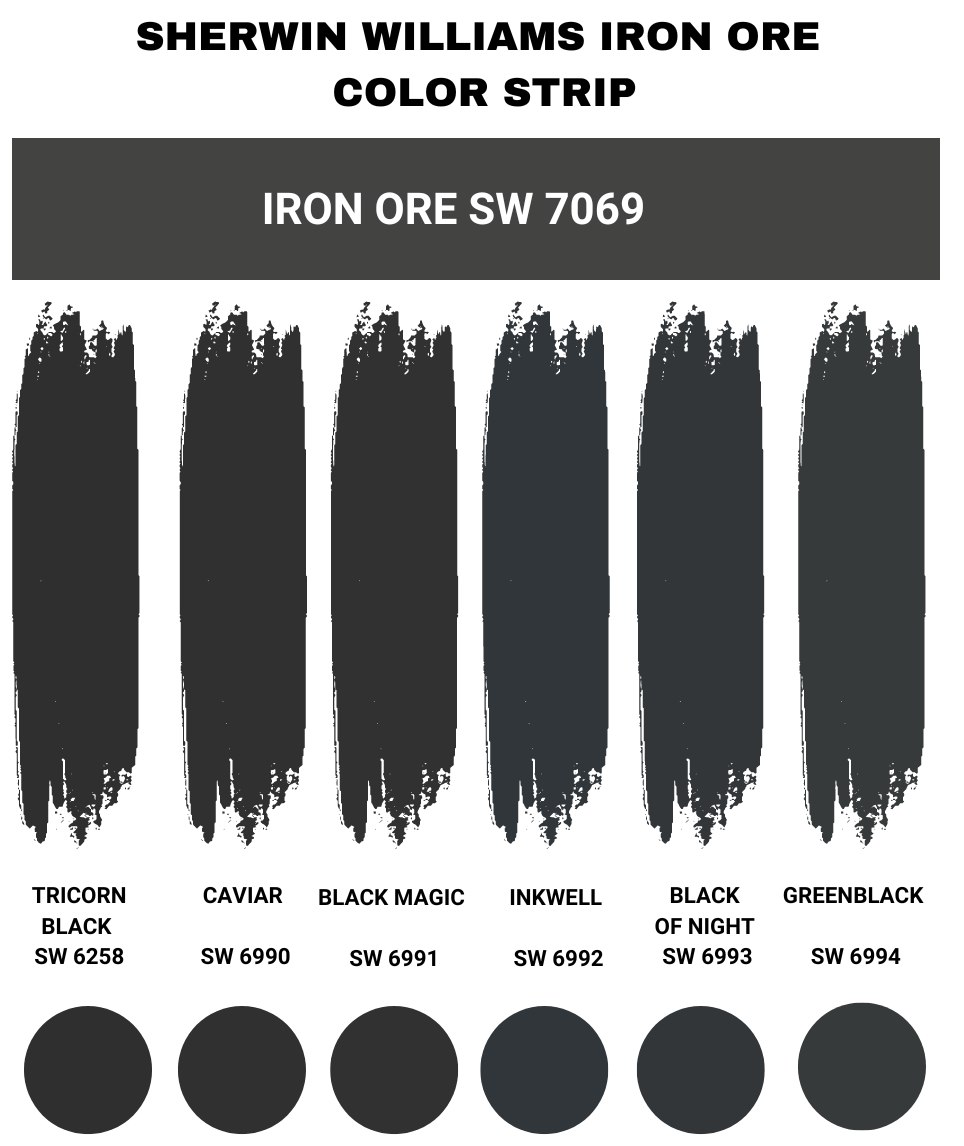
Sherwin Williams Iron Ore vs Tricorn Black
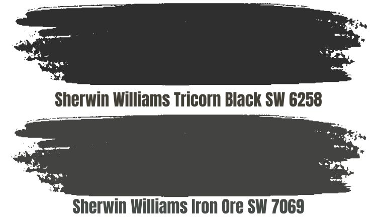 When comparing Tricorn Black and Iron Ore, there is no doubt that Tricorn Black is the darker and more richly pigmented of the two. With an LRV of 3, it has a deep and dramatic black appearance that easily stands out against any backdrop. In contrast, Iron Ore has an LRV of 6, which lends it a softer and more muted shade.
While both Tricorn Black and Iron Ore have an undeniably elegant and modern feel, since Tricorn Black tends to be a little darker than Iron Ore, it is the ideal choice for projects that require a bold, dramatic look (areas like the den or library). On the other hand, if you are looking for more brightness and light in your living room or kitchen, Iron Ore might be a better option.
And if you want to achieve the best of both worlds by combining these two shades together in one space, you can certainly do so with great results!
Sherwin Williams Iron Ore vs Caviar (SW 6990)
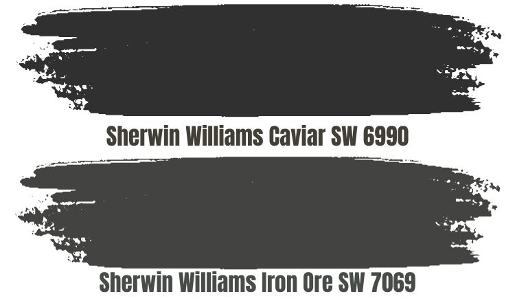
When comparing Sherwin Williams’ shades of Iron Ore and Caviar, it’s clear that these paints have very distinct characteristics. While Iron Ore’s undertones are strongly influenced by the green and gray hues of the mineral from which it takes its name, Caviar boasts a much darker color and significantly lower LRV, or light reflectance value. This makes it a great choice for creating dramatic visual impact in any room.
Sherwin Williams Iron Ore vs Black Magic (SW 6991)
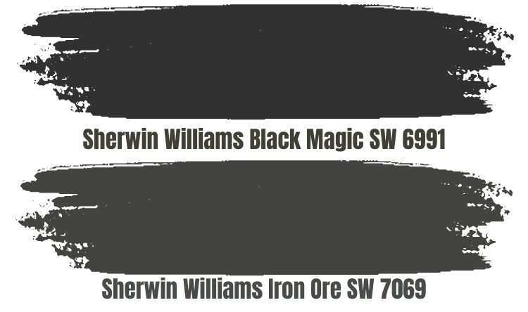
Both of these paints offer rich, deep black tones that are ideal for spaces like kitchens and bathrooms. However, Black Magic has a true black undertone and boasts a LRV (Light Reflectance Value) of 3, making it significantly darker than Iron Ore. Because of this, Black Magic is especially popular for cabinets and other large surfaces where an intense black hue is needed.
Sherwin Williams Iron Ore vs Inkwell (SW 6992)
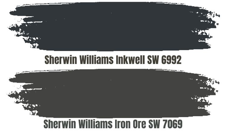
While Iron Ore is a rich, soft black that is perfect for bold accent walls, Inkwell is a deep blue with moody undertones that can be used to create a dramatic effect in any room of the house. With an LRV of 4, Inkwell is slightly darker than Iron Ore and exudes a sense of creativity and sophistication.
Sherwin Williams Iron Ore vs Black of Night (SW 6993)
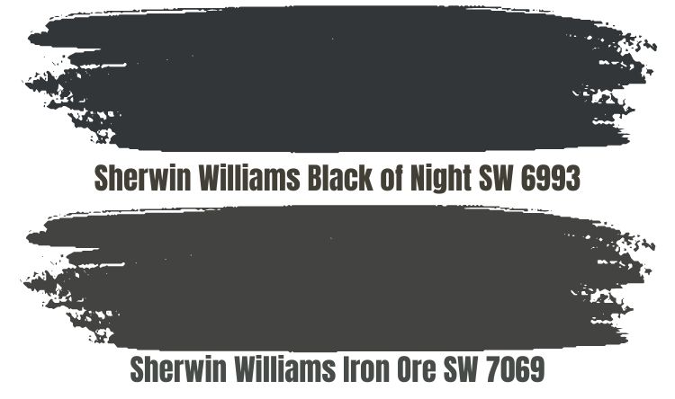
Black of Night is the darker of the two colors. With an LRV of 4, Black of Night has a deeper and richer color that perfectly captures the moody, dynamic nature of nightfall. This dark shade of cyan-blue offers a cool and slightly ethereal feeling that is perfect for creating a sense of drama and intrigue. In contrast, Iron Ore has an LRV closer to 6, meaning that it isn’t quite as dark or saturated as Black of Night.
Sherwin Williams Iron Ore vs Greenblack (SW 6994)
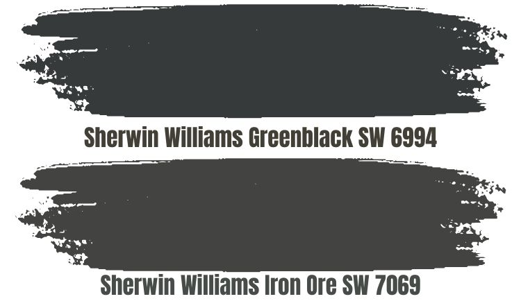
When comparing Sherwin Williams’ Iron Ore and Greenblack, it’s clear that Greenblack has a stronger green tone than Iron Ore. With a LRV of 4, Greenblack is also darker and more vibrant than its counterpart, making it the perfect choice for those who want to add a pop of color to their space. With its rich green undertones, Greenblack is bold without being overwhelming.
Sherwin Williams Iron Ore Color Palette
Coordinating Colors for Iron Ore
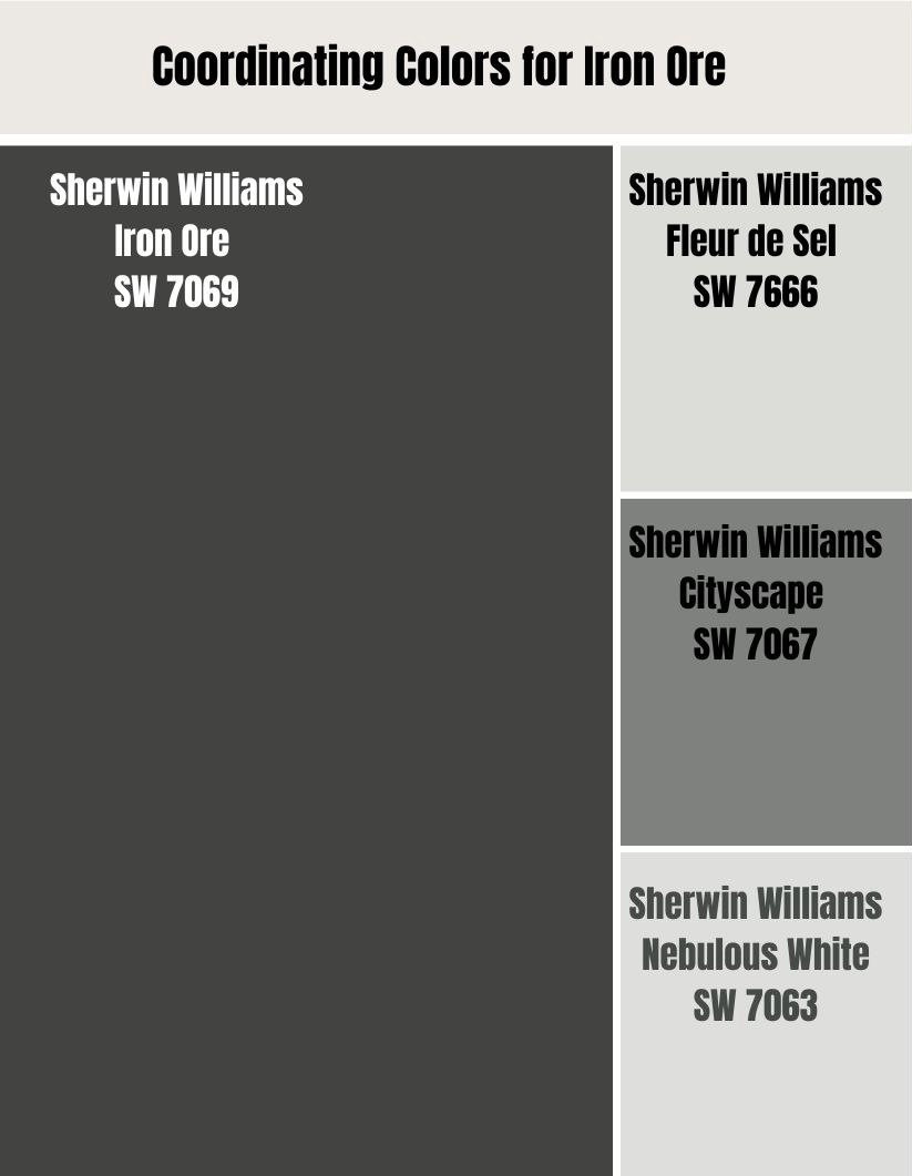
With dark hues like Sherwin Williams Iron Ore, it is especially important to choose colors that will complement and brighten the space, rather than compete with or overpower it.
Fleur de Sel (SW 7666)
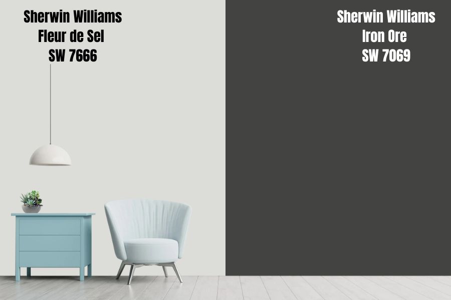
Sherwin Williams Fleur de Sel is the perfect choice for anyone looking for a pale gray paint with soothing blue-green undertones. This color has a calming effect that immediately puts your mind at ease, making it the ideal choice for any room in your house.
Cityscape (SW 7067)
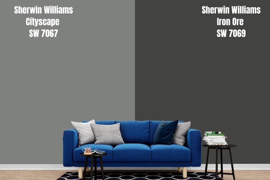
Cityscape has a stylish gray base with just the right amount of green undertone, giving it a cool, urban feel that perfectly complements dark and moody spaces. And when paired with an equally dark hue like Iron Oak, Cityscape creates a dramatic contrast that’s both beautiful and elegant.
Nebulous White (7063)
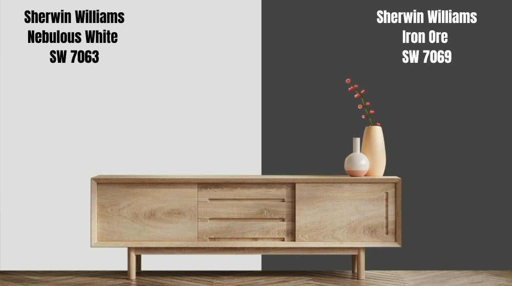
Nebulous White is a cool white with soft gray undertones that creates an overall serene ambiance when paired with soft blacks like Iron Oak. The soft black complements the pure white perfectly, allowing it to pop without feeling too stark or overpowering. And the soft gray tones in the white add just enough warmth and dimension to keep things feeling interesting.
Sherwin Williams Iron Ore Complementary Color
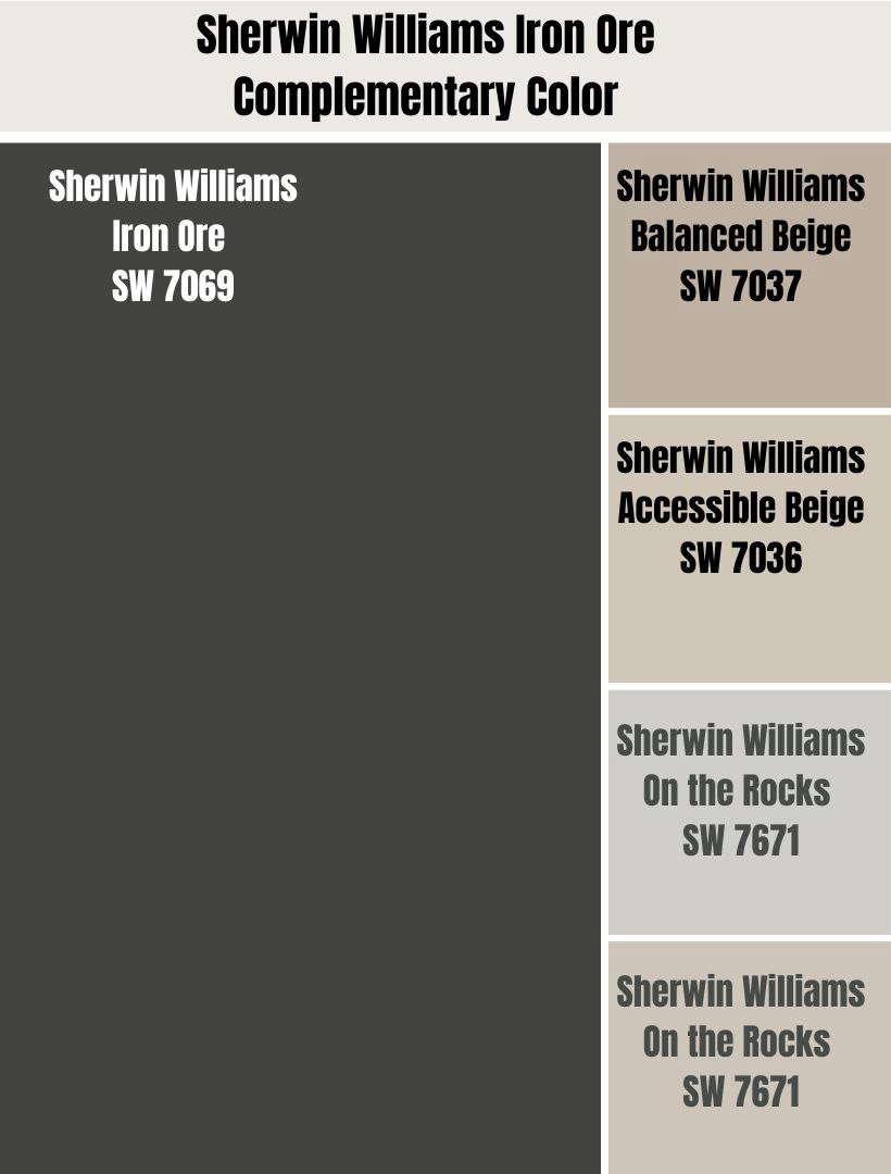
When it comes to choosing colors that go with Sherwin Williams Iron Ore, there are many options to consider. Some of the best options are neutral shades like Balanced Beige or Accessible Beige. These beiges have just the right amount of warmth and brightness to complement the cooler tones of Iron Ore without overwhelming them.
A pleasing contrast can also be achieved by pairing with shades like Worldly Gray and On the Rocks. These will help inject some energy into your décor. Both of these rich gray hues incorporate bold pops of color that will infuse your home with style and flair, making them perfect complements to this elegant shade from Sherwin Williams.
Balanced Beige (SW 7037)
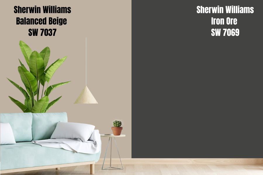
At first glance, Sherwin Williams Balanced Beige might seem like just another run-of-the-mill beige paint color. But this warm and cozy shade is actually quite unique, as it lacks the usual golden undertone that is typically associated with beige shades. With its subtle hints of gray and green, Balanced Beige seamlessly blends into both modern and traditional spaces.
Accessible Beige (SW 7036)
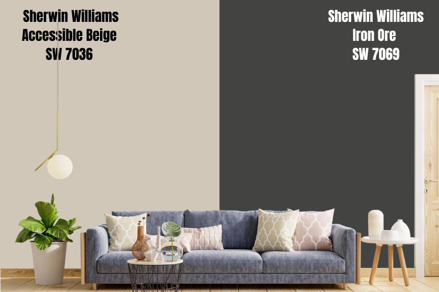
With its light gray undertones, this beige is the ideal shade for creating a sense of balance and tranquility in any space. And with a LVR of 58, this paint color is also brighter than Balanced Beige which has a LVR of 46, making it ideal for creating striking contrast with bold accent colors or rich furnishings.
On the Rocks (SW 7671)
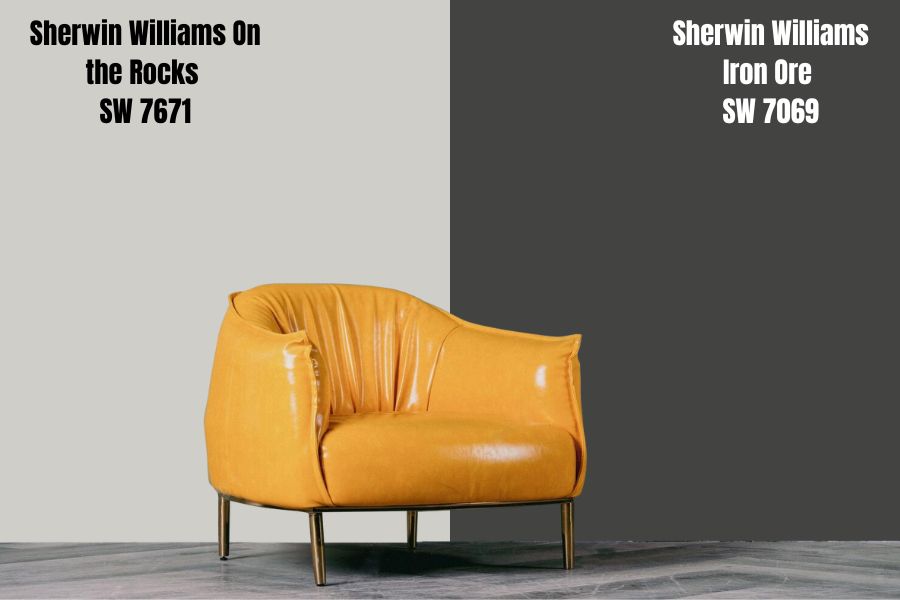
If you’re looking for a sophisticated and modern gray color with undertones of muted sophistication, then look no further than Sherwin Williams’ “On the Rocks.” Featuring an elegant gray hue with subtle hints of green and taupe undertones, this versatile color is the perfect choice for a sleek and stylish living room or bedroom.
Worldly Gray (7043)
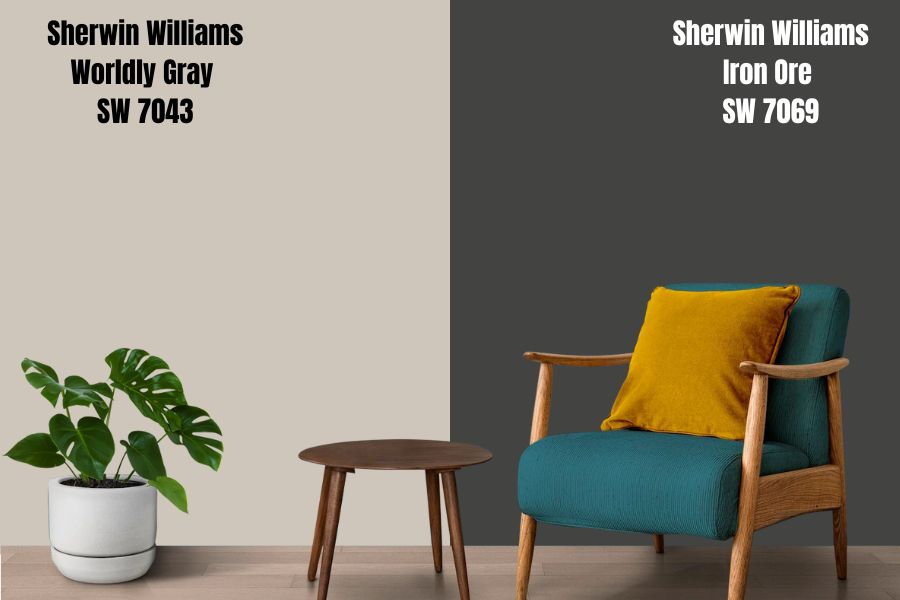
This unique shade offers warm undertones that appear to be mainly green with a touch of violet, allowing it to easily transition between gray and greige depending on the lighting. In addition, with an LRV of 57, this neutral paint color is perfect for adding a bit of warmth and sophistication to any space.
What Trim Colors Go With Sherwin Williams Iron Ore?
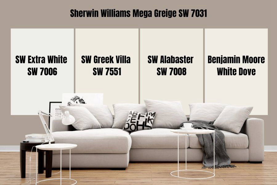
When it comes to choosing a trim color that will go well with Sherwin Williams Iron Ore, there are a number of options to consider. One option is to stick with a crisp white color that will accentuate the rich grays and warm undertones of the Iron Ore hue. For example, a crisp white like SW Extra White can create a clean and polished look, while warmer whites such as SW Greek Villa, SW Alabaster, or Benjamin Moore White Dove can add an inviting touch.
Sherwin Williams Iron Ore Color Comparisons
Sherwin Williams Iron Ore vs Peppercorn
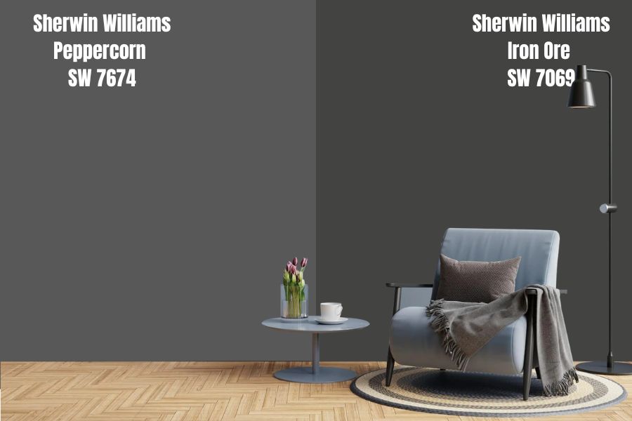
If you’re looking for something that’s bold but not too dark, one color that is worth considering is Sherwin Williams Peppercorn. Compared to the darker shade of Iron Ore, Peppercorn offers a brighter and lighter look. In addition, it has a low-to-very-low reflective value of 10 on the LVR scale – meaning that it will help to make your room appear bigger and more open.
While both of these colors are gorgeous in their own right, they possess very distinct personalities.
On one hand, there’s Iron Ore – a rich, moody shade with deep gray undertones that exude sophistication and class. It would be perfect for a room with minimal decor or an accent wall in an otherwise neutral space. Whether highlighting subtle details or making a bold statement, this steel-inspired hue never fails to make an impression.
On the other hand, there’s Peppercorn – a more playful option with warm green undertones that give it a decidedly earthy feel. This rich and vibrant tone is ideal for creating warmth in any room, from cozy living spaces to bright and airy kitchens.
Urbane Bronze vs Iron Ore
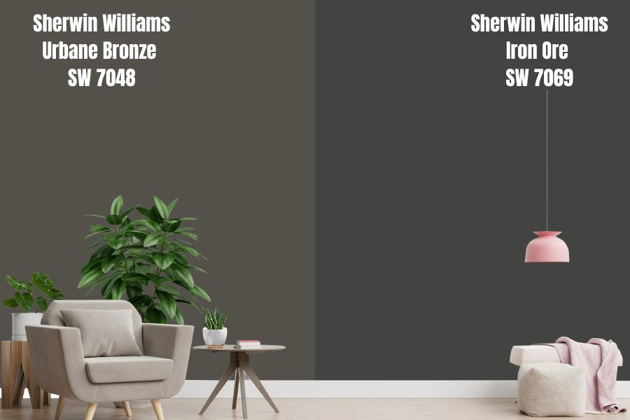
With its cooler and more black tones, Iron Ore is a popular choice for modern spaces that emphasize sleek lines and high-tech functionality. On the other hand, Urbane Bronze has a warmer, browner look that makes it ideal for more traditional interiors.
Additionally, while both paints have hints of green undertones, Urbane has a lighter, brighter appearance that is perfect for bringing life and vibrancy to any room. For comparison, Urbane Bronze has a higher LRV value of 8, making it a more vibrant and luminous shade compared to the LRV of 6 for Iron Ore.
One popular combination we love is to use Urbane Bronze as the main color on the exterior of your house, while using Iron Ore on the trims and accents. This combination brings together the warm, rich tones of Urbane Bronze with the cool, sophisticated vibe of Iron Ore.
Iron Ore vs Wrought Iron
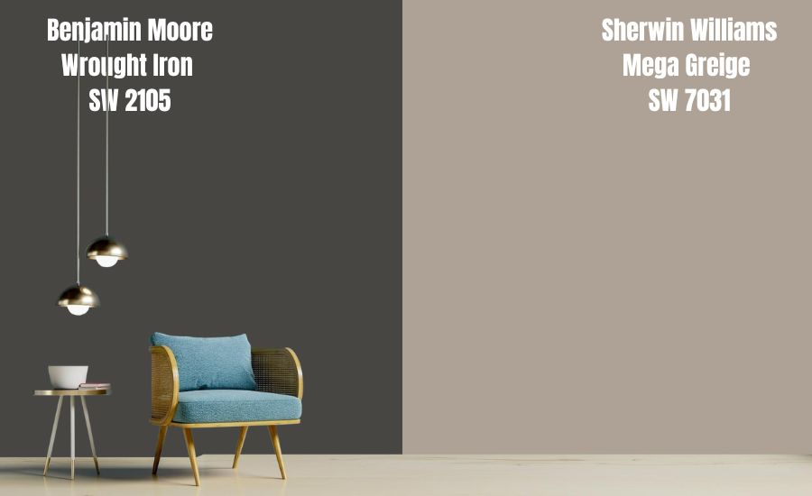
Despite the similarities in appearance, the two paints are also similar in terms of light reflectance value (LRV), or the percentage of visible light reflected off the surface of the paint. With an LRV of 6.16, Benjamin Moore Wrought Iron comes out slightly ahead of Sherwin William Iron Ore at 6.
Iron Ore is warmer and richer than Wrought Iron, with subtle green undertones that lend even more energy and depth to this bold hue. If you’re looking for a richer feel in your space, Iron Ore is definitely the way to go. On the other hand, Wrought Iron has a more subtle appearance, with cool blue undertones that give it a soft and subtly sophisticated feel. If you prefer a more subdued look in your home, Wrought Iron might be the better choice for you.
Black Fox vs Iron Ore
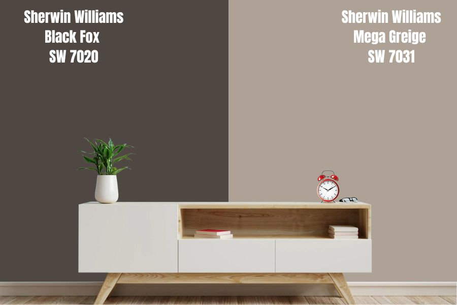
When it comes to choosing the perfect black paint color for your home, there are few options that can top Sherwin Williams’ Black Fox. This rich and luxurious shade boasts deep brown undertones, creating a dramatic and striking look that is sure to turn heads. And at an LRV of 7, Black Fox is one of the darkest shades available in the Sherwin Williams lineup, making it the perfect choice for adding depth and drama to any space.
But if you’re looking for something a little darker still, then you might want to stick with Sherwin Williams’ Iron Ore. With an LRV of 6, Iron Ore has even richer and more intense shades than Black Fox, providing a bold and sophisticated finish that is guaranteed to make a statement.
How Does Light Affect the Color?
Light is a crucial factor when it comes to color, and it can greatly affect the way that certain shades appear. For example, under most lighting conditions, Sherwin Williams Iron Ore appears relatively neutral, with strong earthy tones that work well in a variety of settings.
In general, the Sherwin Williams Iron Ore paint color appears to have a cool, green-gray undertone. This is especially true when the paint is in bright, natural light or under fluorescent lighting.
However, in rare cases, some may even see hints of purple or brown or blue undertones. This suggests that the Sherwin Williams Iron ore paint color is quite dynamic and adaptable, and that its appearance can vary depending on factors such as time of day and type of lighting.
Best Rooms to Paint Iron Ore
Sherwin Williams Iron Ore in Bedroom
This soft black shade is perfect for adding interest and drama to accent walls, making it a top choice for bedroom interiors of all styles. Whether you’re looking to create an elegantly monochromatic look or want to add depth with bold pops of complementary color, Iron Ore is the ultimate choice for bringing a touch of sophistication and understated glamor to any bedroom.
View this post on Instagram
View this post on Instagram
View this post on Instagram
Sherwin Williams Iron Ore in Living Room
When it comes to choosing a color for your living room, you want something that is bold and eye-catching, but also sophisticated and understated. For me, that ideal shade is Sherwin Williams Iron Ore. This soft black is the perfect choice for walls, fireplaces, and accent walls alike – bringing both elegance and drama to any room in which it is used.
View this post on Instagram
View this post on Instagram
Sherwin Williams Iron Ore in Kitchen
This rich, deep color works especially well in kitchens, where cabinets and islands are typically prominent features of the space.
View this post on Instagram
View this post on Instagram
View this post on Instagram
Sherwin Williams Iron Ore in Bathrooms
Sherwin Williams Iron Ore works particularly well in bathrooms. This soft black looks great on both walls and vanities, adding an elegant touch that can really elevate the style of your space.
View this post on Instagram
View this post on Instagram
View this post on Instagram
Final Thoughts
When painting a room, it’s important to choose the right color. If you’re looking for a warm dark, moody color, then Sherwin Williams Iron Ore (SW 7069) might be the perfect choice for you. This paint color is rich and earthy, with slightly green undertones. It can create a dramatic effect in any room, making it the perfect choice for your home office or bedroom. Keep in mind that this color can be quite intense, so use it sparingly for best results.
With its rich, deep color and sophisticated feel, Iron Ore makes the perfect backdrop for any room. Whether you’re going for a modern look or trying to create a classic vibe, this versatile hue is sure to bring your vision to life. So why wait? Unleash your inner artist and start exploring the endless possibilities of Iron Ore!
 Sherwin Williams Smoky Blue (Palette, Coordinating & Inspirations)
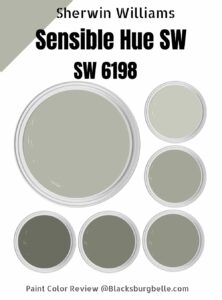 Sherwin Williams Sensible Hue (Palette, Coordinating & Inspirations)
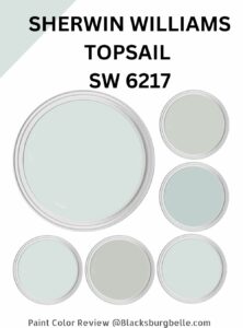 Sherwin Williams Topsail (Palette, Coordinating & Inspirations)
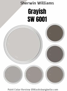 Sherwin-Williams Grayish (Palette, Coordinating & Inspirations)
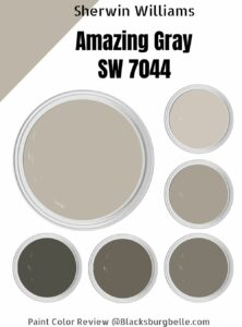 Sherwin Williams Amazing Gray (Palette, Coordinating & Inspirations)
 Sherwin Williams Oyster Bay (Palette, Coordinating & Inspirations)
