
Sherwin-Williams Gray Screen is fast becoming a best-selling neutral paint due to its beautiful blue undertone. With gray paints taking over as the first choice of neutrals for contemporary designers, the only question is, “Which gray paint is the right fit for me?”
If you’re looking for a cool mid-toned gray paint to create a relaxing vibe and help you rejuvenate after a long day out, then Sherwin-Williams Gray Screen is the one for you.
Learn all about the color, from its scientific info like RGB, LRV, and Undertones to its creative aspects, including curating a Color Palette and the right amount for each space.
Table of Contents
What Color is Sherwin-Williams Gray Screen?
Sherwin-Williams Gray Screen is a neutral gray paint with a faint blue undertone that turns it cool. Hence, the color exudes a calming aura great for relaxation and rejuvenation. It’s made of equal portions of green and blue mixed with a lesser red paint into black.
| Manufacturer | Sherwin Williams |
| LRV | 59 |
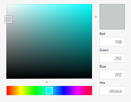
| RGB | Red 198 | Green 202 | Blue 202 |
| Hex Value | #c6caca |
| Color Collections | Sophisticated Sanctuary, Inbe Tweens, Living Well – Focus, Top 50 Colors |
RGB of Sherwin-Williams of Gray Screen
You can recreate any hue using its RGB or CMYK value. RGB represents the amount of Red, Green, and Blue contents mixed into a true black paint to create a unique color. Sherwin-Williams’ Gray Screen RGB value is Red 189, and 202 of Green and Blue.
The higher blue and green contents make for its cool undertones, but you’ll learn more below.
Light Reflective Value (LRV) Of Sherwin-Williams Gray Screen
A paint’s reaction to light influences the decision-making on every new color if you want it to portray the right vibe. The Light Reflectance/Reflective Value tells you if the paint would absorb light or illuminate its surroundings.
You can measure LRV on a scale of 3 – 97, representing the darkest to the brightest hues. The scale misses 0 – 2 and 98 – 100 because there’s no absolute black or white paint without undertones.
Is Gray Screen a Warm or Cool Color?
The blue undertone in Sherwin-Williams Gray Screen makes it a cool color. You can categorize every hue on the color wheel into hot or cold, or equivalents.
Shades resembling fire (red, orange, and yellow) are warm, while those resembling the ocean (blue, green, and purple) are cool. This information would help you create a theme for your space by leaning into its warmth or coolness, depending on the room’s purpose.
What are the Undertones in Gray Screen?
Let’s talk undertones. Have you ever bought paint or any colored item only to get home and realize it’s another shade? That’s the work of undertones, and Sherwin-Williams Gray Screen has two – powder blue and a faint violet.
Undertones are secondary hues embedded in a color waiting to shine under the right conditions.
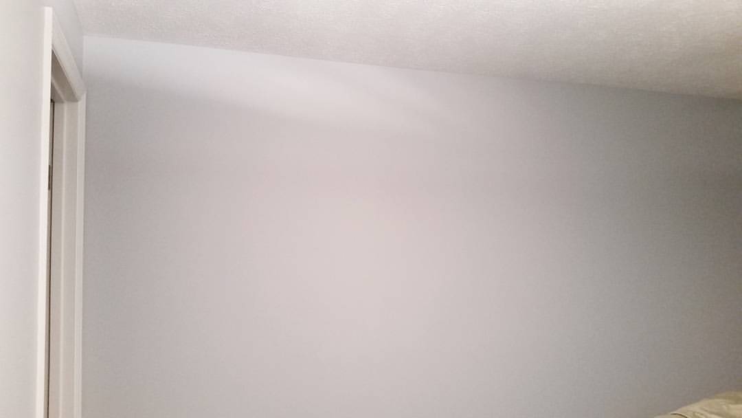
They often come out with bright lights because the color spectrum from artificial lighting exposes every bit of your wall paint. Check out the pictures below to see how Sherwin-Williams Gray Screen transforms based on lighting.
Sherwin-Williams Gray Screen Color Strip
Color strips combine three or more similar hues often used in interior decoration to create a harmonious theme. Your paint color is the central theme from which you create the rest of the colors. Adjust the saturation and brightness to create lighter or darker tones.
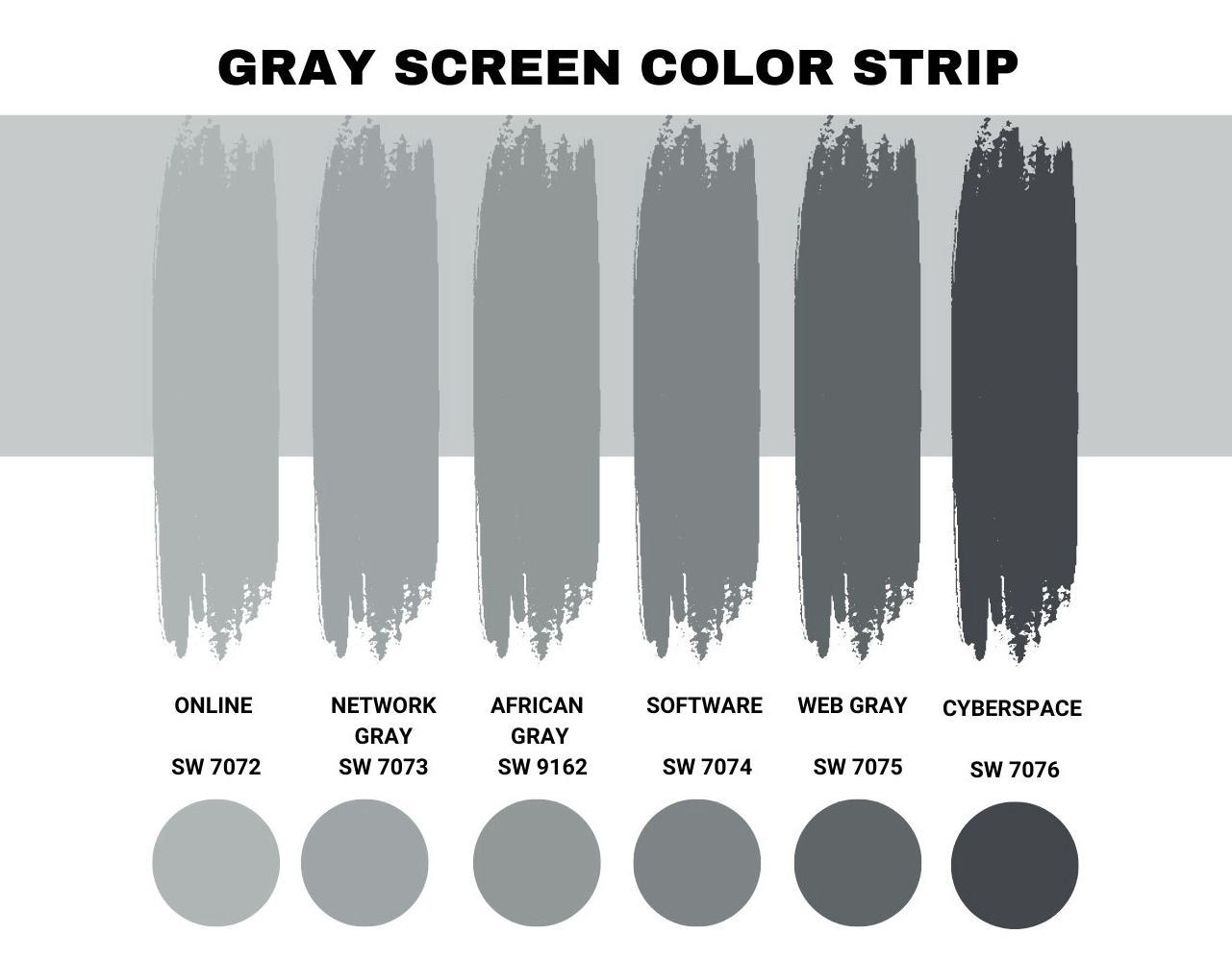
See the table below for Sherwin-Williams’ Gray Screen color strip.
| Color Code | Color Name | Location Number | LRV | Color Tone |
| SW 7071 | Gray Screen | 253-C1 | 59 |  |
| SW 7072 | Online | 253-C2 | 45 |  |
| SW 7073 | Network Gray | 235-C3 | 37 |  |
| SW 9162 | African Gray | 235-C4 | 31 |  |
| SW 7074 | Software | 235-C5 | 23 |  |
| SW 7075 | Web Gray | 235-C6 | 13 |  |
| SW 7076 | Cyberspace | 235-C7 | 6 |  |
Sherwin-Williams Online
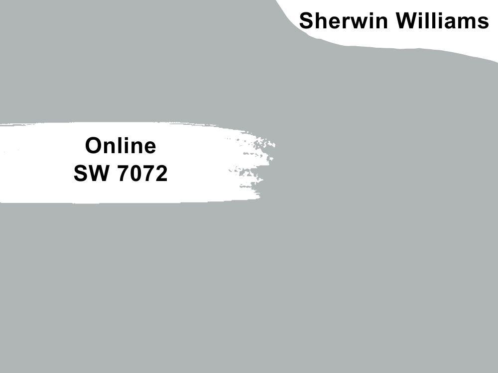
Sherwin-Williams Online isn’t as bright as its counterpart Gray Screen, but it’s closer to the LRV scale’s middle point. The color can morph from mid-toned to light, depending on the lighting.
It reads as several shades lighter when used in South-facing windows or under fluorescent lights.
Sherwin-Williams Network Gray
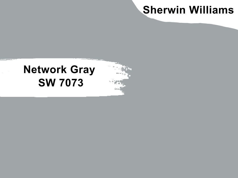
Light gray paints are some of the most popular picks due to their versatility, but let’s make a case for this medium-dark tone, Sherwin-Williams Network Gray.
Although it’s a dark-toned paint, the color has a light blue undertone that brightens it up and pushes it closer to the LRV median. As a cool gray tone, Network Gray works best with neutral colors like white or monochrome themes, including other blue shades.
Sherwin-Williams African Gray
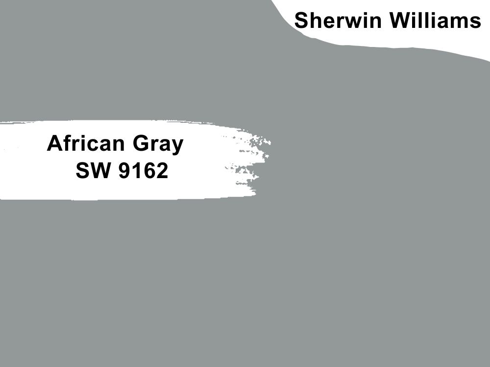
Sherwin-Williams African Gray is a unique gray paint with a blend of lilac and ocean blue in its undertone. With an LRV of 31, this color reflects a decent amount of light without being too bright and ruining the mood.
It’s great for maintaining a cool mood and curating a relaxing palette.
Sherwin-Williams Software
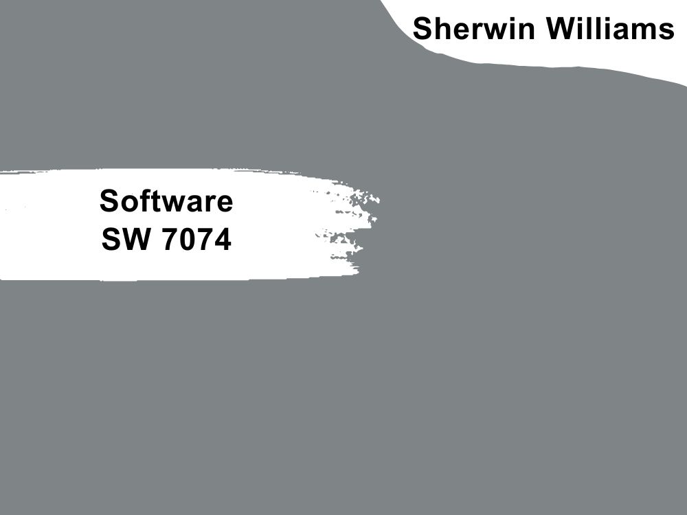
Medium-dark paints appeal to minimalists because of their ability to reflect a steady ray of light into their surroundings. Although Sherwin-Williams Software is not one of its popular neutrals, there’s so much you can do with this cool gray paint.
You can curate a neutral theme with other gray paints like Sherwin-Williams Gray Screen, an off-white color like Torque White (SW 7003), or a bright yellow like Pollen Powder (SW 9014).
Sherwin-Williams Web Gray
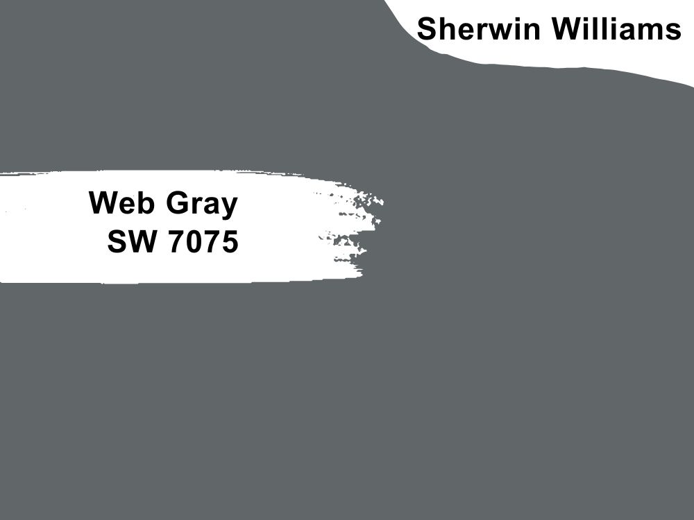
Sherwin-Williams Web Gray is a dark gray paint with warm and cool tendencies due to its blue-green and violet undertones. The color serves as a great accent against lighter gray walls and greenery.
Its 17 LRV means it’s not a solid dark hue that’ll absorb light, but it won’t illuminate its space without enough lighting. You can introduce the lighting through windows and other bright colors like Sherwin-Williams Gray Screen.
Sherwin-Williams Cyberspace
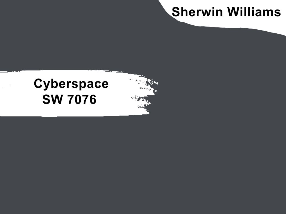
Two-toned colors like Sherwin-Williams Cyberspace make for interesting centerpieces. This color is a beautiful blend of navy and gray yet leans towards black. Its 6 LRV makes the color a great option for dark themes without going the traditional black route.
Cyberspace works well in game rooms, living rooms (when paired with brighter hues,) workspaces, and bathrooms (also paired with white trims)
Sherwin-Williams Gray Screen Color Palette
Decorating a space as a professional requires planning, and that’s where a color palette comes in. It’s similar to a color strip but accommodates more diverse combinations. A color strip sticks to a monochrome tone, but a palette comes in multiple patterns.
Coordinating Colors for Gray Screen
As a neutral paint, Sherwin-Williams Gray Screen can thrive in any combination, whether monochrome, triadic, contrasting, or analogous. However, for the sake of this guide, let’s stick to three combos.
Monochrome Decoration with Gray Screen
Choose a monochrome theme if you’re a centered person looking for a calming vibe. Combining similar colors of varying tones and shades creates a harmonious aura.
As a medium-light color, you can pair Gray Screen with darker gray paints to create a serious vibe or brighten it with lighter gray shades like Sherwin-Williams Samovar Silver (SW 6233), Tradewind (SW 6218), and Stardew (SW 9138).
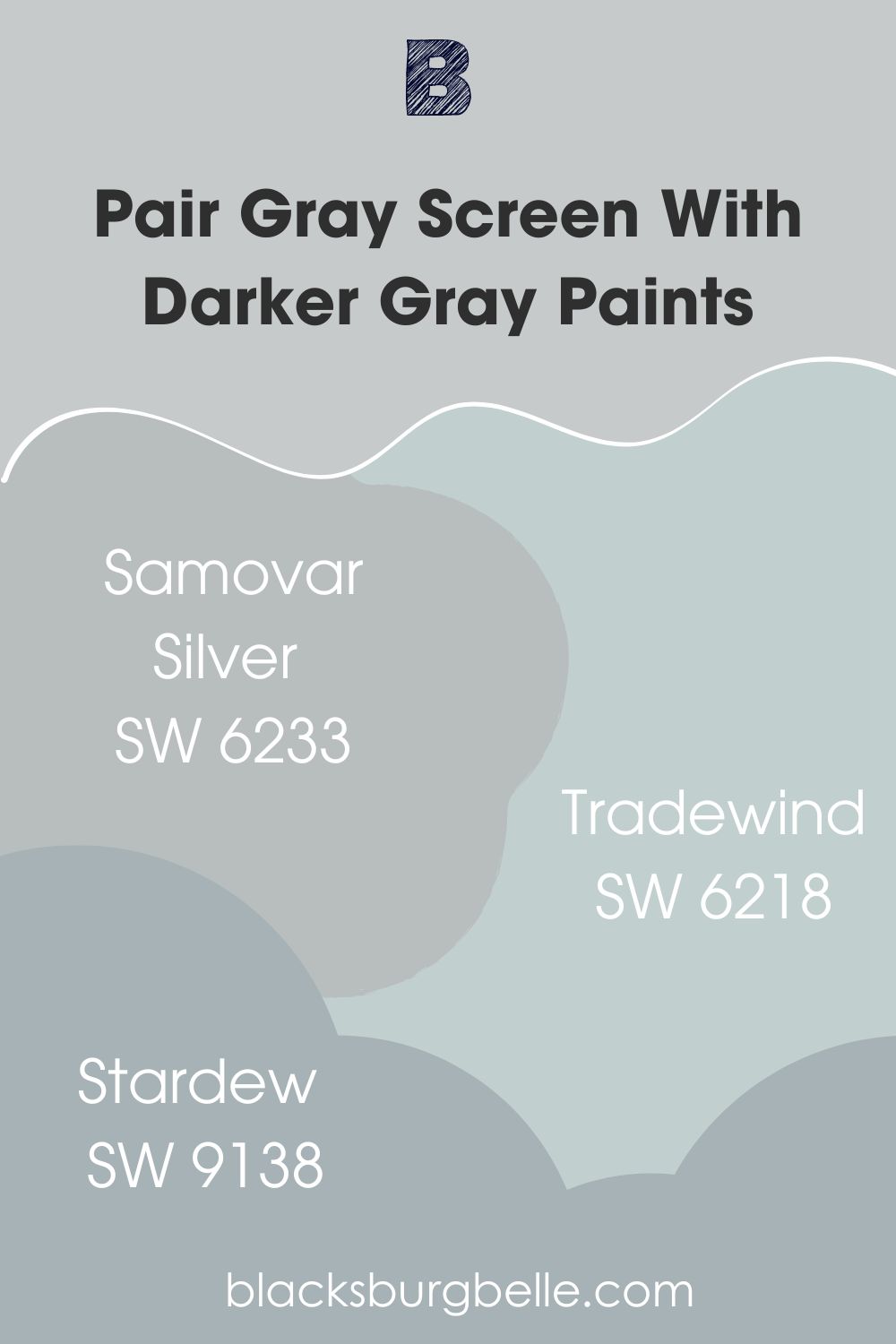
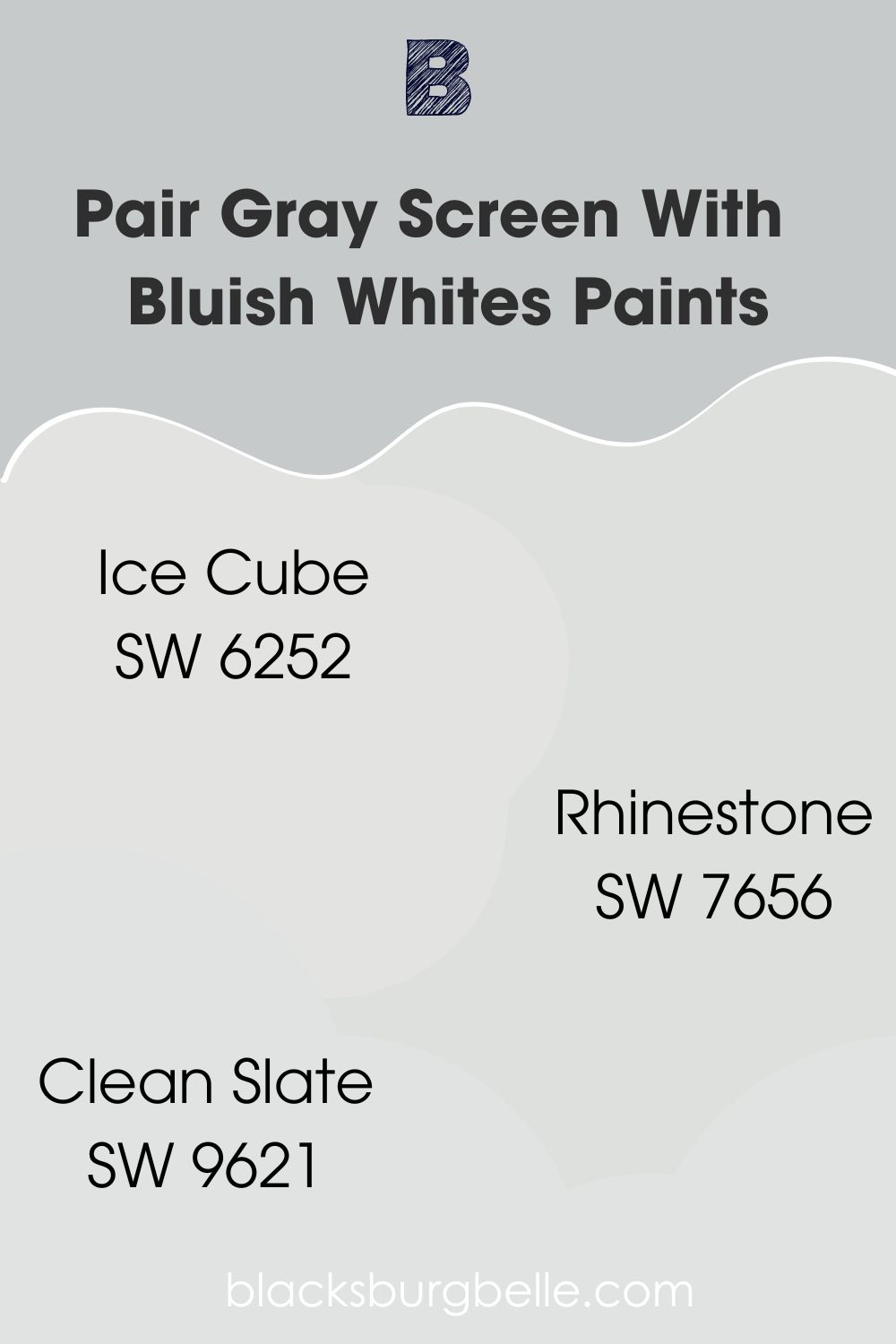
Remember to choose your gray paints based on their undertones to avoid clashing tints. Since Gray Screen has a strong blue undertone, bluish whites are also great pairs.
Some bluish-whites include Ice Cube (SW 6252), Rhinestone (SW 7656), and Clean Slate (SW 9621).
Triadic Decoration for Gray Screen
Good things come in threes, which you’ll get with a Triadic palette. It mixes three equally spaced hues on the color wheel into one space. As a neutral paint, you can form a neutral triad using Beige and Tan or highlight its blue undertone with red and yellow.
Whichever Triadic colors you choose depends on the vibe you want in your space. What’s the room’s purpose? Get creative with brighter tones for children’s rooms, and stick to neutrals for grown-up spaces.
That’s not a hard rule, though, as you may embrace your inner child with the more creative pair.
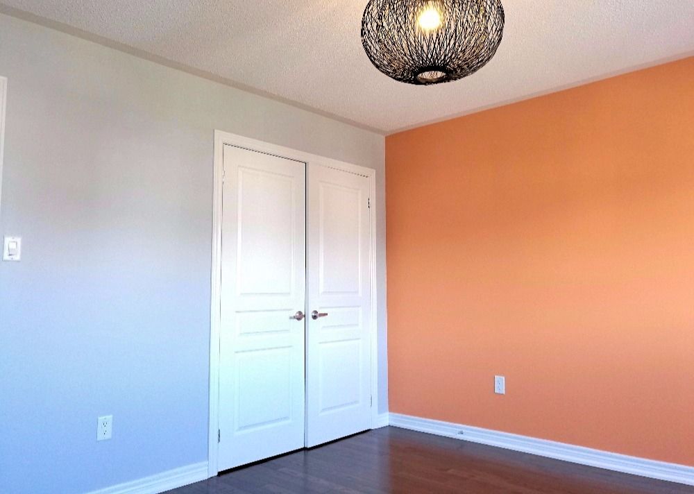
Contrasting Gray Screen with Complementary Colors
When three colors prove too many for you to handle, choose two colors for a sharp contrast. The second color in this palette is whichever one sits opposite your main hue on the color wheel. If you’re using the blue undertone on Gray Screen, that color is orange.
You can go neutral by pairing the paint with cream or brightening it with multiple shades of red.
What Trim Colors Go With Sherwin-Williams Gray Screen?
You can’t go wrong with white trims on Sherwin-Williams Gray Screen, especially ones with blue undertones if you coordinate your color with a contrasting tone, and spice up the hues with wooden trims.
However, note that there are different types of wood, and the wrong tone can ruin the overall aesthetic of your space. Contrasting and Triadic themes would work well with reddish-brown wood such as Mahogany and Oak. However, use a brighter tone for monochrome themes.
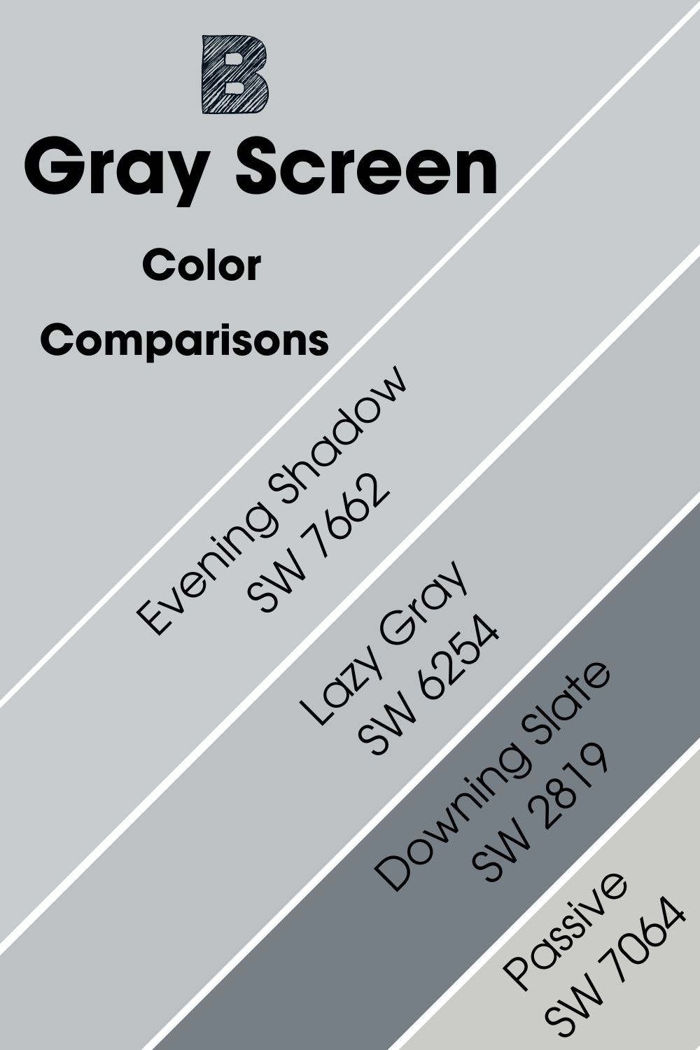
Sherwin-Williams Gray Screen Color Comparisons
“What can I use as an alternative color to Gray Screen?”
Alternatives aren’t only important for replacing paint when you run out of supply but can help you weigh your options before purchase.
Sometimes you like a color but have reservations about its undertones or overlay. Hence the importance of exploring similar hues. Here’s a short list of colors that give similar vibes to the Sherwin-Williams Gray Screen from the same brand.
Sherwin-Williams Gray Screen vs. Sherwin-Williams Lazy Gray (SW 6254)
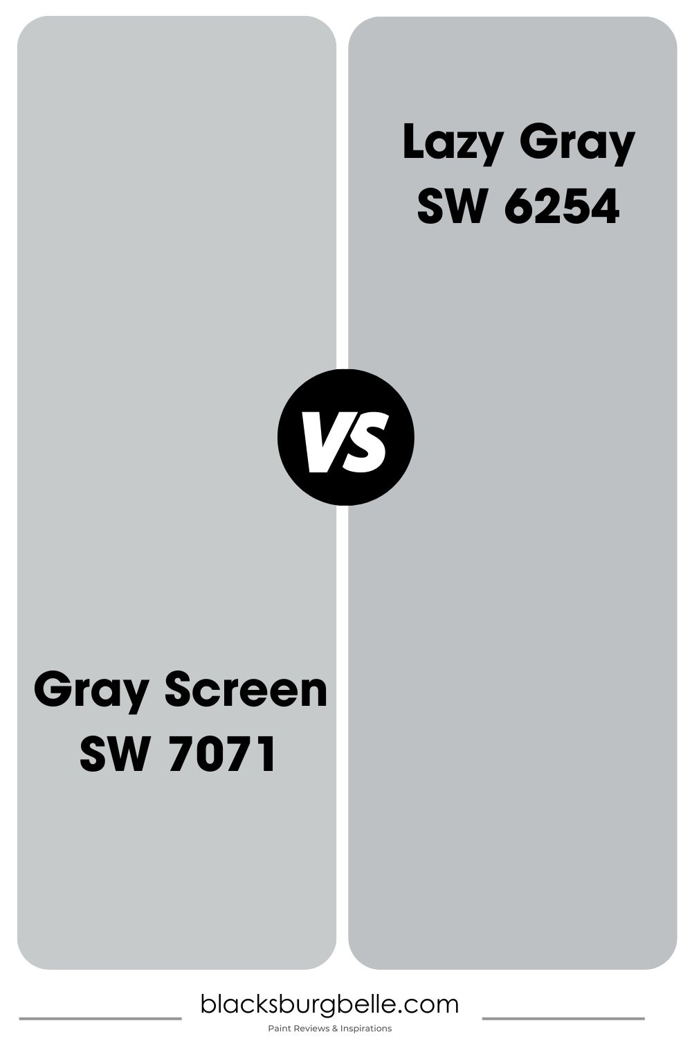
Sherwin-Williams Lazy Gray earned its name because of its two-toned nature, which makes it equal parts gray and blue. That’s unlike its counterpart Gray Screen which has a stronger gray overlay and a lower LRV at 53.
This color can appear blue or gray depending on the lighting and window placement in the room. Use Lazy Gray if you want a bluer aura in the morning and underneath the brightest light but stick to Gray Screen if you can do without it.
Sherwin-Williams Gray Screen vs. Sherwin-Williams Passive (SW 7064)
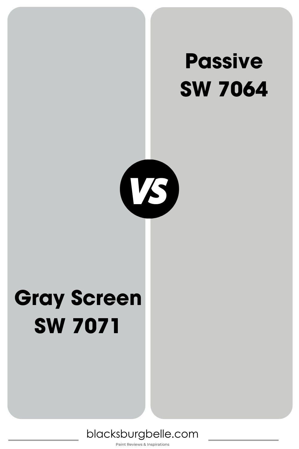
Sherwin-Williams Passive takes the cake when talking about colors that are neither here nor there for the indecisive designer. It’s a beautiful greige tone that leans into white sometimes.
With its multifaceted nuances, Sherwin-Williams Passive works with almost any color and whichever way you, please. You can use the color as a highlight, from trims to accents, or as a full wall coloring, whether inside or outside. Gray Screen isn’t as versatile in usage.
The best part about Sherwin-Williams’ Passive is its cool vibe, regardless of its highlighted tone. It’s a great choice for neutral themes.
Sherwin-Williams Gray Screen vs. Sherwin-Williams Downing Slate (SW 2819)
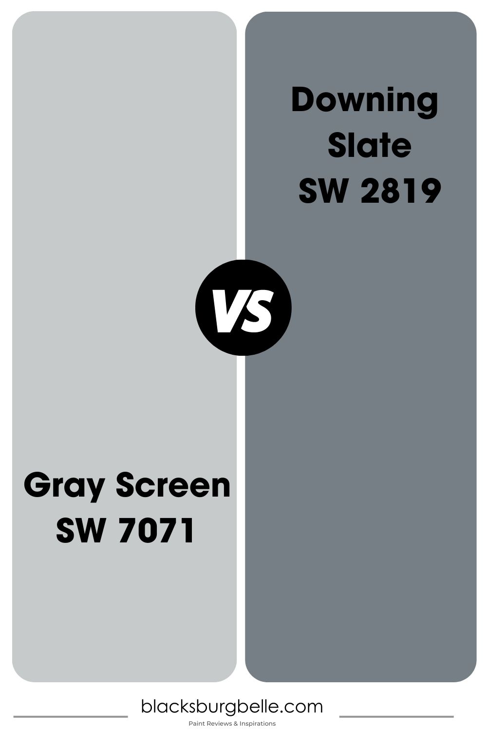
You won’t find more contrasting colors with similar base notes than Sherwin-Williams Downing Slate and Gray Screen. Whereas Gray Screen is a medium-toned neutral paint with a blue tint, Downing Slate is visibly darker, with an LRV of 21.
Sherwin-Williams made Downing Slate part of its Historic Collection to represent the Victorian Era. As much as this color is inherently dark-toned, it has a subtle blue undertone that livens up its surroundings without doing too much.
The brand made Downing Slate for interior and exterior coloring but advised outside usage over painting it inside. If you must use it inside, introduce brighter tones with interior decor, from the flooring to the upholstery and furniture. Also, invest in brighter trims.
Sherwin-Williams Gray Screen vs. Sherwin-Williams Evening Shadow (SW 7662)
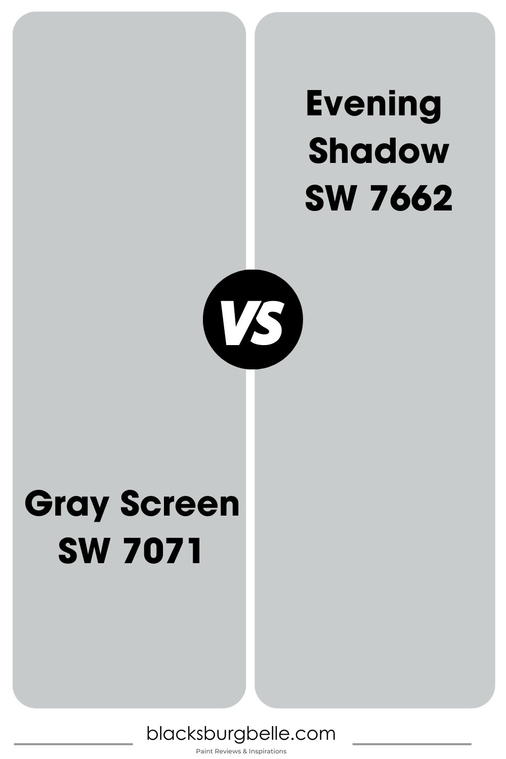
There aren’t many gray paints with violet and blue undertones like Sherwin-Williams Evening Shadow, making it a unique neutral coloring. The violet tint in this color neutralizes its blue content and makes it as mid-toned as possible, even with a 60 LRV.
Sherwin-Williams Evening Shadow is a beautiful substitute for white when you want to avoid crisp tones. However, it’s not a great fit with Gray Screen due to their almost equal LRV.
You need a color far from it on the scale to create a visible contrast unless you don’t mind the subtle blend.
Benjamin Moore Gray Screen Color Comparison
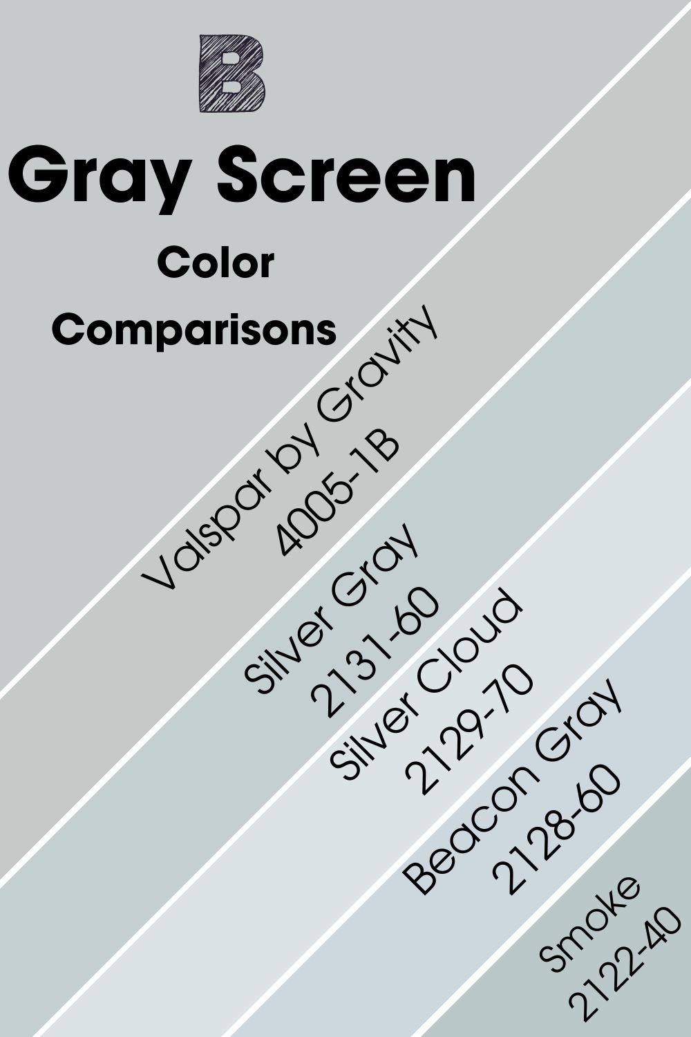
Although this section is mostly for Benjamin Moore alternatives to Sherwin-Williams Gray Screen, I’ve included Valsar’s Gravity for good measure. It’s another popular cool gray paint that begs attention from new decorators. Scroll down to see why you should give it a chance.
Source: Hextoral
Sherwin-Williams Gray Screen vs. Benjamin Moore Smoke (2122-40)
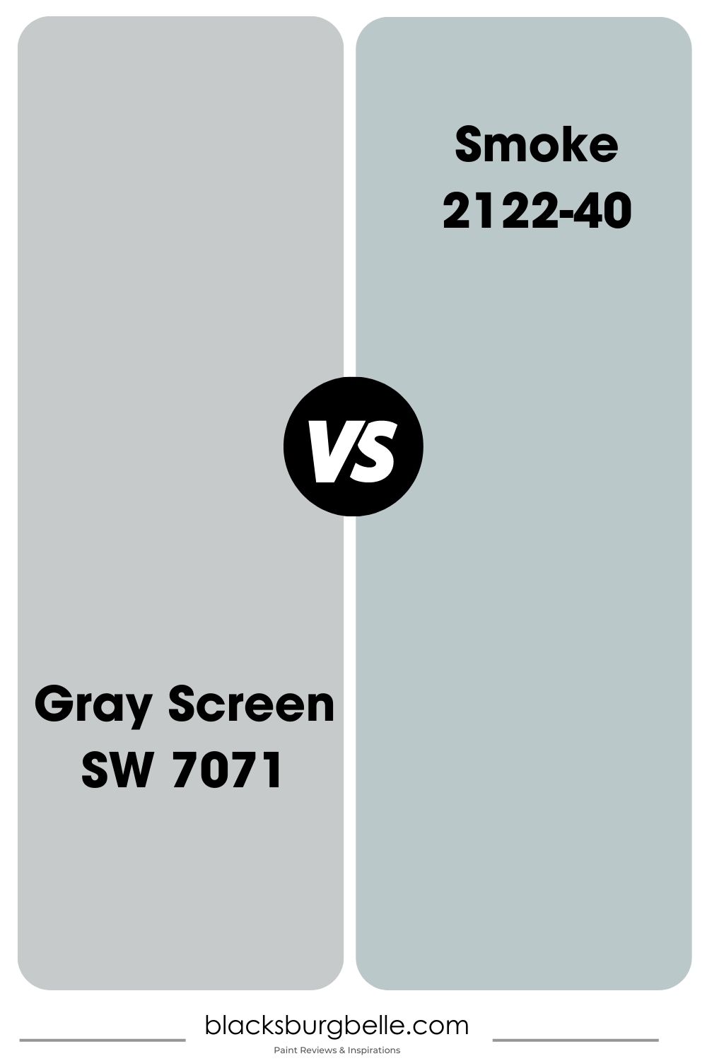
Yes, it’s a gray shade. No, it’s not charcoal or black like real-life Smoke. You shouldn’t always take names seriously when choosing paint. That’s why reviews like this one come in handy.
Benjamin Moore Smoke is a beautiful bluish-greige paint formed by blending an off-white hue into a navy color. It has a misty look like a mirage and an LRV of 56.39, making it one of the brand’s best-selling colors and neutrals.
Sometimes, this color presents a teal tone, which can confuse someone looking for gray coloring. Don’t choose Smoke if you have complications.
Sherwin-Williams Gray Screen vs. Benjamin Moore Silver Gray (2131-60)
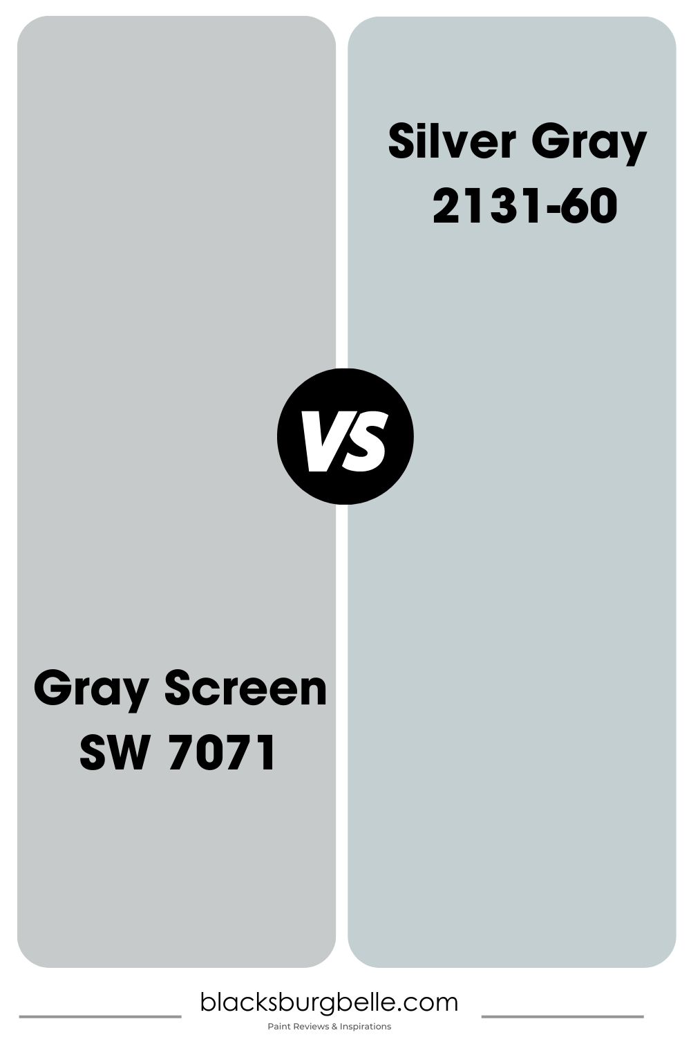
You’ll think Silver Gray would be a light gray paint with white-passing features due to its name, but you couldn’t be more wrong. This color has a strong blue-green undertone that’s reminiscent of the ocean. It’s a wonder Benjamin Moore named it after “Silver.”
This paint hue’s only likeness to the silver mentioned in its name comes out underneath the dimmest lighting. Then, the cool and muted gray overlay creates a calming energy in your surroundings.
If you’re concerned about LRV, Silver Gray has a 60.27 potential.
Sherwin-Williams Gray Screen vs. Benjamin Moore Silver Cloud (2129-70)
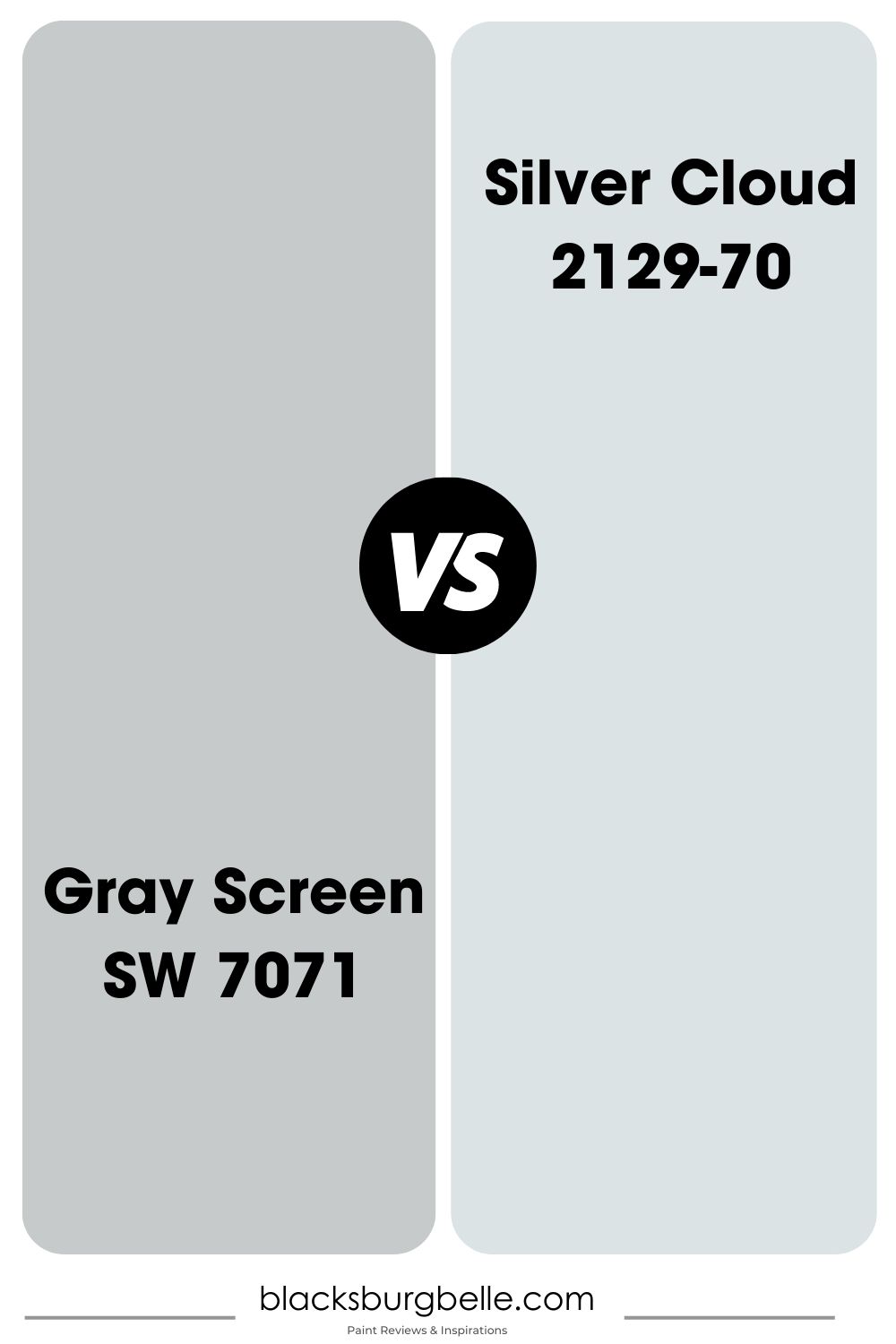
White-passing neutrals like Benjamin Moore Silver Cloud are my favorite shade of gray because of their versatility. This color is similar to Sherwin-Williams Gray Screen in that they both have gray coloring over faint blue undertones but differ in other ways.
Benjamin Moore’s Silver Cloud has an LRV of 73.93, meaning it’s closer to white than neutral. It’s a calming paint despite its very bright outlook and a great option for trims and accents.
Sherwin-Williams Gray Screen vs. Benjamin Moore Beacon Gray (2128-60)
![]()
You’re walking the fine line between sky blue and gray with Benjamin Moore Beacon Gray. This color isn’t dominantly gray, unlike its counterpart, Gray Screen by Sherwin-Williams. Instead, its neutral gray hue is muted beneath a cool, powdery blue overlay.
You can get the best of this hue if you pair it with a darker gray paint like Sherwin-Williams Gray Screen color strip hues. You can pair it with Gray Screen since their LRVs are more than 10 percent apart. Beacon Gray’s LRV is 65.92.
Valspar by Gravity (4005-1B)
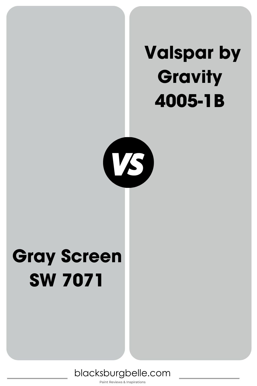
Gravity’s Valspar made this list because of its similarity to Sherwin-Williams Gray Screen.
They have almost the same RGB value, with Valspar being a combination of 198 Red, 201 Green, and 203 Blue, whereas Gray Screen’s green content is lesser and its red is higher – LRVs differ.
Valspar is the darker of the two paints at 57.89 LRV, although the difference isn’t very much. The biggest difference with both colors is their undertone, as Valspar has cool purple notes, whereas Gray Screen has blue tints. It all boils down to the RGB makeup. Check it out again.
Benjamin Moore Gray Screen Version
Benjamin Moore is the best alternative to Sherwin-Williams as an equally high-quality paint manufacturer, but it doesn’t have a “Gray Screen.”
That’s where the scientific aspect of this review becomes relevant as you can use it to decipher the best match, and that’s Pelican Gray (1612). This color has an LRV of 58.58 which is 0.42 darker than its counterpart.
Pelican Gray is part of Benjamin Moore’s Classics Collection because of its neutral shade, which serves as a perfect cool neutral.
Other brands with colors similar to Gray Screen include PPG’s Pittsburgh Gray, and Farrow & Ball Calluna (270). Visit Match My Paint Color for more.
How Does Light Affect the Color?
Remember how I said lighting determines the tone you get from Sherwin-Williams Gray Screen – it’s time for practice. Certain positions receive the most light that’ll help you highlight the blue undertone in your paint best, while others would maintain its neutral gray.
Use Gray Screen with South-facing windows and light for the brightest possible outcome. Northern-facing windows give you the most consistent sunlight, while East-facing windows receive the least rays.
Best Rooms To Paint Gray Screen
Knowing the dynamic of lighting, let’s assess the best rooms to paint Gray Screen. When should you use the color as an accent, and when is it okay to go all out?
Gray Screen for Interior
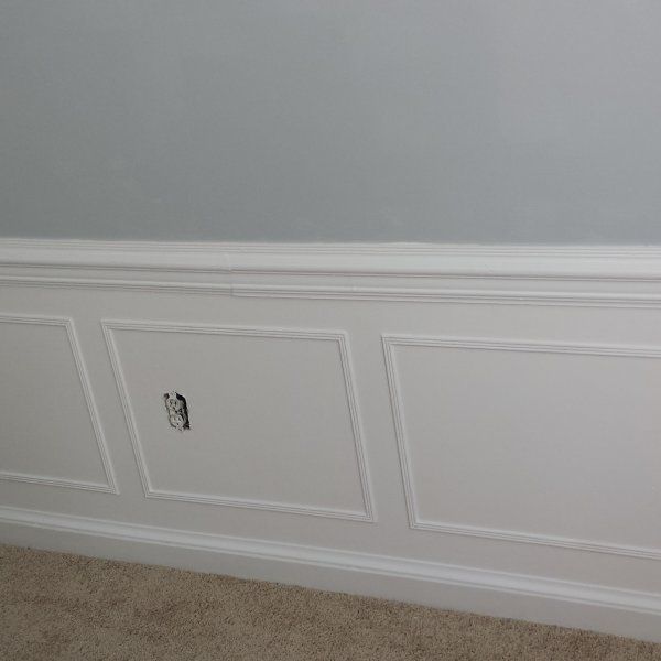
Sherwin-Williams Gray Screen on interior walls and furniture is a good choice because of its medium-light tone. It’s bright enough to illuminate enclosed spaces without being overwhelmingly light. Check out the different ways you can use it below.
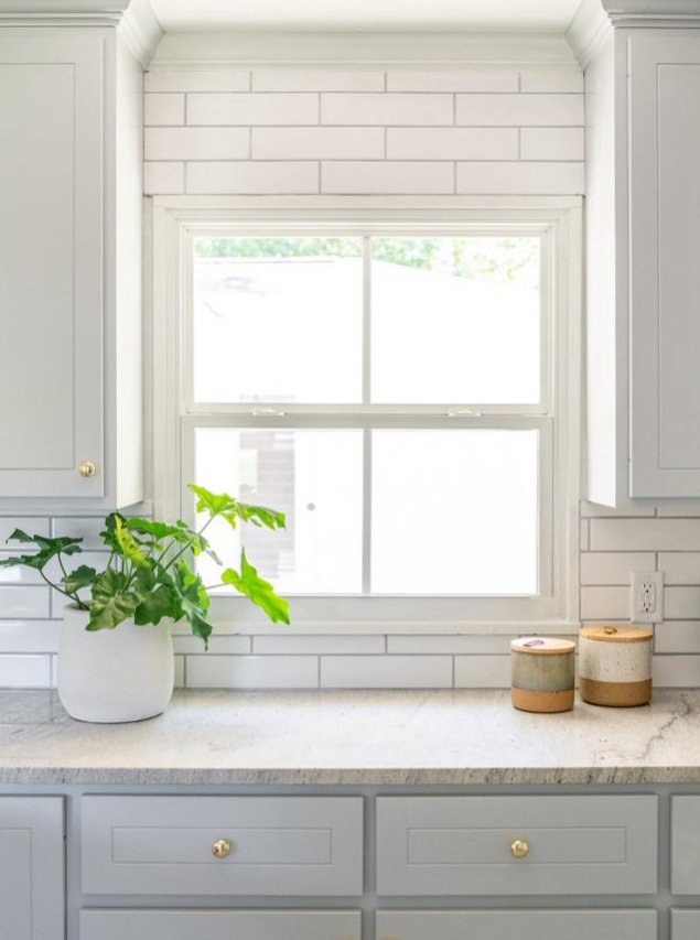
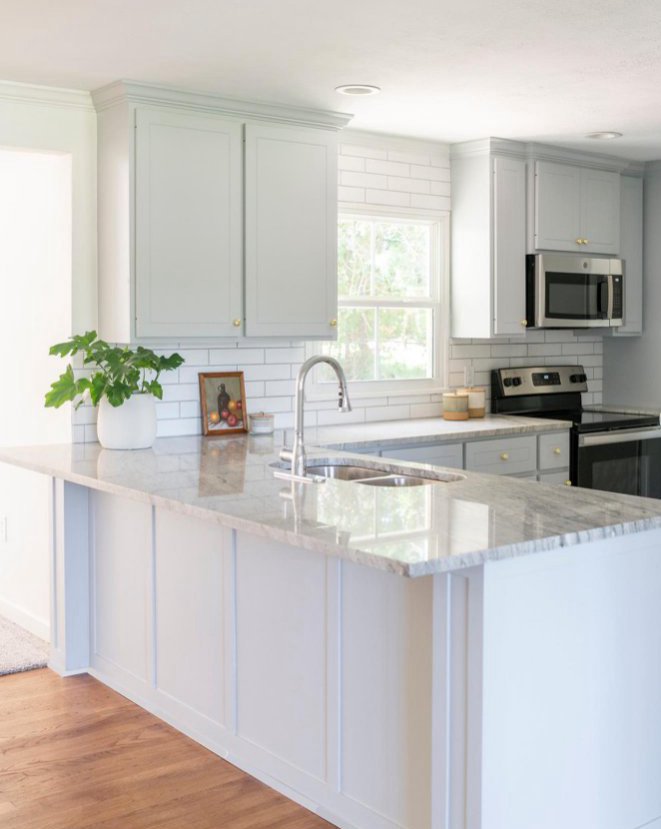
Gray Screen for Cabinets
Sherwin-Williams Gray Screen on cabinets can fit into any room, from bedroom credenzas to kitchen islands, lockers, fireplaces, and other furniture. Consider your overall theme when pairing the Gray Screen-painted cabinet with your walls to avoid clashing tones.
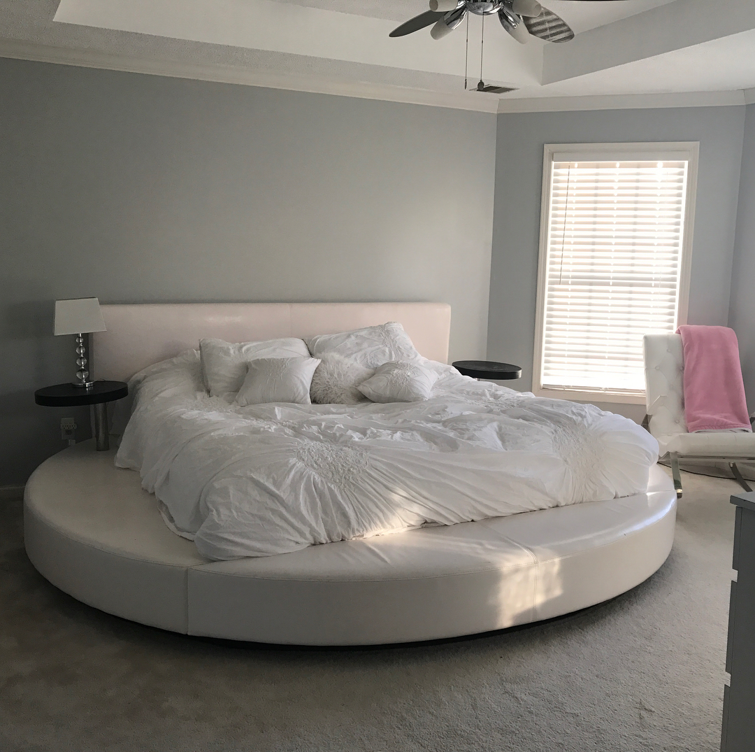
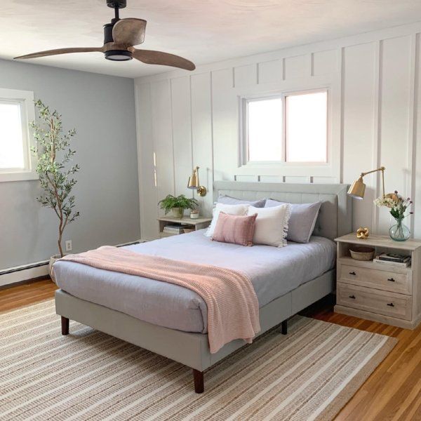
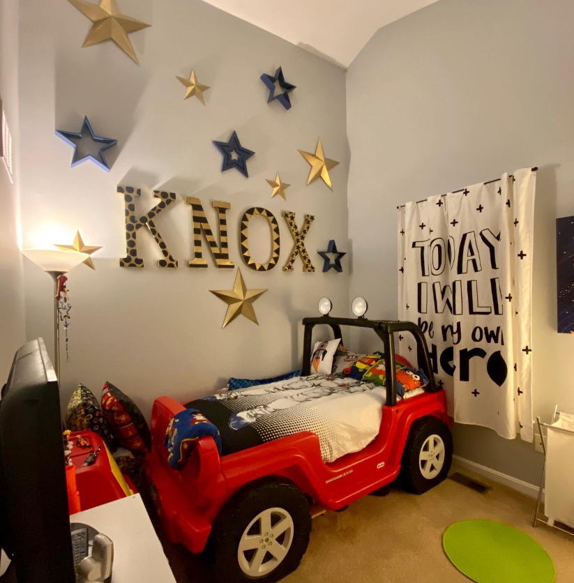
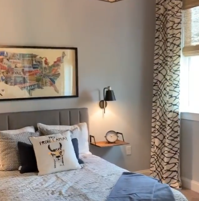
Gray Screen Bedroom
Create a relaxing mood in your bedroom using Gray Screen on the walls and coordinating it with a monotonous theme. Blue-white and Lighter Gray paints are good trims to complement the medium-toned color.
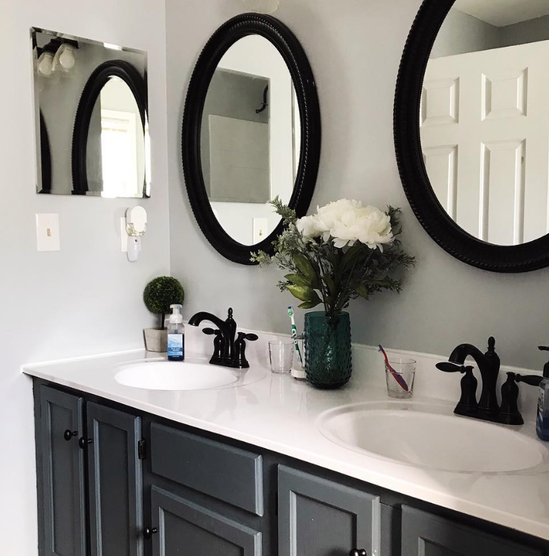
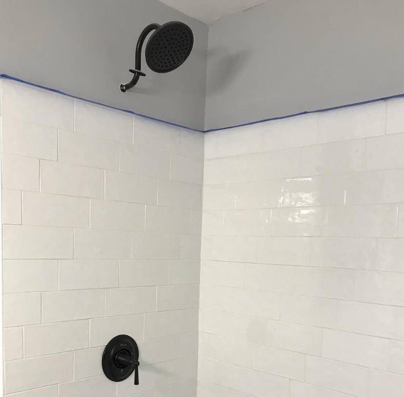
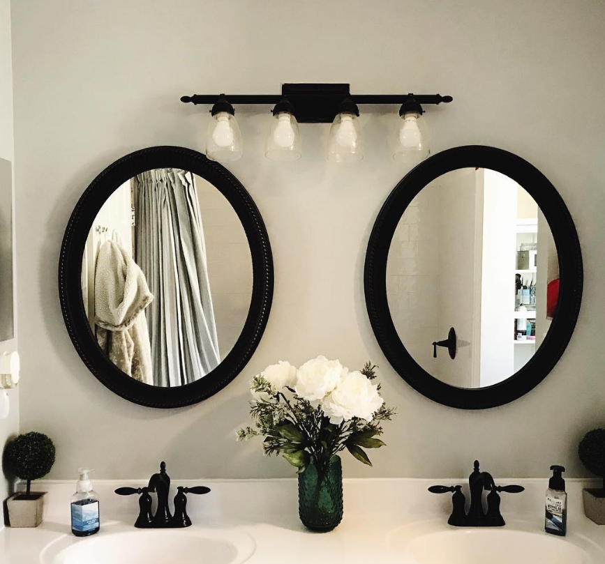
Gray Screen Bathrooms
A monotone theme in the bathroom with Gray Screen at the center creates a relaxing and calming spa-like aura. Highlight the color with a beautiful gray-themed marble tile for an airy vibe, or make it more sophisticated with darker gray swirls.
Add a glass shower for extra pizazz.
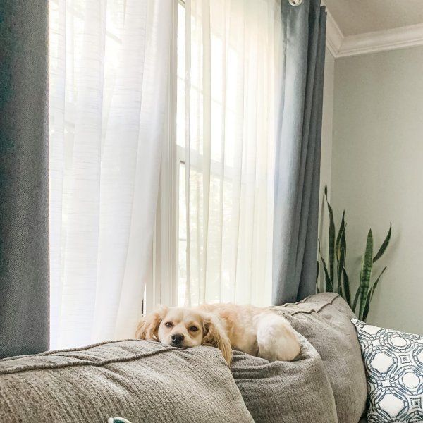
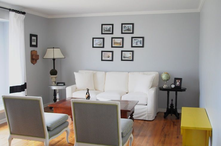
Gray Screen Living Room
The neutral nature of Sherwin-Williams Gray Screen makes it a suitable wall coloring in the living room. You can then let your creativity flow through the accessories depending on your desired mood.
Refer to the Color Palette above for more tips.
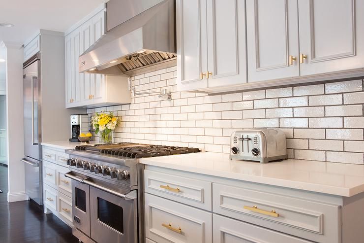
Gray Screen in the Kitchen
Choose Gray Screen in your kitchen if you can’t decide between a bright or dark vibe for the space. It’s the ideal neutral tone to set the mood for your daily meals. Use wooden or white trims based on your chosen theme for the rest of the house.
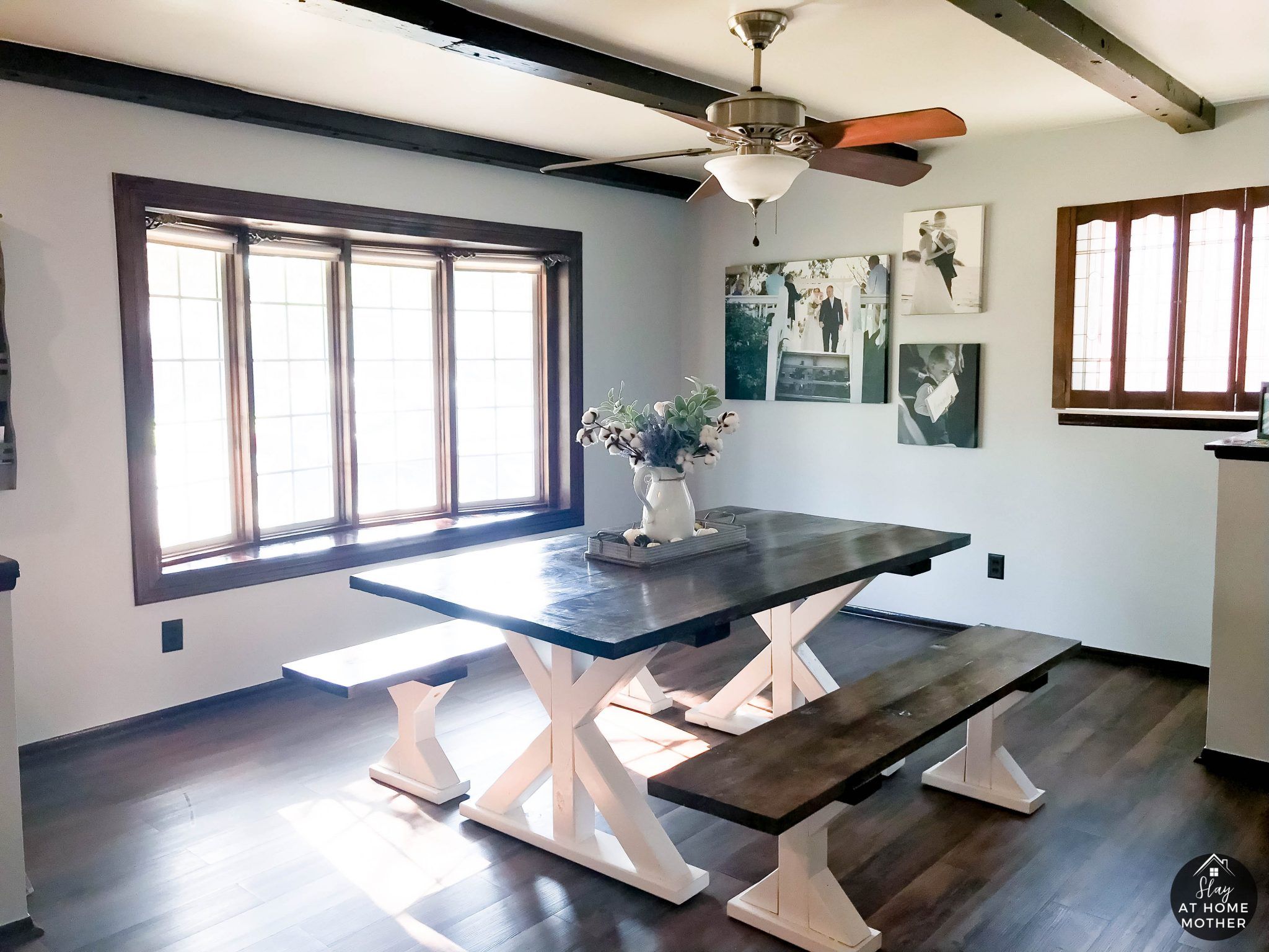
Gray Screen Dining Room
Use the kitchen’s theme to inspire your dining room to create harmony. Whatever combination you use in the former, flip it for the latter to prevent a case of an endless kitchen.
Gray Screen kitchen walls blend with Gray Screen dining room furniture and vice versa.
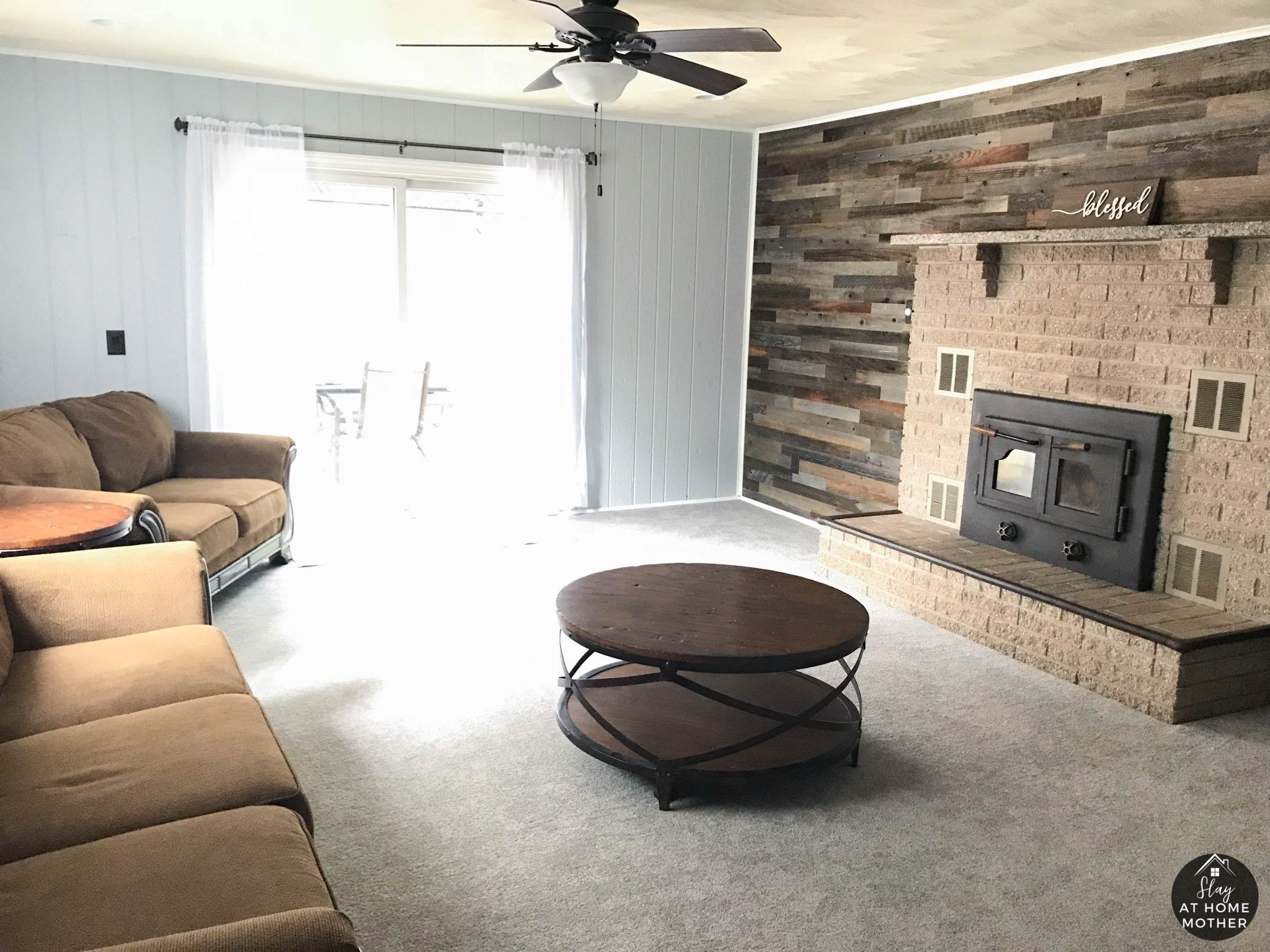
Gray Screen as an Accent Wall or Full Wall?
There’s nowhere Gray Screen wouldn’t blend – however, some places highlight the color’s nuances better than others. Since it’s a medium-light shade, you can’t rely on it to illuminate your space, so that’s out of the question.
Use Gray Screen as an accent wall against lighter-toned paints to create a cool and cozy vibe. Alternatively, it’s great as a full wall coloring for large rooms because it gives the illusion of a smaller space.
Whichever you choose, remember to always stay on theme.
Gray Screen Exteriors
Using Gray Screen outside isn’t 100 percent advisable because you risk highlighting its blue undertone. However, exteriors are great places to explore using the paint as an accent, like against a porch wall, on a shed, and as a door.
Sampling Gray Screen
Sherwin-Williams has three sampling options to prevent you from regretting your paint choice after purchase – it happens more often than you think. You can get the Color Chips, Peel & Stick Strips (like Samplize), or the realistic Color-To-Go lightweight paint.
Final Thoughts
Blue-gray paints like Sherwin-Williams Gray Screen are gaining popularity among contemporary decorators because of their two-toned possibility. You get two colors for the price of one, and what’s not to love about that?
I hope you love this shade as much as I do. Get decorating, and don’t forget to share your final creation with me.
 Sherwin Williams North Star (Palette, Coordinating & Inspirations)
 Sherwin Williams Cascades (Palette, Coordinating & Inspirations)
 Sherwin Williams Clary Sage (Palette, Coordinating & Inspirations)
 Sherwin-Williams Tidewater (Palette, Coordinating & Inspirations)
 Sherwin Williams Coastal Plain (Palette, Coordinating & Inspirations)
 Sherwin Williams Morning Fog (Palette, Coordinating & Inspirations)
