
Sherwin-Williams Retreat is a dreamy and calming paint color perfect for creating a cozy, relaxed space. It is one of Sherwin-Williams’ most popular green hues and the ideal neutral backdrop for almost any style.
One unique aspect of Retreat is its ability to bring warmth to a space without looking too bright or overwhelming, making it suitable for any home decor. It appears gray in some lights and green in others, and its timeless beauty creates a lovely atmosphere that will stand the test of time.
This guide will explore the many ways to use this classic color, its coordinating palette, and potential design ideas in a pictorial outlook of how Retreat can bring to life in any home.
Let us now dig a bit deeper into the versatility of Retreat and its various applications.
Table of Contents
What Color is Sherwin-Williams Retreat?
| Manufacturer | Sherwin Williams |
| LRV | 21 |
| RGB | Red 122 | Green 128 | Blue 118 |
| Hex Value | #7A8076 |
| Color Collections | Soft green with blue-gray undertones, feeling of a crisp mountain breeze |
RGB of Sherwin-Williams Retreat
The RGB color code of Sherwin-Williams Retreat is RGB (122, 128, 118) with a hint of cool tones. Given that it is a member of the green family, it contains a higher percentage of green (128), as indicated in its RGB color paradigm.
A close combination of these three-color tones creates the ideal balance for any space. Retreat’s soothing, cool, and calming effect is due to the higher value of green compared to red and blue.
Moreover, how does the light in the room affect the perception of this color? The LRV of Retreat discussed next will give you a good idea of the answer.
Light Reflective Value (LRV) of Sherwin-Williams Retreat
On a scale ranging from 0 (black) to 100, the Light Reflectance Value (LRV) describes the amount of light that a color either reflects or absorbs. If a color has a lower LRV, it will appear darker and warmer than a color with a higher LRV.
Retreat has an LRV of around 21, indicating that it soaks up more light than it illuminates, giving it a medium-to-dark hue. It is designated by the hexadecimal color code of #7A8076.
Is it a Warm or Cool Color?
Retreat’s RGB and LRV color codes should have given you a clever idea of its luminance, but for absolute certainty, Sherwin-Williams Retreat is a cool color.
This is because blue-green colors blend well with the cool color palette. Retreat also has a lower-end LRV of 21, indicating that it reflects less light than it absorbs, giving it a cooler and darker hue.
But what other undertone colors contribute to Retreat’s unique and stunning appearance? Find out in the following section.
What are the Undertones?
As you may already know, Retreat is a green color that exudes a calm atmosphere in any space. But why does this color appear gray when closely examined? It is primarily due to its blue and gray undertones.
These undertones add subtle complexity to the color, making it appear softer. Given its muted nature and blue-gray undertones, Retreat is frequently used in bedrooms and other places where one wants to feel relaxed.
Check out the different colors for the undertones.
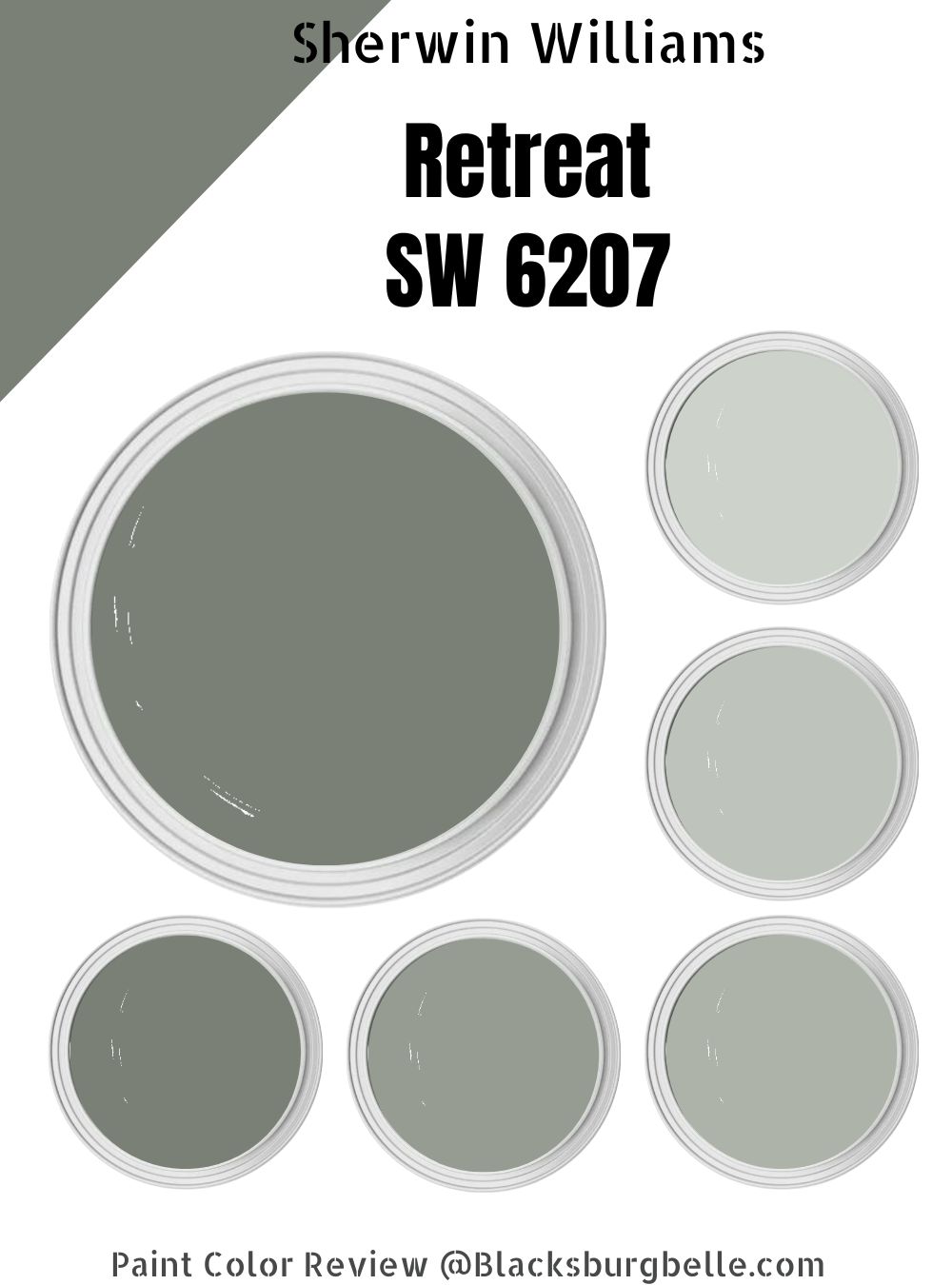
Sherwin-Williams Retreat Color Strip
A color strip is a series of related hues ranging from light to dark shaded tones that is commonly used in monochromatic décor. Since Sherwin-Williams Retreat is a dark color, the lightest shade on the color strip should remain a medium-dark tone.
In effect, if the LRV value of Retreat’s lightest shade exceeds the median, it will be too bright and tacky. Otherwise, it may be too dark, resulting in an overly somber tone that is not visually appealing.
Check out Retreat’s color strip in the table below.
| Color Code | Color Name | Location Number | LRV | Color Tone |
| SW 6204 | Sea Salt | 217-C1 | 63 |  |
| SW 6205 | Comfort Gray | 217-C2 | 54 |  |
| SW 6206 | Oyster Bay | 217-C3 | 44 | 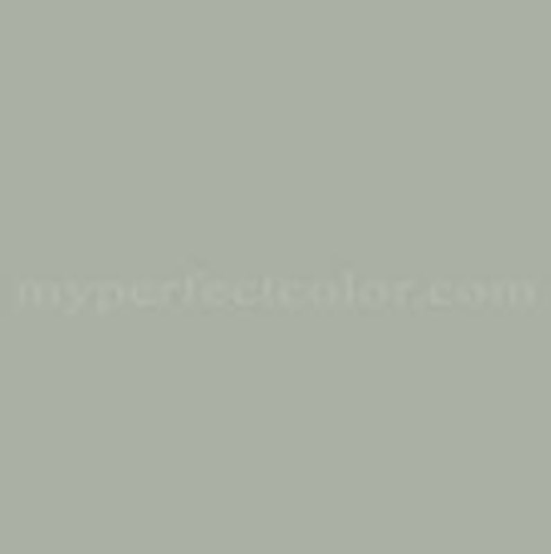 |
| SW 9132 | Acacia Haze | 217-C4 | 32 |  |
| SW 6207 | Retreat | 217-C5 | 21 |  |
Sherwin-Williams Sea Salt (SW 6204)
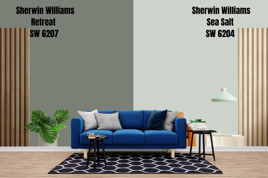
Sea Salt is the lightest color shade in this color strip. With an LRV of 63, this hue provides a subtle but consistent level of light in the room, creating an inviting beachy atmosphere. Its Hex value is #CDD2CA for easy identification of the color match.
The color collection of Sea Salt includes Living Well and Pottery Barn Teen, hinting that it was designed with relaxation in mind. It has cool green with blue undertones that help create a sense of harmony in any design.
Sherwin-Williams Comfort Gray (SW 6205)
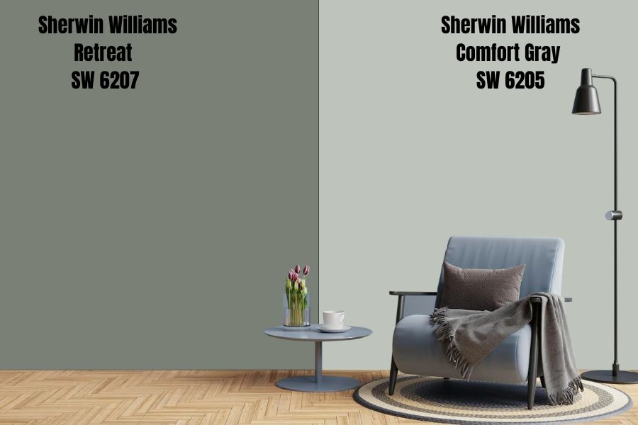
Second on this color spectrum is the Sherwin-Williams Comfort Gray. With an RGB value of (190, 195, 187), this color brings the serenity of nature to indoor space. It has a calming effect, which makes it a popular choice for bedrooms, kitchen upholstery, and living rooms, to name a few applications.
This color has similar color collections to Sea Salt but a slightly lower LRV of 54, simply because it absorbs more light and does not reflect as much as Sea Salt.
Amazing, it’s cool green-gray hues inspire one to slow down, take a deep breath, and appreciate the beauty of nature. It is well-known for its calming effects, which is how the name Comfort Gray came about.
Sherwin-Williams Oyster Bay (SW 6206)
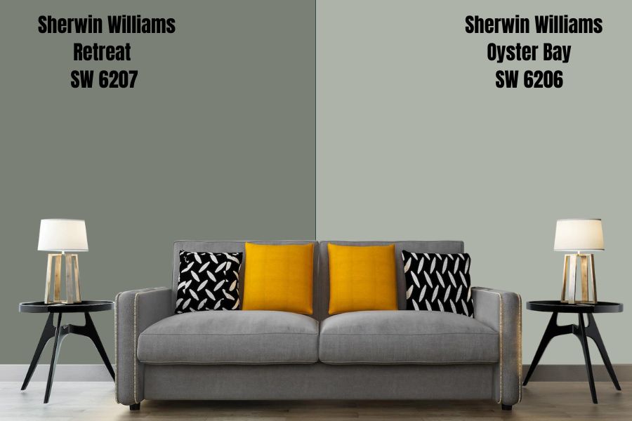
Heading further to the darker territory of this color strip, Oyster Bay is a rich blue-green paint that conveys a sense of stability and luxury. Its 44 LRV is slightly below the median, creating a simple atmosphere which is ideal for both interior and exterior spaces.
This color will give you the chills because its slate-blue undertones contrasts beautifully, providing the ideal backdrop for a neutral effect. Due to its modern look, it works best with minimalistic furniture to create a bold yet calming effect in any space.
Sherwin-Williams Acacia Haze (SW 9132)
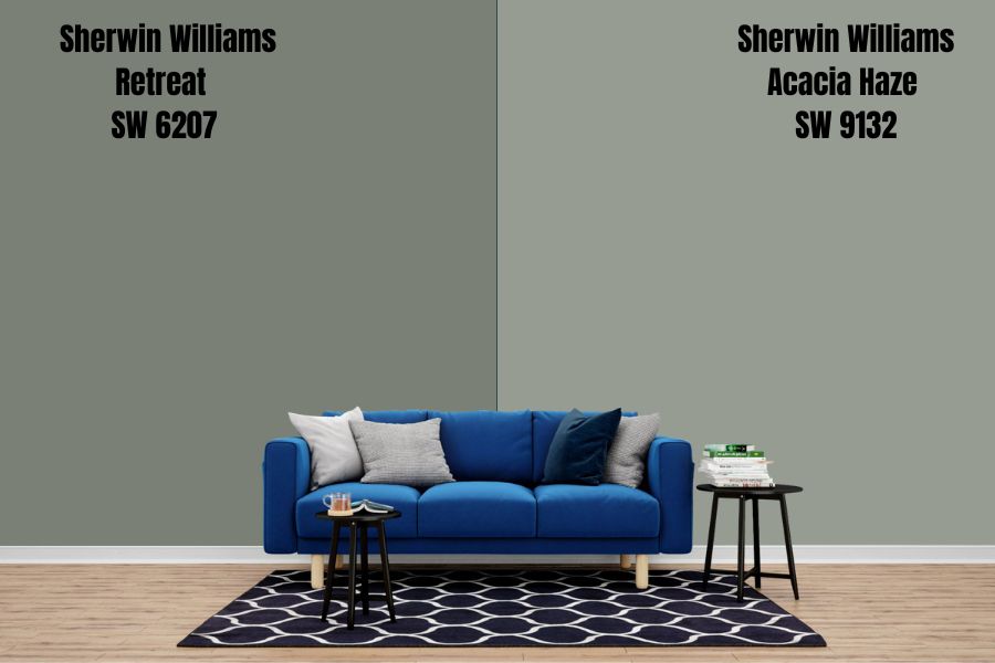
The Acacia Haze is right next to our base color in this strip. It has the same effects in any room as Retreat does with minor changes in light and shade. To avoid mix-ups, you can find it with its Hex value of #969C92.
This color has medium green undertones with strong blue undertones that give it a stoic vibe, making it an excellent choice for homes looking for an inviting yet sophisticated atmosphere.
Its color collections include Colormix Forecast 2020 (Haven), and it has an LRV value of 32.
Sherwin-Williams Retreat (SW 6207)
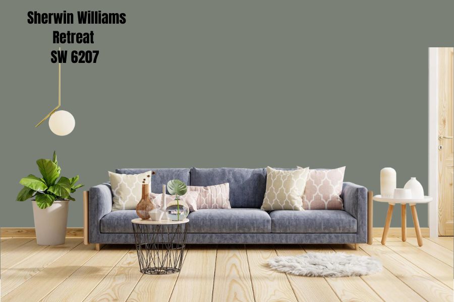
Sherwin-Williams Retreat is the ultimate shade hue in this color palette. With a low LRV value of 21, it provides a soothing hue that is dark enough to add depth and shadow to a room while still providing enough light to avoid feeling overwhelmed.
The timeless and traditional nature of this color is what I love most about it. When you look closely at this color, you can see subtle hints of blue, green, and gray undertones that create an overall harmonious feeling. This neutral tone is sure to remain fashionable for years to come.
If you are looking for the perfect uplifting shade for your bedrooms or kitchen cabinets, Retreat is the perfect hue for you.
Sherwin-Williams Retreat Color Palette
When you explore and push the boundaries of color, design becomes fun and exciting. A color palette is a collection of related hues to create an appealing and unified space. There is no magic required to achieve the perfect decor; rather, creativity and a thorough understanding of the base color are required.
This exercise is more than just picking colors at random because if you don’t do it correctly, you may end up with a disorienting or chaotic atmosphere.
The following three-color palettes for any paint can help you create a harmonious space as long as you pay attention to every detail.
Coordinating Colors for Retreat
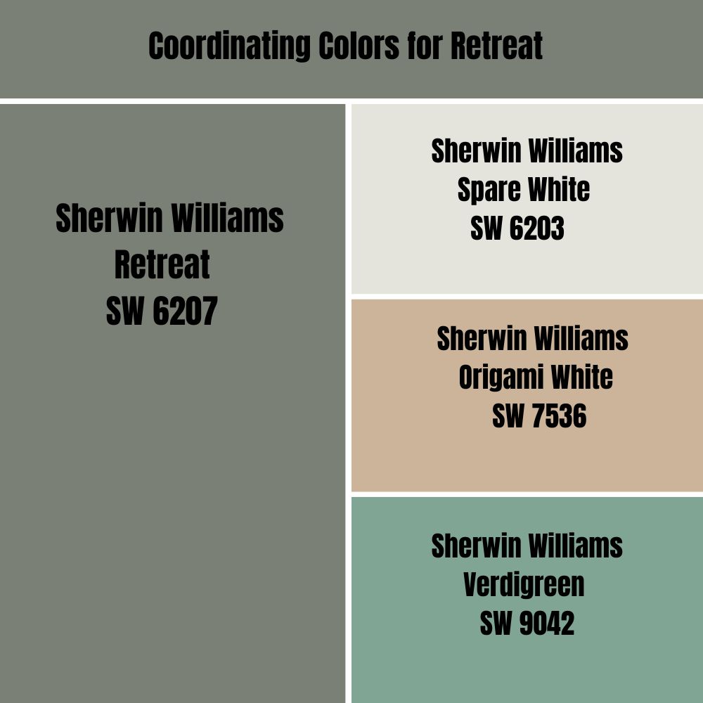
Sherwin-Williams’ coordinating colors for Retreat are Spare White (SW 6203), Origami White (SW 7536), and Verdigreen (SW 9042). But what color pallet classification do these paints fall under? Are there other coordinating colors that expand the visual style for Retreat? Keep reading to get all your answers.
When considering coordinating colors for Retreat, think about the basic themes of Monochrome, Contrast, and Complementary Designs. They capture unique looks, and we will explore them further to determine Retreat’s best color combinations.
Monochrome Decoration with Retreat
Monochromatic colors have the same hue azimuth but have different textures and tones. This is accomplished by creating a color scheme based on the primary hue, in this case Retreat, and ranging from a somewhat darker shade to a lighter tint.
Retreat’s monochromatic design is done with a lighter shade of gray, such as Dark Charcoal (#2E302D), Shadow Gray (#474B45), Ebony (#61655E), and Pastel Gray (#C7CAC5). These colors allow Retreat’s dominant hue to be the focal point, adding depth to the palette.
It is easy not to mess up the monochromatic theme, but it’s also easy to overdo it. Simply use a few colors from the same family without going overboard. Check out the following images to get a better idea of how you can create a well-balanced monochromatic palette.
Contrasting Decoration for Retreat
The contrasting decoration at Retreat uses colors from the same family but at varying saturation levels. Some common examples include Gray (#807C76), Xanadu (#7A8076), and AuroMetalSaurus (#76807C).
These colors create a gentle contrast that is calming and inviting, making them ideal for the Retreat setting. If you need a more subtle contrast, choose colors from the same family, such as Sherwin-Williams Alchemy (SW 6395) or Sherwin-Williams Jardin (SW 6723).
The goal is to use a color palette that is cohesive and harmonious while still providing adequate contrast and visual interest.
Retreat Complementary Colors
Using complementary hues to achieve that outstanding effect in this color scheme can help you keep things simple. But to make this process seamless, we’ll offer a few suggestions.
Typically, you can use simple colors like blues and oranges, reds and greens, purples and yellows, or any other opposite pair on the color spectrum. This not only helps you achieve the desired look, but also makes it easier to coordinate with furniture, walls, and other accessories.
If you crave a more standard approach, go with Rocket Metallic (#857F89), Dark Gray (#ABA7AE), Quick Silver (#AOA49D), or Ebony (#535849). Check out some of the following pictures to get a better idea of what these colors look like when combined.
What Trim Colors Go With Sherwin-Williams Retreat?
Since Retreat is a dark green shade, any light-toned neutral trim color is the perfect complement. This trim color in shades of white, charcoal, or ivory will help create a stunning contrast, giving it a crisp and classic look.
You can also use earthy colors like taupe or light brown to create a cozy and inviting atmosphere. Whichever design you choose, make sure it complements the green and grays in Sherwin-Williams Retreat.
Sherwin-Williams Retreat Color Comparison
Perhaps you want something lighter with just as much beauty and calming texture of hue to contrast with the dark depth of Retreat. Sherwin-Williams offers a number of substitute options that will give you the exact appearance you want.
Without further ado, let’s compare the hue and saturation of these three options to see which one best captures the feel you are trying to create.
Sherwin-Williams Retreat vs. Sherwin-Williams Evergreen Fog (SW 9130)
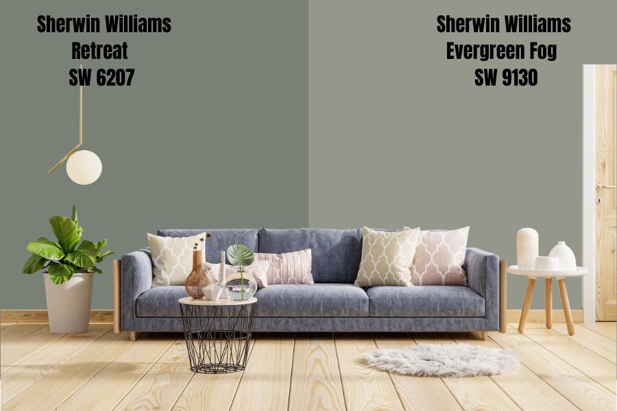
As the 2022 color of the year, the Evergreen Fog should be familiar to anyone acquainted with Sherwin-Williams’ incredible array of colors. You can be sure that it will be a fascinating alternative to Retreat.
This classic shade not only gives you a sense of elegance and style but also a vibrant look that can work with diverse types of spaces. With an LRV of 30, which is 9 more than Retreat’s, it brings the perfect amount of light to create the perfect backdrop for your home decor.
This flexible chameleon hue will transform whatever room it graces with its incredible green-gray undertones and cool tones, making it the ideal addition to any interior design project.
Sherwin-Williams Retreat vs. Sherwin-Williams Pewter Green (SW 6208)
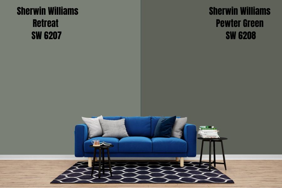
A nature-inspired color, the Sherwin-Williams Pewter Green is another viable alternative to the green shades of Retreat. It has a cool dark hue, with a hint of gray, making it suitable for a calming and tranquil atmosphere
Pewter Green is on the lower end of the LRV scale, having a value of 12, which makes it optimum for darker interiors because it adds a touch of vibrant green to the decor without overpowering the other design elements.
Another noteworthy feature of this color is its ability to enhance the features of organic materials like metal and wood while giving your interior a strikingly unique feel.
Sherwin-Williams Retreat vs. Sherwin-Williams Rushing River (SW 7746)
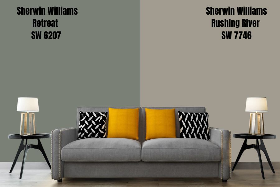
If you crave a lighter green shade for your home design, this color will do. Sherwin-Williams Rushing River is a muted green-gray hue that gives off a neutral yet refreshing vibe to any room
Belonging to the neutral family, neither green nor blue, it is an excellent choice for people who want to keep their home design light, airy, and simple. Its hexadecimal value is #A19C8F, and it has an LRV of 34.
Retreat Benjamin Moore Color Comparison
What if you want other options from a different brand? Retreat, with all its incredible features, also has the advantage of being able to find a suitable substitute in well-known brands such as Benjamin Moore.
This allows homeowners to choose their desired shade from a wide range of color alternatives while retaining the amazing quality and satisfaction that Retreat provides.
Here are the top Benjamin Moore colors with similar aesthetic and calming effects to Retreat. All pictures from Benjamin Moore.
Geddy Gray (CW-720)
Having a similar tone to Retreat, Geddy Gray is a medium-dark hue with an LRV of 22.69. The only discernible difference is its more neutral undertone, which allows it to complement both warm and cool accents.
The hexadecimal color code for this is #7F807A, and the corresponding RGB value is (127, 128, 122).
This color has a rich historical context because it was created in the 18th century by combining white and black pigments. As a result, it is a timeless reminder of the significance of balancing contrasts to create beautiful art.
Lush (AF-475)
As the name suggests, Lush is a beautiful and vibrant green that evokes the rich lushness of nature and a sense of serenity after a heavy summer rain. It has an LRV of 21, so it will feel soft in a room while still providing the perfect pop of color.
This soothing green has subtle blue undertones that complement Retreat’s peaceful yet vibrant energy. Its RGB color code is (115, 128, 113), while its hexadecimal code is #738071.
Rosepine (461)
Rosepine is a Benjamin Moore color that, like Retreat, creates a calming environment while also providing a nuanced sense of elegance. With its soft taupe and gray undertones, this color exudes sophisticated and muted energy.
This color will look fantastic in your living room, bedroom, bathroom, or any other light-filled room in your home. The RGB color code for this medium-dark cool shade is RGB(115, 126, 107) and the Hex value is #737E6B.
Amherst Gray (HC-167)
When designing a space, contrast is essential, and this Amherst Gray provides just that. It is in the Neutral color family and has the RGB color code of RGB (117, 118, 112).
This color works well as a counterpoint to bolder and brighter colors, making it an excellent Retreat alternative for creating a space with a balance of light and dark hues.
What would be the best use for this color? It is frequently used to soften sharp edges in modernist design, and it can also be used in interior design to give a space a pleasantly chic touch. Its hexadecimal value is #757670.
Retreat Benjamin Moore Version
Retreat does not have a Benjamin Moore version but is available from Behr in its identical dark green-grey shades.
Behr Nature Retreat (730 F-5) is a rich and earthy color that evokes the feeling of a natural retreat from the hustle and bustle of everyday life. With an LRV of 23 and RGB (123,135,135), this color has a slightly more subdued feel than Retreat.
You can be sure to find the perfect balance with this shade and its ability to provide a serene environment, making it an excellent choice for bedrooms, living rooms, and dining rooms alike.
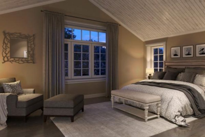
How Does Light Affect the Color?
Whether from a natural or artificial source, light has a role to play in how paint appears in a particular space. Retreat absorbs most of the light due to its dark green shades, so it appears bright when lit up by any light source or dark in shadowed areas.
Southern-facing rooms receive more natural light than rooms facing any other direction, so you can expect to see the paint at its full intensity. To determine the precise location of the light source in the room, use a compass to pinpoint which directions the rooms face.
On the other hand, Northern-facing rooms receive less natural light, making Retreat appear more subdued and dark. It also applies to walls facing east and west that retain natural light but not as much as their southern counterparts.
Best Rooms To Paint Retreat
Sherwin Williams Retreat is suitable for exterior and interior decor, making it extremely versatile. It has a calming effect but can also make a bold statement depending on how you use it.
Not to mention the color’s low reflectivity. This softens the appearance and adds a relaxing atmosphere as well as a polished flair to any home decor.
Retreat may therefore be used in a number of contexts, from urban and minimalist to historical and picturesque. Let’s look at some of these different spaces in their full galore.
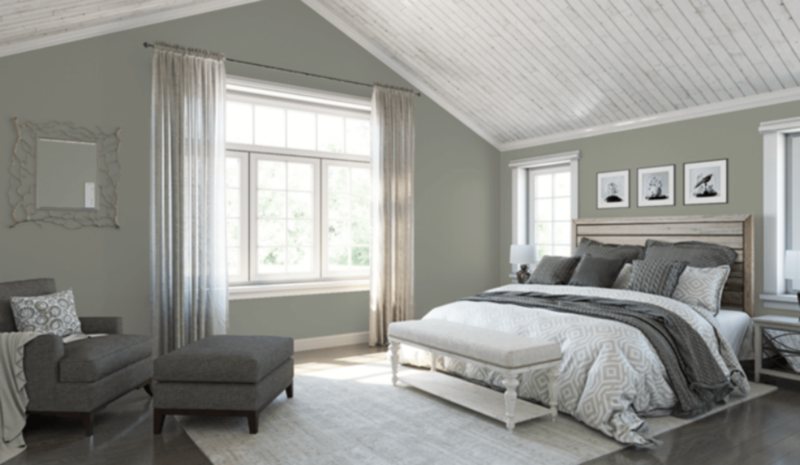
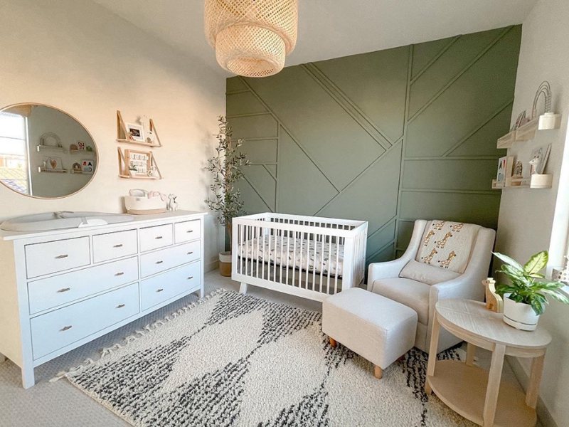
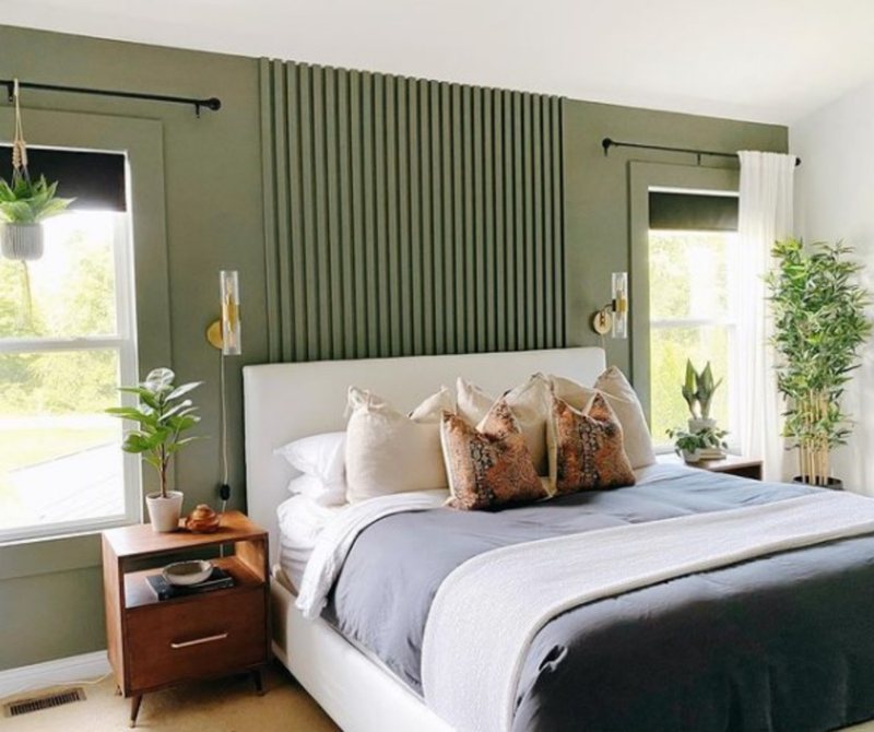
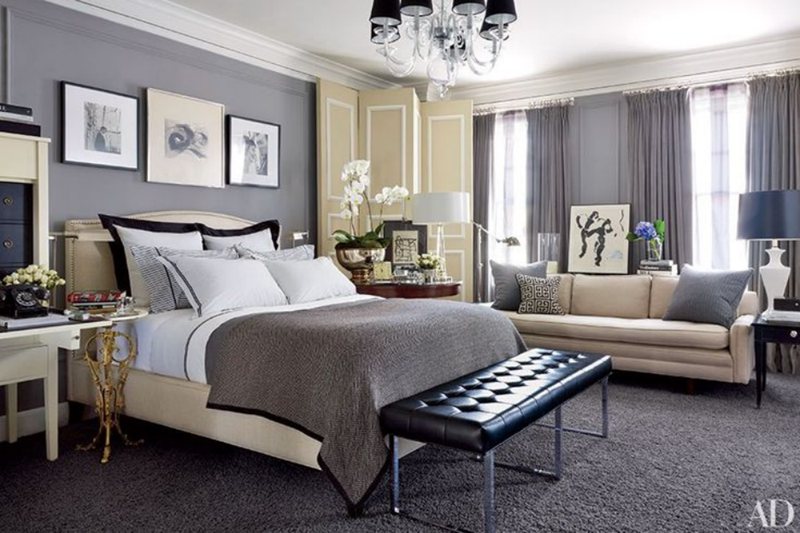
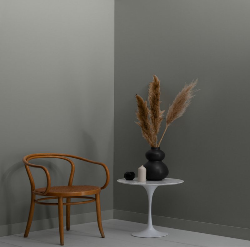
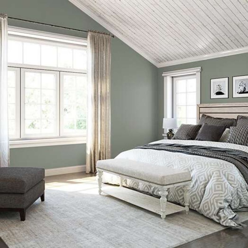
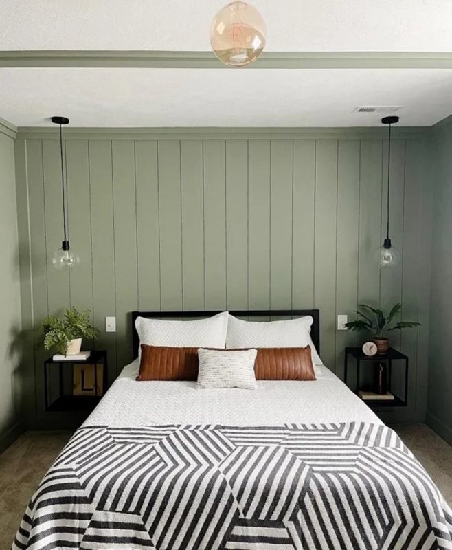
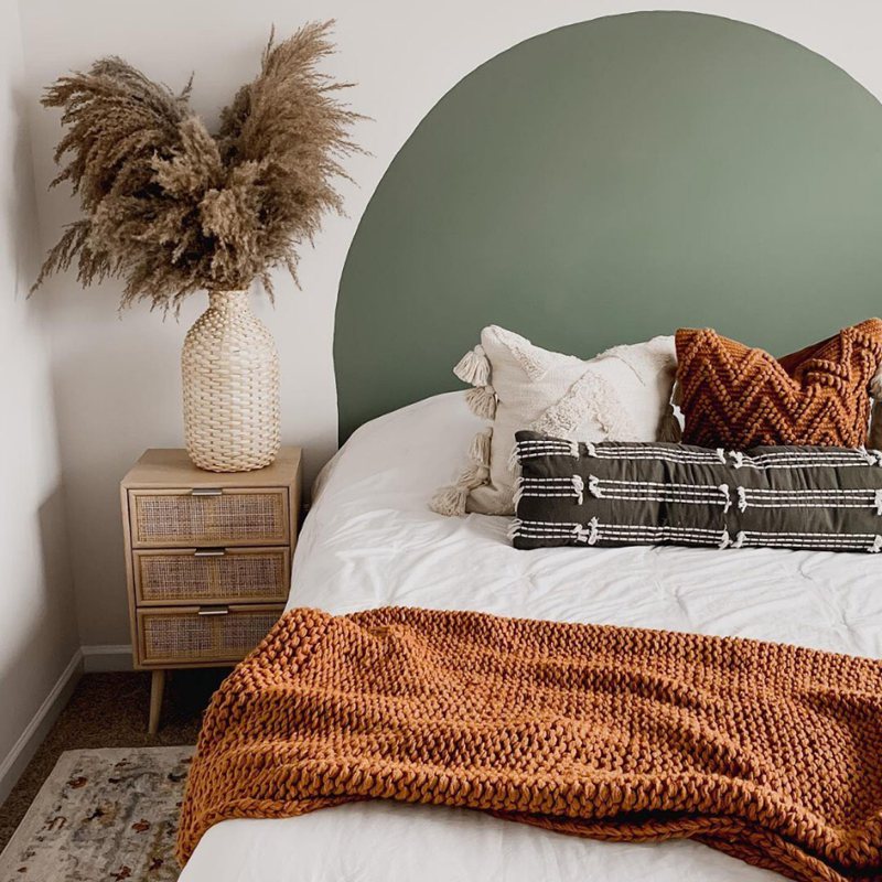
Retreat Bedroom
Retreat certainly knows how to create a calming, relaxing energy in your bedroom. Despite its dark hues, this color scheme is not too heavy or oppressive – it is more earthy and cozy, making it a good addition to your bedroom space.
A great way to incorporate the Retreat palette into your bedroom decor is to pair its dark walls with neutral furniture. Check out these fantastic ideas to get a clear grasp of its style.
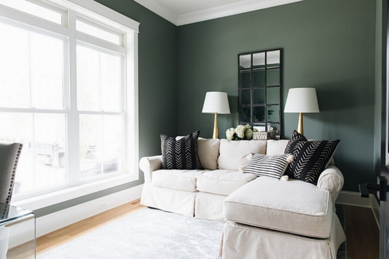
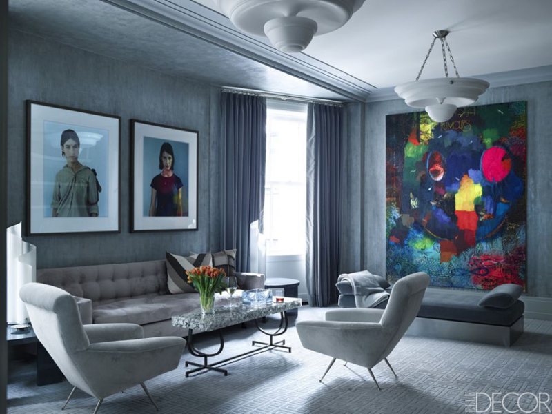
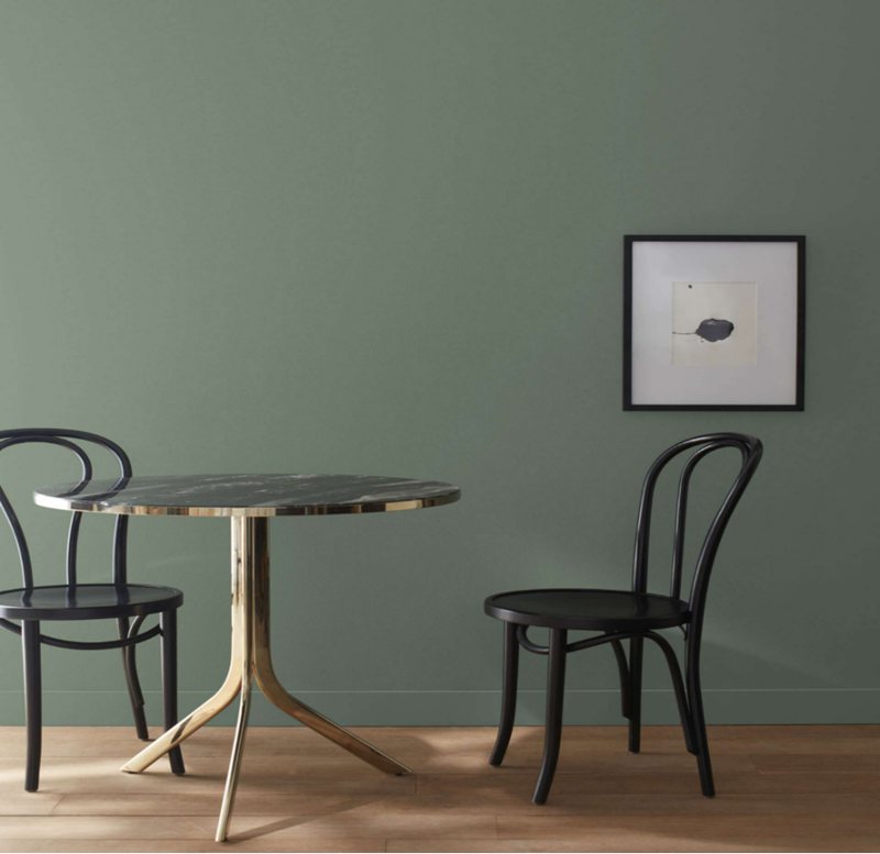
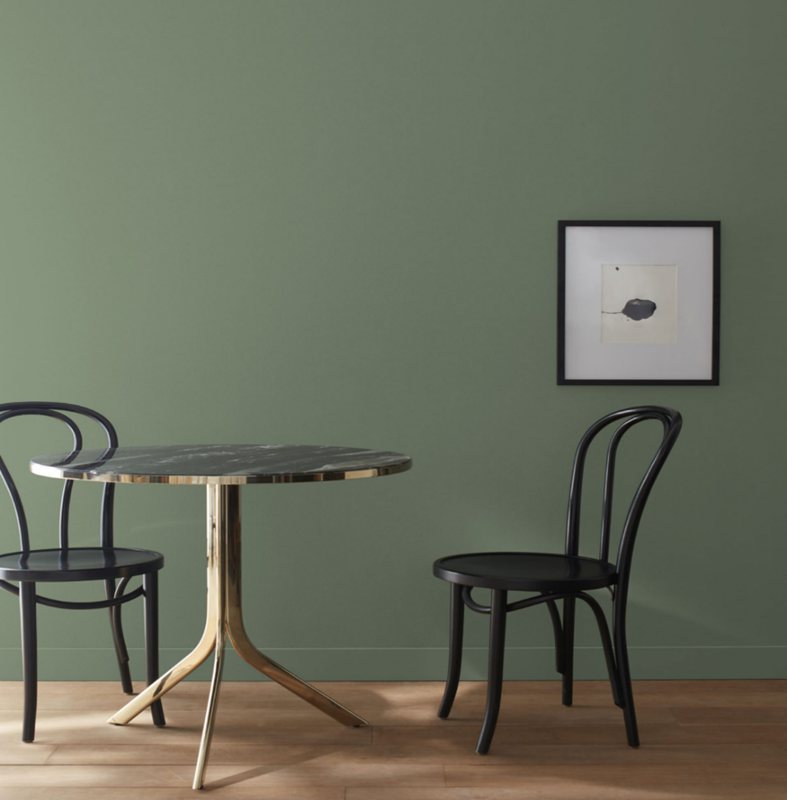
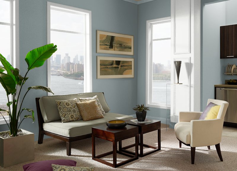
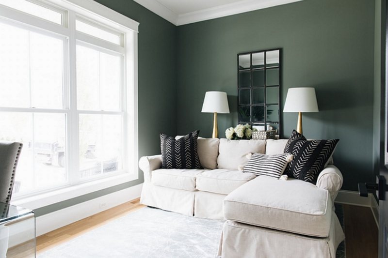
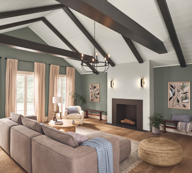
Retreat Living Room
Retreat in the living room is synonymous with adding a breath of fresh air into the space. To get the most out of this shade, consider using one of the monochromatic color pallet we discussed. This will aid in the blend of all the colors to present a unified look.
One tip to help you with your living room decor: Begin with a focal point, such as a piece of artwork or an area rug, a fireplace, or a large window, and build the rest of the room around it.
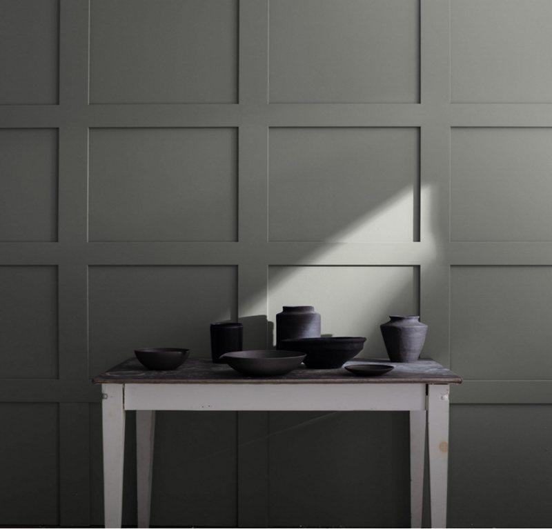
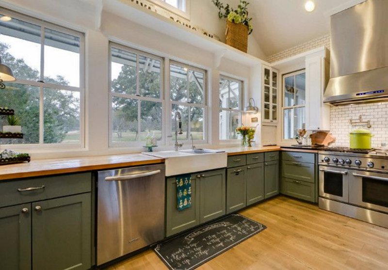
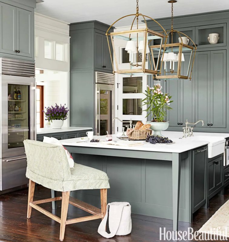
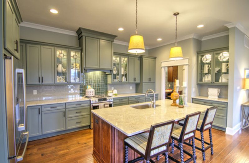
Retreat in the Kitchen
With an exquisite touch of Sherwin Williams Retreat, kitchen upholstery can look even better. This paint’s blue-gray undertones complement natural woods and stainless steel, making it a superb choice for kitchen walls.
If you need more brightness in your kitchen, choose a lighter tint of Retreat in its color strip and white or pastel colors for the ceiling. Check out these designs to see how these colors can create a one-of-a-kind atmosphere in your kitchen.
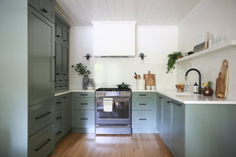
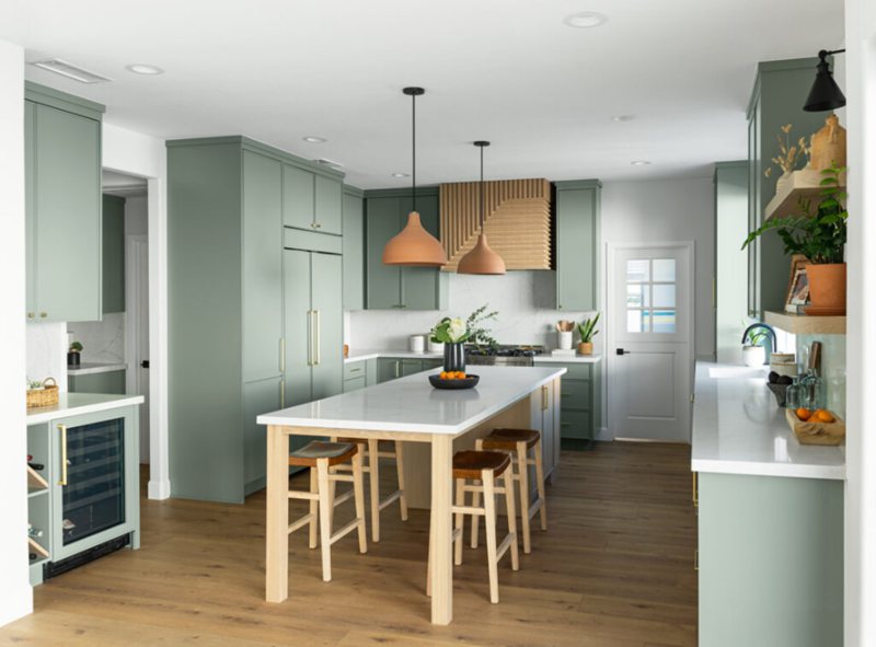
Retreat Cabinets
Retreat adds vibrant colors to cabinetry that can give your kitchen a distinct and modern look. To create a balanced contrast, pair them with light-colored countertops and flooring.
Once you have determined the color scheme for your kitchen, the next step is to choose a dining room style that complements the overall aesthetic.
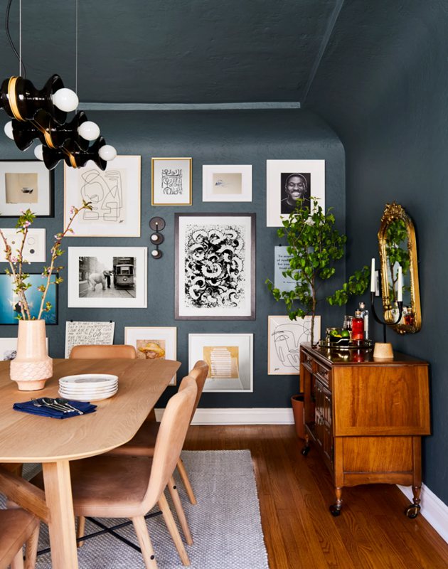
Retreat Dining Room
In this design, you don’t need to go above and beyond to complement its colors. You will discover that the rich, deep color complements a wide range of furniture and tablecloths that are fitting for any dining room space.
By opting for this dark hue in your dining room, you can create a calming atmosphere and an inviting space for guests to relax.
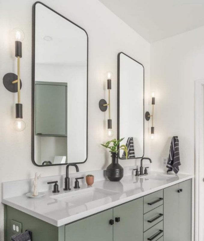
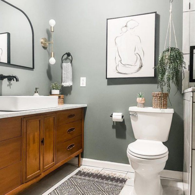
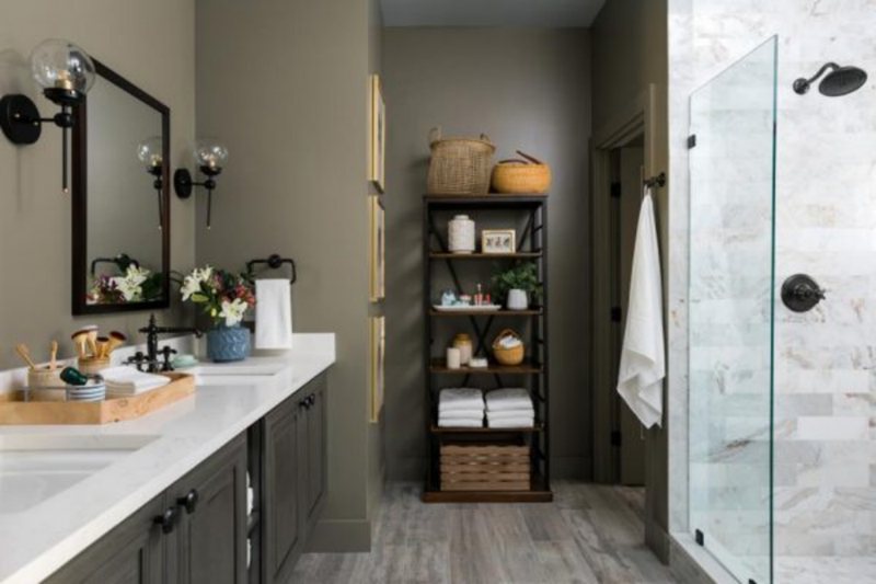
Retreat Bathrooms
Retreat, like most Sherwin Williams versatile colors, looks gorgeous on bathroom walls. The primary benefit of using this color in a bathroom is that it can create a calming environment, allowing you to unwind after a long day.
With its blue-gray undertones, Retreat creates a muted and tranquil atmosphere. Check out some of the many ways you can incorporate Retreat into your bathroom design with the following pictures.
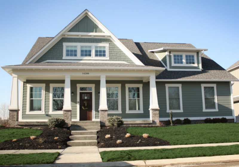
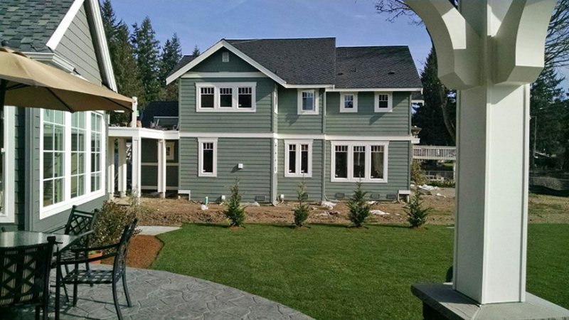
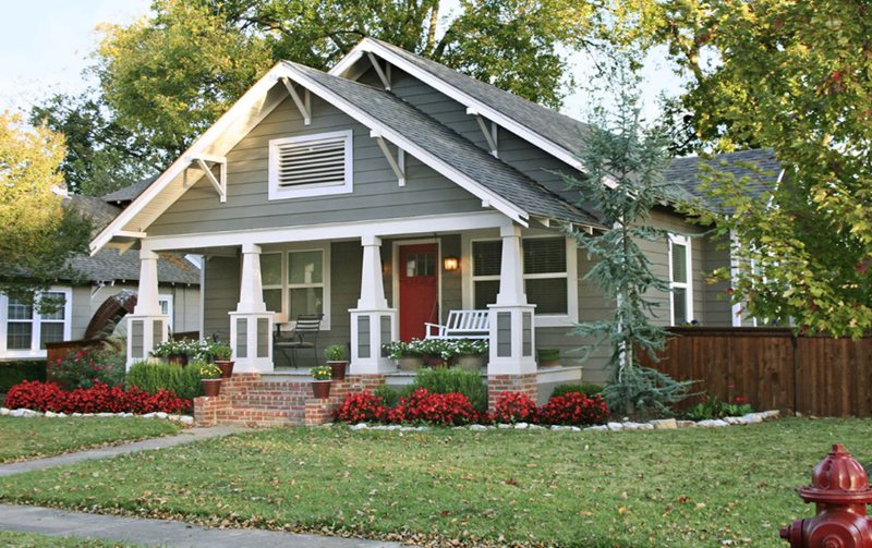
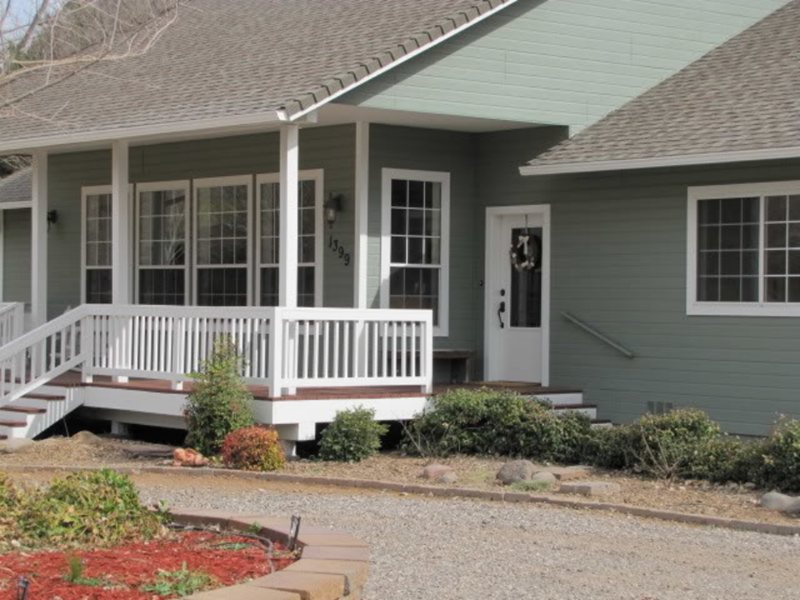
Retreat Exteriors
The major interest of exterior colors is to create a harmonious transition from the home’s exterior to the interior, and Retreat does that effortlessly.
Its dark greenish color lends a rustic feel to outdoor spaces, making it ideal for more country-style homes. Retreat can add a classic elegance to any outdoor space, whether used on a house’s siding, as an accent on windows, doors, and shutters or trim garden beds.
Sampling Retreat
Sherwin Williams Retreat can be sampled with a color chip, a peel-and-stick strip, Color-to-Go, or a Samplize peel-and-stick patch.
They are all good options, but Color-to-Go is the best sampling technique to use. It provides an accurate representation of how the paint will appear on your walls based on the lighting in your home.
Final Thoughts
Beginning with the properties and color representation of Retreat, we’ve seen how its muted blue-gray hue pairs beautifully with many different designs and textures. Lo and behold, Retreat is a versatile color used to create a timeless look that is both stylish and refreshing.
 Sherwin Williams Silverpointe (Palette, Coordinating & Inspirations)
 Sherwin Williams Ivory Lace (Palette, Coordinating & Inspirations)
 Sherwin Williams Rock Candy (Palette, Coordinating & Inspirations)
 Sherwin-Williams Blue Peacock (Palette, Coordinating & Inspirations)
 Sherwin Williams Heron Plume (Palette, Coordinating & Inspirations)
 Sherwin Williams Extra White (Palette, Coordinating & Inspirations)
