
Do you need help picking out the best navy blue paint color for your decor? Try In the Navy SW 9178 by Sherwin Williams. It may not be as popular as others like SW Naval, but it is a fantastic alternative and may be the better option in the long run.
This guide is an extensive review of this rich and saturated paint color. In the Navy paint color is an excellent option if you want a touch of royalty and boldness. I’ll show you all the aspects of this beautiful paint color, including the LRV, undertones, and colors that work well with it.
Ready to make that all-important choice? Come on this exciting journey with me as we explore the color together. I promise you’ll be better equipped to decide when we get off this sweet ride.
Table of Contents
When to Choose Sherwin Williams In the Navy
Selecting a suitable navy blue paint color is usually challenging. It is such a rich color, and one may look better than the next if you are torn between shades. As you may already know, many navy blue shades exist, so why is In the Navy the ideal one for your decor? Here are ideas to consider.
Picking out an accent color?
While other blues can also work as an accent color, In the Navy may be your best option for something different. It is less popular than others, and you may get conversations started with only your accent color.
Have some green in your decor?
In the Navy works well with green because of its undertones. If you have a green thumb, you can arrange your potted plants in a room with this paint color, and the colors won’t clash.
Is lighting not an issue?
This paint color is saturated and deep. If the room where you use it has a lot of light, In the Navy looks amazing. In other words, it works best where there’s good natural lighting.
There are other specific reasons to pick In the Navy over other navy blue options. However, this is a good guide to start your decor design. You can get started right away, but I have other aspects of this paint color to show you to help you make the most of it.
What Color Is In the Navy?
If you have ever looked out at sea when it’s late or when a storm is brewing, you may understand how deep navy blue can be. This is not always the case; sometimes, the sea looks dark gray in a storm. But most times, navy is the color, and you may feel like it draws you into it.
This paint color is reminiscent of the deep blue sea as if you are inside the navy color. And when you use it in a room, it grabs attention, even if you use it minimally. Wondering what this color looks like in real life? Here’s a sneak peek at it below.
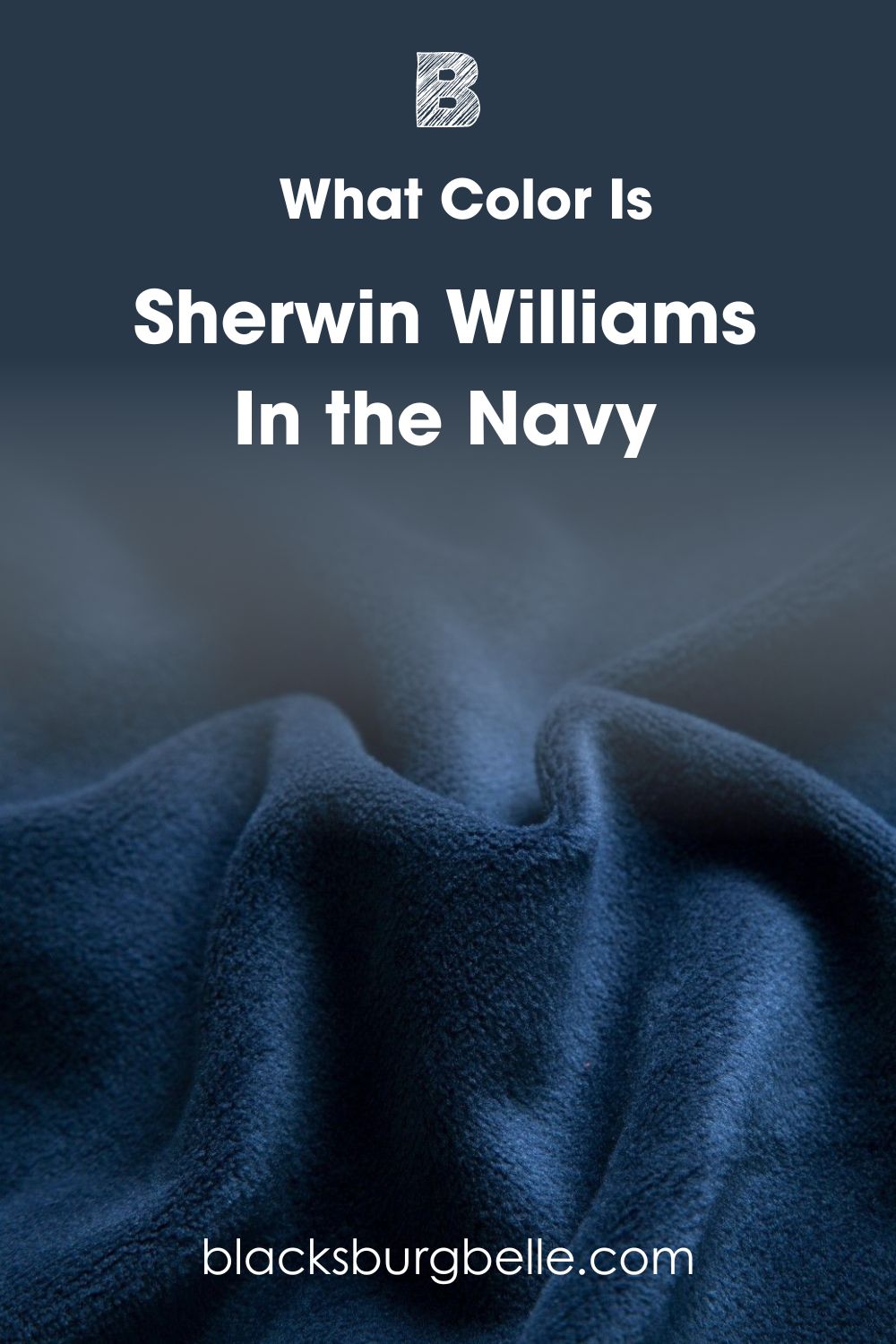
Sherwin Williams In the Navy SW 9178 is a navy blue paint color with a velvety look and feel when done right. It is a solid color that can work well with warm and cool colors.
A Snapshot of the Specifications of Sherwin Williams In the Navy
A detailed chart of the specifications of this paint color will go a long way in explaining more about it. You may be keen on learning about the undertones and LRV, as they are details that change every paint color. And this chart is what you need.
| Sherwin Williams In the Navy | |
| RGB | 40, 56, 73 |
| LRV | 4 |
| Undertone | Green |
| HEX Code | #283849 |
The LRV of Sherwin Williams In the Navy
LRV is the light reflectance value of color and refers to the amount of light the color reflects on a scale of 0 to 100. Pure black has an LRV of 0, and white has an LRV of 100, which means that darker colors are closer to 0 while lighter colors are closer to 100.
However, paint colors use a slightly different scale between 2.5 and 94. The reason is that they don’t have absolutes, that is, pure white or pure black. So, you won’t find a paint color with an LRV lower than 2.5 or higher than 94.
In the Navy has an LRV of 4, which is a pretty low value. It is close to black, although it is blue, which means the color doesn’t reflect much light.
The Undertones of Sherwin Williams In the Navy
As a solid blue, the undertone of this color is not immediately evident. Every color has an undertone, whether or not you see it. The same is true of dark colors like black and navy blue.
In the Navy has a green undertone, but it is not obvious. Only in certain lighting conditions do you see it. This undertone contributes to the tone and depth of the color.
This picture truly represents In the Navy, and the undertones may not be immediately obvious.
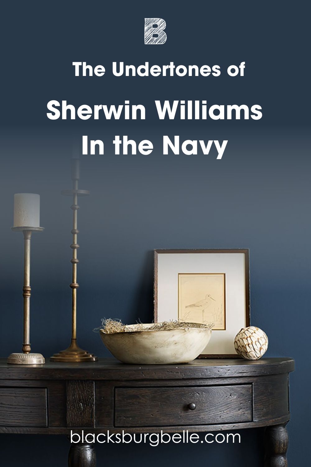
But here is the same color with just a hint of green.
In the second picture, In the Navy looks a little like a turquoise or dark teal. But it looks somewhat different from the color in the first picture. This next picture shows a hint of gray in the blue color, but we can argue that this is because navy blue usually holds a bit of gray.
Does Lighting Affect In the Navy?
Lighting affects every color, whether dark or light. And the same is true In the Navy, despite its deep color. Simply put, lighting affects the paint color, making it look darker or lighter. This applies to natural and artificial lighting conditions.
The next picture shows In the Navy under warm yellow artificial lighting. It looks almost black with just a hint of blue.
Bright natural lighting or direct sunlight makes the color looks bright and very blue. Low light makes it appear darker than usual, and the same is true for cold light. Now, a room may have a northern, southern, eastern, or western exposure. Southern exposures let in bright direct sunlight, and northern exposures let in cold light because of the lack of direct sunlight.
Eastern exposures let in warm light in the morning and cold light in the evening, while western exposures let in cold light in the morning and warm light in the evening. In the Navy would look excellent in a south-facing room. However, you can still use it in such a room if you don’t mind that saturated and full look.
These cabinets painted in In the Navy have bright natural light, so you have an idea of how the color looks in such a room. It may sway your choice.
This next room doesn’t have a lot of bright warm light, and the paint color looks moody and slightly overwhelming.
How Does SW In the Navy Feel in a Room?
It may be because I feel biased toward navy blue, but In the Navy feels regal and royal, and it looks beautiful in a room. As a deep color that shows some coolness, it brings a peaceful calm that still speaks volumes in a space.
Consider using it in a private space to enjoy its saturation, or try it in splashes in different rooms around your house.
Sherwin Williams In the Navy: Warm or Cool?
In the Navy is a cool navy blue paint color. Blue is typically a cool color, but the green undertone contributes to its depth.
However, it is not a crisp or icy color because of the hint of green in it; In the Navy can pair well with some warm colors without looking out of place. Consider using it if you have a neutral or cool color scheme.
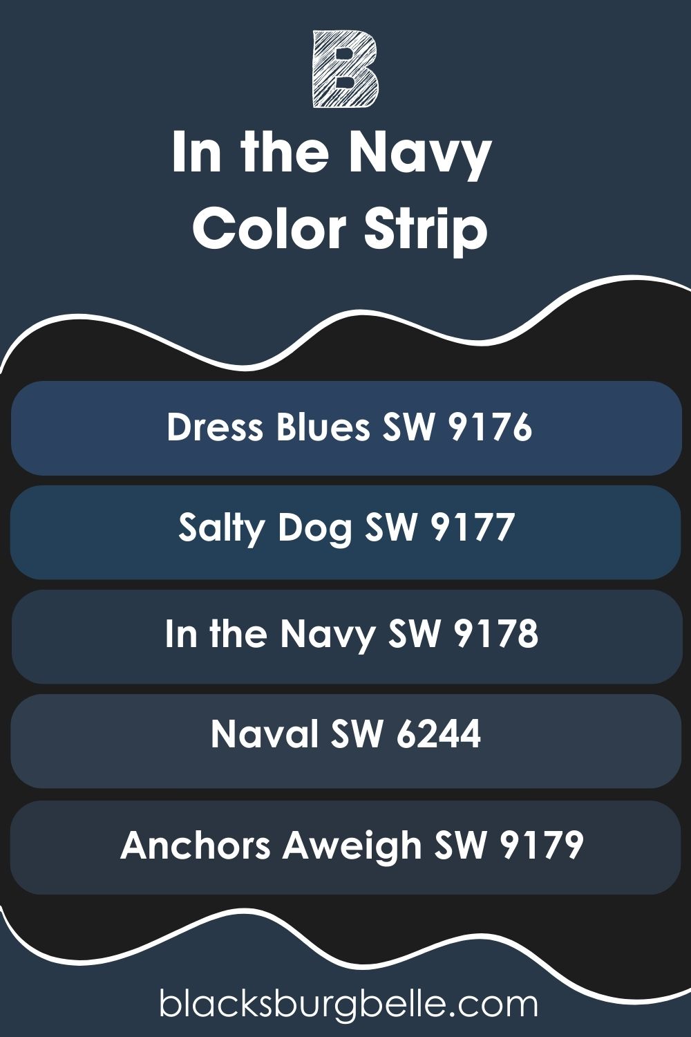
Sherwin Williams In the Navy Color Strip: Lighter to Darker Exploration
If In the Navy is too dark or slightly different from the shade of navy blue you want, you don’t have to look far for alternatives. I’ve carefully picked navy blue colors from the same strip as In the Navy to give you options ranging from light to dark.
- Sherwin Williams Dress Blues SW 9176
- Sherwin Williams Salty Dog SW 9177
- Sherwin Williams In the Navy SW 9178
- Sherwin Williams Naval SW 6244
- Sherwin Williams Anchors Aweigh SW 9179
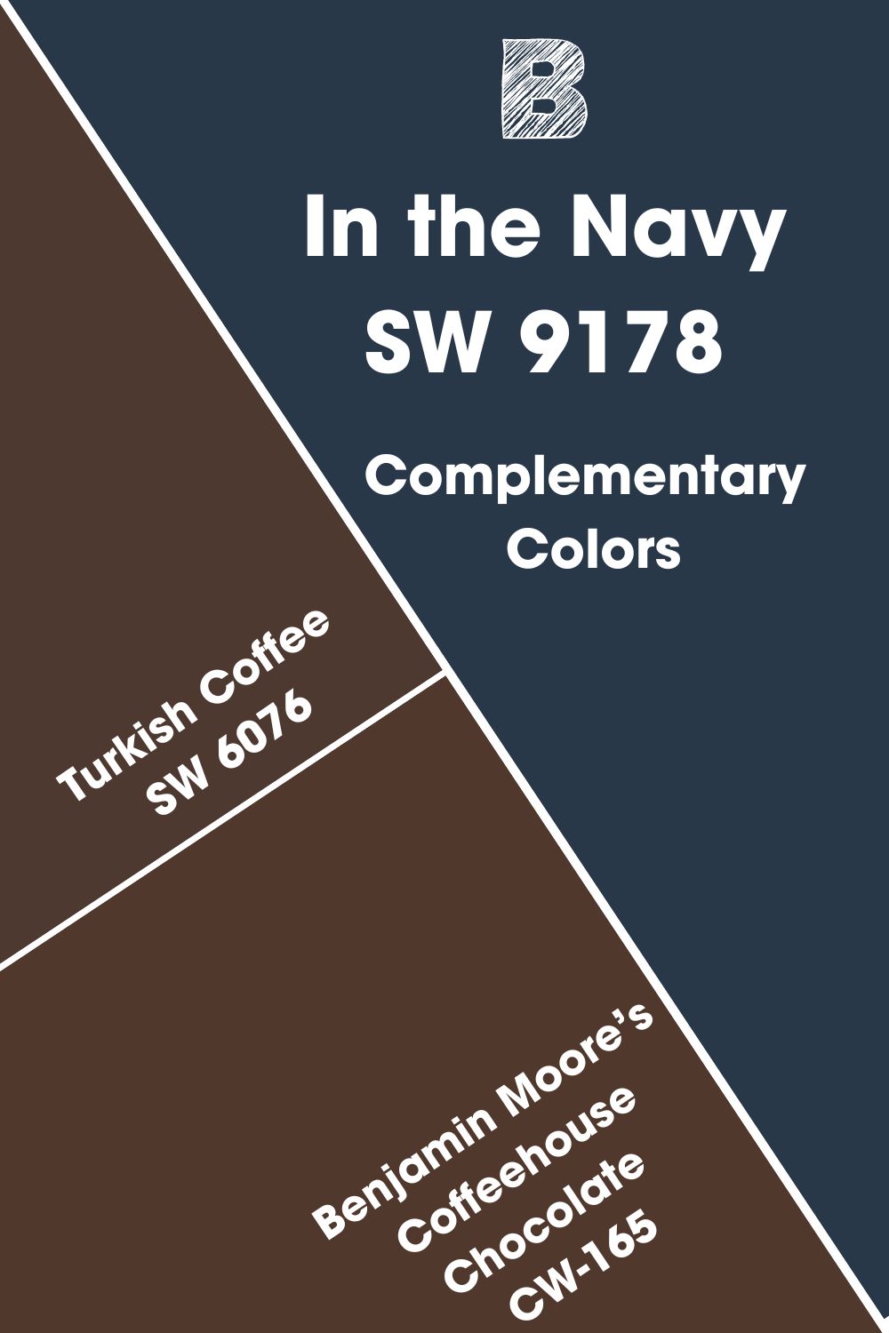
Sherwin Williams In the Navy Complementary Colors
Pick any color on the color wheel and check the color opposite it. Both colors complement each other, regardless of the shades.
Complementary colors are opposite shades on the color wheel and can cancel each other when mixed, producing white, black, or another grayscale color. Blue and orange are complementary colors, like purple and yellow or red and green.
Sherwin Williams In the Navy is a blue paint color, which means orange should be its complementary color. However, it is not your usual blue shade, especially with a bit of green. So, the complementary color for In the Navy is a dark brown with a slightly red hint. The best match from Sherwin Williams for this color is Turkish Coffee SW 6076, a rich brown with a bit of yellow. You can also try Benjamin Moore’s Coffeehouse Chocolate CW-165 if Turkish Coffee is not readily available.
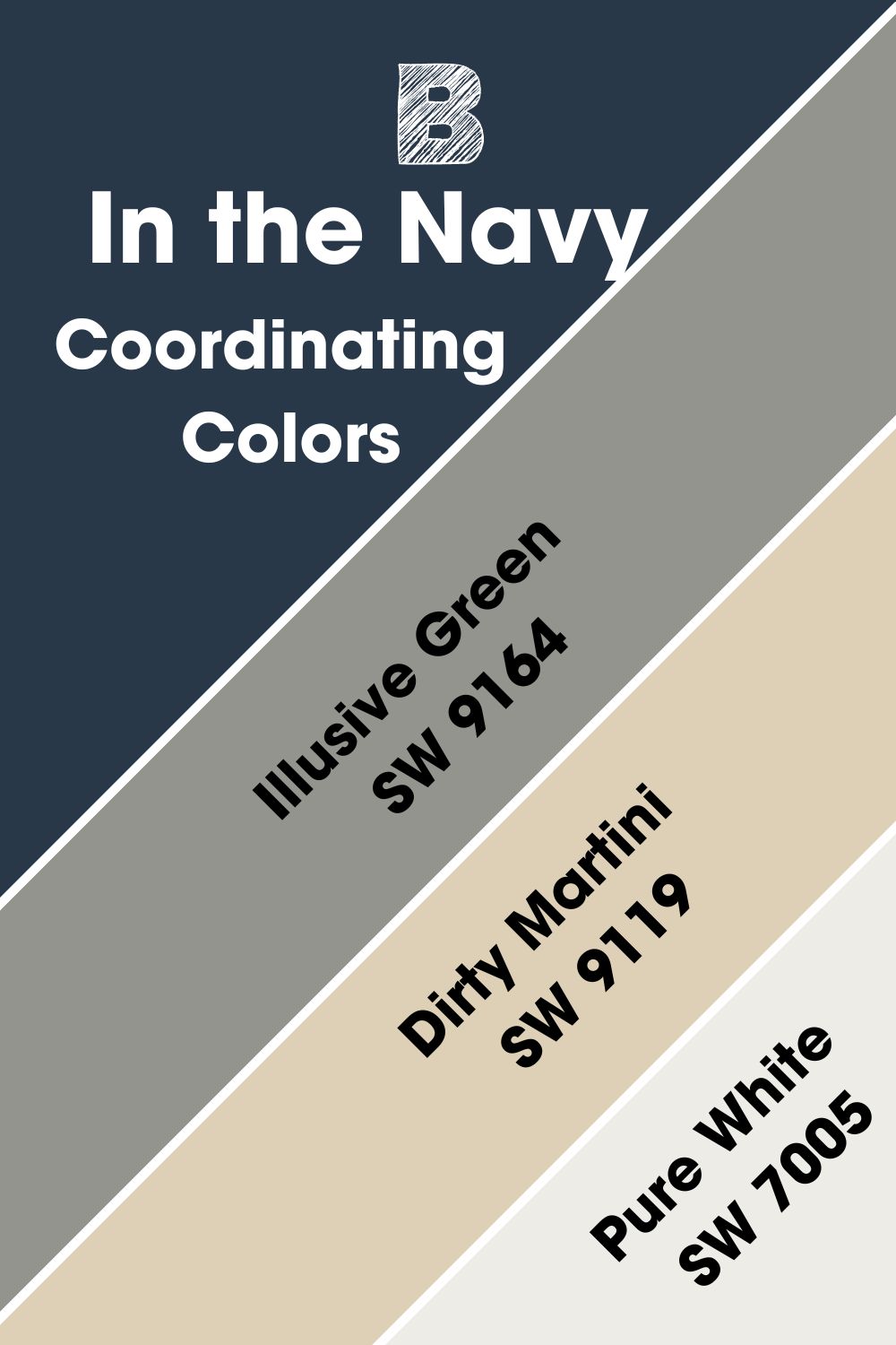
Sherwin Williams In the Navy Coordinating Colors
These can be any color as long as they have some similarities. Complementary colors pair well, despite the seeming lack of resemblance between them. When used together in a color scheme, they present a pleasing appearance and flow nicely into each other.
Sherwin Williams’ In the Navy has different coordinating colors, including Illusive Green, Dirty Martini, and Pure White.
- Sherwin Williams Illusive Green SW 9164: A moody green with gray and cyan undertones that perfectly match the much darker In the Navy.
- Sherwin Williams Dirty Martini SW 9119: A warm but bright neutral paint color that blends well with dark colors, including In the Navy.
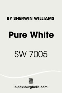
- Sherwin Williams Pure White SW 7005: A bright white paint color that works well as a trim color for In the Navy, despite its slightly yellow undertone.
Sherwin Williams In the Navy Color Palettes
Whether you’re painting a room or an entire house, you’ll need a color palette. Color palettes are treasures that allow you to combine colors to see what works. Interestingly, there are different types, depending on the style you want. But I’ve picked three that fit SW In the Navy to help you get started.
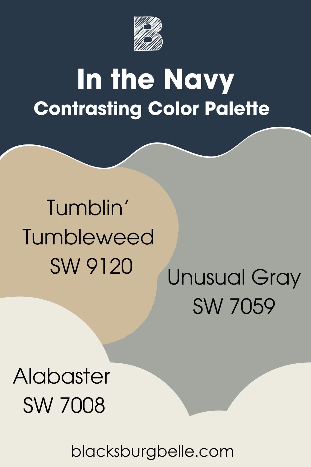
Contrasting Color Palette
- Unusual Gray SW 7059: With cyan and green undertones, this mid-tone gray is not an entirely off-color to pair with In the Navy but blends well with the darker color.
- Tumblin’ Tumbleweed SW 9120: A warm color with neutral tones that introduce earthy tones to the decor and lighten the vibe.
- Alabaster SW 7008: A bright white for a trim color when the walls are done in In the Navy.
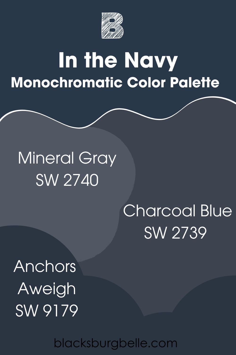
Monochromatic Color Palette
- Mineral Gray SW 2740: A dark gray with a hint of blue that flows into the much darker In the Navy.
- Charcoal Blue SW 2739: A shade slightly darker than Mineral Gray, this color pairs well with the primary color, In the Navy, because of its blend of blue and gray.
- Anchors Aweigh SW 9179: Use this paint color instead of black for trims and cabinets if you want a bit of color without looking bright.
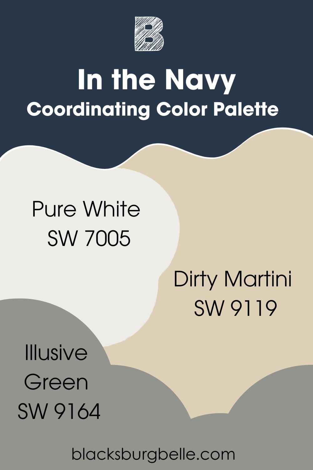
Coordinating Color Palette
- Pure White SW 7005: A bright white paint color that works well as a trim color for In the Navy, despite its slightly yellow undertone.
- Dirty Martini SW 9119: A warm but bright neutral paint color that blends well with dark colors, including In the Navy.
- Illusive Green SW 9164: A moody green with gray and cyan undertones perfectly matching the much darker In the Navy.
Sherwin Williams In the Navy vs Similar Colors
Only a few colors come close to the unique shade that is SW In the Navy. Let’s compare these colors and see how they perform side by side.
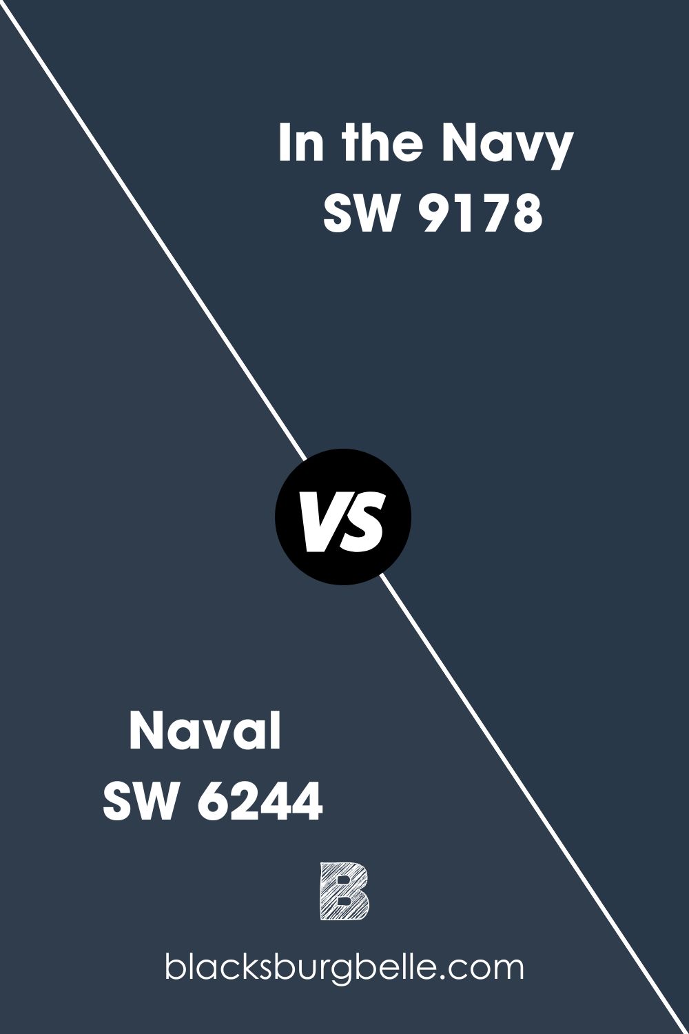
SW Naval vs SW In the Navy
Both paint colors are navy blue, rich, saturated, and have the same LRV of 4. However, Naval has gray undertones, while In the Navy has green undertones.
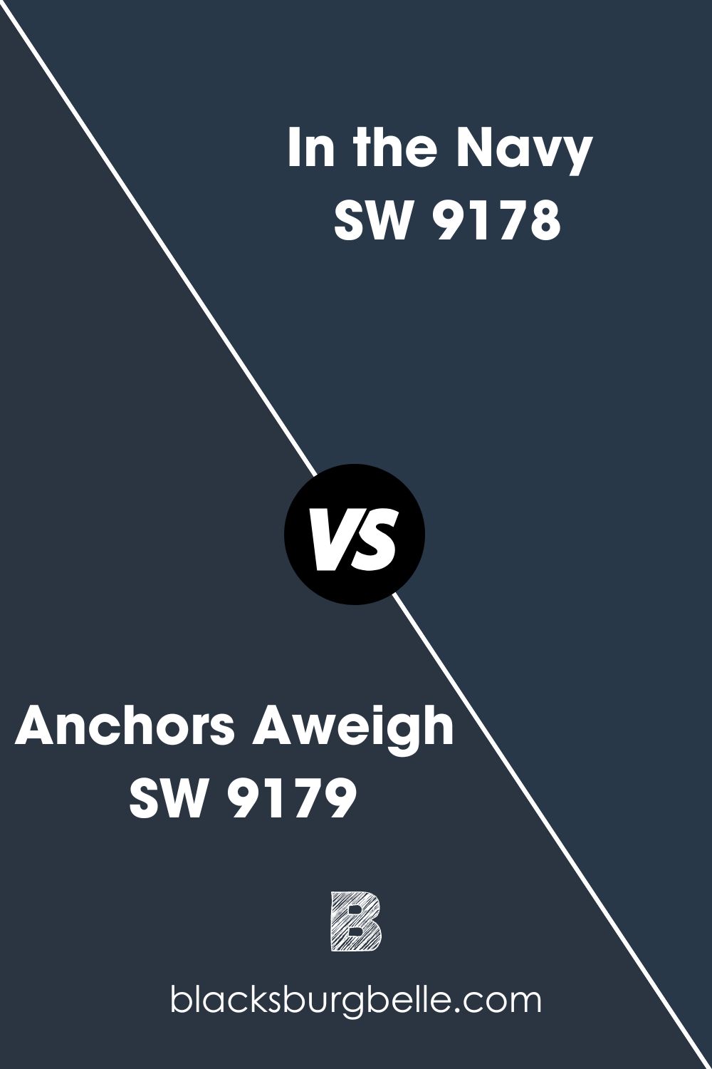
SW Anchors Aweigh vs SW In the Navy
Anchors Aweigh has an LRV of 3, while In the Navy has an LRV of 4. It also has a little more green than In the Navy, and the combination of the lower LRV and the undertone makes Anchors Aweigh the heavier and darker blue of the two.
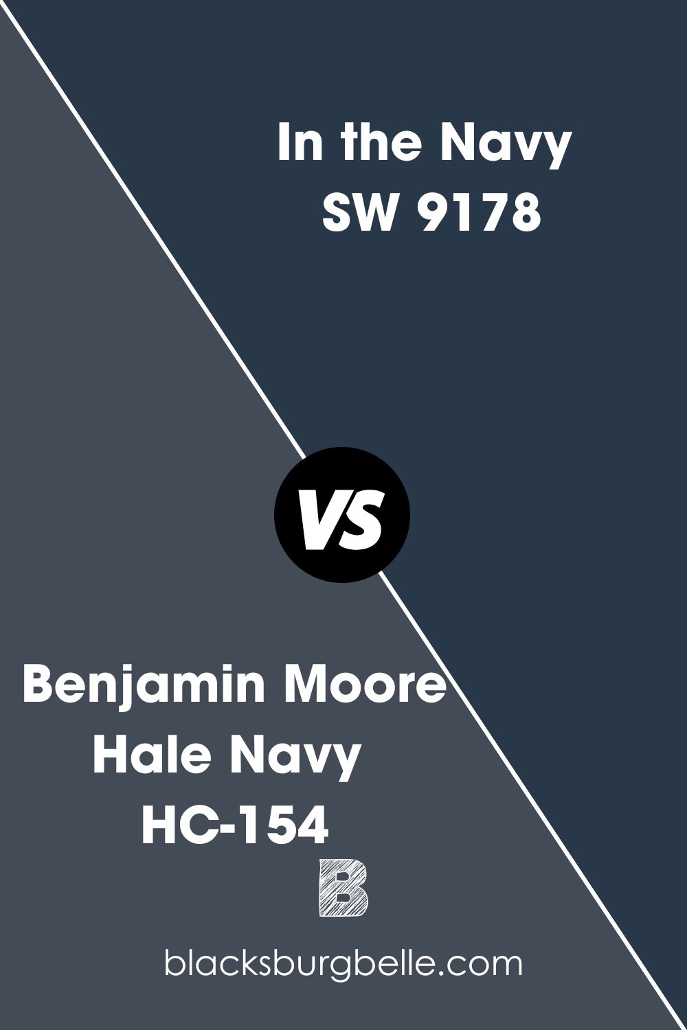
BM Hale Navy vs SW In the Navy
Benjamin Moore’s Hale Navy is considered a true navy but has gray undertones. And with an LRV of 8.36, it is considerably lighter and brighter than the brooding In the Navy.
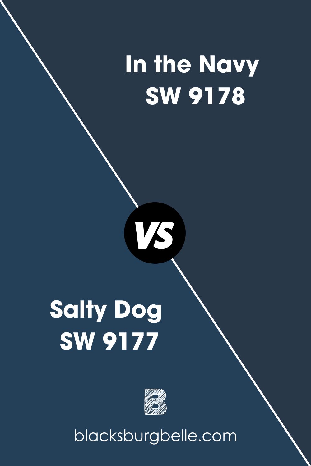
SW Salty Dog vs SW In the Navy
Salty Dog is slightly brighter than In the Navy, with an LRV of 5. Apart from that, these two paint colors have the same green undertones, with Salty Dog having more than In the Navy.
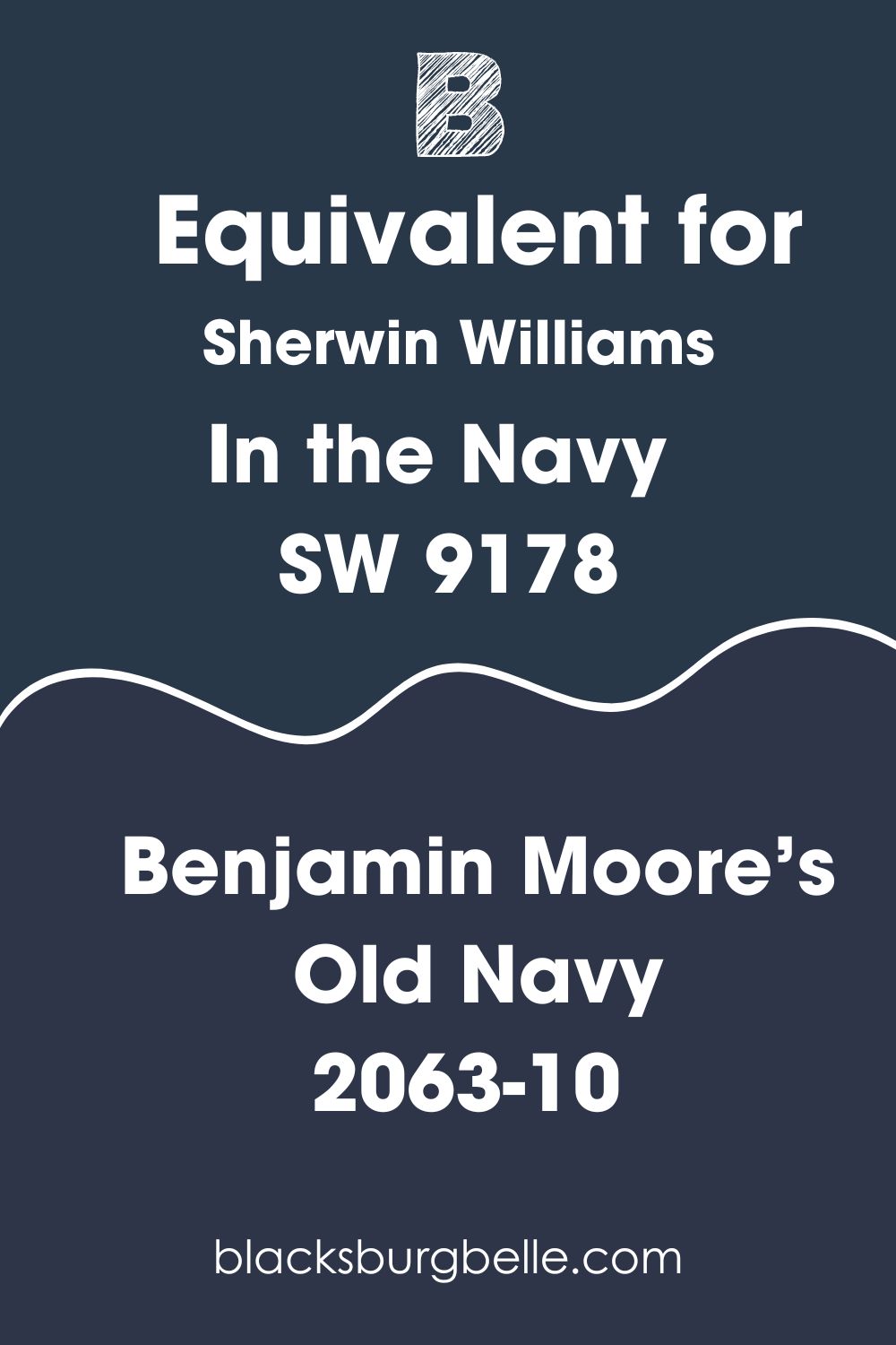
Benjamin Moore Paint Color Equivalent to SW In the Navy
There is no paint color equivalent from Benjamin Moore to match Sherwin Williams In the Navy. All paint colors are unique, so you will find similar colors, not exact equivalents.
That said, Benjamin Moore’s Old Navy 2063-10 resembles In the Navy. Consider it an excellent alternative to the Sherwin-Williams paint color if you want that option.
Where Can You Use Sherwin Williams In the Navy?
You can use In the Navy in any room, especially in a private room or study. It is also an excellent exterior color, including on the trim. Let’s look at some actual pictures for inspiration.
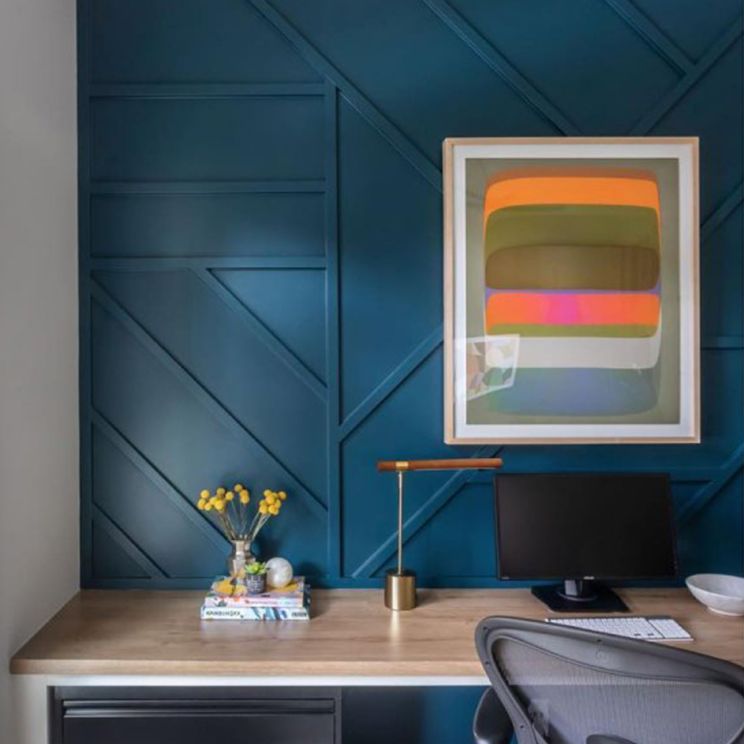
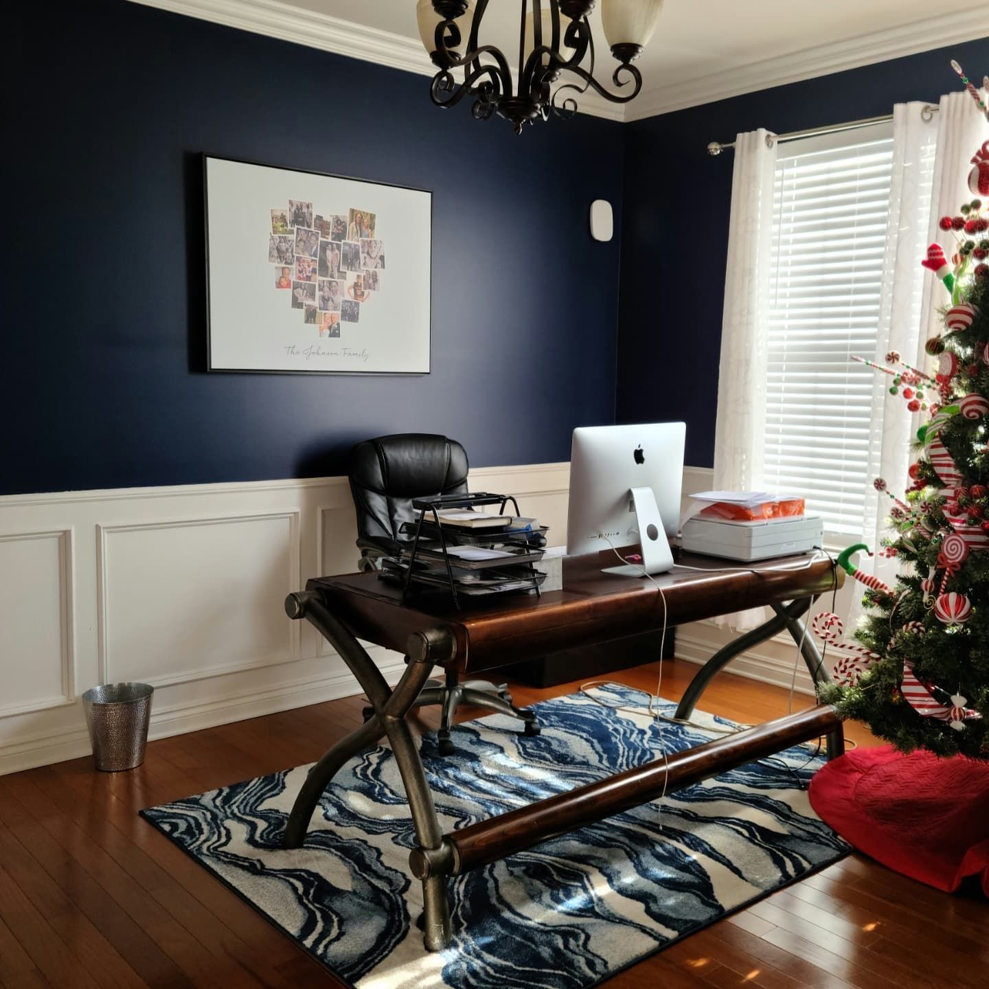
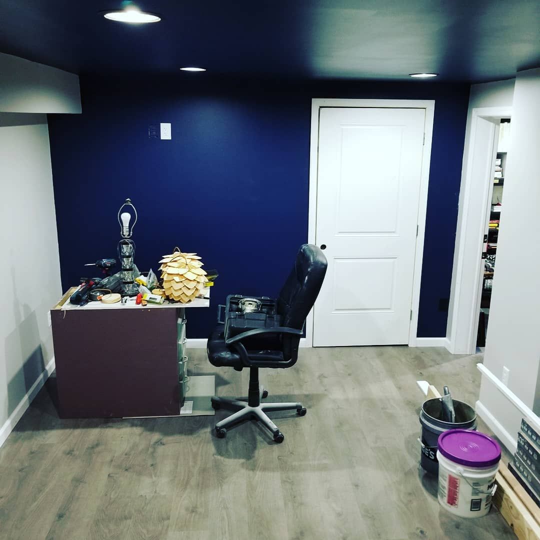
Sherwin Williams In the Navy in a Home Office
This is one of the best places to use this paint color because it allows you to experiment. This office looks fantastic with a combination of blue and white. But the striking feature is the ceiling, painted in the same shade of navy blue as the walls.
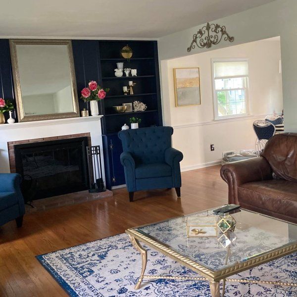
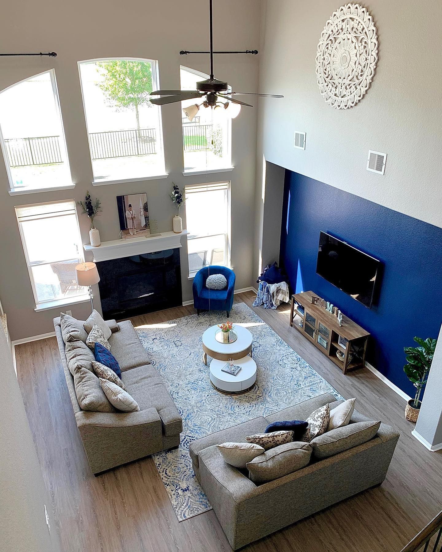
Sherwin Williams In the Navy in a Living Room
As mentioned earlier, In the Navy is ideal for accent walls, as seen in this living room decor. It brings a cool and sophisticated vibe without overtaking the other colors.
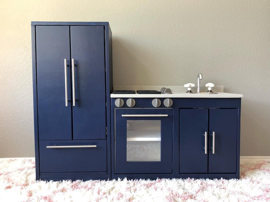
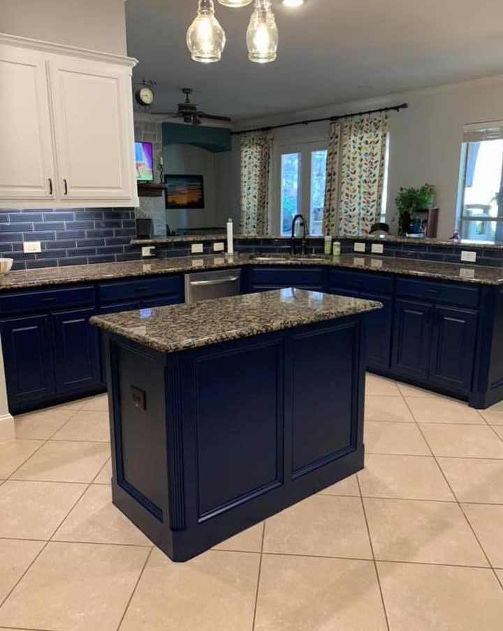
Sherwin Williams In the Navy on Kitchen Cabinets
Navy blue looks great on cabinets, especially in the kitchen. If the walls are light-colored, use this dark blue as the cabinet color. In this next picture, the upper cabinets are painted in SW Ivory Lace, while the lower ones are painted in In the Navy.
Best Trim Color for SW In the Navy Walls
I would go with white, although light gray also pairs well with it. However, white makes this rich and deep blue pop, creating a striking combination.
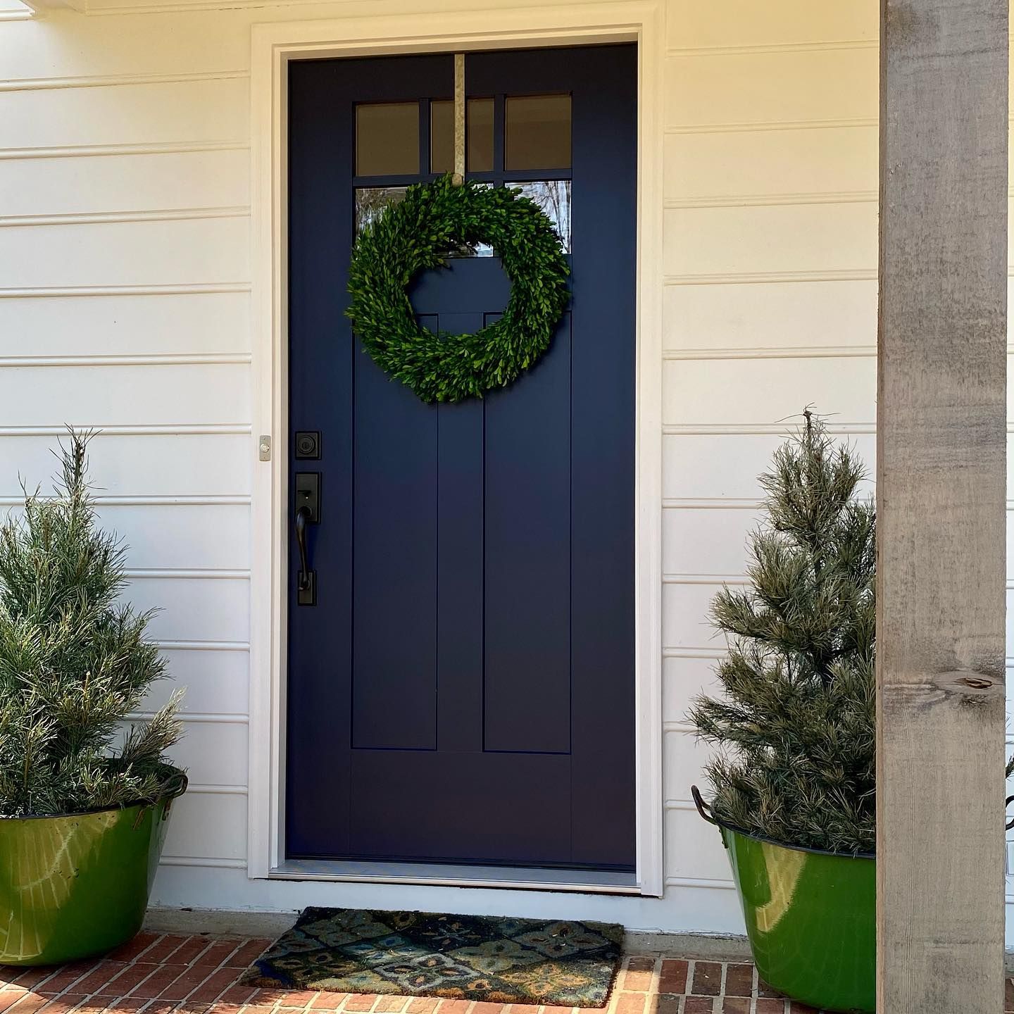
Sherwin Williams In the Navy on a Door
Surrounded by a warm off-white color and bright light, In the Navy has never looked better on a door. Try this color on your front door if you want something unique.
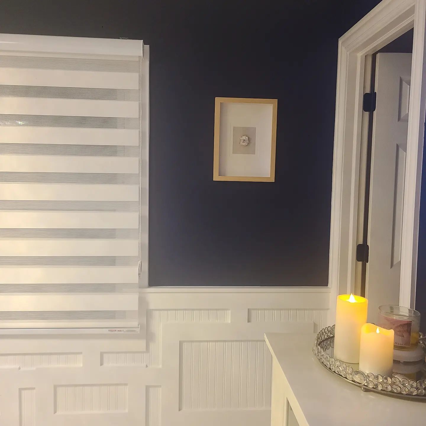
Sherwin Williams In the Navy in a Foyer
This foyer looks beautiful and different because of In the Navy. It’s a great color to use if you want something different in your decor.
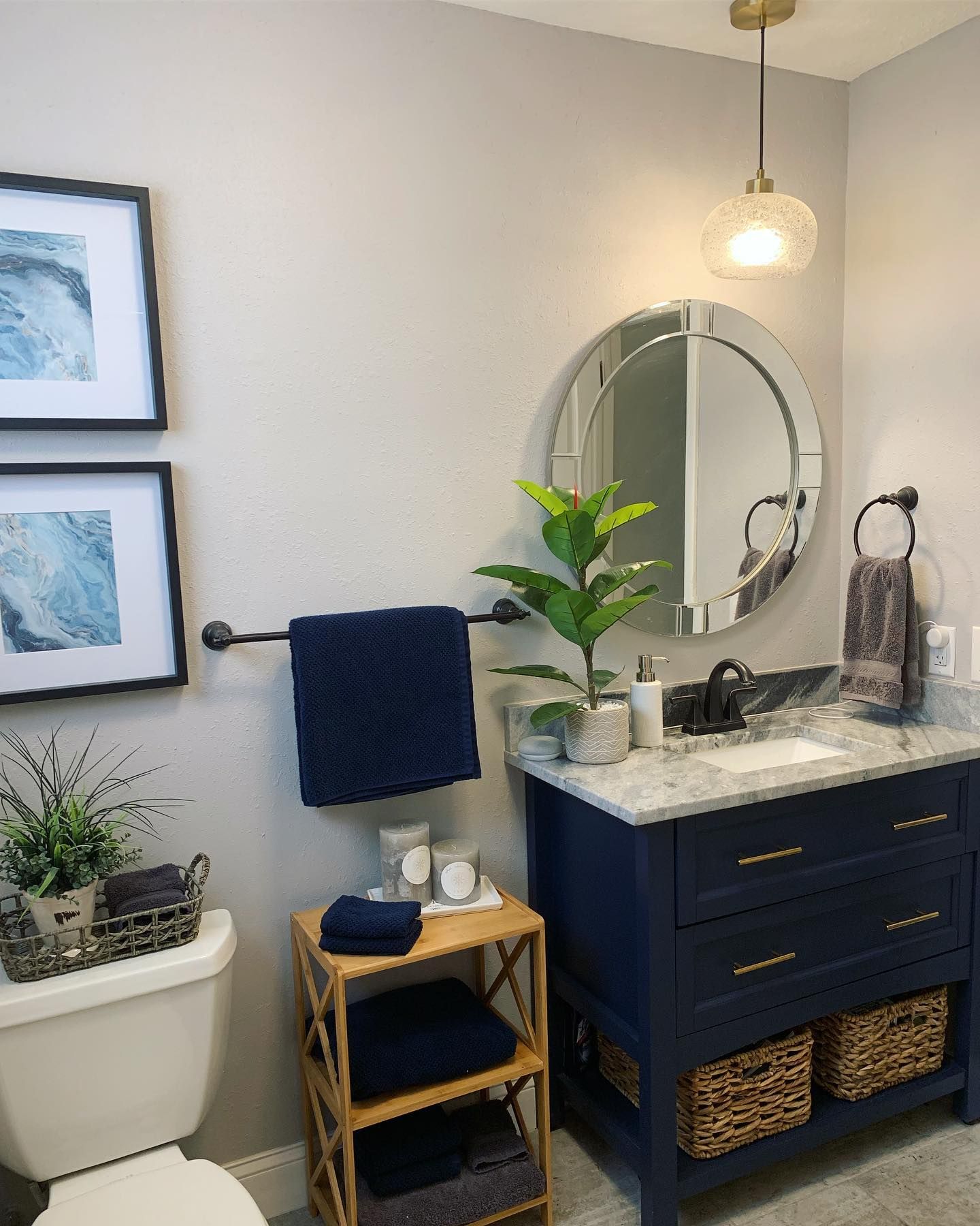
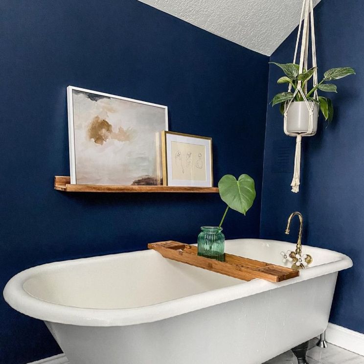
Sherwin Williams In the Navy in a Bathroom
If it looks good on kitchen cabinets, it should look good on bathroom vanities. That’s right, as you can see in this bathroom picture. The vanity color matches the blue towels, warm whites, and wood tones.
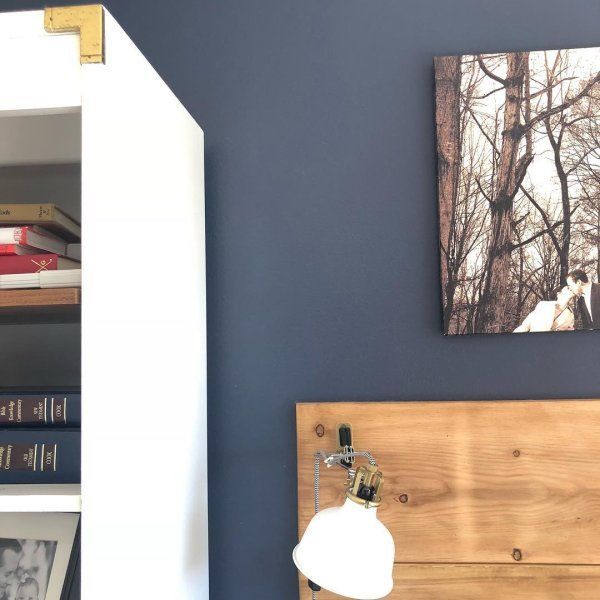
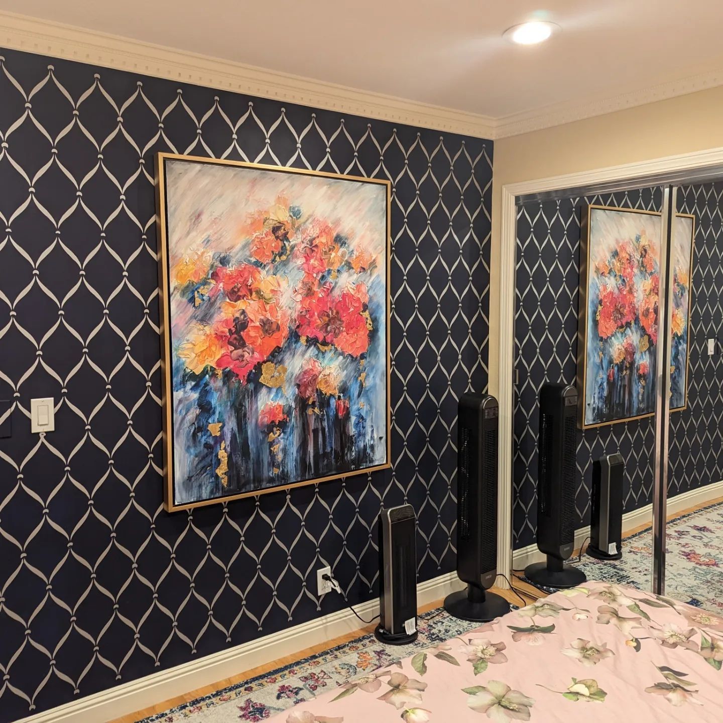
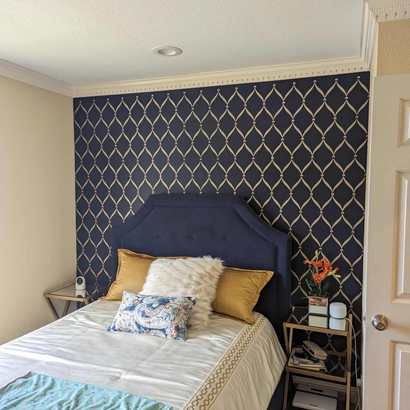
Sherwin Williams In the Navy in a Bedroom
This is a beautiful decor style, and no, it is not wallpaper. That’s In the Navy with a unique stencil pattern.
Sherwin Williams In the Navy on Shutters
You will find that In the Navy is pretty versatile if you know how to combine colors. This house’s exterior combines SW Peppercorn as the main color, In the Navy on the shutters, and Pure White on the garage door and window trims.

Best Ceiling Color for SW In the Navy Walls
I’ve shown you a picture of a ceiling painted blue, In the Navy to be precise, and the walls are also in the same color. However, while this looks great, white and light gray are the best colors for the ceiling. I would go for white for a stunning effect. Use Sherwin Williams Pure White, Extra White, or Ceiling Bright White.
Conclusion
Sherwin Williams In the Navy is a beautiful navy blue paint color that brings a certain coolness and sophistication into a room. With its green undertone, this cool blue gathers some depth, making it unique from other colors. It also has an LRV of 4, making it a pretty deep color.
Pair it with greens, light blues, yellows, whites, and light grays. You can also try wood tones and warm tans if you want versatility. Follow this guide to create an awesome color palette to enjoy coming home to a stunningly finished house.
Do you have any questions or pictures to share with me? Feel free to reach me in the comments section.
 Sherwin Williams Sea Salt (Palette, Coordinating & Inspirations)
 Sherwin Williams City Loft (Palette, Coordinating & Inspirations)
 Sherwin-Williams Dovetail (Palette, Coordinating & Inspirations)
 Sherwin Williams Greenblack (Palette, Coordinating & Inspirations)
 Sherwin Williams Pure White SW 7005 Review
 Sherwin Williams Marshmallow SW 7001 Review & Inspiration
