
If you’re looking for warm white paint with a fresh Spring aura, I’ve found the perfect paint for you. It was love at first sight with Sherwin-Williams Intimate White (SW 6322). A soft pastel white paint with a coral tint that gives it a dreamy look.
Intimate White isn’t among Sherwin-Williams expert picks or popular whites, but it’s a hidden gem. The company recommends using it in nurseries and bathrooms, and most of its customers followed that to a tee.
See the specifications, usage tips, and inspirations on how to use Intimate White that I gathered.
Table of Contents
When to Choose Sherwin-Williams Intimate White?
The proof is in the pudding for Intimate White. This color works best in personal spaces so say no to using it in living rooms, front porches and exteriors, unless you’re making it accent furniture. Instead, use Intimate White in your bedrooms, bathrooms, and romantic corners.
See how to make it work.
Want Some Intimate Vibes?
Set the mood for romance and affection with Intimate White walls.
Looking for Light?
Bring in the morning, noon, and evening sunlight with the brightness of Intimate White whether it’s a full wall or accent.
Playing with White Color?
Step away from the classic pristine white or cool blue-tinted versions and get into this rosy shade.
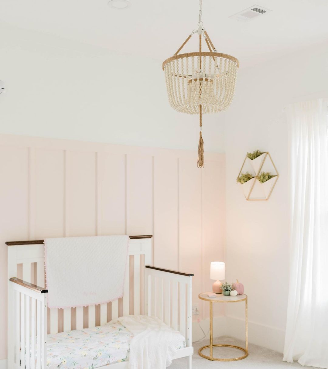
Thinking of a Bedroom Re-Do?
You can’t go wrong with Intimate White walls in your bedroom whether it’s for children or adults. The decor and palette is what would make the difference.
Need New Furniture?
Don’t discard your vintage or old furniture. Instead revamp it with Intimate White paint and watch it take on a new life.
With that said, now let’s get into the details of this Sherwin-Williams hidden gem.
What Color is Sherwin-Williams Intimate White?
Merely sighting Intimate White will paint you a story about how this coral white paint got its name. The color is soft and airy yet doesn’t feel stifling. Instead, Intimate White is a cozy and romantic color that tells you a room is filled with love.
See what I mean in this bedroom corner wall.
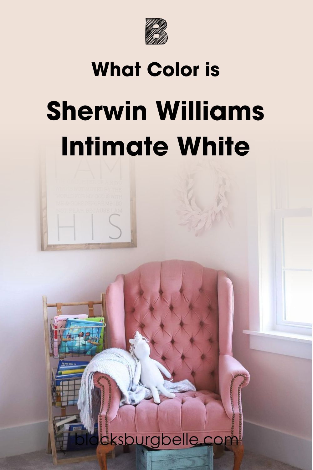
The intimacy comes from the warmth of its reddish-orange undertone. You’ll also notice that most Intimate White uses include analogous colors like cream and deep blush.
Keep scrolling to learn more about coordinating themes for Intimate White.
Snapshot of Sherwin-Williams Intimate White Specification
Here’s a brief outlook of Intimate White at a glance including its Light Reflectance Value (LRV), RGB, Hex Value and Undertones.
| Name | Intimate White (SW 6322) |
| RGB | Red 240 | Green 225 | Blue 216 |
| Hex Value | #F0E1D8 |
| LRV | 77 |
| Undertones | Pink, Peach |
The LRV of the Sherwin-Williams Intimate White
You measure LRV on a scale of 0 – 100, with zero being absolute black and a hundred being pure bright white. With paints, the scale starts from 3 – 97 because there’s no color without undertones. 50 is the median, 60 – 75 is medium-light, and 76 – 97 is light.
Sherwin-Williams Intimate White has an LRV of 77, making it light white paint. But when you pair it with purer and brighter whites, you’ll notice the coral undertone of the color that makes it off-white. If you are wondering how this works? Stick around to find out.
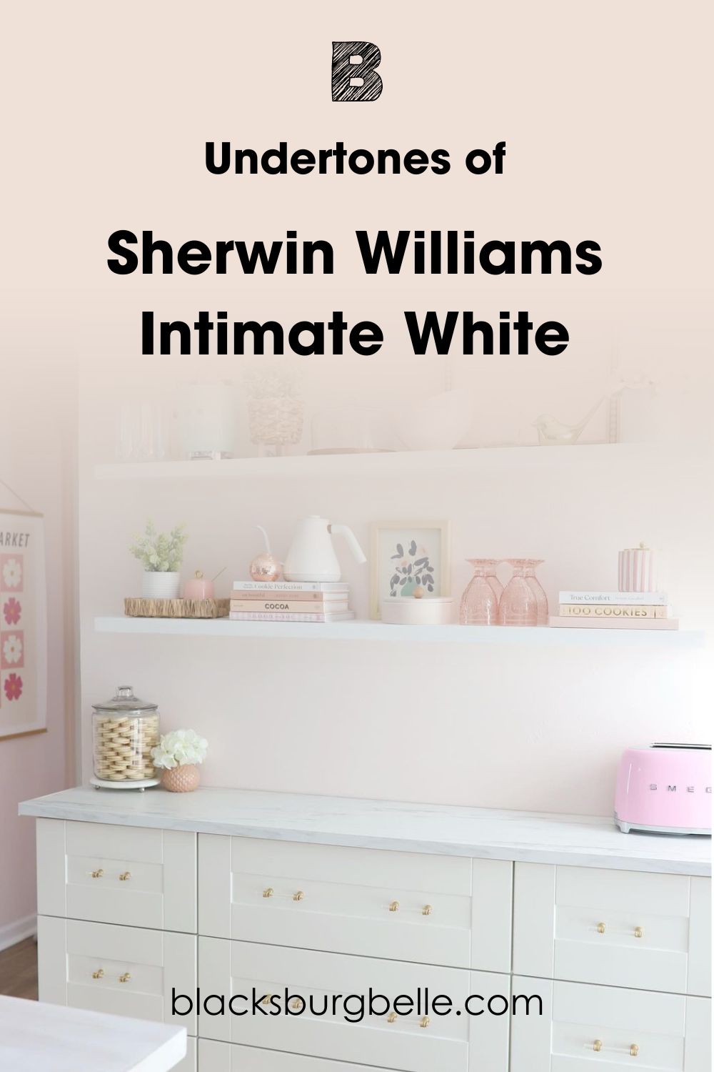
Undertones of Sherwin-Williams Intimate White
If you’re confused about Intimate White being white, peach, or pink, let me clarify. Sherwin-Williams Intimate White is all of the above. When you place it beside a bright white or cool blue, the color morphs into one of its three tints.
Look carefully at this picture before I explain how lighting changes Intimate White. The far wall looks pink while the nearer wall looks peachy.
Lighting Effect on Intimate White
When light reflects on Intimate White, it highlights one of two undertones. Lighting can be natural or artificial, depending on its source. It’s natural when the reflection comes from the sun and artificial when it’s from LED bulbs, fluorescents, and lamps.
I’ll first explain how to use sunlight to your advantage before giving you tips on buying artificial light for Intimate White rooms.
There are four cardinal points from which the sun shines. We have the South, which is hottest in the morning, East, which warms up at noon until afternoon, and West, which is hot late noon until sunset. Northern light remains steady throughout the day.
To get these positions, use a compass. But if you don’t have one, stand outside and point to the sun, preferably at sunrise or sunset. Note that the sun rises in the East and sets in the West. So, stretch your right hand to the sun in the morning for an Eastern position.
That leaves your left hand in the West, face looking at the North and back to the South.
For artificial lighting, use warm light for an intense reflection and cool light to dim Intimate White’s brightness.
Does it look Pink?
Intimate White will appear pinkish when you use it in small rooms with warm lighting and dark flooring. Using a gray carpet in a small room like this deepened the color’s pink undertone.
Does it look Peachy?
Bright light from a South-facing sun in the morning and East-facing light in the early afternoon brings out the peachy tone in Intimate White. But apart from the lighting, the white walls create a cleaner backdrop for the peach-toned headboard.
Is Sherwin-Williams Intimate White a Warm or Cool Color?
Sherwin-Williams Intimate White is a warm color that makes you feel loved with butterflies inside. This cozy and romantic vibe becomes more obvious when you pair Intimate White with warm colors like yellowish cream and off-white.
“If it’s a romantic color, why use it in a nursery?” Because Intimate White can also convey security. It’s a comforting tone when paired with warm wood furniture and beige accessories.
You’ll notice that color coordination plays a big role in highlighting Intimate White’s emotions, so let’s discuss it.
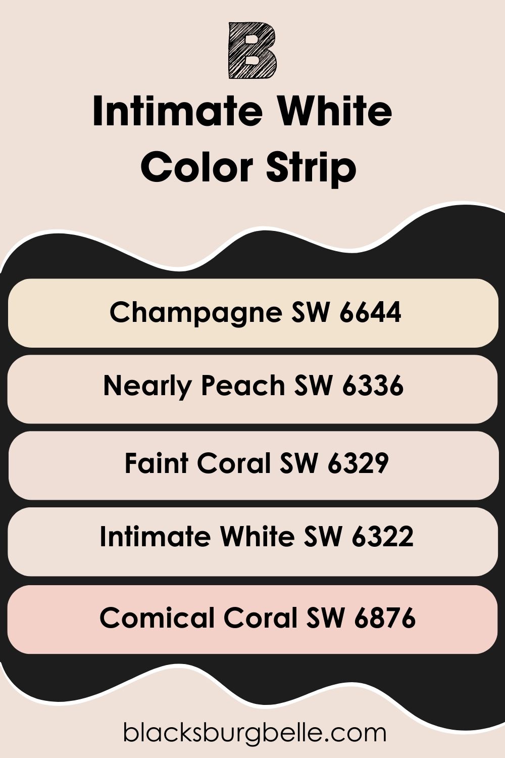
Sherwin-Williams Intimate White Color Strip: Lighter or Darker Exploration
Before we get into color theory and coordination, here are some lighter and darker versions of Intimate White.
Sherwin–Williams Comical Coral is a deeper tone with an obvious orange look, Faint Coral leans into its pink undertone, Nearly Peach embraces its coral tone, and Champagne blends peachy-pink.
- Sherwin-Williams Champagne (SW 6644)
- Sherwin-Williams Nearly Peach (SW 6336)
- Sherwin-Williams Faint Coral (SW 6329)
- Sherwin-Williams Intimate White (SW 6322)
- Sherwin-Williams Comical Coral (SW 6876)
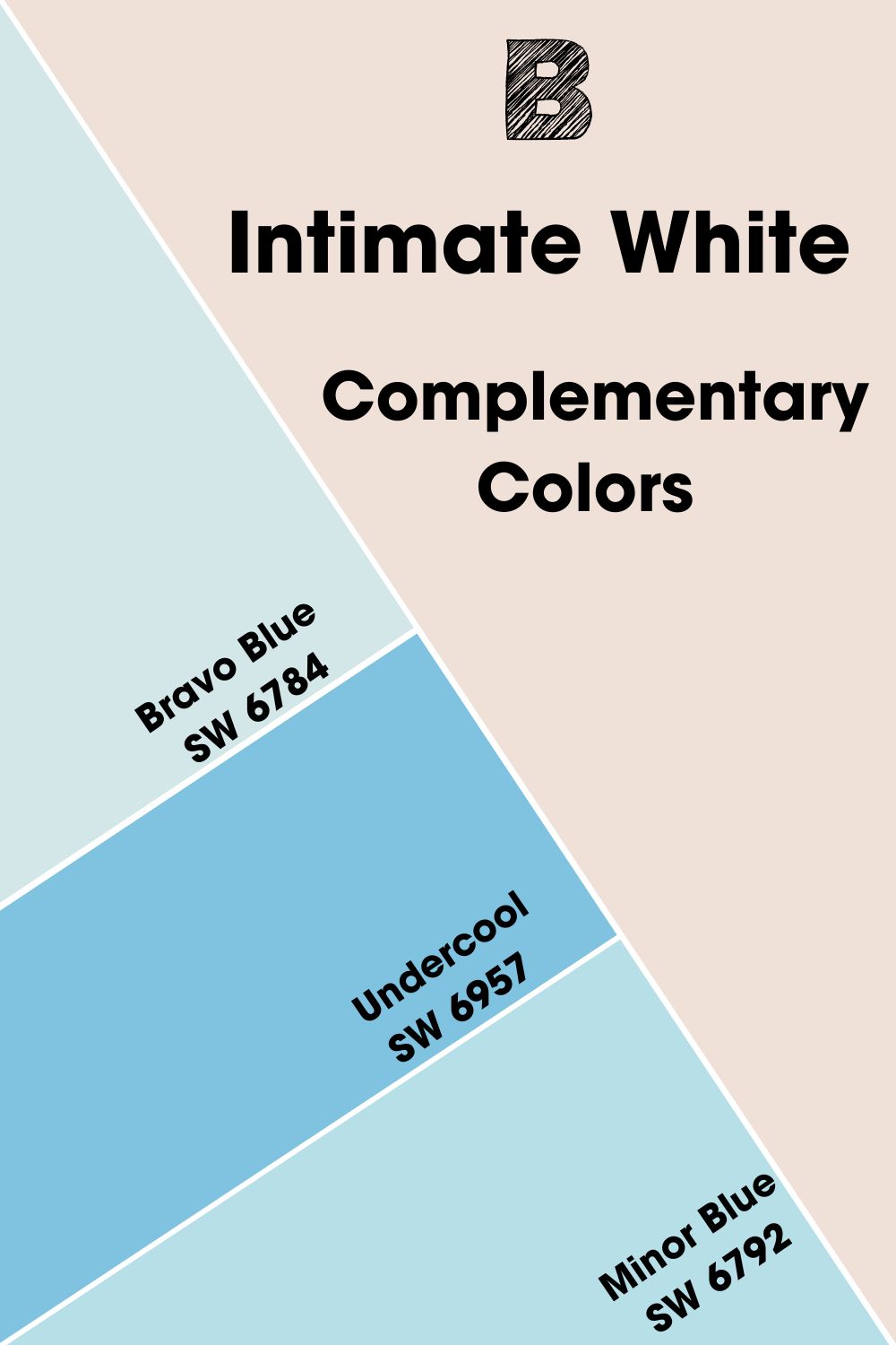
Complementary Colors for Sherwin-Williams Intimate White
Complementary colors are hues placed opposite each other on the color wheel. They’re typically contrasting hues with different emotions. One will be hot and the other cold depending on where each color stands on the wheel. The standard pairs are:
- Red – Green
- Blue – Orange
- Yellow – Purple
Sherwin-Williams Bravo Blue (SW 6784) complements Intimate White. It’s a pastel blue with the same LRV as Intimate White. So it creates a balanced contrast. But if you want a bolder contrast, use darker blue shades like Sherwin-Williams Undercool and Minor Blue.
Ensure you choose oceanic blue tones to balance the subtleness of Intimate White. I also chose medium-light and mid-toned colors because the key to complementing a light tone like Intimate White is not going too far off the scale.
Using Bravo Blue keeps Intimate White looking neutral. But if you want the pinkish-peach undertones, use Minor Blue or Undercool.
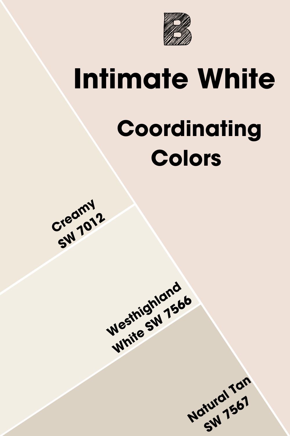
Sherwin-Williams Intimate White Coordinating Colors
There are more color palettes to explore outside, contrasting with complementary colors. Check some of them out below:
- Analogous Theme:Pairs three similar colors based on their closeness on the color wheel.
- Complementary Theme:Balances two contrasting hues in one space.
- Triadic Theme:Pick three colors that form a triangle on the color wheel.
- Split Complementary:Pick the complementary color, then choose two colors beside it. This palette uses compound colors, and since blue is the contrast for orange, you have Blue-green and Blue-purple.
- Monochromatic Theme:Use one color in different shades and tints for a harmonious look.
Monochromatic and Complementary themed spaces always appear more mature and cleaner than other styles because they use simple combos. Triadic, Analogous, and Split Complementary palettes are bolder and ideal for children’s spaces.
Coordinating Colors for Sherwin-Williams Intimate White
- Sherwin-Williams Creamy (SW 7012):This bright yellowy white adds more light to Intimate White rooms.
- Sherwin-Williams Westhighland White (SW 7566):Use this creamy white as a trim to blend all three colors into the space.
- Sherwin-Williams Natural Tan (SW 7567):The ideal shadowy neutral gray with an earthy green undertone to tone down the brightness.
Sherwin-Williams Intimate White Color Palette
I’ve handpicked the colors in these palettes based on their LRVs and compatibility with Intimate White. The analogous palette is my favorite while coordinating colors come in a close second. I love both themes because of their similar tones and romantic aura.
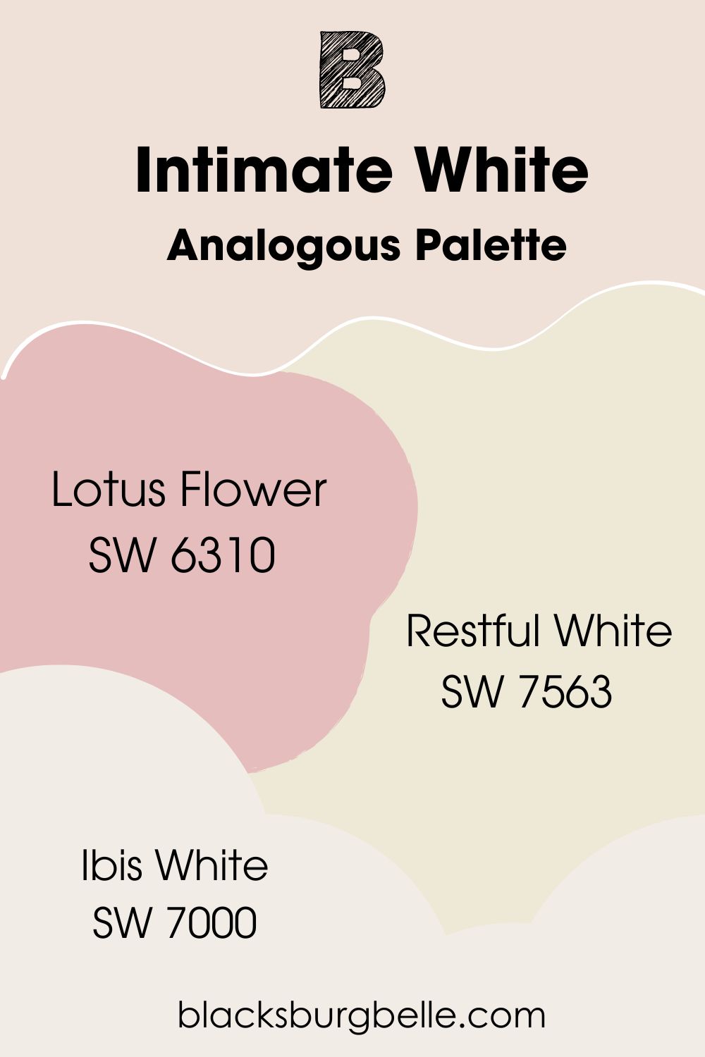
Analogous Palette
- Sherwin-Williams Lotus Flower (SW 6310): A mid-toned pinkish-red color ideal for accentuating Intimate White.
- Sherwin-Williams Restful White (SW 7563): Intimate White against this yellowish-white paint will become warmer and pinker.
- Sherwin-Williams Ibis White (SW 7000):Use this warm and bright white as a trim for this palette.
This palette thrives in bedrooms and bathrooms. Make Ibis White the trim, Intimate White and Restful White adjacent walls, and Lotus Flower your accent. You can also Make Lotus Flower an accent for Restful White and make Intimate White your cabinet color.
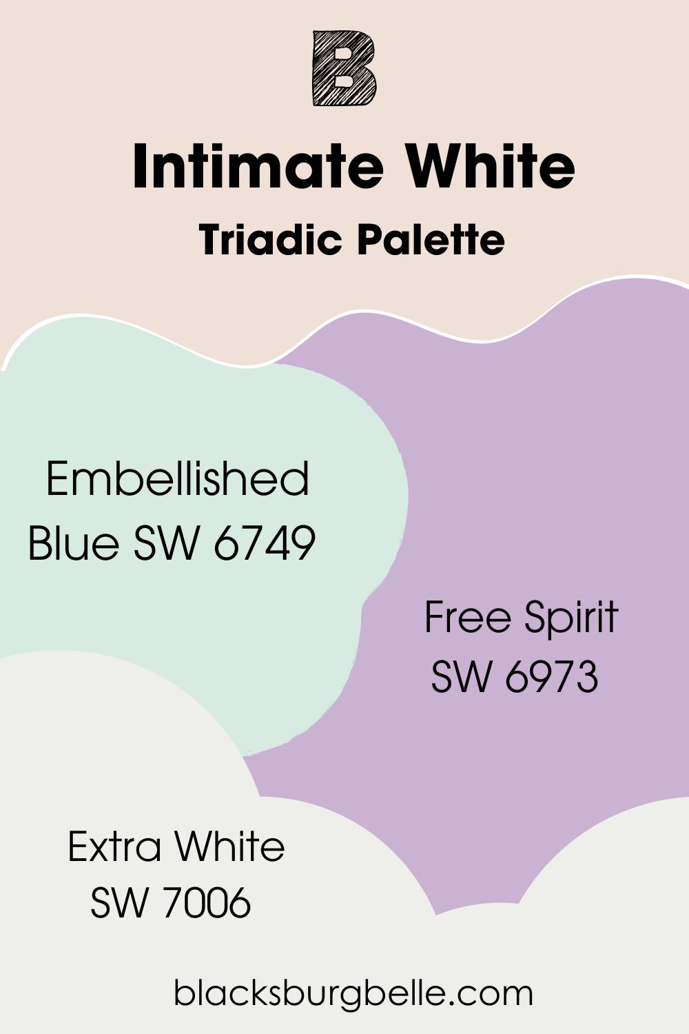
Triadic Palette
- Sherwin-Williams Embellished Blue (SW 6749):The minty goodness of cyan-green adds a cool aura to Intimate White.
- Sherwin-Williams Free Spirit (SW 6973):A mid-toned magenta with blue undertones blending coolness and warmth.
- Sherwin-Williams Extra White (SW 7006):This bright white with a faint cloudy undertone is the ideal blank trim to highlight the other three colors.
Make Embellished Blue your door color, Intimate White on the walls, Free Spirit as an accent furniture like a dresser, ottoman, or beddings, and Extra White as the trim. This palette suits children’s bedrooms, classrooms, and hospital rooms.
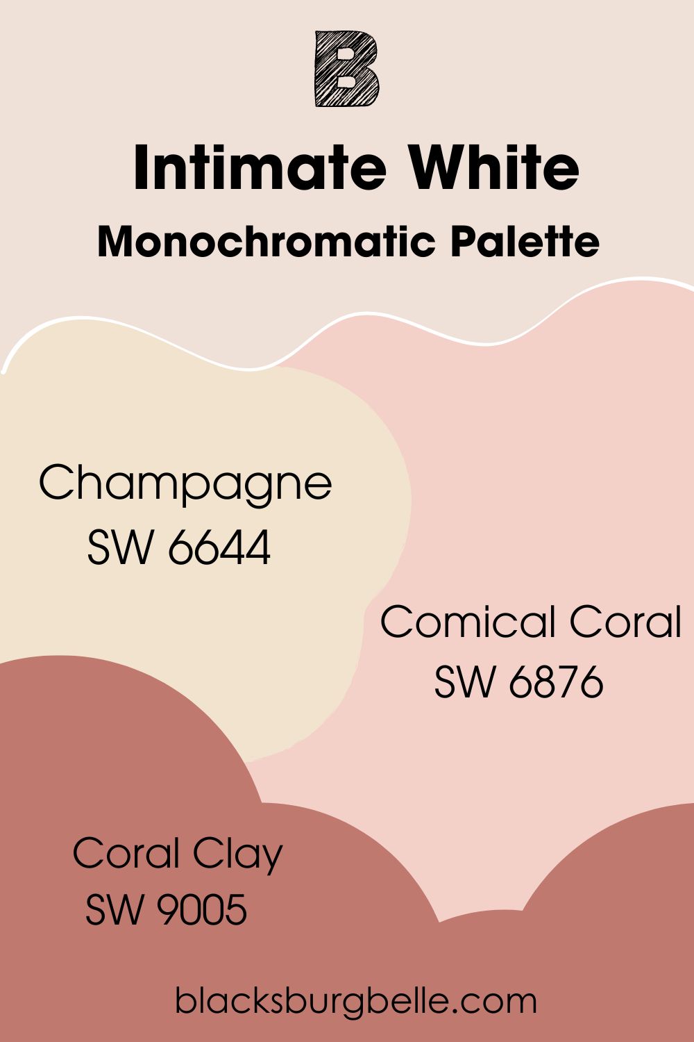
Monochromatic Palette
- Sherwin-Williams Champagne (SW 6644):A mix of peachy pink underneath a warm layer of cream.
- Sherwin-Williams Comical Coral (SW 6876):A medium-light pastel orange that appears as a coral tone.
- Sherwin-Williams Coral Clay (SW 9005): A dreamy blush red with a dark orange undertone.
Use Comical Coral as your wall paint, Intimate White as the trim, then Champagne and Coral Clay as accents. You make Coral Clay your furniture color and Champagne for your side walls and cabinets. I love this palette in bedrooms and bathrooms.
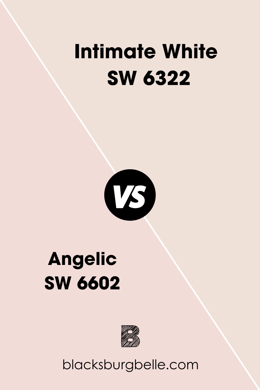
Sherwin-Williams Intimate White vs. Sherwin-Williams Angelic (SW 6602)
Sherwin-Williams Angelic is an archived peach-toned white similar to Intimate White but it’s only available as a Color-to-Go sample size.
Sherwin-Williams Intimate White vs. Sherwin-Williams Reliable White (SW 6091)
If you want a dormant undertone in your white paint choose Sherwin-Williams Reliable White over Intimate White.
Sherwin-Williams Intimate White vs. Sherwin-Williams Faint Coral (SW 6329)
Faint Coral is so similar to Intimate White that you’ll need a white line and extra bright light to see its pinker undertone.
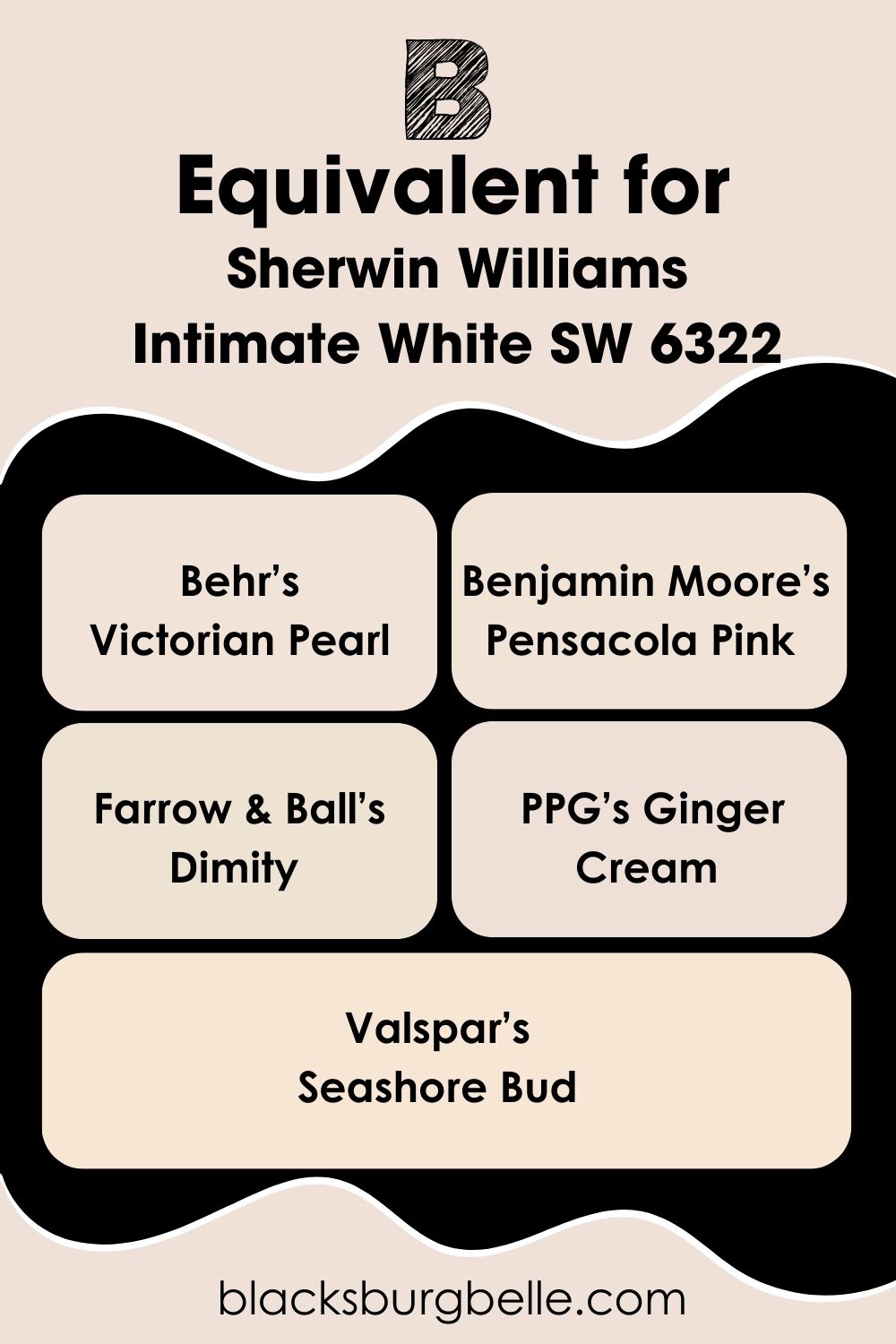
Sherwin-Williams Intimate White Equivalent with Other Brands
There’s no other Intimate White paint from other top or average paint manufacturers. But I’ve selected a few options if you want a color that is close. Note that you won’t get the exact tone unless you custom order it with the Hex Code. Now let’s get into these brands.
Behr’s Victorian Pearl, Benjamin Moore’s Pensacola Pink, Farrow & Ball’s Dimity, Ginger Cream is for PPG, and Valspar’s Seashore Bud.
Where can you use Sherwin-Williams Intimate White?
Intimate White is best in bedrooms and bathrooms as you’ll see from the popular inspirations online. But if you love the color and want to experiment with it in other spaces, here’s a compilation of surfaces you could try:
Sherwin-Williams Intimate White on Walls
You can’t go wrong with Intimate White walls. The color will warmly reflect whether you use it in a small or large room. It can give a romantic and mature vibe like this bathroom or a cute look in bedrooms.
For elegance, ensure you pair Intimate White with complementary white trims and gold-plated fixtures.
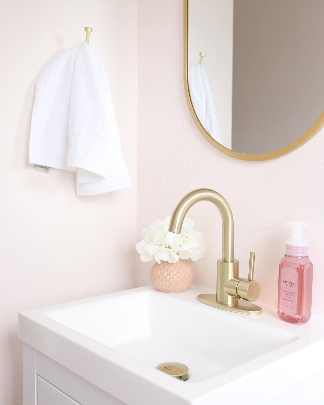
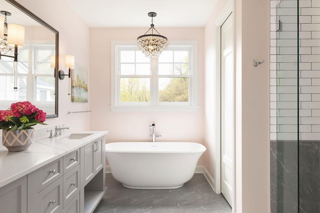
Sherwin-Williams Intimate White in the Bathroom
The second most-used room for Intimate White is the bathroom. And that makes sense when you consider the color’s aura. When you want to design bathrooms in hotels, resorts, honeymoon suites, and master bedrooms, use Intimate White walls.
It sets the mood before you add the scented candles, flower petals, and music. Seeing the Intimate White walls paired with neutral trims and accents is a chef’s kiss.
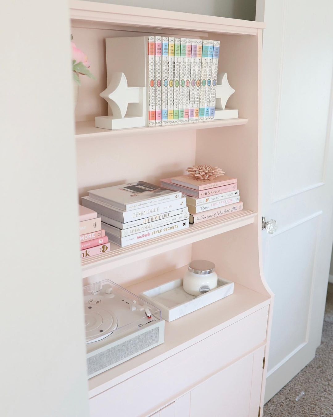
Sherwin-Williams Intimate White as an Accent
Now this is a style I can get behind. If you’re thinking, “Can I use white paint as an accent?” The answer is yes. A tinted white paint with visible undertones like Intimate White adds a hint of elegance to bright white walls like this bookshelf.
Intimate White as an accent is also the best way to add color in a bold palette like Analogous and Triadic.
Sherwin-Williams Intimate White on Cabinets
Most people use Intimate White cabinets in their bathrooms, bedrooms, entryways, and hallways. You’ll hardly see it in a kitchen because of its sensual vibe. But you can switch up the aura with wooden fixtures and darker warm colors when it’s in the kitchen.
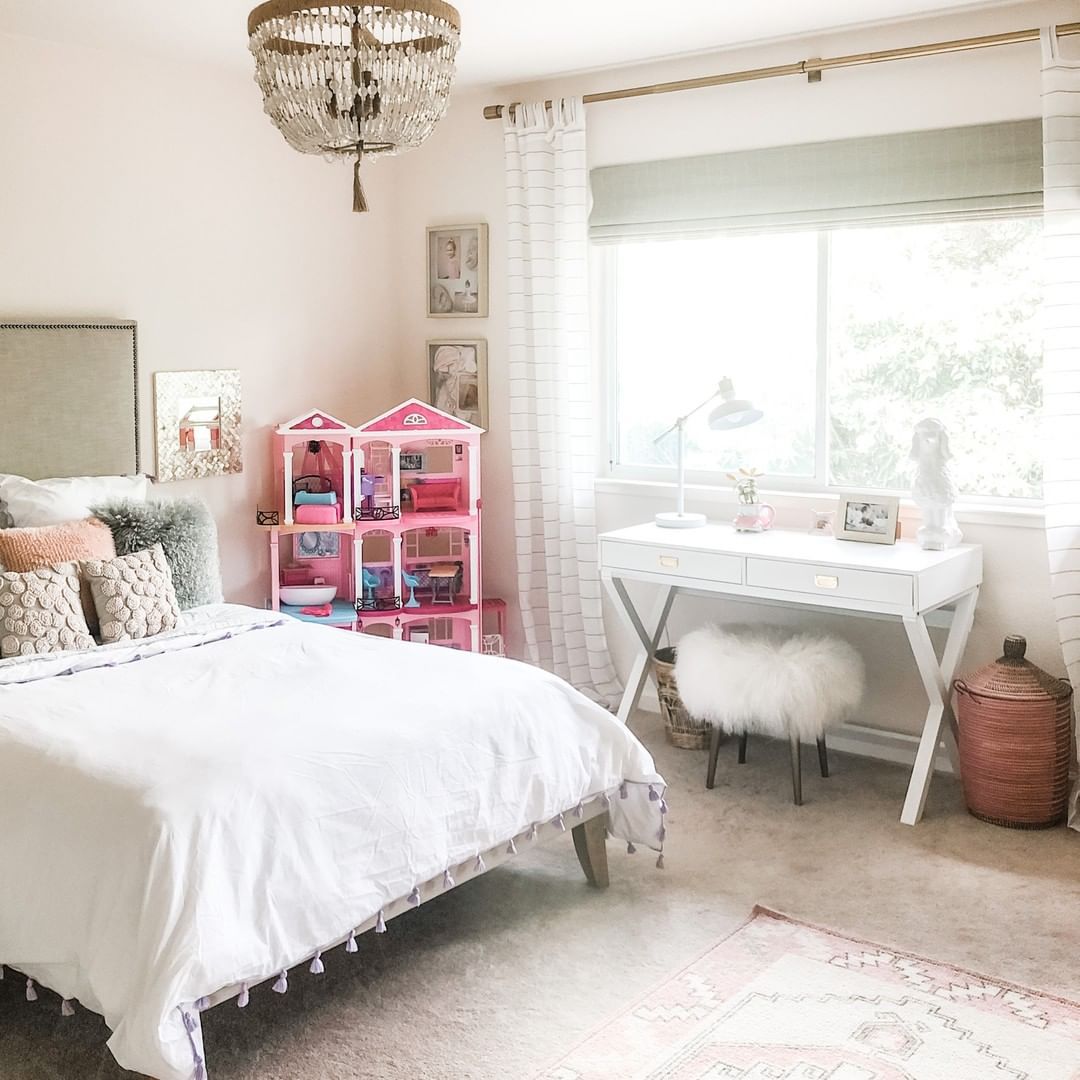
Sherwin-Williams Intimate White in the Bedroom
Now this is the number room for Intimate White. The color fits all bedrooms to the point that it feels as if Sherwin-Williams customized it for that purpose. You can use it in an adult’s bedroom with white trims and greige accents like this.
The Barbie dreamhouse in the corner is a subtle reminder that Intimate White brings out the child in you.
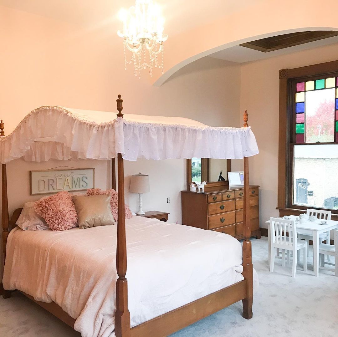
You can also highlight the pink undertone in Intimate White for a kid’s bedroom. These Victorian-style trims and furniture prove that this pink-peach tinted white paint suits traditional-style homes.
I prefer the adult bedroom’s combination of Intimate White with light yellow and bright whites for a clean finish.
Sherwin-Williams Intimate White on Doors
Firstly, check out a close shot of Intimate White on a door. The zoomed-in look gives you a clear look at the pinkish undertone in this white paint. It’s become more obvious if you use it inside with enclosed walls to add shadows to the Intimate White doors.
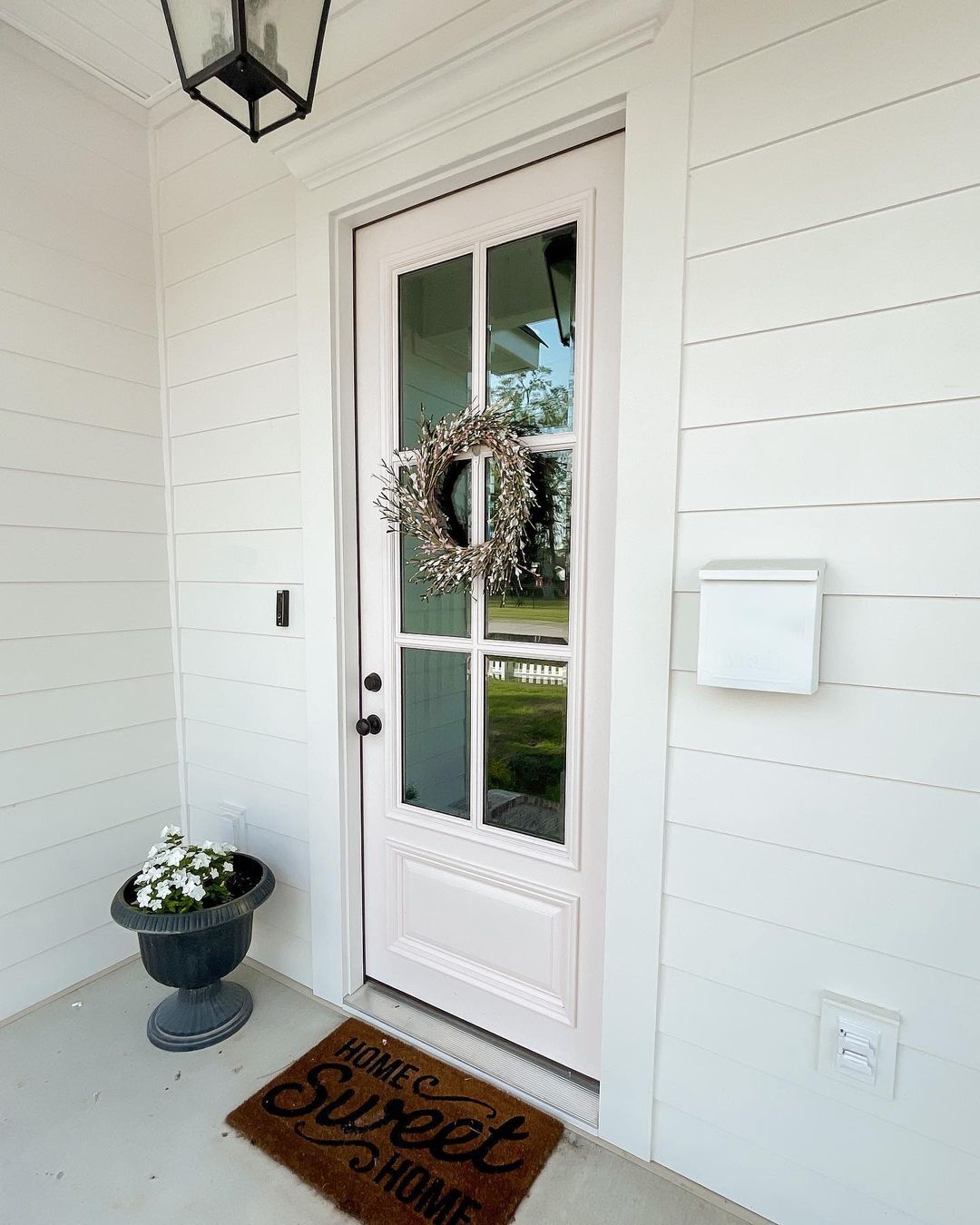
Now look at the zoomed-out version of the same color on a French front door. You’ll notice the pinkish undertone because there’s a brighter white paint on the siding and trims. It’s a beautiful way to maintain a clean look without a boring monotone.
Intimate White isn’t my go-to for front doors because it doesn’t have that oomph and energy to make a lasting first impression.
Sherwin-Williams Intimate White on Furniture
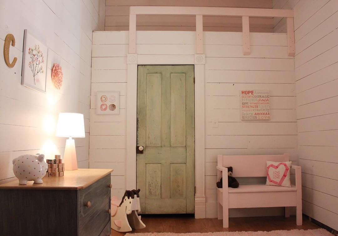
Painting Intimate White on furniture is a nice way to add the color as an accent. In this room, you’ll see the pinkish-white paint on the bench and railing. It’s a cute addition to the off-white walls and pairs excellently with the artwork.
Also, using this faded green color on the door shows how you can incorporate Intimate White in a triadic palette. Remember how I said that’s a theme for children’s rooms? Well, you’ve seen it in reality.
Conclusion
Sherwin-Williams Intimate White is a warm neutral meant for intimate spaces, as you’ve seen in the inspirations. The color shines best when you use it in south-facing rooms and pair it with white, gray, and yellowish-white paints.
Using it on your exterior is a bust because you won’t get the full undertone experience. But Intimate White inside is a dream-fest.
Remember to test the color against your preferred surface using:
- color-to-go,
- color chips, or
- peel & stick strip
All samples are from Sherwin-Williams. Once you’ve confirmed Intimate White is for you, use my tips for the perfect space and share your experience with me.
 Sherwin Williams Silverpointe (Palette, Coordinating & Inspirations)
 Sherwin Williams Ivory Lace (Palette, Coordinating & Inspirations)
 Sherwin Williams Rock Candy (Palette, Coordinating & Inspirations)
 Sherwin Williams Ivoire (Palette, Coordinating & Inspirations)
 Sherwin Williams Gale Force SW 7605: Paint Color Review
 Sherwin Williams Evening Shadow SW 7662: Paint Color Review
