
Black is not an everyday color, although it is gaining traction as an excellent neutral. So, if you are undecided between Sherwin Williams Iron Ore vs Peppercorn, you are not alone. Looking at both of them apart, is there a difference that may help you select one?
There are several differences between the dark charcoal paint colors. But the main differences are in their shades, undertones, and tones. Iron Ore SW 7069 is darker and warmer than Peppercorn with different undertones. Peppercorn SW 7674 is a perfect balance between warm and cool, looking lighter and softer than Iron Ore.
Let me take you on a journey to discover all about these two paint colors. I will explain more about these differences and other aspects to help you decide on the best one for you. But before that, I want to give you a brief on when to use each paint color.
Table of Contents
When to Use Sherwin Williams Iron Ore vs Peppercorn
Knowing the primary difference between Iron Ore and Peppercorn is one thing. But it is completely different knowing the best place and time to use each. It is even more difficult because one of them is a perfect neutral paint color, so where does it work best?
Use SW Iron Ore if:
- You have ample lighting in the room
- You don’t mind using a deep and dark color
- Warm colors with fussy undertones don’t bother you
Use SW Peppercorn if:
- A dark and perfect neutral is what you want
- Charcoal paint colors perform as well as black for your space
- You’re unsure of the color scheme in the room and want to tie everything together
There are different reasons you may want to use dark paint colors, whether they are black or dark charcoal. These types of paint colors are not the easiest to use in any space because of their deep color and saturation. But the best places to use them are on trims, window frames, and accents.
Dark and deep colors usually make a room smaller. This is even more so if they are warm like Iron Ore. So, you may want to use them minimally to keep the room from feeling too choked. Also, ensure the lighting is bright in the room to keep them from looking too dark and deep.
Now, I’m excited to show you what these colors look like with pictures. They will go a long way in showing you the differences between them.
Sherwin Williams Iron Ore vs Peppercorn in Pictures
I have briefly explained some aspects of these paint colors, but looking at pictures is one way of explaining things. Pictures say a thousand words, they say, so let me show you two pictures.
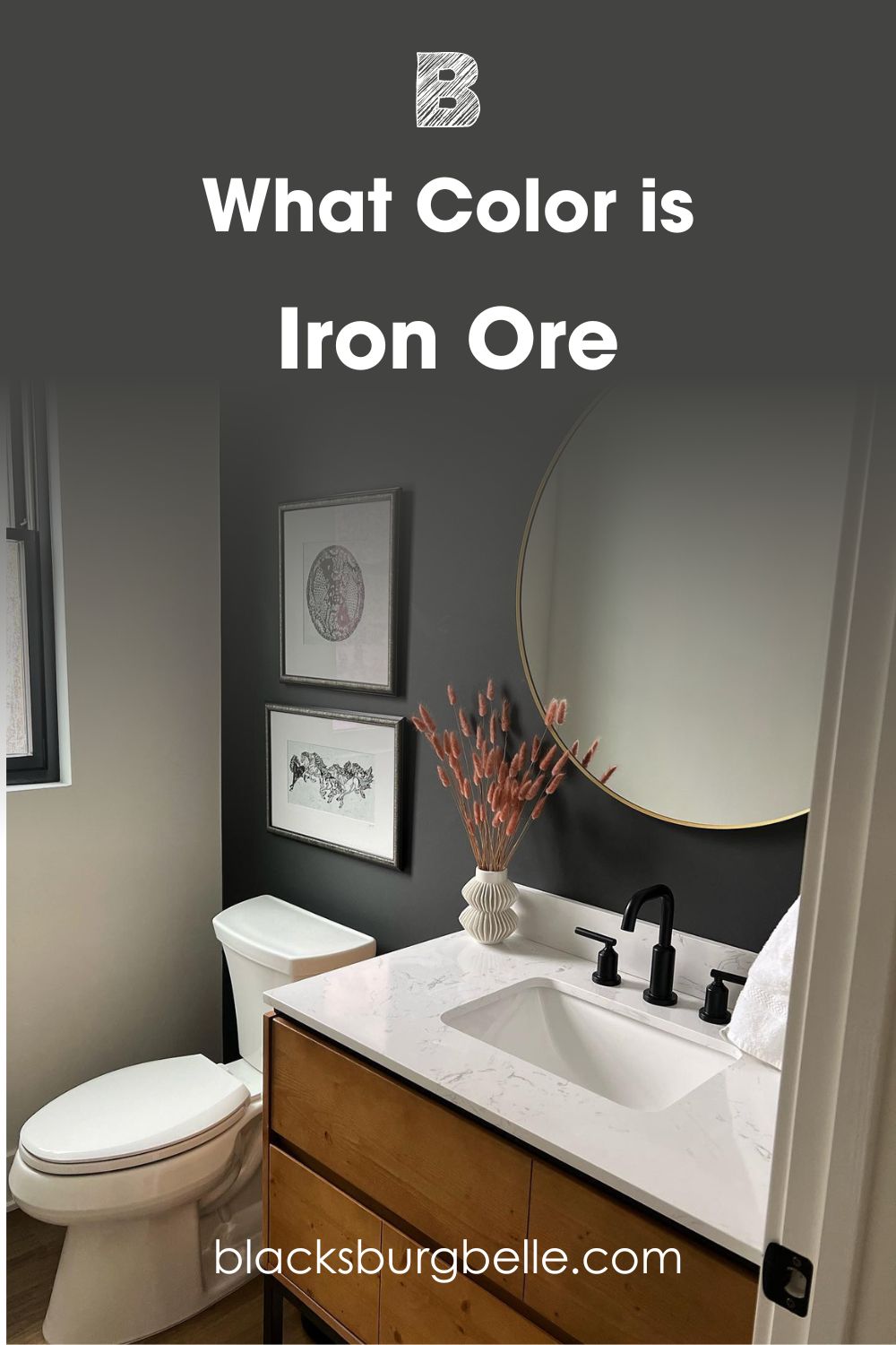
Here is Iron Ore on one wall of this powder room:
And here is Peppercorn used on this accent wall:
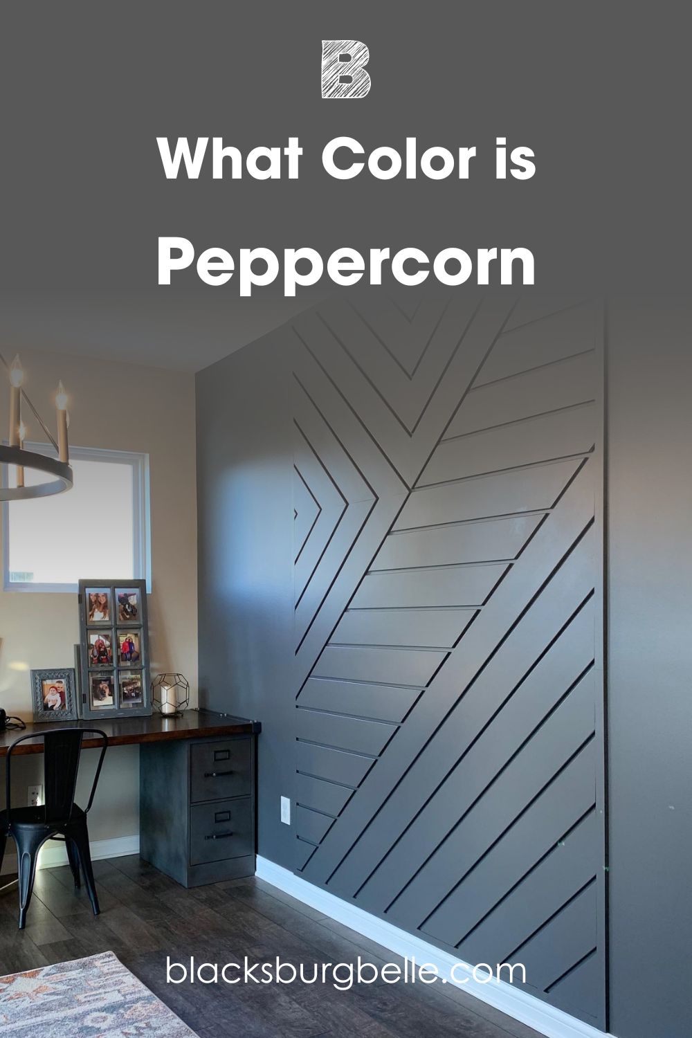
Iron Ore looks more solid and opaque than Peppercorn. I deliberately picked these two colors because of their exposure to sunlight. The warm light throws the colors into sharp relief so you can see how each performs.
Of course, they are dark colors and the pictures use them only on one wall. But if you want a color that is a solid dark color without any shifting colors, try Iron Ore. But Peppercorn may serve you better if you want a soft black that is a balanced neutral.
I want to point out that Peppercorn looks less like black than Iron Ore. At first glance, you already know that Peppercorn is more of a charcoal gray than black. It is also more obvious because of its LRV. Never mind; I will explain more about LRVs later.
For now, let’s take a look at the basics of these paint colors and compare them with each other. Shall we?
Quick Comparison Guide: Sherwin Williams Iron Ore vs Peppercorn
Here is a chart detailing the basic characteristics of Iron Ore and Peppercorn. These aspects are what determine the differences, even when two colors look exactly the same.
| Iron Ore | Peppercorn | |
| RGB | 67, 67, 65 | 88, 88, 88 |
| LRV | 6 | 10 |
| Undertones | Blue-green | Neutral |
| HEX Value | #434341 | #585858 |
Emotional Effects: Sherwin Williams Iron Ore vs Peppercorn
I’ve mentioned how dark and saturated colors can make a room feel smaller. This is especially true if the room is already small. But what I did not mention is that they can also make a room looks stately, regal, and sophisticated
Iron Ore is the obviously warmer color, so it makes you feel cozy and welcome. It pulls other colors together and makes the decor look amazing. Because of its undertones, you can try pairing it with slightly cool whites. Warm whites may feel overwhelming when paired with Iron Ore because of its saturation. But the paint color keeps the room from looking boring.
Peppercorn is a perfect neutral – peep the RGB that has a perfect balance of red, green, and blue. Although it is a dark color, there is a certain softness that makes you relax instead of feeling overwhelmed. Moreover, it is the ideal backdrop for bright and soft colors because it can work with any color scheme.
LRV of Sherwin Williams Iron Ore vs Peppercorn: Which Reflects More Light?
The LRV of color means its light reflectance value. It refers to the amount of light, on a scale of 0 to 100, that a color can reflect or not reflect. The close to 0 it comes, the less light it reflects, and the closer to 100 it comes, the more light it reflects.
Now, for paint colors, the range on the scale is between 2.5 and 94. That means there are no paint colors with an LRV of 0 to 2 and beyond 94. I explained this to give you an idea of how light or dark these paint colors are.
Iron Ore has an LRV of 6. Does it paint a picture in your head? It is pretty close to the darkest end of the scale, so it gives you an idea of how saturated the color is and how much light it absorbs.
Peppercorn has an LRV of 10. Although it is still significantly dark, it reflects more light than Iron Ore. In other words, Peppercorn appears brighter than Iron Ore, whether or not there is any light. That is why I recommend using a lot of light in a room with either of these colors but especially Iron Ore.
Undertones of Sherwin Williams Iron Ore vs Peppercorn: Are They the Same?
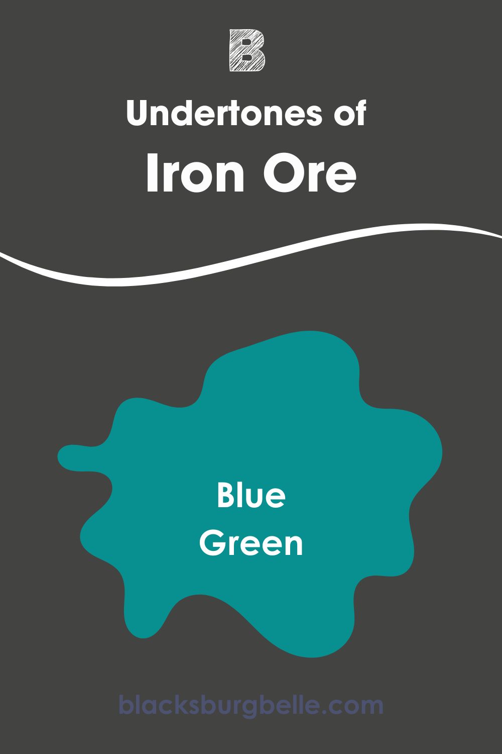
Iron Ore and Peppercorn have different undertones, and although they are similar colors, these undertones make all the difference. Iron Ore has slightly blue-green undertones, which lend it more depth and saturation.
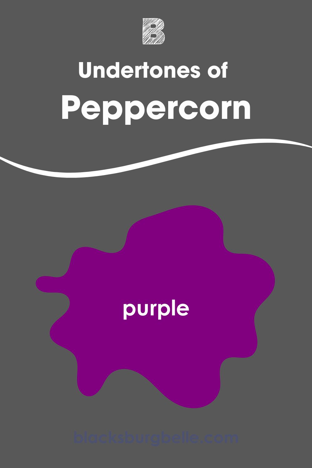
On the other hand, Peppercorn has barely perceptible undertones, although it can show a bit of purple in certain lighting. But because it is not yielding when it comes to undertones even when used outside, it is more accommodating of other colors than Iron Ore.
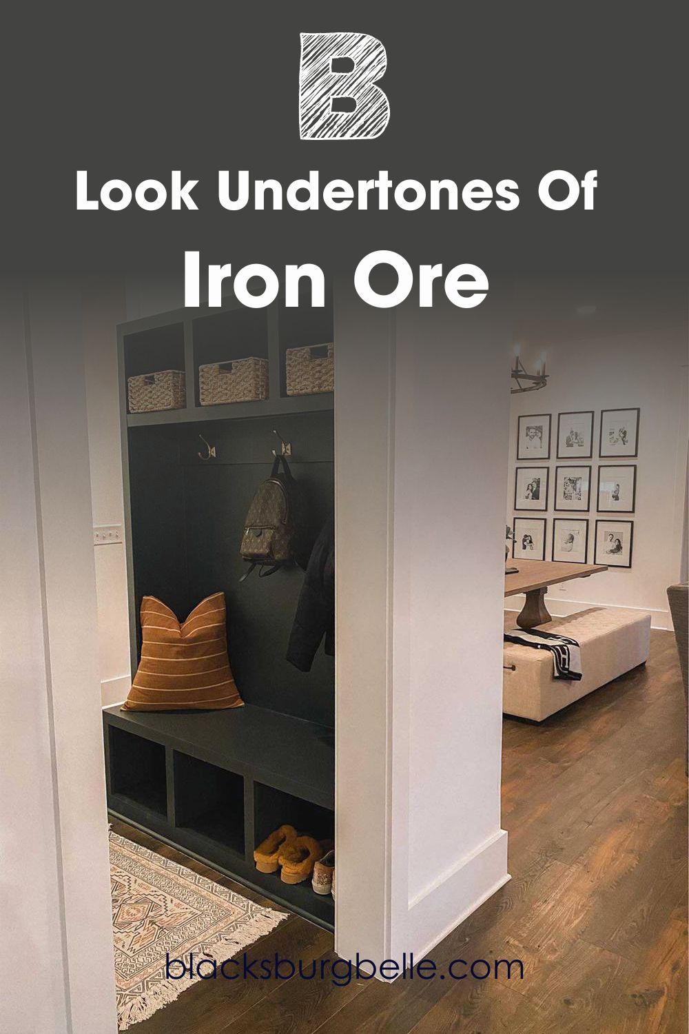
A Closer Look at the Undertones of Iron Ore
So here, I want you to see the undertones that are likely to show through this paint color. Undertones are usually the deciding factor, so they play a big role in which color you pick. Iron Ore looks more like a dark green than dark charcoal in this picture.
A Closer Look at the Undertones of Peppercorn
I talked about how neutral peppercorn can be, but also about how it can show a bit of purple in certain lighting. So, I found the perfect representation of this, especially useful because it is inside the house with artificial lighting.
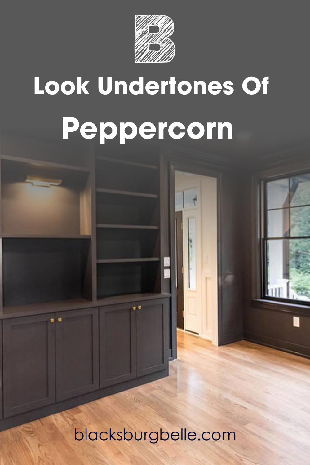
Both rooms in the pictures look amazing, especially the one painted in Peppercorn. Check out the view outside the window and how it blends with the decor. Moreover, I love how most of the room is painted this dark charcoal and does not feel too much. Maybe we have the wood flooring to thank for that.
But there is something sophisticated and lovely about the Iron Ore picture. The addition of wood tones and gold with warm whites and wood flooring makes the dark charcoal paint color much better. Both rooms use artificial lighting, so you have a better idea of how they may perform under such lighting.
Sherwin Williams Iron Ore vs Peppercorn: Are They Warm or Cool?
Iron Ore is typically a warm paint color, although it can read a little neutral sometimes. But placed side by side with Peppercorn, it is more solid and thicker. However, it is not very warm, but I recommend pairing it with other warm colors.
Peppercorn is a neutral paint color, neither warm nor cool. It is perfectly balanced between the two tones, which makes it ideal for every color scheme and tone. But because it can show a bit of purple like in the picture above, it may show a cool face sometimes since purple is a cool color.
If you want a balancing color for a backdrop for other colors, try Peppercorn. It is the softer of the two colors and more accommodating of bright, deep, and light colors. But if you are more inclined toward a solid color with a hint of warmth, opt for Iron Ore.
Sherwin Williams Iron Ore vs Peppercorn Complementary Colors
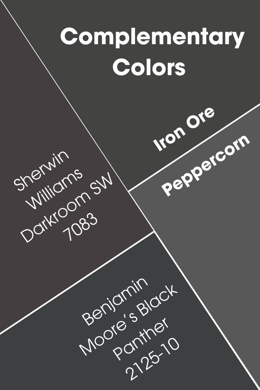
What are complementary colors? When you have any color, its complementary colors sit directly opposite it on the color wheel. It doesn’t matter whether or not the colors match. So, what are the complementary colors for Iron Ore and Peppercorn? Are they the same?
The best color that complements Iron Ore is a medium-dark shade of blue-magenta. The closest to it is Sherwin Williams Darkroom SW 7083. Some refer to it as a black paint color with purple undertones, but it has one of the lowest LRVs you will find. You can also use Benjamin Moore’s Black Panther 2125-10 as a complementary color.
Sherwin Williams Iron Ore vs Peppercorn Color Palettes
Color palettes can make or break any decor simply because they are versatile. While you can add almost any color that has the same tone with the central hue to the color palette, you must be cautious not to overdo or underdo it. This is especially true for dark colors like Iron Ore and Peppercorn.
Color Palette for SW Iron Ore
Extra White, Cityscape, and Smoky Azurite are some of the best colors to add to this color palette. They include contrasting and coordinating colors, and you can complete them with vibrant colors.
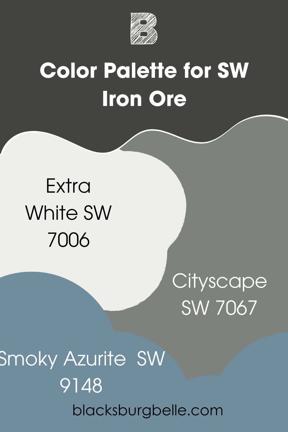
- Extra White SW 7006: It is a clean and crisp white that works well as a trim paint color for Iron Ore.
- Cityscape SW 7067: A deep gray with neutral tones that balance the effect of Iron Ore in a room
- Smoky Azurite SW 9148: A cool denim blue with yellow-gray undertones that contrast with Iron Ore
Color Palette for SW Peppercorn
Willow Tree, Nebulous White, and Gray Matters match well and coordinate with Peppercorn. As with Iron Ore, consider adding a vibrant color like blue or purple to the decor to complete the palette.
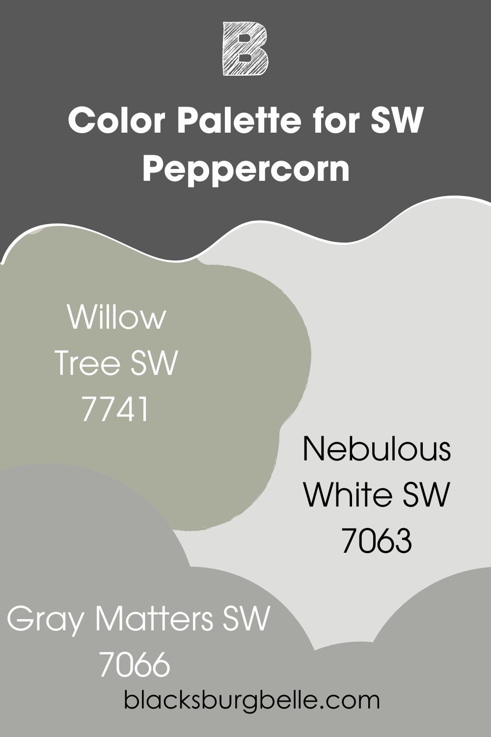
- Willow Tree SW 7741: A mild green with blue-gray undertones that pair well with the neutral Peppercorn
- Nebulous White SW 7063: A cool white with hints of blue that blend with the slight purple in the dark charcoal paint color
- Gray Matters SW 7066: This is a mid-tone gray with neutral tones that balance other shades and pair well with vibrant colors
Sherwin Williams Iron Ore vs Peppercorn on Cabinets
Deep colors like black and dark charcoal have become trendy in recent years. You will find more people willing to try them on cabinets and in every room, including nurseries. What do cabinets look like when painted in Iron Ore or Peppercorn? Let’s take a look!
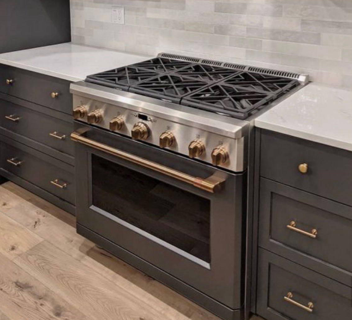
SW Iron Ore on Cabinets
With light walls and countertops, Iron Ore looks warm and a little light in this kitchen. It may have something to do with the lighting in the room.
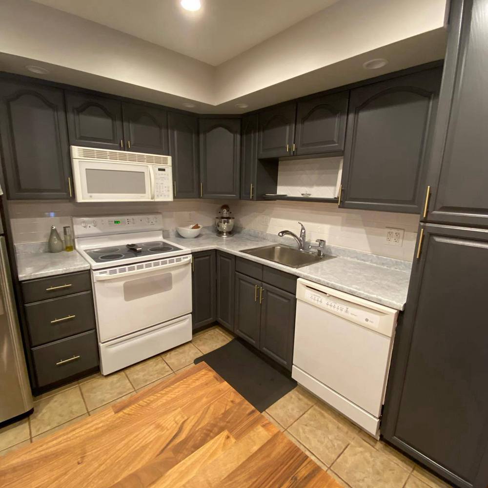
SW Peppercorn on Cabinets
Peppercorn looks more forgiving of the lighting in this kitchen, probably because of its neutral tones. It pairs well with white appliances and beautiful flooring.
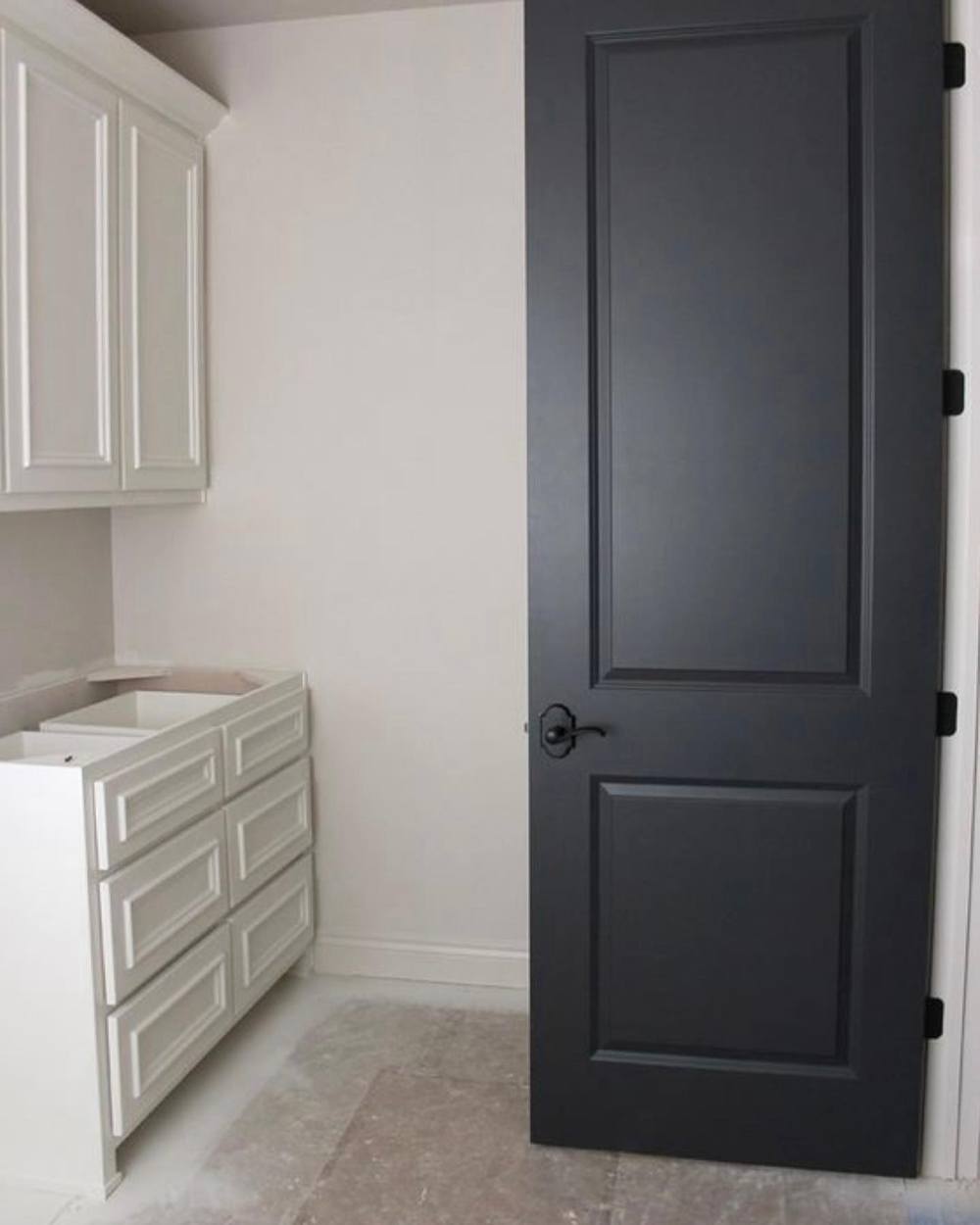
Sherwin Williams Iron Ore vs Peppercorn on Doors
Have you ever been in a room painted light colors and finished with a black door? Like white, black usually looks great on everything if you know how to pair it. Here are a couple of pictures of Iron Ore and Peppercorn used on doors.
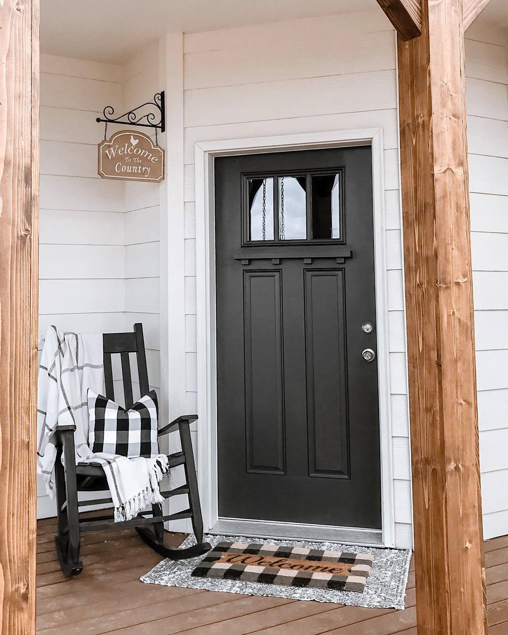
SW Iron Ore on Doors
Surrounded by white walls and light wood tones, Iron Ore looks amazing and stands out on this front door.
SW Peppercorn on Doors
As with Iron Ore, this door painted with Peppercorn is surrounded by white. Because of this, the paint color looks like dark charcoal with a hint of blue.
Sherwin Williams Iron Ore vs Peppercorn on Exteriors
Black is no longer restricted to window frames. It is also an excellent color for the entire exterior of a house. You can pair it with any other color, especially if it is a light color. So, let me show you what they look like outside the house.
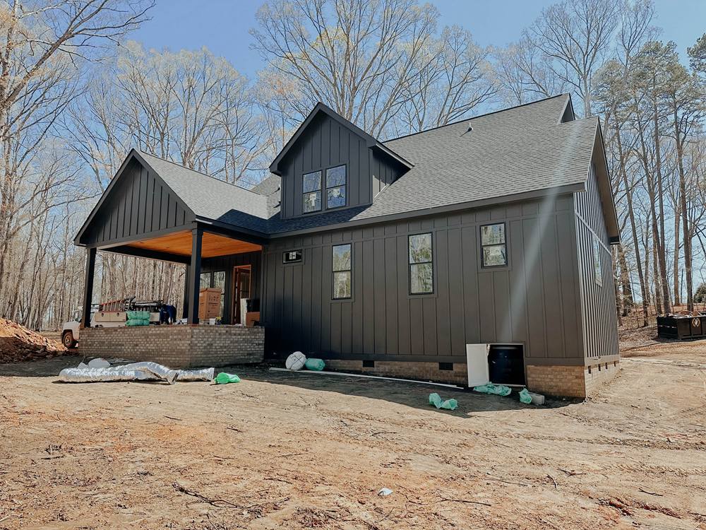
SW Iron Ore on Exterior Walls
Iron Ore looks more like its real color, which is dark charcoal, than black. The sunlight and environment may add to the color, but there is no better way to see its true color than outside the house.
SW Peppercorn on Exterior Walls
Peppercorn looks very warm with the setting sun directly facing it. Despite this warm light, the paint color still looks soft and less black than charcoal.
Sherwin Williams Iron Ore vs Peppercorn on Window Frames
White walls or walls painted in any other light color pair well with dark window frames. I’m sure you already know this, but I want to show you real pictures to seal the deal for you.
SW Iron Ore on Window Frames
This next picture is a large room with window and door frames painted with Iron Ore paint color. It gives the mostly white room a stately look, even without any decorations.

SW Peppercorn on Window Frames
Black or colors similar to black like Peppercorn are spectacular for window frames. You can try it if you are unsure of true blacks.
Sherwin Williams Iron Ore vs Peppercorn on Trim
What do Iron Ore and Peppercorn look like on trim, especially outside the house? Dark trim colors are not as common as light ones, but they still look great. They create some versatility, moving an ordinary-looking house to something unique.
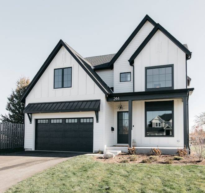
SW Iron Ore on Trim
This house’s exterior is different in a good way, and I love how the designer used almost equal parts of Iron Ore and white paint color.
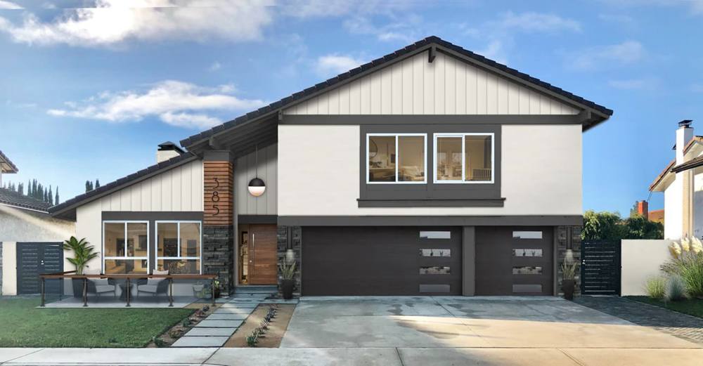
SW Peppercorn on Trim
In this next picture, Peppercorn is used on doors and trim on the outside of the house. You can envision the outcome of your exterior paint project if you decide to go this route.
Sherwin Williams Iron Ore vs Peppercorn on Interior Walls
One of the first places we want to use dark paint color is on interior walls. This is before considering doors, trim, and window frames. We want to get an idea of what the colors can do before trying them anywhere else. So, here are real pictures of Iron Ore and Peppercorn on walls.
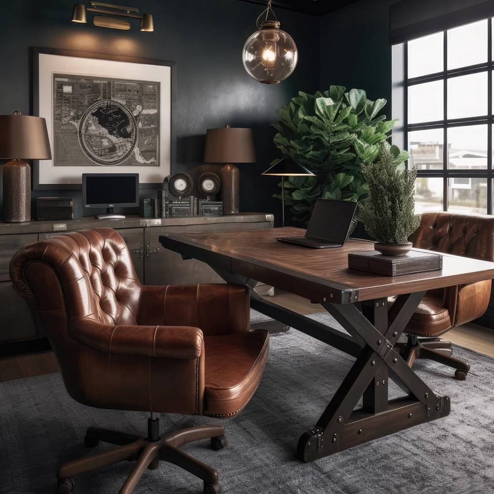
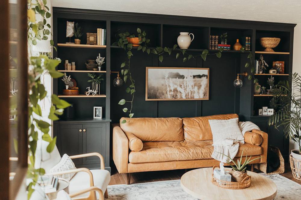
SW Iron Ore on Interior Walls
This office is gorgeous, looking rich, dark, regal, and different. The walls are done in Iron Ore and paired with rich wood tones and a dark gray rug.
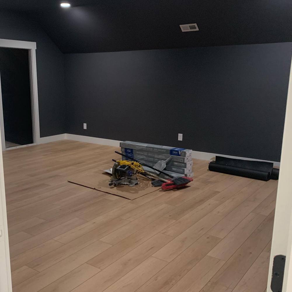
SW Peppercorn on Interior Walls
Although still in the process of being finished, this room already looks awesome with Peppercorn on the walls. The white trim and wood flooring really set it off.
Sherwin Williams Iron Ore vs Peppercorn with Various Colors
Although they are dark and mostly neutral, bright colors can throw shades off of Iron Ore and Peppercorn. So, how do they perform when paired with lots of bright colors? Let me show you.
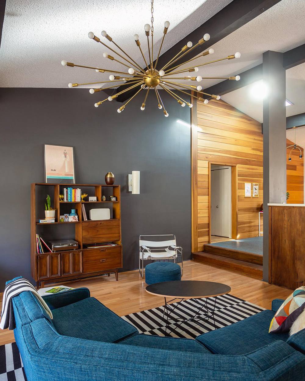
SW Iron Ore Paired with Various Colors
This room has a lot of earthy tones and nature-toned colors. The mixture creates beautiful chaos but comes together well because of the backdrop of Iron Ore.
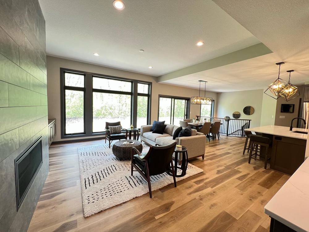
SW Peppercorn Paired with Various Colors
This room is something out of a picture book, with all the colors perfectly blended. The teal-colored couch looks great together with the walls and center rug.
Lighting Conditions
Several pictures in this guide have shown how these paint colors react to lighting, both natural and artificial. I have also shown you that they require a lot of light to perform well. Otherwise, they may look too dark and somber.
Warm light brings out the undertones and makes it easier to tell the difference between Iron Ore and Peppercorn. If you are unsure, paint swatches or use samples and compare them under different lighting conditions, especially exposures. The colors usually change with northern or southern exposures. The same applies to western and eastern exposures.
Final Words
Sherwin Williams Iron Ore and Peppercorn are rich, saturated, and deep colors. Because of their deep shades, they can easily mimic soft blacks. However, in certain lighting, you can easily see their true color: charcoal.
I’ve explained the LRVs, RGB color codes, and undertones. The undertones are the most crucial of all the aspects of the paint colors. Peppercorn is more neutral than Iron Ore, showing little or no undertones in almost all lighting conditions. You will also find a guide to creating a color palette for each paint color.
I’d love to hear your thoughts and see pictures of your decor if you have ever used one or more of these colors. Share them with me in the comments section.
 Accessible Beige Vs Agreeable Gray: Which is Good?
 Mindful Gray vs Agreeable Gray: What’s the Difference?
 Sherwin Williams Shoji White Vs Alabaster: How to Choose
 Sherwin Williams Tricorn Black vs Iron Ore: How to Choose?
 Modern Gray vs Agreeable Gray: How to Choose?
 Benjamin Moore Ballet White vs Swiss Coffee: How to Choose
