
If you are in search of paint colors that are known for their outstanding ability to deliver a warm and inviting vibe in your home, allow me to introduce you to Benjamin Moore White Sand and Muslin.
Although they are excellent neutrals that add a classy touch to your space, understanding the differences and similarities between them is crucial to achieving the results you desire.
Benjamin Moore White is a light paint color with warm greige undertones, while Muslin is a classic neutral color with more depth and gray than your usual off-white.
In this article my aim is to get you familiar with the properties that sets these neutrals apart. This way, deciding on which of these two neutrals will be best for your space should be a no stress affair.
Table of Contents
When to Use Benjamin Moore White Sand vs. Muslin
Every homeowner picks a color with a purpose in mind; honestly, without that, you’d just unknowingly cause a disaster in your home.
Understanding what scenarios to use a paint color helps with emotional interpretation and articulation of thoughts.
Let’s get into it.
Use Benjamin Moore White Sand If:
- You love colors that brighten up spaces.
- You need a soothing and tranquil atmosphere in your home.
- You need a versatile color that looks good in traditional and modern spaces.
Choose Muslin if:
- You love the beige side of things that don’t look traditionally golden or dark.
- You fancy warm colors on your palette.
- You need a timeless touch with a bit of complexity in your space.
- You’re not afraid to introduce personality and character to your home.
White Sand and Muslin are great colors for any spot in the house, outdoors inclusive. You can also use them as accent walls with darker colors.
Also, if your home is around coastal areas and colder regions, do not shy away from these colors as they’re warm and also neutral enough to work with loads of green, blue, gray, and slate colors.
Exploring White Sand and Muslin: A Visual Perspective
There’s no better way to get an idea of what you’re working with than viewing them being used in a space. Placing White Sand and Muslin side by side will help us identify their differences better and maybe go further with their similarities.
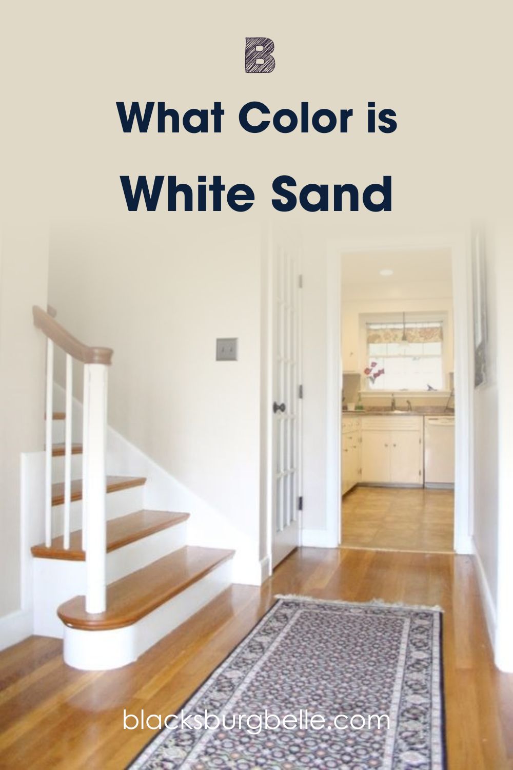
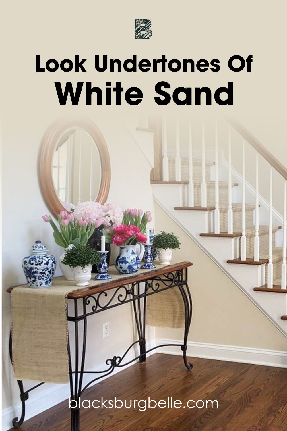
See Benjamin Moore White Sand Used in a Living Room
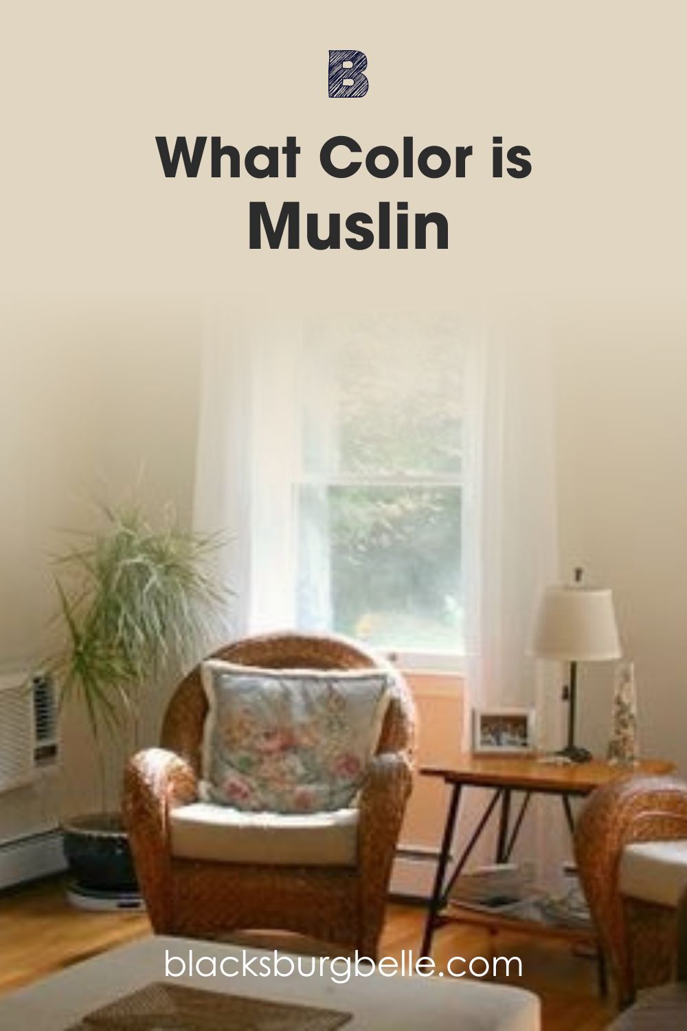
See Benjamin Moore Muslin Used in a Living Room
One fact is established with these two images- both White Sand and Muslin have a lot going on when it comes to undertones, and you’ll see them under different lighting conditions.
Benjamin Moore White sand isn’t off-white or yellow-beige; instead, it’s a warm, classic beige with a golden appearance. And while both are excellent neutrals, White Sand brings a muted and calming touch into a space.
As for Muslin, you can’t ignore how warm the room in the image is, not to mention that on close examination, you’ll also get a feel of depth.
In addition to this, when choosing either of these two colors, external factors are involved in the decision-making process; these include lighting, texture, and even the environment.
The bottom line is that these great neutrals are perfect for creating a sophisticated yet soft space that merges warm and cool qualities. They also add a bit of modern and traditional touch to your space.
In the Spotlight: A Quick Comparison of White Sand and Muslin.
For further explanation, I’ve added a table containing major specifications of White Sand and Muslin. Here, you’ll get familiar with the light reflective value, Red, Green, and Blue ratio, Hex Code, and even Undertones of these two gems.
| White Sand | Muslin | |
| LRV | 68.07 | 66.54 |
| RGB | 225, 214, 197 | 88.24, 83.92, 75.69 |
| Hex Code | #E1D6C5 | #E1D6C1 |
| Undertones | Yellow, Orange | Orange, Pink, Gray |
Emotional Effects of White Sand and Muslin in a Space
Upon application, paint colors provide feedback that goes beyond aesthetics to you and everyone who walks into your space. It’ll appeal to your emotions and evoke happiness, sadness, or indifference.
For rooms painted White Sand, the warmth from its beige hue envelopes and transports you into a world of calmness and bliss. Its warm undertones ferry you through the coldest days and embrace bright sun rays should it ever come in contact with it.
With Muslin, you also get something close, however, this time, a bit of depth is added to the whole situation with the help of gray. This color is easy to look at and creates a moody atmosphere, so I recommend using it in a room with lots of light for extra balance.
As you can see, the reactions surely differ, and lighting also has a huge role to play in determining your reaction. To tweak and keep things on the cool side, make sure you use these colors either in a north-facing room or pair them with really cool artificial lighting or accessories.
LRV of Benjamin Moore White Sand and Muslin
The importance of a color’s light reflective value, also known as LRV, can’t be swept under the carpet. The LRV scale runs from 0-100 and precisely predicts just how much light a color can absorb or reflect.
0 is the darkest, and 100 is the lightest. Then there’s the 50-60 for colors that work in both light and dark spaces( they reflect and absorb just the perfect amount of light).
Benjamin Moore White sand has an LRV of 68, which makes it a soft white and also miles away from a bright or true white.
With this color, you can go all the way and use it in a dark space; and while it may not open it as much as you want, it also won’t add more depth to the existing situation.
Muslin has an LRV of 67 which puts it in the medium to light range, but this does not mean it an off-white. It’s a great choice for bathrooms and living rooms that need that warm touch and a bit of depth.
It’ll be grossly unfair to call Muslin a dark color, but pairing it with pure whites or neutrals with much higher LRVs will put things in a better perspective.
Light reflective value helps you determine where your color works best and so, it should not be taken lightly. Colors like White Sand and Muslin that fall under the medium to light category can work in any space, provided you pair them with the right elements.
Undertones of White Sand and Muslin: Are They Similar
Undertones are a substantial part of a color setup. They’re the soft and quiet differences in shade that appear due to mixing different paint colors together. Understand that the exact shade of an undertone is determined by the percent of each color used in the color mixture.
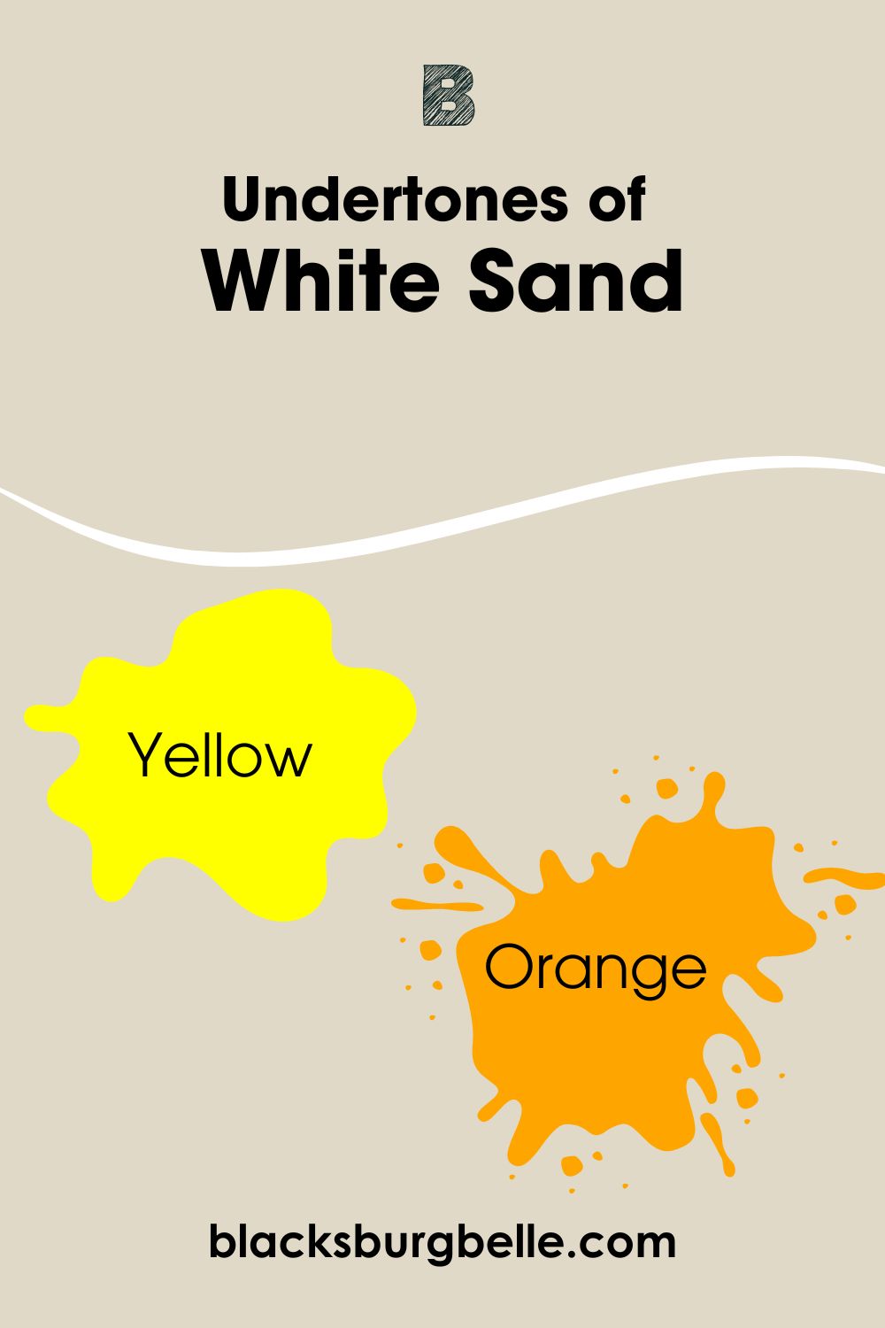
Benjamin Moore White Sand has yellow and orange undertones. While orange is the most dominant of the pair, yellow’s influence is much more reduced. In some cases, you barely see any yellow.
You should also know that undertones are very sensitive, and your perception of color can switch based on surrounding perception. Benjamin Moore Muslin has a soft orange undertone. However, in some situations, you can see that faint yellow.
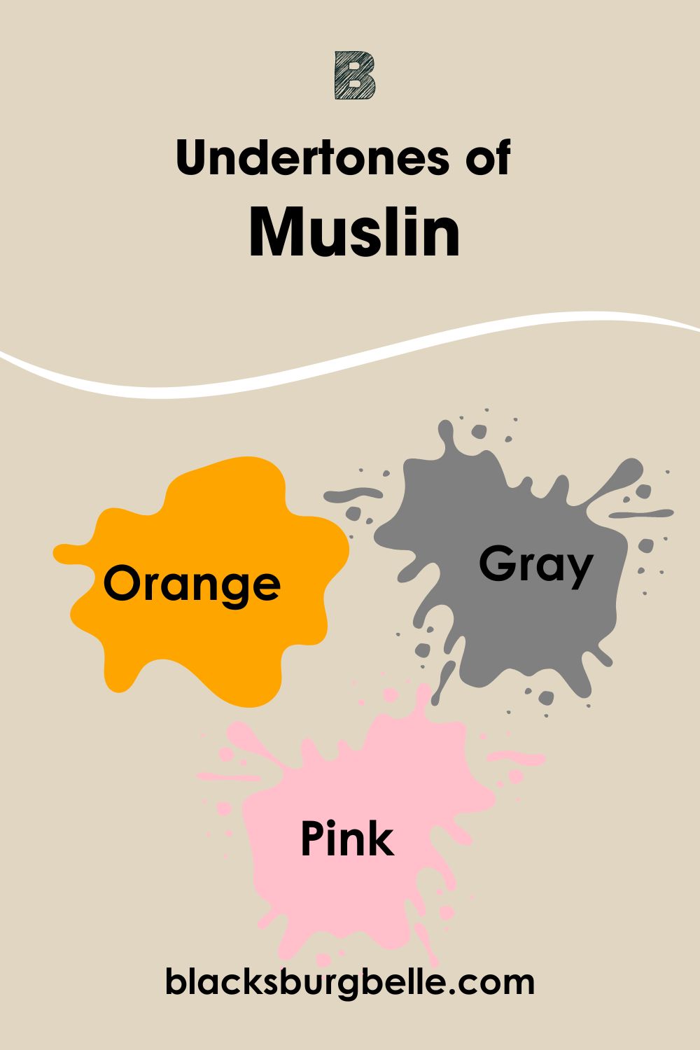
There’s also a touch of pink and gray in this color, but experts have argued that you can only see them when you place Muslin side by side with creamier colors with a bit of pink.
A Closer Look at White Sand’s Undertone
White Sand is the total package, and its array of undertones confirms my claim. This color is up there with some of the most versatile and unique shades Benjamin Moore has produced yet.
As we break down this image, I’d love for you to carefully study the reaction of White Sand to incoming light from different directions and, most importantly, the role accessories play in that situation.
The wall situation looks completely neutral from the mirror and flower table side. We can’t read out any undertones. I believe White Sand is in its true element here, and because the surrounding accessories are quite neutral, too, hence the influence.
It’s a different affair as you proceed towards the staircase and the end of the space; orange is out in full glare, and if you’re patient enough, you’ll feel the swift wave of yellow (it could be gone in a blink too).
The wooden floor and railing further deepen the impact of orange in this color.
A Closer Look at Muslin’s Undertone
Muslin reads darker than White Sand. Hence you may get some cool undertones with this one, but I do not promise anything.
The final decision is yours to make regarding the undertone really, I can argue CONVINCINGLY that I see a bit of green in the image below, which may differ for thousands of readers. Let’s get into it.
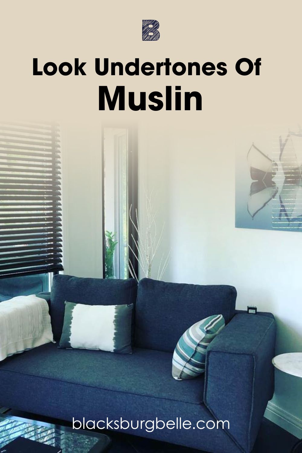
Muslin shows off its gray side in this image. Well, thanks to the surrounding monochromatic tones that manage to draw it. Moreso, you can tell this space isn’t getting much light as expected, hence the iciness.
Nonetheless, you can still see hints of orange and pink (I might have given you hints along the way too). Isn’t it just mindblowing how colors pull these things off?
White Sand vs. Muslin- Are They Warm or Cool?
Colors are generally regarded as warm or cool due to underlying factors, like their undertones and light reflective value. They eventually decide your direction as per lighting and pairing in a space.
White Sand and Muslin are both warm colors. However, there’s a slight difference in their delivery, but not serious enough to cause serious harm. White Sand and Muslin will add to the brightness of your room, but the gray undertones in the latter help add a stint of coolness.
White Sand vs. Muslin- Complementary colors
You need to know about the best complementary colors for your choice of hue. This is important for aesthetic balance and exploring your anchor color’s versatility. Now, figuring it out isn’t difficult at all.
Complementary colors are located directly opposite each other on the almighty color wheel, which also translates to real-life situations.
For more clarity, green is directly opposite red, blue stands across orange, and yellow faces blue.
Certainly, you’ll find bits and pieces of the basic colors in whatever shade you choose to work with, including Benjamin Moore White Sand and Muslin. My pick for the perfect complementary color is Benjamin Moore English Hyacinth and Spring Flowers.
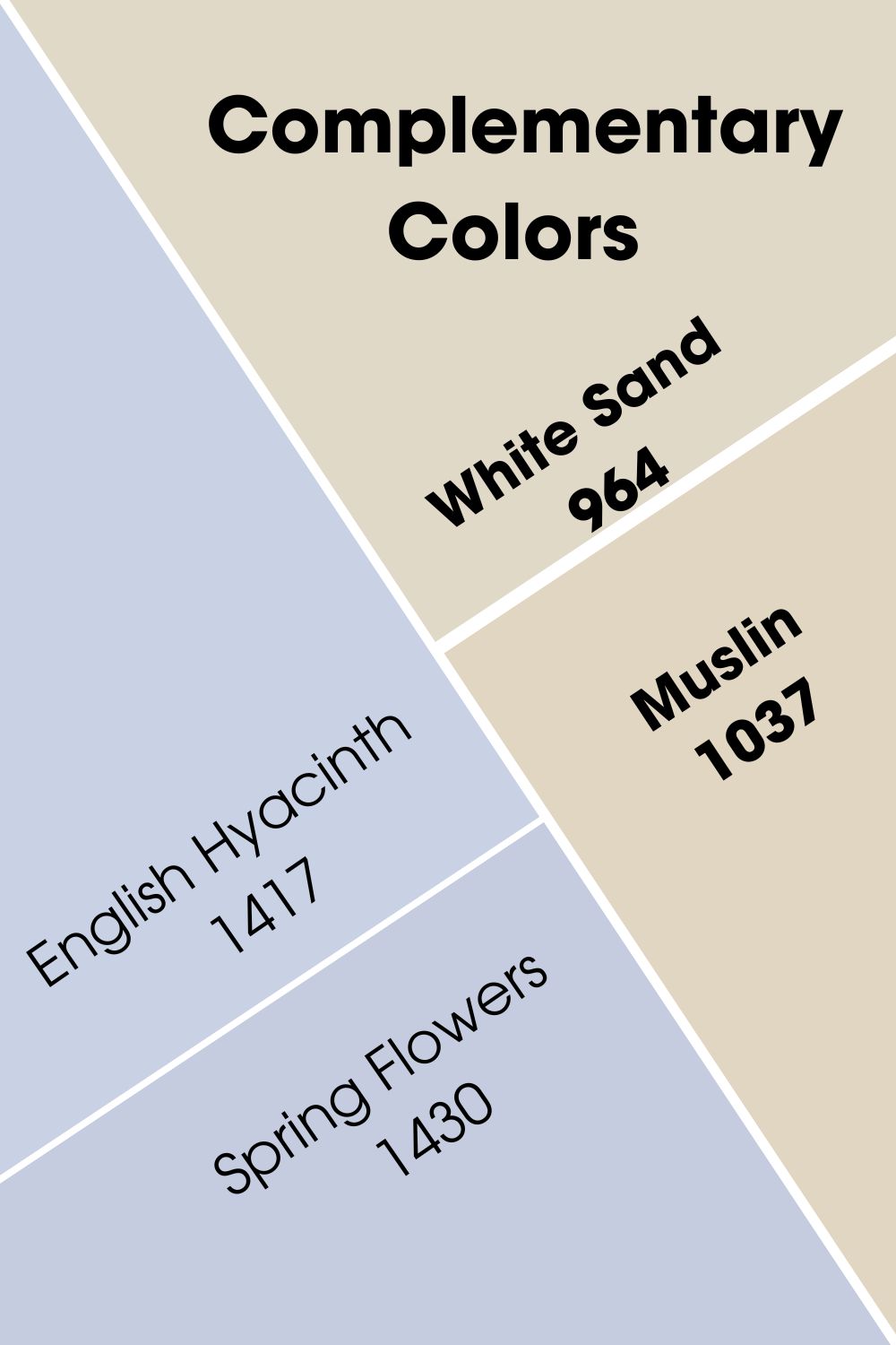
Both colors are a gorgeous shade of cool blue with undertones of gray to match the yellow and orange undertone in White Sand and Muslin, respectively.
White Sand vs. Muslin Color Palette
Color Palettes are fun to curate and absolutely easy to work with. We’ll be working with two major types of palettes for this article- the monochromatic and contrasting palettes.
Lovers of the monochromatic palette will notice one major feature on their list, the colors picked are seriously alike, with only a slight difference in intensities and tone. The idea behind a monochromatic palette is simple, to create a less chaotic, modern space.
So let’s say we’re working with a blue-gray palette; other colors aside, the main shade will also come in varying tones of blue-gray, but you can almost not spot any difference except you’re so observant.
The contrasting palette is much more daring and filled with brighter colors. This palette aims to ultimately show you the range of your anchor color and how it can work smoothly with absolutely different tones to create a perfect environment.
Think traditional farmhouses and Victorian-inspired houses. These spaces display peak creativity through the boldness of their owners. This palette usually runs warmer than the monochromatic style, thanks to the undertones of those bright and fiery shades.
On a final note, understand that the more saturated a color is, with a low LRV, the better it matches with darker and saturated colors. Therefore, beige colors like White Sand and Muslin will perform well in a color palette consisting of earthy tones, organic hues, nature-inspired colors, and colors with undertones of the same family.
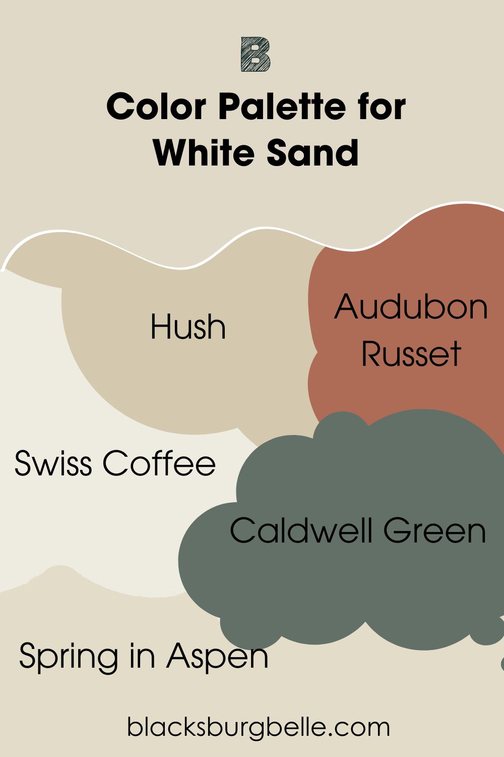
White Sand Color Palette
Whether you choose to go monochromatic or over the top with the contrasting palette, the colors I’ve picked below will help bring your dream to life. However, pairing colors isn’t just enough; you must also consider how to accessorize correctly.
Hush
A soft beige that appears as neutral as it neither reads too brown nor gray. You’ll find slight hints of yellow and orange like white sand in this one. It has an LRV of 57, which means it’s a muted color but not too dark.
Audubon Russet
A very dramatic and rich red hue with a touch of terracotta. This one leans dark with an LRV of 20.95. You can also find hints of pink in there, and it works great with the beige side of White Sand.
Swiss Coffee
A creamy off-white paint, this color adds elegance to your space. It’s also very versatile with an LRV of 83.93 and beige undertones that may sometimes read as yellow, but the gray in it prevents this occurrence half the time.
Caldwell Green
Caldwell Green is a soft green/gray color with an LRV of 14.67 and is also very non-neutral. This one is an excellent choice for a contrasting palette, as it’ll work with the orange and beige sides of White Sand.
Spring in Aspen
A bubbly color that reminds you of the brightness of spring. This is a soft, warm orange tone with an LRV of 70.95. It works best with neutral, white, and creamy colors- so you know it’s a perfect fit for White Sand.
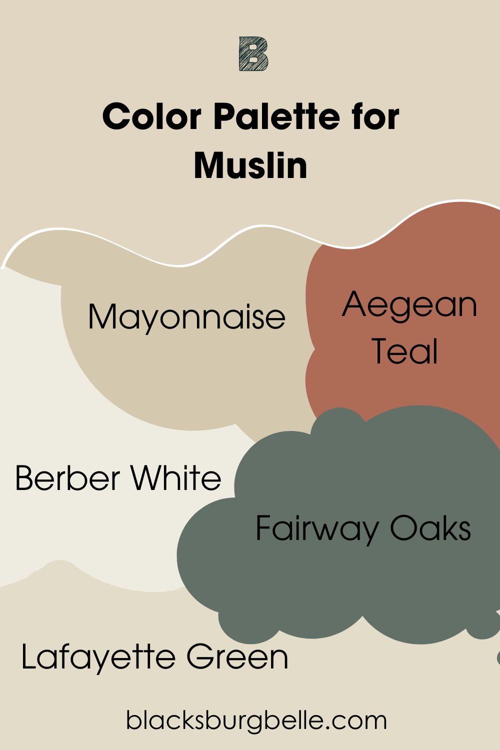
Muslin Color Palette
Use the colors on this list to curate your personal space according to how you feel and, most importantly, the message you wish to send as soon as anyone steps their feet into your lovely home.
Keep things simple with a cute monochromatic touch, or go Avante Garde with the tested and trusted contrasting palette.
Mayonnaise
What does this remind you of? A cold bowl of vegetable salad with a creamy yellow dressing on a fine morning? Well, you’re not far from the truth. Mayonnaise is a bright white with creamy yellow undertones, making it read neutral.
It has an LRV of 88.07, making it perfect for use in small rooms and spaces with lots of sunlight.
Aegean Teal
According to the color wheel, blue is an excellent complementary color for orange. Therefore, this blue-green color with a hint of gray works amazingly with every side Muslin has to show after application and under any lighting situation.
Berber White
Think sophistication; think Berber White. This one is a fresh beige with gray and pink undertones, keeping it firmly in the cool and warm category. This color has an LRV of 63.23, so expect a bit of depth when working with it.
Fairway Oaks
Fairway Oak is a warm beige color with an LRV of 46.08, undertones of orange, and a very gentle touch of pink that’ll come to the surface when you pair it with a color like Muslin. It’s also neutral, serving as a great backdrop for more vibrant colors.
Lafayette Green
introduces drama into your space with this slate dark green with deep gray undertones and an LRV of 10.54. I imagine this color working on a Muslin exterior as trim and on doors too.
Benjamin Moore White Sand vs. Muslin on Walls
Definitely the best place to showcase your painting job in any space; walls have been a worthy ally over the years, as they truly show us the potential each color carries. Benjamin Moore White Sand and Muslin are not left behind in this discourse.
As you delve deeper into the read, you’ll find real-life images of these colors on various walls inside the home with a little pointer on how to make them work for you and yours.
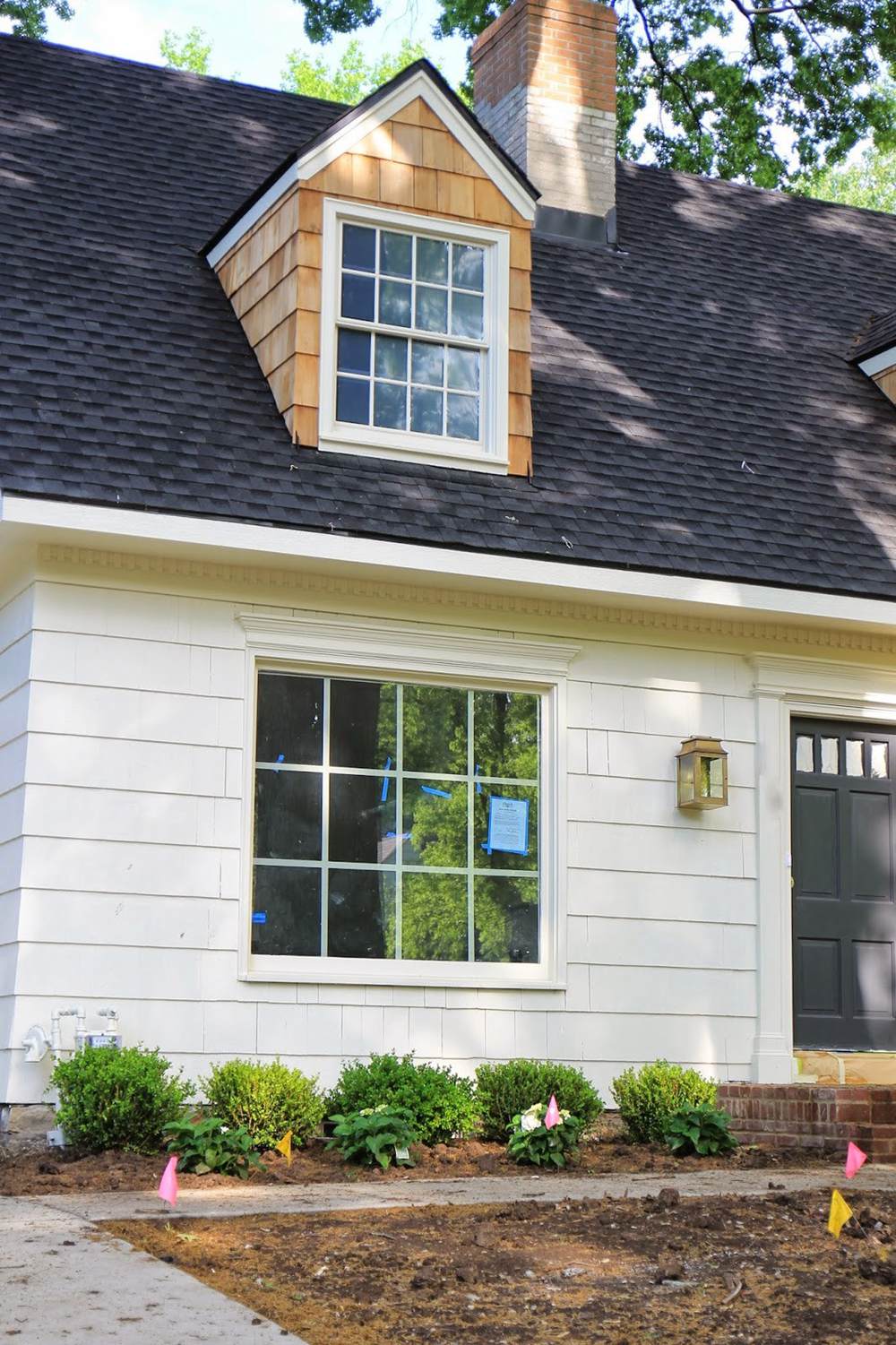
White Sand on Interior Wall
All the characters in this room appeal to the beige in White Sand. This gorgeous warm space also shows off a hint of orange courtesy of the warm lighting and that blue carpet is the perfect icing on the cake.
It’s not a coincidence that brown wooden floors are most chosen for neutral or beige walls. It creates a balanced setting.
Muslin on Interior Wall
I’ve earlier established that there’s a gray side to Muslin, and while it won’t hit you instantly, some factors can trigger it. All the accessories in this space are primarily on the cool spectrum, including the incoming light.
The cool blue lights from the north fades out the beige tones in this picture and creates a soft atmosphere. There’s also some pink in this room, towards the portrait area.
Benjamin Moore White Sand Vs Muslin On Exterior Walls
Outdoor walls have surely transitioned from being plain and boring to now conveying strong messages through the colors they carry. To answer the big question as to whether you can use White Sand and Muslin on your exterior, I’ll attach true images to the rest of the section.
White Sand on Exterior Wall
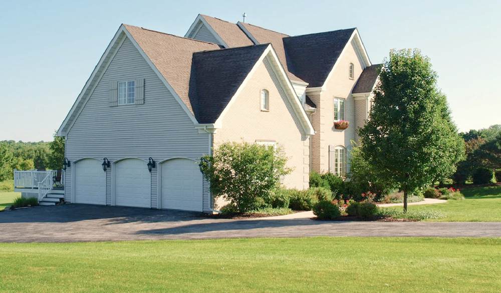
This image explains things clearly in respect to light and color. On the darker end of the situation, White Sand doesn’t do much and keeps things absolutely neutral, now on the other end lots of light, look washed out and orangey.
Colors outdoors are way complicated, as the surrounding greenery affects the final delivery. BUT the greens around here didn’t influence anything, instead, it works perfectly with the orange.
Muslin on Exterior Wall
Like every color, Muslin looks washed out in this picture, just like any other neutral. This color is perfect if you want a soft color that doesn’t necessarily look like white but is quiet enough to match surrounding colors without causing serious disorganization.
Benjamin Moore White Sand vs. Muslin in Muted Spaces
Muted spaces generally affect the outcome of colors because of the insanely low amount of light they’re getting. Colors in muted space have low saturation, very grayed and dulled.
The desaturation occurring in the space means a base color like brown, black, or white has been added.
Almost any color, including dark colors, can exist in a muted space, although they’ll look almost black. Let’s check how White Sand and Muslin work in muted spaces.
White Sand in Muted Spaces
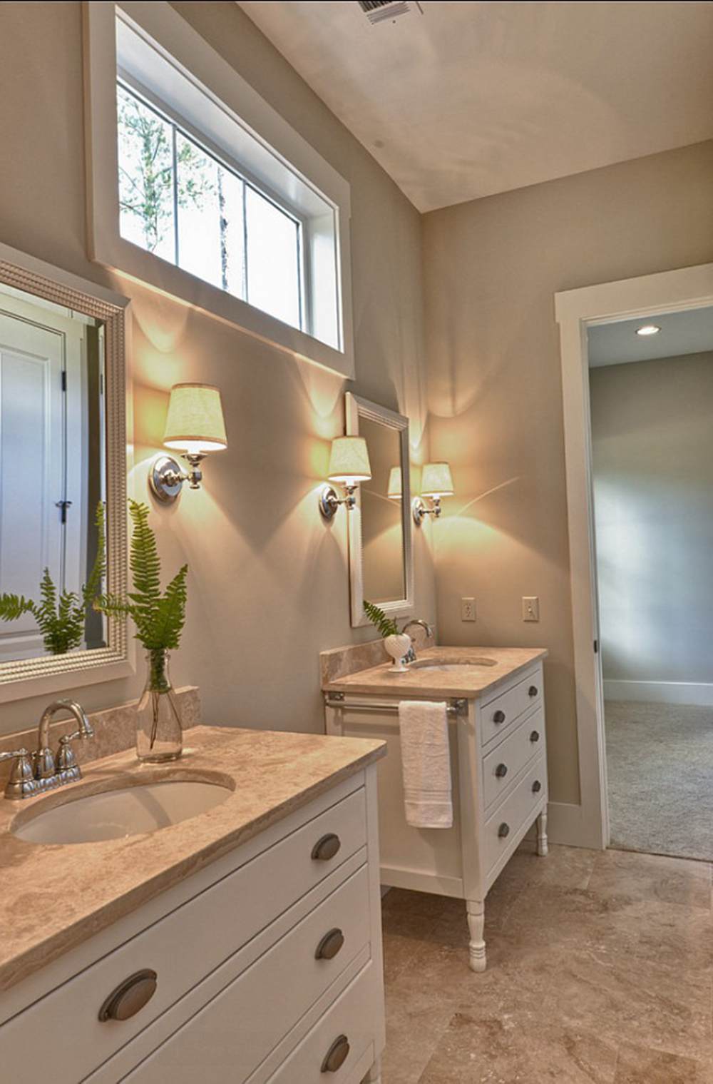
This room combines warm colors to create an inviting and comforting space, including a White Sand wall. Coincidentally, this space is a bathroom that also needs calm colors.
White Sand shows off a dark orange side in this space and matches the brown floor tiles. Be like this homeowner and pair your White Sand wall with warmer, neutral tones.
Muslin in Muted Space
The lack of light in this space pulls out the pink and orange tones. You can also find a gray touch in it that keeps things cold. Make sure to test out your colors in other lighting situations before you make up your mind.
Lighting Condition
Lighting, whether artificial or natural, will help draw out certain characters you didn’t know exist in your paint color. For example, a north-facing room is prone to cool lighting from the sun, hence drawing out enough coolness from your hue or adding to it.
Southern-facing rooms get a healthy dose of warm lighting all day long. For east-facing rooms, you get a warm touch in the morning and coolness towards the end of the day. Western-facing rooms work better with warmth in the late afternoons and early evenings.
You can also work this magic with your over-the-counter light bulbs. At this point, I’d also like to chip in with the idea of SAMPLING. Sampling your paint color helps you make well-informed decisions.
The process is easy as you can purchase ready-made paint strips courtesy of SAMPLIZE and then try them out on a plain white wall while leaving them on for a few days to get all the information you need to make the colors work.
Sampling will also help you determine the right accessories to pair with your color and the perfect finish to go for when you finally choose.
Conclusion
In this explicit article, I’ve walked you through the formation of these colors and how you can use them in your own space.
Benjamin Moore White Sand and Muslin are warm and neutral and carry loads of potential to transform your space from ordinary to extraordinary.
However, all is still incomplete without adding the following information.
- Consider the space you’re working with before settling for a color
- Do you have existing decor in your space? If yes, then you must tailor your color choice to work with them.
- How good or bad is the lighting condition?
It’s time to say goodbye, but please share your thoughts, experience, and discoveries in the comment box below.
 Greek Villa vs Alabaster: How to Choose
 Sherwin Williams Tricorn Black vs Iron Ore: How to Choose?
 Sherwin Williams Rainwashed vs Sea Salt: How to Choose?
 Benjamin Moore Ballet White vs Swiss Coffee: How to Choose
 Benjamin Moore Pale Oak vs Classic Gray: How to Choose?
 Sherwin Williams Creamy vs Alabaster: How to Choose?
