
It can sometimes be hard to find the right gray, especially one that doesn’t feel too washed out and boring. Thankfully, Sherwin Williams has your back and created the color Mindful Gray SW 7016.
As the name Mindful Gray suggests, this color is like a soothing balm for the senses, so it’s perfect to create a really zen vibe in any space! I personally love the warmth of this gray, it’s like a comforting smile to me and it’s the reason why it has so much character compared to other neutral shades.
Keep reading as I take you on an inspiration journey with Sherwin Williams Mindful Gray SW 7016.
Table of Contents
When to Choose Sherwin Williams Mindful Gray?
I’ve truly been on a journey of discovery with Sherwin Williams Mindful Gray, from jumping deep into interior design inspiration, spinning the color wheel, and indeed getting hands-on with this paint myself!
So, here’s my breakdown of some of the ways in which Mindful Gray can really make its mark on your home.
The Ultimate Relaxation Station
If you are looking for a calming color but don’t want one that leans too far on the cold side, then look no further than Sherwin Williams Mindful Gray. It truly is perfect as a main or accent color for any room in which you want to kick back and relax, whether that’s a living room, bedroom, or even a bathroom.
That Perfect American Farmhouse
Want a country kitchen or looking for a color to paint your siding? Mindful Gray SW 7016 has you covered, helping to bring a farmhouse vibe while still retaining a slightly modern and versatile touch.
A Truly Friendly Color
Whether it’s super light or very dark, incredibly warm or really cold, Sherwin Williams Mindful Gray can make perfect bedfellows with almost any paint or accent color you put it up against. Bright white? No problem. Earthy and leathery browns and tans? Easy peasy. Striking black accents? No biggie.
Gray Doesn’t Have to be Boring
Gray doesn’t have to be a boring color, and Sherwin Williams Mindful Gray has character in spades. Not only can it work as a subtle neutral, but it can also help to bring a room alive, including entertaining spaces like dining rooms, and it doesn’t spoil the fun when used in a kid’s room, either!
Now that I’ve filled you in on some of the key highlights, I hope you’ll stay with me as we take a deeper dive into the world of Sherwin Williams Mindful Gray.
What Color is Sherwin Williams Mindful Gray?
Mindfulness is the practice of being consciously aware of your surroundings, in order to truly feel at peace in the moment. Sherwin Williams Mindful Gray certainly has a feeling of contemplation and calm about it, and so this is likely where the inspiration for this name came from!
When I think of Mindful Gray, my mind drifts to the zen technique of balancing stones. I’ll show you what I mean below.
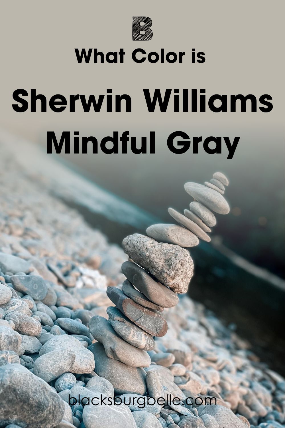
Doesn’t this picture just fill you with a sense of satisfaction and calm? Not only that, take a look at the warm colors in some of the stones, doesn’t it remind you of a certain gray paint that we are talking about right now?
Snapshot of Sherwin Williams Mindful Gray Specifications
For those of you who need a more detailed technical review of Sherwin Williams Mindful Gray, I’ve got you covered! Take a peek at the chart below which should answer some of your color questions.
| Sherwin Williams Mindful Gray | |
| RGB | R: 188, G: 183, B: 173 |
| Hex Value | #bcb7ad |
| LRV | 48 |
| Undertone(s) | Violet, Green |
The LRV of Sherwin Williams Mindful Gray
If you are not all that versed in the world of paint, you might not have heard of the term LRV before. Don’t worry, because it’s actually quite simple! LRV stands for light reflective value and helps us to know how much light a color reflects. The traditional scale goes from 0, reflecting no light at all, so black, to 100, where you find white with the highest reflective value.
It’s worth noting though that no paint color is truly black or pure white, as there is always a level of pigment in the manufacturing process. This means that when looking at paint, the darkest color you can get comes in at 2.4, and the brightest at 94.
The LRV of Sherwin Williams Mindful Gray is 48. This puts it just below the mid-point on the LRV scale, meaning that it leans on the darker side. However, don’t let this low LRV number put you off, as actually Mindful Gray SW 7016 still does have a brightness to it thanks to its warmer undertones.
Undertones of Sherwin Williams Mindful Gray
Although Sherwin Williams Mindful Gray is classified as a neutral color, there are still some undertones that can be picked out in this paint.
Many people have been quick to spot that there is a slight green, and a slight violet undertone, although these aren’t too prevalent to the point where they affect the color. In fact, these undertones actually stop Mindful Gray from becoming too warm, helping it to keep giving that zen and calm vibe.
Some other colors to look for in the undertone of Sherwin Williams Mindful Gray are a slight hint of blue, and also some taupe notes, too.
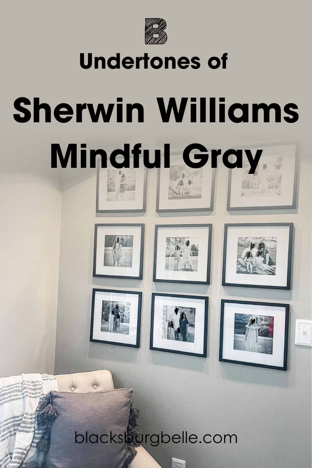
To show you what I mean, here’s a great picture that shows off the undertones of Mindful Gray. How many colors can you see poking through from the undertone?
Does Sherwin Williams Mindful Gray Look Cold?
With undertones including green, violet, and blue, you might be worried that Sherwin Williams Mindful Gray might be a little bit cold.
However, it’s completely the opposite, and is actually quite a calming, warm color!
While it’s not the warmest gray in the world, I would not say that it leans at all on the cold side. In fact, the undertone colors actually help to tone things down and stop it from being too warm or greige.
You can see this perfectly in this inspiration picture that I have found.
See here how you can really see the green undertone come through, but it isn’t actually making this bathroom look cold? That’s the magic of Mindful Gray at work!
Sherwin Williams Mindful Gray is Warm or Cool Color?
Although it’s a neutral shade, Sherwin Williams Mindful Gray SW 7016 definitely leans towards the warm side.
Mind you, it definitely doesn’t go all the way to the warm side, but still enough that it creates a cozy feeling.
If you are looking for subtlety and serenity, Mindful Gray will give it to you in spades.
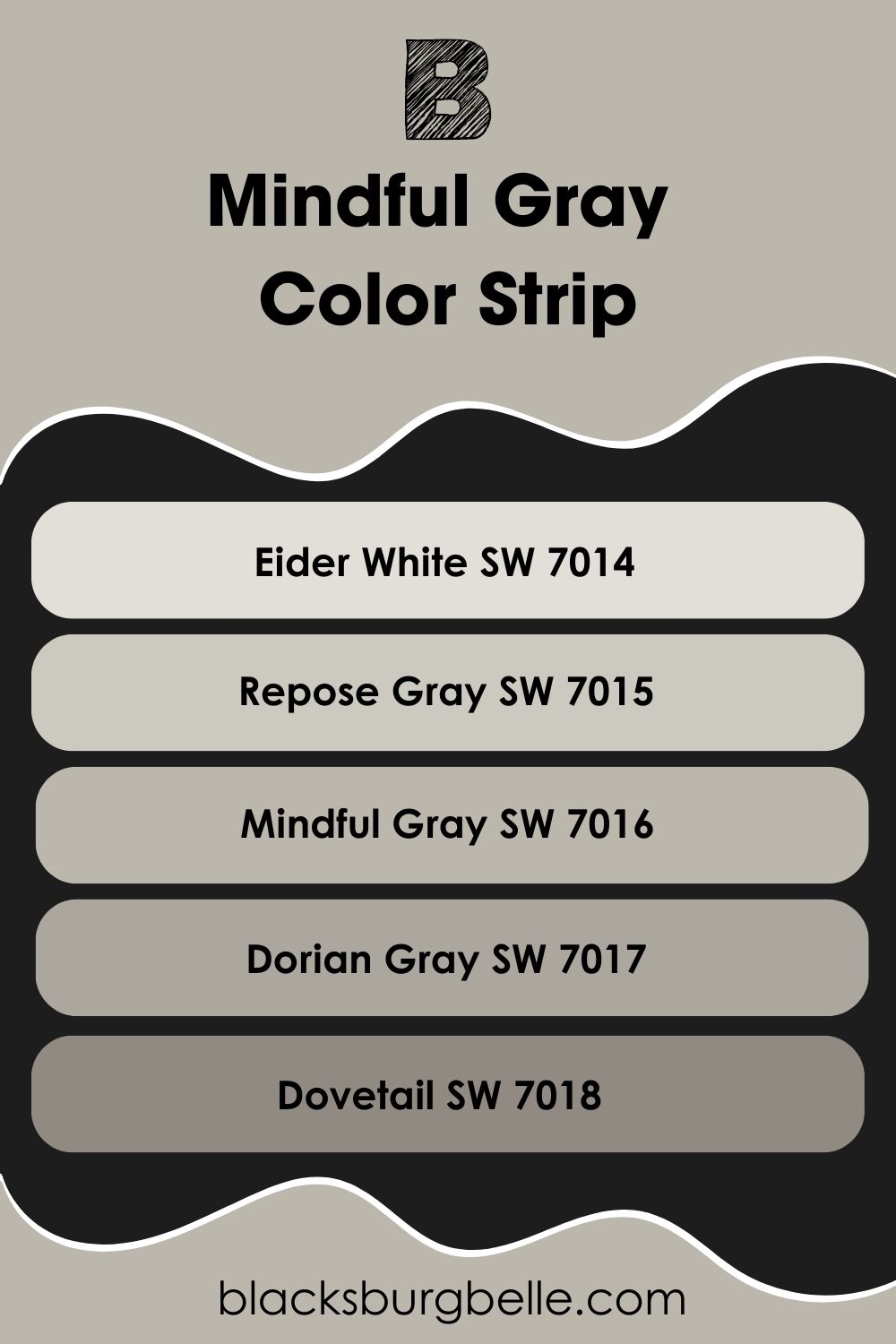
Sherwin Williams Mindful Gray Color Strip: Lighter or Darker Exploration
Mindful Gray might not be the perfect gray color for you, and that is OK! Thankfully Sherwin Williams has a whole host of colors that are darker and lighter shades similar to Mindful Gray so you can find your perfect match.
I’ve placed these in a list for you below, ranging from the lightest color at the top, and the darkest at the bottom. Of course, I’ve put Mindful Gray in the middle for reference!
- Sherwin Williams Eider White SW 7014
- Sherwin Williams Repose Gray SW 7015
- Sherwin Williams Mindful Gray SW 7016
- Sherwin Williams Dorian Gray SW 7017
- Sherwin Williams Dovetail SW 7018
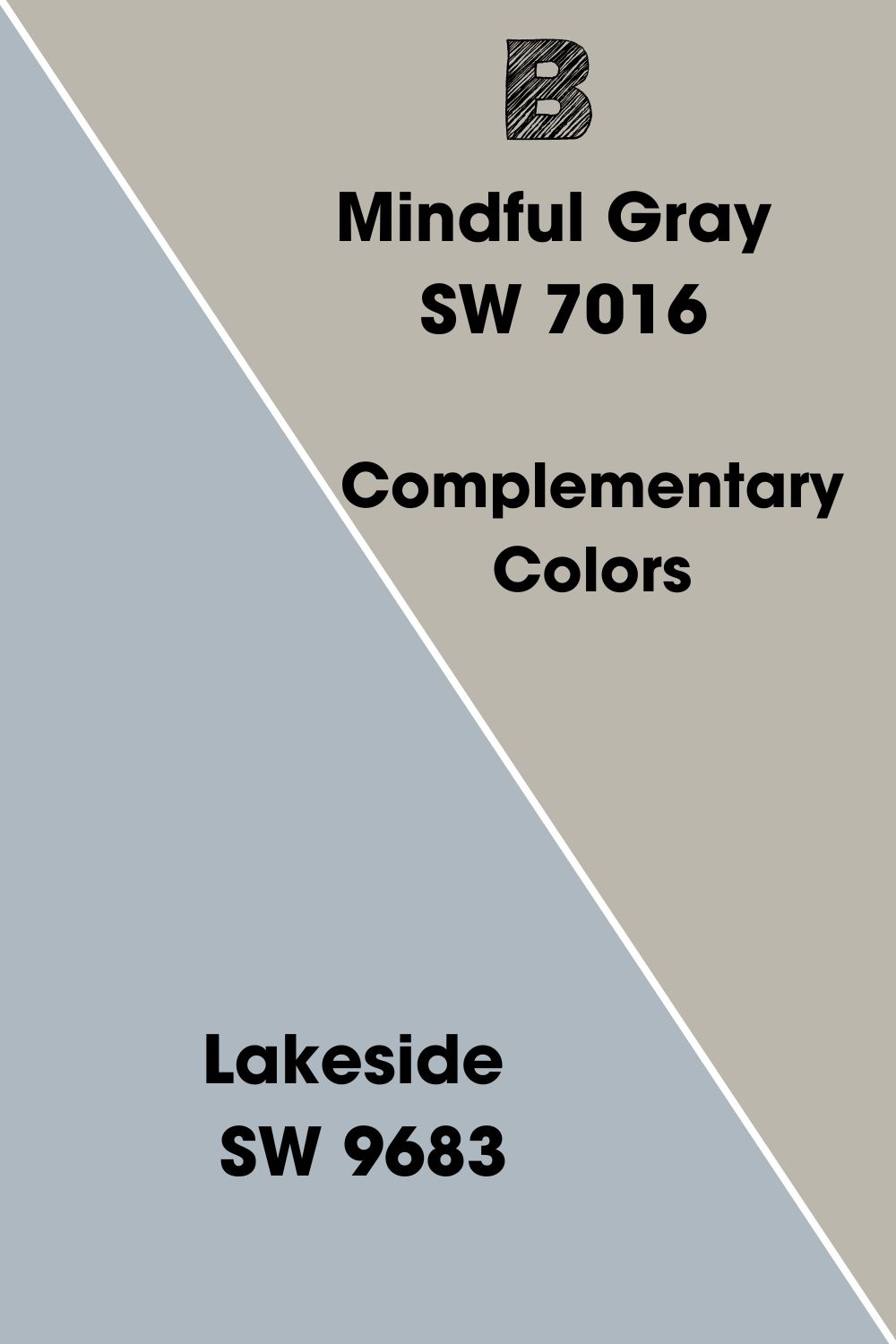
Sherwin Williams Mindful Gray Complementary Colors
To really pull a room together, you need more than one color. As much as Mindful Gray might be a vibe, it still needs other colors to help it to shine.
So, what is the perfect pairing for Sherwin Williams Mindful Gray? The answer might lie in its complementary color. This is the color that is on the opposite end of the color wheel, which often provides a welcome contrast that really gives a space that wow factor!
I’ve been looking at the color wheel for you, and I have found the perfect paint from Sherwin Williams that represents this complementary color for you!
The complementary color for Mindful Gray is a shade of slate blue, and this is best represented by Sherwin Williams Lakeside SW 9683. This cool-toned gray-blue provides a great contrast to the warm notes within Mindful Gray.
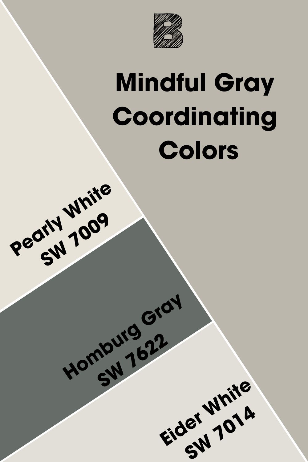
Sherwin Williams Mindful Gray Coordinating Colors
It’s worth not just thinking about the way in which complementary colors can contrast, but how coordinating colors can also bring harmony with Sherwin Williams Mindful Gray.
I’ve compiled my top 3 coordinating colors for Mindful Gray SW 7016 for you.
- Sherwin Williams Pearly White SW 7009: This gorgeous creamy white helps to create a bright and crisp look with Mindful Gray. It also works its magic on picking up the violet undertones of Mindful Gray, too.
- Sherwin Williams Homburg Gray SW 7622: This darker gray still leans on the warm side, creating a cohesive darker contrast to Mindful Gray.
- Sherwin Williams Eider White SW 7014: As a lighter gray, Eider White is perfect friends with Mindful Gray in a color scheme, helping to lift dark areas to keep a space bright and inviting.
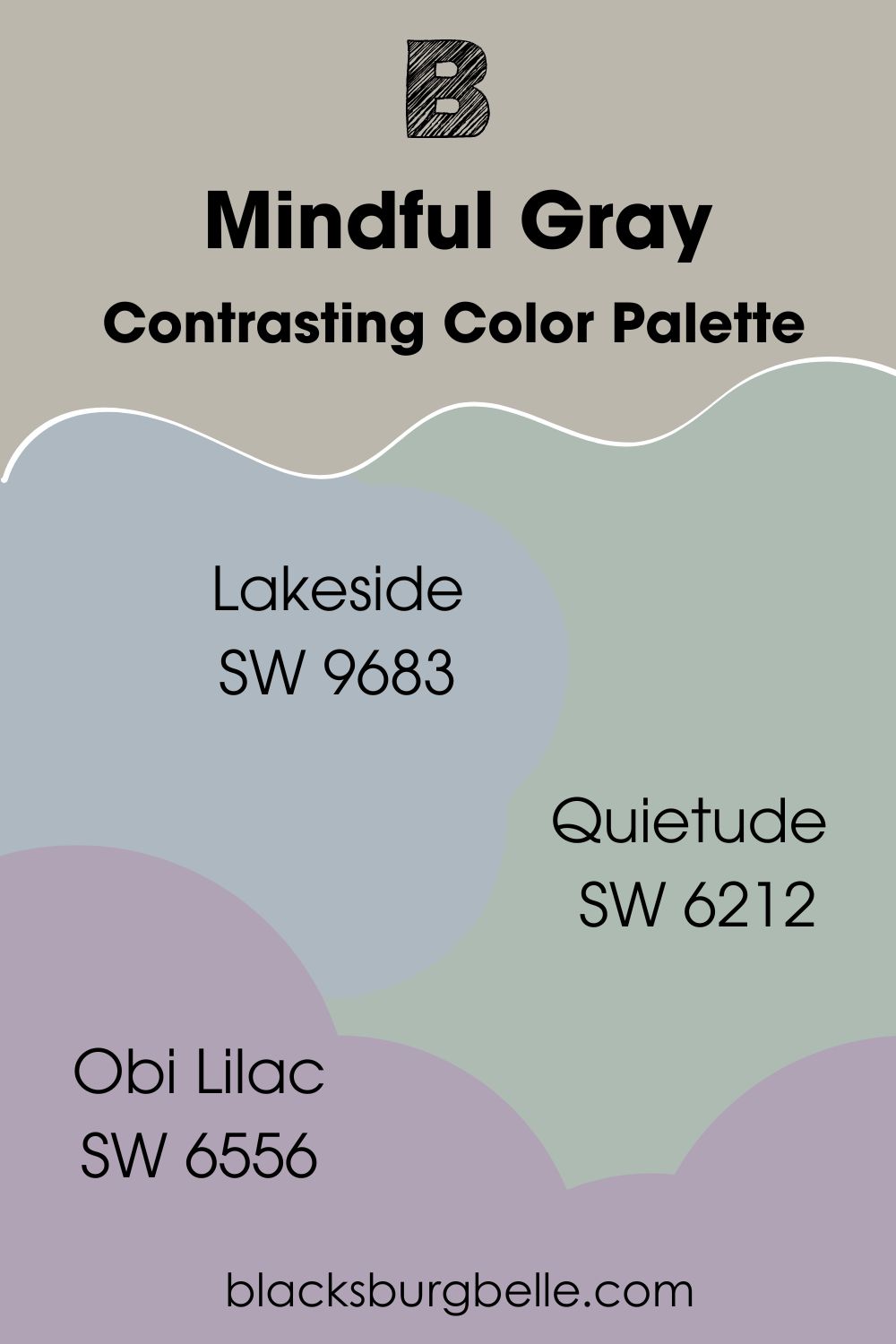
Sherwin Williams Mindful Gray Color Palette
If you need further convincing from me when it comes to adding Sherwin Williams Mindful Gray to your next design project, check out these color palettes I’ve created that celebrate everything that this color is capable of!
Contrasting Color Palette
Lakeside SW 9683: This cool blue-gray provides a welcome complement to Mindful Gray, helping to add depth to a space.
Quietude SW 6212: Quietude is a cooler gray-green that helps to pick up on Mindful Gray’s undertones.
Obi Lilac SW 6556: This cool lilac is a true contrast to Mindful Gray, helping to create a playful accent that doesn’t take away from Mindful Gray’s charm.
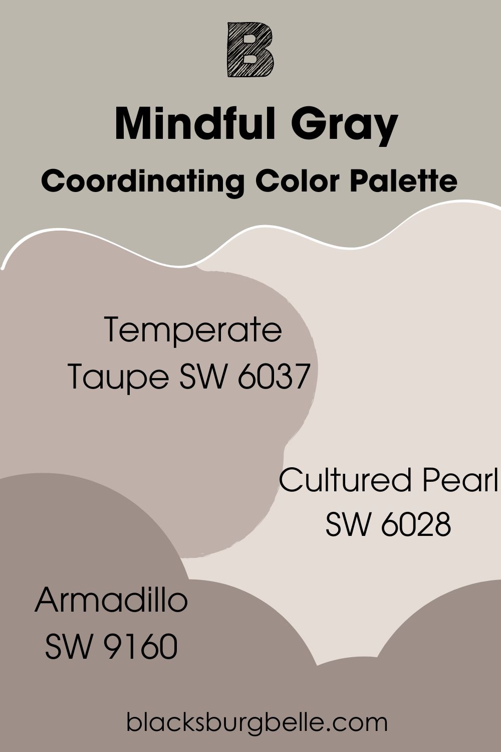
Coordinating Color Palette
Temperate Taupe SW 6037: This paint color is almost the reverse of Mindful Gray, being a soft violet with warm gray undertones. As a result, the two make a perfect pairing!
Cultured Pearl SW 6028: This cool pinkish-white pairs well to create a brightness and depth to the color scheme, without making things feel too cold.
Armadillo SW 9160: This gray-purple adds a berry richness to round out this color palette, creating a sumptuous feel.
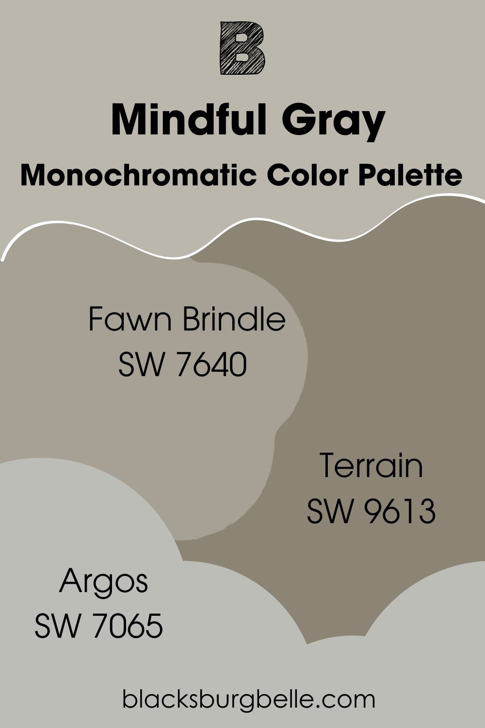
Monochromatic Color Palette
Fawn Brindle SW 7640: This color provides a more foresty complement to Mindful Gray, with its green undertones.
Terrain SW 9613: This deep brown has gray undertones which help it to mesh with Mindful Gray while keeping things earthy and natural.
Argos SW 7065: Keeping with the natural theme, Argos is a stony neutral gray, helping to round things out and really create a zen look to complement Mindful Gray.
Sherwin Williams Mindful Gray vs Other Paint Colors
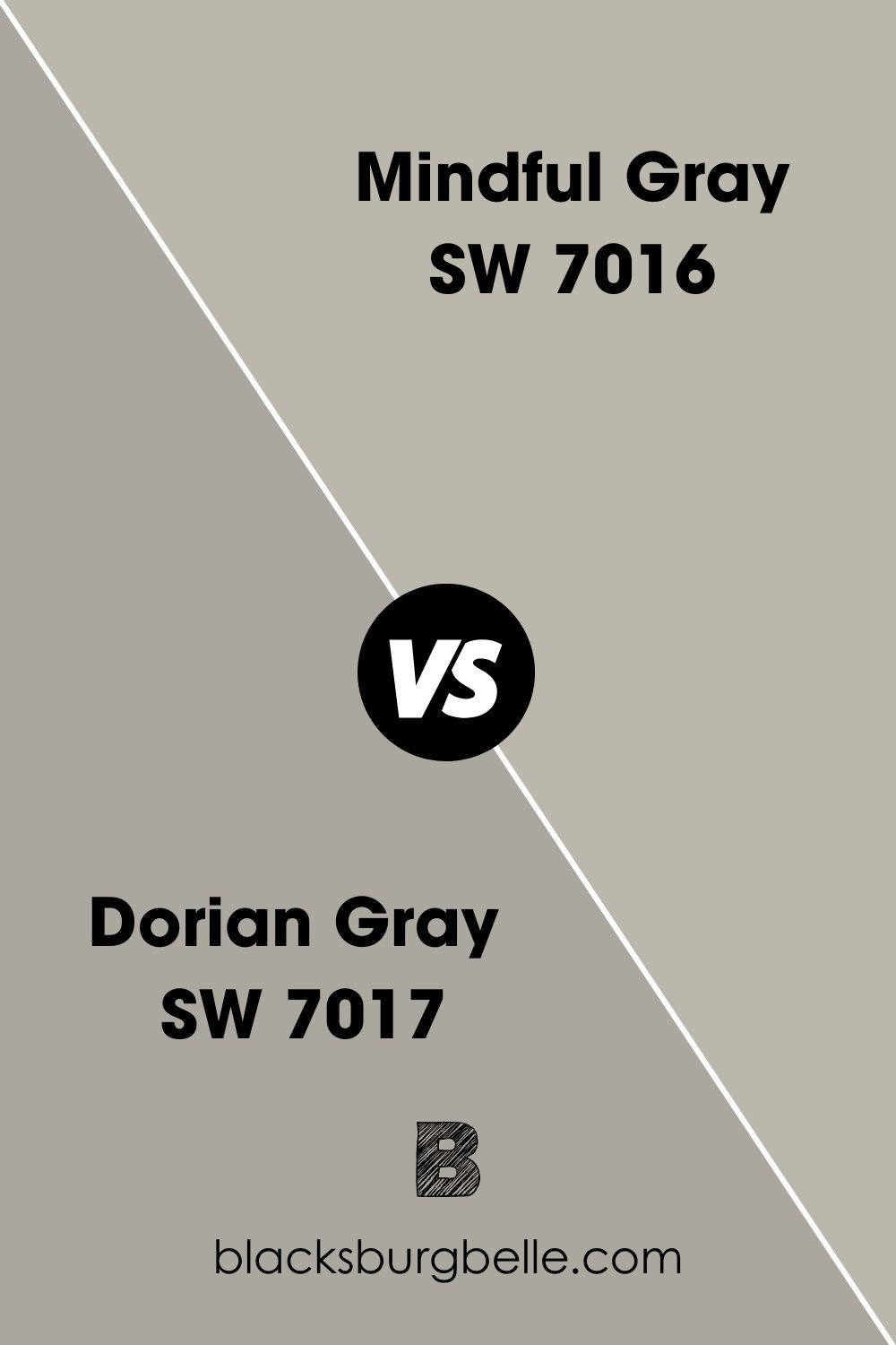
Sherwin Williams Dorian Gray vs Mindful Gray
Although these two colors share a lot of similarities on the color wheel, there is one thing that can decide the battle of Dorian Gray vs Mindful Gray. This is the lightness and darkness of the two shades. Mindful Gray is lighter, with an LRV of 48, while Dorian Gray has an LRV of 39.
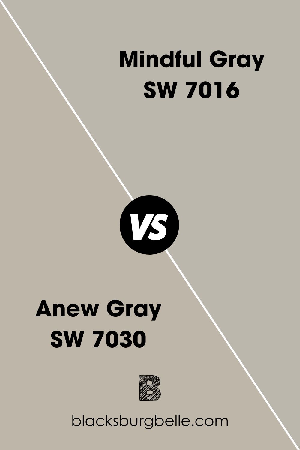
Sherwin Williams Mindful Gray vs Anew Gray
While Mindful Gray leans more towards being a neutral gray, Anew Gray is definitely much more of a greige, with a very warm, stone undertone that almost has brown notes to it.
Sherwin Williams Amazing Gray vs Mindful Gray
Amazing Gray bears a lot of similarities to Mindful Gray. They both have a similar LRV, or 47 and 48 respectively, and each has a green-gray undertone. However, Mindful Gray leans into this and its violet undertone much more heavily.
Sherwin Williams Mindful Gray vs Benjamin Moore Revere Pewter
One of the first distinctions when it comes to Mindful Gray vs Revere Pewter is the fact that they are both from different paint manufacturers, Sherwin Williams for Mindful Gray, and Benjamin Moore for Revere Pewter. Revere Pewter is also much lighter, with an LRV of 55, and has a lot more of a beige undertone.
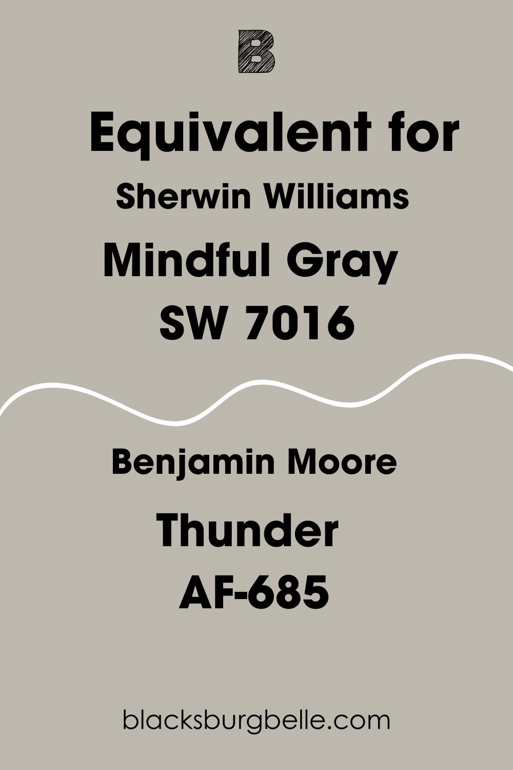
Sherwin Williams Mindful Gray Benjamin Moore Equivalent
I’ve already spoken about one Benjamin Moore paint in comparison to Sherwin Williams Mindful Gray in the form of Revere Pewter, but what is the best match in their catalog?
I’ve done some digging, and I have the answer for you.
The Benjamin Moore equivalent of Sherwin Williams Mindful Gray is a color called Thunder AF-685. These colors are all but identical in their specifications, and are even less than .5 away from each other in LRV, too!
Where Can You Use Mindful Gray SW 7016?
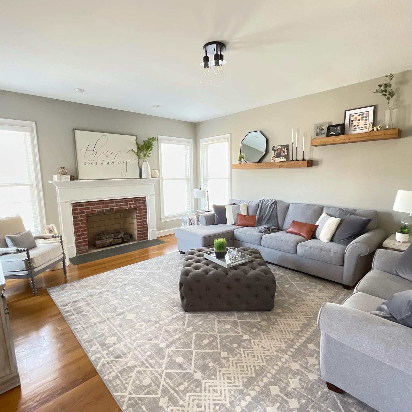
Sherwin Williams Mindful Gray Living Room
The warm tones of Mindful Gray makes it perfect for creating a relaxing living room space. See how in the example below it stands out but still complements to cooler blue-gray of the couches, but also doesn’t feel out of place with the brick fireplace and the wooden accents, either!
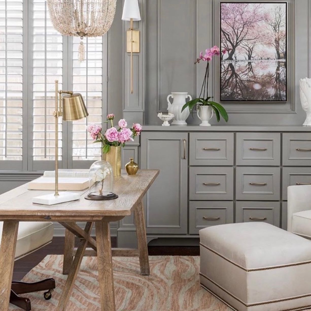
Sherwin Williams Mindful Gray on Furniture
If you are looking to create a really zen home office, using Mindful Gray on your furniture and storage can create a relaxed work environment. See how it is carried on onto the walls as well for a really seamless look.
I just love how the gold accents and the pink really pop, too!
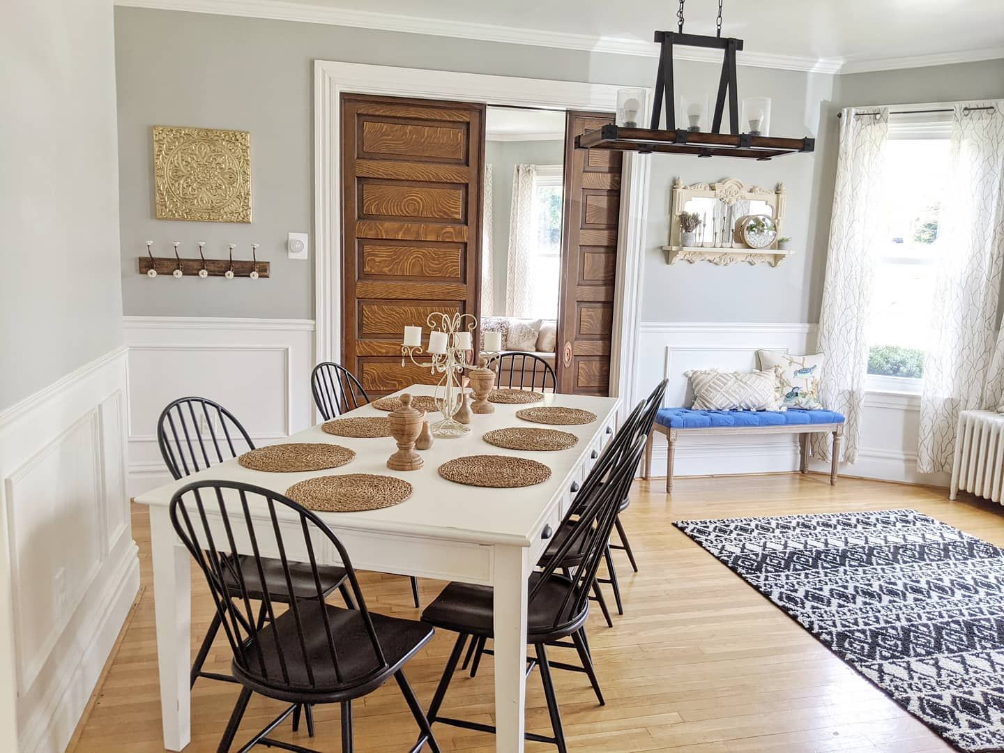
Sherwin Williams Mindful Gray Dining Room
Some people might shy away from adding a gray to an entertaining space such as a dining room, but I ask them to look at this gorgeous example of Mindful Gray at work and think again!
Mindful Gray works really well up against the crisp white trim and coving. It also helps to blend together seamlessly even the stronger accents such as the dark chairs and light fitting, and the rich wood of the door.
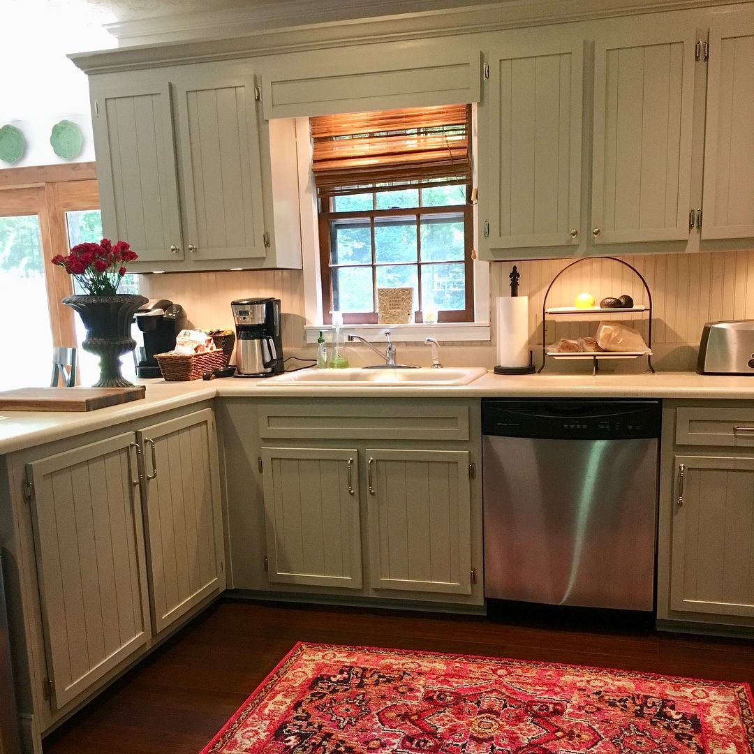
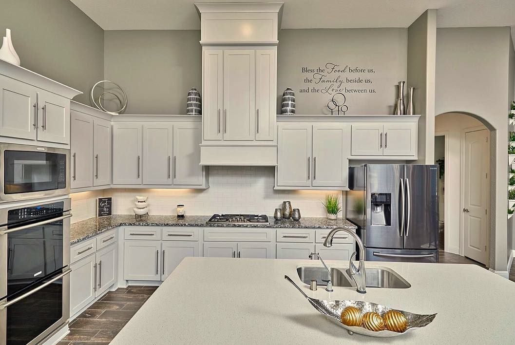
Sherwin Williams Mindful Gray Kitchen Cabinets
If you ever needed reminding of Mindful Gray SW 7016 and its slightly green undertone, then look no further than these gorgeous kitchen cabinets!
The color seems to take on new life, and creates a super cozy farmhouse vibe that fills me with a bit of kitchen envy!
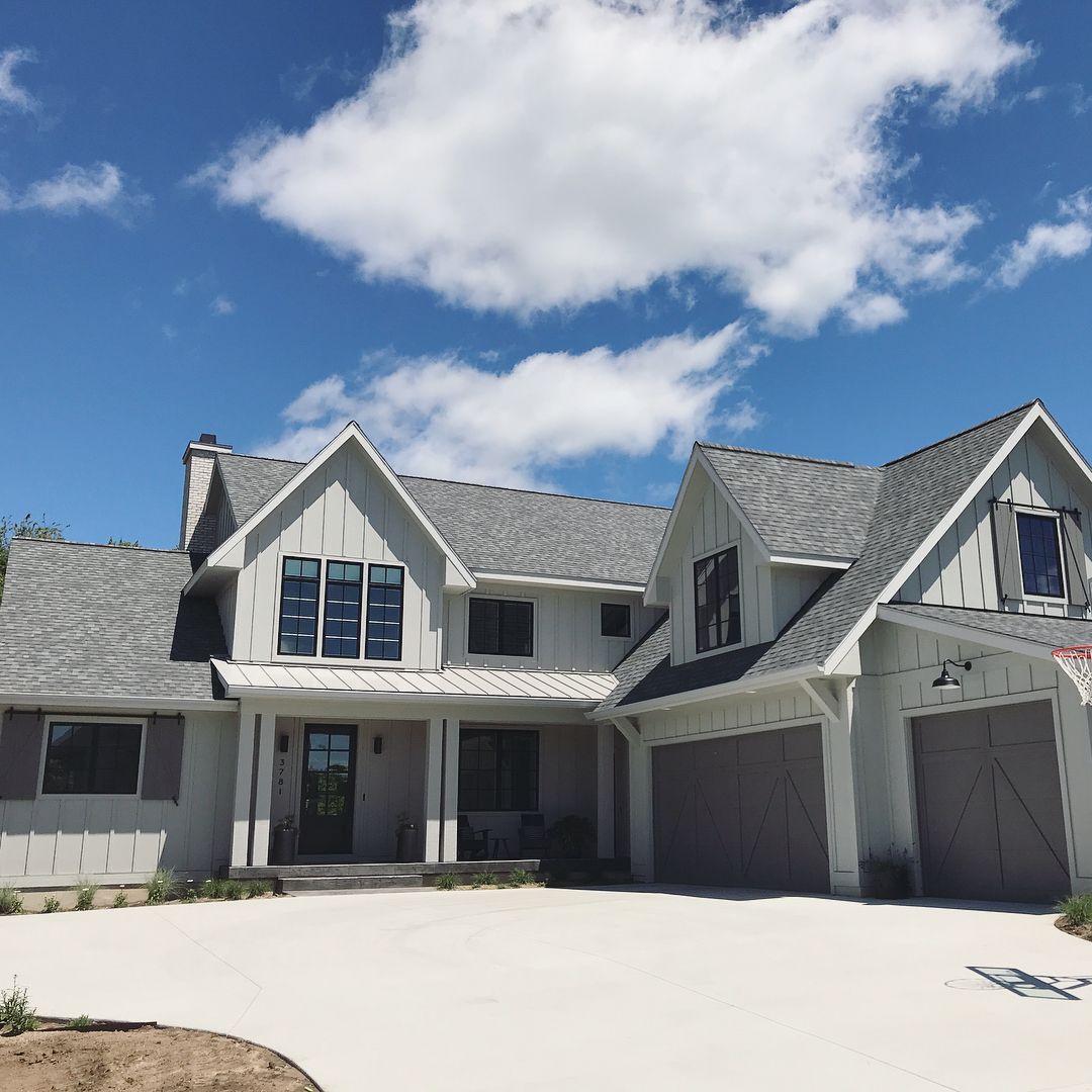
Sherwin Williams Mindful Gray Exterior
Don’t just think about reserving Mindful Gray to the sidelines as an accent color when it comes to the exterior of your property. Make it the star of the show and it can create a warm, stony feel and also carry other slightly darker grays such as those seen on the shutters and garage door of this property.
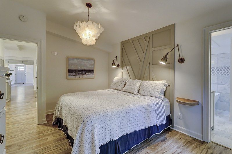
Sherwin Williams Mindful Gray Bedroom
If there’s anywhere in the house that we all want to kick back and relax, it’s definitely the bedroom! Turn yours into a peaceful haven by using Mindful Gray to ramp up the relaxation factor.
Can we also have a shout-out to how well it goes with the white trim?
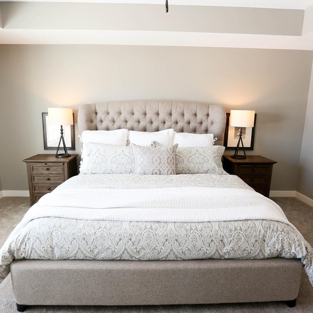
Adding on to this, Mindful Gray doesn’t have to be the main color in your bedroom for it to make a real impact. Using it as an accent color to create a statement headboard has to be one of the most amazing and creative ways I’ve seen someone use this color. Take a look!
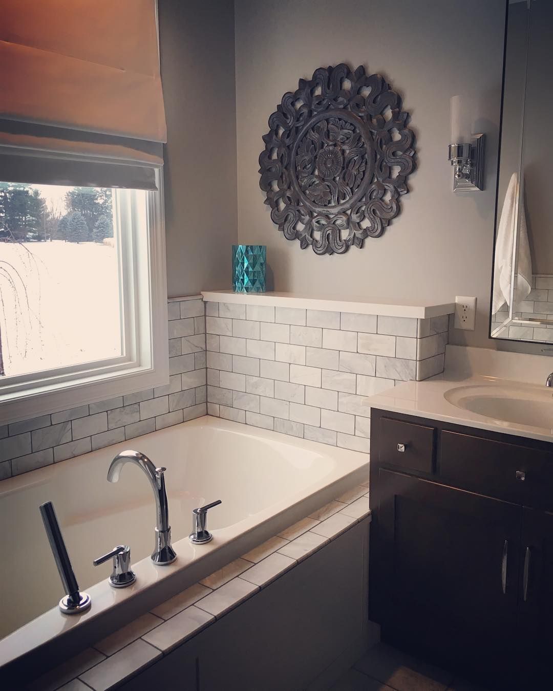
Sherwin Williams Mindful Gray Bathroom
Light the candles and relax as Mindful Gray shows us how amazingly well it does within a bathroom. Even in low lighting such as in my inspiration picture I’ve found, it still has a mellow and inviting vibe perfect for a zen soak. Now, where’s my bath oils?
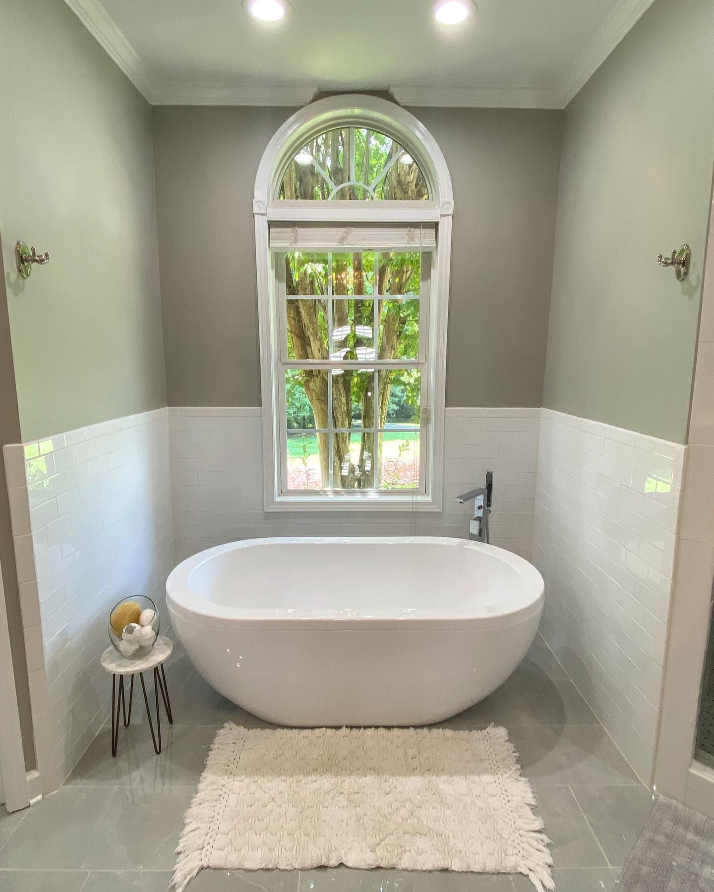
For a brighter look in a bathroom, take a peek at how Sherwin Williams Mindful Gray holds its own as the primary color in this inspiration picture I’ve found.
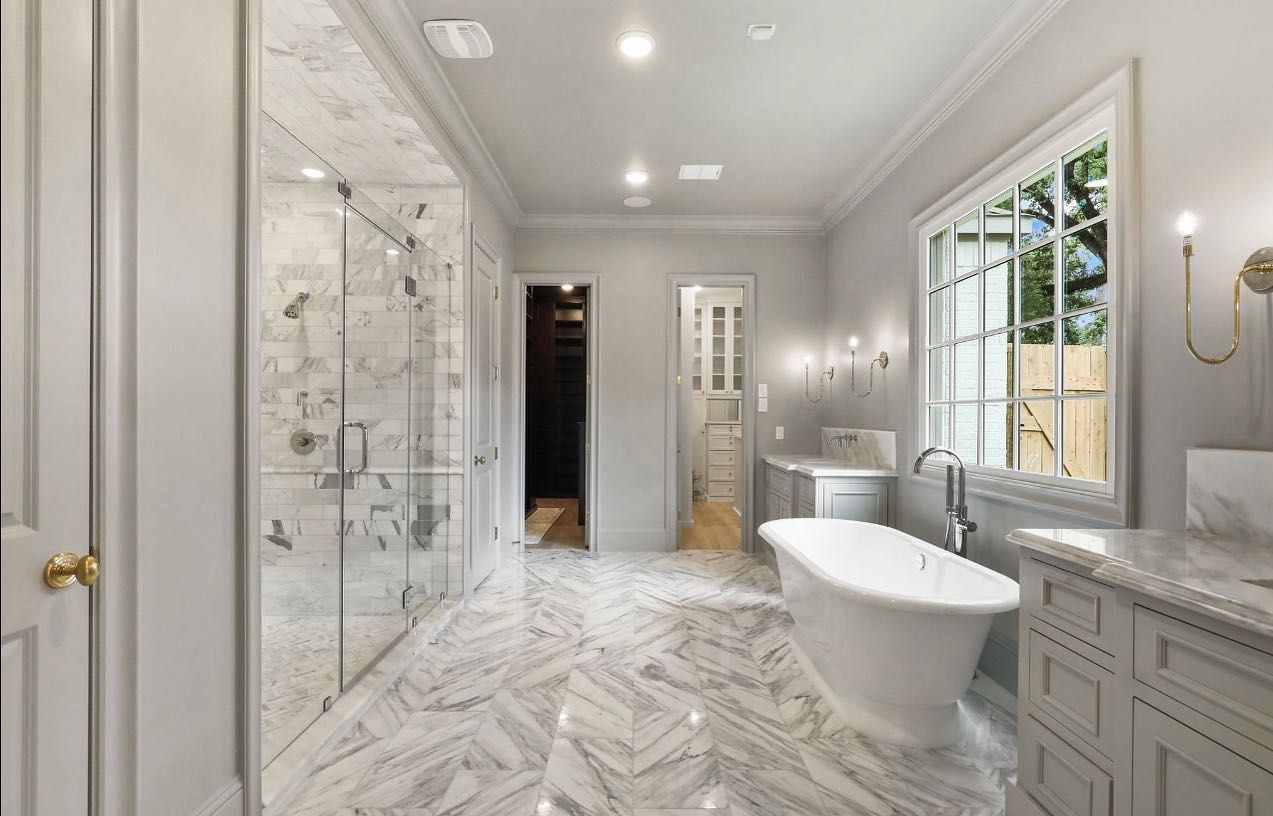
The color really holds its own even against that gorgeous marble. Take a look at the ceiling, too! Rather than feeling closed in, it still feels spacious while still having that cozy factor to it.
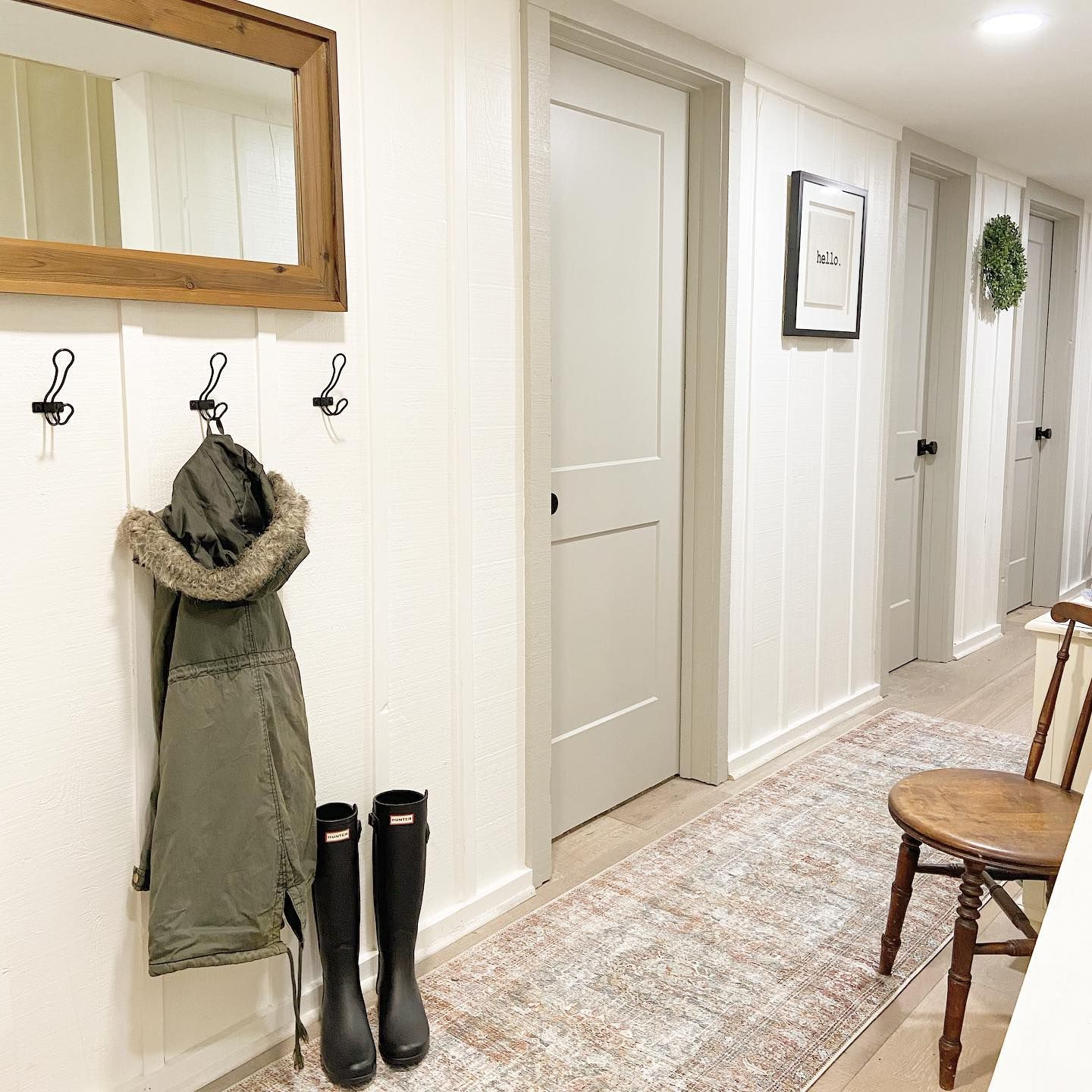
Sherwin Williams Mindful Gray on Doors
Here you can see Mindful Gray in action being used as an accent color. Sherwin Williams Mindful Gray on the door frames, as well as the doors themselves, creates a seamless look as it cozies up to the Alabaster paneling on the walls. What a truly welcoming hallway!
Sherwin Williams Mindful Gray Kitchen Walls
I’ve already let you in on how painting Mindful Gray onto kitchen cabinets can help to transform the room, but the same can also be said when it is used on the walls, too! Here it’s paired with a lighter color on the cabinets which helps to bring out not only the green but also its warm stone notes, too.
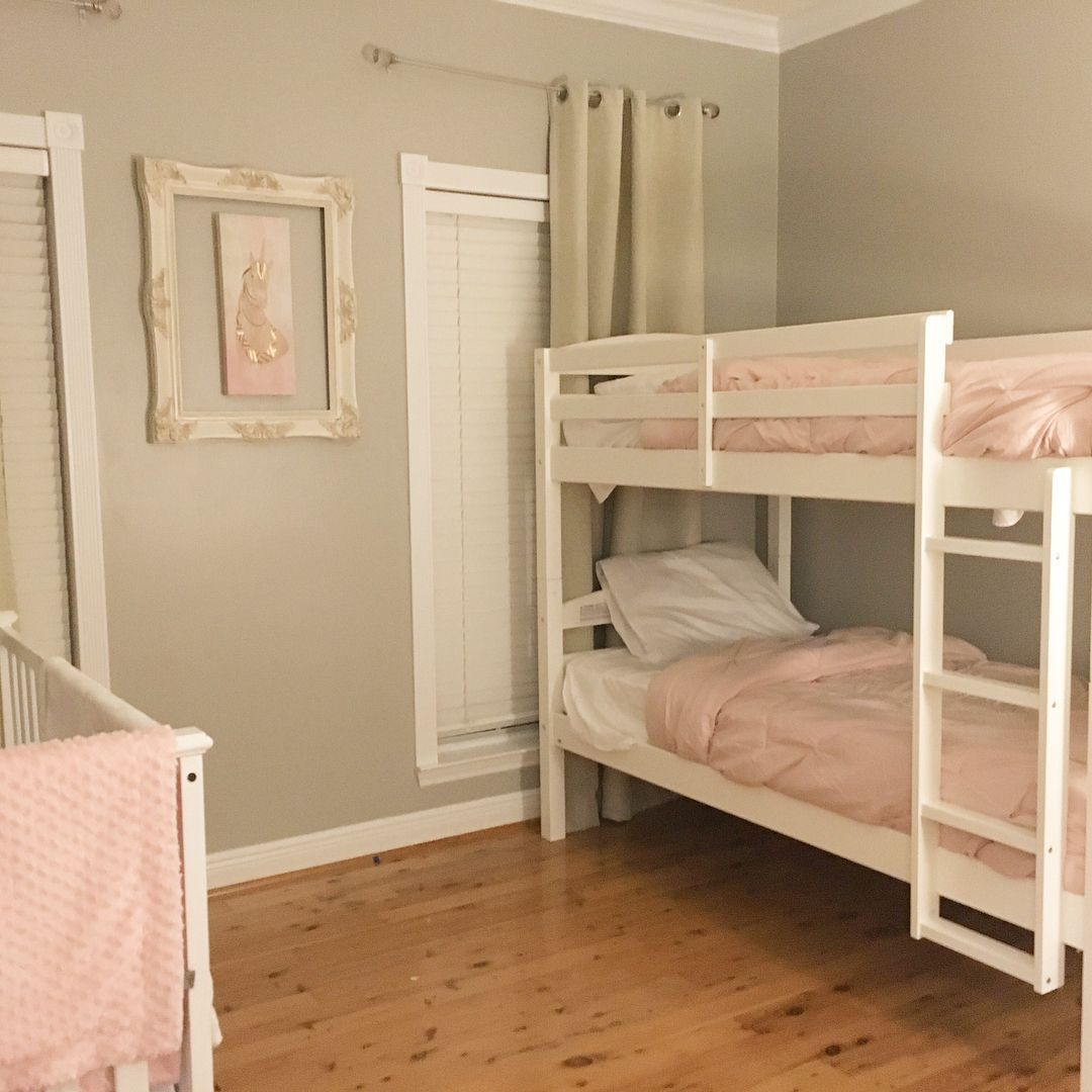
Sherwin Williams Mindful Gray Kids Room
Don’t just keep the secret of Mindful Gray for the adults. Gray might seem like a boring color in a kid’s room, but just look at how enchanting it becomes when paired with those dusky and rosy pinks! I also love the way it helps the crisp bright white to stand out which could otherwise have been lost by the pale pinks. It truly is a room fit for a princess!
Conclusion
If you are in need of a warm gray that really brings that cozy relaxation factor, look no further than Sherwin Williams Mindful Gray.
With its transformative powers thanks to its varied undertone, this neutral paint proves that it is not content to sit on the fence and will happily lend itself to almost any project you can think of!
In all honesty, I liked this color before, but from poring through loads of inspiration, I’ve come to love it even more and have figured out some combinations that I didn’t even know would work!
I’m definitely getting out the paint pot to experiment more with Sherwin Williams Mindful Gray, and I really do urge you to go out and get a sample for yourself.
 Sherwin Williams Mega Greige (Palette, Coordinating & Inspirations)
 Sherwin Williams Steamed Milk (Palette, Coordinating & Inspirations)
 Sherwin Williams Toque White (Palette, Coordinating & Inspirations)
 Sherwin Williams Anew Gray (Palette, Coordinating & Inspirations)
 Sherwin Williams White Heron (Palette, Coordinating & Inspirations)
 Sherwin Williams Repose Gray SW 7015: A Good Paint Choice?
