
Trying to pick the perfect white paint color that doesn’t look too stark? You’d be amazed at the number of white paint colors in the market, but one of the best and most popular is Sherwin Williams Snowbound SW 7004.
What makes it so popular? I’m glad you asked because we’re going on this ride of discovery to see what Snowbound is all about and if it is right for your decor. Stick around to learn all you need to know about this paint color.
Table of Contents
When to Choose Sherwin Williams Snowbound
Because it’s a beautiful white color, it is easy to get carried away when using Snowbound. However, it helps to know the best time and place to use it. Is it versatile? Does it match everything? You will find out in this guide.
Don’t have a lot of light?
Snowbound is one of the brightest white paint colors you will find. It is not as bright as High Reflective White, but it’s more versatile and usable in more places. And it will hold up under bright and low light. You can use it in a north-facing room without worry.
Need the perfect trim color?
As a bright white, Snowbound is one of the best colors you can use for the trim. It looks amazing inside the house but even more spectacular outside because of the abundance of light.
Looking for a cool white backdrop?
Snowbound is typically a cool color, so you can incorporate it into a cool color scheme as a backdrop. It will blend well with vibrant colors, soft pastels, and deeply saturated hues as the perfect neutral and softener.
Trying to pick a central color?
If you are not open to adding too many colors to the decor in a particular room, consider using Snowbound as the central color. A few splashes of color here and there will not diminish its brightness or beauty.
There’s a reason Snowbound is on your radar, so I want to help you make up your mind. These pointers are only starters to get you to see where and when the paint color works best. But that’s not all; I have so much more to show you about Snowbound.
What Color Is Snowbound?
You may be wondering about this name for this specific color. The term ‘snow’ in the name is already a pointer to the color, but is that all there is to it?
Do you know that picture of freshly fallen snow that makes you want to curl up with a cup of hot cocoa? Snowbound means being kept from going out because of heavy snowfall. But it doesn’t have to be something bad because staying home can bring a positive turn of events.
Simply put, this paint color can have the same effect on you, bringing calmness and relaxation in an otherwise tedious world. Here’s a look at a beautiful snow picture:

The picture of freshly driven snow and its beauty inspired the name of the paint. Snowbound SW 7004 is a bright white paint color with a hint of gray. This paint color can appear crisp because of the gray in it, but the undertones can change and show a bit of taupe, which is pink-purple.
That is why this typically cool white can appear slightly warm in south-facing rooms. Such rooms have bright and warm direct sunlight. So, don’t be surprised to see Snowbound lean warm in some rooms.
A Snapshot of Sherwin Williams Snowbound
Every paint color has specific attributes that make it unique. Now, these attributes apply to all paint colors, but no two are the same. So, the following chart details these attributes as they apply to Snowbound.
| Sherwin Williams Snowbound | |
| RGB | R: 237, G: 234, B: 229 |
| LRV | 83 |
| Undertone | Gray, pink-purple |
| HEX Code | #EDEAE5 |
Now, let’s discuss the most important ones in this chart, which are the LRV and undertone.
The LRV of Sherwin Williams Snowbound
LRV means light reflectance value and refers to the amount of light that color reflects. Some colors reflect more light than others, hence, the value scale. LRVs run on a scale of 0 to 100; 0 is the value for pure black, while 100 is the value for pure white.
Since no paint color is completely black or white, the scale for paint colors is between 2.5 and 94. This gives you an idea of how bright any paint color is, including the one under review.
Snowbound has an LRV of 83. Pretty high, right? It shows how bright the paint color is and how much light it reflects. That is why I called it one of the brightest whites in the market, although there are a few brighter ones.
The Undertones of Sherwin Williams Snowbound
The undertones of any paint color are vital to how it performs, where you use them, and how to combine the main color with other colors. They also determine the tone of the paint color, that is, warm or cool.
Snowbound has gray undertones. That is what you see at face value. But like many other colors, the undertones can look slightly different with various lighting conditions. A room with direct sunlight presents the paint’s actual color.
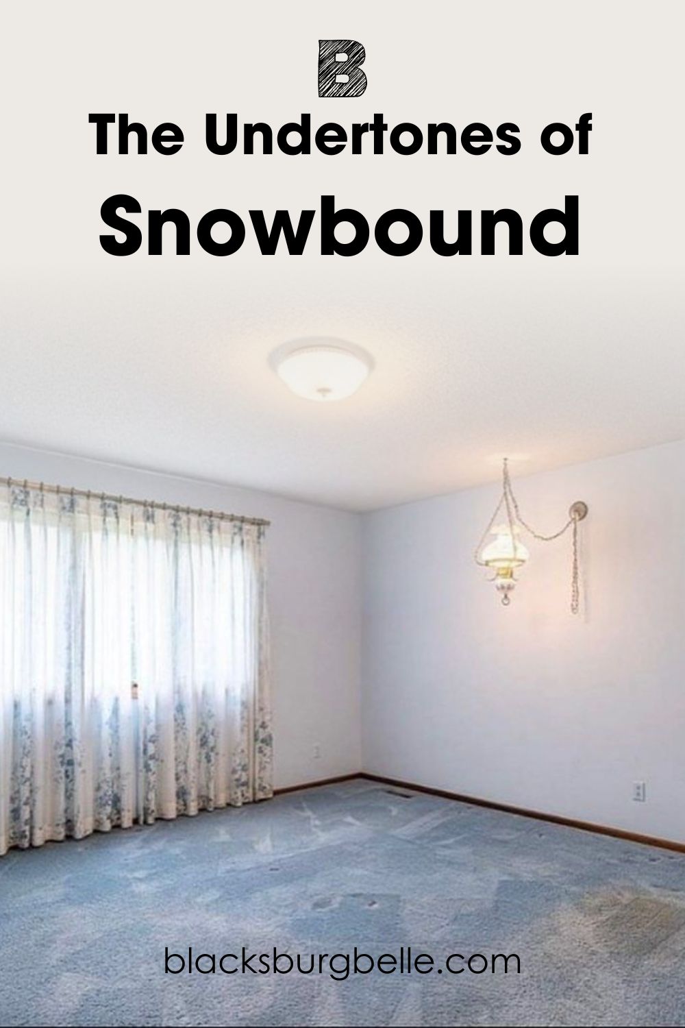
You can clearly see that Snowbound is a bright white, but you will also see the slightly gray undertone. There is also a hint of warmth to it. What I mean is that the paint color does not appear as cool or stark as you would expect a cool white with this level of brightness to be.
Does Lighting Affect It?
Lighting is a crucial aspect of picking any paint color. A bright white like Snowbound can hold up well in any room, whether or not it is well-lit. However, it may look slightly muted and change its undertones if the lighting is cold. And that is where you may find that slightly taupe undertone, that is, pink-purple.
Therefore, you must decide where you want to use this paint color and if you are ok with pink or purple peeking through it. This next picture is what Snowbound may look like if you use it in a room with relatively low light.
You can notice a bit of pink-purple in certain parts of the room. It becomes even more obvious the darker the room gets.
Does It Appear Yellow in a Room?
On its own, Snowbound does not read yellow in a room because the undertones don’t lean toward that direction. However, its shade and slightly gray cast can make it easy to pick up hues around it. So, it may look a little yellow if there is a vibrant yellow around it.
It may also read a little creamy leaning toward light tan in the right lighting. For example, this next picture has some wood tones around it, making it look slightly tan.
But in another outdoor space with wood tones around it, this time dark, Snowbound doesn’t change its hue.
Sherwin Williams Snowbound: Warm or Cool?
Snowbound is a cool color because of its gray undertones. However, it can also read slightly warm if the setting is right. This is because of the hint of pink and purple in it since pink is categorized as warm.
So, if you want a bright white that has some versatility, Snowbound may be your best bet. Its peculiar balance between warm and cool may be what you need to make your decor better.
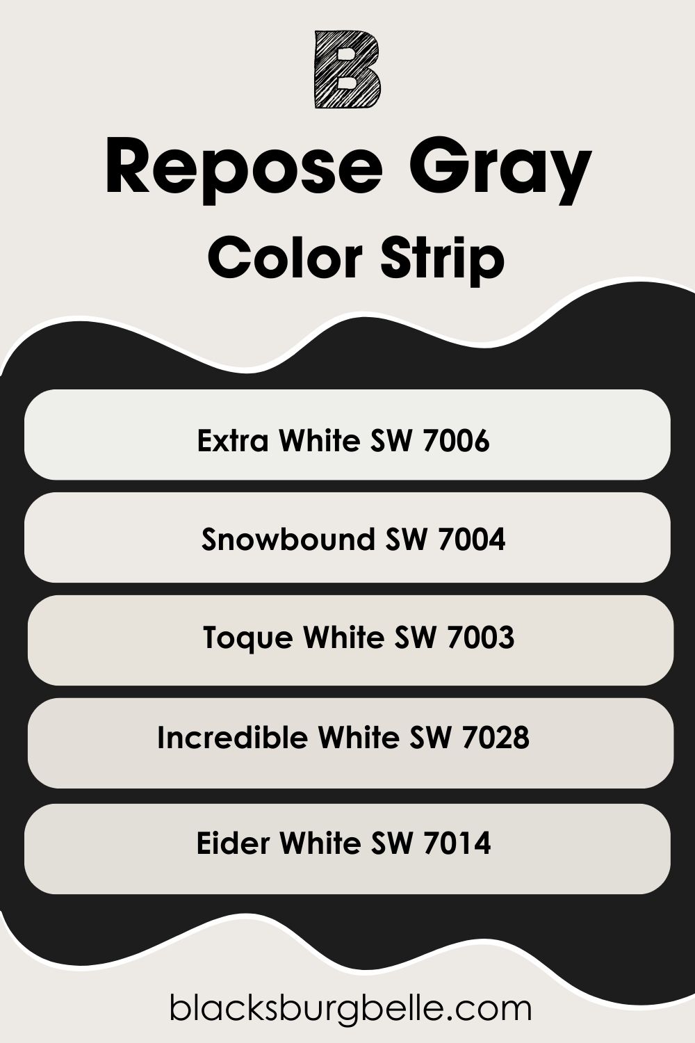
Sherwin Williams Snowbound: Lighter or Darker Exploration
It is possible that Snowbound doesn’t exactly meet your needs when it comes to brightness or shade. You may want something brighter or more muted. Don’t worry; I’ve got you covered in this aspect. I’ve carefully picked other colors that fit in the same white category as Snowbound, from lighter to darker.
- Sherwin Williams Extra White SW 7006
- Sherwin Williams Snowbound SW 7004
- Sherwin Williams Toque White SW 7003
- Sherwin Williams Incredible White SW 7028
- Sherwin Williams Eider White SW 7014
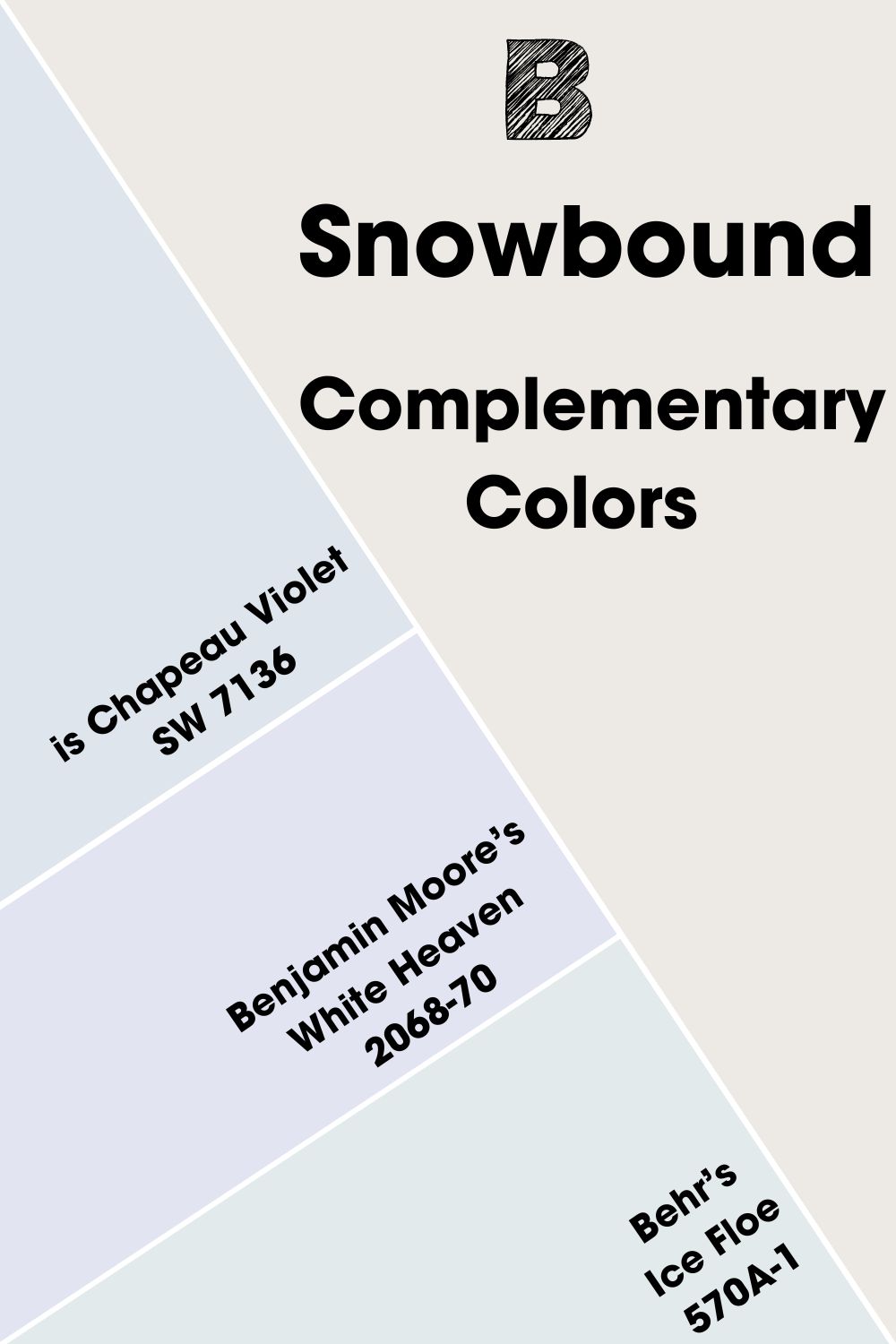
Sherwin Williams Snowbound Complementary Colors
These colors are opposite each other on the color wheel and may not match at first glance. Examples are blue and orange or green and red. They can be vibrant colors but usually, cancel each other when mixed to produce a grayscale color.
Snowbound is a white paint color. But because it is not a true white, its complementary color is a very light blue-gray color. The closest matching shade from Sherwin Williams is Chapeau Violet SW 7136. Since it’s an archived color, you can try Benjamin Moore’s White Heaven 2068-70 or Behr’s Ice Floe 570A-1.
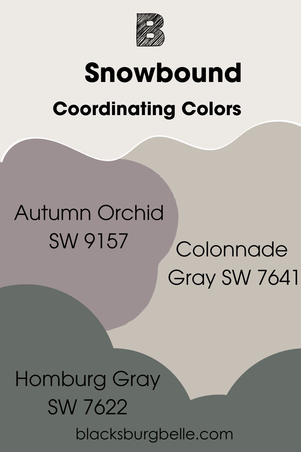
Sherwin Williams Snowbound Coordinating Colors
These colors have a smooth flow with each other, although they don’t usually have the same color. This is different from colors with the same shade. Coordinating colors have some similarities to create a seamless flow when used together in the same color scheme or palette.
- Autumn Orchid SW 9157: A deep purple paint color with a hint of gray that pair well with the bright Snowbound
- Colonnade Gray SW 7641: A warm gray paint color with beige undertones that bring a soft warmth to the decor along with Snowbound
- Homburg Gray SW 7622: A dark gray with deep cyan undertones to bring some character to the decor when paired with Snowbound
Sherwin Williams Snowbound Color Palettes
As a bright white color, Snowbound is ideal for use with various colors, especially if they have the same tone. But what colors work best with Snowbound, despite its versatility? I’ve taken the liberty to create a few color palettes to guide you.
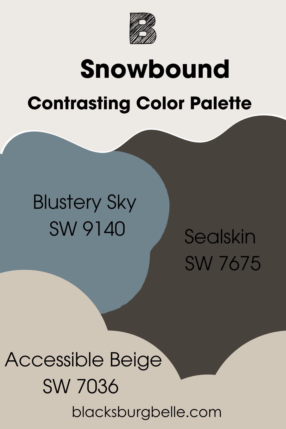
Contrasting Color Palette
- Blustery Sky SW 9140: A mid-blue shade with a hint of warmth that brings some difference to the usually cool Snowbound
- Sealskin SW 7675: A dark shade that directly contrasts the bright Snowbound for a striking effect
- Accessible Beige SW 7036: This warm and light beige is a perfect neutral to pair with Snowbound
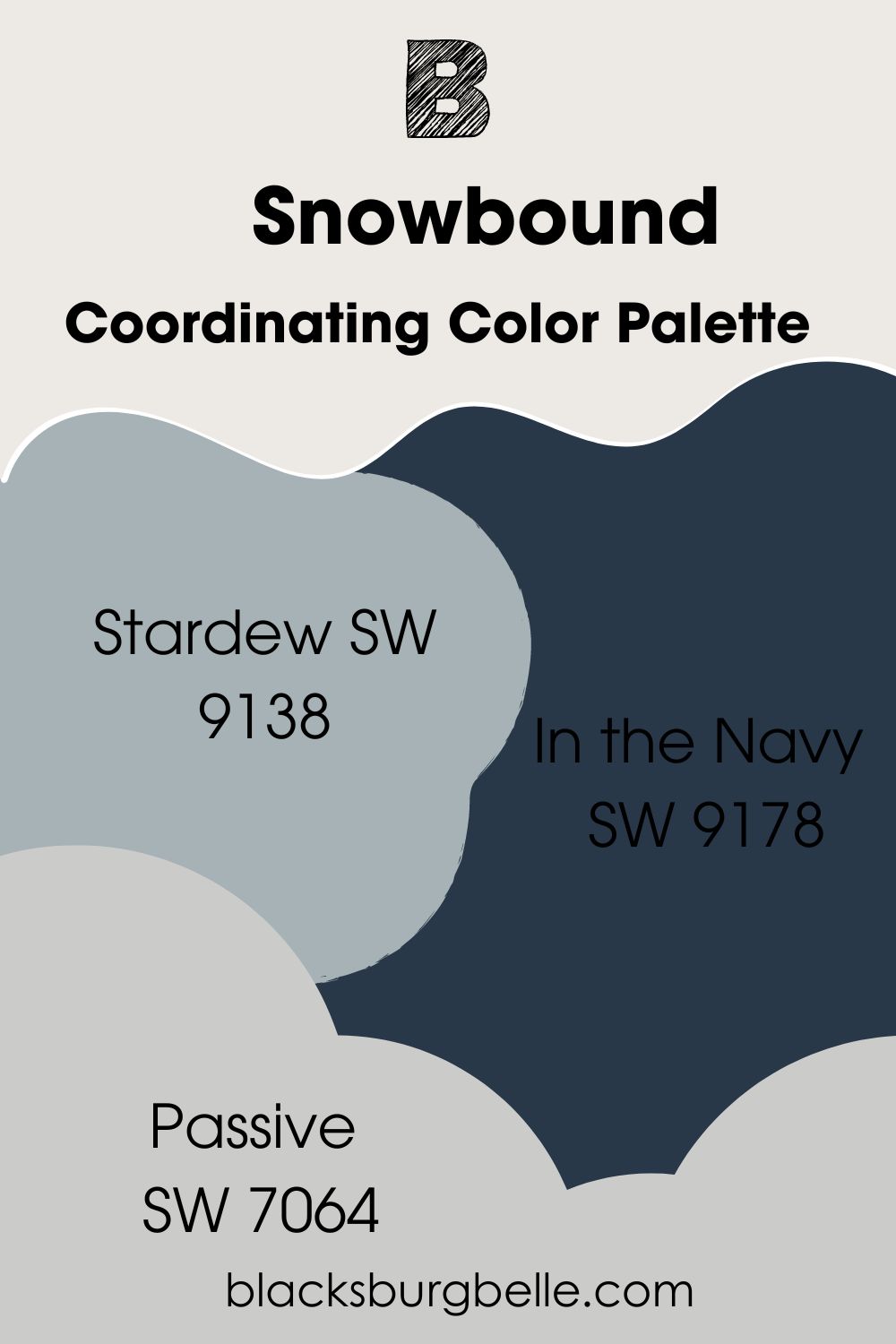
Coordinating Color Palette
- Stardew SW 9138: A blue-gray paint color with enough coolness to match Snowbound’s tone
- In the Navy SW 9178: A deep shade of cool blue that contrasts yet matches Snowbound if you want versatility
- Passive SW 7064: Use this light paint color on walls and Snowbound on trim for a classic bright effect on your decor
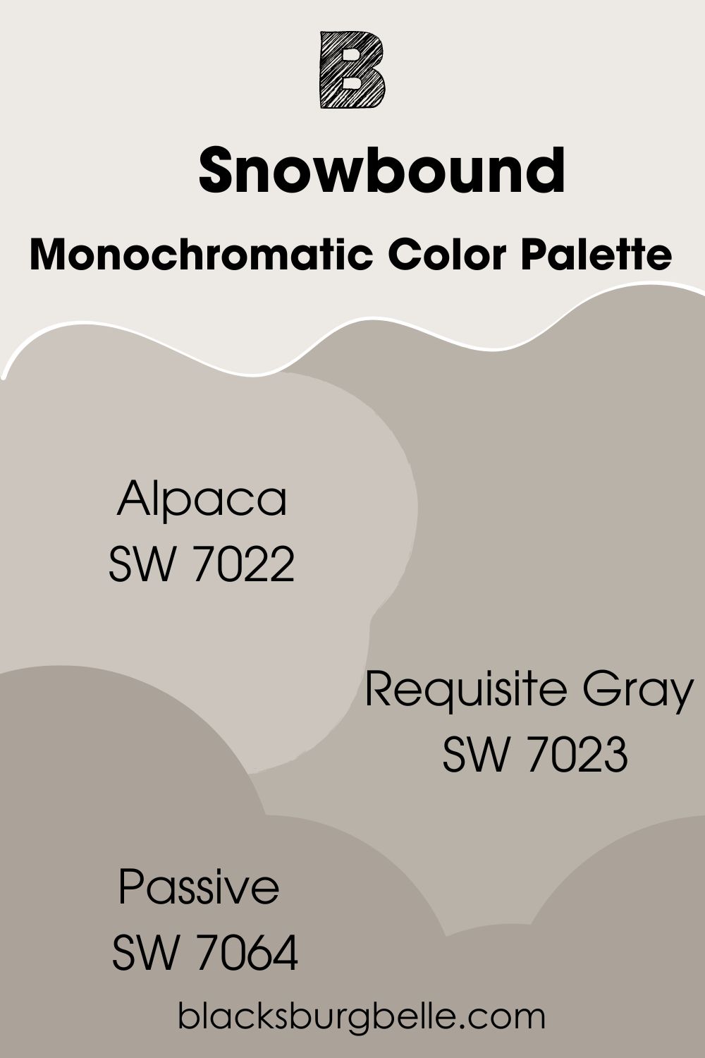
Monochromatic Color Palette
- Alpaca SW 7022: A warm light gray that fits the bright Snowbound if you want a monochromatic look in your home
- Requisite Gray SW 7023: A slightly darker shade of the previous color and fits well with Snowbound, especially when used as a wall color and Snowbound as a trim color
- Functional Gray SW 7024: With slightly taupe undertones, this paint color complements the slightly cool Snowbound
Sherwin Williams Snowbound vs Similar Colors
Are there other white colors that are similar to Snowbound and can replace it? I carefully picked some colors so you can compare them to Snowbound and decide for yourself.
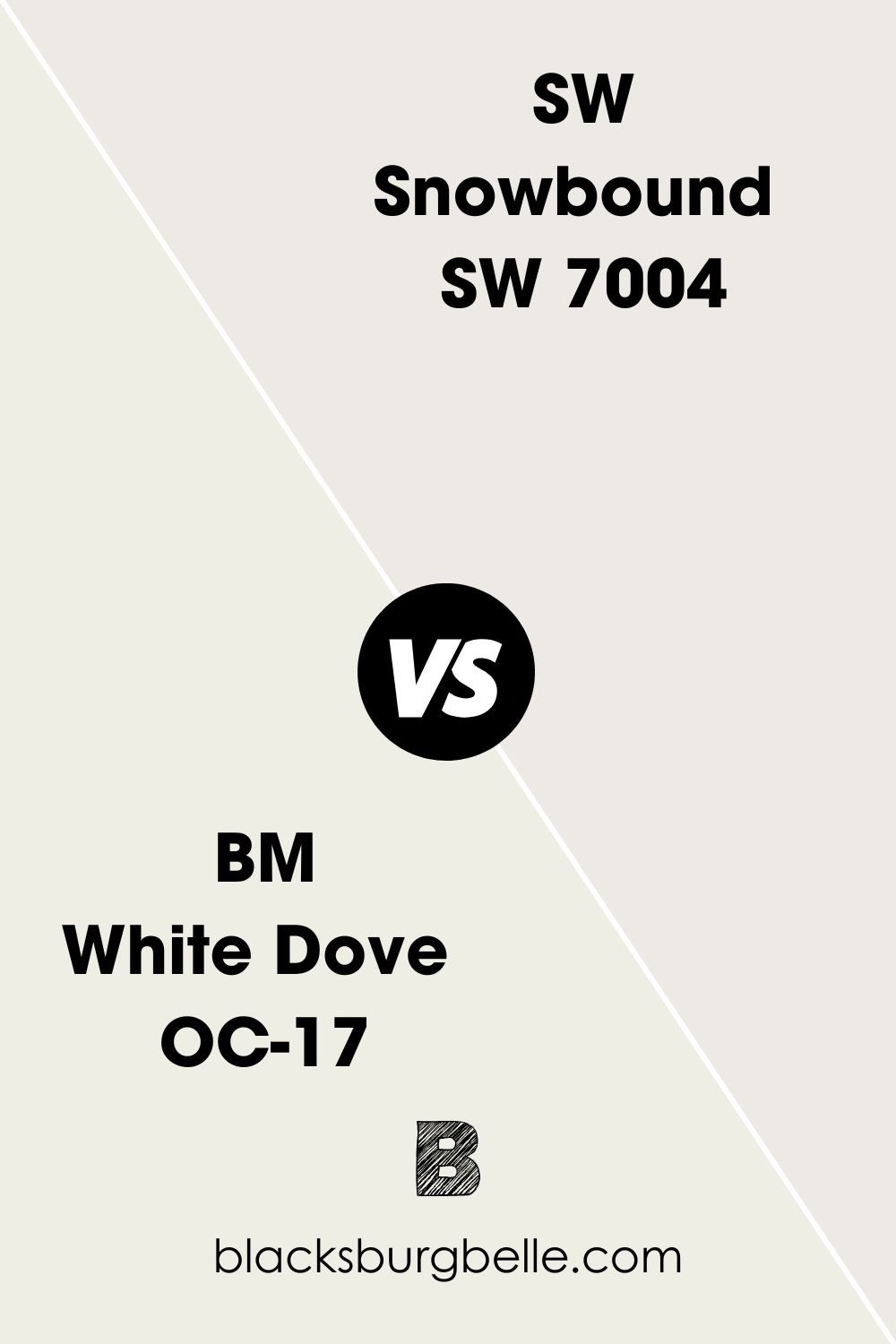
SW Snowbound vs BM White Dove
Benjamin Moore’s White Dove has different undertones of greige, which make it warm. So, it may be in direct contrast to Snowbound in some settings.
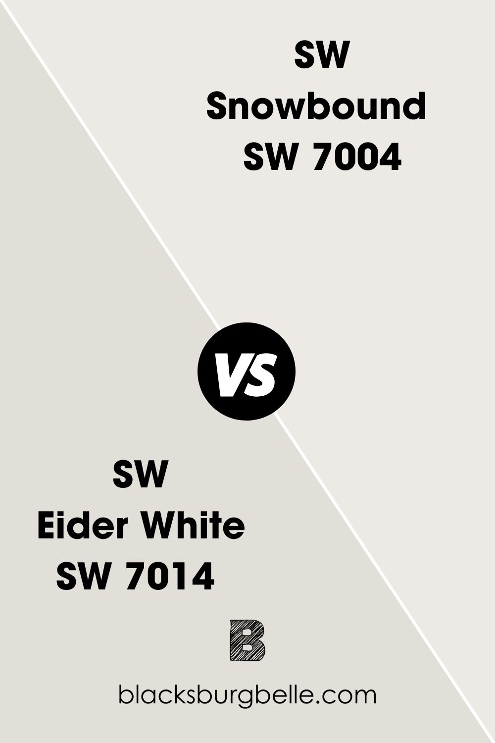
SW Eider White vs SW Snowbound
Eider White and Snowbound are from the same color collection, but Snowbound is brighter with an LRV of 83. Eider White has an LRV of 73.
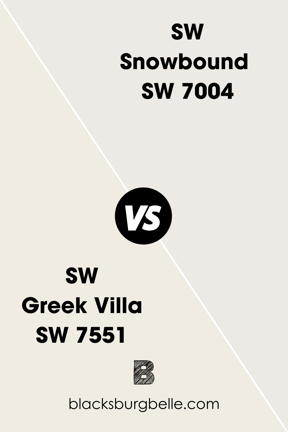
SW Greek Villa vs SW Snowbound
Greek Villa shows slightly yellow undertones and has a higher LRV of 84 than Snowbound’s 83.
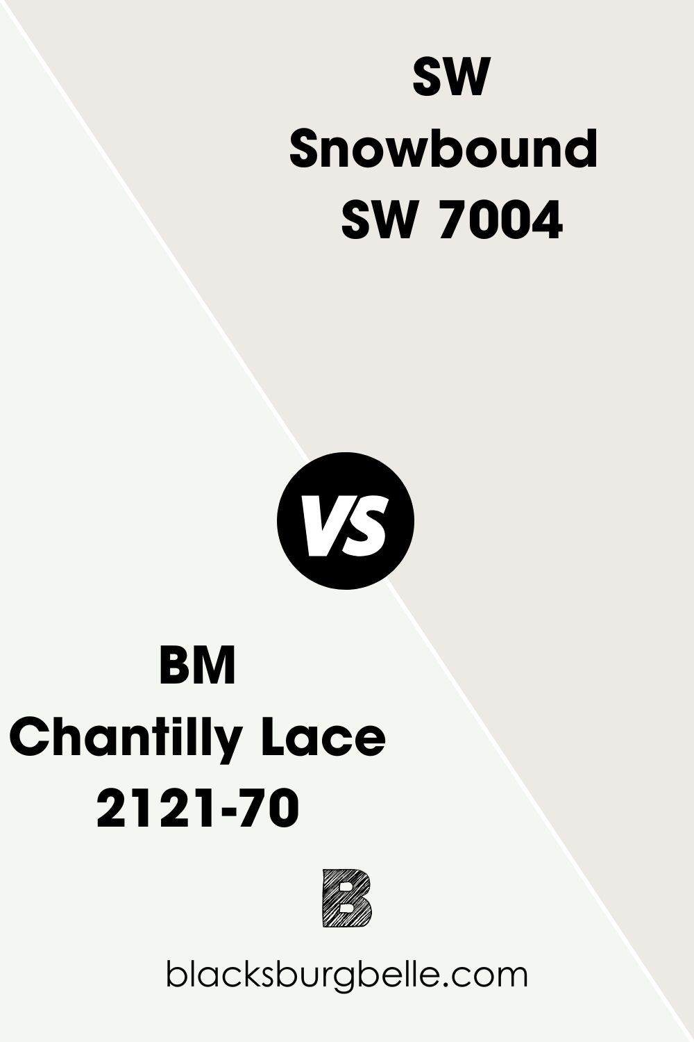
SW Snowbound vs BM Chantilly Lace
Snowbound looks a little like light gray with faint purple undertones when placed side by side with the whiter Chantilly Lace with a slight green undertone. Besides, Chantilly Lace has a much higher LRV of 90.4.
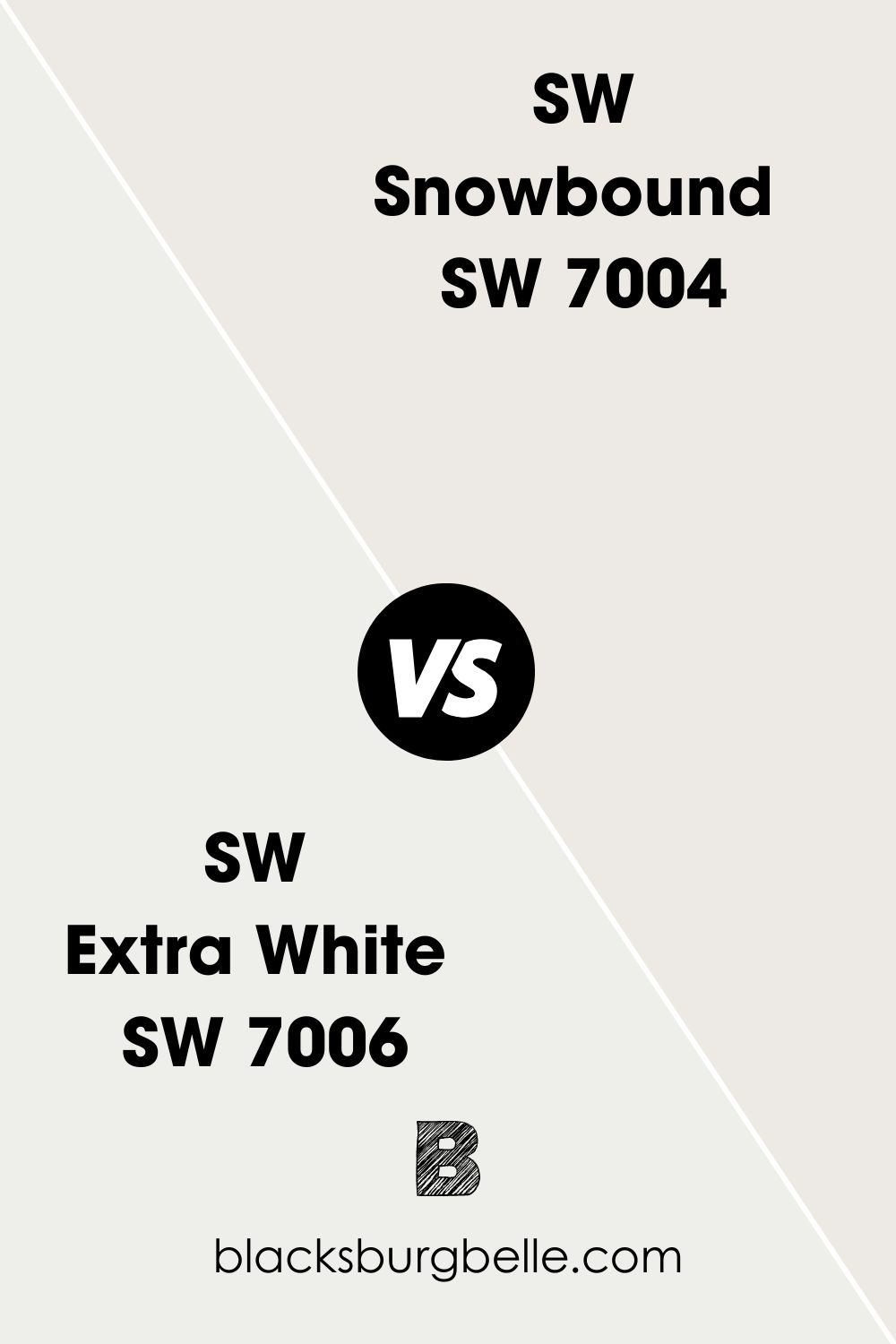
SW Extra White vs SW Snowbound
Extra White is a brighter white than Snowbound. It also looks a little blue when paired with Snowbound, which makes the undertones of Snowbound more pronounced.
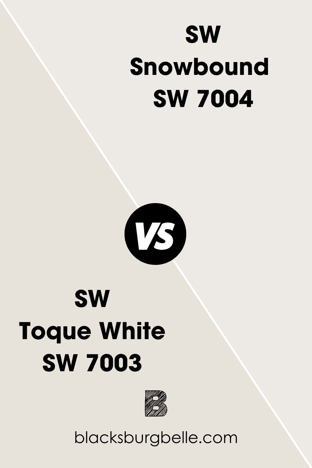
SW Toque White vs SW Snowbound
Picked from the same collection, Toque White is more muted than Snowbound. It also has a lower LRV of 74, while Snowbound has an LRV of 83.
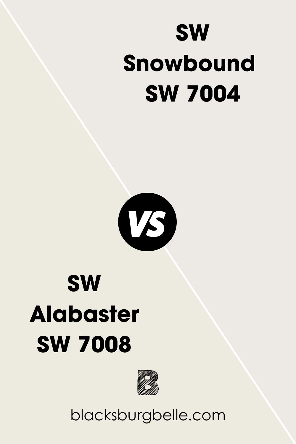
SW Alabaster vs SW Snowbound
Alabaster has slightly yellow undertones and looks warm compared to the slightly cool Snowbound with taupe undertones.
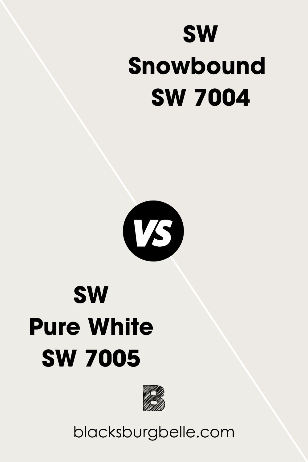
SW Pure White vs SW Snowbound
Pure White is warmer and a bit brighter than Snowbound, with slightly warm gray undertones that sometimes read beige.
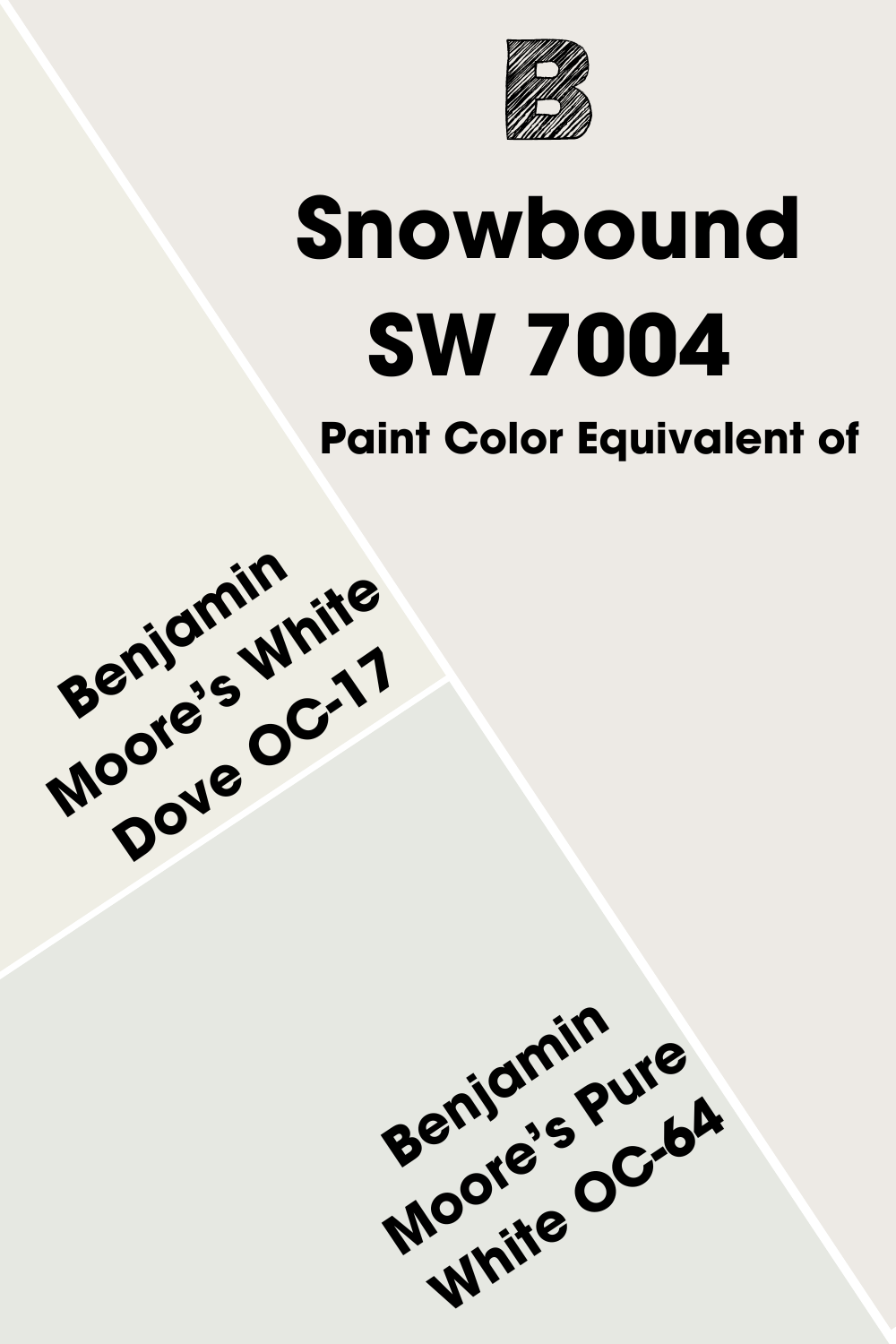
Benjamin Moore Paint Color Equivalent of SW Snowbound
Is there a Benjamin Moore paint color that is the same as SW Snowbound or close to it? I want to point out that you won’t find two paint colors that are the same. So, it would be a deception to try to find a Benjamin Moore color that perfectly matches Snowbound.
However, some come close to the bright white, and Benjamin Moore’s White Dove OC-17 tops the list. Another option is Pure White OC-64 with its gray tones that give it a crisp appearance.
Where Can You Use Sherwin Williams Snowbound?
This white paint color is great for use anywhere in your house, whether as a central color, complementary color, trim color, ceiling color, or accent color. Want to see its effect in real pictures? Come along with me.
What Trim Color Goes with SW Snowbound Walls?
Since it’s a bright white, it is best to keep the walls and trim the same color. In other words, use Snowbound for the walls and trim. But if you are unsure, you can try a crisp white like Extra White on the trim.
What Ceiling Color Works with SW Snowbound Walls?
As with the trim color, the best ceiling color for walls painted with SW Snowbound is Snowbound. It is enough to work as an entire room color unless you want something dramatic on the ceiling. In that case, try black or blue.
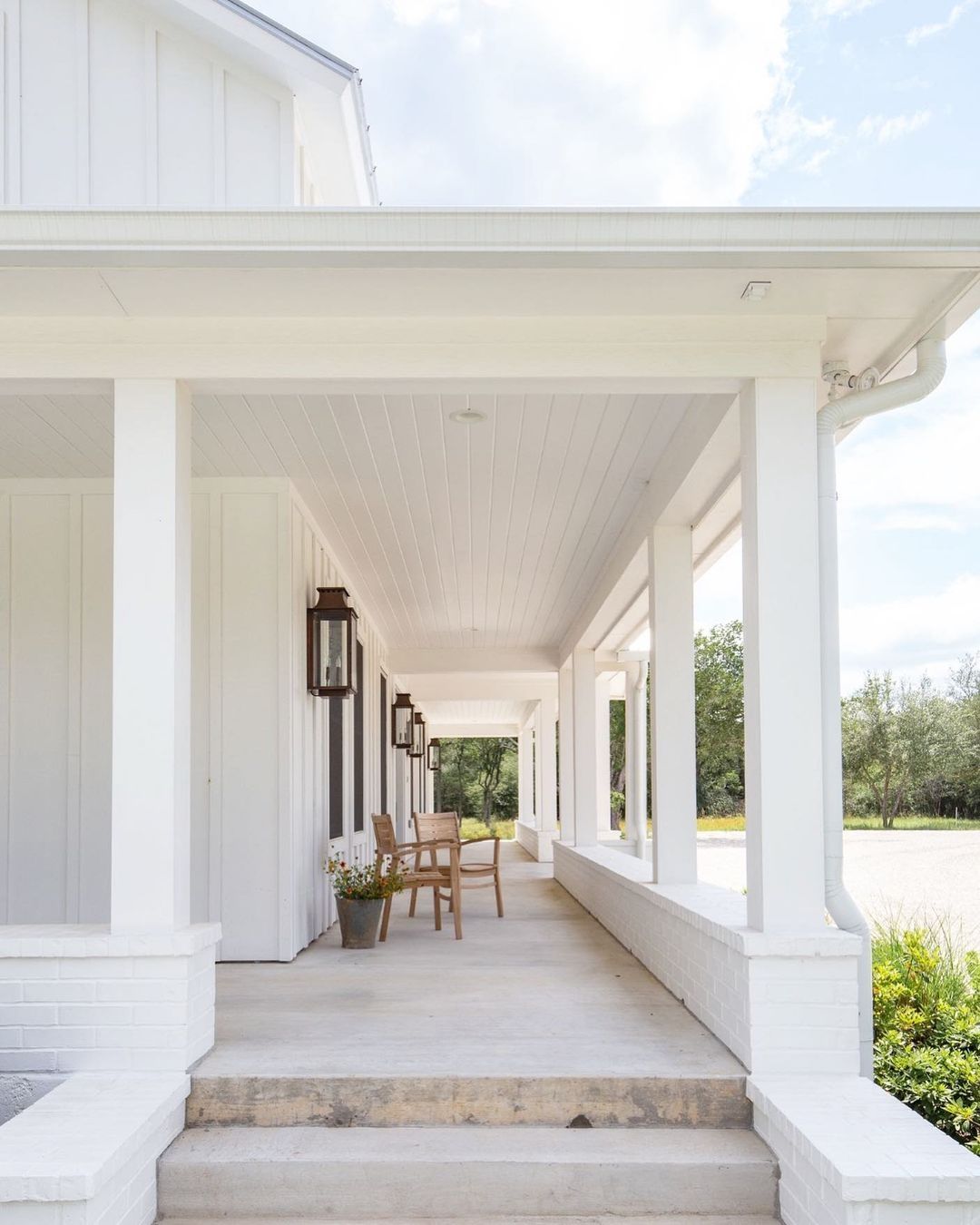
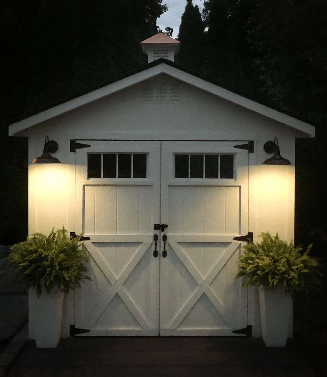
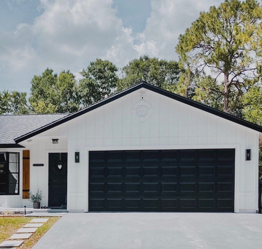
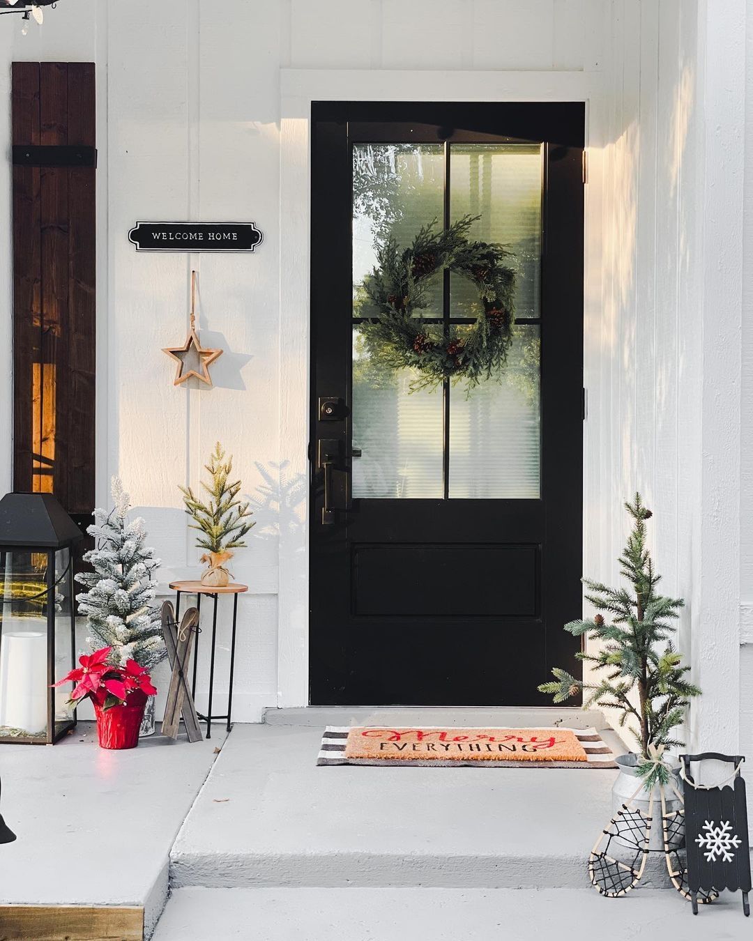
What Trim Color Goes with SW Snowbound Exterior?
White trim looks good on the exterior of a house, even if you use Snowbound on the walls. So, consider Snowbound trim for Snowbound walls. But for a striking balance, you can use wood for the trim or paint it a dark color. This next picture uses Tricorn Black for the garage door and trim.
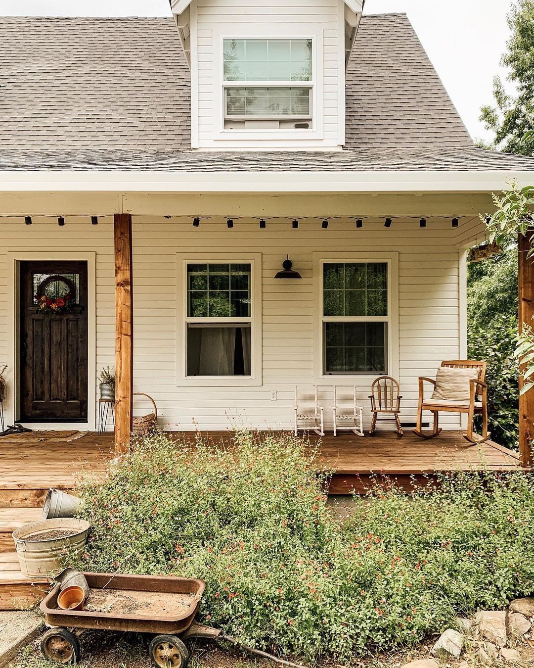
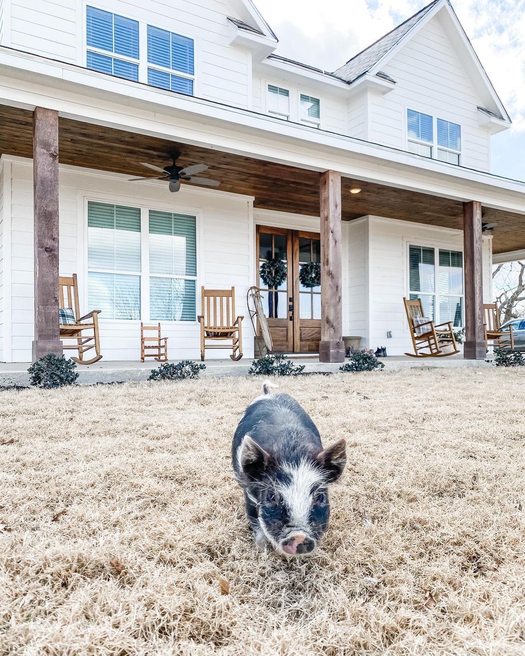
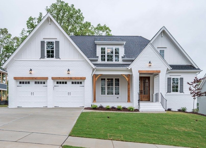
Sherwin Williams Snowbound on Exterior Walls
I’d like you to see how Snowbound looks with wood trims. It may be something you want to do with your house.
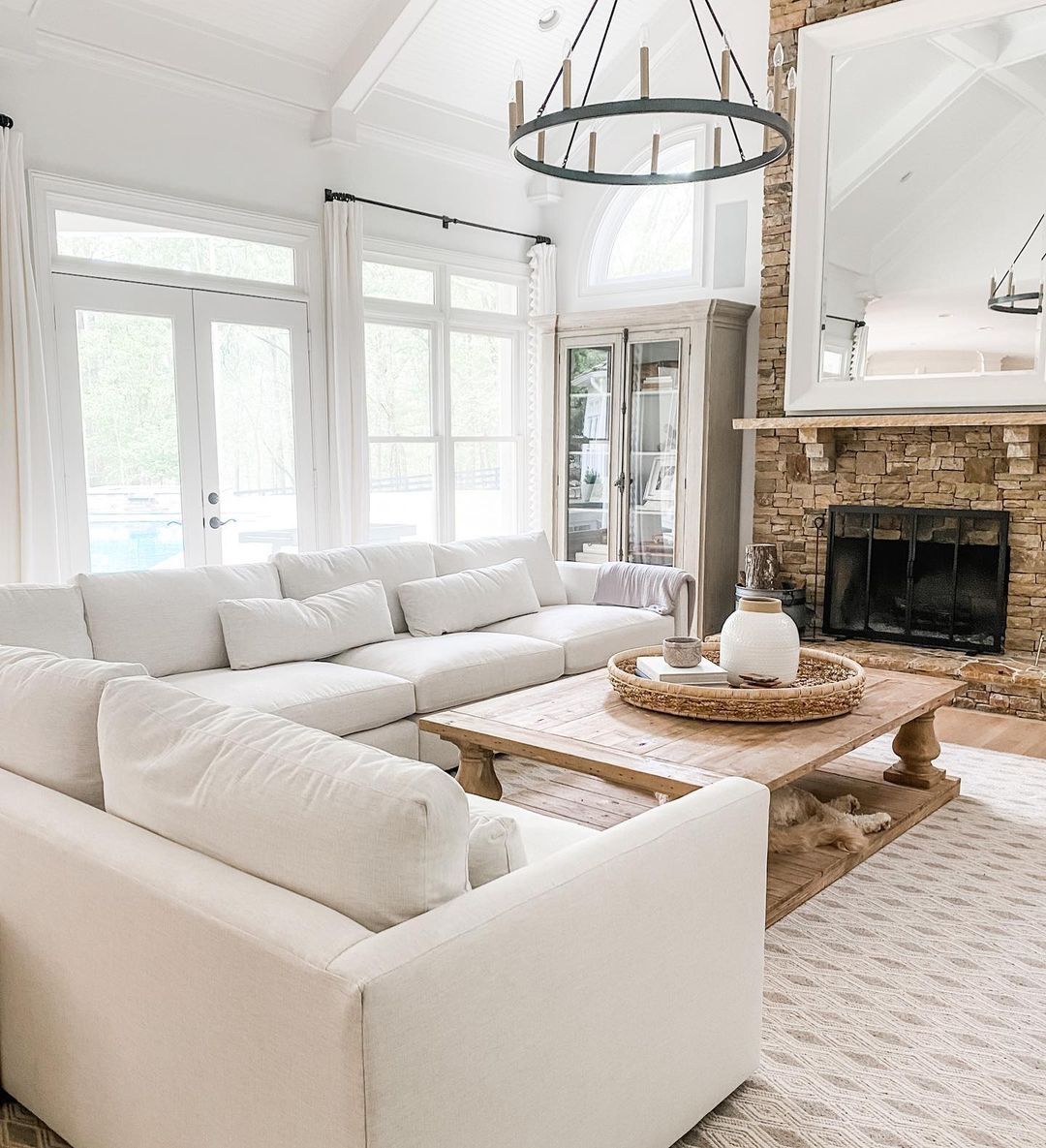
Sherwin Williams Snowbound in Living Rooms
This paint color is perfect for living rooms, and you can use it on the trim and ceiling as well as the walls. Try vibrant colors or soft pastels around the room using accessories.
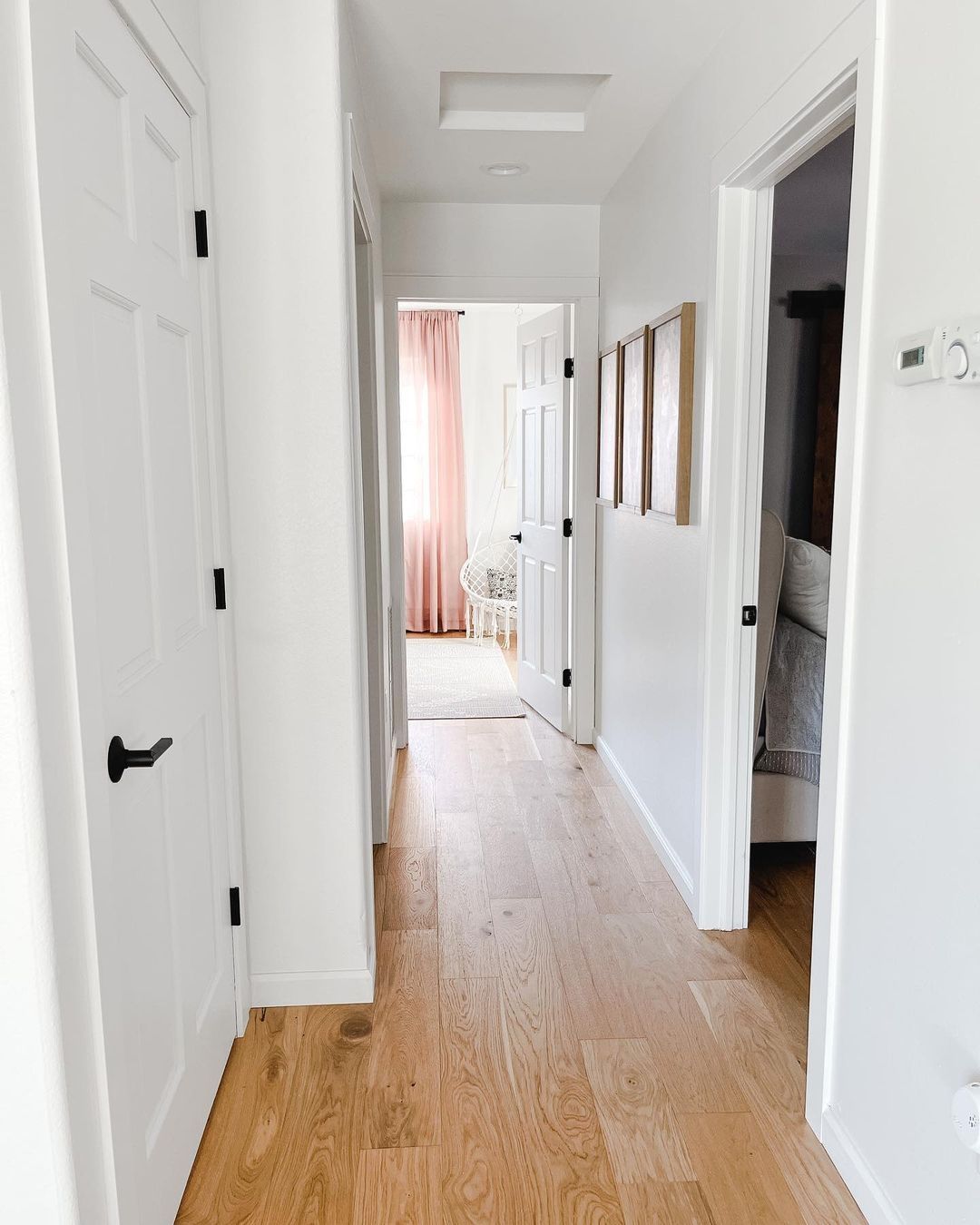
Sherwin Williams Snowbound on Doors
If you want classic white decor, use Snowbound for the entire room, including the doors. The next picture shows a hallway painted in Snowbound.
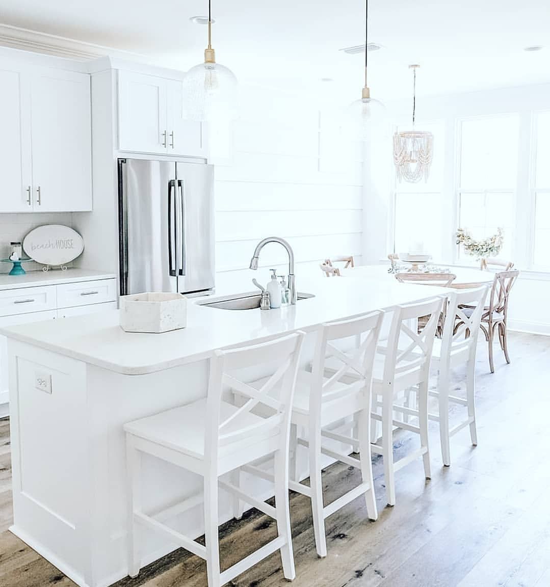
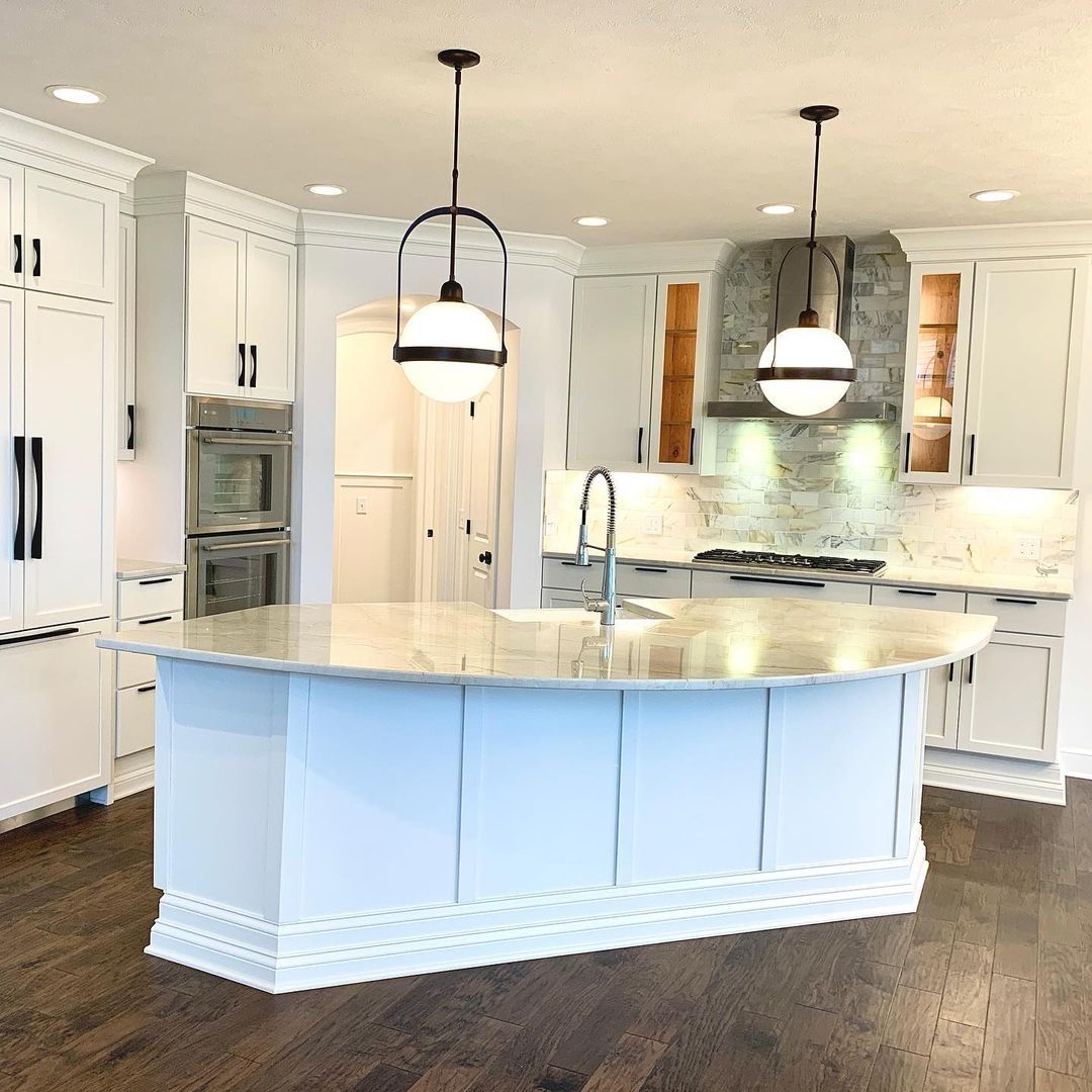
Sherwin Williams Snowbound on Kitchen Walls
Cabinets are not the only place to enjoy some Snowbound love. Try this paint color on the kitchen walls if you are a fan of the classic white look.
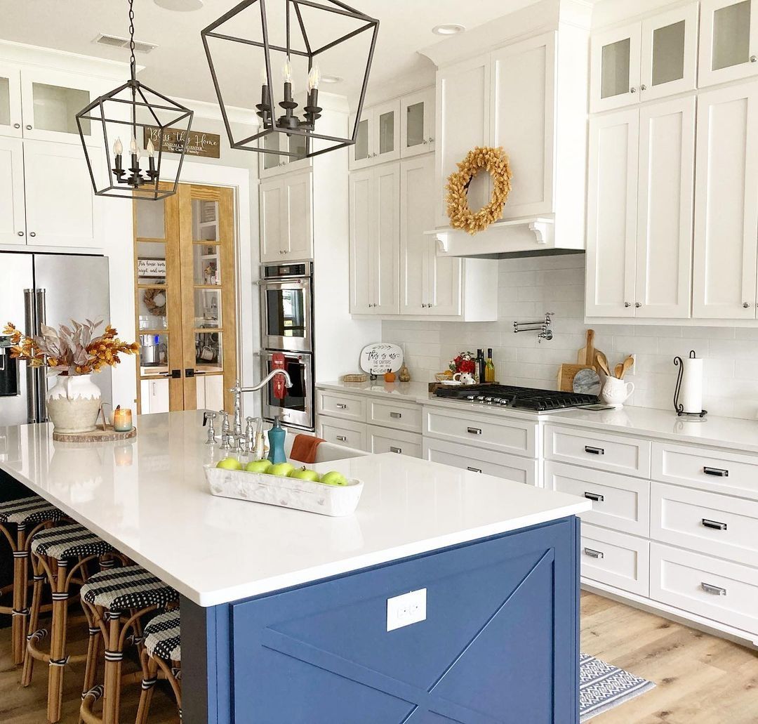
Sherwin Williams Snowbound on Kitchen Cabinets
This kitchen looks amazing with the navy blue island and white cabinets. Then, the pops of color all over the place complete the look. The island is Naval, while the cabinets are Snowbound.
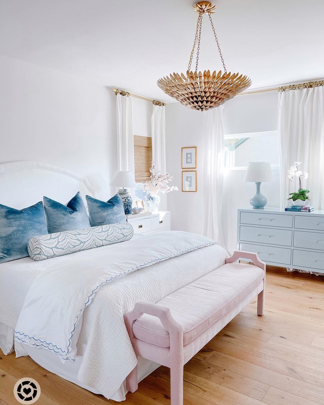
Sherwin Williams Snowbound in Bedrooms
A beautiful bedroom starts with the right paint color. Snowbound is a great option if you want to use other colors in your bedroom. See what it looks like in the next picture.
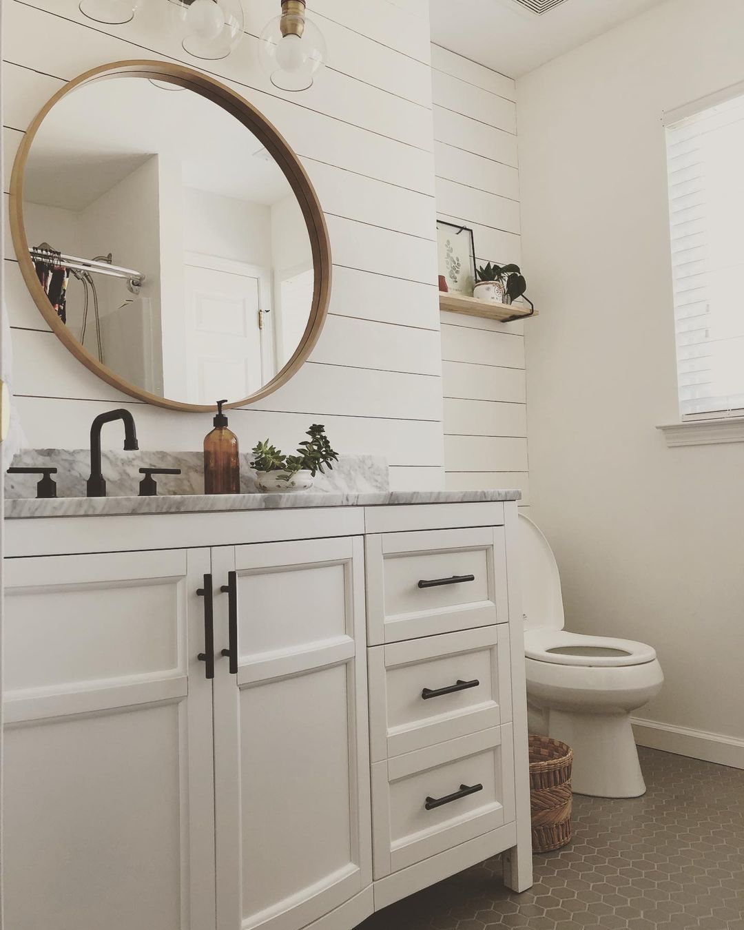
Sherwin Williams Snowbound in Bathrooms
White will always be a favorite color for bathrooms, and there’s no use pretending. And you might as well choose Snowbound because it doesn’t disappoint.
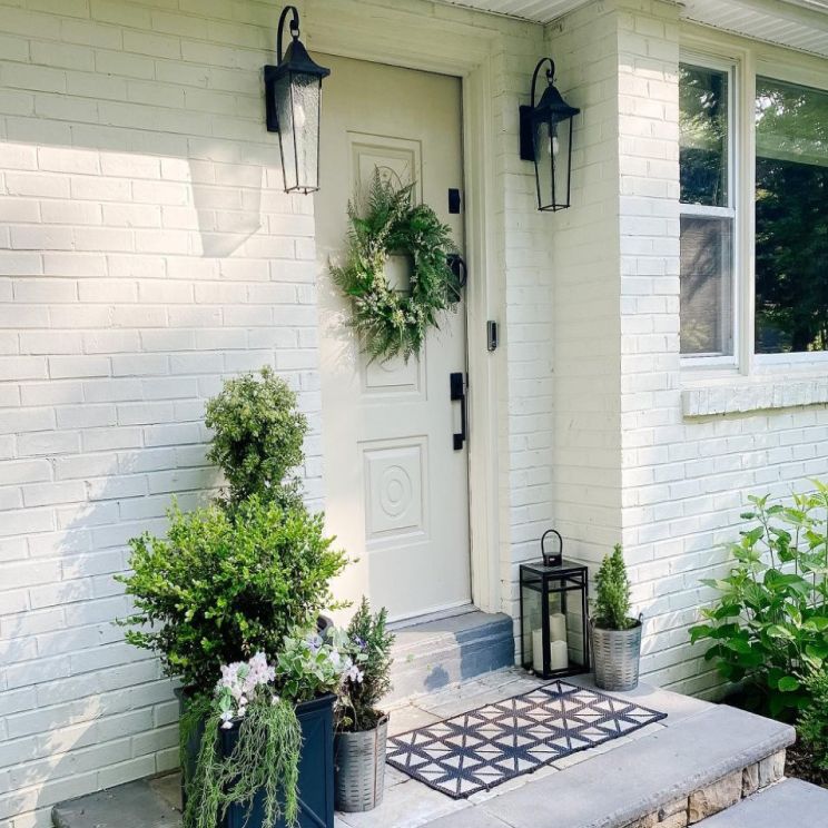
Sherwin Williams Snowbound on Exterior Brick
Not every paint color looks great on brick or beside it. But Snowbound performs well on and beside brick, whether inside or outside the house.
Sherwin Williams Snowbound with Various Colors
Because of its peculiar shade, Snowbound tends to pick up hues from vibrant colors around it. However, in this next picture, it holds up well with the red, green, and black around it. It even remains bright in the shadows of the sun.
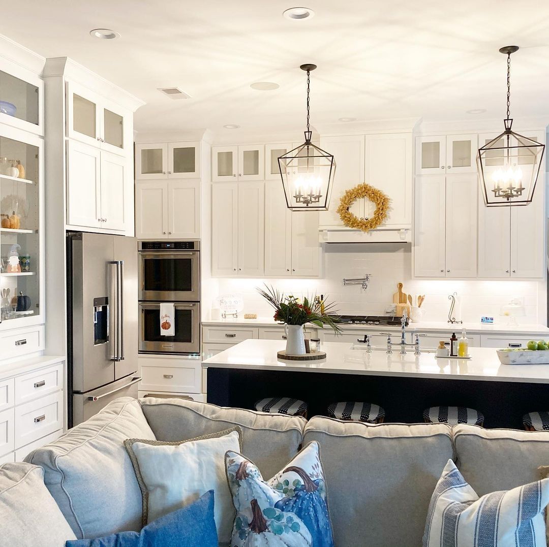
Sherwin Williams Snowbound Under Artificial Lighting
I’ve talked about how Snowbound performs in natural lighting. But does it show other hues in artificial lighting? This kitchen has bright artificial lighting, and Snowbound appears creamy and a little gray. This will depend on the room and the elements in it.
Conclusion
There you have it: everything you need to know about Sherwin Williams Snowbound SW 7004. It is a white paint color with cool undertones that may also read warm sometimes, depending on the lighting and the colors paired with it.
Snowbound has gray undertones but can also show a hint of pink and purple – that is taupe undertones. It has many colors that go with it, especially with its high LRV of 83, but only one complementary color. This guide provides all the information you need about creating different color palettes and coordinating other colors with the primary hue.
However, I’m available if you need further assistance. And I would love to go on this painting journey with you. So, feel free to reach me in the comments section. I’m rooting for you and hope you have a splendid time making your house a home.
 Sherwin Williams Iron Ore (Palette, Coordinating & Inspirations)
 Sherwin Williams Tradewind (Palette, Coordinating & Inspirations)
 Sherwin Williams Caviar (Palette, Coordinating & Inspirations)
 Sherwin Williams Acacia Haze (Palette, Coordinating & Inspirations)
 Sherwin Williams On The Rocks (Palette, Coordinating & Inspirations)
 Sherwin Williams Essential Gray SW 6002: Paint Color Review
