
Do you want a warm neutral with some extra depth for your space? Or you’re simply like me, getting drawn to deep, warm grays out of curiosity? Either way, I’ve got the right paint color for you. This time, we’ll examine Sherwin Williams Pavestone.
Pavestone belongs to several color collections, which shows its versatility and use. These collections include Timeless Colors, Color ID (Dreamer), Finest Whites & Neutrals (Cool Neutrals). This paint color has much to offer in interior and exterior spaces.
I have checked out this paint color and put together a comprehensive review. Keep reading to discover Pavestone’s undertones, LRVs, color pairings, and more.
Let’s get started!
Table of Contents
When to Choose Sherwin Williams Pavestone (SW 7642)
Knowing when to make a choice concerning paint colors can prove a bit challenging. The reason is that you’ve got several options to pick from, regardless of color type. So, when do you choose Sherwin Williams Pavestone?
The following tips will help you decide.
Want a gray with depth?
Pavestone has an LRV of 32, which gives it strong depths while preventing it from looking too dark. You can still enjoy the paint color’s warm tones because it isn’t too dark or deep for spaces.
Do you mind some green?
Sherwin Williams Pavestone has soft green undertones that won’t hesitate to show up. As such, you should only use the paint color if you feel comfortable having some green appear.
Aiming for a cozy feel?
With warm tones, Pavestone brings cozy vibes to any space. Its low LRV helps to maintain this appearance, as the paint color has enough depth to prevent washing out in bright light.
Working with abundant lighting?
Well-lit areas bring out the best in Sherwin Williams Pavestone. In such spaces, the paint color shows its tones freely and effortlessly exudes its vibes.
Using it in dark spaces can give a gloomy vibe.
Working on a bedroom?
Homeowners have reported Sherwin Williams Pavestone’s performance in several spaces. The paint color gives the best results in areas where you want to unwind and relax.
I couldn’t agree more!
What Color is Sherwin Williams Pavestone?
Sherwin Williams Pavestone is a medium shade of gray that borders on greige because of its depth and warmth. The paint color takes a stony appearance in most spaces, making it look natural on walls and cabinets alike.
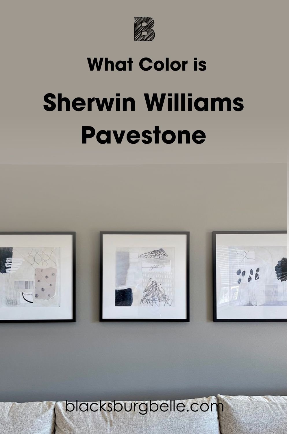
Pavestone has a cozy, welcoming presence that makes it popular in homes. It gives amazing results in areas like living rooms and bedrooms. The best part is that you don’t have to use it on all the walls. Pavestone works well on accent walls, cabinets, shutters, etc.
The neutral looks good with earthy palettes and nature-inspired decor. Want a gray that gives a relaxing embrace in your space, Pavestone might be the one for you.
Snapshot of Pavestone’s Specifications
Paint colors have core attributes that say a lot about them. These specifications govern how they look and if they are viable for any space.
| Specifications | Pavestone |
| RGB | 160 / 153 / 143 |
| HEX Value | #A0998F |
| LRV | 32 |
| Undertones | Mild green |
The LRV of Sherwin Williams Pavestone
Light plays the most important role in how any paint color looks. This makes it vital to understand how your color interacts with it. This is where LRVs come in.
LRV refers to Light Reflectance Value, which tells how well a paint color reflects light. This attribute runs on a scale of 0 – 100, with 0 representing true black and 100 representing true white. In summary, the lower the value, the darker the color.
Note that every other paint color falls within the range of 3 – 97 because no paint color is truly white or black.
Sherwin Williams Pavestone has an LRV of 32. This value puts the paint color in the medium range on the LRV scale. It means that Pavestone reflects a bit less light as it absorbs.
Undertones of Pavestone (SW 7642)
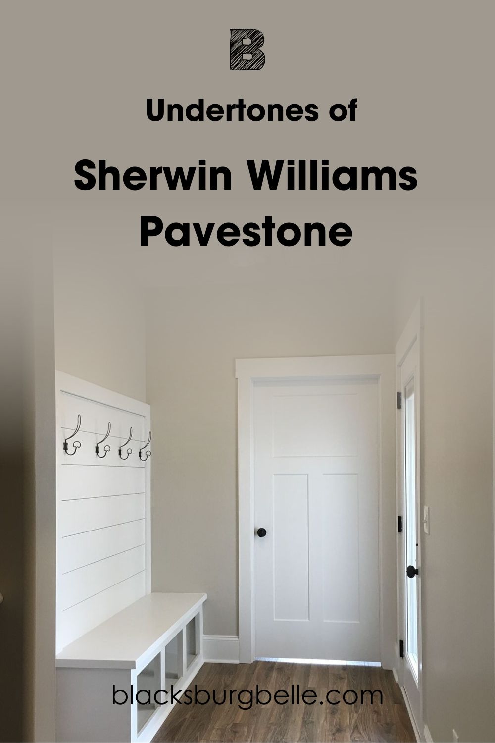
Sherwin Williams Pavestone has soft green undertones. Normally, one would expect this to give the stony gray a cool look. But that’s not the case. The paint color looks cozy in any space, even when its undertones appear.
Green tones fall into two categories: cool green and warm green. Cool green shades sit close to blue on the color wheel, while warm green shades sit close to yellow. Pavestones’s green undertones fall on the warm side of the wheel, thanks to the tiny bit of yellow in them.
Will SW Pavestone Look Green on Walls?
No, Sherwin Williams Pavestone will not look green on walls. Although the paint color has soft green undertones, they’re not intense enough to overwhelm its stone-gray shade.
Is SW Pavestone Greige?
Sherwin Williams Pavestone looks close to greige but isn’t one. Pavestone is a warm stone gray with good depth.
However, the paint color can appear a bit greige, depending on lighting or color pairings.
Will SW Pavestone Wash Out in Bright Light?
No, it will not wash out in bright light. The reason is that Sherwin Williams Pavestone has an LRV of 32. This gives it enough depth to maintain its tones and look in bright light.
Is Pavestone a Warm or Cool Color?
Sherwin Williams Pavestone reads warm in any space. Apart from its naturally warm tones, Pavestone has warm green undertones. This helps it maintain a cozy, embracing vibe in any space, whether you use it on walls or furniture.
North-facing rooms generally receive cool natural light, making Pavestone look less warm than usual. These spaces bring out more of the paint color’s gray tones. Note that Pavestone will never look cold or icy, even in cool lighting.
South-facing rooms, on the other hand, receive warmer light. Using Pavestone in these spaces strengthens its green tones, making it look warmer than usual. However, its gray will remain obvious.
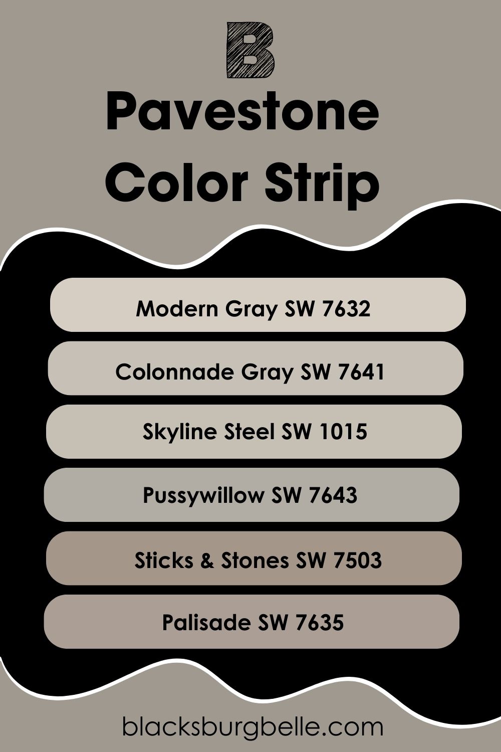
Sherwin Williams Pavestone Color Strip: Lighter or Darker Exploration
A color strip consists of up to seven paint colors with different shades and LRVs but with similar tones. These colors form a family that can also pair together for a nice monochromatic look or palette.
Pavestone is the fifth member on its strip, with the third lowest LRV. The following are other members of the color strip, from the brightest to the darkest.
- Sherwin Williams Modern Gray (SW 7632)
- Sherwin Williams Colonnade Gray (SW 7641)
- Sherwin Williams Skyline Steel (SW 1015)
- Sherwin Williams Pussywillow (SW 7643)
- Sherwin Williams Sticks & Stones (SW 7503)
- Sherwin Williams Palisade (SW 7635).
Modern Gray and Colonnade Gray are arguably the most popular members of this color strip.
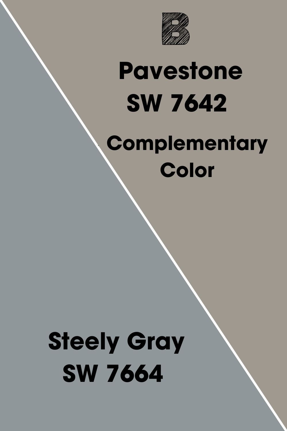
Pavestone’s Complementary Color
Complementary colors are the direct opposite of your paint color on the color wheel. But why are they significant?
Your color’s complement is quite important as that’s the hue that cancels out your color. Interestingly, it gives the best contrast when you pair them together in the same space.
Finding your color’s complement is quite easy. All you have to do is look at the hue opposite your paint color on the color wheel.
SW Pavestone’s complementary color is Sherwin Williams Steely Gray.
Sherwin Williams Steely Gray (SW 7664)
Steely Gray is a cool medium to dark gray with an LRV of 30 and deep, welcoming vibes. The paint color has cyan/blue undertones that make it read cool in any space. With good depth and soft gray tones, the neutral works best in bedrooms.
Sherwin Williams Steely Gray performs better in well-lit areas. This is because the paint color absorbs more light than it reflects. You can also pair it with Pavestone in relevant palettes and spaces.
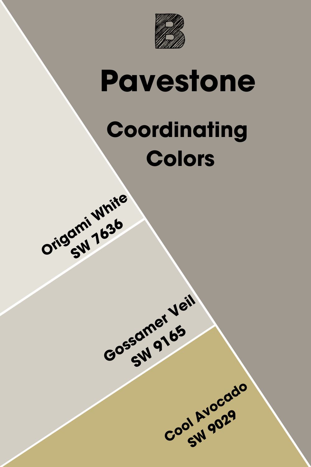
Sherwin Williams Pavestone (SW 7642) Coordinating Colors
Regardless of how well a paint color looks, it needs other colors to look better in any space. These coordinating colors pair nicely with your main color to give a better overall effect and vibe.
Coordinating colors fall into five different color schemes. You can always adapt any of the schemes depending on your taste or preferences.
- Analogous Color Coordination: These colors work together for a soft, gradient effect. They sit adjacent to each other on the color wheel.
- Triadic Color Coordination: Triadic colors form triangles when you link their positions on the color wheel. They give the most vibrant, lively, and energetic vibe of all the schemes.
- Complementary Color Coordination: These colors sit opposite each other on the color wheel. Since they contrast well with each other, Complementary Color Coordination gives the best contrasts.
- Split Complementary Color Coordination: You create this pairing by picking one complementary color and two analogous colors. The result is a richer and more flexible look.
- Monochromatic Color Coordination: Go for this scheme if you want the cleanest and classiest look. Monochromatic color schemes consist of colors with similar tones but different shades and tints.
Here are some of the best coordinating colors for Sherwin Williams Pavestone:
- Sherwin Williams Origami White (SW 7636): Origami White is a clean, crisp white with an LRV of 76. The paint color has mild violet/blue undertones that help it read cool in any space. However, Origami White will show little undertones in bright light.
- Sherwin Williams Gossamer Veil (SW 9165): Gossamer Veil brings a relaxing vibe to any space or room. The mist-gray has an LRV of 62 and reads cool in any space. Most experts recommend the paint color for bedrooms and family rooms.
- Sherwin Williams Cool Avocado (SW 9029): This paint color looks warm and natural in almost any space. Cool Avocado is a mid-toned yellow with strong green undertones. It looks quite different from your average yellow or green paint color.
Sherwin Williams Pavestone Color Palette
Pavestone has enough versatility to work well with several palettes out there. Its depth makes it viable on walls and cabinets too.
The following palettes feature Sherwin Williams Pavestone:
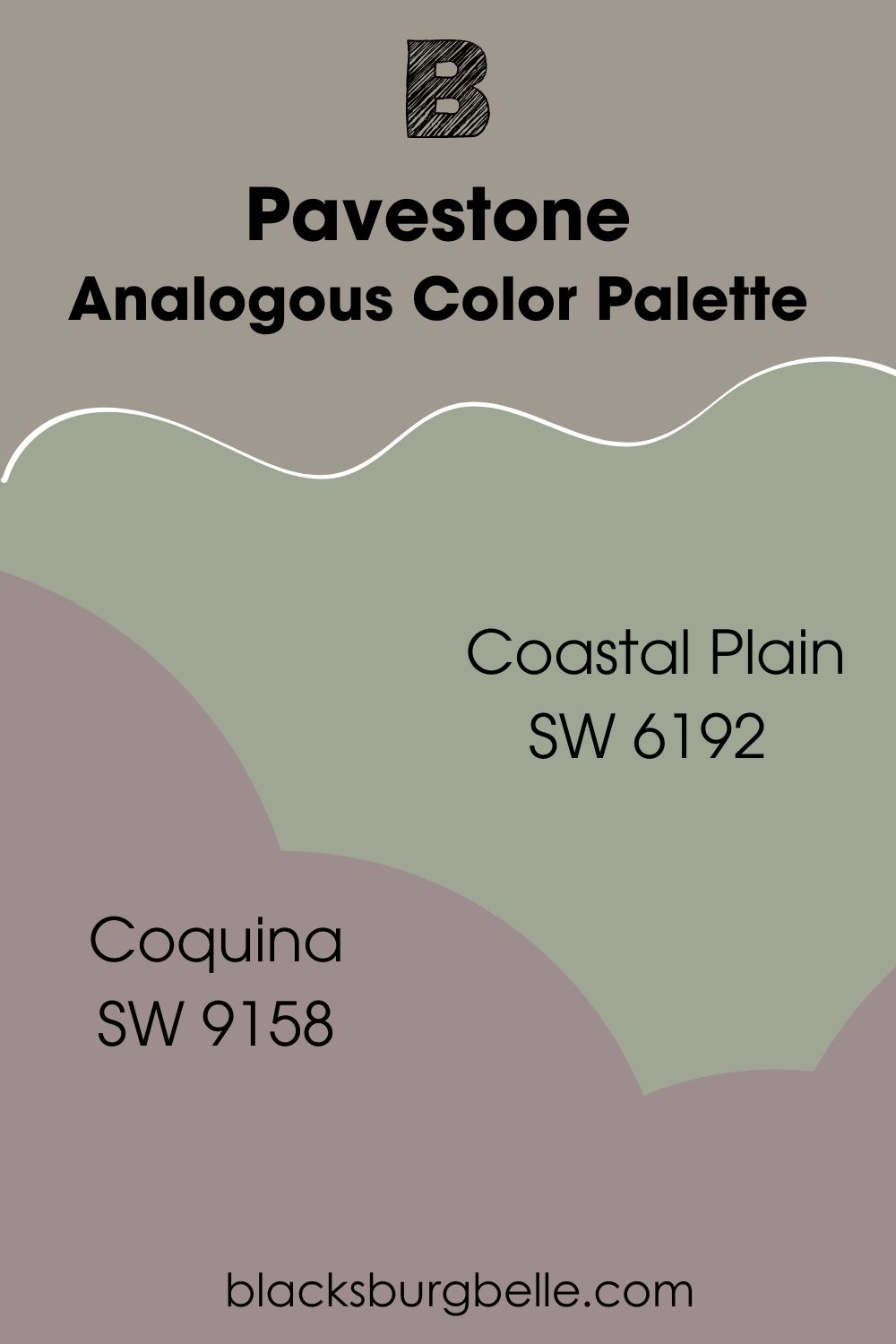
Analogous Color Palette
- Sherwin Williams Coastal Plain (SW 6192): Coastal Plain brings a sense of relaxation and elegance to any space. The cool green paint color looks amazing in interior and exterior spaces. It has an LRV of 37 and adds a soft touch to this palette.
- Sherwin Williams Coquina (SW 9158): Coquina is a deep shade of purple with vibrant red undertones. It has an LRV of 28 and even more depth than Pavestone. Together, they give a sense of coziness that balances with Coastal Plain’s cool tones.
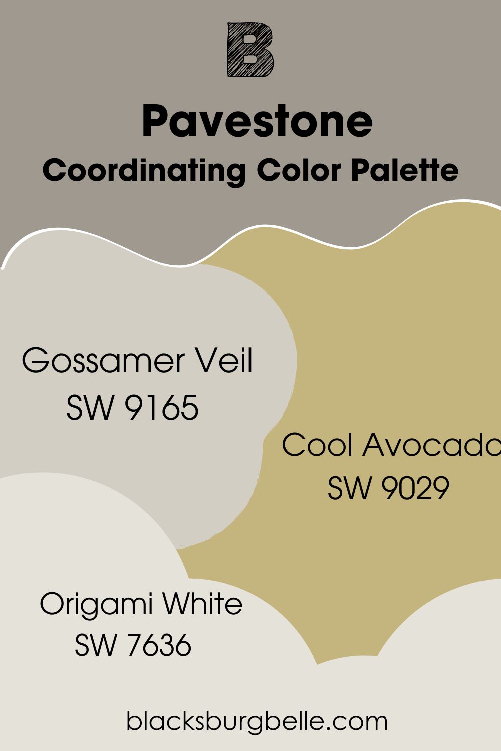
Coordinating Color Palette
- Sherwin Williams Gossamer Veil (SW 9165): This cool gray adds a homely vibe to the palette. Gossamer Veil has an LRV of 62. It works better on the walls for this palette than on furniture or cabinets.
- Sherwin Williams Cool Avocado (SW 9029): Cool Avocado brings some extra color to this palette. The warm blend of yellow and green balances attention-seeking yellow tones with the relaxing touch of green.
- Sherwin Williams Origami White (SW 7636): Origami White is the brightest member of this palette with an LRV of 76. It is the second cool color here and works well as a trim for a crisp finish.
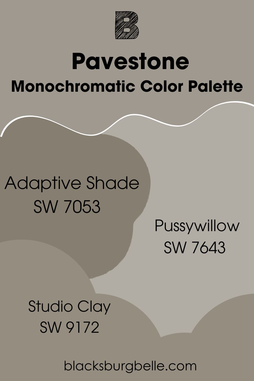
Monochromatic Color Palette
- Sherwin Williams Adaptive Shade (SW 7053): Adaptive Shade has similar tones to Pavestone but a much stronger depth. It has an LRV of 21 and warm, cozy tones. You can use Adaptive Shade on cabinets or furniture.
- Sherwin Williams Pussywillow (SW 7643): Pussywillow looks similar to Pavestone but has less strong gray tones and a higher LRV of 42. Its mild warm green undertones give it an inviting touch.
- Sherwin Williams Studio Clay (SW 9172): Studio Clay is a deep taupe shade with a warm cozy feel. It has an LRV of 27 and belongs to the same color strip as Adaptive Shade. Studio Clay works well on walls and cabinets too.
Sherwin Williams Pavestone vs. Similar Paint Colors
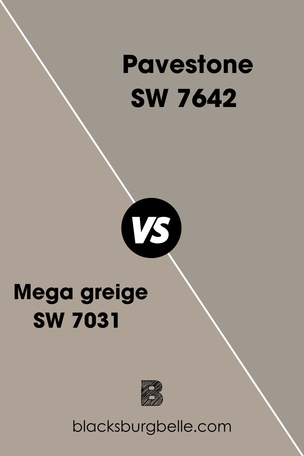
Mega greige vs. Pavestone
As its name implies, Sherwin Williams Mega Greige is a medium to dark greige paint color. It has stronger cozy tones than Pavestone and a higher LRV of 37. Mega Greige looks good in both interior and exterior spaces.
The paint color has gray and beige tones, giving it a higher versatility than Pavestone. While both paint colors have green in them, you can barely notice it in Mega Greige.
Studio Clay vs. Pavestone
Sherwin Williams Studio Clay is a dark taupe paint color, while Pavestone is gray. Also, Studio Clay has a lower LRV of 27 and more depth. Both paint colors have similar undertones of warm green.
If you want a significantly deeper tone, go for Sherwin Williams Studio Clay.
Felted Wool vs. Pavestone
Sherwin Williams Felted Wool is a dark greige paint color with some green undertones. The paint color blends gray and beige to give any space a much warmer and cozier vibe. Although most homeowners opt for Mega Greige, which has a more balanced shade, Felted Wool has its moments.
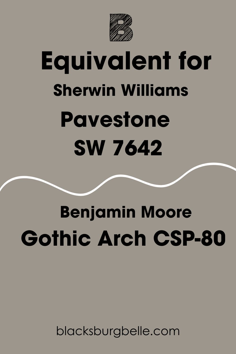
Sherwin Williams Pavestone Benjamin Moore Equivalent
Benjamin Moore does not have any paint color called Pavestone. However, the brand has a color that looks quite similar. Don’t worry, I’ve checked it out for you.
Sherwin Williams Pavestone Benjamin Moore equivalent is BM Gothic Arch.
Benjamin Moore Gothic Arch CSP-80 is a medium to dark gray with an LRV of 31.08. Just like Pavestone, the paint color has a stony look that feels natural on walls. However, Benjamin Moore Gothic Arch has stronger gray tones and less tendency to manifest undertones.
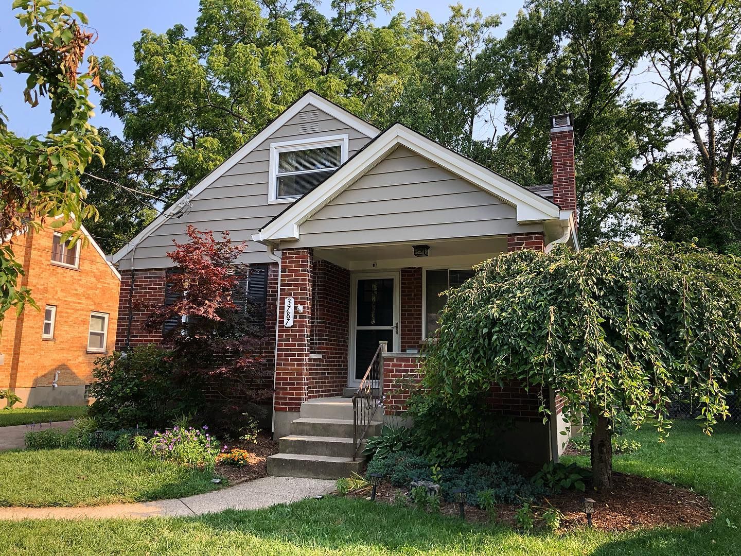
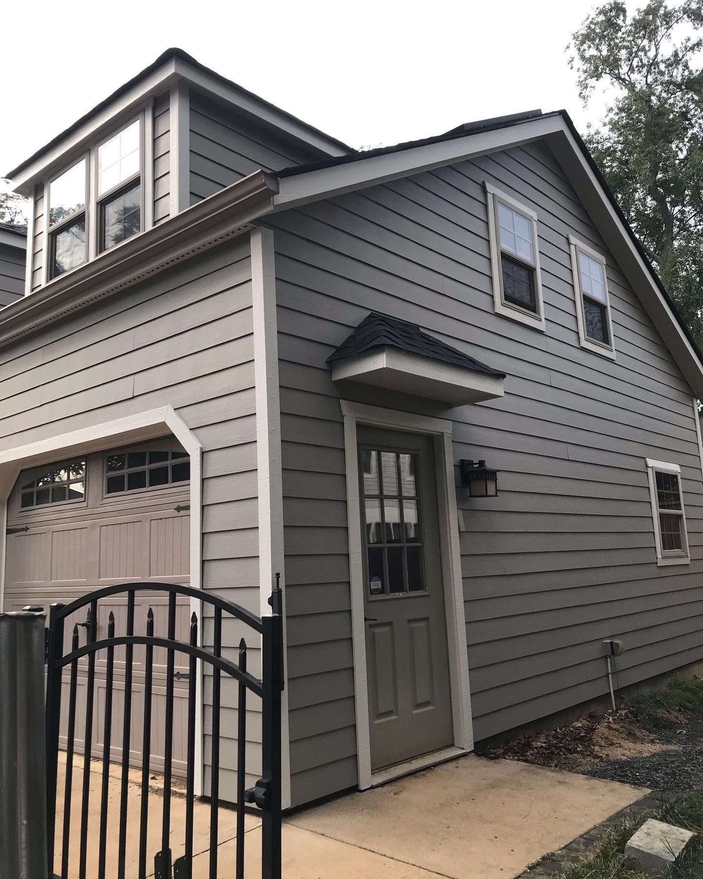
Sherwin Williams Pavestone Exterior
Thanks to its solid gray tones, Sherwin Williams Pavestone looks natural on exterior walls. You can choose to pair it with other suitable colors like white. Or simply use it all through. The former gives a more colorful look, while the latter gives a sophisticated vibe.
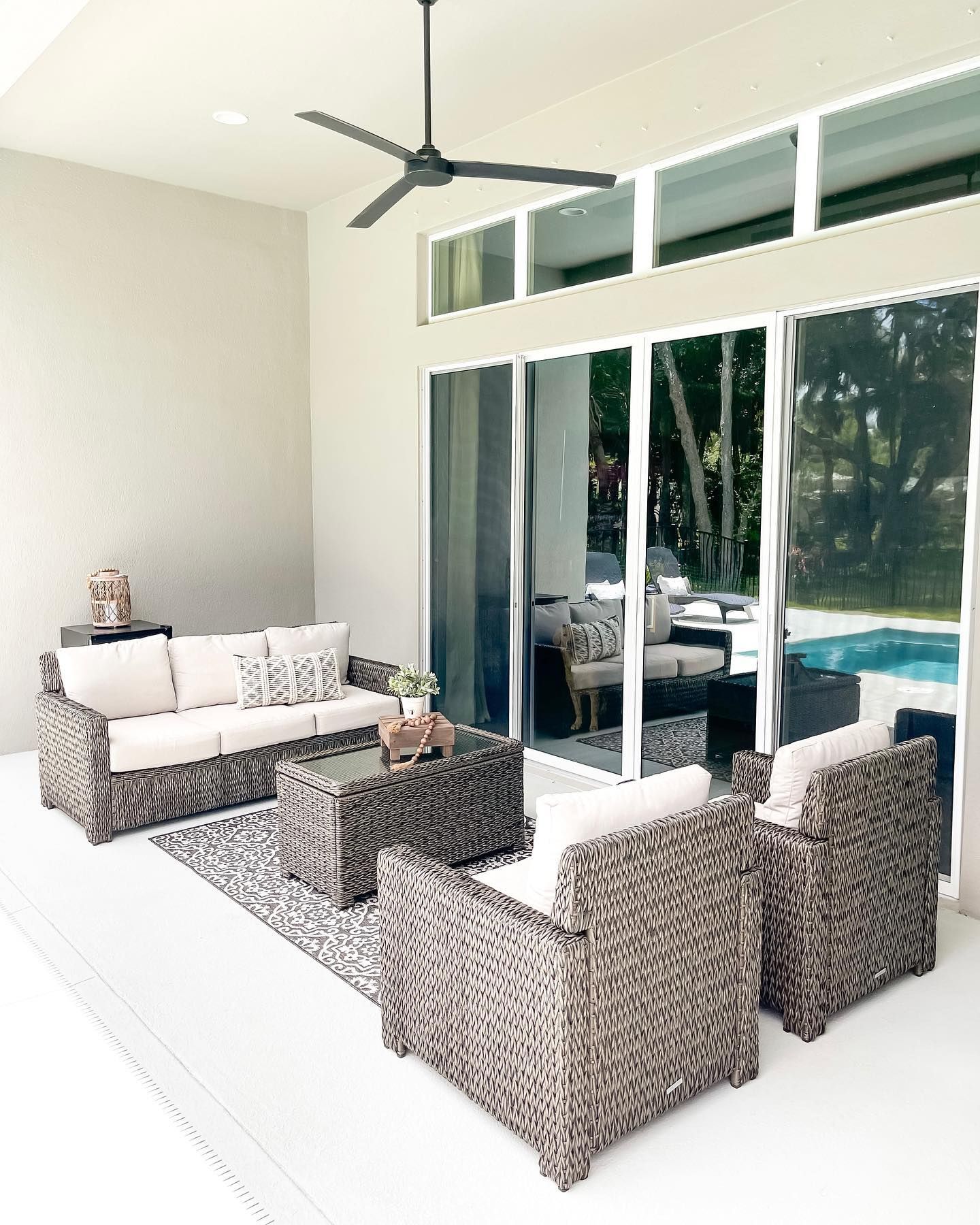
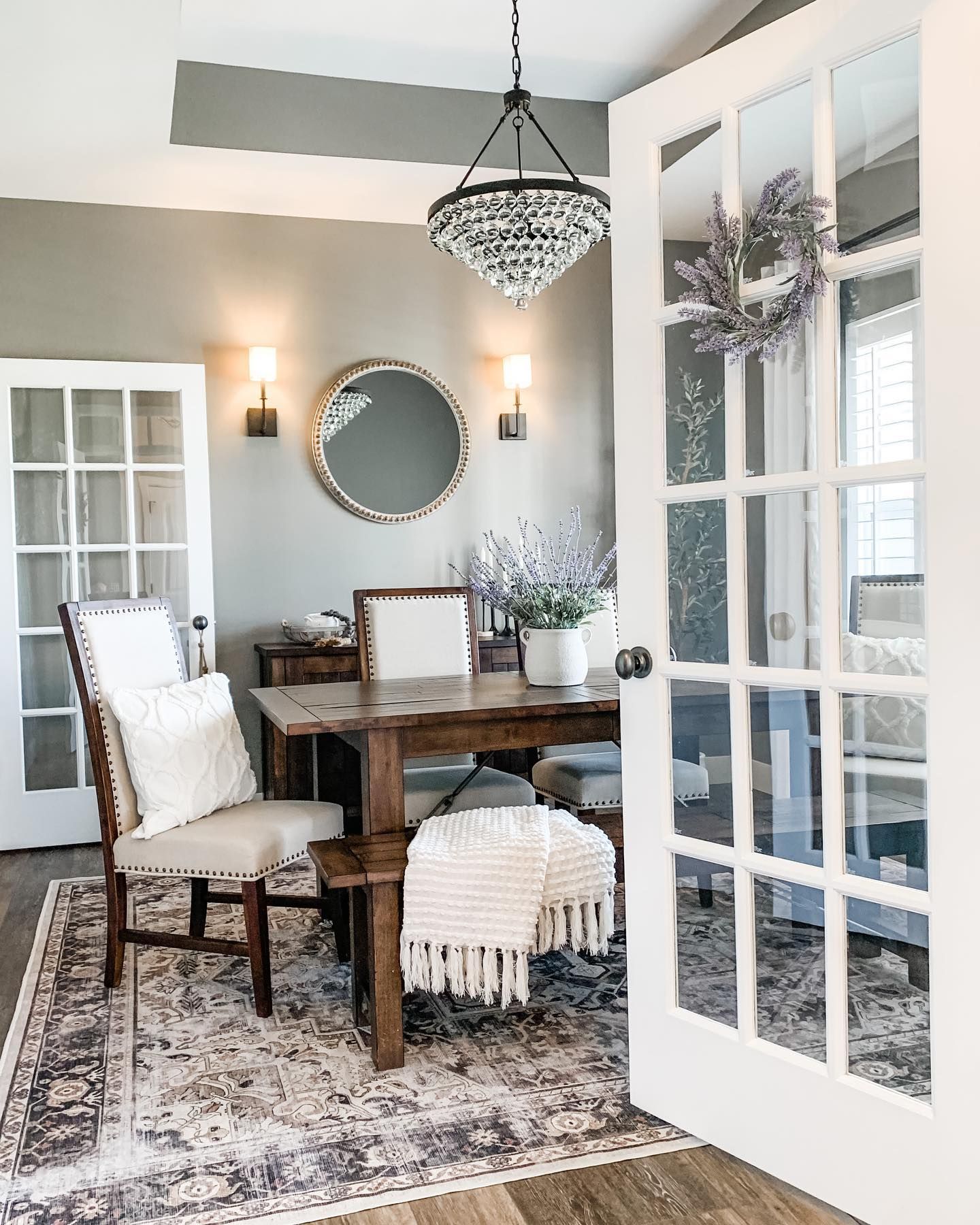
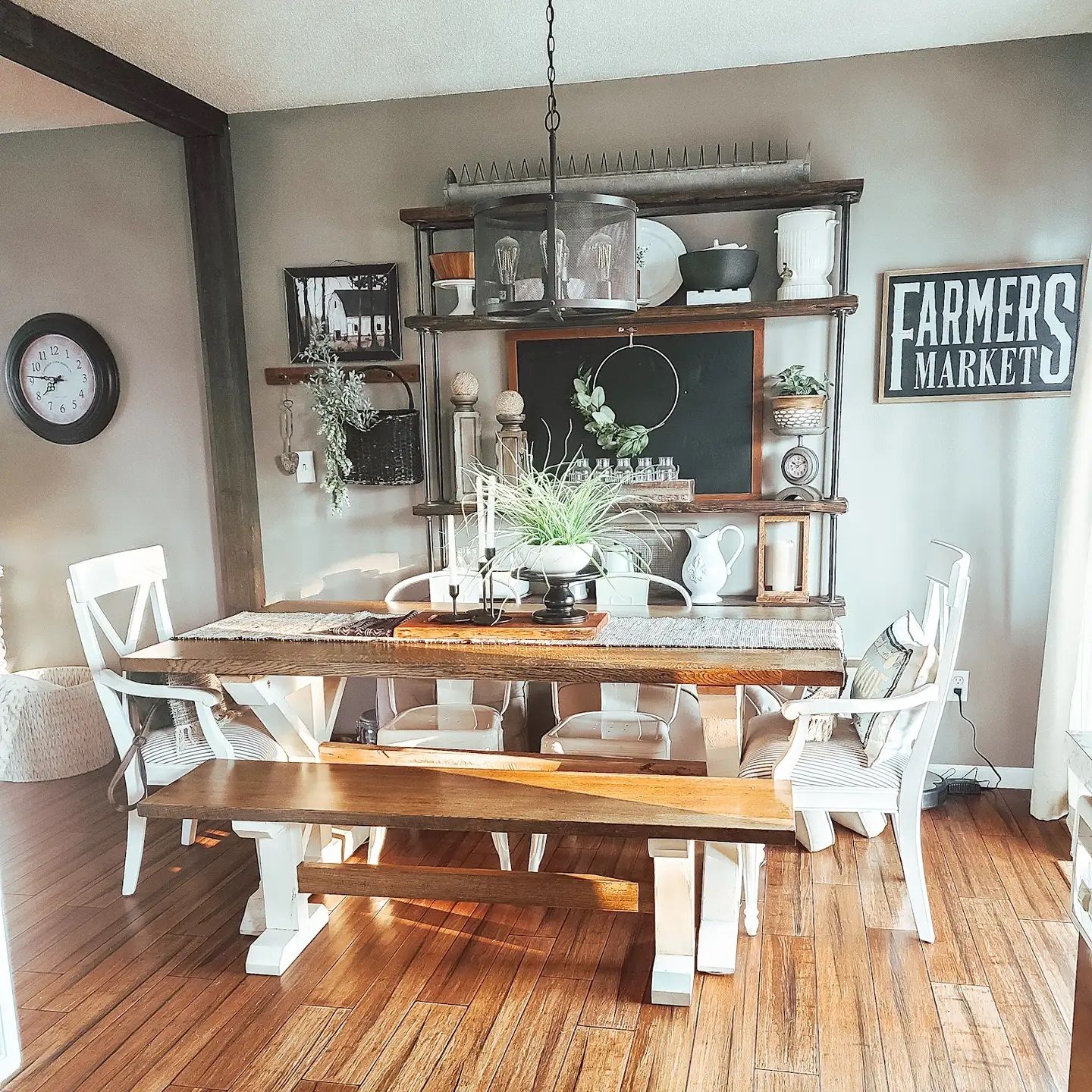
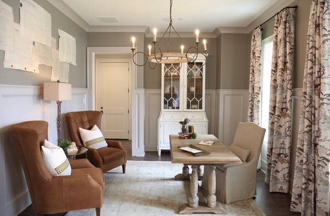
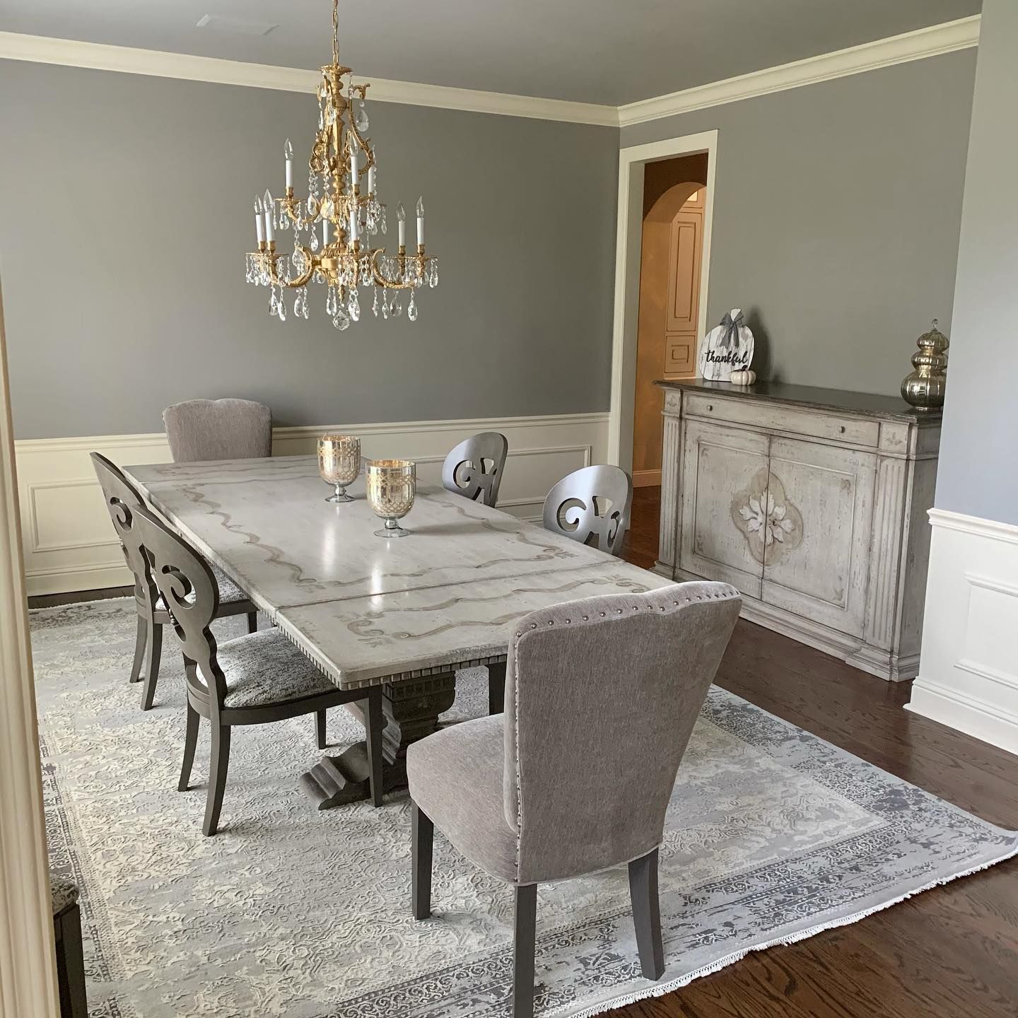
Sherwin Williams Pavestone Interior
While you can use Pavestone on all the walls in interior spaces, most people opt for pairing it on the walls. Either way, the paint color gives these spaces a cozy and welcoming feel.
Notice how Pavestone shows its soft green undertones in the dining space. Lighting plays an important role in how the paint color appears in any space.
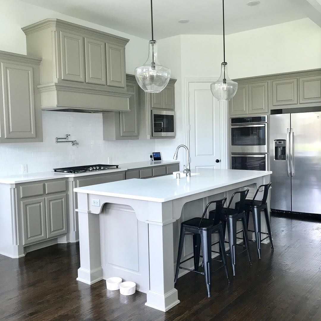
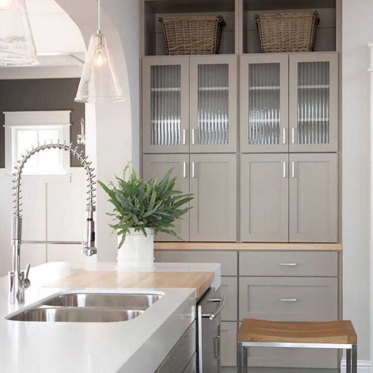
Sherwin Williams Pavestone Cabinets
Use Sherwin Williams Pavestone on your cabinets for a smooth, stylish touch to your space.
Thanks to the color pairings and lighting in the first picture, Pavestone’s green undertones show up, giving the kitchen a calm, nature-inspired vibe.
On the other hand, the paint color leans more into its gray tones below.
Conclusion
I had so much fun reviewing Sherwin Williams Pavestone. The paint color has lots to offer your home and spaces when used right. This is one of the reasons why I recommend sampling paint colors before use. Doing this will help you avoid unnecessary surprises.
Here is a quick recap of this lovely paint color:
- Sherwin Williams Pavestone is a mid-toned gray with soft green undertones.
- Pavestone can sometimes lean into greige (gray + beige)
- The paint color reads warm in any space.
- Sherwin Williams Pavestone works well in interior and exterior spaces.
- Using it in well-lit spaces is the best way to enjoy Pavestone.
Feel free to drop any questions you might have in the comments section. Mind you, I’ll like to hear your opinions too!
 Sherwin Williams Sea Salt (Palette, Coordinating & Inspirations)
 Sherwin Williams City Loft (Palette, Coordinating & Inspirations)
 Sherwin-Williams Dovetail (Palette, Coordinating & Inspirations)
 Sherwin Williams Greenblack (Palette, Coordinating & Inspirations)
 Sherwin Williams Pure White SW 7005 Review
 Sherwin Williams Marshmallow SW 7001 Review & Inspiration
