
Have you ever wondered why everybody is opting for Sherwin-Williams’ Redend Point?
I’ll clue you in as I take you on an extensive exploration of the brand’s 2023 Color of the Year.
Before I go any further however, I’d like to say, welcome new readers and returning subscribers.
I’m excited about reviewing Redend Point because it’s a unique blush-beige paint that inspires the creative genius in every designer.At the end of this review I’m sure you’ll come to love this paint because of the warmth and versatility of the color.
In this review, I’ll be shedding light on everything, including undertones, LRVs, color palette, lighting conditions, and when to use Redend Point (SW 9081), so, let’s get started.
Table of Contents
When to Choose Sherwin-Williams Redend Point SW 9081)?
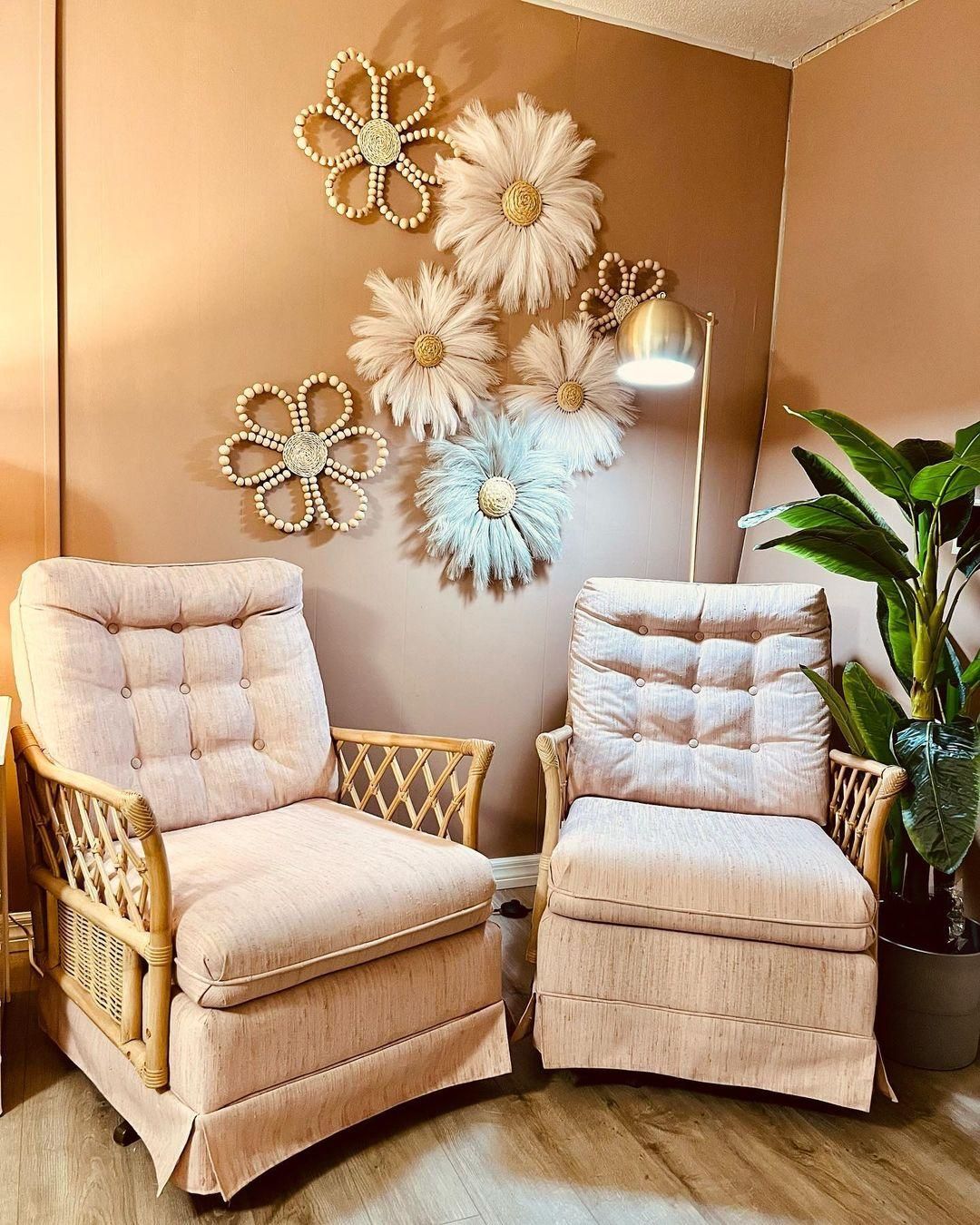
The recurrent theme with Redend Point is elegance. Because this color blends several neutrals into one beautiful look, you get the best of multiple worlds. Here are of the best situations to choose Redend Point:
Are you trying to get Cozy?
Every face of Redend Point is warm and snuggly, whether it’s the taupe, brown, pink, or beige tone.
Do You Need Low Light?
The mood always feels intimate with Redend Point because of its low light reflection.
Can’t Decide Between Neutrals?
Why pick one when you can have four-in-one warm neutrals with Redend Point? Start your day with its blush pink tone, enjoy the vibrance of its beige in the afternoon, step into the evening with its taupe style, and end the day with its brown note.
Want to Give Your Office a Facelift?
Many businesses have been able to achieve an upscale look with Redend Point, from hair salons to waiting rooms, lounges, bakeries, and bars, Redend point is a versatile color as long as you’re designing a cozy and intimate space.
However, much of the color’s appeal lies in its warmth and diverse undertones. See what I mean below.
What Color is Redend Point (SW 9081)?
Paint brands typically name their colors based on relatable references like real-life places and objects, this however cannot be said of Redend Point. Sherwin-Williams named this blush-brown color after its position on the RGB spectrum.
Before we go further, let’s assess the color’s emotion and the feelings you’ll get in its presence. See the color used in a patisserie.
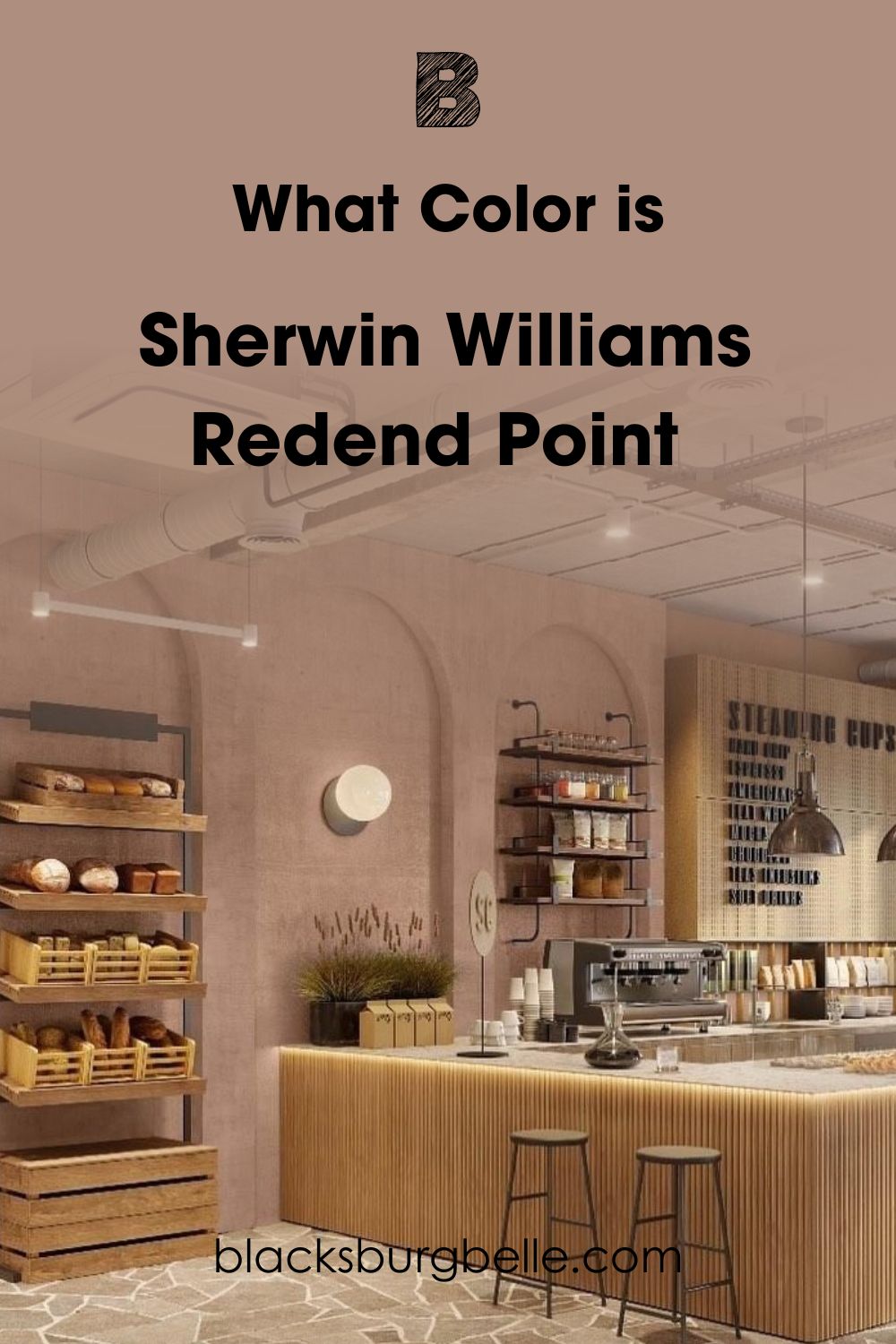
It’s a soft medium-dark paint with all-around warmth from its undertones to the overtones. That means Redend Point will always be cozy and friendly, no matter the lighting condition. Because it has an earthy undertone, you can use this color as a neutral anchor.
The Director of Color Marketing at Sherwin-Williams, Sue Warden, described Redend Point as “a thoughtful hue for reinventing a space with warmth,” you can see this in how the color transforms bare walls into sophisticated backdrops.
I could go on forever about how amazing Redend Point is, but let’s get into the science of it all. It’ll give you another perspective on its subtle elegance.
Snapshot of Redend Point Specification
See all the elements that make Redend Point such a unique and loveable color.
| Name | Redend Point (SW 9081) |
| RGB | Red 174 | Green 142 | Blue 126 |
| Hex Value | #AE8E7E |
| LRV | 30 |
| Undertones | Brown, Beige, Gray |
The LRV of Redend Point
Knowing the Light Reflectance Value of any paint is essential because it helps you plan your palette adequately. You measure this LRV on a scale of 0 – 100, where zero is pitch black and hundred is brilliant white.
But realistically, the scale for paints is 3 – 97 because of the nuances in every color mixture.
Redend Point has an LRV of 30, a perfect middle point between pitch black and 50 (neutrals), making it a medium-dark tone.
This means it won’t absorb every ray of light even though it won’t give the brightest reflection. You don’t need bright lights anyway, if you’re leaning into the subtle warmth of Redend Point.
Undertones of Redend Point
If you’ve ever bought paint at face value but discovered it’s a different hue upon usage, then you’ve had experience with undertones. These undertones are secondary colors in every paint that exists because of the paint’s RGB content.
Most paints have one or two undertones, but a few unique mixtures carry more than three tints in their DNA. Redend Point (SW 9081) is one of those with its Brown, Gray, and Beige undertones.
That’s why it appears as different colors in multiple pictures depending on the coordinating colors, lighting, and position.
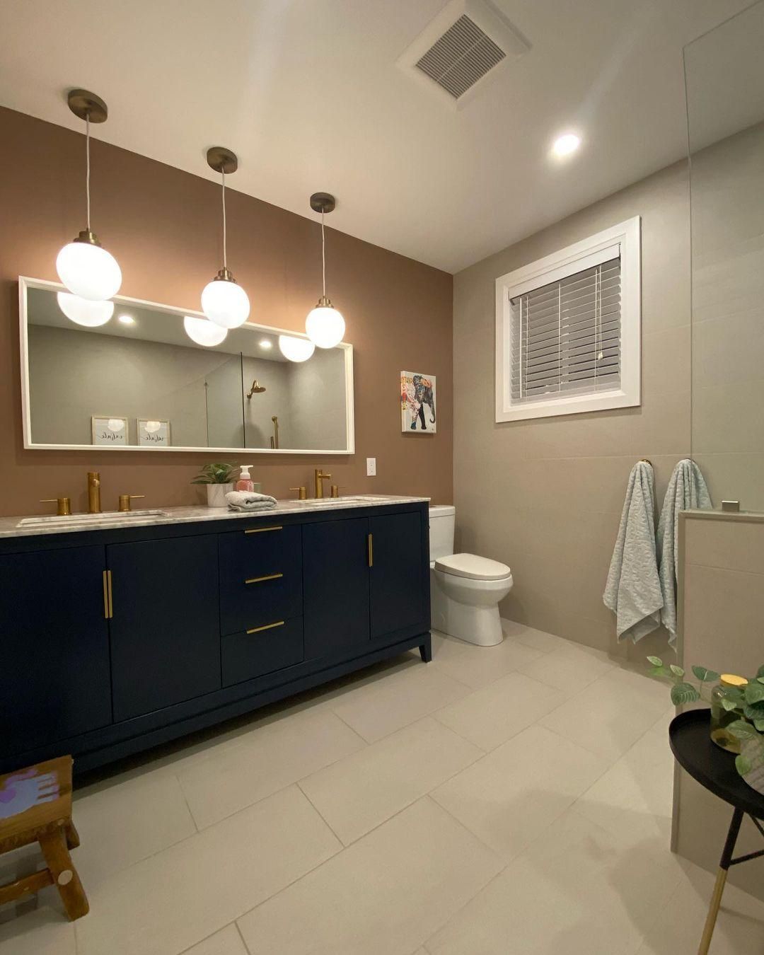
Use this picture as a visual reference as I explain all the tones in Redend Point.
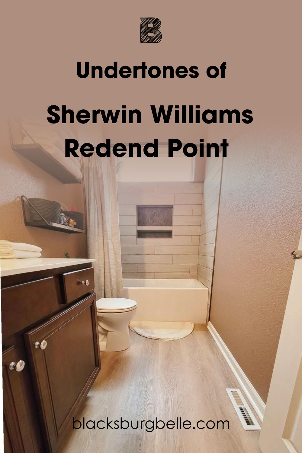
In this bathroom, Redend Point is used on both the left and right walls, but, we bet you thought those were two different colors. The sunlight hitting the left side (with the towel organizer) and chocolate brown cabinets gave the color a golden beige tone.
Meanwhile, the right side draws reflection from the white trims and light off-white floorboards. So, it mainly retains its blush tone with tints of beige on the bottom and top from the lighting. Isn’t it beautiful?
Sherwin-Williams Redend Point Lighting Conditions
Let’s start with positioning because it’s the foundation of every interior and exterior design.
To get the intense version of Redend Point, use it in the East or West position. The Eastern light burns hot from noon until 4:00 pm giving the space a dim glow in the morning and evening. From late noon until sunset, the Western room gets the most light.
If you want a muted tone every time, use Redend Point in Northern rooms. If you’re going for the lightest version of the color, Southern rooms and windows are your best bet.
For lighting, you’ll need cool white lights to maintain the blush and rosy-brown tone of Redend Point walls and furniture.
Finally, if you want the deep taupe to tan brown version, get orange and yellow warm lights. They give an intense glow, making every color, including SW 9081, cozier.
It’s time to talk about the many faces of Redend Point.
Why Does Redend Point Look Pink?
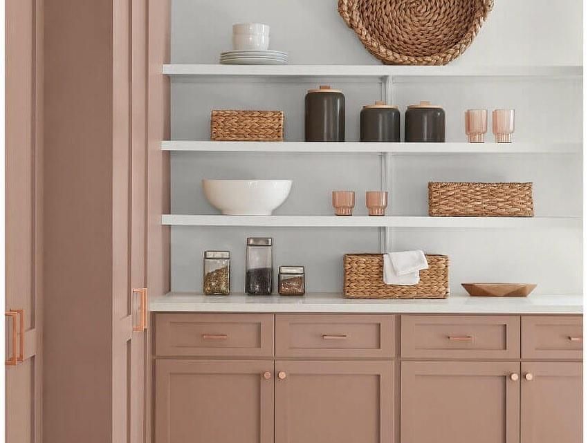
I believe Redend Point’s default tone is blush pink, as seen on this standalone cupboard. But being against a light white wall allowed the color to reflect its softest undertone.
I’ll tell you a little secret “This is my favorite tone.”
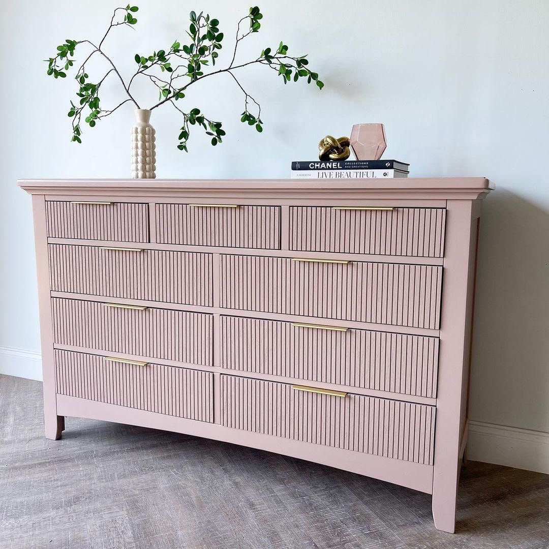
The dominant rosy blush pink tone in Redend Point is thanks to its high red pigment. When you look at this color in the morning or underneath white light, that’s the shade that’ll greet you.
It’s also obvious when painted in large living rooms, bedrooms with multiple windows, or when paired with bright whites.
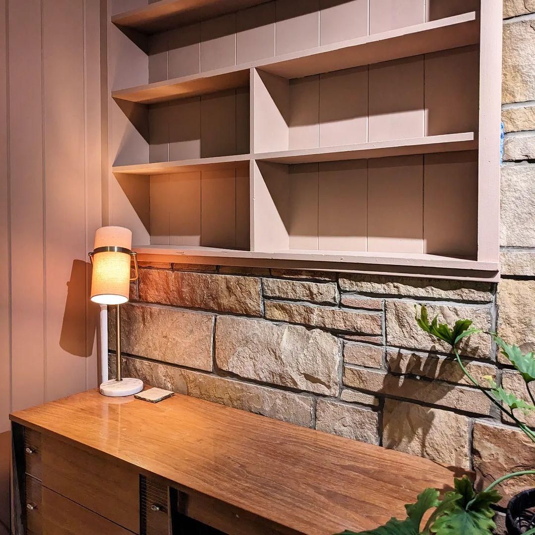
Why Does it Look Brown?
This accent Redend Point wall leans into brown because of its position. It however barely gets any light from that angle, even though it has white borders on each side. Sunlight hits from the west, giving it a low reflection while the white walls and hanging plant retains most of the light.
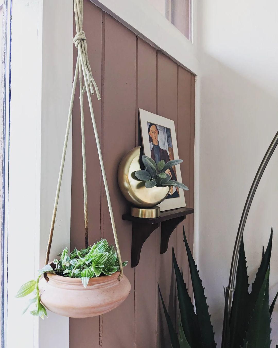
At the heart of Redend Point is a bold red color (174 red of RGB). But it won’t show up as the primary color, instead, you’ll get a shade of dark red from its mixture with the other undertones, gray and beige.
So, Redend Point in small rooms with little to no lighting intensifies the color and produces a brown tone.
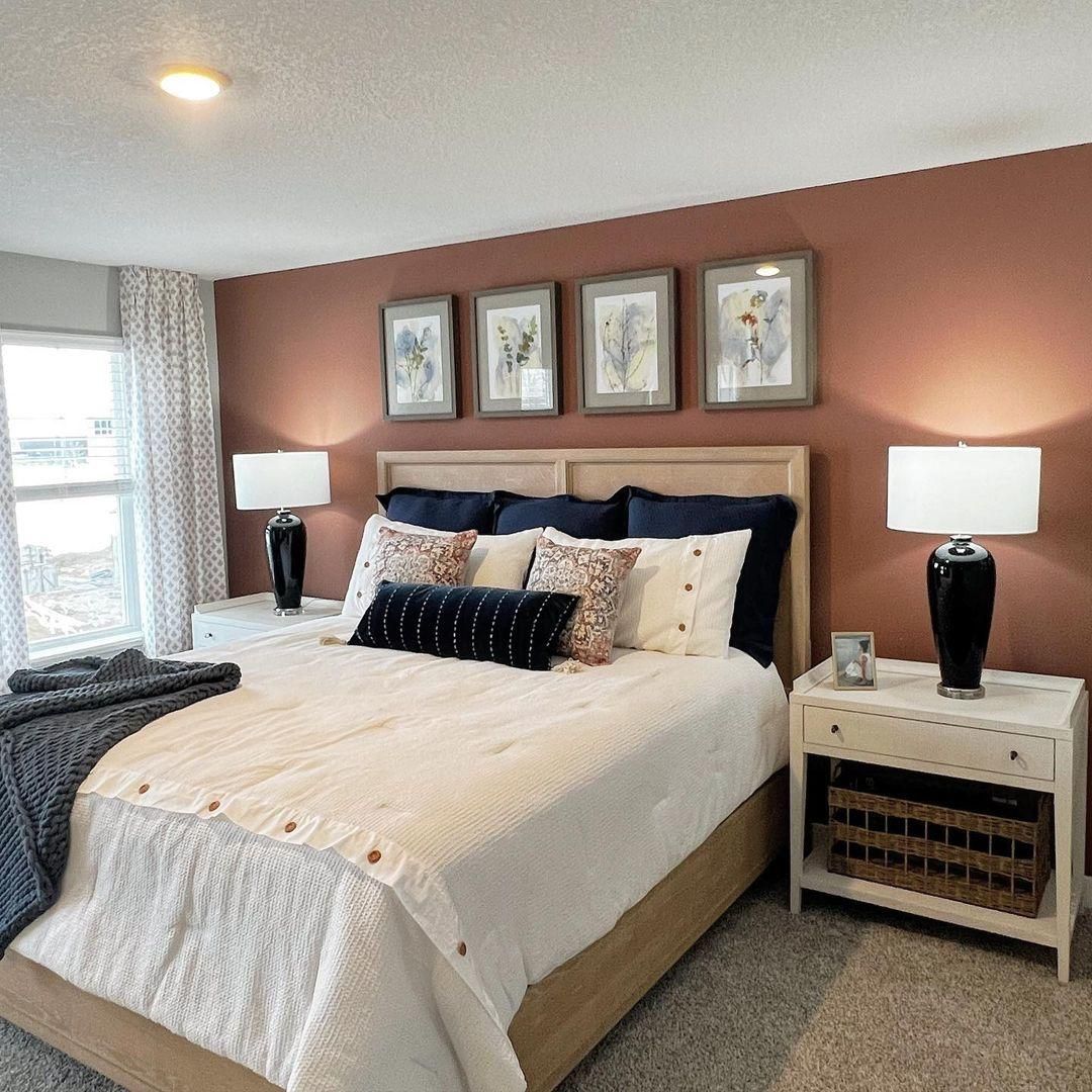
Why Does Redend Point Look Taupe?
You can hardly tell that the walls in this wide bedroom are Redend Point from the taupe tone.
The stony gray ceiling board and light gray floors add to the blush tone and intense deep reflection. The taupe shade will become more obvious when night falls and no sunlight seeps through the glass windows.
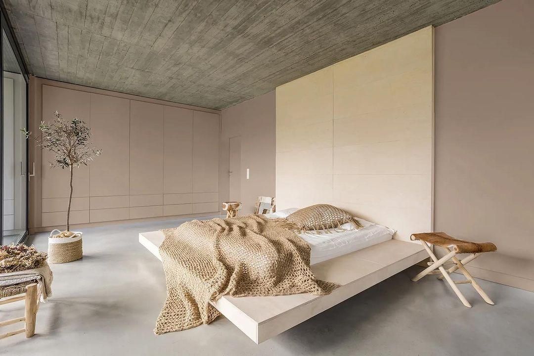
Redend Point’s brown undertone takes over its rosy cover and becomes a rich taupe tone in Eastern and Western light.
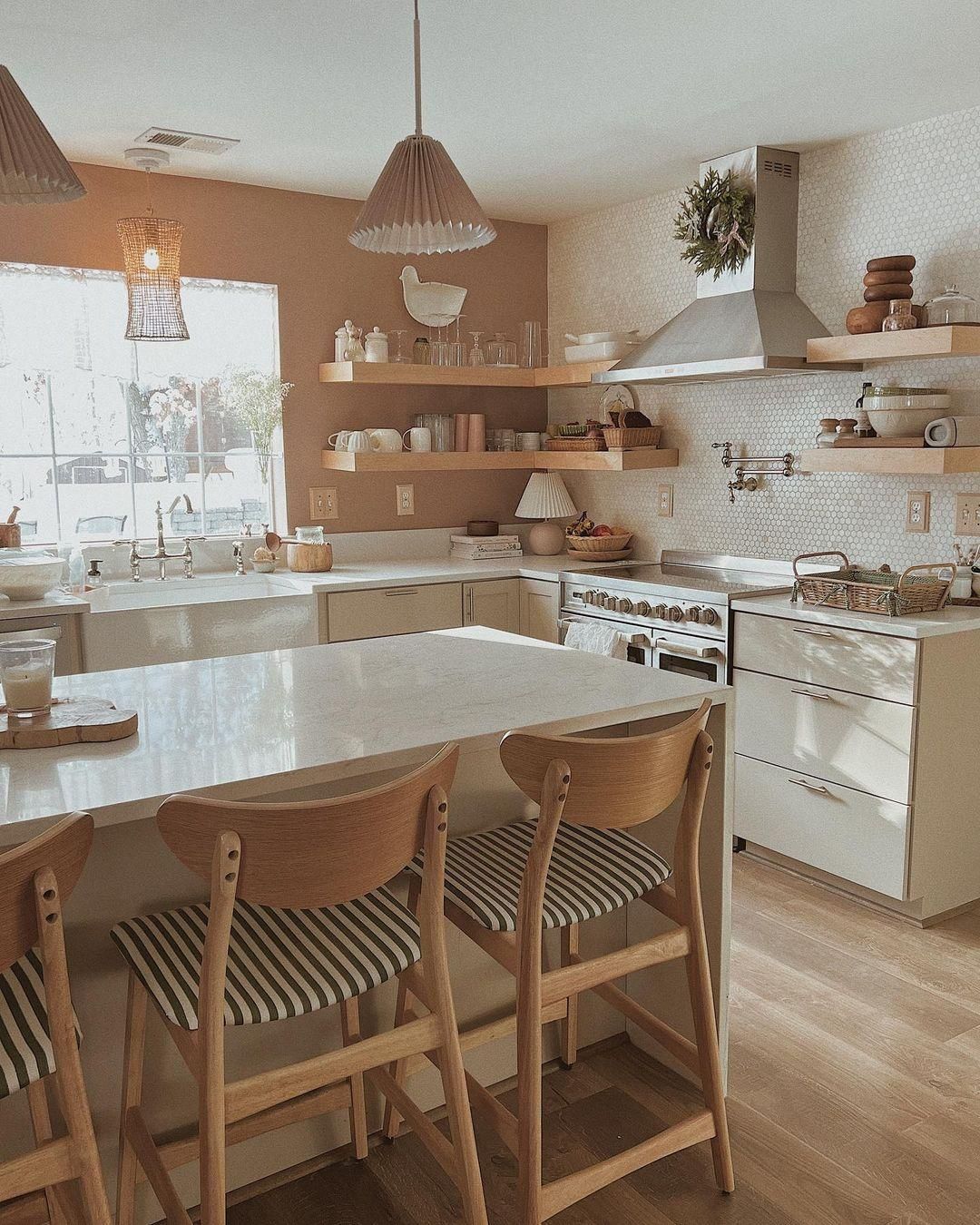
Why Does Redend Point Look Beige?
I love how Redend Point transforms into a golden beige in this corner lounge. The white light bulb, mixed with natural sunlight, bounces off the golden lampholder and transfers its new color to the walls. It’s truly a sight to behold.
Southern-facing light is bright and optimistic, giving Redend Point its unique beige glow. It’s not the most common reflection from the paint, but it looks like a fairytale come true. You’ll often get beige notes when you use Redend Point under the brightest morning sun.
Use Redend Point on your hallway furniture, front porch walls, and exterior furniture for this look.
With these undertones achieved through the different lighting conditions, now you know why Redend Point became a worldwide hit after Sherwin-Williams crowned it the Color of 2023. It’s not often that consumers accept recommended colors, as we’ve done this year with this refined blush-brown hue but it’s worth it.
Is Redend Point a Warm or Cool Color?
Redend Point is all “warmth” and no ice. Don’t expect relaxing vibes from this color, even though it’s subdued. Instead, get ready for daily doses of assurance and dependence with a hint of elegance.
The earthy undertones in this color keep you grounded, and its rosy overcoat infuses an air of sophistication. I love how Redend Point is a muted color with a quiet energy burst.
Unlike yellow or orange which hit you with cheerfulness instantly, its positivity slowly creeps in like a pep talk from your confidant. Once light hits a Redend Point surface, the color’s transformation into a pretty pink or beige tone gives you a fuzzy feeling inside.
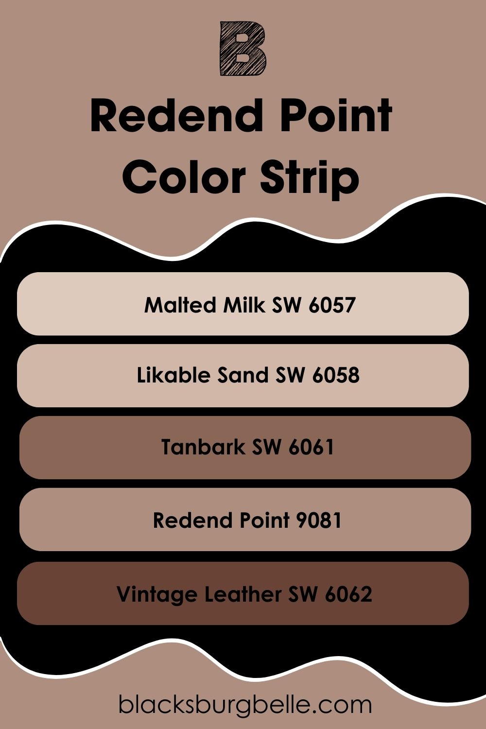
Redend Point Color Strip: Lighter or Darker Exploration
Is Redend Point too dark or not bright enough for you? Check out these similar colors from its color strip. They’re variations of Redend Point with tints for lighter tones and shades for darker tones.
- Sherwin-Williams Malted Milk (SW 6057)
- Sherwin-Williams Likable Sand (SW 6058)
- Sherwin-Williams Tanbark (SW 6061)
- Sherwin-Williams Redend Point (9081)
- Sherwin-Williams Vintage Leather (SW 6062)
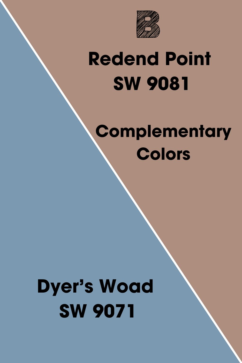
Complementary Colors for Redend Point
Complementary colors create a beautiful contrast by nature because of their positions on the color wheel. The standard combos are red to green, yellow to purple, and blue to orange.
You can use those as the benchmark for complementing complex colors like Redend Point, but I relied on science to get you the perfect contrast.
Sherwin-Williams Dyer’s Woad (SW 9071) complements Redend Point. It’s a smoky blue paint with a medium-dark LRV matching the blush-brown tone.
Dyer’s Woad also has a relaxed vibe that’ll balance the warmth in Redend Point without messing with the overall aura.
Redend Point Coordinating Colors
If you’re thinking of how to make Redend Point work in your home or office, don’t worry. I have the answers. One of these five color palettes is the key to creating your dream space.
- Analogous theme:Three is not a crowd in this trio. Combine Redend Point with two other colors beside it on a color wheel.
- Complementary theme:Contrasting colors make the boldest statements in this theme. Use Redend Point with the color opposite it on the color wheel.
- Triadic theme:Draw a triangle on your color wheel with Redend Point as the peak. Then choose the two equally spaced hues from it to complete the triad.
- Split Complementary theme:First, pick the complementary color for Redend Point, Dyer’s Woad. Then choose the two colors beside it to pair with your anchor hue.
- Monochromatic theme:Maintain a uniform look in your space using only lighter, darker versions of one color. Add white for lighter tones and black for darker tones to create a monochrome strip.
The Monochromatic theme is ideal for minimalists and the easiest to design. But sometimes, people equate easy to boring, where other themes become relevant. I love how Complementary and Analogous styles maintain sophistication with bolder combos.
Scroll up to see some of them for yourself.
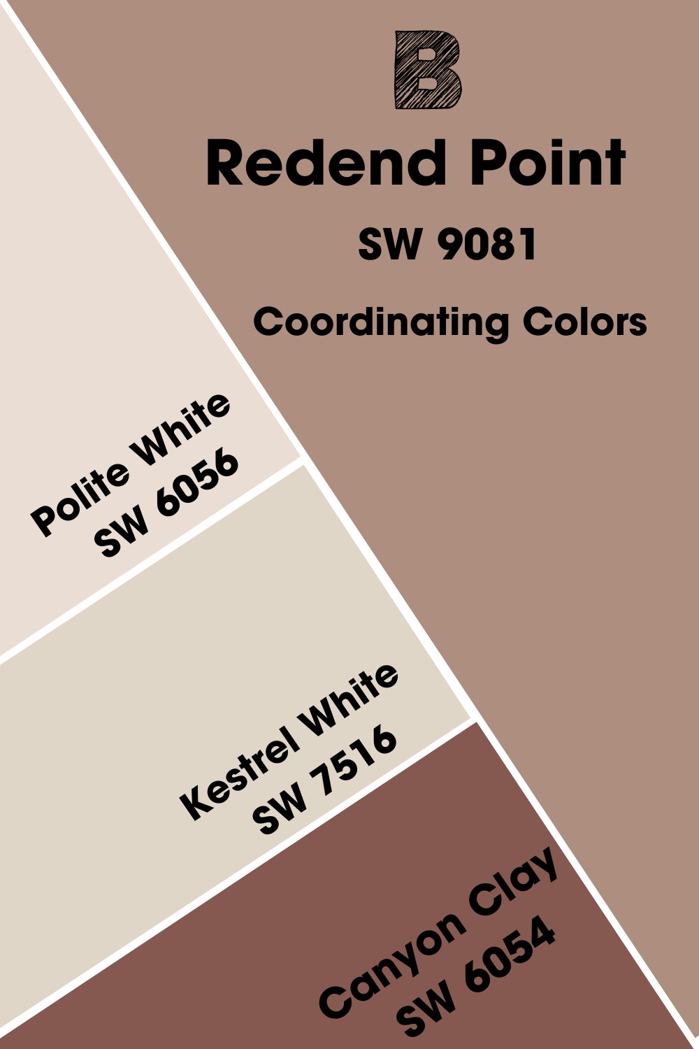
Coordinating Colors for Redend Point
Sherwin-Williams recommended three colors as the perfect coordinating hues for Redend Point. So, let’s dissect them and see if they fit the tone.
- Sherwin-Williams Polite White (SW 6056):This medium-light off-white paint has a strong purple undertone. Use it when you pair Redend Point with warm lighting so that it highlights the beige undertone.
- Sherwin-Williams Kestrel White (SW 7516): A snug off-white paint with pink tints to match Redend Point’s blush tone. It has an LRV of 68 and is pretty reflective without extra lighting.
- Sherwin-Williams Canyon Clay (SW 6054):If you’ve ever wondered what a reddish-tan paint looks like, this is it. This color is dark with an LRV of 13, which’ll cast a dusty shadow on the already muted Redend Point.
Using these three colors with Redend Point creates a look similar to the monochrome theme. But the white paint in the mix adds a different vibe and makes a posh combo. Try it out and let me know what you think.
Redend Point Color Palette
I designed three Redend Point color palettes for you. Contrasting and Monochromatic palettes are popular trendy combos. Then, I added the Analogous theme to give you a taste of what thinking outside the box can do.
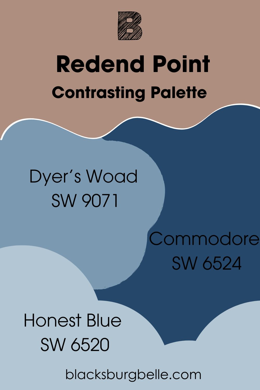
Contrasting Palette
- Sherwin-Williams Dyer’s Woad (SW 9071):A beautiful smoky blue color with strong purple undertones. It has the same LRV as Redend Point, giving you a perfect reflection.
- Sherwin-Williams Commodore (SW 6524): Pairing this deep violet-tinted blue paint with Redend Point makes the room look elegant. Use Commodore cabinets against Redend Point walls to make the color pop.
- Sherwin-Williams Honest Blue (SW 6520):This mid-tone blue adds a cheerful aura to any room. It also has a purple undertone mixed with gray to match Redend Point’s taupe vibe.
When you use this palette, Redend Point should be your anchor. You can then use the blues as accents and highlights. Use Commodore on cabinets and furniture, Dyer’s Woad on accent walls, and Honest Blue on throw pillows and curtains.
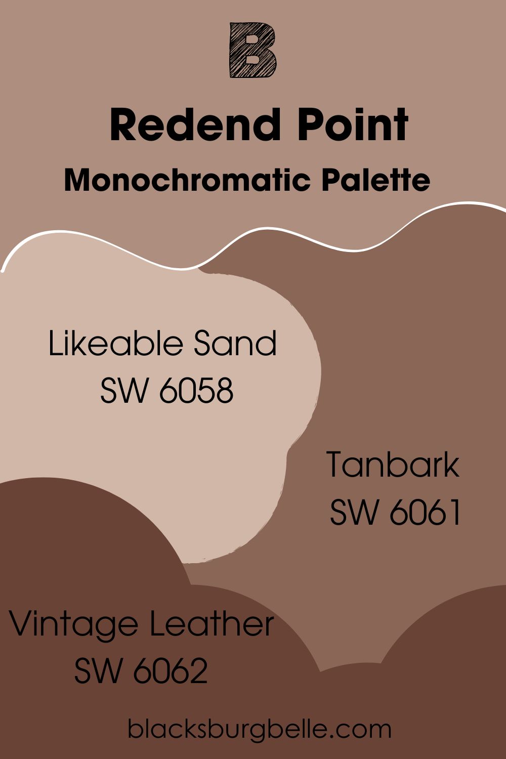
Monochromatic Palette
- Sherwin-Williams Likeable Sand (SW 6058): This neutral beige paint is unchanging in its reflection. It has a 50 LRV making it a perfect neutral hue even with its red undertone.
- Sherwin-Williams Tanbark (SW 6061): This warm chocolatey beige deepens the earthy undertone in Redend Point. It gives you a cozy and intimate energy.
- Sherwin-Williams Vintage Leather (SW 6062):You can’t appreciate Redend Point in monochrome without adding a deep reddish-tan color like this. It’s the best dark tone to cast a matching shadow on your muted walls.
Redend Point in monochrome themes is an exciting combo because it shows the color’s range.
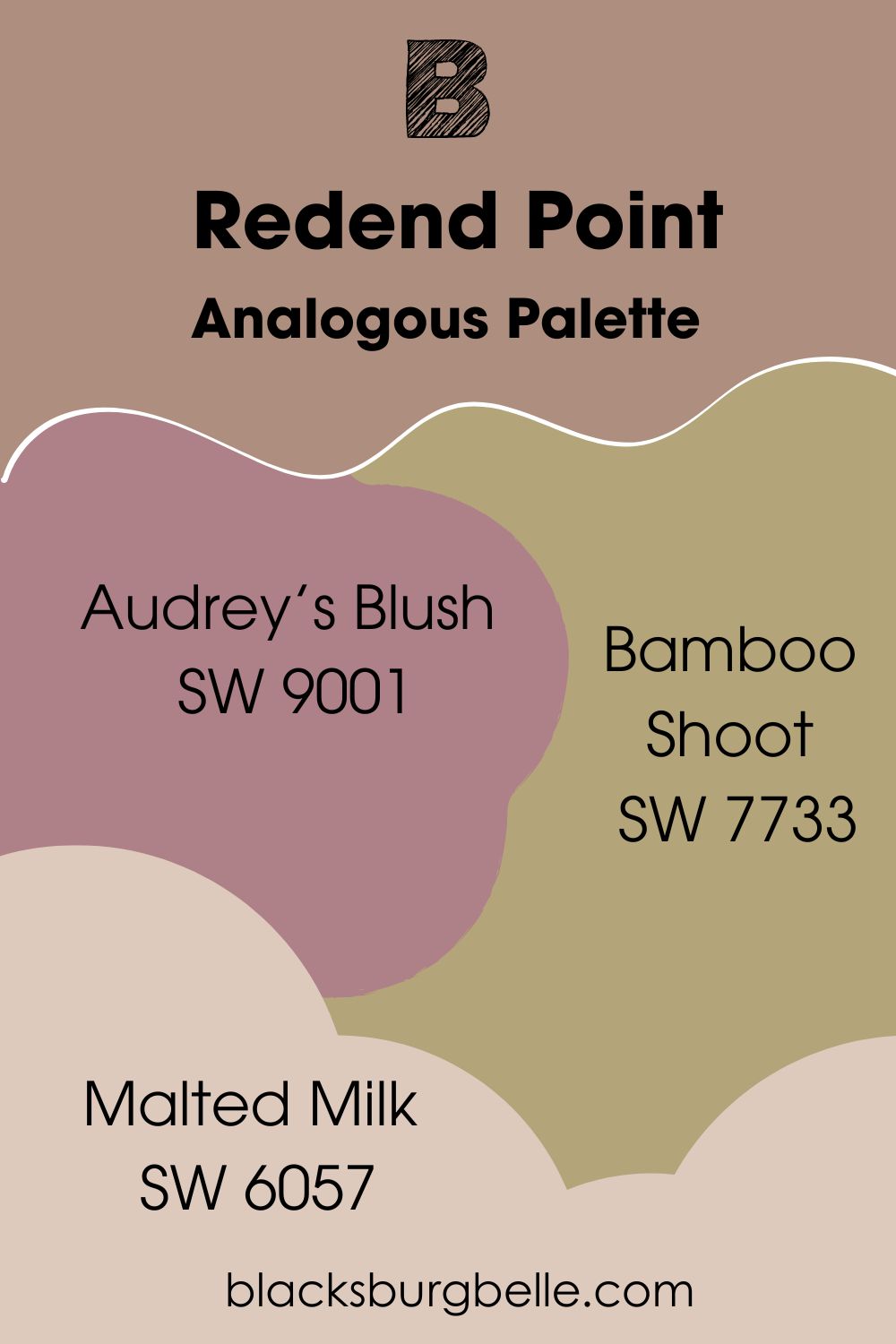
Analogous Palette
- Sherwin-Williams Audrey’s Blush (SW 9001):This bolder blush-pink tone matches Redend Point’s overtone.
- Sherwin-Williams Bamboo Shoot (SW 7733): Use this yellow-green medium-dark paint to highlight the reddish-brown part of Redend Point. Its color changes into an earthy forest tone under dim lighting.
- Sherwin-Williams Malted Milk (SW 6057): A beautiful beige with a reddish-orange base to tie the other two colors to Redend Point. It’s a gorgeous wall paint in the dining room with Redend Point accents furniture and Bamboo Shoot accent wall.
Pairing a mixture of colors that highlight each undertone in Redend Point in one space is like creating a perfect cocktail. This analogous palette helps you appreciate the color’s beige, gray, brown, and pink notes at once.
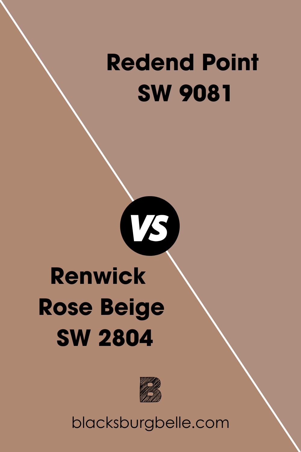
Sherwin-Williams Redend Point vs. Sherwin-Williams Renwick Rose Beige
Renwick Rose Beige has an orange undertone making it darker than Redend Point.
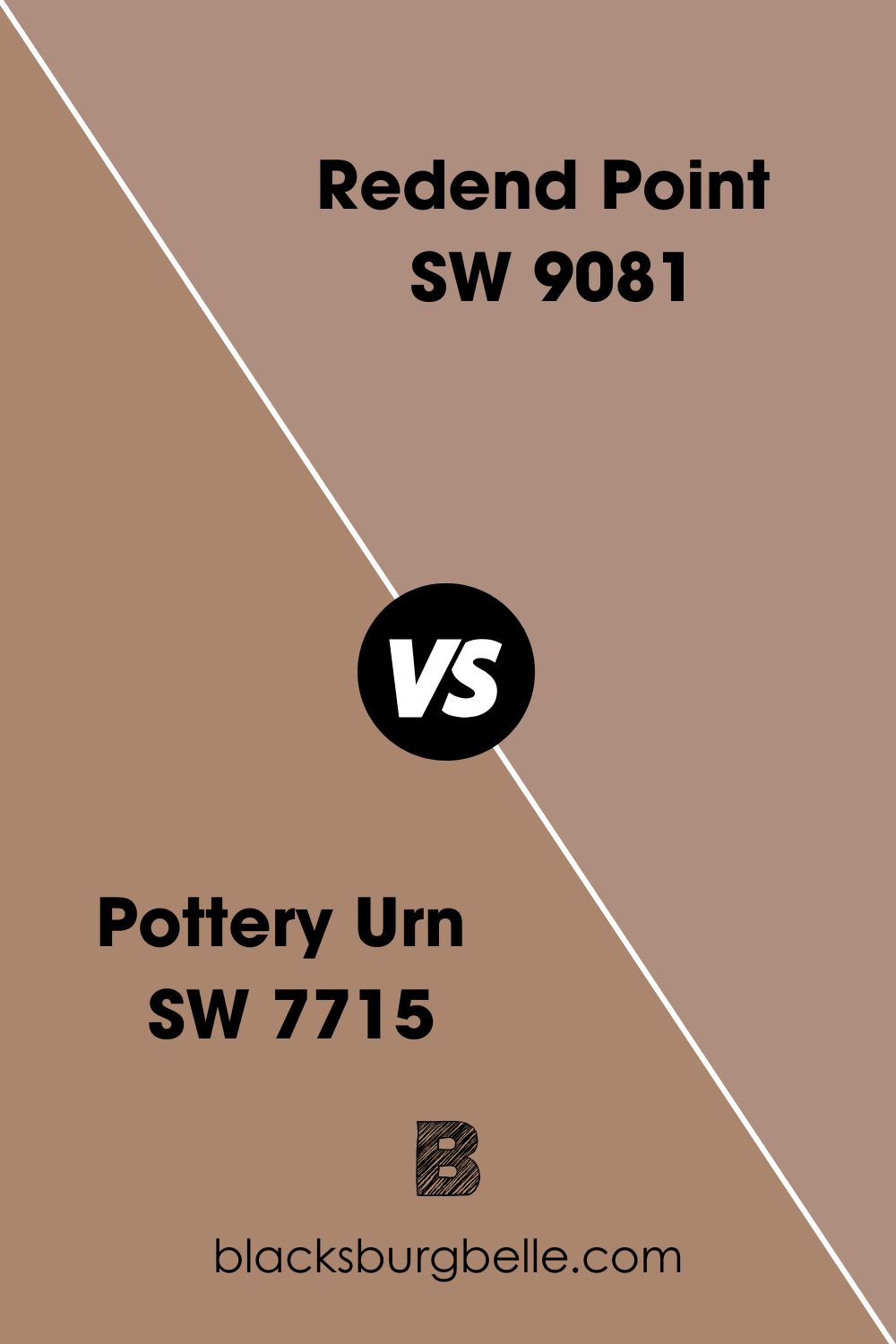
Sherwin-Williams Redend Point vs. Sherwin-Williams Pottery Urn (SW 7715)
Pottery Urn leans into its brown undertone than Redend Point and has an LRV of 27.
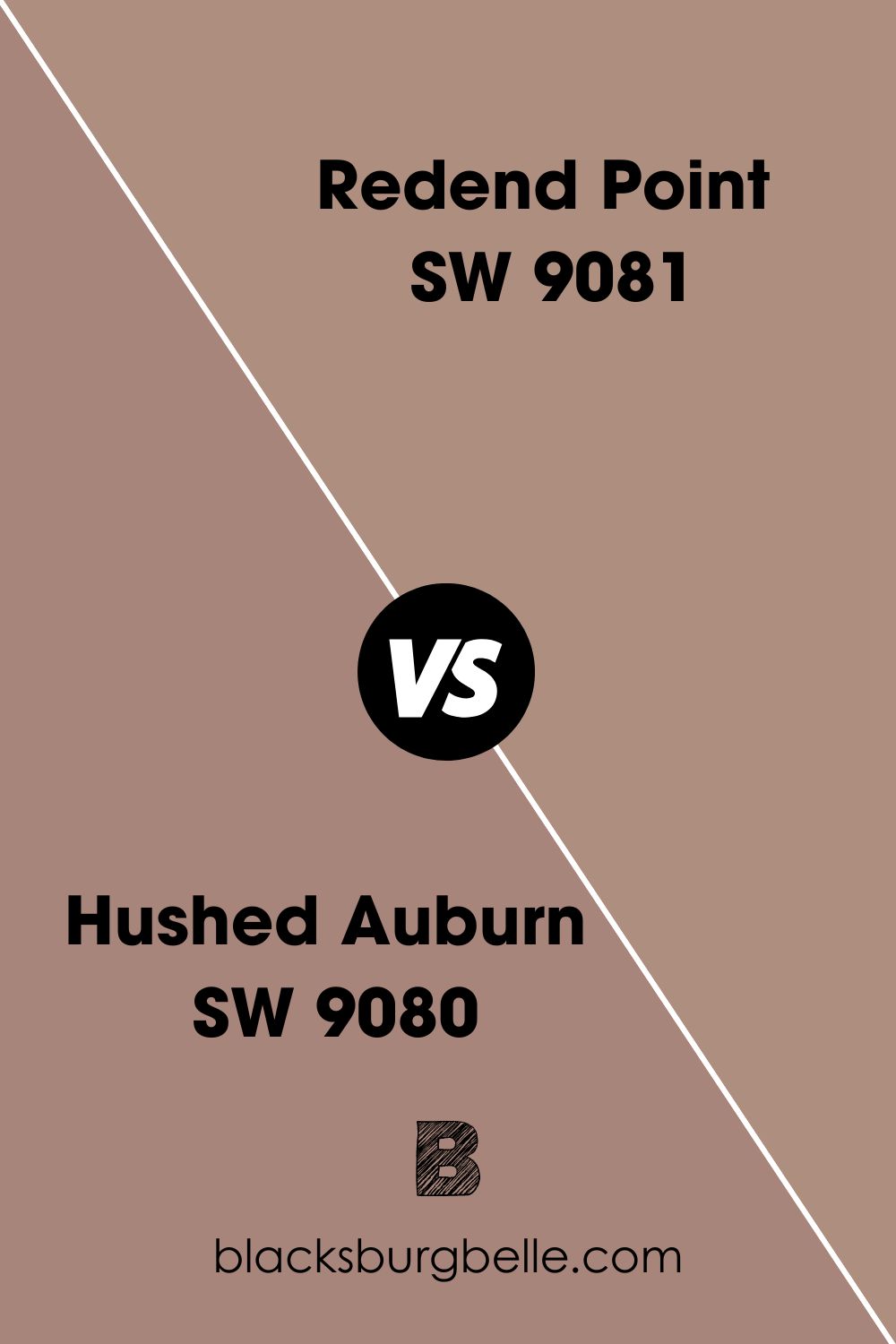
Sherwin-Williams Redend Point vs. Sherwin-Williams Hushed Auburn (SW 9080)
Hushed Auburn is slightly darker than Redend Point but has the same undertones with an LRV of 26.
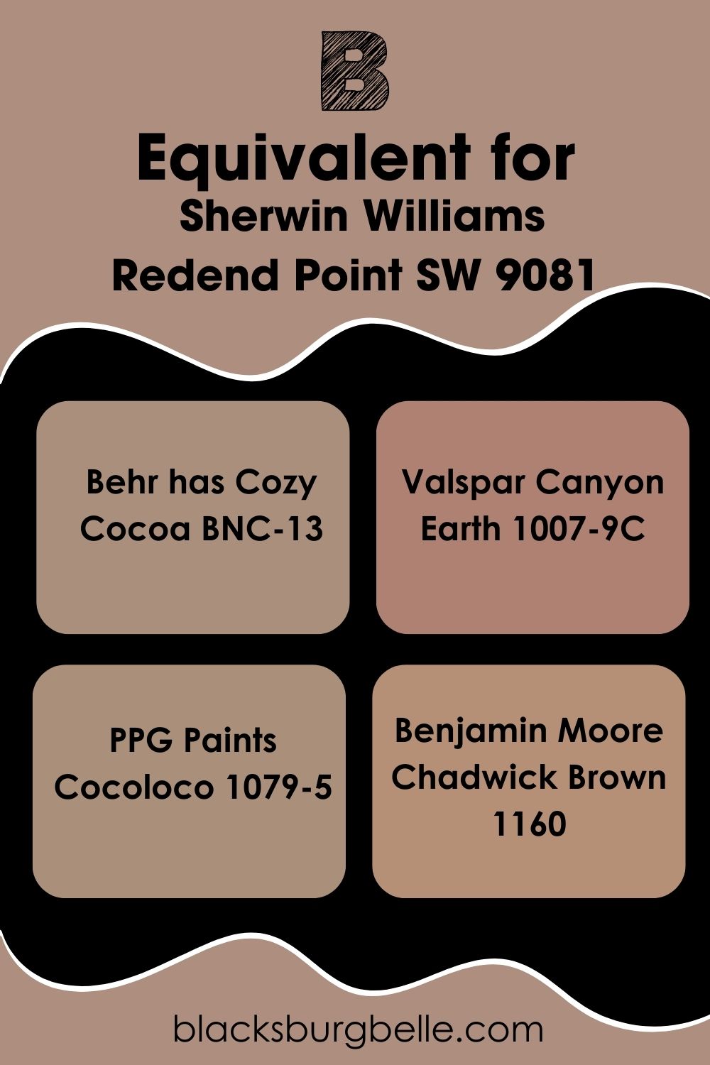
Redend Point Equivalent with Other Brands (Benjamin Moore, Valspar, PPG, and Behr)
Sherwin-Williams is the only brand with Redend Point as a paint name. But you can find similar colors at other top brands. Behr has Cozy Cocoa, Valspar has Canyon Earth, PPG has Cocoloco, and Benjamin Moore has Chadwick Brown.
Cozy Cocoa is the closest in shade to Redend Point, followed by Cocoloco. Canyon Earth’s red tone is more obvious, while Chadwick Brown only looks like Redend Point when its brown undertone takes over.
Where can you use Redend Point (SW 9081)?
You can use Redend Point everywhere, including home interiors, business spaces, furniture, and exteriors. See real examples below.
Sherwin-Williams Redend Point Walls
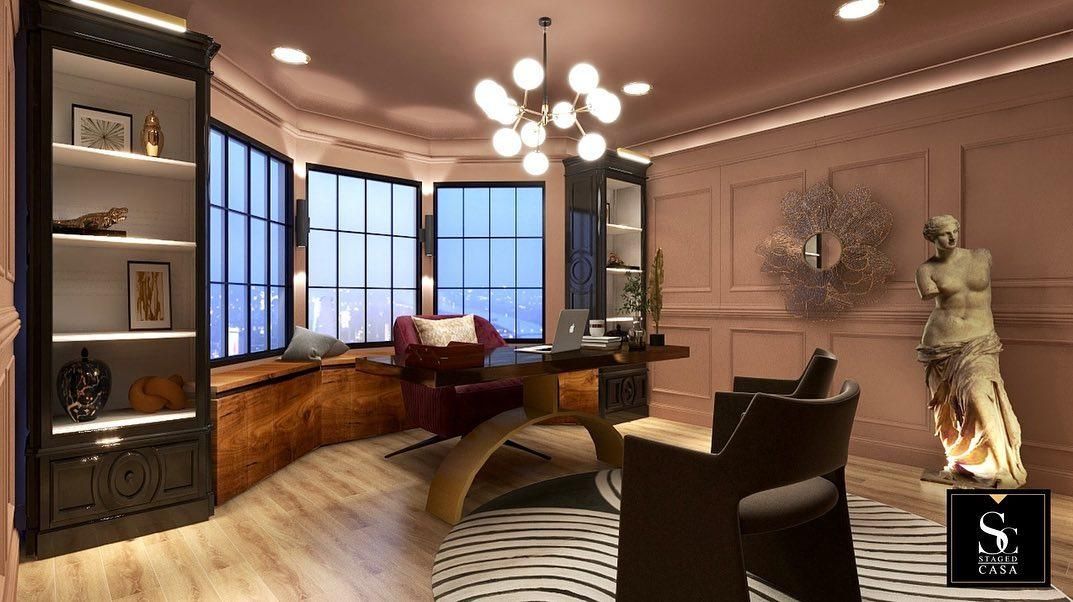
Nothing beats the snuggly feeling of Redend Point walls in the home and office. It’s cozy without feeling like the room would close in on you. Also, its undertones match typical office furniture made of leather and dark brown wood.
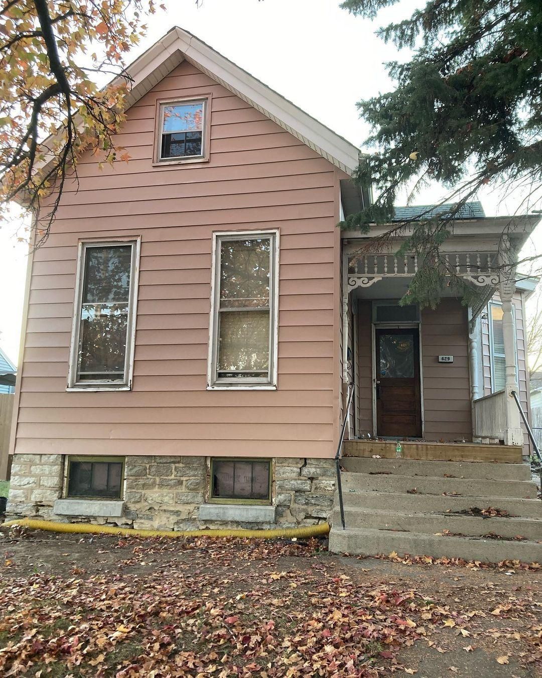
Sherwin-Williams Redend Point Exteriors
Your building will stand out when you use Redend Point on your exterior. You can paint it over a brick wall, a paneled wall, or as a half-wall on red bricks. But the best part for me is how the sunrise and sunset can give different colors to all sides of the building.
You can see an example in this picture which shows the outer building as a rosy blush pink while the inner wall appears taupe.
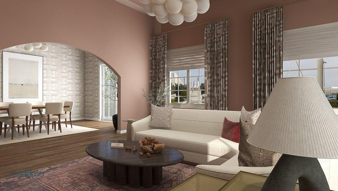
Sherwin-Williams Redend Point Living Room
Using Redend Point in your living room with simple modern pieces gives it a vintage elegance. The color blends into the background while maintaining its character.
As you can see in the image below, this homeowner chose a coordinating theme by mixing off-white furniture and accents with Redend Point.
Sherwin-Williams Redend Point Bathroom
This is one space where you can get creative without worrying about other people’s thoughts. Experiment with bolder coordinating colors like complementary deep blue cabinets and alternate gray walls. You can also explore the analogous theme here.
Sherwin-Williams Redend Point Bedroom
Your personality should shine in your bedroom because it’s your private space away from all housemates. Use Redend Point on the walls, then add color to your bedding, furniture, art, curtains, and floorings.
Sherwin-Williams Redend Point Cabinets
We’ve seen Redend Point as the star in the room, but you can’t ignore it even when it’s an accent cabinet. This combo works best with white walls and tan motifs. Add to the warmth by using golden or bronze fixtures on your kitchen, bedroom, and bathroom cabinets.
Sherwin-Williams Redend Point as an Accent
Even when you use Redend Point in bits, the color can steal the spotlight. Check out its look on this kitchen accent wall.
Sherwin-Williams Redend Point on Furniture
Highlight brick walls with Redend Point furniture that’ll stand out without messing up the simplistic vibe of the space.
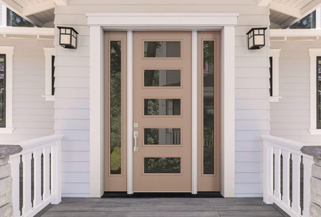
Sherwin-Williams Redend Point on Doors
Front doors painted in Redend Point stand out without looking overbearing. See how the color subtly blends with this grayscale white walls and the darker gray floorboards.
Conclusion
And we’ve come to the end of the journey. Sherwin-Williams did their big one with Redend Point, and its impact will last longer than 2023. I love how subtle yet present and sophisticated the color appears. Remember to:
- Use it as a full paint in large rooms
- Pair it with mid-toned whites and creams for the best blush tone
- Don’t expect coolness from the color.
I prefer using it as an accent in coordinating and analogous palettes but feel free to choose your style.
Please share your experience with me, including pictures of how your Redend Point turns out.
 Sherwin Williams North Star (Palette, Coordinating & Inspirations)
 Sherwin Williams Cascades (Palette, Coordinating & Inspirations)
 Sherwin Williams Clary Sage (Palette, Coordinating & Inspirations)
 Sherwin-Williams Tidewater (Palette, Coordinating & Inspirations)
 Sherwin Williams Coastal Plain (Palette, Coordinating & Inspirations)
 Sherwin Williams Balanced Beige SW 7037: Paint Color Review
