
When it comes to picking a white paint color, it can sometimes be as tricky to get right as if you are picking a more saturated shade! But, if you are looking for a cool white paint to use, then you can’t go far wrong with Sherwin Williams Nebulous White SW 7063.
I am personally a huge fan of a cool white paint color, and will take them over a warm white any day! These paint colors are often bright and fresh, perfect for bringing new life into a space, and Sherwin Williams Nebulous White is no exception.
Keep on reading to learn all there is to know about Sherwin Williams Nebulous White SW 7063, and hopefully, I can make you a convert, too!
Table of Contents
When to Choose Sherwin Williams Nebulous White SW 7063?
As usual, I’ve been doing my thing and researching Sherwin Williams Nebulous White to the fullest extent of my abilities! This has involved scouring the internet for the very best design inspiration, and using a sample paint pot or two for myself!
So, let me give you the rundown on some of the top ways in which you can use Sherwin Williams Nebulous White SW 7063.
Works with White
Although it might seem counterintuitive, pairing Sherwin Williams Nebulous White with other white paints can have a showstopping effect. This is especially true when it is used with warmer white paint colors, such as Sherwin Williams Alabaster or Grecian Villa.
Light and Bright
One of the best things about Sherwin Williams Nebulous White is that it is a cool-toned paint color. This means that it can really freshen up a space, leaving you feeling invigorated. As a result, you’ll find that it is perfect for a quick room makeover or in transitional spaces such as hallways.
Exterior Elegance
If you want a clean and sophisticated color for the outside of your home, then you really can’t go wrong with Sherwin Williams Nebulous White. This color looks fantastic not only on the siding but on the exterior brick, too. Pair with gray or black trim and accents to round the look together.
A Versatile Color
Although, yes, white can go with pretty much everything, some whites can tend to love warmer colors rather than cool ones, and vice versa. Sherwin Williams Nebulous White bucks this trend by being able to not only work with warm and cold colors but pale and incredibly saturated shades with no problem at all!
Ideal for Kitchens and Bathrooms
Thanks to its brightness and cool blue notes, Sherwin Williams Nebulous White is a perfect choice in a kitchen or bathroom. Either use it on the cabinets, or on the walls to really lift a space.
Make Your Furniture a Feature
Not just for your walls and trims, Sherwin Williams Nebulous White is also an amazing color when painted on furniture. Either add a few solid coats and some gold or iron fixings for a chic feel or distress it for a rustic allure that is perfect for any farmhouse scheme.
These are just a few ideas to whet your appetite when it comes to using Sherwin Williams Nebulous White SW 7063, and I am far from done singing the praises of this paint! Carry on scrolling and I will give you the full scoop on this paint color and why it should be your white paint of choice!
What Color is Sherwin Williams Nebulous White?
Sherwin Williams Nebulous White is a cool white color with blue undertones, but you might be wondering why Sherwin Williams chose this particular name to describe this paint color. “Nebulous” might have its meaning from two different sources. It could come from the Latin word “nebula”, which is used to describe a fog or a mist, or it could be from the nebulas that we find in outer space, which are massive clouds of dust and gas where new stars are born.
I have found a picture of a nebula for you below.
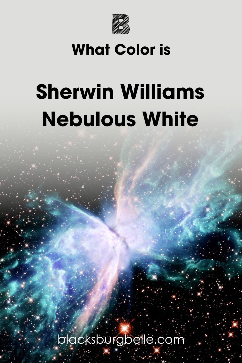
Although you can see a plethora of colors coming out of this nebula, if you look towards the center you start to see the cool, white shades come through.
Nebulas have a sense of wonder and mystery about them, and the same can be said for the effect that Sherwin Williams Nebulous White SW 7063 has on a room.
Snapshot of Sherwin Williams Nebulous White Specifications
Of course, to make an informed decision about whether Sherwin Williams Nebulous White is the right paint color for you, you’ll need to know the technical details about this paint color. I’ve got you covered, so take a look at this handy chart I have put together below.
| Sherwin Williams Nebulous White SW 7063 | |
| RGB | R: 223 G: 223 B: 220 |
| Hex Value | #DEDFDC |
| LRV | 74 |
| Undertones | Blue, Gray |
The LRV of Sherwin Williams Nebulous White
If you are not all that versed in the world of paint, you might not have heard of the term LRV before. Don’t worry, because it’s actually quite simple! LRV stands for light reflective value and helps us to know how much light a color reflects. The traditional scale goes from 0, reflecting no light at all, so black, to 100, where you find white with the highest reflective value.
It’s worth noting though that no paint color is truly black or pure white, as there is always a level of pigment in the manufacturing process. This means that when looking at paint, the darkest color you can get comes in at 2.4, and the brightest at 94.
The LRV of Sherwin Williams Nebulous White is 74. Although this is on the lighter end of the scale, this paint color definitely isn’t one of the brightest whites out there. Some people may argue it is more of an off-white.
Undertones of Sherwin Williams Nebulous White
Although it is classed as white, no color is purely just one shade, and Sherwin Williams Nebulous White is no different. So, what are the undertones of this paint color?
The main undertone of Sherwin Williams Nebulous White SW 7063 is blue, although there are some gray notes that come through too thanks to its lower LRV than other white paints.
To show you what this undertone looks like, take a look at this photo I have found from Sherwin Williams themselves.
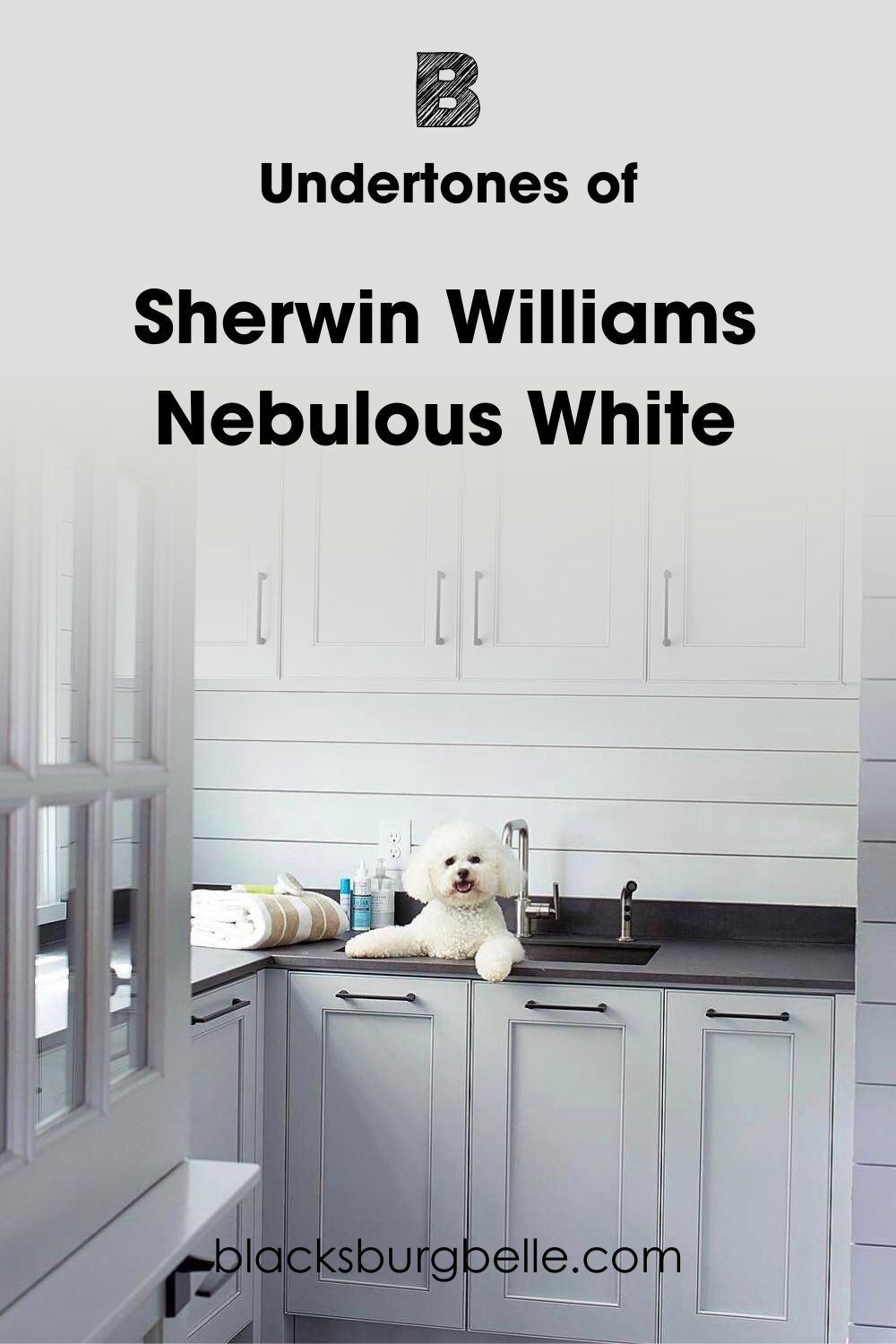
As you can see, there are blue notes coming through in the undertone, especially around the ridges and grooves of the paneling and cabinets where the shadow plays on this paint color.
Is Sherwin Williams Nebulous White Too Cold and Clinical?
One concern that you may have about this paint color, especially as it is a cool white with a blue undertone is whether it makes a room feel too cold, or becomes almost a clinical white. I am happy to put your worries at ease!
Although, yes, Sherwin Williams Nebulous White is a cool color with a cool undertone, it’s worth paying attention to the full color makeup of this paint. If we look at the RGB for Nebulous White, we can see that the main weight of the pigment is red and green. This helps to combat and balance things out.
See what I mean in this photo below.
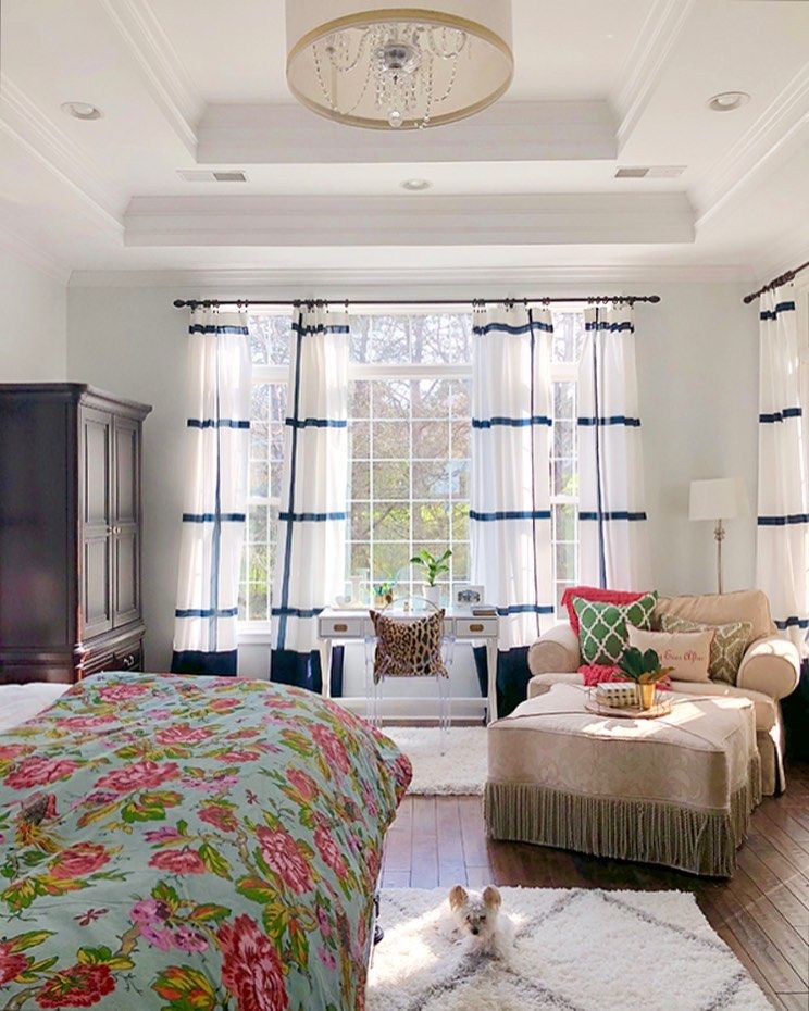
Here, even in the bright, natural light from the windows, Sherwin Williams Nebulous White just makes things feel fresh, not cold at all!
Of course, I have to add a caveat here that not all paints look the same in every single room. Depending upon the size of the room, the lighting level, and the paint finish you choose, whether it’s matte or glossy, every paint will look different. Sherwin Williams Nebulous White is no exception!
Sherwin Williams Nebulous White is Warm or Cool Color?
If you haven’t already guessed from the way that I have been talking about it, Sherwin Williams Nebulous White is a cool color.
Cool-toned colors are perfect for creating calm and freshness in a space. While warmer colors make us sink into coziness, cool colors uplift us and ignite our curiosity.
It’s easy to see why this color ends up being a real breath of fresh air to me!
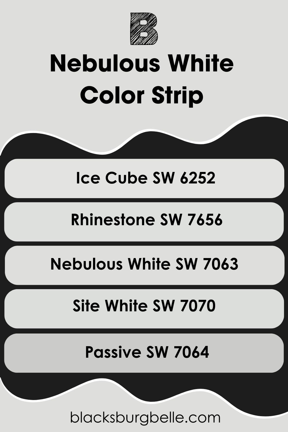
Sherwin Williams Nebulous White Color Strip: Lighter or Darker Exploration
I know that sometimes a color is close, but not perfect when it comes to meeting your design needs. So, I have gone ahead and had a look at some lighter and darker shades to compare to Sherwin Williams Nebulous White.
I have put them in a list below from light to dark, with Nebulous White in the middle for reference.
- Sherwin Williams Ice Cube SW 6252
- Sherwin Williams Rhinestone SW 7656
- Sherwin Williams Nebulous White SW 7063
- Sherwin Williams Site White SW 7070
- Sherwin Williams Passive SW 7064
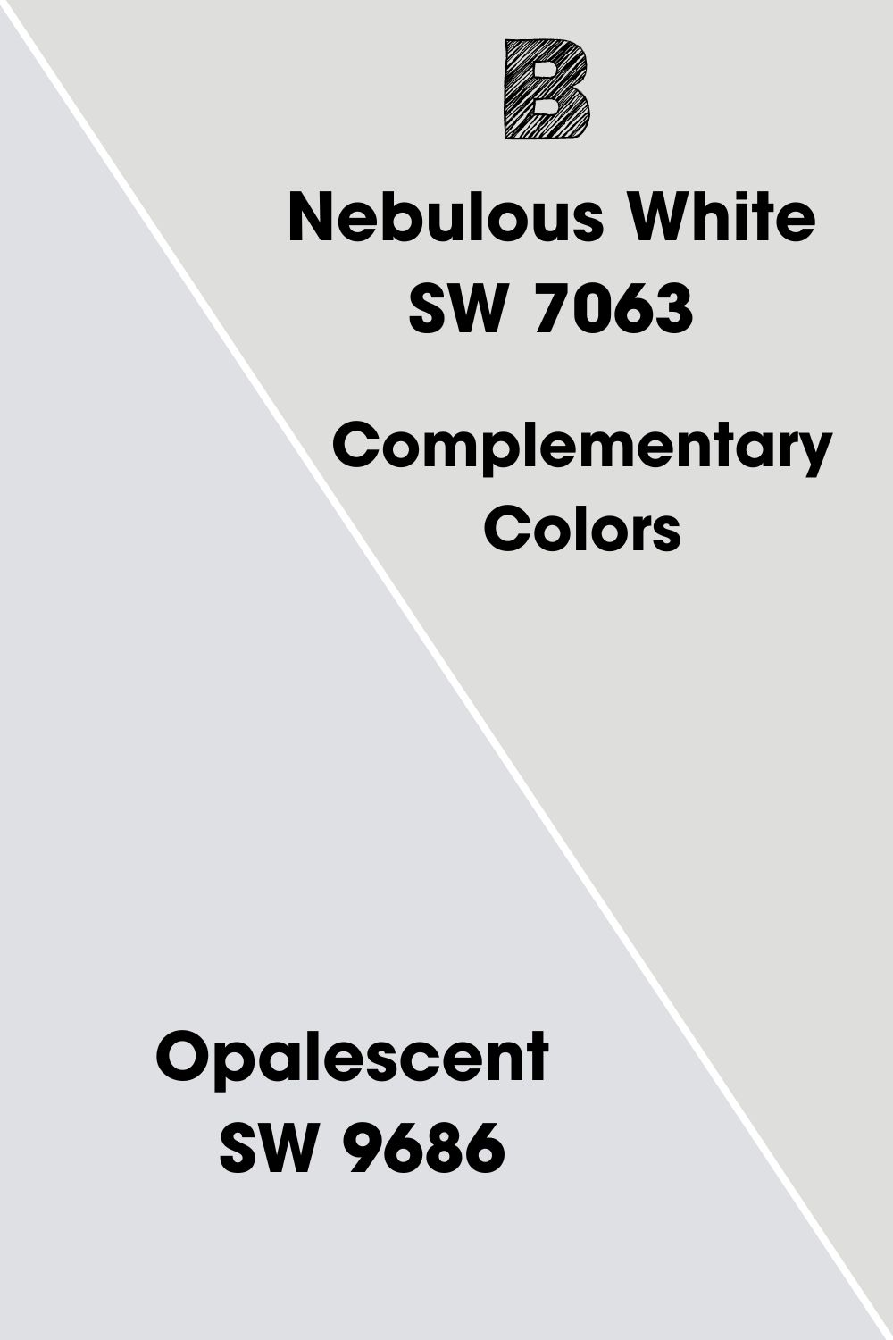
Sherwin Williams Nebulous White Complementary Colors
Although it is certainly possible, you probably don’t want to use only Sherwin Williams Nebulous White in a room. So, you’re going to need some other paint colors to go along with it!
A great place to start is to find the complementary color. This color is found at an equal distance on the opposite side of the color wheel and usually provides a fitting contrast to the original color.
I’ve gone ahead and found out what the complementary color is for Sherwin Williams Nebulous White for you, and figured out a paint from Sherwin Williams to match!
The complementary color to Nebulous White is a purple-tinged white, which is perfectly represented by Sherwin Williams Opalescent SW 9686.
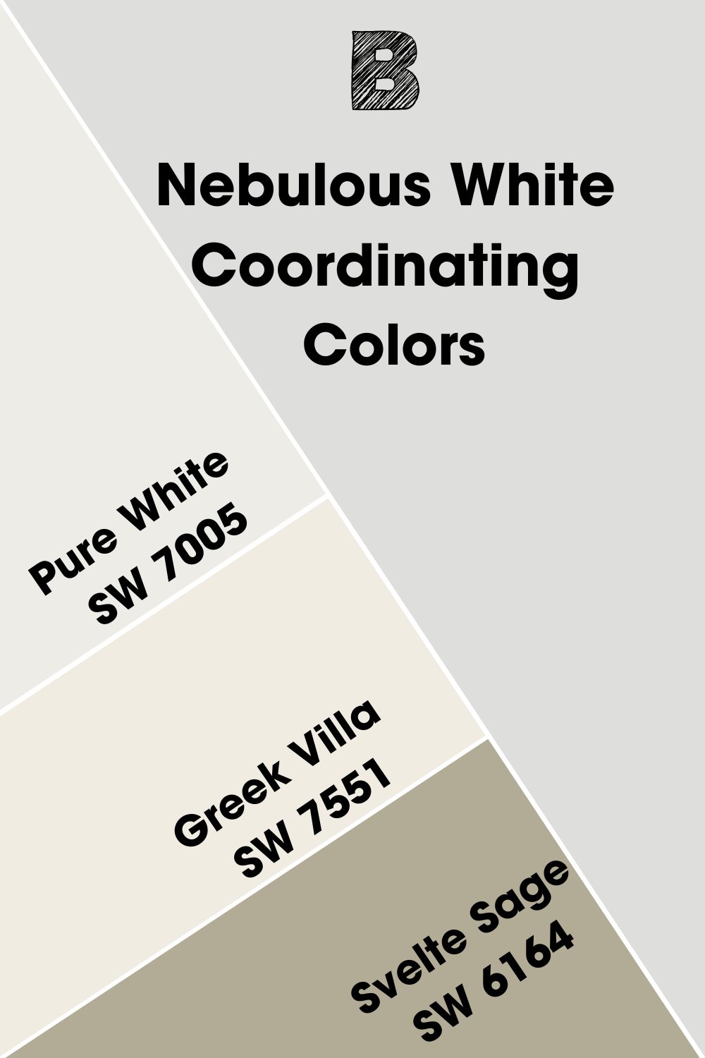
Sherwin Williams Nebulous White Coordinating Colors
If you don’t want to make as much of a contrast when it comes to your color scheme involving Sherwin Williams Nebulous White, you might want to look at the coordinating colors instead, which offer more cohesion and often share aspects with the original paint color.
Here are the top 3 coordinating colors to go with Sherwin Williams Nebulous White SW 7063.
- Sherwin Williams Pure White SW 7005:This bright white with its slight yellow undertone makes a great trim and ceiling color when used with Nebulous White.
- Sherwin Williams Greek Villa SW 7551:This warm off-white is capable of warming up any space, so it’s perfect to accompany Nebulous White when you feel this color might become too cool.
- Sherwin Williams Svelte Sage SW 6164:This neutral brown-green has gray undertones that complement Nebulous White well, whilst adding an earthy feel to a space. Perfect for an accent wall or for a piece of furniture.
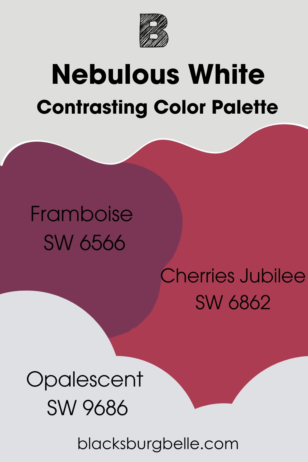
Sherwin Williams Nebulous White Color Palettes
Contrasting Color Palette
- Sherwin Williams Framboise SW 6566: This rich berry red has purple notes in it that work well with the blue undertone of Nebulous White. Pair for a rich contrast and a showstopping effect on an accent wall or statement piece of furniture.
- Sherwin Williams Cherries Jubilee SW 6862: This cherry red works beautifully in combination with Framboise, and meshes with Nebulous White by contrasting its cool notes.
- Sherwin Williams Opalescent SW 9686:As the true complementary color to Nebulous White on the color wheel, we already know that Opalescent works well. Its purple undertones help to bring in the other two colors in this palette, too.
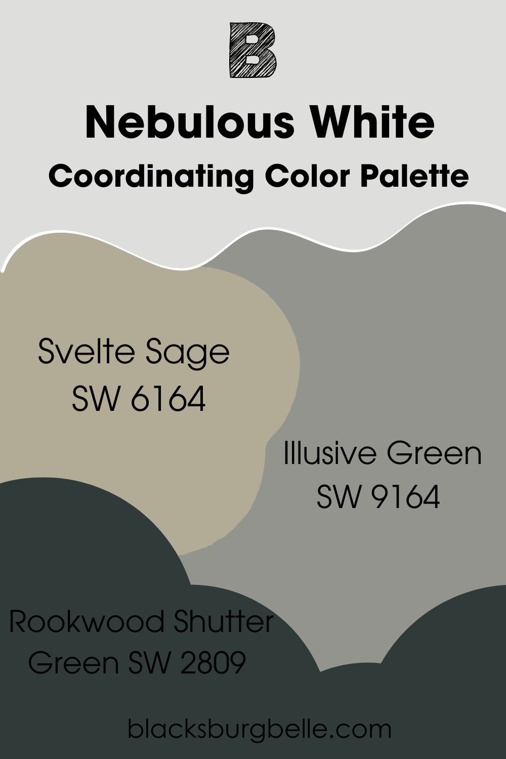
Coordinating Color Palette
- Sherwin Williams Svelte Sage SW 6164: Helping to start off a natural feel with this color palette, the earthy green notes of Svelte Sage help to mellow out the cool freshness of Nebulous White.
- Sherwin Williams Illusive Green SW 9164: This green-gray has cyan undertones which allow it to work amazingly with Nebulous White.
- Sherwin Williams Rookwood Shutter Green SW 2809: From the Historic Collection, this deep and dark green has gray undertones to mesh together with the other greens and grays reflected in this scheme.
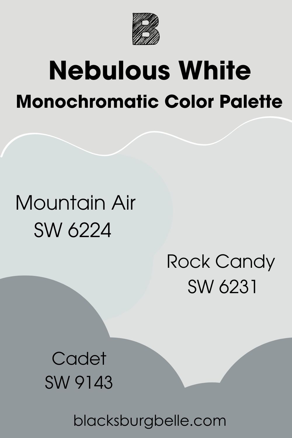
Monochromatic Color Palette
- Sherwin Williams Mountain Air SW 6224: This cool pastel has notes of blue and green which help it to blend seamlessly with Nebulous White while adding a bit of color.
- Sherwin Williams Rock Candy SW 6231:This cool blue white is slightly brighter than Nebulous White, and works well as a trim color.
- Sherwin Williams Cadet SW 9143:This blue gray acts as the dark element in this color palette, adding depth without being too heavy.
Sherwin Williams Nebulous White vs Other Paint Colors
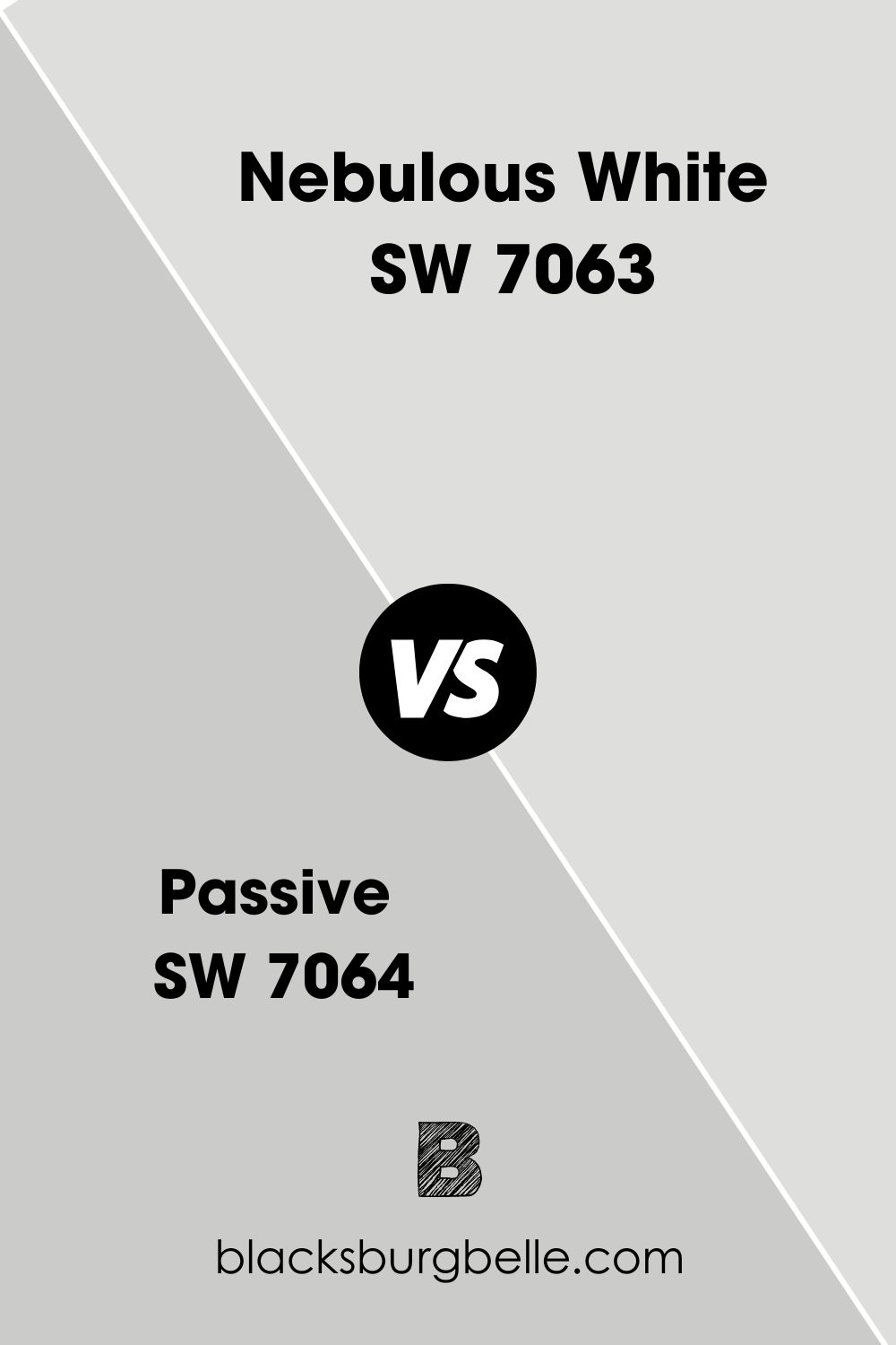
Sherwin Williams Nebulous White vs Passive
Although both of these colors are cool-toned and have blue undertones, there is a difference in their lightness. While Sherwin Williams Nebulous White has an LRV of 74 and would be considered an off-white, Passive with an LRV of 60 is definitely much more of a gray.
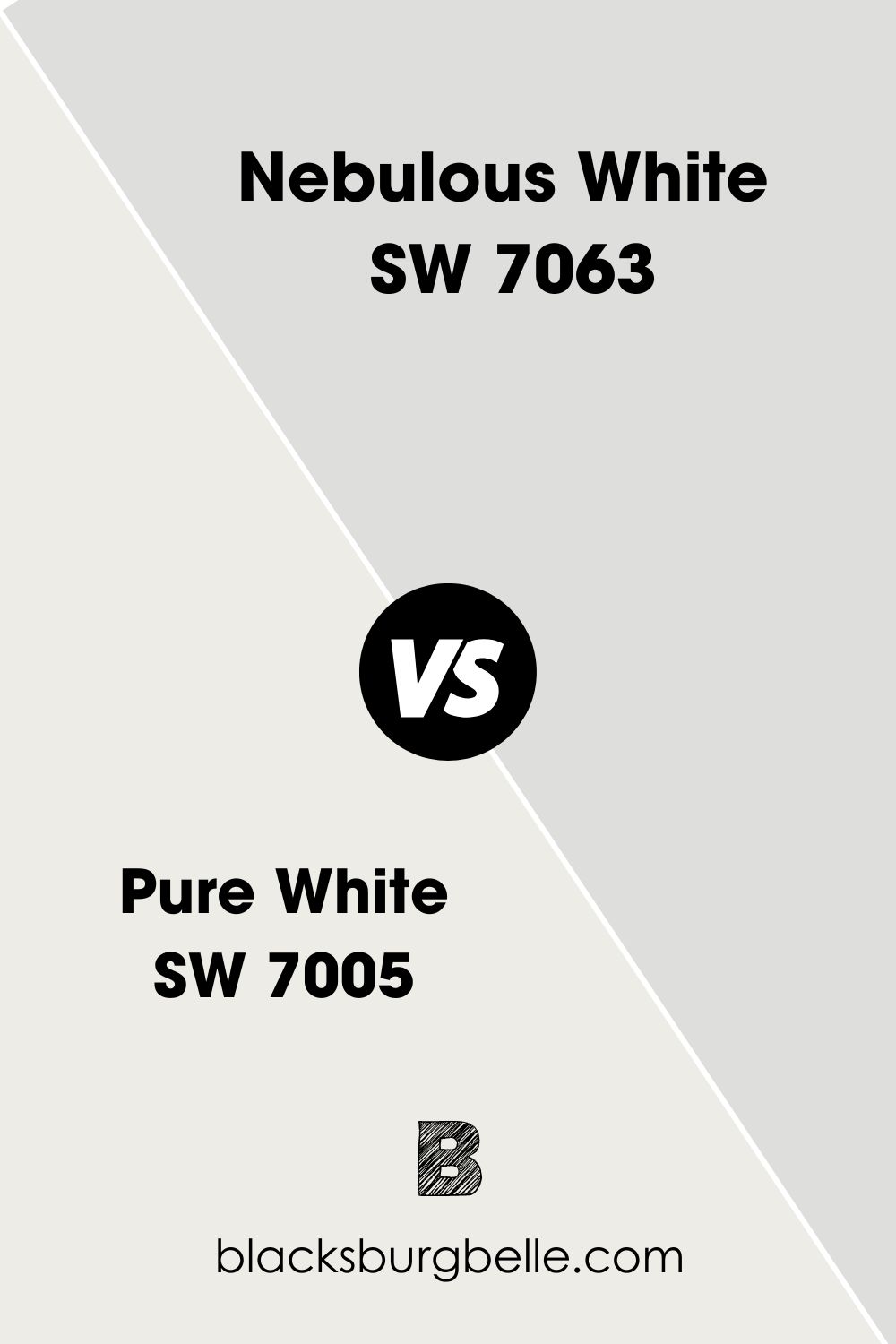
Sherwin Williams Nebulous White vs Pure White
Sherwin Williams Pure White is much lighter than Nebulous White, with an LRV of 84 to Nebulous White’s 74. Another difference between these colors is their undertones, with Pure White having a yellow undertone to make it a warm color, while Nebulous White has a blue undertone making it cool.
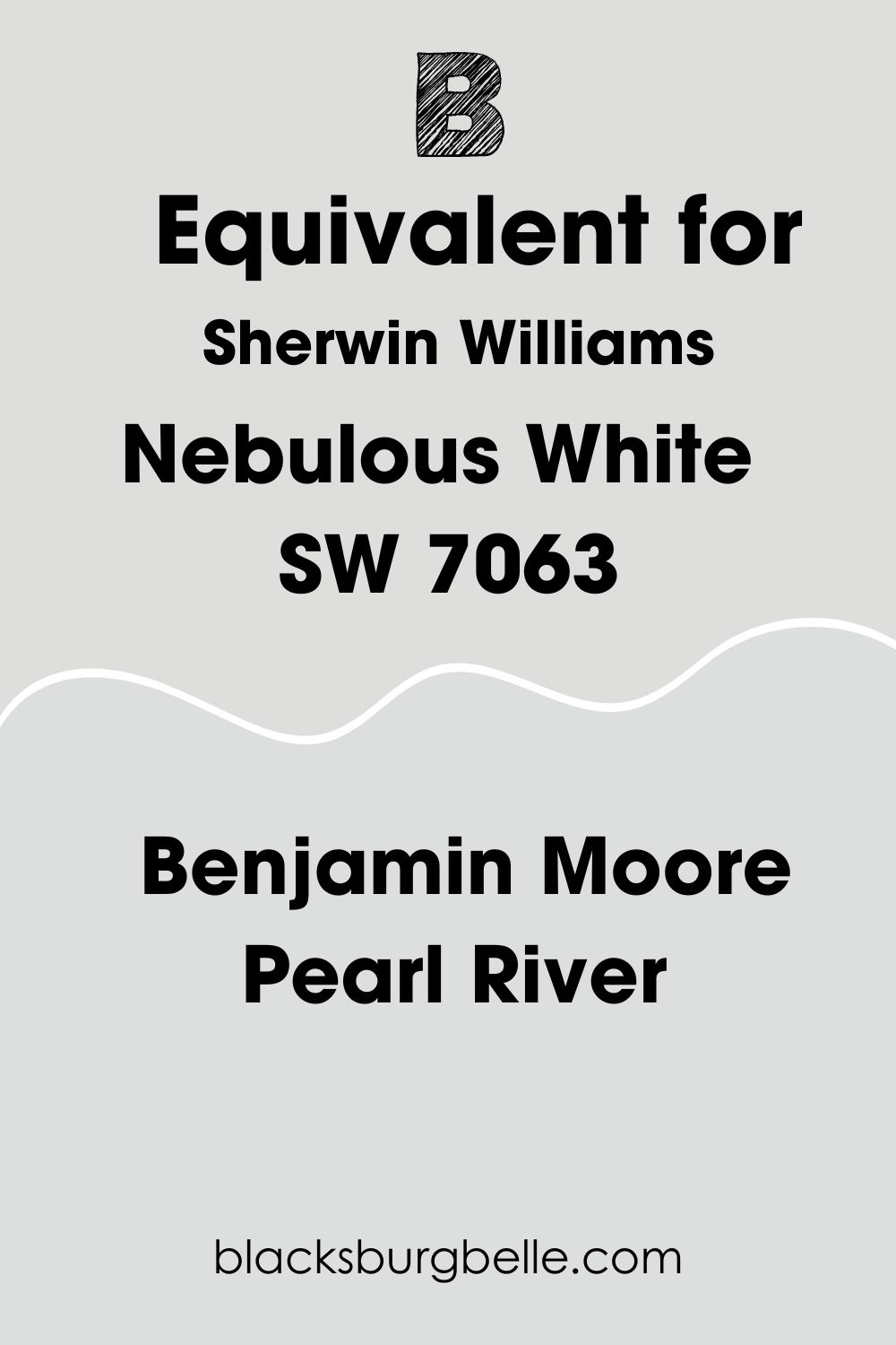
Sherwin Williams Nebulous White Benjamin Moore Equivalent
If you like Sherwin Williams Nebulous White but just wish it came as a Benjamin Moore shade instead, I have got you covered!
Although there is not an exact color match, there is a color that comes incredibly close from the Benjamin Moore catalog, and that is Pearl River.
Both colors have a similar LRV, with Pearl River just being 1 point darker at 73. Alongside blue, Pearl River also has some violet undertones to it as well.
Where Can You Use Sherwin Williams Nebulous White SW 7063?
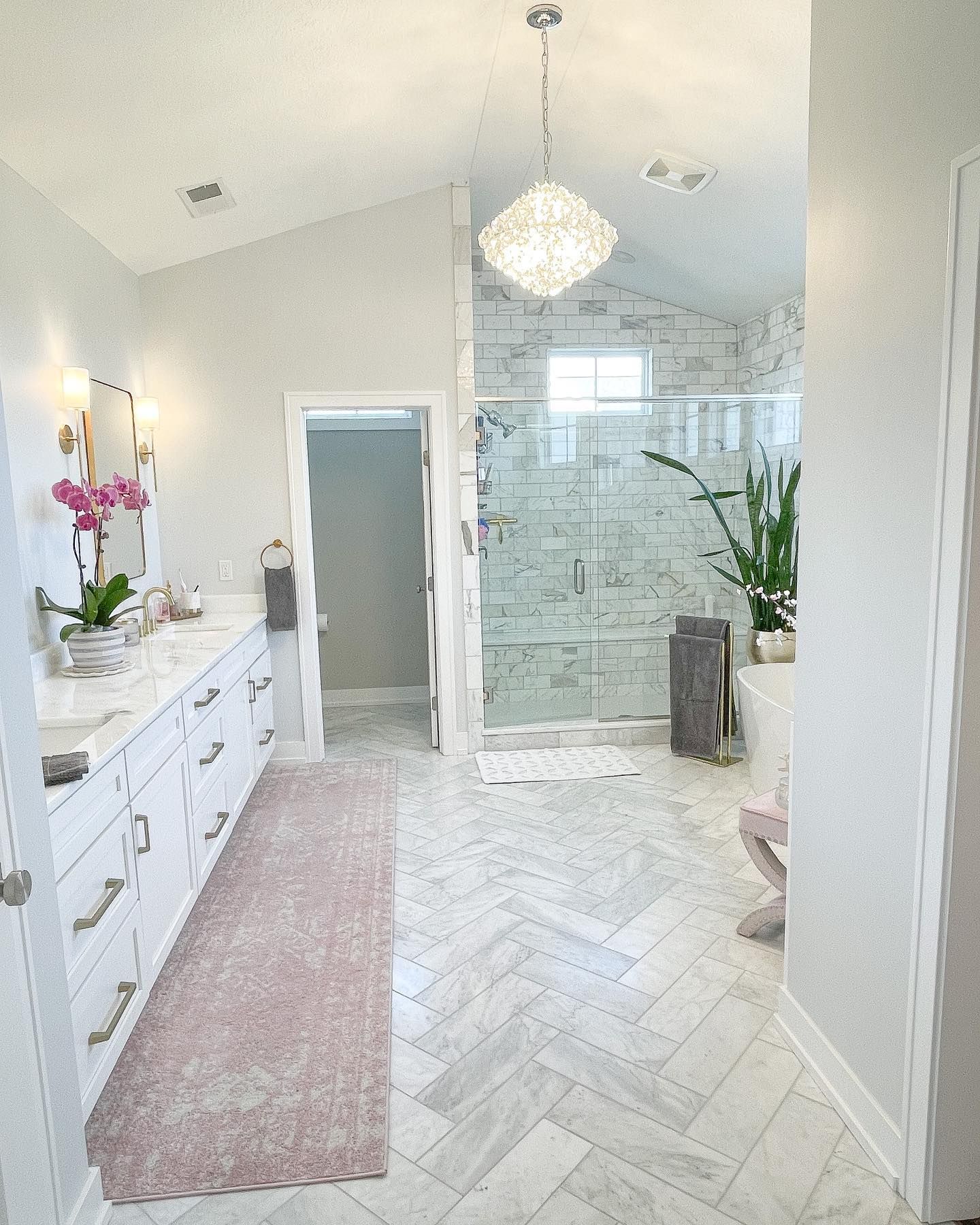
Sherwin Williams Nebulous White Bathroom
With its cool notes, Sherwin Williams Nebulous White is a perfect addition to any bathroom. See in the example below how it brings together the white of the tiles, cabinets, and the plumbing by leaning into its cool, gray coloring? I love it!
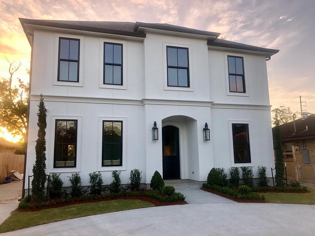
Sherwin Williams Nebulous White Exterior
Not just to be used inside, as a white paint color it’s a no-brainer that Sherwin Williams Nebulous White SW 7063 would also look amazing on the outside of your property too! See how crisp it looks in this example below, helping to give serious curb appeal!
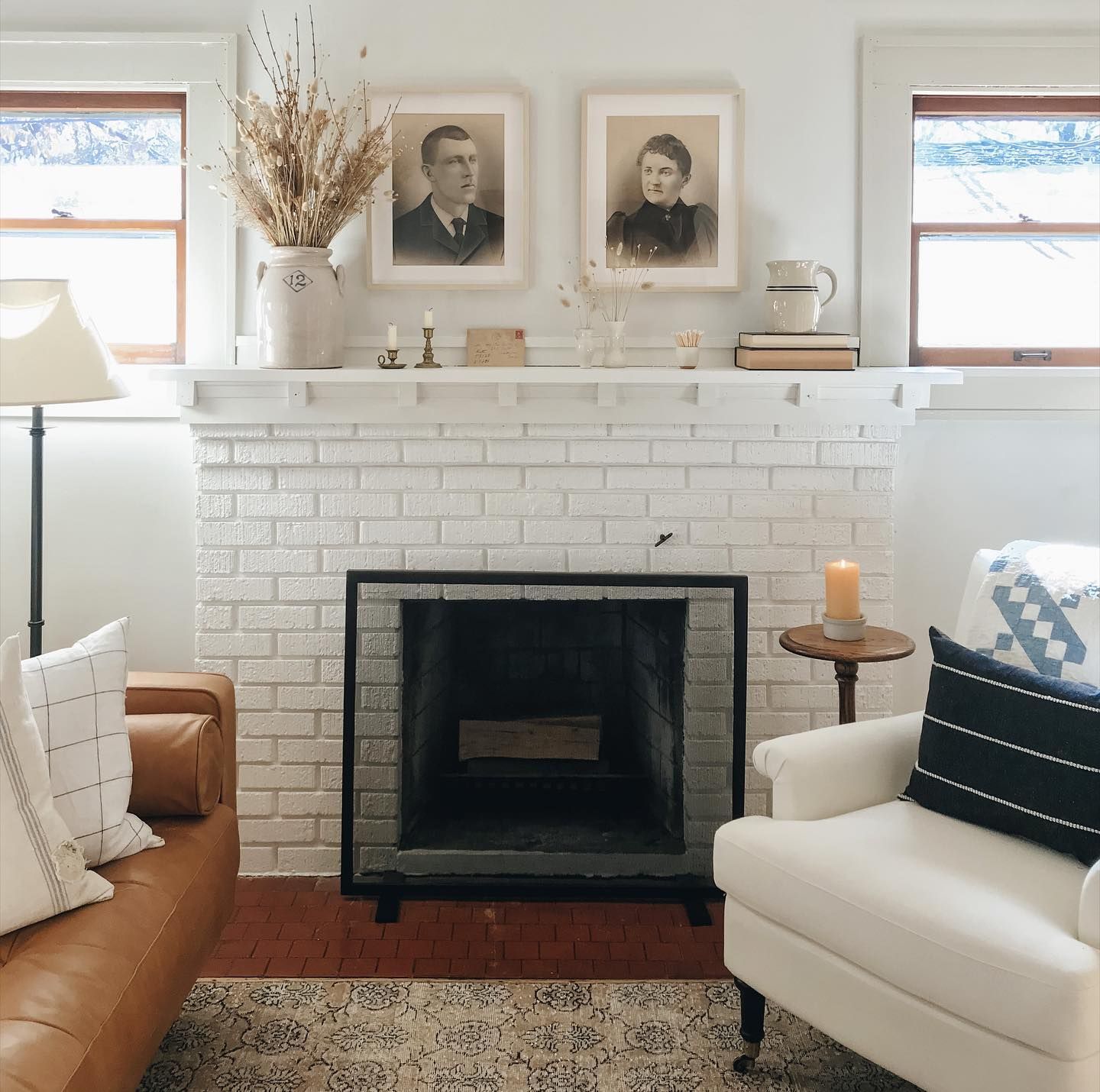
Sherwin Williams Nebulous White Living Room
Sherwin Williams Nebulous White can mesh with almost anything, and in this living room below it works wonderfully with the warm wood flooring and the rich blue of the couch. You can also see how it works with a warmer white trim, which is on the window frames and pillars of the fireplace surround.
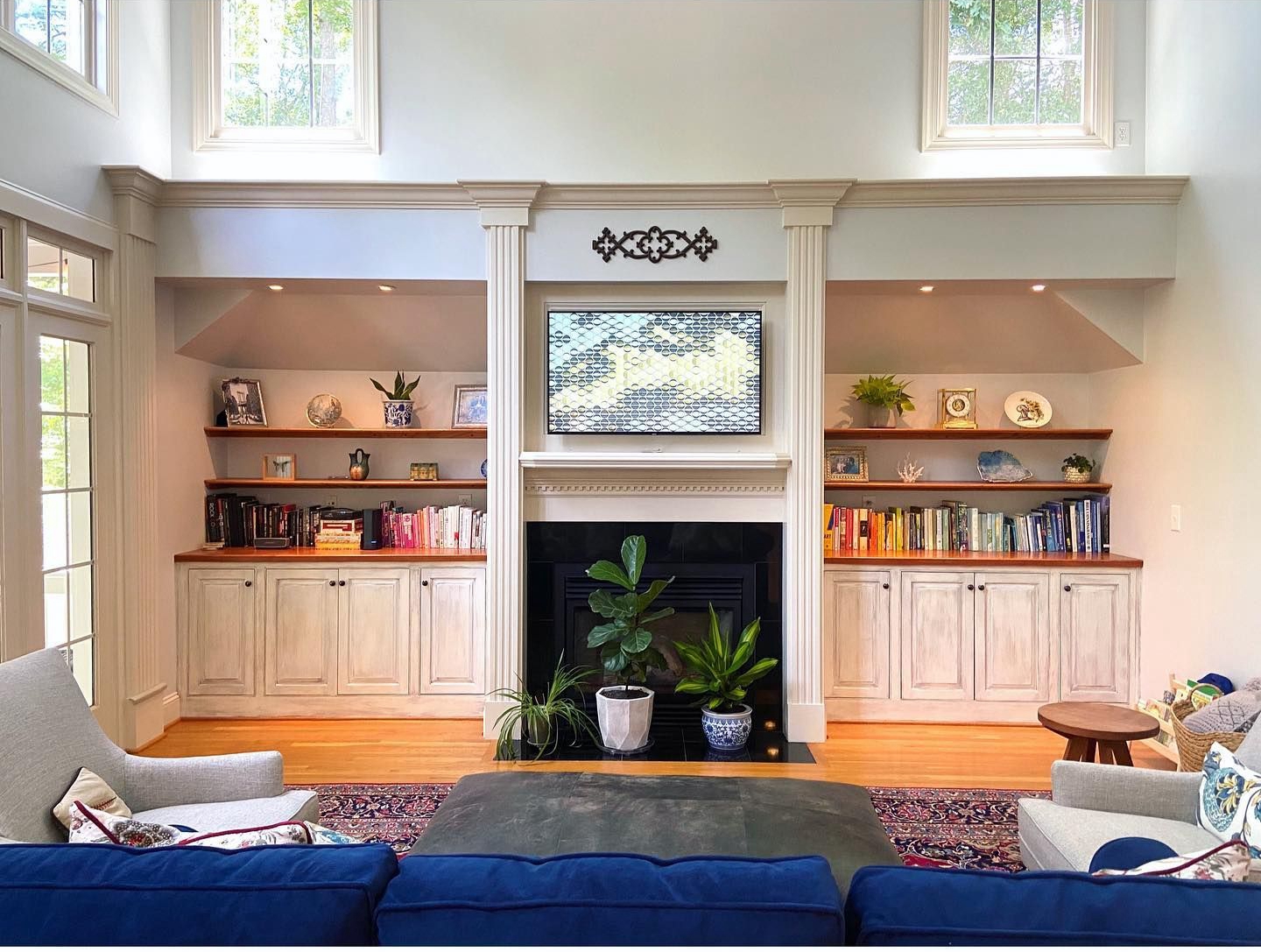
Speaking of fireplaces, in this living room Sherwin Williams Nebulous White SW 7063 has been used not only on the walls but carried on onto the brick of the fireplace too! Here it allows other details of the room to take the fore, but still has more character about it than other white paints with less of an undertone.
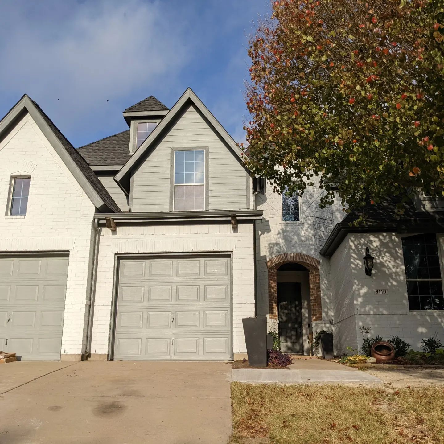
Sherwin Williams Nebulous White Exterior Brick
In this inspiration picture I have found, Sherwin Williams Nebulous White has been used as the main brick color, helping the other grays on the siding, trim, and garage doors to pop. Not only does it work with the cool grays, but I love how it also helps the exposed brick around the main entryway stand out, too.
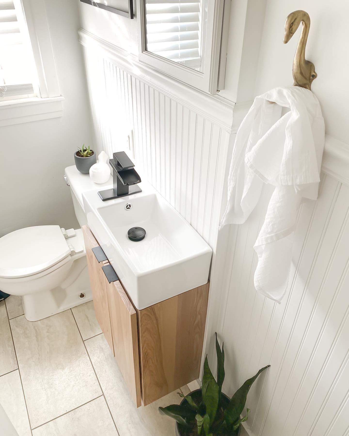
Sherwin Williams Nebulous White Powder Room
Not just for big bathrooms, Sherwin Williams Nebulous White SW 7063 can also work wonders in smaller powder rooms. In this example here, it’s been used as the wall color, with absolutely stunning results!
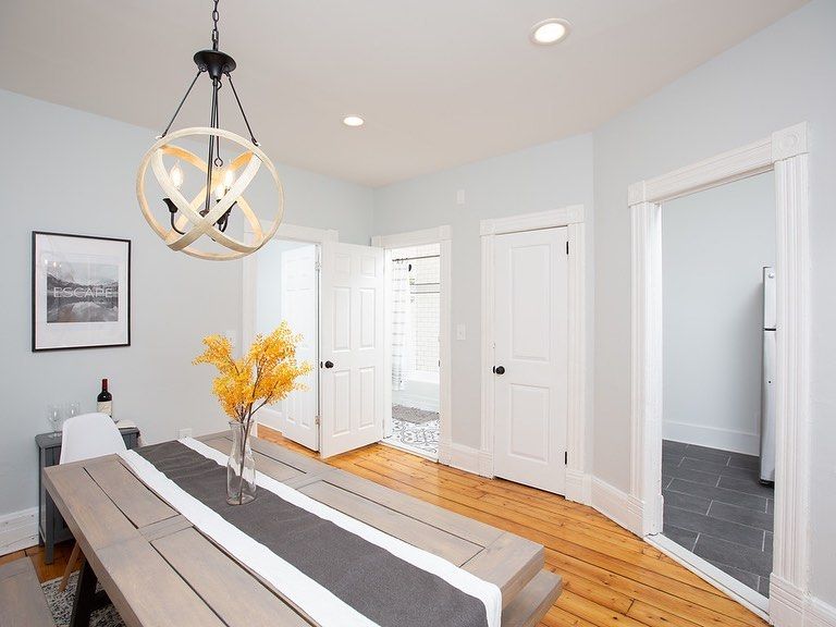
Sherwin Williams Nebulous White Dining Room
If you ever had doubts that Sherwin Williams Nebulous White had a blue undertone, you can’t ignore it in this dining room setup. With the addition of the warmer whites on the doors and ceiling, it really helps to pick up on the cool gray and blue notes of this paint.
Sherwin Williams Nebulous White Patio
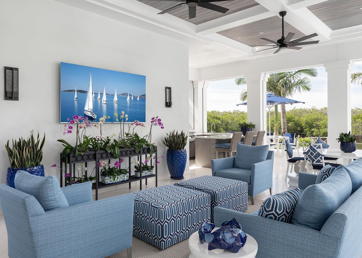
Here in this sunroom-come-patio space, Sherwin Williams Nebulous White helps to add to the beachy vibe and keep things feeling fresh! I personally love the way that it picks up on the other blues in the space from the furniture and the plant pots.
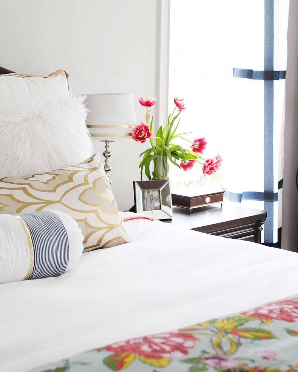
Sherwin Williams Nebulous White Bedroom
If your bedroom needs a facelift, then Sherwin Williams Nebulous White could be your answer! This color goes with pretty much everything, allowing your bedroom furniture and textiles to shine on a backdrop that is truly fresh and inviting.
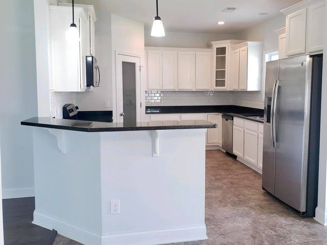
Sherwin Williams Nebulous White Kitchen
In this kitchen, Nebulous White has been used as the wall color and works as the perfect backdrop to the warmer white that is painted on the kitchen cabinets. This look can also easily be reversed with Sherwin Williams Nebulous White on kitchen cabinets and a warmer white on the walls, too!
Conclusion
To round things up, Sherwin Williams Nebulous White is a cool-toned white paint color that you really shouldn’t sleep on!
I love the way its slight icy vibe with the blue undertone can really freshen up a space. Not only that but the versatility that this paint color shows when it is paired with even warm colors is truly amazing!
So, when it comes to picking a white for your design project, a cool-toned one is nothing to be scared of.
If I still haven’t convinced you fully, why not pick up a sample pot of Sherwin Williams Nebulous White SW 7063 for yourself and see the magic in action?
 Sherwin Williams Gauntlet Gray (Palette, Coordinating & Inspirations)
 Sherwin Williams Rain (Palette, Coordinating & Inspirations)
 Sherwin Williams Pewter Green (Palette, Coordinating & Inspirations)
 Sherwin Williams Magnetic Gray (Palette, Coordinating & Inspirations)
 Sherwin Williams Lazy Gray (Palette, Coordinating & Inspirations)
 Sherwin Williams Rhinestone (Palette, Coordinating & Inspirations)
