
Do you want a relaxing neutral paint in your home but can’t decide on a color? Then, you’ve come to the right place. Welcome to my world of colors, where I dive into high-quality paints’ emotions, science, and creative parts.
I found Sherwin-Williams Comfort Gray (SW 6205) while reviewing the best neutrals for full house paintings, and it’s a soft green-gray paint ideal for zen spaces.
This color is part of Sherwin-Williams Living Well (Recharge) and Pottery Barn Kids (Fall/Winter) collections.
Now, let’s explore the undertones, LRV, coordinating colors, and how to use Comfort Gray.
Table of Contents
When to Choose (Comfort Gray SW 6205)?
Before we get into the technicalities of using Comfort Gray (SW 6205), I’ll appeal to your emotions and interests. Here’s a quick survey of reasons to choose Comfort Gray so you can decide if it aligns with your taste and vision.
Want Some Relaxed Vibes?
Comfort Gray’s coolness creates a soothing environment for you to unwind after a long working day.
Looking for Light?
Don’t choose this color if you’re looking for bright neutral paint. It’s a medium-light shade that leans more towards medium than light.
Playing with Neutrals?
Comfort Gray is perfect when you can’t decide on colorless paint. Because it’s not green, blue, or gray but all of the above, you can get creative with your decor without compromising neutrality.
Thinking of a Bathroom Renovation?
You’d love the calming aura from Comfort Gray, whether it’s a bathroom cabinet or half-wall. You can offset its muted tone with a darker brown color or brighten it with bold white paint.
Making a Bold Statement with Your Doors?
Whether it’s a front door or an interior door, Comfort Gray is a beautiful color choice. Its three-toned chameleon nature would thrive in this position, especially when you pair it with green, blue, white, or gray walls.
Outdoor Lover?
Keep your guests intrigued as they wonder about the color of your home exterior. “Is it Gray, Blue, or Green?” That makes a fun guessing game, as they’ll never agree.
Want your Clients to Feel Relaxed before an Appointment?
Many professionals recommend Comfort Gray in offices, waiting rooms, and dentist rooms because it’s a soothing color. It inspires confidence in your guests before and during an appointment.
Now that you’ve seen the potential of Comfort Gray in the home and office (especially in waiting rooms) let’s get technical.
What Color is Sherwin-Williams Comfort Gray?
Comfort Gray got its name from two elements in the color. Firstly, it’s a gray paint which is a mixture of white and black. In ancient language, gray meant “without color,” a.k.a. Neutral, while comfort describes the feeling you get from this shade.
See what this paint color looks like before I continue.
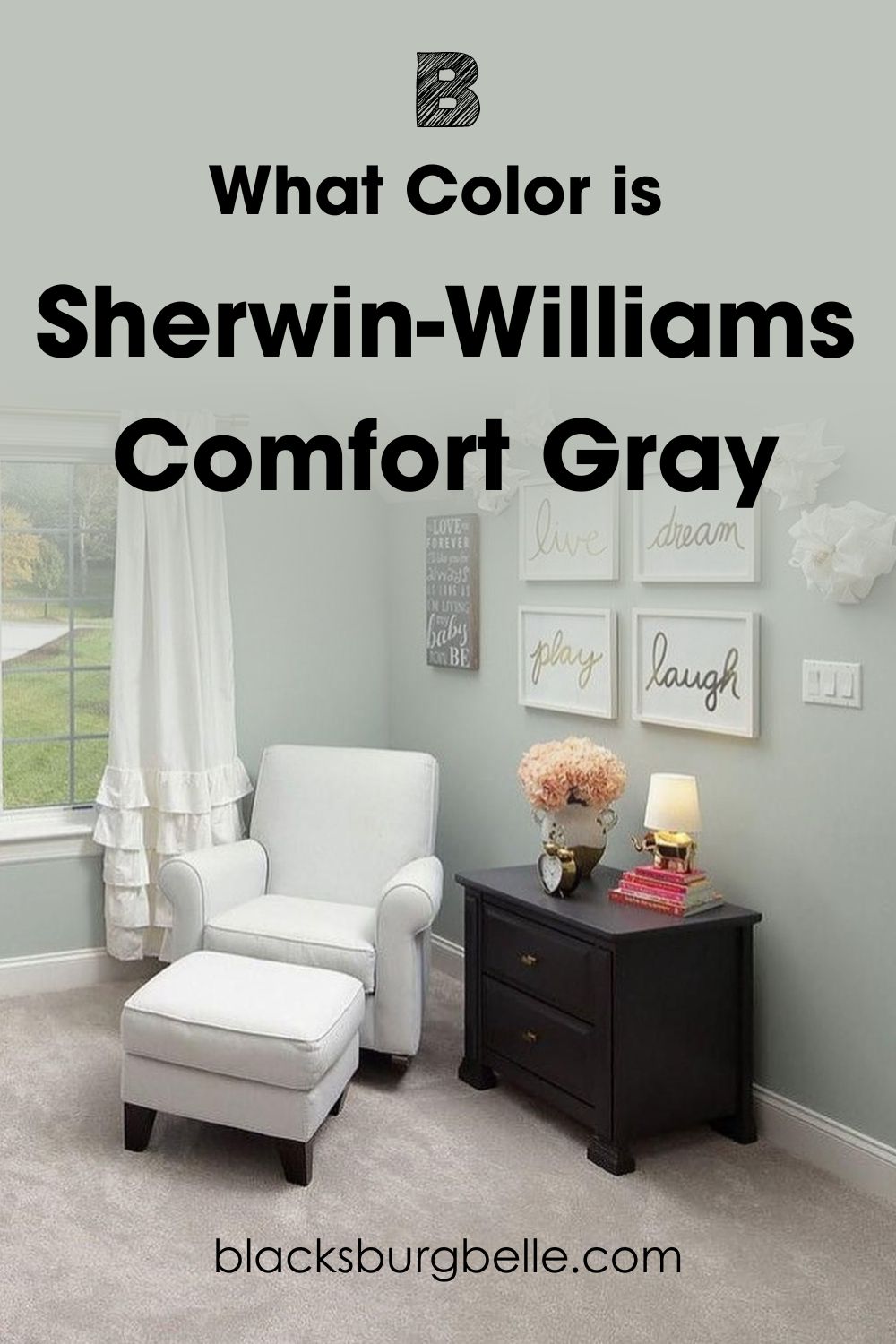
You can see that Sherwin-Williams Comfort Gray (SW 6205) is a cool green-gray paint with a misty mid-toned look. As its name suggests, this color wraps you in a comforting hug while maintaining neutrality.
Still not intrigued? This next part will win you over.
Snapshot of Comfort Gray Specification
If you’re a person of science, then this table showing the details of Comfort Gray will appeal to you. It contains all the info you need to mix the color yourself and what to expect when you use it on any surface.
| Name | Comfort Gray (SW 6205) |
| RGB | Red 190 | Green 195 | Blue 187 |
| Hex Value | #BEC3BB |
| LRV | 54 |
| Undertones | Green, Blue |
The LRV of Sherwin-Williams Comfort Gray
All paints have a Light Reflectance Value (LRV) measured on a scale of 3 – 97, with 0 being pitch black and 100 being pure white.
Instead of 0 – 100, the value caps at 3 – 97 because of the undertones present in every mixed paint.
Comfort Gray has an LRV of 54. That means this color is not close to black or white but is not exactly on the middle point. Hence, Comfort Gray is primarily neutral, like any color in the 45 – 55 range.
The extra 4% on its LRV comes from the green undertone, which consumes the color under bright lighting.
Undertones of Sherwin-Williams Comfort Gray
Now that you understand all that LRV is, let’s discuss undertones and why they exist.
Sherwin-Williams Comfort Gray has a soft blue and green undertone. Are you surprised? I was too, when I first saw the color. Check out Comfort Gray in the picture below as I explain why it has two undertones.
Does Comfort Gray Look Green?
If your first encounter with Comfort Gray is at night or under dim lighting, you’ll understand why this question comes up often. The color leans into its green undertone with less lighting and dusky skies.
The dominant green tint is because that’s the highest pigment in its RGB component.
Does Comfort Gray Look Blue?
Another popular question I get is, why does Comfort Gray look blue?
Well, it will interest you to know that once the dusky sky fades under morning sunlight, Comfort Gray transforms into a beautiful blue-gray paint. I first saw the faint blue undertone and wondered why Sherwin-Williams categorized Comfort Gray as green paint.
But it made sense once I realized the blue tint only showed under cool white lighting and open window rooms in the morning (8:00 am – 11:00 am).
Is Sherwin-Williams Comfort Gray a Warm or Cool Color?
Comfort Gray (SW 6205) is a cool color. All its elements, from the green and blue undertones to the gray overtone, are all cool hues. The color wheel is split into warm and cool colors based on the emotions and aura each shade provides.
Because Comfort Gray looks like it’s moving away when used on walls, and its undertones take form from the ocean, it’s a cool color.
Comfort Gray on your bedroom walls and bathroom accents will make the rooms feel like a post-rainfall September evening. That’s why it belongs to the collections Living Well (Recharge) and Pottery Barn Kids (Fall/Winter).
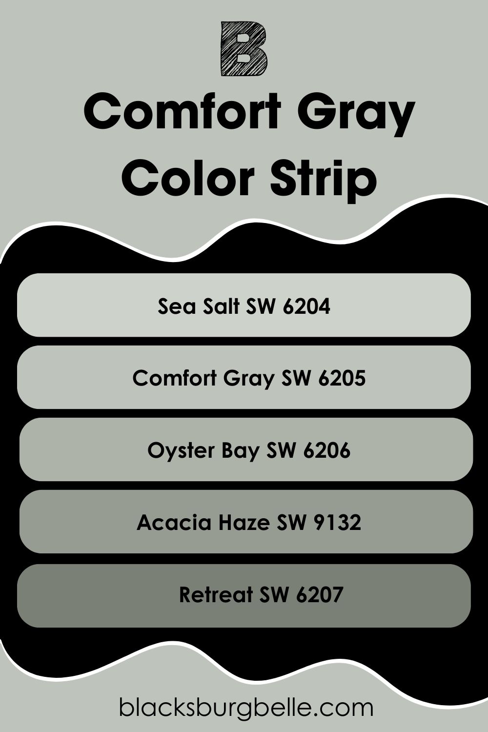
Sherwin-Williams Comfort Gray Color Strip: Lighter or Darker Exploration
Let’s discuss lighter and darker shades of Comfort Gray (SW 6205). If you feel like the color is too neutral, Sherwin-Williams offers seven colors in one strip. But I picked five for this review and arranged them from the lightest to the darkest.
- Sherwin-Williams Sea Salt (SW 6204)
- Sherwin-Williams Comfort Gray (SW 6205)
- Sherwin-Williams Oyster Bay (SW 6206)
- Sherwin-Williams Acacia Haze (SW 9132)
- Sherwin-Williams Retreat (SW 6207)
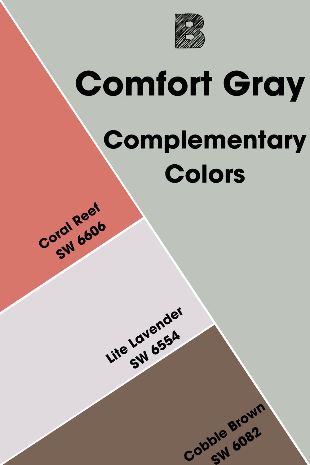
Complementary Colors for Sherwin-Williams Comfort Gray
Colors on opposite ends of the color wheel complement each other because of their contrasting tones. The placement from a standard wheel containing primary and secondary colors is blue-orange, red-green, and yellow-purple.
So, as a two-toned color, we’ll use the blue-green (aqua) undertone to match Sherwin-Williams Comfort Gray’s complementary color.
You can use red to highlight its green undertone or orange to emphasize its blue undertone or complement both undertones with a reddish-orange tan color. See the three complementary colors I’ve picked below:
- Coral Reef (SW 6606):This warm watermelon red paint adds a playful energy to the quiet aura of Comfort Gray walls. It’s a great combo for kids’ rooms and living rooms.
- Lite Lavender (SW 6554): This beautiful reddish-violet color is medium-light and adds energy to the muted Comfort Gray. Use it in your bedrooms and bathrooms to introduce a warm vibe to the environment.
- Cobble Brown (SW 6082): You’ll notice most Comfort Gray rooms have dark brown furniture like this orange-tan paint. The contrast creates an aura balance in your living rooms and entryways.
Sherwin-Williams Comfort Gray Coordinating Colors
By now, you should know that there’s more to combining colors than mixing two shades because you like their look. Coordinating colors are made for each other so they blend when you pair them, no matter their undertones and overtones.
Here are some bold themes you can try on your next renovation:
- Analogous Theme:Color sisters, as I call them, are three shades sitting beside each other on the color wheel. Mix primary and secondary colors and secondary and tertiary colors for the best result. A good example is the Green-Blue-Purple combo.
- Complementary Theme:Make a bold statement by pairing contrasting colors.
- Triadic Theme:Get creative by picking three unlikely colors from equal triangle distance on the color. So, all primary colors (red-blue-yellow) and secondary colors (purple-green-orange).
- Split Complementary Theme:This theme isn’t common because it’s tricky to style. It requires using analogous colors of a complementary color. Meaning for Green, you’ll pick Orange-Red and Purple-Red.
- Monochromatic Theme:Adding white to a color creates a tint, while black forms a shade. Combining variations of one color in a space creates harmony.
The monochrome theme is the best when a color is meaningful to you, but you want variety. If you use bold color themes like Analogous and Triadic, remember to choose one color as the anchor and the others as accents.
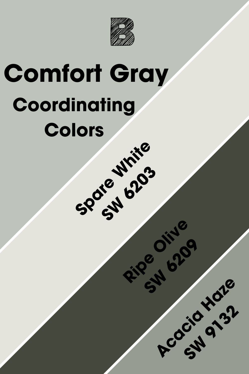
Coordinating Colors for Sherwin-Williams Comfort Gray
With so many options, it wasn’t easy settling on these three but I promise they’re worth it for highlighting Sherwin-Williams Comfort Gray.
- Sherwin-Williams Spare White (SW 6203):This green-tinted white paint will blend in as a trim with Comfort Gray walls. It’s also a medium-light color so it won’t mess with the tranquil environment you’ve created.
- Sherwin-Williams Ripe Olive (SW 6209):Use the deep green shade of this color with a soft blue-gray undertone that matches Comfort Gray, as an accent. Its 6 LRV adds sophistication to your muted gray paint.
- Sherwin-Williams Acacia Haze (SW 9132):I love this medium-dark green gray because of its blue-gray undertone. It’s a mix of elegance and minimalism wrapped in one color.
Notice that all three colors I selected have blue-gray and green undertones to complement Comfort Gray’s nuances.
Sherwin-Williams Comfort Gray Color Palette
Based on the summary I gave you before, I’ll highlight the best three colors to fit in three color palettes for Comfort Gray. Because it’s a muted color, I chose bolder shades in each palette, and they’re all from Sherwin-Williams.
Also, I narrowed the palettes to the three most popular designs. Check them out.
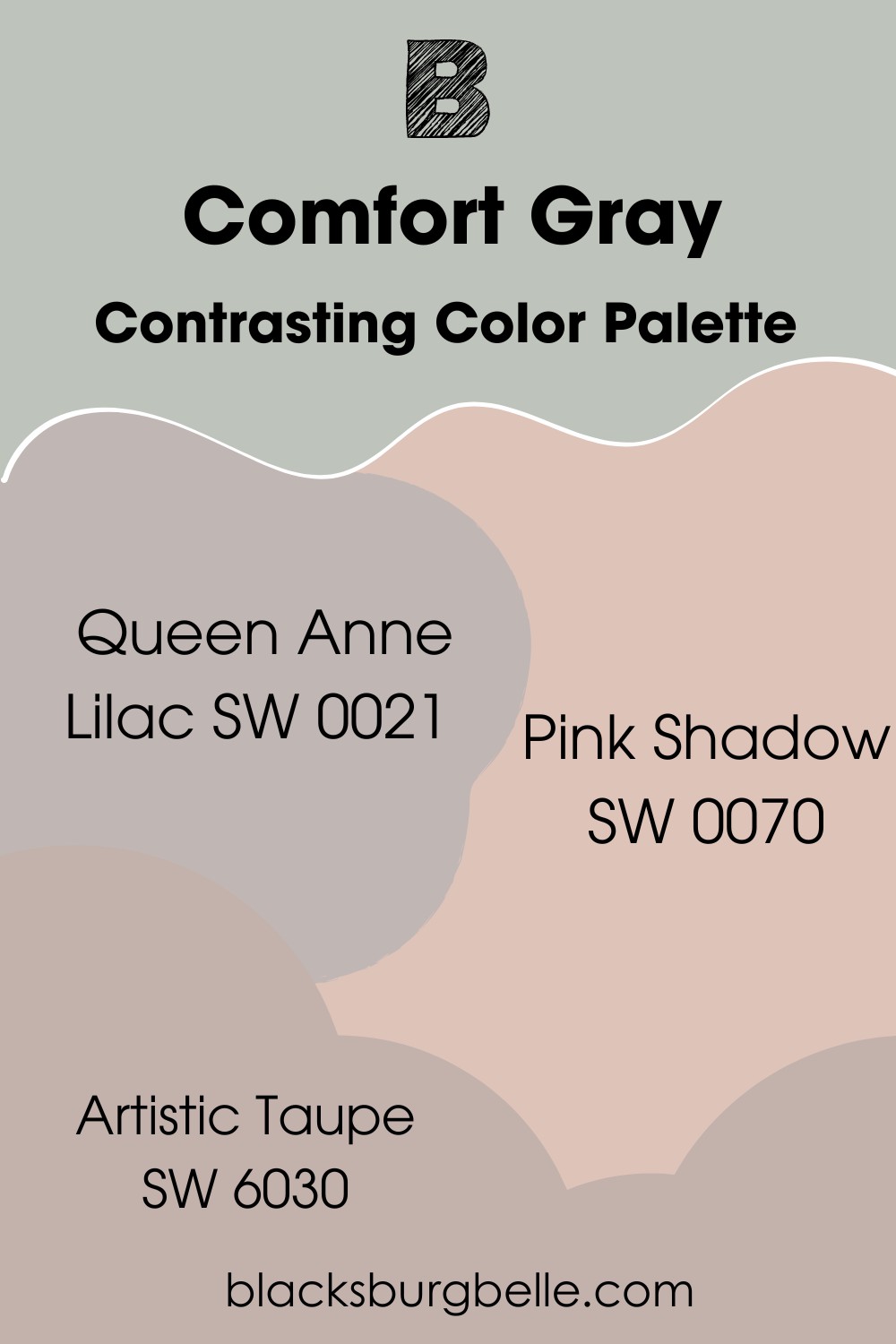
Contrasting Color Palette
- Queen Anne Lilac (SW 0021):With an LRV of 48, this soft lilac paint with its bold purple undertone maintains a muted energy like Comfort Gray and gives the color a chance to shine.
- Pink Shadow (SW 0070):Use this light pink tone to highlight the muted green undertone in Comfort Gray. I love how this combo creates a fairytale aura in nurseries and living rooms.
- Artistic Taupe (SW 6030):You can choose this reddish-purple taupe color to add intensity and warmth to the dull Comfort Gray. And because its LRV is 46, this color wouldn’t upset the balance in your room.
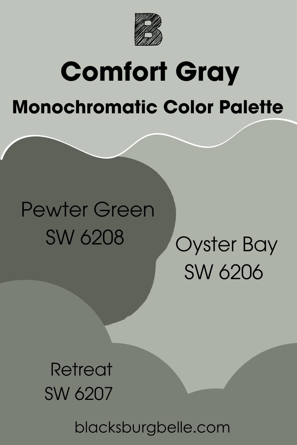
Monochromatic Color Palette
- Pewter Green (SW 6208):A moody yet soothing dark green-gray that’ll bring a naturalist energy into a living room with Comfort Gray walls.
- Oyster Bay (SW 6206):Use this blue-green tinted gray paint as an accent color for Comfort Gray bathrooms.
- Retreat (SW 6207):This medium-dark charcoal green-gray paint with a blue undertone used on kitchen cabinets highlights muted Comfort Gray walls.
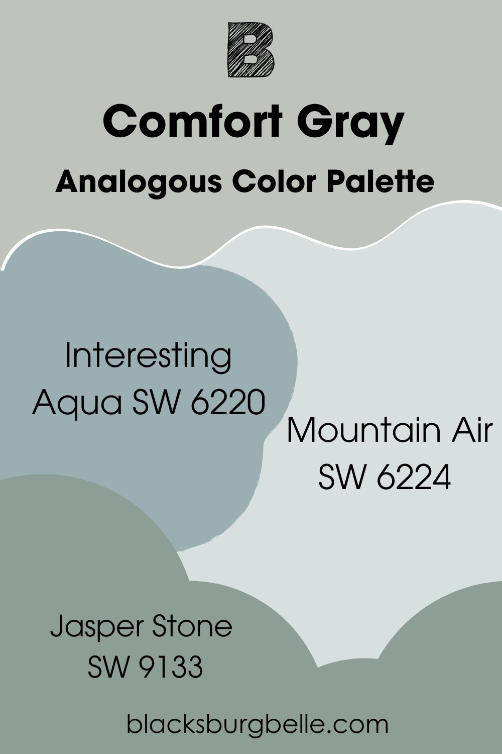
Analogous Color Palette
- Interesting Aqua (SW 6220): A gentle blue-green paint with gray undertones suitable for bathrooms and bedrooms like Comfort Gray. It’s highly reflective with 73 LRV, so you need only a big window for natural lighting.
- Mountain Air (SW 6224):This pastel purple with blue undertones gives your bedroom a floral vibe. It’ll make the blue-gray side of your Comfort Gray walls pop more without additional lighting.
- Jasper Stone (SW 9133):As a bold green color with blue-gray undertones, this medium-dark shade creates a moody vibe when paired with Comfort Gray. It’s a good option to fade the blue-tint and maintain the green notes only.
Sherwin-Williams Comfort Gray vs. Sea Salt
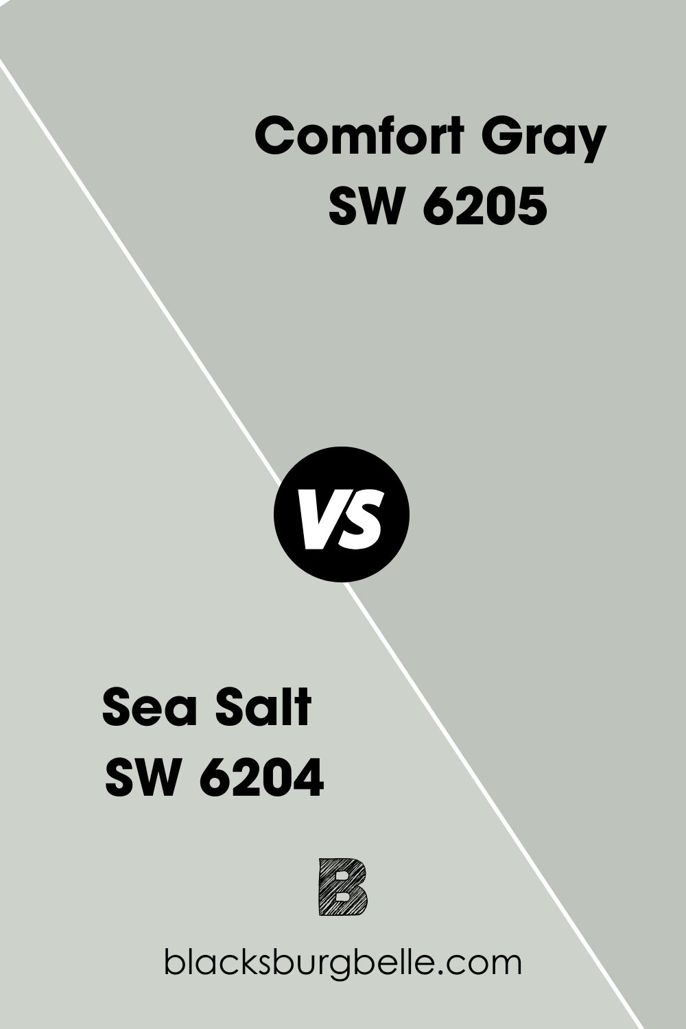
Pairing Sea Salt (SW 6204) with Comfort Gray creates a beautiful harmony because it leans into its blue undertone while Comfort Gray favors its green undertone. Both colors will bounce off each other and give your home a relaxed green, blue, and gray vibe.
Sherwin-Williams Comfort Gray vs. Silver Strand
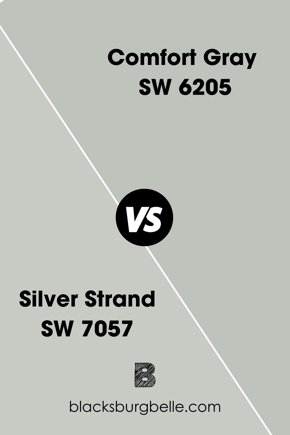
Unlike Comfort Gray, Silver Strand (SW 7057) has a cyan undertone that makes its gray tone appear misty. The color has an LRV of 59 but looks way lighter than Comfort Gray, even though they both have green tints.
Sherwin-Williams Comfort Gray vs. Agreeable Gray
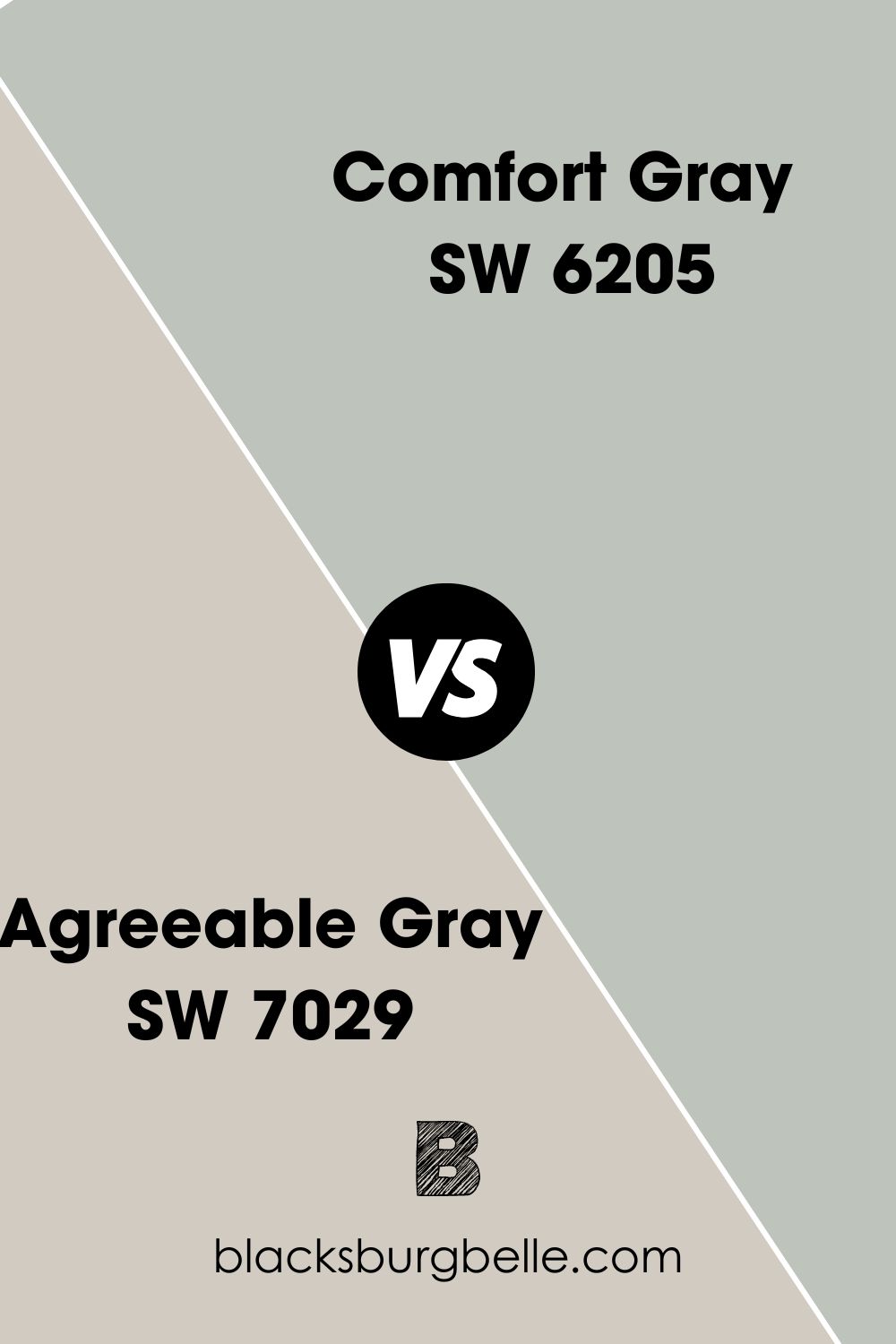
Agreeable Gray (SW 7029) is an expert pick with a beige undertone that makes it look greige and warm-cool. But Comfort Gray is purely cool because it has no warm undertones.
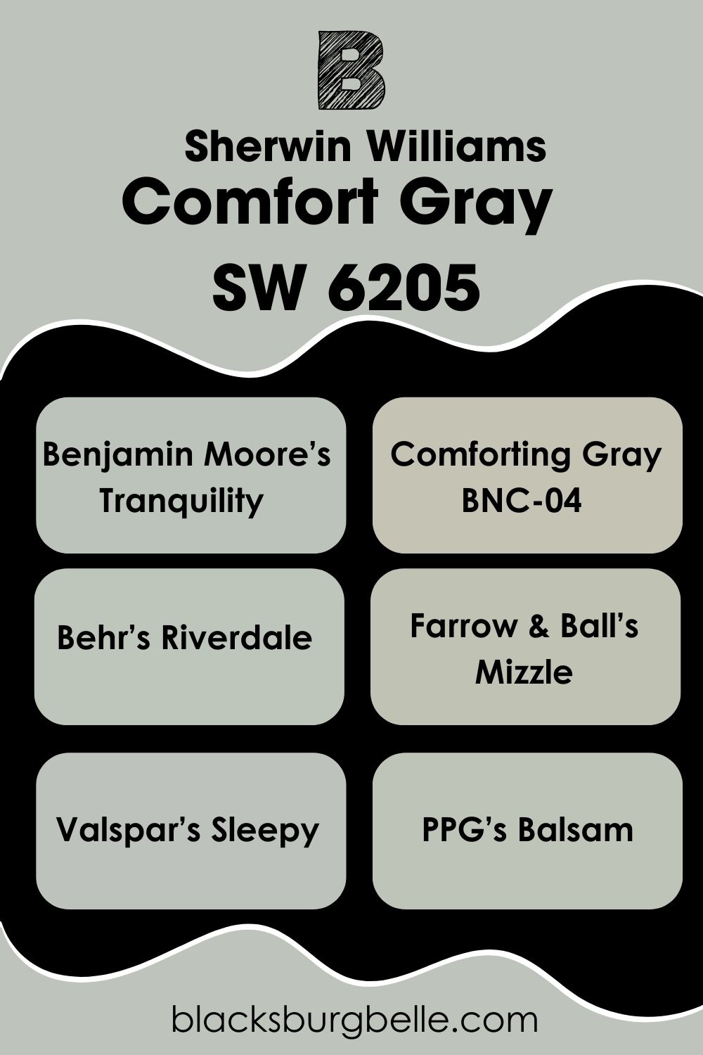
Sherwin-Williams Comfort Gray Equivalent in Benjamin Moore and Other Brands
Behr has a paint called Comforting Gray (BNC-04) but its color is closer to Sherwin-Williams Colonnade Gray.
To get a similar shade to Sherwin-Williams Comfort Gray from other brands, use Benjamin Moore’s Tranquility which has proportions red 187, green 195, and blue 187.
Other similar colors to Sherwin-Williams Comfort Gray include Behr’s Riverdale, Farrow & Ball’s Mizzle, Valspar’s Sleepy, and PPG’s Balsam.
Where can you use Comfort Gray (SW 6205)?
Comfort Gray is at its best in relaxation areas like bedrooms, bathrooms, waiting rooms, lounges, and porches. See visual examples below:
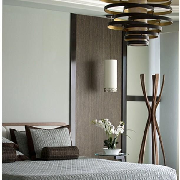
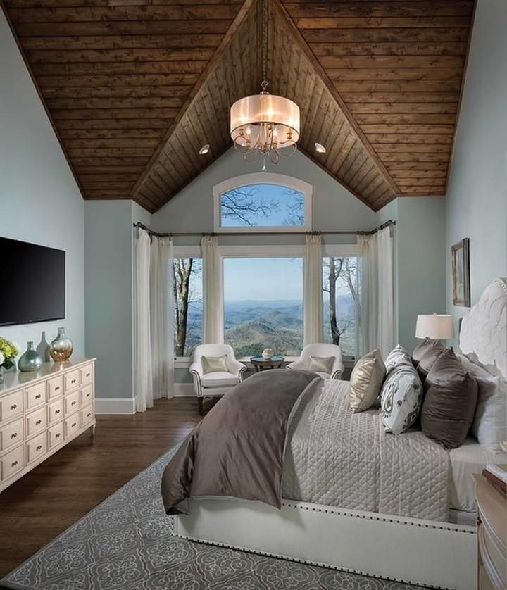
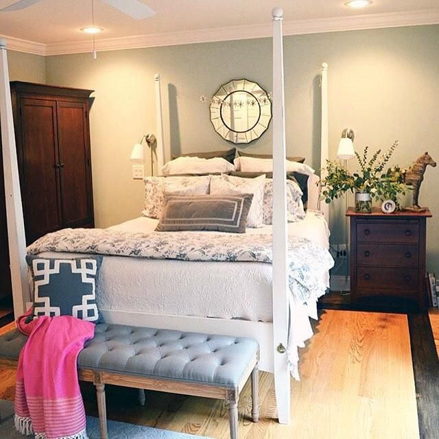
Comfort Gray in Bedrooms
Firstly, let’s take in the rich blue tint overwhelming this Comfort Gray bedroom walls before we get into the decor.
This bedroom is a classic from the wooden ceiling to the orange-bulb chandelier. Even though the owner used white curtains to match its trims, they acknowledged the floorboards and ceiling with the deep taupe bedding.
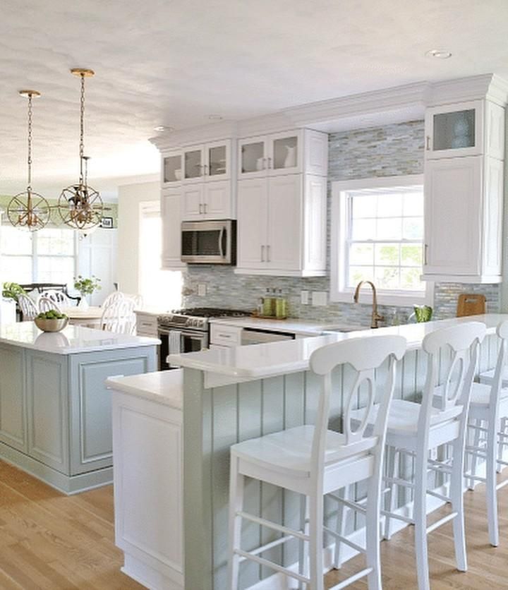
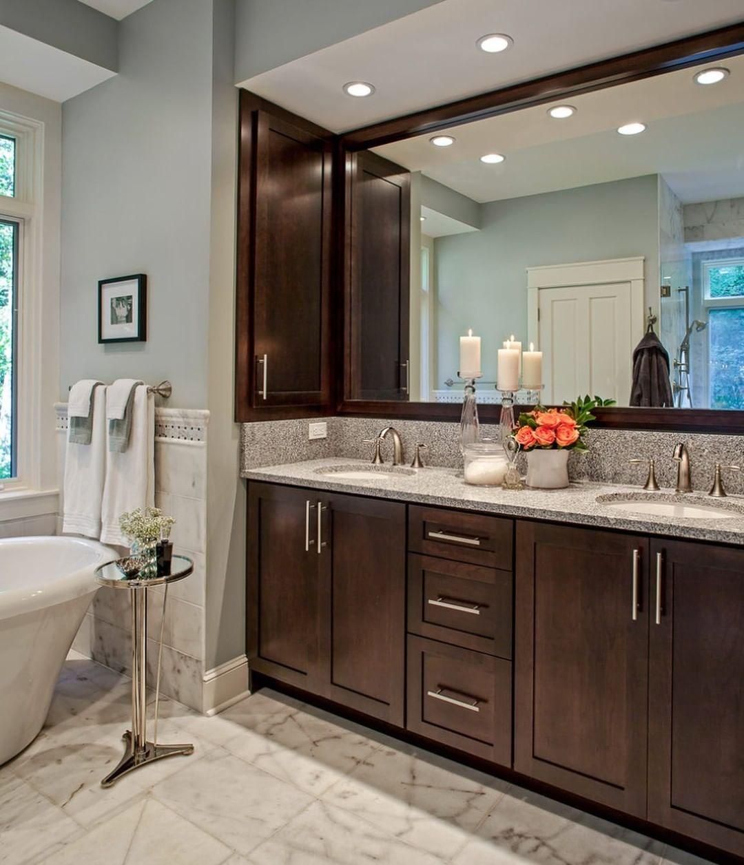
Comfort Gray in Bathrooms
I love how you can pay homage to the mid-50s by using dark brown furniture in the bathroom paired with a dependable color like Comfort Gray.
The combination creates a rustic yet elegant vibe that’s perfect for unwinding daily. Start and end your day feeling relaxed and ready for anything.
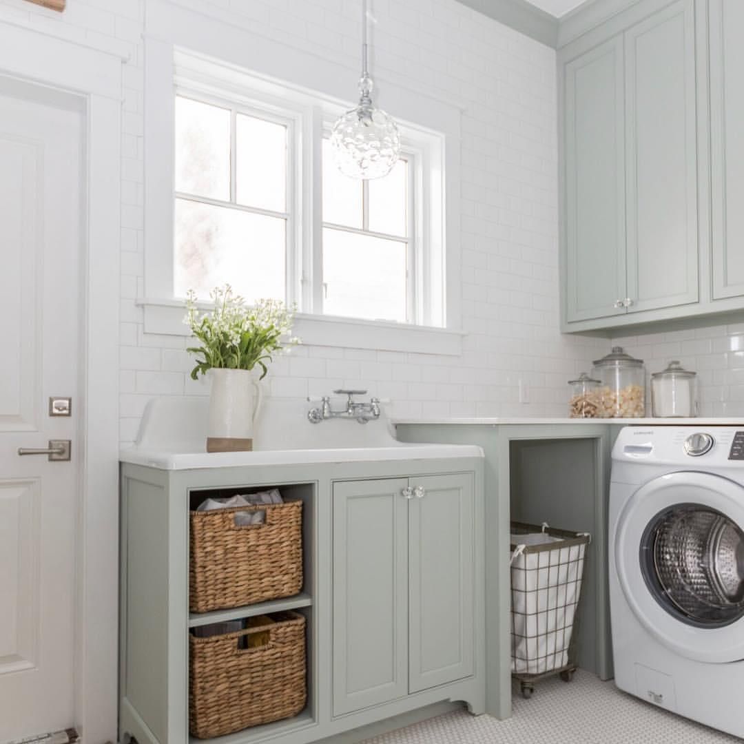
Comfort Gray in Laundry Rooms
Doing laundry is often a hassle, and only a few people like it. But this relaxed mood courtesy of Comfort Gray cabinets and pure white walls makes the chore more appealing.
The accent features carry the color, while the main walls, trims, and doors pick tints from their reflection through the window.
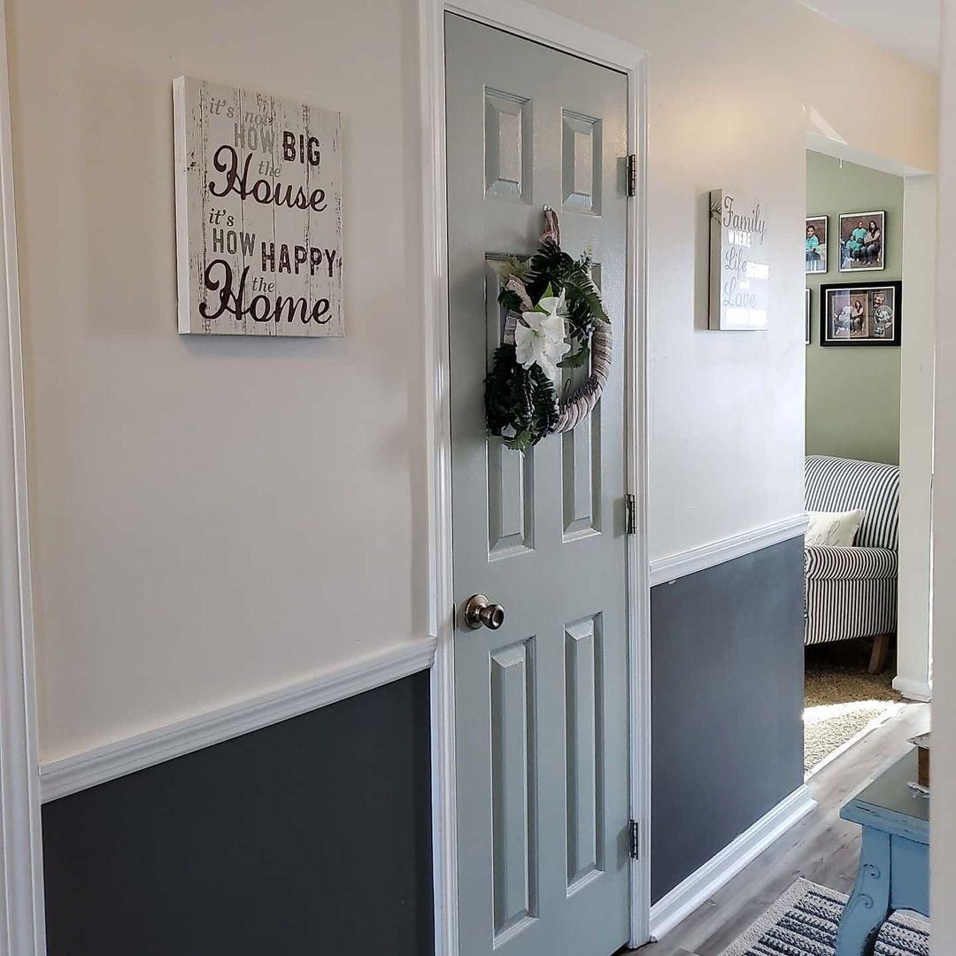
Comfort Gray on Doors
This picture captures the essence of Comfort Gray in one space. Rather than use the typical white paint for their interior door, the designer chose Comfort Gray for its versatility.
The green undertone matches the muted green paint in the living room peeking from the corner, while the dusky charcoal gray half wall complements the Comfort Gray door.
Finally, they harmonized the colors with the green-tinted white trims giving the room a unique and relaxed look.
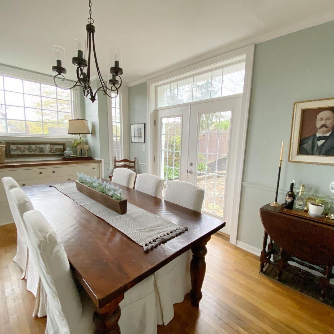
Comfort Gray in Dining Rooms
Using open-plan doors and windows to allow natural light into this dining room was a smart choice. It gave the softest blue undertone in the Comfort Gray walls a chance to shine.
Also, using white trims and chocolate brown wooden furniture created a balance of warmth and coolness. The color palette created a modernized traditional room.
Lighting Conditions for Comfort Gray
Because Comfort Gray isn’t very reflective, you’ll need additional lighting or brighter colors to highlight its undertones. But you can always rely on nature to help you if you don’t have either.
Let’s talk about lighting conditions and how they affect the reflection of Comfort Gray.
South-facing light is the hottest in the morning and will show the blue side of the color. If you want the gray tone to shine, use North-facing light, which is steady throughout.
The green side of Comfort Gray gets the most intense in the evening or under West-facing light.
Remember that coordinating colors also add to Comfort Gray’s potential for reflection. Using darker coordinating colors will highlight the gray and green parts, while lighter colors accentuate the blue undertone.
Finally, warm lighting like yellow and orange bulbs brightens Comfort Gray and makes its gray note pop. But white and blue lighting, a.k.a. cool lights, give its green tone more shine from its dimness.
That’s all about working with nature.
What Color Goes with Comfort Gray?
As the “King of Comfort Gray” Thom Sweeney recommends pairing Comfort Gray with chocolate brown, caramel, and other sandy colors. If you want a bold combination, use coral, watermelon, and indigo.
Finally, tie all colors in with a sparkling white trim free of undertones or with faint tints.
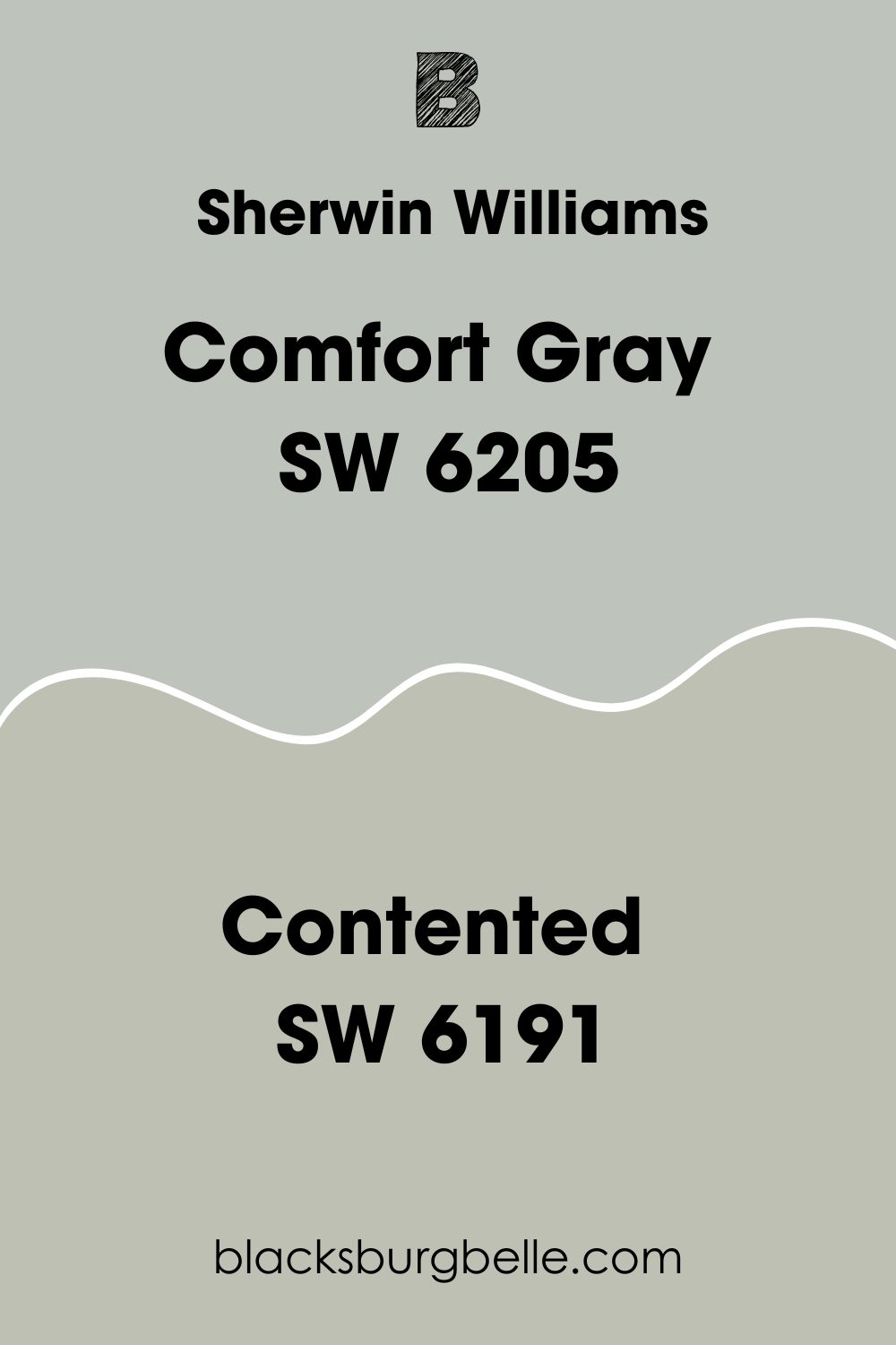
What’s the Difference Between Comfort Gray and Contented (SW 6191)?
Sherwin-Williams Contented (SW 6191) is more neutral and darker than Comfort Gray even though they share undertones. Because its LRV is 52 while Comfort Gray’s own is 58.
Is Comfort Gray Green or Blue?
Comfort Gray is mostly green than blue but it has both colors as undertones.
Conclusion
I loved every moment of exploring Sherwin-Williams Comfort Gray (SW 6205), and I hope you’ve enjoyed learning about it too. Before I go, let’s quickly refresh your memory on this medium-light color.
- This color is blue, green, and gray, wrapped in a beautiful hue
- It’s best used to relax
- You can use Comfort Gray as an accent or a whole wall painting
It’s time to say goodbye, but please share your thoughts, experience, and discoveries in the comment box below.
 Sherwin Williams Incredible White (Palette, Coordinating & Inspirations)
 Sherwin Williams Black Fox (Palette, Coordinating & Inspirations)
 Sherwin Williams Naval (Palette, Coordinating & Inspirations)
 Sherwin Williams Tricorn Black (Palette, Coordinating & Inspirations)
 Sherwin Williams Silvermist (Palette, Coordinating & Inspirations)
 Sherwin Williams Snowbound SW 7004 Review
