
Are you at a crossroads on which color to opt for between Agreeable Gray and Edgecomb Gray for that big revamp in your home?
While both of these gray paint shades are breathtaking, having to settle for one may seem impossible. For this reason providing you with detailed comparison guide on these two gray paint colors is necessary to aid and hasten your decision making process
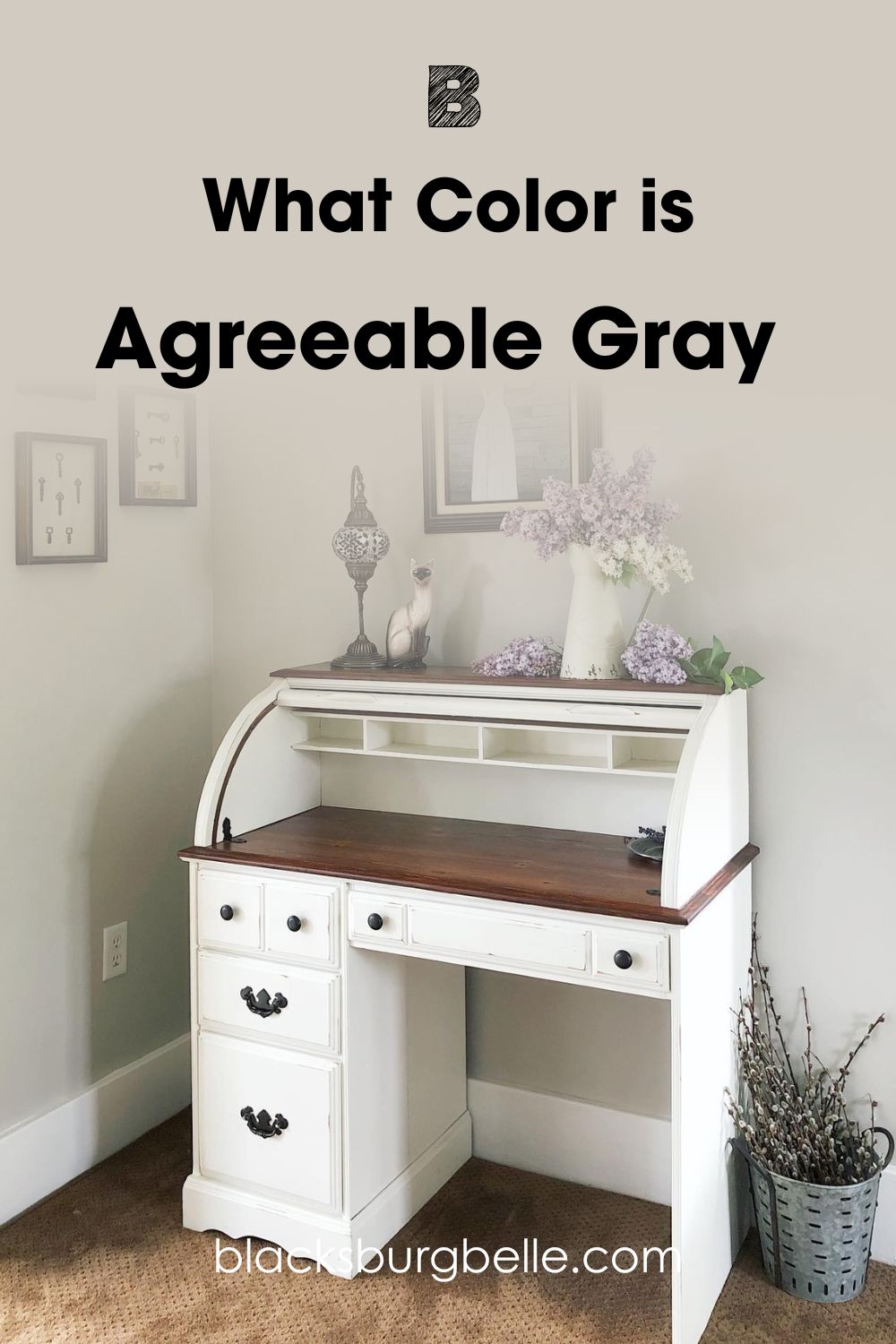
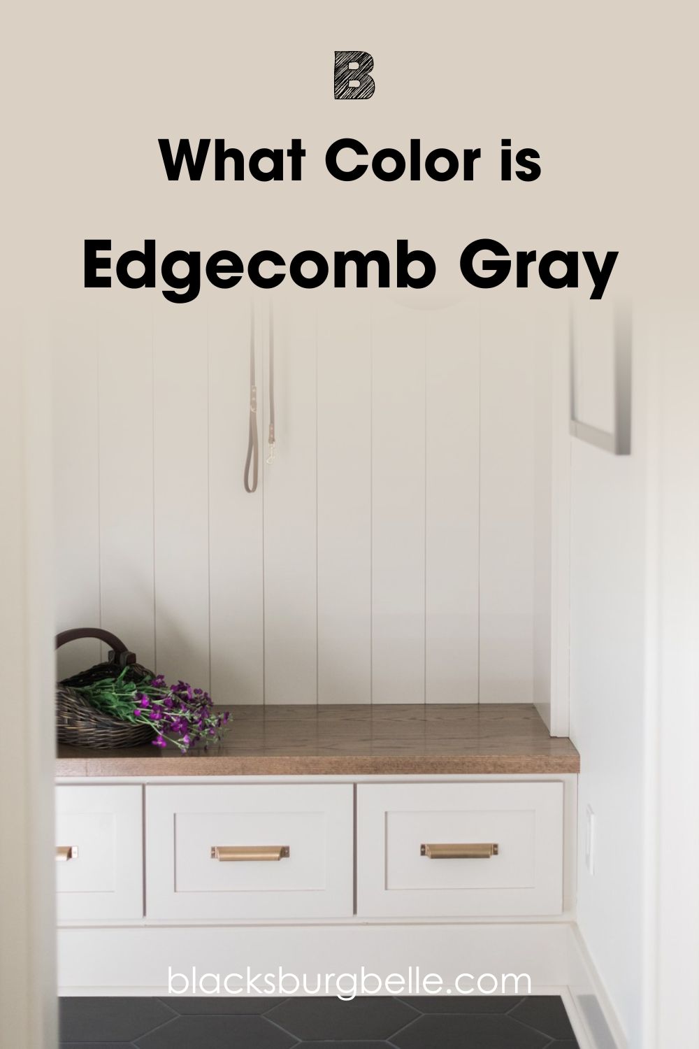
While Agreeable Gray which is a soft gray shade from Sherwin Williams is notorious for its balanced warm and cool tones, Edgecomb Gray belongs to the Sherwin Williams’ paint collection. It commutes between gray and beige, making it an excellent neutral and when used together, the difference between them is glaring.
Join us as we dive deeper into the complexities of these colors and how they fare in different spaces, so you can finally make up your mind.
Table of Contents
When to Use Sherwin Williams Agreeable Gray vs Edgecomb Gray
To understand the differences between these colors better and to allow you to make decisions with no regrets, getting acquainted with the different situations where these gray paint colors stand out is crucial.
Use Agreeable Gray when:
- You want a warm light greige paint color for your space that can work under any lighting condition
- You don’t mind peeks of purple from time to time
- You do not intend to allow those bright, golden lights entering your south-facing room to go to waste.
- You crave a timeless, modern touch in your personal space.
- You crave more depth for your large sized room., this is thanks to its low LRV.
Use Edgecomb Gray when:
- You want a warm and subtle gray with hints of green to match your surrounding decor
- You crave an organic and natural look in your space
- You have a small space and aim to create an illusion that it is larger.
- Your room faces north; and you intend to use the lights to help balance the yellow undertones and make it more neutral.
Neutrals like these two colors work well with a wide range of colors especially white and more projected colors. These darker hues make the neutral pop and the neutrals in turn deliver a soft warm touch on the deep shades.
Hence, you should pair Agreeable Gray or Edgecomb Gray with saturated colors for better appearance.
Agreeable Gray vs. Edgecomb Gray: Visualizing The Difference
In this section of the article, the goal is to present side by side images showing scenes where these two gray paint colors feature. This step is very important in deciding what works best at the point of picking a paint color especially when it involves paint colors with similar hues like Agreeable Gray and Edgecomb Gray.
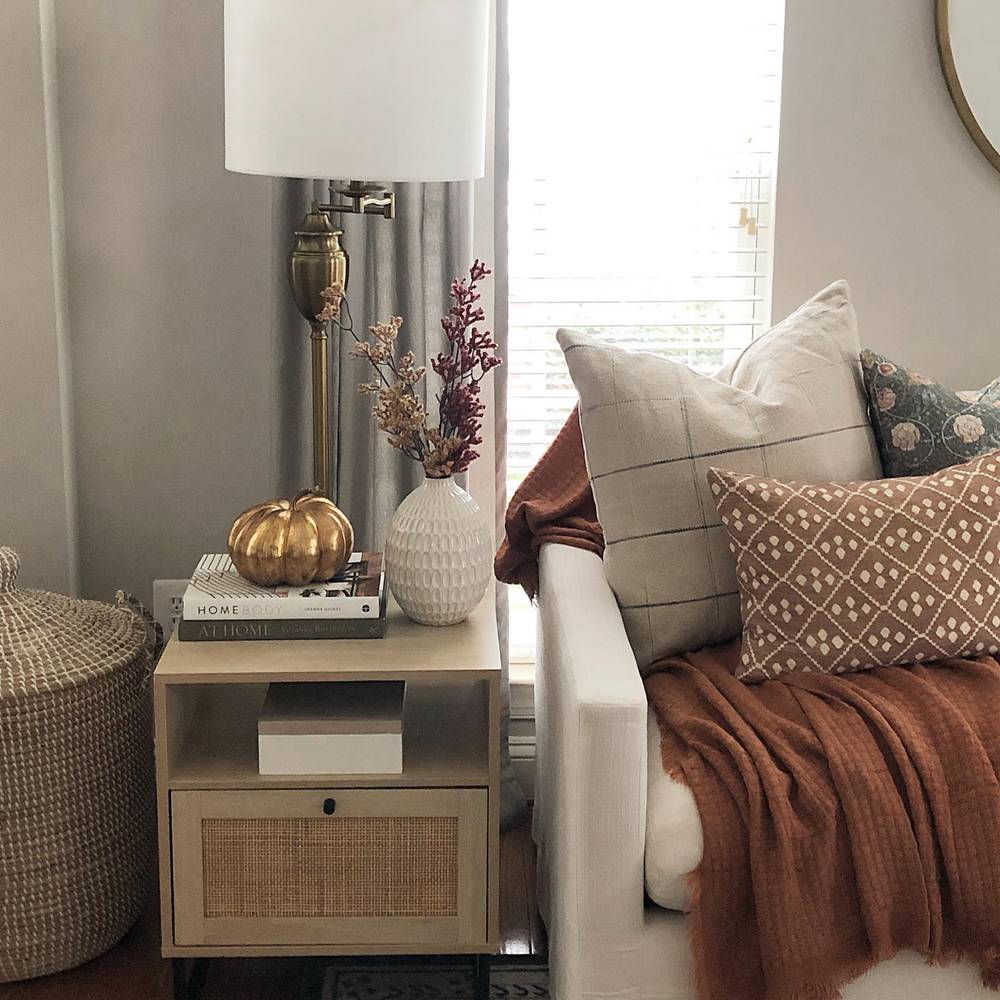
Here, Agreeable Gray(AG) is used in a picture room
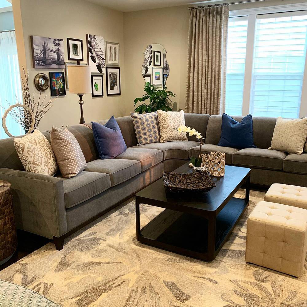
Here is an image of Edgecomb Gray(EG) paint used in closet
Thanks to these real life images, we’re able to show you how AG and EG perform under natural light.
It’s not hard to tell that Agreeable Gray stays grounded in its gray heritage and appears to have more depth in the first image than Edgecomb Gray which looks alive with a golden touch in the second picture.
With that being said, Agreeable Gray is best used to create a cool and relaxed setting, giving your home a traditional touch. It’s a different ball game for EG which we recommend for use if you intend to create a warm, modern ambience in your room.
Edgecomb Gray is more intense and in touch with its beige side, while Agreeable Gray completely flips the script and if the push comes to shove, you now know where to turn with both hues.
However, there are other ways to help you gauge how much light a color can reflect and we’ll check them as we proceed. Remember this when working with any of the two colors.
A Swift Comparison: Agreeable Gray vs. Edgecomb Gray
This is the tip of the iceberg before we go into deep details. Here you can glance at the chart we’ve prepared for you. It contains the key features of these two colors including their Light Reflectance Value, RGB, Hex Code, and Undertones.
| Agreeable Gray | Edgecomb Gray | |
| RGB | 209, 203, 193 | 218, 209, 196 |
| LRV | 60 | 63.88 |
| Hex Value | #d1cbc1 | #dad1c4 |
| Undertones | Pink, Yellow, and tan undertones | Gray, Green Undertones |
Emotional Effects: Agreeable Gray and Edgecomb Gray
This section details how Agreeable Gray and Edgecomb Gray can determine your emotional response when you enter a room.
Agreeable Gray creates a soothing and calm environment, and we bet you’d often find yourself drowned in the serenity that this brings into a space. There’s that seamless, easy, and exciting quality in it.
Edgecomb Gray isn’t far off, too, as it’ll instantly win your heart over with its cozy warmth, just like the old quilt your grandmother gave you. It spreads comfort in your space, making it the perfect spot to hibernate after a long day.
It’s intriguing how much effects things as abstract as paint colors have on our emotions. However, that’s more reason to deeply analyze these different scenarios to help you understand it all. That said, both colors are excellent choices, but the right fit depends on the kind of atmosphere you aim to create.
LRV of Agreeable Gray vs. Edgecomb Gray
Knowing the nitty gritty of colors is one of the final steps to becoming the perfect connoisseur, so let’s move on to the LRV side of things.
LRV, short term for light reflective value, is an existing scale among paint enthusiasts and homeowners strictly used to measure the possibility of a color reflecting or absorbing a certain degree of light.
This scale runs from 0-100, with 0 being the absolute black and 100 being the perfect white. LRV can determine how light or dark your room can get, so don’t hold this information lightly.
Agreeable Gray has an LRV of 60. This value is a whopping 10 points away from 50, which is the sweet spot. This means that this color has a decent light-reflecting quality and may even be more pronounced when used with a darker hue.
Edgecomb Gray has an LRV of 63. This means that Edgecomb Gray is slightly higher than Agreeable Gray, and when used side by side, Edgecomb Gray’s brightness is immediately seen, even though both are excellent options for a bright and airy feel.
Agreeable Gray and Edgecomb Gray Undertones: Are They Similar?
Here, we’ll observe the interesting undertones of Agreeable Gray and Edgecomb Gray. These subtle hints of colors you see under different lighting conditions set both colors apart and influence their appearance in your room.
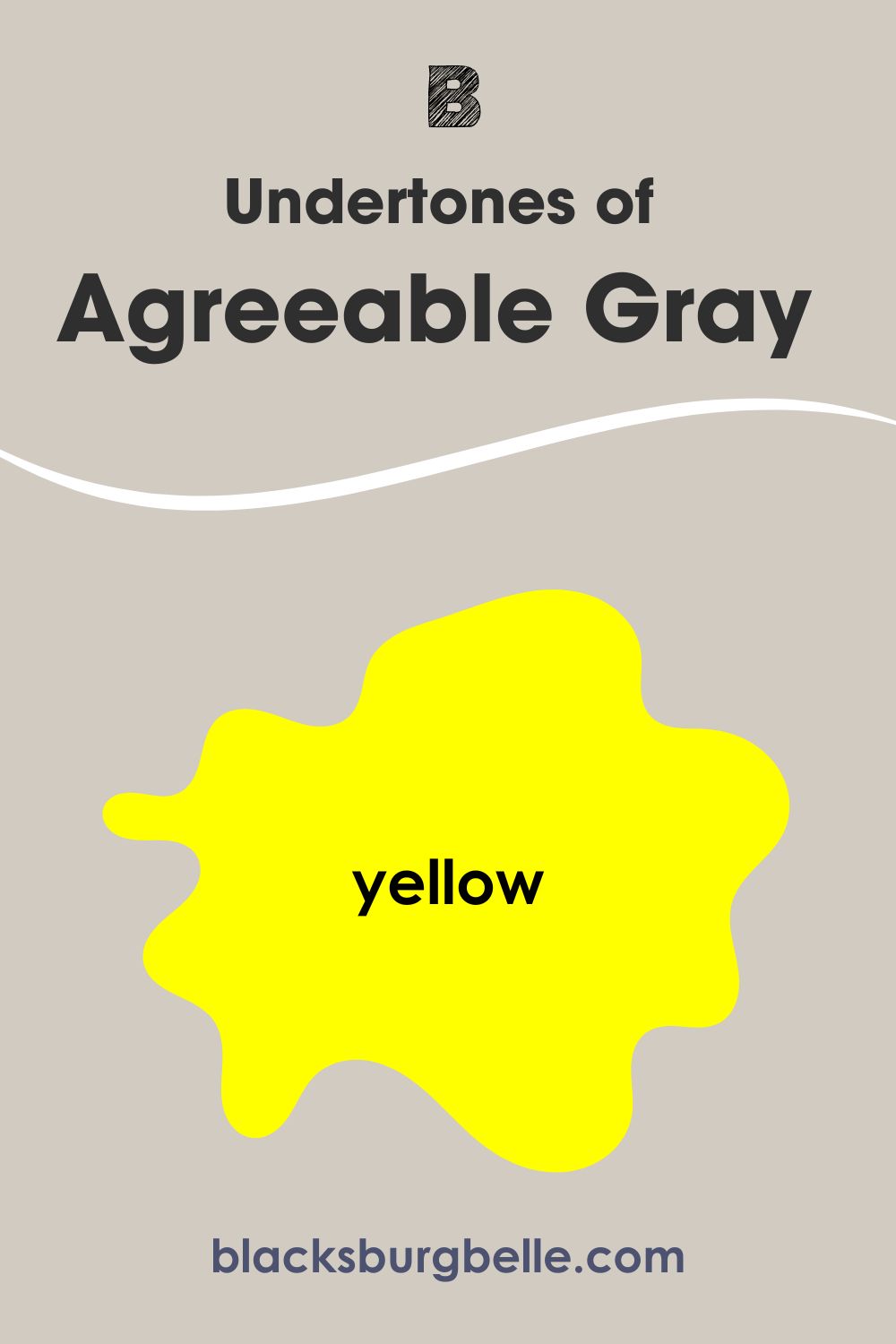
Agreeable Gray has beige or taupe undertones; on your lucky day, you may also find hints of pink and purple, depending on the lighting situation. Like most warm colors, Agreeable Gray has a touch of yellow.
Edgecomb Gray comes in with warm gray undertones that mix with the beige to give a breathtaking, gorgeous golden color. You may find green undertones given some specific lighting conditions.
The RGB value of each color also explains how much primary color they carry. Edgecomb Gray has more primary colors than its sibling colors, emphasizing Red.
A Closer Look at Agreeable Gray’s Undertones
This section greatly excites me because I get to show you the stark differences in the undertones of colors. Agreeable gray has so many personalities that it can make you forget you’re working with an actual gray.
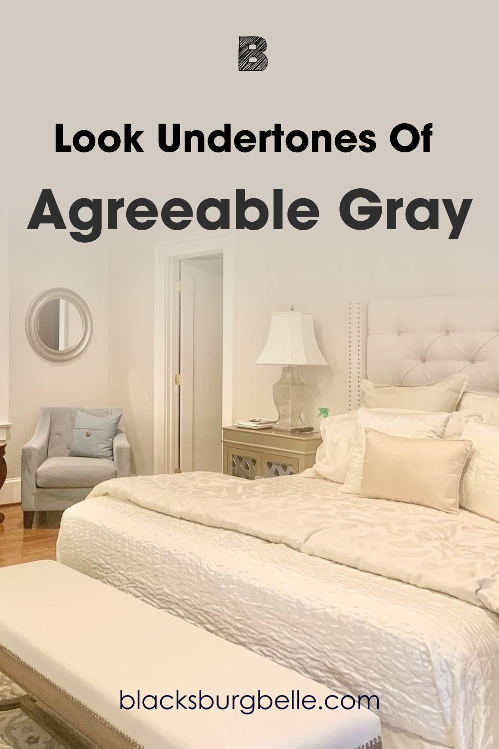
Want to see what I’m talking about again? Observe the featured image above; all you’d see is pink. The warmth in the bedroom is undeniable, and it also leans yellow with a slight touch of beige.
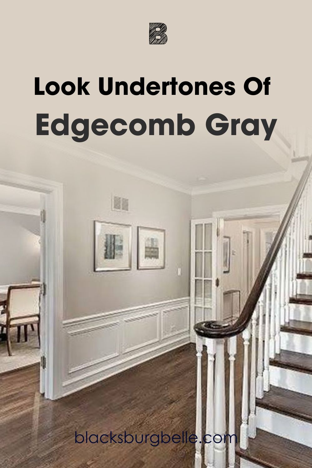
A Closer Look at Edgecomb Gray’s Undertones
Edgecomb Gray also has a lot to offer in terms of undertones. You can catch a glimpse of the warm gray down to the side of the green in the first frame. It’s not a surprise as gray can also pass as a cool color, but most importantly, you get a quiet and organized feel from the space.
These colors are the epitome of versatility as they work well with natural or artificial lighting and the picture above is a clear representation of how the light accentuates their beauty. The undertones are very vivid.
As for Edgecomb Gray, it may be a bit dicey when trying to pair it with other colors due to its picky green undertones, but on a better note, they’re subtle, so you have nothing to worry about.
We however advise you use them with white or on white trims should you encounter trouble when trying to cure the right complementary colors or color palettes. White and these colors look stunning, providing you with a fresh and airy result.
Agreeable Gray Vs. Edgecomb Gray- Are They Warm or Cool?
Every color is either warm or cool. Now let’s see where these gems belong.
Agreeable Gray and Edgecomb are both greige neutrals.
Based on observing these colors in real space, I have concluded that Agreeable Gray shows off its warm side when used with Edgecomb Gray or other true grays.
Edgecomb Gray is simply a warm gray with very earthy undertones. It also passes as a neutral. This is MY account, and it may vary according to the next person based on lighting situations and other factors.
When you use these colors in a south facing room, their warmth comes to the surface and stays this way until sun down. They’ll lean into their cool side when used in a north-facing room, expect them to be grayer than normal in this situation.
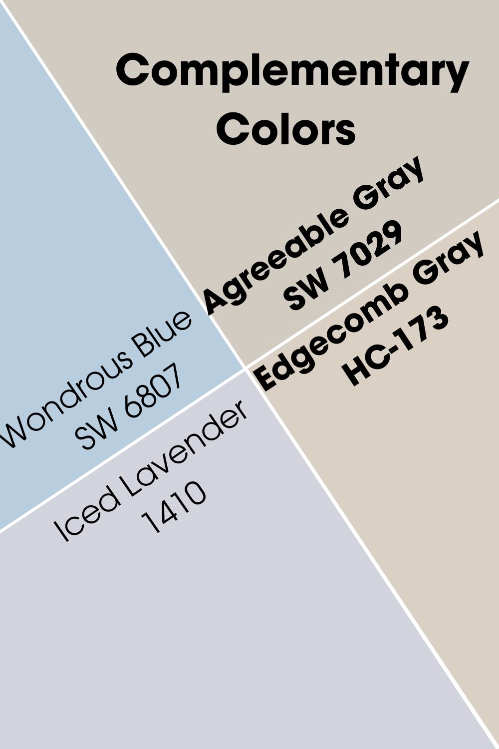
Agreeable Gray vs. Edgecomb Gray Complementary Colors
Complementary colors are directly opposite each other on the color wheel. For better understanding, blue is directly opposite orange on the wheel; red sits opposite green, and blue faces yellow.
Agreeable Gray and Edgecomb Gray are almost of the same shade, so we expect they have complementary colors like warm off-whites and soft purples.
Our picks are Sherwin Williams’s Wondrous Blue with purple undertones that works well with Agreeable Gray and Benjamin Moore’s Iced Lavender with whispers of gray to awaken the deep purple hue it carries for Edgecomb Gray.
These two hues have one thing in common; they’re rich purple hues that fit right into Agreeable Gray and Edgecomb Gray’s shoes.
Agreeable Gray Vs. Edgecomb Gray Color Palette
Whether monochromatic or contrasting, the colors on this list are Agreeable Gray and Edgecomb Gray’s closest allies. They work together to produce a harmonious, artistic, and balanced space. Let’s explore the color palette for these two colors and see if they hold any similarities.
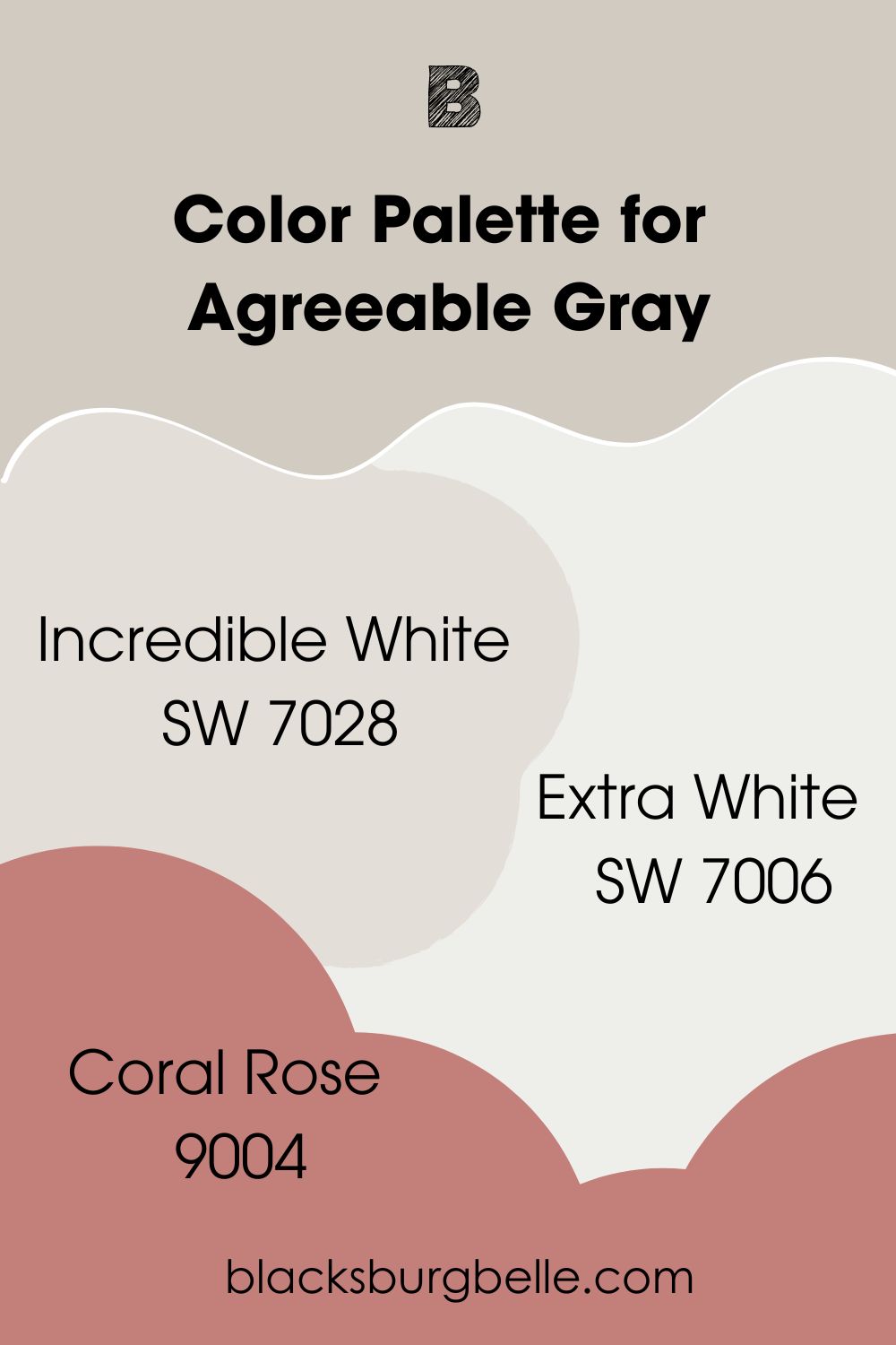
Color Palette For Agreeable Gray
Since Agreeable Gray is a warm color, it’s smart to include only warm colors in the palette, but painting is a creative activity: hence you can throw in some cool tones for more range. Check out our picks below.
- Sherwin Williams Incredible White: This is a warm greige paint color with pink and purple undertones and an LRV of 74, and it works when used sparingly with Agreeable Gray.
- Extra White: This color also has enough depth to work in a big room without looking washed out. We recommend using it as an exterior trim color with Agreeable Gray.
- Coral Rose: Here is a color which exudes a balance of warm and cool tones that adapt well to any setting. It makes your space feel bold and heavy and pairs well with the brightness of Agreeable Gray, thanks to its soft pink and red undertones.
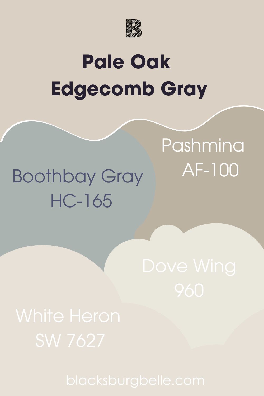
Edgecomb Gray Color Palette
These colors are the perfect fit for the Edgecomb Gray color palette. You can swing both ways on this strip, as against the stereotype that warm colors should only be used alongside other warm colors.
Cool colors can help give a balance you didn’t even know you needed. For things as sensitive as colors, you never know what you’ll get until you try.
- Boothbay Gray: This one is a gray with blue and green undertones. On some occasions, it may read more blue than gray too, depending on the lighting. Boothbay Gray has an LRV of 43.16, putting it somewhere in the mid toned category.
- Pashmina: Pashmina is a pretty greige color that mostly leans towards it’s beige side. However, the gray in the color tones it down from getting too warm. Like Edgecomb Gray, it’s also a neutral and comes with an LRV of 43.62
- Dove Wing: This one is a light neutral with beige undertones that’ll pair nicely with Edgecomb Gray to create a monochromatic space.
- White Heron: Also a neutral, this light greige color has an high LRV of 76, which means when you pair it side by side with Edgecomb Gray, it adds a soft touch to EG’s depth.
The colors listed here are just a pointer to how creative you can get with Pale Oak and Edgecomb Gray. You can add your own spin to it and create a color palette with tones related to the ones listed above, perhaps we can get inspired by your genius this time.
Agreeable Gray vs. Edgecomb Gray on Cabinets
Just like most colors, SW Agreeable Gray and BM Edgecomb Gray will add an interesting twist to your kitchen decor. You can even use your cabinets as a tester for how well these colors will perform in other rooms, and alongside other colors as well.
SW Agreeable Gray on Cabinets
Agreeable Gray is a stunning color for your kitchen cabinets with its undertones. The play of background colors gives a violet outlook that works with surrounding colors no matter the intensity.
BM Edgecomb Gray on Cabinets
Edgecomb Gray can’t hide the lushness of its green on this set of cabinets. The depth and light situation around it also contributes to its final appearance.
Agreeable Gray Vs. Edgecomb Gray on Wall
Another excellent spot to use our two feature colors is your home walls. Try these shades if you want to add a pop of color to your wall or give white a break.
SW Agreeable Gray on Walls
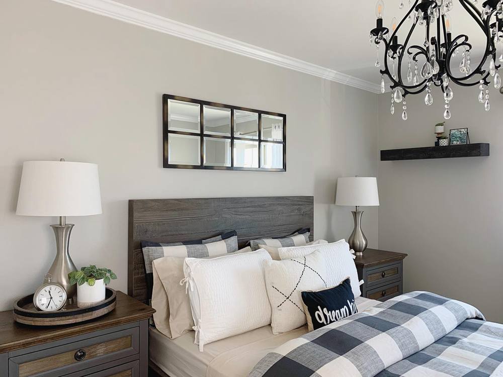
Each time we try to forget just how gray Agreeable Gray is, pictures like the first image swing in to remind us. This color looks ravishing on the bedroom wall and will surely get you a good night’s rest.
BM Edgecomb Gray on Walls
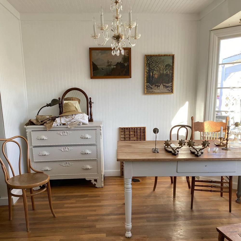
As seen in this dining space, Edgecomb Gray works with other neutral tones to deliver an aesthetically balanced and pleasing result.
You will notice the slight difference in undertones in areas hit with varying light intensities- we love real-time examples like these as they help you understand better.
Agreeable Gray vs. Edgecomb Gray on Trim
It’s never too late to observe how both hues work on trims. Trims are the icing on the cake to any paint work and they can ultimately make or mar your outcome. If you’re too scared to commit to a full wall, opt for AG or EG on your trims and you won’t regret it.
SW Agreeable Gray on Trims
Agreeable Gray adds extra detail and personality to this wall as it shines bright on the window and wall trims.
BM Edgecomb Gray On Trims
Edgecomb Gray understood the assignment in this space as it flanks the much brighter wall as window trims. Yes! You can incorporate darker colors into your palette in trims and ceiling paints.
Agreeable Gray vs. Edgecomb Gray on Exterior Walls
Take this as the sign you need to use any of these two gems on your home exterior. Watch closely how they perform in the respective images and you’d take my word for it.
SW Agreeable Gray on Exterior
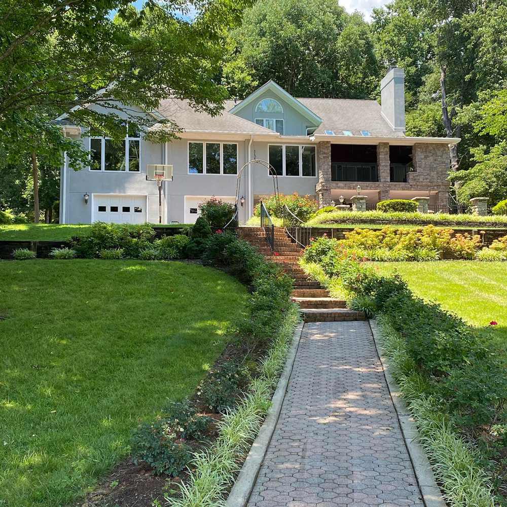
Agreeable Gray doesn’t put up a mediocre performance on exteriors too. It doesn’t look washed out in the sun as much as other neutrals do. Instead it connects to its gray side, and compliments the surrounding greenery.
BM Edgecomb Gray on Exteriors
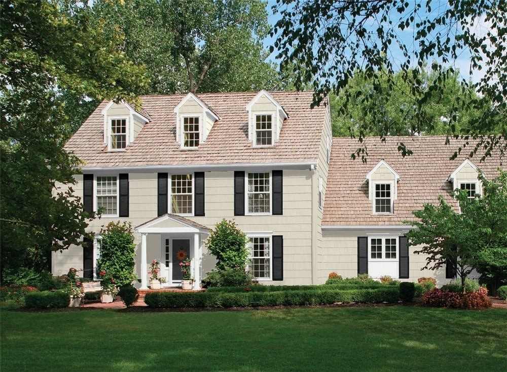
Edgecomb Gray appears very light and washed out on the surface of this house and its almost creamy demeanor brightens up a gloomy day. Notice the way the green undertones it that matches the lush green characters around the house.
Agreeable Gray vs. Edgecomb Gray on Doors
Nothing screams versatility like using actual wall colors on furniture, like these artsy doors that got the Midas touch from Agreeable Gray and Edgecomb Gray, respectively.Keep your doors fashionable with these pictures inspiration.
SW Agreeable Gray
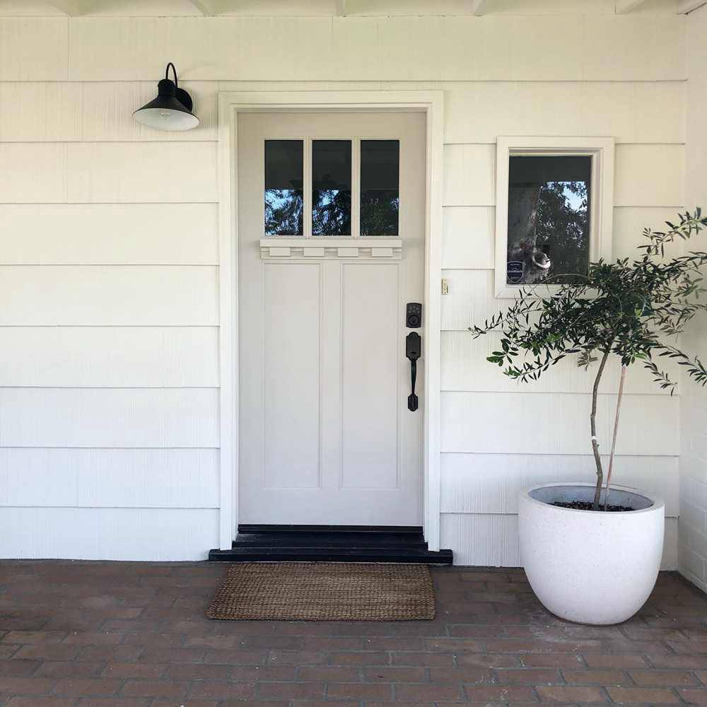
Oh, the pink and gray undertones in Agreeable Gray will welcome you at the entrance in the first image. It’s really amazing how Agreeable Gray maintained a strong character even after being paired with a much brighter color.
BM Edgecomb Gray on Doors
You’ll love the touch of green in Edgecomb Gray and how it just comes out when you least expect it. I blame the green hints on the door on the surrounding trees for this gorgeous exposure though.
SW Agreeable Gray vs BM Edgecomb Gray in Muted Lighting
As I’ve stated earlier and will still buttress, lighting can alter the effects of this color and even give it a completely different shade. This section reveals just how much they morph under muted lighting.
SW Agreeable Gray in Muted Lighting
Agreeable Gray is almost coffee brown in the image below due to the very low light touching it on this bedroom wall. How this color adjusts itself to match the surrounding textures and colors is magic.
BM Edgecomb Gray in Muted Lighting
In the image above, you’ll notice that it seems the gray and green undertones have completely faded. Edgecomb Gray will pass for a light brown color if we go by its appearance in this image. But that’s what muted lighting does to paint colors.
Lighting Conditions
The impact of light on your color is very profound, and it may occur in one color than the other.
Personally, Edgecomb Gray is that color for me. In some situations, all you see is soft touches of green, and in other lighting conditions, you see its beige and gray properties take the forefront pushing it closer to Agreeable Gray.
Edgecomb Gray works best in a space with warm and cool lighting conditions due to some of its cool undertones (green). The cool lights control it from getting too yellow, though it’s neutral. Warm lighting also helps it survive in a space with cool touches by drawing out the beige.
Conclusion
Whew. You made it to the end, and we bet you’ve learned all there’s to know about this favorite greige twins and can now make up your mind when the need arises. One more vital box to tick is to sample your paints before heading in fully.
Finally, other important steps also include
- Considering your room size
- Choosing a finish
- Analyzing existing decor
- Understanding the space lighting set up
We love your comments and suggestions in the box below, don’t be stingy with the questions either.
 Sherwin Williams Alabaster Vs Pure White: How to Choose!
 Mindful Gray Vs Repose Gray: How to Choose?
 Agreeable Gray Vs Repose Gray: What’s The Difference?
 Revere Pewter vs Agreeable Gray: What’s The Difference?
 Light French Gray vs Repose Gray: How to Choose?
 Benjamin Moore Chantilly Lace vs Simply White: Which Is Better?
