
Hey there, are you a lover of the color gray? Well, I understand why you made gray your choice, who wouldn’t?
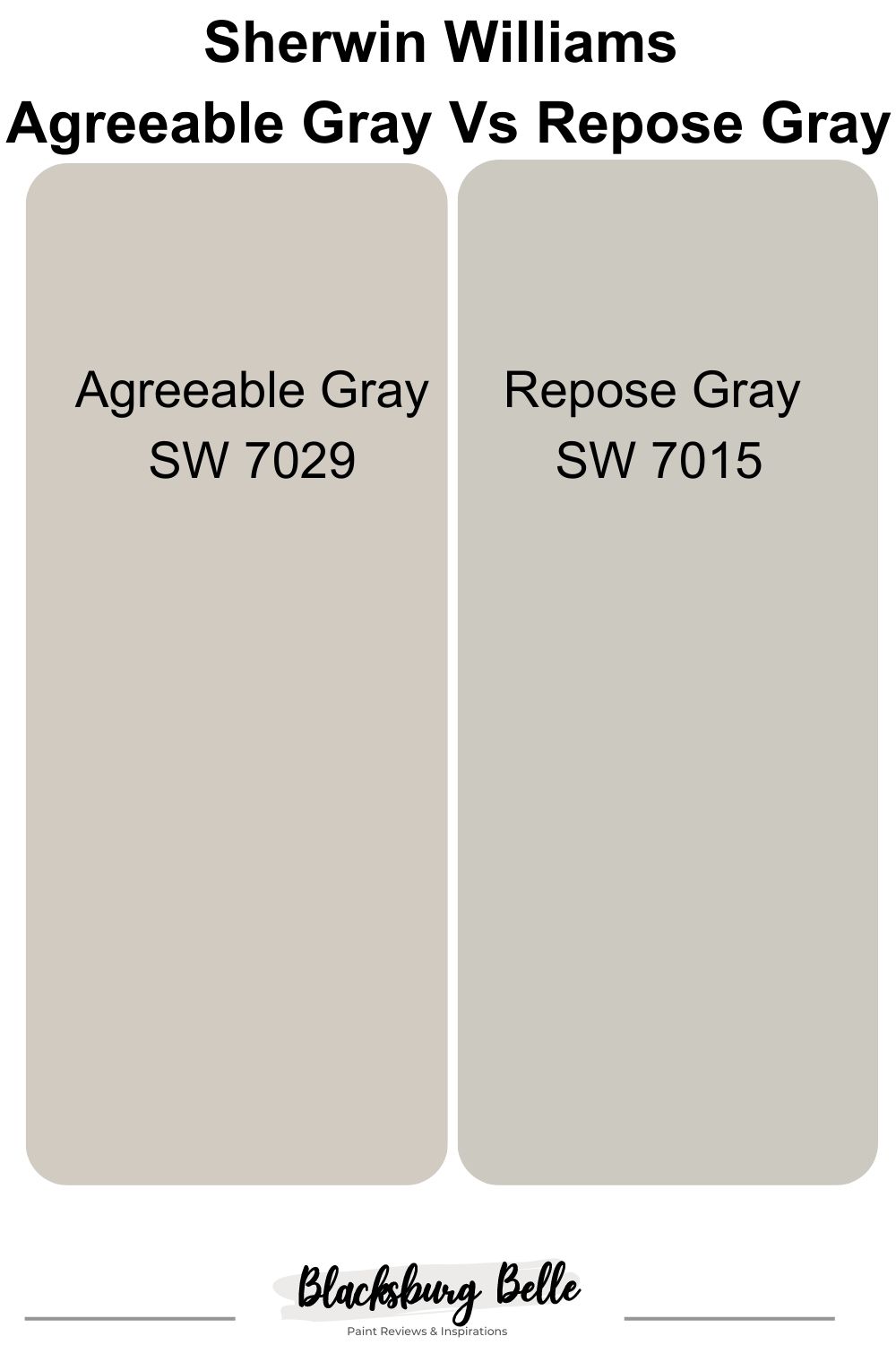
Agreeable Gray and Repose Gray are among the most popular shades of gray by Sherwin Williams, and also one of the best gray paints you can use for your interior and exterior decorations.
However, choosing between these two paints can pose a problem because of how similar they are in appearance.
This article is going to be your ideal guide to choosing the best gray shade for “YOU” and help you see the differences between them.
Table of Contents
The Visual Distinctions: Agreeable Gray Vs Repose Gray
Repose Gray carries a coolness that is missing in agreeable gray. This characteristic gives it the ability to work beautifully with just about any style of decoration, making it a very satisfactory gray paint choice.
Let’s take a quick look at the visual differences between Agreeable Gray and Repose Gray.
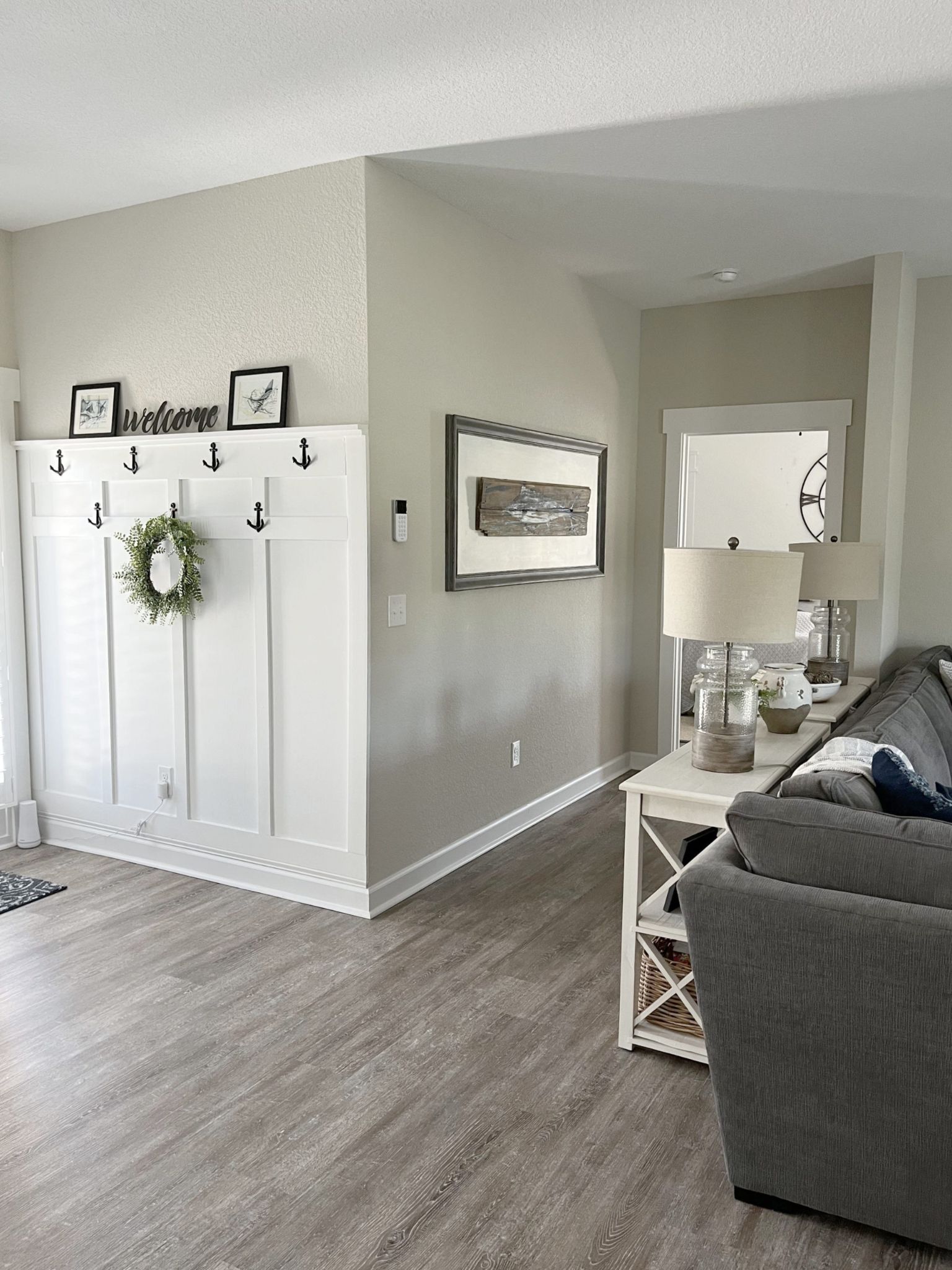
Here’s an image below of a living room area where the walls were painted in Repose Gray.
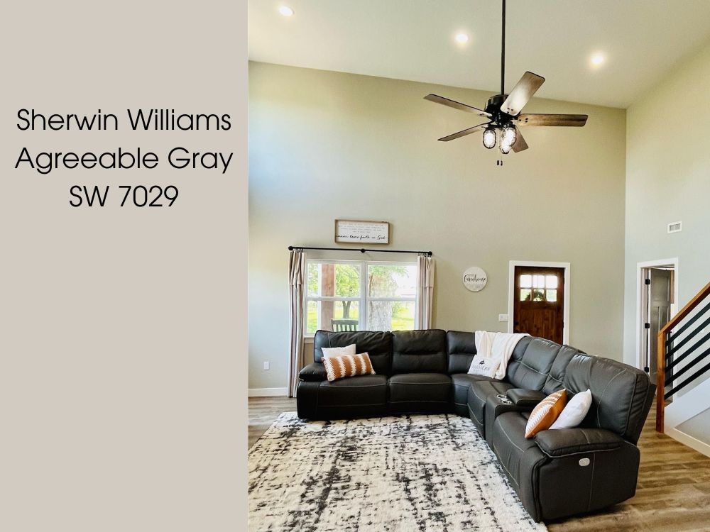
Below is another image of Agreeable Gray used on the walls of this bedroom.
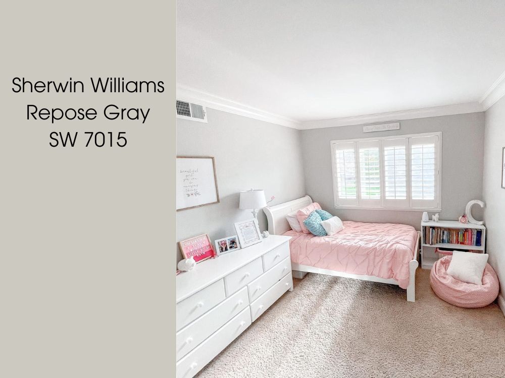
The difference between both can be spotted at first glance. Agreeable Gray appears to be light and brighter than Repose Gray. Both colors appear as cool neutrals, however, if you are looking to brighten up your room without using white, then Agreeable Gray is the ideal choice.
Emotional Effect: Agreeable Gray Vs Repose Gray
Agreeable Gray is a beautiful warm-toned paint color that has a classic appeal and sophistication that plays a very vital role in determining the beauty of this color. When it comes to the emotional effect of colors, both colors offer distinct experiences.
Agreeable Gray, as its name suggests, tends to create a sense of agreeability and harmony in a space.
Repose gray by Sherwin Williams on the other hand is a very popular shade of cool gray paint created from a mixture of brown, gray, greige, and VERY SLIGHT hints of purple. Repose Gray, on the other hand, has its own emotional impact. This color emits a cooler and more sophisticated vibe. It carries a touch of elegance and refinement
As much as lighting plays a big part in how a paint color looks, other factors might determine the appearance of a paint color also which in turn would have varying emotional effects.
When To Use Agreeable Gray Vs Repose Gray
Agreeable gray works best in spaces with lots of exposure to natural light. In a well-lit room, it will have an appearance of a warm light greige making the room a warm, friendly, and inviting space.
Agreeable gray also looks great in a dark room with constant exposure to artificial light.
The concentrated warmness that Agreeable Gray carries, makes it a better option for your interior decoration.
Use Agreeable Gray If;
- You want a brighter shade of gray.
- You want a cool gray color that has a high LRV
- You want a gray color that works well with other color options.
Use Repose Gray If;
- You prefer a deeper or darker shade of gray that isn’t overly dim.
- You want a cozy color that would exude warmth in any space.
- You have white finishes and furniture.
In The Spotlight: A Quick Comparison Of Agreeable Gray Vs Repose Gray
The Table Below Shows The Basic Parameters Of Both Agreeable Gray And Repose Gray. With this, you can clearly spot varying differences between both paints.
| Agreeable Gray | Repose Gray | |
| RGB | 209, 202, 192 | 204, 200, 191 |
| LRV | 60 | 58 |
| HEX value | #D1CAC0 | #CCC8BF |
| Undertones | Blue, green, violet, beige | Blue, green, violet. |
LRV Of Agreeable Gray VsRepose Gray
First, we need to understand what the LRV means. Light Reflectance Value is simply the percentage of light a paint color reflects. It is used by experts to determine how light or dark a color will appear when applied on a surface.
LRV is measured on a scale from 0-100%. 0% which is black and doesn’t reflect any light to 100% which is pure white and reflects all the light.
Agreeable gray has an LRV of 60
Repose gray has an LRV of 58
One of the reasons why these colors are very similar in appearance is because of how close in percentage their light reflectance value is.
However, the slight difference in the light reflectance value of agreeable gray and repose gray is responsible for making agreeable gray a lighter shade of gray compared to repose gray.
The difference in their LRV also tells us that agreeable gray will reflect more light than response gray would.
PS: The higher the LRV, the brighter the paint color.
Agreeable Gray vs Repose Gray Undertones
Another property that differentiates these two colors from each other is their undertones. Before we go further, let us understand the relationship that grays have with undertones.
When considering grays, including warm and cool, it is important to note that they all have these three undertones, blue, green, or purple which means there is always a lighting situation that supports the showing up of these undertones.
The difference between the many shades of gray is that they have these three undertones in different proportions and might also have a mixture of other colors as undertones.
However, when merged together, Agreeable Gray would appear light brown and Repose Gray would appear light blue.
Agreeable Gray Undertones: A Closer Look
Agreeable Gray is a very flexible color and being gray/greige-taupe is not dedicated to a particular undertone.
It anyway has green, faintly blue, prominent beige, and a splash of purple or violet undertones.
The greige part of this paint color tends to favor the green undertone in the paint and the taupe part of the paint loves the violet undertone.
Here’s a bathroom with the walls painted in Agreeable Gray.
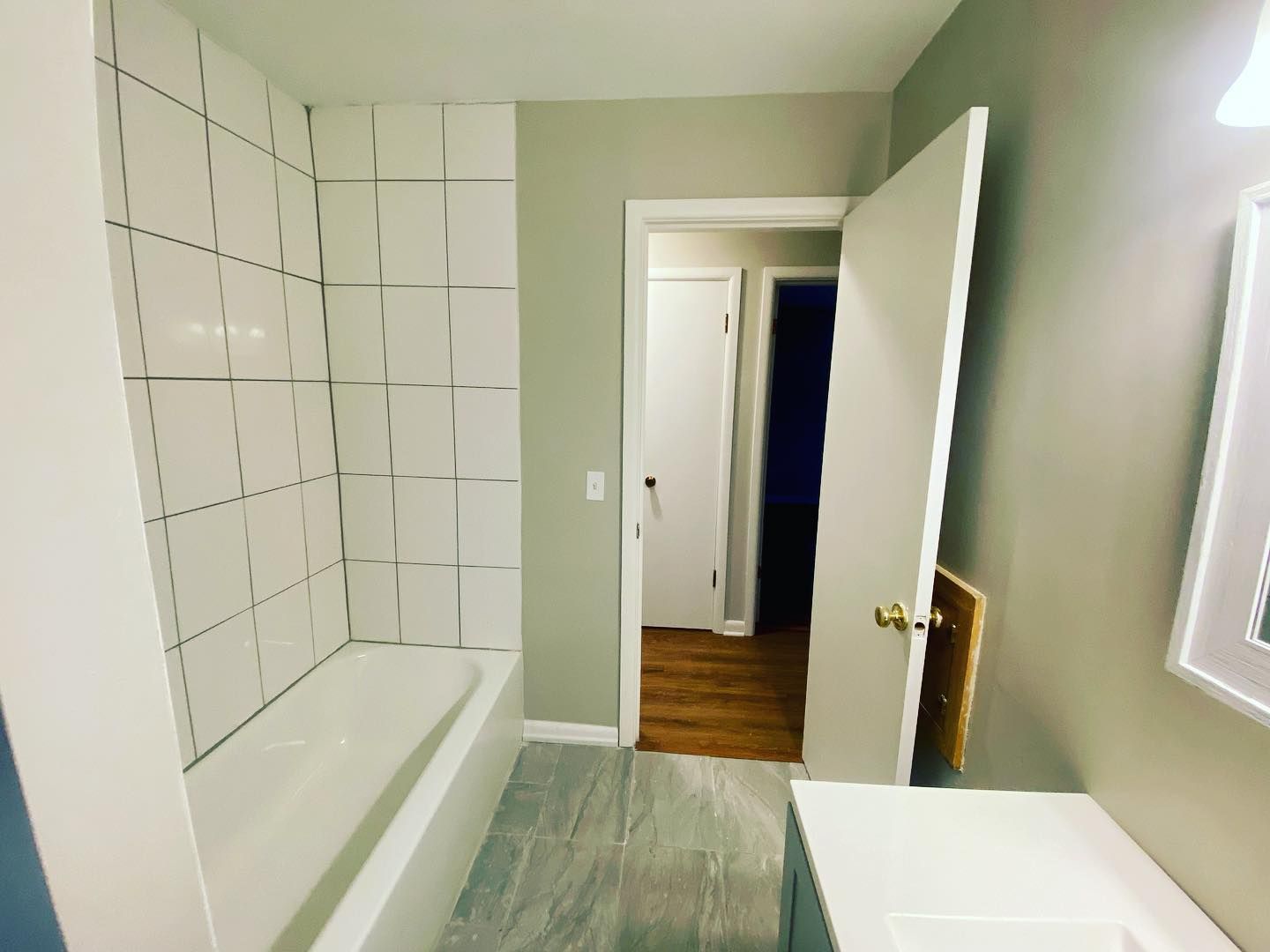
The beige is responsible for the warmth that the color carries while blue gives the faint hint of coolness.
So, in the presence of certain lighting conditions, agreeable gray will give us a flash of its very vague violet undertones. In others, a peck of green, and in some a hint of blue coolness with an overall envelope of warmth.
These undertones are the reason why this shade of gray moves towards the beige-yellow side of the color wheel.
Repose Gray Undertones: A Closer Look
When it comes to repose gray, its undertones are a mix of brown, gray, and greige with a kiss of purple. It also has blue-green undertones that give off cool energy making the blue value in its RGB concentration higher than that of agreeable gray.
Here’s a living room painted in Repose Gray, that exposes some of these undertones.
What the green undertones do is give the color a very alluring freshness, and the hint of purple undertones helps the gray paint not to be flat or look dull.
The blue undertones further give this color a spike of coolness and the brown is responsible for its warm nature.
Agreeable Gray Vs Repose Gray: Warm Or Cool?
Agreeable gray is a warm gray/greige paint color. its warmth however might fluctuate in strength depending on the nature of the light it is exposed to and the color it is compared or matched.
The undertones in agreeable gray find a way to maintain their neutrality all the time. The beige And faint blue undertone in this mix gives the paint color a nice balance of warmth and a kiss of cool tones.
Repose Gray has a soft violet undertone that comes up most times and some green also. In certain kinds of light exposures, repose gray will emit some touches of blue that will come with a beachy-like coolness.
The only difference between agreeable gray and repose gray when it comes to their coolness or warmth is that repose gray carries a coolness that is more than that of agreeable gray. However, both colors are warm colors.
Agreeable Gray VS Repose Colors Complementary Colors
Complementary colors are two colors that are on opposite sides of the color wheel. This simply means that they cancel each other out when mixed or combined. An example is black and white.
Agreeable Gray Complementary Color
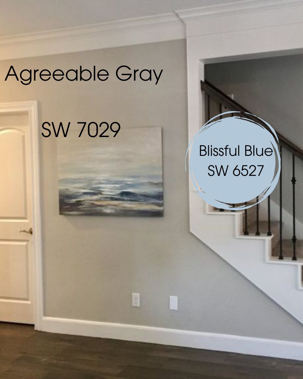
Agreeable gray being a neutral gray pairs well with a lot of different colors ranging from bold to saturated colors, deep neutral black, and even neutral wood tone.
Although this neutral can work well with almost any other color, here is an ideal complementary color for Agreeable Gray.
- Blissful Blue SW 6527: This is a unique shade of blue from the Sherwin-Williams collection that is known to create an abiding calm.
Repose Gray Complementary Color
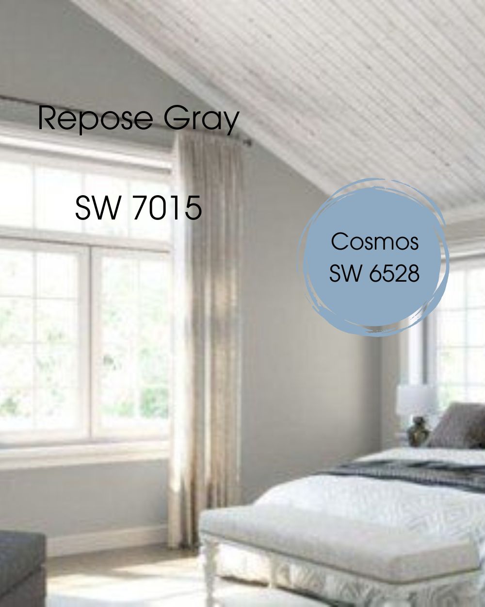
Repose gray works exceptionally well when paired with whites. This collaboration leads to the creation of a very cozy beach-like vibe.
However, when matching colors with repose green with the intent of bringing out the fresh green tone in the color, here’s one color that truly brings out the best in Repose Gray.
- Cosmos SW 6528: A cool blue color with unique undertones that brings life to a space when used to complement Repose gray.
Agreeable Gray And Repose Gray Color Palette
A color palette is a collection of colors that have been thoughtfully chosen to work in harmony with a central or main color.
In this section, we will be Introducing the Agreeable Gray and Repose Gray color palettes, where a carefully curated selection of hues that perfectly complements Agreeable Gray And Repose Gray have been chosen, using any of these would result in a harmonious and balanced combination.
Agreeable Gray Color Palette
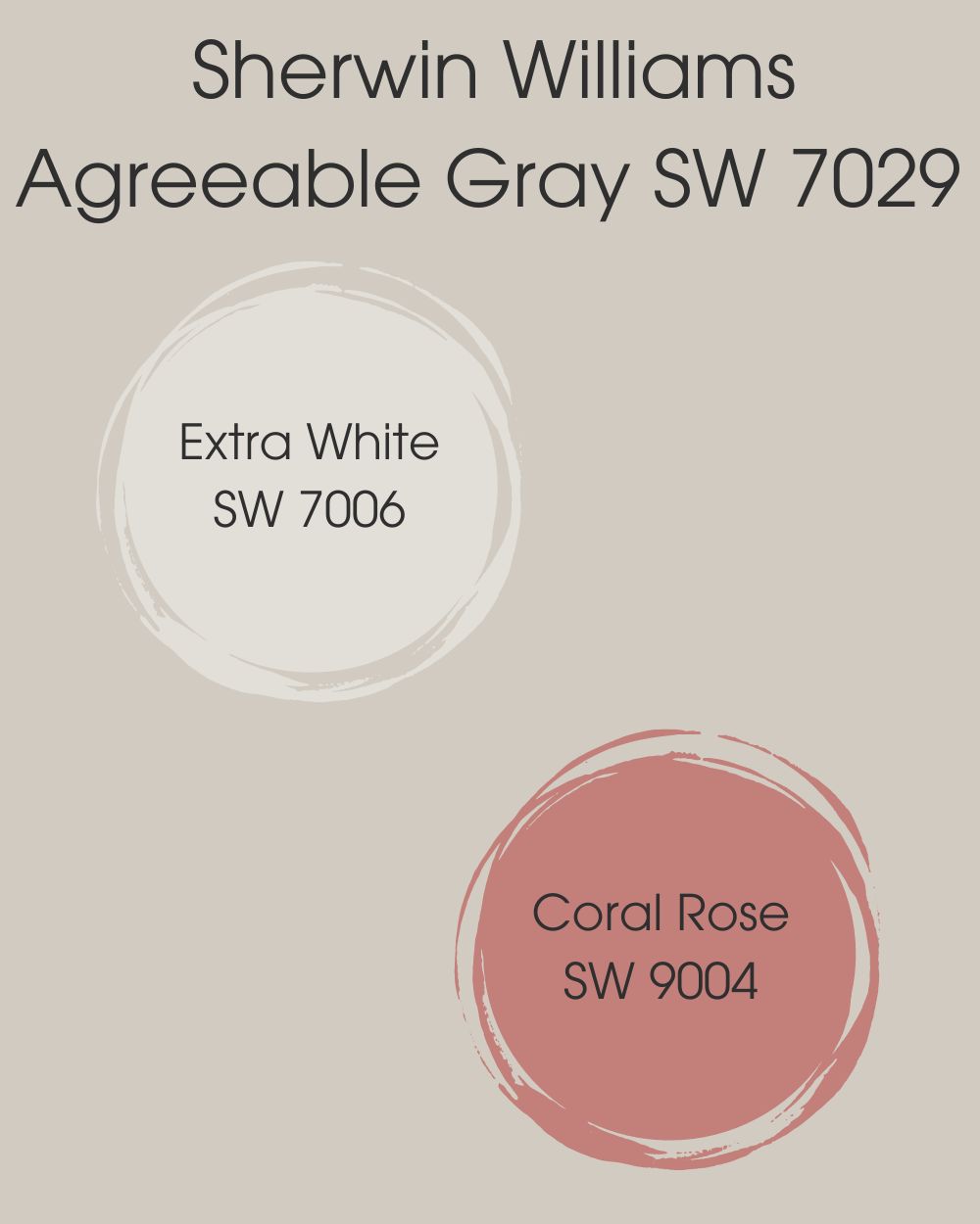
- Extra White SW 7006: This white works well for a tidy and modern impression. It is a great option for your ceiling trims because of its excellent light reflection. Indeed a perfect match with Agreeable Gray.
- Coral Rose SW 9004: This is yet another amazing option that could easily be paired with Agreeable Gray to create the perfect ambiance. Coral Rose is a unique shade of Terracotta.
Repose Gray Color Palette
Your primary concern when selecting the perfect color scheme should be taking the various undertones of Repose Gray into account. Repose Gray pairs well with the following hues:
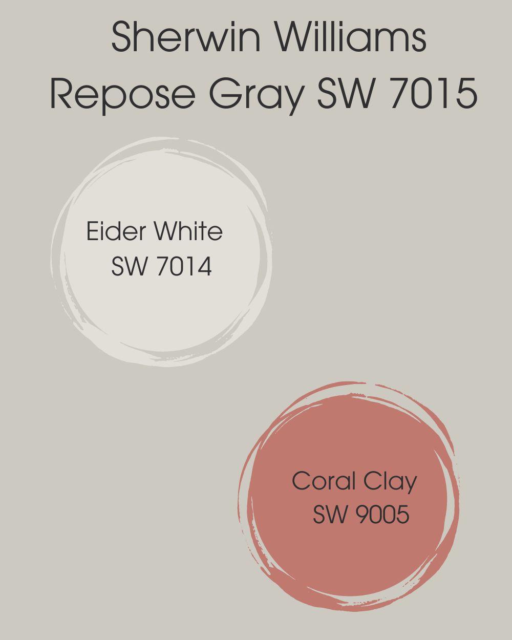
- Sherwin Williams Eider White (SW 7014): A cool white paint color with gray undertones that brings a warm and bright contrast to Repose Gray.
- Sherwin Williams Coral Clay (SW 9005):A deep but gentle rich red paint color that acts as a soft glowing backdrop when meshed with Repose Gray.
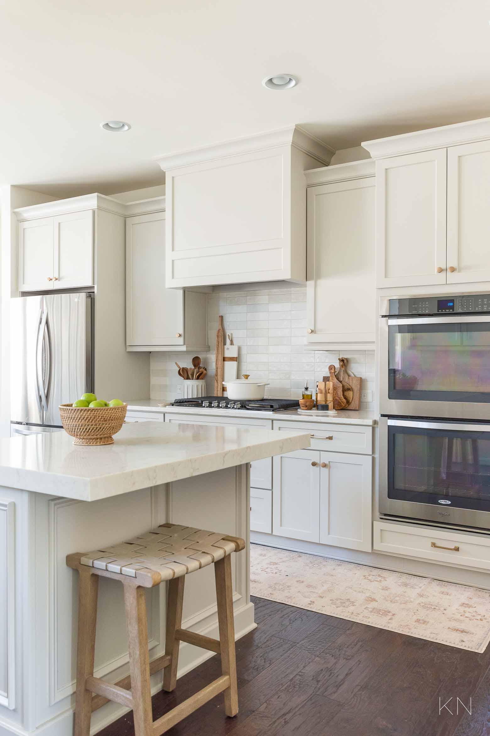
Agreeable Gray VS Repose Gray On Kitchen Cabinets
Don’t want white cabinets? That’s okay. Agreeable gray and repose gray both work beautifully on kitchen cabinets.
Here’s an image of Agreeable Gray on Kitchen Cabinets.

Below is another image of Repose Gray on kitchen cabinets.
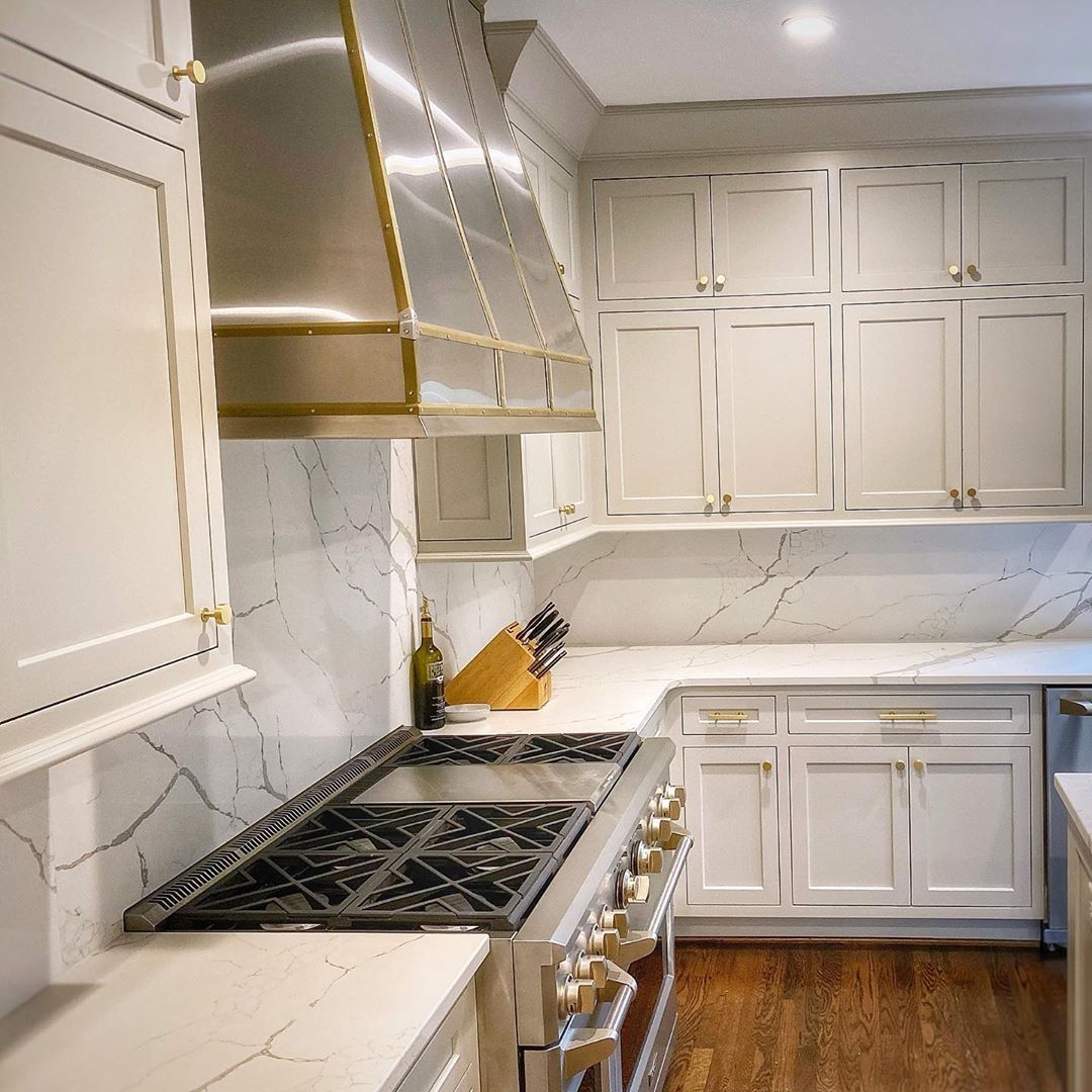
Both appear bright however, Agreeable gray seems a bit dimmer when used on the cabinet. Remember that lighting plays a vital role in the overall appearance of any paint color.
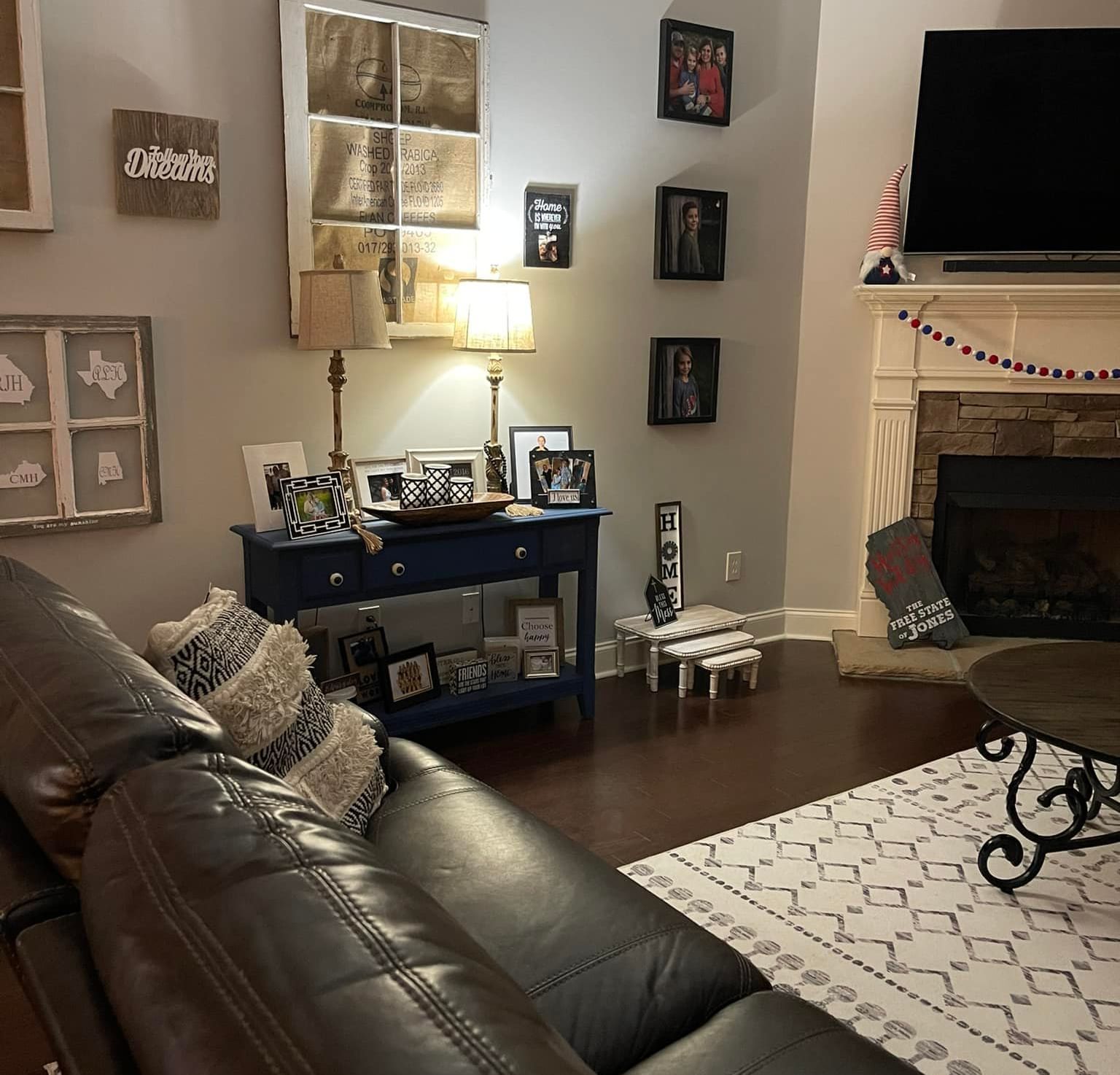
Agreeable Gray VS Repose Gray On Living Room Walls
Your living room is yet another ideal spot for Agreeable gray to shine, below is an image of how Agreeable gray looks in a living room.
You can see the green undertones quite well thanks to the lighting of the room. Based on personal preference I would choose to go with Agreeable Gray for my living room area.
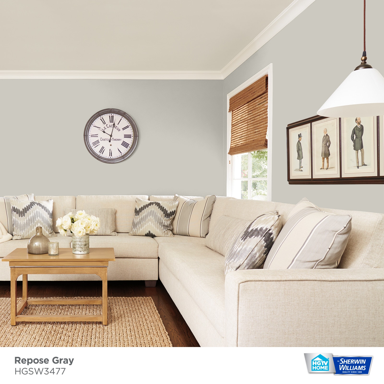
On the other hand, below is an image showing a unique view of Repose gray in a living room setting;
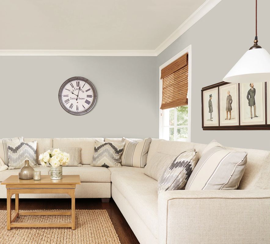
In the image above you can see the blue and purple undertones trying to come alive. It might not be 100% visible but it is most definitely there.
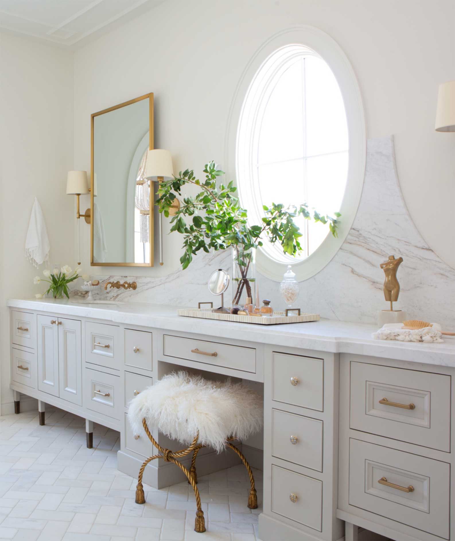
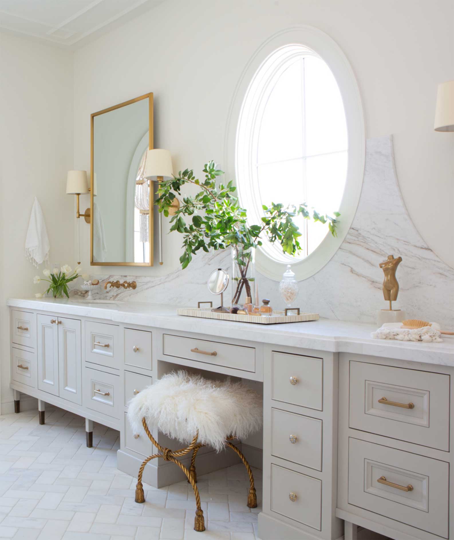
Agreeable Gray VS Repose Gray On Bathroom Walls
A gray-colored bathroom with light situations that supports its faint violet undertone is never a go wrong. The mixture of artificial and natural light in this bathroom creates an irresistible aura and environment.
Here’s what Agreeable Gray looks like on bathroom walls as seen in this modern setting below.
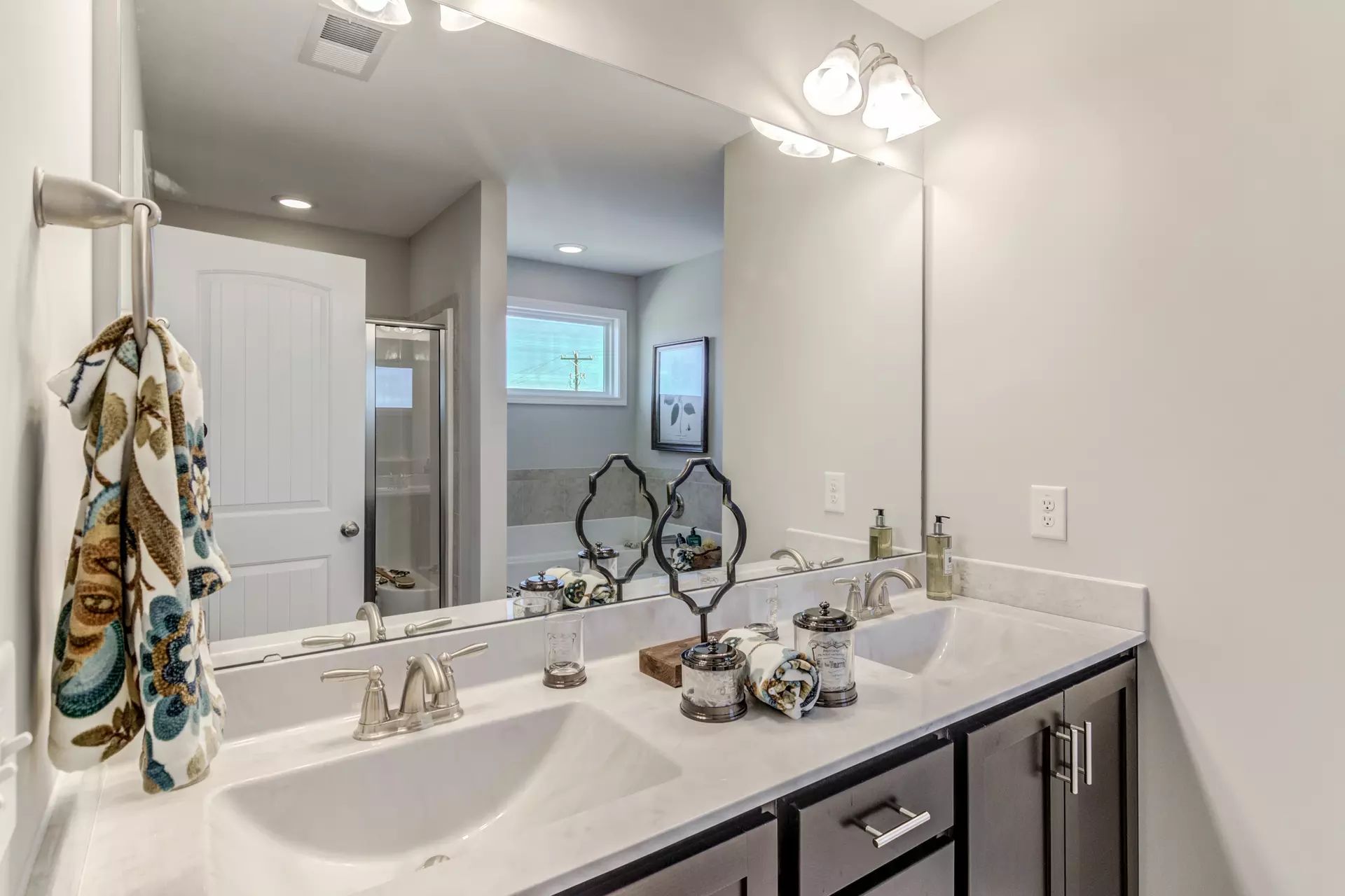
Below is an example of Repose Gray on your bathroom walls, which is not a bad idea for someone who wants a cool and serene-looking bathroom.
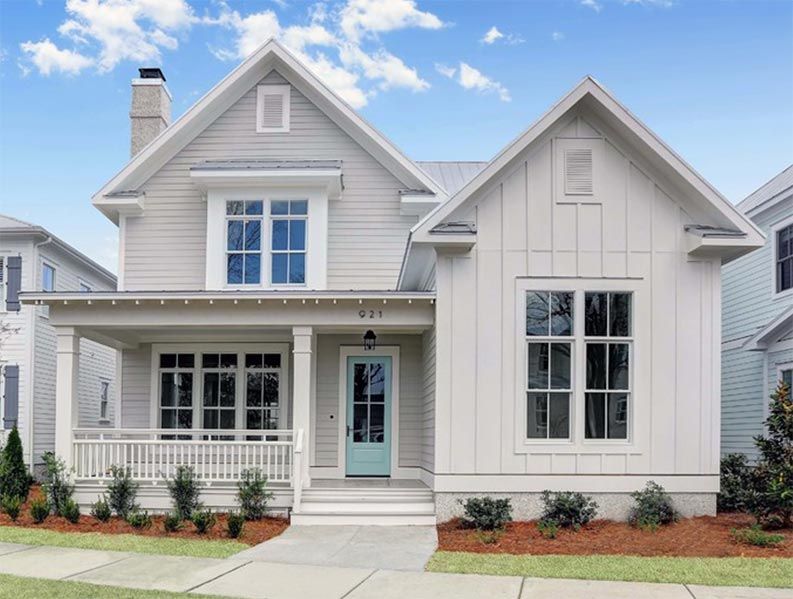
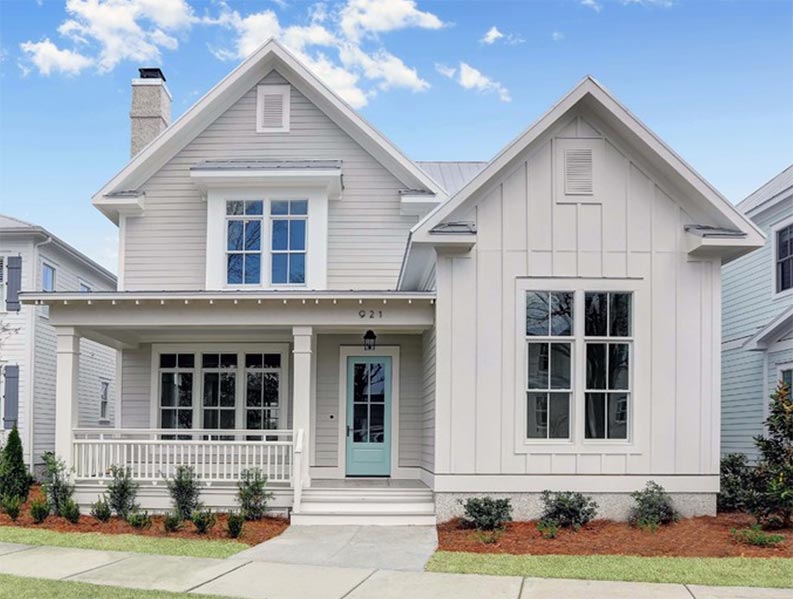
Agreeable Gray Vs Repose Gray On Exteriors
It’s very clear that the exposure on the exterior part of this house favors its green undertones. Agreeable gray, as a neutral paint, has blended beautifully with the surroundings as in the image below.
Here’s an exterior of a home painted in Agreeable gray and what appears to be Pure White.
Below is another exterior painted in Repose gray, here pure white was also used as a coordinating color to create the perfect blend.
I can’t get over the view this exterior gives. The repose gray on the walls of this building has created a very inviting and accommodating appearance, making the subtle green undertones visible which further brings out a bit of freshness.
While Agreeable Gray and Repose Gray might differ in various ways, we can’t ignore the fact that both paints actually have a striking resemblance and a few similarities.
A noticeable similarity between both paints is their ability to adapt to different lighting conditions. Agreeable Gray and Repose Gray are both versatile and this allows them to easily adjust to different levels of natural or artificial lighting.
Conclusion
Agreeable Gray or Repose Gray, whatever your decision might be, the difference between these two paint colors is what makes them unique and distinctively wonderful on their own. Aside from these differences, they are both neutral, collectively versatile, universally appealing, and inoffensively captivating. I hope you enjoy reading this article, tell us in the comment section below, which gray are you choosing for your home and why? Thanks for stopping by.
 Sherwin Williams Worldly Gray Vs Agreeable Gray
 Sherwin Williams Alabaster Vs Pure White: How to Choose!
 Forest Green Vs Hunter Green: What are the Differences?
 Benjamin Moore Alabaster vs Sherwin Williams Alabaster: What’s the Difference?
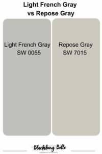 Light French Gray vs Repose Gray: How to Choose?
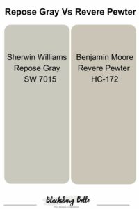 Repose Gray Vs Revere Pewter: How to Choose?
