
White paint colors have always been popular for any space and will never go out of style. However, this doesn’t mean people won’t get stuck picking one from the options out there. We have Benjamin Moore Simply White and Decorator’s White in this case.
Do you find it challenging to pick from these two options? Or do you simply want to figure out their differences, if there are any? You’ve come to the right place, as I will address the answers you seek in this article.
Here’s the short of it. Benjamin Moore Simply White is the brighter one of the two. Also, it falls on the warm side with yellow undertones. While this makes it a cozy white, it also reduces its versatility a bit.
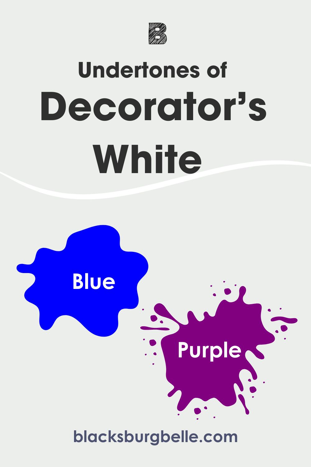
On the other hand, Benjamin Moore Decorator’s White is a cool white paint color. It has blue and purple undertones. Anyone of these can show up depending on other factors like lighting and color pairings.
If you want the long and detailed answer, continue reading. This article compares both colors and addresses their properties. It also contains the best tips on how to choose between Simply White and Decorator’s White.
Table of Contents
When to Choose Benjamin Moore Simply White or Decorator’s White
Although you now know some of their major differences, it’s sometimes not enough to make the right choice. When do you choose Simply White or Decorator’s White? Here’s a simplified rundown of how to pick the right color for your space.
Choose Simply White (OC-117) if:
- You prefer a warm white with creamy tones.
- Your space has abundant light to help bring out the paint color’s beauty.
- You want to set a cozy vibe in your space.
- You want to avoid a white paint color that has blue or green undertones.
Choose Decorator’s White if:
- You want a cool white with refreshing appeal.
- You don’t mind a white with blue and purple undertones.
- Your space doesn’t have lots of cool lighting that can make the paint color look icy or cold.
- You don’t want a white with yellow or creamy tones.
Based on the above tips, you can now pick between Simply White and Decorator’s White. However, do you want to know how we arrived at these deductions? Remember that white paint colors have high versatility. This is why it can be a little tricky when weighing them against each other.
Fortunately, we are just getting started. By the end of this article, you will fully understand the uniqueness of each of these colors. You will also know how I came about the above tips.
The Visual Distinctions: Benjamin Moore Simply White vs. Decorator’s White
We will begin by looking at the paint colors in real homes and spaces.
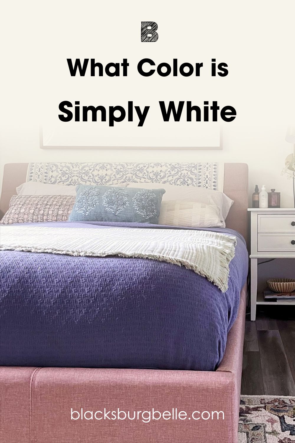
Firstly, here is Simply White on a bedroom wall:
And Decorator’s White:
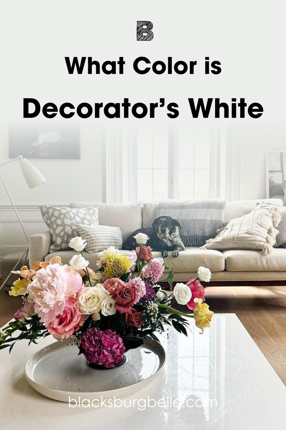
The above pictures depict the paint colors on the walls of living spaces. You can immediately notice the different tones in both colors. One gives a cozy feel, while the other looks more refreshing and calm.
Benjamin Moore Simply White shows its creamy tones on the bedroom walls. The lovely white displays strong yellow undertones that add warmth to the space.
On the other hand, Benjamin Moore Decorator’s White displays its blue undertones in the second picture. The tranquil white adds a cool feel to the living room. It also looks breezy and light-hearted.
Benjamin Moore Simply White vs. Decorator’s White? – A Quick Comparison
This quick comparison focuses on the main properties of both white paint colors. These attributes tell a lot about the color. And you will immediately spot the differences between the two from the table below:
| Attributes | Benjamin Moore Simply White | Benjamin Moore Decorator’s White |
| RGB | 247, 247, 238 | 236, 238, 235 |
| LRV | 89.52 | 82.68 |
| Undertones | Strong Yellow | Blue and Purple |
| HEX Value | #F7F7EE | #ECEEEB |
Emotional Effects: Benjamin Moore Simply White vs Decorator’s White
Paint colors have been proven to have effects on us beyond visual satisfaction. White paint colors generally spark a sense of purity and serenity. So, what effects do Simply White and Decorator’s White have on our emotions?
Benjamin Moore Simply White is a warm white paint color with yellow undertones. This gives it a cozy appearance in any space. As you might’ve guessed, this means that Simply White creates a sense of acceptance, security, and warmth. It also infuses a bit of energy into your space, thanks to its yellow tones.
On the other side, we have Benjamin Moore Decorator’s White, which is a cool white paint color. It has blue and purple undertones, which show up depending on lighting, among other factors. Decorator’s White gives a sense of tranquility and comfort in any space. It breathes refreshing minty vibes into any space you choose to use it.
LRV of Simply White vs. Decorator’s White – Which Reflects More Light?
You’ve probably heard of LRVs when reading about colors or looking for a good choice. But what does it mean? And why is it so important?
A paint color’s LRV refers to its Light Reflectance Value. This value indicates how strongly the color reflects light. It runs on a scale of 0 – 100. Lower values indicate darker colors, and higher values represent brighter colors.
White paint colors have the highest LRVs, because they are closer to true white (LRV = 100).
Simply White has an LRV of 89.52.
Decorator’s White has an LRV of 82.68.
The above values already show that Simply White has a higher reflectance than Decorator’s White. Regardless, both paint colors reflect light strongly. This makes them suitable for any space, including dim-lit ones. It also increases their versatility, as you can use them in both interior and exterior spaces.
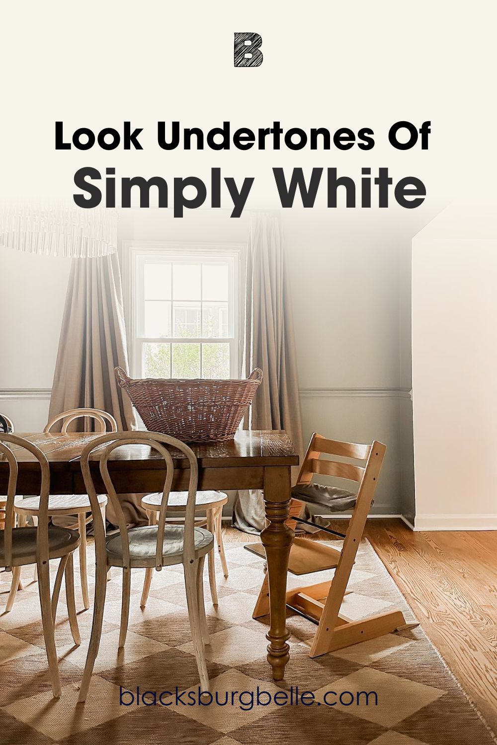
Undertones of Simply White vs. Decorator’s White: Are They the Same?
By now, you already know that these two paint colors have different undertones. This property is another important factor when comparing them. Undertones might not show up all the time. However, that doesn’t mean they aren’t there and can’t sometimes pop up.
Factors like lighting and surrounding colors play a role in determining when undertones get revealed.
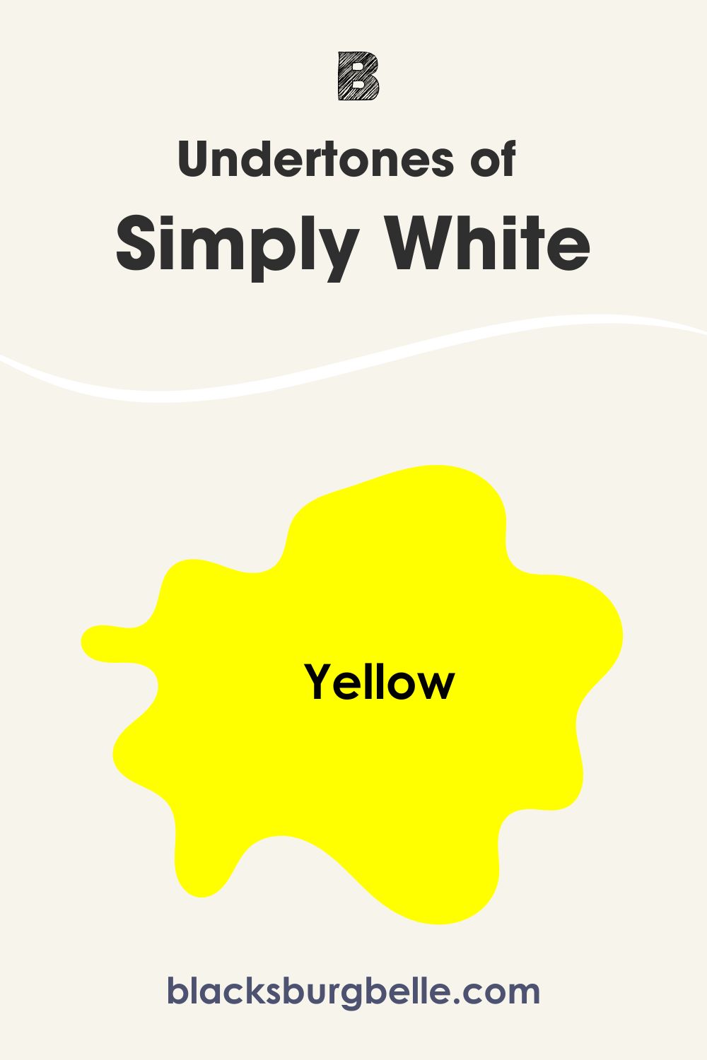
Benjamin Moore Simply White has strong yellow undertones that show up almost all the time. They are largely responsible for its cozy look and warm feel. In incandescent lights, Simply White will look very warm. Cool lighting will only make it look a little less warm than usual.
What about Benjamin Moore Decorator’s White? The pretty white has blue/purple undertones. They are responsible for its cool look and refreshing vibes. Warm lighting bring out more of its purple undertones. Cool lighting and north-facing rooms allow its blue to pop up.
Placing them side-by-side will show Simply White’s yellow tones and creamy look. You will also notice Decorator’s White’s cool look and its blue/purple tones.
A Closer Look at Simply White’s Undertones
The picture below shows Simply White’s yellow undertones on the walls of a living room. The surrounding beige tones also help to bring out the white’s warmth and coziness.

A Closer Look at Decorator’s White Undertones
A quick glance at the picture below shows a plain white color on the wall. However, you willImage Credit:@ notice the subtle blue undertones upon looking closely.
Simply White vs Decorator’s Dove – Are They Warm or Cool?
Both white paint colors read differently. Simply White is a warm white paint color with yellow undertones. Decorator’s White is a cool white color with blue and purple undertones. It’s important to know this as it will help you know the right spaces for the colors.
Benjamin Moore Simply White is the right choice if you want warmth in your space. Benjamin Moore Decorator’s White becomes the better option if you want a cool refreshing look for your space.
Thanks to their high LRVs, both paint colors work well in interior and exterior spaces. However, Simply White might not be the best choice if you have cool colors in the space already. Except you are aiming for a balanced look.
Simply White vs Decorator’s White Complementary Colors
Complementary colors are located on the opposite sides of each other on the color wheel. They give the strongest with each other when placed side-by-side. Also your color’s complements will make it pop when paired together.
Both Simply White and Decorator’s White pick their complements from purple. To be precise, their complementary colors have lavender tones. Interestingly, these tones can lean towards warm or cool. Their look depends on the undertones and color pairings.
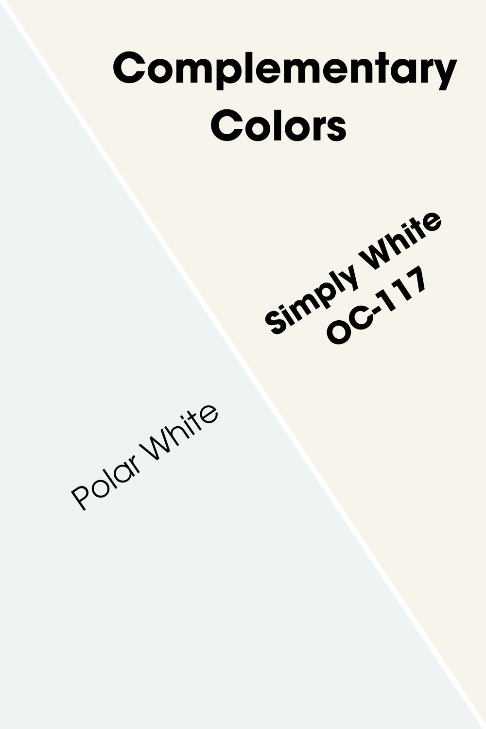
Benjamin Moore Simply White (OC-117) Complementary Color
Simply White’s complementary color gives a delicate and inviting look when paired together.
Benjamin Moore Polar White
Polar White has an LRV of 79.34, which puts it in the off-white category. The paint color has strong lavender/purple tones that give it a unique look. It’s reflectance allow it to do well in spaces with good lighting and dim ones too.
Benjamin Moore Decorator’s White (OC-149) Complementary Color
When you pair Decorator’s White with its complement, you can get a laid-back but sophisticated look.
Benjamin Moore Oyster (2115-70)
Don’t confuse this paint color with Oyster white from the same brand. Although it’s called a gray, Oyster has enough reflectance to qualify as a white color. It has pearly vibes with lavender/purple undertones.
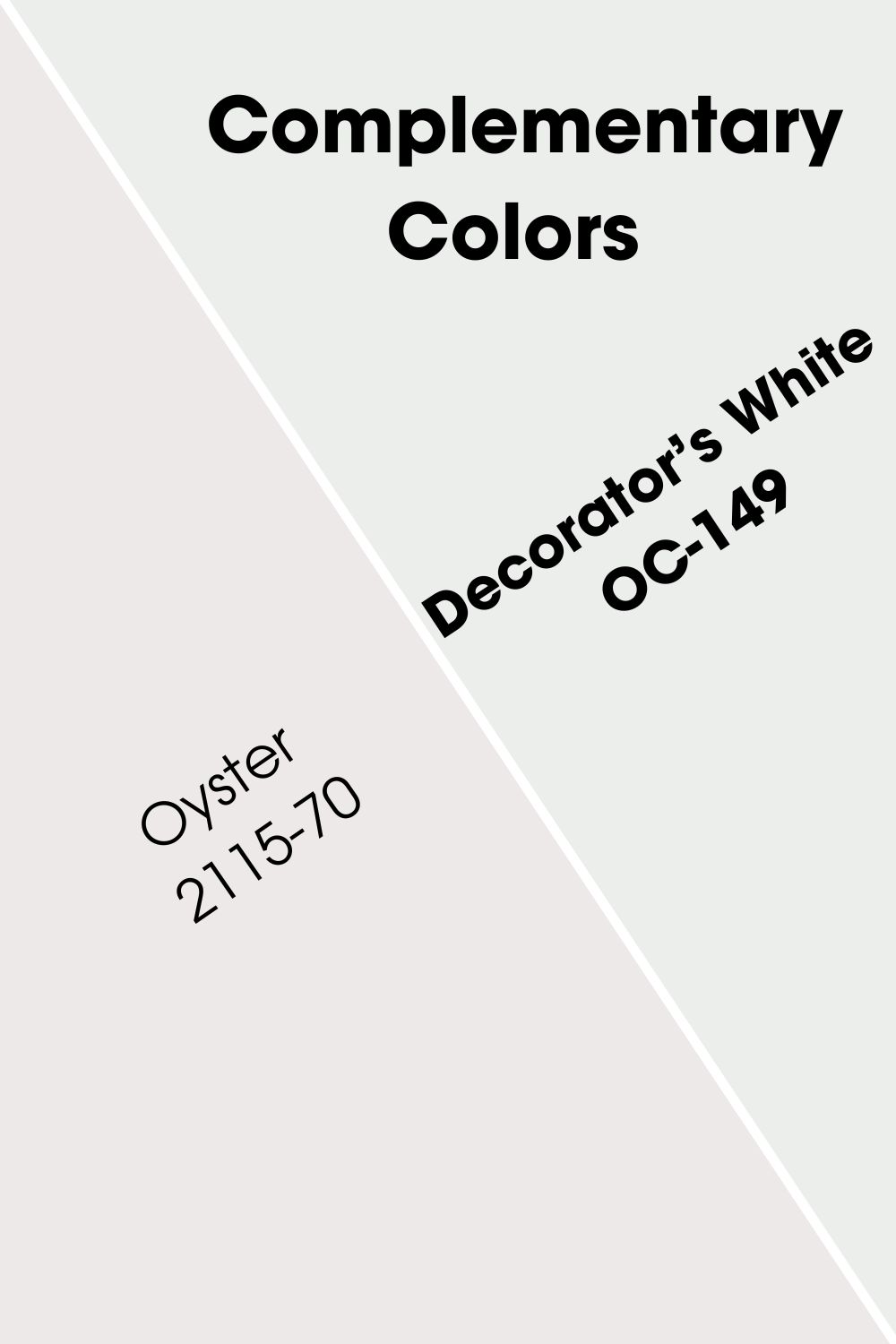
If you want a cool aquatic theme, you can consider this paint color too.
Simply White and Decorator’s White Color Palette
Now that we’ve established their differences and uniqueness let’s check out how they pair with relevant colors. These palettes put Simply White and Decorator’s White with other colors for a lovely look.
Simply White Color Palette
Benjamin Moore Simply White pairs with several other colors out there. It also fits into lots of palettes. You can always use it with warm colors for the best cozy looks. Or pair it with cooler options for a balanced look.
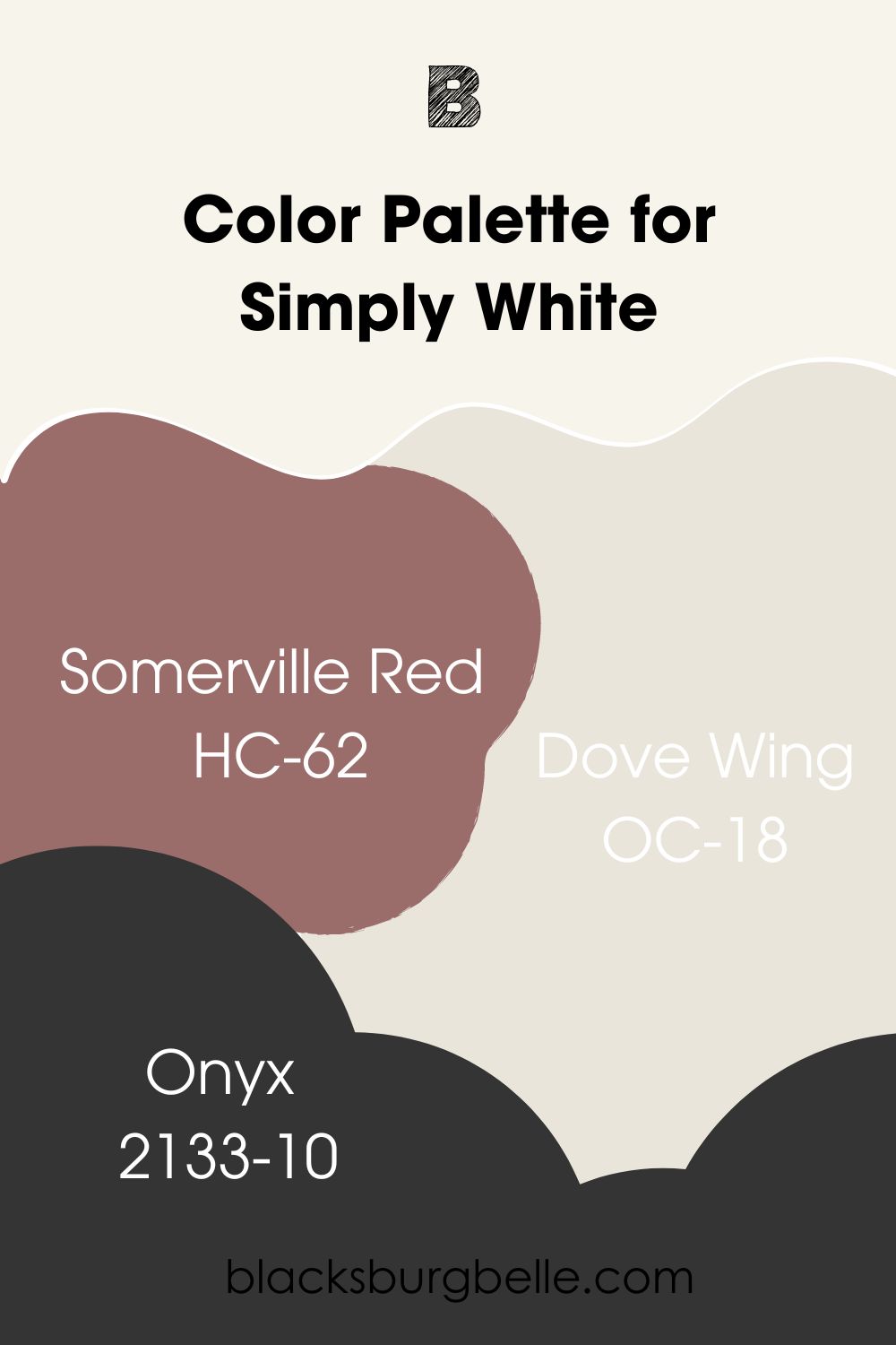
Benjamin Moore Simply White (OC-117)
This is the main color for this palette. Simply White is a warm, creamy white with soft yellow undertones. It has an LRV of 89.52 and works well in interior and exterior spaces.
Benjamin Moore Somerville Red (HC-62)
This medium-to-dark shade of wine brings a splash of color to the palette. Benjamin Moore Somerville Red has gray undertones that give it a ‘dusty’ look. This sets it apart from the average red or wine paint color.
It has an LRV of 19.43. This means that you will get the best of it in well-lit spaces.
Benjamin Moore Dove Wing (OC-18)
Dove Wing is an off-white paint color with silvery undertones. It has an LRV of 77.52 and pairs nicely with Simply White in any space. Although both paint colors have high LRVs, Simply White is several shades lighter.
Benjamin Moore Onyx (2133-10)
Onyx is a deep, rich black paint color with an LRV of 4.99. It has a high versatility and pairs nicely with almost any paint color out there. The luxurious black looks amazing on furniture and walls alike.
It has no discernable undertones. This makes it good to go with the undertones in this palette.
Decorator’s White Color Palette
This palette focuses on adding a calm and nature-inspired vibe to your space. It includes cool tones and a lovely green.
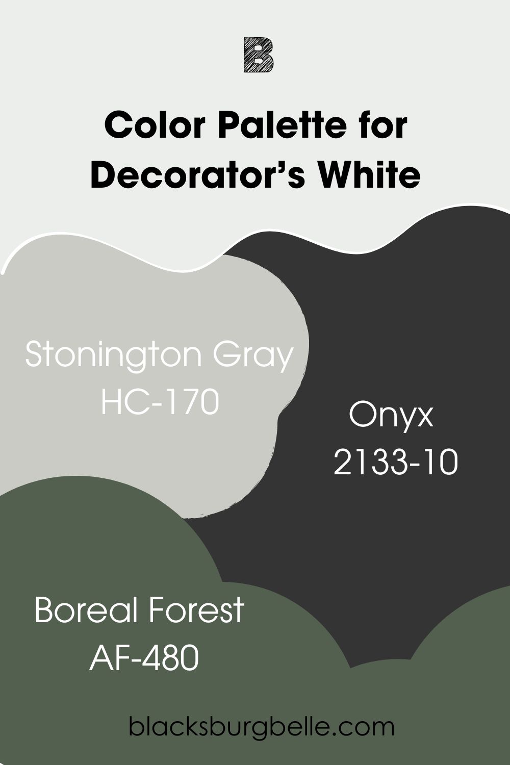
Benjamin Moore Decorator’s White (OC-149)
Here’s our main color. Benjamin Moore Decorator’s White is a cool white with mild blue undertones. It looks good on interior and exterior walls alike. You can use it to add a refreshing feel to your space.
Benjamin Moore Stonington Gray (HC-170)
This medium to light-toned gray has soft blue undertones that fit into this palette. It pairs nicely with Decorator’s White in any space, especially interior areas. Benjamin Moore Stonington Gray is quite popular among homeowners because of its versatility and comforting vibe.
Benjamin Moore Onyx (2133-10)
Yes, this luxurious black made it to this palette. Benjamin Moore Onyx anchors the colors in this palette. You can use it on furniture or on the walls; it works wonders. The paint color adds a sense of sophistication and boldness to any space.
Benjamin Moore Boreal Forest (AF-480)
Boreal Forest is the green paint color in this palette. The paint color makes you feel closer to nature just by being in your space. It reads cool and works well in both interior and exterior spaces.
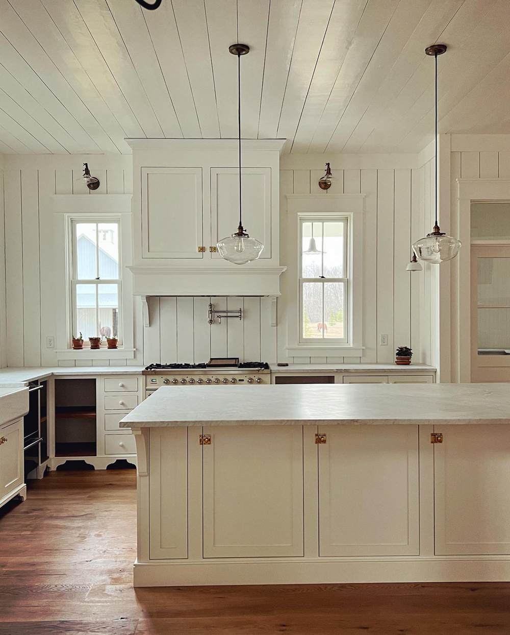
Simply White vs Decorator’s White on Cabinets
White paint colors look good in any space. But how do these ones hold up to this fact? Let’s check the pictures.
Simply White on Cabinets
The warm white looks cozy on the kitchen cabinets. It goes seamlessly with the other colors in the space. This helps to create and maintain a welcoming atmosphere.
Decorator’s White on Cabinets
As opposed to Simply White, Decorator’s White looks plain and a little cool on these cabinets. Also, it looks closer to true white in the picture. The reason is that the surrounding cool colors makes its mild blue undertones negligible.
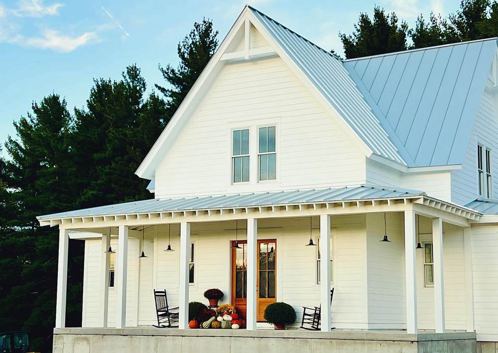
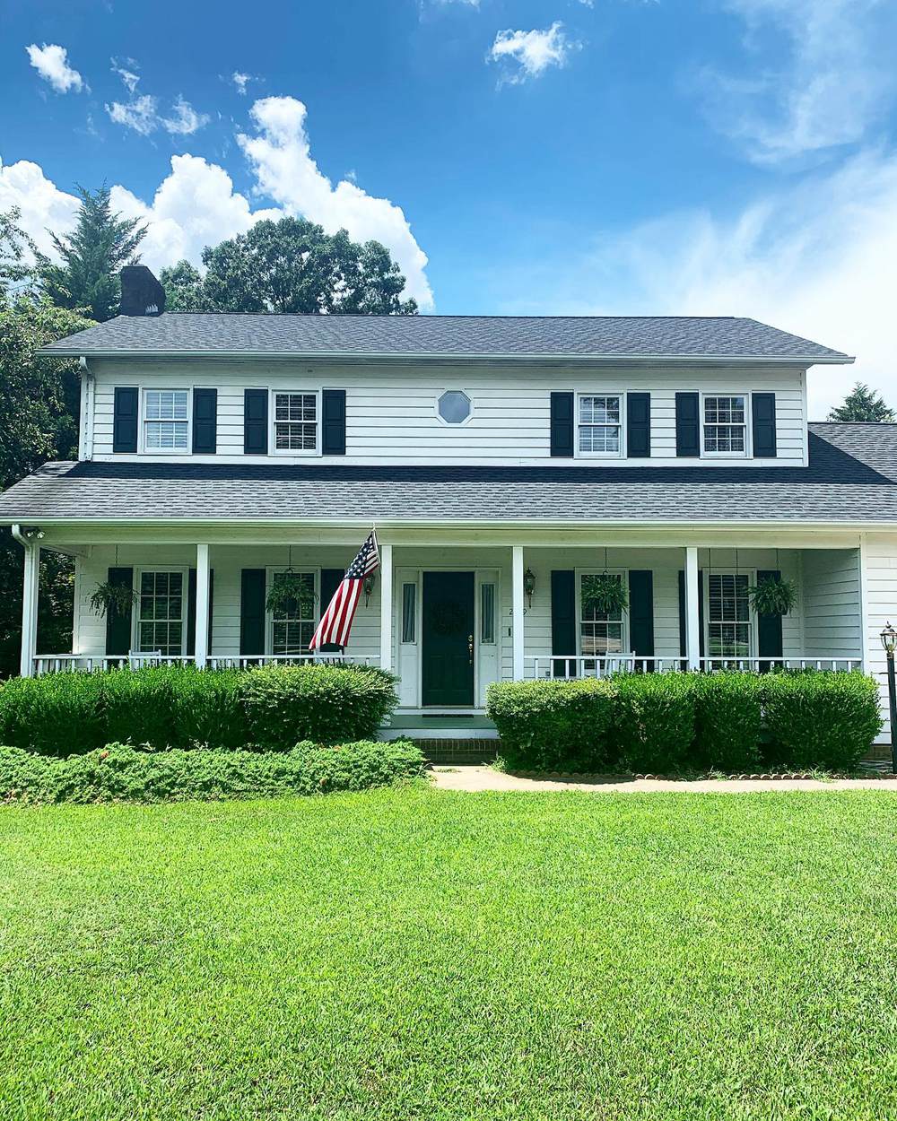
Simply White vs Decorator’s White in Exterior
In case you are wondering, Simply White and Decorator’s White look good in exterior spaces. Here are some pictures showing how they look on exterior walls.
Simply White on Exterior Walls
Benjamin Moore Simply White shows its yellow undertones on these exterior walls. Notice how it looks less warm on the upper walls. That’s because of the direct sunlight. The lower portion has a bit of shade, allowing the sun rays to give the color a creamier tone.
Decorator’s White on Exterior Walls
Benjamin Moore Decorator’s White looks cool on these exterior walls. If you look closely, you can catch its soft blue undertones, especially on the upper walls. However, the lower portion looks a bit green because of the strong green tones surrounding them.
Simply White vs Decorator’s White in Living Room
These lovely white paint colors look just as good on living room walls. They make it easy to feel welcomed in both living and workspaces.
Simply White on Living Room Walls
I love how Benjamin Moore Simply White looks cozy but doesn’t overwhelm the space with yellow tones. It exudes just enough warmth to make the living room soothing and welcoming.
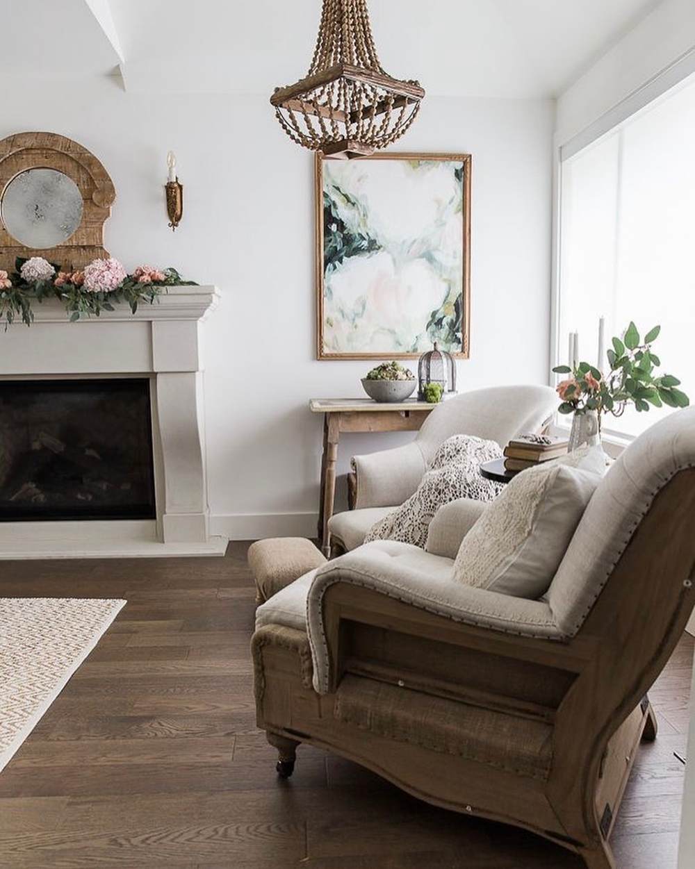
Decorator’s White on Living Room Walls
Benjamin Moore Decorator’s White looks cool on the living room walls. It pairs wonderfully with the green tones in the space. Together, they give a nature-inspired vibe and a sense of therapeutic comfort.
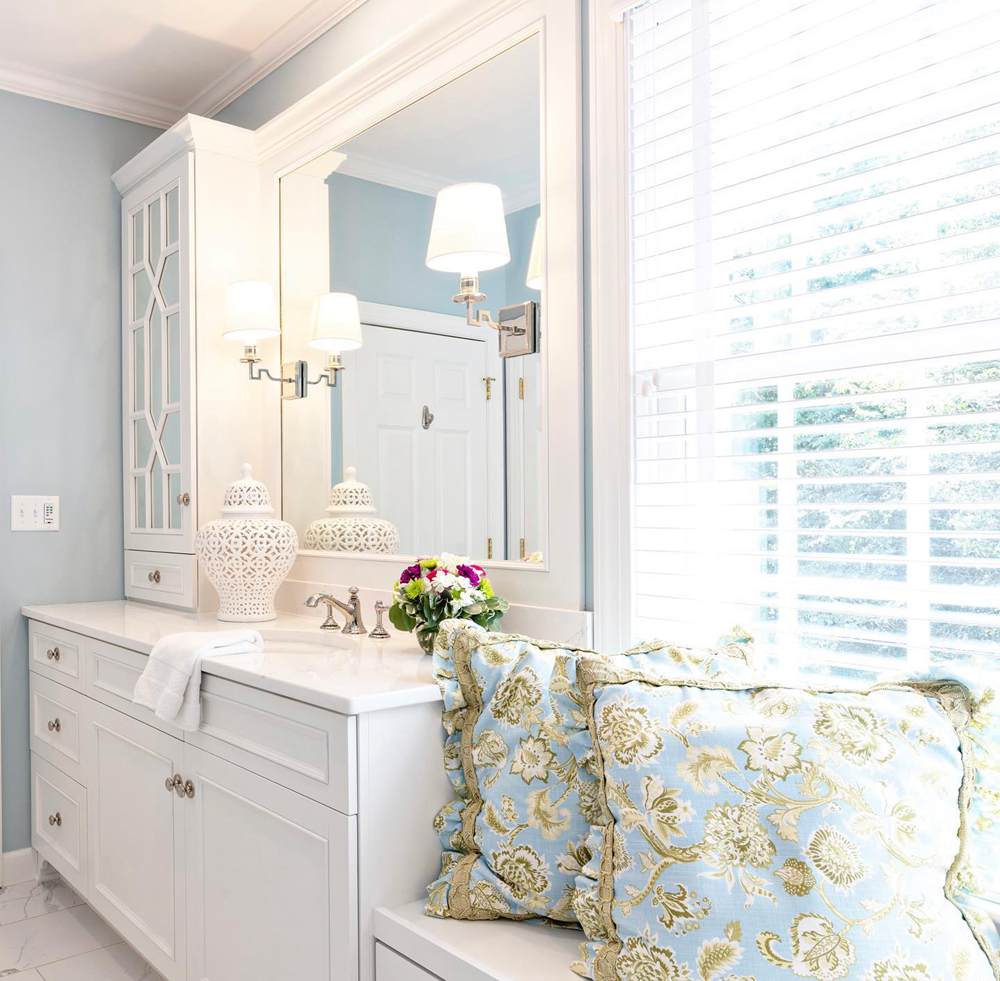
Simply White vs Decorator’s White on Furniture
Thanks to their versatility, Simply White and Decorator’s White also look amazing on furniture. They add a sense of luxury and sophistication to any space. However, ensure to include colors that go well with them in the room.
Simply White on Furniture
The paint color looks less creamy on this nightstand. However, it still exudes subtle cozy vibes. Together with the tone on the wall, Simply White gives a perfect look to the furniture.
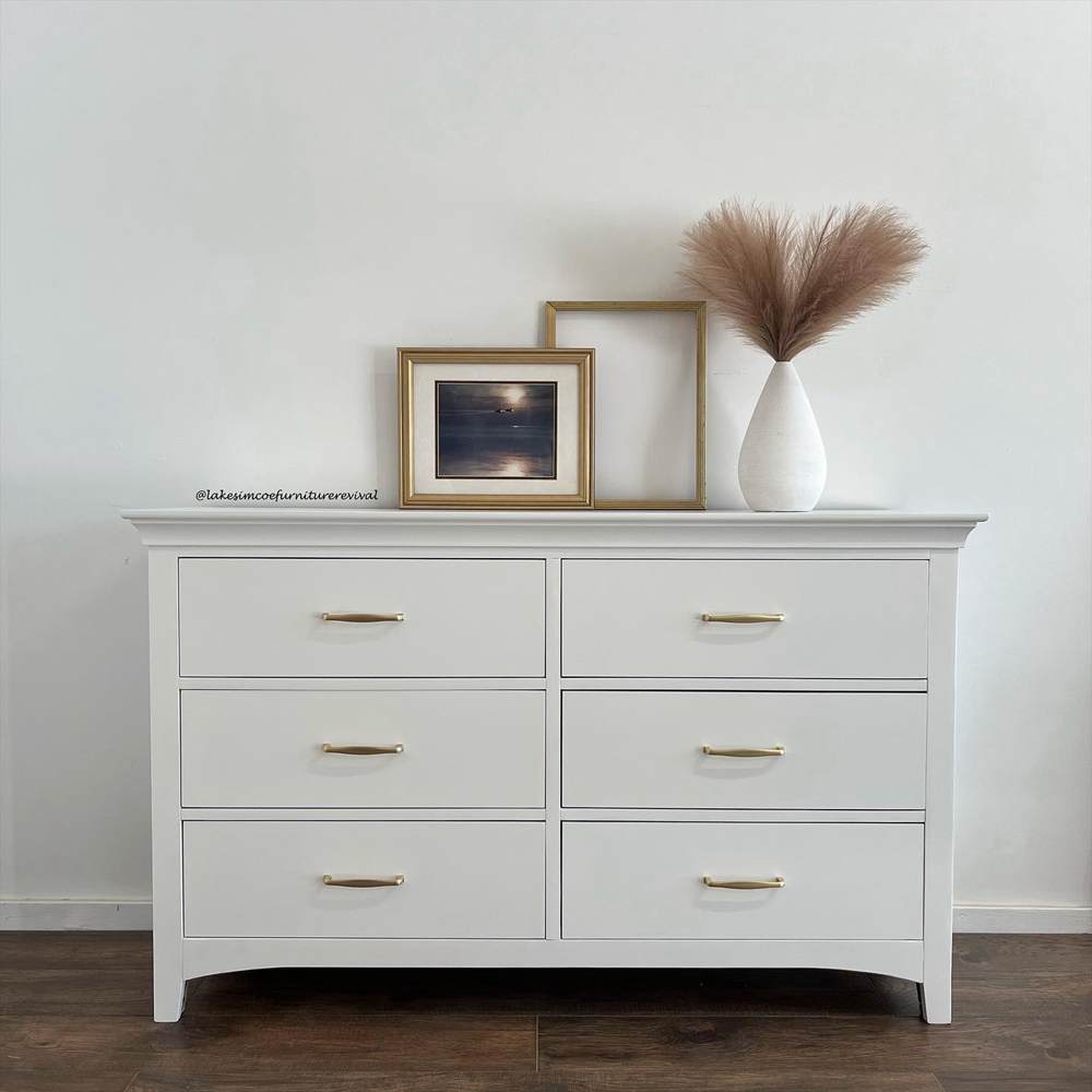
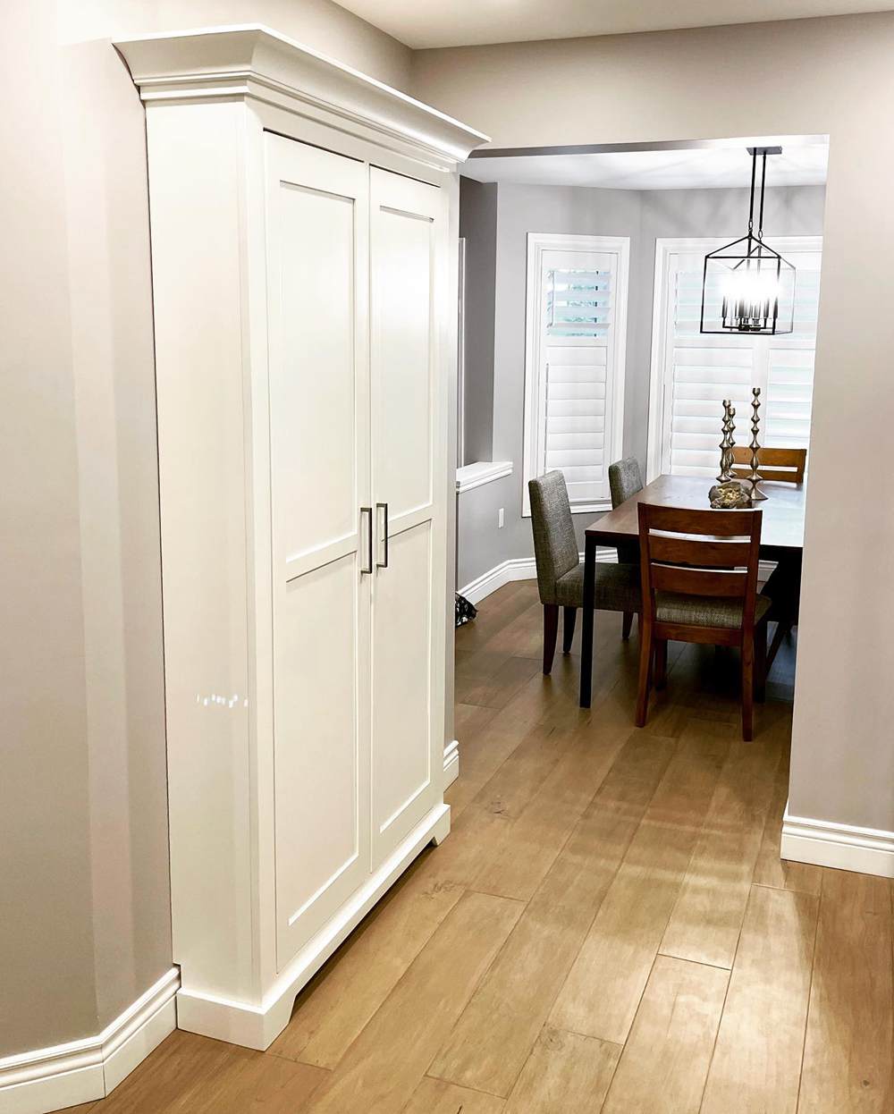
Decorator’s White on Furniture
Benjamin Moore Decorator’s White looks clean and attractive on this pantry. It stands out in the midst of the surrounding warmth and cozy vibe. The bright white commands attention but in a subtle and welcoming way.
Conclusion
Now that we have covered the details of our Simply White vs Decorator’s White discussion, you can fully appreciate the colors as I do. Furthermore, you can now choose between the two lovely white paint colors.
As a quick recap, the following tips will help you better understand Simply White and Decorator’s White:
- Simply White has yellow undertones and a creamy look. However, lighting can sometimes hide these tones.
- Decorator’s White has soft blue/purple tones and a mild crispy look. But it can sometimes show some green.
- The lighting in your space plays a crucial role in how the colors turn out.
- Decorator’s White works best when you want an overall cool vibe in your space.
Do you have any more questions? Kindly leave them in the comments section. I will gladly answer them all.
 SW Alabaster Vs BM White Dove: How to Choose!
 Sherwin Williams Rainwashed vs Sea Salt: How to Choose?
 SW Dover White vs BM White Dove: Let’s Compare
 Sherwin Williams Snowbound vs Alabaster: How to Choose?
 Benjamin Moore Pale Oak vs Classic Gray: How to Choose?
 SW Alabaster vs BM Swiss Coffee: Let’s Compare
