
Hale Navy and Old Navy are notoriously famous for confusing homeowners when they’re on the table as desired colors for paint jobs. There are numerous reasons for this, and the top of the list is that they’re both gorgeous shades of blue but strikingly different personalities.
Hale Navy is a dark navy blue with hints of charcoal black and gray, While old Navy is a true blue and a much cooler color than Hale Navy and is perfect for homeowners who enjoy serenity in their space.
Hang tight as I take you on a rollercoaster ride into the world of these two colors, what they’re all about, and, most importantly, how to navigate your way around them with real-life images to inspire you all year long.
Table of Contents
When to Use Benjamin Moore Hale Navy Vs. Old Navy
It’s not a straight line between these two. You must first create a solid master plan of the right situations and spaces to use Hale Navy and Old Navy, including your end goal. For paints, the beginning is as important as the last brush stroke.
Use Hale Navy if:
- You need a stunning navy blue space
- You desire to work with a very versatile cool blue
- You want a touch of gray in your space.
- Lean towards a coastal or beachy color palette.
Use Old Navy if:
- You crave a classic and timeless vibe in your space
- You love a true and highly pigmented blue
- You want to keep things cozy and relaxing in your home
These blue colors are excellent for large spaces, including kitchens, living rooms, and outdoors. Use them as accent walls to create a coastal/hazy vibe in your bathroom or hallway.
Due to their original composition and how they come off as primarily cool colors, you can pair them with much warmer tones for a healthy contrast.
Benjamin Moore Hale Navy vs. Old Navy: A Visual Perspective
Pictures are worth a thousand words, and when it comes to understanding the situation between these colors to a reasonable extent, a side-by-side representation of them in real spaces is necessary.
See Benjamin Moore Hale Navy used in a dining room
See Benjamin Moore Old Navy in a Bedroom
When you examine these images closely you’ll notice how Hale Navy and Old Navy react under unique lighting conditions and, most importantly, with different textures and shades. This is a pleasant experiment and an out-of-body experience.
Basically, you should use Hale Navy and Old Navy to make your room appear intimate and personal. They both give off really chill vibes, and you can apply warm creamy whites to add a soft, creamy touch.
Whether you want a traditional touch or you embrace the simplicity of modern minimalist designs, there’s a chance for you to explore all options available with Hale Navy and Old Navy.
Quick Comparison: Hale Navy vs. Old Navy
Before investigating these two colors’ in-depth details, I’d love to tease your appetite with a simple illustration.
The table below contains key details of Hale Navy and Old Navy, including their RGB, Hex Code, and, most importantly, LRV number.
| Hale Navy | Old Navy | |
| RGB | 68,76,87 | 47, 54, 74 |
| LRV | 8.36 | 5.13 |
| Hex Value | #434C56 | #2F364A |
| Undertones | Gray | Indigo |
Emotional Effects: Hale Navy and Old Navy
One of the essences of colors in a space is their sheer impact on your emotions. The amazing ability of colors to elevate or dampen your mood as soon as you walk into a home will forever be intriguing.
For Hale Navy, you’ll discover that this color oozes mystery that hits you when you come in. This is due to the dynamics of the color, which may read blue sometimes or pure black.
Upon further observation, you’ll also notice that this color also creates a soothing, welcoming vibe that calms your nerves after a rough day. While it’s not the best option for people with small spaces as it may trigger claustrophobia, there’s no denying that this color makes you feel at home.
With Old Navy, the effect is almost the same, adding a cute purple touch to the feeling. This color is really cool and easy on the eyes and perfect for a good night’s sleep. You’ll find Old Navy to be the answer if you don’t know how to make your large space feel more you.
LRV of Hale Navy Vs. Old Navy
The Light Reflective Value of a color determines just how much light your color will absorb or reflect in your desired space. This simple mathematics is done with the help of a scale that runs from 0-100- with 0 being the darkest and 100 the lightest.
Now that it’s out of the way, let’s check out what our twin colors comprise.
Hale Navy has an LRV of 8.36. This one is very seated in the dark and cool category, which means it absorbs more colors than it reflects and creates an intimate feel in your space; all thanks to the reaching depth of this hue.
Old Navy tones it down with an LRV of 5.13, dark enough to make the brightest room fall into a deep slumber and also instantly cool off a warm, light space. This cobalt blue will absorb all the light and make your large space appear smaller and comfy by drawing in the walls.
Now both colors have been established as dark and cool tones, and it’s left for you to decide how to incorporate them into your color palette based on how you feel.
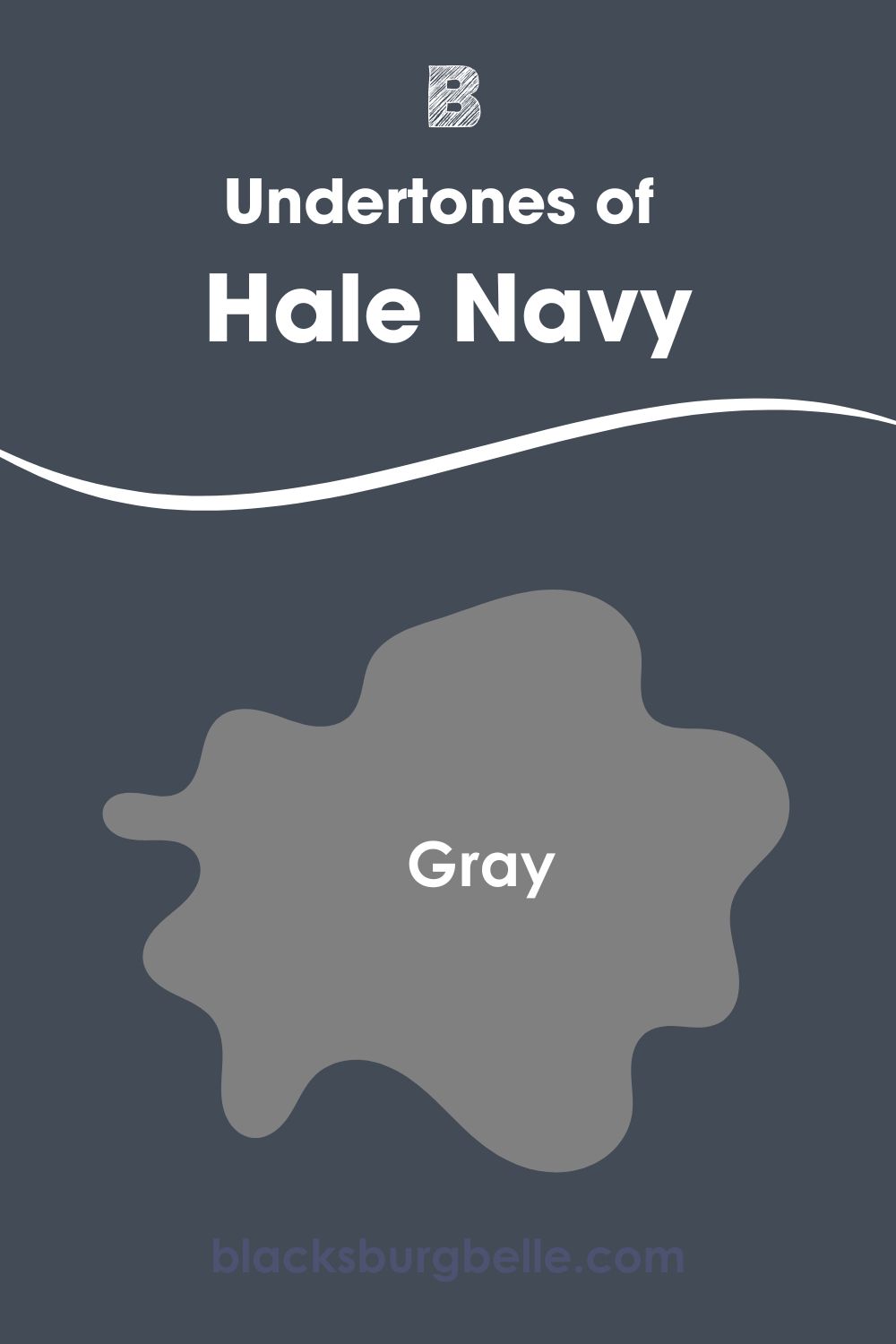
Hale Navy and Old Navy Undertones: Are They Similar
Undertones are integral to any color. Getting familiar with your color undertones will help deliver a more balanced space. Trust me when I say the last thing you want in your home is a bad paint job.
Pause everything you think you know about blue undertones. Hale Navy crushes the trend by ditching the popular “green undertones” and adopting a gray one instead. You already know anywhere you see gray, purple isn’t far off, and you may see hints of that in Hale Navy.
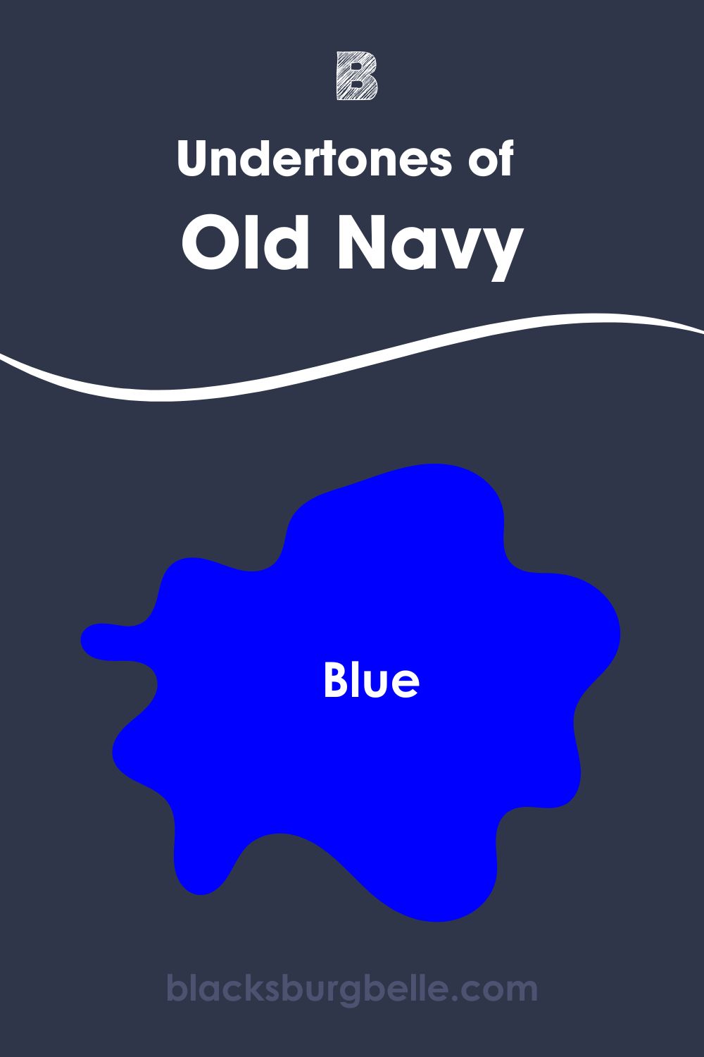
Old Navy is a true classic navy blue with blue undertones. You may likely find indigo undertones, too.
A Closer Look at Hale Navy’s Undertones
Hale Navy is a true chameleon that embodies the touch of vintage and modern goodness. The ability of this color to shapeshift from one room to the next is one of the numerous things we adore about it.
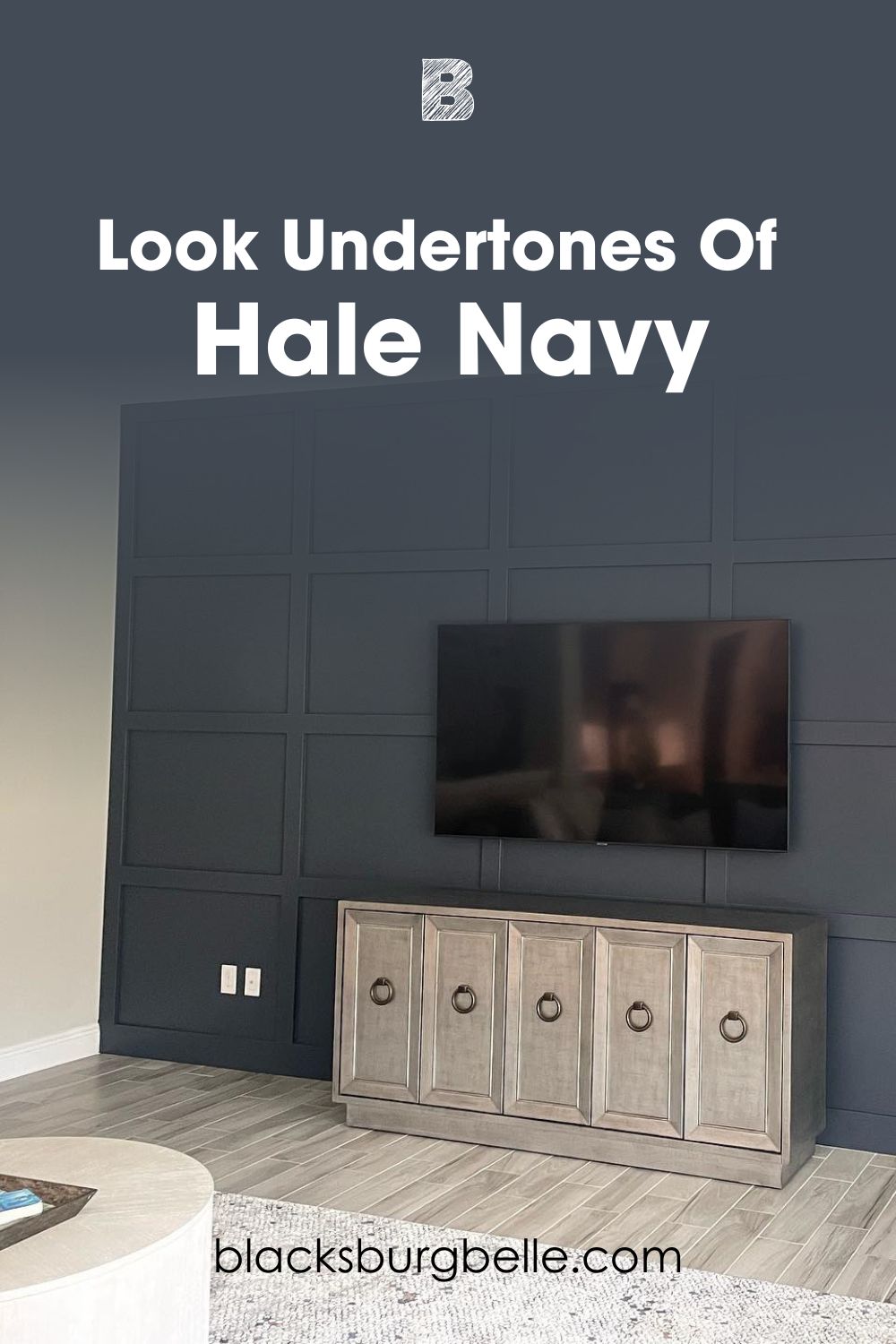
If you still don’t know why we call Hale Navy warm, especially when placed beside other navy blues and even old navy, this is your answer.
Notice how Hale Navy completely departs from its blue side and embraces its unique gray undertone in this image? As much as we expect this to happen, there’s one sole suspect here: the lighting!
The warmth of the light draws out the gray in the dark blue. The real magic is when it switches back to its blue side when it catches wind of the blue northern lights.
A Closer Look at Old Navy Undertones
For Old Navy, it’s more responsibility. That’s the reality for most true blues regarding the undertones, and you’ll see just why in the image below.
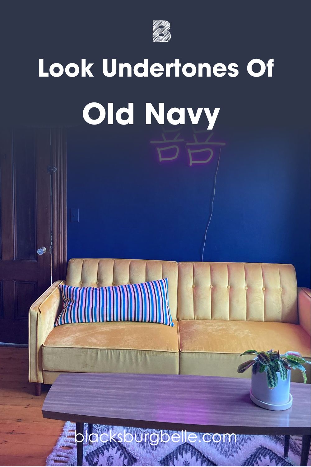
For viewers, the eye automatically shifts between blue and indigo, all at the same time. I may be a bit complicit in this drama as per my choice of image, especially how the owner craftily inserts soft pink/purple details.
We can both agree that this person is much more aware of the abilities of this superb color and also reminds us that our accessorizing can make or mar the heights to which our colors can take us.
Hale Navy Vs Old Navy – Are They Warm or Cool?
Before we proceed, it’s general knowledge that all blues are automatically cool colors (if you didn’t know, now you do) due to their setup on the color wheel and color composition. However, Hale Navy is pretty warm compared to other navies and blues, thanks to its gray undertones.
Old Navy is a relatively cool color. It’s a true blue with just enough indigo/purple to keep it warm. Sometimes, you don’t see the purple, just pure black, especially in muted spaces.
Hale Navy vs Old Navy Complementary Colors
Complementary colors provide a high-contrast combination that makes them brighter and more pronounced. On the color wheel, you’ll find that yellow stands across the blue, then blue faces orange, and red is directly opposite green.
This phenomenon is also repeated in real life, and they sure look good when paired together. Now, for Hale Navy and Old Navy, it’s highly expected that you find reds, browns, oranges, or purples, and if they’re not primarily these colors, they most definitely have them as undertones.
Benjamin Moore Brown Sugar and River Rock are my two picks for this section. Brown Sugar is a dark, warm brown with undertones of purple and red under some lighting conditions.
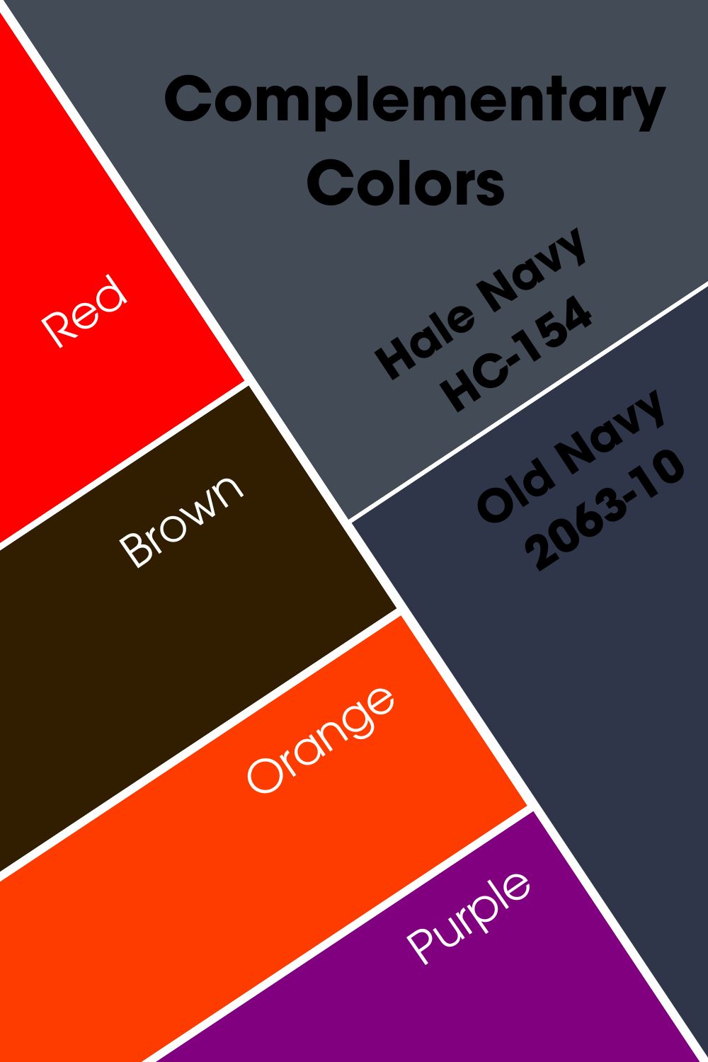
River Rock could pass for black color, but the undertones of green, brown, and even yellow are undeniable.
Hale Navy Vs Old Navy Gray Color Palette
While we’ve established the differences between Hale Navy and Old Navy, we must explore the possibilities of them working together on one palette and delivering a stunning result- this feat isn’t impossible, and I’ll show you how.
There Are two ways to go about color palettes- the monochromatic way or the contrasting way. The colors on the monochromatic palette are one way traffic. What this means is that all your choice colors appear the same with varying amounts of intensities.
The contrasting palette is much more daring and very colorful. Here, you get to use opposing colors with your anchor color in a space to add warmth or coolness. The versatility and range of this type of palette make it a top pick for homeowners.
The beauty of palettes is that the choice is never taken away from you, and there’s no rule to anything (apart from the basic ones we’ve set before this section). You can add your spin on it to make it more personal.
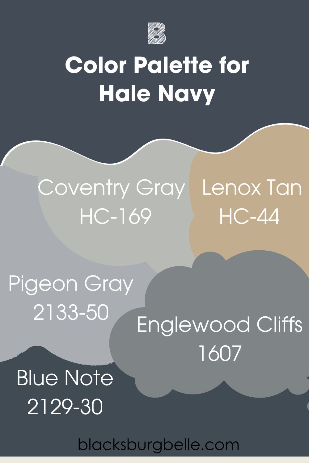
Color Palette For Hale Navy
As earlier described, you can embrace a calm vibe in your home by sticking to cool blues all through in tune with the monochromatic theme, or just keep it fun and bold with a contrasting color palette.
Let me show you the colors I’ve picked for the Hale Navy palette without further ado.
Coventry Gray: This is a medium-toned gray with neutral undertones, a perfect match for Hale Navy gray undertones. It has an LRV close to 48, with subtle blue-green undertones or even purple in rare conditions.
Lenox Tan: This one introduces you to the goodness of warm beige paint color- you should have gotten enough info from the Tan in its name. Lenox tan has an LRV of 43.52 and sits pretty on the medium end of the scale.Its chic yellow-orange undertone works well with the rich navy blue hue of Hale Navy and, most especially, douses the cold tension on the gray undertones.
Pigeon Gray: Pigeon gray is our medium soft gray with violet hints and an LRV of 42.18. Violet is a great match for most navy blues as it adds a much needed warm touch to them.
Englewood Cliffs: Englewood Cliff awakes a feeling of the rocky horizons by the river bed. This medium-toned blue-gray has an impressive dose of purple which works in perfect unison with Benjamin Moore Hale Navy.
Blue Note: Last but not least on this list. This one is a black hue with navy undertones. It’s the right candidate for the accent wall color if you intend to run with a monochromatic color scheme for your space.
Color Palette For Old Navy
Our good old classic Old Navy’s longevity is not solely because it’s a true blue; it’s also because you get to use it with a wide range of other colors while watching it hold its own. Old Navy is so magical, and the colors you read about below are even more breathtaking.
Marilyn’s Dress: Marilyn’s dress is a pale blue-gray, a cool color and a classy hue. It’s not hard to see a wink of purple in this since it’s a cool color with an LRV of 75.59
Luxe: Luxe has cool gray undertones, adding a curious and chill vibe to its overpowering violet tone. You can also see the blue in the color when used in a northern-facing space.
Sapphireberry: Talk about the most lovely shade of blue you’ve ever seen. Benjamin Moore Sapphireberry has an LRV of 63.72, 3 points away from my preferred medium range.This color will brighten up a space by reflecting a great deal of light. It can also be a trim/accent wall for a Hale Navy interior or exterior.
Deep Mulberry: Benjamin Moore’s Deep Mulberry has an LRV of 5.36. This is proof that this one is almost a black color but with enough touch of violet/purple in it to work perfectly with Hale Navy in a room.
Polo Blue: Polo Blue is a classic navy hue itself. This color is edgy, dark, and masculine, with an LRV of 3.61. You’ll find some undertones of gray and purple buried deep in it.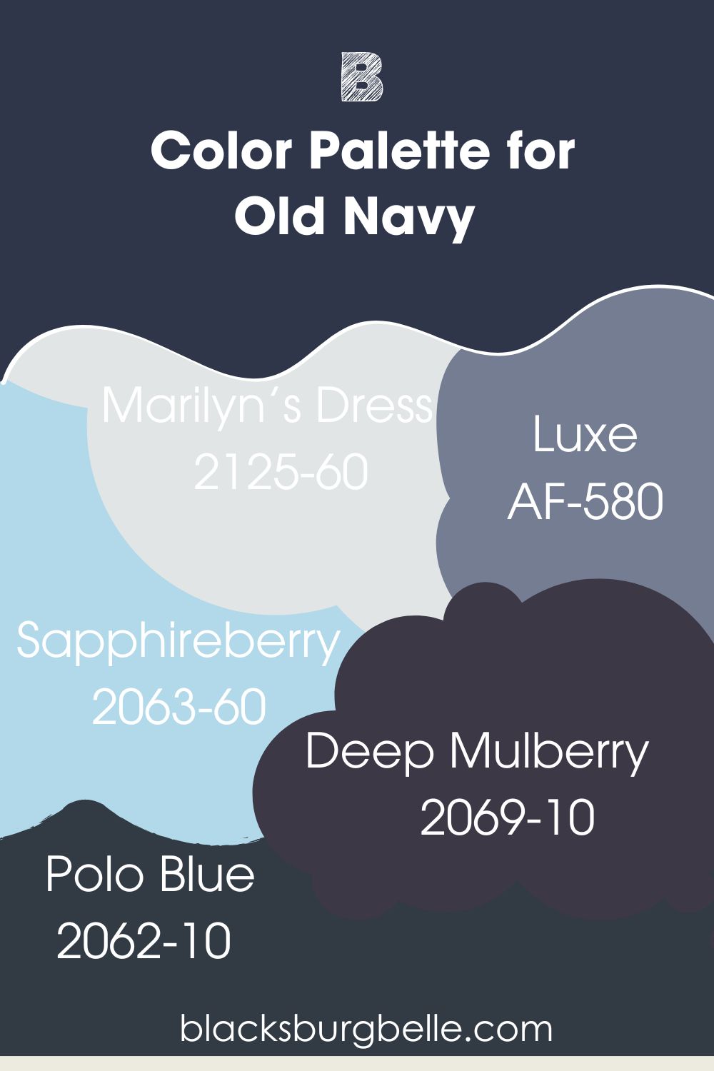
Hale Navy vs. Old Navy On Cabinet
Hale Navy and Old Navy are versatile enough to deliver in your kitchen and, interestingly, on your kitchen cabinetry. Since they’re cool and easy on the eyes, I suggest incorporating shiny handles and bright-colored details for elevated personality and more character.
Hale Navy on Kitchen Cabinet
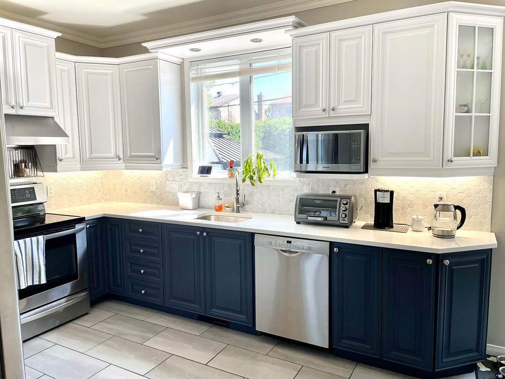
One reason why we love this color is how well it stands out amongst other tones in any space and at any given time of day. This modern kitchen feels the unique touch of Hale Navy on its cabinet.
I adore the shiny gold handles on the drawers that add a warm feel to the coolness of Hale Navy. The gray undertones are also hard to miss in this image.
Old Navy on Kitchen Cabinet
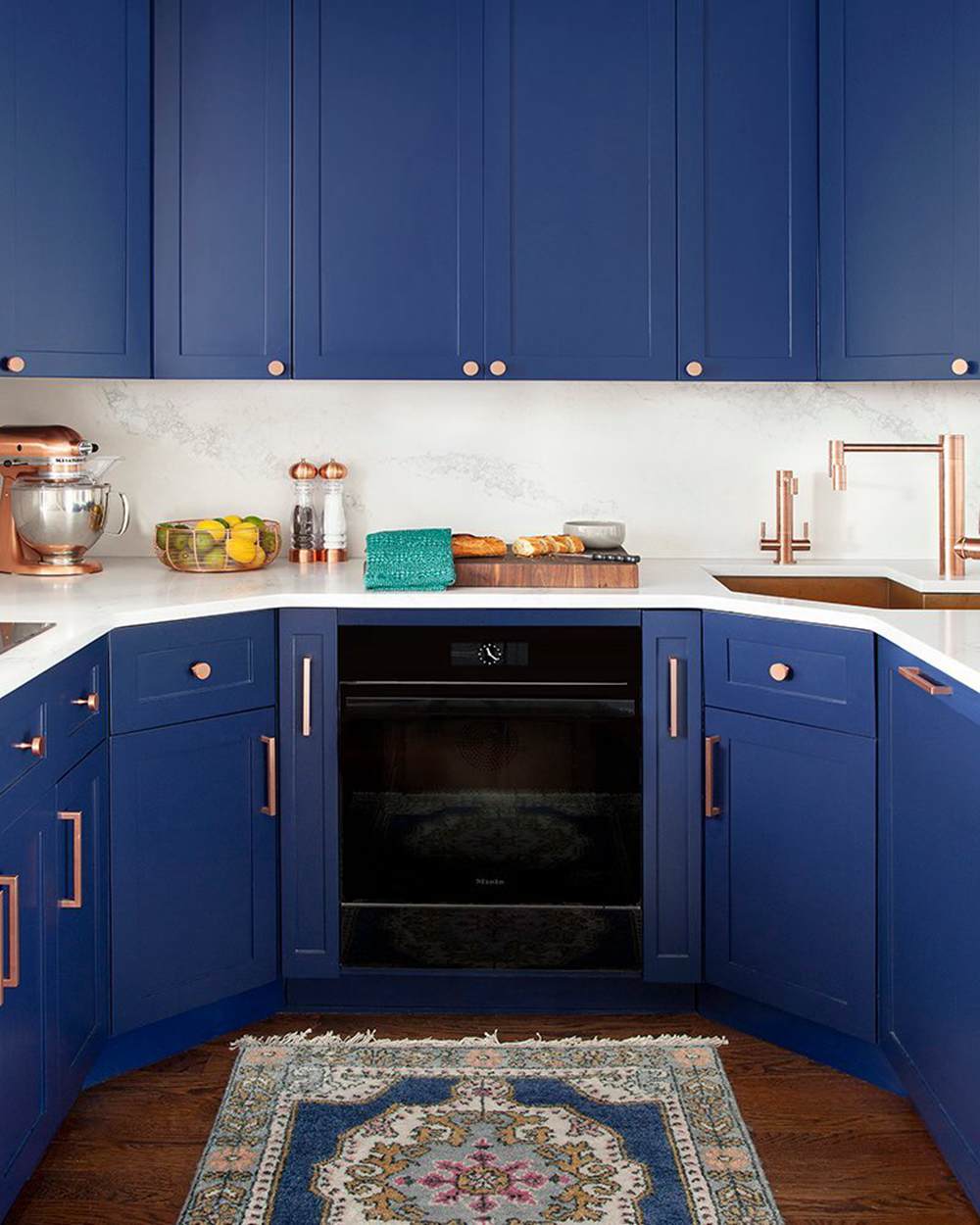
Old Navy sticks to its blue roots in the traditional kitchen; There’s a quick distraction with the pure white in the middle, which keeps you from being overwhelmed by the all blue cabinetry. The attention to detail in this space is amazing! Even the mixer looks catchy in its rose gold tone that pays homage to the indigo in Old Navy.
Incorporate wooden floors, chic golden handles, and an interesting center rug to add a modern twist to your kitchen.
Hale Navy vs. Old Navy On Wall
Need that cool vibe indoors? Try Hale Navy and Old Navy on your walls and bask in sheer tranquility. These deep blue hues will add depth to your space, whether as a main or accent wall. There’s no stopping your creativity.
Hale Navy on Interior Walls
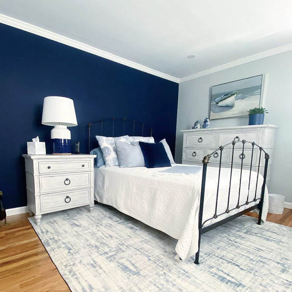
Check out this cozy bedroom. You can feel the ice-cool breeze from Hale Navy on the wall and how it transfers on the adjacent white wall. I love the minimalist vibe in this space, with the white and blue sheets.
The gorgeous gray and white rug on the floor works well with the bright wooden floor to give a balanced result.
Old Navy on Bedroom Wall
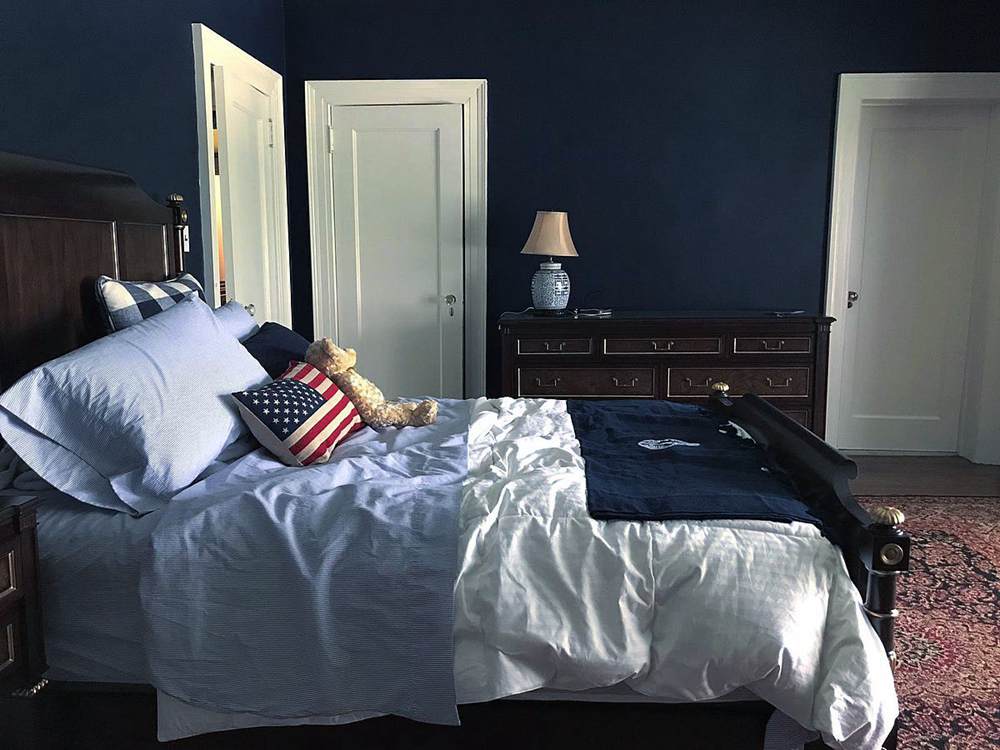
Old Navy appears a whole lot darker on the walls of this bedroom. Two things are responsible, the influx of northern lights and the less light entering this room generally. The room looks put together with the white trims, white doors, dark wooden floor, printed center rug, and that classic bed frame.
Hale Navy vs Old Navy on Exterior
Talk about range and versatility. Hale Navy and Old Navy deliver the best exterior work. As expected, all colors appear washed out in the sun, but not these two gems. They’re bold, daring, and undaunted in broad daylight,
Hale Navy on Outdoors
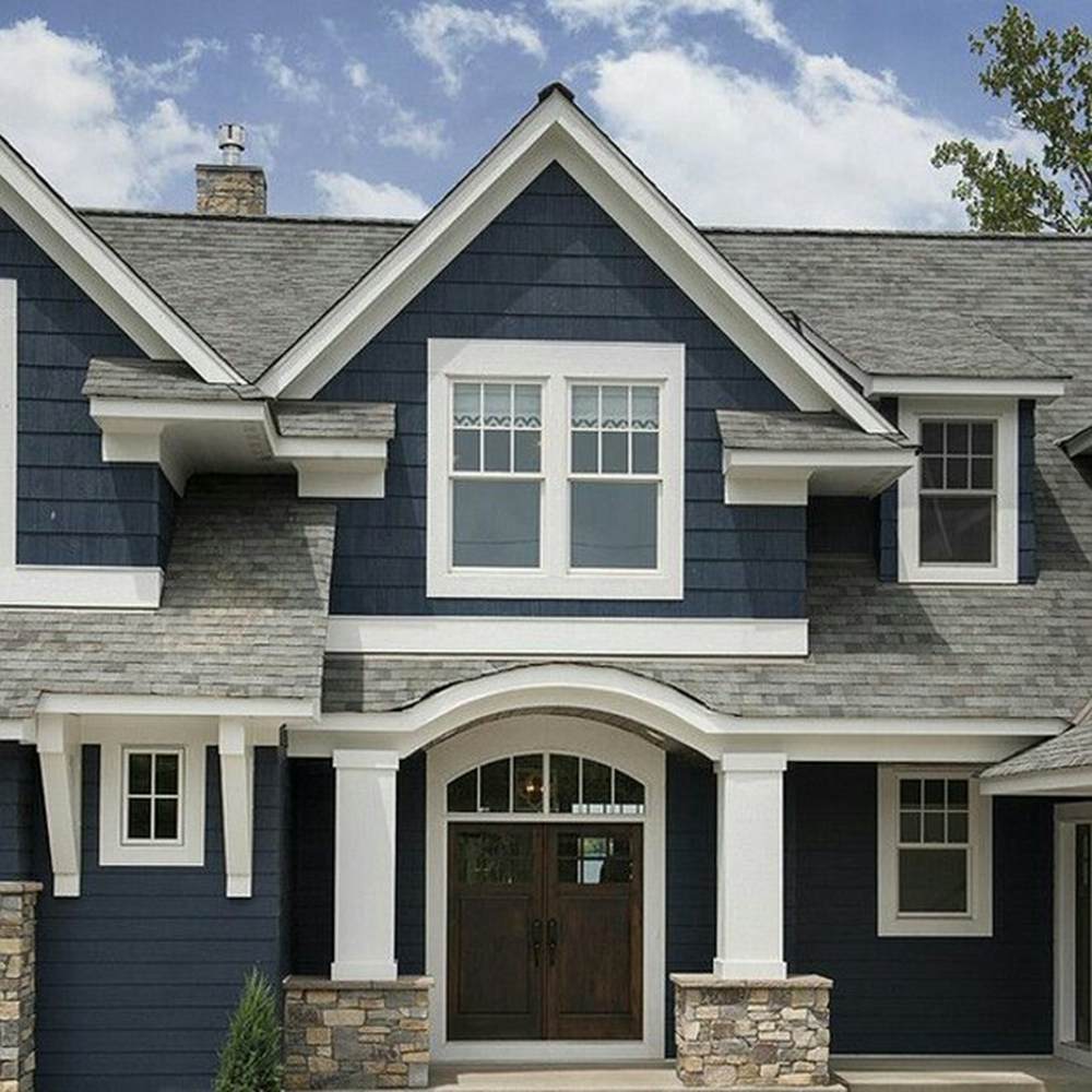
Hale Navy loses touch with its renowned depth a bit in this image, and that’s expected. You can almost touch the gray in this color with your bare hands. What makes things more fascinating is the gray roofing.
Trims can influence the outcome of your paint job, and what they’ve done in this image is incredible. This theme is perfect for those who stay in coastal cities or just love a feel-good ocean vibe,
Old Navy Outdoors
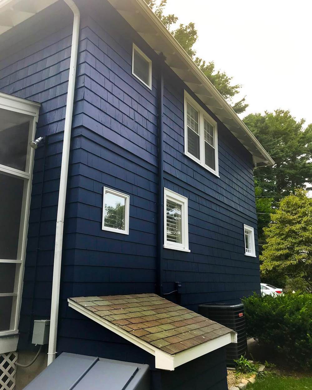
Old Navy is another excellent outdoor color. I love how the indigo in it matches the greenery outside, helping to create a calm and relaxing environment. Prepare for your house to be the center of attention when you use this color with matching white trims for your exterior.
Hale Navy vs Old Navy On Door
Doors are important to every home. They welcome you to a world of possibilities whether you’re walking in or out; therefore, you must pay serious attention to them and insert maximum creativity.
Hale Navy on Old Door
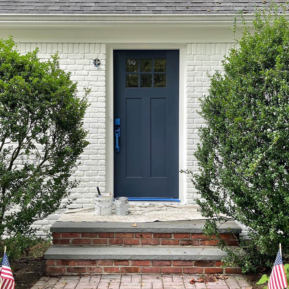
While we don’t want to judge a book by its cover, you can already tell you’re entering into a unique space by the color of choice for this door. The Hale Navy door stands out against the creamy white walls and brick walkway.
Old Navy on Door
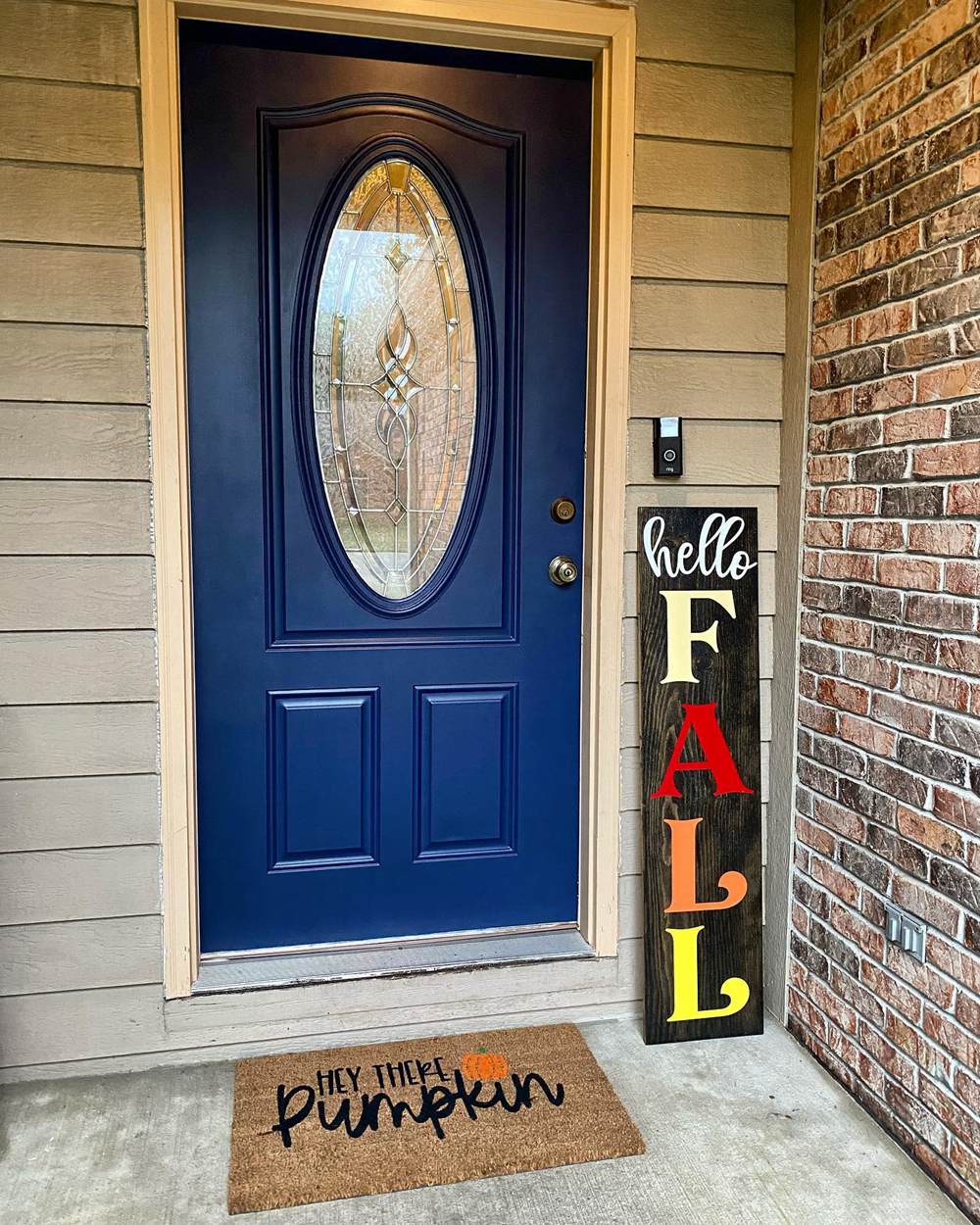
Make a bold statement on your doorway with Old Navy. One thing is sure that this color will instantly pop and lift up the entire situation of your entrance. You can see the peeks of indigo undertones on the door, thanks to the incredibly high amount of natural light.
Hale Navy vs. Old Navy on Woodwork
Nothing says you shouldn’t paint pieces of furniture in interesting colors too. In fact, these fancy colored stools, drawers, vanities, and chairs help bring your space together and promote artistic excellence.
Hale Navy on Desk
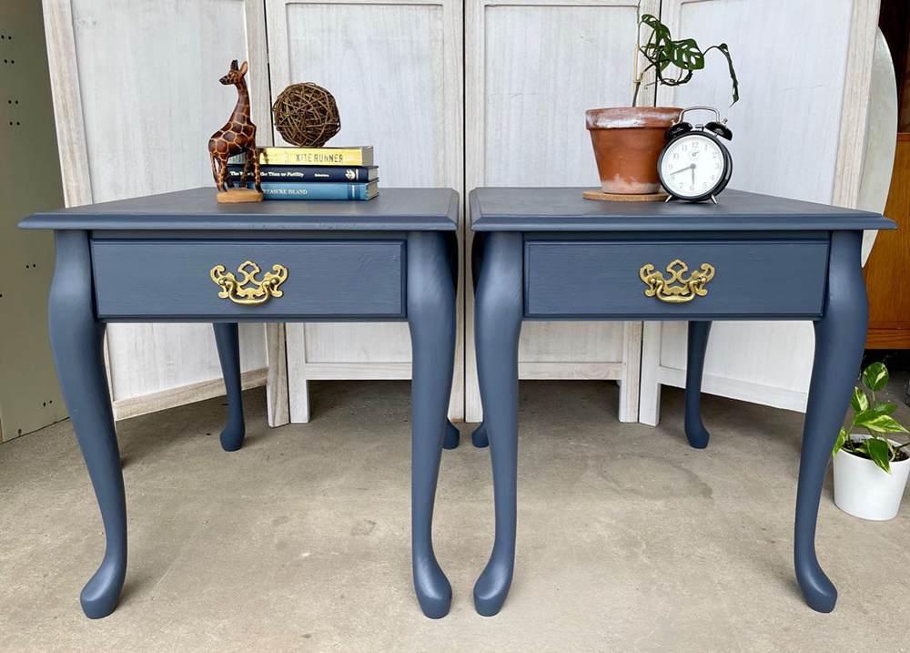
Hale Navy looks like the perfect modern beauty of this piece of stool. Blue is such a regal color, and I honestly can’t express my obsession with this hue. These twin stools would be plain, brown, and boring on a normal day, but the owner made the best decision.
Its gray undertones pay a much-needed visit on the surface, and you can see how that combination leads to a silvery tone. The gold accents are the perfect icing on top of the cake.
Old Navy on Drawers
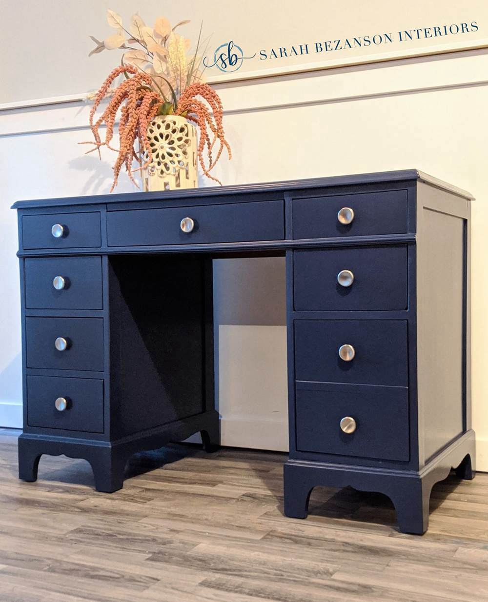
You can almost confuse Old Navy for purple on this piece. Well, you already know why. Everything makes perfect sense, from the creamy walls to the bright pink vase on it and the freshly tanned wooden floor.
Hale Navy Vs Old Navy in Muted Spaces
Forget all you know about your color of choice. When they get used in muted spaces, you see a side you’ve never seen before, but in a good way. Let me show you just how below.
Hale Navy in a Muted Nursery
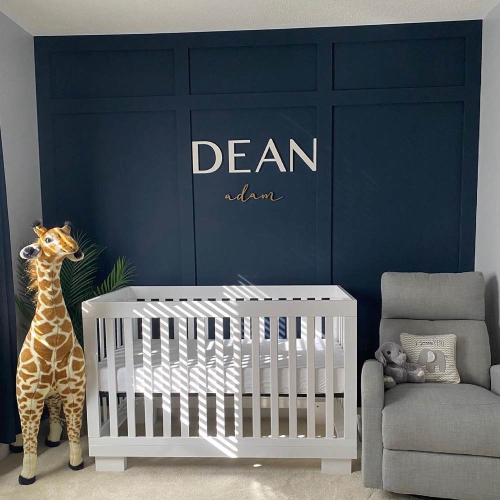
You can almost confuse Hale Navy for black here. Yes, this is how it works in a space that doesn’t get much lighting. But not to worry, I think it just lets you experiment more. The cute brown giraffe, white baby cot, and gray chairs add a neutral, natural touch to this space.
Old Navy in a Muted Space
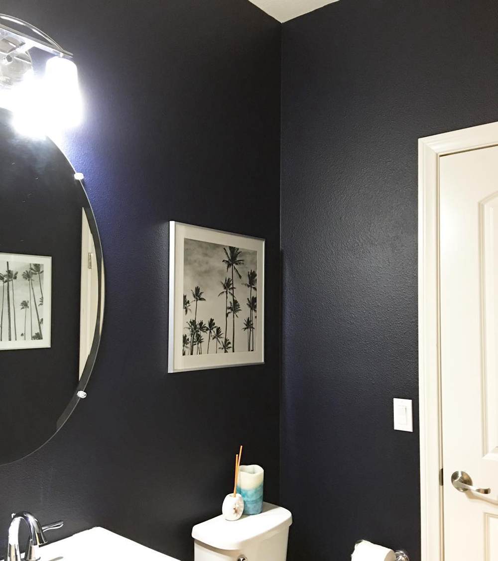
These colors have very low LRVs, so they normally look very dark indoors, which is also why I don’t recommend them for small spaces. But the homeowners salvaged the situation with the white accessories, helping to create a balance.
Lighting Conditions
Any color in this world can be altered by the lighting situations surrounding it. When you use Hale Navy and Old Navy in a space with loads of warm light, you get a fine coat of gray and indigo, respectively.
They’re more in tune with their blue sides in cool spaces. You just get that icy, chilly, coastal feel all day long.
Conclusion
In these modern and artistically forward times, it’s imperative to lay it all out and understand Hale Navy and Old Navy’s makeup.
Your home and space are a big part of your life; therefore, all loose ends need to be tied to have an excellent result in your paint job. Here’re a few more steps to abide by:
- Consider your room size
- Study and understand your lighting
- Decide on the right finish for you
- How large or small is your space?
Don’t forget to drop your comments and suggestions in the box below. I love to hear back from you and get a different perspective on these unique colors.
 Mindful Gray Vs Repose Gray: How to Choose?
 Agreeable Gray Vs Repose Gray: What’s The Difference?
 Benjamin Moore Ballet White vs Swiss Coffee: Let’s Compare
 Benjamin Moore Edgecomb Gray vs Revere Pewter: How to Choose?
 Benjamin Moore Palladian Blue vs Wythe Blue: How to Choose?
 Benjamin Moore Simply White vs Decorator’s White: How to Choose?
