
There’s a reason Benjamin Moore’s Chelsea Gray is popular with interior designers and homeowners. When you are looking for dark grays or charcoal paint colors that look more bodied than others, Chelsea Gray comes in at the top five.
And if you’re in the market for this shade of gray, you will soon know you may have hit the jackpot. Chelsea Gray is a beautiful color if you know how to handle it. And that is part of my mission here, including to show you how to maximize the undertones and other aspects.
Without further ado, let’s get right to it.
Table of Contents
When to Choose Benjamin Moore Chelsea Gray
Like most dark grays and other neutrals, Chelsea Gray looks best when used minimally to avoid overwhelming a room. This should guide you on usage when it comes to the paint color. Here are a few pointers to get you started.
New kitchen cabinet color
When the rest of the kitchen is white or some light neutral color, Chelsea Gray blends in if you use it on the cabinets. It’s a great color to match any appliance color.
Bathroom vanity upgrade
As with kitchen cabinets, your bathroom vanity can get a sweet upgrade if you use this dark shade of gray on it. Chelsea Gray sharply contrasts with the usual white or light color on bathroom walls.
Accent or feature wall love
And if your aim is to use it in a bedroom, living room, or any other similar room, try it on an accent wall to keep the usage minimal. That way, it doesn’t overshadow the rest of the colors in the room.
Outdoor aesthetics
Because of its dark shade, Chelsea Gray looks amazing outside the house. The reason is the abundance of bright and natural lighting to keep it from looking too dark or somber. Moreover, it lends a sophisticated and elegant appearance to the house.
These ideas should get you on the right road to achieving your dream decor with Chelsea Gray. but before you start painting, let’s explore other aspects of the color, including how light affects it and where to use it.
What Color Is Chelsea Gray?
Gray will always be a staple color in interior and exterior decor because of its neutrality. The color allows you to add any other color without fussing or overshadowing it. In fact, you can use gray as a background color and still achieve the style you want.
Fortunately, there are many shades of gray, and Chelsea Gray is one of them. While the color is dark, it’s not too deep that it looks almost black. Still, you must use it cautiously, especially in smaller rooms.
Benjamin Moore Chelsea Gray HC-168 is a dark gray paint color that brings a soft warmth and understated elegance to the decor. If you want a balanced bride between warm and cool colors, Chelsea Gray should be on your list.
A Look at the Specifications of Benjamin Moore Chelsea Gray
I can go ahead to explain the details of this color, but before doing that, I’ve created a chart to summarise these details for easy reference. They include the undertones and LRV, which are crucial to how paint colors perform.
| Benjamin Moore Chelsea Gray | |
| RGB | 134, 132, 124 |
| LRV | 23.33 |
| Undertone | Brownish-violet, green |
| HEX Code | #86847C |
The LRV of Benjamin Moore Chelsea Gray
Wondering what LRV is? It is the light reflectance value of color and indicates the amount of light the color throws back into a room on a scale of 0 to 100. Dark colors absorb light, so to speak, so they are close to 0. Light colors, on the other hand, reflect a lot of light, so they are close to 100.
White has an LRV of 100, while black has an LRV of 0. But paint colors use a scale of 2.5 to 94 because there are no true black or white paint colors. Each has a certain hue hidden under it.
Benjamin Moore’s Chelsea Gray has an LRV of 23.33, pretty low for a paint color. Although it doesn’t reflect a lot of light, it’s not so low that you confuse it with black.
The Undertones of Benjamin Moore Chelsea Gray
This is another important aspect of every paint color. Undertones can determine whether or not a chosen paint color works in a specific decor style. Chelsea Gray has brownish-violet undertones that keep it grounded.
When paired with cool colors, you may notice the violet undertone in Chelsea Gray, making it look a little cool. But the brown undertone gives it a warm vibe and keeps it from looking crisp or icy. Sometimes, you will also notice a green hue in Chelsea Gray.
Here is a true picture of the Chelsea Gray shade.
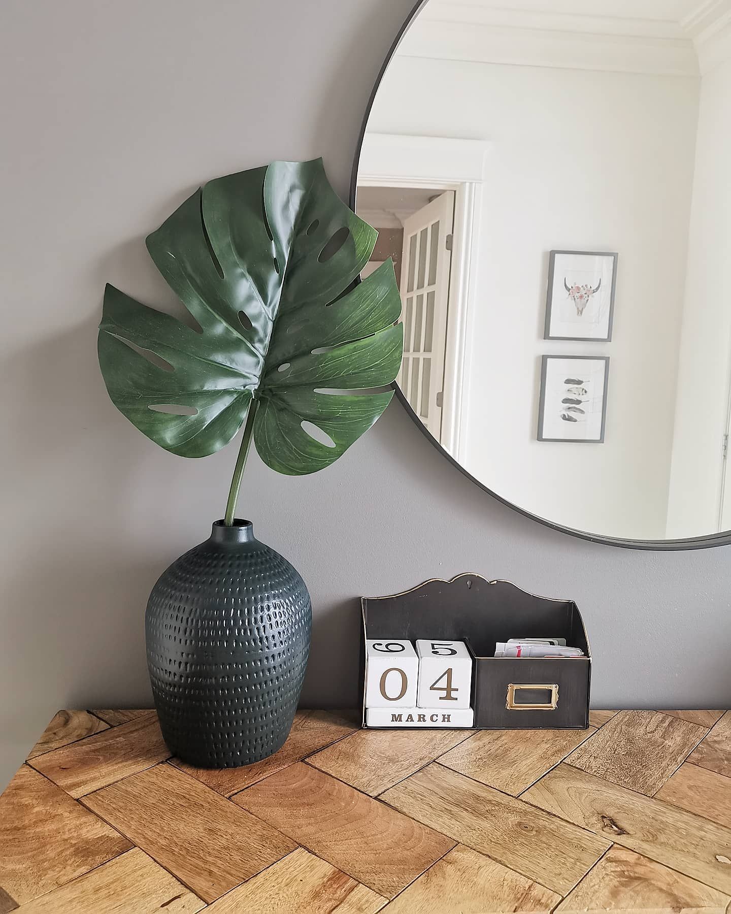
And this is Chelsea Gray revealing that green part of its makeup.
A hint of violet peeks through to the surface of Chelsea Gray in this beautiful setup.
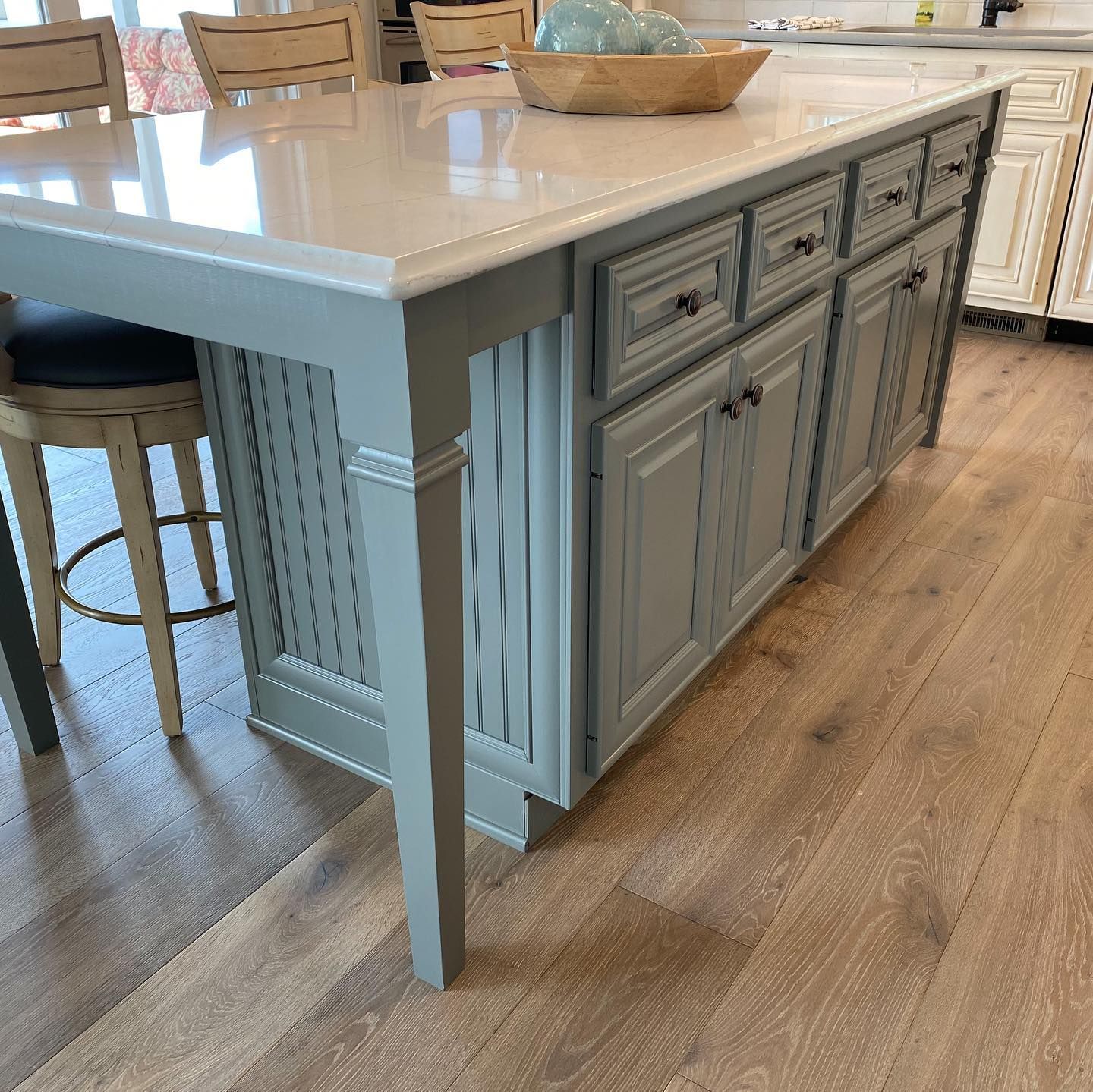
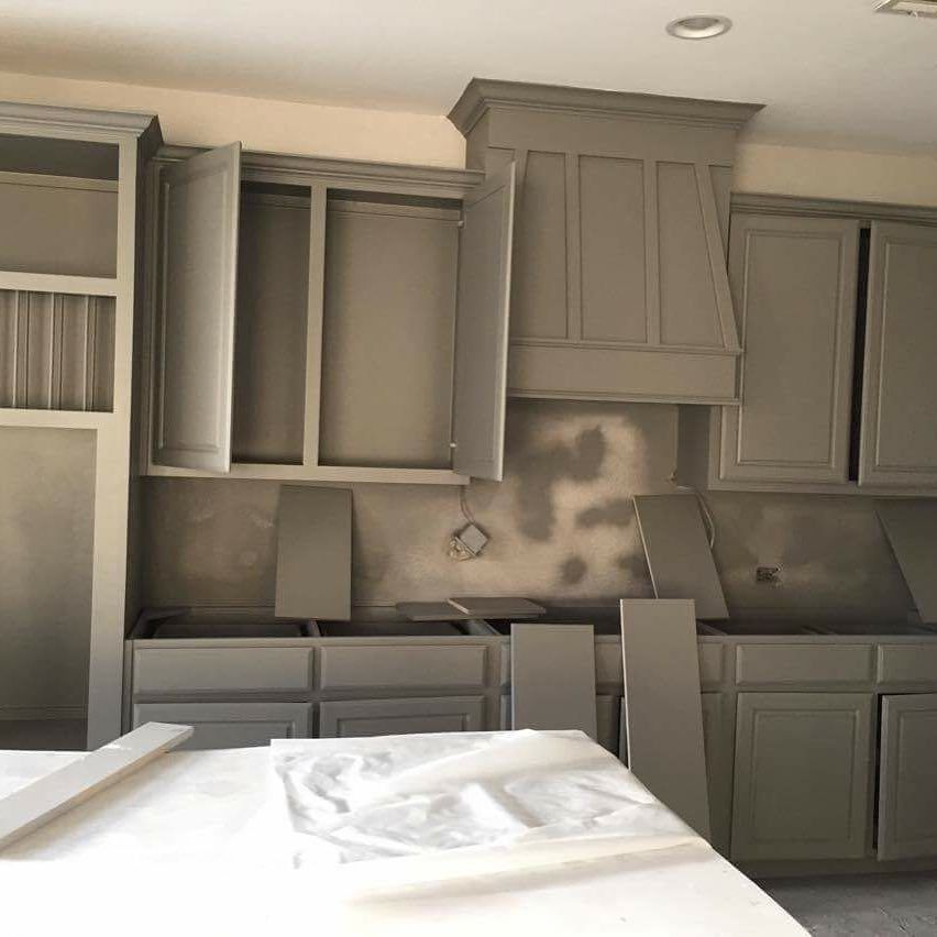
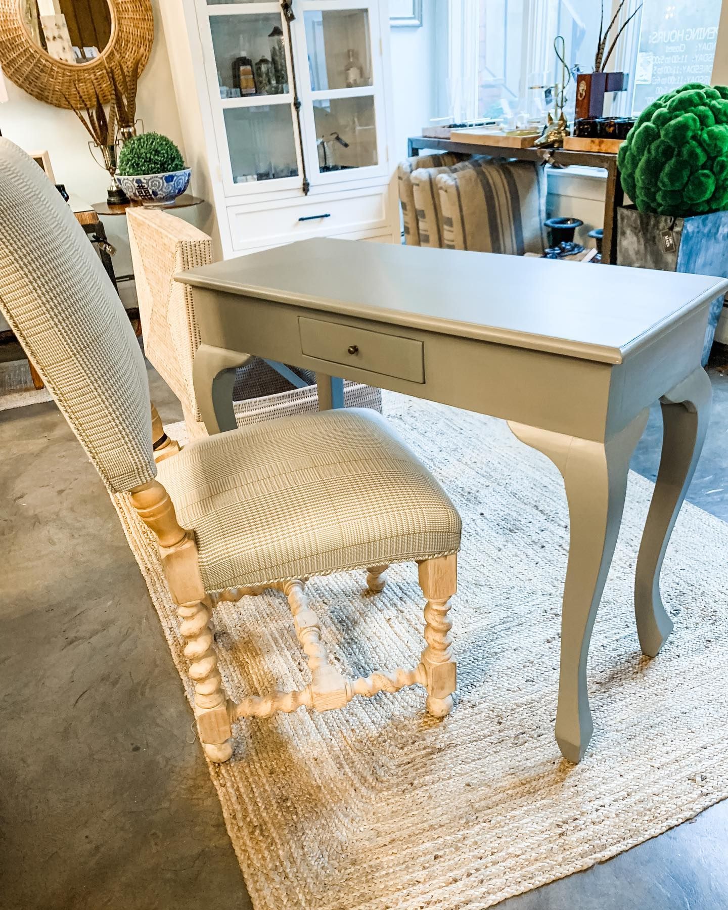
There is a hint of brown evident in the color of these cabinets, which is Chelsea Gray.
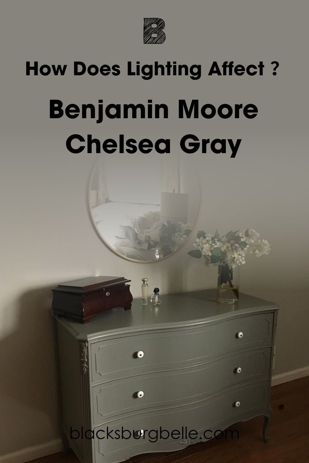
How Does Lighting Affect Benjamin Moore Chelsea Gray?
As with many other colors, Chelsea Gray can look light or dark, depending on the lighting conditions. Low light can give the paint color a brooding look, making it appear darker than usual. Chelsea Gray loves bright light, whether natural or artificial, and that is why it works well in the outdoors.
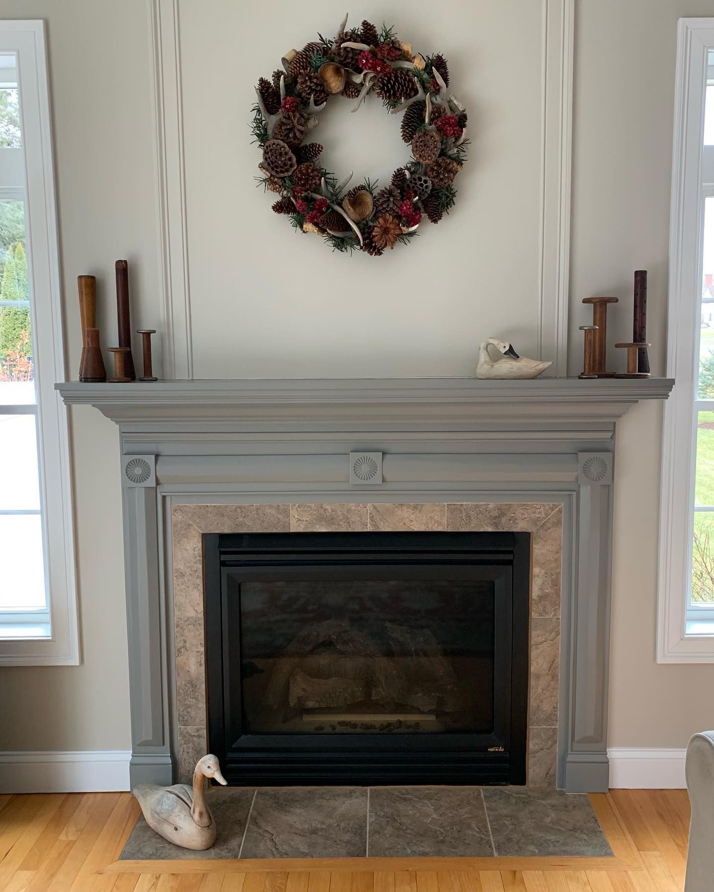
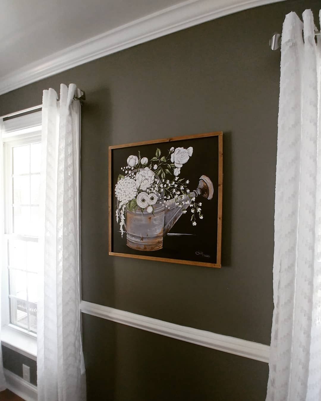
There’s low light in this room, and Chelsea Gray on the dresser looks dark green instead of gray.
In this room with brighter light, Chelsea Gray still shows a bit of green but doesn’t look moody.
The lighting is bright but slightly cold in this next photo, which brings out the violet hue in Chelsea Gray.
In warm light, the paint color, which is on the table, takes on a different hue, although this can change once the lighting changes.
How Does Chelsea Gray Feel in a Room?
Chelsea Gray is welcoming and relaxing in a room. It also makes you proud of your home, especially when you have visitors, because it presents a sophisticated face. You can pair it with wood flooring and paneling or try it with warm whites for the best results.
As mentioned, use Chelsea Gray minimally, like on feature walls, cabinetry, or other furniture and accessories. That way, it doesn’t make the room look drab or stuffy.
Benjamin Moore Chelsea Gray: Warm or Cool?
Chelsea Gray is a warm gray paint color. Typically, grays are cool colors, but sometimes, you can find warm grays, those with warm green undertones. The green in Chelsea Gray leans toward olive green, the type with a slight yellow hue, not the cool emerald type.
Moreover, it has brown in it, which is usually warm. However, the slightly violet hue gives it a little coolness that reveals itself in cool light. Therefore, Chelsea Gray works well with warm and cool colors.
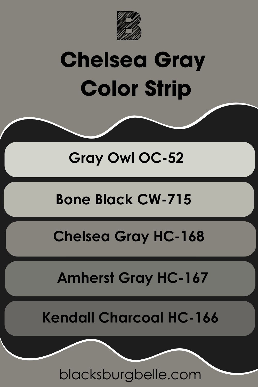
Benjamin Moore Chelsea Gray Color Strip: Lighter to Darker Exploration
Sometimes, the paint color you choose doesn’t quite hit the right spot for your decor. In such a situation, having options is crucial, so I’ve carefully picked lighter and darker alternatives to Chelsea Gray for this purpose.
- Benjamin Moore Gray Owl OC-52
- Benjamin Moore Bone Black CW-715
- Benjamin Moore Chelsea Gray HC-168
- Benjamin Moore Amherst Gray HC-167
- Benjamin Moore Kendall Charcoal HC-166
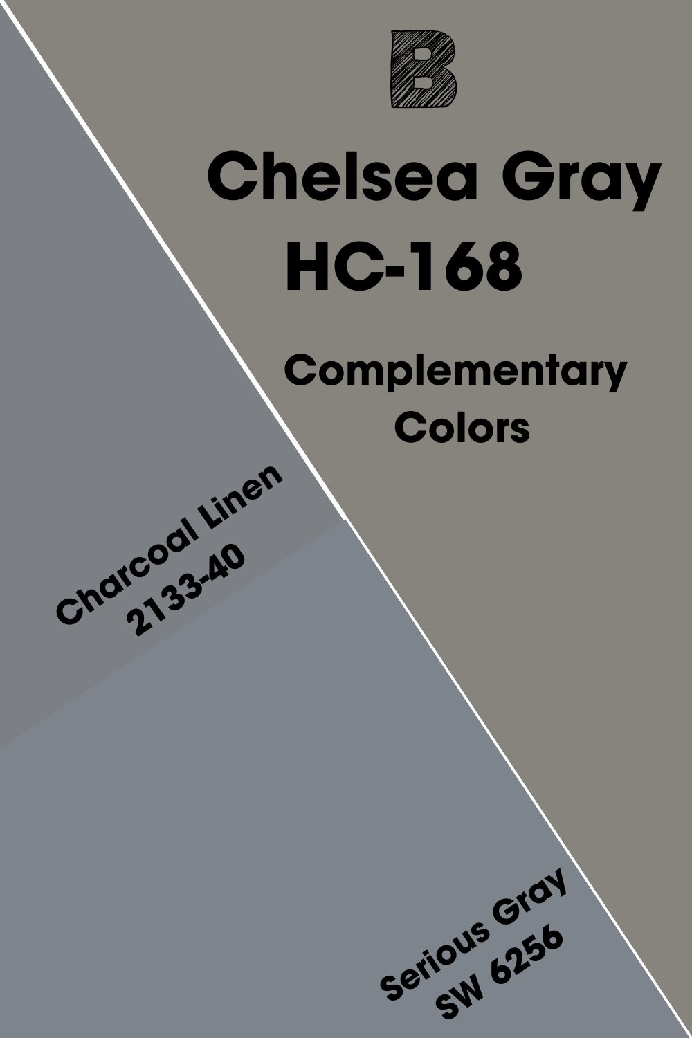
Benjamin Moore Chelsea Gray Complementary Color
Every color has a specific complementary color, including Chelsea Gray. Complementary colors are opposite each other on the color wheel and usually pair well, although they may look nothing alike.
As a gray color, Chelsea Gray may not immediately appear on the color wheel because it’s neutral.
However, its peculiar shade makes it easy to find and determine its complementary color. It is a dark shade of blue-gray and Benjamin Moore’s Charcoal Linen 2133-40 is a close match. Also, Sherwin Williams Serious Gray SW 6256 comes close but is not an exact match.
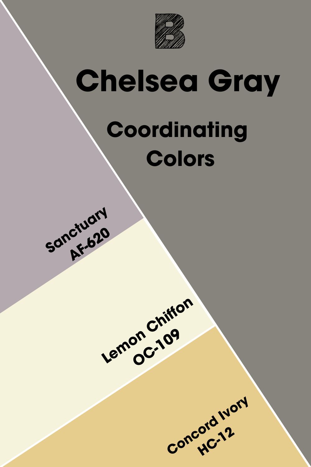
Benjamin Moore Chelsea Gray Coordinating Colors
These colors match each other in a color scheme or decor, although they have seemingly nothing in common. Sanctuary, Lemon Chiffon, and Concord Ivory are some of Chelsea Gray’s coordinating colors.
- Benjamin Moore Sanctuary AF-620: A soft shade of purple that hints a bit at gray and perfectly complements Chelsea Gray.
- Benjamin Moore Lemon Chiffon OC-109: A yellow undertone warms this bright white paint color to make it look creamy, blending with the dark Chelsea Gray as a trim color.
- Benjamin Moore Concord Ivory HC-12: A smooth and pretty yellow-gold paint color whose apricot undertone adds a bit of contrast to the decor when paired with Chelsea Gray.
Benjamin Moore Chelsea Gray Color Palettes
I’ve picked a few color palette examples to guide you on how to create yours. These are my ideas, but you can add yours to make it a personal style.
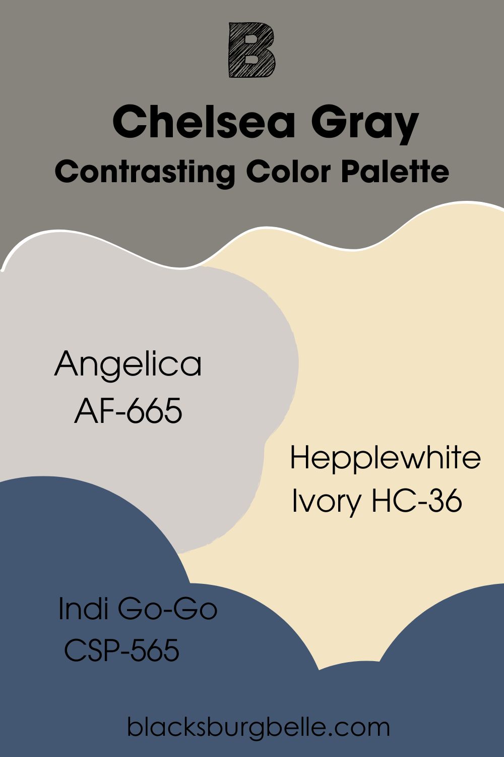
Contrasting Color Palette
- Angelica AF-665: A pale gray-lavender paint color that highlights the violet in Chelsea Gray for a perfect match.
- Hepplewhite Ivory HC-36: A creamy yellow paint color that softly warms a room and throws a different shade from the muted Chelsea Gray.
- Indi Go-Go CSP-565: A deep blue color that leans a little toward slate but adds depth to any decor for a beautiful look.
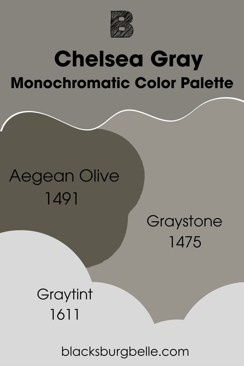
Monochromatic Color Palette
- Aegean Olive 1491: A deep olive green with a brown and gray undertone that blends with Chelsea Gray because it’s a darker version.
- Graystone 1475: A balanced gray paint color with a hint of purple to soften and add color.
- Graytint 1611: A light shade of Chelsea Gray with obvious lavender tones that lighten the decor when you use dark hues like Chelsea Gray.
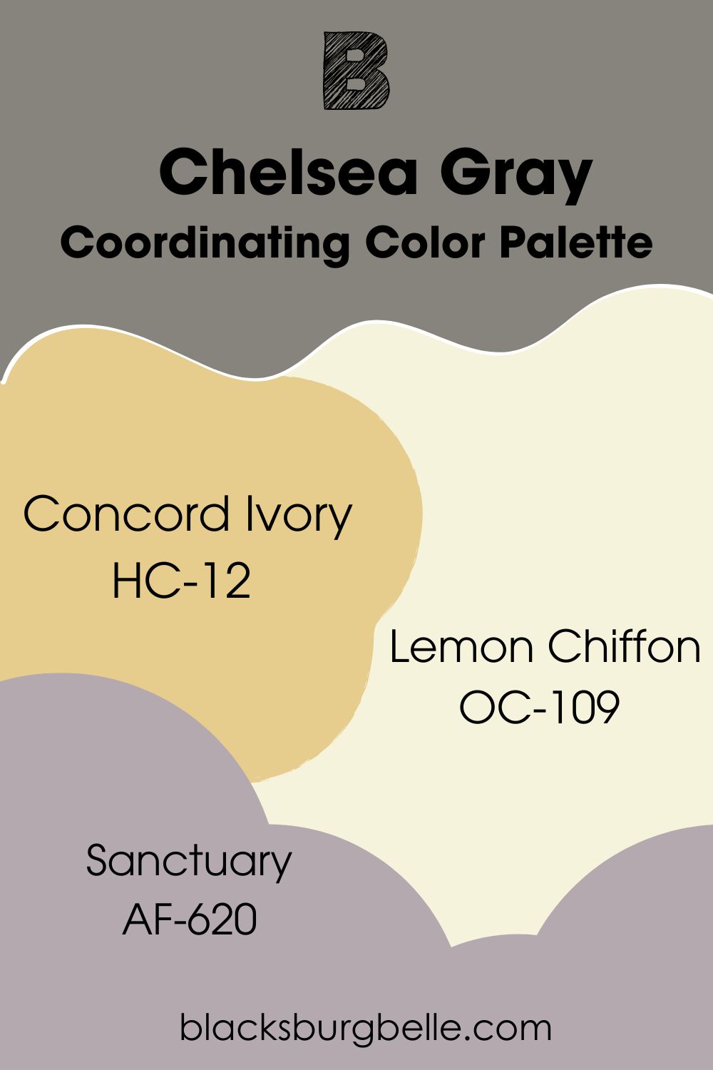
Coordinating Color Palette
- Concord Ivory HC-12: A smooth and pretty yellow-gold paint color whose apricot undertone adds a bit of contrast to the decor when paired with Chelsea Gray.
- Lemon Chiffon OC-109: A yellow undertone warms this bright white paint color to make it look creamy, blending with the dark Chelsea Gray as a trim color.
- Sanctuary AF-620: A soft shade of purple that hints a bit at gray and perfectly complements Chelsea Gray.
Benjamin Moore Chelsea Gray vs Similar Colors
If you’re still looking for other colors that look similar to Chelsea Gray or want a wider range of options, check out the comparative list below for inspiration.
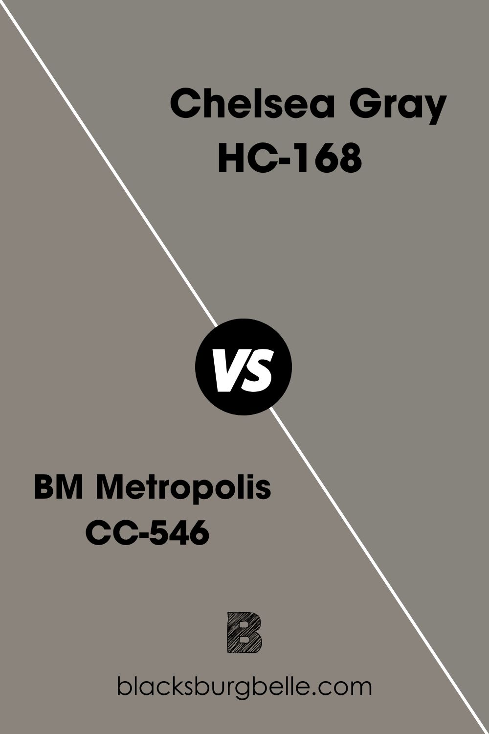
BM Metropolis vs BM Chelsea Gray
Metropolis is slightly lighter than Chelsea Gray and has a warmer appearance because of its plum undertones. It is more of a taupe paint color than gray.
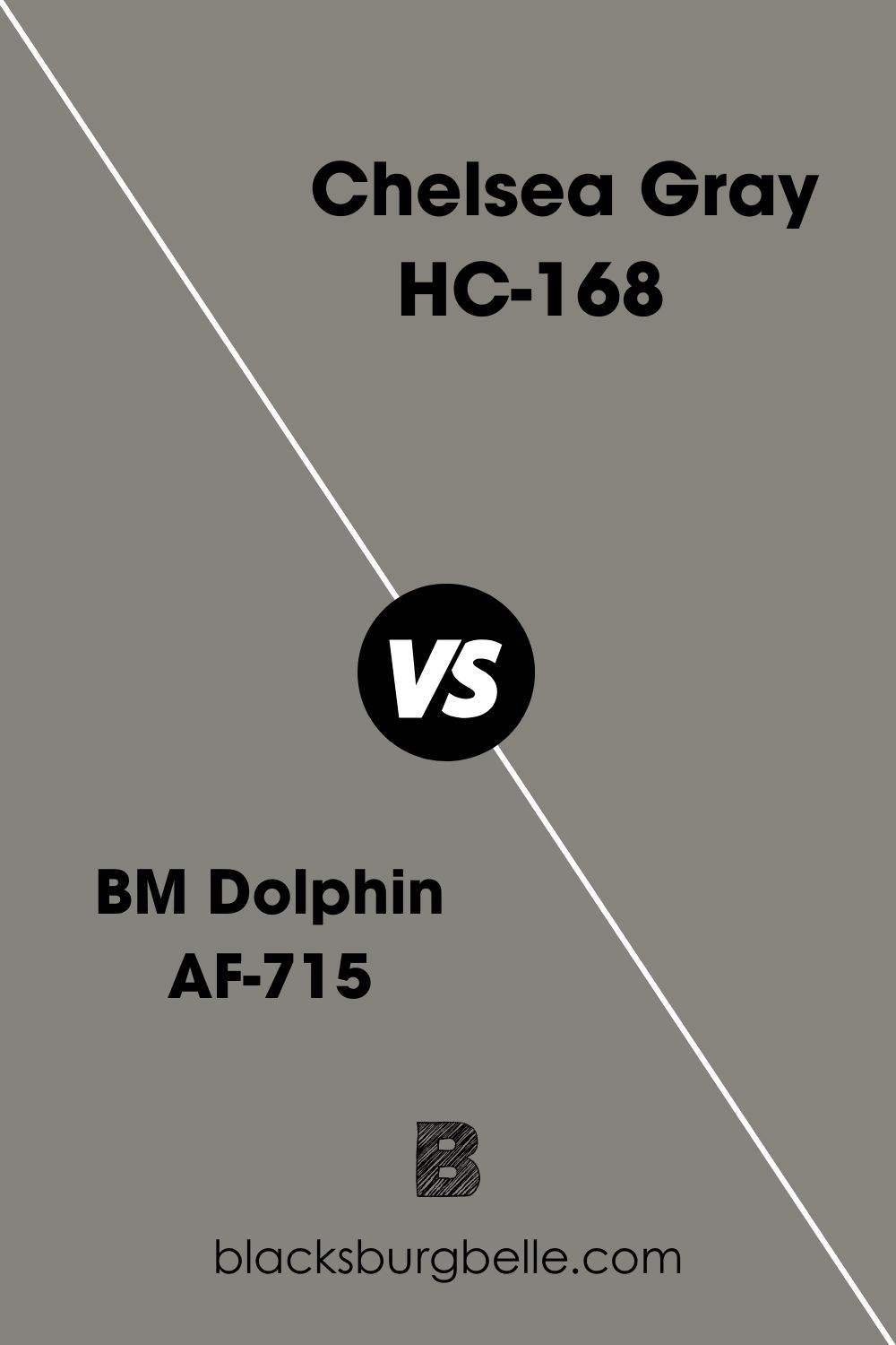
BM Dolphin vs BM Chelsea Gray
Dolphin is close to Chelsea Gray in shade and undertones. It has similar brown undertones and a slightly lower LRV, making it a smidge darker than Chelsea Gray.
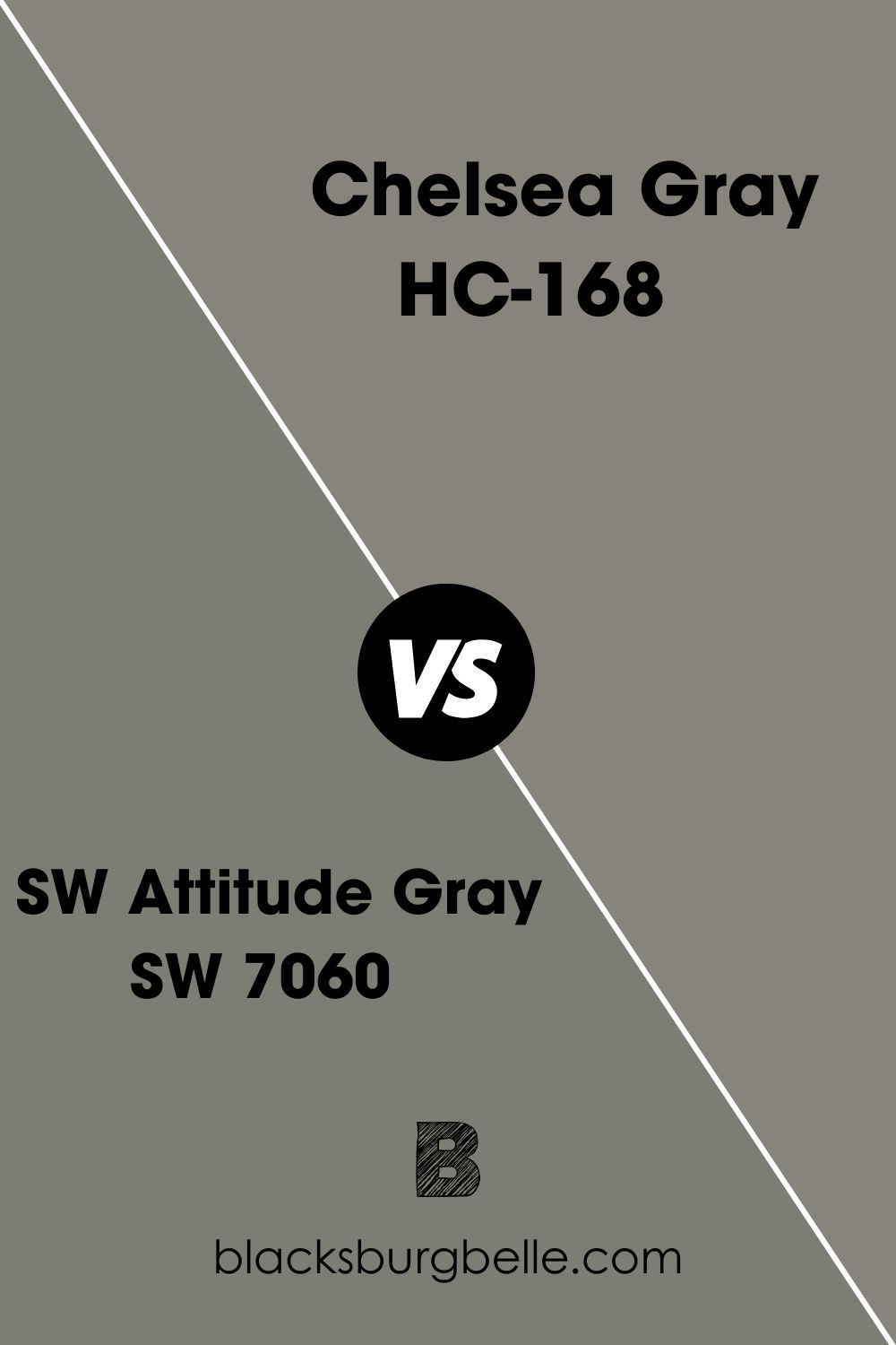
SW Attitude Gray vs BM Chelsea Gray
Sherwin Williams Attitude Gray has an LRV of 20, which means it’s darker than Chelsea Gray. But its green undertone makes it pretty similar to Chelsea Gray, although it shows more green than the color under review.
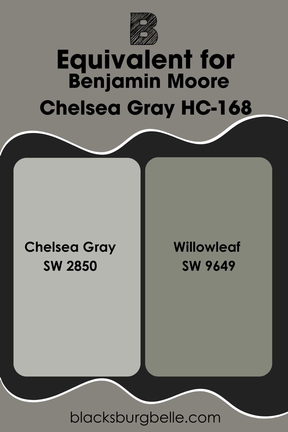
Sherwin Williams Paint Color Equivalent to BM Chelsea Gray
There is a Sherwin Williams paint color named Chelsea Gray SW 2850. You’d think both colors would look the same, but they are miles apart in shade. However, Willowleaf SW 9649 is similar to Chelsea Gray, especially when you compare their red, green, and blue (RGB) values.
Where Can You Use Benjamin Moore Chelsea Gray?
You can use Chelsea Gray in any room that has a lot of light, whether natural or artificial. Let me show you some examples.
Benjamin Moore Chelsea Gray on a Trim
In a beautiful twist, this bathroom has the darker Chelsea Gray on the trim, while the walls are done in BM Sea Salt. There’s good lighting in the room, so you can see the colors well.
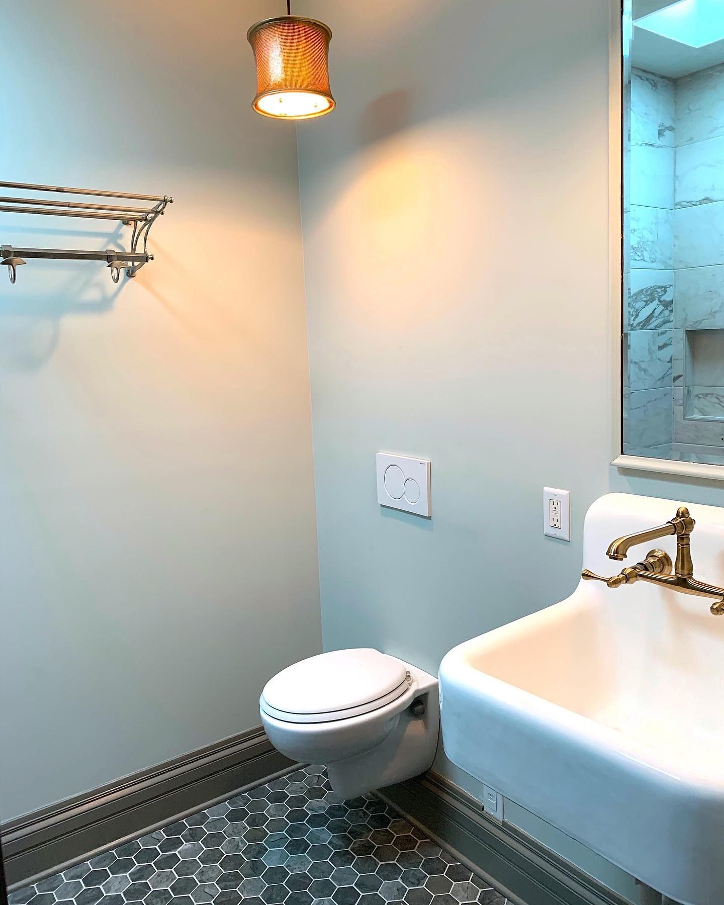
Benjamin Moore Chelsea Gray on Bathroom Vanity
The white walls and gold fixtures make Chelsea Gray look soft and creamy. It also looks lighter than usual.
Best Ceiling Color for Benjamin Moore Chelsea Gray Walls
White is your best bet to lighten the room if you paint the walls Chelsea Gray. Try a crisp or warm white because this gray paint color accommodates both. BM Chantilly Lace or Oxford White looks great.
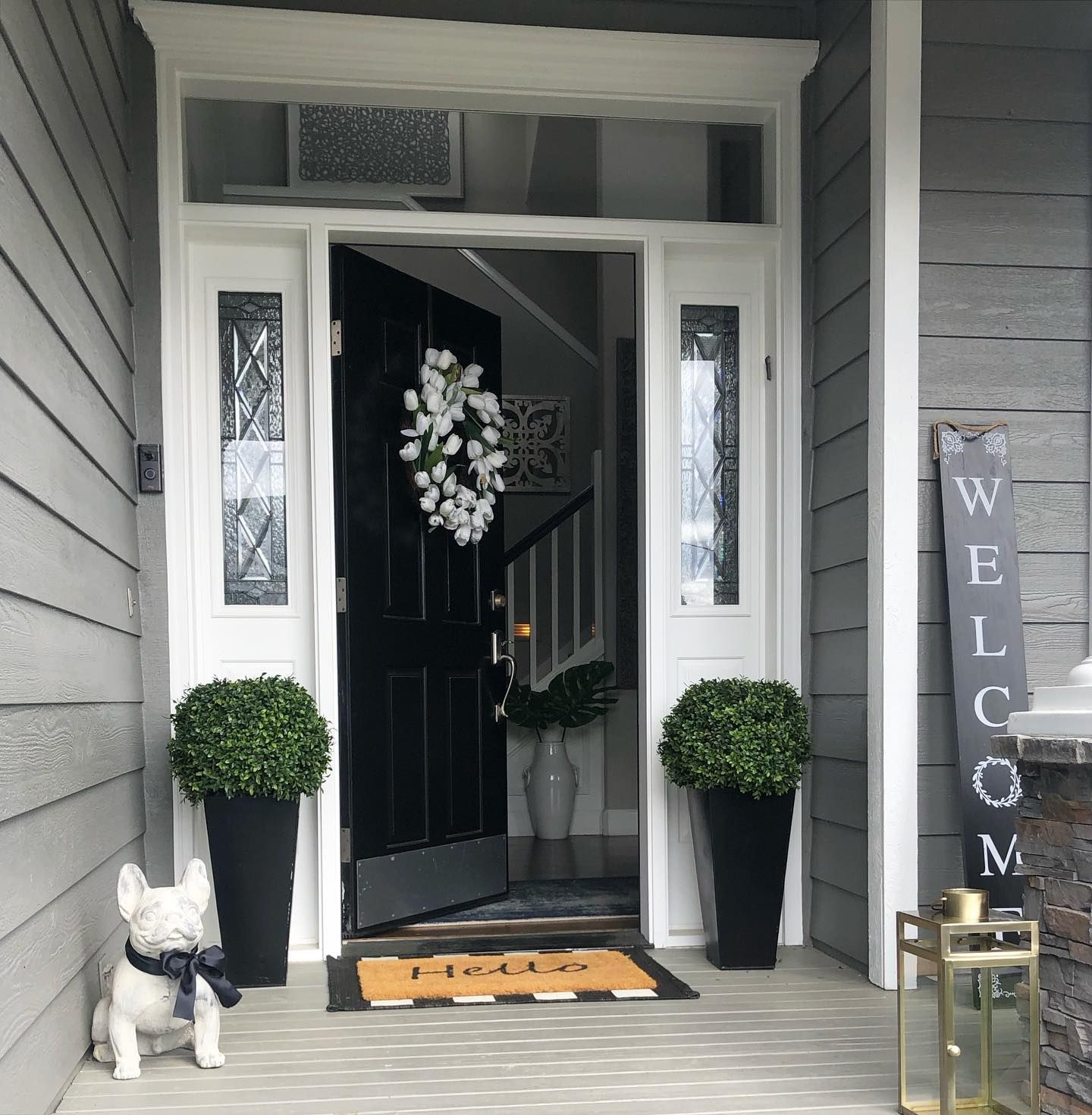
Benjamin Moore Chelsea Gray on a Porch
If I could poach this porch, I would. It’s somewhere I don’t mind spending time in because of the calm serenity it represents.
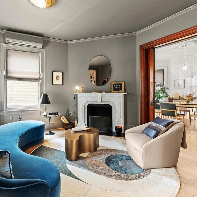
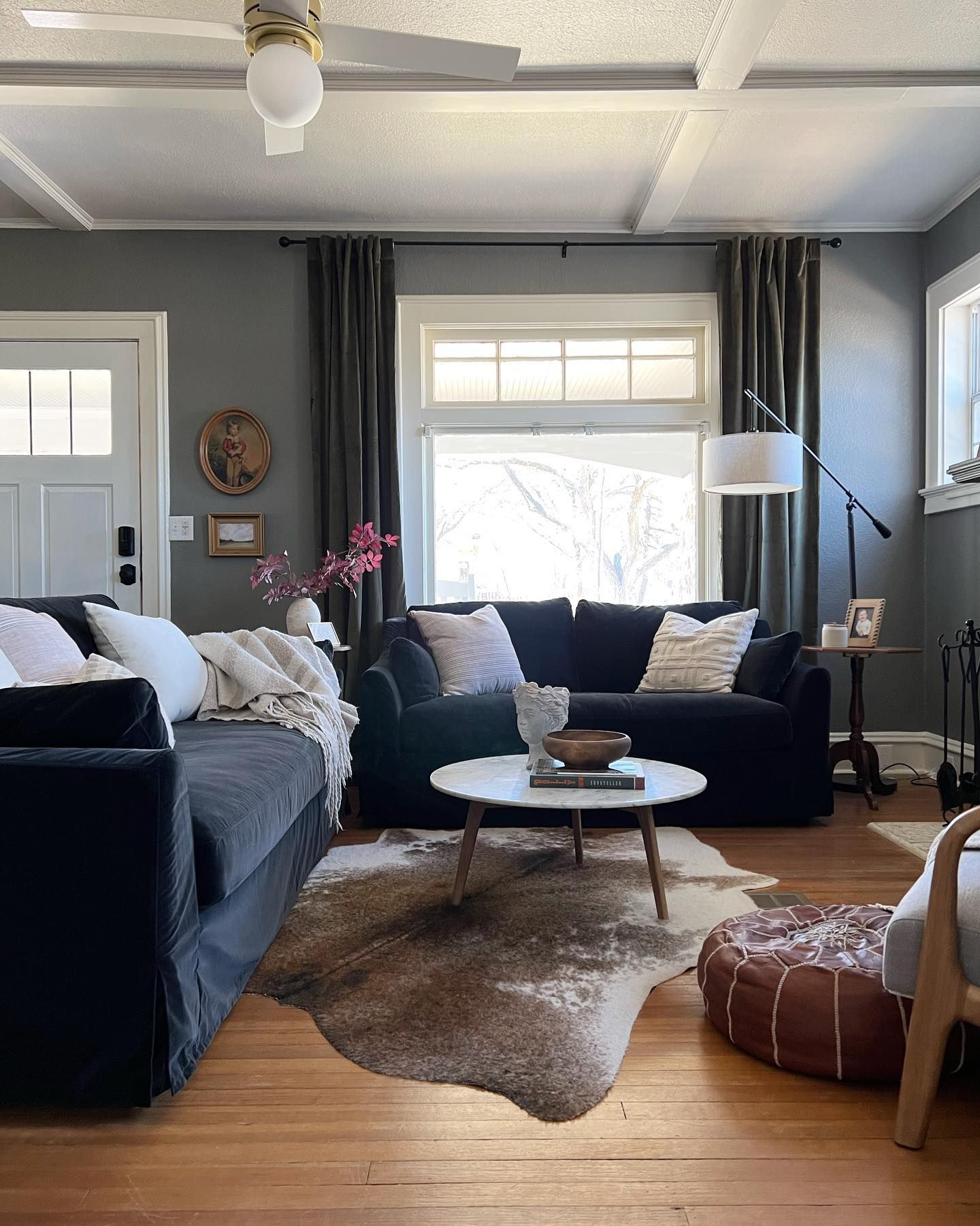
Benjamin Moore Chelsea Gray in a Living Room
You can easily work different colors into this decor and change the curtain to something lighter, but the result will remain striking.
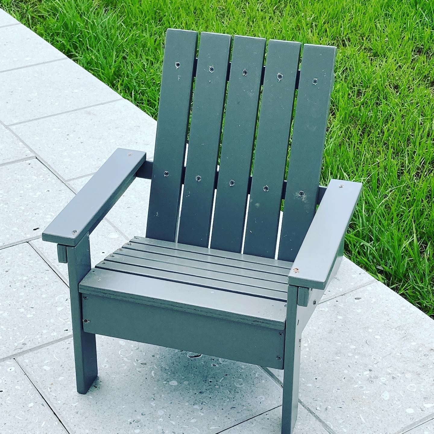
Benjamin Moore Chelsea Gray on Furniture
You’d think this is a green paint color, but it’s Chelsea Gray.
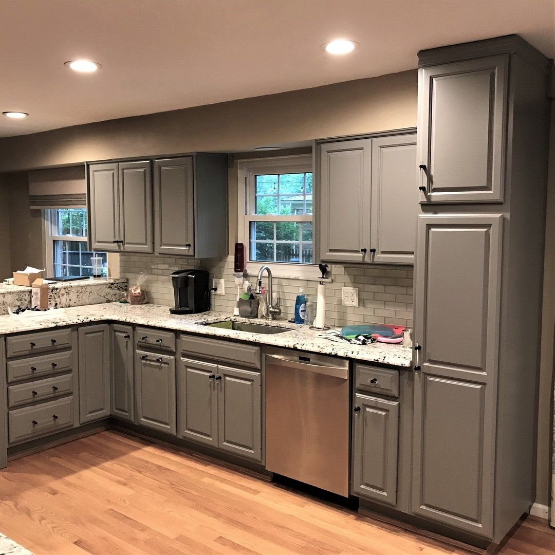
Benjamin Moore Chelsea Gray on Kitchen Cabinets
Even under warm artificial light, Chelsea Gray still looks like the best color for cabinets.
Best Trim Color for Benjamin Moore Chelsea Gray Walls
I recommend white because of the dark shade of this paint color. Try BM Lemon Chiffon or White Dove for the trim.
Benjamin Moore Chelsea Gray on Exterior Walls
Do you want your house’s exterior to maintain that edgy look? Chelsea Gray may be your go-to color. Check out this decor for inspiration.

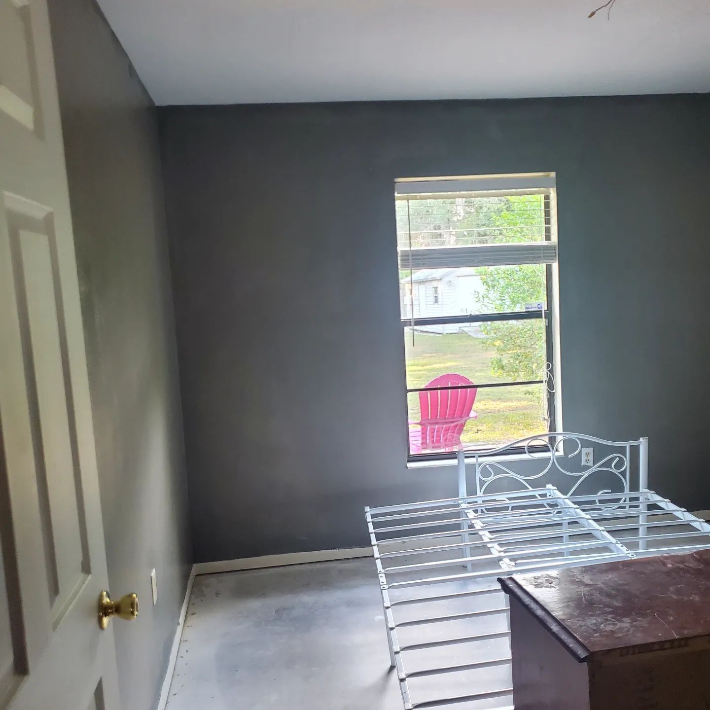
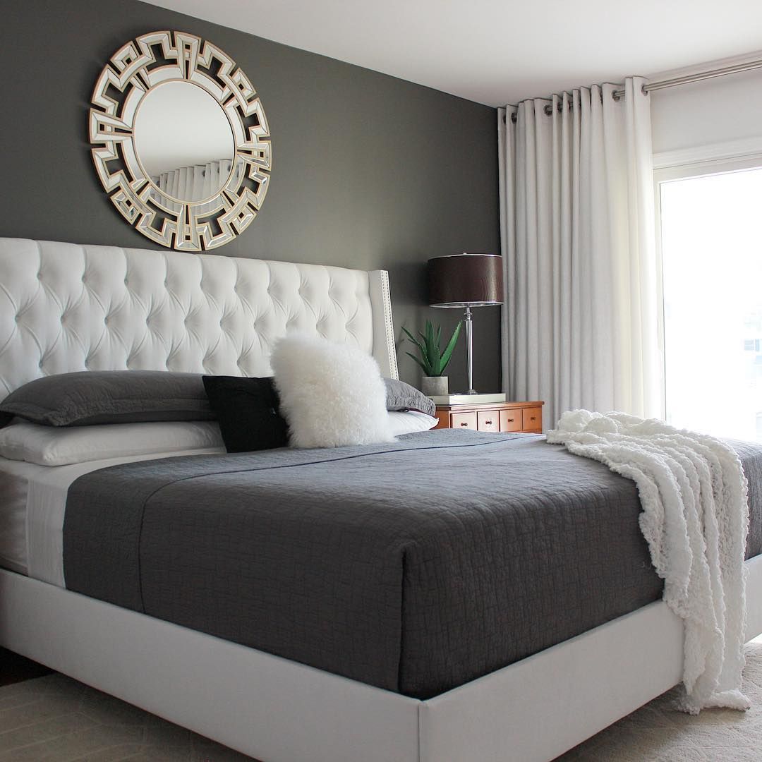
Benjamin Moore Chelsea Gray in a Bedroom
This bedroom makes you want to stay in bed all day.
Conclusion
Benjamin Moore Chelsea Gray is a dark gray paint color with brownish-violet and green undertones. It’s a unique color that pairs well with many others, including vibrant colors and soft pastels. With an LRV of 23.33, you know it works best with a lot of lighting.
Follow this guide to create personalized color palettes and get the inspiration you need to decorate. It is best to use Chelsea Gray on cabinets, accents, and furniture, but you can get creative and discover other ways to use it.
I’m rooting for you, but remember to test the color before deciding to see if it fits the picture you have in mind. Let me know your thoughts and questions in the comments section.
 Sherwin Williams Drift of Mist (Palette, Coordinating & Inspirations)
 Sherwin Williams Storm Cloud (Palette, Coordinating & Inspirations)
 Sherwin Williams Indigo Batik (Palette, Coordinating & Inspirations)
 Sherwin Williams Daphne SW 9151: Paint Color Revie
 Sherwin Williams Moody Blue SW 6221 Review
 Benjamin Moore Swiss Coffee OC-45: Review & Inspiration
