
Are you looking for the perfect blend between blue and gray? Light blue colors work much better when they have some gray to tone them down. But, with numerous blue-gray shades, which one do you pick for your walls?
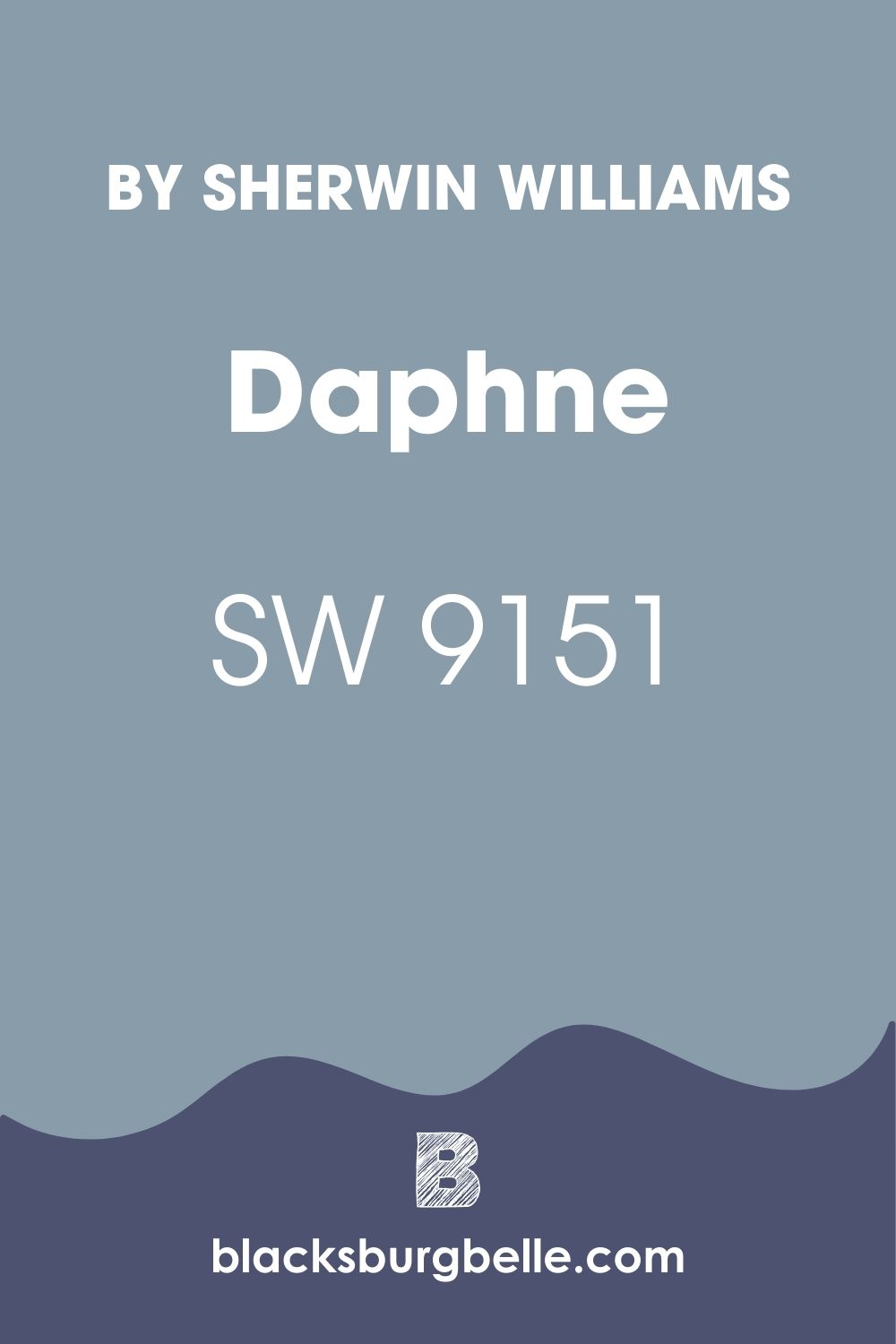
Sherwin Williams Daphne is a softer, muted blue-gray that has worked for me in almost every room. The Daphne SW 9151 in my spaces has a blue that creates that happy, bright shade, while the gray undertones keep the paint color from becoming too bright or loud. The blue in Sherwin Williams Daphne also brings that soothing, colorful, and beachy feeling.
In this detailed guide, I want to take you deep into this unique blue-gray paint color, where we will analyze it and see what it has for your home. Are you ready? Let’s get started!
Table of Contents
What Color is Sherwin Williams Daphne?
| Manufacturer | Sherwin Williams |
| LRV | 32 |
| RGB | R: 137 G: 156 B: 170 |
| Hex Value | #899caa |
| Color Collections | Trendsetter |
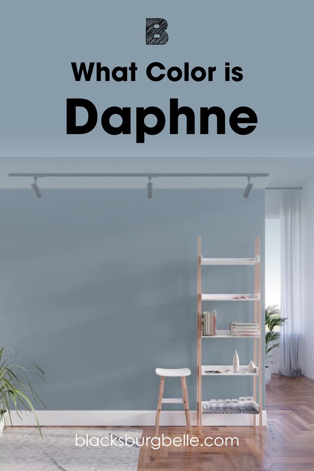
Daphne SW 9151 is blue and sits halfway between navy and sky blue. The paint color is a combination of blue and gray, with each color seeming to be at about 50%.
Daphne works perfectly in many spaces, including furniture, accessories, and even walls. This could be because many people associate this color with accessibility, glamour, grace, and, sometimes, transparency.
Sitting in the Sherwin Williams Trendsetter color collection, Daphne SW 9151 sets the trends by keeping the room trendy and ultra-modern. The color boasts a hex value of #899caa.
RGB of Sherwin Williams Daphne
The RGB scale helps interior designers—and paint color experts—determine the amount of red, green, and blue mixed to create a specific paint color. The scale starts at zero and ends at 255. For Daphne SW 9151, the paint color combines red: 137, green: 156, and blue: 170.
LRV of Sherwin Williams Daphne
LRV is an abbreviation for Light Reflectance Value. It represents the amount of light a specific color can reflect. At 0, we have pure black, which reflects 0% light, while at 100, we have pure white, which reflects 100% light.
Interestingly, Sherwin Williams Daphne SW 9151 falls on the lower half of the LRV scale, with a value of 32. When you shine a light on Daphne, it reflects 32% of this light.
Is Sherwin Williams Daphne Warm or Cool?
Undoubtedly, I would say Daphne SW 9151 is a cool color. The paint color carries blue as its primary tone—blue falls on the cooler side of the color wheel. The blue color forces the gray in Daphne to swing toward the cool side.
What Are the Sherwin Williams Daphne Undertones?
Sherwin Williams Daphne boasts a combination of gray-blue undertones. These undertones are well-balanced, and the color neither looks entirely gray nor fully blue.
Irrespective of the room in which you intend to use Daphne, you do not have to worry about its blue overwhelming the space, as the gray in it will balance it out. The fact that the color is not too high on the LRV scale means it is chilled in its light reflective abilities—this makes it perfect for balancing the illumination in over-illuminated rooms.
Sherwin Williams Daphne Color Strip: Sherwin Williams Daphne Color Comparisons
When we shop for colors, we often want to know what colors we miss by not going up or down the color strip a few tones. I will compare several colors pretty close to Daphne SW 9151 on the color scale to answer this question.
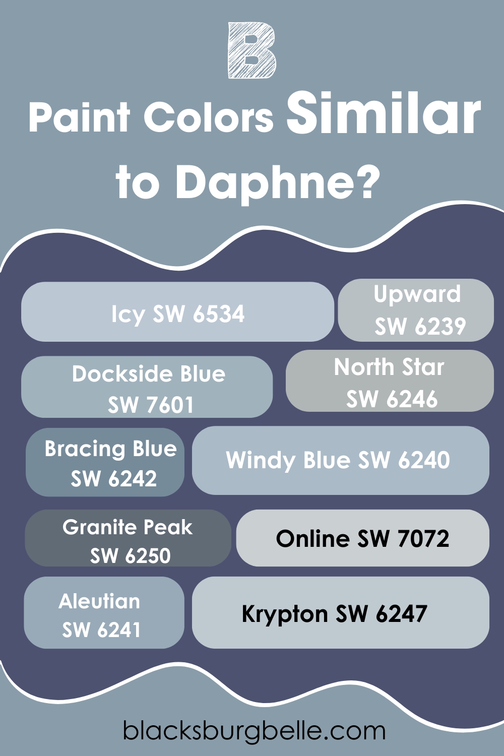
Sherwin Williams Aleutian (SW 6241)
Aleutian SW 6241 brings that cream feeling into the room with its blue shade. The color is slightly darker than the sky blue paint color, with its muddy undertones keeping it restful and muted.
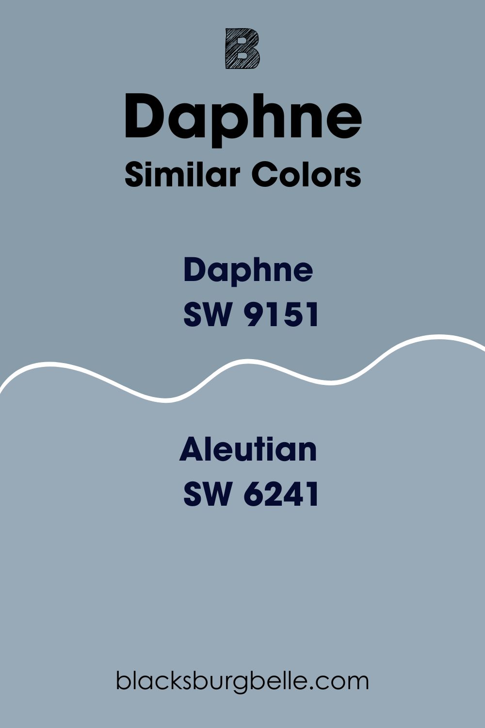
When comparing Daphne to Aleutian on the LRV scale, Aleutian SW 6241 tends to reflect 6.67% more light with an LRV of 38.67%. Aleutian may perform better in a less lit room than Daphne.
The two colors, however, seem to share the same undertone. They have a cool blue color which gets balanced by the gray undertone.
Sherwin Williams Granite Peak (SW 6250)
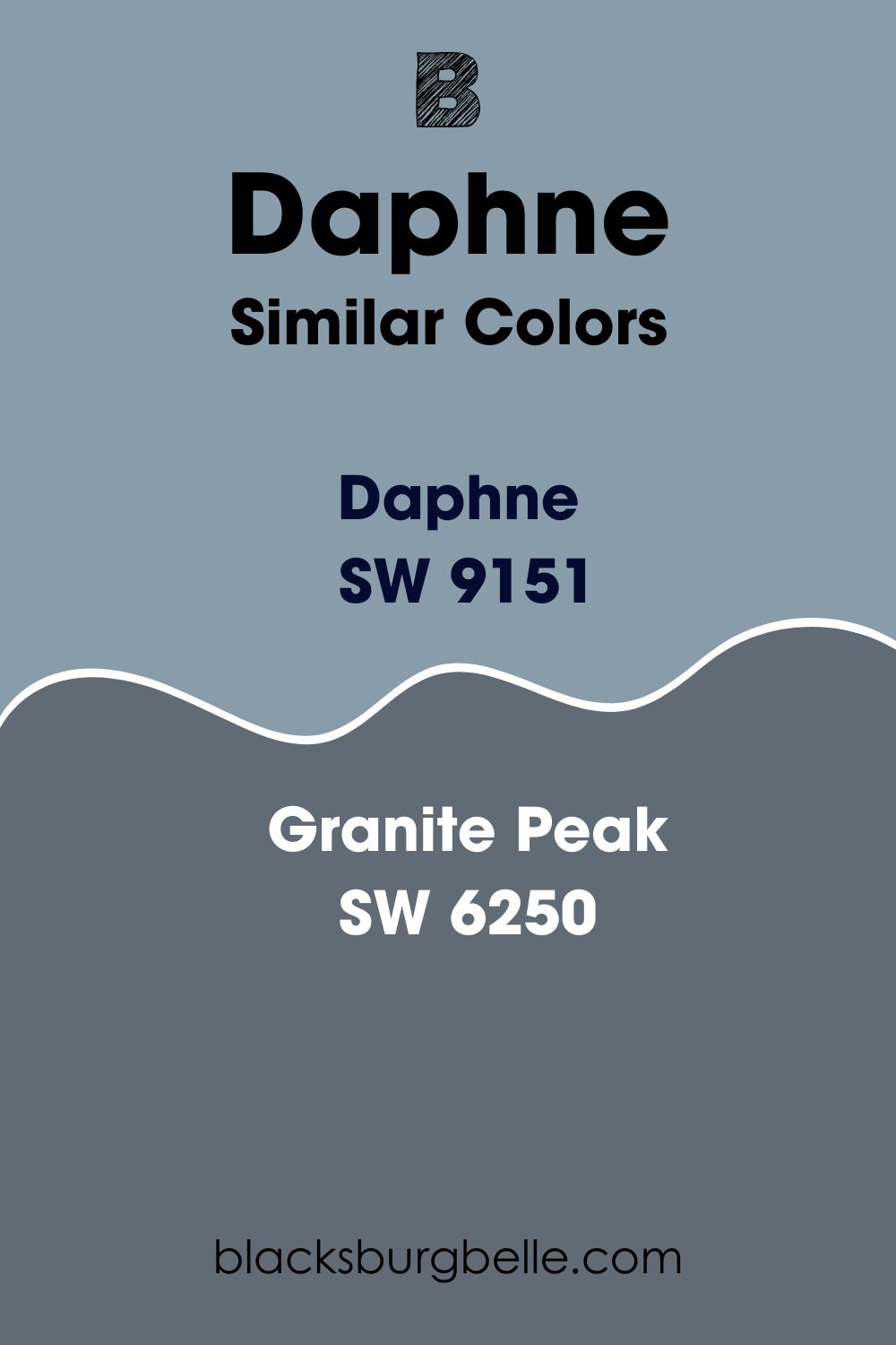
Unlike Daphne, which balances blue and gray, the Granite Peal seems slightly different as the gray color shines more than the icy blue undertones. For this reason, this color is often considered a deep charcoal gray.
While Daphne seems balanced in almost all types of lighting, with its gray-blue undertones showing, Granite Peak behaves like a chameleon. Granite Peak will look cooler gray in some lighting, while it may look bluer in another.
On the LRV scale, Granite Peak is much darker than Daphne, with an LRV of 14. Therefore, Granite Peak is the moody, silky, dark blue you do not want to use in a dark room.
Sherwin Williams Bracing Blue (SW 6242)
Bracing Blue is a charming color. The SW 6242 is saturated enough to have a homey and welcoming appearance. However, like Daphne, it carries gray undertones that ensure it does not overwhelm your space.
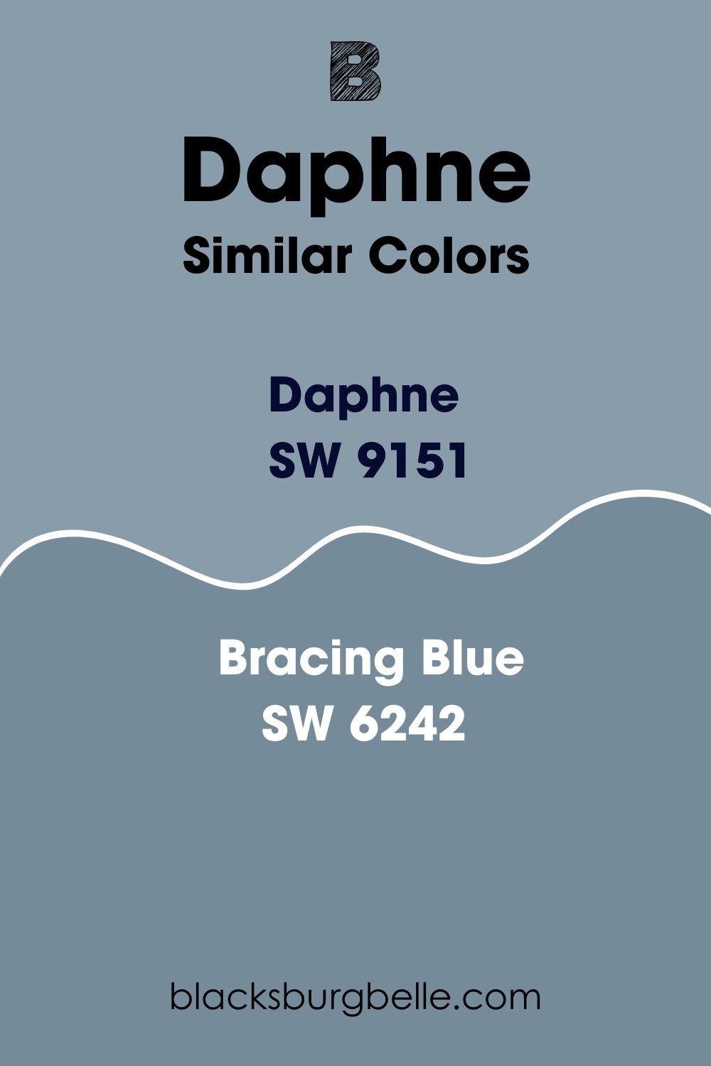
On the LRV scale, Bracing Blue reflects a quarter of the light you shine on it—with an LRV of 25, the color is 7% less reflective than Daphne. Bracing Blue, however, combines red: 118, green: 139, and blue: 154 on the RGB scale.
Sherwin Williams Dockside Blue (SW 7601)
Dockside Blue (SW 7601) is teal with muddy gray undertones. Dockside Blue is full of color and rich while remaining medium when you paint in a medium-lit room.
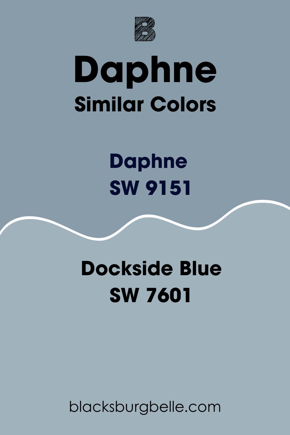
Unlike Daphne, which maintains an ideal balance between its blue and gray undertones, Dockside Blue allows its cool blue to shine more. The more Dockside Blue you paint in a room, the bluer the paint color looks.
Dockside Blue reflects more light than Daphne. It boasts an LRV of 42.65%, reflecting close to 13% more light than Daphne.
Sherwin Williams Icy (SW 6534)
Similar to Daphne, Icy SW 6534 is a blue color that comes with gray undertones. It is slightly close to the sky blue color, although it’s much lighter. Icy SW 6534 is light enough that it is the first color on this list to enter the second half on the LRV scale. Icy reflects 56% of all light shone on it, much higher than Daphne, which can only reflect 32% of the light.
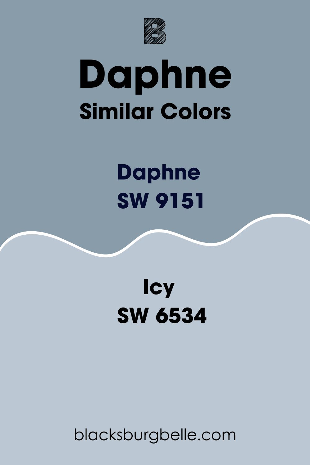
Like Daphne, Icy SW 6534 also brings heavy gray undertones. These tone down the cool blue, keeping it from getting too loud. However, interestingly, Icy tends to read some purple, especially when you pair it with warmer light—this could be yellow-tinted light bulbs or light coming in through a south-facing window.
Sherwin Williams Upward (SW 6239)
Sherwin Williams is a purely blue color that tends to be much clearer than Daphne. Interestingly, unlike Daphne, which may look muddy because of its gray undertones, Upward SW 6239 feels less bright.
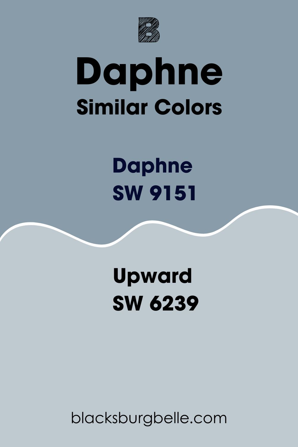
Upward, however, is a cheerful color that works well on walls in many rooms, including dark rooms where Daphne may not perform well. Upward’s ability to work in dark rooms results from its ability to reflect much more light—the paint color boasts an LRV of 57.37, reflecting 25.57% more light than Daphne.
Sherwin Williams North Star (SW 6246)
North Star is a crisp, cool paint color with an icy appearance. Like Daphne, North Star works well for homeowners whose goal is to bring in some color while not wanting to overwhelm their space with blue—North Star succeeds in keeping rooms neutral.
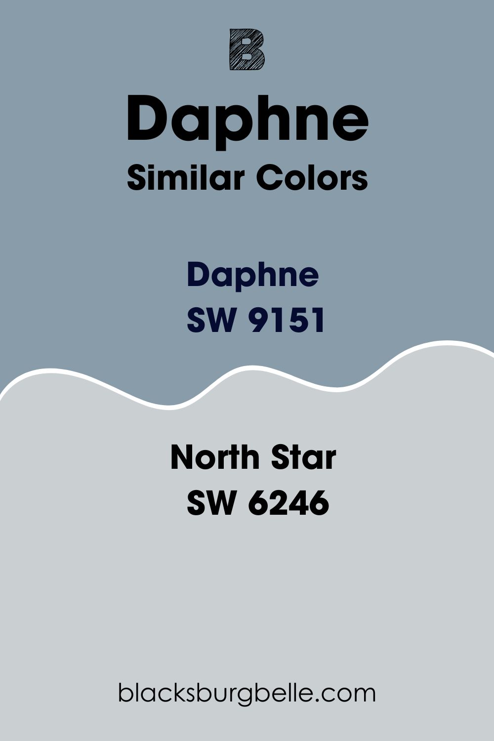
Bringing a beach house theme, North Star is a light blue color with solid gray undertones that balances the cool in blue—this is much similar to Daphne, although in this case, North Star is a much lighter color. North Star has an LRV of 62, reflecting almost twice the amount of light that Daphne can reflect.
Sherwin Williams Windy Blue (SW 6240)
Although light, Windy Blue SW 6240 is a richly toned blue-gray paint color. It carries enough pigment to read as blue, although this cool blue tone is muddied enough to prevent it from looking overwhelming in a room.
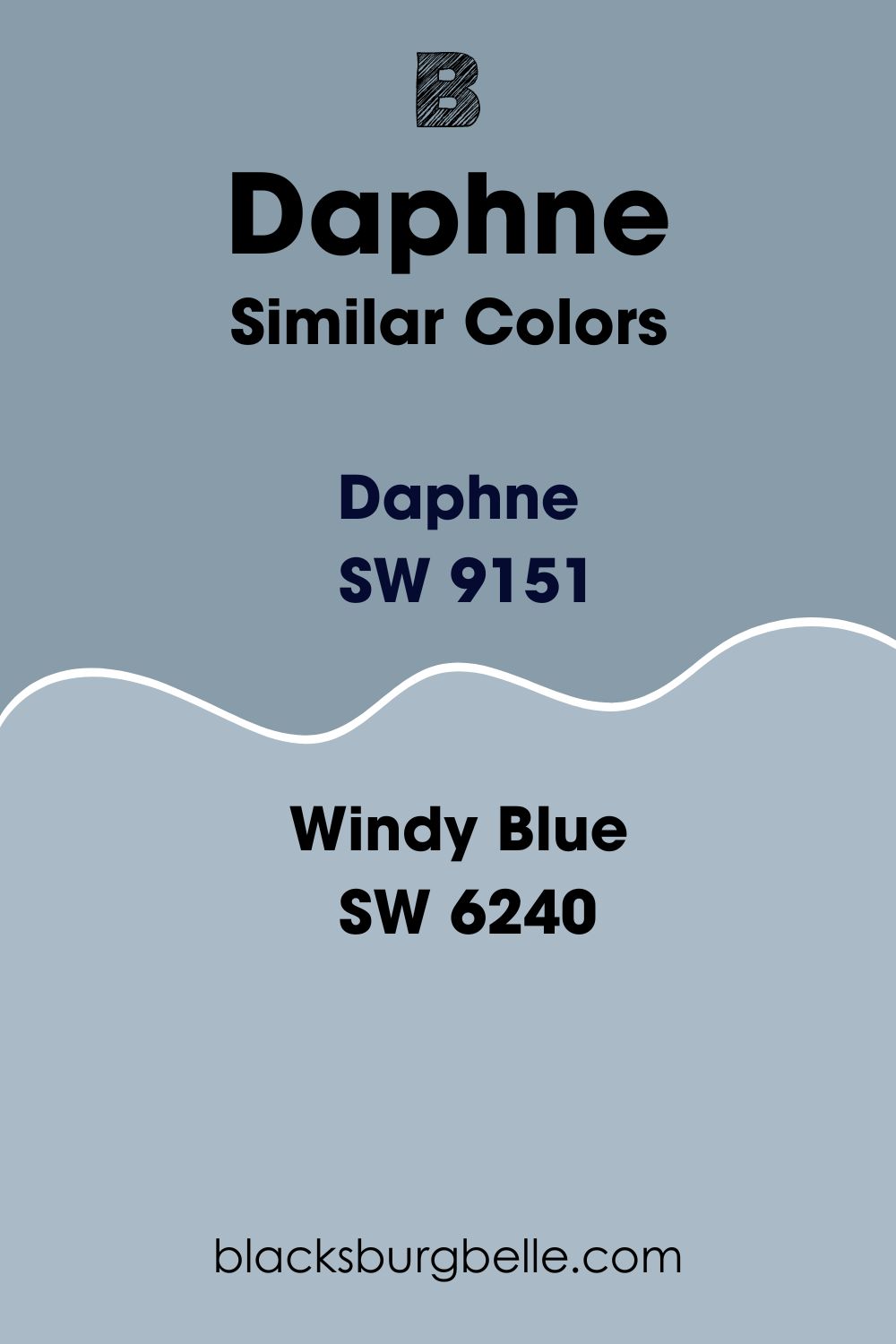
On the LRV scale, Windy Blue is more reflective than Daphne. The color reflects 16% more light than Daphne, with an LRV of 48. On the RGB scale, Windy Blue combines red: 170, green: 186, and blue: 198.
Sherwin Williams Online (SW 7072)
If you are in the market for cool blue-gray paint, then Sherwin Williams Online might be a good option if you need a lighter version of Daphne. What differentiates online from Daphne is that it is grayer than blue.
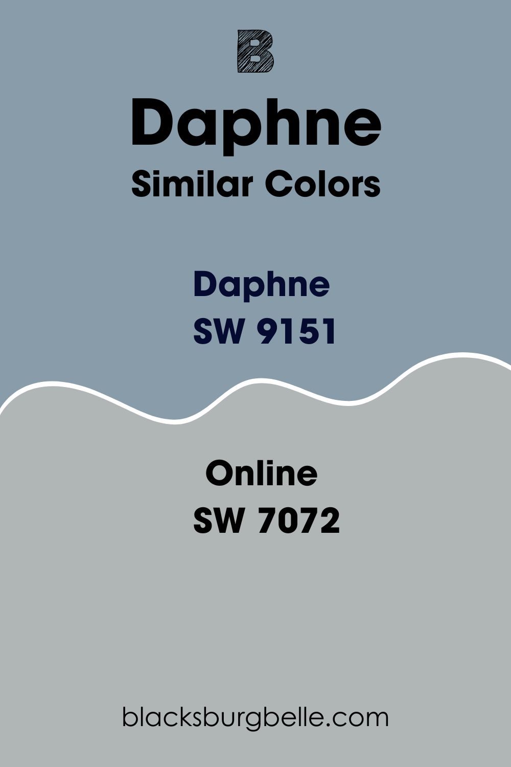
Online is also different from Daphne in its ability to reflect light. While Daphne will only reflect 32% of the light, Online will reflect 13% more, with an LRV of 45.
On the RGB scale, Online combines red: 176, green: 181, and blue: 181. The color only falls short from the medium light shade of gray which has an RGB (181, 181, 181).
Sherwin Williams Krypton (SW 6247)
Krypton is a cool, icy blue that features a heavily undertoned gray. Interestingly, although Daphne and Krypton have a similar color combination, Krypton reflects 20% more light with its LRV of 52%.
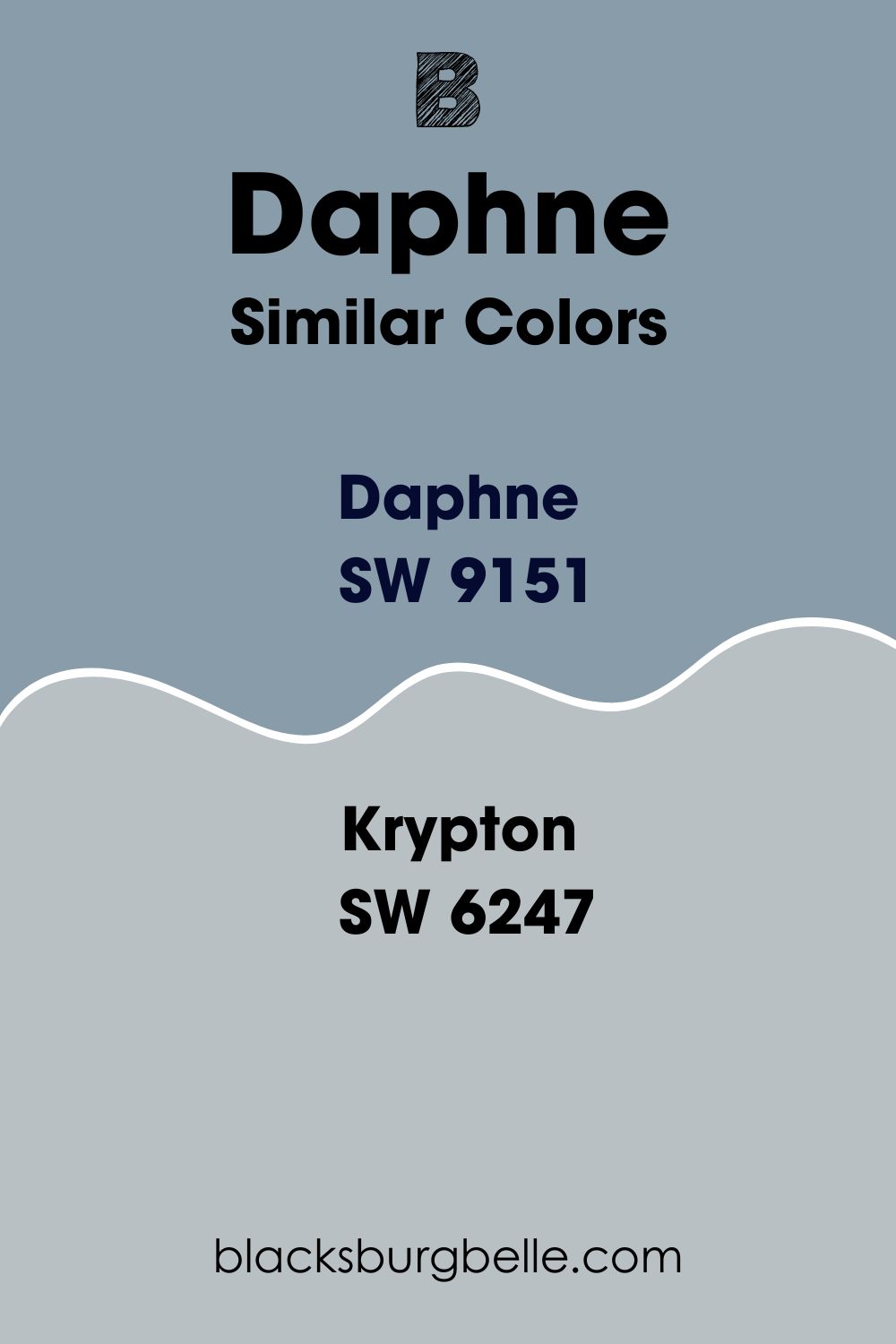
On the RGB scale, Krypton is pretty different from Daphne, combing red: 184, green: 192, and blue: 195. Like Daphne, Krypton brings a calm, airy, and soothing feel to any space. However, since the color exhibits a cool touch, it almost always delivers the best results when you use it in warm rooms that can balance its coolness.
Sherwin Williams Daphne Color Palette
Coordinating Colors for Daphne
One thing that has always made Sherwin Williams Daphne an exciting color is that I can pair it with various paint colors. Below, I will list some colors that pair nicely with Daphne.
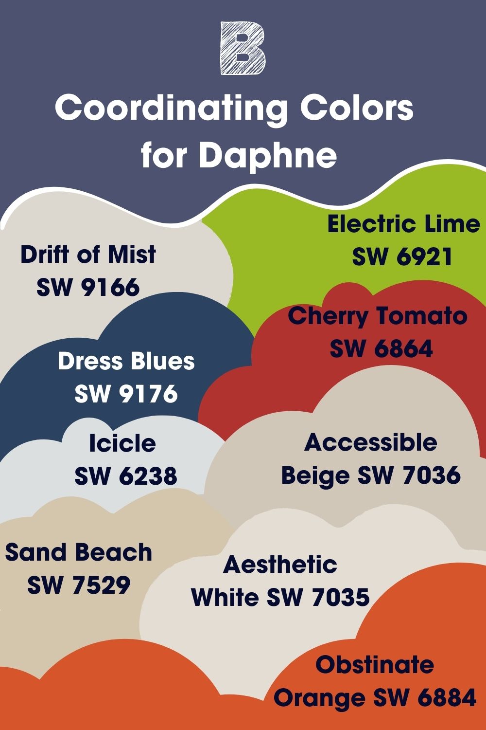
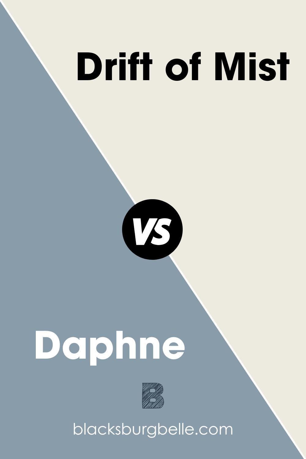
Sherwin Williams Drift of Mist (SW 9166)
Pairing Daphne with a soft paint color has always worked for me. In this case, Drift of Mist is a soft, warm gray that nicely balances the cool blue-gray in Daphne.
Although warm, you can quickly turn Drift of Mist into a cool color by simply using it in a room with north-facing light. In your room with south-facing light, you enjoy the full warmth of this color.
The Drift of Mist reflects 69% of the light you shine. This makes it ideal for use together with Daphne, which reflects only 32% of the light—the two colors create a balance when used in a dark-lit room.
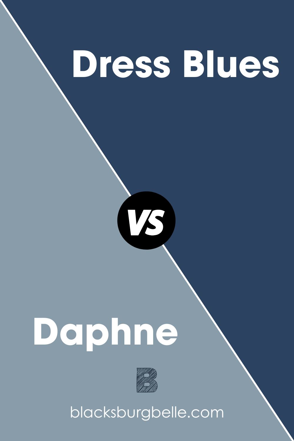
Sherwin Williams Dress Blues (SW 9176)
This dark blue shade is perfect for homeowners planning to implement a cool feel in their space. Combining this color with Daphne tends to bring out their blue undertones, which quickly chills a room even if it has a warm south-facing light.
With an LRV of 5, Dress Blues leans on the dark paint colors side, making it less ideal to use in a dim light room. However, combine Daphne with Dress Blues in an overly lit room, and you can quickly balance the light, keeping it from being too loud in your space.
Sherwin Williams Icicle (SW 6238)
Much like Daphne, Sherwin Williams Icicle adds that cool and calm aura to your home. With deep blue undertones like Daphne, Icicle adds a chilly vibe to any room.
Icicle SW 6238 falls in the off-white range on the LRV scale. With an LRV of 73, the color adds some brightness to a dark room, making it a perfect color to pair with Daphne when you need to add a cool vibe to a dark-lit room.
The Icicle paint color will add an airy, refreshing, calm feel to your space. However, because of its bold, cool undertones, you should pair it with Daphne in warmer south-facing rooms—in the north-facing rooms, a combination of Icicle and Daphne may feel too cold.
Sherwin Williams Sand Beach (SW 7529)
Softer blue shades will always evoke calm feelings associated with the sea. Take it a notch higher and add a sandy-colored neutral to create that feeling that reminds you of the seashore. If you are wondering which color can help you achieve this, grab a can of Sand Beach (SW 7529).
Sand Beach is relatively high on the LRV scale, with 57 as its light reflectance value. In the north-facing light, this color will create a superb balance with its warmth which will help balance the coolness in Daphne. The color fits in the Living Well and Timeless Color Wall collection—the paint can give your room that modern, appealing look.
Sherwin Williams Obstinate Orange (SW 6884)
On the color wheel, orange sits opposite the blue color. This makes it a close natural complement to the blue color. A Daphne and Obstinate Orange combo creates a pleasing and appealing combination that will offer an energizing contrast ideal for a bustling space.
The Obstinate Orange (SW 6884) is one of the most standout orange shades that Sherwin Williams produces. The color, however, is darker, with an LRV of 21. Therefore, when pairing it with Daphne, you may want to use the two colors in a room with enough light—a south-facing room would work well for these colors.
Sherwin Williams Electric Lime (SW 6921)
Green and blue are neighbors on the color wheel, making them a refreshing combination for use in any space. Electric Lime SW 6921 is one of the most vibrant greens produced by Sherwin Williams.
Combine Electric Lime and Daphne, and you enjoy a bold look in that room. Electric Lime can add some interest into a room with its LRV of 42—it reflects more light than Daphne, making it a decent combining pair in a darkish room.
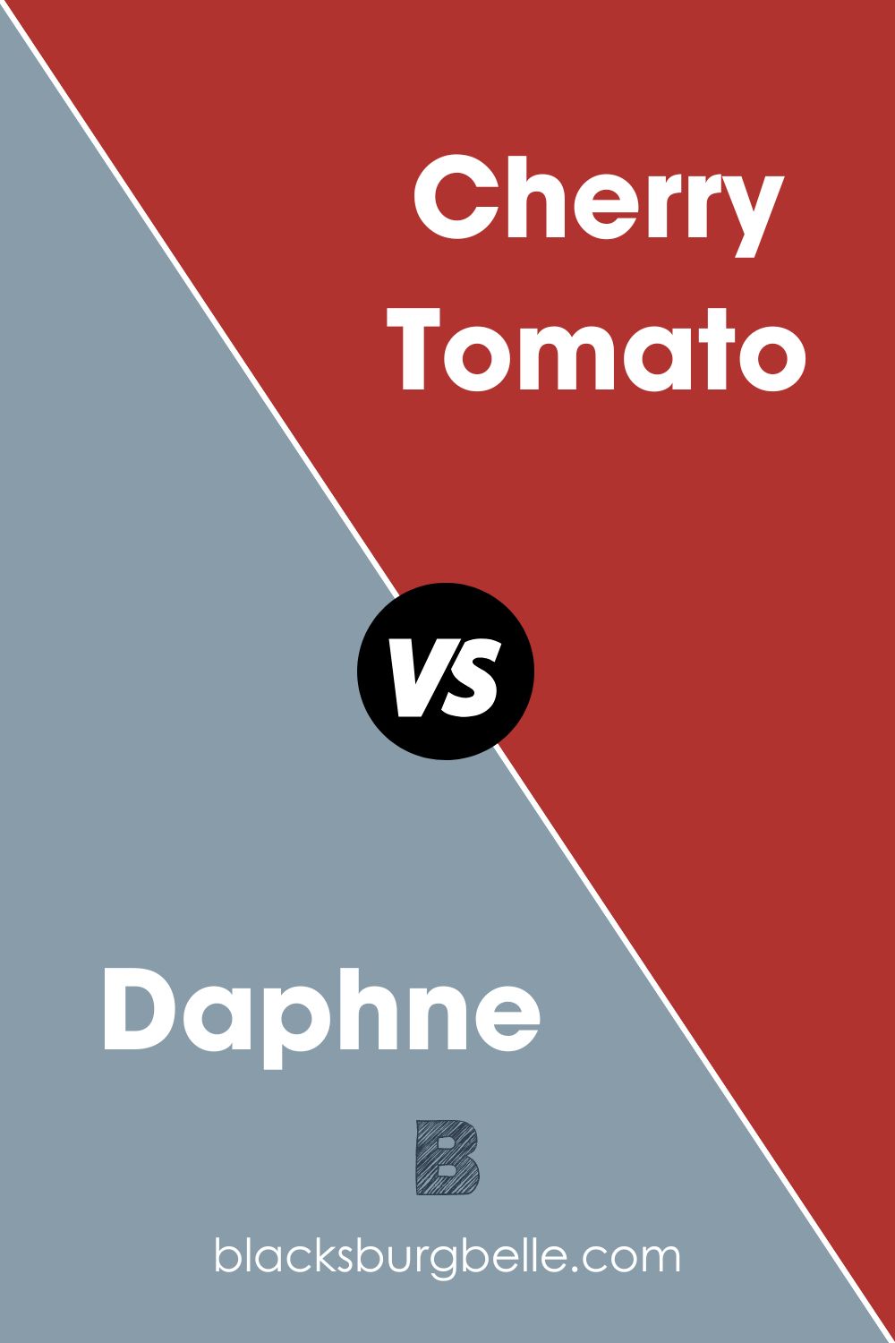
Sherwin Williams Cherry Tomato (SW 6864)
When you place red in the light blue room adorned by Daphne, red pops—you can pair Daphne with Cherry Tomato in your bedrooms or bathrooms to create that much-needed comforting atmosphere.
Cherry Tomato boasts a light reflective value of 12. Compared to Sherwin Williams Daphne, with an LRV of 32, Cherry Tomato reflects 20% less light. Therefore, if you pair these colors in a dark room, they may look bland. However, put these colors in a room with enough light—or a south-facing room—and you will enjoy the balancing effect that the Cherry Red warmth brings to the cool of Daphne.
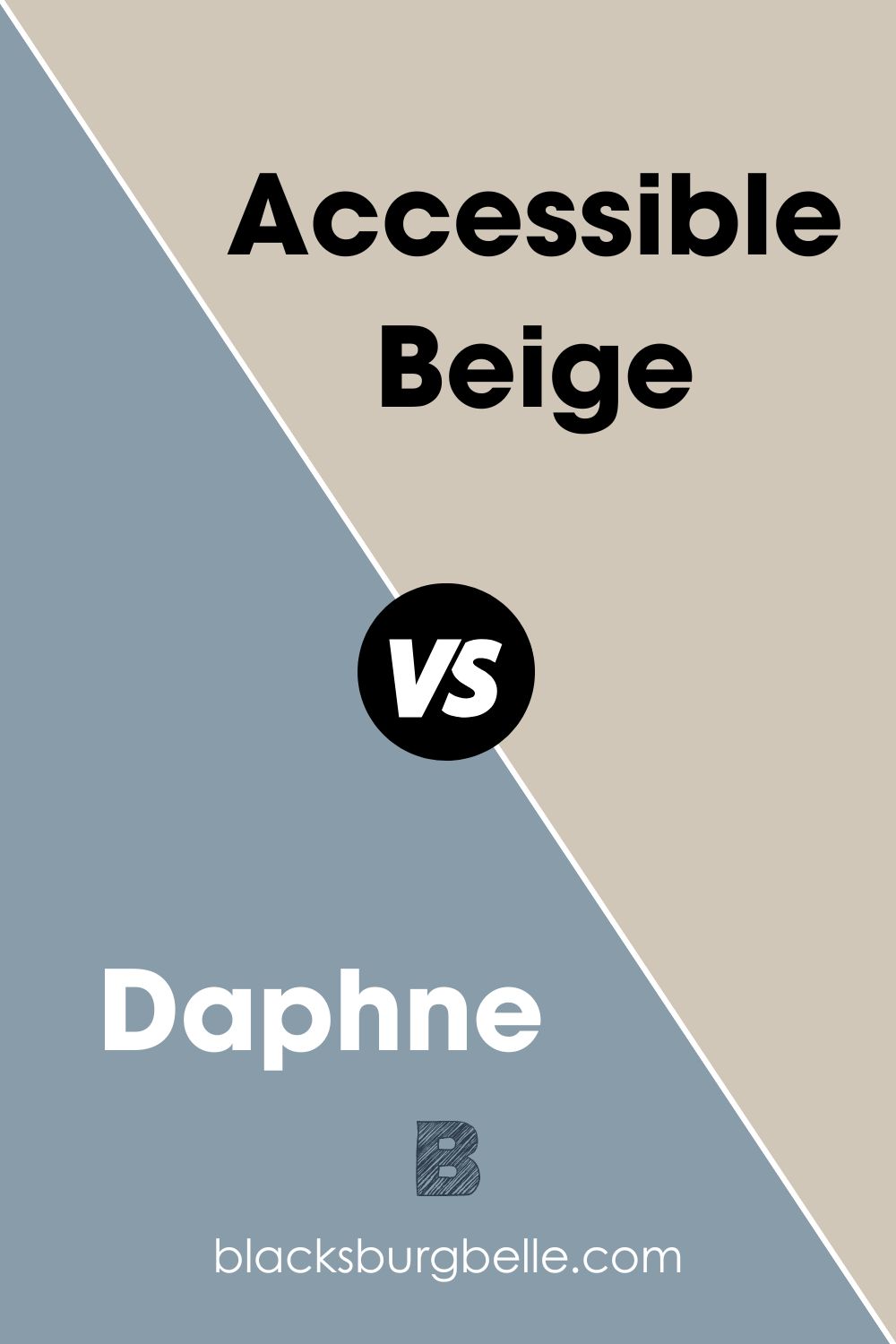
Sherwin Williams Accessible Beige (SW 7036)
In neutral rooms, adding a dose of blue creates an added personality layer. An amount of neutral could keep your blue from becoming too loud in a room adorned with Daphne.
As a beige color, Accessible Beige is warm paint color. When you pair it with Sherwin Williams, you create a situation where the two colors balance each other—Accessible Beige is warm, while Daphne leans on the cooler side.
With an LRV of 58, Accessible Beige can reflect more than half of the light you shine. In a dark-lit room where you have used the less reflective Daphne, you may be able to create interest with Accessible Beige.
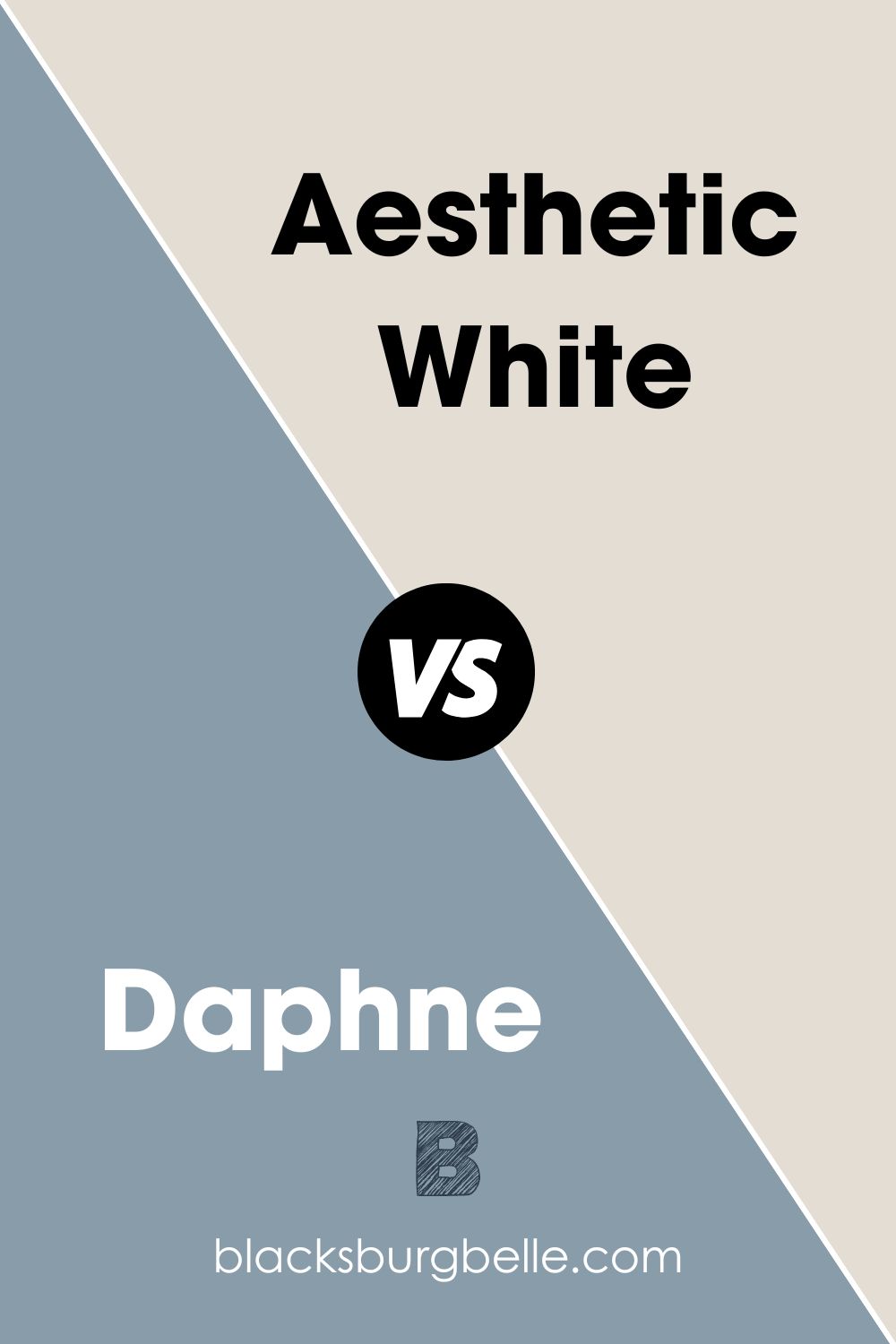
Sherwin Williams Aesthetic White (SW 7035)
If you want to use Daphne SW 9151 in a dark room, you can always pair it with Aesthetic White to brighten the room. Aesthetic white boasts an LRV of 73—sitting in the off-white range; this color is a white that does not overwhelm the space.
At heart, this color is warm. This makes it a perfect color for pairing with Daphne for rooms with cold colors—it will allow you to balance the two colors.
Like other white colors, Sherwin Williams Aesthetic White is exceptionally susceptible to picking colors and reflections from everything in its surroundings. Since it has no strong undertones, you may find it picking the blue in Daphne.
Sherwin Williams Daphne Complementary Color
If your goal is to create the most significant contrast in your room by pairing Daphne with a complementary color, you may want to use Pastel Brown. If you mix Daphne and Pastel Brown, the two colors will cancel each other’s hue, producing a grayscale color like black or white.
Pastel Brown has a hex value of #766355. On the RGB scale, the color combines red: 118, green: 99, and blue: 85. On the CMYK scale, Pastel Brown boasts a combination of cyan: 0 percent, magenta: 16.1%, yellow: 28%, and key (black): 53.7%. Pastel Brown boasts a light reflective value of 13.7%, meaning it is less reflective than its complementary color Daphne.
What Trim Colors Go with Sherwin Williams Daphne SW 9151
Sherwin Williams Daphne is a very versatile color when it comes to trims. However, my most popular colors when I am working with Daphne SW 9151 include:
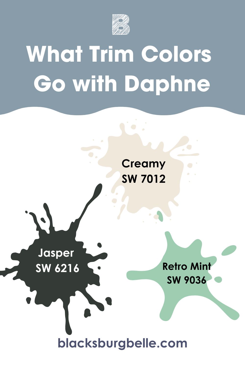
Sherwin Williams Creamy SW 7012
It’s impossible to go wrong with a blue & white color scheme. However, instead of going for the cool white, you can opt for creams—in this case, the Sherwin Williams Creamy SW 7012 will be an ideal fit.
With a light reflective value of 81, Creamy SW 7012 can create interest in a dark room where you have used Daphne SW 9151 and the light is not enough. The creamy color will catch the eyes and then redirect this attention to the cool Daphne. Creamy combines red: 239, green: 232, and blue: 219.
Sherwin Williams Jasper SW 6216
When you want to avoid overpowering the room with blue but want it to enjoy some attention, you can have green color as the trim. In this case, the light blue color in Daphne will still stand on its own but will share the spotlight with a bolder hue.
Jasper might be a perfect color when looking for a shade of green to trim in a light blue room. Jasper, however, is a more blackish color—this means it may take a black appearance in a room with low light.
Suppose you would like to avoid the bland appearance of black, pair Sherwin Williams Daphne and Jasper in a lighted room. This will offer you the most benefits from Jasper with an LRV of 4 and Daphne with an LRV of 32.
Sherwin Williams Retro Mint SW 9036
Blue works well with green. Mint green, in this case, brings that invigorating fresh mood.
Sherwin Williams Retro Mint SW 9036 has a light reflective value of 54. It reflects 22% more light than Daphne SW 9151—for this reason, if you were to use Daphne and Retro Mint in a dark room, you would create a balanced light appearance.
Both colors are cool. They may be ideal for balancing the warmth in south-facing rooms. The two colors in a north-facing room could make them seem too cold.
Sherwin Williams Daphne Benjamin Moore Version
Franklin Lakes is the closest color to Sherwin Williams Daphne SW 9151, produced by Benjamin Moore. On the RGB scale, Franklin Lakes boasts red: 132, green: 160, and blue: 171.
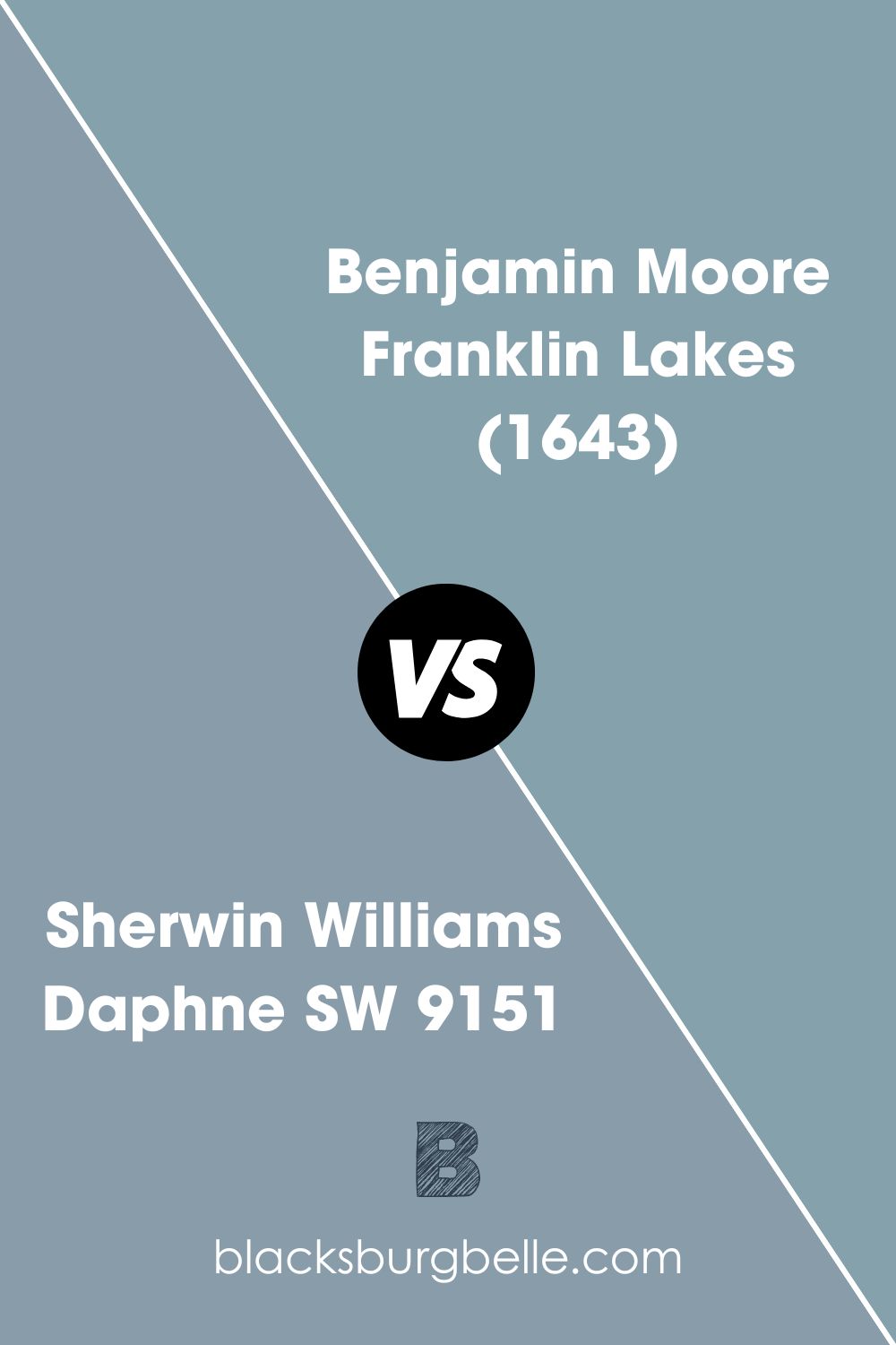
A sophisticated shade, this muted blue boasts a gentle cast of gray. The color has an LRV of 33%, which almost matches Daphne’s light reflectance value of 32%.
How Does Light Affect Sherwin Williams Daphne?
A north-facing room will let in a softer light, producing a warm effect in Sherwin Williams Daphne. Moreover, since the color is a bit light in its blue color, it will look slightly saturated.
South facing room will have more intense light, bringing out the cool undertones in Sherwin Williams Daphne. Since the color does not have a high light reflective value, it will not make the room look too washed out.
Luckily for you, if you use the proper artificial lighting, you will find it easy to control the hues in your Sherwin Williams Daphne at any time of the day, regardless of the natural light.
Best Rooms to Paint Sherwin Williams Daphne SW 9151
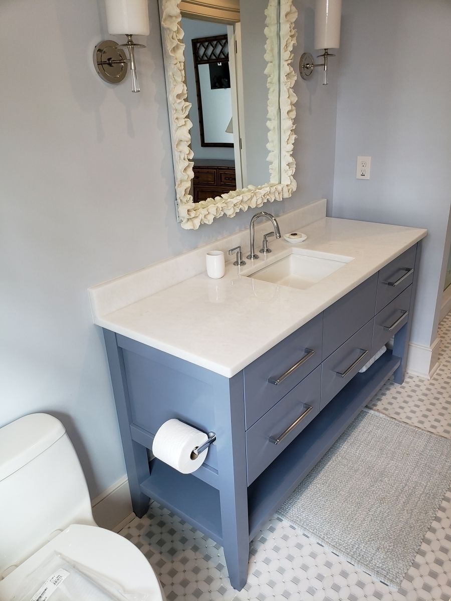
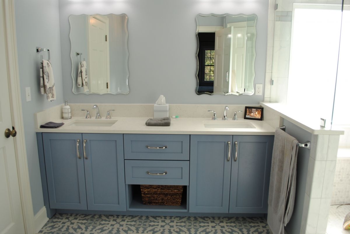
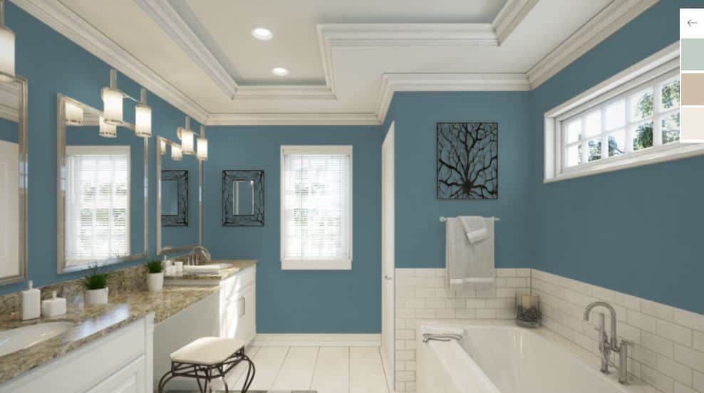
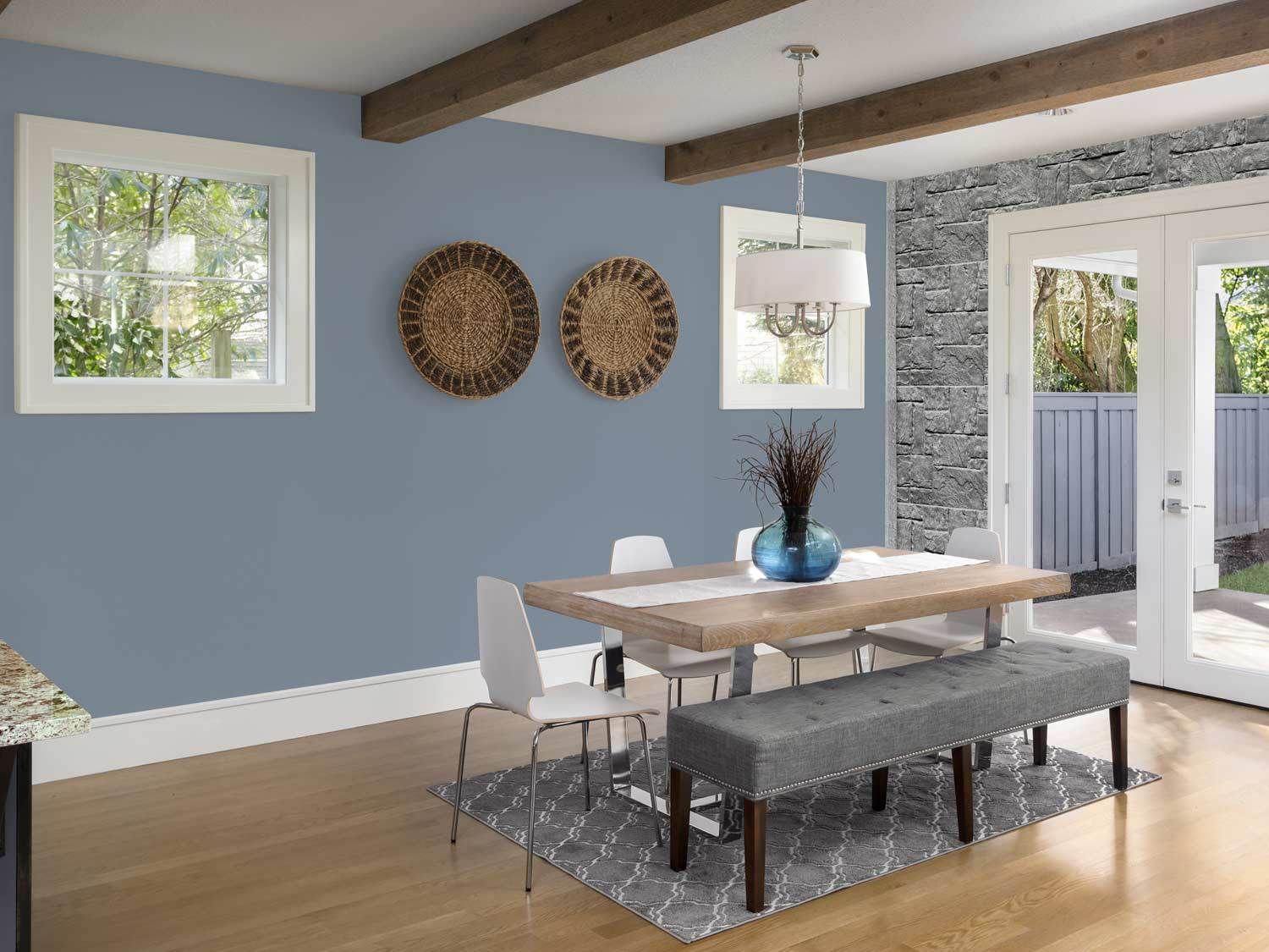
Sherwin Williams Daphne in Bathroom
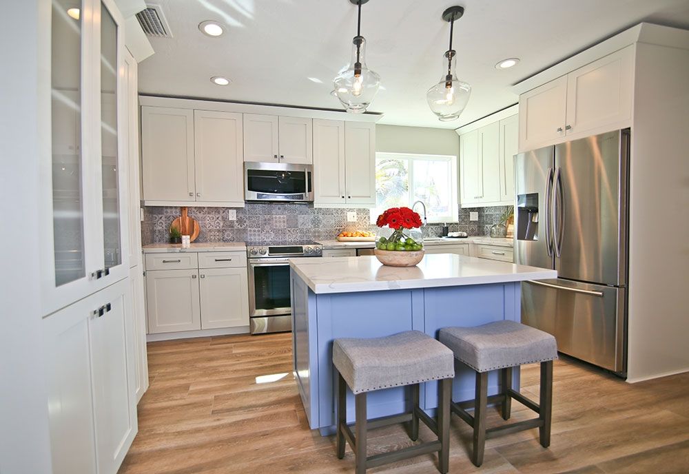
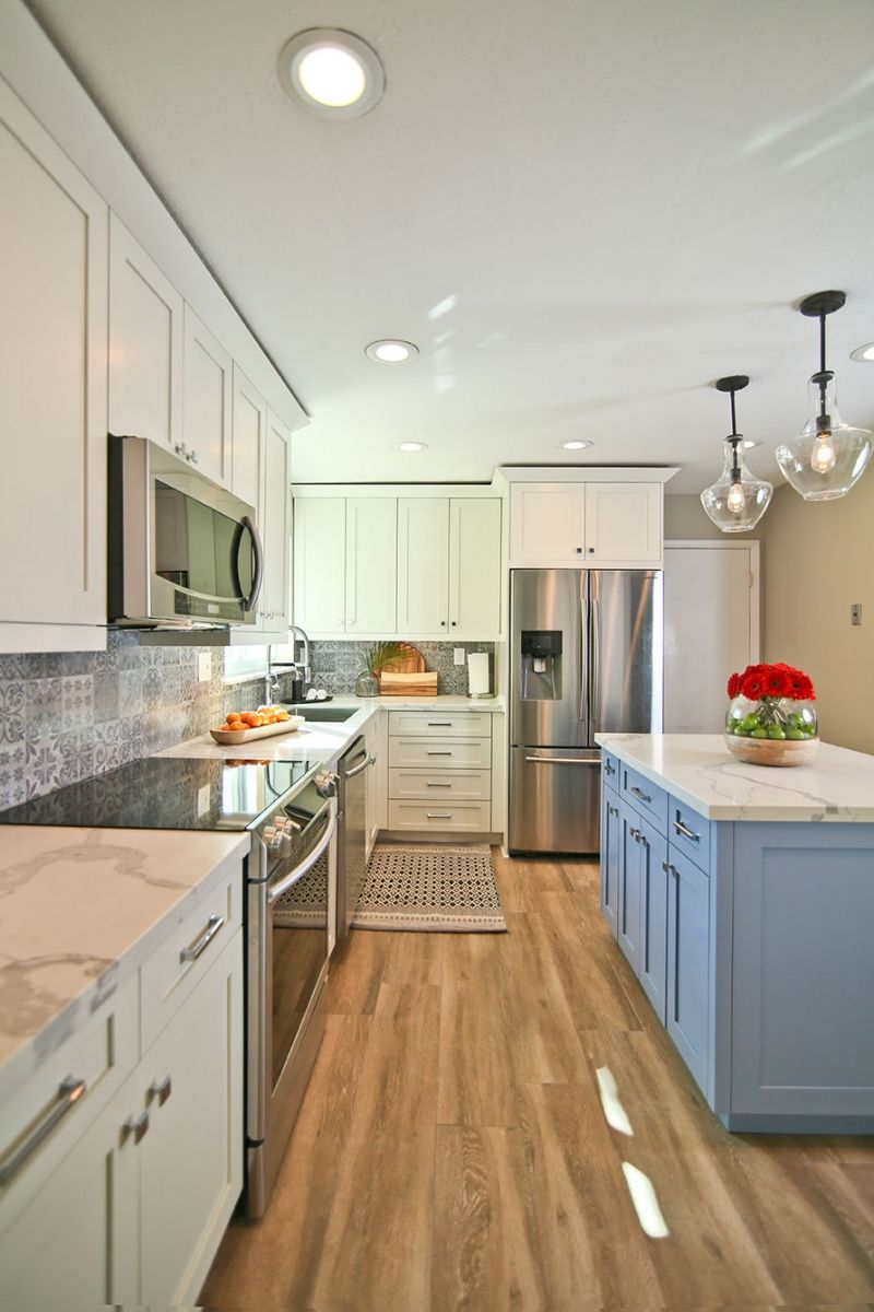
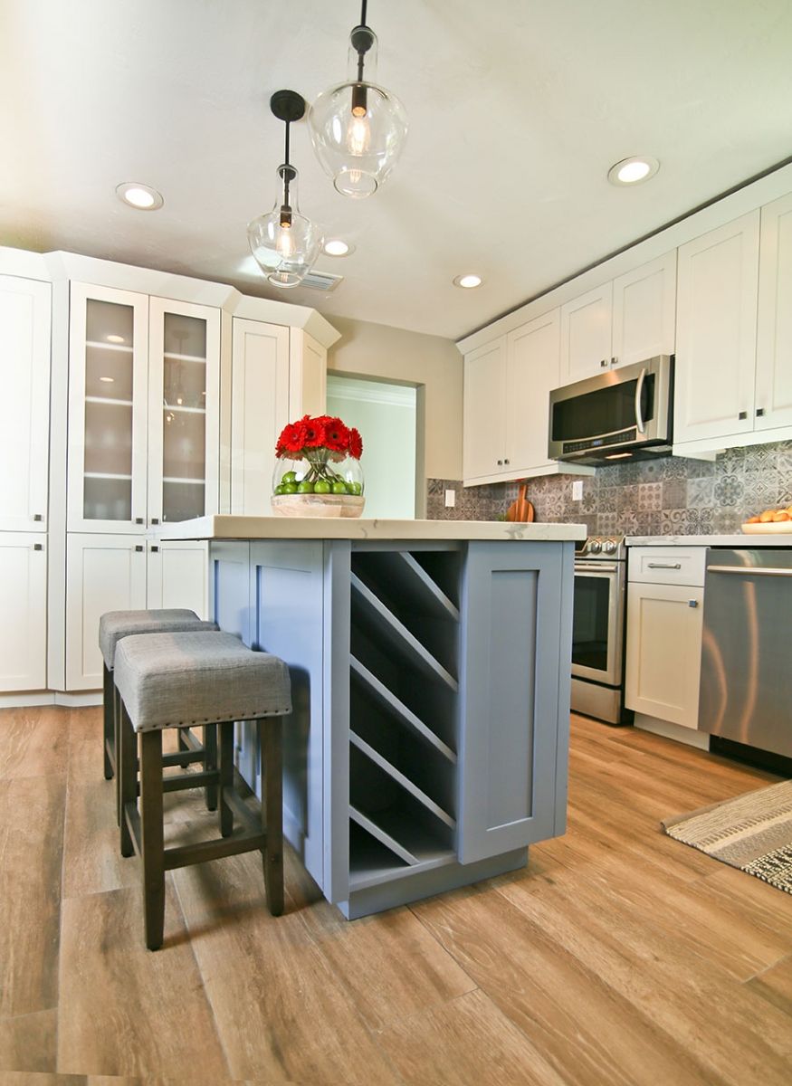
Sherwin Williams Daphne in Kitchen
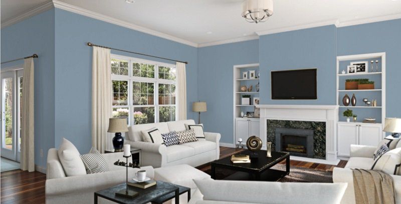
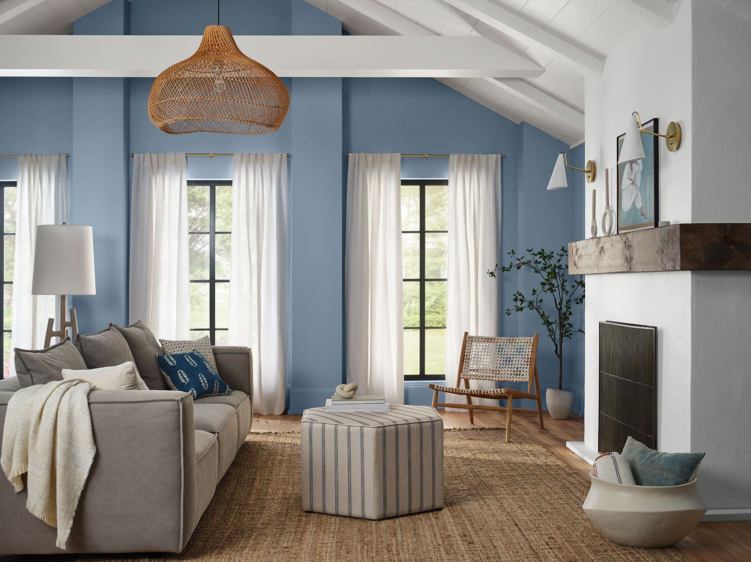
Sherwin Williams Daphne Living Room
Overview
In a bustling world, you must designate a place in your home where you can relax and unwind. Color is a significant determinant of how resting a space feels. Luckily for you, a perfect blend of blue and gray allows you to establish a calm atmosphere for reading, writing, or relaxing.
If you are worried that you have to mix blue and gray, you do not have to. Sherwin Williams has already done that for you, producing Daphne SW 9151. This light blue color adds an uncommon coolness to your rooms. However, if you want to add warmth, Daphne is so versatile that it allows you to pair it with your favorite warm colors.
Daphne is not highly reflective. With an LRV of 32, this color may not perform well in a dark room. Therefore, this color will perform well in a south-facing room.
We hope this guide has answered your questions about Sherwin Williams Daphne SW 9151. If there is a question we did not answer to your satisfaction, be sure to let us know in the comments.
 Sherwin Williams White Duck (Palette, Coordinating & Inspirations)
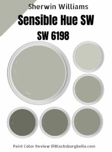 Sherwin Williams Sensible Hue (Palette, Coordinating & Inspirations)
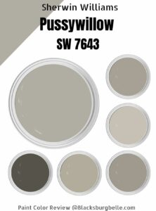 Sherwin-Williams Pussywillow (Palette, Coordinating & Inspirations)
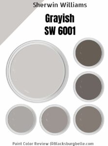 Sherwin-Williams Grayish (Palette, Coordinating & Inspirations)
 Sherwin Williams Dried Thyme (Palette, Coordinating & Inspirations)
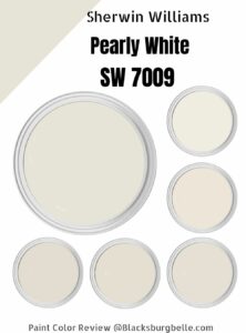 Sherwin Williams Pearly White (Palette, Coordinating & Inspirations)
