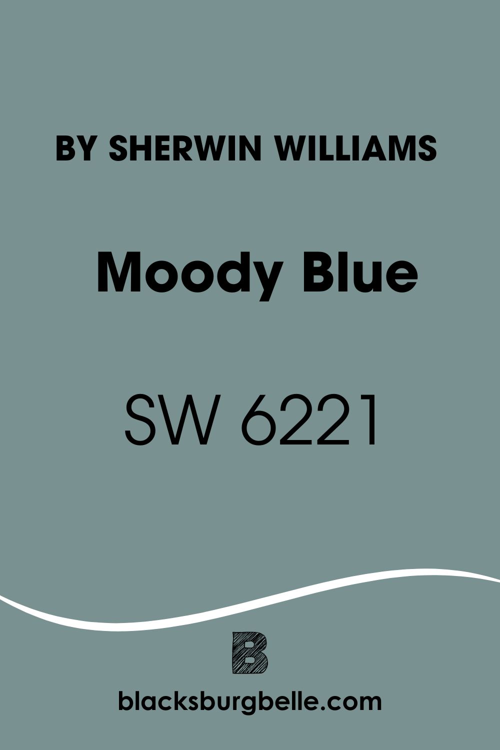
When you hear the color blue, you probably think of something calm and relaxing. Now, we’ve got a paint color named Moody Blue. What does it look like? What sort of vibe does it bring? Is it any different from the average blue paint color?
These questions and a bit of curiosity made me check out. Now that I understand the color, I can say I’ve got you covered!
Sherwin Williams Moody Blue combines subtlety and elusiveness to give a uniquely calming effect. The paint color is notable for its separate interpretation of the color blue in a space. If you enjoy using something unique and adaptable, here’s a color for you.
I have put together a comprehensive review of Sherwin Williams Moody Blue. Continue reading to discover its undertones, appearances, unique properties, and much more.
Table of Contents
When to Choose Sherwin Williams Moody Blue (SW 6221)
It is one thing to know a paint color and its properties, it’s another thing to know the right time to pick it. Fortunately, I’ve checked out Sherwin Williams Moody Blue and examined several pictures. I’ve got you covered.
Want cool vibes with depth?
Moody Blue is a cool paint color with an LRV of 27. This gives it enough depth to meet this criterion. It works well on interior and exterior walls.
Abundant light?
Good lighting allows Moody Blue to express itself well. Poor lighting gives the paint color its unique name by making it look moody.
Comfortable with blue and green tones?
Moody Blue is a blend of blue, green, and gray tones. Depending on color pairings and lighting, it can subtly shift between blue and green.
Want something that works on cabinets too?
Sherwin Williams Moody Blue works as well on woodwork as it does on walls. You can use it on kitchen cabinets or even window shutters.
What Color is Sherwin Williams Moody Blue?
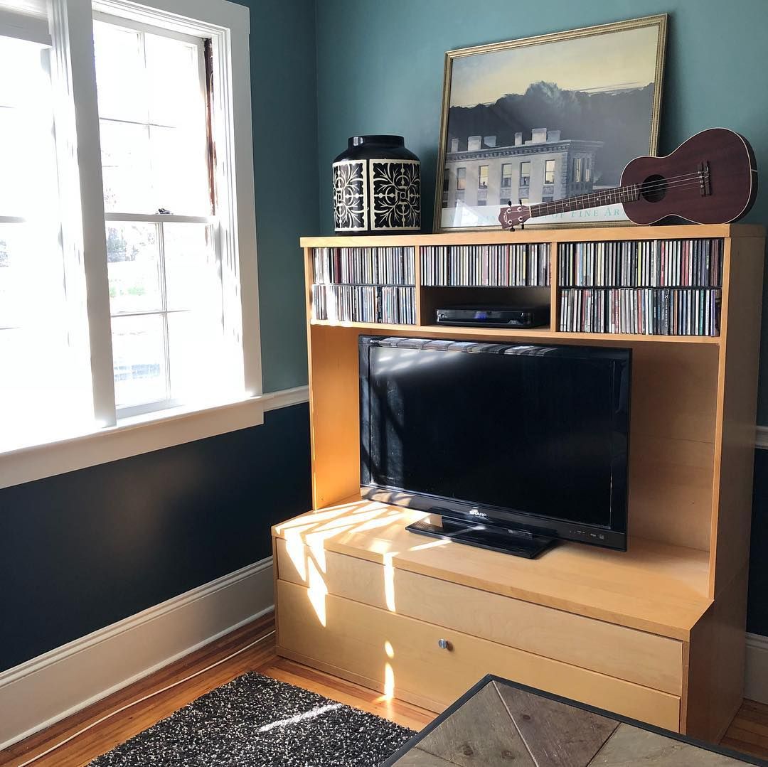
Moody Blue is a medium to dark-toned blue paint color with interesting undertones. As its name implies, the color can give a cool but moody vibe. While this sounds like something off-putting, it actually has its moments.
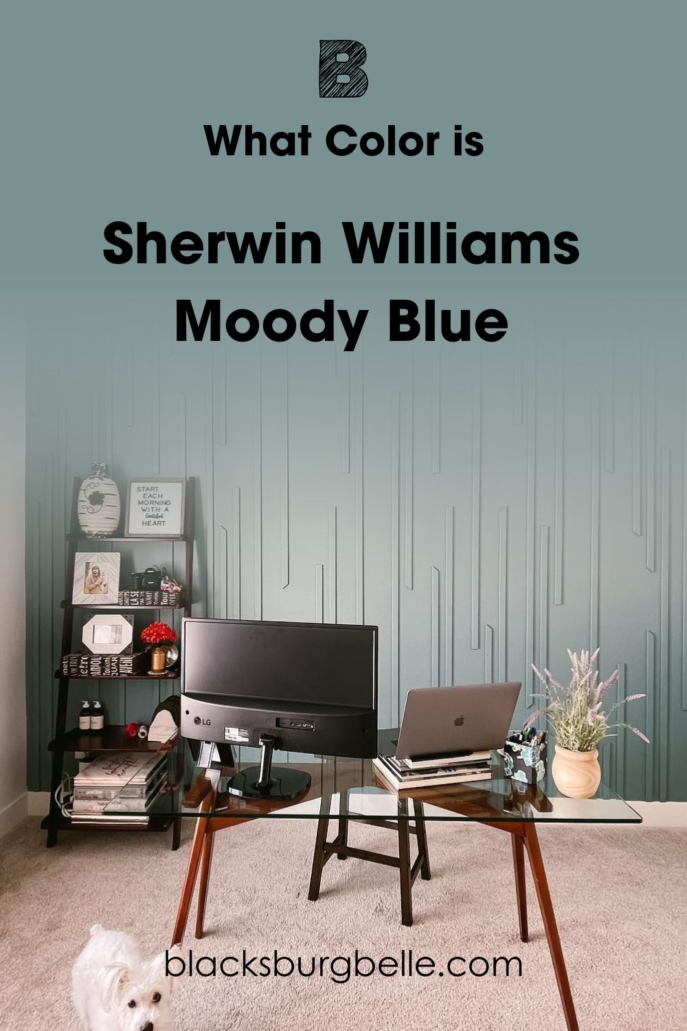
With a look that can alternate between green and blue, Mood Blue can be a sort of chameleon in some spaces. Sherwin Williams calls it an elusive blue, but I see it more like a 2-in-1 paint color. You can use it to your advantage once you understand when it shows green or blue.
Snapshot of Moody Blue Specifications
Here is a table that shows Moody Blue’s specifications. This information makes up the core of the paint color’s personality.
| Specifications | Moody Blue |
| RGB | 122 / 145 / 146 |
| HEX Value | #7A9192 |
| LRV | 27 |
| Undertones | Strong Green and Subtle Gray |
The LRV of Moody Blue
A paint color’s LRV refers to its Light Reflectance Value. It shows how much light the color reflects by measuring it on a scale of 0 – 100. 0 represents true black, meaning that darker colors have lower values. The opposite is the case for true white(which has an LRV of 100) and brighter colors with higher values.
Sherwin Williams Moody Blue has an LRV of 27. This means that the paint color falls in the medium to dark range on the scale. As such, Moody Blue performs poorly in spaces with little/limited lighting.
You should use the unique blue paint color in well-lit areas. This will bring out its tones and help it hit its full potential. However, you can pair it with a much brighter color to make it a bit more viable in dim space. But you will miss out on its lovely undertones.
Undertones of Moody Blue
Sherwin Williams Moody Blue’s undertones are the main reason behind its uniqueness. While some undertones show up sometimes, you will almost always be able to discern Mood Blue’s undertones. But what are they?
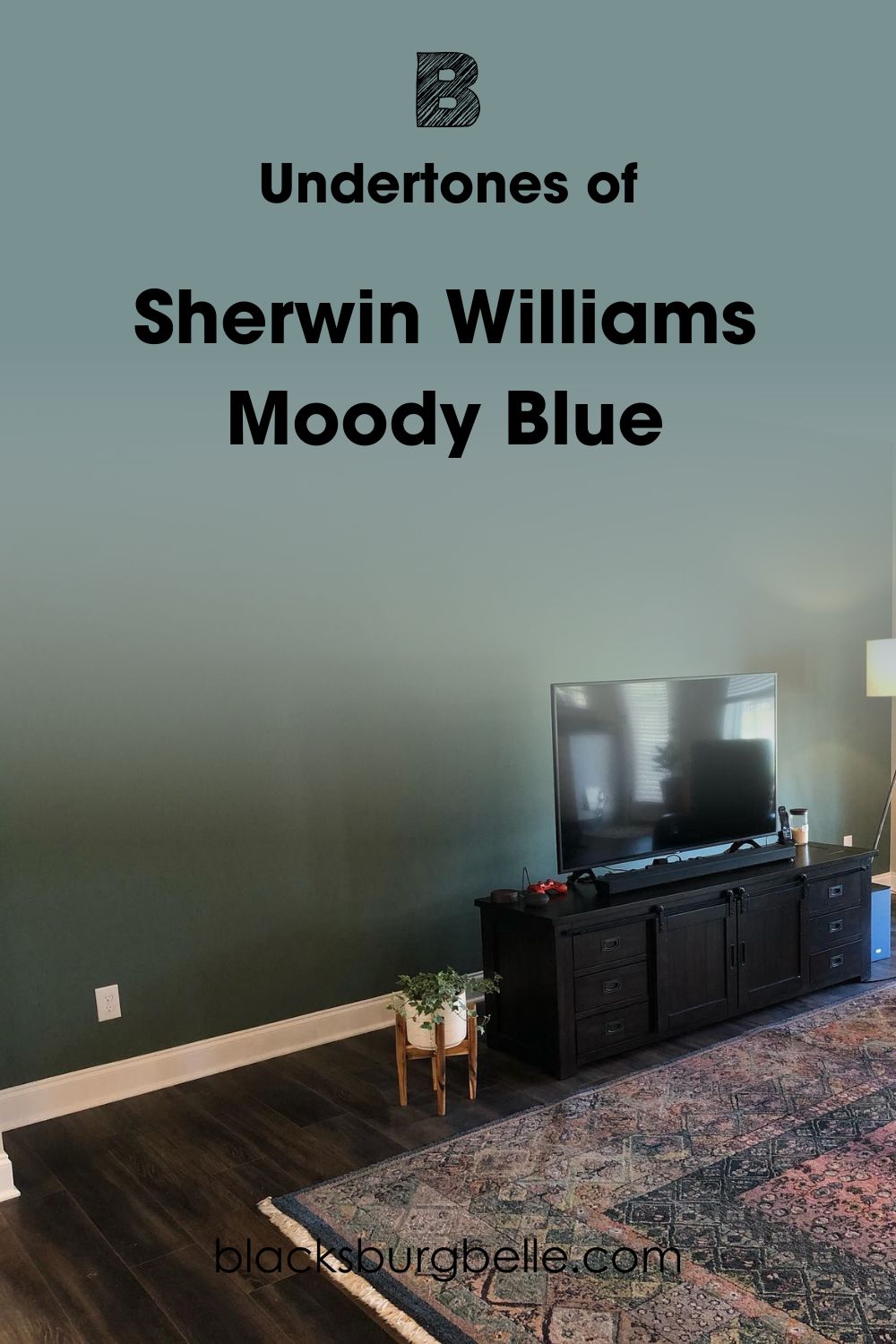
Moody Blue has strong green undertones and subtle gray too. Its green tones have enough intensity to sometimes make it look like a green paint color. Fortunately, Moody Blue’s gray undertones prevent it from looking totally overwhelming in spaces.
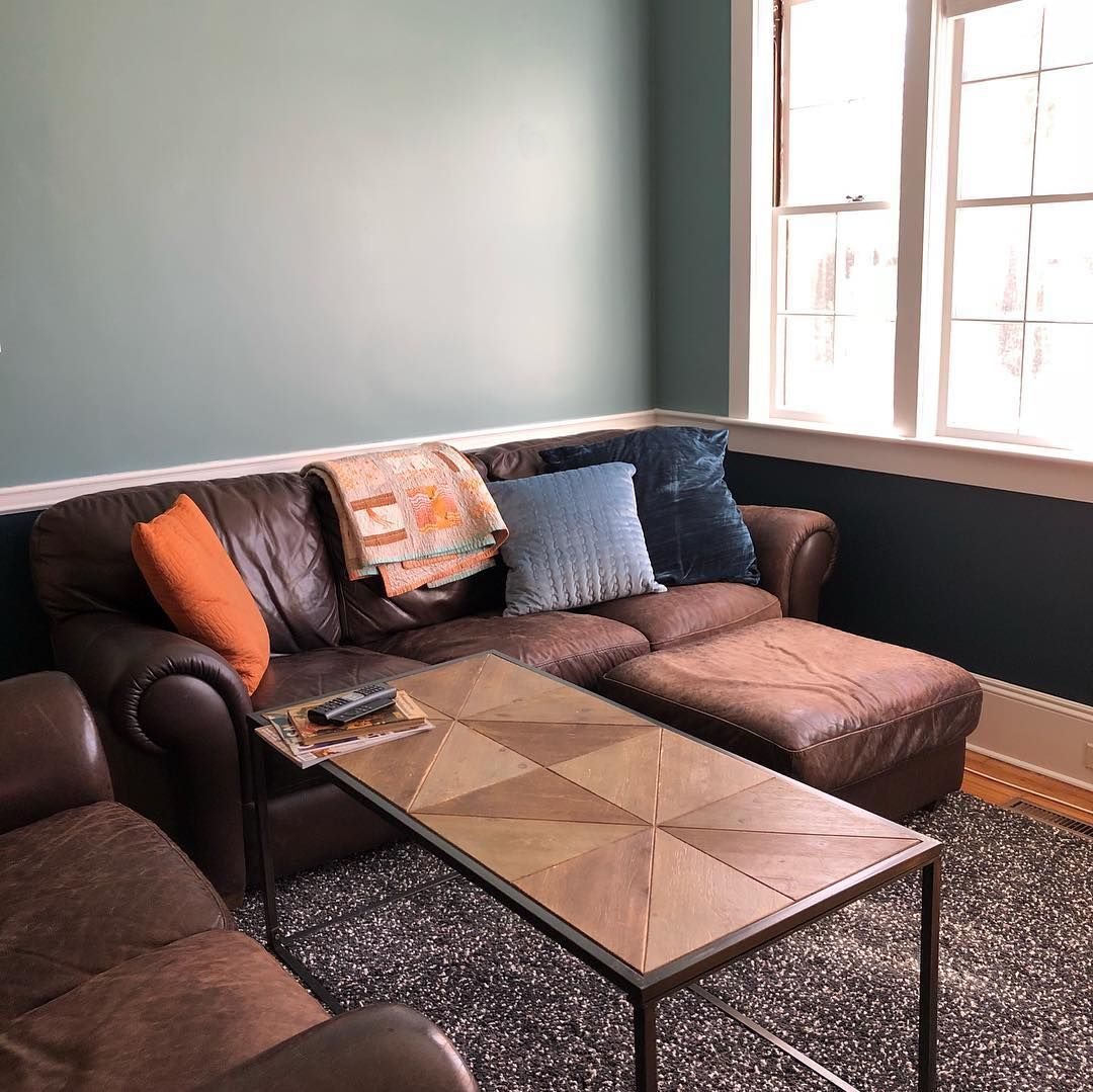
Note that factors like lighting and color pairings play a huge role in determining how the paint color will turn out. Incandescent lighting strengthens its green while cool lighting brings out more of the blue.
Does Moody Blue have Warm Undertones?
No, Sherwin Williams Moody Blue has cool green undertones. Its subtle gray remains neutral and does little to influence its reading.
Will Moody Blue Actually Look Moody on My Walls?
Sherwin Williams Moody Blue will only look gloomy or moody in dark spaces. If you use it on your walls, ensure that you have abundant lighting in the area. This way, the paint color will look more like a calm, ‘shape-shifting’ blue instead.
Is Moody Blue a Warm or Cool Color?
Sherwin Williams Moody Blue is a cool paint color. Generally, blue falls on the cool side of the wheel. Since that is its main tone, the paint color reads cool in any space. Fortunately, it has enough depth to never look icy or cold, even in bright, cool lights.
Also, Moody Blue has green undertones that read cool. They contribute to its overall feel, giving your space a soft, cool touch that feels welcoming. If you are wondering, the result remains the same even if you use the paint color on furniture or doors.
Note that Moody Blue will read cool regardless of whether its blue or green is stronger at that moment.
Sherwin Williams Moody Blue Color Strip: Lighter or Darker Exploration
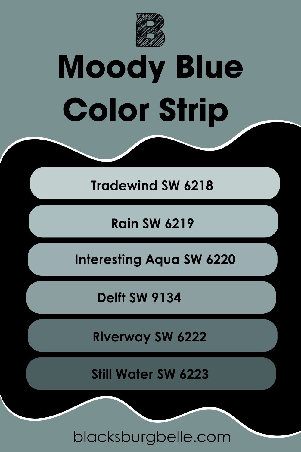
Just like most other colors, Moody Blue has a color strip that consists of six other colors. Although these guys share similar tones, they have differing LRVs, shades, and sometimes undertones.
What I like most about color strips is their ability to form a monochromatic palette when paired together. Let’s check out the members of Moody Blue’s color strip from the brightest to deepest.
- Sherwin Williams Tradewind SW 6218
- Sherwin Williams Rain SW 6219
- Sherwin Williams Interesting Aqua SW 6220
- Sherwin Williams Delft SW 9134
- Sherwin Williams Riverway SW 6222
- Sherwin Williams Still Water SW 6223
The above list shows that Moody Blue belongs to the same color strip as some popular blue colors from the brand. Paint colors like SW Tradewind and Riverway are the most notable on this strip.
However, none of them have the subtle chameleon-like attribute of Moody Blue.
Moody Blue Complementary Color
Complementary colors provide a way to make your color look brighter and better in any space. Generally, it’s important to know the colors that complement your main color. Like my other reviews, I’ve covered you for Sherwin Williams Moody Blue.
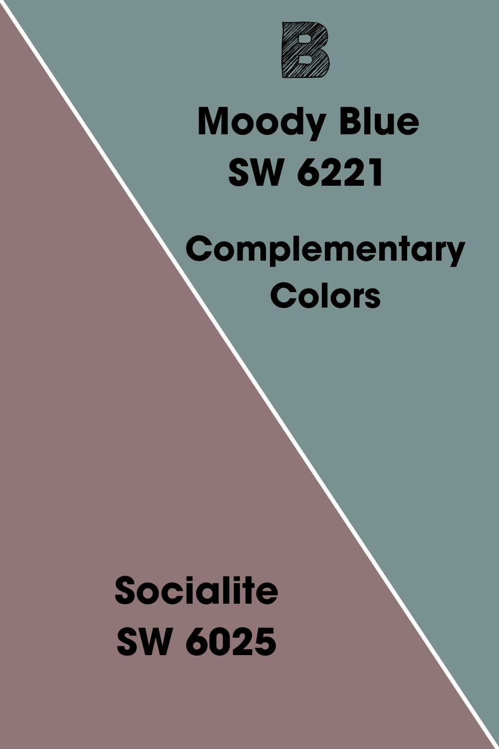
Moody Blue’s complementary color is Sherwin Williams Socialite.
Sherwin Williams Socialite SW 6025
Socialite is a dark blend of red and brown with an LRV of 20. The paint color reads warm in any space and has a good depth of color. If you are wondering, SW Socialite has stronger red tones compared to its brown.
However, this doesn’t mean that you won’t easily spot the brown. Socialite feels a bit light-hearted on walls and gives a sort of energetic warmth. But you will only get the best of it in spaces with abundant lighting.
While the paint color is more popular in bedrooms, it does well in both interior and exterior spaces.
Sherwin Williams Moody Blue (SW 6221) Coordinating Colors
While colors can have just one complement, they can have multiple coordinating colors. These colors pair excellently with the paint colors and each other too. So much so that they can form an amazing palette if you combine them.
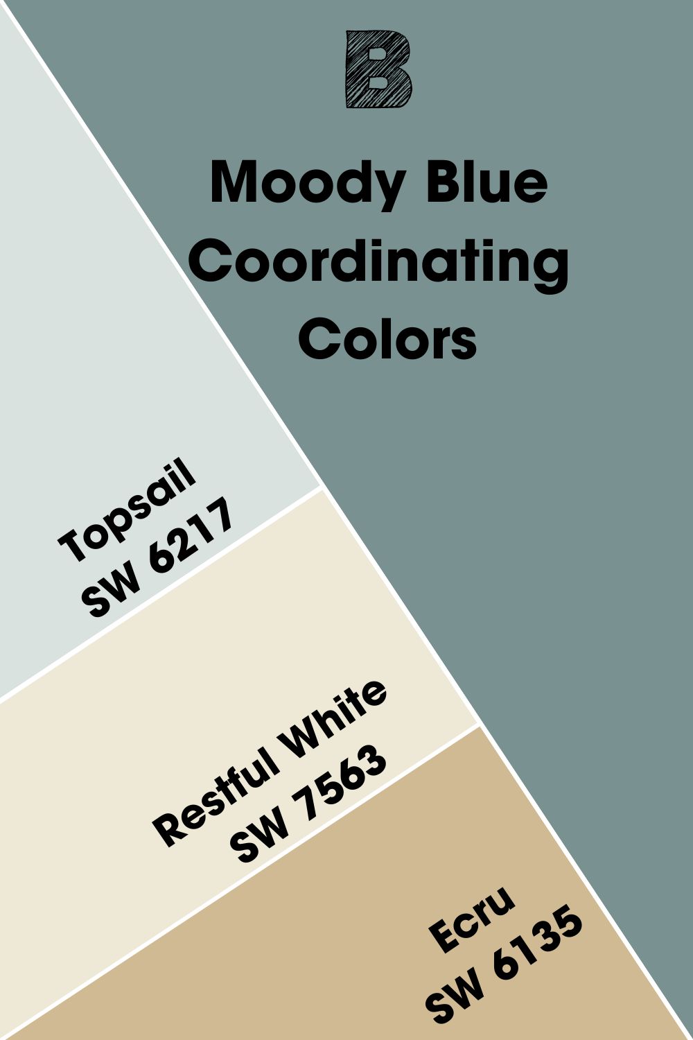
Moody Blue’s coordinating colors include the following:
- Sherwin Williams Topsail SW 6217: This bright sky blue paint color brings an airy and cool vibe to any space. It has an LRV of 75 and is quite popular in areas like bedrooms and nurseries. Topsail fits perfectly into relaxing palettes like spa-inspired ones.
- Sherwin Williams Restful White SW 7563: Restful white is a warm, cozy paint color with soft yellow undertones. It gives a balanced look with Moody Blue. Both paint colors have soothing vibes that make them wonderful in spaces like bedrooms and living rooms. Restive White has wonderful summer vibes too.
- Sherwin Williams Ecru SW 6135: Ecru is a golden shade of yellow with an LRV of 51. It has warm, cozy vibes with more depth than Restful White.
Sherwin Williams Moody Blue Color Palette
Despite its name, Sherwin Williams Moody Blue gives amazing results when used with the right colors. The following are examples of palettes that you can use or adapt depending on your preference.
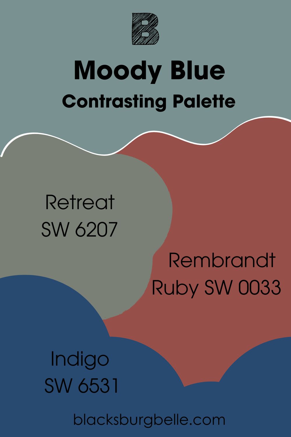
Contrasting Palette
- Retreat SW 6207: This paint color is perfect for a refreshing feel with nature tones. Sherwin Williams Retreat has blue and gray undertones that go with Moody Blue. The muted green adds a touch of the forest to this palette.
- Rembrandt Ruby SW 0033: This dark red brings a splash of color to the palette and any space. It belongs to the Historic Color Collection and can look timeless in a home. Rembrandt Ruby pairs nicely with Moody Blue for a colorful look. It cheers up the mood.
- Indigo SW 6531: Sherwin Williams Indigo is a deep violet with a beautiful look. It has strong blue undertones that make most people call it blue. Indigo works well on walls and cabinets, thanks to it depth. You can also flex it on window shutter if you are aiming for a colorful look.
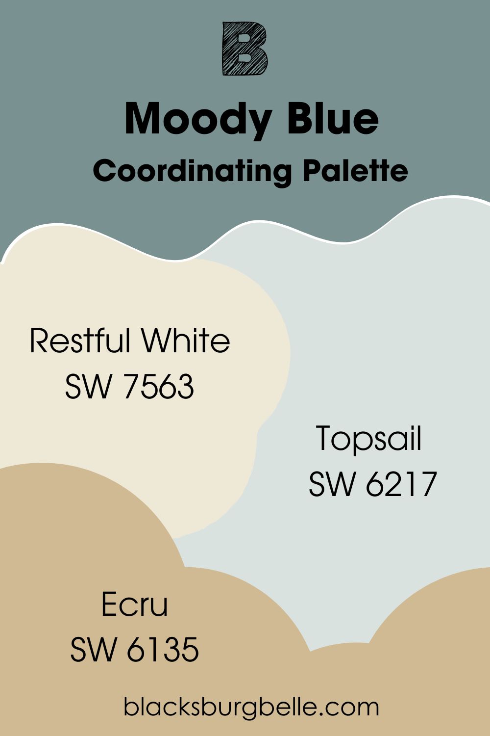
Coordinating Palette
- Restful White SW 7563: One of the two cozy colors in this palette. Sherwin Williams Restful White has soft yellow undertones and an LRV of 81, which gives it a bright look. The paint color has a relaxing feel that makes it a good choice for almost any space in a home.
- Topsail SW 6217: Topsail is the most popular member of this palette. The bright, light-hearted blue has an elegant look that fits well into summer vibes. Little wonder why it’s quite popular for beachy decor.
- Ecru SW 6135: Ecru is the second cozy color in this palette. It is a yellow paint color with strong tan tones. While most people that use Ecru flex it on walls, the paint colors also works on cabinets.
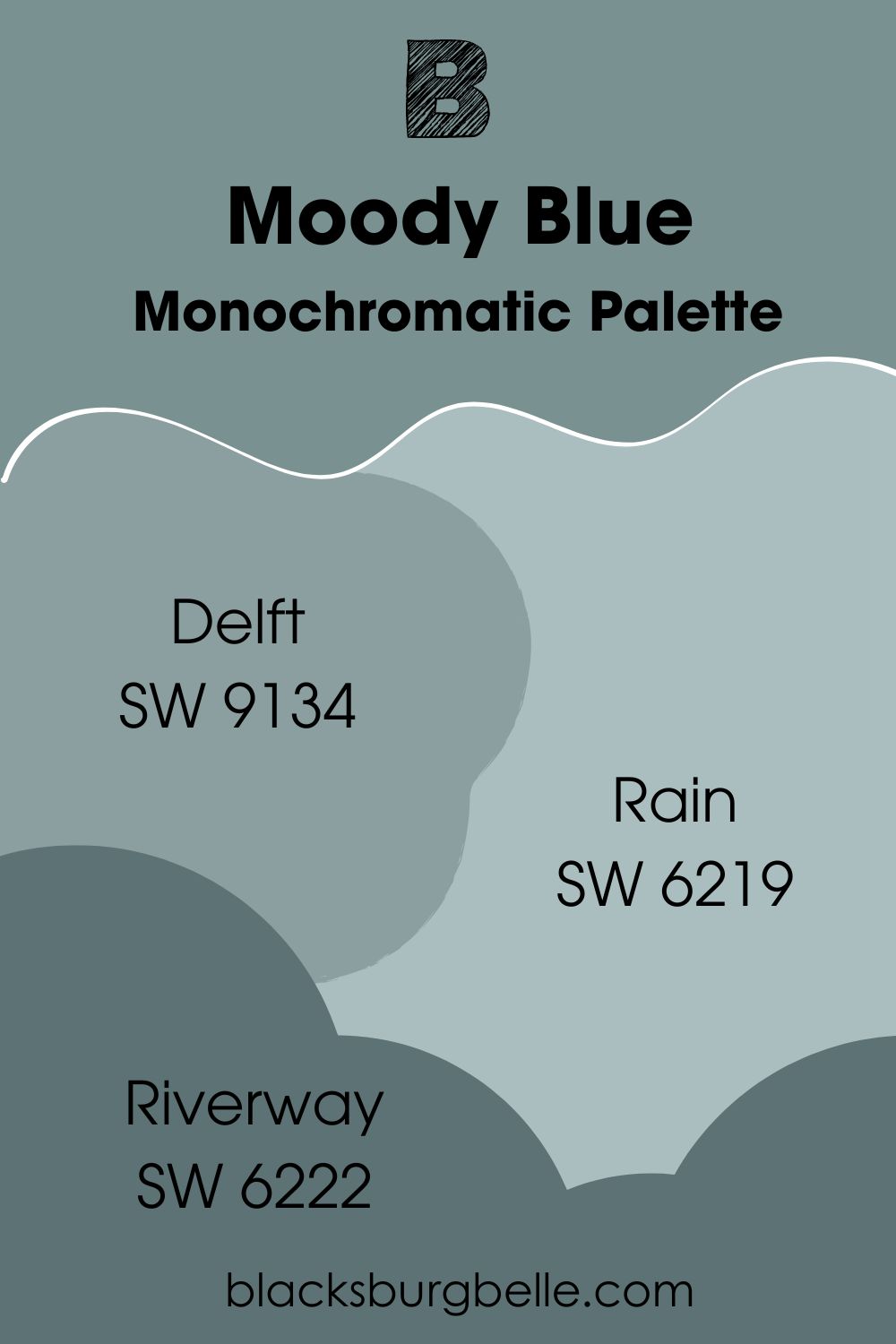
Monochromatic Palette
- Delft SW 9134: Delft feels more serene and a bit less gloomy than Moody Blue. It is a couple of shades brighter and has gray and green undertones too. The paint color has a way of looking cool without leaning all the way towards a chilly look.
- Rain SW 6219: Rain is a quite popular choice for spa vibes and palette. The airy blue brings peaceful and relaxing vibes to any space. It has an LRV of 49 with green and gray undertones giving it refreshing touch. You can also use it in spaces with limited lighting.
- Riverway SW 6222: Riverway brings extra complexity to this this palette. Although it is the deepest color here, it has a gentle feel. The paint color also has green and gray undertones, but a ‘filmy’ look.
Sherwin Williams Moody Blue vs. Other Paint Colors
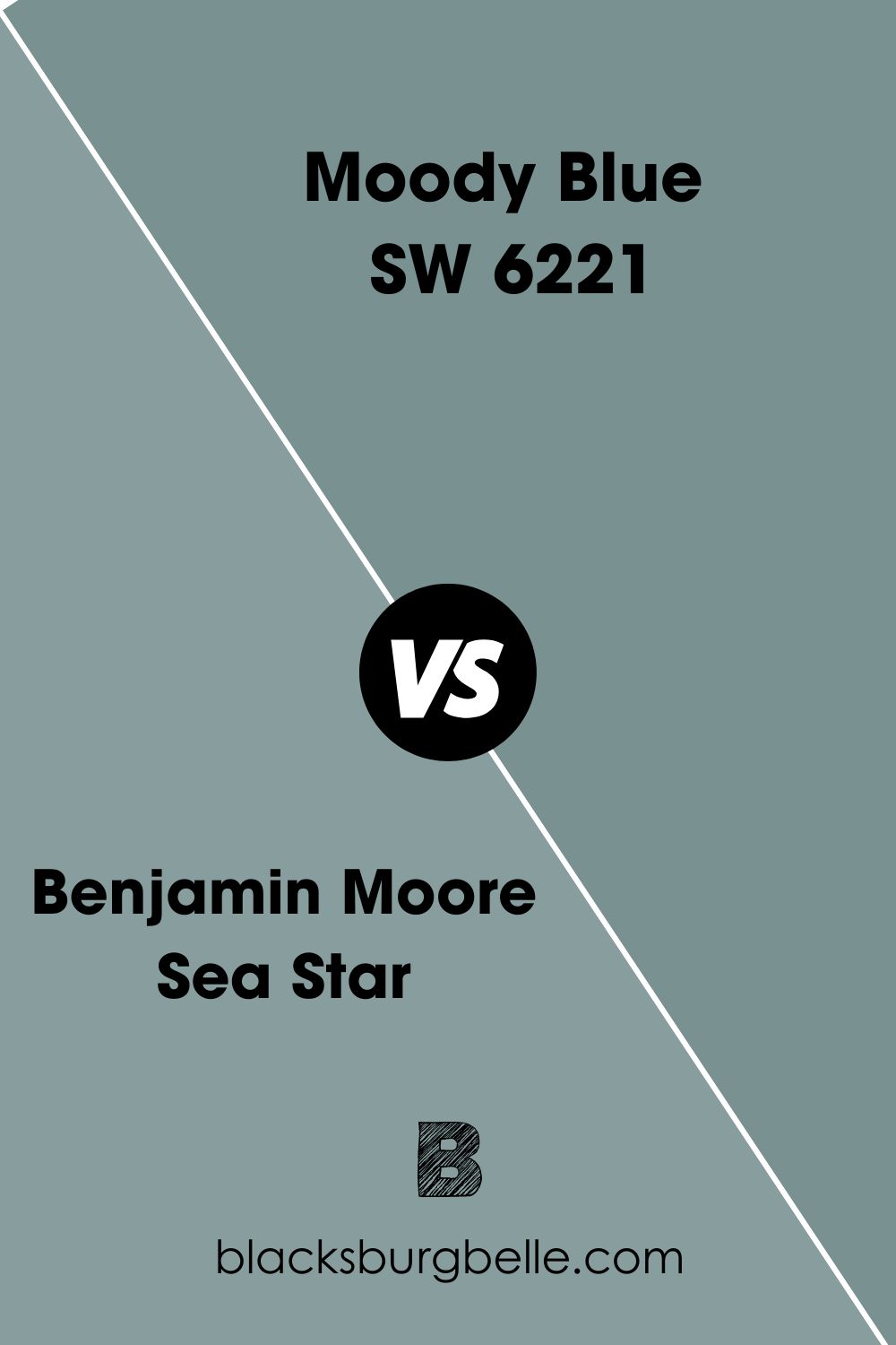
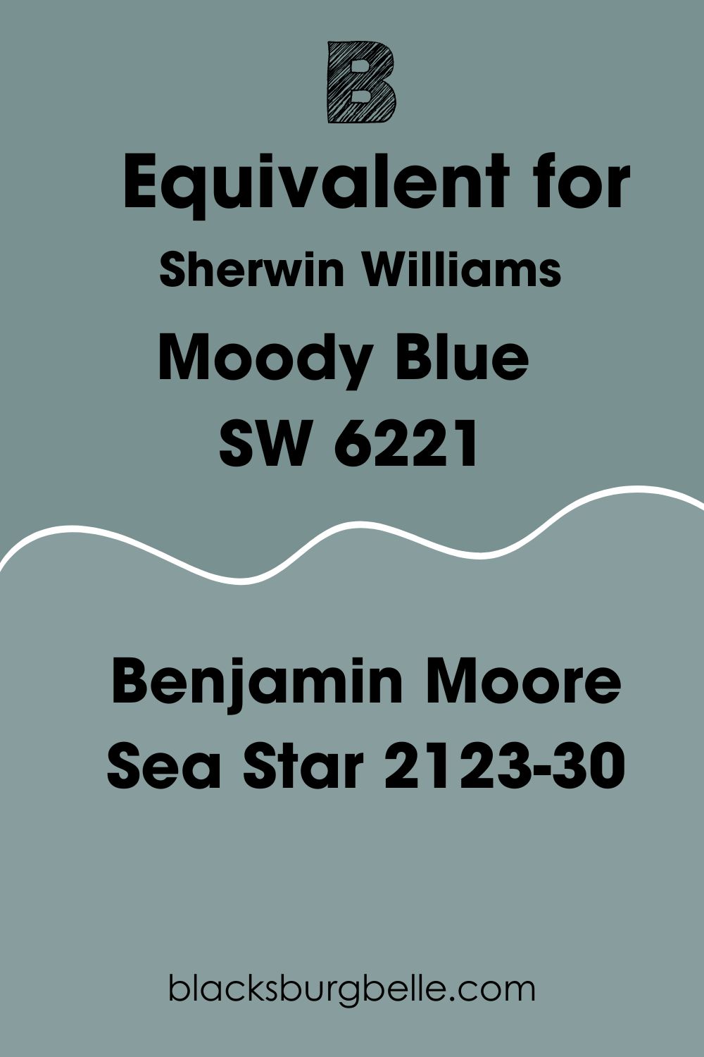
Benjamin Moore Sea Star vs. Sherwin Williams Moody Blue
Both of these colors have blue, green, and gray tones. They can look the same if you don’t pay close attention. However, the main difference between them is their LRV and brightness.
Benjamin Moore Sea Star has a slightly higher LRV of 32.99. This makes it a couple of shades lighter than Sherwin Williams Moody Blue.
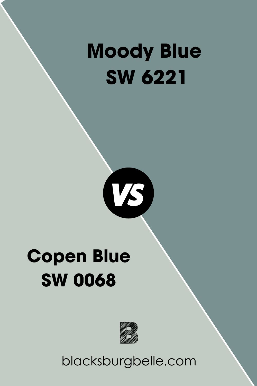
Sherwin Williams Moody Blue vs. Copen Blue
Moody Blue has a lower LRV and stronger blue tones than Copen Blue, which is a light shade of green. Sherwin Williams Copen Blue is significantly brighter and has a warmer feel.
Also, Copen Blue fits more into several palettes than Moody Blue.
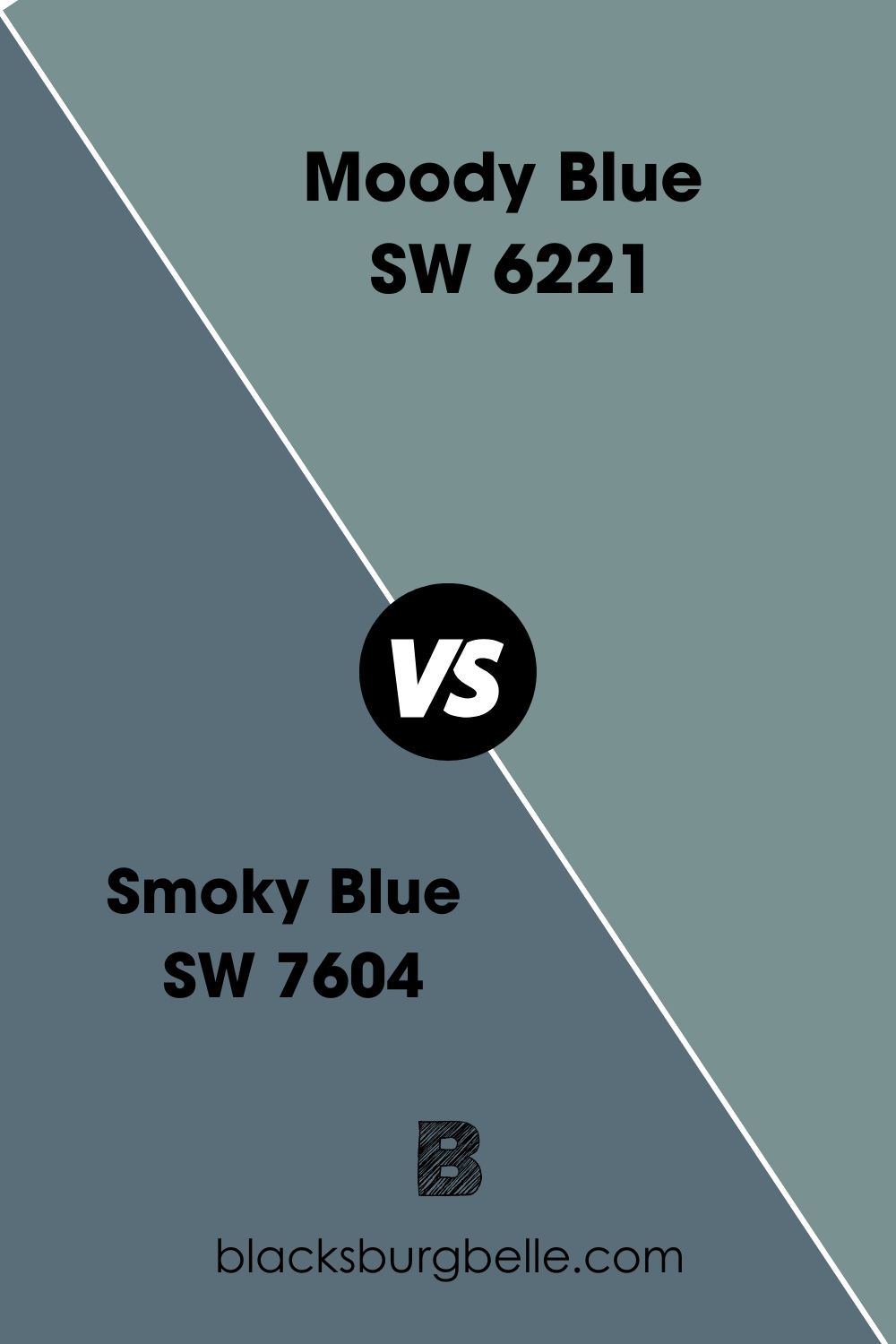
SW Smoky Blue vs. Moody Blue
You might think that these paint colors are both blue because of their name. However, putting them side-by-side shows Moody Blue as more of a green. Smoky Blue has stronger blue and gray undertones too.
In terms of LRV, Moody Blue has a higher value but a lesser color depth.
Sherwin Williams Moody Blue Benjamin Moore Equivalent
Benjamin Moore does not have a paint color called Moody Blue. Even though it has some similar options, they don’t look exactly like the Sherwin Williams product. However, that doesn’t mean we shouldn’t check them out.
Benjamin Moore Sea Star 2123-30
Sea Star is a nice blend of green, blue, and gray, with an LRV of 32.99. The paint color looks really similar to Sherwin Williams Moody Blue. However, it is some shades brighter because of its higher LRV.
Also, Benjamin Moore Sea Star has a bit less blue and green. But you can’t easily notice, making this detail negligible.
Sherwin Williams Moody Blue Living Room
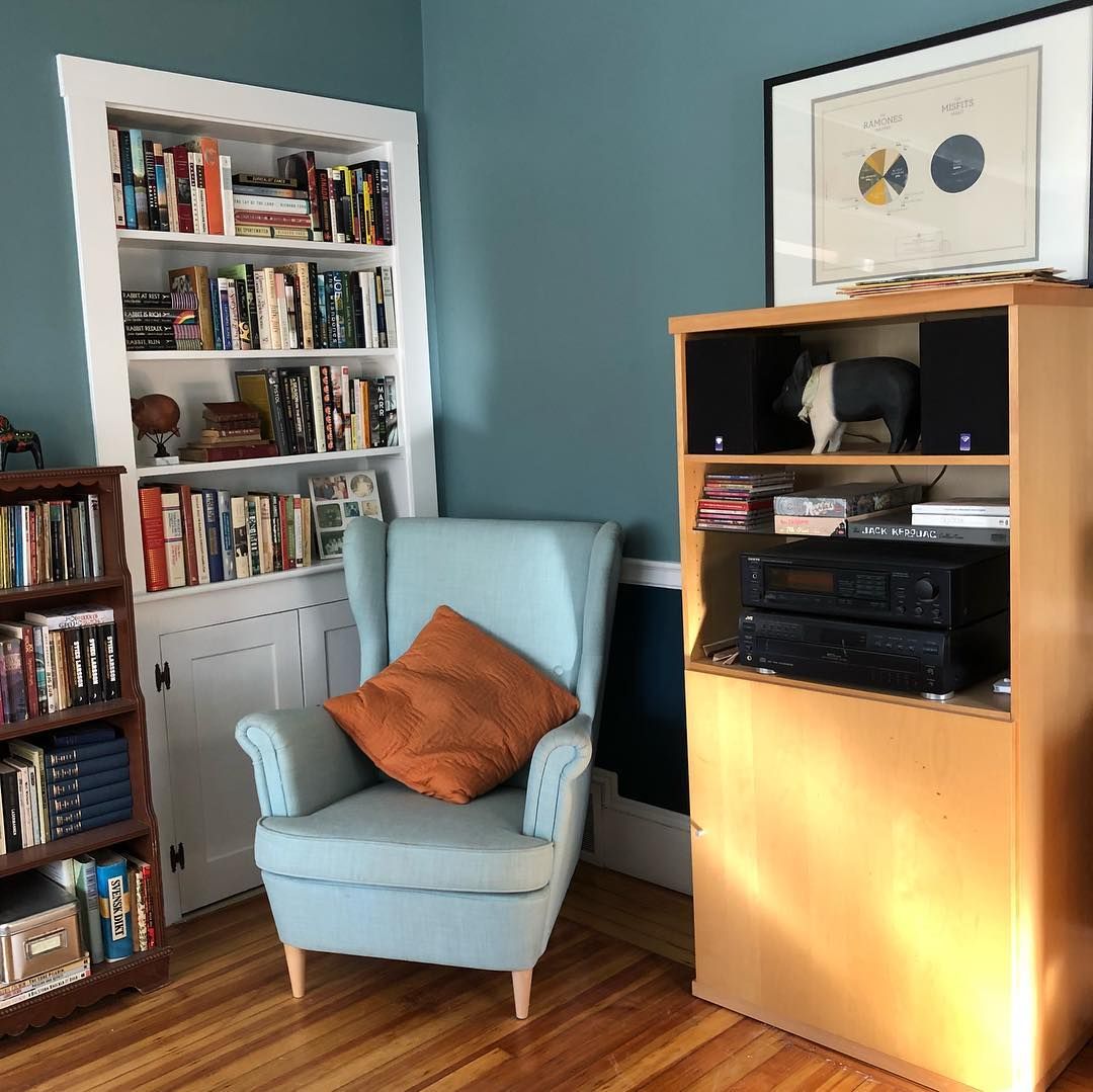
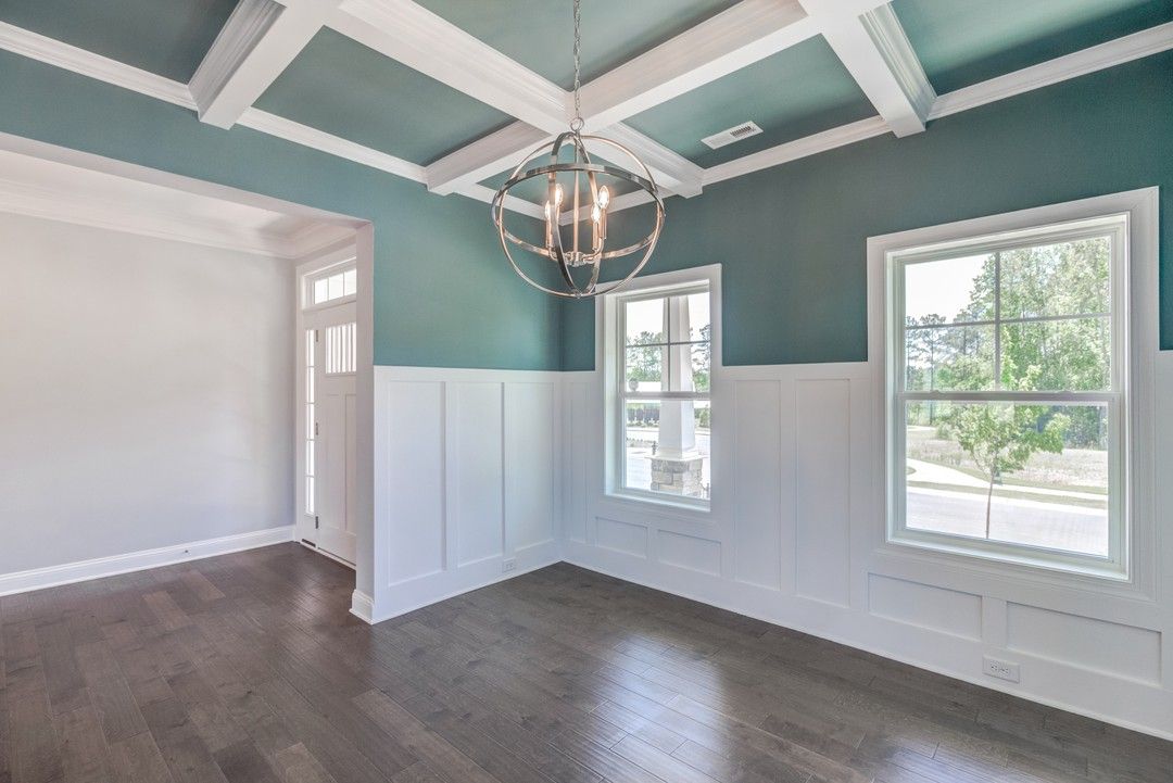
Moody Blue looks calm and cool on living room walls. While it can appear quite strong when used alone, having adequate lighting makes it better.
On the other hand, you can get better results by pairing it with a brighter color like white. As you can see in the second picture, the paint color looks a bit more cheerful and pretty.
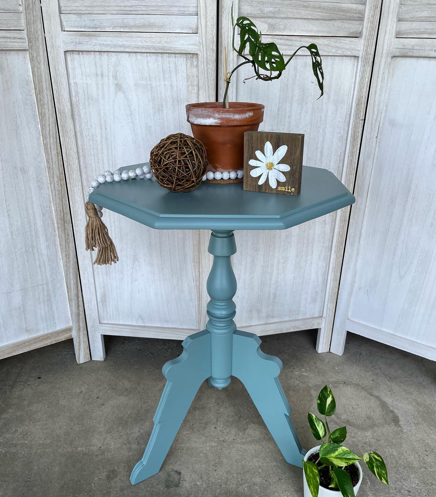
Sherwin Williams Moody Blue Furniture
You can easily get a relaxed, spa vibe when you use Moody Blue on furniture. The paint color’s cool and calm looks feel both natural and cheerful in these pictures. Guess it can look quite different from what its name suggest, yeah?
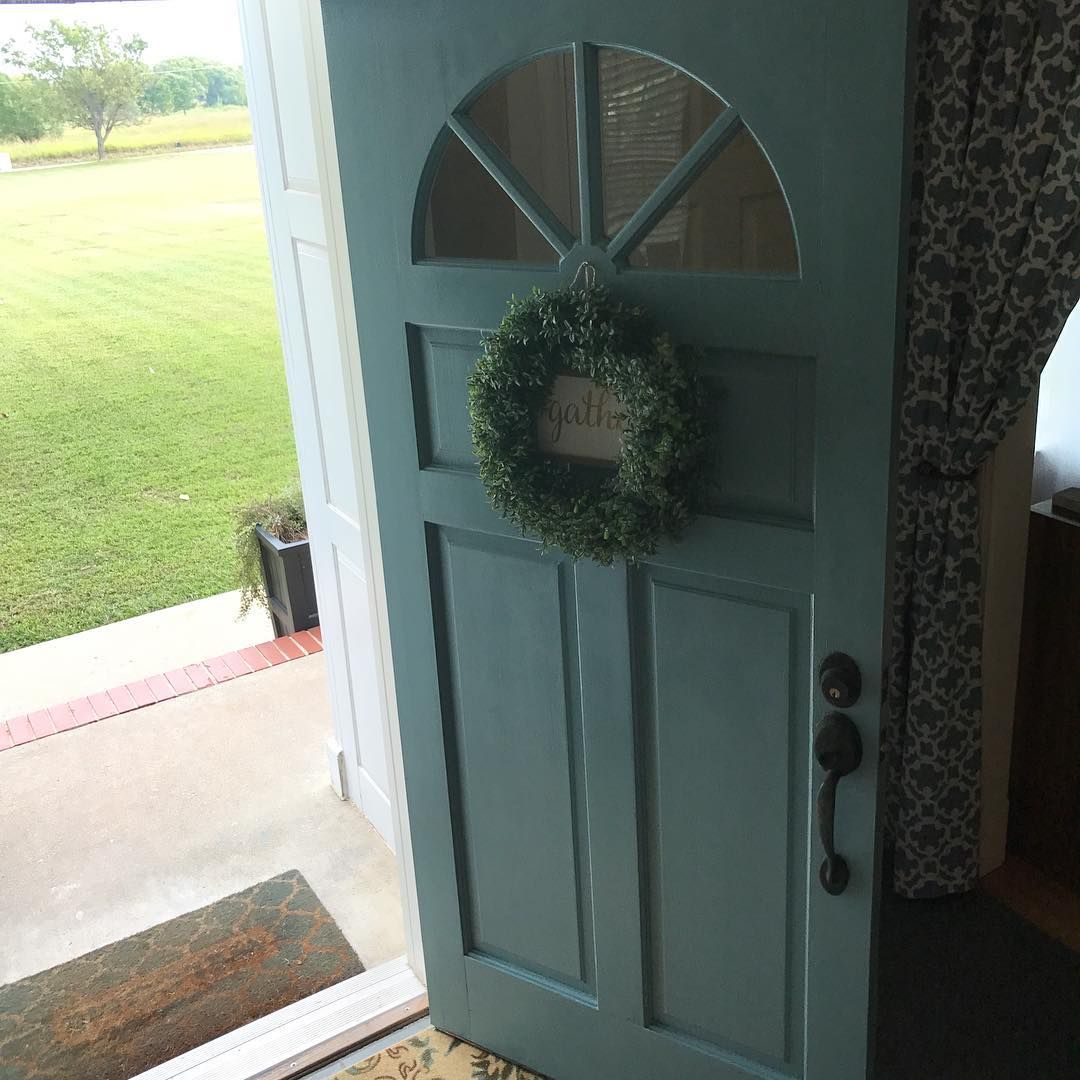
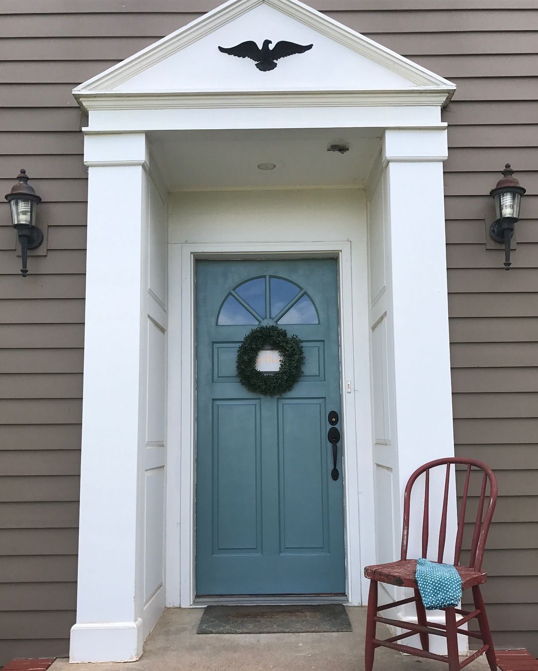
Sherwin Williams Moody Blue on Doors
Moody Blue has enough depth and color to look good on doors, regardless of the space. You can get even better results by either trimming it with white or using that as a surrounding color.
These color pair nicely because putting them together helps Moody Blue look cheerful.
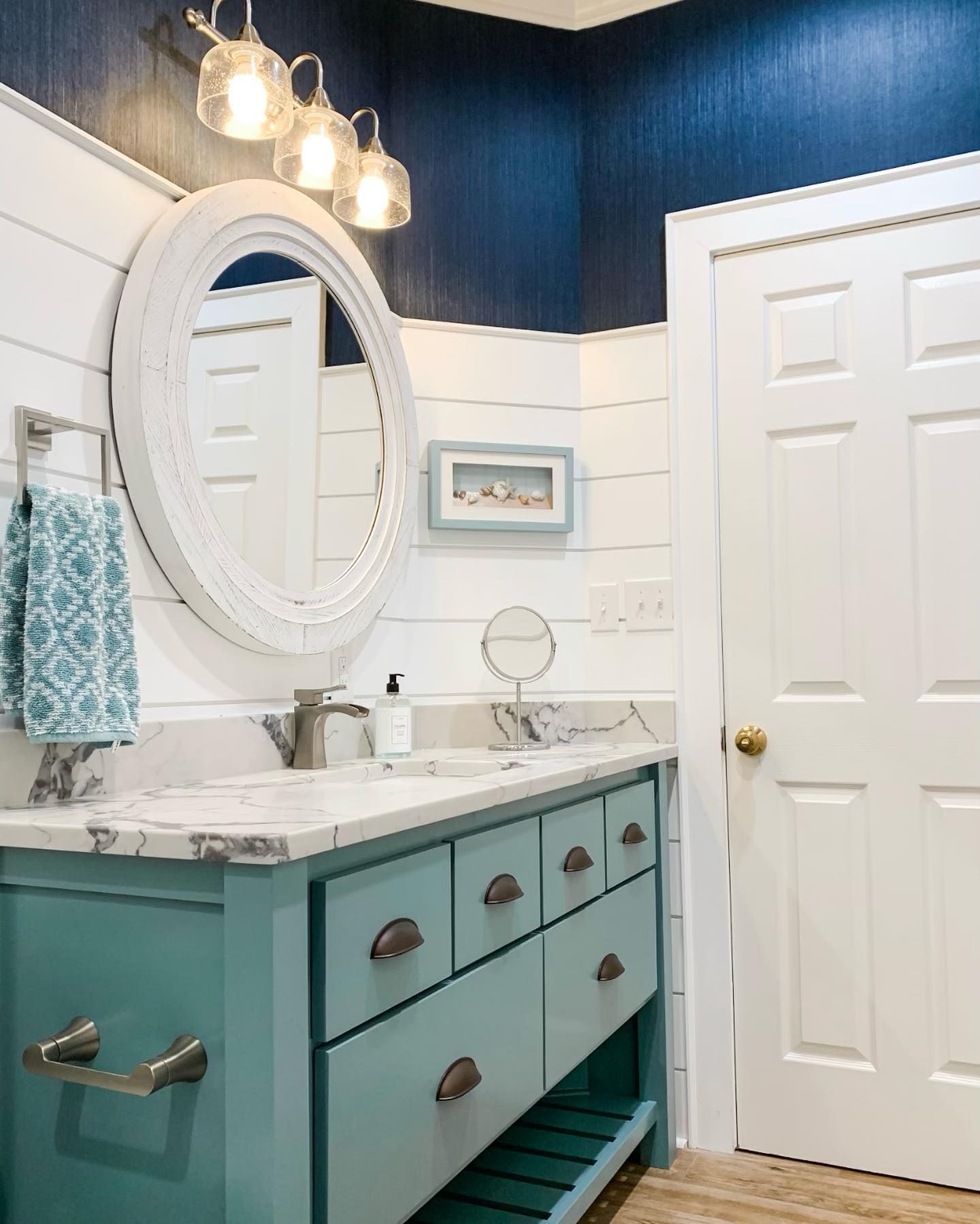
Sherwin Williams Moody Blue Cabinets
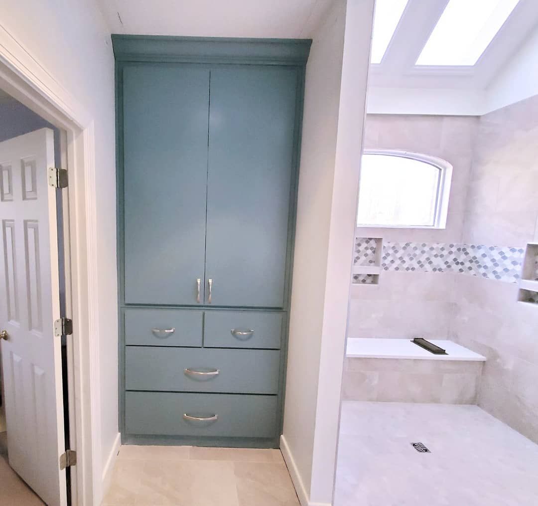
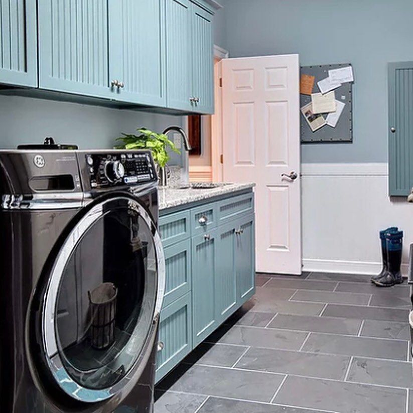
Apart from looking good and natural on cabinets, Sherwin Williams Moody Blue also gives a relaxing appearance.
Remember that putting adequate lighting in the space yields the best results. As the pictures below show, Moody Blue can show a bit more green in warm lighting.
Conclusion
Although it isn’t as popular as most other blue paint colors from the brand, Moody Blue can be worth it. The paint color shines when used in the right setting or with the proper color pairings. You’ve gotten this information and more from this review.
Don’t forget that the paint color reads cool and can subtly lean into blue or green. It all depends on lighting most times. Also, Moody Blue can pair well with both cool and warm colors.
Feel free to drop your questions in the comment section. I’ll respond to them all.

