
Do you find it challenging to pick between Benjamin Moore Cloud vs. White Dove? Or you can’t seem to understand the differences between the two paint colors? Fortunately, I’ve been there. And can relate to these challenges, especially when Benjamin Moore’s pictures can be confusing. I have put together a detailed comparison of the two.
I’ll give you the short version. Both white paint colors are popular from the brand and excellent choices. However, Benjamin Moore Cloud White is brighter and warmer than White Dove. With Cloud White, you get a versatile white with cozy vibes. White Dove gives you a cool feel and a little more depth.
You can decently differentiate between the two lovely colors with the information above. But I’ve got you covered if you want to get to the thick of the comparison. Join me as I explore these colors, their undertones, attributes, and real home pictures.
Table of Contents
When to Choose Benjamin Moore Cloud White or White Dove
Most times, it isn’t enough to know the differences between Benjamin Moore Cloud White and White Dove. You also need to understand when to choose one of the colors or the other. When do you do this? The following tips will help you make this decision.
Pick Cloud White (CC-40) if:
- You want a creamy white that doesn’t look too yellow.
- Your space needs a warm white paint color with cozy vibes.
- You don’t mind soft yellow/taupe undertones for a white paint color.
- Your space has access to abundant natural light. This will allow Cloud White to reach its full potential.
Pick White Dove (OC-17) if:
- You prefer a creamy white that isn’t off-white.
- You don’t mind a white that can sometimes pick up mild peachy undertones from artificial lights.
- Your space needs a not-too-warm white with a little more depth.
Most times, you can easily pick between colors, depending on some factors. Properties like brightness, undertones, and versatility can help you arrive at a decision. However, there are cases where this becomes tricky.
Both paint colors, in this case, have high versatility. They go well with a wide variety of colors and work in any space. As such, you might not fully understand how we came to the above conclusions.
Don’t worry, we are just getting started!
The Visual Distinctions: Benjamin Moore Cloud White vs. White Dove
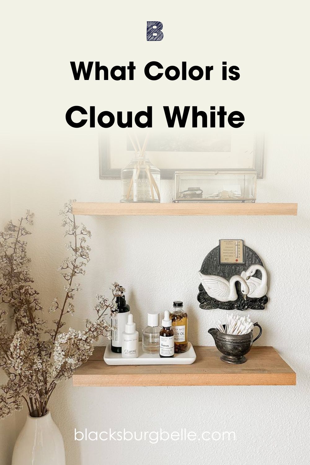
Now, let’s make a pictorial comparison of both paint colors. Here, we have a picture of Cloud White:
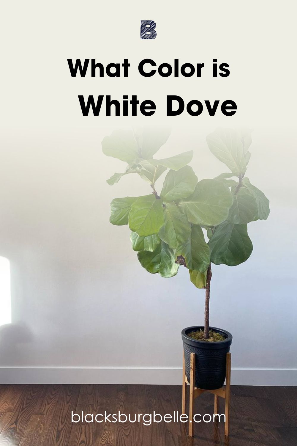
And White Dove:
You will notice a little more warmth and beige tone in Cloud White from the pictures above. Although the picture also contributed to its warmth. The right side of the wall shows what the lovely white looks like in abundant natural light. It looks slightly less warm than the left side, which has some shade.
On the other hand, White Dove looks significantly less warm in the picture. Note that the paint color isn’t cool. It reads warm too, but at a lesser intensity than Cloud White. The cool green of the pot plant contributes to the white’s cool outlook too. However, you will notice White Dove’s warmth at the upper left of the wall, with a little less lighting.
Both paint colors have high reflectance. They reflect light well and look good in dark and bright spaces. However, darker areas bring out their warmth more.
Benjamin Moore Cloud White vs. White Dove? – A Quick Comparison
Next up, we’ll take a quick look at the properties of both white paint colors. These attributes define the most basic aspect of every color out there.
| Attributes | Benjamin Moore Cloud White | Benjamin Moore White Dove |
| RGB | 243, 238, 225 | 239, 238, 229 |
| LRV | 85.05 | 83.16 |
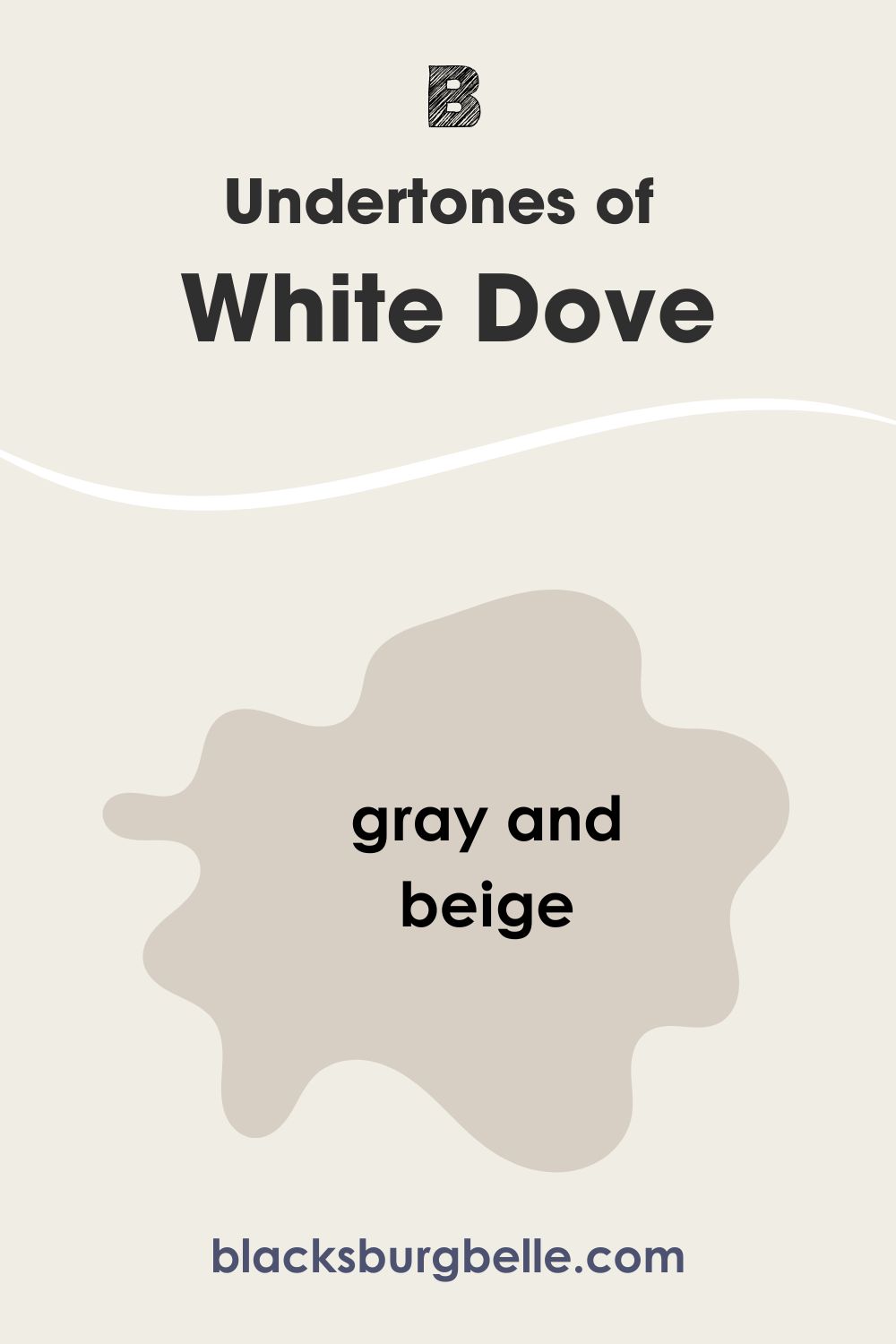
| Undertones | Soft Yellow or Taupe | Greige (Gray and Beige) |
| HEX Value | #F3EEE1 | #F0EDE4 |
Emotional Effects: Benjamin Moore Cloud White vs. White Dove
Colors affect our emotions and moods. Whether by wearing them or using them to beautify spaces, they have extra effects beyond visual satisfaction. Now, how does Benjamin Moore Cloud White and White Dove affect use?
Cloud White is a warm, bright white. It gives a cozy feel that makes it easier to relax in rooms with the paint color. Its warm and creamy look gives a little cheerfulness to the versatile white. With Cloud White, you can easily feel calm and welcomed just by stepping into a space where it is used.
White Dove has a similar effect but a little variation. The pretty white has gray undertones that tone down its warmth a little. Don’t expect this paint color to heat up your space. However, abundant light helps it to give a tranquil and attractive vibe
Generally, white represents purity, hygiene, and peace. Add that to the soothing effect of warm colors, and what do you get? You achieve a sense of homely purity that puts your mind at rest.
Also, they reflect light strongly due to having high LRVs. Using them in any room will make it look spacious.
This is one of the reasons why these paint colors are more popular in homes and living spaces.
LRV of Cloud White vs. White Dove – Which Reflects More Light
You have probably been seeing the LRVs of paint colors and wondering what it all means. LRV stands for Light Reflectance Value. Manufacturers and interior experts use it to indicate how strong a paint color reflects light.
LRV runs on a scale of 0 – 100, with higher values representing brighter colors. Lower values indicate strong absorbing properties. Therefore they represent darker colors.
BM Cloud White has an LRV of 85.05. This falls on the bright end of the LRV scale and makes it qualify as a white paint color. Despite its warmth and creamy tone, Cloud White doesn’t land in the off-white category. It reflects more light than off-whites.
BM White Dove has an LRV of 83.16. Just like Cloud White, White Dove’s LRV falls on the high end. It also puts the paint color above the off-white range. With lesser warmth and gray undertones, you can easily depict White Dove as a proper white.
Of the two, Benjamin Moore Cloud White is the brighter one. White Dove comes closely behind. In a well-lit room or space, you will only notice a slight difference between them outside of their undertones. This means that their LRVs are negligible.
Undertones of Cloud White vs. White Dove: Are They the Same?
Undertones are one of the various differences between Cloud White and White Dove. Fortunately, they won’t show up all the time. You will mostly notice them under certain conditions like lighting or color pairings.
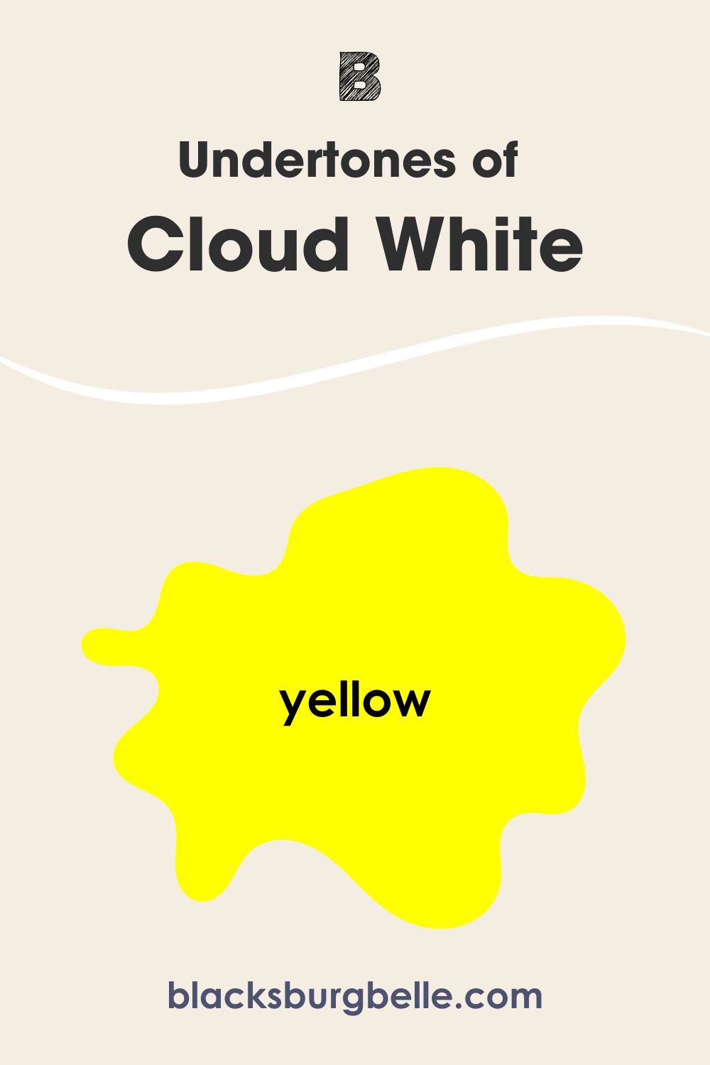
Cloud White has soft yellow undertones that can come off as taupe in some settings. These undertones contribute heavily to its warmth.
White Dove has a mixture of gray and beige undertones, which is greige. They have a lesser influence on its warmth. This is why it looks cool compared to Cloud White. However, a side-by-side comparison with a cool white will reveal its warmth.
Putting both colors side-by-side shows Cloud White with more warmth. Also, incandescent lights can reveal a mild peachy tone in Cloud White.
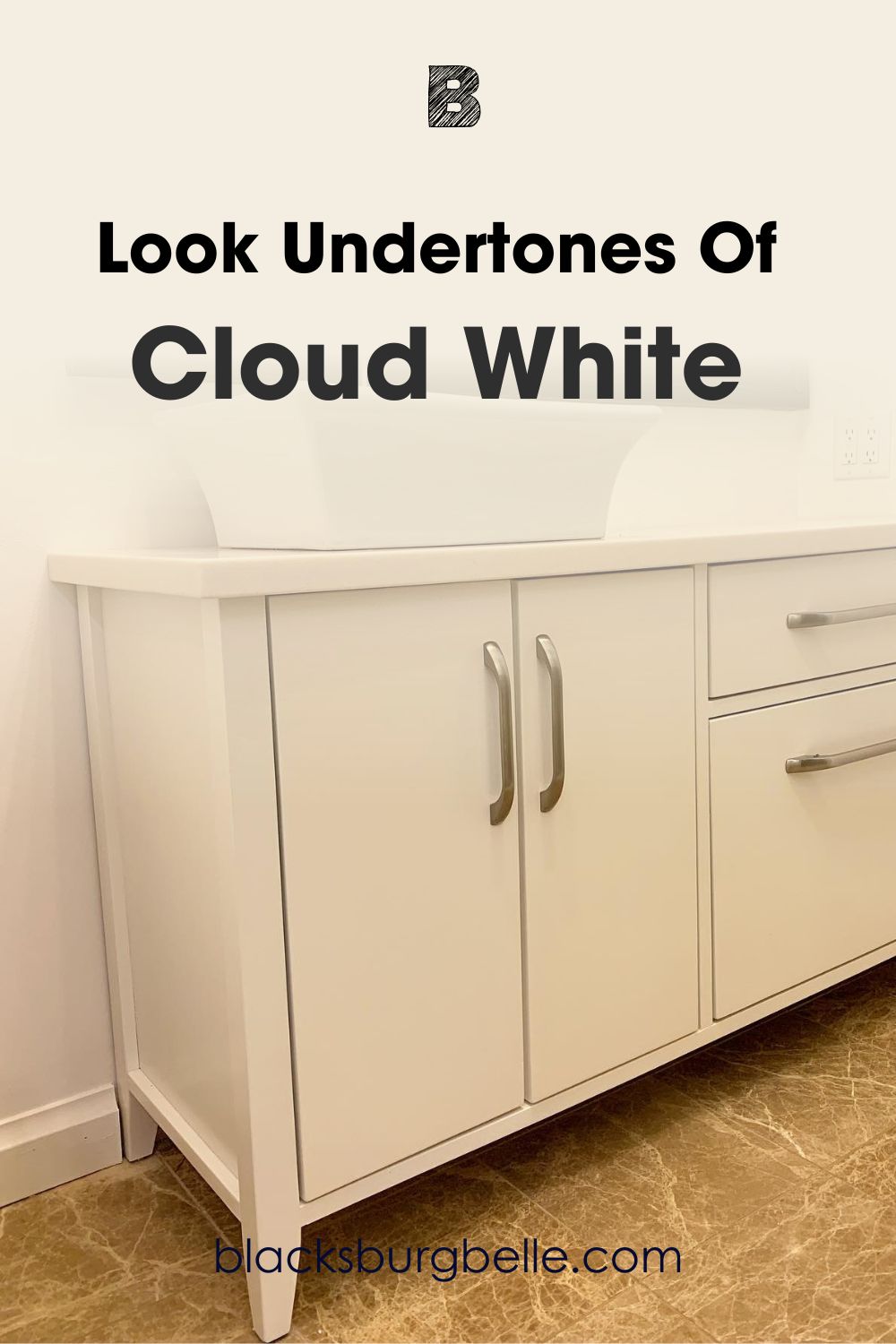
A Closer Look at Cloud White’s Undertones
The picture below perfectly captures Cloud White’s undertones. Thanks to the lighting, you can easily see the paint color looking almost yellow.
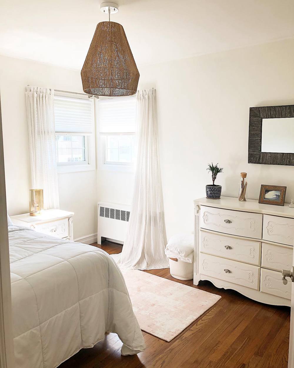
A Closer Look at White Dove’s Undertones
BM White Dove on the nightstands shows a mild touch of gray on the left where the light is more. The right side spots a bit of beige on the nightstand and the wall.
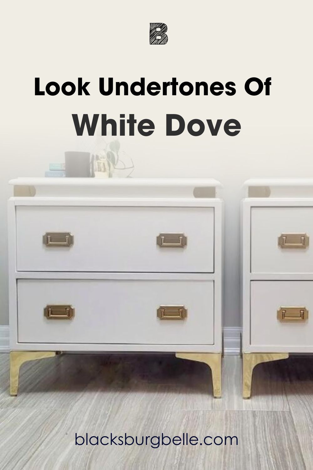
You will notice from both pictures that Cloud White reveals a creamy undertone, and White Dove shows a mild greige.
Cloud White vs. White Dove – Are They Warm or Cool?
Cloud White and White Dove are both warm white paint colors.
While they both read warm, checking them out side-by-side shows Cloud White to be the warmer of the two. However, this doesn’t mean that White Dove can’t warm up your space. It has some beige in it, after all.
So what do I mean by all of that? It means that Cloud White is better for you if you want more warmth in your space. And if you want the less warm option, check out White Dove. However, warm lighting and color pairings can still bring out the cozy side of both paint colors.
Furthermore, these paint colors are better suited for north-facing rooms. The reason is that such spaces look predominantly cool because of their location in relation to sunlight. Using Cloud White or White Dove in north-facing rooms will give a balanced look.
Cloud White vs. White Dove Complementary Colors
Paint colors, especially whites, always look awesome in spaces. However, they can look even better with complementary colors.
These are paint colors on the opposite side of your main color on the color wheel. Complementary colors pair best with your main color. This makes it quite important for you to know the exact one for your color.
In this case, I’ve checked it out for you. Both BM Cloud White and White Dove have the same main complementary color. It’s Benjamin Moore White Heaven.
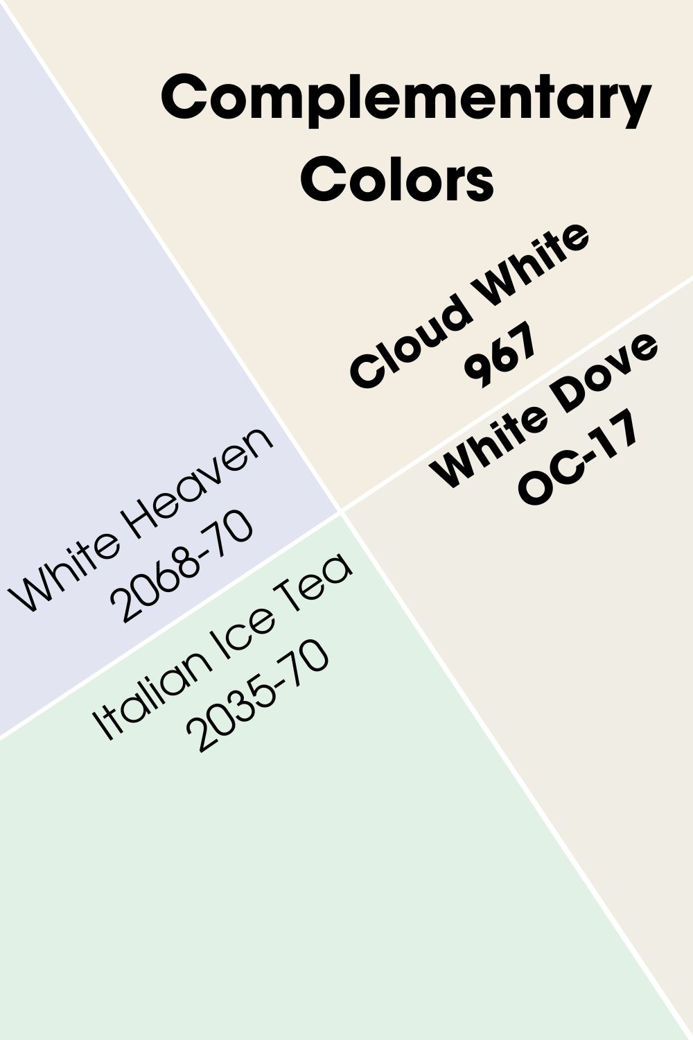
Benjamin Moore White Heaven (2068-70)
The brand describes it as “a pale yet luminous lilac that can bring instant levity to any space.” But, I find it quite unsatisfactory. Benjamin Moore White Heaven is a light-toned purple with a bit more blue than red.
It has an LRV of 76.69. This makes it suitable for almost any space in a home. However, the lovely purple shade can wash out in bright light. Therefore, you should use it in spaces with moderate or low lighting. This will allow the paint color to retain its unique purple.
Benjamin Moore Italian Ice Tea (2035-70)
I added a worthy mention as a bonus. Because why not? Benjamin Moore Italian Ice Tea is a light-toned green paint color. It has an LRV of 80.66, which is higher than BM White Heaven. Thanks to its color depth and blue undertones, it doesn’t wash out in bright light. At least, not as readily as White Heaven.
You can pick Italian Ice Tea as a more colorful alternative for your space. The blue undertones don’t show up readily, and you will see the green almost all the time. BM Italian Ice Tea works best in north-facing rooms.
Cloud White and White Dove Color Palette
Now that we have gotten their differences out of the way, let’s check out their individual palettes. Your space can only achieve your desired look and vibe when you pair colors together. Having these lovely whites as our main colors, we can add in other colors to give an amazing palette.
I am sure you are just as excited to see these combinations as I am to show them to you.
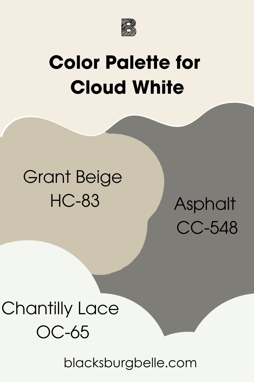
Cloud White Color Palette
As a versatile white paint color, Cloud White goes with several palettes. Since it’s a warm color, you can work with other warm colors for your palette. This doesn’t mean you can’t add in cool colors for versatility and uniqueness.
This palette focuses on Cloud White’s warmth. It boosts its coziness and helps to make your space feel more homely and welcoming.
- Grant Beige HC-83: This mid-toned mixture of gray and beige reads warm and goes nicely with Cloud White. It has mild green undertones but looks predominantly beige. Grant Beige has an LRV of 55.81.
- Asphalt CC-548: This charcoal gray acts as an anchor for your palette. It has an LRV of 21.27, which puts it in the dark range. You can pair it with Cloud White on walls or use the dark color on an accent wall.
- Chantilly Lace OC-65: This bright, popular white has an LRV of 90.04 and almost no undertone. It reads neither warm nor cool and will not hamper the warmth you desire. Instead, Chantilly Lace will add finesse to the overall look.
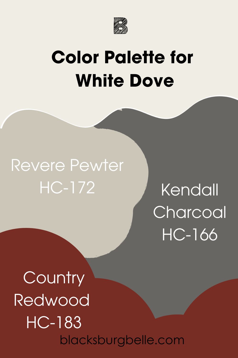
White Dove Color Palette
Several palettes can also work for White Dove, and it permits more colorful options. The reason is that it doesn’t have the creaminess of Cloud White. In this case, the palette has a brilliant red that you can use to spice things up.
- Revere Pewter HC-172: This mid-toned gray is perfect for spaces with lots of artificial light. Its warmth can easily add a glow to any area. Revere Pewter has green undertones that make it even more suitable for White Dove.
- Kendall Charcoal HC-166: This dark gray has rich undertones but works well with several colors. Note that you can use this neutral on accent walls or cabinets too. Also, you can replace it with a black paint color, depending on personal preference.
- Country Redwood HC-183: Now to the much-anticipated splash of color. Country Redwood is an earthy red that leans into burgundy. It has an orange tinge that helps to tone down the energy. While it can infuse cheerfulness into your space, you should use it sparingly.
Cloud White vs. White Dove on Cabinets
Several homeowners and lovely pictures testify to how good Cloud White and White Dove look on cabinets. Let’s check them out.
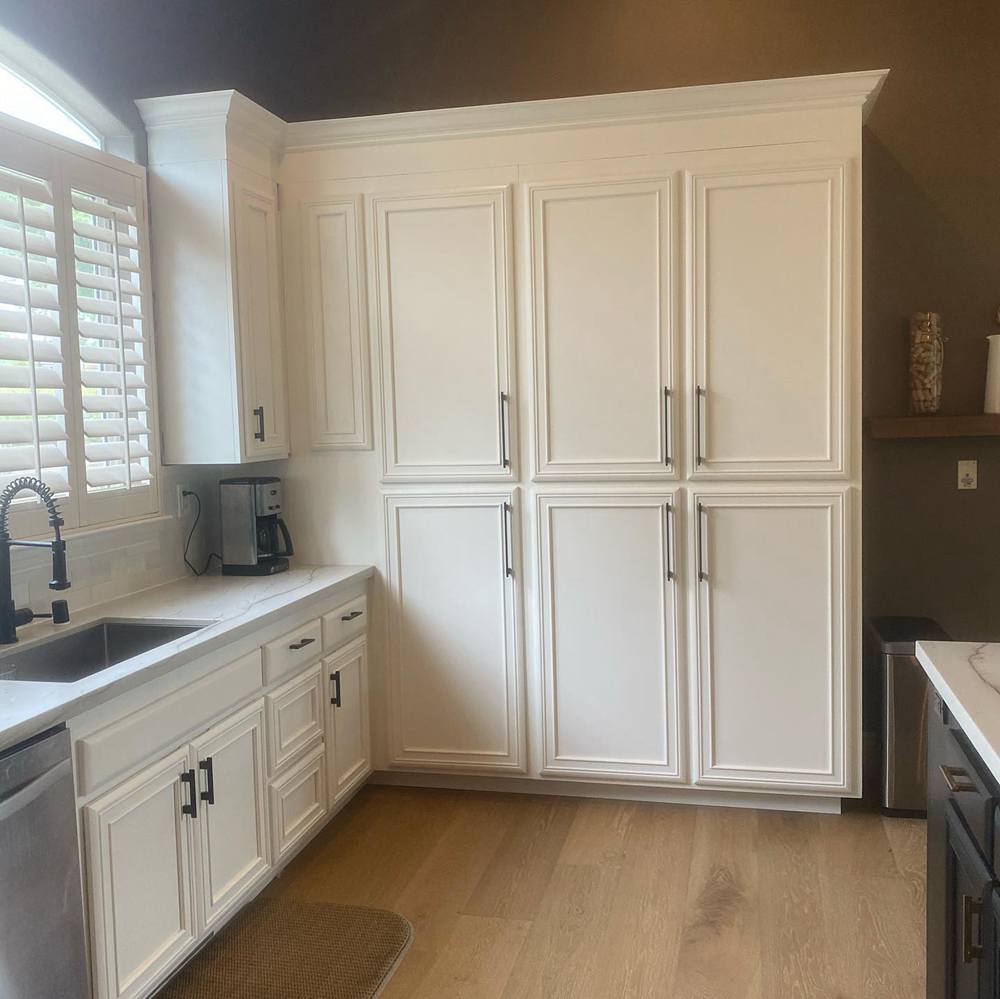
Cloud White on Cabinets
The picture below shows Cloud White on the cabinets adding a cozy look to the kitchen. Also, the white paint color makes the overall look more homely and relaxing.
You will notice how Cloud White looks less creamy in direct light. Its yellow undertones only jump out in the shaded part of the kitchen.
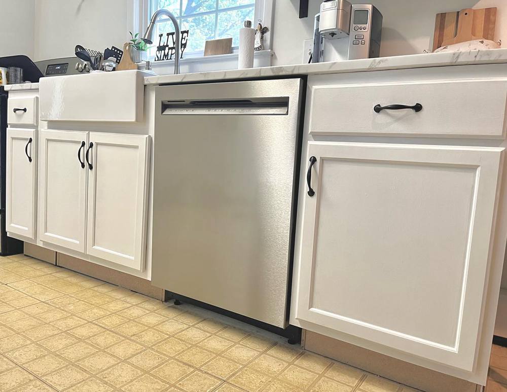
White Dove on Cabinets
As shown in the picture below, White Dove also looks mildly warm on cabinets. This means that the paint color will not look stark, thanks to its gray undertones.
Speaking of undertones, you will notice the gray on the left, thanks to the lighting. White Dove’s mild beige shows a little on the right side of the picture.
Cloud White vs. White Dove Interior
It’s no longer news that white paint colors look amazing in interior spaces. The same goes for Cloud White and White Dove.
Cloud White on Interior Walls
Cloud White perfectly fits into this bedroom decor. Its coziness makes you want to crawl under the covers for a nice, snug nap.
In bright, afternoon sunlight, the paint color looks closer to white and leans away from its yellow/taupe undertones. You can see this in the part of the picture closer to the windows. Areas away from the windows maintain a slightly creamy look.
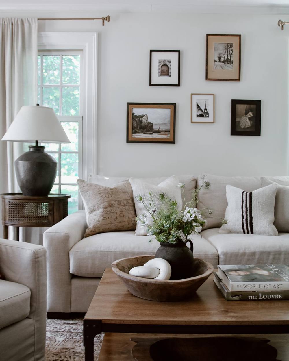
White Dove on Interior Walls
On this interior wall, White Dove looks almost pure. While you might spot a bit of green, it cements the living room’s atmosphere of joy, comfort, and love.
At the same time, the bright white ensures that the space doesn’t look too stark or crispy. That’s because of its gray undertones.
Cloud White vs. White Dove on Exterior Walls
Exteriors greatly influence how people perceive your home. Fortunately, Cloud White and White Dove both look good on exterior walls. I’ve got pictures for you!
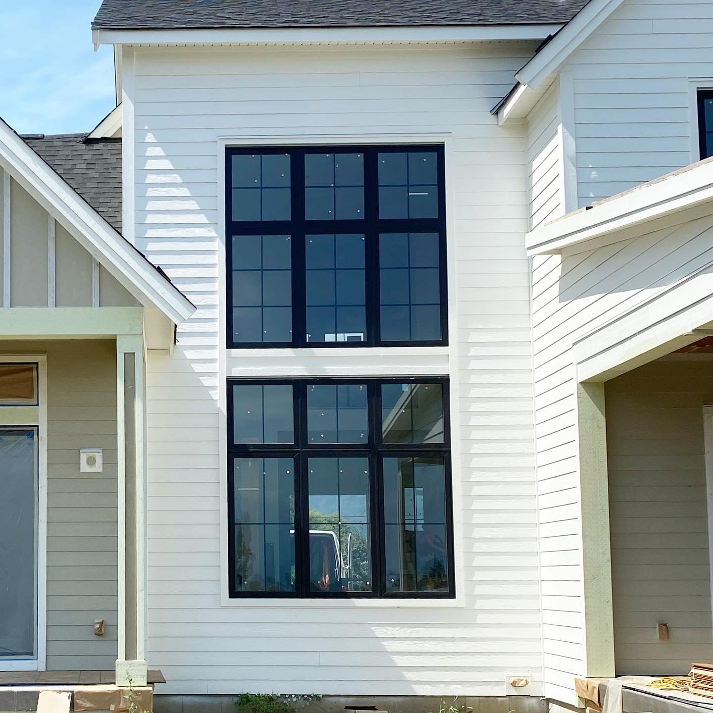
Cloud White on Exterior Walls
In the bright sunlight, Cloud White can easily hide its taupe undertones. Even looking hard will only show a tiny bit of yellow that you can miss.
Pairing the white paint color with a dark neutral like black can give an amazing look. When it comes to putting Cloud White on exterior walls, imagination might just be the only limit.
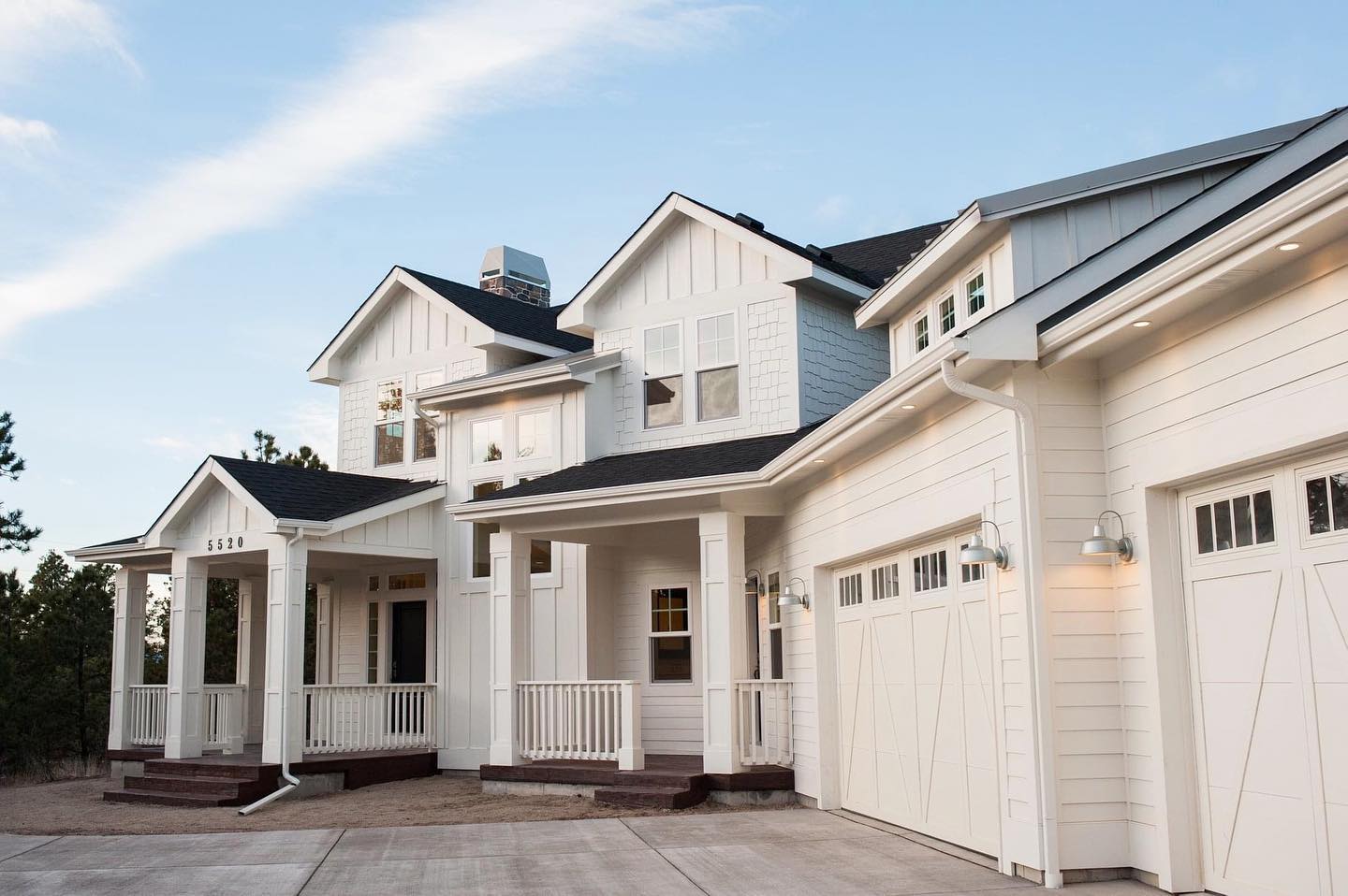
White Dove on Exterior Walls
Surprisingly, White Dove takes a warm, cozy look on these exterior walls. Its warmth show strongly here, including on the garage doors. Note how the artificial lights boost its mild beige.
Cloud White vs. White Dove on Furniture
Sometimes, you simply want your warm white on the furniture instead of the walls. I’ve got good news for you. These whites totally rock!
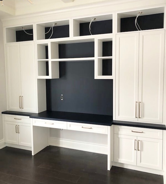
Cloud White on Furniture
Cloud White looks mildly creamy and warm here. It pairs nicely with the deep navy blue for a sophisticated feel.
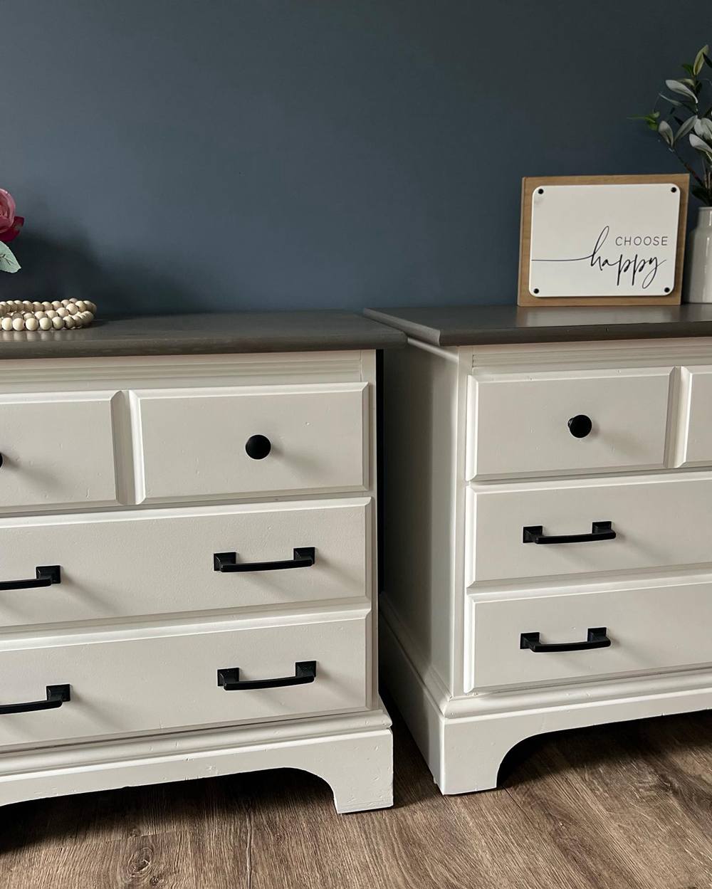
White Dove on Furniture
Apart from looking amazing on this nightstand, White Dove adds a refreshing touch to the space. You can notice a bit of beige here, thanks to other colors used with it.
Also, we can spot a little bit of its full greige undertone here.
Conclusion
You now have the full details of the Benjamin Moore Cloud White vs. White Dove discussion. We have also covered their differences. This means that you can now make a choice between the two warm white paint colors.
Most of the time, you will have to choose based on how much warmth you want to work with. However, pay attention to the other colors you are adding. This will help you pick colors that won’t contradict your desired vibe or look.
To put it simply, go for Cloud White if you want a creamy, warm white. If you want something a little less warm, with a slight green, pick White Dove. Yes, you heard that right. White Dove can sometimes flash a mild green.
In case you’ve questions for me, feel free to leave them in the comments section.
 Sherwin Williams Alabaster Vs Pure White: How to Choose!
 Mindful Gray Vs Repose Gray: How to Choose?
 Agreeable Gray Vs Repose Gray: What’s The Difference?
 Revere Pewter vs Agreeable Gray: What’s The Difference?
 Light French Gray vs Repose Gray: How to Choose?
 Benjamin Moore Chantilly Lace vs Simply White: Which Is Better?
