
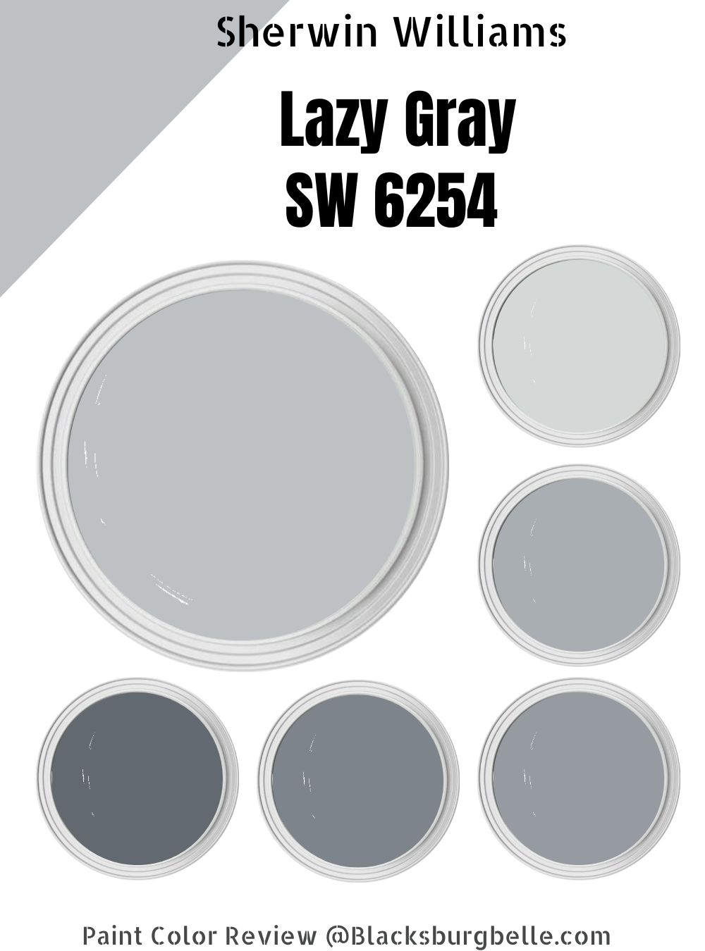
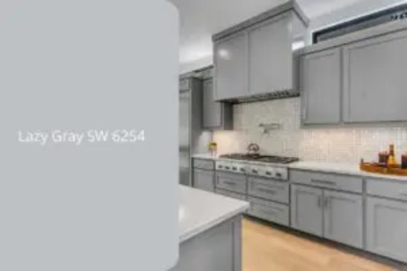
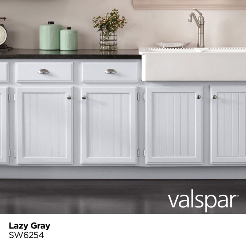
Sherwin-Williams Lazy Gray is a light blue-gray paint that’ll keep you guessing its true identity. If there were a color limbo, Lazy Gray would be in it since it’s neither gray nor blue or gray and blue, depending on how you see it.
Choosing to adorn your walls with this paint color promises nerve relaxing moments especially if you’re someone with a busy lifestyle looking for with little or no time to recharge. Its cool aura also presents a pretty outlook that ensures the space isn’t clinical or stifling. There’s so much to achieve with Lazy Gray.
You should know that If you want pure gray paint with little to no nuances, the Lazy Gray by Sherwin Williams isn’t for you. However, if ready to explore your creativity, stick around to learn everything about this beautiful blue-gray color.
Table of Contents
What Color is Sherwin-Williams Lazy Gray?
Sherwin-Williams Lazy Gray (SW 6254) is a cool two-toned neutral paint with a calming vibe. The paint has the highest blue content in its RGB makeup, making an interesting undertone.
Get this paint to rejuvenate, recharge and recenter your life.
| Manufacturer | Sherwin Williams |
| LRV | 53 |
| RGB | Red 190 | Green 193 | 195 |
| Hex Value | #BEC1C3 |
| Color Collections | Top 50 Colors, Neutral (Family) |
RGB of Sherwin-Williams Lazy Gray
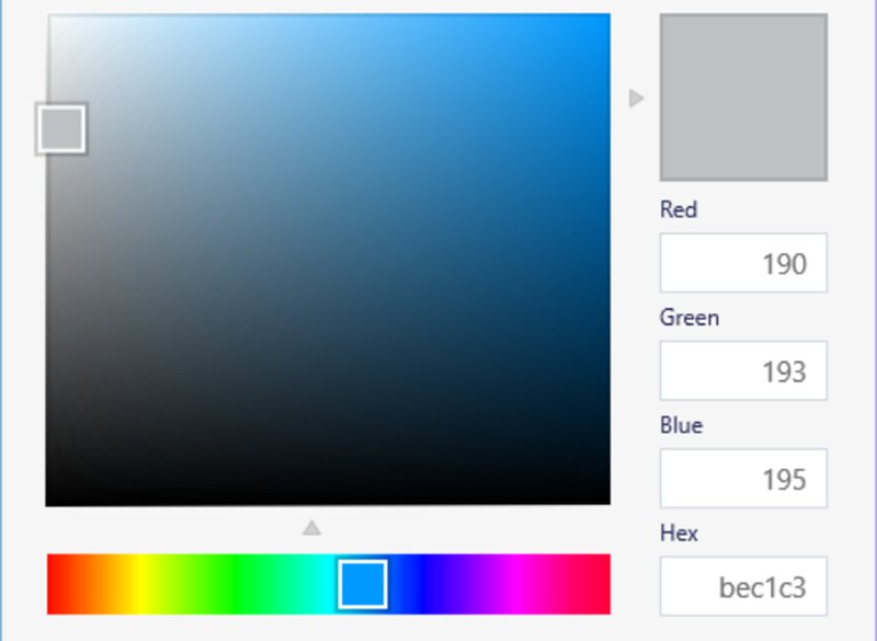
Lazy Gray by Sherwin-Williams contains Red 190, Green 193, and Blue 195 mixed into pure black (free of undertones) paint. The RGB of every color forms a Hex Code or Value, which is a unique marker useful for recreating the exact shade.
Light Reflective Value (LRV) Of Sherwin-Williams Lazy Gray
There’s never a dull or dim vibe with Sherwin-Williams Lazy Gray’s medium LRV, no matter where you use it.
Every color has an LRV between 0 – 100, with zero being pure black and 100 being absolute white. However, with paints, the value changes to 3 – 99.9 due to the presence of undertones. As a paint with 53 LRV, Lazy Gray is only three spots away from the median.
Hence, Lazy Gray wouldn’t consume every light that hits its surface nor bounce it off. Instead, it’s one of the few paint shades certain to retain its hue no matter the lighting condition. Scroll further down to learn more about lighting.
Is Lazy Gray a Warm or Cool Color?
It is cool. With its two undertones, Lazy Gray produces cool air thanks to the high blue content in its RGB. You can categorize every hue into two primary elements – fire and water.
Colors that remind you of heat fall under the warm category, while those that mimic the sea are cool. Lazy Gray is the latter hence its position on the cool end.
What are the Undertones in Lazy Gray?
You’ll get only one undertone from Lazy Gray–blue. An undertone is a secondary color embedded in your paint, waiting to pop out at the sign of a different lighting condition. It’s the reason many people get disappointed with their chosen hue after purchase.
Picture buying Sherwin-Williams Lazy Gray to get a neutral gray paint only for it to show blue underneath a bright light. You can avoid such situations by understanding undertones and color nuances like you’re doing now.
See three examples of Sherwin-Williams Lazy Gray under different lighting below.

Sherwin-Williams Lazy Gray Color Strip
If you want a monochrome palette with no idea about the colors to include with your Sherwin-Williams Lazy Gray, then you need a color strip. It’s a group of colors from 3 to 7 based on one primary hue but different in saturation, shading, and brightness.
Since Lazy Gray is a medium tone, many of the colors in its strip are darker.
You can create a lighter strip with two more colors – Ice Cube (SW 6252), a bluish-white with 77 LRV, and Ceiling Bright White (SW 7007), another bluish-white paint with an 83 LRV.
| Color Code | Color Name | Location Number | LRV | Color Tone |
| SW 6253 | Olympus White | 234-C1 | 68 |  |
| SW 6254 | Lazy Gray | 234-C2 | 53 |  |
| SW 6255 | Morning Fog | 234-C3 | 42 |  |
| SW 9161 | Dustblu | 234-C4 | 32 |  |
| SW 6256 | Serious Gray | 234-C5 | 23 |  |
| SW 6257 | Gibraltar | 234-C6 | 14 |  |
| SW 7615 | Sea Serpent | 234-C7 | 7 |  |
Sherwin-Williams Olympus White
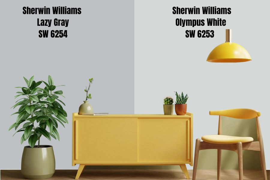
Getting the right white paint to pair with Lazy Gray can present a problem because of its blue hints, but you can’t go wrong with Olympus White. The color is a few beats lighter than its counterpart at 68 LRV yet not too light that it creates a sharp contrast.
This pastel paint also has a strong blue undertone that’ll blend well with the nuances in Lazy Gray. Use Olympus White as an accent wall or cabinets for a Lazy Gray-painted wall.
Sherwin-Williams Morning Fog
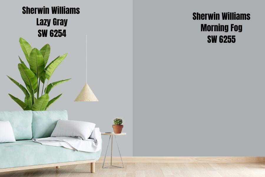
Morning Fog has two tones, like its counterpart Lazy Gray. It’s typically a misty gray hue with hints of cyan lurking underneath the surface. The color is medium-dark with an LRV of 42, but it makes a great option for creating cool aesthetics.
You can place it against a Lazy Gray wall or cabinets without fear of blending into the background.
Sherwin-Williams Dustblu
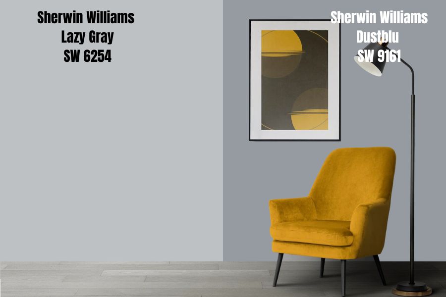
With Sherwin-Williams Dustblu, the color strip turns even darker but not quite black. It still has an airy feel to its aura due to its 32 LRV and a more cyan note than Morning Fog.
It’s a calming neutral paint perfect for relaxing spaces – bedrooms, reading rooms, bathroom cabinets, or accent walls.
Sherwin-Williams Serious Gray
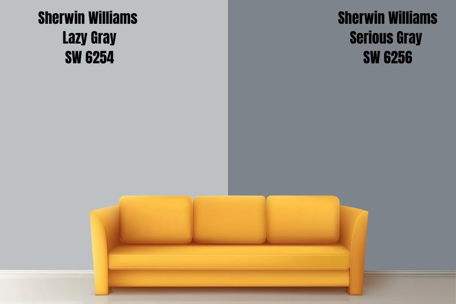
When you want a dark gray paint devoid of strong undertones reminiscent of other colors, choose Serious Gray. Its charcoal base notes blend seamlessly with the calm gray overlay giving you the perfect dark gray paint.
Sherwin-Williams Serious Gray has a 23 LRV meaning it absorbs light a lot but gives a little of it back into its surroundings.
Sherwin-Williams Gibraltar
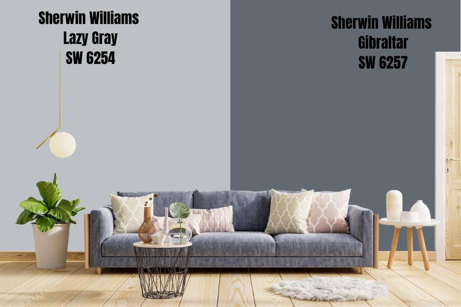
If Serious Gray isn’t charcoal enough for your taste, then Gibraltar would do the job without leaving you with doubts. It’s a warm neutral tone with faint blue undertones despite it being the highest value in its RGB makeup.
Sherwin-Williams Sea Serpent
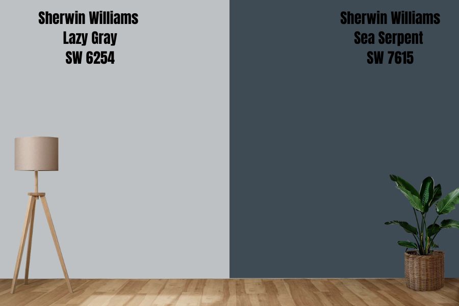
Navy-gray paints are a unique shade of dark neutrals that’ll leave your space looking exquisite. It has a rich teal undertone for serious spaces like offices and dens.
The warm blue (yes, I know it’s an irony) seeps out underneath the brightest light, but it cools down towards the evening.
Sherwin-Williams Lazy Gray Color Palette
Let’s design the perfect room using a Sherwin-Williams Lazy Gray color palette. Curating a space requires blending the right colors for a seamless outlook in one or multiple shades.
Coordinating Colors for Lazy Gray
Coordinating colors for Lazy Gray depends on your chosen theme, as every room can portray whatever feeling you desire. Colors have personalities, so you must match the right one to the best-suited space.
With coordination, you can express a wild and experimental style using sharp themes like contrast, tame bold themes like triads, or subtle classics like monochrome. Check out how each one works.
Monochrome Decoration with Lazy Gray
A monochrome color theme best suits a cool, calm, and collected individual because of its use of one color in different shades. It presents the most harmonious front for your room and often has a soothing vibe regardless of the color’s nature – cool or warm.
Although monochrome decorations work well in every space (it’s versatile), they are best used in relaxation rooms like the bathroom and bedroom.
Pair a Lazy Gray painted wall with accessories made from colors in its strips, such as Sea Serpent carpets, Gibraltar accent walls, Dustblu cabinets, and other gray-blue paints for the curtains and beddings.
Triadic Decoration for Lazy Gray
Get creative with triadic decorations using three colors, including Sherwin-Williams Lazy Gray as the centerpiece. The other two colors come from triangulating the paint on the color wheel.
You can form your triad using either of the two dominant tones as a blue-gray paint. For blue, you get the other two primary colors – yellow and red while gray (with blue undertones) triangulates with brown and cream.
Use the first two (yellow and red) for a vibrant space, or go with the neutrals for a mature laidback style.
With triads, Lazy Gray doesn’t have to be wall paint as it serves the same purpose as an accent on the cabinet, door, or single wall.
Contrasting Lazy Gray with Complementary Colors
Complementary themes blend two opposing colors, often unlikely pairs, into one space. Due to their striking differences, the paired hues create a balance of cool and warm notes suitable for someone in love with both vibes.
Combine Lazy Gray, a blue-toned gray neutral, with colors like cream (white with yellow bases) and pastel yellow.
What Trim Colors Go With Sherwin-Williams Lazy Gray?
As a general rule, white paints make the most versatile and ideal trims for neutral paints like Lazy Gray. However, the trick is finding one with the perfect undertone. Use your palette here and decide what undertones work best with your design.
White paints with blue undertones, like Ice Cube by Sherwin-Williams, are ideal for monochrome designs. Get more creative with a complementary theme, such as a creamy white paint like Natural Choice.
Highlight the red in a triadic theme using brown trims like chestnut floorboards. Note that darker trims would make the room appear smaller, while lighter trims open up the space.
Sherwin-Williams Lazy Gray Color Comparisons
Despite its unique markers, the Lazy Gray isn’t the only blue-gray paint by Sherwin-Williams. Depending on your preference, you can find others with bluer undertones or grayer overtones.
Would you still want Sherwin-Williams Lazy Gray when you compare it with other neutrals? It’s time to find out.
Sherwin-Williams Lazy Gray vs. Sherwin-Williams Repose Gray (SW 7015)
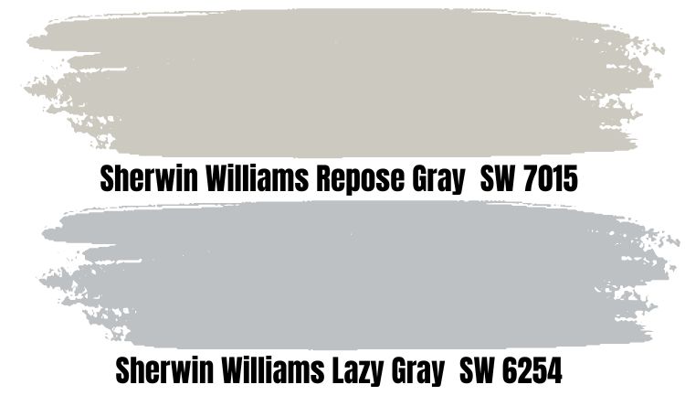
Repose Gray is one of the most popular neutral gray shades by Sherwin-Williams. The color is a medium-light tone with a warm beige and brown undertone. Occasionally, you’d see a hint of blue flash only under the brightest south-facing light.
If you want more blue undertones, stick to Lazy Gray but if you want an almost invisible flash of blue, switch to Repose Gray.
Sherwin-Williams Lazy Gray vs. Sherwin-Williams Gray Screen (SW 7071)
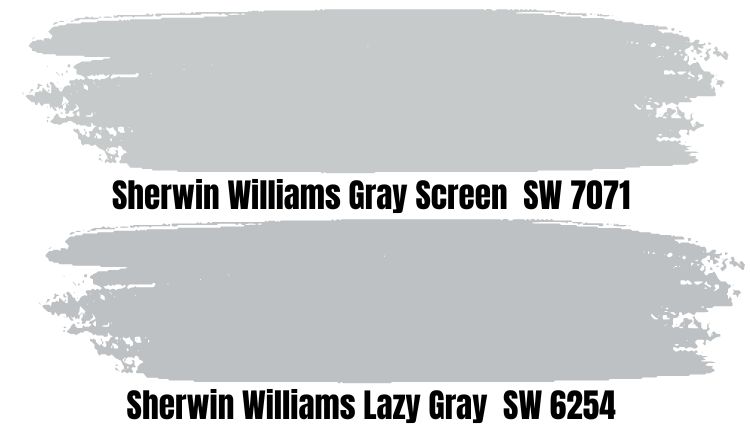
You’d get a similar blue overlay on a neutral gray paint with Gray Screen. The painting is a cool tone that presents a calm vibe. It’s brighter than Repose Gray but not as bright as Lazy Gray despite their similarities.
This color does well in relaxing rooms like the bathroom and bedroom. You can also use it in a living room and highlight it with a pretty bluish-white trim.
Sherwin-Williams Lazy Gray vs. Sherwin-Williams Light French Gray (SW 0055)
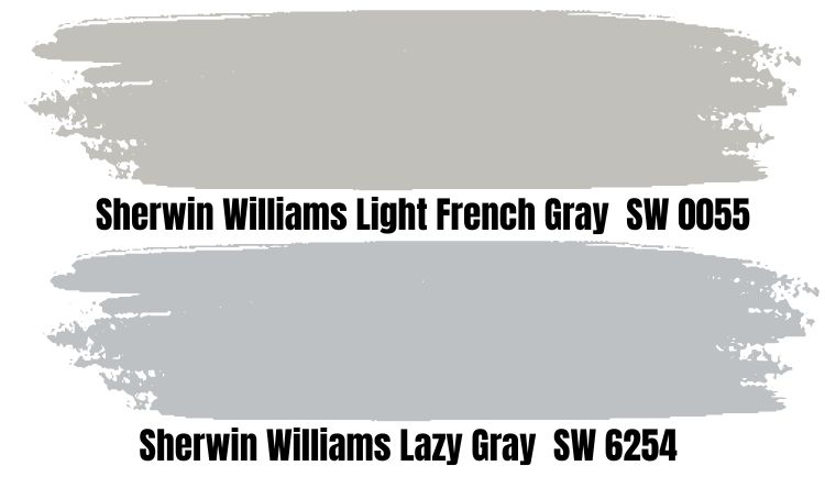
If you want a historic gray with a serious outlook, then look no further than Light French Gray. The color suits interior and exterior coloring because it balances warm and cool notes.
Light French Gray is mid-toned and darker than its counterpart, Lazy Gray but serves the purpose of a breezy neutral paint better than the latter.
Sherwin-Williams Lazy Gray vs. Sherwin-Williams Morning Fog (SW 6255)
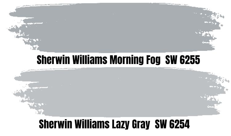
Blue grays like Morning Fog make for interesting neutral backdrops, as the strong blue undertone provides a cool tinge occasionally. This color also contains a smidge of green, making the undertone more aqua/teal than Lazy Gray’s bright blue.
Like Lazy Gray, Morning Fog comes alive with creamy white trims. However, it’s more elegant when paired with an almost black navy or faint charcoal paint.
Benjamin Moore Color Comparison
What if Sherwin-Williams isn’t your cup of tea or is unavailable? The next best thing is a beautiful gray shade by Benjamin Moore. The colors are as diverse as the Sherwin-Williams library and would leave you confused unless you know what you want.
Here’s a short list of some beautiful blue-grays from the brand ranging from classics to historical colors and exclusive collections.
Subway Tile (CSP-585)
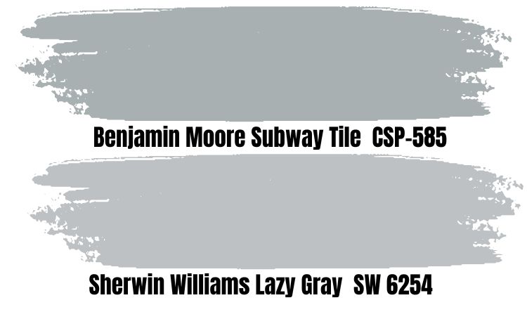
You’d get a silvery gray color with a subtle blue undertone from Subway Tile. The paint has a subtle blue undertone for a calming effect as part of the Aura Color Collection. It’s designed to make your space elegant and exotic.
Metropolitan (AF-690)
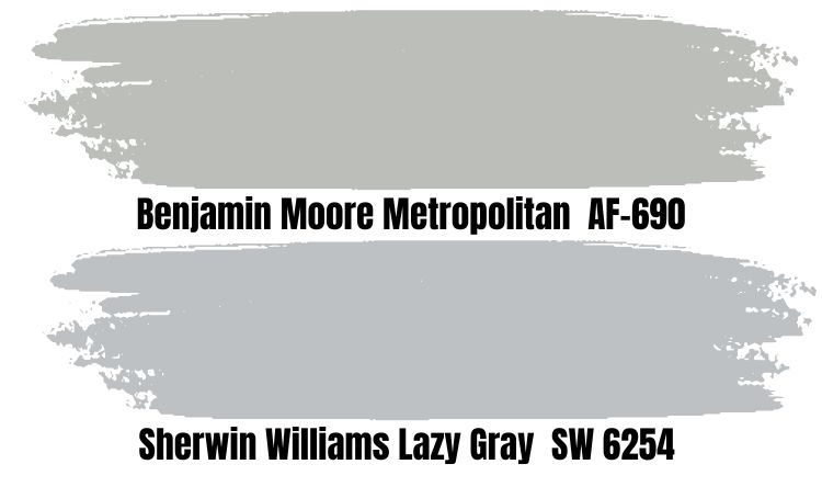
If you want warm gray paint suitable for a contemporary city home, then Metropolitan AF is for you. The color has little to no undertones because its sage green tinge is subtle. Many designers consider it a close-to-perfect neutral, with an LRV of 49.96.
Seersucker Suit (CSP-580)
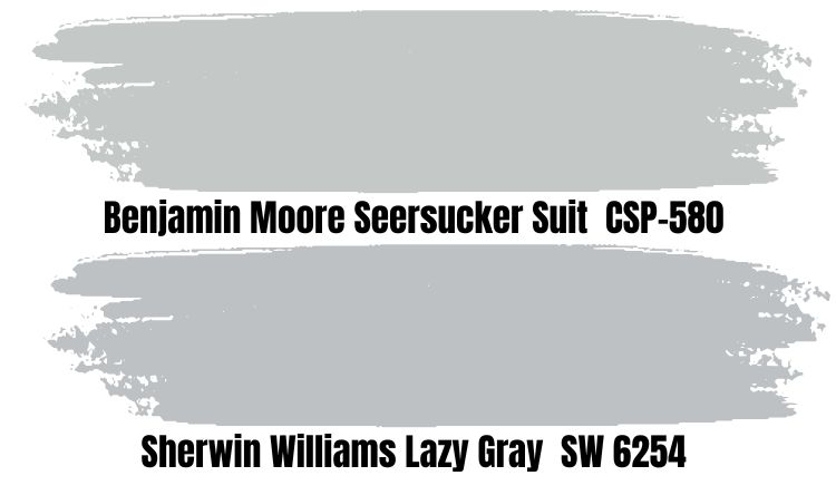
Benjamin Moore made Seersucker Suit an exclusive interior gray paint with a striking blue note. It’s brighter than Sherwin-Williams Lazy Gray at 56.29 and presents an exquisite aura background for your space.
The brand wants users to reserve Seersucker Suit for interior painting as it shines best in enclosed spaces rather than outside. If you must use it outside, paint it on a door or an accent wall.
Winter Solstice (1605)
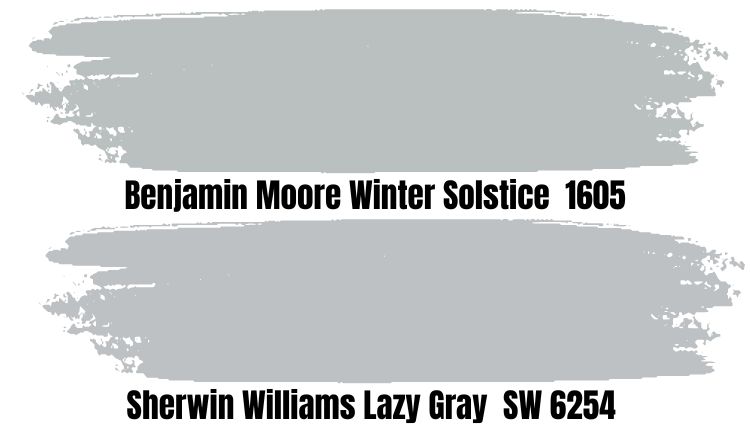
Winter Solstice by Benjamin Moore is a close replica of Sherwin-Williams Lazy Gray paint. It has almost the same LRV as its counterpart, although it’s more neutral than it at 50.66. The snowy gray paint has a rich blue hue that blends seamlessly into it.
Benjamin Moore’s Version of Lazy Gray
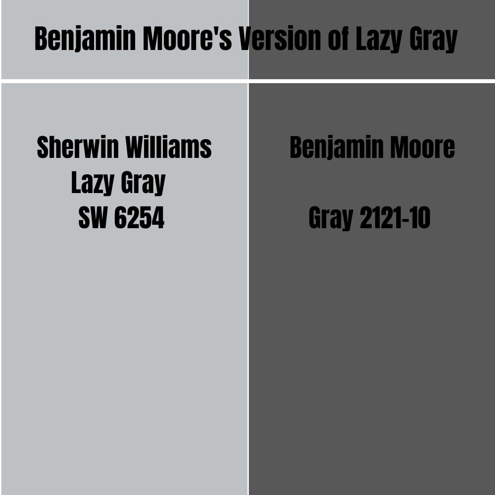
There’s no Lazy Gray shade in the Benjamin Moore library, but the brand has a “Gray (2121-10)” paint. It’s way darker than Sherwin-Williams Lazy Gray with an LRV of 11.51. Choose this paint as an alternative to black, as it has a warm charcoal overlay.
For a close replica use Winter Solstice.
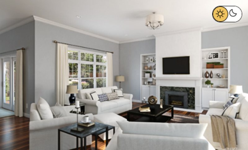
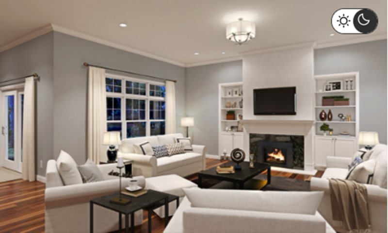
How Does Light Affect the Color?
South-facing light presents the brightest reflection, highlighting the blue part of Sherwin-Williams Lazy Gray. Meanwhile, without consistent bright light, the paint appears cool and gray devoid of its blue undertone.
The difference is so clear that you’d miss the strong blue undertone if you buy the color based on a first impression under dim lighting. Use the paint underneath the North-facing light to maintain this dim, muted gray look.
Best Rooms To Paint Lazy Gray
Lazy Gray may be a neutral paint, but that doesn’t mean it’s perfect for every room. The color thrives best in some spaces due to its unique features, from undertones to LRV.
Knowing when to use Lazy Gray as an accent and a full wall paint is the difference between a professionally curated space and an amateur design. I’ve broken down the paint’s usage into two – Interior and Exterior – for the best understanding.
Lazy Gray for Interior
Using Lazy Gray inside is a no-brainer because its cool tone makes large spaces look smaller. Depending on your chosen theme when curating your palette and your home’s position, it can be on the furniture or wall.
Remember that lighting determines the shade that shines from the two-toned paint.
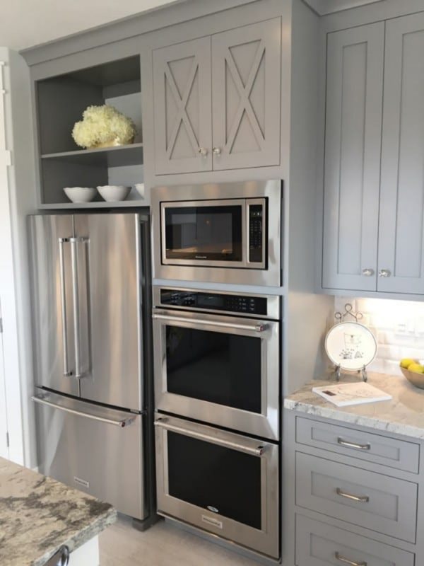
Lazy Gray for Cabinets
Sherwin-Williams Lazy Gray as a cabinet works best with neutral wall paints, especially whites. The shade of white then depends on your theme, although bluish-white is the default option. You can never go wrong with that.
These cabinets can be in the kitchen but are best placed in the bedroom and bathrooms. Those spaces are the most ideal for relaxing paints like Lazy Gray.
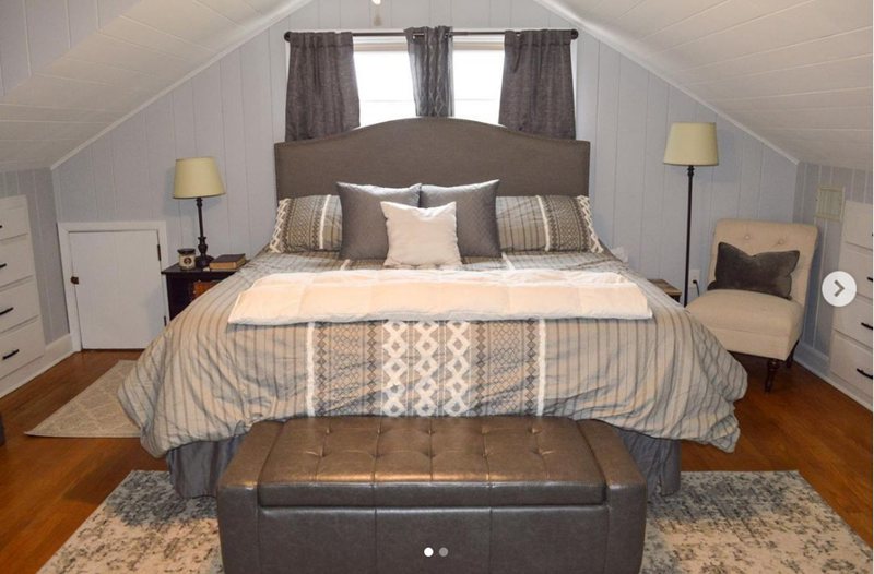
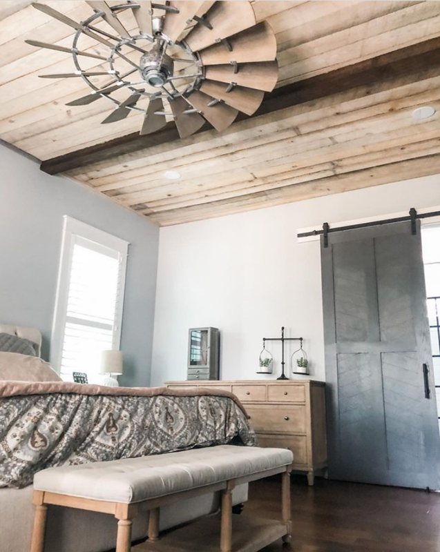
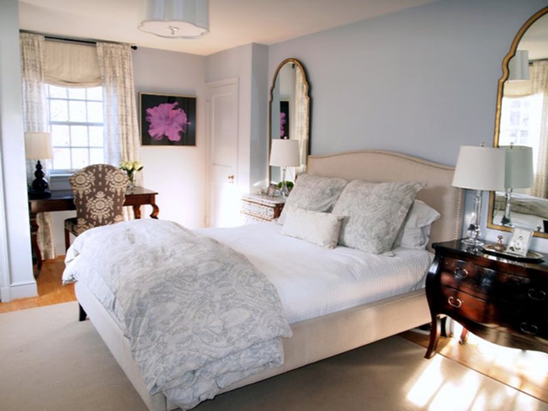
Lazy Gray Bedroom
The question here is how much Lazy Gray can you handle? First, you need to consider your room size and position.
If you want to highlight the blue in Lazy Gray, invest in artificial lighting alongside brighter coordinating paints if it’s a space that gets little to no light. Using the blue-gray paint as an accent would accentuate its cool features.
However, if you want to keep it as a dour gray with the blue tint being only a smidge visible, use it in a north-facing window room that gets consistent low light. Then tone it down with darker neutrals like Peppercorn.
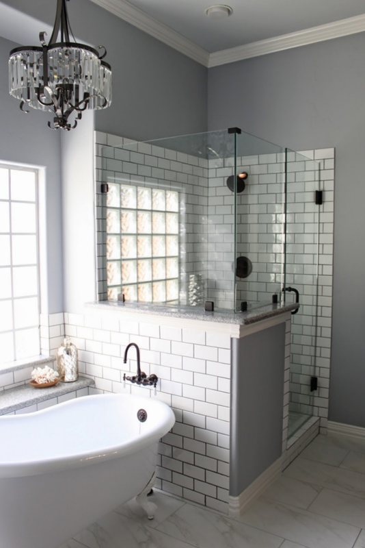
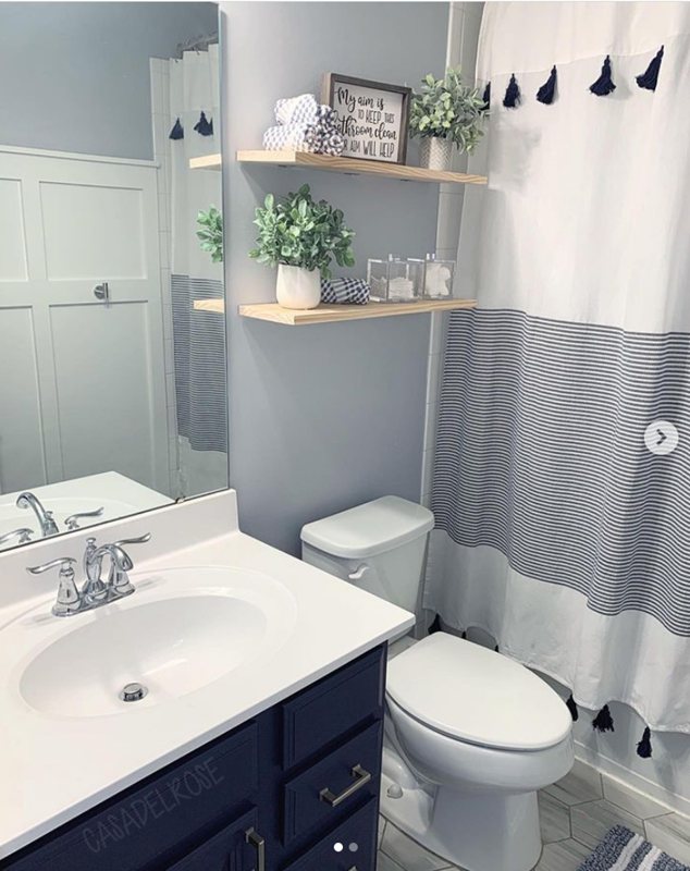
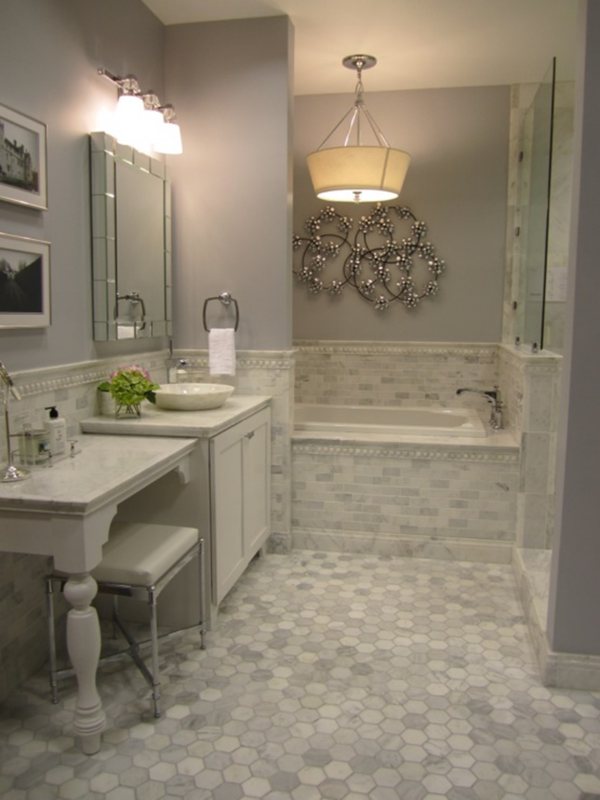
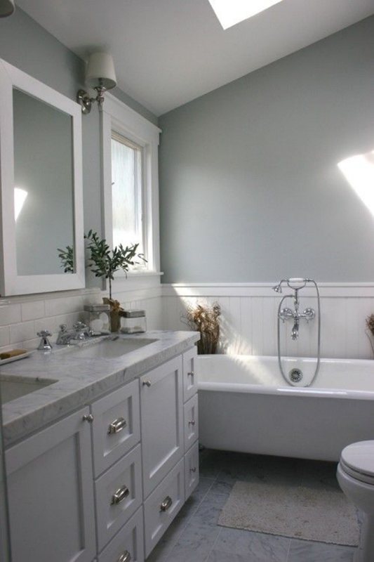
Lazy Gray Bathrooms
Lazy Gray in the bathroom should always highlight the blue side because why not? You can pair this with the coolest bluish-white paint, like ice cube trims or crisp white tiles. Your only struggle should be whether or not to make the paint the star of the show, and I vote “Yes.” Use equal parts of Lazy Gray with coordinating colors for a seamless blend.
However, if you’re wary of too much blue, using the paint as a highlight is the way to go. Put it on your cabinet and bathroom organizer.
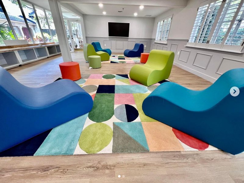
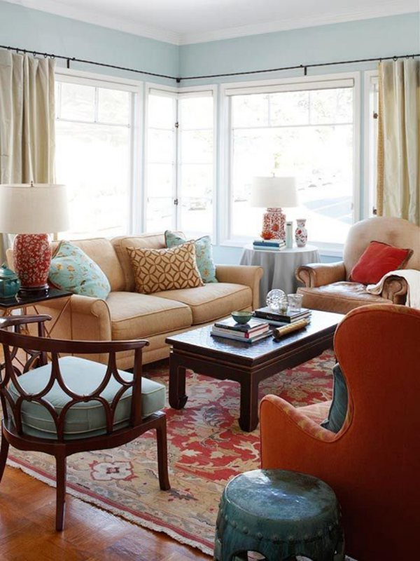
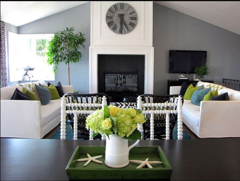
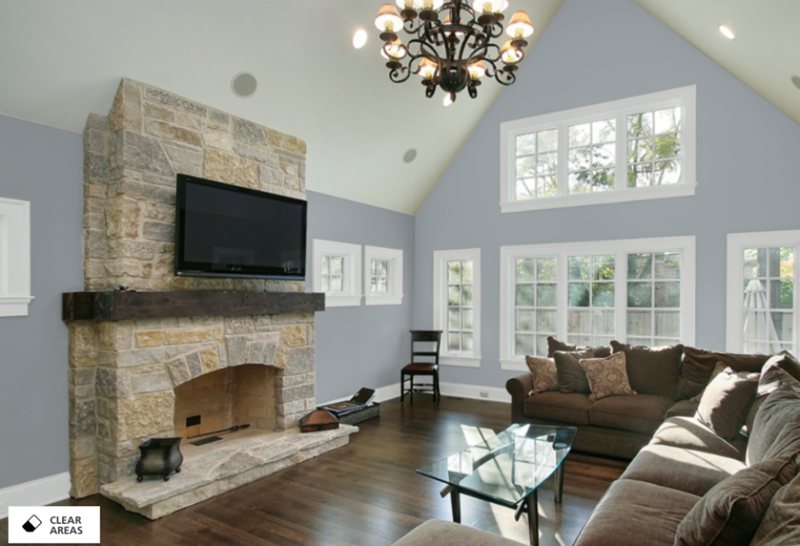
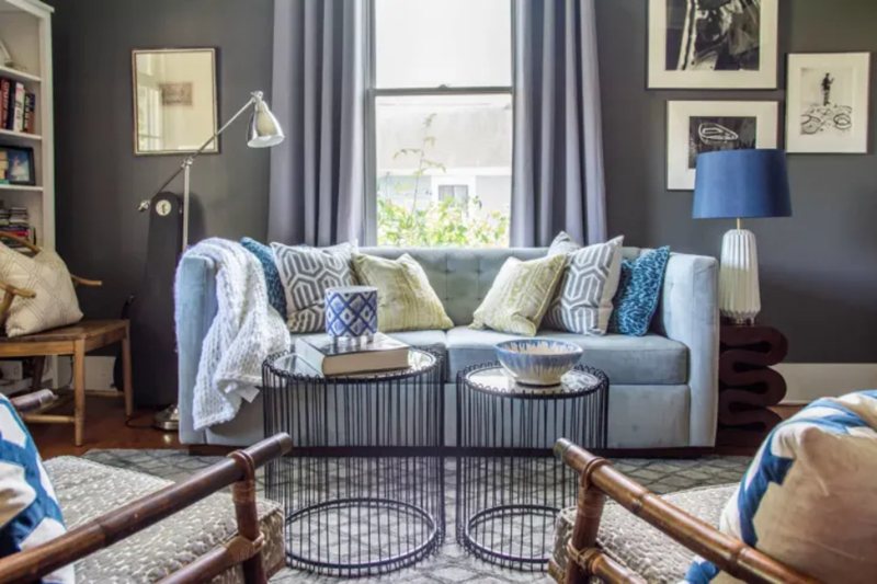
Lazy Gray Living Room
Spending time in the living room would show you that some colors can be depressing, but Lazy Gray isn’t one of those. Instead, its bluish-gray hue would keep your mood steady for as long as you sit in that space.
Remember, the living room is one of the places you’re allowed to get the most creative. Don’t be afraid to experiment with daring themes like triads and contrasts. Use Lazy Gray as your backdrop (on the walls), and let your creativity flow through the décor.
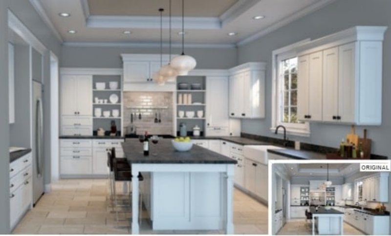
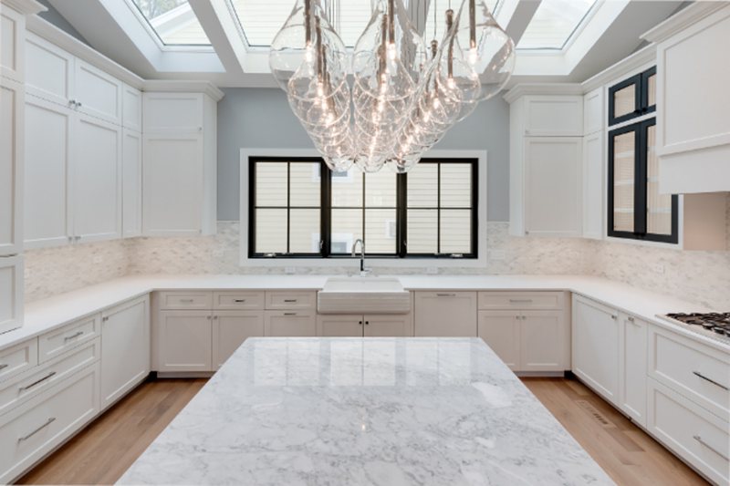
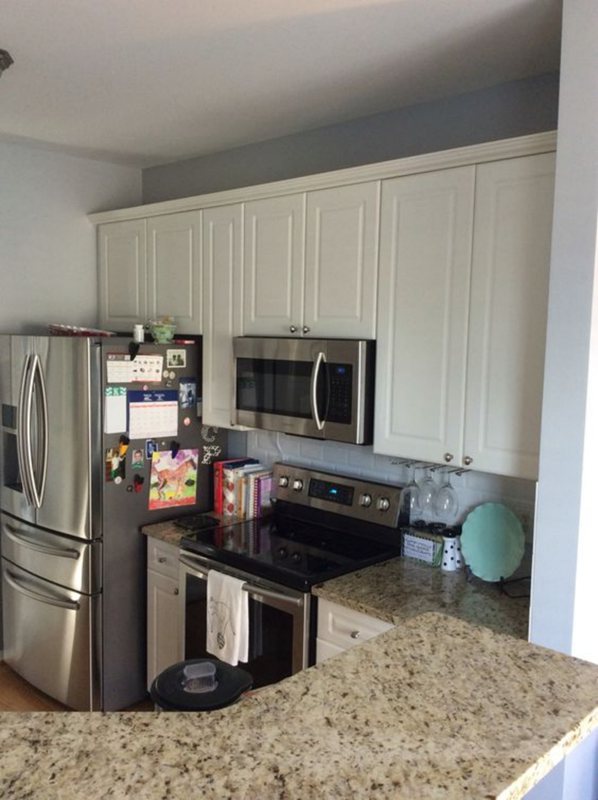
Lazy Gray in the Kitchen
Sherwin-Williams Lazy Gray on the kitchen cabinets and doors always works as an accent since you don’t want to feel too relaxed in the kitchen. You need a color with spunk that’ll spur you to cook and eat, and those are warm hues.
The kitchen is another great room to try contrasting Lazy Gray with yellow-based whites or rich reddish tans. Juxtaposing the warmth with the cool aura of the blue-gray paint would create a balance.
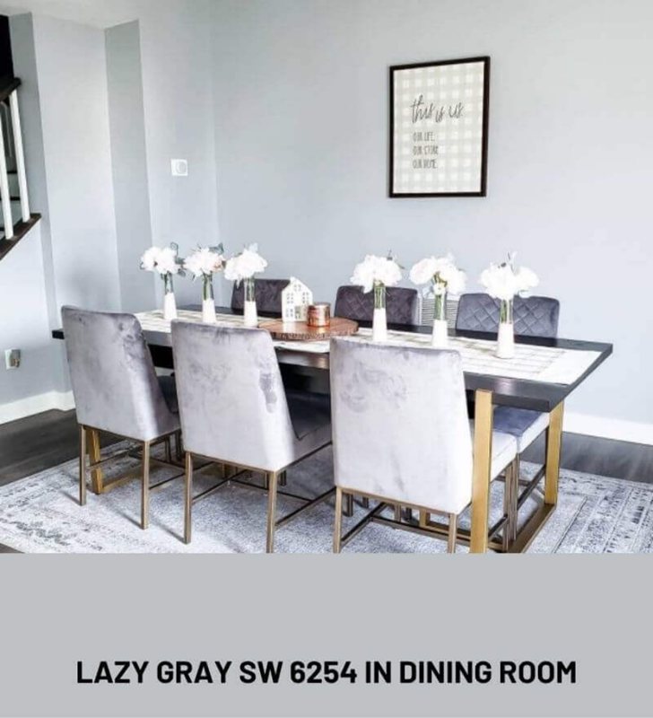
Lazy Gray Dining Room
Unlike the kitchen, you can use Lazy Gray on your dining room walls since the space often serves double duty as a homework/study room. The blue tint would calm your nerves and aura after a stressful time cooking in the kitchen.
Also, if you’ve taken my advice on using Lazy Gray as an accent in the kitchen, it’ll blend with the dining room’s wall.
Lazy Gray as an Accent Wall or Full Wall?
It can go either way for me, depending on all the factors earlier explained, from size to lighting. Use the paint as a full wall coloring to open up a small space underneath the brightest light.
If there’s little to no lighting, stick to accenting, trims and highlights. Instead, find a brighter paint to do the heavy lifting and help the blue in Lazy Gray shine.
Lazy Gray Exteriors
Lazy Gray outside is best as an accent since the outdoors presents the most risk of natural bright light. You don’t want your home looking like a baby boy reveal scene every morning when the blue takes over the neutral gray.
Instead, a little Lazy Gray on the door or porch would stand against white or dark gray paint. Try using it on your tool shed or detached pool house if it must be outside. The key is to use it sparingly or mix with other colors outdoors.

Sampling Lazy Gray
I advise clients to preview every painting in the morning under natural light and in the evening after sunset. You’ll be surprised at the transformation from undertones during these key times.
While digital shades present an almost replica, there are still slight differences you can only see with samples. Get a peel & stick strip from Sherwin-Williams, Samplize, Color Chips, or Color-to-Go for the most realistic preview.
Final Thoughts
Lazy Gray is the color of the ocean’s horizon on a cloudy day so avoid it if you hate blue. No matter how you design it, its undertone is powerful enough to seep out when you least expect it to.
However, this color will surely soothe and bring balance back into your life if you’re dealing with nerves and anxiety.
 Sherwin Williams Mega Greige (Palette, Coordinating & Inspirations)
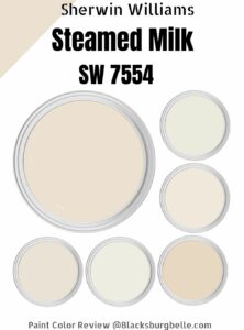 Sherwin Williams Steamed Milk (Palette, Coordinating & Inspirations)
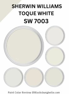 Sherwin Williams Toque White (Palette, Coordinating & Inspirations)
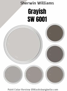 Sherwin-Williams Grayish (Palette, Coordinating & Inspirations)
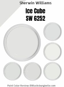 Sherwin Williams Ice Cube (Palette, Coordinating & Inspirations)
 Sherwin Williams Pearly White (Palette, Coordinating & Inspirations)
