
Are you tired of neutrals that are just not neutral enough? If you’re looking for something with more balance, you should try Benjamin Moore Edgecomb Gray HC-173.
It’s the perfect neutral paint that sits in the sweet spot between gray and beige. This makes it a unique greige color that most neutral-loving people have fallen in love with.
Like most neutrals, this color can be easily misinterpreted as boring. However, it can bring out the best in your space when styled right. Stick with me for everything you need to know for optimal results.
Table of Contents
When To Choose Benjamin Moore Edgecomb Gray?
As one of the most popular neutral paints Benjamin Moore has to offer, there are several reasons why Edgecomb Gray tends to be a crowd favorite. It’s gray, it’s beige, it’s warm, and it’s clean.
Are you still trying to decide if Edgecomb Gray is the right color for you? You’re not alone. Most people tend to second-guess their decision to choose a neutral like this. Here are some reasons why you may be gravitating towards it.
Are You Looking To Update Your Tuscan Finish?
If your house has a lot of terracotta designs, travertine, or sandstone finishes, you may want to incorporate a color that keeps it looking fresh while complementing it.
Benjamin Moore Edgecomb Gray has distinct Tuscan hues that will complement your space while giving it a more modern feel.
Do You Want A Warm Neutral?
As much as Edgecomb Gray is a greige color, it can lean towards some level of warmth. I think of this color as a warm gray. It reminds me of warm stones and rocks sitting out under the sun.
Need Something Soft?
Soft. That’s the first thing that popped into my head when I saw this color. It doesn’t jump out at you but teases a delicate, airy feel I can’t get tired of.
Sneaky Undertones?
This greige paint has undertones that may sneak up on you in certain lighting situations. Its green-gray undertones may not always be visible, but they’re there. I’ll tell you more about this later on.
What Color Is Benjamin Moore Edgecomb Gray?
Think of getting a subtle warm feel when you sit out in nature and look at light gray and brown rocks basking in the sun. That’s a summary of what Edgecomb Gray looks and feels like.
It is a light, warm neutral that reminds me of earthy, organic home accessories. It also gives out a clean, airy feel due to its gray side.
Edgecomb Gray can read like a bright color in a room with a lot of light. But without adequate lighting, it radiates cooler and muted hues. We’ll talk more about lighting later on. For now, consider the picture below.
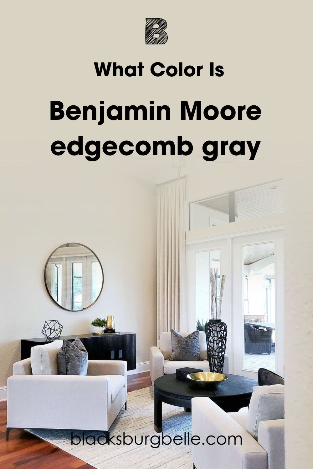
At first glance, you might dismiss this paint as a bright paint or an off-white color. I attribute this to the abundant natural light in the picture above.
Now, take a look at the ceiling, which reads bright white. When you compare the ceiling with the walls, you can see how warm Edgecomb Gray is.
Depending on what you compare it with, this color can read like a warm beige or a cool gray. In this case, comparing it with white brings out its warmth.
However, when you compare it with certain colors like Benjamin Moore Shaker Beige, you can see how cool and gray it can also be.
Snapshot Of Benjamin Moore Edgecomb Gray Specification
All paint colors have their unique specifications that make them stand out from each other. To help you understand Edgecomb Gray more, let’s look at the table below.
| Color Name | Benjamin Moore Edgecomb Gray HC-173 |
| LRV | 63.09 |
| RBG | 218, 209, 196 |
| Undertones | Gray-green |
| Hex Code | #D9D3C4 |
LRV Of Benjamin Moore Edgecomb Gray
Also known as Light Reflectance Value, LRV is a scale professionals use to measure how light or dark a color is. It quantifies how much light a color will absorb or reflect. 0 indicates that the color reflects no light at all, while 100 shows that it reflects all light.
Benjamin Moore Edgecomb Gray falls at 63.09 on the LRV scale.
This makes it a color that reflects more light than it absorbs. It is quite the bright paint and exudes a muted sense of airiness without being harsh.
The position of Edgecomb Gray on the LRV scale puts it as a light neutral that teeters between light and gray. It also makes it easier to pick up on the slight undertones that make this paint unique.
Speaking of undertones, let’s explore that in the next section.
Undertones Of Benjamin Moore Edgecomb Gray (OC-65)
Undertones are the subtle influences of underlying colors that can make another color appear cool or warm. Warm colors have orange, red, or yellow undertones. They depict coziness and often appear as if they’re radiating towards you.
On the other hand, cool colors have undertones of green, purple, or blue. Depending on the shade and hue, they make spaces appear calm, soothing, and sometimes sterile.
The Benjamin Moore Edgecomb Gray paint has slight green-gray undertones. But don’t expect this paint to make your space appear noticeably green because it won’t. Remember that it’s still a neutral paint.
This paint’s green-gray undertones are subtle and can only be obvious under specific lighting situations. Let’s use the picture below as an example.
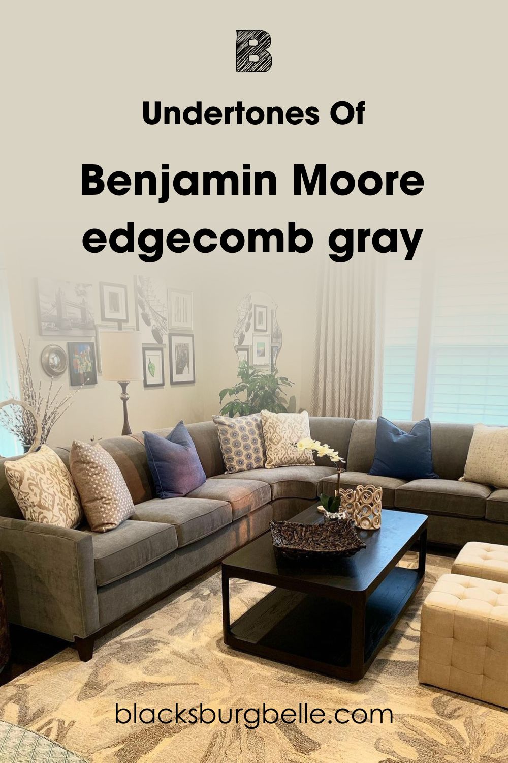
Notice how there’s only a fair amount of natural light, which makes the slight green undertones of Edgecomb Gray more obvious.
Different lighting types will affect how you perceive color at different times. This next section will give you more insight.
What Is The Effect Of Lighting On Benjamin Moore Edgecomb Gray?
Depending on the type and position, different types of lighting bring out the undertones of paint colors or suppress them.
For instance, North-facing lights will make Edgecomb Gray appear cooler, leaning towards its gray side. This is because north-facing windows allow blue-tinted or cool lights into a room, and these lights will mute the little warmth Edgecomb Gray has to offer.
If you’re using Edgecomb Gray in a room with South-facing lights, expect it to gravitate towards warmth. South-facing lights are often warm and light and will accentuate the warm and beige side of this paint.
Can Edgecomb Gray Read Yellow?
Edgecomb Gray will not read yellow in an obvious hue. You will only notice the slight yellow undertones if the lighting takes your attention from the cool nature of the paint and allows you to focus on this warmth.
Consider this image below.
Is Edgecomb Gray A Bright Color?
I would describe this paint as a muted, bright color. Confusing? Let me explain. Its LRV places it closer to white than black, and its gray-beige combination makes a bright neutral.
However, it doesn’t jump at you or appear as a glaring bright color. Its slightly gray-green undertones help to tone down any excessive brightness it may have.
Even in a room surrounded by glaring lights, Edgecomb Gray does not come out as a harsh bright color but softens the entire ambience of your space. The picture below depicts this almost perfectly.
See? It looks bright, but not in the harsh way you might expect a room with so much light to look. On the contrary, it looks airy, soft, and incredibly delicate. It’s no wonder this is one of Benjamin Moore’s best-selling colors.
Is Benjamin Moore Edgecomb Gray A Warm Or Cool Color?
Edgecomb Gray is a neutral that can be described as a warm gray. In its composition, it has 80% red, 85% yellow, and just 77% blue. Its higher red and yellow hues place it on the warmer side of the spectrum.
If you compare this paint to a true gray, you’ll see just how much its beige undertones make it warm.
If you want to bring out Edgecomb Grey’s warmth, I advise pairing it with beige and earthy furniture. However, if you want to make it appear cooler, off-white and crisp colors will do the trick. It is a highly versatile color that will look great either way.
Benjamin Moore Edgecomb Gray Color Strip: Lighter Or Darker Exploration
No matter how versatile a color is, sometimes, it just doesn’t get the job done. If Benjamin Moore Edgecomb Gray is close to what you want, consider its color strip.
Let’s look at some variations of Edgecomb Gray that may be closer to what you’re looking for.
- Boothbay Gray HC-165
- Pashmina AF-100
- Edgecomb Gray HC-173
- Dove Wing OC-18
- White Heron SW 7627

Boothbay Gray is a true gray paint mostly devoid of beige undertones and, instead, has steely blue hues. On the other hand, Pashmina is a much darker neutral that does not show gray undertones the way Edgecomb Gray does.
Dove Wing and White Heron are neutral-leaning off-whites that give off the same clean, airy feeling as Edgecomb Gray, but brighter.
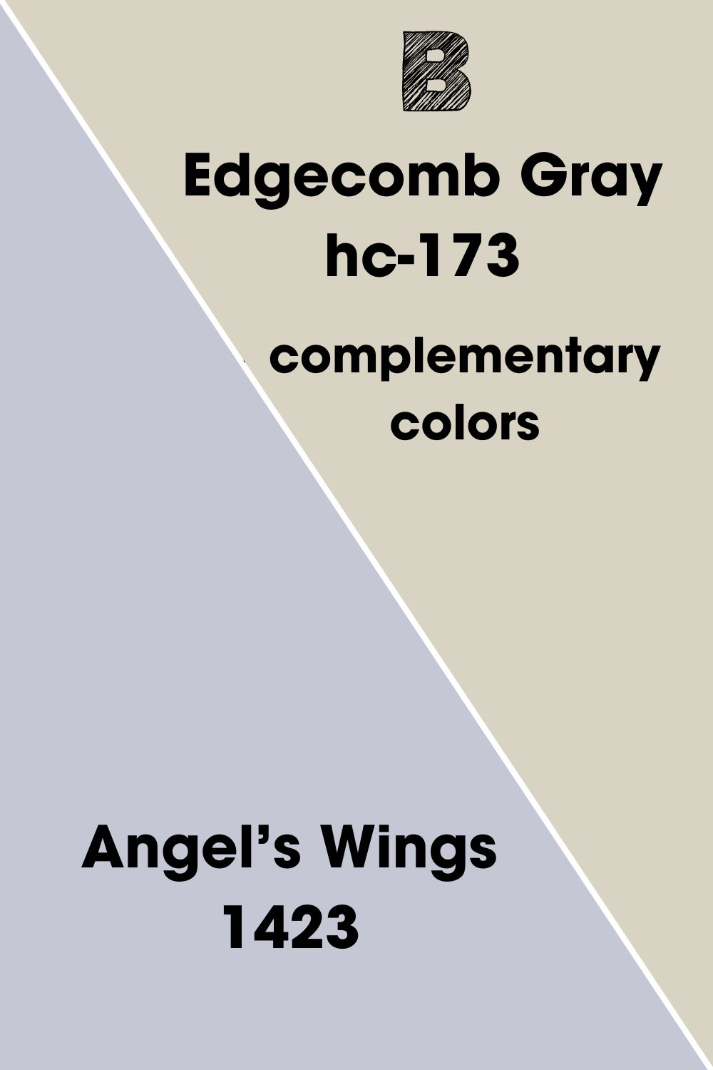
What Are Complimentary Colors For Benjamin Moore Edgecomb Gray
Also called opposite colors, complementary colors create a huge visual contrast when placed side by side. Even though they have opposing hues and undertones, they create a beautiful palette because they accentuate each other’s bold hues.
On the color wheel, complementary colors can be found 180 degrees from each other. Some common complementary pairs include green and magenta, yellow and purple, and orange and blue.
For Edgecomb Gray, the closest complimentary color I found was Benjamin Moore Angel’s Wings. It’s a gray color with faint wisps of violet and lilac that starkly contrast Edgecomb Gray’s beige hues.
Using Edgecomb Gray with Angel’s Wings results in a bold and sophisticated look that feels every bit as modern. The contrast this pairing creates also brings some semblance of balance to spaces.
Suppose you’d like a deeper contrast, swap Angel’s Wings for darker colors like French Violet and Wood Violet. These stand on the darker end of the spectrum, creating a profound effect when used as trim colors with Edgecomb Gray.
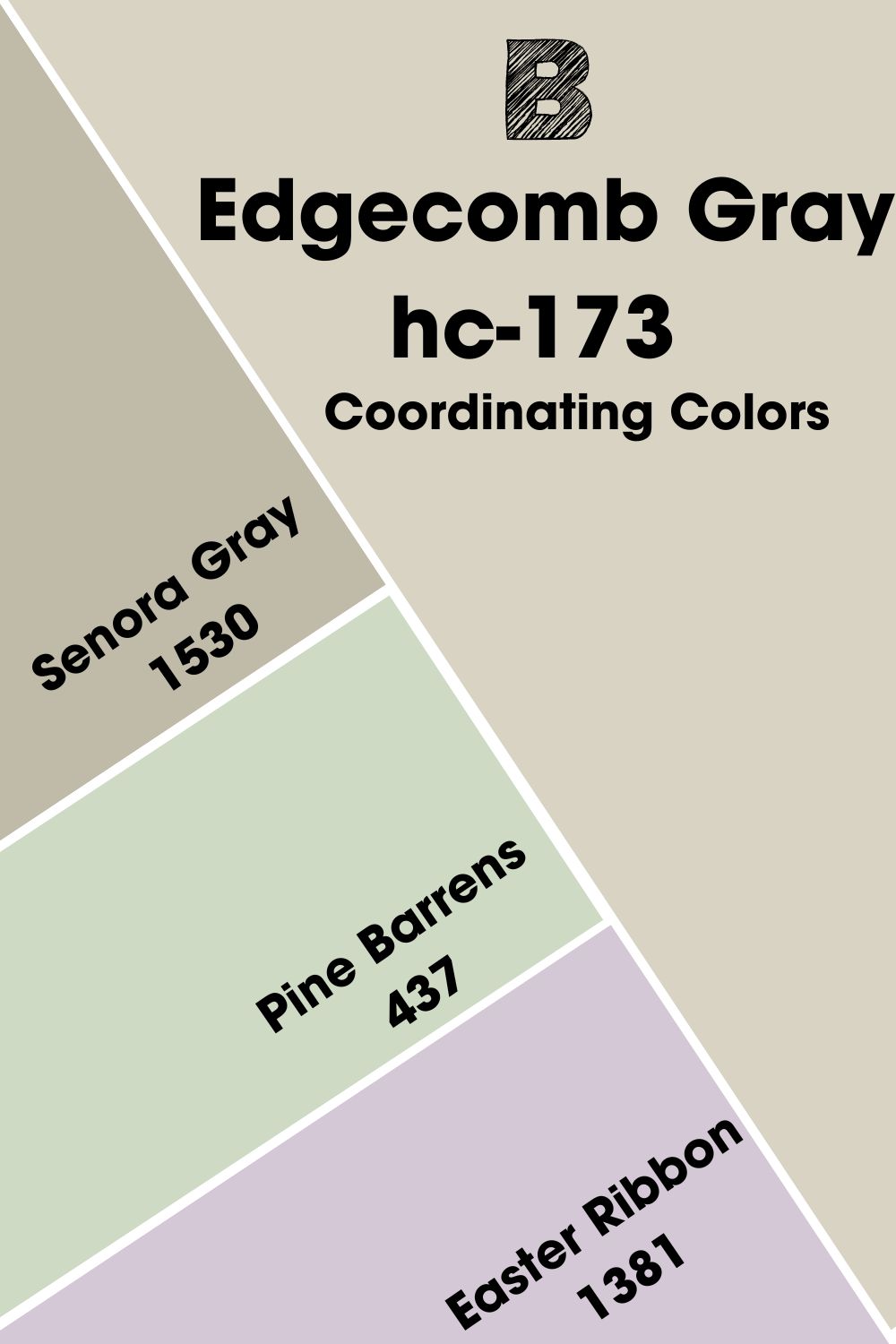
Benjamin Moore Edgecomb Gray Coordinating Colors
Coordinating colors often share similarities in hue or intensity that make them a good match. When used in space, coordinating colors can help cancel out the blandness resulting from using a single color on its own.
Let’s look at some common themes you can use as a guide to creating beautiful coordinating palettes.
- Analogous Theme: The easiest way to spot analogous colors is by picking any three colors that sit side by side on the color wheel. Because of their proximity to each other, these colors often fall within the same hue and family, creating a beautiful gradient effect.
- Monochromatic Theme: This is an interesting scheme that is created by adding white to make a lighter shade or black to create a darker shade.
- Complementary Theme: For every two colors on the color wheel, one is considered dominant, while the other is an accent color. Together, they are called complementary colors.
- Split Complementary Theme: This theme works based on complementary colors. However, it uses one color and the two colors that symmetrically surround it.
- Triadic Theme: This color palette uses three evenly spaced colors from the color wheel to create a harmonious triadic effect.
Coordinating Colors For Benjamin Moore Edgecomb Gray HC-173
For the delicate Edgecomb Gray paint, I found a couple of colors that create a well-coordinated palette.
- Benjamin Moore Senora Gray 1530: This mid-tone color is a darker version of Edgecomb Gray. With an LRV of 48.2, it hides its subtle green undertones more.
- Benjamin Moore Pine Barrens 437: This quiet green sits light and pretty. Where Edgecomb Gray’s green undertones are hard to find, Pine Barrens will draw them out nicely.
- Benjamin Moore Easter Ribbon 1381: With an LRV of 59.1, this pastel violet contrasts Edgecomb’s perfect greige hue.
Senora Gray draws out the warmth in Edgecomb Gray, and the two can be paired for a more cozy effect. You can use Pine Barrens as an accent, while Easter Ribbon sits better as a trim color that finely contrasts with Edgecomb Gray.
Benjamin Moore Edgecomb Gray Color Palette
Because Edgecomb Gray has one foot in beige and the other in gray, it gives you the advantage of versatility. There are several appealing color palettes you can create using this unique paint.
I’ve put together some unique color palettes you can play around with. Get comfortable with mixing and matching to find what’s best for your space.
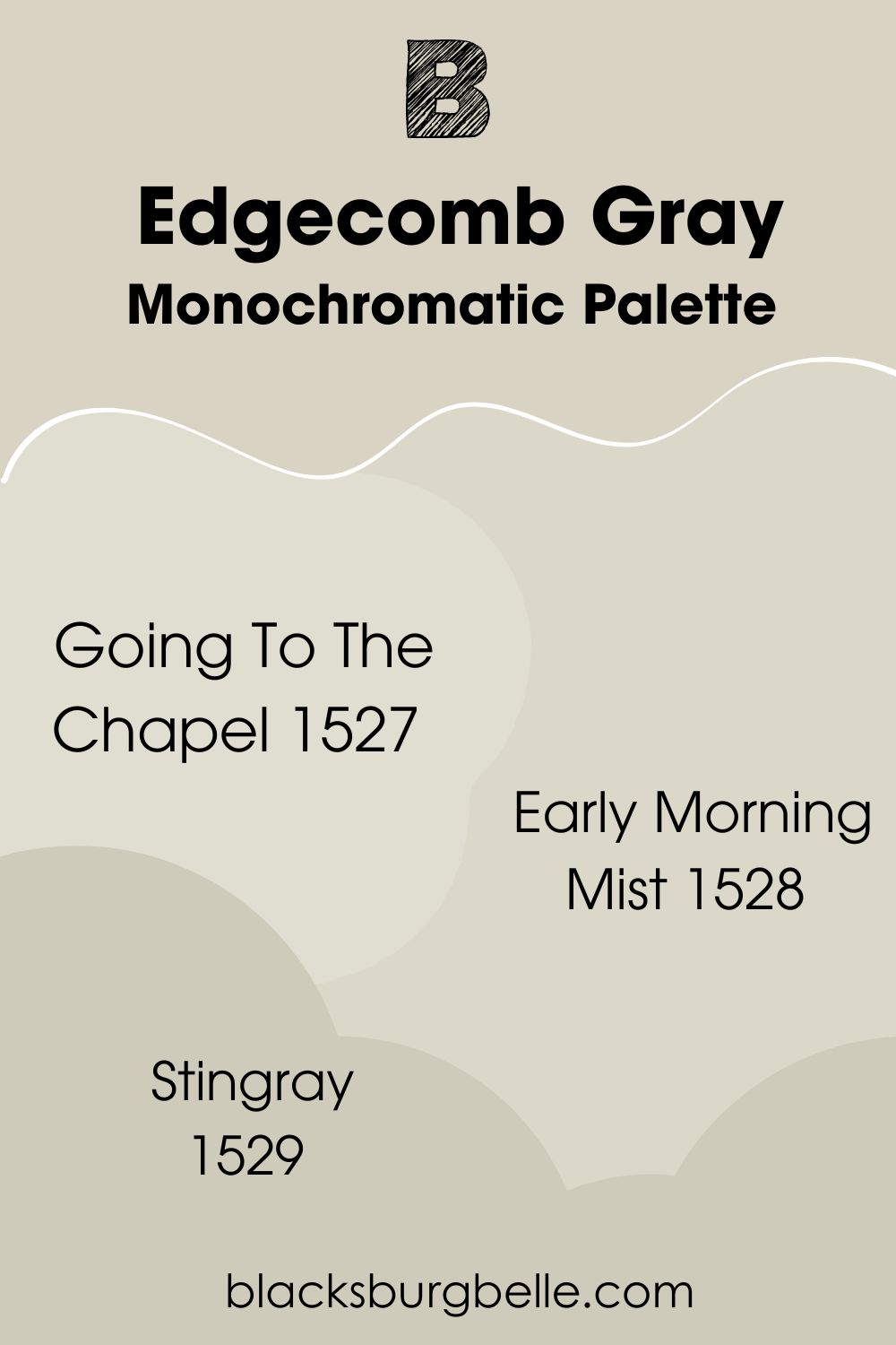
Monochromatic Palette
- Benjamin Moore Going To The Chapel 1527: One of Benjamin Moore’s classic paints with an LRV of 71.74. It gives off hints of green that pair well with Edgecomb’s fleeting undertones.
- Benjamin Moore Early Morning Mist 1528: This unique gray color reminds me of the bright morning mist with the most subtle wisps of aloe.
- Benjamin Moore Stingray 1529: With an LRV of 58, Stingray leans more towards the gray side of Edgecomb Gray to give off a beautiful cool gradient effect.
This monochromatic palette works well because you can either go down the gray lane with colors like Stingray or play around with green undertones with Early Morning Mist and Going To The Chapel.
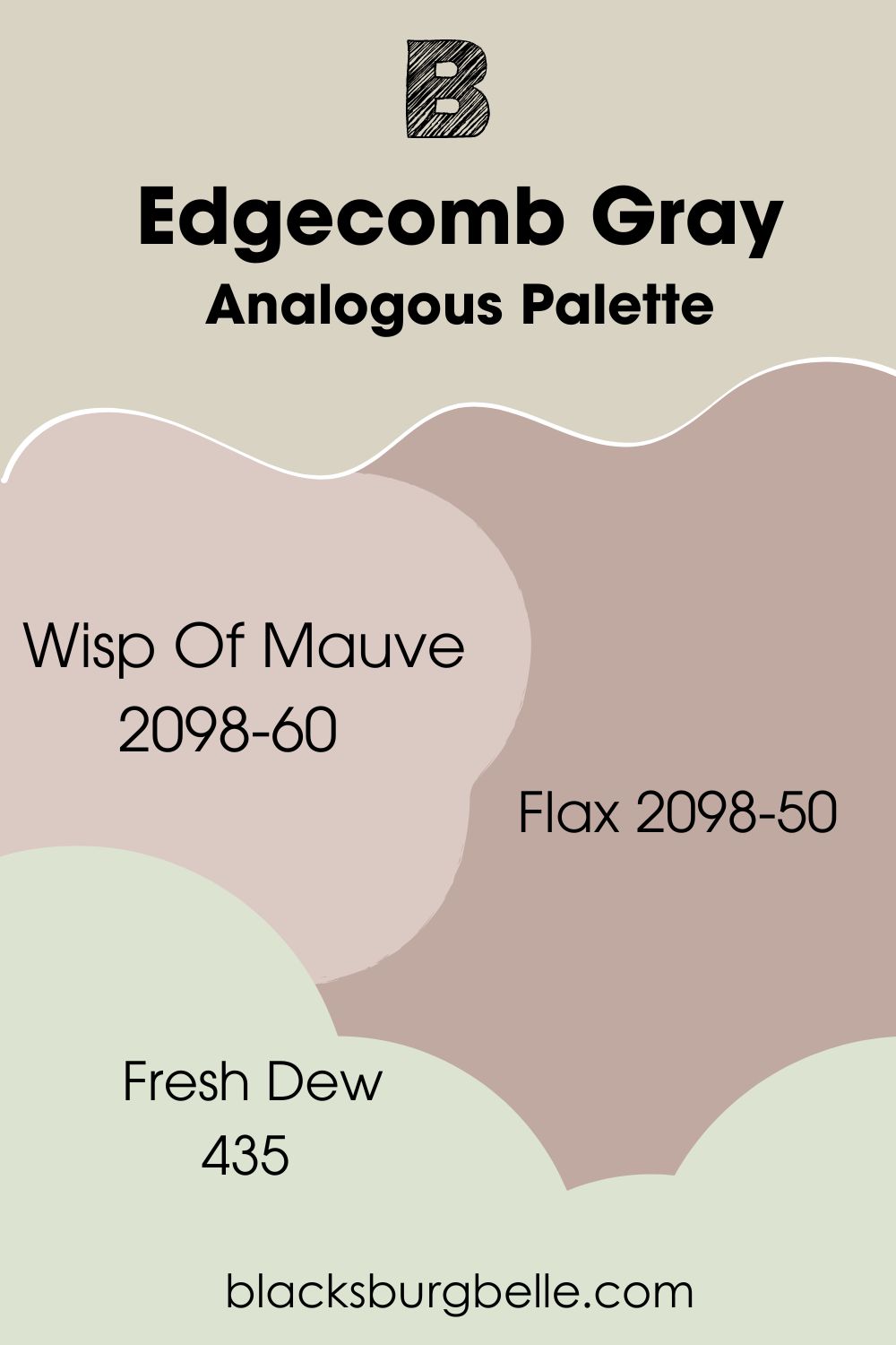
Analogous Palette
- Benjamin Moore Wisp Of Mauve 2098-60: This soft color uses wisps of gray and purple to add character to your space, especially when paired with Edgecomb Gray.
- Benjamin Moore Flax 2098-50: For a more refreshing contrast, flax shares the organic nature of Edgecomb Gray. Together, these two colors will bring your house a homely and nostalgic feel.
- Benjamin Moore Fresh Dew 435:A bolder and brighter version of Edgecomb Gray that sits at an LRV of 72.8 and lets its green hues come out to play at all times.
For the analogous palette, Edgecomb Gray goes well with colors that have more saturation to them and do not sit as neutral as it does.
Wisp of Mauve and Flax use light organic or purple hues to add some color to a space, while Fresh Dew uses evident green tones to liven up a room.
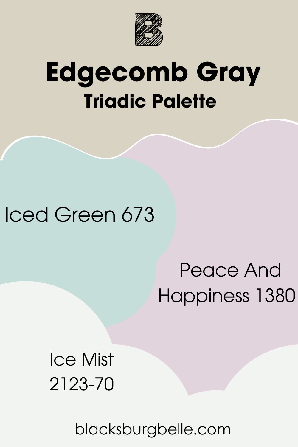
Triadic Palette
- Benjamin Moore Iced Green 673:What Edgecomb Gray lacks in coolness, Iced Green makes up for it with a bubbly cast.
- Benjamin Moore Peace And Happiness 1380: This color uses a brilliant mix of pale violet with hints of red that contrast with Edgecomb Gray’s quiet, greige hues. They create a vibrant palette full of life but not too overwhelming when used together.
- Benjamin Moore Ice Mist 2123-70: At an LRV of 88.84, this color can appear as a clean white but features sneaky bright blue undertones that complement the muted airiness Edgecomb Gray brings.
Among all three palettes, the triadic palette is the most contrasting. It boldly uses opposing hues to draw out the earthy beauty of Edgecomb Gray.
I suggest you use accent colors like Iced Green and Peace And Happiness. On the other hand, Ice Mist creates a perfect contrast that makes it great for trimmings.
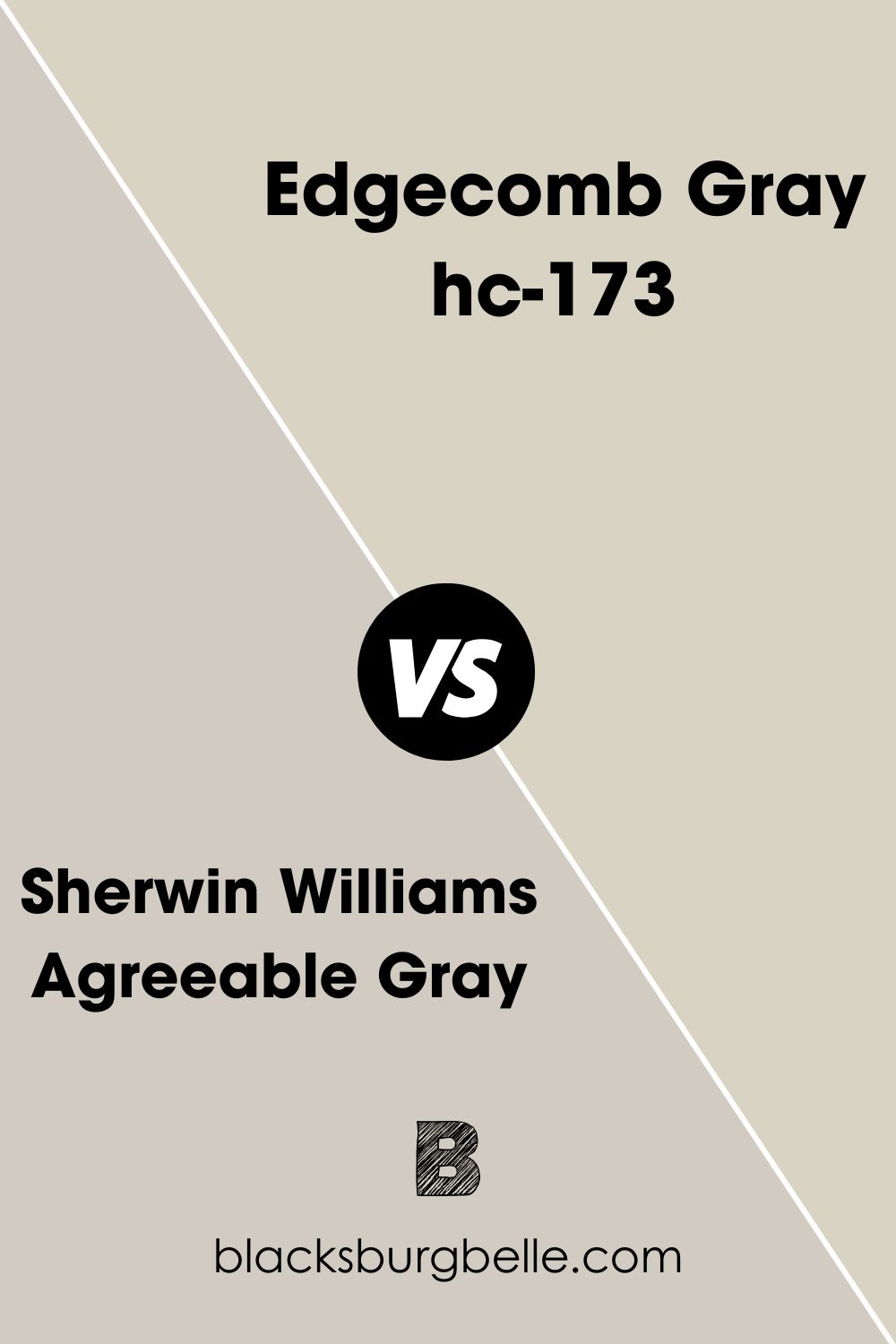
Benjamin Moore Edgecomb Gray Vs Agreeable Gray
Agreeable Gray is a soft, warm gray that mimics the delicacy of Edgecomb Gray. But it sits darker at an LRV of 60.
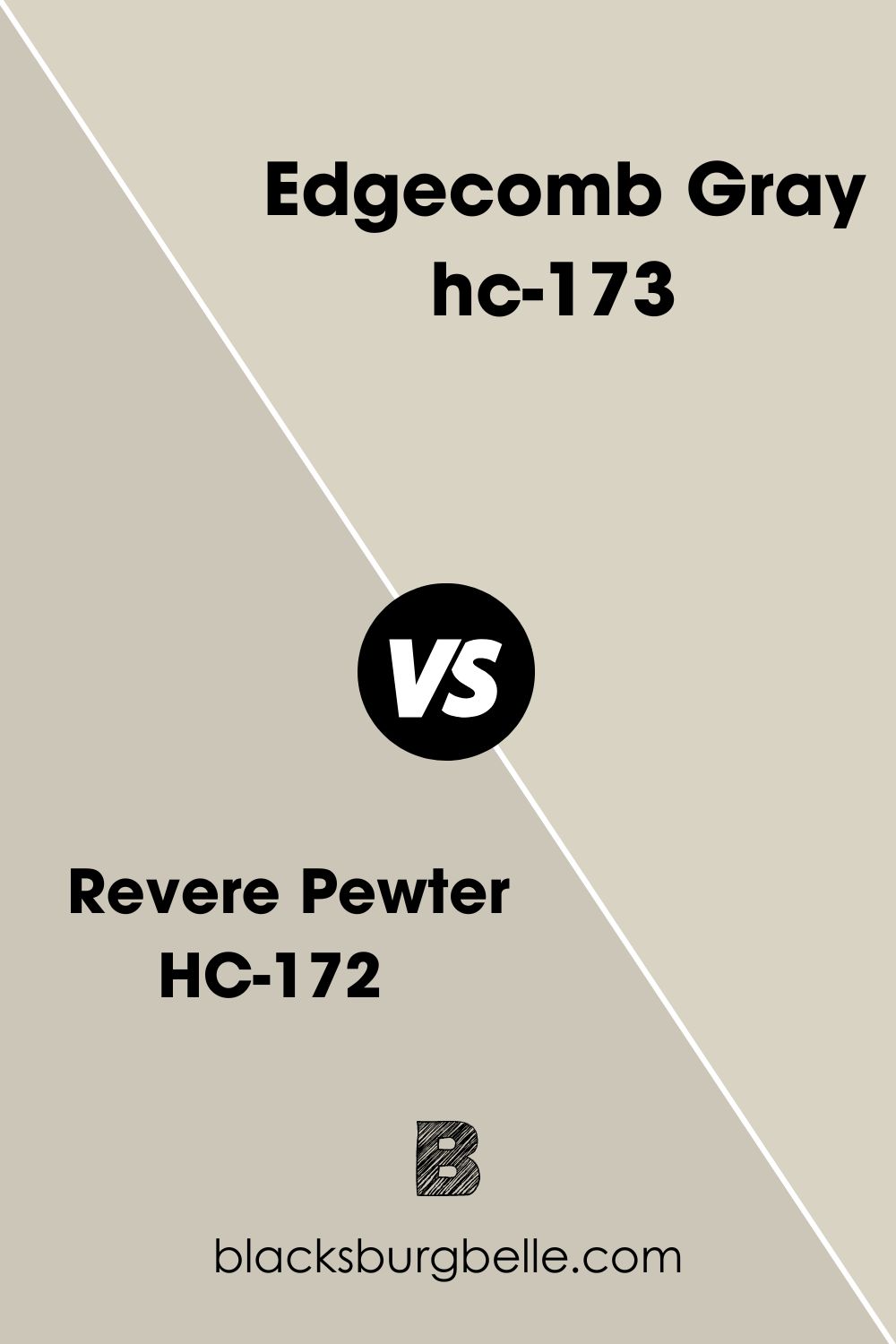
Benjamin Moore Edgecomb Gray Vs Benjamin Moore Revere Pewter
While these are warm grays, Benjamin Moore Revere Pewter leans more toward tan hues as it’s darker and creamier.
Benjamin Moore Pale Oak Vs Edgecomb Gray
Benjamin Moore Pale Oak gets the job done for a color that’s just the right amount of warm gray but reminiscent of white oak.
Benjamin Moore Balboa Mist Vs Edgecomb Gray
Balboa Mist pales slightly in comparison to Edgecomb Gray. However, they’re both greige colors with slightly warm casts.
Accessible Beige Vs Edgecomb Gray
Even though they have similar gray undertones, Accessible Beige feels cozier than Edgecomb Gray.
Benjamin Moore Wind’s Breath Vs Edgecomb Gray
Wind’s Breath is part of Benjamin Moore’s unique off-white collection, which reads brighter than Edgecomb Gray and commands a bit more attention.
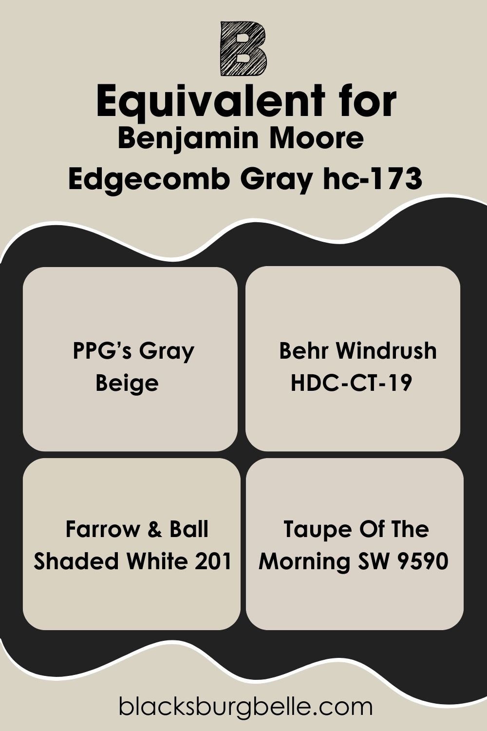
Benjamin Moore Edgecomb Gray Equivalent In Other Brands
Although you might not get the exact match, certain paints from other brands bear similarities with Benjamin Moore’s Edgecomb Gray.
BEHR’s Windrush comes closest to Edgecomb Gray, with subtly lighter tones, while Farrow & Ball Shaded White matches its greige neutrality almost perfectly.
PPG’s Gray Beige and Sherwin Williams’ Taupe Of The Morning embrace their gray undertones more than Edgcome Gray. Valspar’s Shoreline Haze has a little bit more warmth to it.
Where Can You Use Edgecomb Gray?
Now that you know a bit about Edgecomb Gray, you should also get tips on when and where to use this soft color. An advantage of using this paint is that its undertones are pretty relaxed, so you can easily play around with it in so many different ways.
Edgecomb Gray works almost anywhere. It’s great in the living room, bathroom, kitchen, and even laundry rooms.
You can also accessorize it to match whatever vibe you’re looking for. Let’s look at some examples.
Benjamin Moore Edgecomb Gray In The Kitchen
This is a fantastic kitchen wall color with the right accents and trimmings. In a well-lighted kitchen, it will read more gray than beige, bringing a unique and airy feel to the space.
If you’re using Edgecomb Gray, I suggest you use it where you have sufficient natural light. Even though it might look gray, pairing it with off-white cabinets will add to your kitchen’s spaciousness.
Consider the picture below.
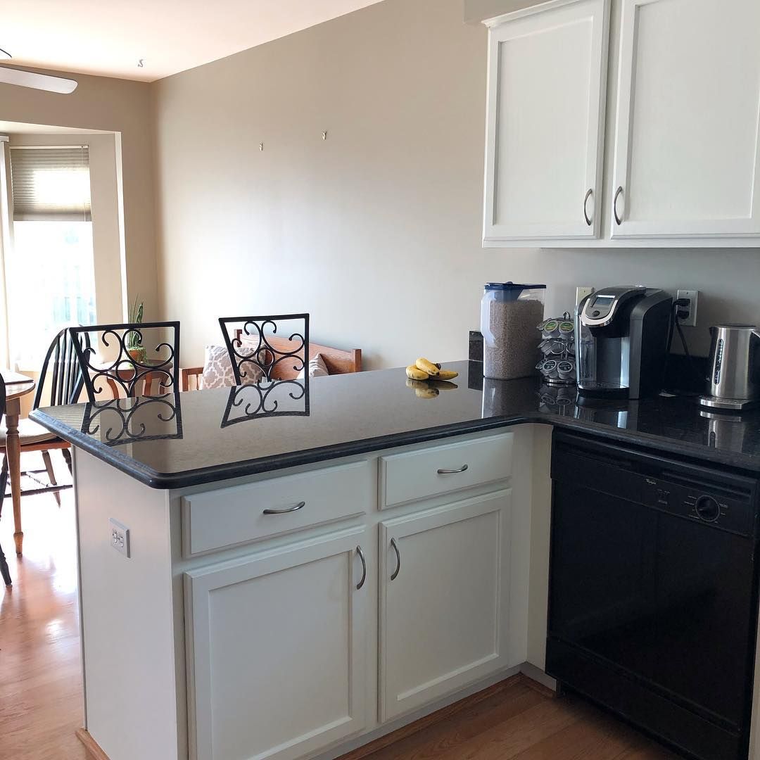
Notice how the walls look gray. Edgecomb Gray will read brighter and not as gray in better or warmer lighting, as seen in the picture above.
Benjamin Moore Edgecomb Gray In The Bathroom
Edgecomb Gray has slightly warm wisps that make a great wall bathroom color. Its neutrality helps tone down the sterile feel often common to bathrooms.
While you may not be totally cozy using this paint in your bathroom, it certainly won’t feel too cold or rigid.
The best way to make this work in the bathroom is to use accent cabinets with brighter colors, like off-white. While the Edgecomb Gray adds a touch of warmth to the bathroom, the white accents will balance it out.
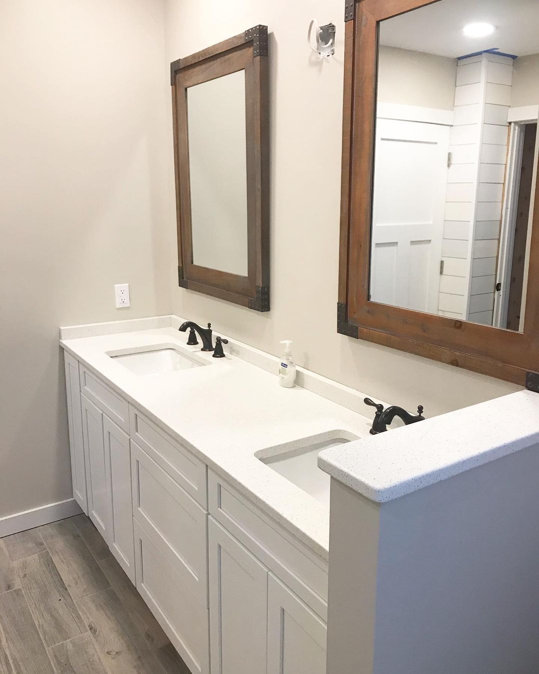
To remove more of the sterile feel of your bathroom, you can also use dark brown furnishing around the mirrors. However, this may not be appealing if you want a more modern aesthetic.
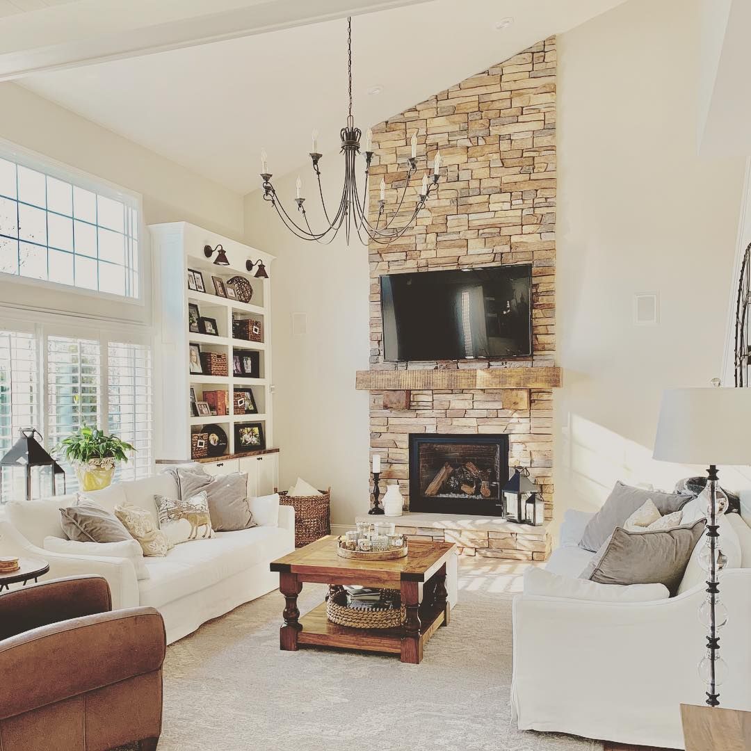
Edgecomb Gray In The Living Room
For people who love a cozy but airy space, Edgecomb Gray makes a perfect wall color for living rooms.
You can use dark and earthy furniture like dark brown stools, beige couches, or brown pillows to bring out the coziness.
On the other hand, you can use a bright color like White Dove for the cornices and trim. This makes the entire space look larger and cleaner, especially if you have excess light.
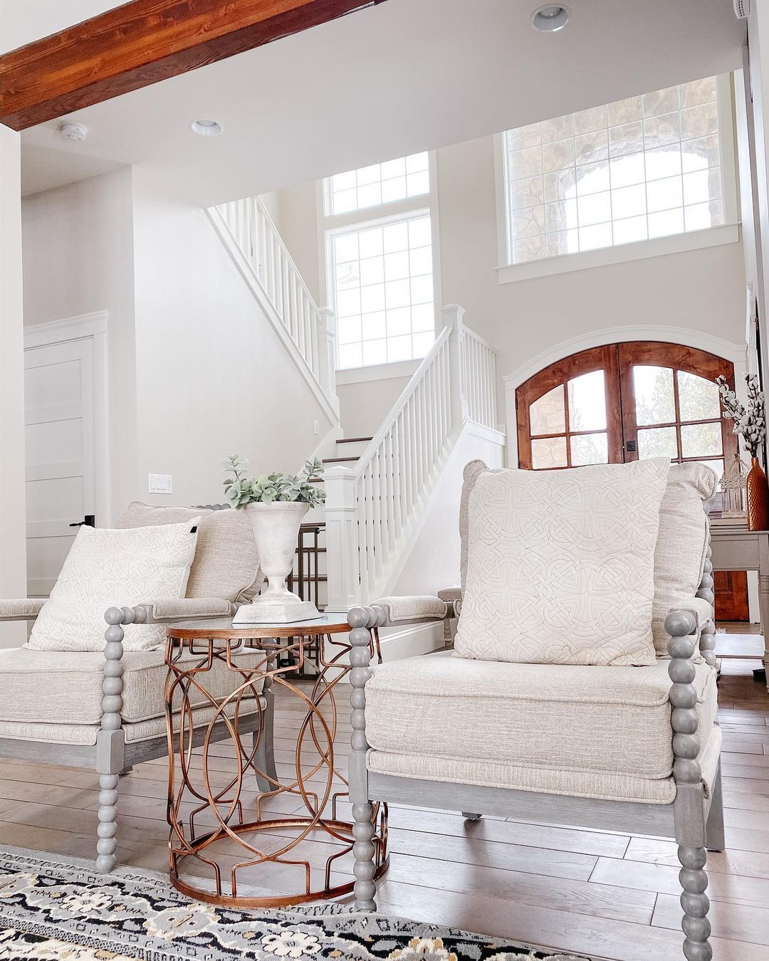
In the picture above, you’ll notice that even though Edgecomb Gray is used on the walls, it looks bright and clean. This is because of the cream couches, white trims, and off-white ceiling.
Conclusion
Benjamin Moore Hedgecomb Gray reminds me of the color of concrete because of its warm gray and slightly green undertones.
Even though I’d typically prefer something with more warmth to it, you can add to the cozy feel of Hedgecomb Gray with earthy textures and brown furniture.
This paint color can also read gray if you pair it with cooler grays and brighter whites with hints of blue, purple, or violet.
 Sherwin Williams Incredible White (Palette, Coordinating & Inspirations)
 Sherwin Williams Naval (Palette, Coordinating & Inspirations)
 Sherwin Williams Tricorn Black (Palette, Coordinating & Inspirations)
 Sherwin Williams Silvermist (Palette, Coordinating & Inspirations)
 Sherwin Williams Snowbound SW 7004 Review
 Sherwin Williams Charcoal Blue SW 2739: Color Review
