
Are you interested in dark neutral paints but don’t want to use the common black, gray, or taupe? If this sounds like you, I have the perfect navy blue for you.
Sherwin-Williams Charcoal Blue (SW 2739) is a beautiful blend of gray and blue that gives off a soothing and calm energy.
Charcoal Blue was the star of Sherwin-Williams’ 2019 Colomix Aficionado Collection. The first thing that stood out about this color was that I couldn’t tell if it was blue or gray.
I’m excited to explore the undertones, mood, LRV, more color palettes, and usage of Charcoal Blue and I’m excited to bring you on this journey with me.
Table of Contents
When to Choose Sherwin-Williams Charcoal Blue (SW 2739)?
Before we get into the details of Charcoal Blue, let me brief you on when to choose this grayish-blue paint. The recurring usage is in offices and exteriors for entire walls, then accents in bedrooms, kitchens, and living rooms because of its dark tone.
Want Serious Vibes?
If you’re not playing around and need a paint color with the ability to keep you grounded, Charcoal Blue is for you. It’s a color filled with depth and a bit of soothing energy when its gray undertone takes over.
Looking for Light?
Don’t come here if you’re looking for a color to brighten up your space. Charcoal Blue is fully moody and dull with no hint of brightness and an LRV of 6.
Playing with Blue Color?
Charcoal Blue shows you how exciting blue can get if you give the color a chance. It has a gray tint that makes its navy tone appear hazy and shadowy.
Planning To Re-Do The Kitchen?
Give your kitchen cabinets a facelift with Charcoal Blue. You can also use the color on your wainscoting paired with white walls to give the space a modernized, classic look.
Interested in Outdoor Activities?
Outdoor activities like barbecue parties and games will be more exciting with an elegant backdrop like Charcoal Blue on your exterior walls.
You can do so much with Charcoal Blue because having two dark tones makes it a neutral color. Whether you’re using it indoors or outdoors, the color has a way of elevating every space.
The only question you should ask yourself is what color theme would work best? To answer that, firstly, you must understand what color Charcoal Blue is, including all its elements.
What Color is Sherwin-Williams Charcoal Blue (SW 2739)?
You can take a wild guess by looking at the color and know why its name is Charcoal Blue (SW 2739). This paint color possesses a rich gray undertone that makes its navy color appear dusty with a charcoal surface.
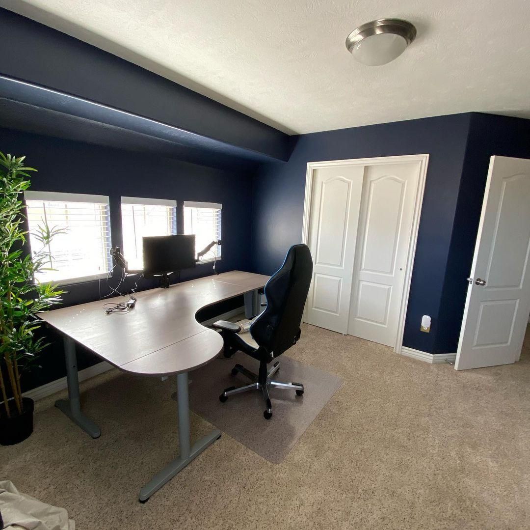
See what it looks like in this office.
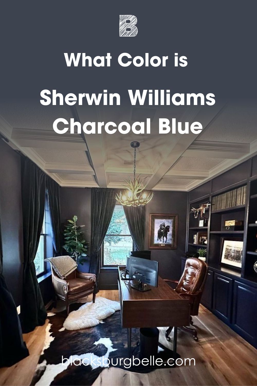
The Aficionado Collection introduced color enthusiasts like me to the beauty of using dark neutrals. You can tell that Sherwin-Williams drew inspiration from the 1960s when mixing Charcoal Blue.
Its dusky tone is calming and reminds you of a classic English gentleman — the kind to wear a well-tailored three-piece suit and leave a woody scent on his trail. I love the sophisticated aura Charcoal Blue brings into any room or exterior wall.
In addition to this, it didn’t have to do too much to capture your attention. It definitely grabbed yours, which is why you’re here. I won’t gush about the color further until I’ve convinced you that you’re making the right decision. Let’s go.
Snapshot of Charcoal Blue (SW 2739) Specification
This table gives you a scientific view of Charcoal Blue including its RGB, Hex Value, LRV and Undertones.
| Name | Charcoal Gray (SW 2739) |
| RGB | Red 61 | Green 68 | Blue 80 |
| Hex Value | #3D4450 |
| LRV | 6 |
| Undertones | Gray |
Now let’s dissect each of these elements starting with the Light Reflectance Value.
The LRV of Sherwin-Williams Charcoal Blue (SW 2739)
Light Reflectance Value is a number between 0 – 100 which tells you a paint’s ability to reflect or absorb light. Zero is pitch black while hundred is pure white, but it caps at 3 – 97 for paints because of undertones.
Charcoal Blue’s LRV is 6, meaning it’s unapologetically dark and a few percentages shy of pitch black. Only bright lighting will reflect its undertones; even then, don’t expect the room to become very bright.
Scroll down to see how you can use lighting to highlight Charcoal Blue.
Undertones of Sherwin-Williams Charcoal Blue (SW 2739)
If you search for Sherwin-Williams Charcoal Blue (SW 2739) on the internet, you’ll see two colors – gray and navy blue. Don’t let them confuse you because they’re the same hue. The chameleon behavior is a result of undertones.
Undertones are alternate colors in paint because of the RGB and only come out when light shines. This bedroom barn door painted in Charcoal Blue is a perfect example to demonstrate the effects of lighting and undertones.
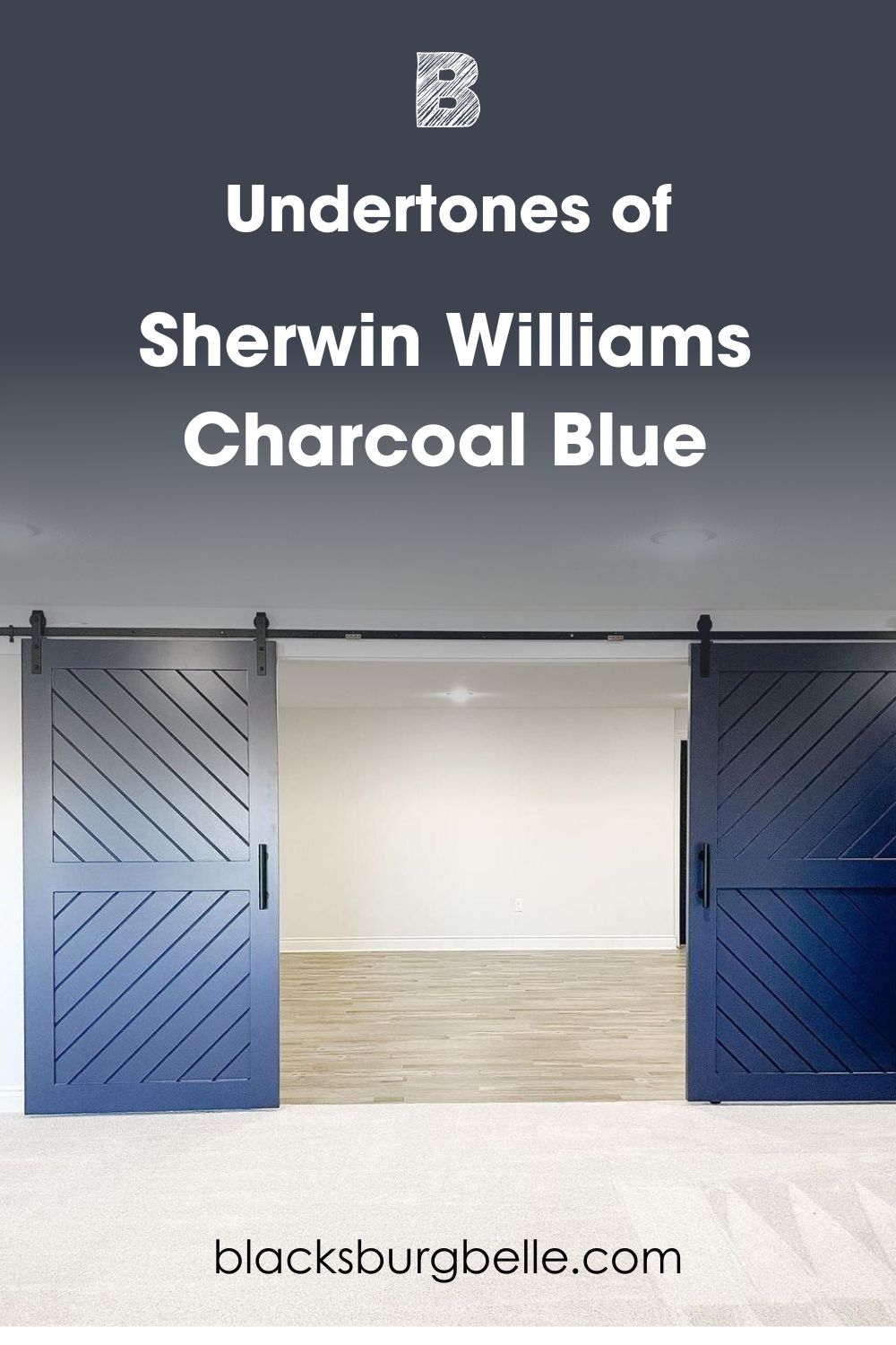
The left door looks gray while the right side looks navy but they’re the same paint. I’ll tell you why that happened.
Lighting Condition for Charcoal Blue
Lighting is the key to highlighting the undertones in every paint. For Charcoal Blue, the best lighting is white because it peels back the navy blue layers to show the charcoal gray tint.
You must brush up on your geography knowledge if you rely on natural sunlight. Get a compass and mark your room’s position from North to South, West, and East. Now pay attention because it’s about to get technical.
Remember these positions. North is up, South is down, East is Right, and West is left. Stand outside your house at sunset and point your right hand to the sun, that’s the east.
Stretch your left hand in the opposite direction for the west and stand firm. Your front stares at the North, and your back faces the south.
North-facing light reflects steady rays throughout the day, so it won’t change the navy to gray. Instead, it’ll keep the color in its navy-gray state.
The South-facing light position is your best option if you want that dusty gray look. It’s the brightest in the morning until noon, when the sunlight moves towards the west.
East-facing rooms have bright rays between 12:00 pm and 4:00 pm while West-facing light becomes hot from late afternoon until sunset. Because the final sun of the day doesn’t burn as brightly as the morning rays, its glow is subtle and only shows navy.
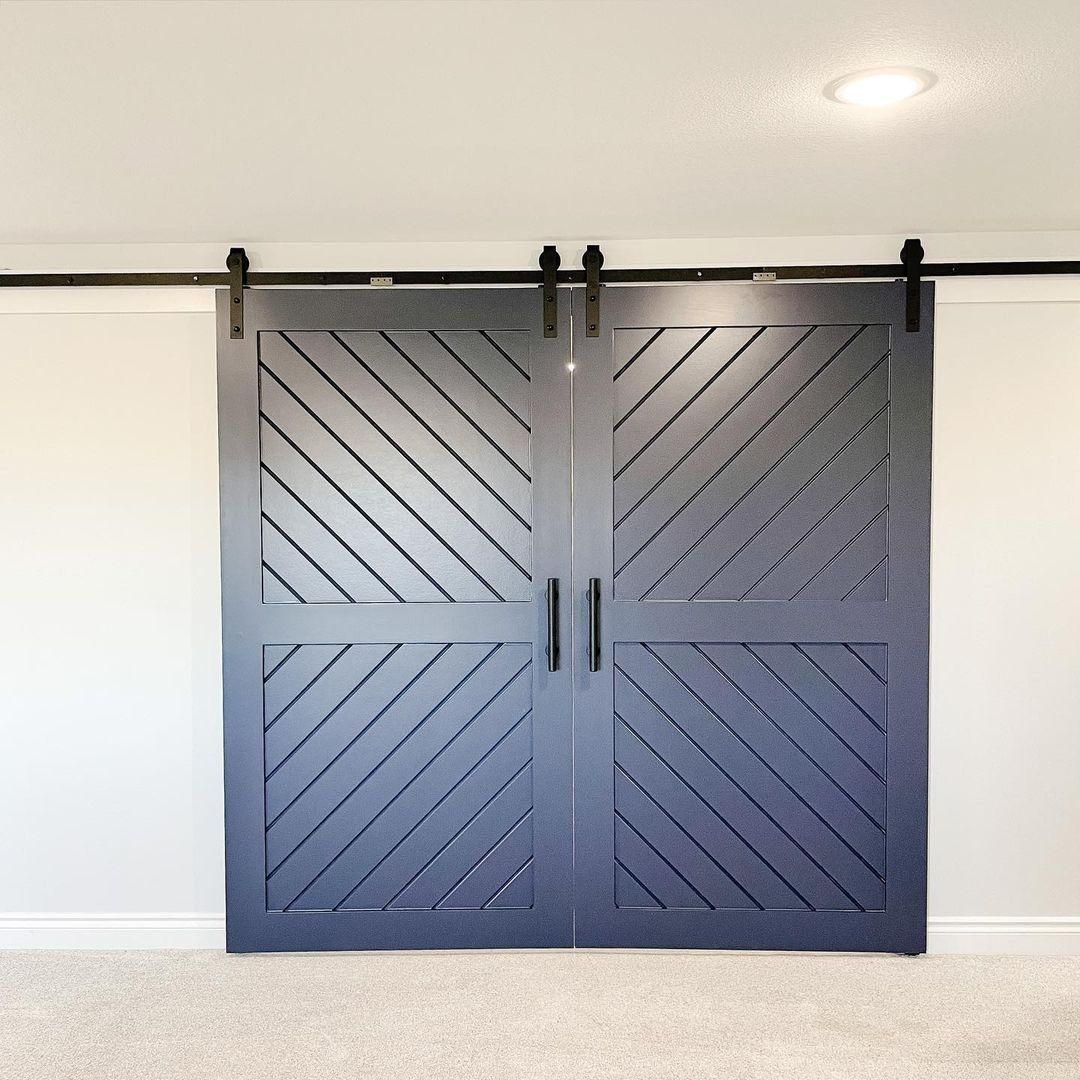
Does it look Gray?
Charcoal Blue will appear gray in South-facing rooms and light. This barn door you saw earlier had two colors, but now both sides are gray because of the white ceiling bulbs. The reflection came from the South, so the undertone took over the color.
Does it Look Navy?
Charcoal Blue in enclosed spaces with dim lighting appears as a navy blue. The deep tone becomes more intense when there are brighter colors like white and medium-dark brown to make the contrast obvious.
See, the accent wall in this bedroom looks navy for the most part until you look at the side lamp’s reflections and see the soft gray glow.
Is Charcoal Gray a Warm or Cool Color?
Charcoal Gray is a cool color that’ll have you feeling relaxed and forgetting all your problems (I wish!) You won’t forget your problems, but at least you won’t be agitated while dealing with them.
It’s no coincidence that most designers choose Charcoal Blue in their offices, gyms, and bedrooms.
Style-forward homeowners also use the color in their living rooms, dining rooms, exterior walls, and accents all around the house.
When a color is cool, it looks like it’s moving away from you. So it makes small rooms appear larger. You’ll love Charcoal Blue as an accent or whole wall because of its soothing tone. Yes, it’s a dark color, but it’s not stifling. You’ll see what I mean soon enough.
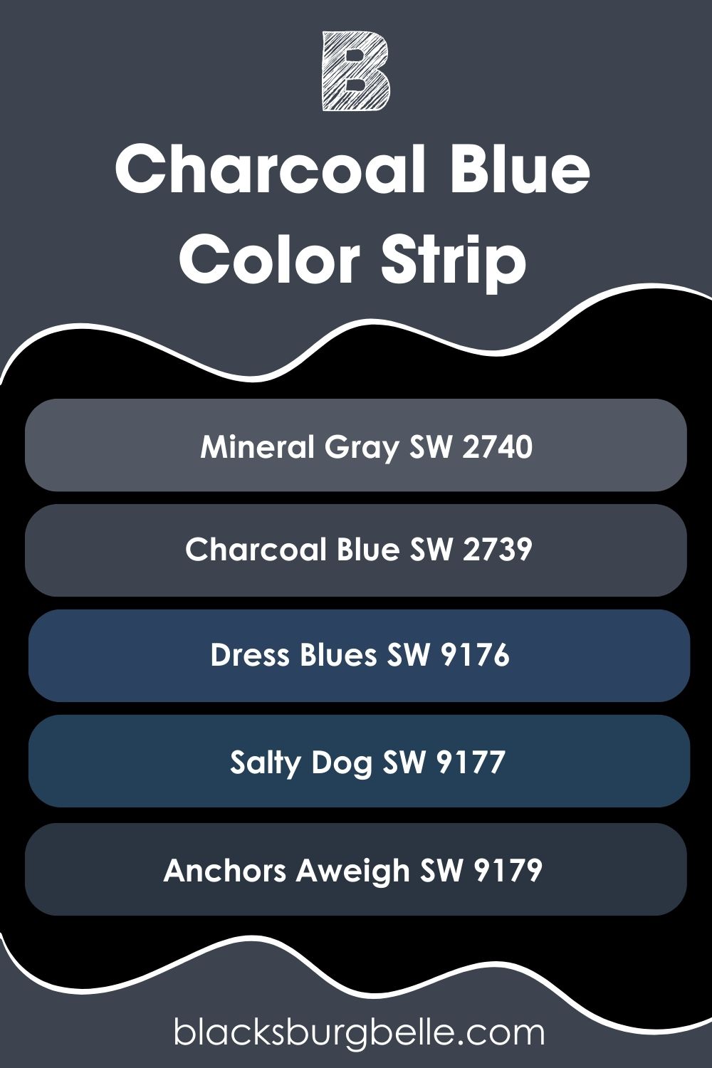
Sherwin-Williams Charcoal Blue (SW 2739) Color Strip: Lighter or Darker Exploration
If you’re still unsure about using a dark two-toned navy like Charcoal Blue, you have options from its color strip. You can choose a truer blue like Dress Blues (SW 9176) and Salty Dog (SW 9177).
Lean more into the gray tone with Mineral Gray (SW 2740), or embrace the dark side with Anchors Aweigh (SW 9179), a perfect alternative to black.
- Sherwin-Williams Mineral Gray (SW 2740)
- Sherwin-Williams Charcoal Gray (SW 2739)
- Sherwin-Williams Dress Blues (SW 9176)
- Sherwin-Williams Salty Dog (SW 9177)
- Sherwin-Williams Anchors Aweigh (SW 9179)
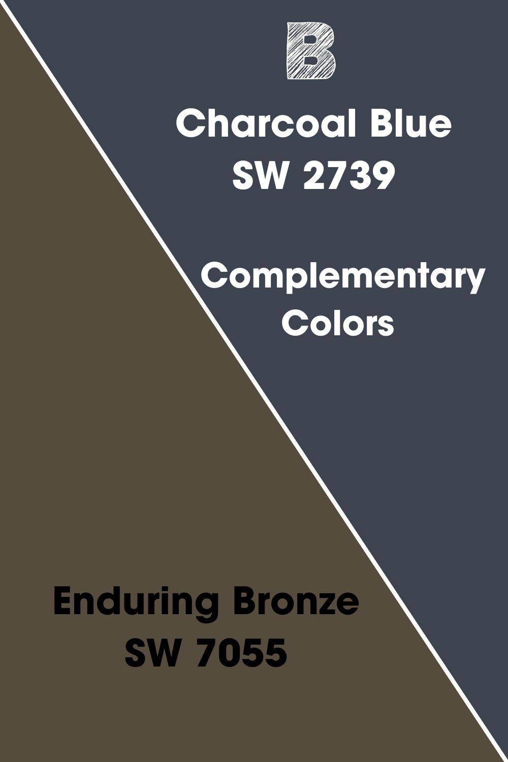
Complementary Color for Sherwin-Williams Charcoal Blue
Complementary colors are two opposite hues on the color wheel. Since they have contrasting vibes, complementary colors create a bold balance that’s difficult to ignore.
The complementary color for Sherwin-Williams Charcoal Blue is Enduring Bronze (SW 7055). It’s another dark neutral paint in a warm brown tone with an LRV of 7.
Although Enduring Bronze has a gray undertone to match Charcoal Blue’s own, there’s a hint of earthy green and orange there too. Even though both colors have similar surfaces, their different auras create a beautiful balance of warmth and coolness.
See how you can incorporate other orange-toned colors with Charcoal Blue in the Color Palette session below.
Charcoal Blue Coordinating Colors
I’ve put together a list of popular coordinating color themes and how they translate emotionally.
- Analogous Theme: Combines three colors placed side by side on the color wheel. Their similar tones and vibes create a beautiful gradient.
- Complementary Theme: Using opposing tones of red-green, blue-orange, and yellow-purple to make bold statements.
- Triadic Theme: Form a three-color triangle by pairing equally spaced hues on the color wheel. You have all primary colors in one group, so, as secondary and tertiary colors.
- Split Complementary Theme: Instead of opposite colors use the triad of a complementary color for an exciting combo. For Charcoal Blue, that’ll be Red-orange and Yellow-orange.
- Monochromatic Theme: Pair the different shades of one color ranging from lighter to darker tones.
The monochrome theme is the simplest yet trickiest to combine because the undertones of all shades must match.
You can also use monochrome grading in complementary themes instead of pairing a single contrasting color. Use variations of it to add more style to the space. So for Charcoal Blue, you can use tans and browns instead of purely orange colors.
See some examples below.
Coordinating Colors for Charcoal Blue (SW 2739)
- Sherwin-Williams Creamy (SW 7012):A warm and soft light yellow that comes off as white when paired with dark tones like Charcoal Blue.
- Sherwin-Williams Gossamer Veil (SW 9165):This filmy gray color adds an airy vibe to Charcoal Blue and highlights its undertone.
- Sherwin-Williams Moonlit Orchid (SW 9153):Use this warm medium-dark gray paint to balance the coolness of the other two colors.
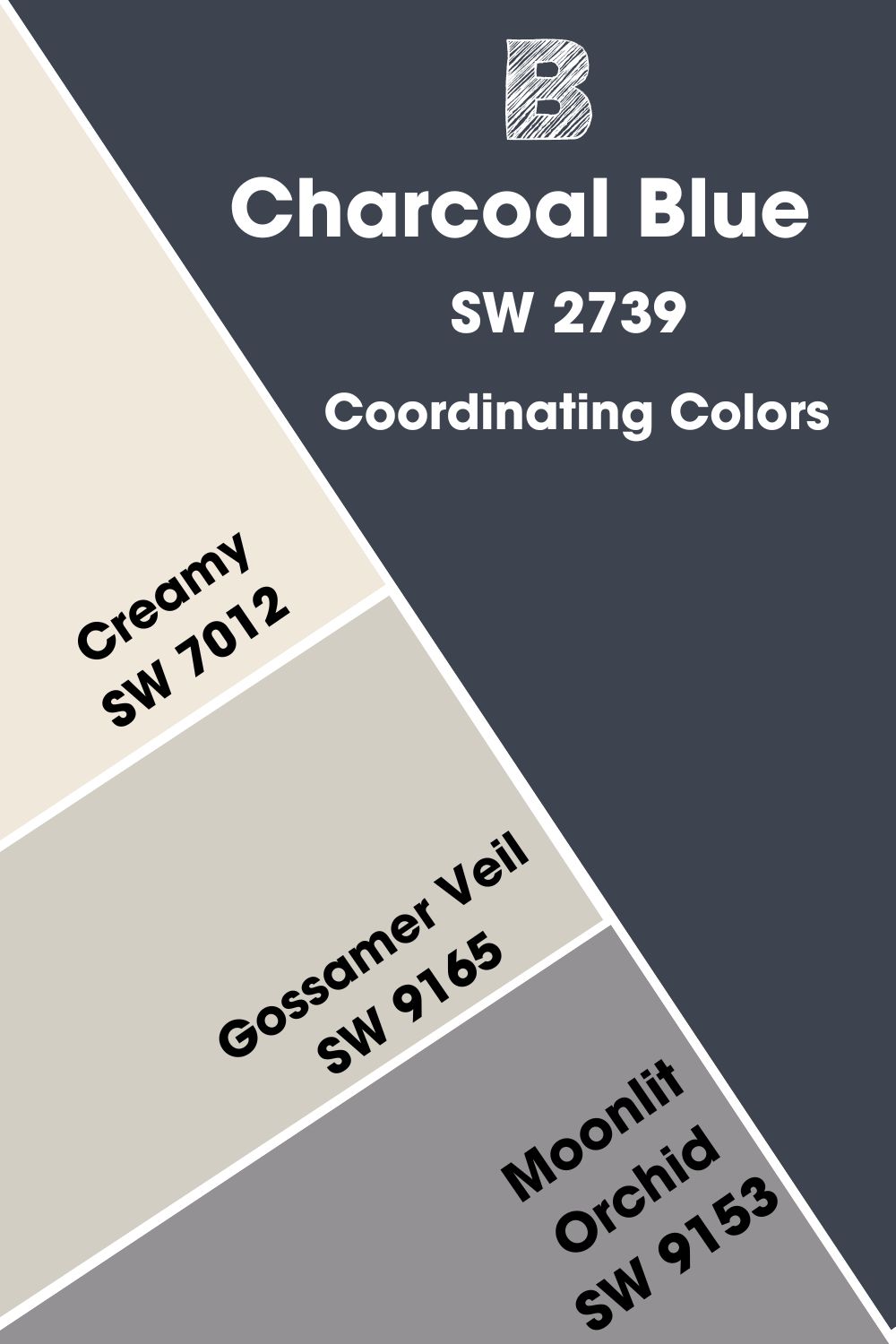
This color palette embraces the gray side of Charcoal Blue because it has two gray colors and one cream paint to highlight the other three. Use coordinating colors in living rooms, bedrooms, and bathrooms for a smooth and calming look.
Sherwin-Williams Charcoal Blue (SW 2739) Color Palette
Other palettes for Charcoal Blue include:
Contrasting Palette
- Sherwin-Williams Enduring Bronze (SW 7055):A dark brown paint filled with warmth and earthy aura to keep Charcoal Blue grounded.
- Sherwin-Williams Wheat Penny (SW 7705):A bold copper brown paint with a rich orange undertone for complementing Charcoal Blue.
- Sherwin-Williams Steady Brown (SW 6110):This dark brown paint has a golden and sandy look that works excellently as an accent or fixture on Charcoal Blue.
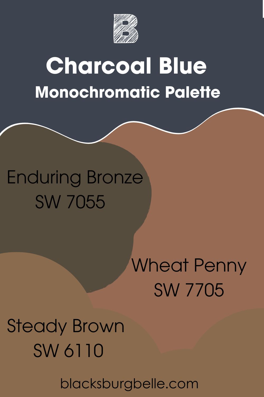
This color palette suits office spaces because it’s purely dark and has no light tones to highlight features. You’ll need big windows and white lighting to add brightness to the room, but you won’t regret its sophisticated look. The contrasting palette is the Aficionado theme hallmark.
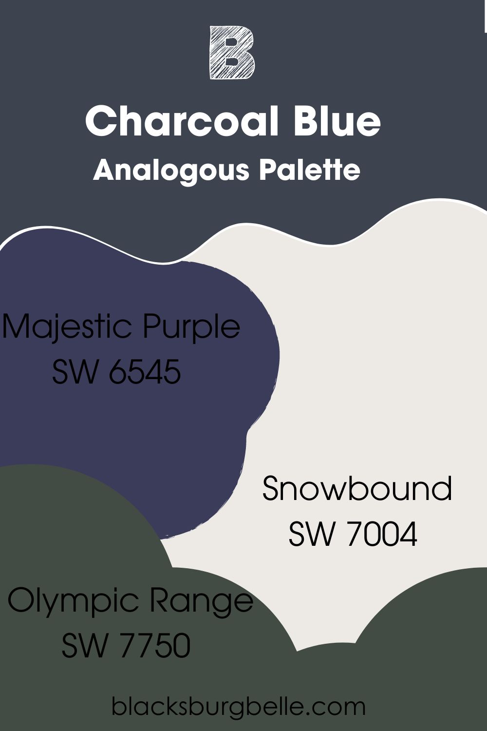
Analogous Palette
- Sherwin-Williams Majestic Purple (SW 6545): A rich and royal purple shade with a deep navy undertone that’ll highlight the blue part of Charcoal Blue.
- Sherwin-Williams Olympic Range (SW 7750): The blue-gray undertone in this dark green blends with Charcoal Blue to create a tranquil mood.
- Sherwin-Williams Snowbound (SW 7004): This cool white paint has a soft gray undertone. So using it as a trim in this palette blends in with the other dark tones while adding brightness to the room.
Use this palette in your living room, kitchen, and on your exteriors.
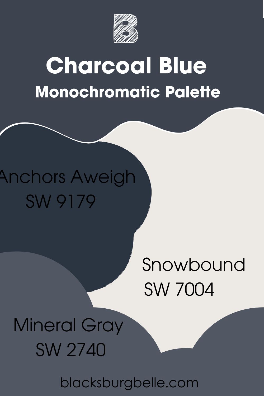
Monochromatic Palette
- Sherwin-Williams Anchors Aweigh (SW 9179): Navy blue gets darker with this color which serves as a unique alternative to black.
- Sherwin-Williams Mineral Gray (SW 2740): Adding this visibly medium-dark gray paint to the mix emphasizes the dual tone of Charcoal Blue.
- Sherwin-Williams Snowbound (SW 7004): This white paint appears very bright against the darker colors in this palette. Use it as your trim.
This palette is ideal for all rooms and is a great way to maintain a moody yet cool vibe.
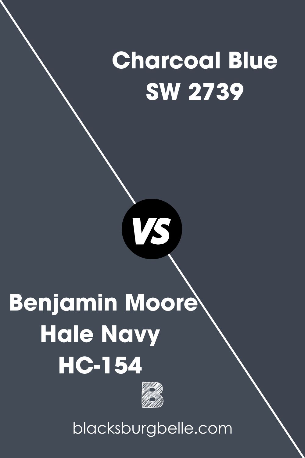
Sherwin-Williams Charcoal Blue vs. Benjamin Moore Hale Navy (HC-154)
Benjamin Moore’s Hale Navy’s charcoal surface is lighter and more obvious than Sherwin-Williams Charcoal Blue.
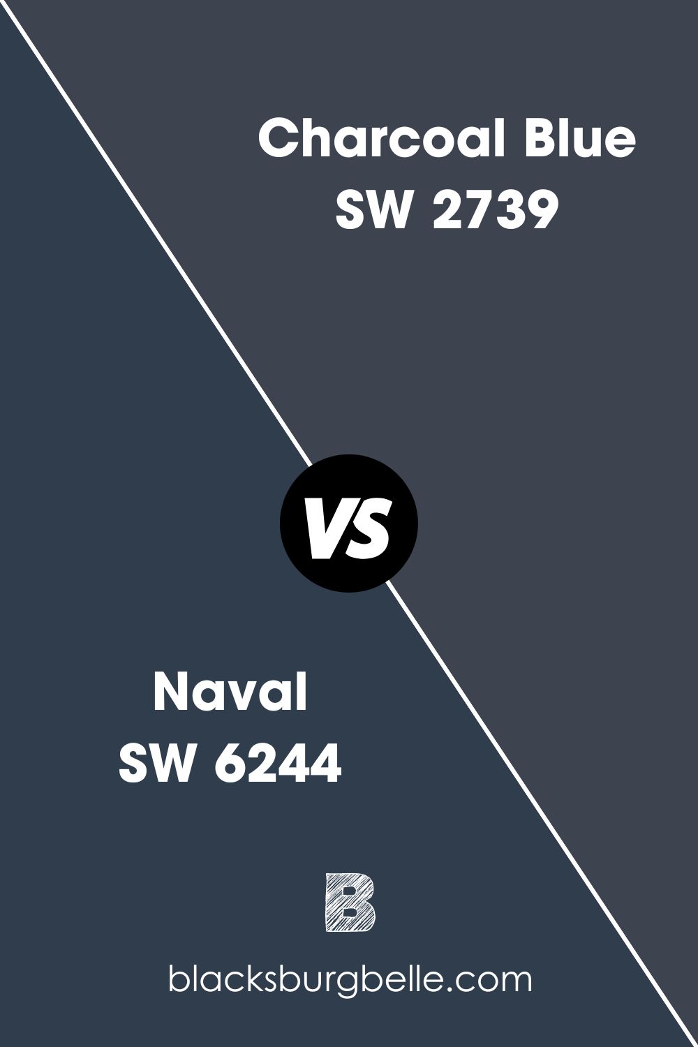
Sherwin-Williams Charcoal Blue vs. Sherwin-Williams Naval (SW 6244)
Sherwin-Williams Naval is a truer navy blue than Charcoal Blue because it lacks a gray undertone.
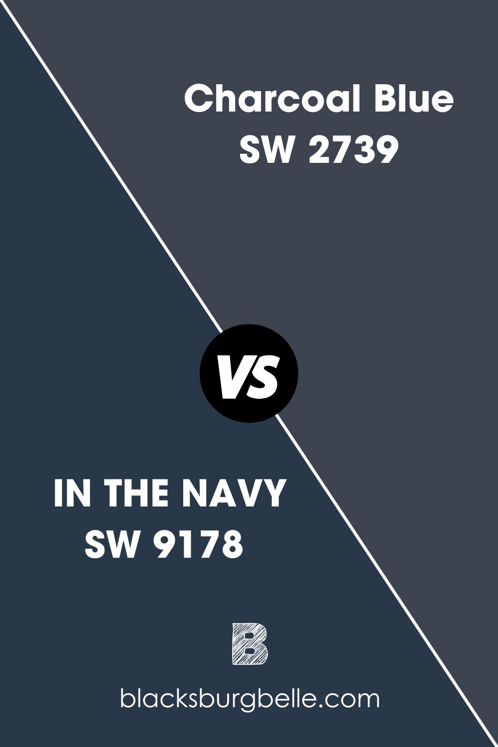
Sherwin-Williams Charcoal Blue vs. Sherwin-Williams IN THE NAVY (SW 9178)
Sherwin-Williams IN THE NAVY with 4 LRV is darker and bluer than Sherwin-Williams Charcoal Blue.
Charcoal Blue Equivalent from Behr (N490-5)
Behr’s Charcoal Blue and Sherwin-Williams versions are worlds apart even though they share the same name. The RGB for Behr’s version is red 111, green 123, blue 132, and the hex value is #6F7B84.
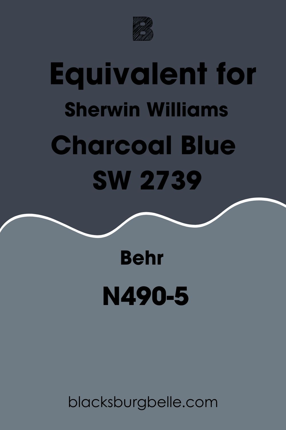
It’s more of a gray paint than navy because its blue element is merely an undertone. Here’s a picture to put it into perspective.
Where can you use Charcoal Blue?
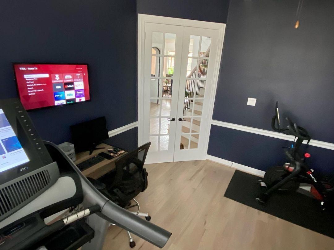
I’ll show you physical representations of Charcoal Blue around the house. It’s a serious color, so you’ll find it in offices and gyms. But you can also use Charcoal Blue in living areas as an accent for lighter whites and grays.
Charcoal Blue on Walls
You can appreciate Charcoal Blue’s two-toned nature on the walls in this office space. The white doors and windows highlight the navy tone while the natural sunlight reflects its gray tone. You won’t feel claustrophobic even though it’s barely reflective.
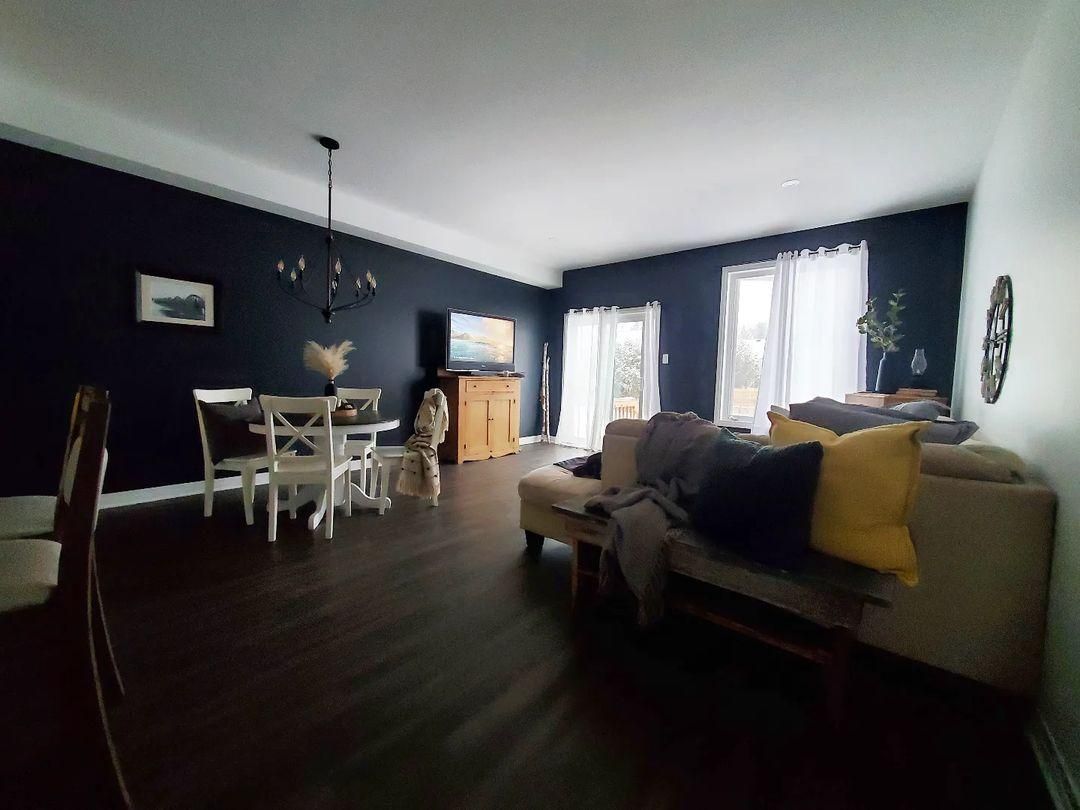
Charcoal Blue in the Living Room
Using a white accent wall to offset the darkness of Charcoal Blue walls in this living room was a wise choice. The white curtains, large windows, and white dining table brightens the room, while the brown settee compliments the color.
This is a typical example of the complementary theme with a neutral white to tie all colors in.
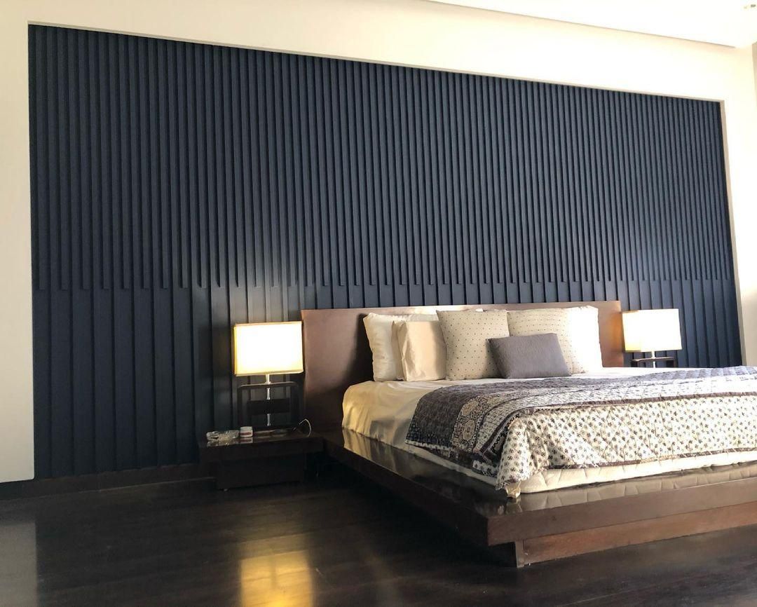
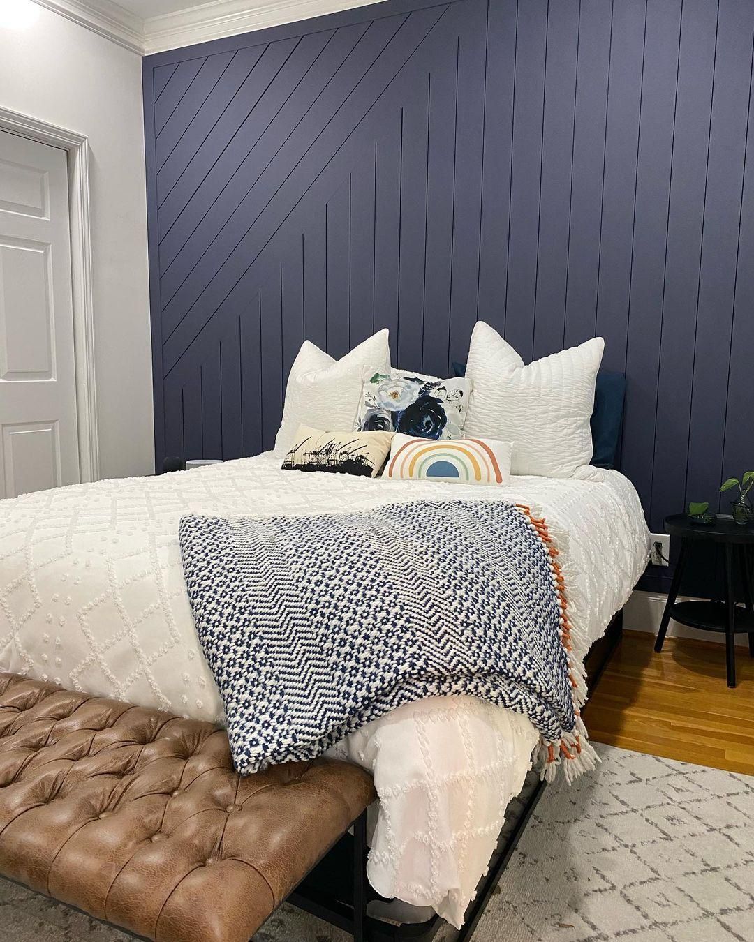
Charcoal Blue on in the Bedroom
Charcoal Blue all over the bedroom would be overkill, but you can soften it with white paint. Make it the accent like in this picture and highlight the color with brighter tones on adjacent walls and beddings.
The bedroom is also the best place to use your complementary palette. Wooden floorboards and leather furniture add elegance to this space. It’s certainly a mature choice.
Charcoal Blue in the Office
Work doesn’t feel tedious with an inspirational color like Charcoal Blue on the walls. Using white doors and trims liven up the mood and prevents the space from looking too serious.
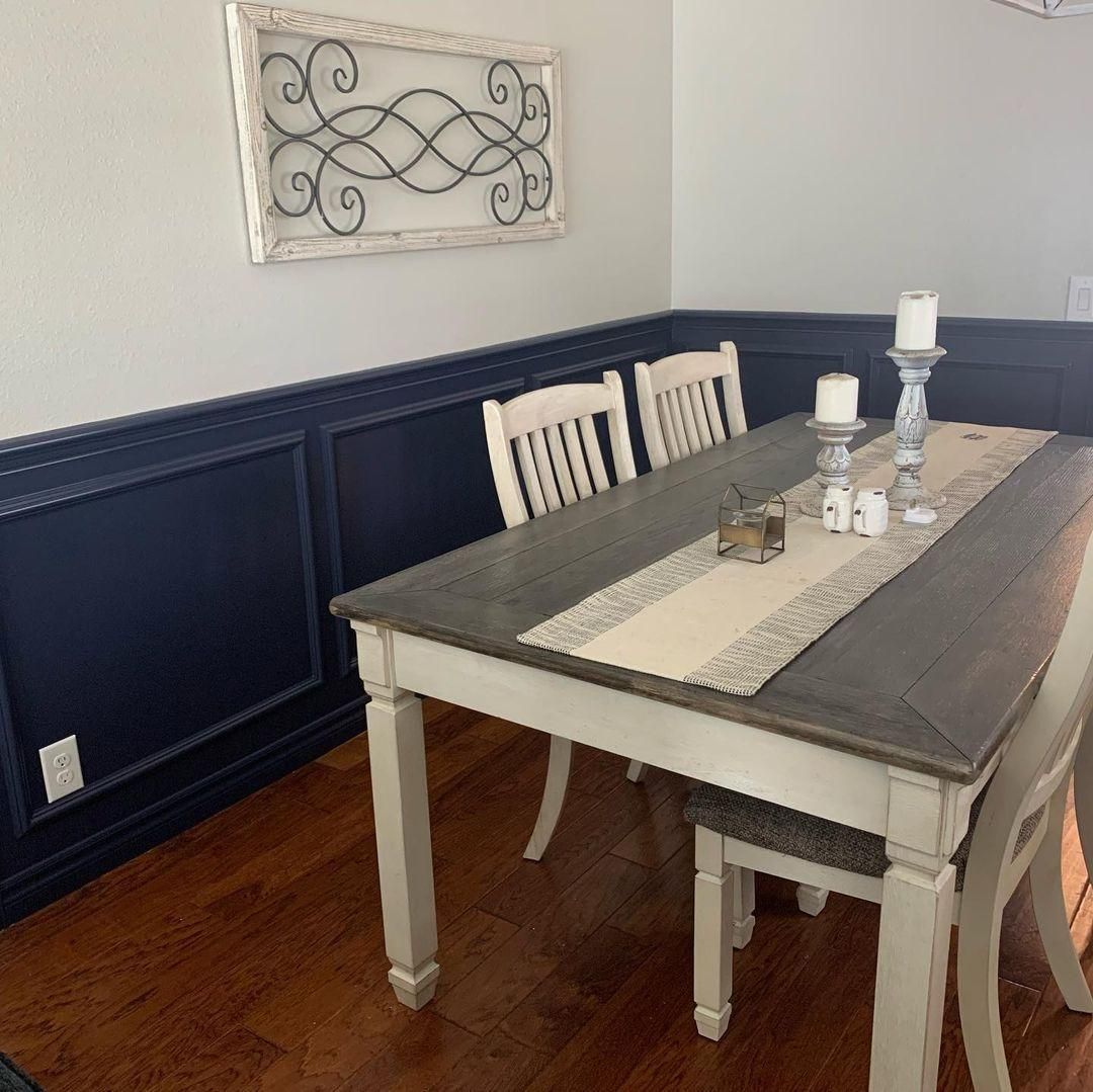
Charcoal Blue as an Accent
Charcoal Blue is at its best when used as an accent. It’s such a bold color that the slightest drop steals the attention of the room. I love how this wainscoting complements the brown floorboards in this dining room.
Without Charcoal Blue, the space would’ve looked traditional and boring because of the white walls.
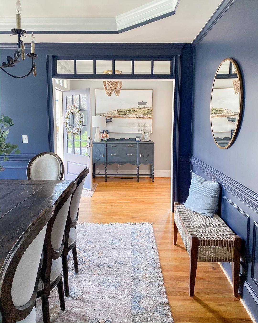
Charcoal Blue in the Dining Room
You’ve seen Charcoal Blue as an accent in a dining room, how about a full color?
This dining room looks modern despite having vintage-style tables, chairs, chandeliers, and floorboards. The white walls in the entryway, with light blue shades on the door and dresser paired with the wooden floorboards, are a beautiful way to embrace the complementary theme.
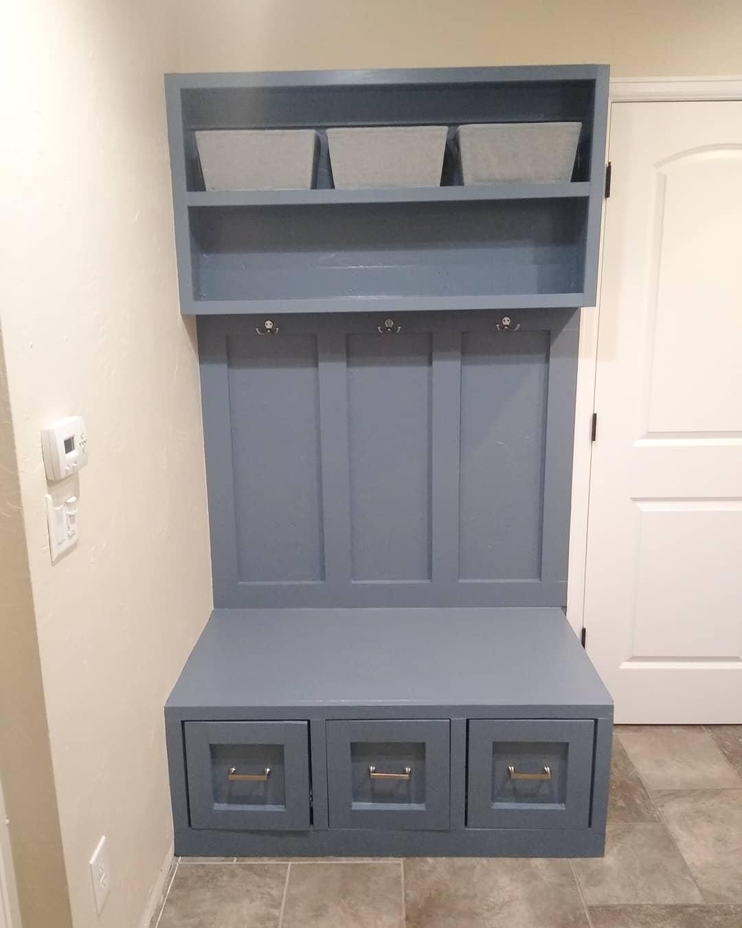
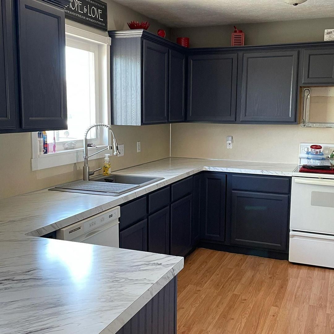
Charcoal Blue on Cabinets
Using Charcoal Blue cabinets against white or light gray walls is a beautiful way to add the color in your bathroom and kitchen.
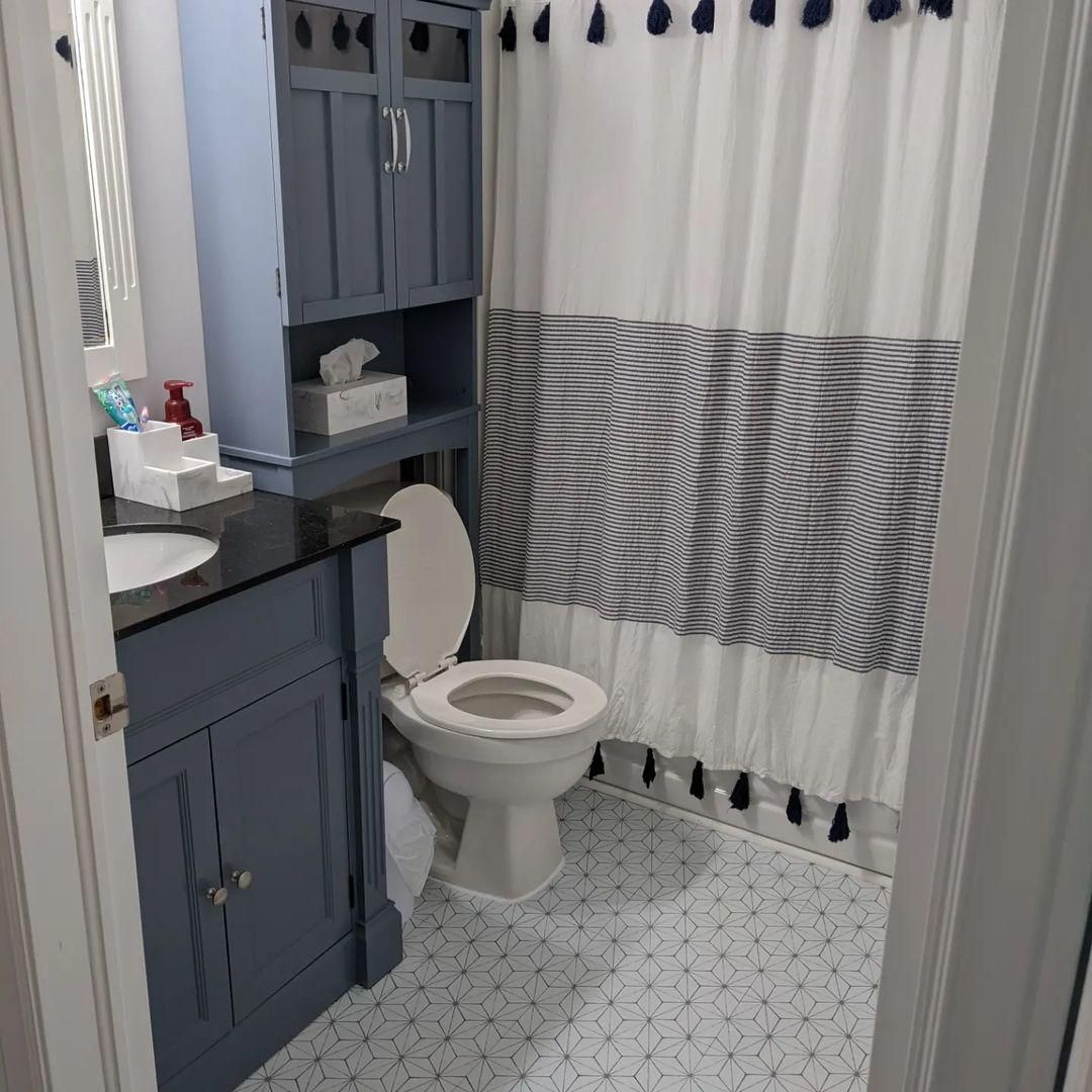
Charcoal Blue in the Bathroom
Even though this bathroom is small, there are enough white walls, an open window, and lighting to emphasize the gray tone in Charcoal Blue.
It gives the bathroom a clean and breezy look. The hints of black from the shower curtain tassels and countertop adds a suave aura to the entire space.
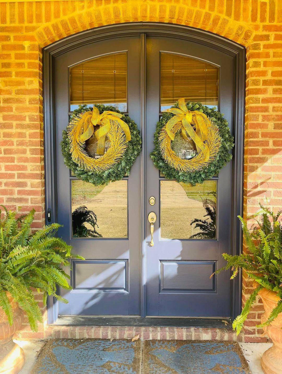
Charcoal Blue on Doors
When you use Charcoal Blue on interior doors, you’ll mostly get the gray tone unless you pair it with Charcoal Blue walls and darker tones in an Analogous palette to deepen its navy tone.
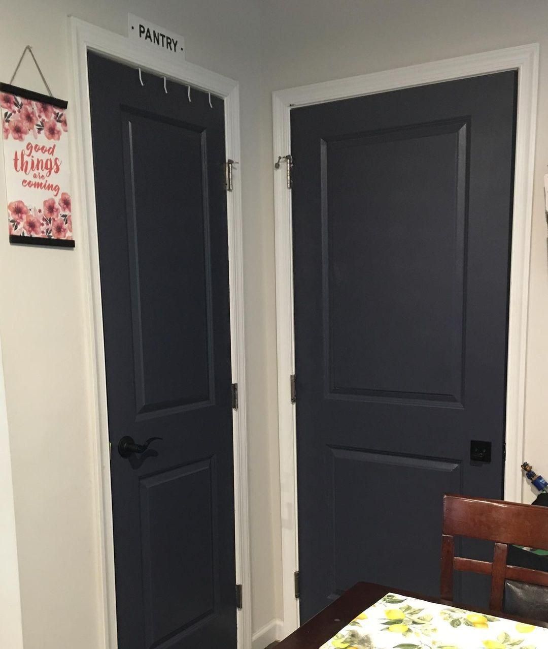
If you want the gray and navy tones at once, use Charcoal Blue on front doors. The natural sunlight will give it a warm glow and highlight its gray undertones.
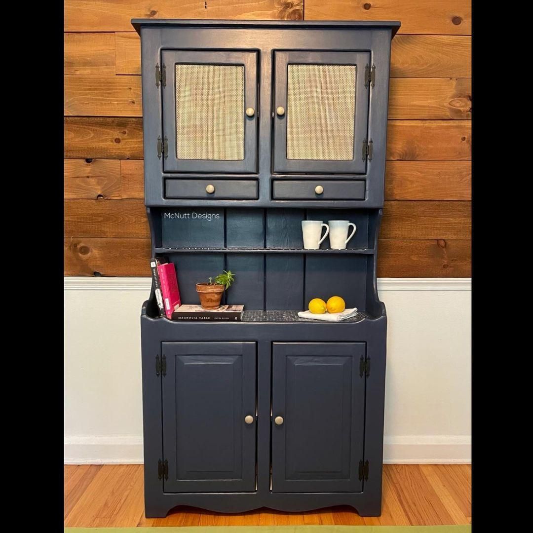
Charcoal Blue on Furniture
Give your old wooden furniture a makeover by painting it Charcoal Blue. It’s a great way to use color as an accent.
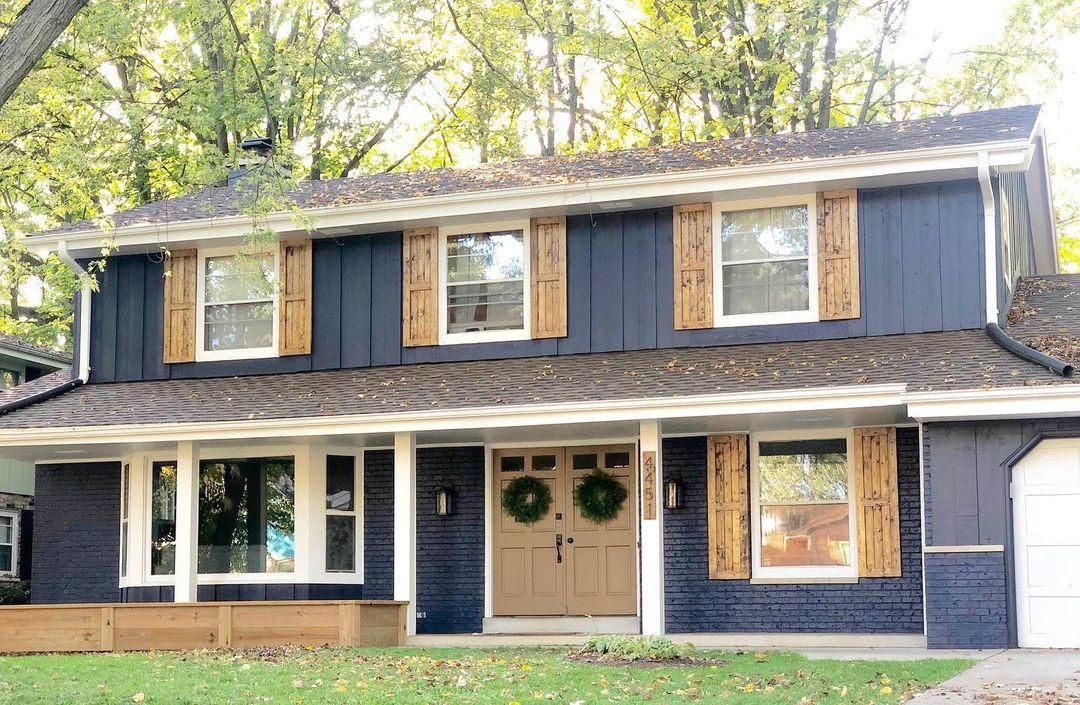
Charcoal Blue on Exteriors
If you want to modernize your exterior walls, Charcoal Blue is your friend. The color’s grayish-navy face is too elegant and regal to ignore. You can tone it down with white trims and add warmth with complementary windows and doors.
Conclusion
Now that you know dark neutrals can be interesting, especially with a two-toned navy gray like Charcoal Blue, I hope you’re ready to try. Also, because it’s a depth-filled color, that doesn’t mean you should relegate it to your home office and gyms.
Dare to be different, and use Charcoal Blue on your exteriors, living room rooms, and bedrooms. Here are some parting tips if you decide to take the leap:
- Add a cool white paint to Charcoal Blue in living areas
- Use wood, leather, and metal accessories and
- Determine your room’s position for the best lighting.
 Sherwin Williams Iron Ore (Palette, Coordinating & Inspirations)
 Sherwin Williams Tradewind (Palette, Coordinating & Inspirations)
 Sherwin Williams Caviar (Palette, Coordinating & Inspirations)
 Sherwin Williams On The Rocks (Palette, Coordinating & Inspirations)
 Sherwin Williams Essential Gray SW 6002: Paint Color Review
 Sherwin Williams Cyberspace SW 7076: Review & Inspiration
