
If you love delicate, cool colors, this article is for you. The Benjamin Moore Glass Slipper paint color is a unique color that combines the delicacy of powder blue with clean, subtle undertones to deliver an illusion of glassy walls.
So, if you’re looking for something versatile enough to go with modern and traditional architecture, I’d certainly recommend it.
However, before you fully commit, read on for more information to help you decide if Glass Slipper is the right pick.
Table of Contents
When To Choose Benjamin Moore Glass Slipper?
Glass Slipper is one of the palest colors in Benjamin Moore’s classic blue collection. It might not be a neutral color, but it doesn’t sit too cold or sterile.
Still wondering if this is what’s right for you? Here are some guidelines to know if you’re on the right track.
Looking For Something Cool, Yet Cozy?
It is a beautiful shade of blue that instantly adds a calm and serene atmosphere to any room. Its powdery hues make it look soft and cozy, making it the “perfect” cool color.
Need An Airy Feel In Your Space?
It has bright hues that add an airy feel to a room, primarily when used as a solid wall color. It is a bright color that magically makes a room appear larger than it is.
Looking For Soft, Tranquil Hues To Play Around With?
Glass Slipper is the furthest thing from a harsh color. Instead, it sits very close to cool baby blue tones, only lighter. If you’re looking for something to give you a cool sense of tranquility, this is the right color for you.
Searching For The Perfect Pale Blue?
In the world of blue pastels, Glass Slipper stands out as a pretty pale color that never gets overwhelming. Unlike other pastels, it uses gray undertones to dampen excessive brightness.
We’ll discuss its undertones shortly. But for now, let’s dig deeper into what makes Glass Slipper special.
What Color Is Benjamin Moore Glass Slipper 1632
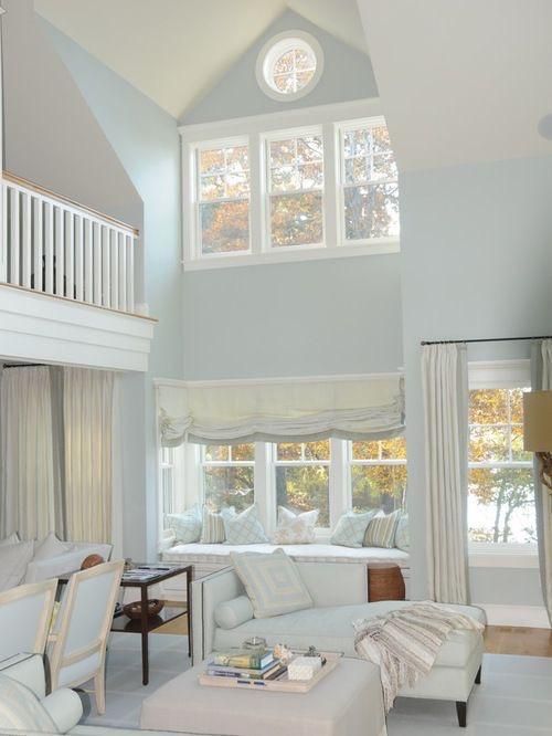
Imagine a world where reality meets fiction, and you can hold one of Cinderella’s glass slippers. It’ll most likely be a clear, delicate glass with the slightest hints of blue. This sums up what Benjamin Moore’s Glass Slipper looks like.
It’s a delicate blue with an elegant quality that makes it stand out among other blues.
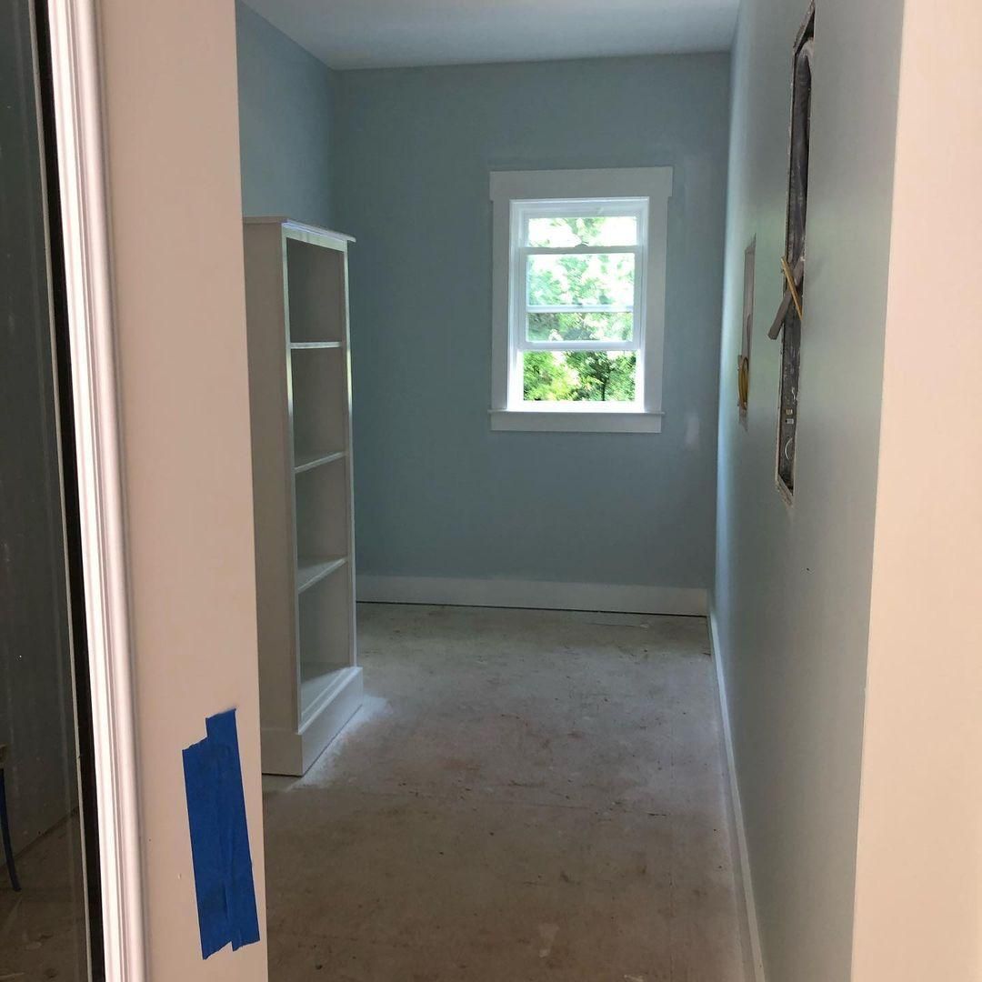
Take a look at the photograph below.
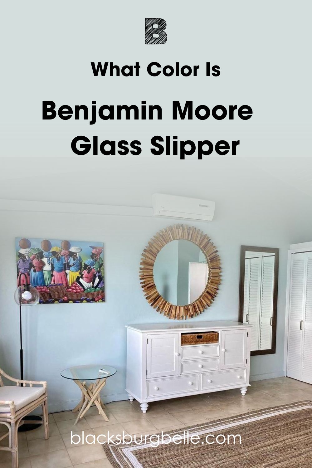
Yes, Glass Slipper might be a pastel blue, but it doesn’t jump out at you as expected. Instead of appearing too colorful, it adds an airy feel to the room and gives the walls a fine, glassy finish.
Let’s look at its specifications before we continue digging into this color.
Snapshot Of Benjamin Moore Glass Slipper Specification
From LRV to RGB Value, the table below displays the specific makeup of Glass Slipper. Knowing these values will give you a clearer picture of the paint you’re dealing with.
| Name | Benjamin Moore Glass Slipper 1632 |
| RGB | Red 212 | Green 222 | Blue 221 |
| Hex Value | #D4DEDD |
| LRV | 70.2 |
| Undertones | Blue-gray |
LRV Of Benjamin Moore Glass Slipper
LRV stands for Light Reflectance Value. It’s a scale that informs us of how much light a color will absorb or reflect. Hence, you can use it to predict how bright or dark a color will appear.
The true LRV scale starts from 0 and ends at 100, with 0 being the darkest and 100 being the brightest. However, because there is no perfect color and no absolute whites or blacks, we read LRVs from 3 to 97.
Benjamin Moore Glass Slipper has an LRV of 70.2.
This LRV value places it as a bright color that reflects a great deal of light, making a room appear brighter and more spacious.
Depending on the light you throw at it, this color can also look darker due to its undertones.
With that said, let’s unravel what undertones mean and its effects on this paint color.
What Are The Undertones Of Benjamin Moore Glass Slipper?
Undertones are subtle influences of other colors that give a color character and life. They could make them warm, cool, or neutral. Once you have a proper understanding of undertones, creating a color palette that truly reflects your style and creativity would be a breeze.
Besides primary colors, almost every other color has undertones. Warm colors have red or yellow undertones, while cool colors have blue undertones.
Benjamin Moore’s Glass Slipper has subtle blue-gray undertones.
Glass Slipper visibly looks more blue than gray. However, those gray undertones can come out to play if you do it right. After a rather lengthy search, I finally found a picture showing the gray undertones this paint offers.
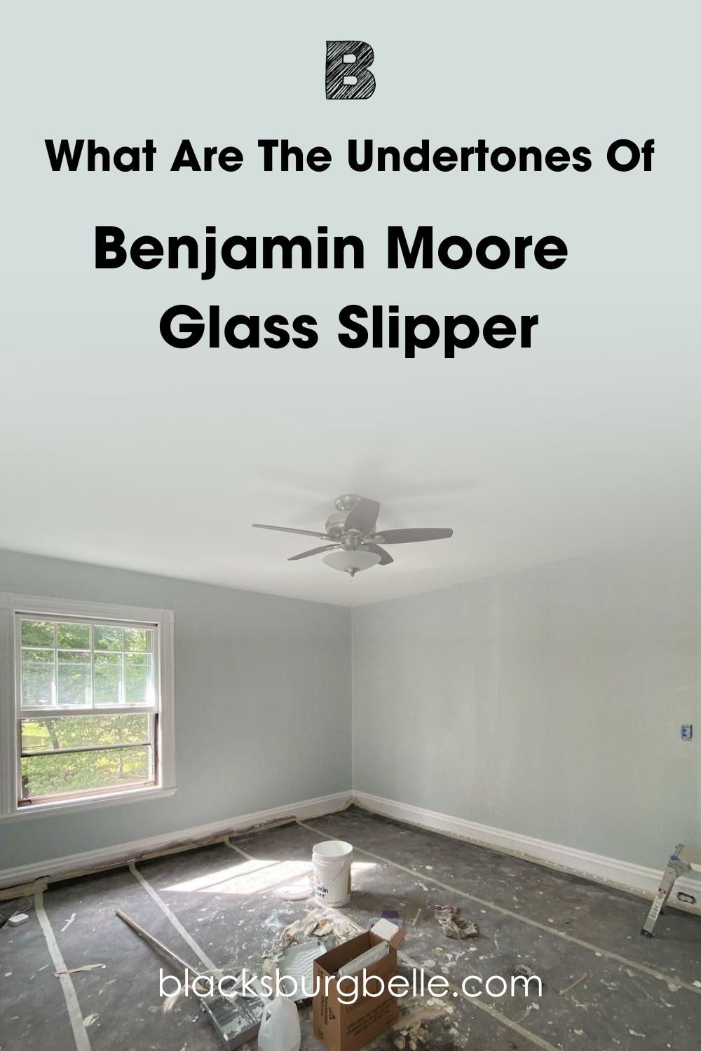
In the picture above, lighting and exposure have a lot of influence on why this paint looks more blue-gray than blue. We’ll discuss lighting in the next part.
Besides lighting, I’ll also address some questions you may have about how this color really looks in person.
What Is The Lighting Effect On Benjamin Moore Glass Slipper?
The best type of light to observe Glass Slipper in is natural light. Under natural light, you will observe that Glass Slipper doesn’t only appear brighter and happier, you’ll also enjoy seeing it come alive.
Also, while North-facing lights are cooler and may cause the gray undertones in Glass Slipper to be more visible, South-facing lights on the other hand are warm and will make this paint appear more saturated and brighter.
Since this is a cool color, it tends to add some coldness to a room. Hence, it is best used in warmer climates. Imagine coming from a hot and tiring day and walking into a cool, refreshing room. That’s the effect Glass Slipper offers.
If you use this color in a house in cold climates, you must compensate with soft accessories and warm furnishings. Otherwise, your space might appear too rigid.
Does Glass Slipper Look Green Or Blue?
Glass Slipper is a visible, powder blue void of any green undertones. However, if you’re familiar with color theory, you should know that green is a mixture of blue and yellow.
This may be why you might think Glass Slipper has green undertones. It may appear to have green undertones, but remember that they are not true undertones.
Does Glass Slipper Read White?
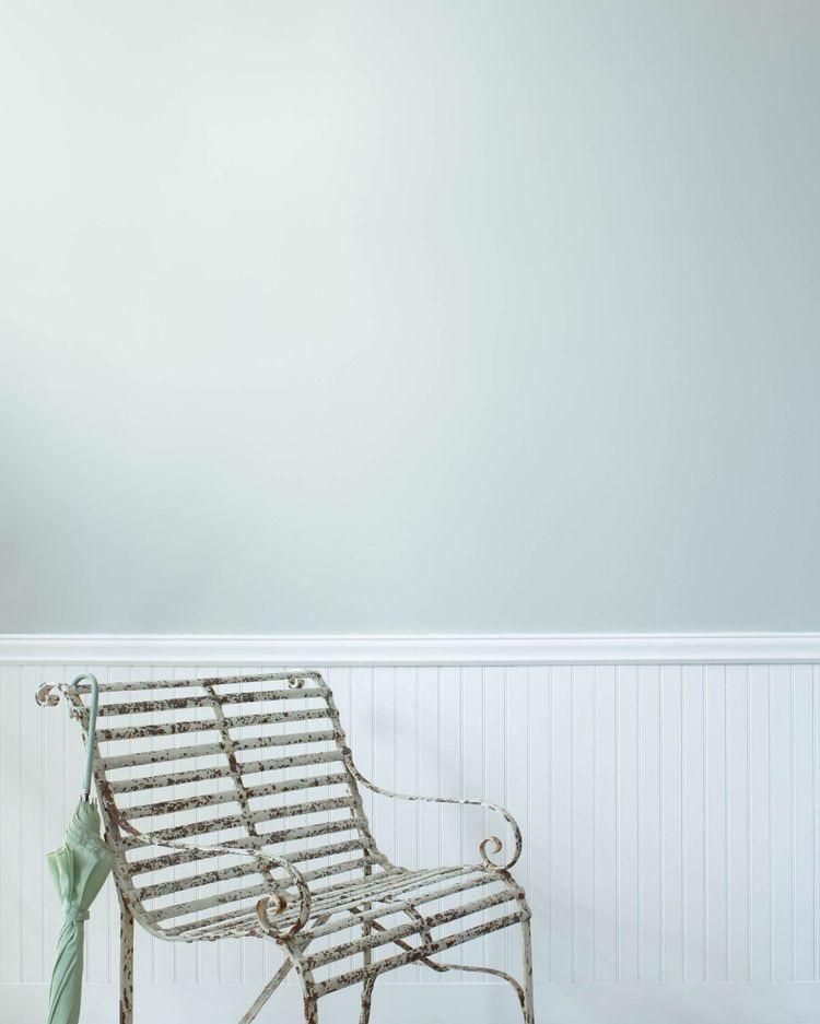
Even though this paint can appear quite bright in a lot of light, it never appears white due to its strong blue masstones. Think of this color as a nice balance between white, silver, and blue. It may be close to white, but those blue hues are constantly visible.
Even in a room with so much light, Benjamin Moore Glass Slipper does not appear white. Instead, its cool tones are accentuated, especially in contrast with the creamy white trims and ceiling.
Benjamin Moore Glass Slipper: Is It A Warm Or Cool Color?
Glass Slipper is a cool color void of any form of warmth. Even its slightly gray undertones are cool. Hence, it mimics the quietness of pale blue skies and stimulates calm, refreshing feelings of serenity.
This color is also less of an icy blue and more of a beachy, soft blue. It might be cool, but it doesn’t take much to make it appear cute and playful. The Benjamin Moore Glass Slipper on your walls will not feel rigid or overwhelming, while Glass Slipper as an accent color livens up the place.
Let’s look at other ways to explore this color to achieve the desired results.
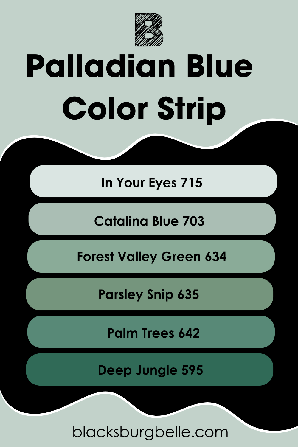
Benjamin Moore Glass Slipper Color Strip: Lighter Or Darker Exploration
If you love what you’ve seen so far with the Benjamin Moore Glass Slipper but wish it was warmer, cooler, lighter, or darker, I have a solution for you. Look into its color strip.
Glass Slipper’s color strip presents you with more variations of the beautiful powdery blue. It gives you options similar to Glass Slipper in hue, intensity, and base notes.
From the Benjamin Moore color strip, Glass Slipper is the first among seven colors. This means that in this paint’s shade family, it is the lightest.
Below, I’ve listed some darker and cooler Glass Slipper alternatives that will yield similar results.
- Benjamin Moore Glass Slipper 1632
- Benjamin Moore Brittany Blue 1633
- Benjamin Moore Santorini Blue 1634
- Benjamin Moore Water’s Edge 1635
- Benjamin Moore Providence Blue 1636
- Benjamin Moore Blue Spruce 1637
- Benjamin Moore Midnight Blue 1638
You can find Brittany Blue and Santorini Blue on the lighter end of the spectrum. They are deeper than Glass Slipper but pale when they are compared to darker contrasts like Providence Blue, Blue Spruce, and Midnight Blue.
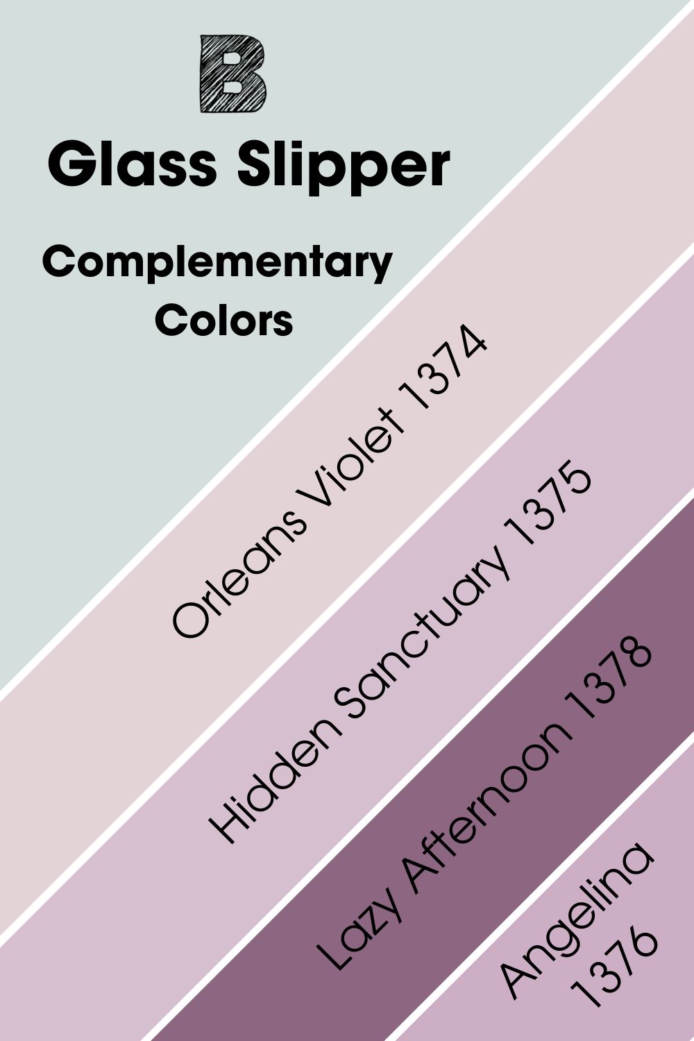
Complementary Colors For Benjamin Moore Glass Slipper
Complementary colors are like two peas in a pod in the most unusual way. They possess opposing hues and greatly contrast each other. However, this contrast is what makes them work so well together. They basically look their best when placed side by side.
To spot complementary colors, take any two colors that sit opposite each other on the standard color wheel. If you do this, you’ll find that blue complements orange, red complements green, and yellow complements purple.
Every color has an opposing color that complements it with contrasting hues and the Benjamin Moore Glass Slipper is not exempted. Using this same color theory, I found that Benjamin Moore’s Orleans Violet 1374 complements Glass Slipper.
Benjamin Moore’s Orleans Violet is a beautiful blend of soft pink and lavender, which reads warm. Its warmth contrasts Glass Slipper’s coolness to create an alluring visual effect. It sits on the lighter end of the spectrum, just like Glass Slipper does.
If you’re interested in sharper contrasts, I’ve also put together some darker shades you can use.
- Benjamin Moore Hidden Sanctuary 1375: This is a soft violet with whispers of light pink that draw out the coolness of Glass Slipper.
- Benjamin Moore Angelina 1376: A beautiful mid-toned plum that offers a deeper contrast to Glass Slipper.
- Benjamin Moore Lazy Afternoon 1378: This warm-toned purple shares faint wisps of gray undertones with Glass Slipper while contrasting its airiness.
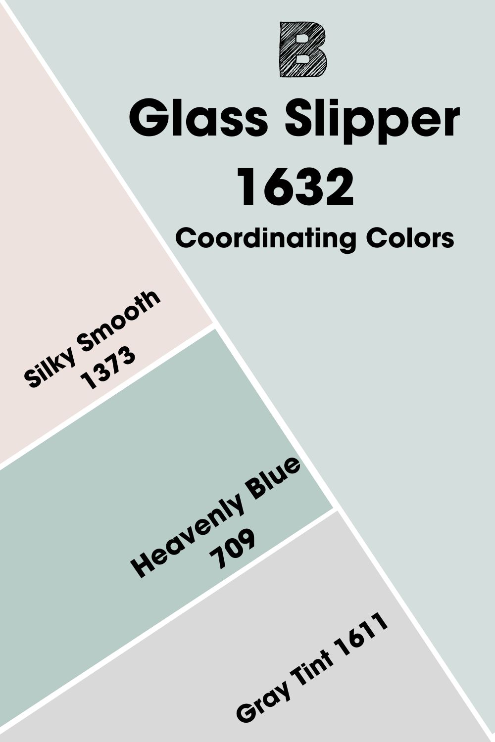
Benjamin Moore Glass Slipper Coordinating Colors
The beauty behind color theory is that you can mix and match to create numerous palettes that reflect your style in a unique sense.
Besides using complementary colors to create a beautiful palette, you can also create palettes using different themes like analogous themes, triadic themes, and others. Let me explain what these themes mean before giving you examples.
- Analogous Theme: Technically, this theme consists of three colors that sit next to each other on the color wheel.
One color serves as the dominant color, the next is a supporting color, and the third is usually a combination of the first two colors or a noticeable accent color.
- Complementary Theme: As mentioned earlier, complementary colors stand out against each other to create visually striking images.
- Triadic Theme: This theme consists of evenly spaced colors on the color wheel, forming a perfect triangle. Together, they create a vibrant and colorful palette.
- Split Complementary Theme: This creates a playful color palette by mixing a primary color with the two colors that are adjacent to its complementary color. Hence, sharing the complement.
- Monochromatic Theme: This theme involves creating a refined look using different hues, tints, and shades of a single base color. Monochromatic themes often challenge your creativity, allowing you to create dynamic gradient effects.
Coordinating Colors For Benjamin Moore Glass Slipper 1632
- Benjamin Moore Silky Smooth 1373: This pretty lavender pink sits soft and easy. If Glass Slipper had a warm identical twin, this would be it.
- Benjamin Moore Heavenly Blue 709: A tranquil color that presents a balanced mix of blue and gray in a deeper saturation than Glass Slipper.
- Benjamin Moore Gray Tint 1611: This is a gentle, neutral color with the slightest hints of gray.
Heavenly Blue is a much deeper shade of blue that helps draw out Glass Slipper’s coolness. Where Glass Slipper is a wall color, Heavenly Blue will make a fine accent.
Gray Tint presents neutral hues that work best on trims and cornices, while Silky Smooth can be used as a contrasting accent.
Benjamin Moore Glass Slipper Color Palette
Now, to one of the most exciting sections of this article. We’ll look at several palettes you can create with Glass Slipper.
From the simple minimalist enthusiast to the loud maximalist, Glass Slipper presents options for everyone.
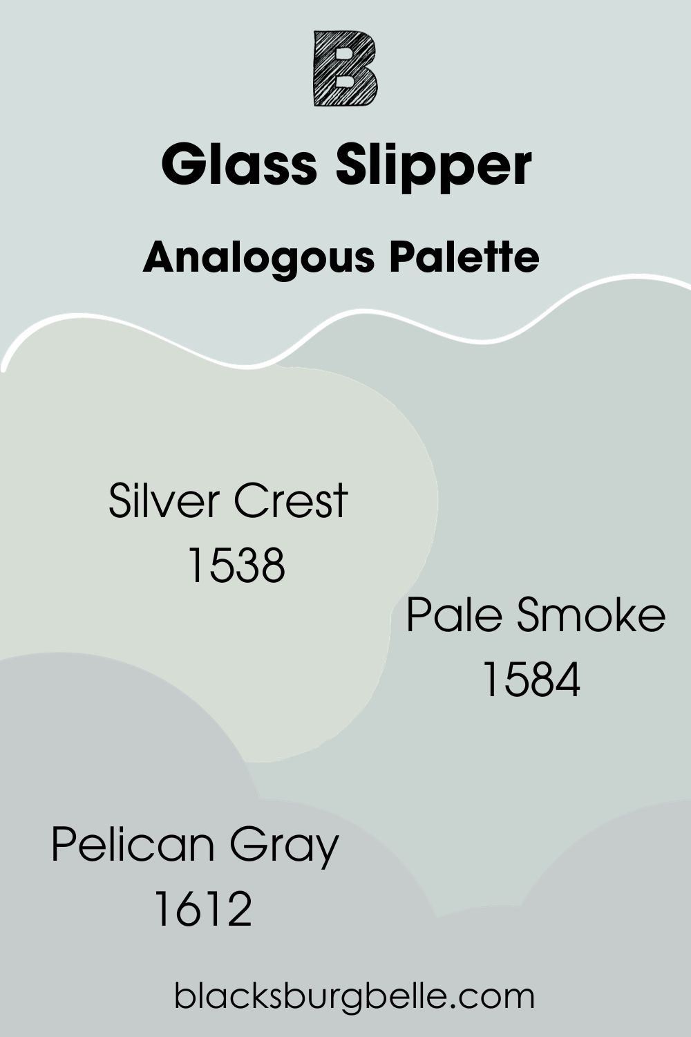
Analogous Palette
- Benjamin Moore Silver Crest 1538: A light blue hue that reads just as bright as Glass Slipper. However, its gray undertones are more prominent in the presence of slightly green wisps.
- Benjamin Moore Pale Smoke 1584: At an LRV of 63.6, this color is a picture-perfect confluence between blue and gray.
- Benjamin Moore Pelican Gray 1612: A peaceful neutral color that sacrifices the business of saturation for serenity.
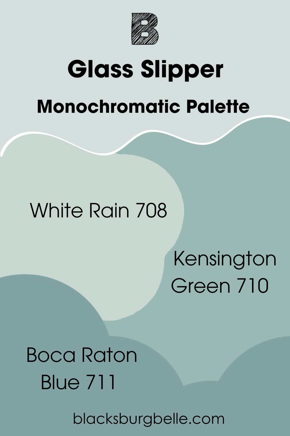
Monochromatic Palette
- Benjamin Moore White Rain 708: Another peaceful blue-gray with the slightest hints of underlying green tones.
- Benjamin Moore Kensington Green 710: A blue-green similar to a dark shade of Glass Slipper with similarly distant undertones of gray.
- Benjamin Moore Boca Raton Blue 711:This deep color is perfect for lovers of distinct teal hues with disappearing hints of gray.
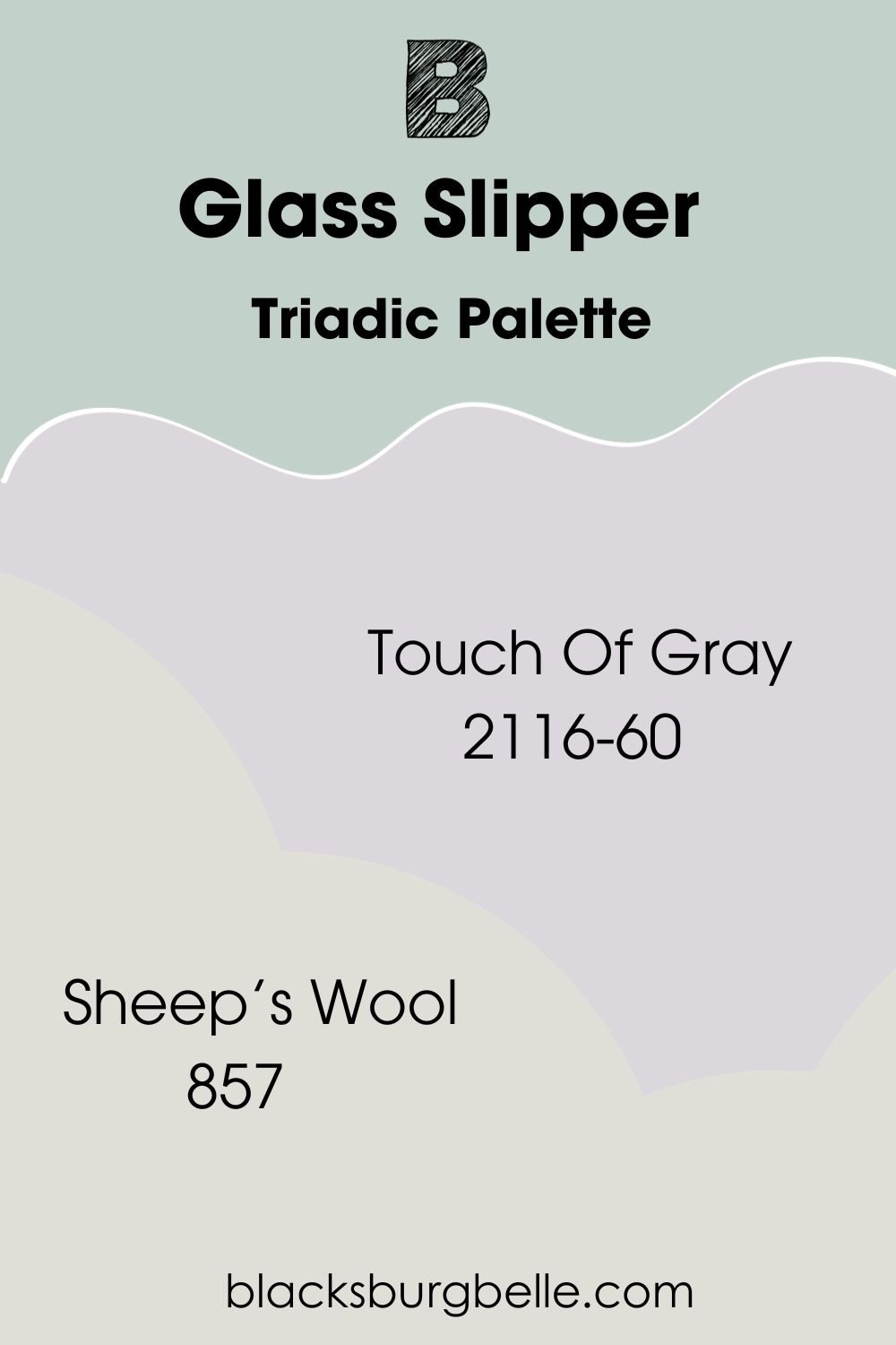
Triadic Palette
- Benjamin Moore Touch Of Gray 2116-60: A beautiful, soft pastel where violet hues meet light pink and traces of gray.
- Benjamin Moore Sheep’s Wool 857: This bright off-white uses blue-gray undertones to appear less harsh.
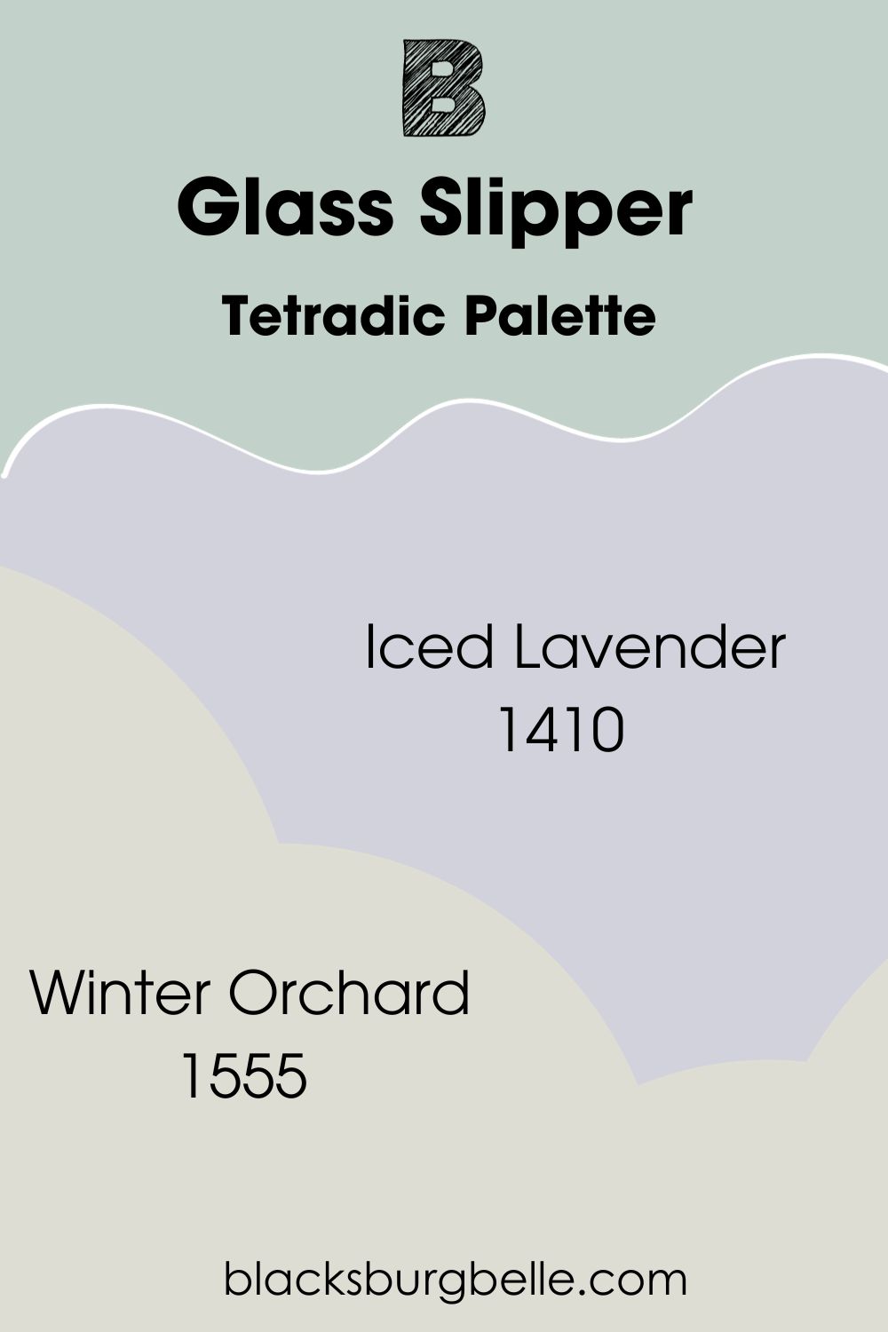
Tetradic Palette
- Benjamin Moore Iced Lavender 1410: This color has an LRV of 64.78. It combines soft hints of gray and purple to add life to a room.
- Benjamin Moore Winter Orchard 1555:A light and cool neutral reminiscent of light snow in wintertime.
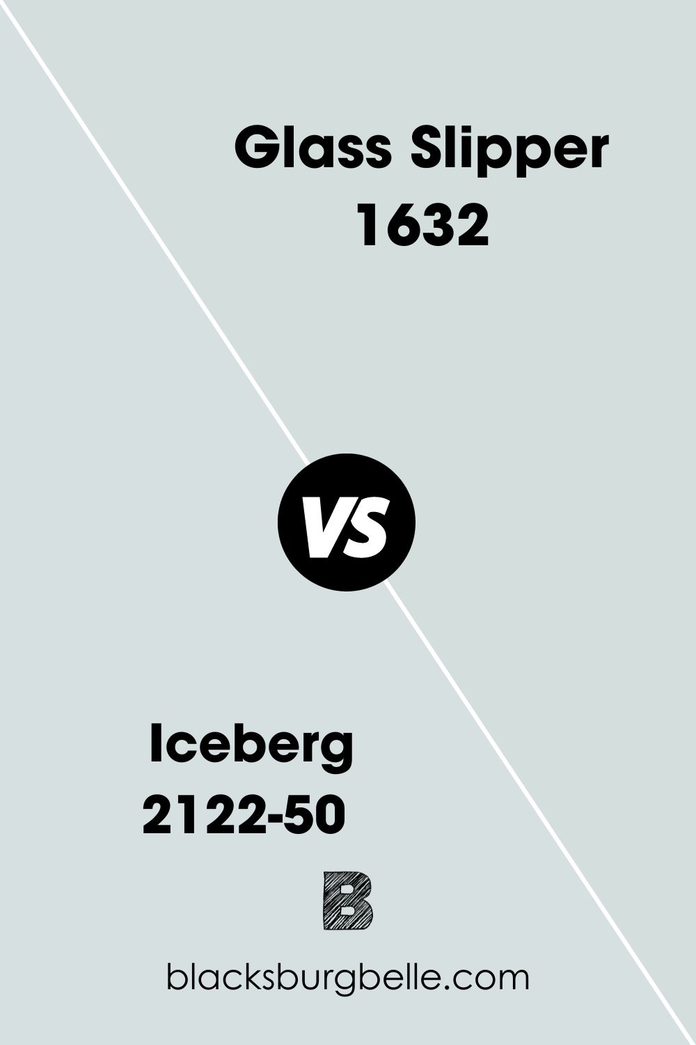
Benjamin Moore Iceberg vs. Glass Slipper
Although they are two similar paints, Benjamin Moore Iceberg is slightly brighter, with an LRV of 71.1. It also features more prominent gray undertones than Glass Slipper.
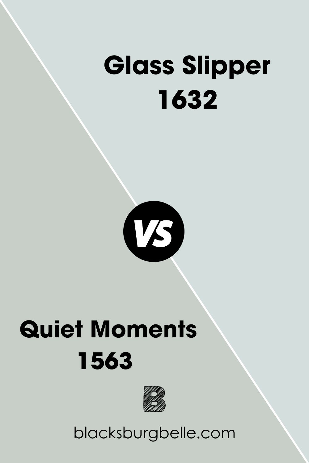
Benjamin Moore Glass Slipper vs. Quiet Moments
Where Glass Slipper lacks truly green undertones, Quiet Moments makes up for it with a perfect balance of blue, green, and gray.
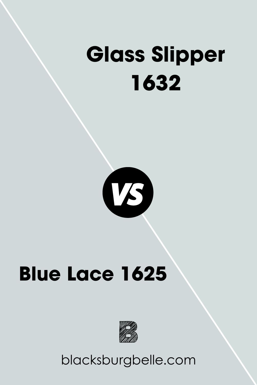
Benjamin Moore Glass Slipper vs. Blue Lace
Blue Lace is an elegant color that reads more blue than Glass Slipper. It is not as close to white as Glass Slipper is, but it exudes a similarly soft intensity.
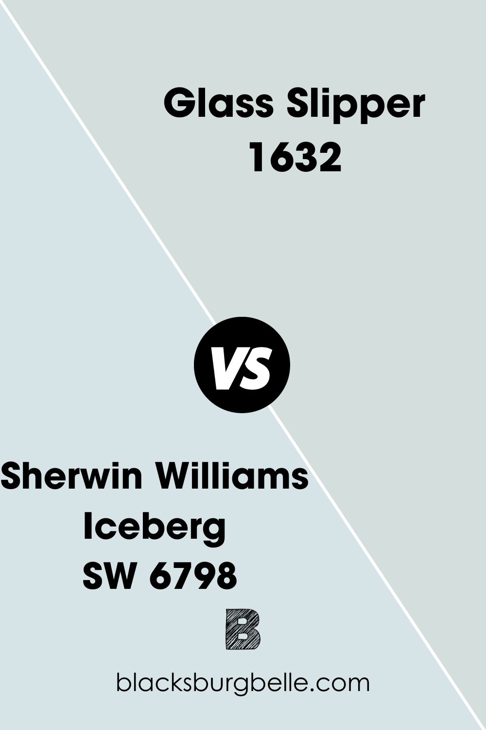
Sherwin Williams Iceberg vs. Glass Slipper
While Glass Slipper is a powder blue, Sherwin Williams Iceberg is a crisp, clean blue. The latter color features refreshing undertones of light purple, while the former doesn’t.
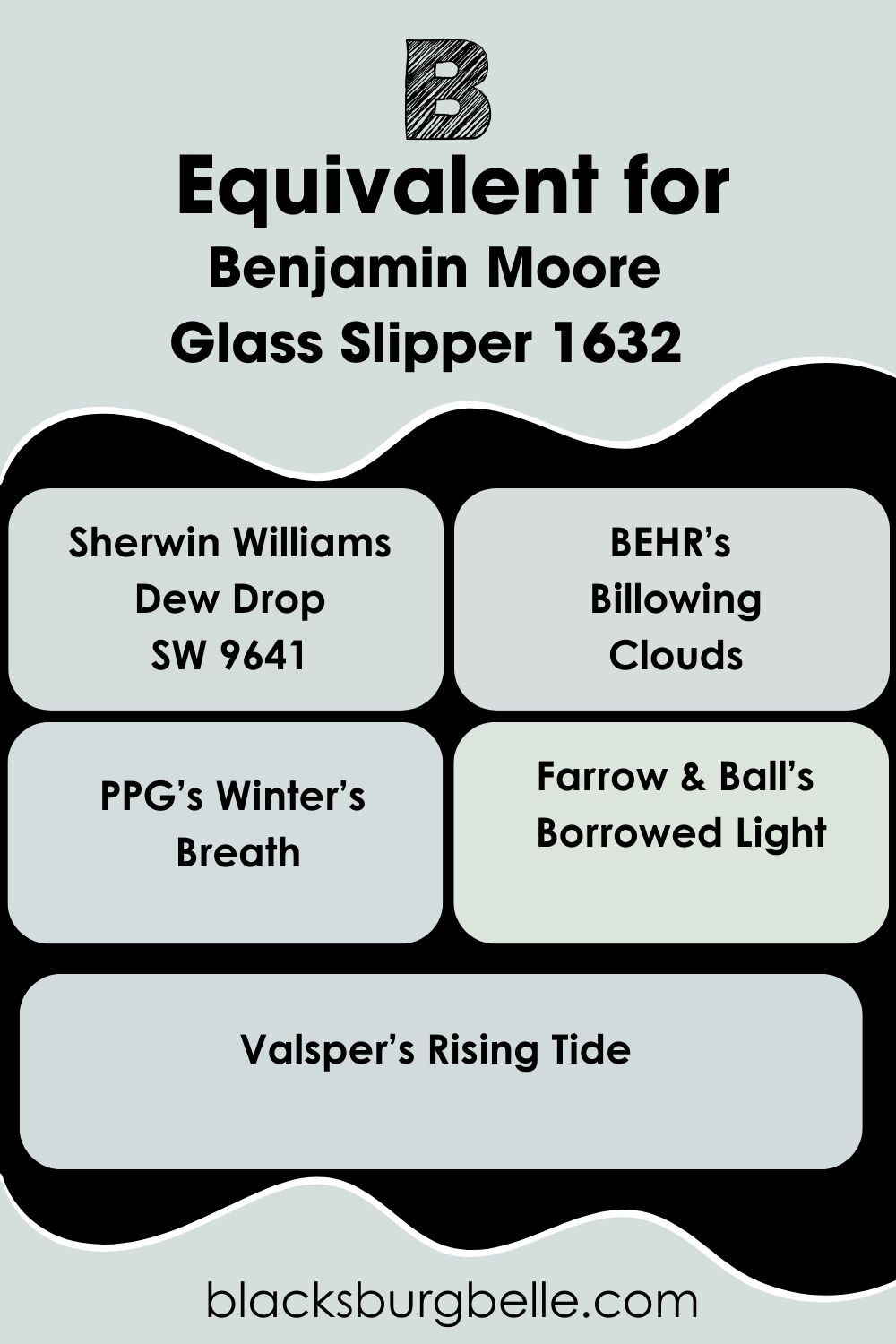
Benjamin Moore Glass Slipper Equivalent In Sherwin Williams And Other Brands
One of the closest matches to Benjamin Moore’s Glass Slipper is Sherwin Williams Dew Drop.
They share similar LRV intensities, but Dew Drop reads slightly, almost unnoticeably paler.
BEHR’s Billowing Clouds reads more gray, while PPG’s Winter’s Breath is slightly bluer and crisper.
Farrow & Ball’s Borrowed Light features more neutral undertones, and Valsper’s Rising Tide reads slightly darker than Glass Slipper at an LRV of 69.32.
Where Can You Use Benjamin Moore’s Glass Slipper?
Even though Benjamin Moore Glass Slipper is certainly not a neutral color, you can use it almost anywhere in your home. Hear me out.
It doesn’t always have to be a wall color, although I can’t think of any instance where it won’t work as one. You can also use it for accents, trims, and window casings.
The only place this paint might not be a good fit would be rooms requiring darker hues and deeper saturations like man caves. Other than that, a little bit of Benjamin Moore Glass Slipper here and there will make your home come to life. Let’s look at some examples.
Benjamin Moore Glass Slipper In The Bathroom
When you think of bathrooms, do you think of sterile blues? Because I do. In this case, Glass Slipper gives you the blue without the sterility.
It’s clean but soft. Plus, if the room has a fair amount of light but not too much, those slightly gray undertones might come out to play. Look at the picture below.
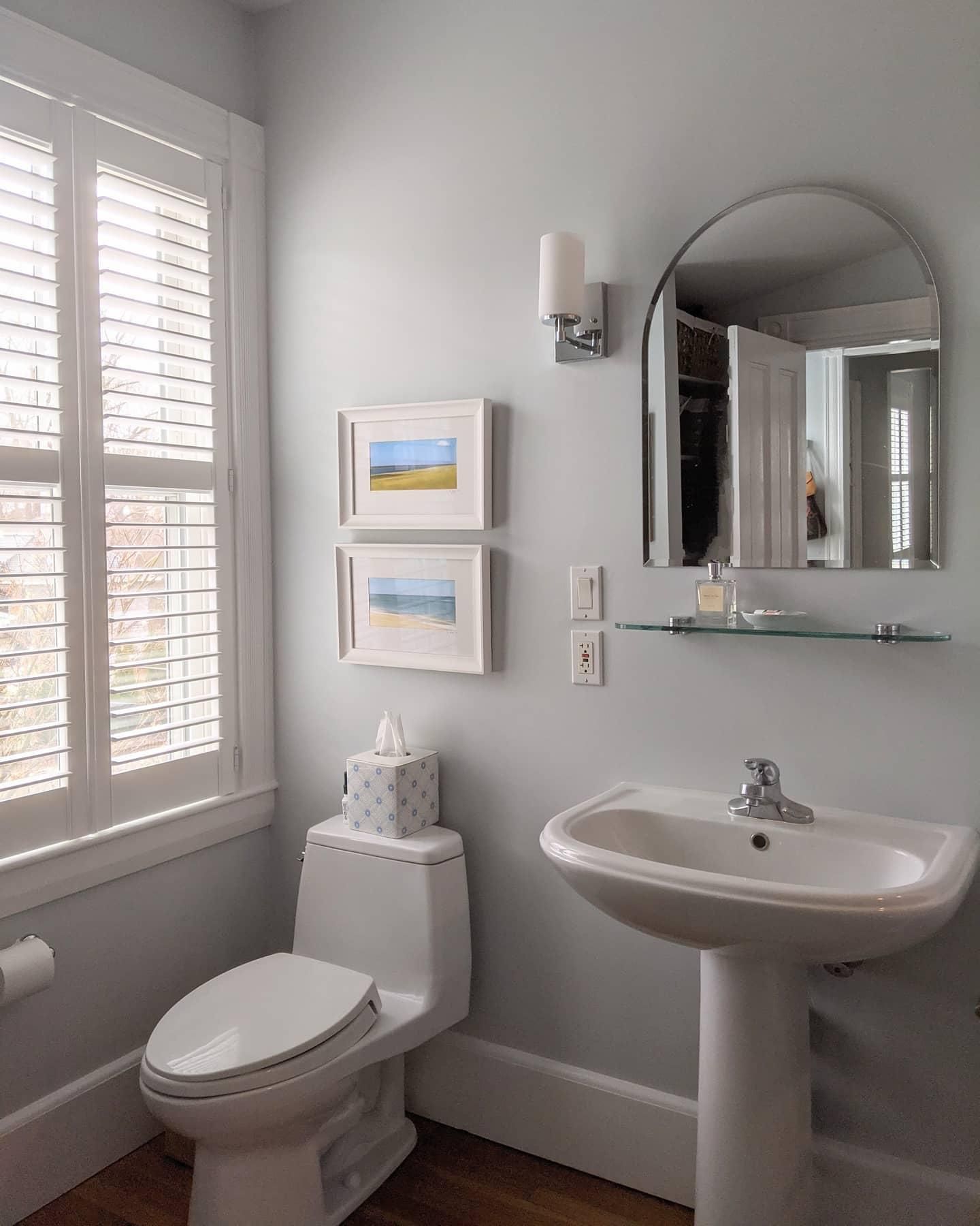
This user utilized the gray undertones of Glass Slipper by drawing it out with North-facing windows and minimal furnishing. Notice how the lighting fixtures, window casings, and trims are creamy off-white.
The wash-hand basin and toilet bowl follow the same off-white pattern to crown it all. This sparse design, combined with the lighting, makes Glass Slipper appear anything but sterile. Instead, it reads soft and clean.
If you’d like the same results, follow the pattern in the picture above. However, remember that colors can read differently on our screens than in person. So, before committing to a color, use sample peel-and-stick paints for a more accurate depiction.
Benjamin Moore Glass Slipper As An Accent
This is a no-brainer. Benjamin Moore Glass Slipper can add a pop of color to any space it’s incorporated in. If you’re not feeling it as a wall color, try it as an accent color in your bathroom, room, or kitchen,
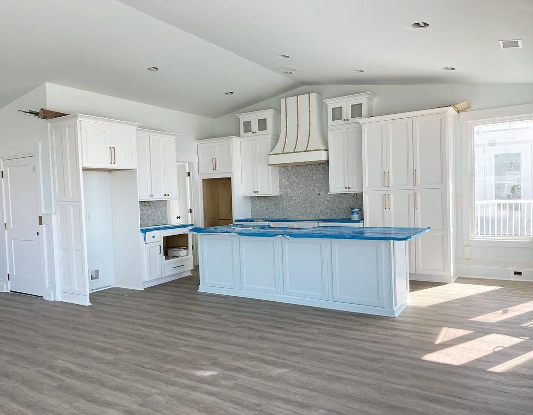
What’s the first thing you notice in the picture above? I bet it’s the island.
Here, Benjamin Moore Glass Slipper paint was used as a single accent color in the middle of the kitchen, instantly enriching the space.
If you’re thinking of using Glass Slipper similarly, keep the other colors as muted as possible to avoid taking the focus off your accent. In this case, they used off-white on the cabinets, with gold handles to keep it classy.
Benjamin Moore Glass Slipper In The Bedroom
If you think blue can’t be cozy, think again. Glass Slipper as a wall color in the bedroom can make your room become a haven you may never want to leave. Just remember that you must keep it simple enough to look cozy.
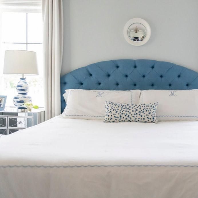
The single deep blue headboard and blue spotted throw pillow make this space simple and cohesive.
To the far left, you can also notice the baby blue picture frame and blue specks on the bedside lamp. Throw slight hints of blue occasionally, and your bedroom will become the picture of snug tranquility.
Benjamin Moore Glass Slipper In The Laundry Room
Are you looking for a color that keeps your laundry room looking clean but not rigid? Glass Slipper might be your answer.
From the picture above, the key to making this color work in your laundry room is using bright white colors as your trim. It helps tone down Glass Slipper’s coolness but keeps it simple and light.
Conclusion
The Benjamin Moore Glass Slipper is a cool color, so it’s not one of my favorites. However, it adds an undeniably beautiful pop to any room. The more traditional designers might prefer this as a wall color, while modern decorators may use it as an accent.
Either way, this color brings a peaceful sense of calm to your home. I’d recommend it if you’re searching for something beachy, soft, and void of harsh undertones.
If you still have questions about The Benjamin Moore Glass Slipper, leave a comment and I’d be happy to answer them.
 Sherwin Williams Gauntlet Gray (Palette, Coordinating & Inspirations)
 Sherwin Williams Rain (Palette, Coordinating & Inspirations)
 Sherwin Williams Pewter Green (Palette, Coordinating & Inspirations)
 Sherwin Williams Magnetic Gray (Palette, Coordinating & Inspirations)
 Sherwin Williams Rhinestone (Palette, Coordinating & Inspirations)
 Sherwin Williams Web Gray SW 7075: Review & Inspiration
