
Do you ever wonder why some colors, like Benjamin Moore October Mist (1495), are part of the Classic Collection?
That’s because they’ve proven versatile, durable, trendy, and reliable throughout the years.
Benjamin Moore describes the classic collection as a “contemporary go-to and foundational part” of its paints. October Mist is one of the collections’ leading neutral neutrals. It’s a mid-toned gray with a sage green undertone that gives it an earthy vibe.
You may remember October Mist as Benjamin Moore’s color of the year 2022. Now, it’s time to revisit the past. Let’s dissect the specifications palette and see inspirations of Benjamin Moore October Mist.
Table of Contents
When to Choose Benjamin Moore October Mist?
Before we get deep into the details of Benjamin Moore October Mist, take a sneak peek into what you can expect from this green-gray color.
Embracing the Natural Decor?
If you love Fall and nature-themed decor, October Mist is a great backdrop.
Can’t Decide on a Color?
Two-toned hues like October Mist fixes the problem of indecision because you can enjoy its gray and green tones.
Playing with Gray Color?
Gray paints are famous for their neutrality but this one takes it a step further by adding a quiet warmth with its green undertone.
Designing a New Study Room?
Make reading time a gentle and refreshing moment with the nurturing aura of October Mist walls and desks.
Paying Attention to Your Entryway?
Welcome guests with the promise of prosperity and happiness with an October Mist entryway.
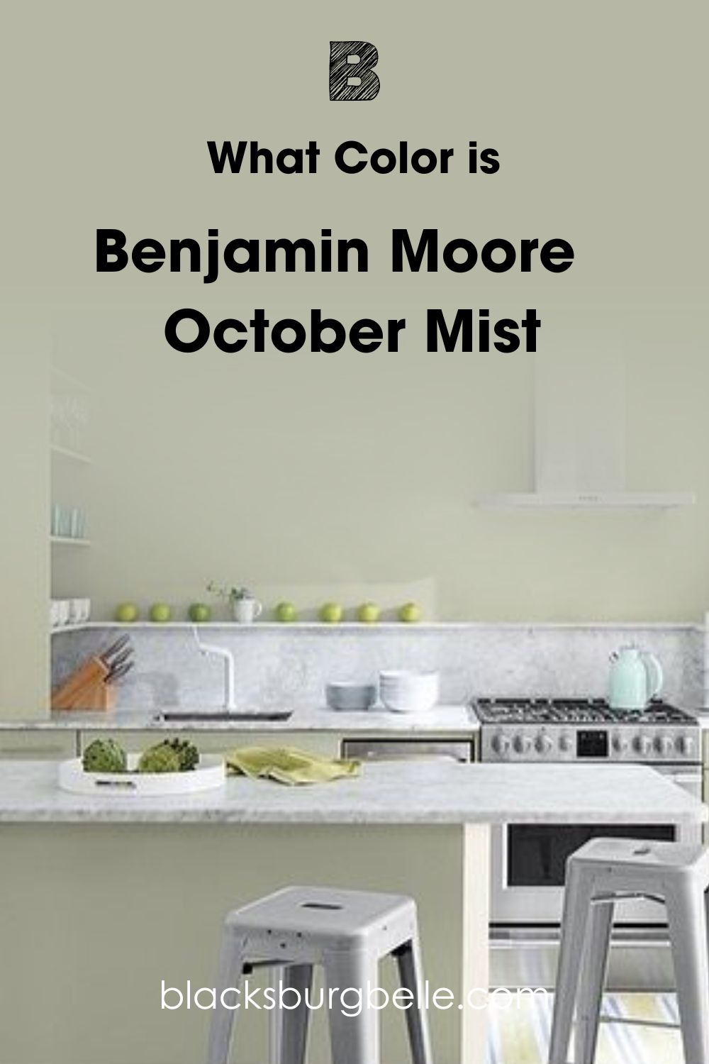
What Color is Benjamin Moore October Mist?
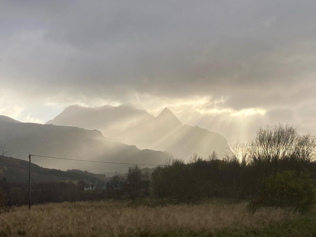
Many colors get their names from real objects, while others get inspiration from abstract ideas and feelings. Benjamin Moore October Mist falls into the latter category. It looks like a cloudy early October morning, and how the sky looks when it’s pregnant with rain.
Because of the grounding sage green in October Mist, the color is encouraging in a subtle way. Unlike most cheerful colors that come with vibrant outlooks, this one slowly creeps on you.
If you want a neutral but energetic space, choose October Mist. But if you’re into brighter colors, I don’t recommend choosing this color.
Snapshot of Benjamin Moore October Mist Specification
One glance at this table will give you an insight into October Mist and your second chance at deciding whether it’s for you. It contains its color name and code, RGB, Hex Value, Light Reflectance Value, and Undertones.
| Name | October Mist 1495 | CC-550 |
| RGB | Red 183 | Green 185 | Blue 166 |
| Hex Value | #B7B9A6 |
| LRV | 46.54 |
| Undertones | Sage Green |
The LRV of Benjamin Moore October Mist
The LRV of a color is measured between 0 – 100, with 0 being the most absorbent black and 100 being the most reflective white. This figure tells you how much light your paint will reflect on its own and with additional illumination.
With paints, the scale is 3 – 97 because of undertones. So, 3 – 29 (dark), 30 – 45 (medium-dark), 46 – 55 (mid-toned), 56 – 79 (medium-light), and 80 – 97 (light).
With that info, you now know Benjamin Moore October Mist having an LRV of 46.54 makes it a mid-toned color.
Mid-toned paints lie in the middle of the scale and have an almost neutral reaction to light. Because October Mist is closer to the dark side of the scale, it’s mostly dull without additional lighting. But when it receives light, the color’s sage green undertone takes over.
Lighting Conditions for Benjamin Moore October Mist
You can decide whether to highlight the green or gray part of Benjamin Moore October Mist by manipulating lighting. If you use artificial bulbs, get a yellow – orange warm light for the gray color to thrive and blue – white cool light to highlight the sage green undertone.
Instead of extra lighting, you can take advantage of your room’s position in relation to sunlight. When the sun rises in the East, its reflection becomes the brightest in South-facing rooms. By noon until afternoon, the sun moves further East and burns hotter there.
From late noon until sunset, the West-facing rooms get hotter, but the sunlight isn’t as bright as the morning and early noon. So, it’s dim. Meanwhile North-facing light is consistent and neutral throughout the day.
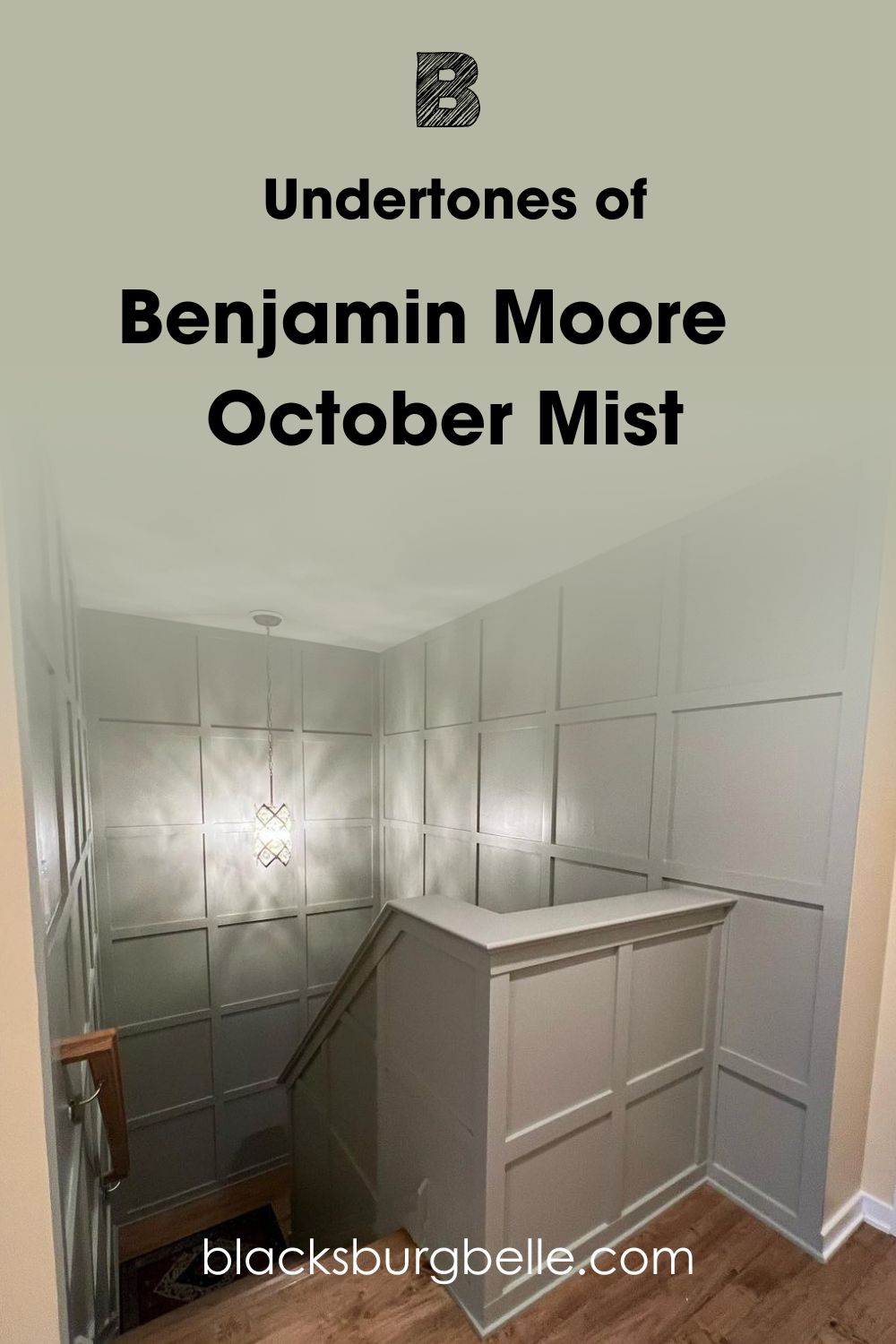
Undertones of Benjamin Moore October Mist
If you’re still confused about why Benjamin Moore October Mist is green and gray, it’s time to break it down. A color can have multiple faces because of its RGB, which is a mixture of red, green, blue, and true black paint.
So, when you see one color, prepare for another or more tones when it interacts with light. See an example below:
Does it look Green or Gray?
Earlier, I spoke about using lighting to highlight Benjamin Moore October Mist, and now it’s time to recap. If you want to emphasize its gray tone, use warm lighting or position it in a West-facing room or small space like this one.
To get the light sage green part of the color, use white or blue lighting in the South or Eastern-facing room. If you want to appreciate the green-gray tone together, a North-facing room is your best bet.
Now, let’s dive deeper into the emotions of Benjamin Moore’s October Mist.
Is Benjamin Moore’s October Mist a Warm or Cool Color?
Benjamin Moore October Mist is a warm color that can turn cool. You may think sage green-gray is so last year, but I beg to differ. There’s a reason October Mist is part of the Benjamin Moore Classics, and you’re about to learn why.
Even though I think October Mist is a Fall/Winter color, it’s a timeless shade that keeps your home in style all year around. If you’re a camping and outdoor lover, you’ll understand the earthy vibe of this color. If you don’t, it doesn’t hurt to explore new territories.
Use Benjamin Moore October Mist in your entryway, living room, kitchen, bathrooms, and bedrooms. You can also use the color in your office space or study area to boost your energy during work.
Because of its nature-themed undertone, October Mist can give off a warm or cool vibe. All you need to control that vibe is the position and coordinating palette.
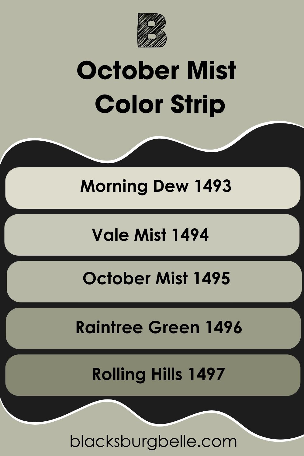
Benjamin Moore October Mist Color Strip: Lighter or Darker Exploration
It’s chill if you’re already in love with Benjamin Moore October Mist from this review, but if you’re still interested in something more, here are some options:
- Benjamin Moore Morning Dew (1493)
- Benjamin Moore Vale Mist (1494)
- Benjamin Moore October Mist (1495)
- Benjamin Moore Raintree Green (1496)
- Benjamin Moore Rolling Hills (1497)
Benjamin Moore Morning Dew (1493) is a cooler and more misty gray with a fainter green undertone than October Mist. But for a more neutral green-gray, choose Vale Mist.
Meanwhile, Raintree Green is a darker gray with an olive undertone, and Rolling Hills gives you a more nuanced dark green-gray with its brown undertone.
Let’s talk about color palettes and how to use October Mist in your space.
Benjamin Moore October Mist Coordinating Colors
Color palettes go the extra mile in expressing individuality and the character of a place. You can choose any of these five popular themes.
PS: Get a color wheel for this part.
- Analogous Theme: A combination of three similar colors based on their closeness on the color wheel. You’ll have cool colors, green-blue-teal, warm colors, red-orange-yellow, and sometimes a mix of both color types, lemon-yellow-green.
- Complementary Theme: Pair two opposite colors to create a bold contrasting look. You’ll recognize these contrasting combos (red-green, blue-orange, yellow-purple) from brand logos and jersey designs.
- Triadic Theme: Draw an equal-sides triangle on the color wheel and pick all colors that form a triad into one palette. You’llIn one group, you’ll have all primary colors – red-yellow-blue and secondary colors – green-purple-orange.
- Split Complementary Theme: This combo requires two steps. Firstly, you’ll pick the complementary color. Then, split it into two by pairing it with one color to the left and another to the right. Compound colors are the split-complementary tones.
- Monochromatic Theme: Use one color in different tints and shades by adding white for lighter tones and black for deeper shades.
You can explore shades of sage green, olive, and earthy browns with the monochromatic theme, but the Analogous, Triadic, and Split-Complementary themes are the most dynamic.
Mixing three colors that are on a surface level creates the most imaginative combos. You’ll see what I mean soon.
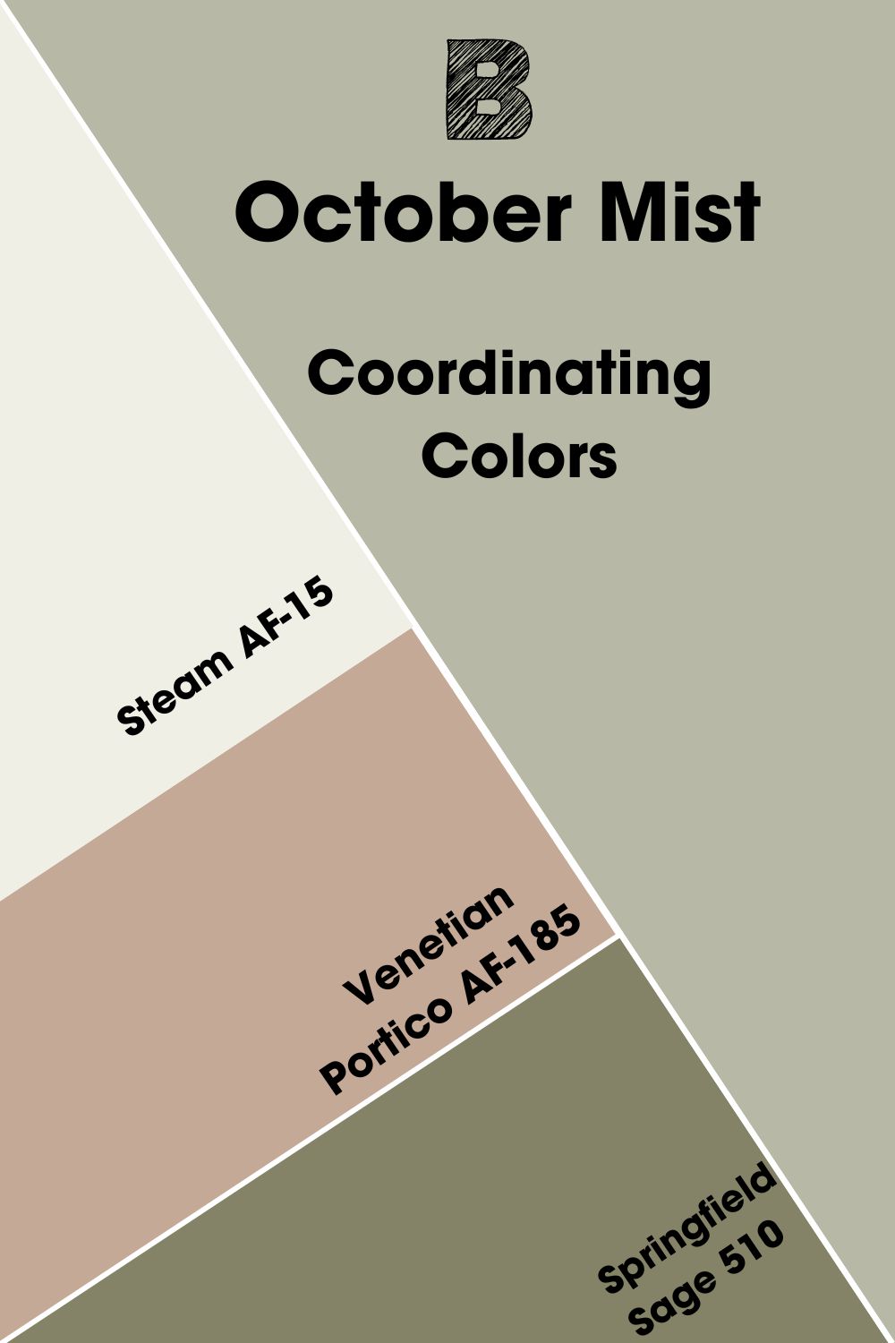
Coordinating Colors for Benjamin Moore October Mist
Benjamin Moore recommends four colors as the perfect pairs for October Mist, and I’ve selected my best three to see if the choice is informed or not.
- Benjamin Moore Steam (AF-15):A bright and warm off-white color with a soft yellow undertone that makes it look creamy.
- Benjamin Moore Venetian Portico (AF-185):A clay-toned blush color with equal parts pink and tan tones.
- Benjamin Moore Springfield Sage (510):This deep brown and olive highlights the earthy sage in October Mist.
This color palette is filled with nature-inspired colors from the clay Venetian Portico to the leafy Springfield Sage and sunny yet cloudy Steam. Use Springfield Sage and Venetian Portico as accents and Steam as the trim.
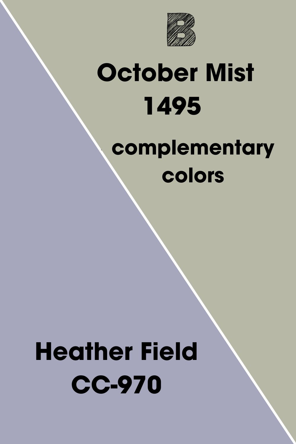
Complementary Colors for Benjamin Moore October Mist
As I mentioned earlier, complementary colors are pairs of contrasting hues based on their opposite positions on the color wheel. You’ve seen these popular combos and wondered why anyone bothered to pair them because of how bold and contrasting their tones look.
Every primary color has a corresponding complementary color, Yellow-Purple, Red-Green, and Blue-Orange. That last combo is the most popular because most variations of orange and blue are neutral colors.
As a green-gray color, October Mist’s complementary hue is a variation of red, as you’ll see soon. I used a color generator to get the exact match and found Benjamin Moore Heather Field (CC-970), a.k.a. Central Mauve, as the complementary color for October Mist.
Heather Field is a soft medium-dark mauve formed from a combo of blue and red. So, even though it’s not an obvious red color, it complements October Mist, which is also not a pure green hue.
Benjamin Moore October Mist Color Palette
Let’s discuss the other color palettes that work for Benjamin Moore October Mist. I tried to choose the most dynamic colors in each theme to give you a bold look. Remember that these are recommendations and not absolutes.
So, you can use them as references while using the tips in this review to create your own palette.
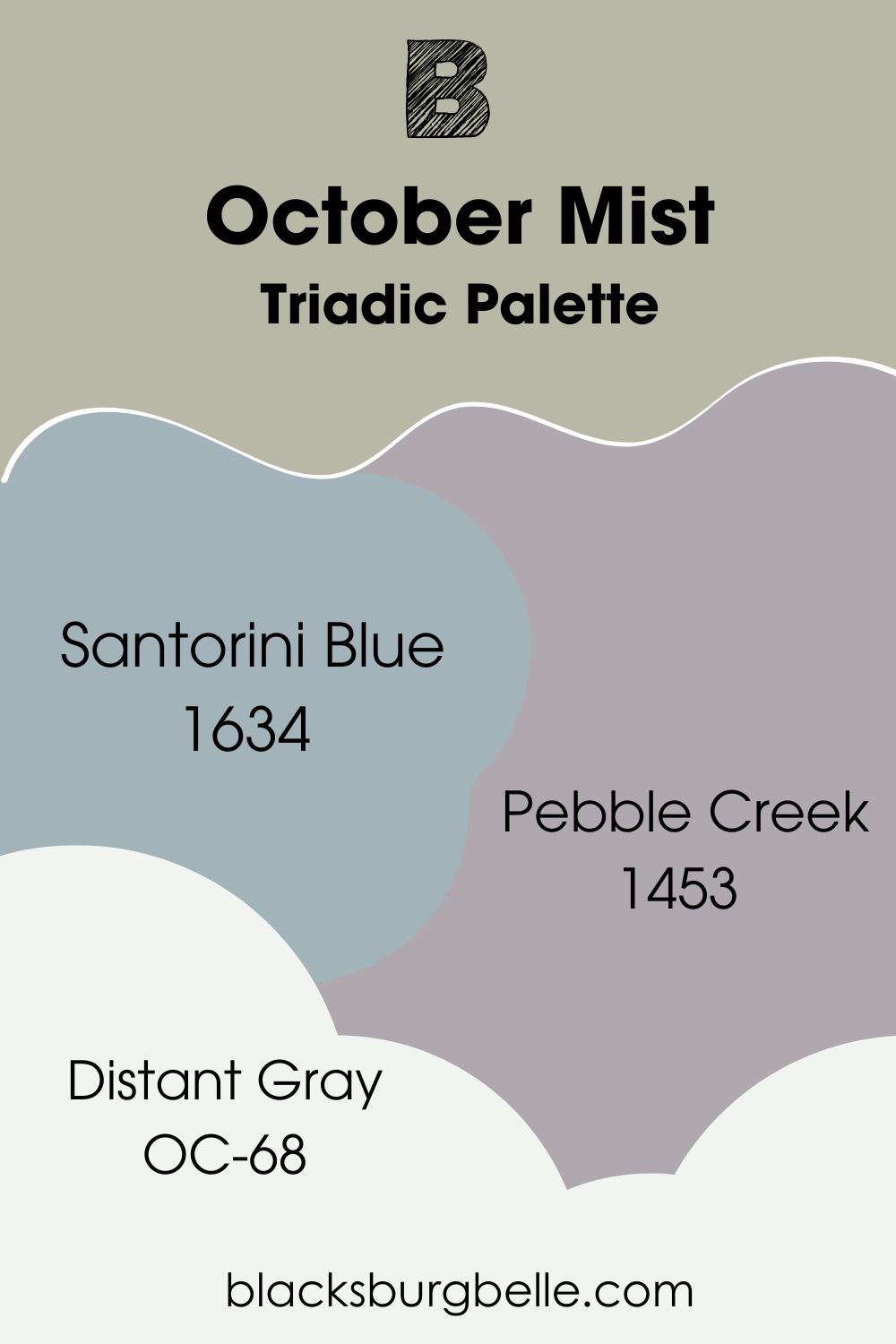
Triadic Palette
- Benjamin Moore Santorini Blue (1634):A soft and cool gray-blue with a medium-dark reflectance value.
- Benjamin Moore Pebble Creek (1453):This medium-dark gray is colored with a light amethyst tone.
- Benjamin Moore Distant Gray (OC-68):A hazy white paint with a blue-gray undertone to make it off-white.
Use October Mist as an accent for Santorini Blue walls and highlight them with Pebble Creek furniture. Then trim your walls with Distant Gray.
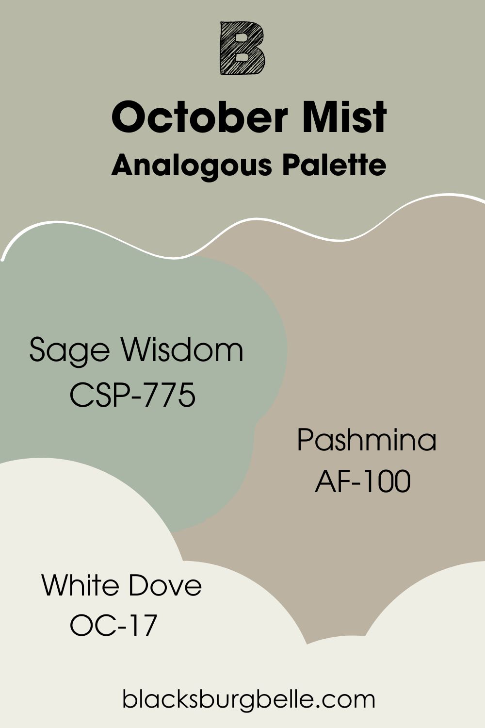
Analogous Palette
- Benjamin Moore Sage Wisdom (CSP-775):An obvious sage green with a faint gray undertone.
- Benjamin Moore Pashmina (AF-100):This neutral taupe is the perfect marriage of gray and beige.
- Benjamin Moore White Dove (OC-17):A bright and creamy yellow-tinted white paint.
Use White Dove as the trim to tie in a Sage Wisdom and October Mist wall since both colors are green. Then, accentuate both colors with Pashmina.
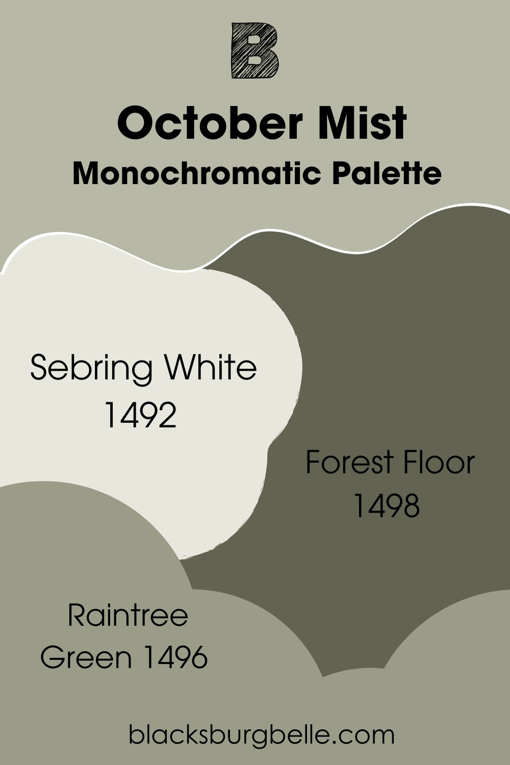
Monochromatic Palette
- Benjamin Moore Sebring White (1492):A cool white paint with a tinted sage green cast.
- Benjamin Moore Forest Floor (1498):A deep and earthy olive with a brown and charcoal gray undertone.
- Benjamin Moore Raintree Green (1496):This mellow gray has a faint olive-green base.
Because all colors in this palette are green grays except the Sebring White, you can decide which tone you’d like to highlight. If you want to accentuate the green part, focus on Forest Floor as your main accent. But to highlight the gray part, focus on Raintree Green.
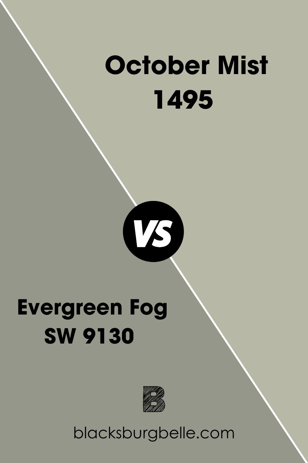
Benjamin Moore October Mist vs. Sherwin Williams Evergreen Fog (SW 9130)
Get Sherwin-Williams Evergreen Fog for a green-gray paint that’s two shades darker than October Mist.
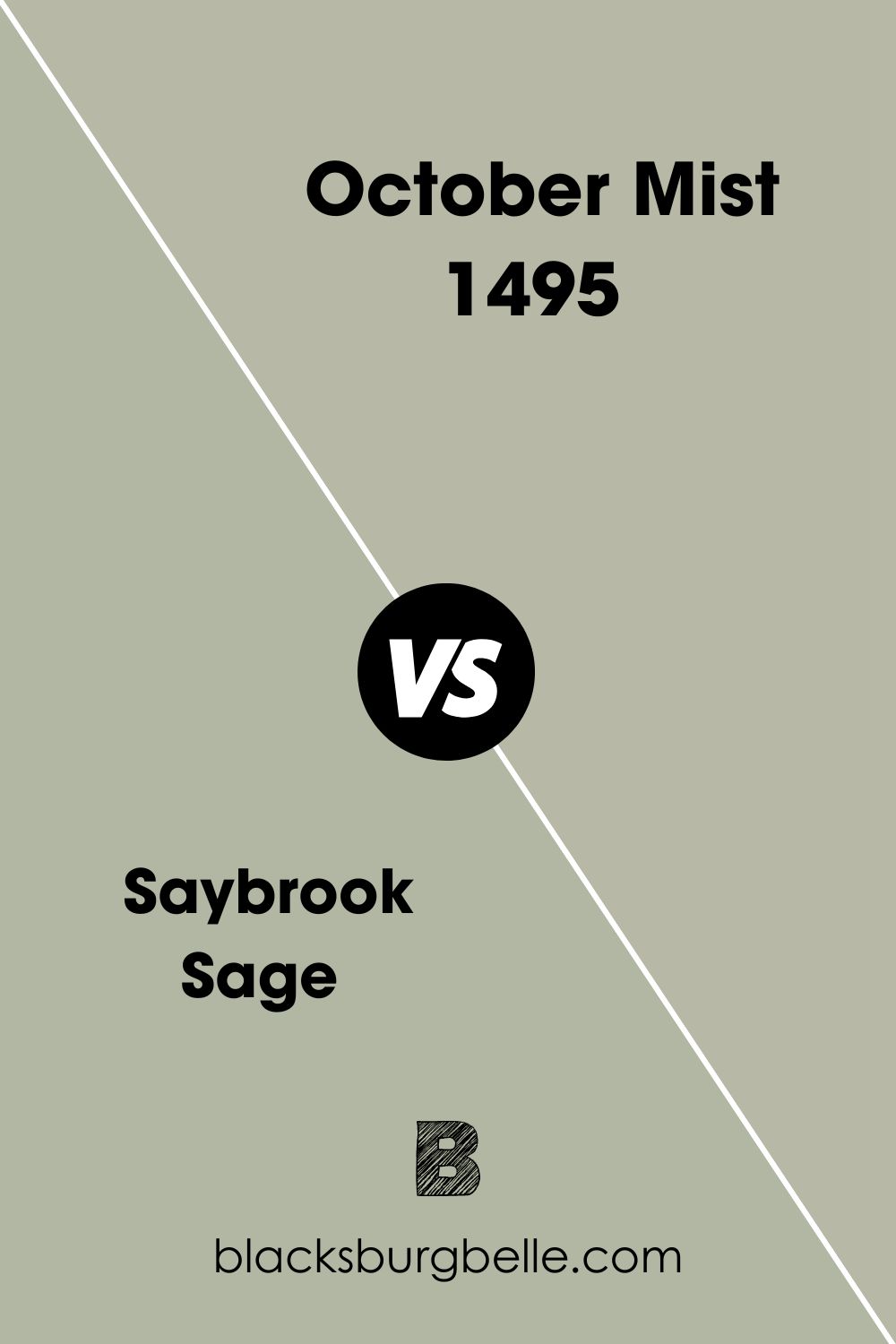
Benjamin Moore October Mist vs. Benjamin Moore Saybrook Sage
Even though its name is Saybrook Sage, this color’s green undertone is closer to aloe than October Mist, making it a darker green-gray tone.
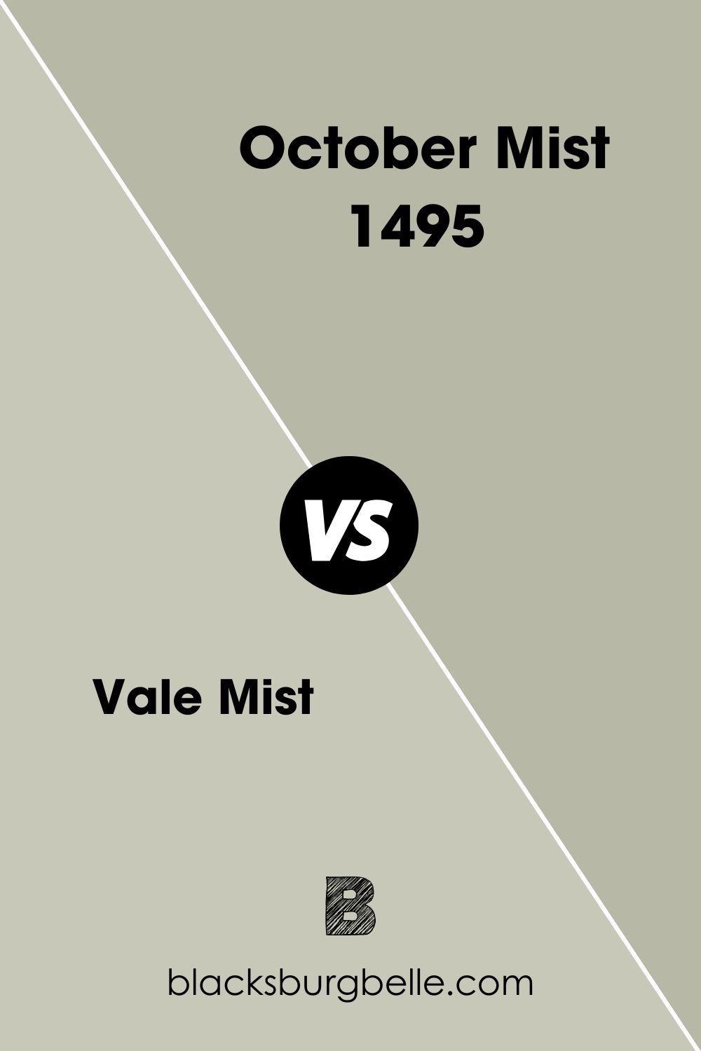
Benjamin Moore October Mist vs. Benjamin Moore Vale Mist
For a silvery and more neutral sage green, get Vale Mist instead of October Mist.
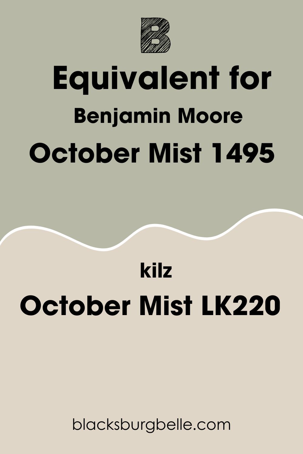
Benjamin Moore October Mist Equivalent with Kilz (LK220)
KILZ paints isn’t as popular as Benjamin Moore, but it does have a medium-dark taupe paint named October Mist (LK220). The two colors are visibly different because KILZ’s October Mist lacks a green undertone.
Kilz’s October Mist looks taupe under dim and white lighting but appears as a sandy tan, unlike Benjamin Moore’s version, which is a mid-toned green-gray.
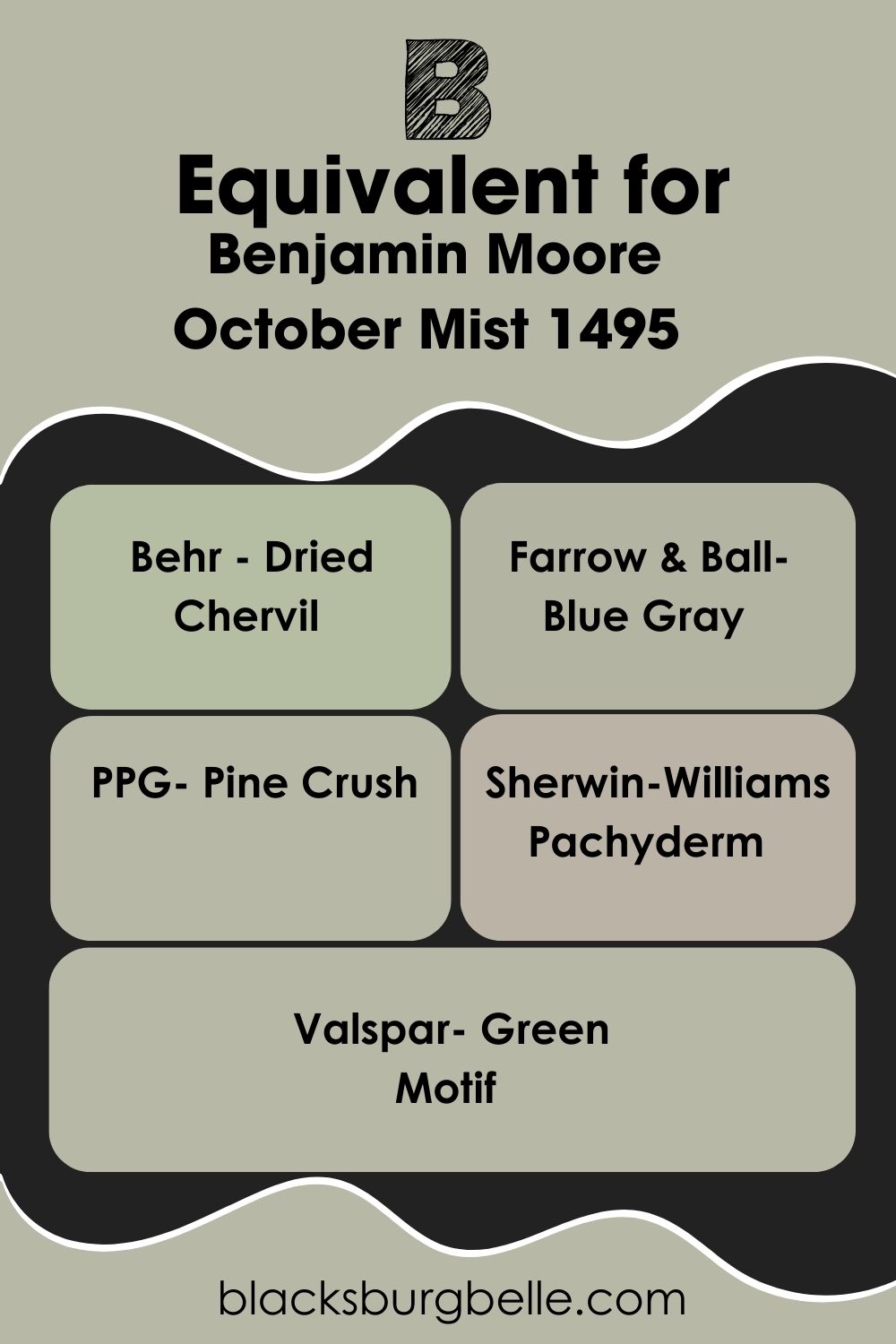
Benjamin Moore October Mist Equivalent with Other Brands
If you want this exact green-gray tone from another brand, you have to custom-order it. But if you don’t mind a similar tone, here are some options to explore:
- Behr – Dried Chervil
- Farrow & Ball– Blue Gray
- PPG– Pine Crush
- Sherwin-Williams– Pachyderm
- Valspar– Green Motif
Of all those alternatives, Farrow & Ball’s Blue Gray is the only green-gray with a soft blue undertone.
Where can you use Benjamin Moore October Mist?
You can use October Mist anywhere inside your house but not in your exteriors. That’s because the color’s tones and tints get lost under direct sunlight.
But when October Mist gets limited rays through open windows paired with enclosed walls and other colors, you can appreciate its green-gray tone better.
Here are some inspirations to help you in curating your interior decor with October Mist as the central or accenting color.
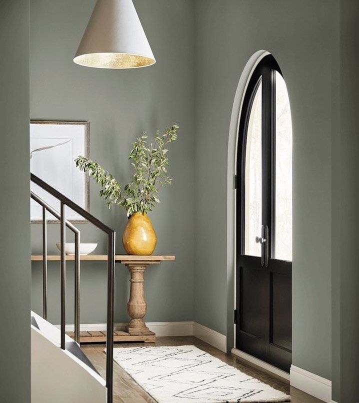
Benjamin Moore October Mist on Walls/Entryways
Because October Mist by Benjamin Moore is a mid-toned color, you can use it on an entire wall without fear of it being too much. Now, the wall’s position is another story. “Which walls look best when painted in October Mist?”
My top pick is the Entryway. You want to welcome people into your space with the warm and promising aura of October Mist.
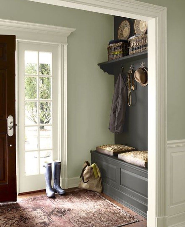
This entryway shows that you can use October Mist as your trim and wall painting and it’ll still look beautiful.
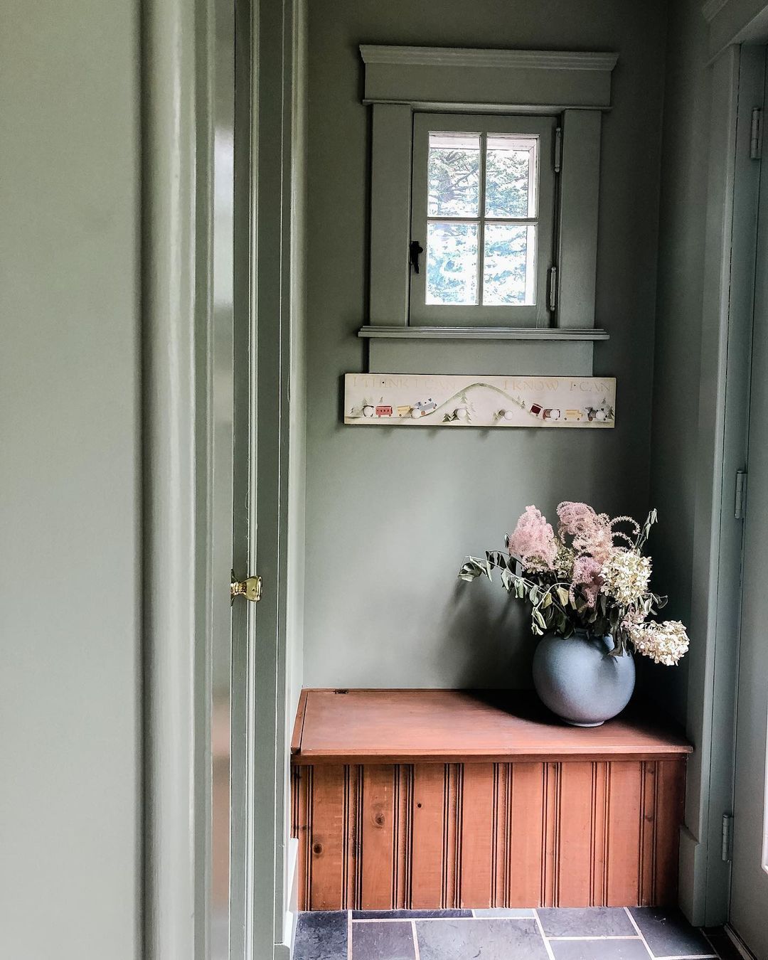
Even though green-gray is a classic color, it suits a modern-themed entryway just as well as any vintage space.
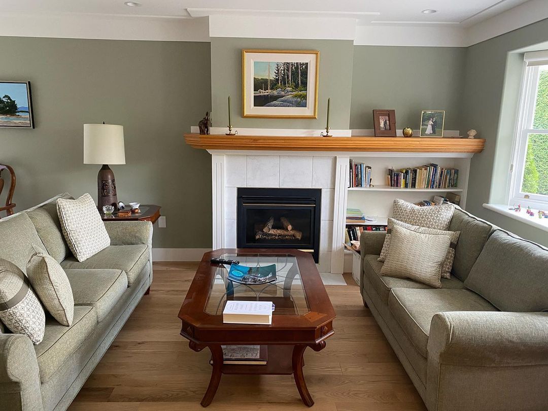
Benjamin Moore October Mist in the Living Room
Whether you like a minimalist, modern, or traditional living room, October Mist is a great background choice to build your palette around. Most interior designers pair the color with wooden floorboards and accessories to highlight its earthy nature.
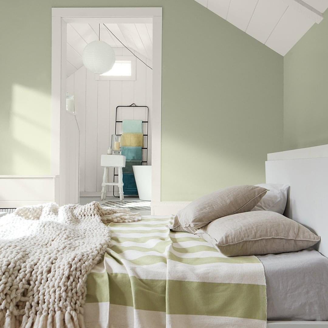
Benjamin Moore October Mist in the Bedroom
Let’s take the refreshing vibe into the bedroom and highlight it with bright off-whites, tans, and beiges. You can use Benjamin Moore’s October Mist as an accent or a full wall covering.
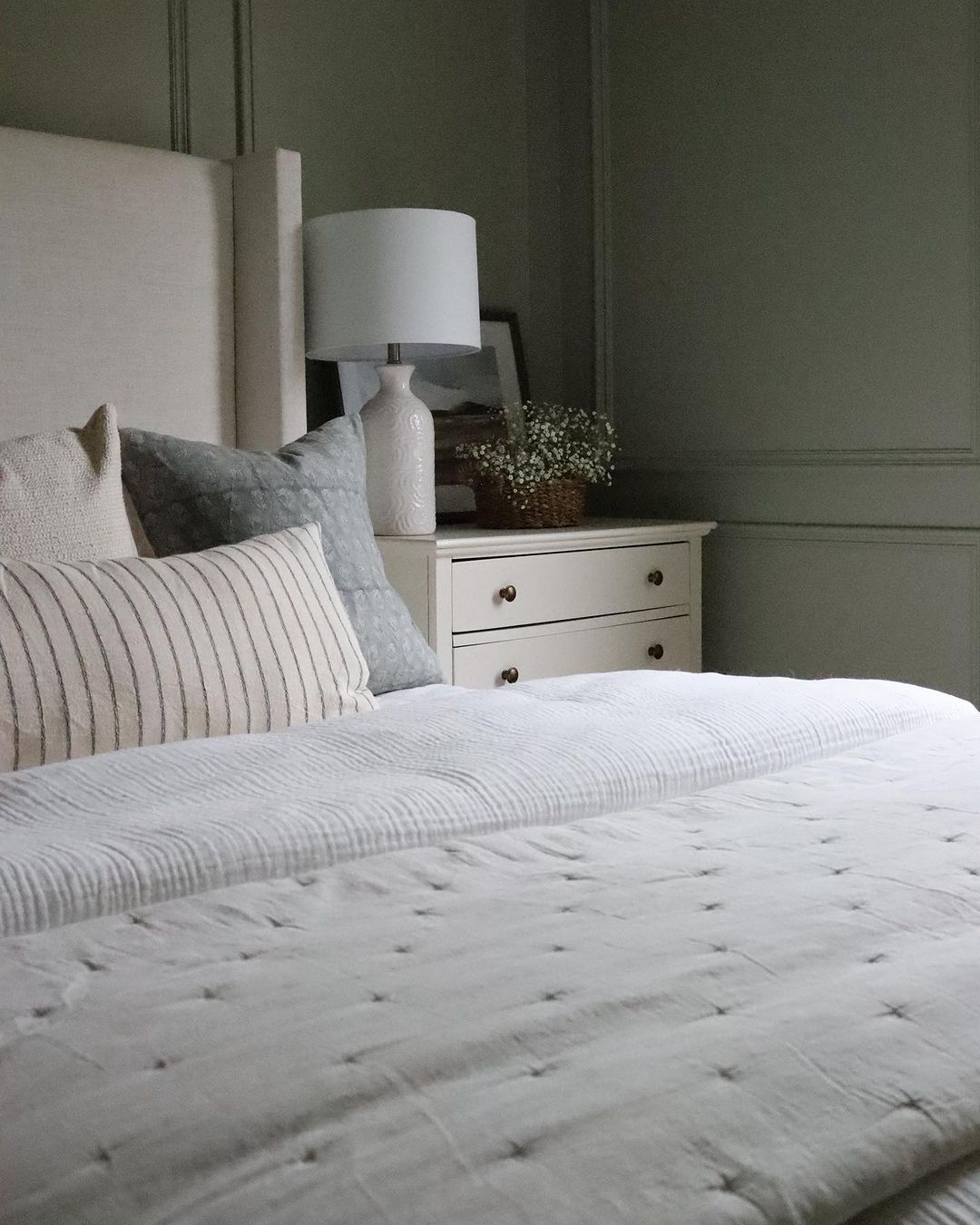
Notice that the brighter light in this second bedroom gives October Mist a sage green look while the room with lower lighting leans into its gray look.
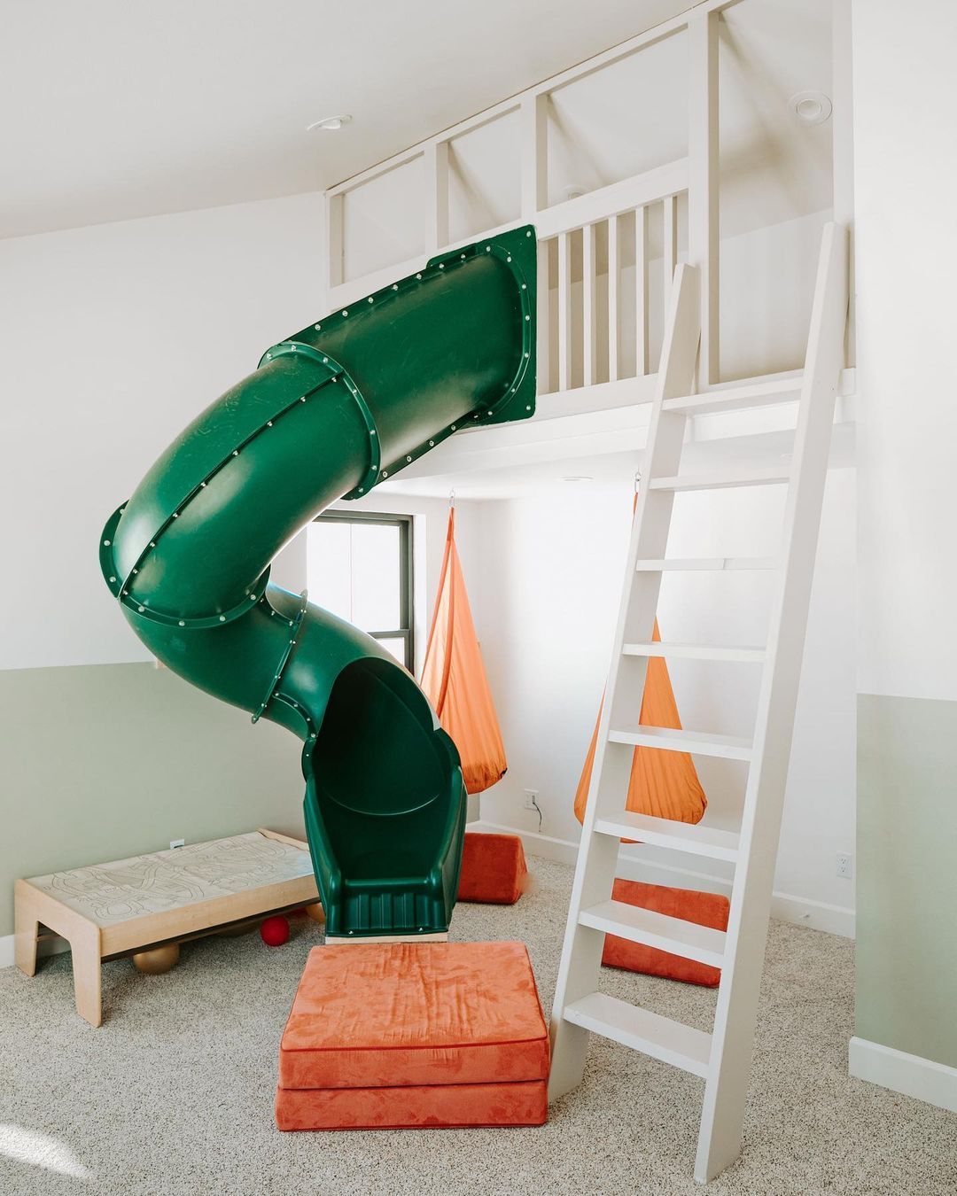
This kid’s bedroom sold me on Benjamin Moore’s October Mist. The color combination and measured use of this green-gray paint capture its essence. The blend of green and orange is everything I love about Fall in one space.
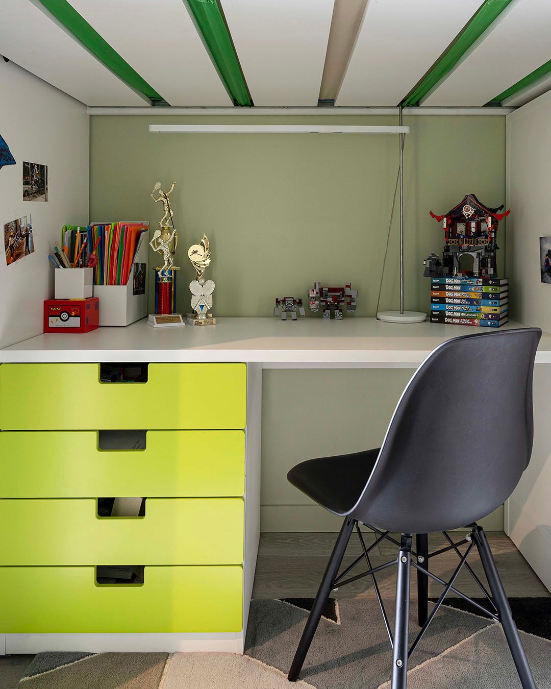
Benjamin Moore October Mist in a Study Room
People who love attaching study rooms to bedrooms or having them separately will love October Mist walls. It’s the right blend of green-gray to keep you refreshed and inspired as you study daily.
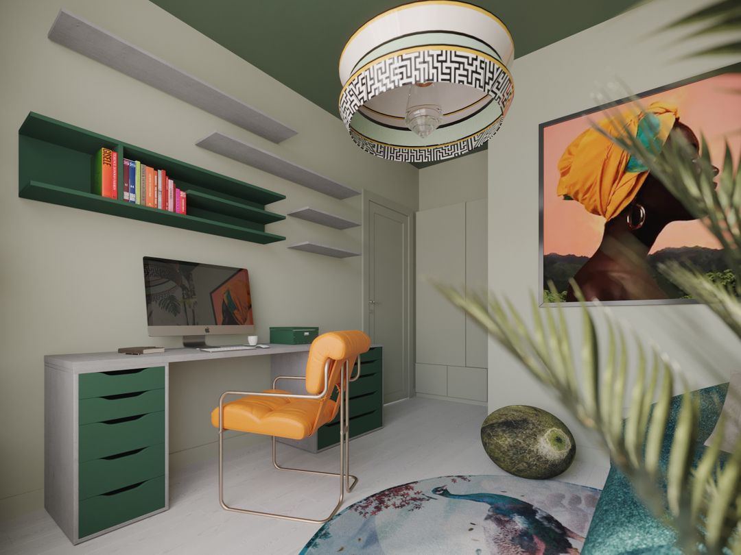
I noticed that every study room with Benjamin Moore’s October Mist walls used a monochrome theme and added shades of orange to their palette. Even though the color is versatile, October Mist is best used in children’s and teenagers’ study rooms.
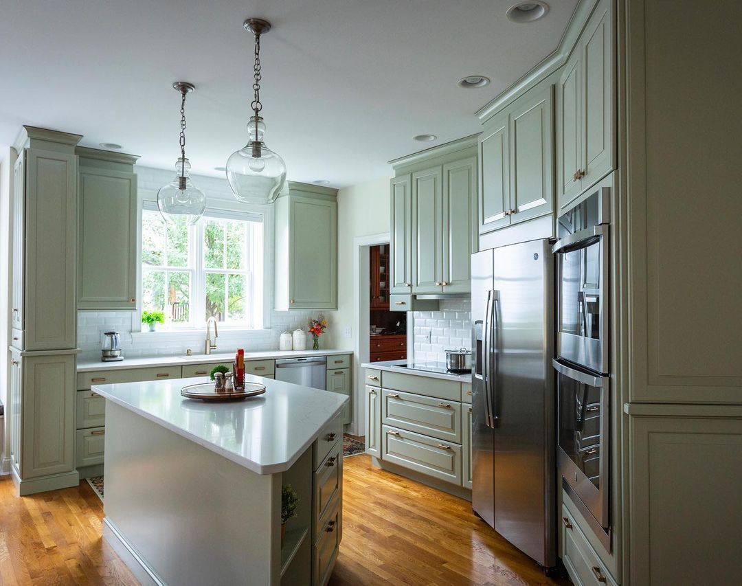
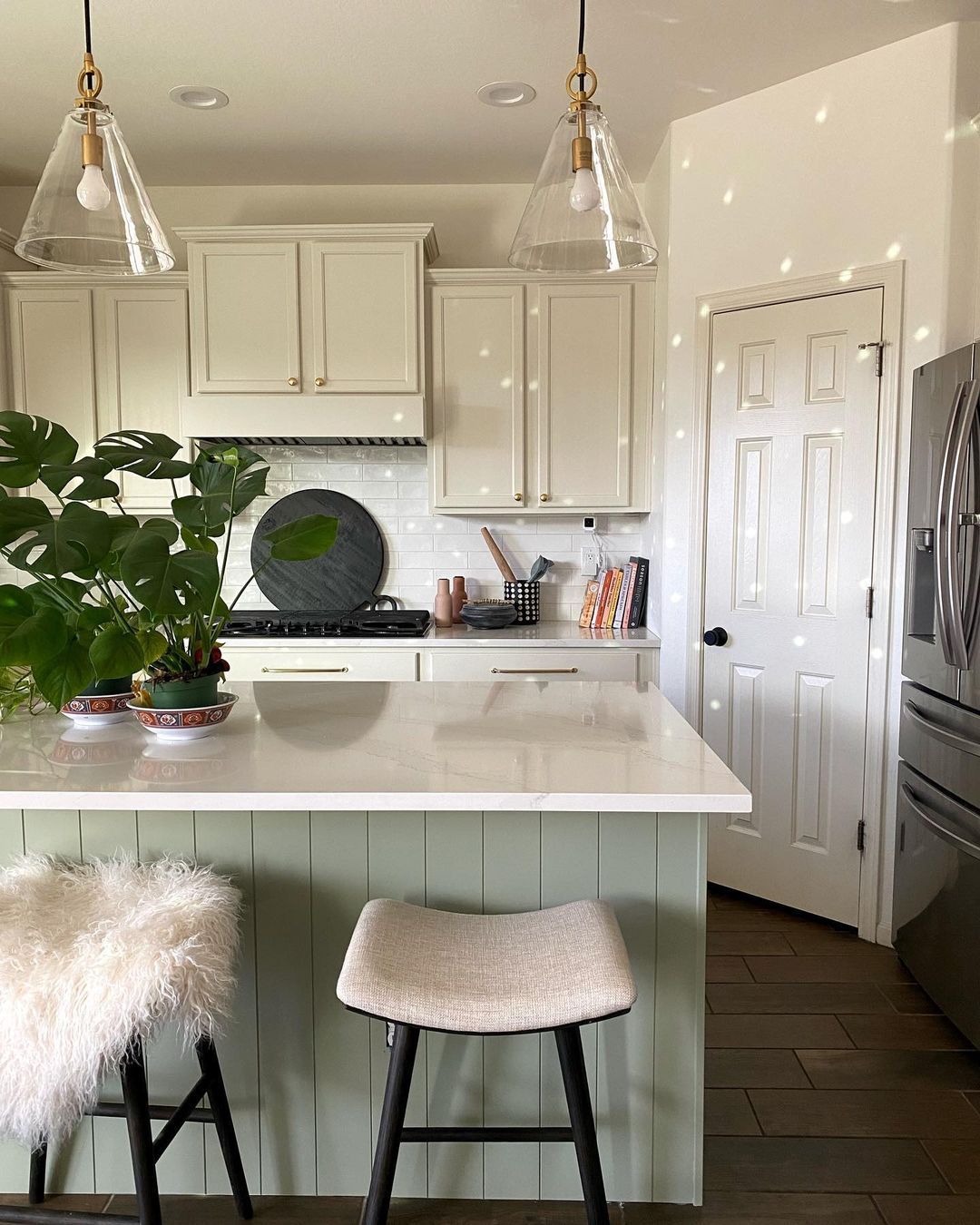
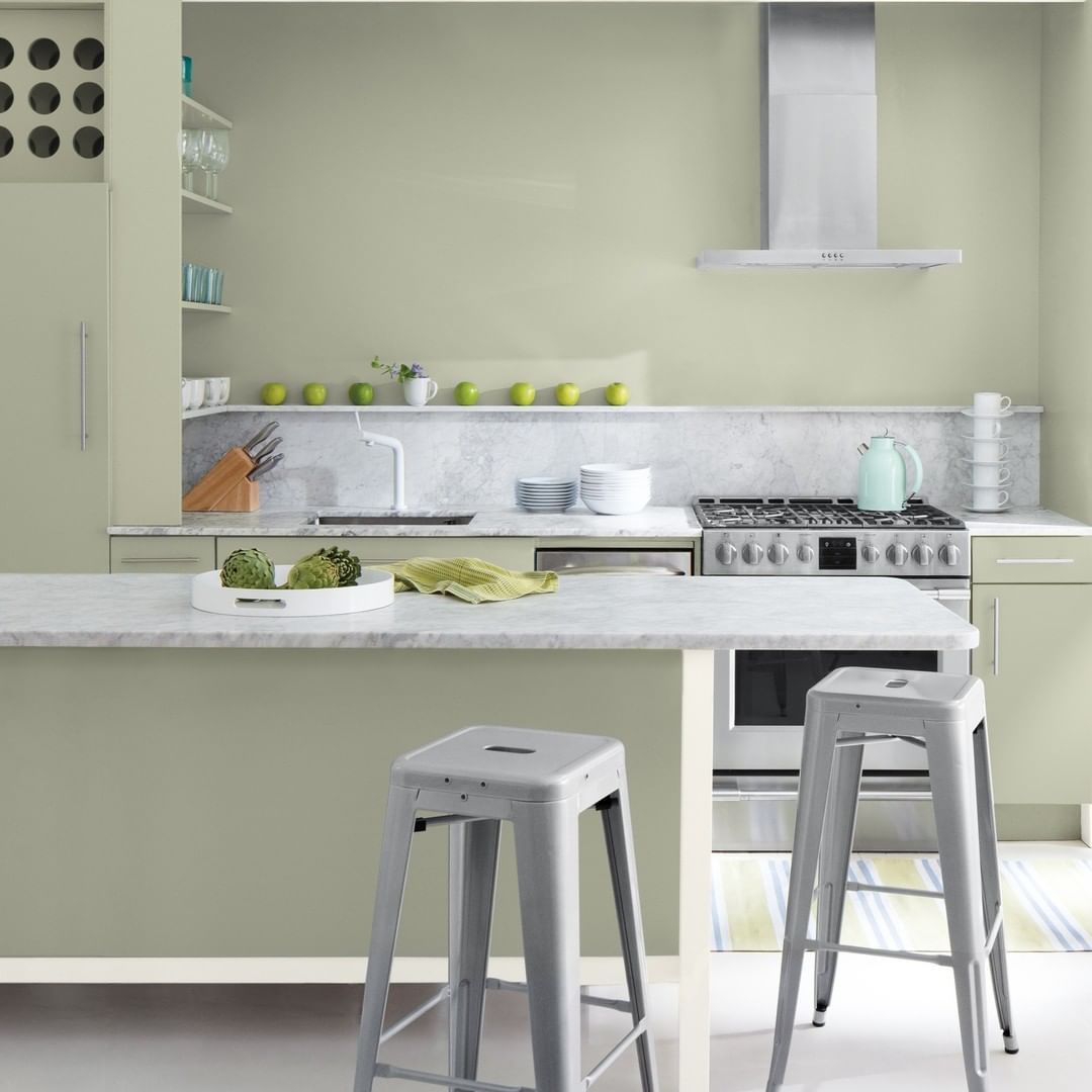
Benjamin Moore October Mist in the Kitchen
When you want to paint October Mist on your cabinet, the kitchen is the best place. You can mix this green-gray with another color, like off-white or beige, to add more energy to the space or use it all over to keep the kitchen’s energy grounded.
This is what October Mist used as an accent in the kitchen looks like.
This is what an entire kitchen covered in October Mist looks like.
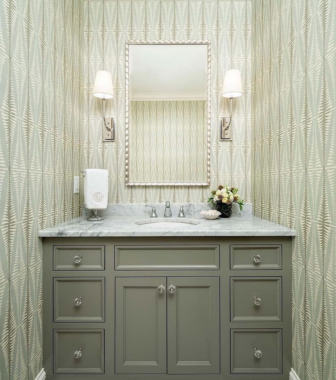
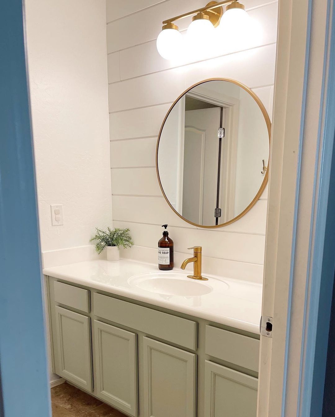
Benjamin Moore October Mist in the Bathroom
You know, bathroom designs can take on different forms. The space can have a painted cabinet against a tiled wall or painted walls and cabinets. Either way, October Mist will look good. The lighting will determine whether you get a green or gray reflection from the color.
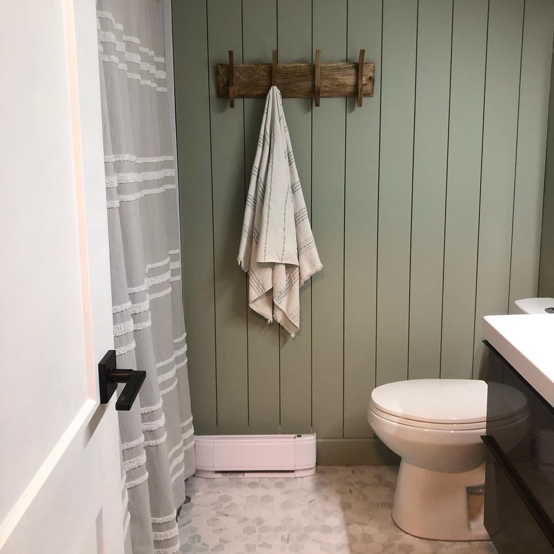
Here, October Mist looks lighter because it’s receiving direct light from the wall fixture and paired with an off-white countertop and walls.
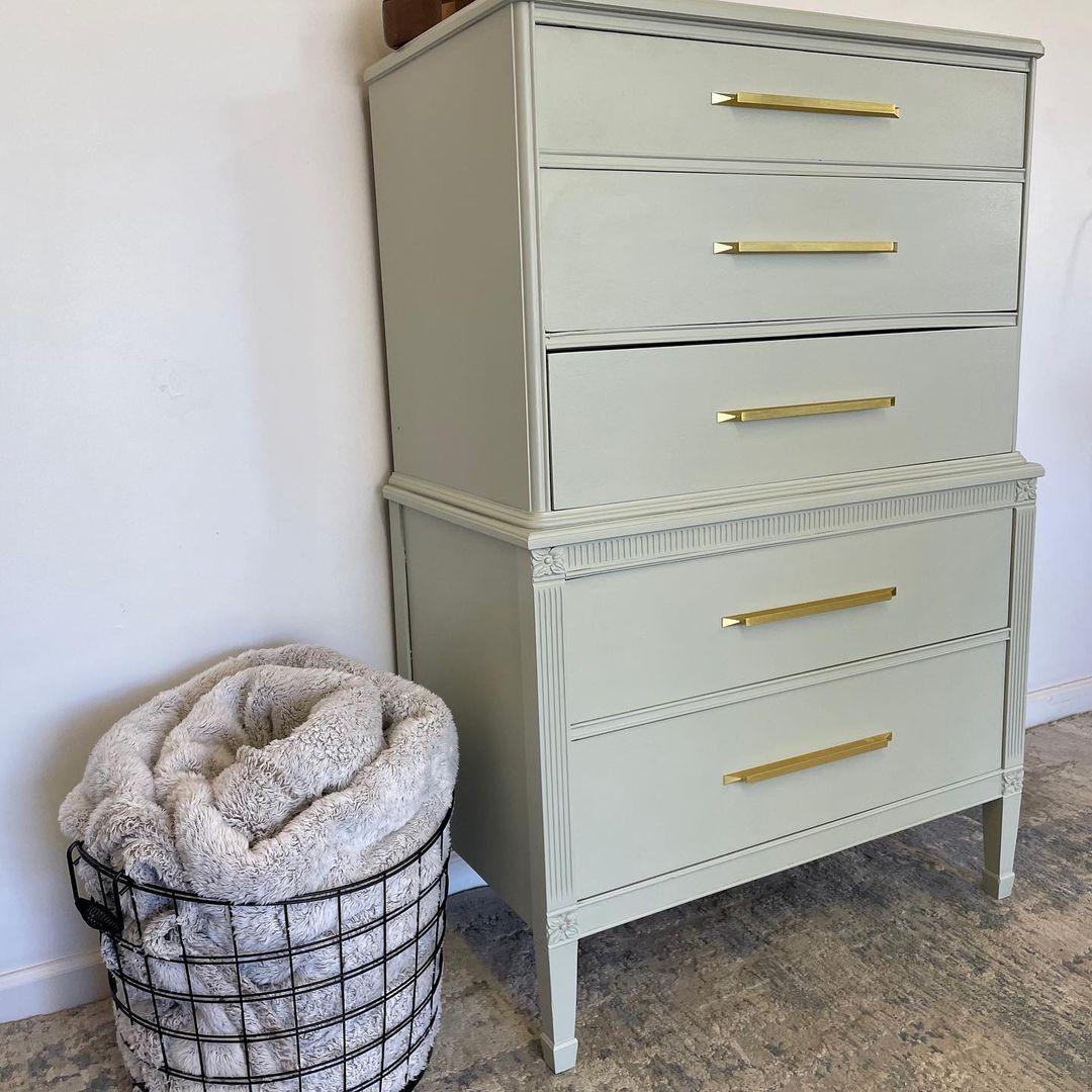
Benjamin Moore October Mist on Furniture
You can add color to a neutral space by using painted furniture. But if you don’t want it to be too bright or take the attention away from the rest of your decor, try a mellow yet warm shade like Benjamin Moore’s October Mist.
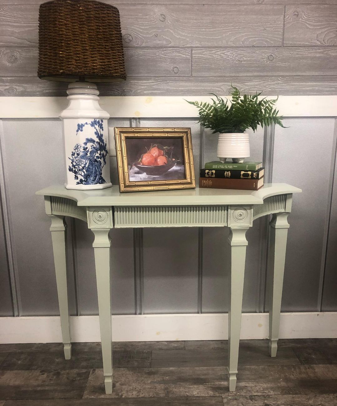
Benjamin Moore’s October Mist is equally elegant on minimalist furniture like this table. Even though it’s a vintage design, the soft sage green-gray adds a modern touch to the furniture and overall space.
Conclusion
Reviewing Benjamin Moore’s October Mist was a refreshing experience, and that’s how it makes you feel when you use it in your home. If you’re in tune with nature, you’ll love this color. If you need a breather from the stress of reality, you’ll love this color.
Don’t buy Benjamin Moore October Mist if you want an airy and calm color or a vibrant and fiery hue. It’s not an in-your-face color. Instead, its beauty is in its grounding sage-green undertone and somewhat neutrality.
Sample October Mist before committing. If you’re worried about staying trendy, don’t be because this green-gray is forever.
 Sherwin Williams Rock Bottom (Palette, Coordinating & Inspirations)
 Sherwin Williams Topsail (Palette, Coordinating & Inspirations)
 Sherwin Williams Ice Cube (Palette, Coordinating & Inspirations)
 Sherwin Williams Creamy SW 7012: Review & Inspiration
 Sherwin Williams Halcyon Green SW 6213: Paint Color Review
 Benjamin Moore Dove Wing OC-18: Review & Inspiration
