
So you want to use white paints for your space but can’t decide between warm and cool shades? While I recommend you consider using either Sherwin-Williams Natural Choice or Alabaster, there’s more to these colors than meets the eye.
How do these colors differ, you ask?
Natural Choice is a warm creamy white paint while Alabaster has a gray undertone that makes it a breezy off-white tone. Natural Choice and Alabaster rank as two of Sherwin-Williams’ best-selling whites. They have the right tones, tints, LRVs, and ability to match other colors.
Many people love white paints because of their versatility, however, choosing mindlessly isn’t an option if you want your space to deliver the effect you desire. You must understand the undertones, overtones, light reflection value, and several other elements of the colors involved.
For the remainder of this piece, we’ll establish the differences and similarities between these paint colors. You’ll also get to see live images of these colors when placed side-by-side.
Table of Contents
When Should you Natural Choice and Alabaster?
Let’s start comparing scenarios when Natural Choice or Alabaster is ideal because they’re white paints with warm undertones. As neutrals, both white colors will fit anywhere. But their differences make them better in unique situations.
I noticed Alabaster is more popular than Natural Choice because it has less undertones and isn’t a picky shade.
Before I get into the details, here are some quick tips to speed up your decision making process.
Choose Sherwin-Williams Natural Choice if:
- You want a white paint with yellow and orange undertones
- You want to create a homely vibe
- Most of your furniture is finished wood in honey and red shades.
Choose Sherwin-Williams Alabaster if:
- You want a creamy off-white color
- You want to avoid bold undertones
- You want to highlight gray and taupe furniture
Both Natural Choice and Alabaster are white-passing paints. That means lighting will change their color to cream and off-white. So, it’s best to pair them with intense warm colors.
Because Alabaster has a gray edge, you can complement it with warm gray paints to match its other undertones while Natural Choice works with beige. Since both colors are bright with high LRVs, mid-tones and darker shades highlight their features.
Now, I’ll take you on a visual and technical road teaching you to choose between Natural Choice and Alabaster.
Visually Exploring Sherwin-Williams Natural Choice and Alabaster
Visualizing Natural Choice and Alabaster in real-life spaces will clear your confusion on their similarities.
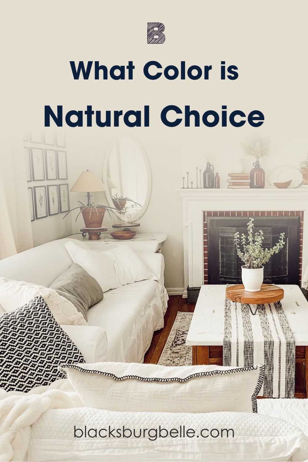
See Natural Choice in a well-lit Living Room
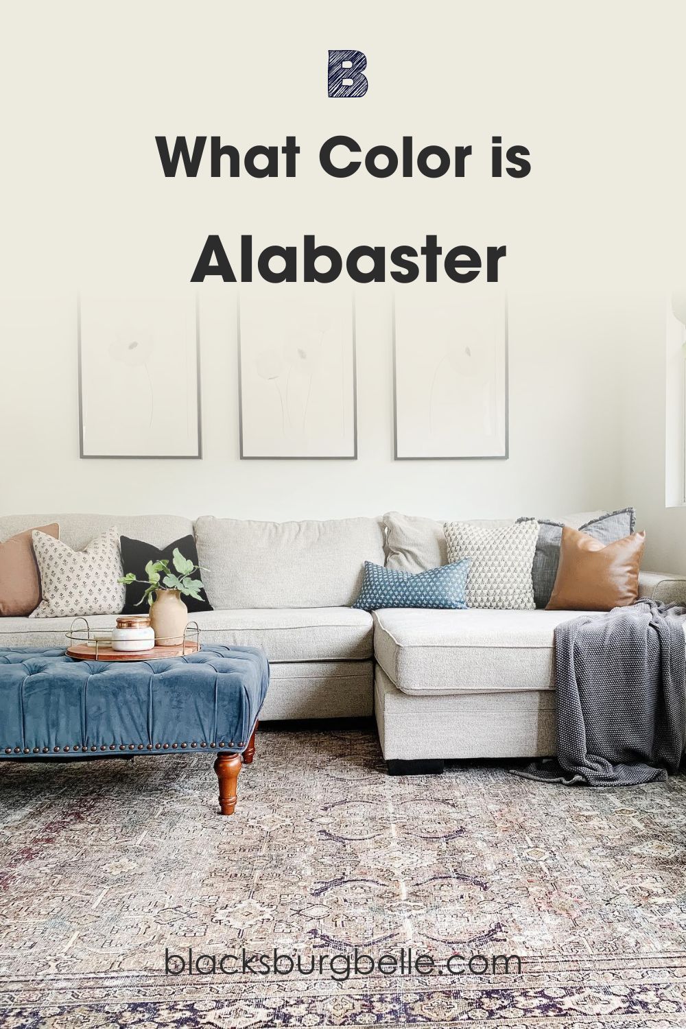
Now, see Sherwin-Williams Alabaster in a living room
In frame one, you can see the warm yellow-orange glow peeking behind the off-white veil of Natural Choice walls.
The white sofa covers, trims, and fireplace accent highlighted the difference, while the orange-toned wooden floorboards captured the warmth in the color’s undertone.
Meanwhile, Alabaster gives the living room a calm aura in frame two. The blue accents on the center table and throw pillow with the indoor green plant add to that relaxed aura by highlighting the gray undertone.
Comparing Natural Choice and Alabaster: A Quick Overview
Even though Natural Choice and Alabaster are off-white paints, their surface look and undertones aren’t the same. You’ll notice that Alabaster is brighter with more RGB pigments and softer tints.
See the table below for a quick comparison before we get into the details.
| Natural Choice | Alabaster | |
| LRV | 73 | 82 |
| RGB | 227|222|208 | 237|234|224 |
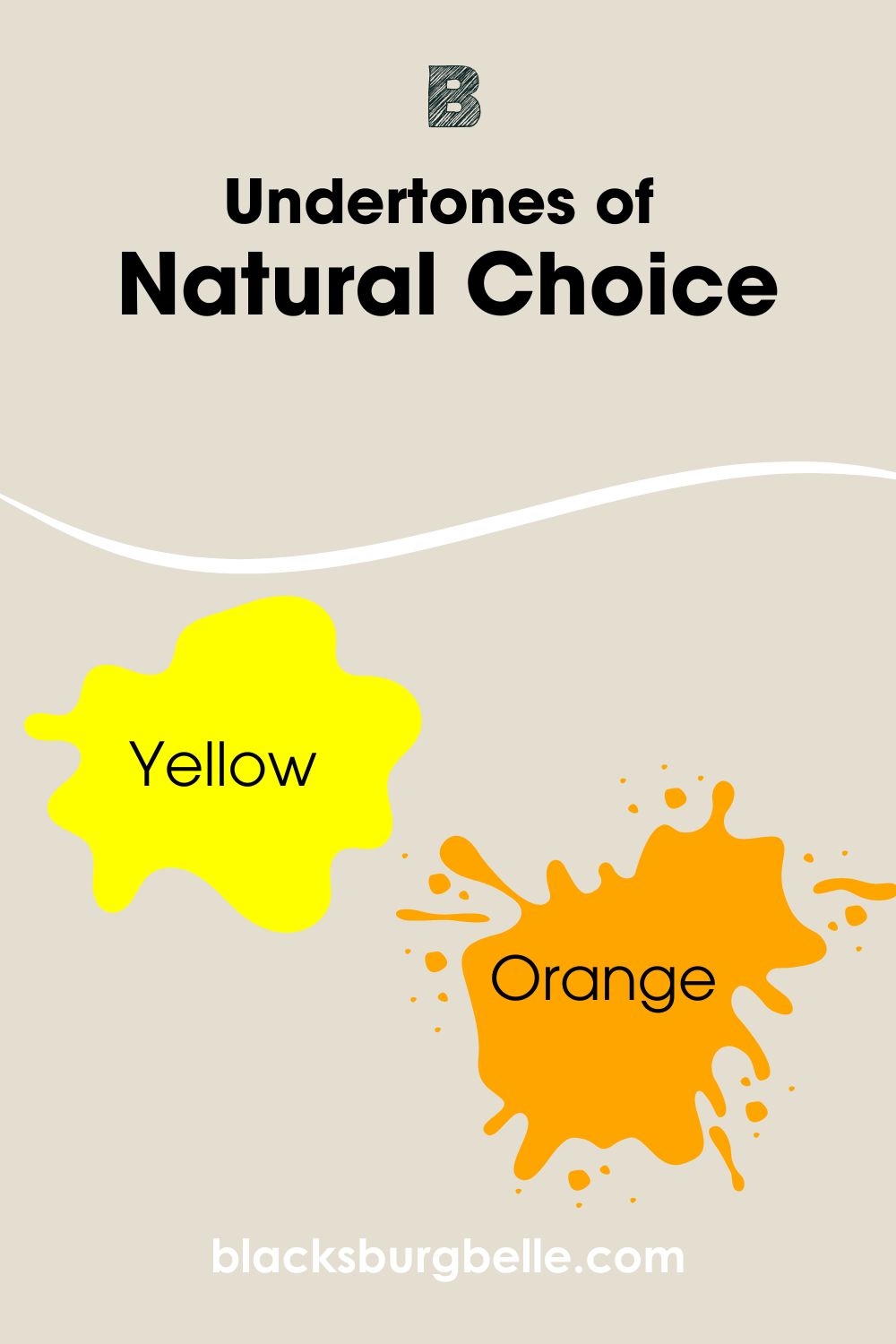
| Undertones | Yellow, Orange | Gray, Beige |
| Hex Value | #e3ded0 | #edeae0 |
Emotional Effects: Natural Choice vs. Alabaster
“How does the color make you feel?”
Natural Choice gives you a warm and fuzzy feeling while Alabaster relaxes without sacrificing its coziness like a longtime friend.
Since white paints are pristine and impersonal, choosing an off-white shade is excellent for giving a room or exterior character.
If you want your space to look welcoming and energized, then Natural Choice is the one for you. The bright undertones would ensure you’re always in an upbeat mood. On the other hand, I’ll pick Alabaster for a warm yet soothing white paint, pick Alabasteraura.
Light Reflectance Value (LRV) of Natural Choice vs. Alabaster — Which Color Reflects More Light?
Light Reflectance Value (LRV) is a scale of 3 – 97, determining how brightly a color reflects under light. Pure black (0) absorbs while pure white (100) reflects the lightest, but you can’t get those figures with paints because of undertones hence the scale cap.
Sherwin-Williams Natural Choice has an LRV of 73, making it a medium-light tone since it sits between 50 and 100. As a mid-toned paint, Natural Choice without lighting is bright and reflective with additional light.
That means you don’t need multiple bulbs to brighten a room painted in Natural Choice. A well-positioned window in the south is enough to capture the sunlight and warm up the space.
Sherwin-Williams Alabaster has an LRV 82, meaning it’s brighter than Natural Choice. At 82 LRV, this color is almost at the brightness extreme, so in its natural state, you’ll get a blinding glow.
Thankfully, Alabaster has soft undertones that ground its brightness and transform its surface into a greige shade. You’ll highlight its best features when you use Alabaster in rooms with north-facing windows.
You’ll learn more about lighting positions in a bit, but first, let’s analyze the different undertones in Alabaster and Natural Choice.
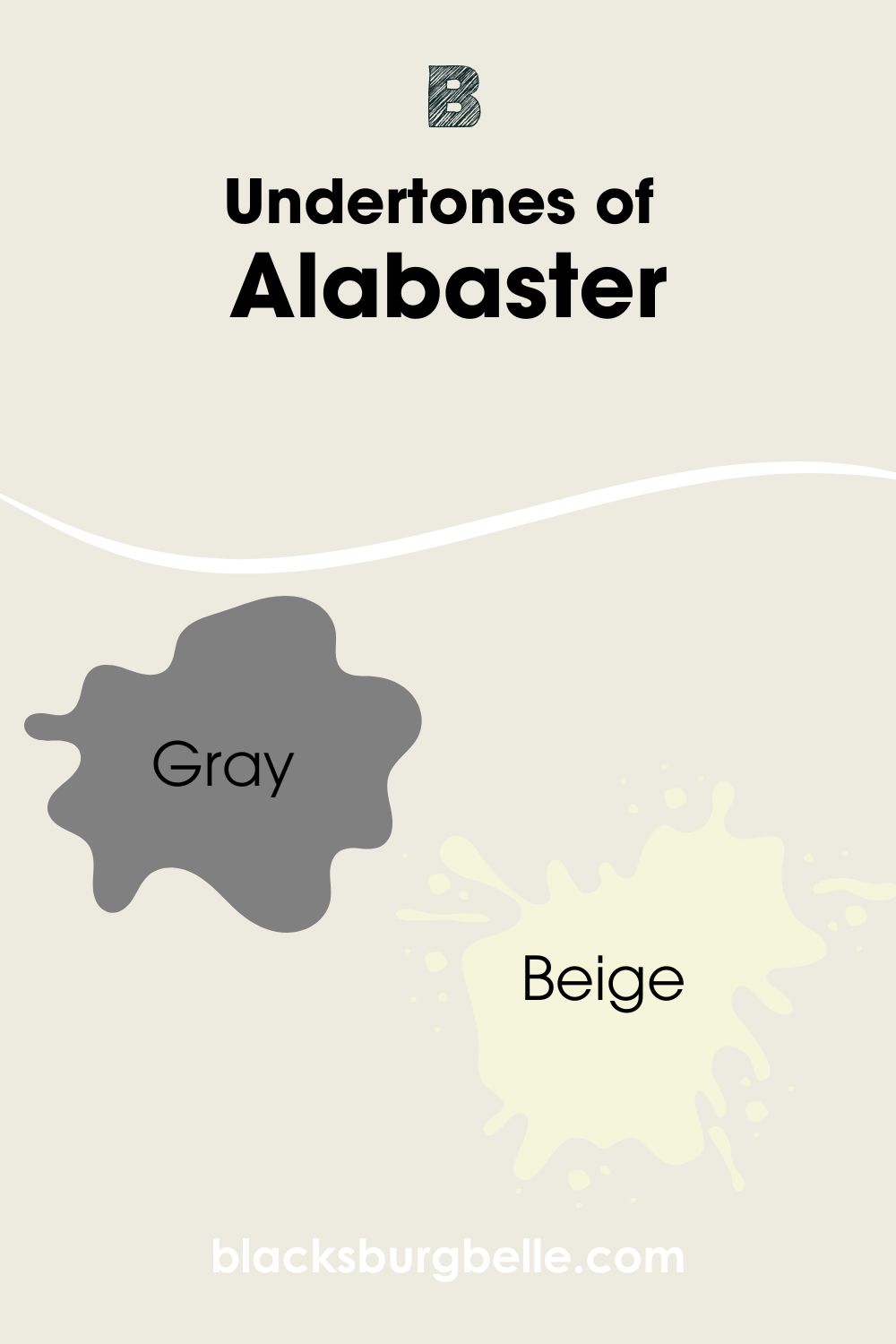
Undertones of Paint Natural Choice vs. Alabaster: Are Their Undertones Alike?
Natural Choice has yellow and orange undertones, while Alabaster has greige tints, combining gray and beige. So, no, they’re not alike. Even their red, green, and blue (RGB) measurements are different.
We’ll look closer at both colors’ undertones for visual confirmation.
A Closer Look at the Undertones in Natural Choice
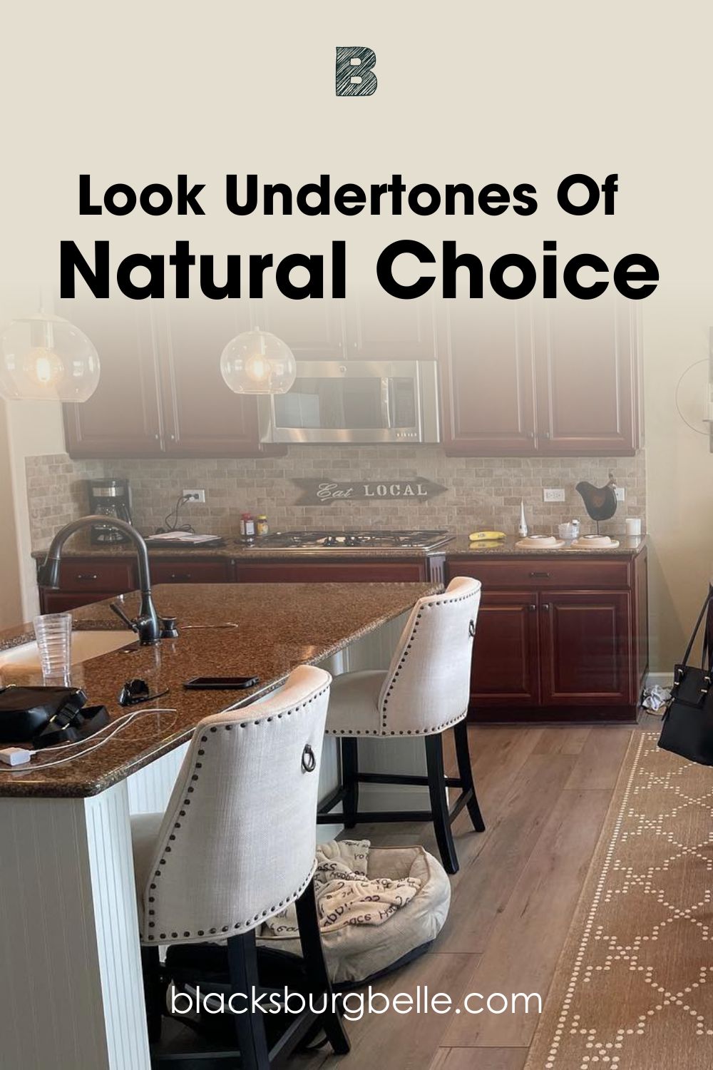
Natural Choice looks more like a creamy yellow paint in this open-plan kitchen. The dim lighting means the color relies on itself for illumination. The small windows and large glass door allow sunlight into the space to tease out the undertones.
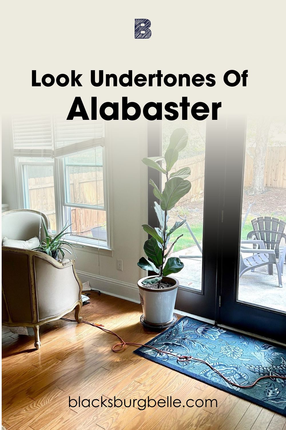
A Closer Look at the Undertones in Alabaster
See how Alabaster appears as a serene gray off-white in its natural state. The neat white trims on the black door emphasize its greige tone, although the colors almost blend.
Natural Choice has red 227, green 222, and blue 208, while Alabaster has red 237, green 234, and blue 224. Translating that physically explains why Natural Choice is warmer with no hint of coolness, unlike Alabaster, whose blue quantity is close to its red and green.
I realized Alabaster looks soothing without additional lighting, while Natural Choice leans towards a warm yellow. I recommend using Alabaster in a small space with warm lighting If you want its beige tint to shine.
Meanwhile, for Natural Choice to stay in its off-white tone, stick to spacious rooms, open areas for exteriors, and white lights. It’ll hide the yellow/orange undertone and keep the color neutral.
Natural Choice vs. Alabaster — Warm or Cool?
Alabaster is whiter than Natural Choice, which is more of a creamy white. Both colors are warm paints due to their fiery undertones. How does that work?
The color wheel is split into warm and cool sides depending on their aura.
Here’s a breakdown, red, orange, and yellow are warm tones because they mimic fire and heat. Blue, violet, and green are cool because of the ocean and lastly, purple is in the middle because it blends a fiery red with cool blue.
In technical designing terms, warm paints are advancing colors because it feels like it’s moving toward you, while cool paints are receding since they look like they’re moving away.
Since Natural Choice has yellow and orange undertones, it’s a warm white paint. I’d say the same for Alabaster, but the gray aspect of its undertone adds a faint coolness to its dominantly warm tone.
Color Palette for Natural Choice and Alabaster
Now that you understand undertones let’s discuss color palettes and the creative part of designing. To do this, I’ll briefly overview key terms like color theory, color palette, and themes.
Color theory is the science of combining different colors on the color wheel to create the perfect combo. A standard color wheel includes the primary (red, yellow, blue) and secondary colors (orange, green, purple).
You can now use color theory to create your color palette. Combine two or more colors with matching undertones and overtones to create a balanced and beautiful theme. You have four options between monochrome, analog, triadic, and complementary palettes.
Monochrome palettes combine multiple shades of one color by adding black and white to alter their tones. It’s the ideal option when you want a harmonious space.
Analogous themes pair colors beside each other on the wheel to make a subtle statement.
A triadic palette is the trickiest to design because it involves three clashing colors that form an equal triangle on the wheel. If you’re into color blocking, try this theme.
Now let’s analyze Sherwin-Williams Natural Choice and Alabaster palettes.
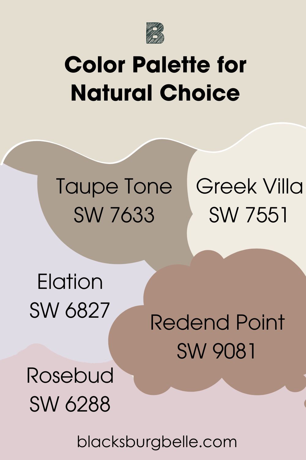
Natural Choice Color Palette
Because Natural Choice is a neutral paint, I used its undertones to create its palette. You can take the simple route by pairing it with orange and yellow accents or exploring your new knowledge of color theory.
- Taupe Tone (SW 7633): At 36 LRV, Taupe Tone is a medium-dark neutral guaranteed to make Natural Choice cozier. Use it in family rooms and dining areas.
- Greek Villa (SW 7551):This bright white paint is the best option for your trims in a Natural Choice monochrome palette. It has a rich yellow base that’ll blend in and create a sunny mood in your room.
- Elation (SW 6827):Although this light violet has almost the same LRV as Natural Choice, its airy aura and bold red undertone works in an analog theme.
- Redend Point (SW 9081):Elevate Natural Choice with the rosy taupe tone of Sherwin-Williams’ color of the year. It has an earthy outlook that reminds you of artistic pottery.
- Rosebud (SW 6288): Create a triad with this pastel pink tone with a 64 LRV and Icelandic (SW 6526) blue paint with frosty violet undertones.
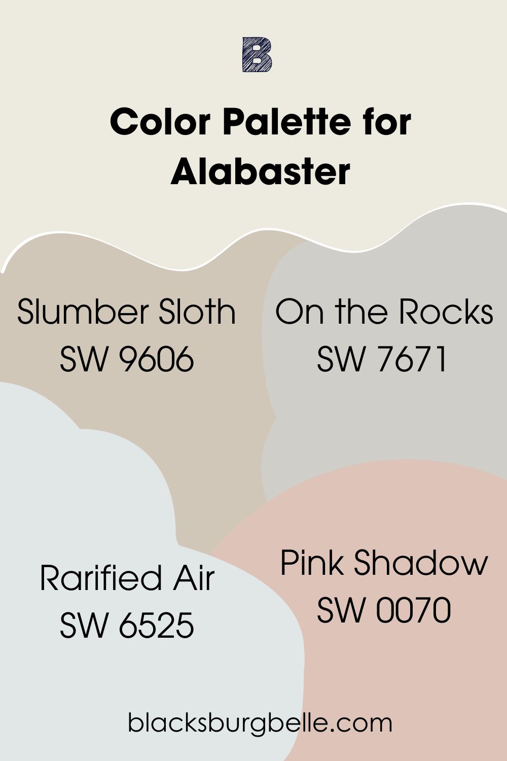
Alabaster Color Palette
You can play it safe by highlighting Alabaster with bolder gray and beige paints or get creative with color theory.
- Slumber Sloth (SW 9606): This mid-toned beige paint is all you need to set Alabaster’s warm nature loose in a monochrome theme.
- On the Rocks (SW 7671):Use this bright gray shade to highlight the color’s coolness. It’s a medium-light shade that’ll balance the high LRV nature of Alabaster.
- Rarified Air (SW 6525): This medium-light pastel purple creates an airy aura that matches the warm gray undertone in Alabaster. Use it as the foundation for your analog theme.
- Pink Shadow (SW 0070): Close your analog palette with the mid-toned Pink Shadow, which adds a historical vibe to any room. It highlights the greige undertone in Alabaster and pays homage to its duality.
Complementary Colors for Natural Choice vs. Alabaster
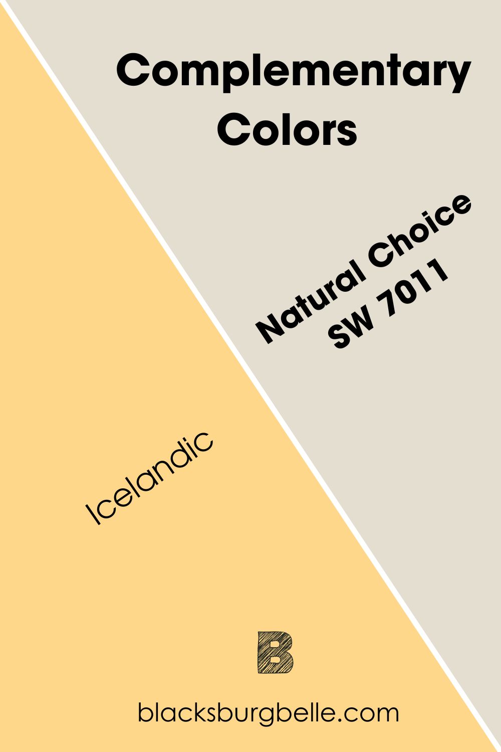
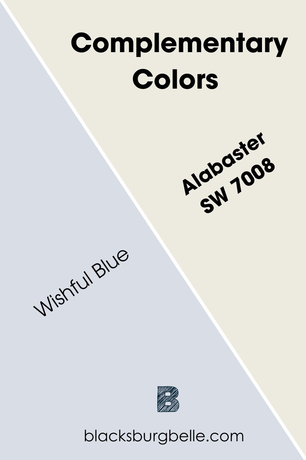
Natural Choice’s complementary color is Icelandic, while Alabaster’s complementary tone is Wishful Blue.
Complementary colors are contrasting shades that sit opposite each other on the color wheel. The standard pairs include red = green, yellow = purple, and blue = orange.
Since Natural Choice has orange and yellow undertones, its complementary colors perfectly blend purple and blue into a cool gray paint. Icelandic has an LRV of 67, making it darker than Natural Choice, although it’s a soothing shade of violet.
Alabaster’s undertone is harder to read because it’s also neutral. Using the orange tint in the beige part, the contrasting shade is a soft violet paint. Wishful Blue balances blue and purple in a 72 LRV pastel hue.
Can you use Alabaster and Natural Choice Together?
Using Natural Choice and Alabaster in the same space is not ideal because there’s not much difference between their overtones. However, with the right third and fourth colors, you can highlight similar shades in their undertones.
I prefer replacing traditional white trims on Natural Choice-painted walls with Alabaster gives extra warmth. The yellow and orange undertones in Natural Choice intensifying the beige tone in Alabaster makes a fun combo.
In this case, it’s ideal to use orange wooden floorboards and furniture to harmonize both colors. Finally, complete the look with yellow and orange accents, especially leather chairs and colored throw pillows.
Alabaster vs. Natural Choice on Walls
Wall paints influence the overall aura of any room because they take up the most space. It’s also the foundation of your theme as you build accents and highlights around its undertones for balance.
Alabaster on Walls
The bright white light on this Alabaster wall emphasizes its gray undertone and gives the room a warm yet soothing look. Adding bright white accents and furniture to this space will solidify its relaxing vibe.
Natural Choice on Walls
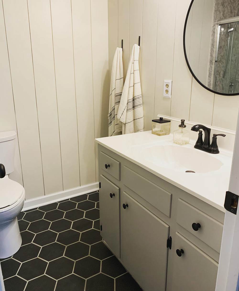
Even though this bathroom’s owner chose white paint to keep it neutral, the warmth in Natural Choice walls matching the warm green-gray cabinet makes the space look cozy.
The black flooring and accent accessories offset the brightness and give the bathroom a rustic look.
Alabaster vs. Natural Choice on Cabinets
Painting the cabinet is the way to go when you want to introduce brightness on a dark-toned or mid-toned wall. You’ll get a beautiful furniture piece while staying on the theme and introducing light into the space.
Alabaster on Cabinets
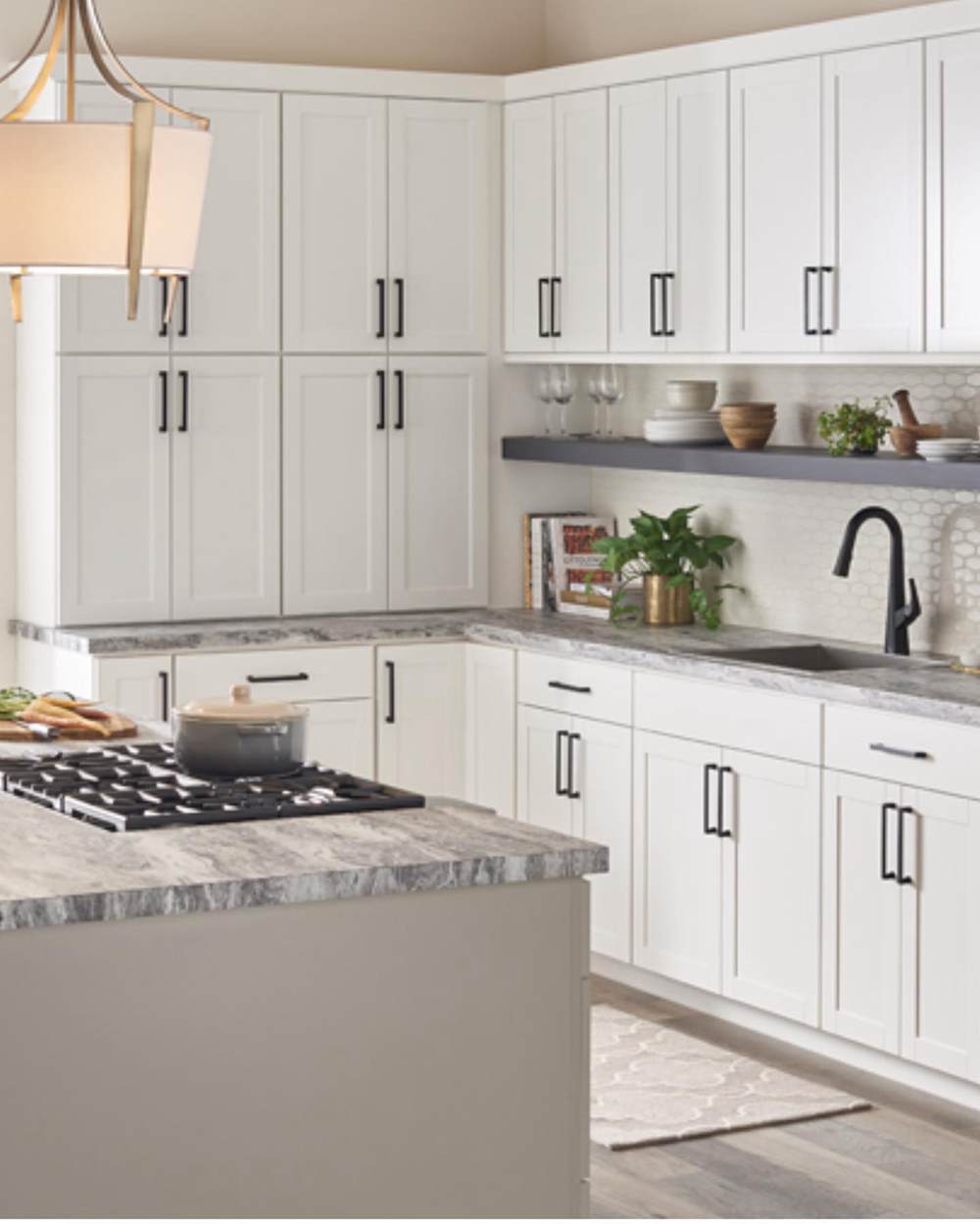
Thanks to the lighting position and gray marble tiles, the greige undertone in Alabaster doesn’t show on this cabinet. Despite the classic design of this kitchen, Alabaster white gives the space a modern look.
Natural Choice on Cabinets
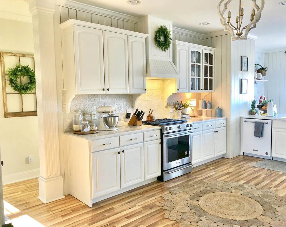
The yellow bulb in this kitchen, matched with the tan and cream floorboard, brings out the warmth in the Natural Choice cabinets. Together, they make the small kitchen look homely and welcoming. You can tell this space belongs to a family with children.
Alabaster vs. Natural Choice on Exteriors
Considering the amount of natural light exteriors get, there’s no hiding the undertones in your paints. Whether you use Natural Choice and Alabaster on the walls or as trims, prepare the area for the presence of its warm notes.
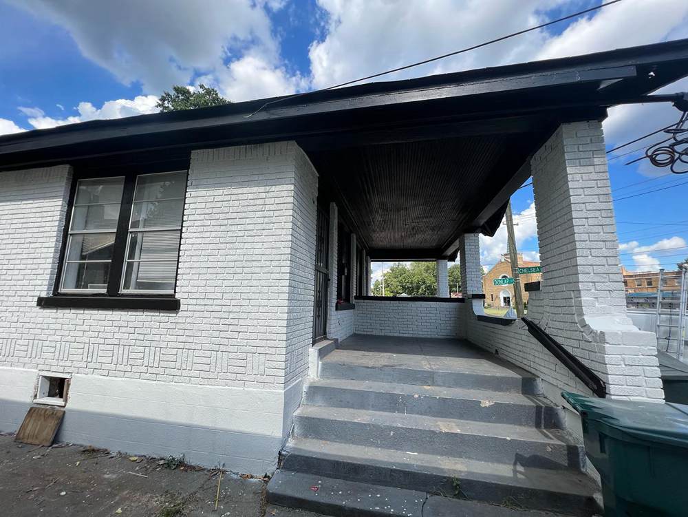
Alabaster on Exteriors
It takes a bright south-facing light to highlight the beige tone in Alabaster as seen on this quaint farmhouse. The black roofing and red brick foundation added warmth and suppressed the gray tint.
The cool gray shade would take over the color when the sun sets in the evening.
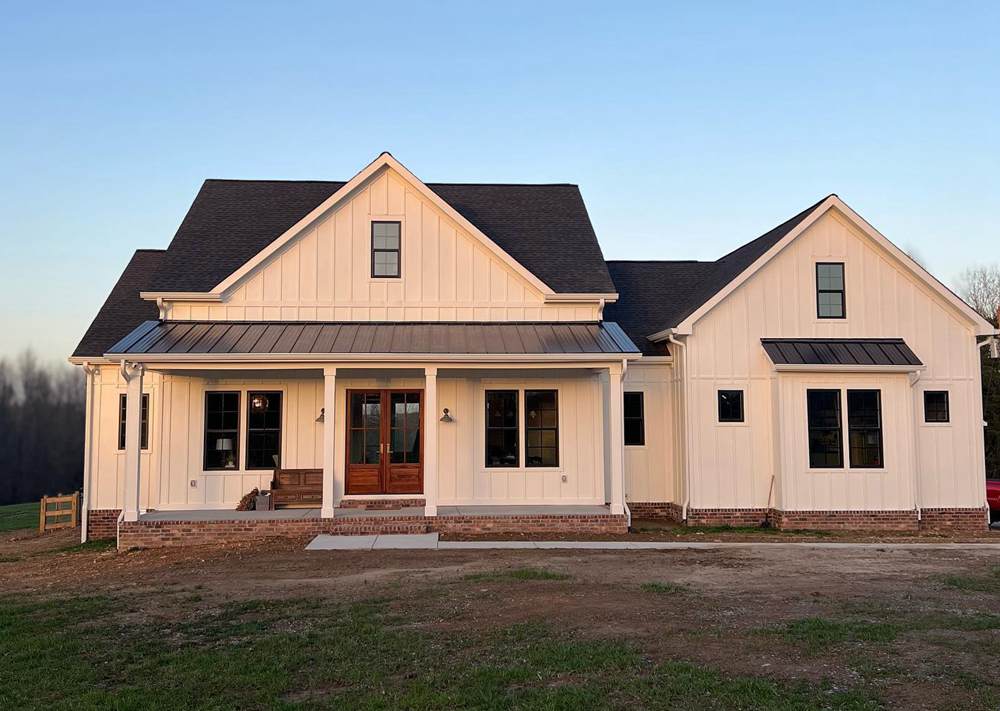
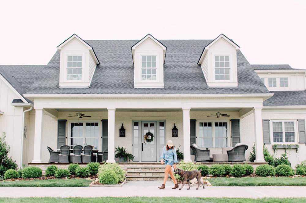
Natural Choice on Exteriors
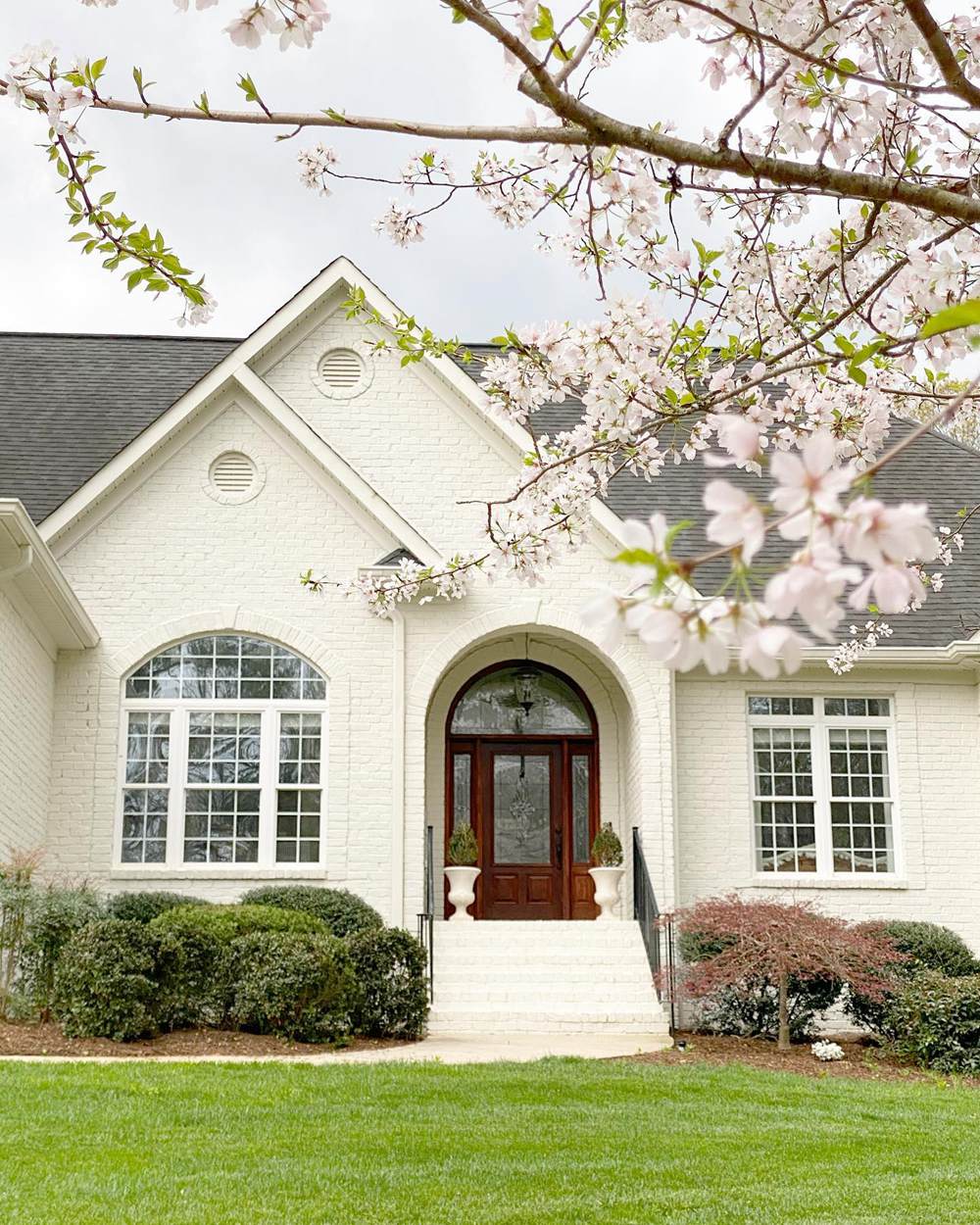
Because there’s a green garden and lawn with a big brown front door on this Natural Choice-painted brick house, the color mixes its whiteness and orange-yellow notes.
You’ll notice the left side receiving direct sunlight is warmer than the right angle shaded by a hanging tree branch.
Alabaster vs. Natural Choice as Accents
Accents are often bold colors because of their position and purpose. But with the unique undertones in Natural Choice and Alabaster, neutral white can command the same attention as any other color.
See how it works.
Alabaster on Accents
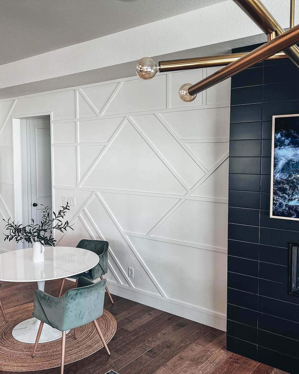
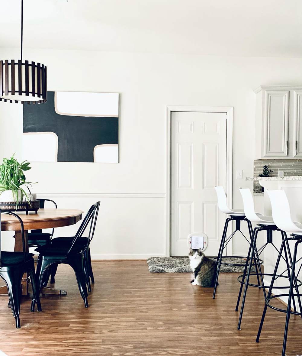
The patterned accent wall painted in Alabaster brings much-needed light into this dining table/waiting room. See how the color highlights the black background wall and teases out the green undertone to match the chairs.
Natural Choice on Accents
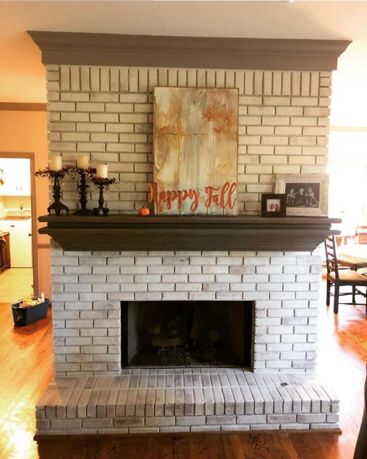
Image Credit:
I love how Natural Choice gave this brick fireplace a modern facelift. Also notice how it blends with the warm lighting and beige wall in the background. It’s fall-coded for Halloween decor.
Alabaster vs. Natural Choice for Trims
Trims highlight walls and hide defects like cracks, thinning paint, and watermarks. So, many people prefer to use bright white or natural wood with glossy finishes.
But when you use pastel whites like Alabaster and Natural Choice, you can add warmth while beautifying the space.
Alabaster for Trims
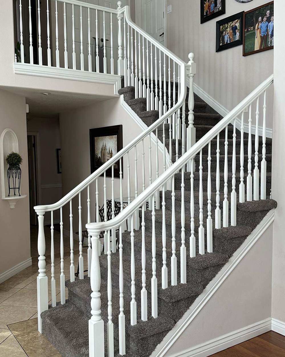
Pairing Alabaster staircase railings with a warmer neutral paint emphasized its whiteness. It also gave the home a clean and personal look instead of the boringness of crisp white accents.
Natural Choice for Trims
You can use Natural Choice as a trim against a wall painted in the same color. All you need to do to highlight the tone is change its sheen. A glossy sheen would stand out against a matte surface like the picture above.
Alabaster vs. Natural Choice on Woodwork
Don’t leave your woodwork plain with the typical wood finish to brighten it. Instead, consider elevating its beauty with neutral paints whether it’s Alabaster or Natural Choice.
Alabaster on Woodwork
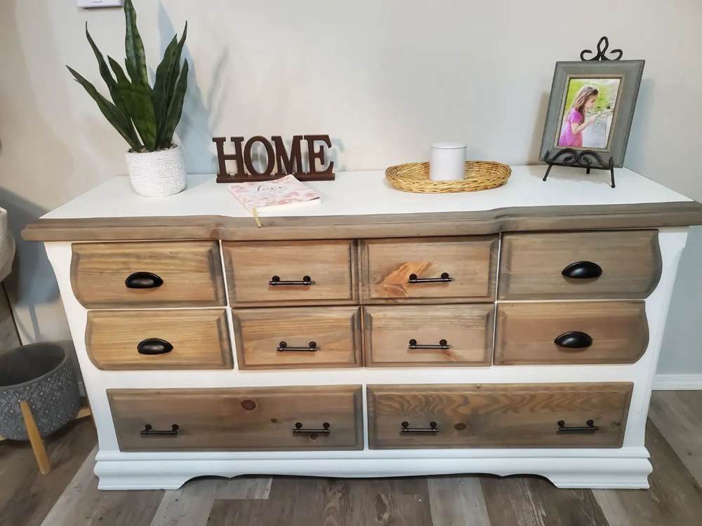
The designer used Alabaster on the solid wood and highlighted it with a Minwax classic gray stain. The dual-tone gives this vintage drawer a modern facelift.
Natural Choice on Woodwork
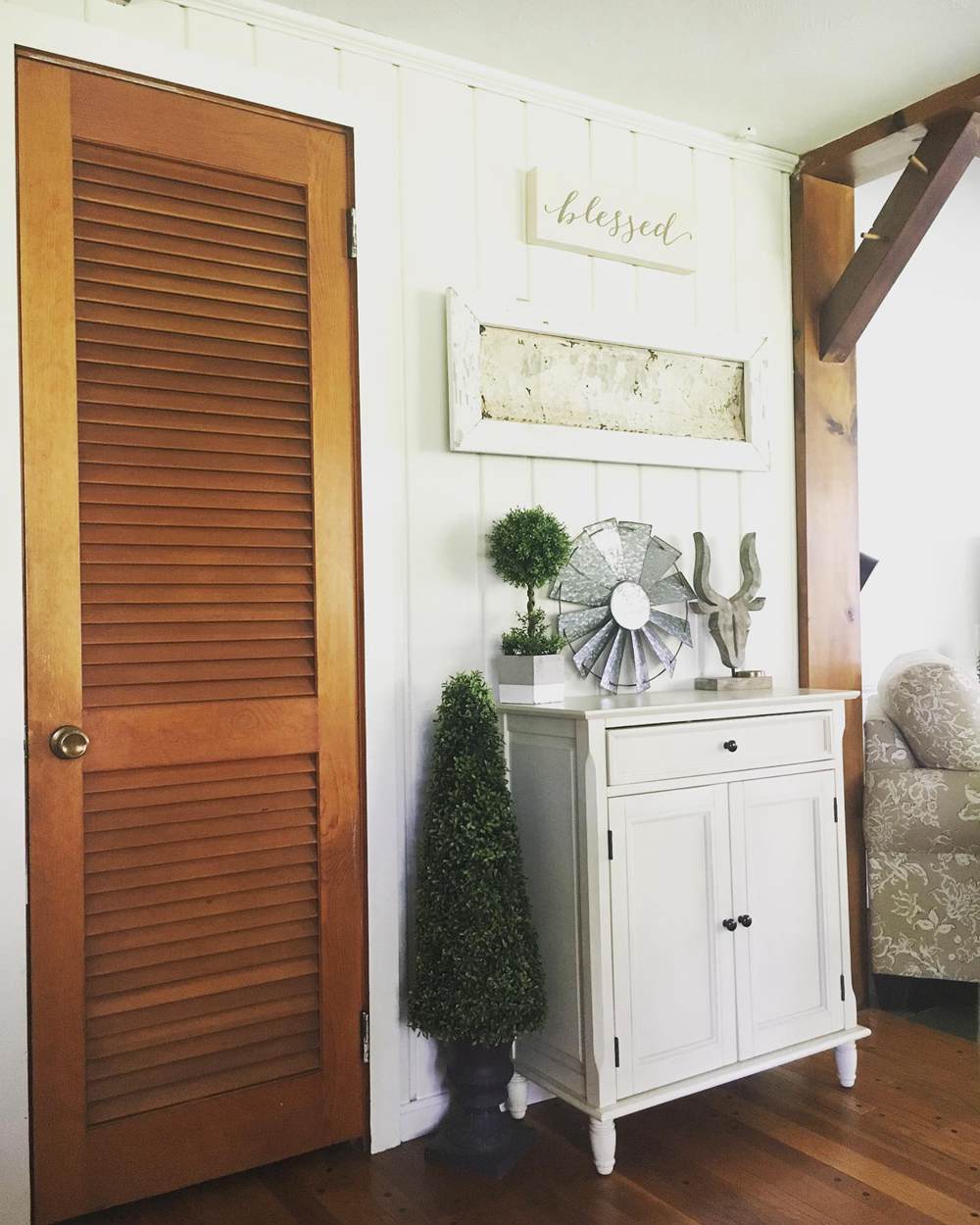
Compare the Natural Choice cabinet to the unpainted wooden door and matching arc. You’ll notice that the painted furniture looks better and classier than the finished ones. Although the wooden door makes the room rustic, it’ll look better if painted in creamy off-white.
Alabaster vs. Natural Choice on Fences
Most homeowners no longer fence their houses like the traditional white picket design. But you can see buildings with pillars and porches surrounded by fences and railings. Check out the different ways painted fences can work on your building.
Alabaster on Fences
Forget red brick styles from the vintage era and modernize your structure with Alabaster’s greige-toned white.
Natural Choice on Fences
This house oozes warmth and security as the sunlight transforms its white Natural Choice exterior, including pillars and front porch, to an orange-tinted cream shade.
Alabaster vs. Natural Choice on Doors
Front doors and interior doors in modern homes and offices are painted white. Using Alabaster and Natural Choice gives the plain color an exciting twist, especially when it mixes with other wall paints and accessories.
Alabaster on Doors
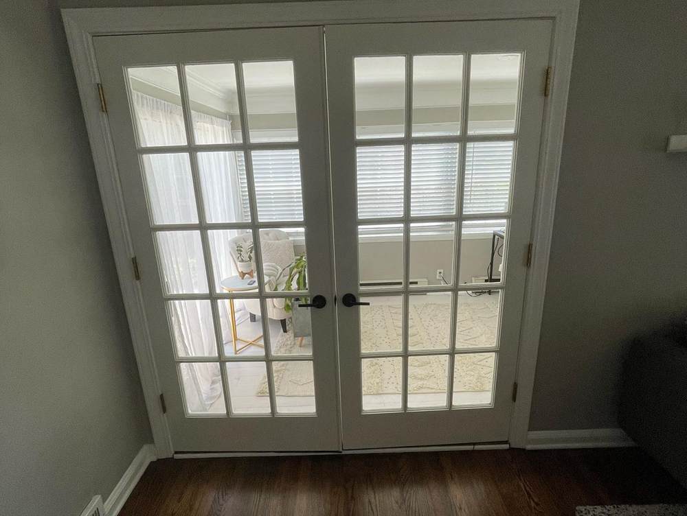
Even though this Alabaster door is in a closed area, the light entering through its glass frame paired with the wall paint gives it a grayish glow.
Natural Choice on Doors
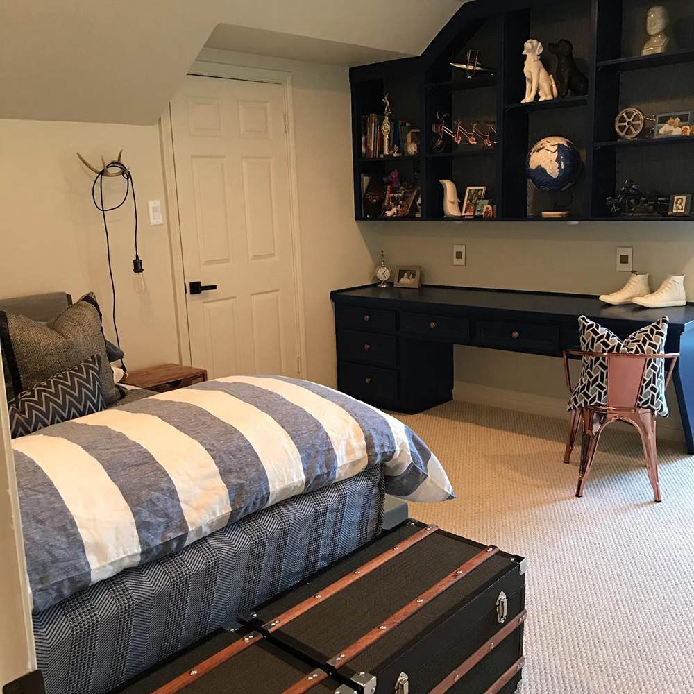
See how the sunlight gives the Natural Choice door a golden hue while the navy presence of the Salty Dog wall shelf tones it down.
Lighting Conditions for Natural Choice and Alabaster
If you want to intensify the warmth of Natural Choice and Alabaster white, using them with South-facing sunlight is best. Use them in North-facing rooms or exteriors to get a steady off-white look with minimal distraction from the undertones.
West-facing light is the most intense in the evening, while East-facing light shines brightest at noon until late afternoon.
Conclusion
White doesn’t have to be boring when you choose the right shades. As you’ve seen with Alabaster and Natural Choice, you can infuse warmth into your space while staying neutral.
Now that you’ve seen a detailed face-off between Alabaster and Natural Choice, it’s time to pick one. Let’s refresh your memory with these tips:
- Alabaster is brighter than Natural Choice
- Natural Choice appears orange or yellow underneath dim lighting
- Alabaster has no yellow undertone, but it looks beige in sunlight
- The sheen you choose can intensify the undertones
Please comment below and share your experience using Sherwin-Williams Alabaster and Natural Choice.
 Forest Green Vs Hunter Green: What are the Differences?
 Taupe Vs Beige: What are the Differences?
 Sherwin Williams Pure White vs Extra White: How to Choose?
 Repose Gray Vs Revere Pewter: How to Choose?
 Benjamin Moore Pale Oak vs Balboa Mist: How to Choose?
 Sherwin Williams IN THE NAVY vs. Naval: How To Choose
