
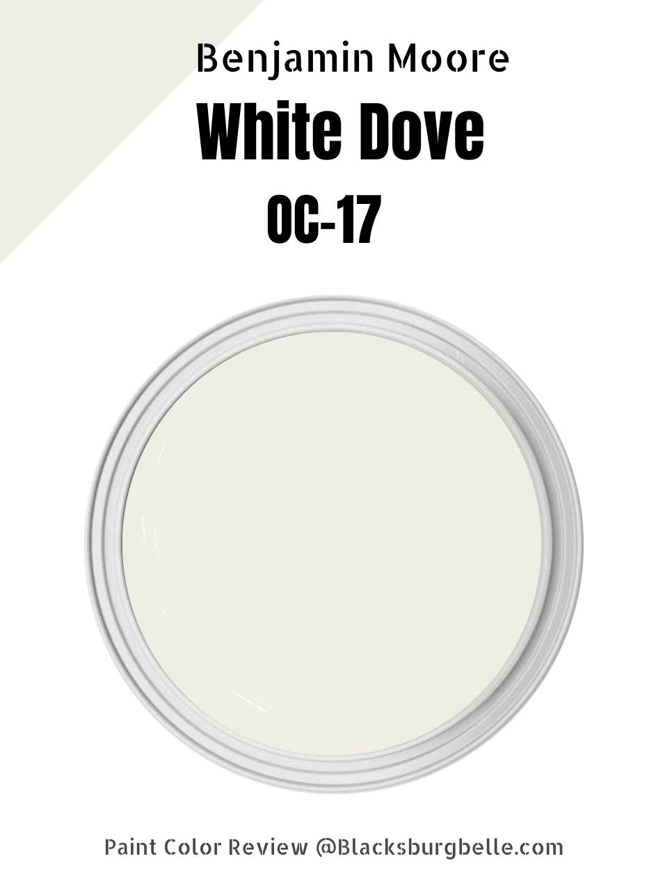
Ever felt overwhelmed by endless white paint chips? Wondering if Benjamin Moore’s White Dove OC-17 is the one for you? I totally get it, I’ve been there!
In a nutshell, White Dove OC-17 is a versatile, warm white. It’s pretty much a crowd-pleaser in any space.
But there’s more to it, folks. Stick with me as we unpack the magic of White Dove OC-17, Its charm, how it plays with light, and how it sizes up against other whites. Ready to nail your white? Let’s go!”
Table of Contents
What Color is Benjamin Moore White Dove
Before we delve any further, let’s get a real feel for this color. What exactly is the shade of Benjamin Moore’s White Dove OC-17?
Did you catch that? That’s White Dove OC-17 for you, a warm, soft, and luminous blend of white with a hint of gray. It’s this tranquil neutrality that makes it such a winner, striking the perfect balance between cool and warm tones.
But here’s where it gets interesting: What makes this shade more than just a color? Why does it evoke a certain feeling within us? We’re going to unpack the emotional impact of White Dove OC-17 in the next section. Trust me, you won’t want to miss this!”
The Emotional Impact of Benjamin Moore White Dove
Colors do more than just please the eye, they shape our experiences.
White Dove isn’t just white. It’s a soothing blend of white with a hint of gray. It makes your space feel larger, cleaner, and more welcoming.
But there’s more. White Dove brings calm, peace, and tranquility into a room. It’s more than a paint color, it’s a mood.
What Sets Benjamin Moore White Dove Paint Apart?
Let’s break it down.
Overview of Benjamin Moore White Dove
Here’s the deal about White Dove OC-17: it’s not just about the color you see, but the values behind it.
| Benjamin Moore White Dove | |
| RBG | (237, 231, 220) |
| LRV | 85.38 |
| Hex Value | #ede7dc |
Interesting, isn’t it? But let’s make these values a little more tangible.
LRV of Benjamin Moore White Dove: How Bright is it?
LRV, or Light Reflectance Value, essentially tells us how bright a paint color will look, The higher the LRV, the brighter the color.
White Dove OC-17 has an LRV of 85.38. It’s really light, reflecting a lot of brightness, and helping spaces feel open and airy.
So, if you’re in the market for a bright, luminous room that feels spacious and uplifting, White Dove might be just what you’re after.
Undertones of Benjamin Moore White Dove
So, you’re curious about the undertones of Benjamin Moore’s “White Dove”, right? Well, let me tell you, it’s got a bit of yellow-gray action going on. What does this mean? It’s warm, it’s cozy, and yet it remains fresh and clean.
But here’s the real deal. The beauty of “White Dove” is its versatility. These yellow-gray undertones make it play nice with other colors and lighting situations. It’s a team player!
Benjamin Moore White Dove is Warm or Cool Color?
When we talk about Benjamin Moore’s “White Dove”, you’ll find it typically identified as a warm white. It leans towards the warm side due to subtle yellow and gray undertones.
Still, its versatility is notable. The perception of “White Dove” can change; it may appear cooler under certain lighting conditions or with particular surrounding colors.
Even with these shifts, “White Dove” maintains a neutrality that makes it a popular choice for many. It’s an adaptable, crowd-pleasing white.
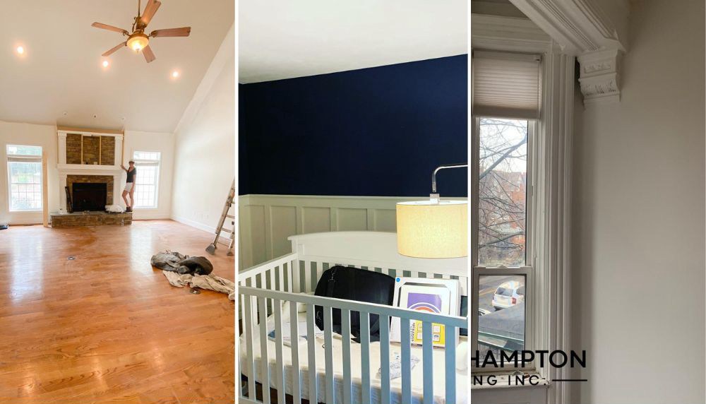
- @ summerblaiseinteriors
- @ jdwhomesolutions Hale Navy (eggshell) on the walls. White Dove on the framing and board and batten.jdwhomesolutions
- @ courthamptonpainting
Remember, though, context is key. I recommend testing “White Dove” in your own space to see how it suits your specific conditions. It’s about finding what works best for you.
Benjamin Moore White Dove Complementary Colors
In color theory, “complementary colors” are colors that are opposite each other on the color wheel. They tend to bring out the best in each other when used together. Let’s dive into some specific Benjamin Moore paint colors that complement “White Dove”.
“White Dove” is a warm, soft white, so on the color wheel, its direct complement would be in the realm of cool blues or blue-violets.
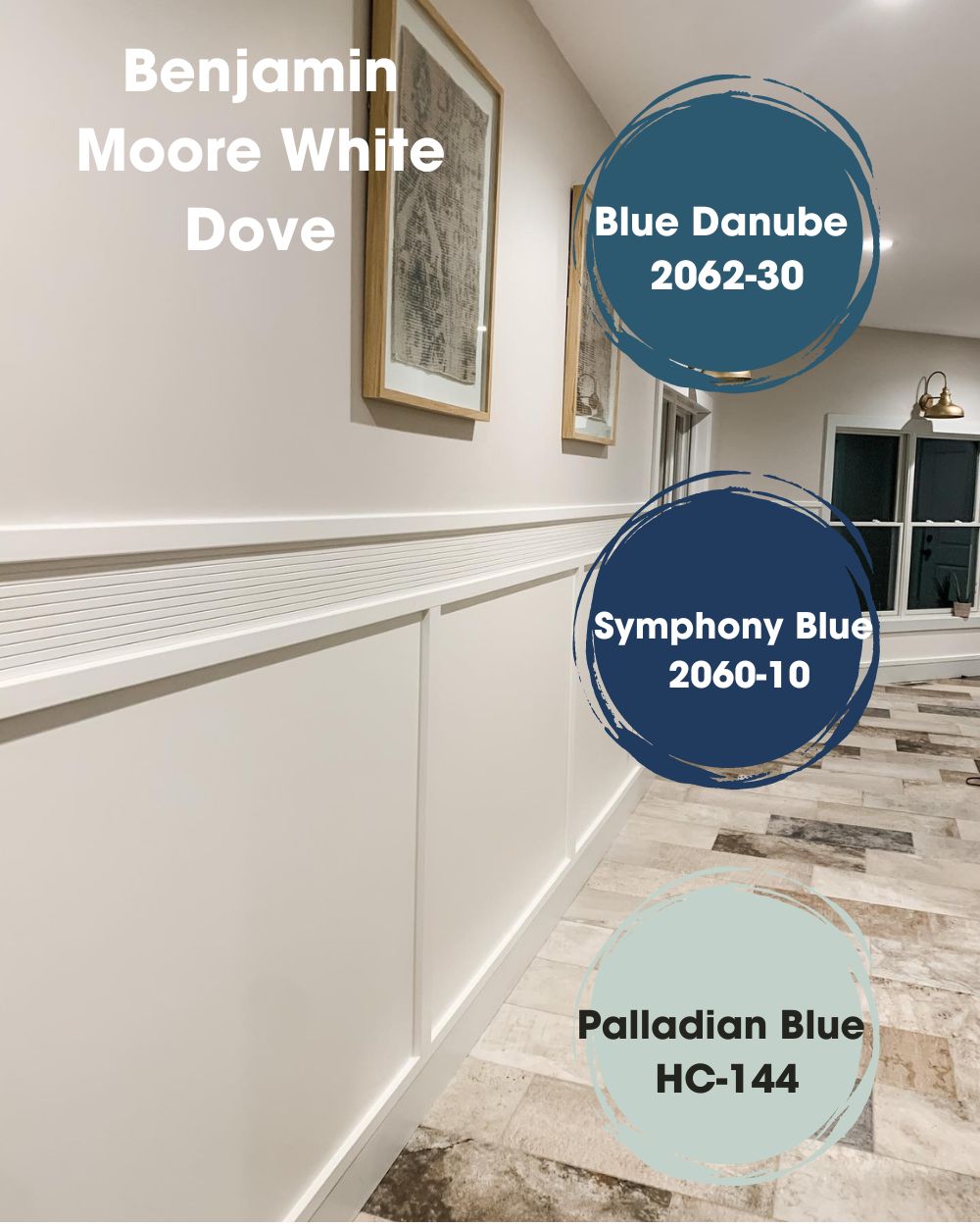
Blue Danube 2062-30
This is a rich, deep bluish-purple that will provide striking contrast and help “White Dove” pop.
Symphony Blue 2060-10
This one’s a true, dark blue that’ll look sleek and sophisticated when paired with “White Dove”.
Palladian Blue HC-144
For a softer, more subtle contrast, this light, airy blue-green is a great choice.
Benjamin Moore White Dove Color Palette
Picture this, we’re diving into the world of color, all inspired by the versatile and ever-popular Benjamin Moore’s “White Dove”. As your personal guide in this paint picking adventure, I’ve cooked up two uniquely stunning color palettes that’ll elevate any space. Let’s get into it, shall we?
First up, we have the “Serene Sanctuary” palette. This one is for those who love their space to be an oasis of calm and tranquility.
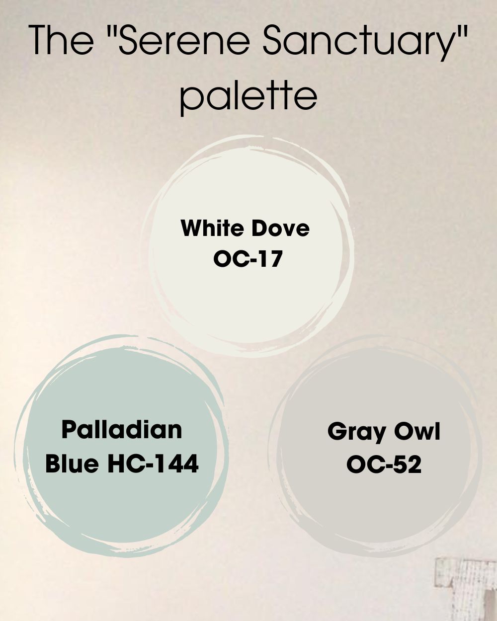
- Our hero, “White Dove OC-17”, lays the foundation – a warm, neutral base that plays well with others.
- Then we have “Palladian Blue HC-144”, a soothing blue-green that can transform any space into a peaceful retreat. Paired with “White Dove”, it’s simply zen.
- To tie things up, “Gray Owl OC-52”. This cool, light gray works seamlessly with our hero and blue-green to add a touch of understated elegance.
Why “Serene Sanctuary”? It’s the palette that breathes a sense of peace into your space. These colors flow together, creating a tranquil haven you’ll love.
Next, let’s turn up the heat with the “Bold & Cozy” palette. For those unafraid of a little drama, this one’s for you.
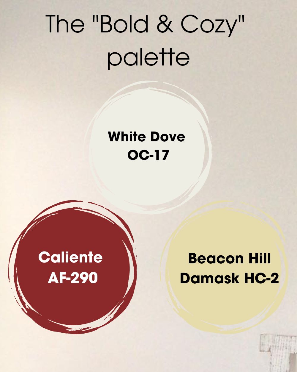
- We start again with our anchor, “White Dove OC-17”.
- Next up, “Caliente AF-290”. This vibrant red is pure energy. It stands bold against “White Dove” and is sure to turn heads.
- Last but not least, “Beacon Hill Damask HC-2”. This warm gold harmonizes with our hero and the vibrant red, crafting a cozy, enveloping atmosphere.
Why “Bold & Cozy”? This palette is all about making a statement while keeping that cozy vibe. The bold yet balanced colors create an ambiance that’s warm, inviting, and unmissable.
But hey, don’t just take my word for it. Try these palettes out in your space. The magic really happens when you see how the light and surrounding elements play with these colors. Happy painting!
Is White Dove a Good Trim Color?
Absolutely, Benjamin Moore’s “White Dove” is a fantastic option for trim. Its warm undertones prevent it from appearing too stark, yet it’s still crisp enough to provide a beautiful contrast with a variety of wall colors.
Whether you’re working with a cool gray wall color like “Gray Owl OC-52” or a bold, darker hue like “Hale Navy HC-154”, “White Dove” can highlight architectural details and create a seamless transition between walls and trim. It’s also a popular choice for kitchen cabinets and doors for the same reasons.
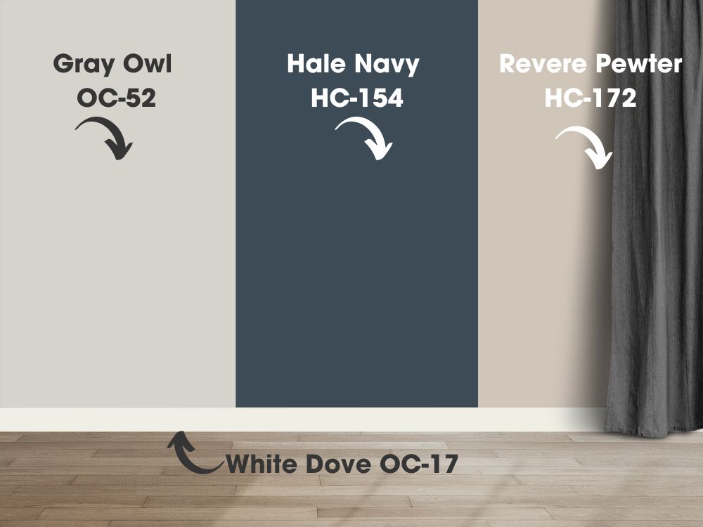
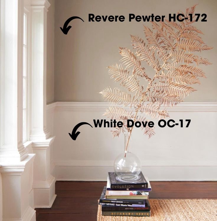
Even if you choose to go with a light neutral or off-white for your walls, such as “Revere Pewter HC-172”, using “White Dove” on the trim adds depth and interest to your room without creating a jarring contrast.
Benjamin Moore White Dove vs Other Colors
How I wish I could immediately show you the beauty of Benjamin Moore White Dove displayed in real rooms. However, before everything begins, I have to let you take a look at its comparison with other colors.
Please have a little patience and finish reading the following comparisons. Only then can you truly appreciate the uniqueness of Benjamin Moore White Dove. So, let’s start with the comparisons.
Benjamin Moore Simply White vs. White Dove
Let’s compare these two wonderful whites, Benjamin Moore’s “Simply White” and “White Dove”. Below are two side-by-side displayed images.
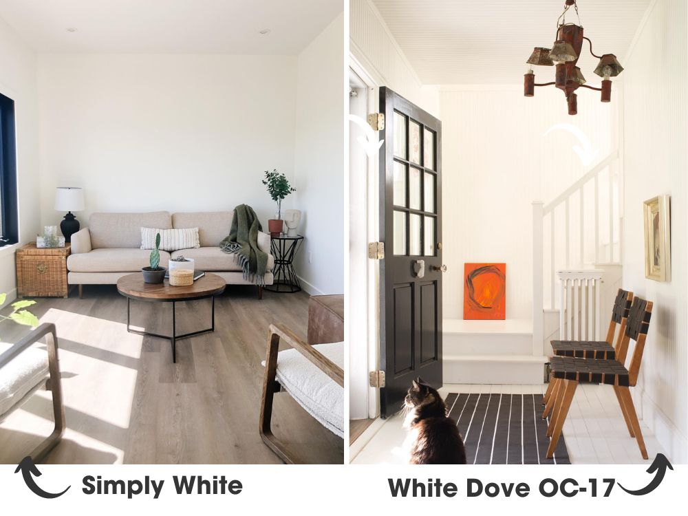
Simply White. Notice its clean, bright quality? That’s due to its higher LRV (Light Reflectance Value). In fact, “Simply White” has an LRV of 91.7, making it the brighter of the two.
White Dove. You can see it’s a touch softer and slightly less bright, with an LRV of 85.38. Still bright, but with a bit more warmth and subtlety.
As for undertones, “Simply White” leans slightly towards yellow, giving it a cheerful, sun-kissed glow. It’s great for rooms where you want to create an upbeat, energizing mood. Pair it with “Gray Owl OC-52” for a modern, contrasting look.
On the other hand, “White Dove” has slight yellow-gray undertones, making it feel warmer and cozier. It’s perfect for rooms where you want a soothing, welcoming ambiance. Try it with “Revere Pewter HC-172” for a warm, sophisticated palette.
In terms of use, “Simply White” is perfect for spaces with a lot of natural light, where its brightness can truly shine. “White Dove”, on the other hand, works wonders in both well-lit and dimmer spaces, adding warmth without losing its fresh, clean appeal.
Both “Simply White” and “White Dove” are fantastic choices, each bringing their own unique vibe. Whether you lean towards the bright, cheerful tones of “Simply White” or the warm, welcoming feel of “White Dove”, you’re in for a treat.
BM White Dove vs SW Alabaster (SW 7008)
Now, let’s take a look at a room painted with “Alabaster” (Image). With an LRV of 82, “Alabaster” is slightly less reflective than “White Dove”, but still very much a light, bright color. It has a warmer, creamy undertone, leaning towards beige without losing its essence as a true white. It creates a rich, soothing mood, and pairs beautifully with “Sea Salt SW 6204” for a serene, comfortable palette.
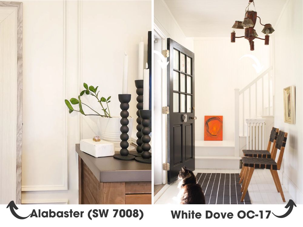
In terms of usage, both “White Dove” and “Alabaster” work well in a variety of spaces and light conditions. However, “Alabaster” often works exceptionally well in spaces where you want a softer, more traditional white, while “White Dove” is great for those seeking a fresh, slightly brighter look.
Benjamin Moore White Dove vs Swiss Coffee
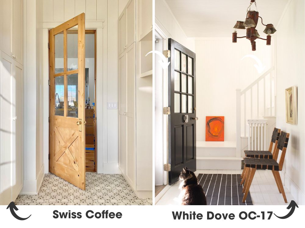
Let’s have a look at “Swiss Coffee”. It has an LRV of 83.93, making it nearly as bright as “White Dove”, but it leans a bit more beige. If you’re aiming for a touch of nostalgic comfort, this is your hue.
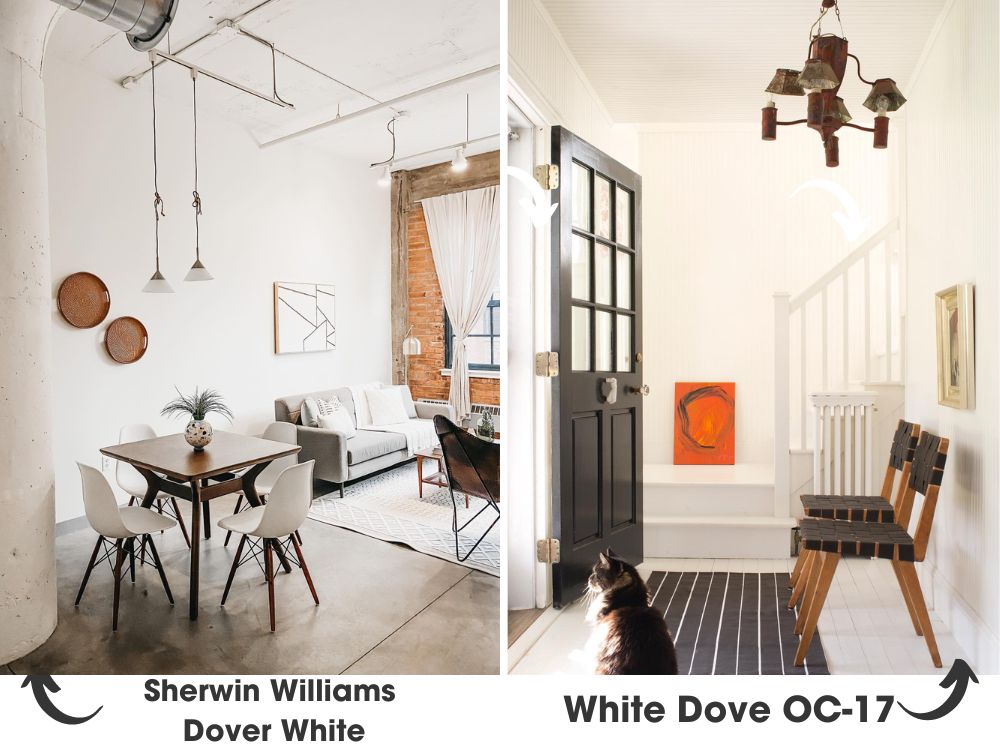
BM White Dove vs SW Dover White (SW 6385)
“Dover White” has an LRV of 83, so it’s a tad less bright than “White Dove”. It also has a creamy, yellow undertone that gives it a sunny, inviting quality. Try it with Sherwin Williams’ “Rain” (SW 6219) for a bright, cheerful palette.
Let’s now immediately return to Benjamin Moore White Dove. Come on, let’s go and take a look at real rooms featuring Benjamin Moore White Dove.
Photos of White Dove in Real Homes
Real photos! Are you trying to shut me up right away? Let the feast of real Benjamin Moore White Dove begin.
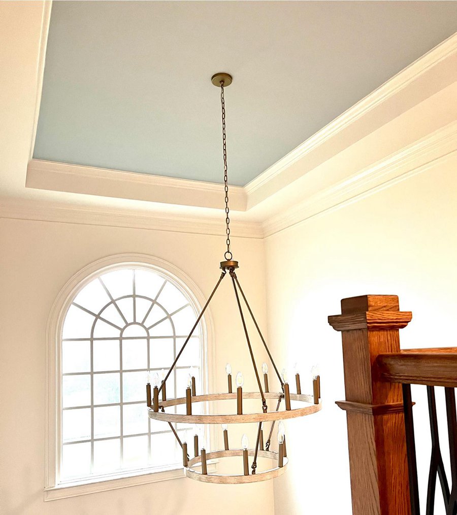
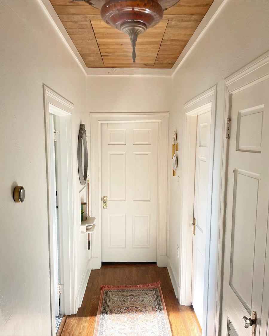
Benjamin Moore White Dove in Entryways
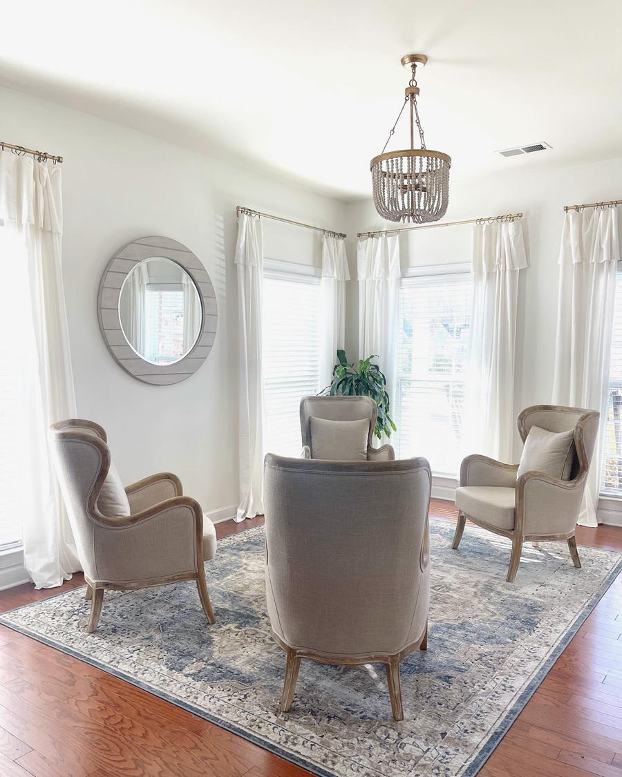
Benjamin Moore White Dove in Living Rooms
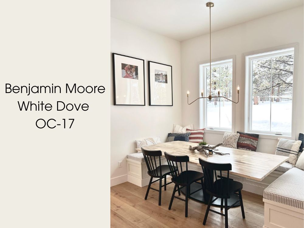
Benjamin Moore White Dove in Dining Rooms
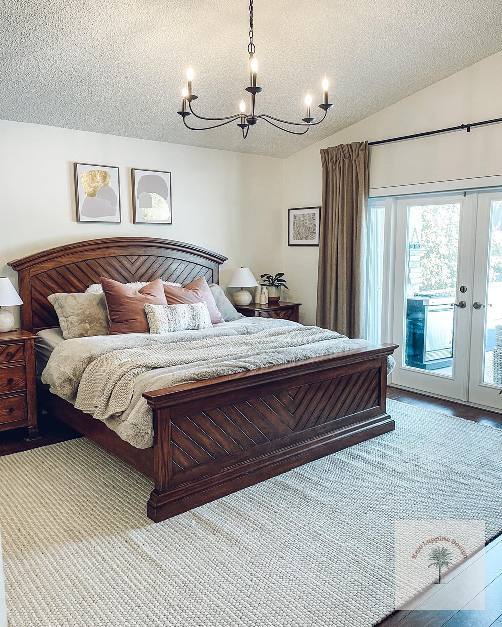
Benjamin Moore White Dove in Bedrooms
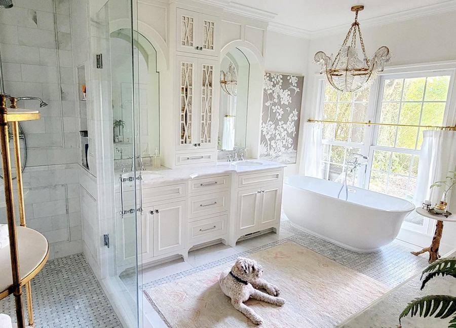
Benjamin Moore White Dove in Bathroom
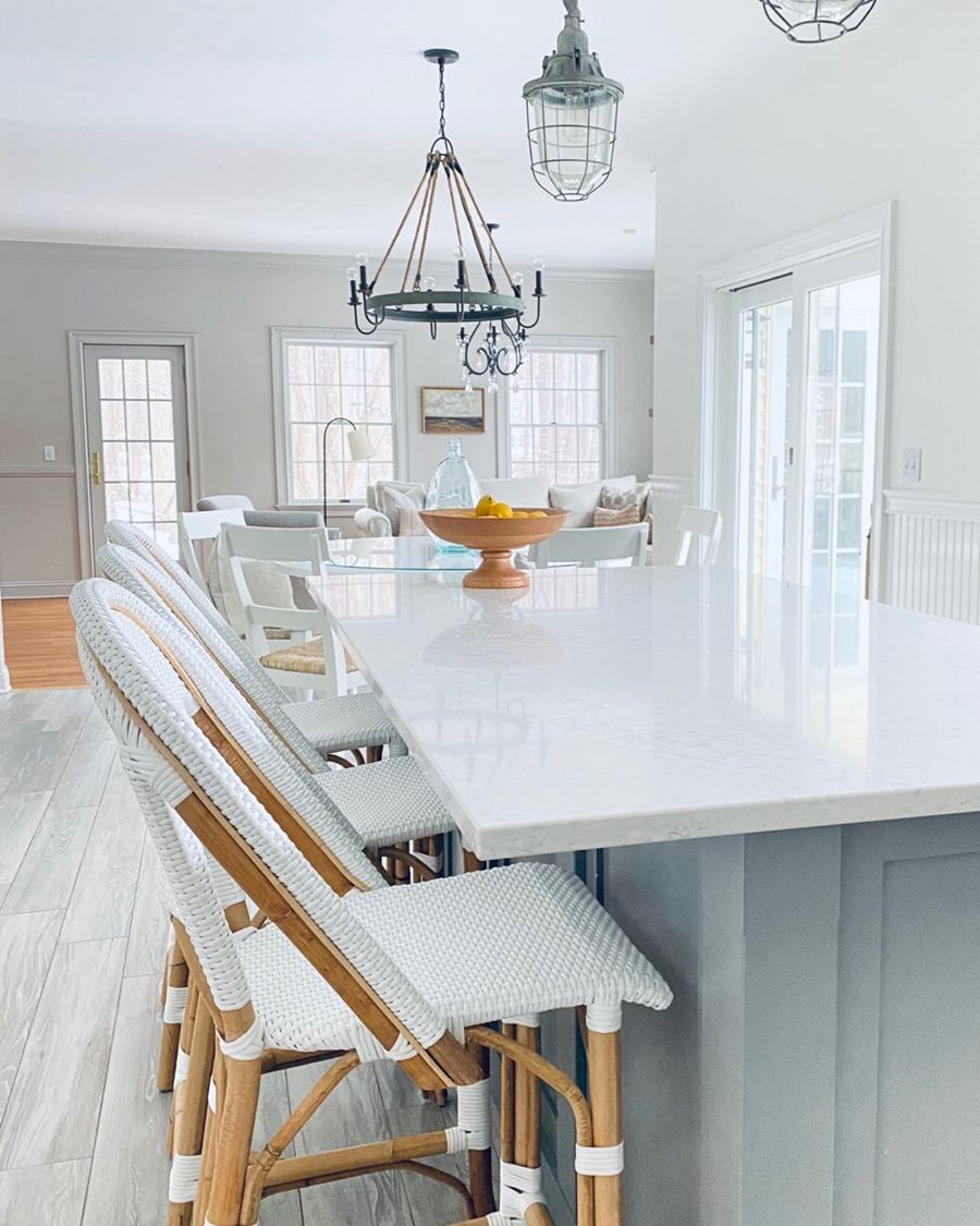
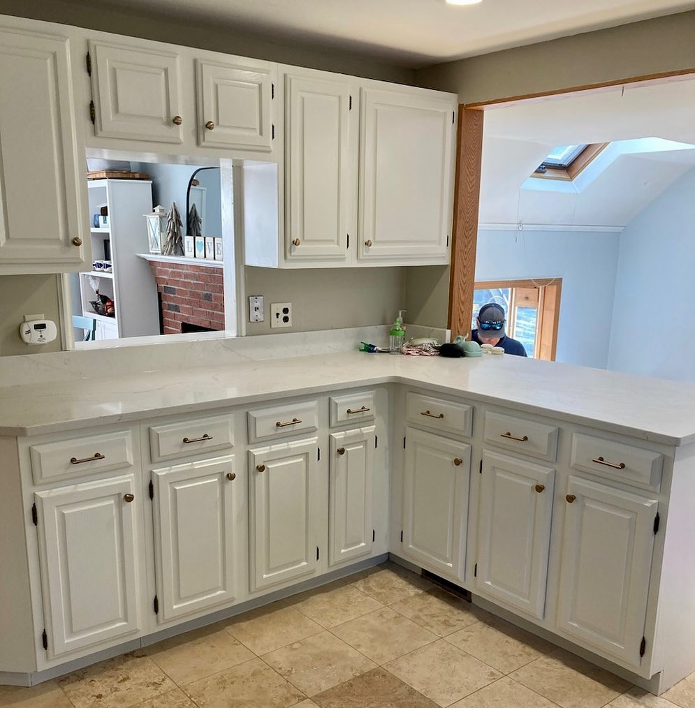
Benjamin Moore White Dove on Kitchen Cabinets
Benjamin Moore White Dove on Cabinets
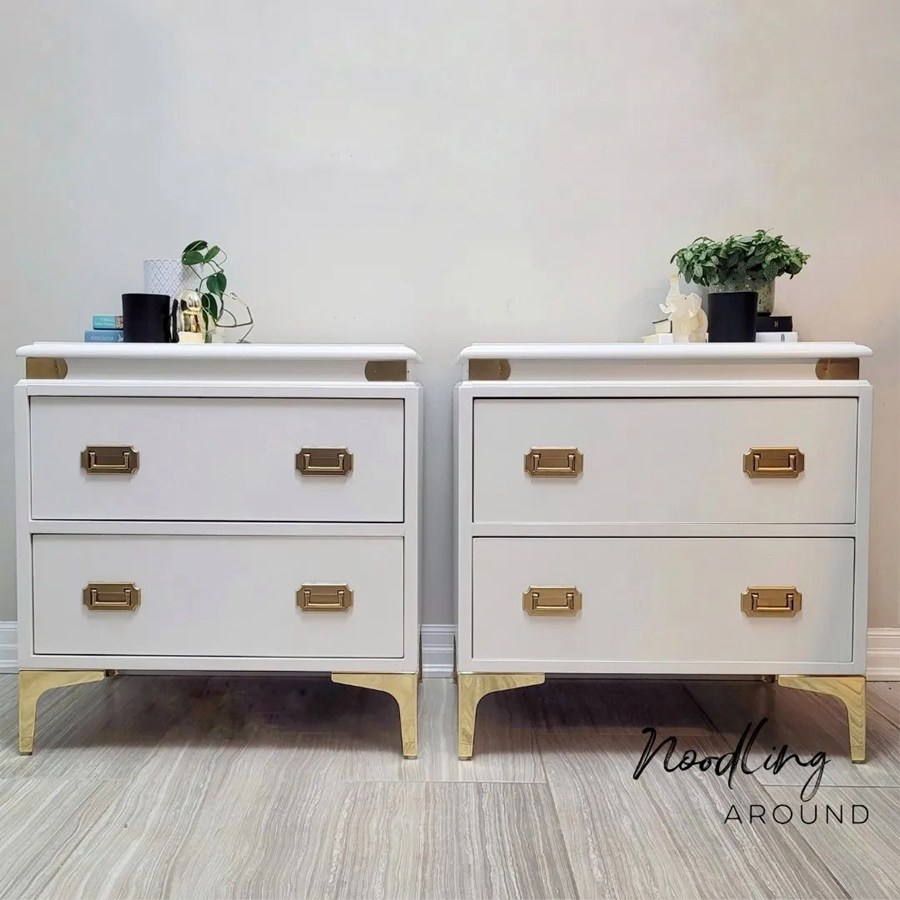
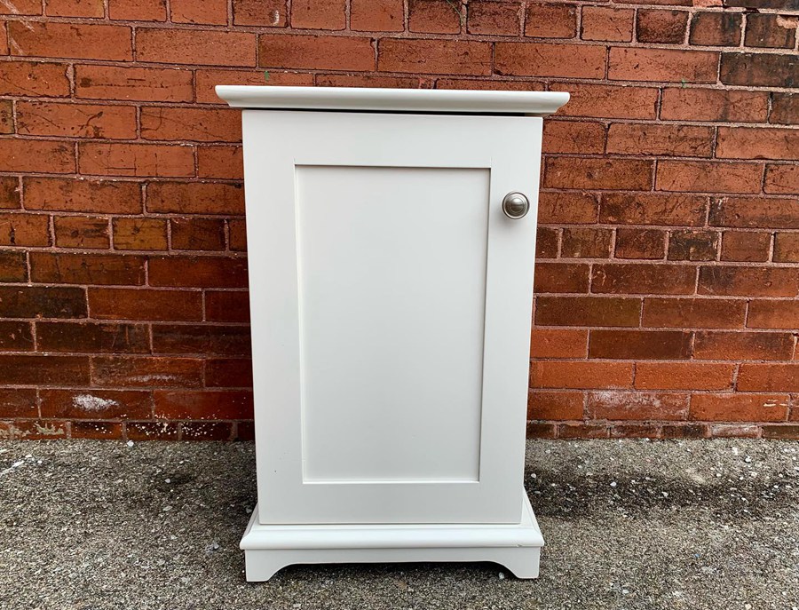
Benjamin Moore White Dove nightstands? Aren’t they great?
Benjamin Moore White Dove on Door
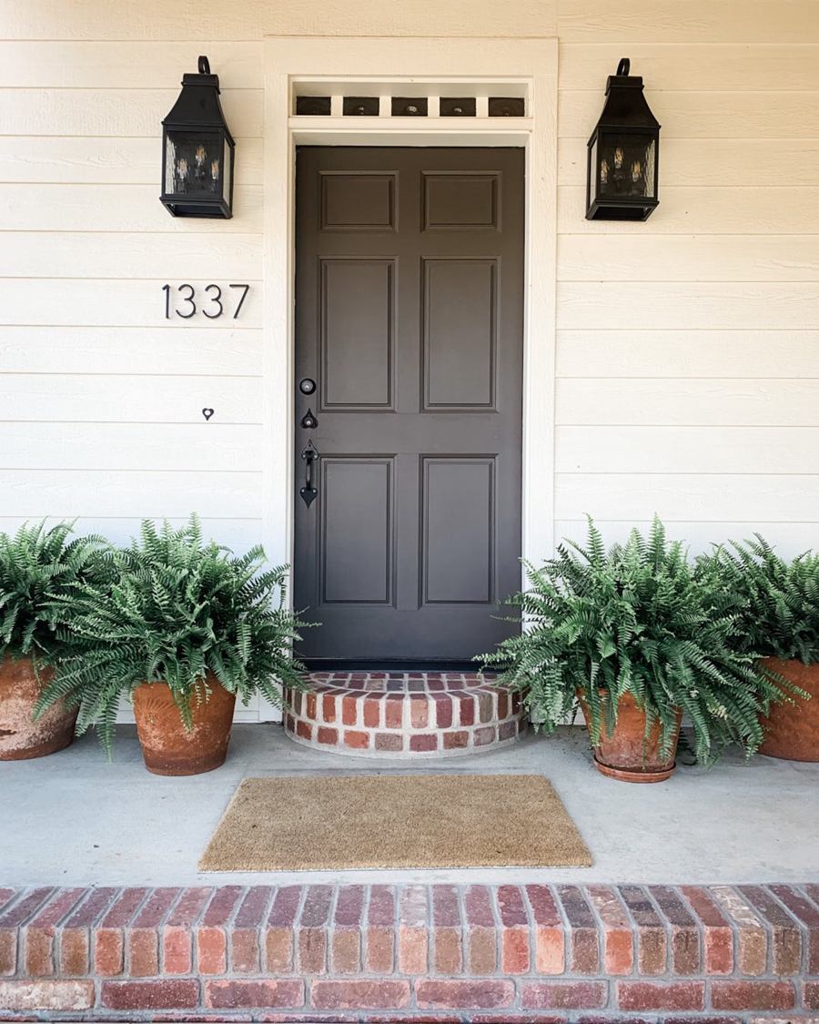
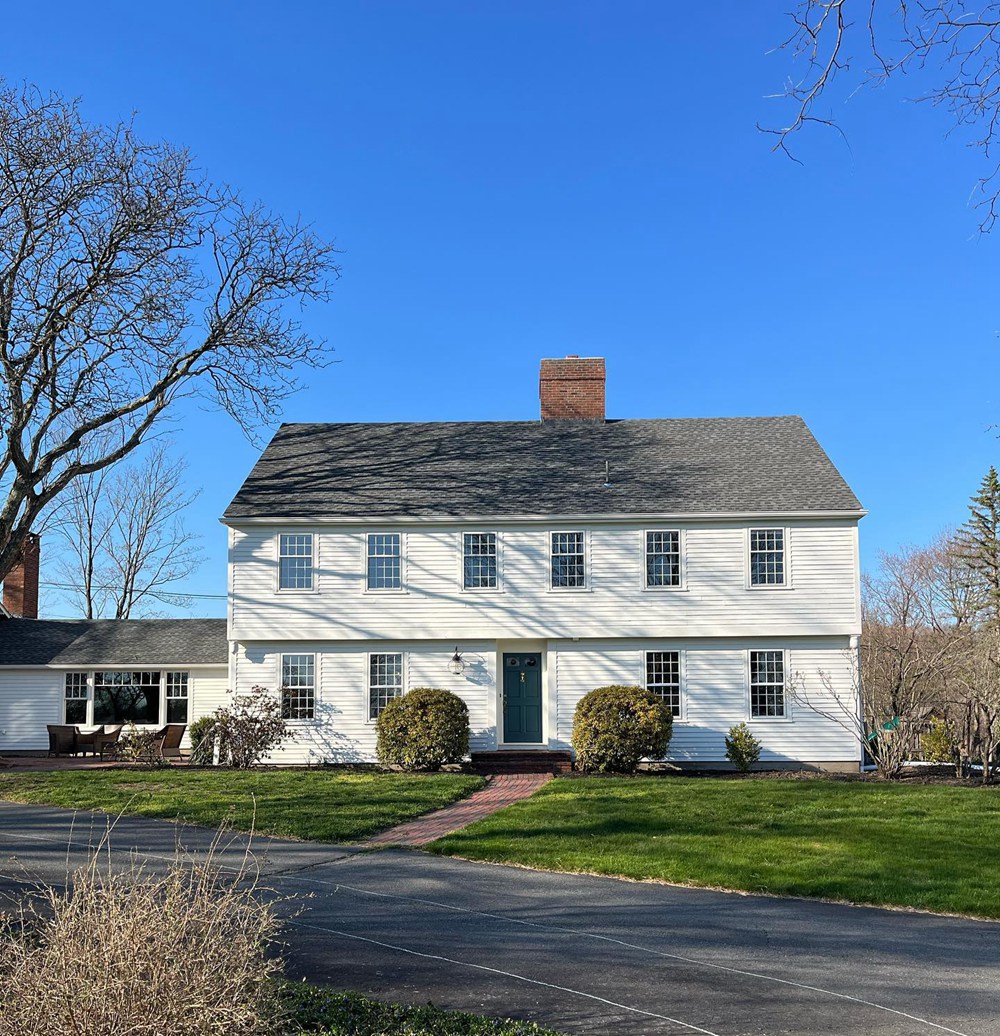
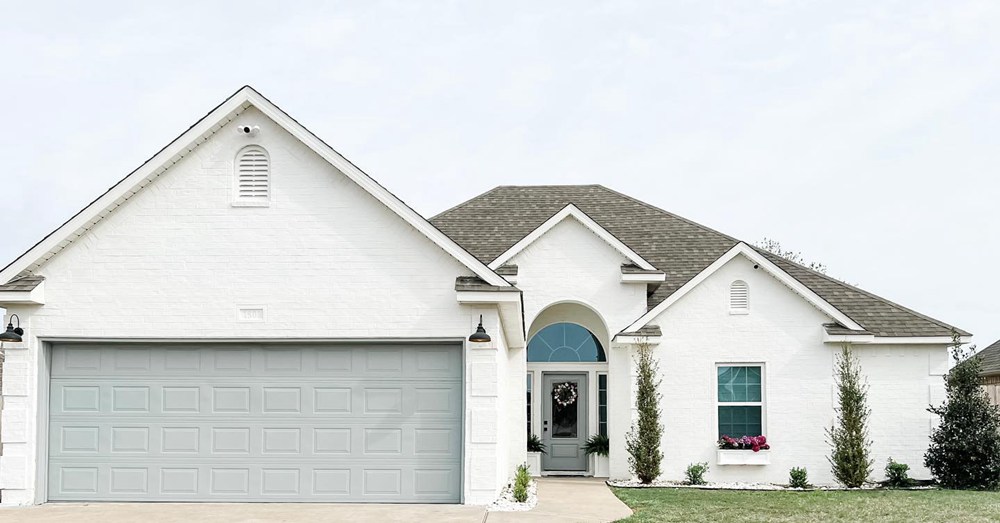
Benjamin Moore White Dove on Exteriors
The beauty of Benjamin Moore White Dove doesn’t stop here, but now I would like to add some additional knowledge about Benjamin Moore White Dove. Keep reading.
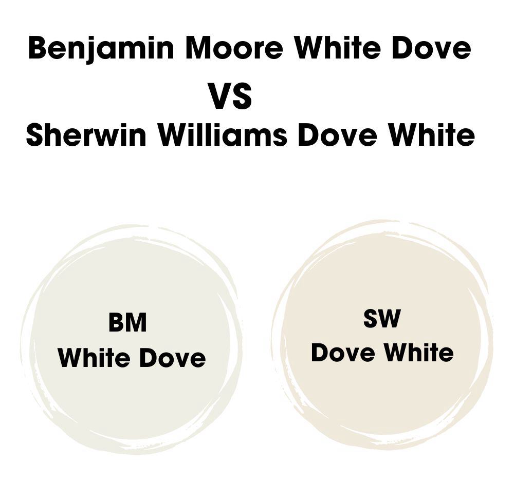
Does Sherwin Williams White Dove Exist?
Interestingly, there’s a bit of confusion surrounding the paint color “White Dove”. Let’s clear things up: “White Dove” is a popular paint color, but it’s exclusive to Benjamin Moore. Sherwin Williams does not have a color named “White Dove”.
However, Sherwin Williams does have a paint named “Dover White SW 6385”. It’s a warm, creamy white with a touch of yellow-beige undertone. It is softer and creamier than Benjamin Moore’s “White Dove”, but could still be a good option if you’re looking for a warm, inviting white.
If you’re looking for other Benjamin Moore colors similar to “White Dove”, consider “Simply White OC-117”. It’s a touch brighter than “White Dove” with a slightly more yellow undertone. It’s clean, bright, and works well in a variety of spaces.
SW Colors Similar to Benjamin Moore’s White Dove
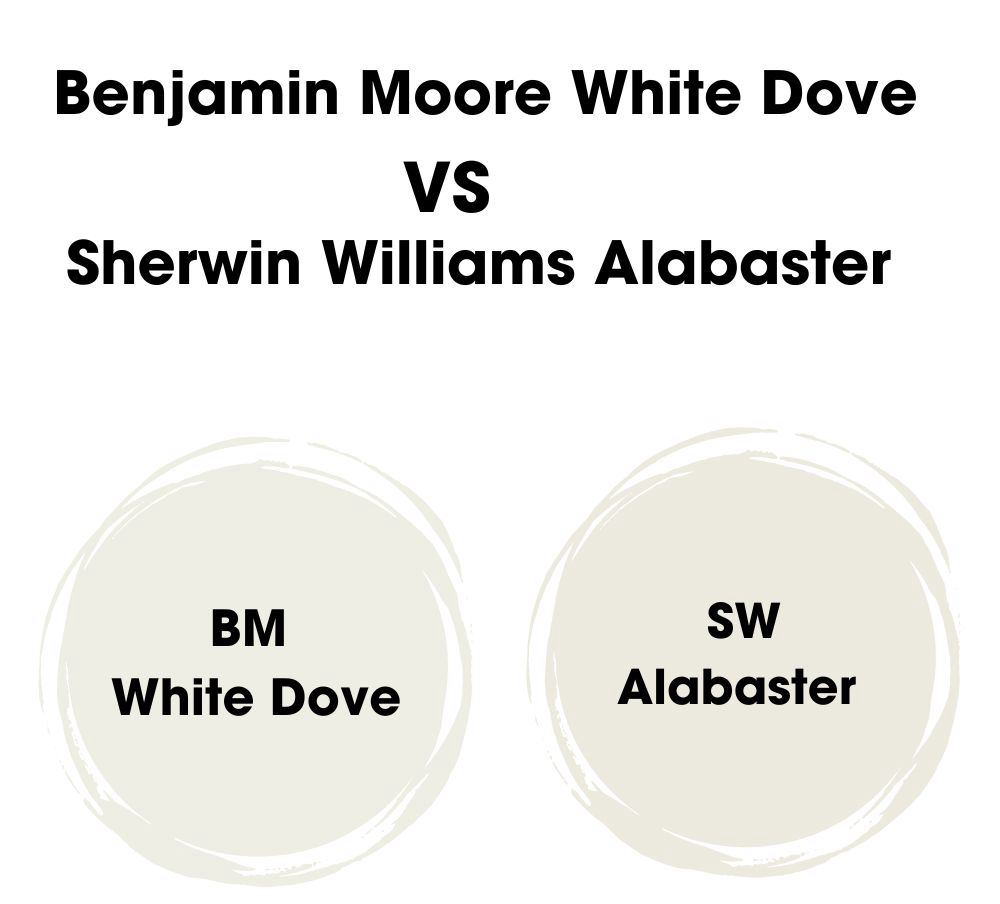
If you’re a fan of Sherwin Williams and are looking for a color similar to Benjamin Moore’s “White Dove”, “Alabaster SW 7008” could be a great choice. Like “White Dove”, “Alabaster” is a warm, soft white that maintains a clean appearance without coming off as stark or cold. It brings a comforting and inviting feel to any room.
When to Choose Benjamin Moore White Dove
After journeying through the world of Benjamin Moore’s “White Dove”, let’s come full circle and talk about when this versatile paint color could be your perfect pick.
- You want a warm, soft white that’s neither too stark nor too creamy.
- Your room has plenty of natural light, and you want to maintain a fresh, bright ambiance without it feeling cold.
- You’re looking to highlight architectural details, such as trim, cabinetry, or doors, without overpowering your main wall color.
- You’re working with a color palette that includes a variety of undertones: “White Dove” works beautifully with both cool and warm colors.
Remember, “White Dove” is a true chameleon in the world of whites, adaptable and elegant, it could be the perfect pick for your project.
Conclusion
We’ve embarked on an in-depth exploration of Benjamin Moore’s “White Dove” together, delving into its undertones, complementary colors, and ideal use cases. We’ve also compared it to other popular shades like Sherwin Williams’ “Alabaster” and “Dover White” as well as its sibling from Benjamin Moore, “Simply White”.
After all this, one thing is certain: “White Dove” is a versatile, elegant white that adapts to various spaces, lighting conditions, and design aesthetics. Whether it’s a bright, cheerful space you’re after, or a warm, cozy ambiance, “White Dove” is ready to take flight in your interior design journey.
But while we may be wrapping up this article, your adventure with “White Dove” is just about to begin.
So, if you found this guide helpful and are ready to soar with “White Dove”, we’d love to hear from you. Please consider rating this article down below. Your feedback not only helps us, but also assists others in their color decisions.
And remember, choosing paint colors can be an exciting part of your design process, a chance to bring your vision to life. So take a deep breath, pick up that paintbrush, and let the magic of “White Dove” transform your space! Happy painting!
 Sherwin Williams White Duck (Palette, Coordinating & Inspirations)
 Sherwin Williams Sensible Hue (Palette, Coordinating & Inspirations)
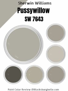 Sherwin-Williams Pussywillow (Palette, Coordinating & Inspirations)
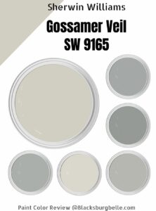 Sherwin-Williams Gossamer Veil (Palette, Coordinating & Inspirations)
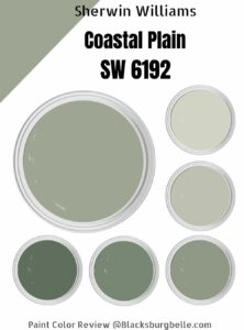 Sherwin Williams Coastal Plain (Palette, Coordinating & Inspirations)
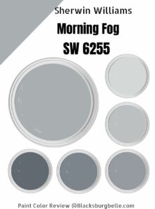 Sherwin Williams Morning Fog (Palette, Coordinating & Inspirations)
