
Are you tired of gray paints and looking for a new way to use color in your palette? I’ve found an interesting tone with blue-green tints to give it a cool and oceanic vibe. Benjamin Moore Wickham Gray (HC-171) is today’s focus.
This medium-light gray paint belongs to two Benjamin Moore Collections, proving its versatility. Wickham Gray is part of the Historical Color and Colors for Vinyl Collections. I’d call this color timeless without sounding cliche because it’s truly a durable shade.
This review includes tips on using Wickham Gray, its specifications, color palettes, and inspirations for your decision-making.
Table of Contents
When to Choose Benjamin Moore Wickham Gray?
Before we get into the details, I’ll give you a quick insight into the color that’s Benjamin Moore Wickham Gray.
Want to Open A Small Space?
It’s not sunshine but Wickham Gray brightens up every space and makes small rooms look bigger.
Looking for Serenity?
Wickham Gray walls exude a serene and chill aura that keeps you soothed throughout the day.
Playing with Gray Color?
You don’t have to settle for the common cloudy and hazy gray tones when you have this oceanic Wickham Gray with its blue-green tint.
Revamping your Exterior?
Whether it’s a modern or traditional exterior, Wickham Gray will always stand out.
Getting a Furniture Makeover?
Wickham Gray on your furniture gives it a modern look. So, don’t throw away that old wooden cupboard or cabinet. Instead, clean it and repaint it with Wickham Gray.
Now let’s get into the nitty gritty of Benjamin Moore Wickham Gray.
What Color is Benjamin Moore Wickham Gray?
Wickham is an old English name meaning “Settlement,” while gray is a neutral color between black and white. Considering the combo of both words, we can say the idea of neutrality inspired Benjamin Moore to name this paint.
Before I explain how the name plays into its appearance, here’s a snapshot of what Wickham Gray looks like.
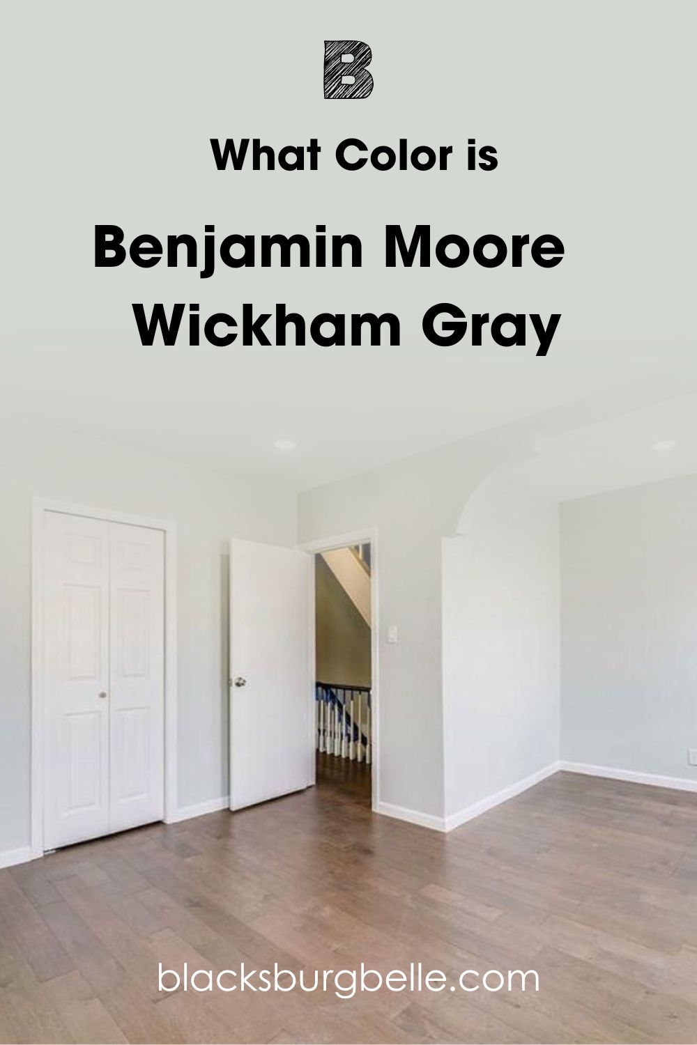
But when you look at Wickham Gray, there’s a hint of oceanic green and icy blue that makes you wonder if it’s truly gray paint. Because of those undertones, I can’t categorize Wickham Gray as a neutral color.
Instead, I’ll say Wickham Gray is a chilled blue-green color with the potential to be neutral. As a Historical Color, Wickham Gray suits a traditional theme that relies on architecture, and as a Vinyl Color, this gray paint works excellently on exterior sidings.
A detailed review will show you all that and more, so I won’t keep you waiting further.
Snapshot of Benjamin Moore Wickham Gray’s Specification
Here’s a breakdown of the specifications that make up Benjamin Moore Wickham Gray. It includes information on the Light Reflectance Value (LRV), RGB, Hex Value, and Undertones.
| Name | Wickham Gray HC-171 | 864 |
| RGB | Red 213 | Green 216 | Blue 209 |
| Hex Value | #D4D8D2 | #D5D8D1 |
| LRV | 67.87 |
| Undertones | Icy Blue |
The LRV of Benjamin Moore Wickham Gray
You can tell how much light a color reflects by measuring it on an LRV scale of 0 – 100. 0 is pure black, which is absorbent, while the brightest white is 100% reflective. With manufactured paint, the scale is 3 – 97 because they all have undertones.
Since dark colors have an LRV of 3 – 30, 31 – 45 is medium-dark, 46 – 55 is mid-toned, but 50 is neutral, 56 – 79 is medium-light, and 80 – 97 is light. These figures are standard, but some exceptions depend on the undertones.
Because it has an LRV of 67.87, Benjamin Moore Wickham Gray is a medium-light color. What’s the implication of this LRV?
Wickham Gray, on its own, will brighten any room but to a limited extent because of its blue-green base. You’ll need bright lighting if you want to lean into its lightness.
Lighting Effect on Benjamin Moore Wickham Gray
Wickham Gray lights every other paint color reacts to lighting changes. When you use cool white bulbs, the color becomes an icy gray but morphs into a cooler green-gray under warm yellow light.
If you don’t have additional light fixtures in your room or you’re painting your exterior, here’s how to use natural sunlight.
Because the sun rises in the East, South-facing and East-facing rooms get the most light in the morning. The South-wing gets hot and bright from sunrise until noon then the sun moves to the East-wing from noon until afternoon.
From 4:00 p.m. until sunset, West-facing rooms get the sun’s direct rays. But it isn’t as bright or hot as the morning and noon lights because it’s getting ready to set in the West. Meanwhile, Northern-facing rooms get sunlight from sunrise to sunset, even though it’s the lowest glow.
Northern-facing rooms are the best positions for maintaining the multi-toned beauty of Wickham Gray. You’ll get the gray surface with occasional flashes of green and blue as the sun moves.
Now let’s discuss how these lightings and positions alter Benjamin Moore Wickham Gray’s reflection.
Undertones of Benjamin Moore Wickham Gray
Benjamin Moore describes Wickham Gray as “an eye-pleasing gray with buoyant blue undertones,” and you can see it on first view. But a closer look at Wickham Gray under dim lighting or at night will show you a slight green undertone.
Here’s what I mean.
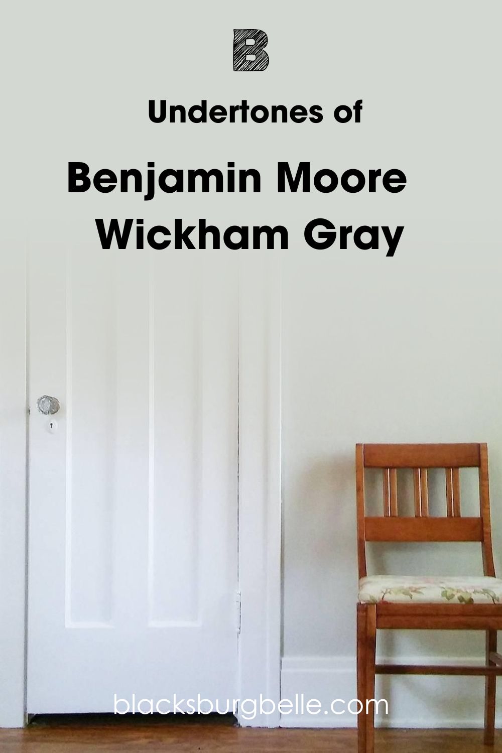
Does it look Blue or Green?
Wickham Gray is primarily gray, but different lighting can show a blue or green tint. That’s because the blue undertone Benjamin Moore cites is actually an oceanic tone with a hint of green. Think of the Caribbean waters for a mental picture, then see this.
If you want to see this blue-gray side of Wickham Gray, use the color under cool, South-facing, or East-facing light. For a green-gray reflection, paint Wickham Gray in a West-facing room or underneath warm lighting.
When you see the coordinating colors and monochromatic palette for Benjamin Moore Wickham Gray, its blue-green undertone becomes more apparent.
Is Benjamin Moore Wickham Gray a Warm or Cool Color?
Benjamin Moore Wickham Gray is a cool color that relaxes and soothes you. If you need a space to inspire calmness, then this blue-green-gray paint fits the bill.
Whether it’s the blue or green undertone that’s shining through, you’re assured of stress relief every time you’re around Wickham Gray. Before reviewing the color, I wasn’t sure about considering another gray paint, but I got lost in its sea blue-green tint. It’s mature without feeling stuck-up and versatile.
You can use Wickham Gray anywhere in your home, but it’s best in your bedroom, bathroom, exterior, and on furniture. It’s time for tips on using Wickham Gray.
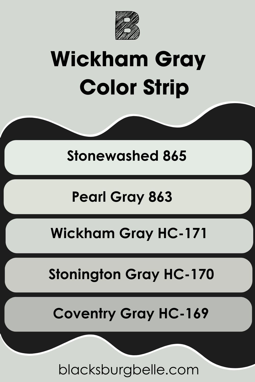
Benjamin Moore Wickham Gray Color Strip: Lighter or Darker Exploration
If you’re still not interested in Wickham Gray, I can understand. Tastes differ, and the color may be too light or too dark for you. So, here are some alternative tints and shades with the same blue-green undertone and gray surface.
- Benjamin Moore Stonewashed (865)
- Benjamin Moore Pearl Gray (863)
- Benjamin Moore Wickham Gray (864)
- Benjamin Moore Stonington Gray (HC-170)
- Benjamin Moore Coventry Gray (HC-169)
Stonewashed is a bright white with a blue-green undertone making it appear gray. Benjamin Moore Pearl Gray is lighter than Wickham Gray and has more of a silvery surface. Stonington Gray is a darker version with a faint blue undertone and no green tint.
Coventry Gray is the darkest in this strip but a mid-toned gray with a subtle green undertone.
Benjamin Moore Wickham Gray Coordinating Colors
Wickham Gray is a beautiful color, but sometimes you can’t see that beauty until you pair it with other hues. These hues highlight the undertones and create new ones when reflections mix. Here’s a shortlist of the most popular color palettes you can explore.
You need a color wheel for this part.
- Analogous Theme: Combines three colors placed beside each other on the color wheel.
- Complementary Theme: Contrasts two opposing tones from the color wheel.
- Triadic Theme: Pairs three colors that form an equal-sides triangle. It’s a bold combo that packs a punch because of the different auras from each color in the triad. Typically has all classes of colors in one group.
- Split Complementary: Split the complementary color of your chosen paint into a compound color. You’ll have one primary color with two secondary colors or vice versa like Red – Green (Green-Blue and Green-Yellow)
- Monochromatic Theme: Add pure white to a color for tints and absolute black for shades of a single color and pair them in one space.
For Triadic Palettes, you’ll have variations of red-blue-yellow, green-orange-purple, brown-gray-white/black.
A Split-Complementary palette for Wickham Gray will have interesting colors because it already has a compound undertone of blue-green. Its complement is red-orange, while the split will be red, orange, or yellow-orange and purple-red.
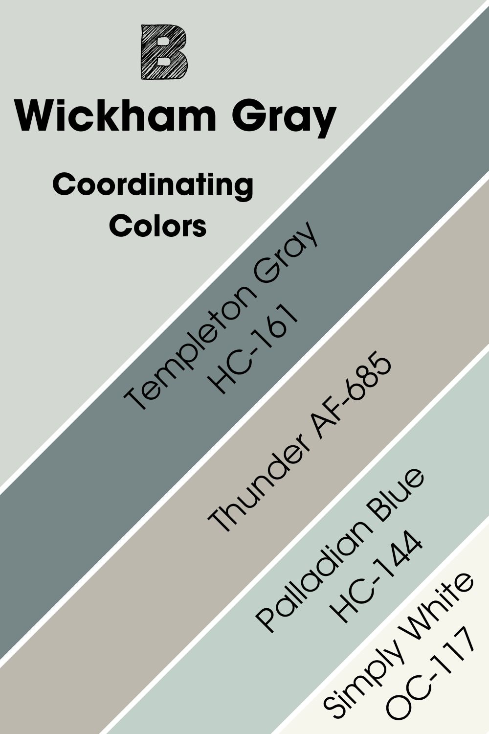
Coordinating Colors for Benjamin Moore Wickham Gray
Benjamin Moore recommends some colors as the perfect pair for Wickham Gray because of their coordinating tones. This palette contains a taupe color, a dark gray with blue-green undertones, a mid-toned baby blue, and a bright white. See them below.
- Benjamin Moore Templeton Gray HC-161
- Benjamin Moore Thunder AF-685
- Benjamin Moore Palladian Blue HC-144
- Benjamin Moore Simply White OC-117
Templeton Gray is a deep charcoal gray with blue-green undertone, Thunder is a taupe tone with gray elements, Palladian Blue is a baby blue with a mint tint and Simply White is a crispy neutral white.
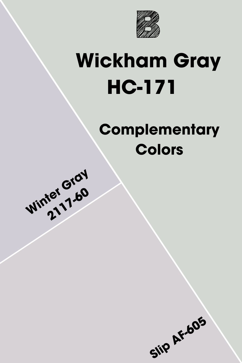
Complementary Colors for Benjamin Moore Wickham Gray
Complementary Colors are two hues opposite each other on the color wheel. Their combo creates a bold presence of their contrasting tones. Ordinarily, you won’t like the pair, but it becomes an ideal palette choice when you need to draw attention.
The standard complementary colors are:
- Red – Green
- Blue – Orange
- Yellow – Purple
Benjamin Moore Winter Gray and Slip are the closest complementary colors for Wickham Gray. Winter Gray is a soft violet tone with a gray cast while Slip is a pastel lilac with a blush base.
The color generator choosing cool tones as complementary hues isn’t conventional, but it’s fitting. With Slip, you can get a quiet warmth because of its blush undertone, while Winter Gray’s vibrance is more obvious because of its violet tint.
Benjamin Moore Wickham Gray Color Palette
You can explore Other color palettes to highlight the blue-green undertone in Wickham Gray, including Triadic, Analogous, and Monochromatic. I’ve added some of my top-pick colors here to inspire your decor.
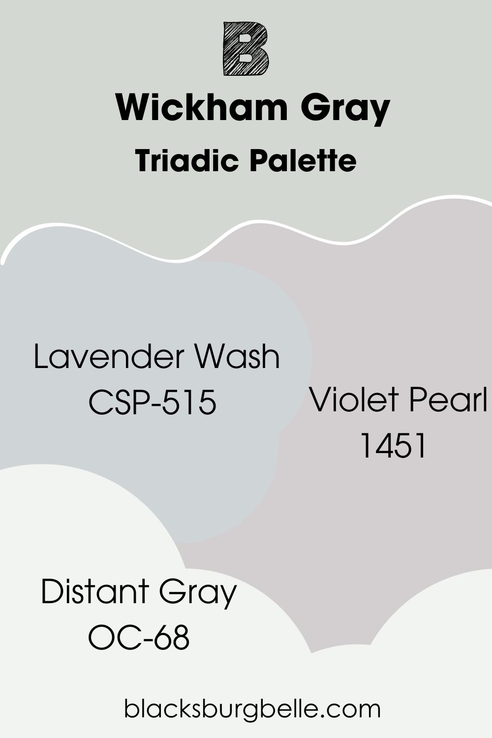
Triadic Palette
- Benjamin Moore Lavender Wash (CSP-515):A calming bluish-lavender
- Benjamin Moore Violet Pearl (1451):This faint gray has a bold violet undertone to warm up its cool exterior.
- Benjamin Moore Distant Gray (OC-68):An off-white paint with a subtle blue-gray cast.
Because Violet Pearl is a medium-light gray with purple flashes, it pairs well with Wickham Gray on adjacent walls. You can then use Lavender Wash as the accenting furniture and Distant Gray for your ceilings and trims.
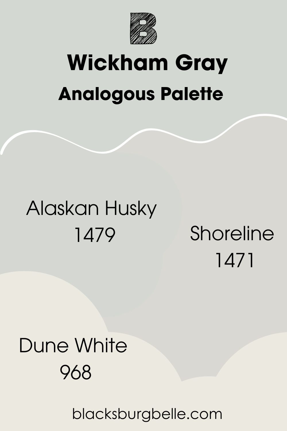
Analogous Palette
- Benjamin Moore Alaskan Husky (1479):This cool and hazy gray is calming because of its faint icy blue undertone.
- Benjamin Moore Shoreline (1471):A light gray with the softest lavender tint.
- Benjamin Moore Dune White (968):A warm white with flashes of green-gray.
Trim this palette with Dune White, then highlight Wickham Gray with Alaskan Husky and Shoreline.
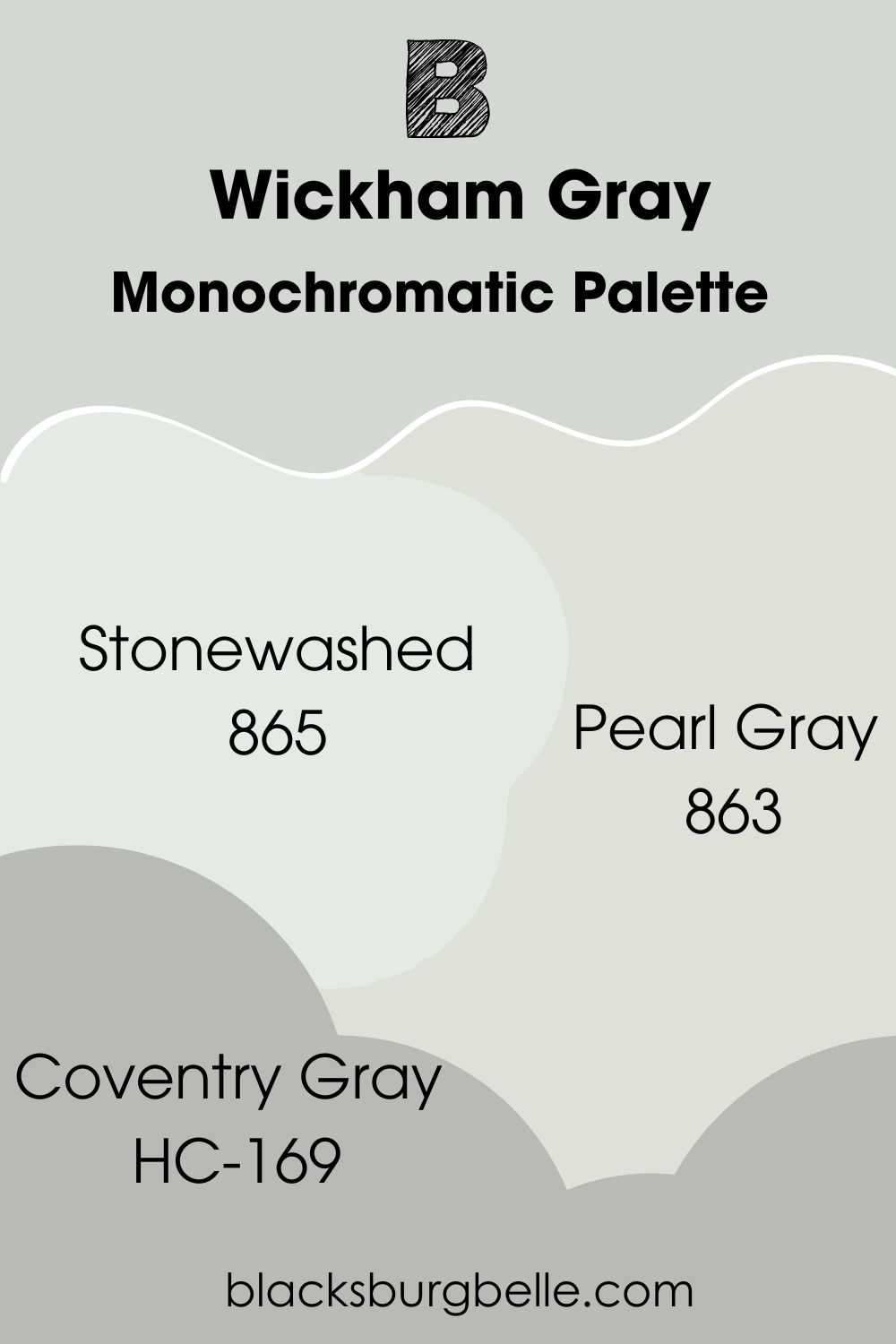
Monochromatic Palette
- Benjamin Moore Stonewashed (865):A blue-tinted white paint.
- Benjamin Moore Coventry Gray (HC-169):Use this mid-toned gray to cast a shadow on the lighter tones.
- Benjamin Moore Pearl Gray (863):A medium-light blue-green gray.
Use Stonewashed as the trim and Pearl Gray as an adjacent wall in this palette. Finally you can make Coventry Gray your accent because it’s darker.
Benjamin Moore Wickham Gray vs. Benjamin Moore Oystershell
Benjamin Moore Oystershell and Wickham Gray share the same color code (HC-171 | 864) because they have the same hex value and RGB. So, Oystershell is another name for Wickham Gray.
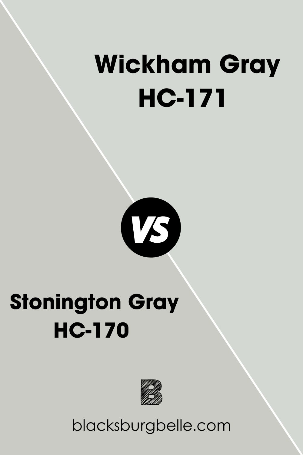
Benjamin Moore Wickham Gray vs. Benjamin Moore Stonington Gray
Stonington Gray is a darker version of Wickham Gray so it appears more silvery than gray.
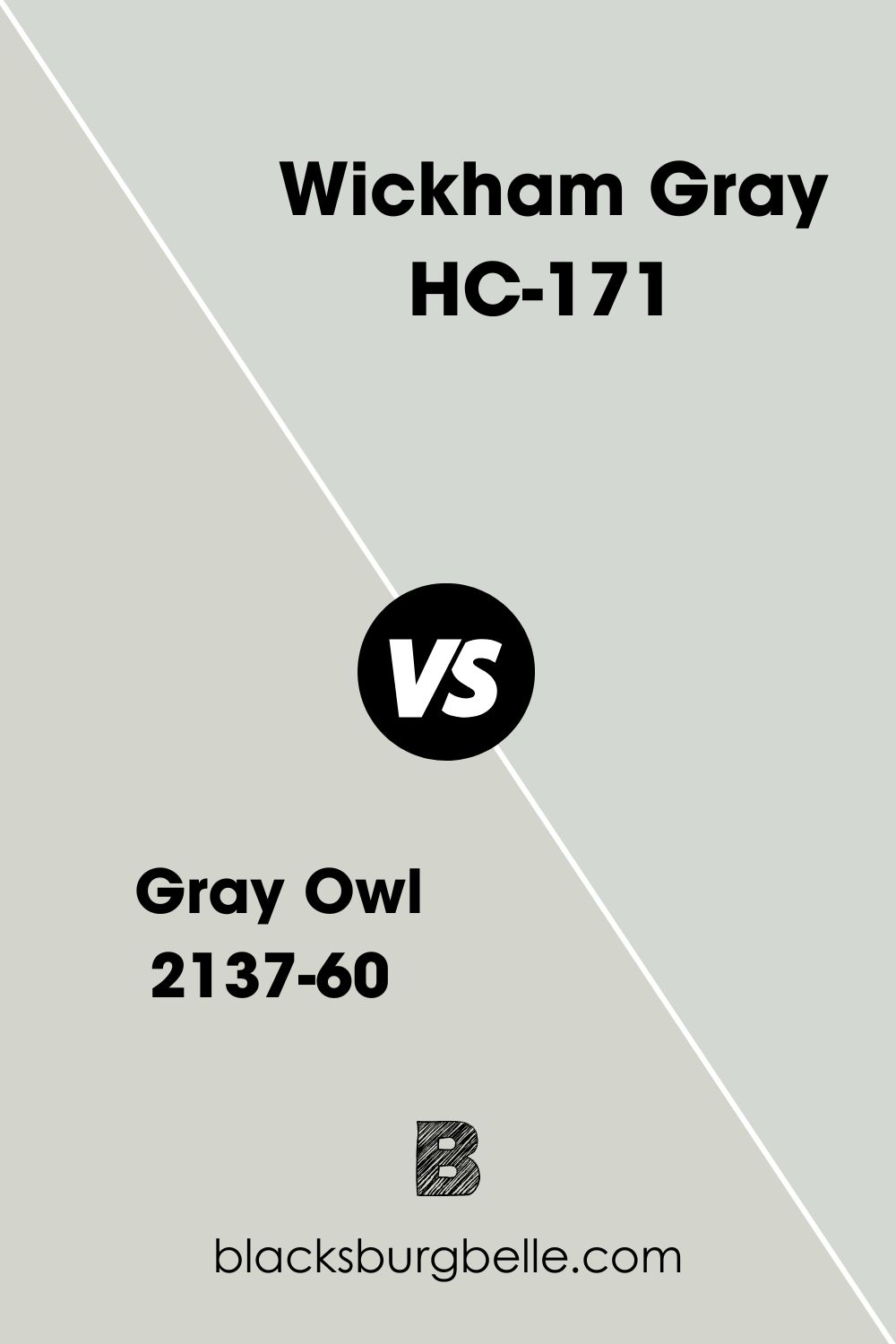
Benjamin Moore Wickham Gray vs. Benjamin Moore Gray Owl (2137-60)
You can barely tell the difference between Gray Owl and Wickham Gray because their LRVs and RGBs are close. But Gray Owl is darker with its 64.51 LRV.
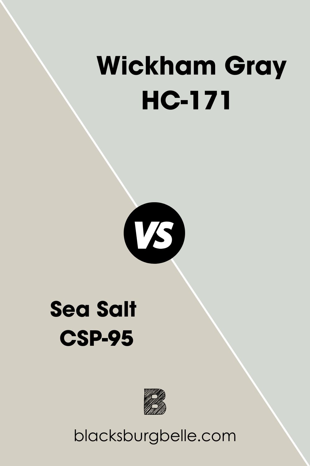
Benjamin Moore Wickham Gray vs. Benjamin Moore Sea Salt (CSP-95)
Sea Salt is visibly different from Wickham Gray because it’s a greige tone tinted by its beige undertone. It gives an earthy and warm vibe unlike Wickham Gray that’s icy and cool.
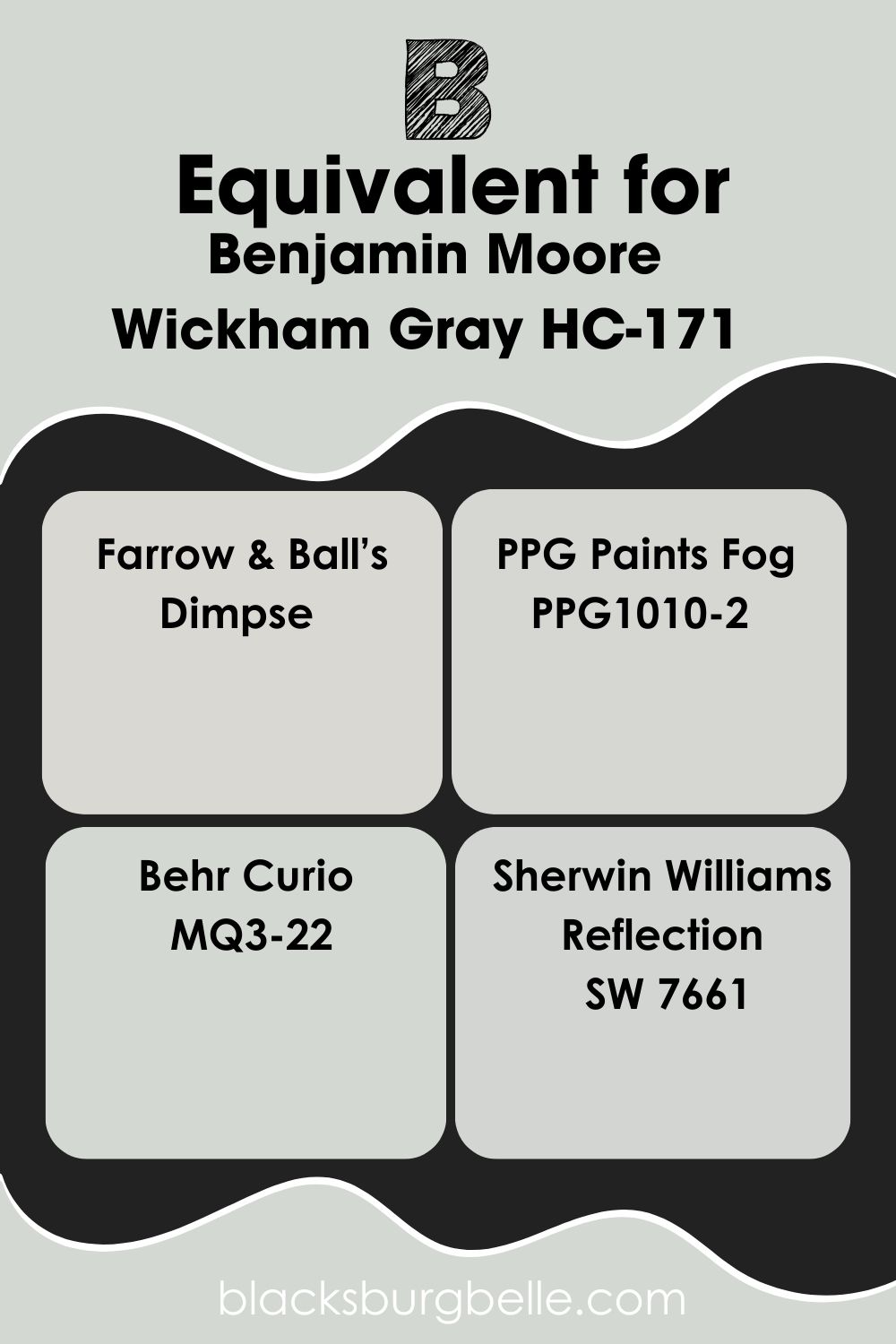
Benjamin Moore Wickham Gray Equivalent with Other Brands
Benjamin Moore is the only brand with a paint called Wickham Gray, so there’s no confusion. But you can try some alternatives if you’d prefer the same color from other manufacturers.
They include Farrow & Ball’s Dimpse, PPG’s Fog, Curio by Behr, and Sherwin-Williams’ Reflection.
They’re not exact matches because of varying RGB, but you can custom-make this exact blue-gray paint using its RGB and Hex Value.
Where Can You Use Benjamin Moore Wickham Gray?
Earlier I told you about Benjamin Moore Wickham Gray’s versatility. Now, it’s time to test the theory.
Benjamin Moore Wickham Gray on Walls
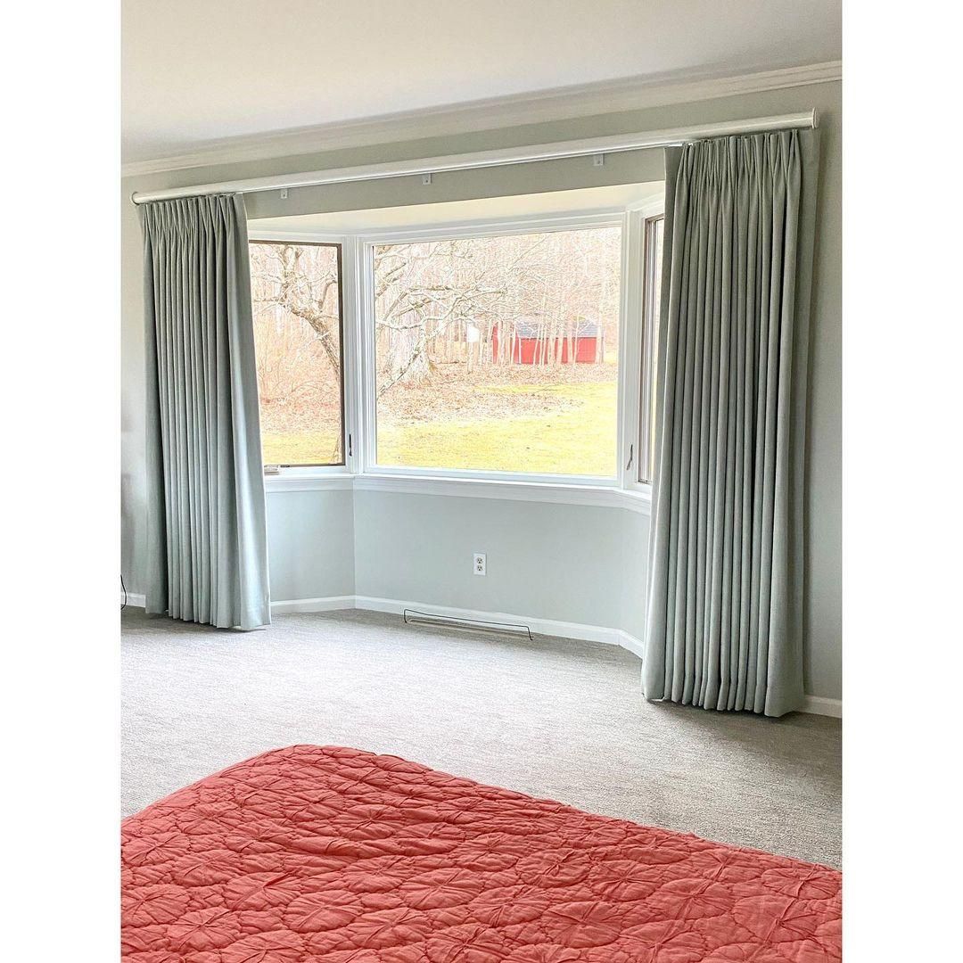
You can use Benjamin Moore Wickham Gray to cover an entire interior wall or as a supplementary tone for a half-and-half painting like this picture.
The color’s coolness is suitable in either condition but if you want to reduce its chilled aura, pair it with a duller color.
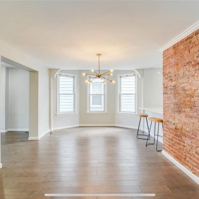
Benjamin Moore Wickham Gray in the Living Room
This living room is a perfect example of using Wickham Gray for an entire wall. This interior leans into the coordinating palette by incorporating grays, greens, blues, and off-whites into the space.
The off-white furniture and rug add warmth to the space and prevent it from looking too icy and cool. This is a good palette for a family room.
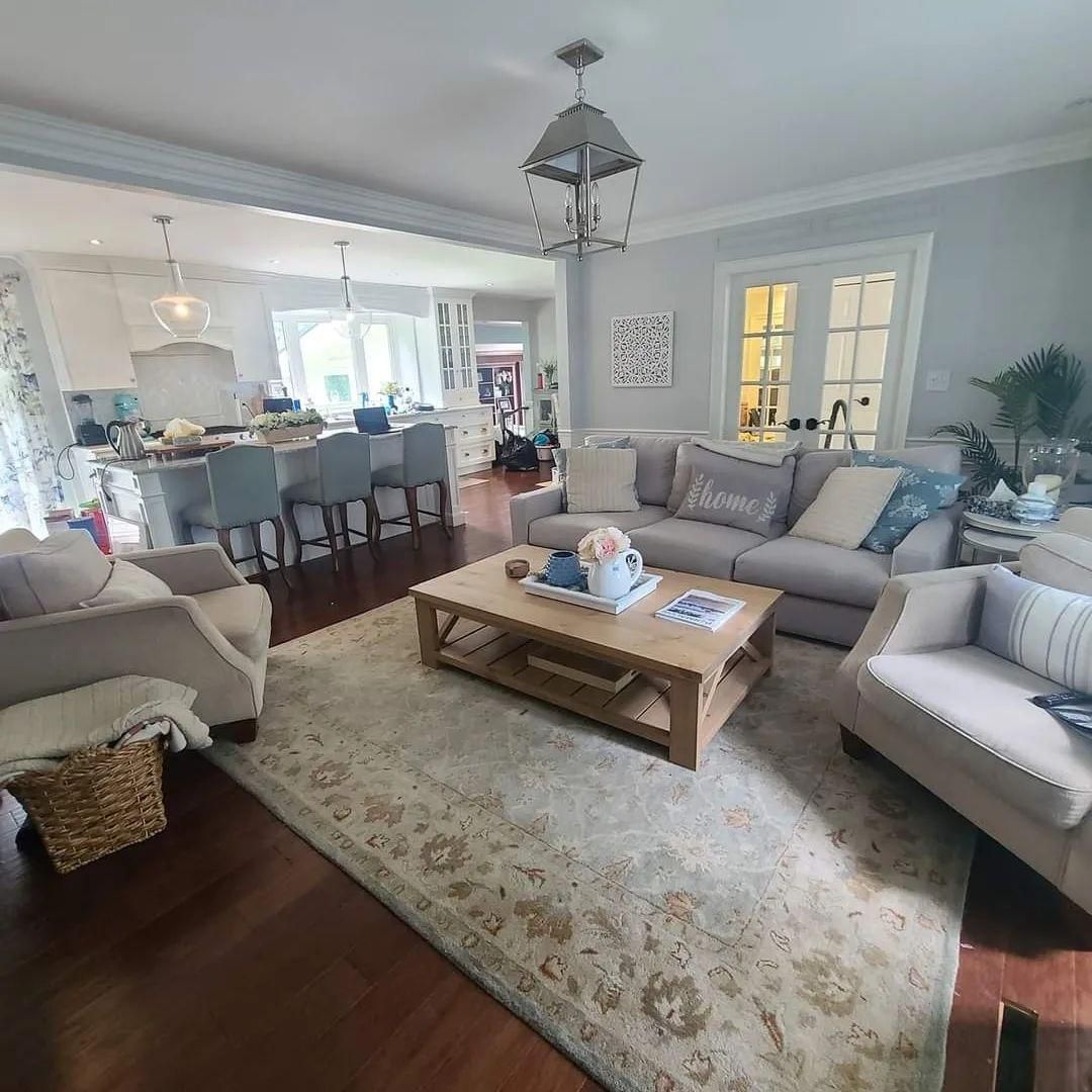
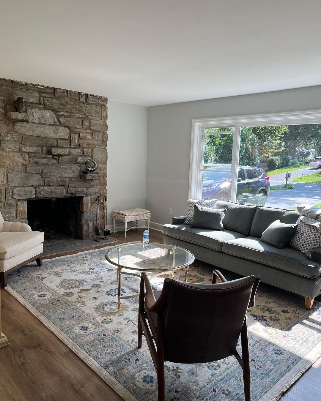
Again you can see the color coordination in this living room mixing earthy tans and brown with the cool Wickham Gray wall.
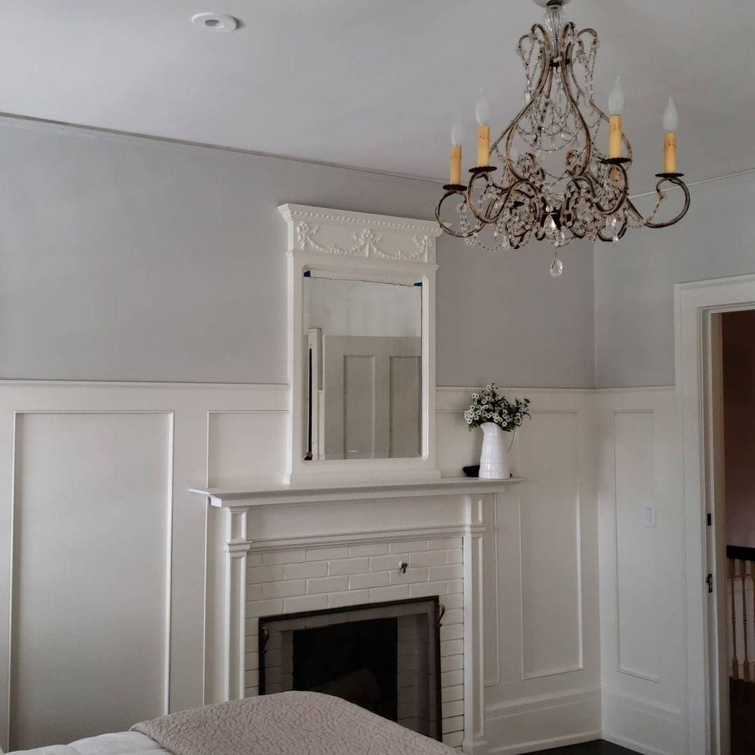
Benjamin Moore Wickham Gray in the Bedroom
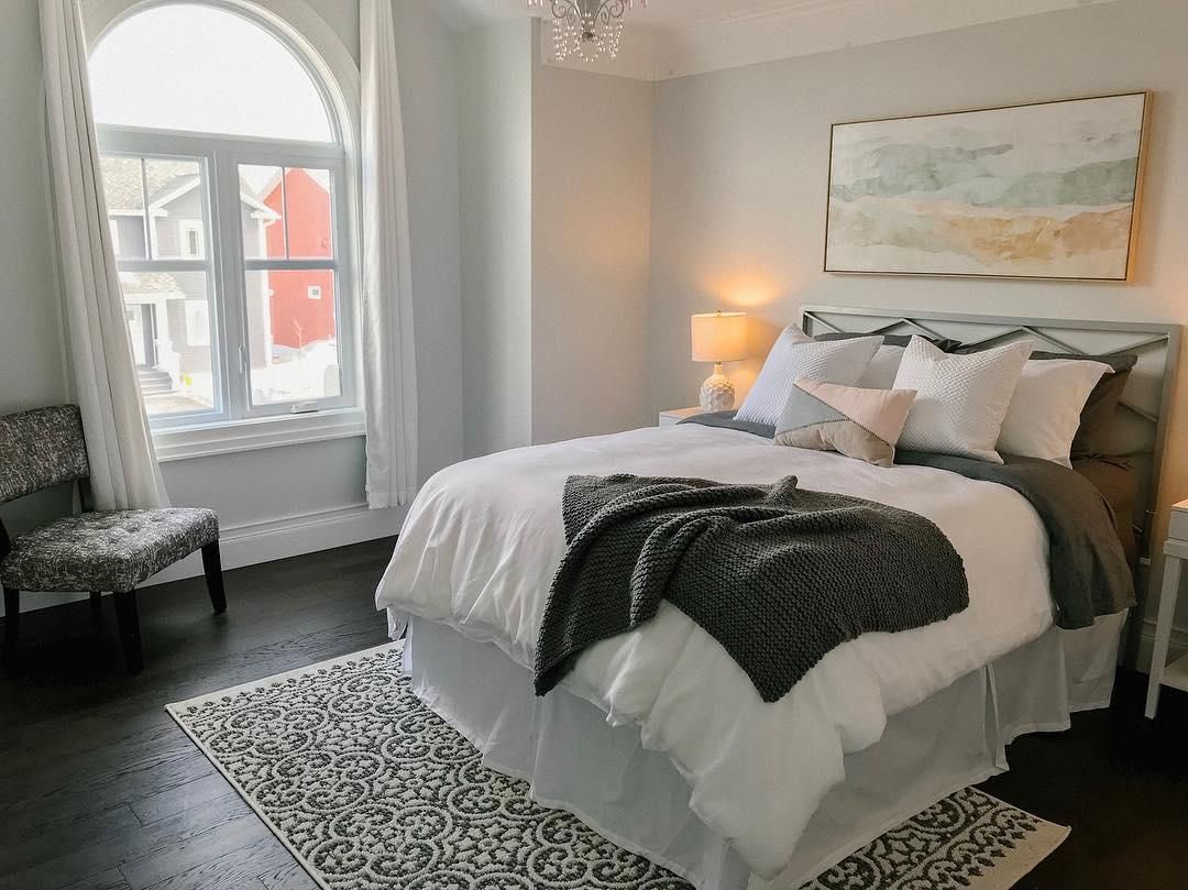
If you want to lean into the coolness of Wickham Gray, the bedroom is the right space. Because you’ll need the soothing energy to help, you unwind daily, choose a palette that highlights Wickham Gray’s blue part.
You can see how this bedroom designer chose deep coal gray to add some shadows to the space. There’s also a golden glow from the side lamp to add warmth to the space.
Benjamin Moore Wickham Gray in a Closet
Let’s walk into the closet and talk about using Wickham Gray in your closet. Most designers don’t pay enough attention to this space, and that’s not very good.
Apart from needing the soothing energy from Wickham Gray in your bedroom, you should extend that vibe to the closet. It can help your meditation as you do your skincare routine. If you don’t want Wickham Gray’s blue-green tone to overwhelm you, use it as an accent.
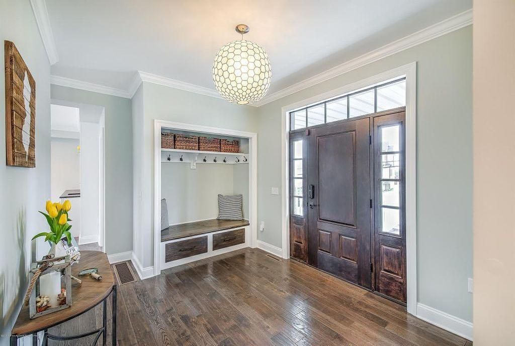
Benjamin Moore Wickham Gray in an Entryway
Welcome your guests and even yourself with the calming aura of Wickham Gray walls in your entryway. Because it’s a medium-light color with a potential for blinding brightness, I recommend pairing it with a deeper and warmer color for calmer energy.
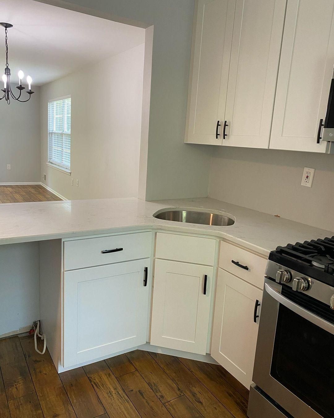
Benjamin Moore Wickham Gray on Cabinets
Again, I’ll love to remind you that the brightness and coolness of Wickham Gray can be overwhelming. So, using it as an accent is better, and the best way is on cabinets. Cabinets work in bathrooms, living rooms, and bedrooms, especially kitchens.
When you paint Wickham Gray on your cabinet, you can mix it with another color like this kitchen.
Or you can use Wickham Gray alone on all cabinets against a bright white wall.
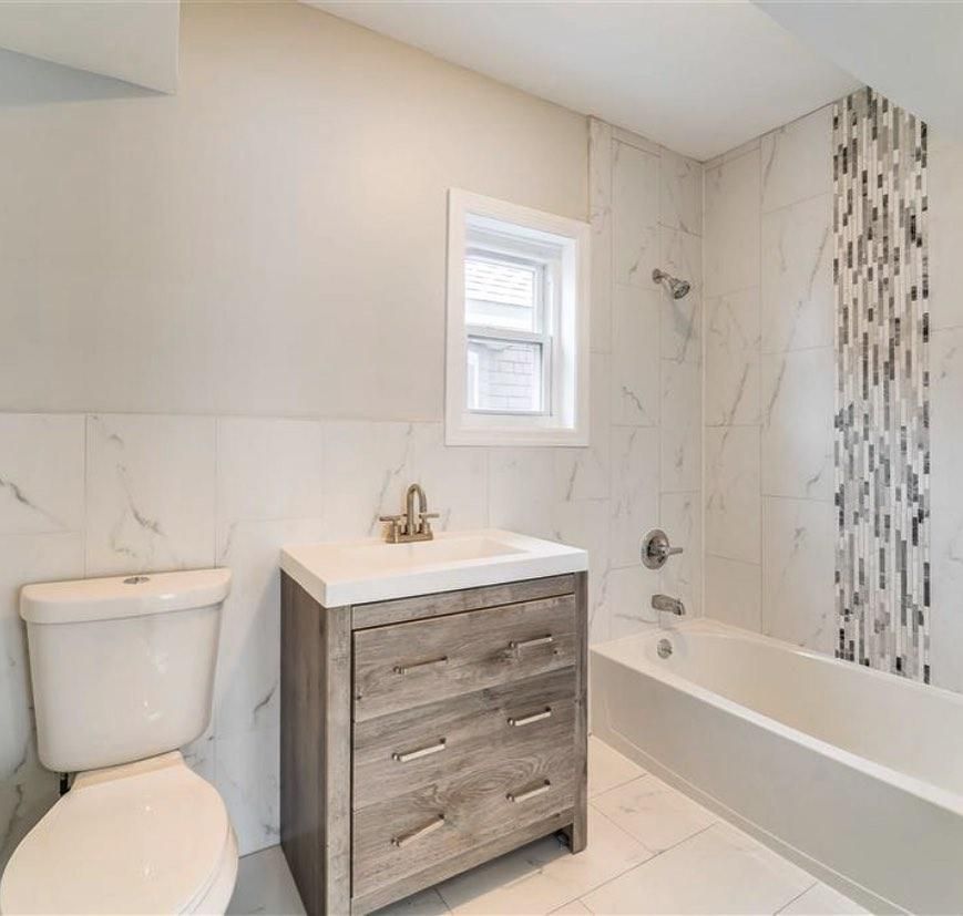
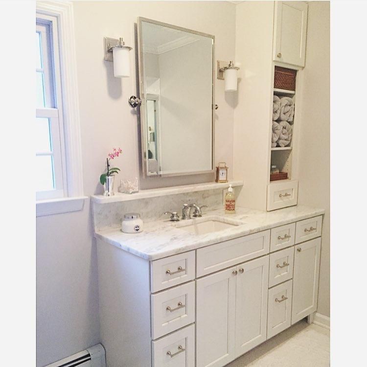
Benjamin Moore Wickham Gray in the Bathroom
Using Wickham Gray in bathrooms is a chance to explore your creativity. You can use it sparingly or excessively depending on your taste. Here’s one way to use Wickham Gray in the bathroom.
You can also use it on your bathroom cabinet while the walls remain a pristine or warm white.
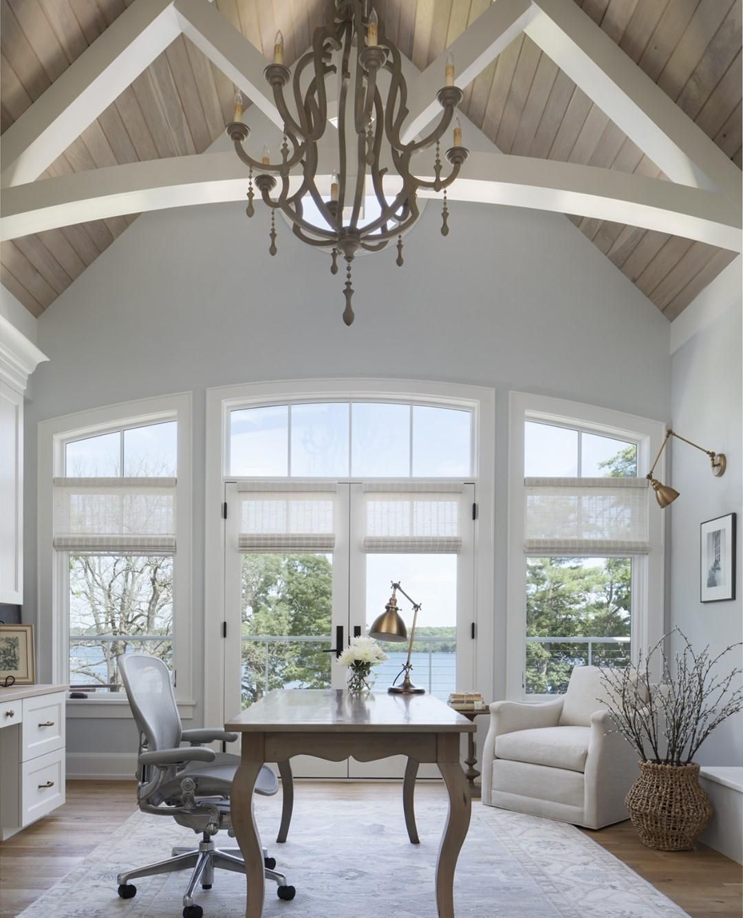
Benjamin Moore Wickham Gray in the Office
Do you think Wickham Gray walls in the office will induce sleep? I’m pleased to debunk that idea and encourage you to use this charming color in your office space. It’ll definitely take the edge of when you feel stressed and is best for soothing your clients.
Benjamin Moore Wickham Gray on Furniture
Remember how I said using Wickham Gray as an accent is an ideal option? Let’s talk about furniture accents. I noticed that painting old furniture with bright colors like Wickham Gray gives them a modern look.
Because these shelves are outside, you can see the light gray part of the color with little or no view of the blue-green undertone.
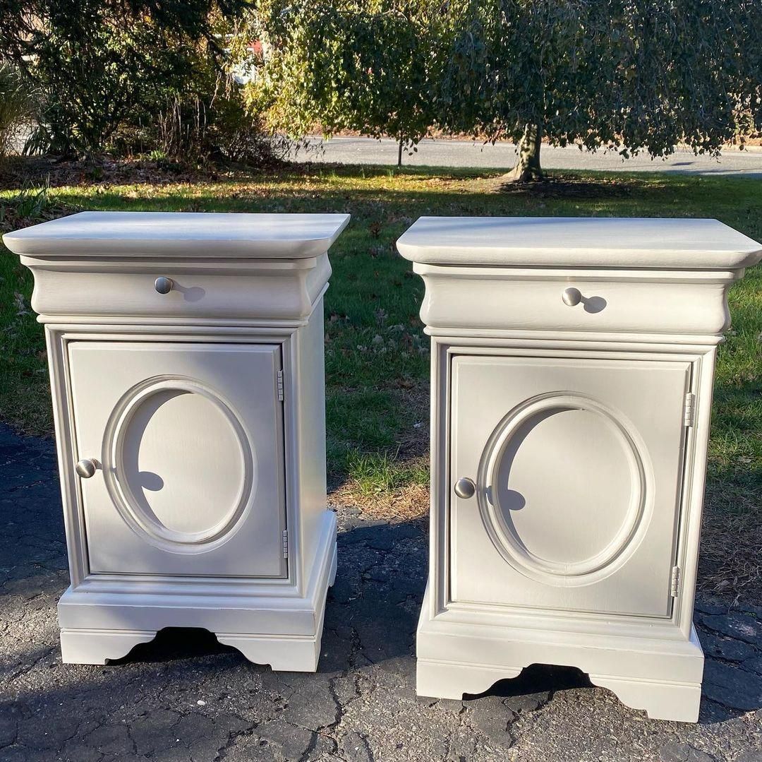
Meanwhile Wickham Gray on interior furniture can appear blue or green depending on the lighting.
Benjamin Moore Wickham Gray on Exteriors
I saw enough inspiration for using Wickham Gray on exteriors which isn’t surprising because it’s part of the Colors for Vinyl collection. Most traditional and even modern buildings used this gray paint for their exteriors.
You can use it on a brick house like this one beautified with greenery.
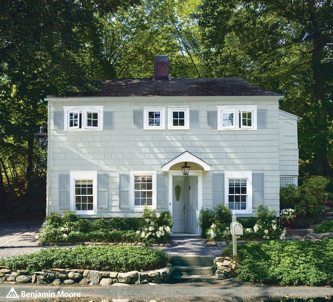
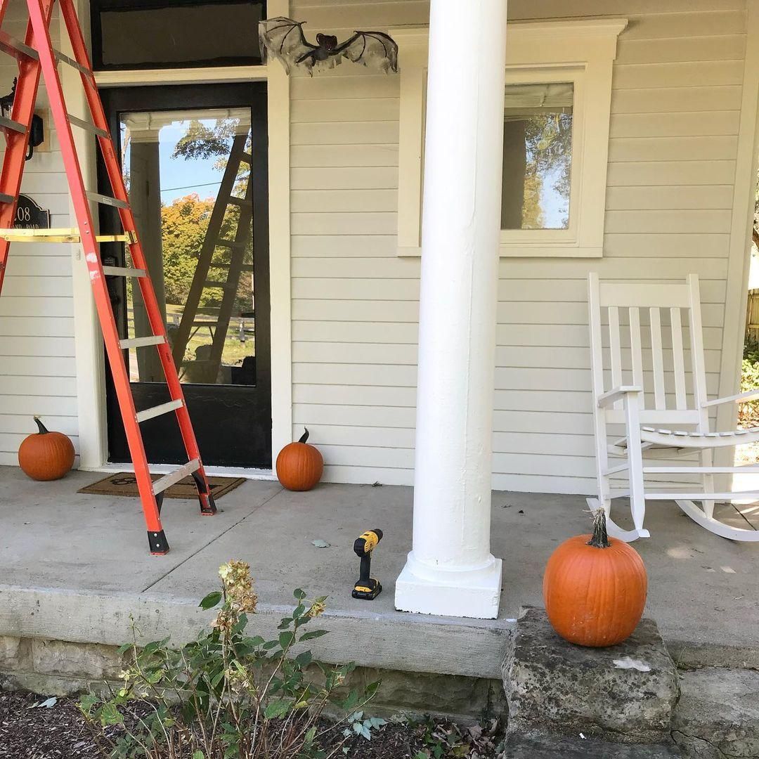
Or use Wickham Gray for a wooden siding like this house and its fall-inspired decor. Notice that the color looks hazier when it’s not receiving direct sunlight unlike the first building that’s in the open.
Conclusion
Benjamin Moore Wickham Gray is a worthy pick if you’re searching for versatile gray paint. Its interesting blue-green undertones give you a wider range of color palette options. You can appeal to either the green or blue side or even both if you like it.
Before settling on it, please sample your Benjamin Moore Wickham Gray on your preferred surface. It’s one thing to fall in love with the color on the screen and another when you watch it in real time.
If Wickham Gray fits your room, kindly share the finished look with me and other readers, including your thoughts on the color.
 Sherwin Williams Incredible White (Palette, Coordinating & Inspirations)
 Sherwin Williams Naval (Palette, Coordinating & Inspirations)
 Sherwin Williams Tricorn Black (Palette, Coordinating & Inspirations)
 Sherwin Williams Silvermist (Palette, Coordinating & Inspirations)
 Sherwin Williams Snowbound SW 7004 Review
 Sherwin Williams Charcoal Blue SW 2739: Color Review
