It’s natural to feel more enamored with how other parts of the house look; the walls, the cabinets, the furniture, and the rest, but finding the right color for your ceiling is really what holds it all together.
When it comes to ceilings, most people don’t want to take any chances and so would often just use white colors. And to be honest, white ceiling colors are the safest and easiest to use and they also look beautiful as well. They help your home feel brighter and airy as they help to reflect as much light as possible into your space.
Does this mean only white paint colors work for ceilings? Not at all. However, there are tons of factors to consider before choosing a color for your ceiling. You have to consider the color of your walls, how much light comes into the space, the size of the room, and lots more. Let’s see how some of these factors affect your ceiling paint choices:
Table of Contents
Room Size & Color Of The Walls
If you have a smaller room that you would love to appear bigger, then it’s probably best you go for brighter ceiling colors as this would help make your room feel more spaced, bright, and airy. Using dark hues in this kind of setting may make the lack of space more obvious and make the room appear smaller, if this isn’t what you are going for, you may want to avoid darker colors for your ceiling.
Also, lots of people have found out that darker colors will usually make the ceilings appear lower while lighter and brighter colors will make the ceilings appear higher. However, if you have a large room you are trying to make smaller and cozier, then you should definitely try darker colors for your ceilings.
Furnishings Light reflection
It’s a rule of thumb that ceiling colors have to coordinate with furnishings and not the other way around. So choose the Color of your furnishings first, and then see what ceiling paint colors match it so you don’t end up painting yourself into a corner (pun intended).
Also, make sure to test the ceiling by observing it under different lighting conditions throughout the day so you are sure that you are getting the exact color you want and are satisfied with the shade you have.
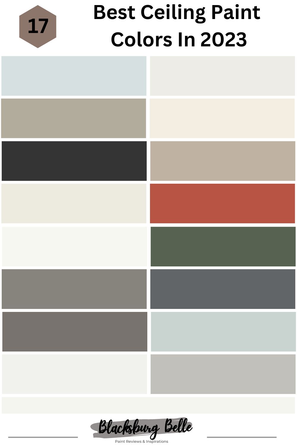
Now that we’ve established the basics, we’re delving right into the list of exciting colors you can use for your ceilings. The list favors a lot of white colors because ceilings are most often painted in matte white colors due to the timeless and classy nature of whites, however, we also have added other colors to keep things exciting if you are looking to explore beyond white.
1. Iceberg 2122-50 by Benjamin Moore
| RGB | 215, 225, 225 |
| LRV | 71.1 |
| Undertones | Gray, slight green |
| Matching colors | African Violet, Snow White, Cloud White, Cumulus Cloud |
Take a look at the scintillating goodness of this delightful blue-gray color. It’s that sophisticated, cool color you need to make your room look refreshing. Trust this color to sit pretty on your ceiling while making your space appear brighter, serene, and peaceful. Trust Iceberg to do well with your decor style, whether it’s a coastal, traditional, or cottage decor style you have going on. Use this color if you want your ceiling to evoke serenity and calmness, and still want to keep things looking interesting.

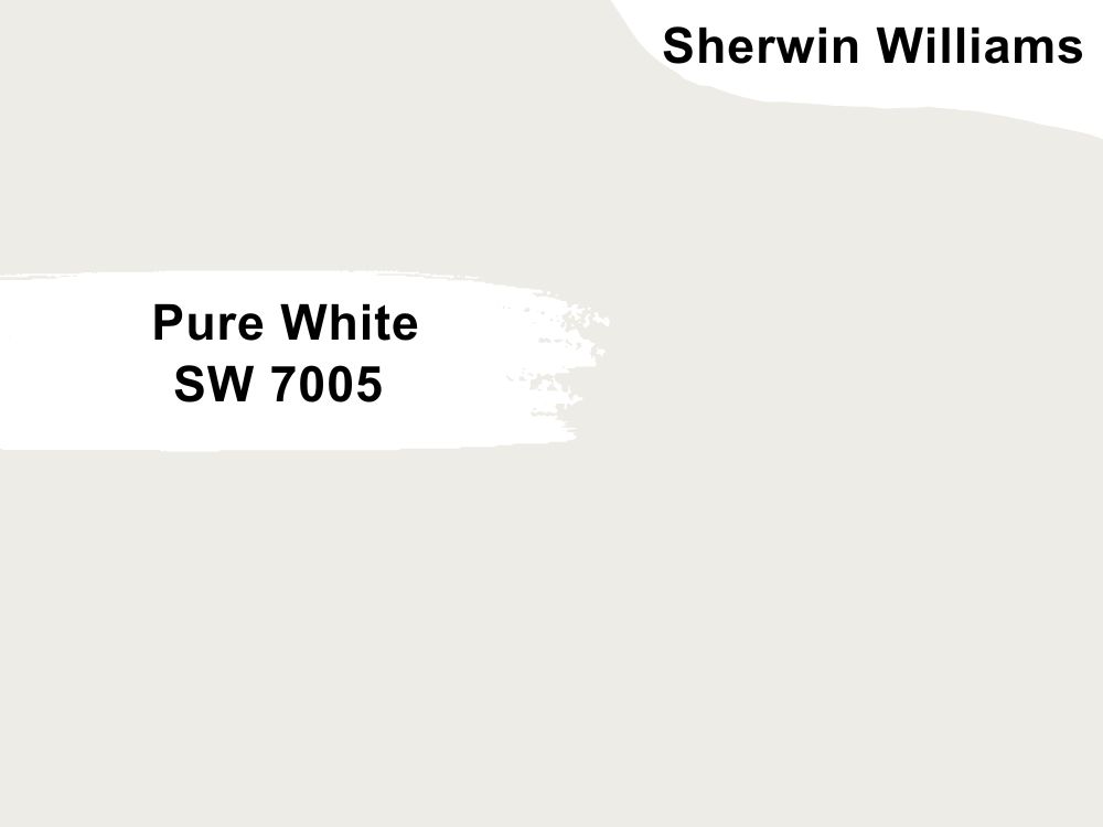
2. Pure White SW 7005 by Sherwin Williams
| RGB | 237, 236, 230 |
| LRV | 84 |
| Undertones | Slight yellow |
| Matching colors | March Wind, Perle Noir |
Pure white is the perfect marriage between creamy and stark, birthing this beautiful, soft, and impressive shade of white that’s just right. Pure White is soft, and highly versatile which makes it an ideal choice for lots of places in your home. As a ceiling color, it’s so beautiful as it can help larger rooms appear larger and brighter, and smaller rooms appear more spaced out as well.
Under Southern light exposure, pure white leans into its warmth and turns slightly yellow. Under northern light exposure, pure white will take on its clean, and crispy side as it may not come off as very soft.
3. Gateway Gray SW 7644 by Sherwin Williams
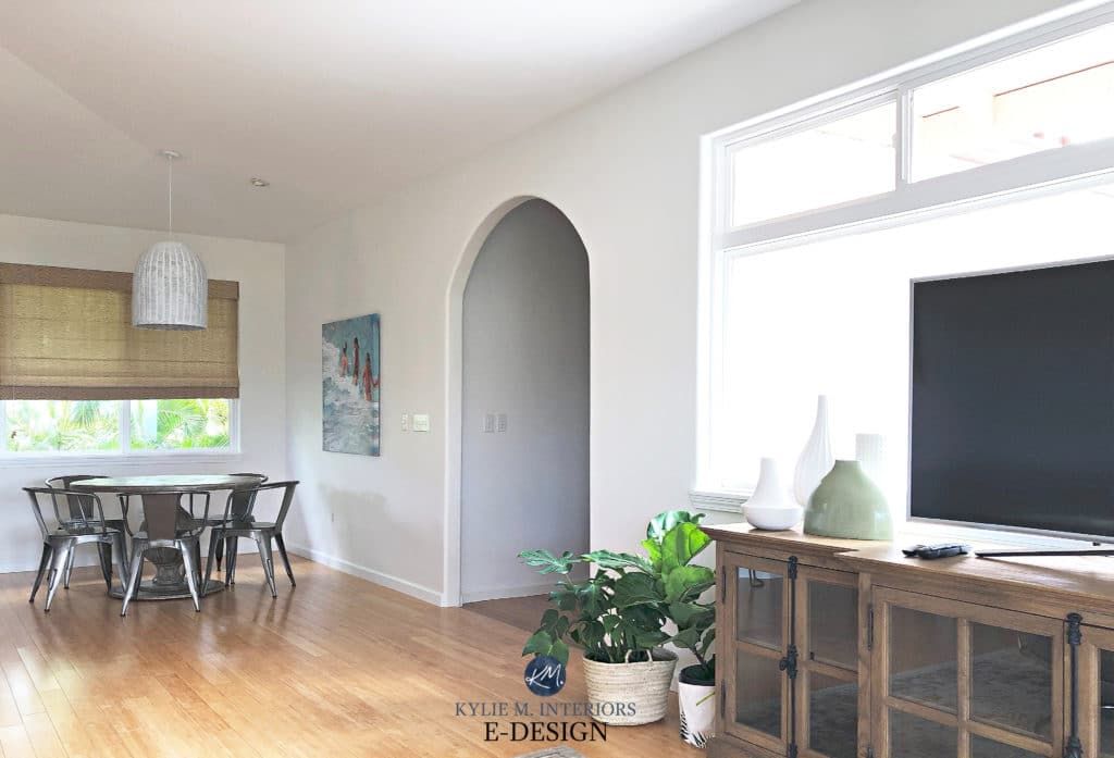
| RGB | 178, 172, 156 |
| LRV | 41 |
| Undertones | Green |
| Matching colors | Virtual taupe, Shoji White, Aesthetic White, Samovar Silver |
Grays are highly regarded because of their ability to appear sophisticated, while also keeping their muted tones.
This neutral, gray color with green undertones is everything beautiful and more! It’s a calming color that brings warmth into any space you put it in. Use this wonderful color for your ceiling if you’re searching for a warm color that won’t leave your room feeling sterile. Choose this color if you’re aiming for a blend of warmth and serenity.
4. Cloud White OC-130 by Benjamin Moore
| RGB | 243, 238, 225 |
| LRV | 85.05 |
| Undertones | Slight taupe |
| Matching colors | Pale Oak OC-20, Champion Cobalt 2061-20 |
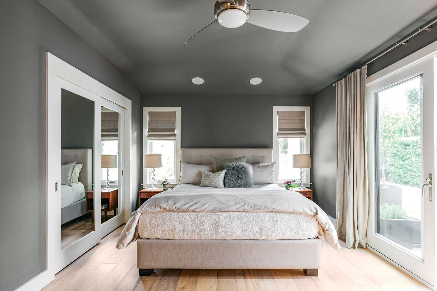
This wonderful white color is great at accentuating the beauty of your home’s design without stealing the show. This white color is soft, and warm and will make your home feel both brighter and more inviting. This color has enough warmth to qualify as a tad bit creamy but isn’t yellowy at all.
Use this beautiful color if you want to avoid any whites that have white undertones. Against a whiter background, cloud white may not appear to be as white as it will lean into its creamy side, however, trust this soft, white color to evoke feelings of ease and tranquility.
5. Onyx 2133-10 by Benjamin Moore
| RGB | 53,52,52 |
| LRV | 4.99 |
| Undertones | Black, Gray |
| Matching colors | Gray Owl, Gypsy love, White Dove, London Fog |
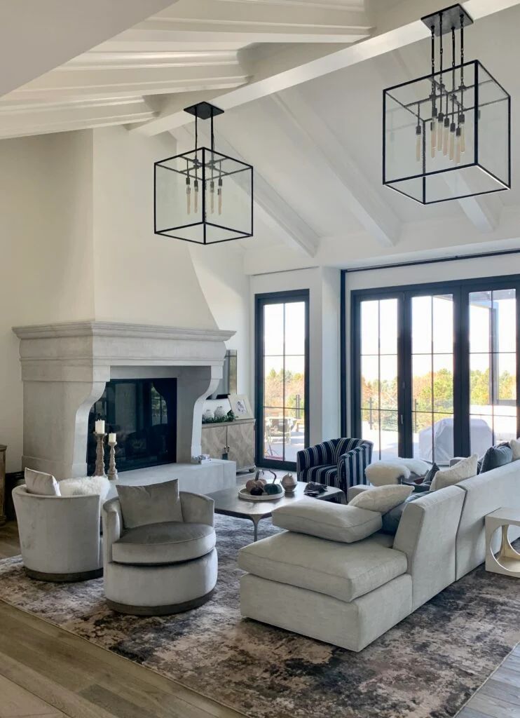
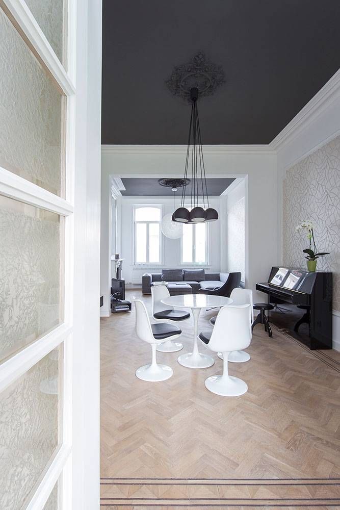
This luxurious black definitely deserves a place on the list! This true black is an ideal choice if you want your room to feel moody and luxurious, and dramatic. However, while this color can be a beautiful ceiling color, you have to be very sure that you are comfortable with a dark color because onyx is actually very dark.
If done nicely, onyx will make a dramatic statement, while also giving life to the other colors around it. We would also recommend that you use this color in rooms where you want a moody look but have tons of artificial lighting. Avoid using this for your ceilings in rooms where you would typically prefer lots of lights, for example, your laundry room.
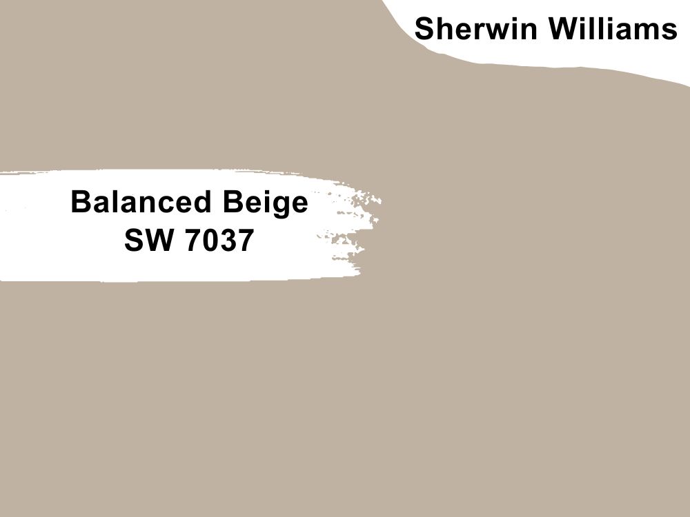
6. Balanced Beige SW 7037 by Sherwin Williams
| RGB | 192 ,178,162 |
| LRV | 46 |
| Undertones | Taupe, or green(rarely) |
| Matching colors | Stucco, Aesthetic White, Peppercorn |
This balanced, warm color is a dream come true for many people who desire to see colors that are right in the middle of gray and full-blown beige colors. Even though this color is in the middle, it isn’t a greige color as it still. more beige than greige but isn’t your usual beige as well. Be careful around using gray or greige colors that are lighter than this color in your room if you use this as a ceiling color, as this doesn’t usually turn out well. However, if you take a chance at this color, your room will look beautiful, timeless, and bold.

7. Alabaster SW 7008 by Sherwin Williams
| RGB | 237, 234, 224 |
| LRV | 82 |
| Undertones | Subtle beige |
| Matching colors | Townhall Tan, Dakota Wheat |
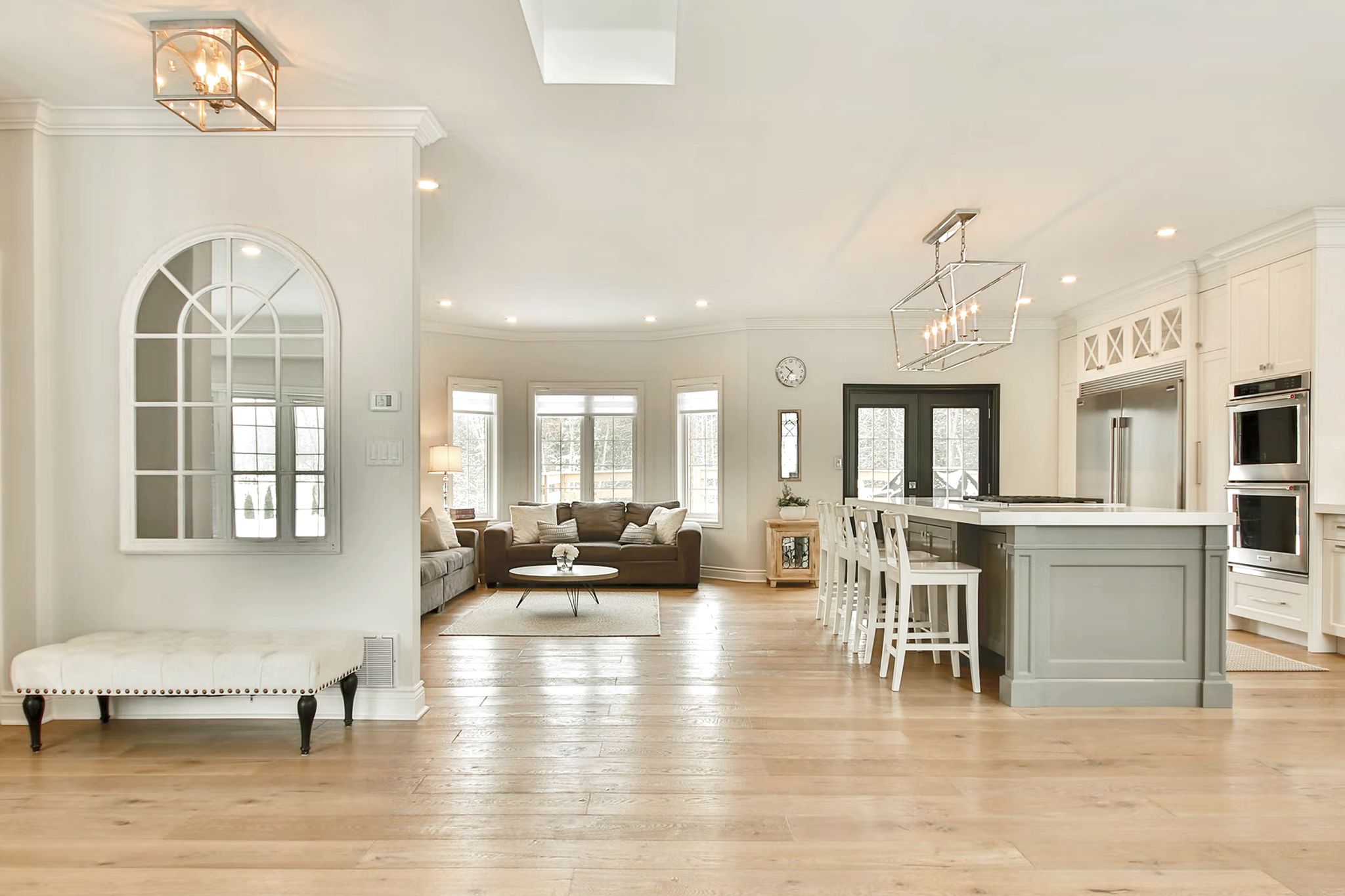
Looking for a soft, white color that would give your home a modern twist? Then what you need is Alabaster white. This balanced white is just what you need to make your space feel clean, airy, and yet not sterile. It also contracts quite nicely with gray and black colors. This white is a great choice because it is easy to use, versatile, and warm yet not creamy enough to flash yellow. As far as white ceiling paints go, this is one of the safest you can use.
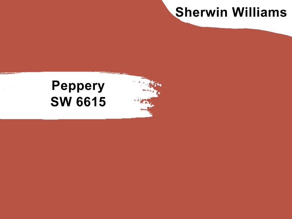
8. Peppery SW 6615 by Sherwin Williams
| RGB | 184, 84, 68 |
| LRV | 17 |
| Undertones | Red |
| Matching colors | Coriander Powder, Faint Coral, Casa Blanca |
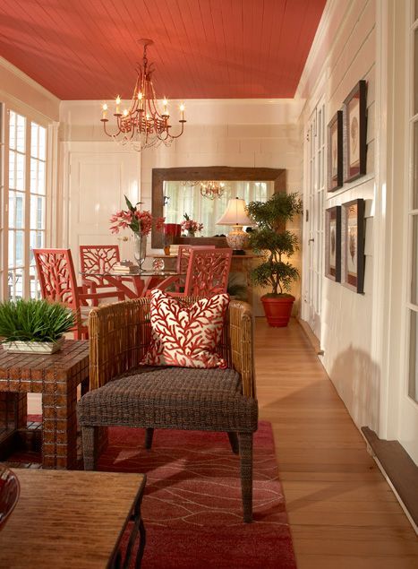
This deep, bold orange color makes the list because designers are welcoming bolder colors for ceilings in 2023. One of the ways they make it work for homeowners would love to try but are still cautious of having a hold blast of color. Ceiling beams. Bolder colors can be used for ceiling beams too and turn out beautifully well.
A perfect example is Peppery by Sherwin Williams. This bold, mid-toned color tends to be on the darker side, but still looks awesome and manages to have somewhat muted tones. If you’ve got the guts, and earth-toned furniture style to match, go for it in say a place like a dining room and watch your room come to life with a bold blast of color.
9. High Reflective SW 7757 White by Sherwin Williams
| RGB | 247,247, 241 |
| LRV | 93 |
| Undertones | Slight blue |
| Matching colors | Favorite Tan, Underseas. |
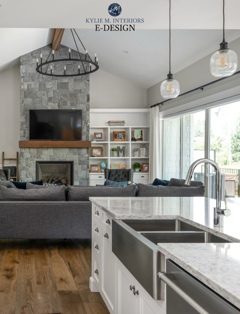
Lovers of white would absolutely love this Sherwin-Williams color because it’s practically one of the brightest white colors you’ll ever find. Use this color to make your room feel bright, spacious, and airy. This is the perfect white to use if you want your room to appear bright, clean, and crisp.
10. Backwoods CC-630 by Benjamin Moore
| RGB | 88,98,81 |
| LRV | 12.68 |
| Undertones | Brown (barely) |
| Matching colors | Dune White, Fieldstone, Boothbay Gray, White Dove |
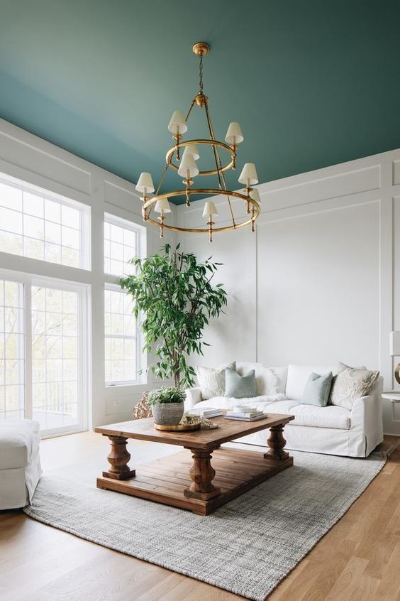
This timeless, dark green color is such a delightful color that pairs well with white, gray, and wood tones. This natural, gorgeous green color is such a delight because it gives off a forestry green feel that’s both calming and beautiful. It is very versatile, and a unique way to bring your ceiling to life. Use this color also if you’re looking to avoid bluish or gray undertones.
This color is the perfect blend of warmth, coziness, and depth. In a room with southern light exposure, backwood is likely to lean into its warmth and flash brown in some places. In a dimly lit room, it pretty much stays the same, which is its cozy shade.
11. Chelsea Gray HC-168 by Benjamin Moore
| RGB | 134, 131, 123 |
| LRV | 22.83 |
| Undertones | Rich Brownish Violet |
| Matching colors | Concord Ivory, Lemon-chiffon, Angelica, Sanctuary |
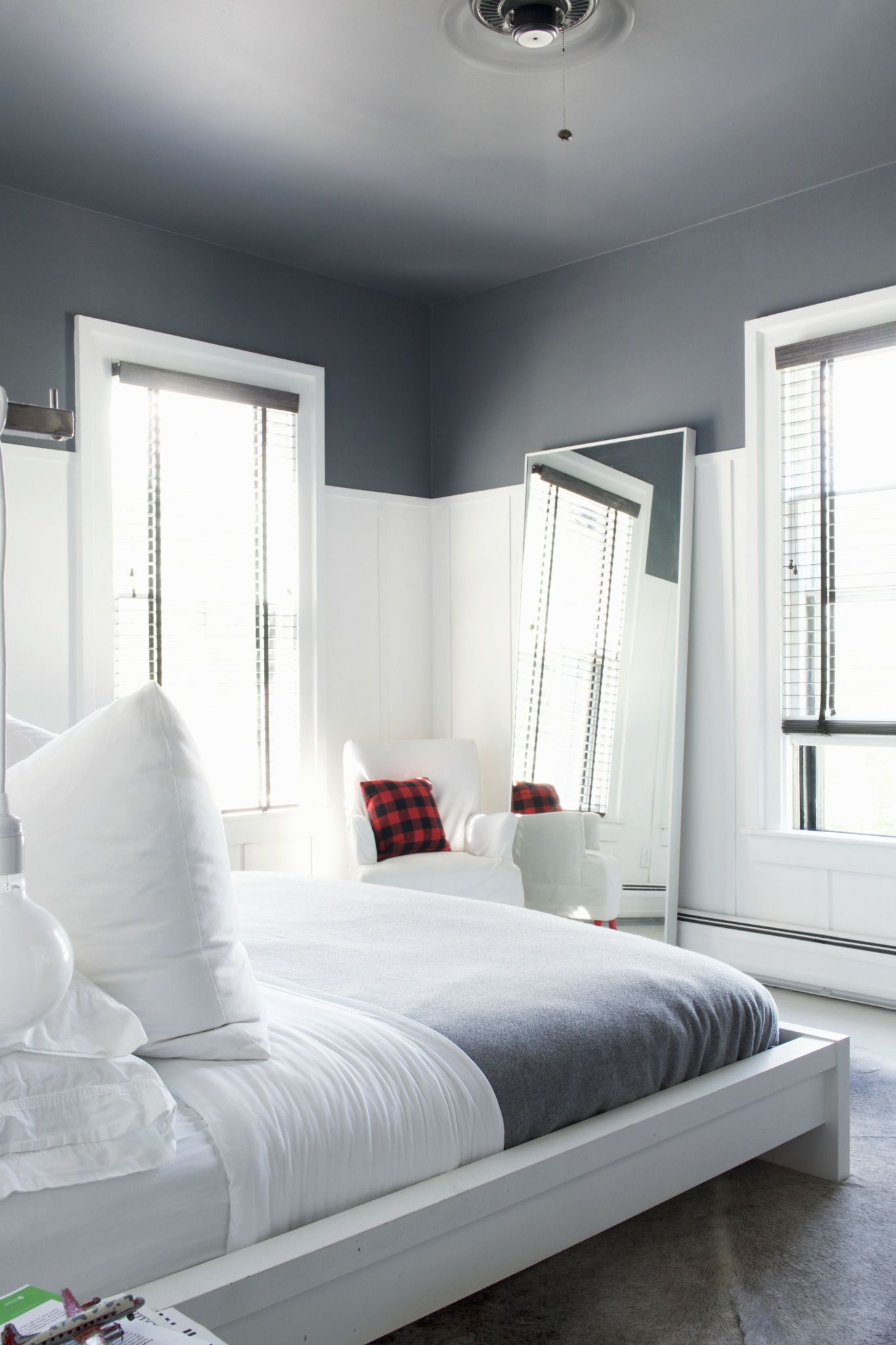
This delectable, handsome gray is popular for a lot of reasons, and it’s not hard for us to see why. It is warm, gentle, and just the thing you need if you are working with a smaller space. Chelse Gray has a calming effect on any room and can be used to evoke feelings of peace and tranquility.
In a room with northern light exposure, Chelsea Gray will maintain its grayness, and with southern light exposure, Chelsea Gray will lean into its warm side, and let its warmth shine through. This charcoal color is loved because it’s highly flexible and goes with a ton of white colors like BM’s White Dove and SW’s High Reflective white. Use this wonderful mid-toned, earthy, charcoal color to create a homey and peaceful feel in your home.
12. Stormy Sky 1616 by Benjamin Moore
| RGB | 98,101,104 |
| LRV | 13.75 |
| Undertones | Navy, gray |
| Matching colors | Yukon Sky, White Dove, Baby’s Breath, Bleeker Beige |
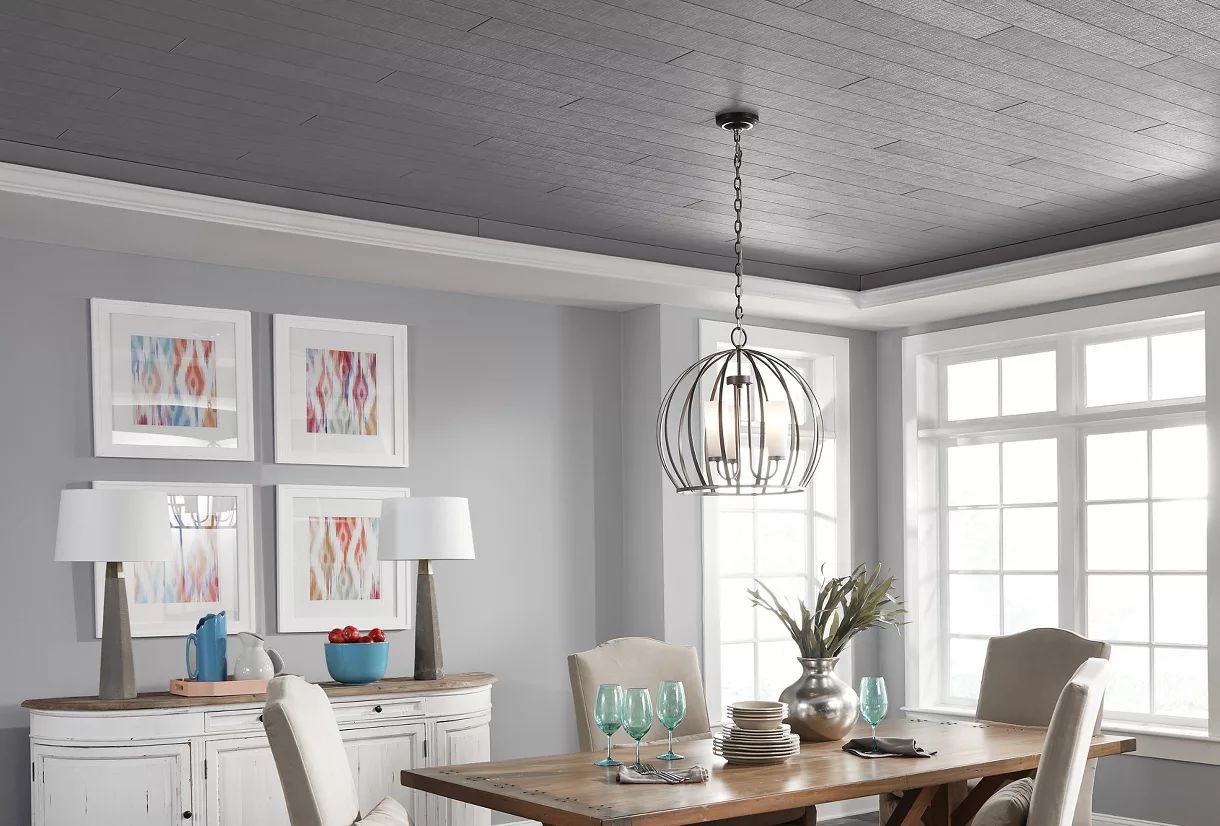
This classy, saturated blue color is a brilliant color to use for your ceilings if your aim is to have a cool-looking, tranquil room. Stormy Sky brings out the best in your home by giving off a classy and tranquil feel. There have been arguments that this is a gray color, but when applied you’ll notice the blue hue strongly comes through.
This color is especially good for those who want a charcoal, “navyish” blue that’s not entirely blue. Want to know what this color would feel like? The picture storm clouds and you have your answer.
13. Gauntlet Gray SW 7019 by Sherwin Williams
| RGB | 120, 115, 108 |
| LRV | 17.20 |
| Undertones | Muted Violet |
| Matching Colors | Repose Gray, Eider White, Armagnac |
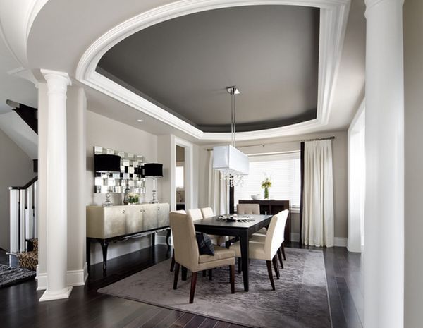
Experience the sheer bliss of this warm, mid-toned gray color. Lovers of gray who are searching for a little warmth will be impressed by this color. Gauntlet Gray isn’t as cold as some traditional gray and will look warm under most lighting settings.
Even under northern light exposure, it will maintain some of its warmth. Use this Gray color for your ceiling if you’re angling for a color that will blend both neutrality and drama. However, be careful about pairing Gauntlet Gray with colors that are lighter and cooler than it.
14. Pale Smoke 1584 by Benjamin Moore
| RGB | 201, 211, 208 |
| LRV | 63.6 |
| Undertones | Blue |
| Matching Colors | White Diamond, Sebring White, Mount Saint Anne, White Dove |
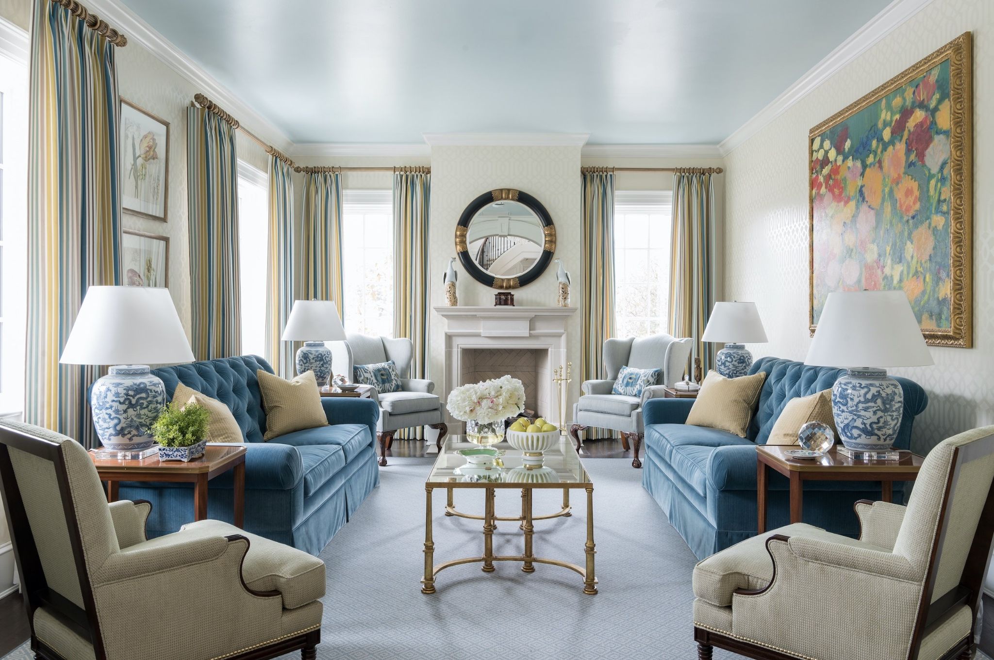
Although described as a blue-gray color by Benjamin Moore, this color is closer to being a moody, green color. A perfect color for a bedroom ceiling, this color is just what you need to introduce beauty and serenity into your space. Many designers swear by this color because it’s so light, cool, and translucent. Use this color if you’ve used agreeable gray for any project, and are searching for something that looks pretty much like it but also has its own twist.
15. Super White OC 152 by Benjamin Moore
| RGB | 255, 255, 255 |
| LRV | 83.76 |
| Undertones | Slight cool, Blue |
| Matching colors | Pure White, Hale Navy, Juneau Spring, Horizon |
This highly popular, best-selling white paint is just the thing you need to add a simple elegance to your home. It’s very versatile and does very well in reflecting lights, so expect things to look quite bright and airy with this color on your ceiling. This white is bright, clean, and crisp and will bring these elements into your home, thereby making your space feel clean and sharp. This white is often used with modern-styled rooms. Use this color to refresh things in your home, and maintain a subtle sense of sophistication.
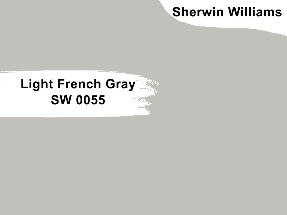
16. Light French Gray SW 0055 by Sherwin Williams
| RGB | 194, 192, 187 |
| LRV | 53 |
| Undertones | Blue tones( especially with rooms that have Northern Light exposure), purple (rarely, but quite possible). |
| Matching colors | Origami White, Gentle Grape |
A true gray at heart, this light gray color is an absolute delight for your ceiling projects.
This color is great because it perfectly balances warm and cool tones and doesn’t flash any strong undertones at all. However, if your preference is a cooler color, you should know that LFG tends to be more of a cooler gray than a warm one. Under northern light exposure, LFG will absorb the cooler light and lean into its cooler side, in fact, you’re likely to find its blue undertones. Under Southern light exposure, LFG will look brighter and lighter and lean into its warmer side.

17. Chantilly Lace OC 65 by Benjamin Moore
| RGB | 245, 245, 239 |
| LRV | 92.2 |
| Undertones | Slight gray/blue (Northern light exposure) |
| Matching colors | Edgecomb Gray, Seapearl, Horizon, White |
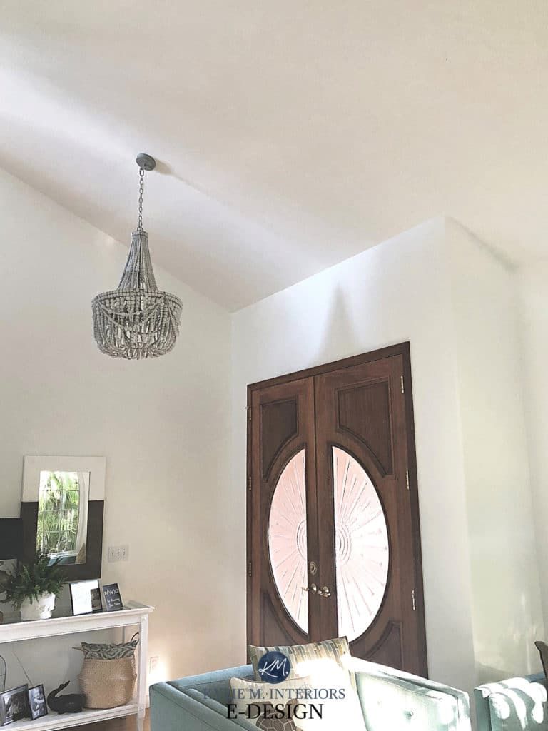
Say hello to this delectable, silky color that many designers swear by. It’s beautiful, soft and looks good in practically any setting. It’s a great color for emphasizing the beauty in the room without taking the stage. With this beautiful white, you can be sure of your room looking soft, crisp, and modern.
Use Chantilly Lace for your ceilings if you want a color you would still be in love with several years down the line, and are also looking to ditch colors with yellow undertones. This beautiful white will make your home feel bright, white, and crisp without ever feeling stark.
Overview
Whether you’re aware or not, your ceiling is an important part of your home. Your ceiling is probably about one-sixth of your room and would therefore definitely influence how things look. Talking about ceiling painting is fun because this is usually a part most people tend to ignore till it’s time to get down to it. However, your ceiling affords you a world of opportunity to make your home or room stand out. Here are some tips that would be helpful as you embark on your painting project:
Tips Before & After Painting
If you’re painting your walls and ceilings at the same time, it’s usually advisable to paint your ceilings first, this is to ensure you don’t splatter paint on your freshly painted walls.
You also need to protect your furniture by either moving it away from the area to be painted or wrapping it with plastic wrap. In terms of finishing, it’s always advisable to go for a flat as it can be quite useful for hiding blemishes and imperfections in your painting.
You also want to ensure that you are covering the entire ceiling area. For safety purposes, make sure you take out smoke detectors, and fire sprinklers as these should never be painted over. You can however leave the faceplates.
Vacuuming the ceiling before painting actually helps because you get rid of dust, and have the chance to sand or repair any cracks you see.
With every painting project, it’s wise to err on the side of caution and sample paint colors before embarking on your painting project. Sampling will give you the opportunity to observe the color throughout the day under different lighting conditions.

