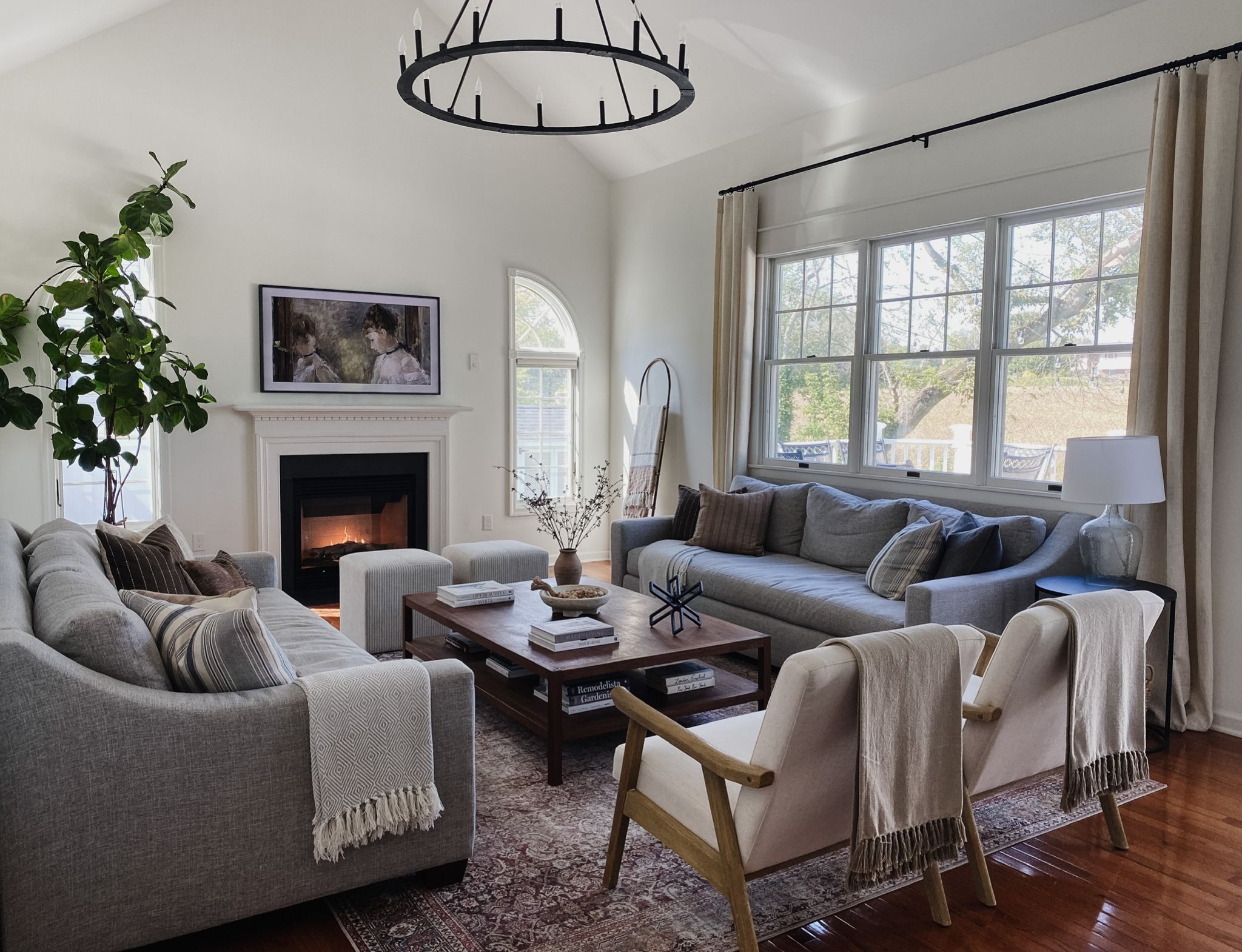
Setting up and decorating a farmhouse may look simple, but it is not always that way. From the decor style and furniture to the appropriate paint colors, the to-do list is endless. This applies whether you are going for a rustic look, a modern design, or a mix of both. Even paint colors are not so easy to choose.
How do you pick the best farmhouse paint colors, especially the trending ones in 2023? We have researched and narrowed the list of the 15 best ones from Sherwin Williams and Benjamin Moore. Let’s get into it to help you choose the most suitable farmhouse paint color.
Table of Contents
Selecting Farmhouse Paint Colors: What to Consider
In your excitement, you may forget that rooms in a farmhouse have different purposes. Consequently, these purposes are vital to the paint color of choice. Of course, this depends on the overall look you want for the entire decor, but some colors, such as neutrals, are indispensable.
1. Existing Decor
If it is a new farmhouse you are decorating, the task of selecting the best farmhouse paint color is not so tedious. You can use neutrals as a backdrop and put a bit of vibrant color in the foreground. Also, you can accurately choose the furniture and accessories that will match the colors.
However, if there is an existing decor, you must check how other colors will fit into it. For example, if there are neutrals predominantly in the decor, bold and saturated colors will make a significant but sophisticated splash. And if there are bold colors, use neutrals to complement them.
2. Room Use
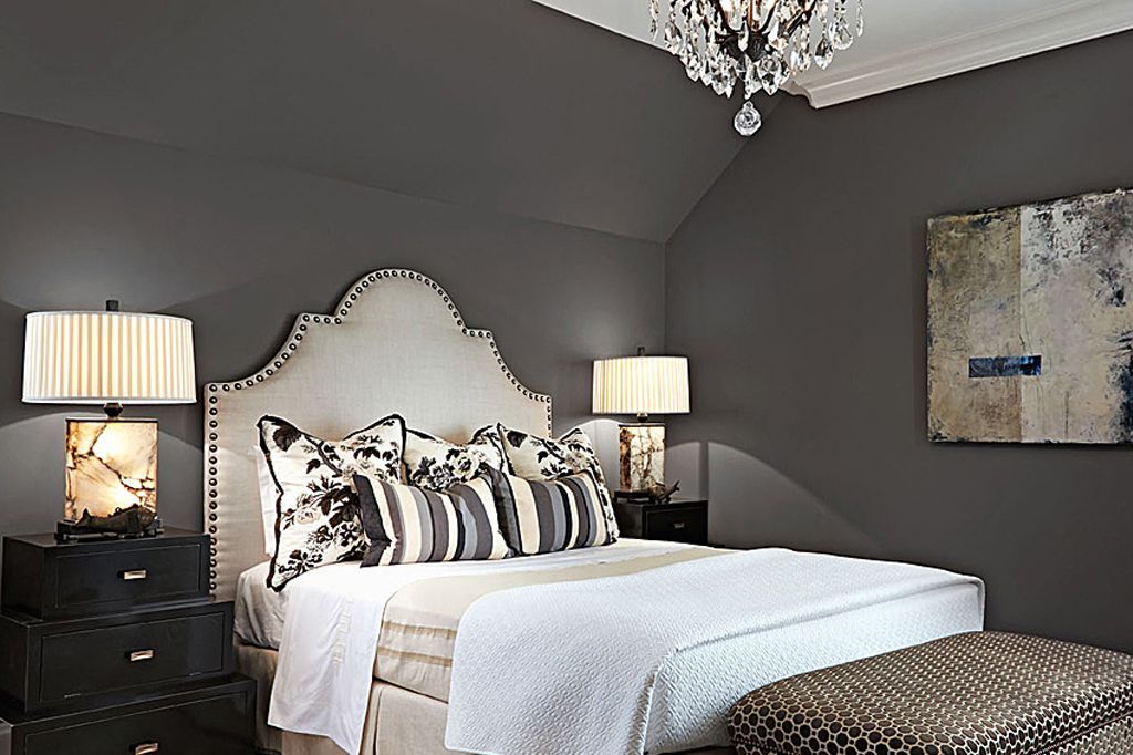
Deep and rich hues may work best on accent walls in bedrooms while using neutrals as the main color theme. That way, the bedroom that should be a place of rest does not feel overwhelming or broody. That is unless dark themes are your style.
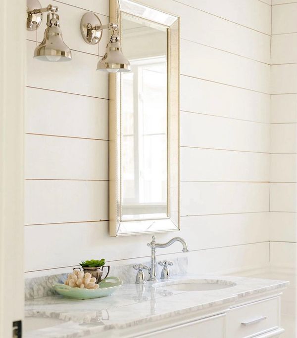
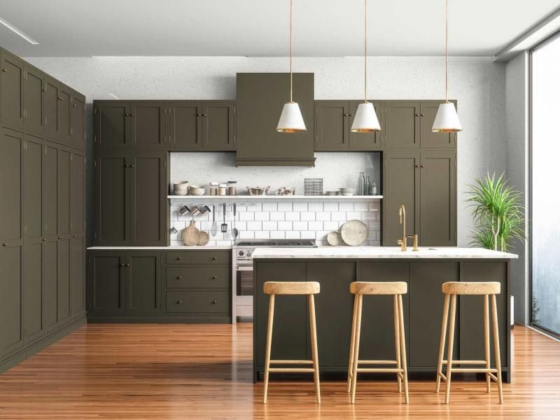
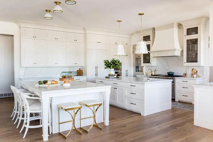
But you can use dark and saturated colors in your living room or dining area. Alternatively, use the colors on accent walls and complement them with lighter colors. Kitchens look excellent in neutrals and a bit of dark color for the cabinets, but you can always make the entire theme light.
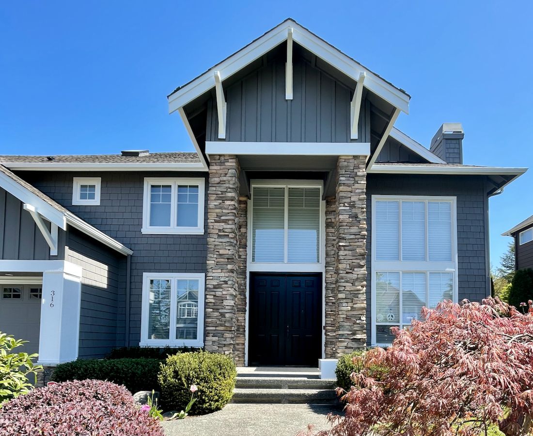
We would like to add that the exteriors of a farmhouse are selective in paint colors. Dark and warm colors are excellent choices for this purpose, so you may want to choose dark and saturated colors and lighter ones for the trims to soften them.
3. Lighting
Another vital factor is the lighting in a room. Colors change according to the lighting in a room: south-facing rooms get a lot of sunlight, while north-facing rooms are the opposite. A room facing west gets muted sunlight in the morning and more warm light in the afternoon.
Since the sun rises from the east, an east-facing room gets the first burst of sunlight in the morning and drops as the sun moves higher into the sky. These directions are key in what color you use, especially if you consider the tones and hues.
There is also the light reflectance value (LRV) to consider; it is the amount of light a paint color can throw back into a room. The higher the LRV of the paint color, the brighter it will make a room appear. This alone can change how you view any room, especially if you want a specific decor.
4. Paint Finish
Paint can have a high gloss, semi-gloss, satin, eggshell, or matte finish, and each has a specific look and purpose. The purpose of each room will determine the finish you choose. The same applies if the paint is for the exterior of the farmhouse.
For example, it is best to use a gloss finish for a kitchen because of the traffic it sees per day. The same is true for stairs and hallways. But bedrooms and living rooms may work better with paint that has an eggshell or matte finish.
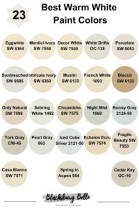
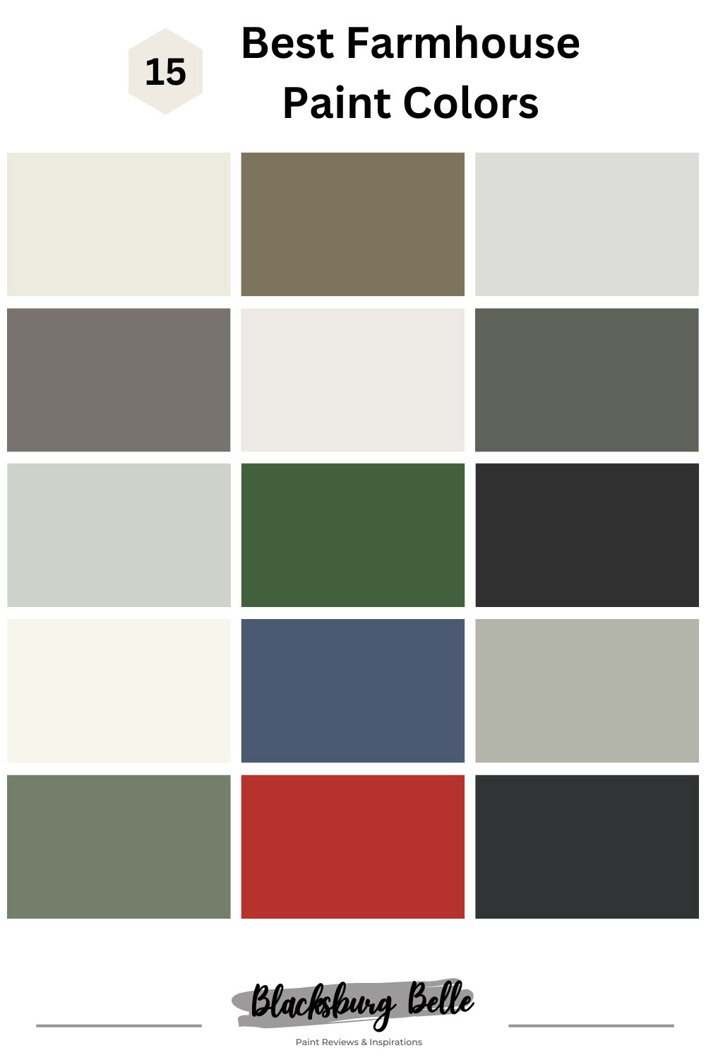
15 Best Paint Colors for Your Farmhouse Interiors and Exteriors in 2023
The following are some of the best farmhouse paint colors from Sherwin Williams and Benjamin Moore to consider in 2023:
9 Best Farmhouse Paint Colors from Sherwin Williams
1. Alabaster SW 7008
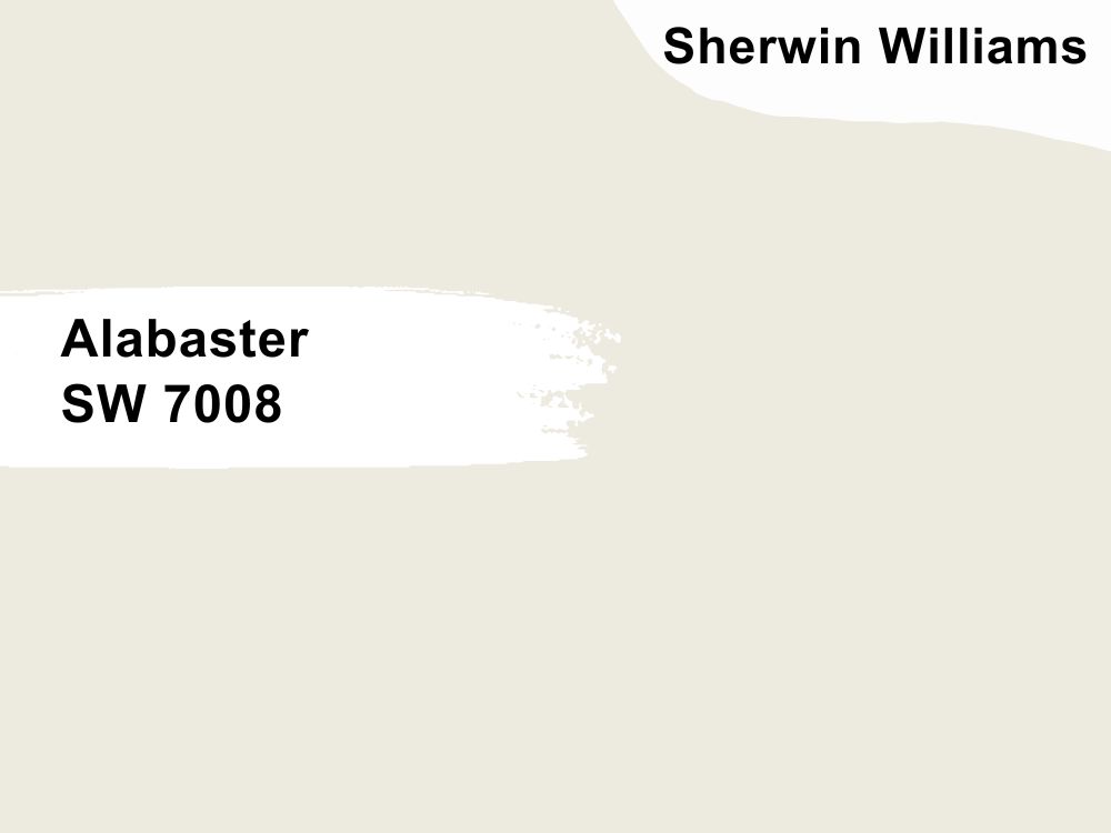
Warm white paint color with subtle undertones
We like this color from Sherwin Williams because of how versatile it is. The subtle undertones mean it can lean warm or cool, depending on the surrounding elements and lighting in a room. And the color peeking out from under all the white removes the blandness that is typical of white paint colors.
With an LRV of 82, you already know it reflects a lot of light into a room. Imagine how bright and fresh a kitchen or living room becomes if you go all Alabaster on it with splashes of color here and there. The same is true for a bedroom or powder room. Alabaster has an RGB color code of 237, 234, and 224 respectively. Coordinate it with Dakota Wheat and Townhall Tan.
2. Messenger Bag SW 7740

Warm dark green paint color with gray undertones
Who says gray and green have to be boring? The dark green shade of Messenger Bag makes it an excellent choice for a farmhouse, whether you want a warm and inviting interior or a unique exterior. Its color is like a mixture of green and brown, which is ideal for complementing wood tones.
The best part of this paint color is that you can throw in other colors without causing a color commotion. This may be because of the gray peeking out from the beautiful melange of green and brown. Although its LRV is low at 18 and it has an RGB color value of 125, 116, and 94 respectively, it still provides a coziness that invites and wraps around you. Coordinate it with Lucent Yellow, Creamy, and Dover White.
3. Fleur de Sel SW 7666
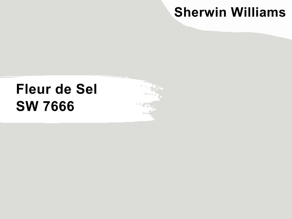
Cool white paint color with slightly green undertones
Whites have interesting shades, and Sherwin Williams Fleur de Sel is such a cool and calm white with a green undertone that you hardly notice. But as we mentioned, the color of the paint may change with different lighting, especially with a high LRV of 72.
While it is such a delicate and soft color, Fleur de Sel is versatile because it complements all colors. Never mind the slightly green tone; it is too subtle to interrupt the color. It has an RGB color value of 220, 221, and 216 respectively, which explains the green. Coordinate it with Carley’s Rose, March Wind, and Extra White.
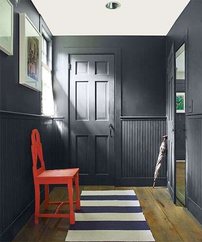
4. Gauntlet Gray SW 7019
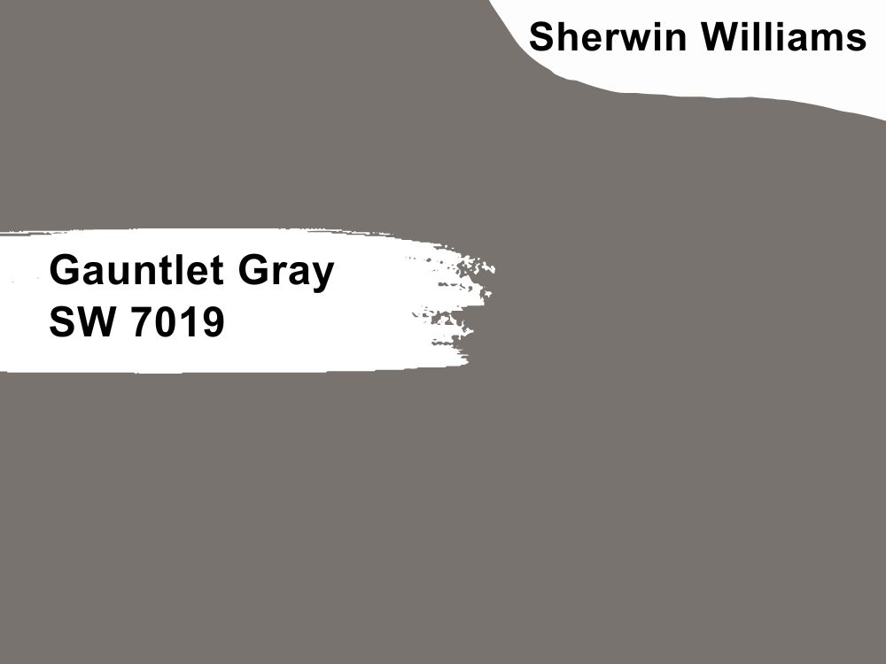
Warm dark gray paint color with a greige undertone
You can get bold with your decor with Gauntlet Gray. It is a dark paint color with striking attributes because of the greige undertone. Instead of looking drab as many dark grays are wont to do, it shows some liveliness that blends well with light neutrals like pure white.
Gauntlet Gray is an excellent choice for your bedroom, living room, powder room, or house exterior. Make your farmhouse stand out with this color as an exterior color. With an LRV of 17 and an RGB color code of 120, 115, and 110 respectively, consider coordinating it with Armagnac, Repose Gray, or Eider White.
5. Snowbound SW 7004

Cool white paint color with a gray undertone
There is a reason Snowbound emerged as the color of the month for September 2022. It is a serene white that evokes calmness. If you want a sweet color to use as a background for vibrant colors or the entire decor, Snowbound should be one of the neutrals to consider.
Go for a white paint color that pops, especially with its LRV of 83. Snowbound has an RGB color code of 237, 234, and 229 respectively. Because of this color’s lightness, Autumn Orchid and Colonnade Gray are excellent coordinating color choices.
6. Pewter Green SW 6208
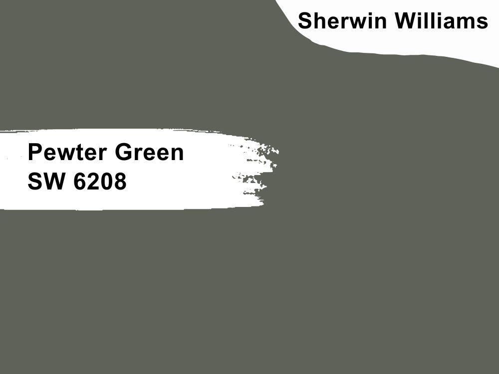
Cool green paint color with neutral tones
So, this color is dark and muted, but it has a bit of gray undertones. A few designers say it has an almost metallic look to it, but that depends on how and where you use it. We do know, however, that Pewter Green is a great choice for the exteriors and interiors of a farmhouse, especially if you are going for that earthy look and feel.
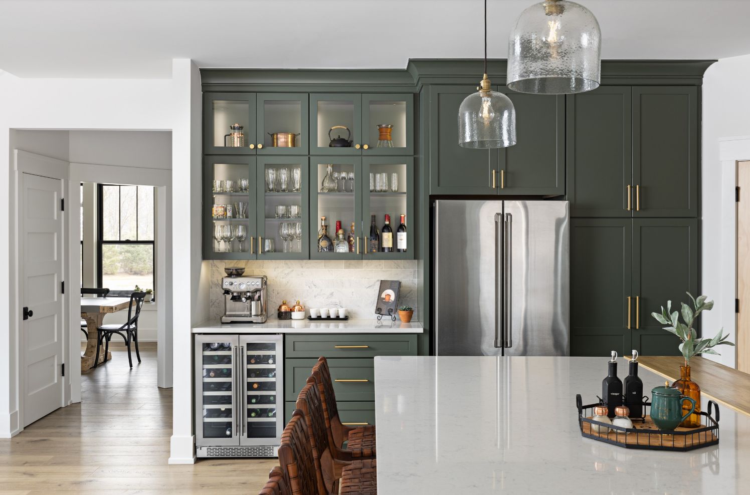
Pair it with wood tones and white colors to keep it in check. With an LRV of 12, which is pretty low, and an RGB color code of 94, 98, and 99, you have an idea of how neutral this paint color can appear in different settings. For the best results, consider coordinating it with Silverist, Shoji White, and Spare White.
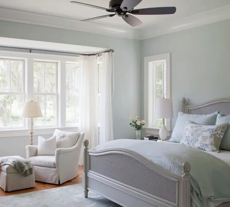
7. Sea Salt SW 6204
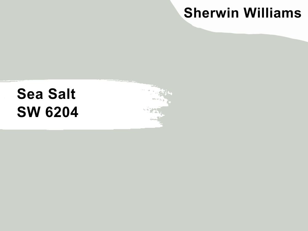
Cool green paint color with blue undertones
Soft pastels are always in vogue, and Sea Salt is one out of many. We love it because of how light it is and the freshness it brings to any decor. Create a relaxing and soothing atmosphere in your bathroom, bedroom, or living room with this paint color.
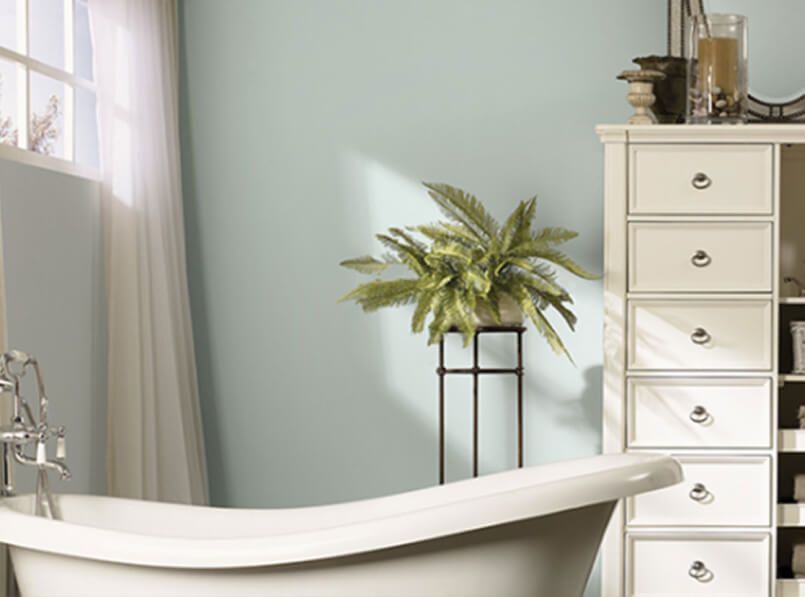
With an LRV of 63, Sea Salt reflects a good amount of light to keep any room bright. And with an RGB color code of 205, 210, and 202 respectively, the paint color has enough neutrality to complement all colors. Match it with colors like Summit Gray, Fleur de Sel, and Spare White for spectacular decor.
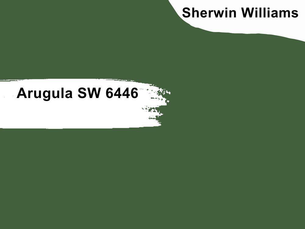
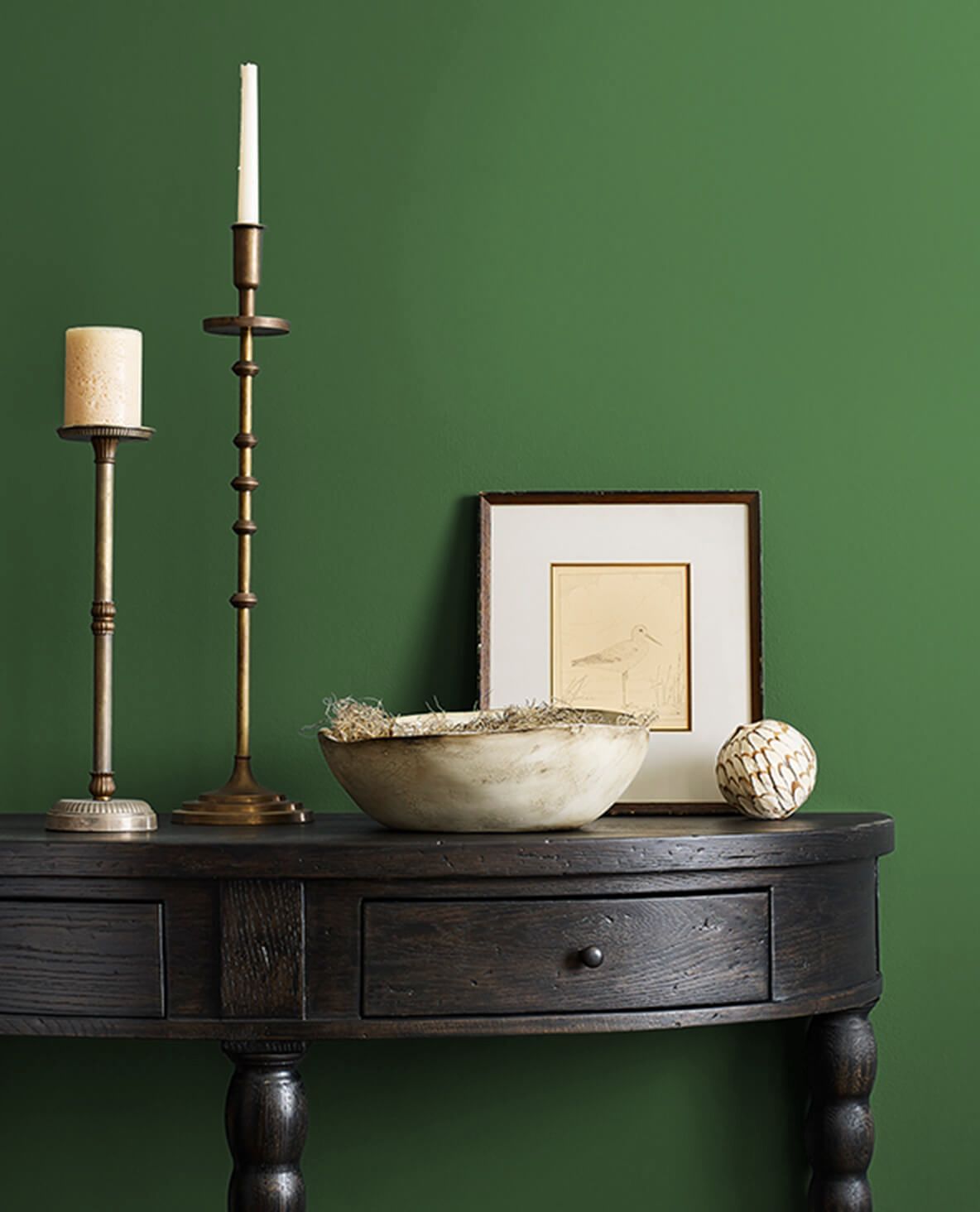
8. Arugula SW 6446
Cool green paint color
This bright green color brings to mind a thriving garden on a spring morning. It is considered a neutral color because of the little or no undertones, so it is perfect for complementary colors. You do not have to worry that the hue will change if the lighting changes.

But because of its peculiar color, it may be best to use it on accents and doors. That is not to say it does not fit other walls or areas of your farmhouse. Arugula has an LRV of 10 and an RGB color balance of 66, 96, and 60. Use it as an entryway color choice for a farmhouse. Consider coordinating it with Chopsticks, Cardboard, and White Mint.
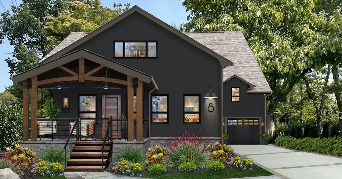
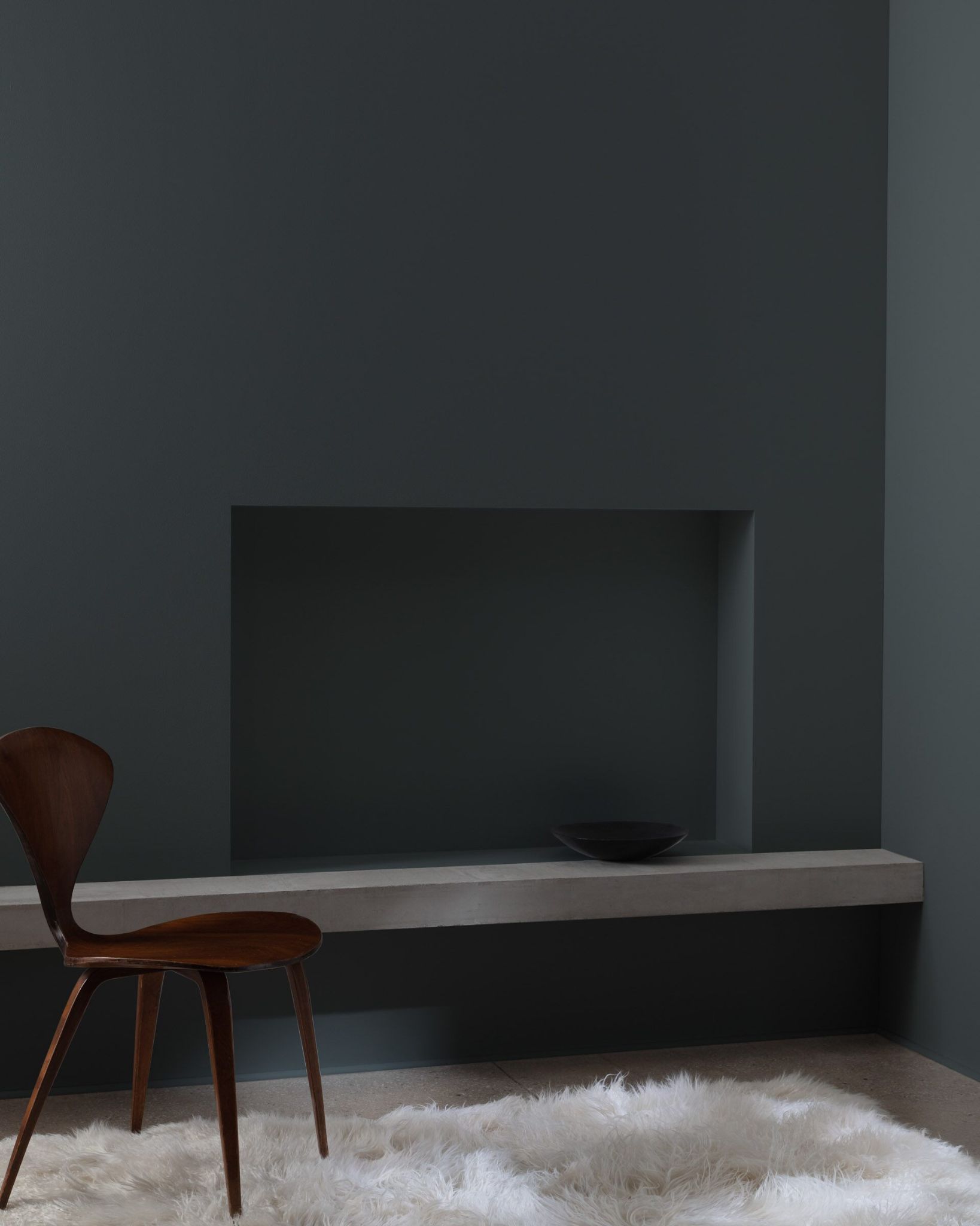
9. Caviar SW 6990
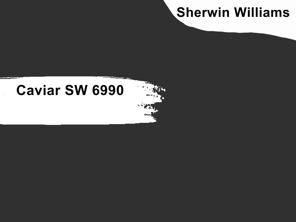
Cool black paint color with neutral tones
Caviar is one of the deepest shades of color from Sherwin Wiliams. As a true black, it has no undertones, so it is an admirable neutral that fits any color scheme, whether it is warm or cool. If it appears too saturated, use it for accent walls or the exterior of your farmhouse, although dining rooms look stately when Caviar is paired with light neutrals.
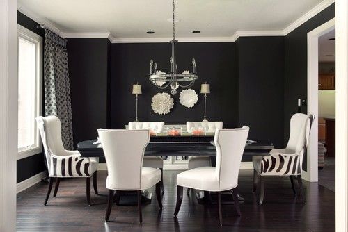
Caviar has an LRV of 3 and an RGB color code of 49, 48, and 49 respectively. Coordinate it with colors such as Oh Pistachio, Taupe Tone, and Snowbound from Sherwin Williams. You can find other colors that work well with Caviar because it is a true black.
6 Best Farmhouse Paint Colors from Benjamin Moore
1. Simply White OC-117

Warm white paint color with subtle yellow tones
Simply White does not select colors or decor; it is versatile enough for any room. You can opt for an all-white kitchen that opens into a living room in your farmhouse and use this paint color. Its subtle yellow undertones take it from just plain white to something more exciting.

It has an LRV of 89.52, which means it can reflect a lot of light. So, while it is a great color to stand alone, note that it may appear too bright if you want some somberness. Simply White has an RGB color code of 246, 246, and 237 respectively. Match it with Silver Satin and Casco Bay or Dovewing and Somerville Red.
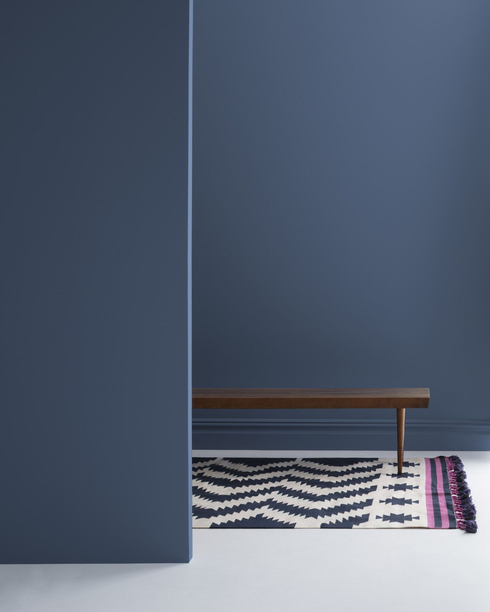
2. Kensington Blue 840

Cool blue paint color with slightly gray undertones
Blue will always be one of the best colors to use in any decor, and a farmhouse is no different. Kensington Blue has a bit of gray in it, which gives a slightly slate look and feel. Because of this, the paint color is not too vibrant or too dull, perfect to complement different colors.
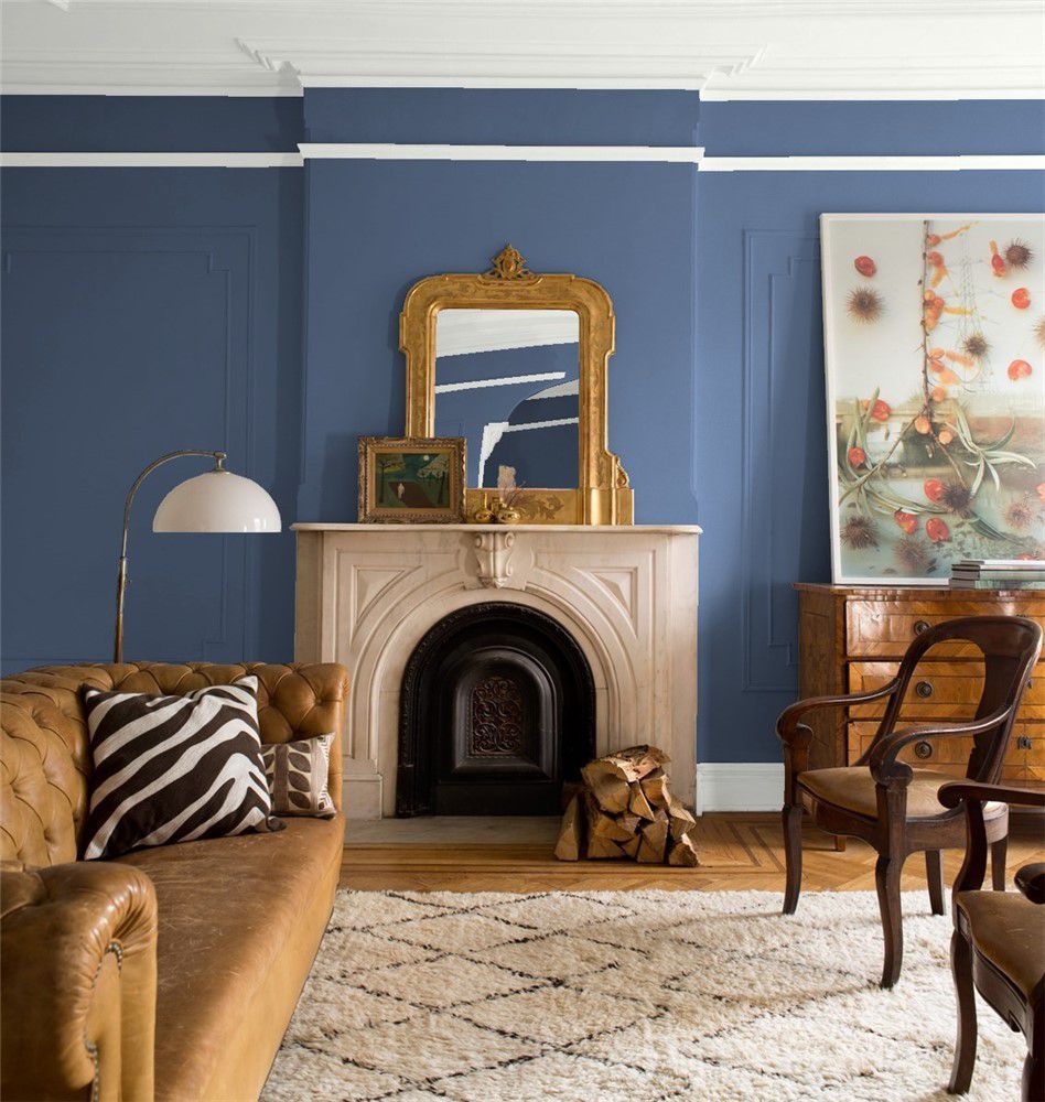
Use it in your bedroom, living room, bathroom, dining room, or on accent walls and front doors for a bit of uniqueness. With an LRV of 11.97 and an RGB color code of 75, 90, and 113 respectively, coordinate this color with Battenberg and Elk Horn or Horizon and Mount Saint Anne.
3. Sea Haze 2137-50

Cool gray paint color with green undertones
If you want complex, simple, and beautiful in one package, Sea Haze is the color for you. Decorate and paint your living room with this color and extend it to your kitchen for a uniform effect. Throw in some browns and wood tones to make the color pop.
Sea Haze has an RGB color code of 179, 181, 171, which is pretty close to perfect neutrality. With an LRV of 45.36, coordinate it with Million Dollar Red, and Copley Gray or Abyss and Downpour Blue from Benjamin Moore.

4. Avon Green HC-126
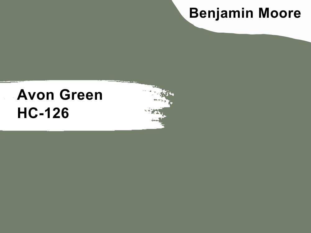
Muted green paint color with hints of gray
Spice up your home with this beautiful shade of green. It works well on doors and entryways, but you can also use it on accent walls or cabinets. The subtle gray in it gives it an earthy tone that fits well with wood tones, especially in a farmhouse.
⁸With an LRV of 20.99, Avon Green works well with other Benjamin Moore colors like Paper White and Coventry Gray or Pink Damask Cappucino. The color has an RGB color code of 115, 127, and 106 respectively.

5. Million Dollar Red 2003-10

Bold red paint color with a hint of brown
This red is a bold statement in your interior or exterior, and it is crucial to find other colors that tone it down. Although it is bright, it is not overwhelmingly so. The brown that peeks out gives it an earthy look, so it is perfect for farmhouse decor.
Million Dollar Red has an LRV of 12.58 and an RGB color code of 181, 52, and 44 respectively. Coordinate it with Snow White and Witching Hour or Sea Haze and Copley Gray.
6. Black Satin 2131-10
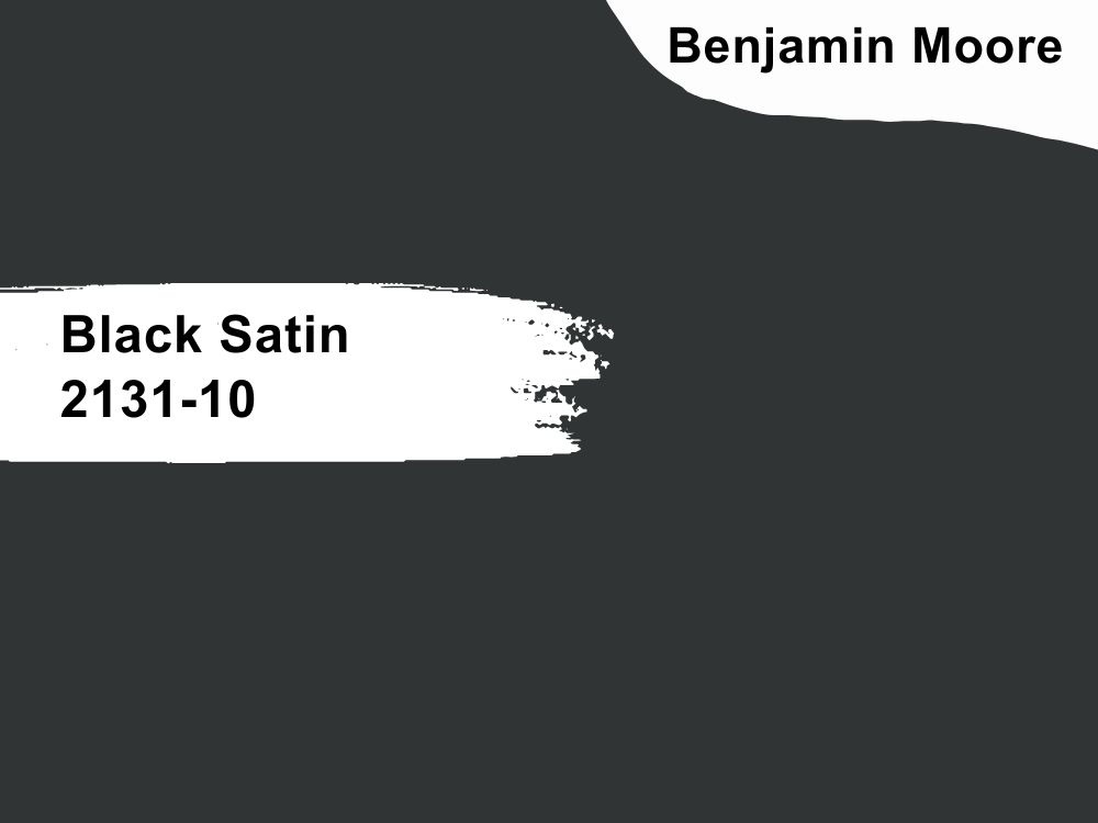
Cool black paint color with green/blue undertones
Black Satin looks and feels like satin. It is such a rich and saturated black made even more dense by the hint of blue and green. Its depth makes it such a stylish and sophisticated color, and the exterior or even the entryway of your farmhouse may look elegant with this color.
Consider coordinating it with Classic Gray and Raspberry Truffle or Cloud White and Northampton Putty, especially with its 4.58. Black Satin has an RGB color code of 49, 52, and 53 respectively.
Conclusion
Your farmhouse can look classy and simple with the right paint colors, and we have carefully picked some of the best from Sherwin Williams and Benjamin Moore. The best part is that you can combine these colors to create unique decor inside or outside the house.
From bold colors like Kensington Blue, Million Dollar Red, and Arugula to softer colors like Alabaster, Sea Salt, and Sea Haze, the list comprises different shades for different purposes. But be sure to check how each color blends into your decor before using it, especially the bold colors. Use sample paint colors to compare before committing to any particular color.
We would love to share your experience with some or all of these paint colors. Feel free to share with us in the comments section.