
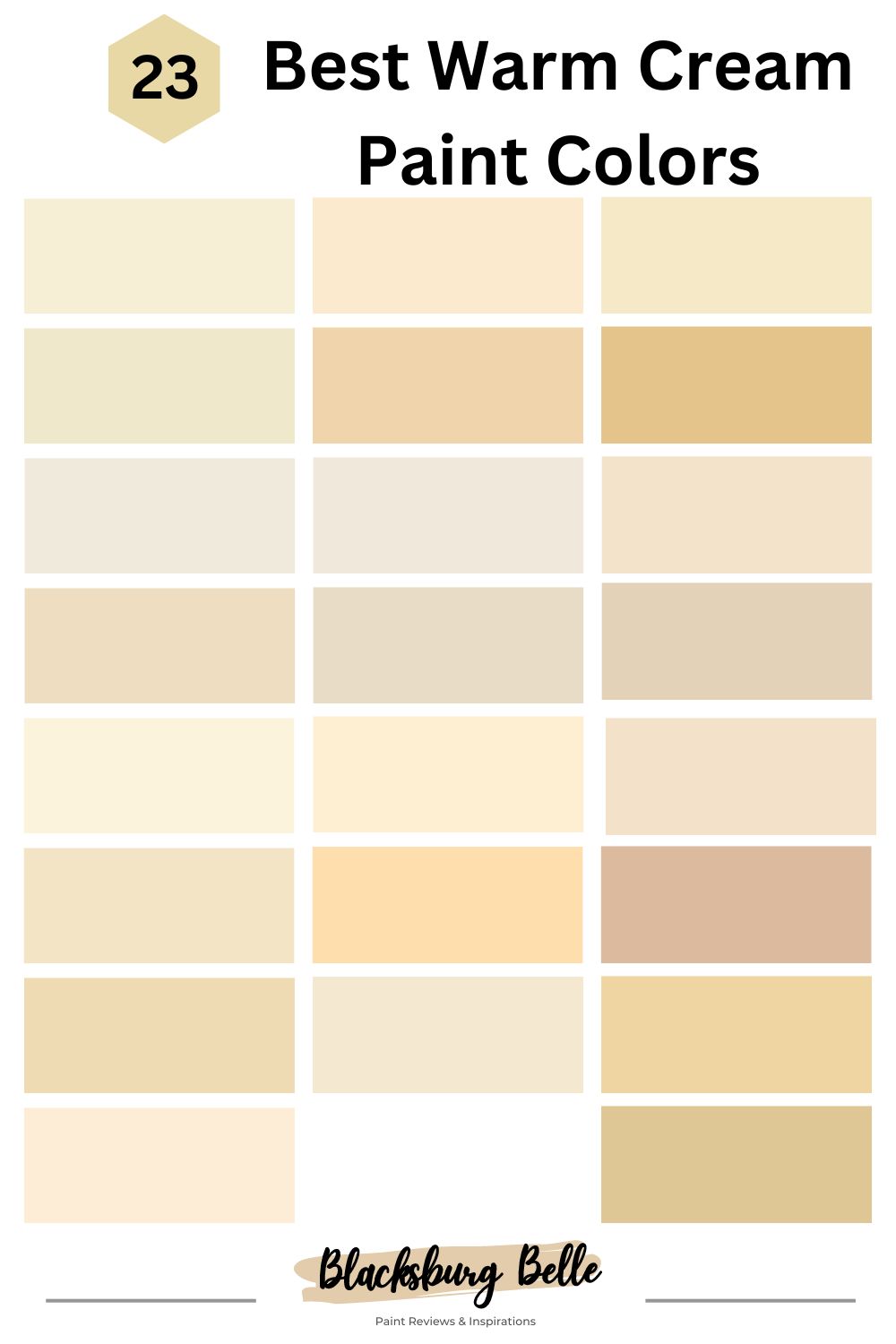
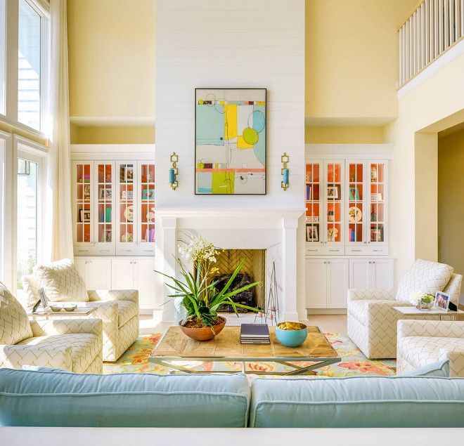
Do you want to stay on trend with using warm cream paint in the home and office? Then, you’re in the right place. We will guide you through the best creamy shades for 2023.
Cream is a timeless color that stays relevant even as design styles shift. The 2023 interior and exterior design is all about bold colors, and warm cream is the brightest neutral shade on the wheel.
Besides being a shining star, warm cream is a versatile and homely tone that instills comfort, harmony, cheerfulness, and positivity. Follow this guide to select one of the 23 best warm cream paint colors for your space, whether accents or interior or exterior walls.
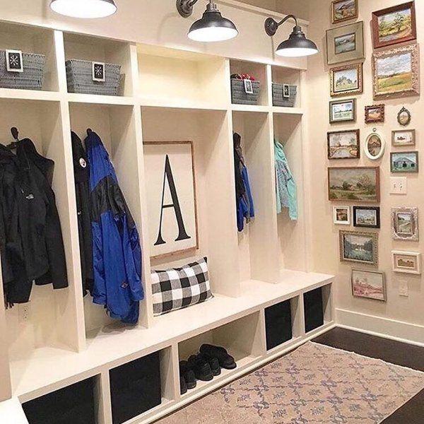
Table of Contents
Steps for Choosing the Right Warm Cream Paint
The art of choosing warm paint depends on two main factors – lighting and space. The interaction of both elements creates an atmosphere that influences your warm gray paint’s reflection. Hence, it’s important to carefully select the ideal shade that matches your purpose by following these steps.
Step 1: Analyze The Space and Lighting
Analyze the area you intend to paint in warm cream colors and determine how much natural light it gets. Painting a virgin wall or empty space gives the best perspective of the area. However, that doesn’t mean you can’t navigate a room with furniture, art, or a colored wall.
Note that small spaces need enough lighting, so we recommend bright cream paints for an airier look, while large spaces can do with medium to dark shades.
When designing spaces with accessories from art to furniture, flooring, greenery, and fixtures their existent colors determine your warm cream paint to create a complementary synergy.
Step 2: Measure The Room Size And Position
Next, use a measuring tape to determine your room’s size and a compass to note its position. Standard-sized rooms differ depending on the purpose, as certain spaces require more legroom than others.
Regular bedrooms are 12 x 14 sq. ft., small for master suites. Likewise, 12 x 16 sq. ft. family rooms are small, while the space is standard for dining rooms and large for workshops, according to Daily Civil. You can use warm cream paint to create your desired aura regardless of the size.
Warm cream with south-facing light guarantees the most intense color reflection while west-facing rooms react oppositely.
Alternatively, you can stabilize the mood in your space by painting warm cream in your north-facing rooms.
Step 3: Evaluate Your Lighting Options
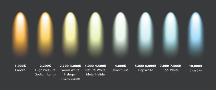
If the sunlight isn’t enough to illuminate your space as bright as you’d like, augment it with artificial lighting. Warm lighting is ideal for an intense glow, while cool lighting creates a dull look.
Differentiate between the lighting types by their glow, a.k.a. degrees kelvin, which ranges from 2700K to 6500K.
Batteries Plus categorized 2700K – 4100K as soft and cool white bulbs, while 5000K to 6500K mimic daylight and are often warm with red, yellow, and orange tints.
Step 4: Conduct Sample Area Testing
In this step you want to create a short list of warm cream paint colors and compare them against your desired surface. Watch their reaction to natural light and darkness, then note the alternate colors in their reflections.
Use color chips or Color-to-Go lightweight paint to test Sherwin-Williams products and Samplize peel & stick strips for every brand from Behr to Benjamin Moore and Farrow & Ball.
Step 5: Analyze the Long-Term Value of a Paint Color
“How long would a warm cream paint color last before fading?”
Settling on a paint shade goes beyond your love for its beauty, as there are other factors to consider. Some warm cream colors quickly get dirty due to their high Light Reflectance Value (LRV). In contrast, others are resilient and withstand harsh conditions.
Ensure heavy-traffic areas don’t have high LRV warm cream paints unless you can afford to repaint them within three to five years. Also, note that high-quality brands are easier to maintain as their pigments are water-resistant.
However, low-quality paint colors don’t last longer than two to three years because they’re thick on application and attract dirt particles and residue.
Step 6: Apply Finishing Touches
Along with quality, selecting the ideal finish for your warm cream paint influences the outlook and lifespan. Use shiny finishes like gloss, luster, silk, and satin for accents, as their flashy tone highlights their surroundings.
Softer finishes like eg-shel and matte are durable and make the best backdrops for other hues to shine.
Understanding Warm Cream Paints
Cream is a yellowish-white paint color that comes in three main variants — warm, cool, and warm/cool — distinguished by their undertones. Since colors are dynamic, each type of cream hue sparks a different aura in its surrounding.
Warm cream promotes vibrance, positivity, tradition, and homeliness, although some are cozier than others depending on their overtone. The key to finding the best cream paint is balancing the yellow and white contents.
What Are The Undertones?
Undertones are secondary colors reflecting from every paint due to their mixture of red, green, blue, and absolute black pigments. The result creates a unique shade with alternate hues potentially reflecting when in contact with light, known as the LRV.
You can measure every paint’s LRV on a scale of 3 – 97, with three being pitch black and 97 being pure white. As a mid-tone yellow paint, cream is often on the neutral scale, although warm types lean towards the high LRV end thanks to its bright undertones.
Types of Warm Cream Paints
Most warm cream paints have red or orange undertones, but some unique hues have softer tints like pink, peach, and dark nuances like reddish-oranges. See how each warm cream paint translates and how best to use them.
Light Warm Cream Paints
Benjamin Moore’s White Dove is so light, it passes as white in high-lit rooms
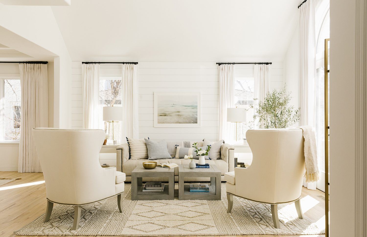
If you’ve ever seen an off-white paint that looks “yellow,” then you have an idea of what light warm cream paint looks like. It’s a cream-based neutral that oozes warmth, invitation, and airiness when used in the background.
These warm cream shades defy the standard of neutrality by leaning towards the high end of the LRV spectrum and illuminating every space they grace.
Typical examples are Sherwin-Williams Dover White, Benjamin Moore’s White Dove, Farrow & Ball’s String No. 8, and Behr’s String Cheese. This shade shines brightest in your grand living, hallways, and adjoining rooms to create a welcoming vibe daily.
Soft, Warm Cream Paints
Pastel yellow paints are soft, easy on the eyes, and airy, making them ideal for nurturing spaces. Soft, warm cream colors come in light, medium, and dark tones, although most are mid-tone.
It’s best to use this muted cream in your nurseries, bedrooms, kitchens, and dining rooms to set the tone for other vibrant decors. Some examples include Farrow & Ball Tallow, Behr’s Glass of Milk, Sherwin-Williams Honeypot, and Benjamin Moore’s Cream.
Dark Warm Cream Paints
Dark-toned warm cream paints aren’t as popular as other types, making them unique and exciting. You can identify these shades with orange and purple tints, the most vibrant warm tones.
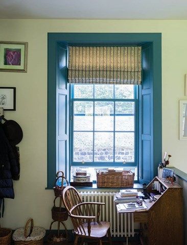
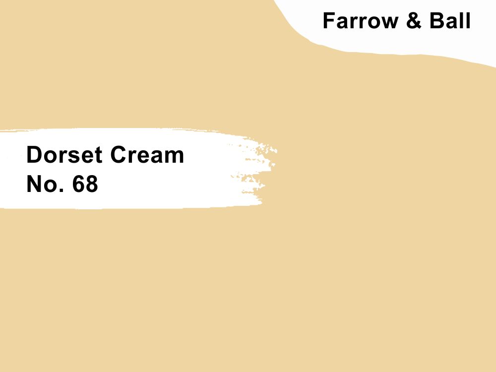
We recommend this shade for recreation rooms, kitchens, front doors, and accent walls. Try out Benjamin Moore’s Suntan Yellow, Farrow & Ball’s Dorset Cream, Behr’s Mac n Cheese, and Sherwin-Williams New Colonial Yellow.
23 Best Warm Cream Paint Colors By Brand (2023 Trends)
Here’s a carefully selected list containing the 23 best warm cream paints across the leading brands in America. It includes a brief description of each brand’s uniqueness and why you should choose one over the other.
Benjamin Moore (BM) Paint Brand
Benjamin Moore is one of two best-selling high-quality paint producers in America. It’s expensive at $45 – $60 a gallon but worth every dollar. It provides full coverage in one swoop leaving a clean look regardless of the finish.
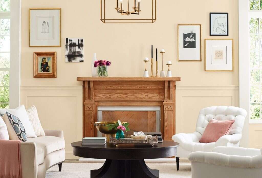
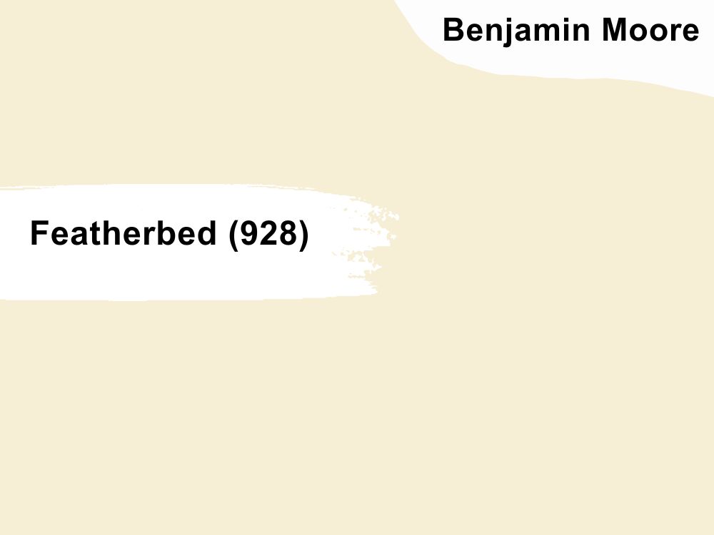
1. Featherbed (928)
Featherbed walls in the bedroom coupled with warm lighting and natural sunlight is the recipe for sunshine in the house
Featherbed (928) is the epitome of creamy goodness as it boasts a cream-based off-white outlook and bright yellow tint waiting to take over. It’s a sunny warm cream with an LRV of 83.6, meaning it needs no extra lighting.
Complement Featherbed in the living room with white trims, and contrast the color with mid-tone blues and dark greens like olives (Dark Celery) and sage.
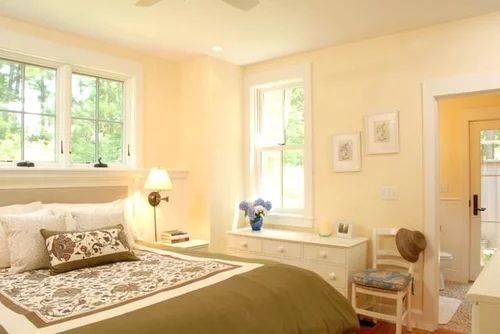
2. Cream (2159-60)
Cream walls inside this house is the ideal backdrop for a classic American theme
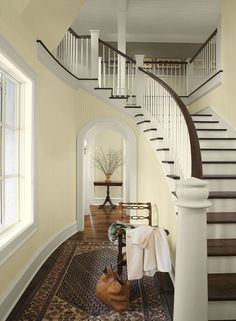
You don’t need additional lighting when you use Cream (2159-60) in your grand room, as the marriage of orange and yellow undertones creates a vibrant glow. Use this high LRV cream with a reflection of 81.46 with light cream leather and warm wood furniture.
You can also add gray shades like Gloucester Sage to tone down the bright outlook in your kitchen and bathroom but stick to homely tones like Delightful Golden in your family rooms and bedroom.
3. Windham Cream (HC-6)
Windham Cream walls in the bedroom creates a sunny glow every morning
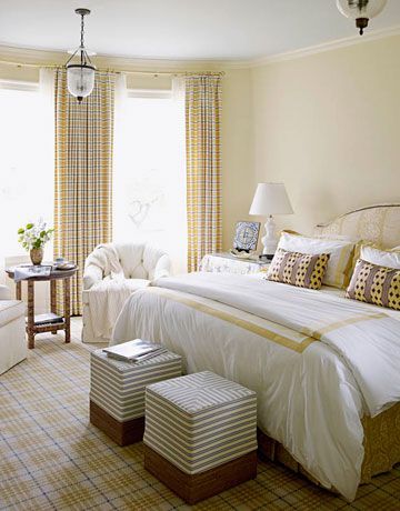
Create a buttery finish with Windham Cream (HC-6), a luscious pastel yellow color. This whispery yellow is a vintage shade with a medium-light LRV of 79.04, making it a bestseller. It creates an airy aura and warmth in living rooms, entryways, hallways, and dining rooms.
Pair Windham Cream with other pastel tones, whether light like Simply White or dark like Rushing River and Chartreuse, for a clean look.
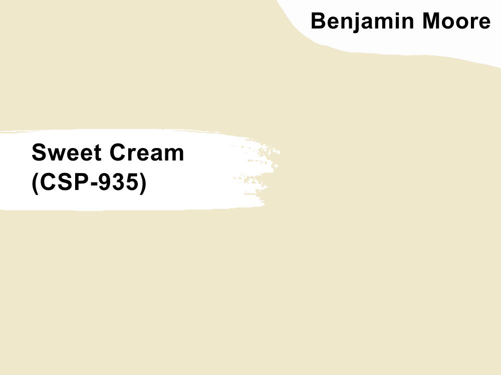
4. Sweet Cream (CSP-935)
Clean Sweet Cream walls in the dining room keeps your mind imaginative
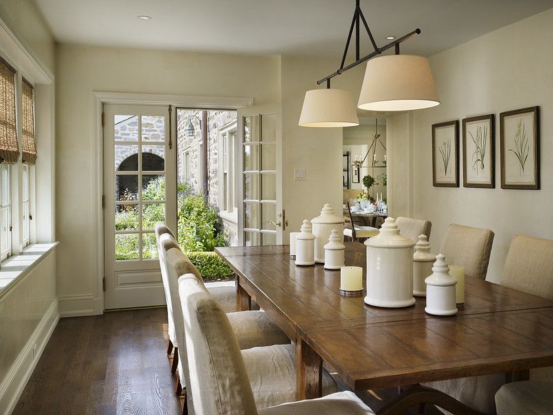
Keep your space looking neutral with a tinge of warmth using Sweet Cream (CSP-935). It’s a milky cream paint with a velvety outlook, no matter the finish. BM recommends it for fairytale and imaginative themes inside the house or school as its 77.54 LRv can fade outside.
Pair Sweet Cream with crisp white paint trims and other pastel colors to harmonize the storybook look.
5. Oklahoma Wheat (2160-50)

Welcome your guests with the warmth of Oklahoma Wheat in the entryway
Bring the heat into your bedroom, guest room, and bathroom with Oklahoma Wheat’s orange-tinted cream tone. With a 66.97 LRV, this warm tone has a softer tan note that transforms your space into a warm sunset along tropical lines.
Combine Oklahoma Wheat with earthy tans like Tawny Rose and airy white drapery to complete the dreamy theme.
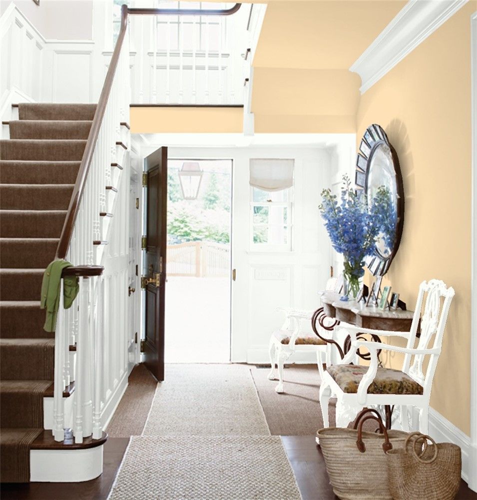
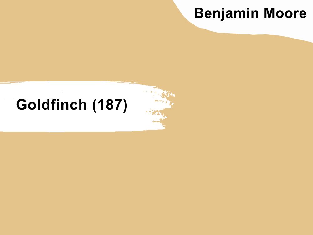
6. Goldfinch (187)
Goldfinch gives the living room a sophisticated look especially with sunlight entering from multiple windows
Morning sunlight looks best in a south-facing room with Goldfinch (187) walls and sheer white or off-white curtains. It’s a cream-based caramel hue with a medium tone of 55.98 that creates a classic and elegant vibe.
Pair this color with dark warm wood for a sophisticated vintage look or orange and beige for a contemporary theme.
Sherwin-Williams (SW) Paint Brand
Sherwin-Williams is America’s second most popular high-quality paint manufacturer and for many good reasons. The brand is pricey at $45 – $60 per gallon but affordable for its quality.
Using this brand gives you a bright lacquer from one coat which is time and cost-effective. It also has the most beautiful warm cream paints, including the best-selling Creamy.
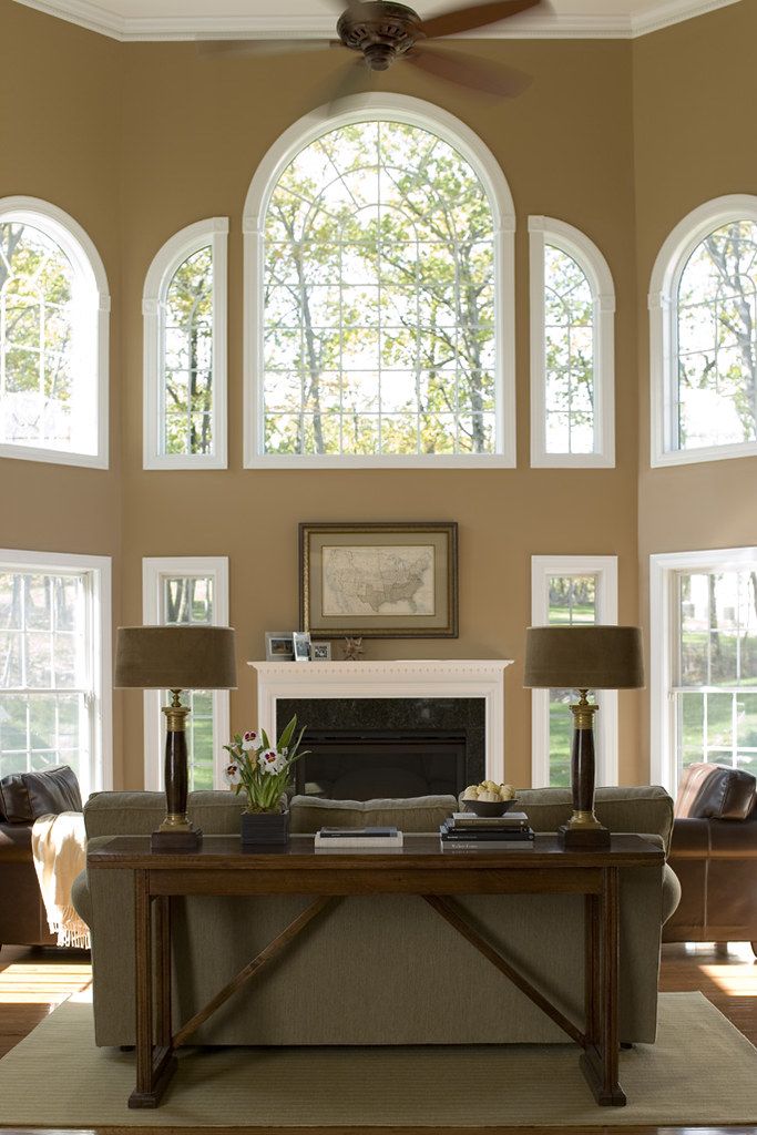
7. Dover White (SW 6385)
Golden Christmas fairy lights accentuate the yellow tint in Dover White walls
Although Dover White (SW 6385) has a beige overtone, its pastel yellow base gives it a rich, velvety cream finish. This 83 LRV hue makes its surroundings breezy while keeping the room warm. It’s ideal for minimalist family homes and children’s hospitals.
Pair Dover White with dark wooden floorboards to reduce brightness and highlight its yellow undertones with warmer beiges like Dakota Wheat and honey wood.
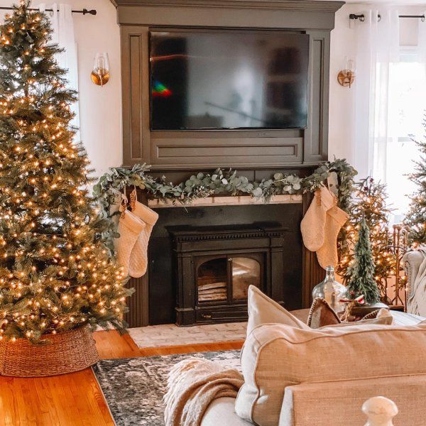
8. Creamy (SW 7012)
Creamy’s timeless tone in the kitchen makes it fit for every generation
Creamy (SW 7012) is a timeless cream color that appears off-white but has a vibrant yellow and cool beige undertone. It’s a versatile neutral because of its ability to flit from a high LRV warm hue of 81 to a cool shade.
Use Creamy to keep your kitchen looking clean and homely and for gender-neutral bedrooms.
9. Vanillin (SW 6371)
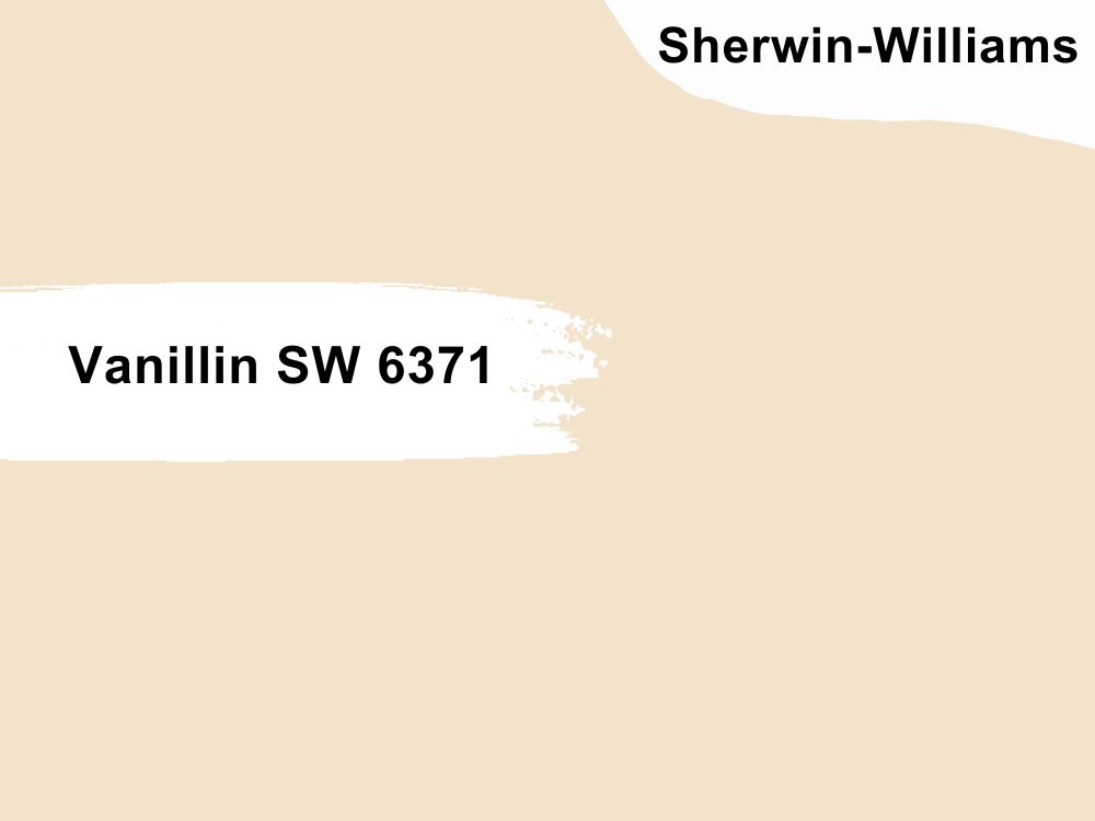
Vanillin mixed with morning sunlight is a recipe for good mornings
Use the warm yellowish-white Vanillin (SW 6371) to create a welcoming vibe in your home. Its 78 medium-high outlook fits every room in the house, whether it’s to wake your senses in the bedroom, cheer you up in the bathroom, or make the kitchen lively.
Vanillin thrives with other warm whites with lesser yellow undertones like Creamy and Marshmallow to tone down its sunny look.
10. Napery (SW 6386)
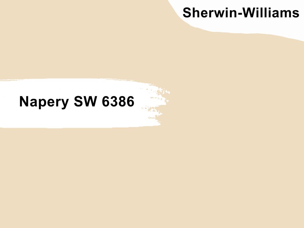
Napery walls harmonize this colorful beach house’s living room
Warm cream paints are often breezy and light, but saturated tones like Napery (SW 6386) are attention steelers. It has a bright yellow-orange undertone and 74 LRV, making it ideal for wooden tan themes.
Napery is a mood-boosting color, so use it in your dining and living rooms to keep people’s spirit’s up. Pair this color with other creams and off-white paints like Dover White or taupe tones to cool it down.
11. Antique White (SW 6119)
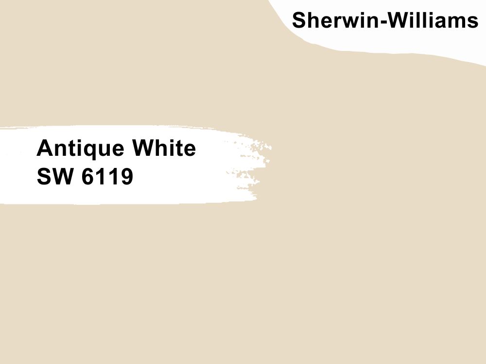
Antique White makes new spaces look homely and lived-in
Give your home an aged look despite being a modern creation with Antique White (SW 6119). Rather than the typical yellow undertone, this 72 LRV color has a beige tint that gives its pastel white look an exciting depth.
Your walls painted in Antique White will always give your guests the idea that there’s a story behind every piece in the home. Pair this color with honey wood for an intense glow and dark chocolate wood for a historical look.
12. Irish Cream (SW 7537)
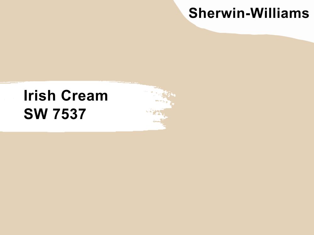
Irish Cream gives your bedroom a regal glow
Welcome your guests with the orange glow of Irish Cream (SW 7537) ‘s off-white look. This color’s medium-light 66 LRV is reminiscent of barley and Irish cream liquor hence the name.
Use Irish Cream with sharp contrasts like navy blue or black, or keep the look simple with silvery blue-gray tones like Upward.
Behr Paint Brand
Behr is an affordable house paint but at the cost of quality, as its application is thick and time-consuming. Unfortunately, it’s also not the best option for long-term use as the color fades off quicker than BM and SW.
Use Behr if you’re painting on a budget, as one gallon is less than $45.
13. Thickened Cream (M290-1)
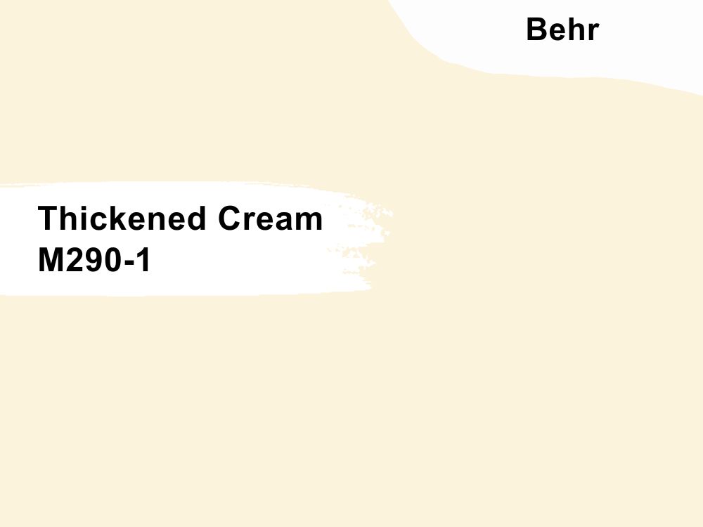
Keep your bathroom clean and sweet with the brilliant Thickened Cream
Thickened Cream (M290-1) is so bright with an LRV of 90, the most brilliant cream shade you can get. Its yellow undertone overshadows the color in the dark and is a top-selling shade.
Use this cheerful tone in children’s rooms, recreation spaces, and gathering areas.
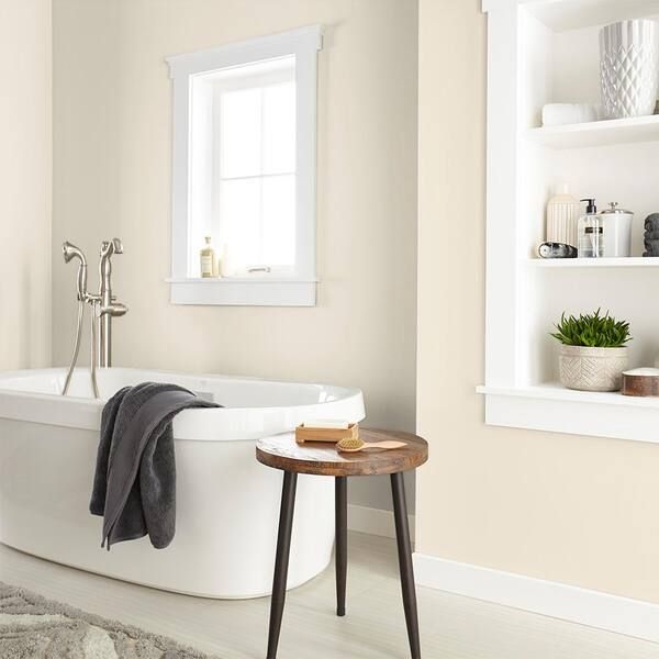
14. Pearly White (M270-1)
Highlight your crisp white furniture with Pearly White walls
Pearly White (M270-1) is a high LRV cream with an overwhelming yellow base that colors its neutral exterior. This color has an 88 reflective strength making it appear white in dim lighting while its orange undertone flashes in sunlight.
Use Pearly White to bring your bedroom to life with taupe beddings and crisp white trims on the windows. The warm tone immediately brings good cheer to dull environments without doing too much.
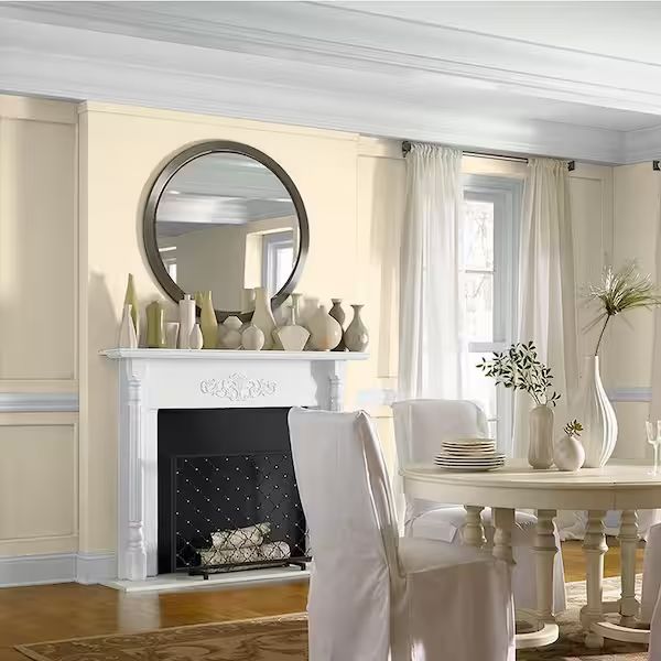
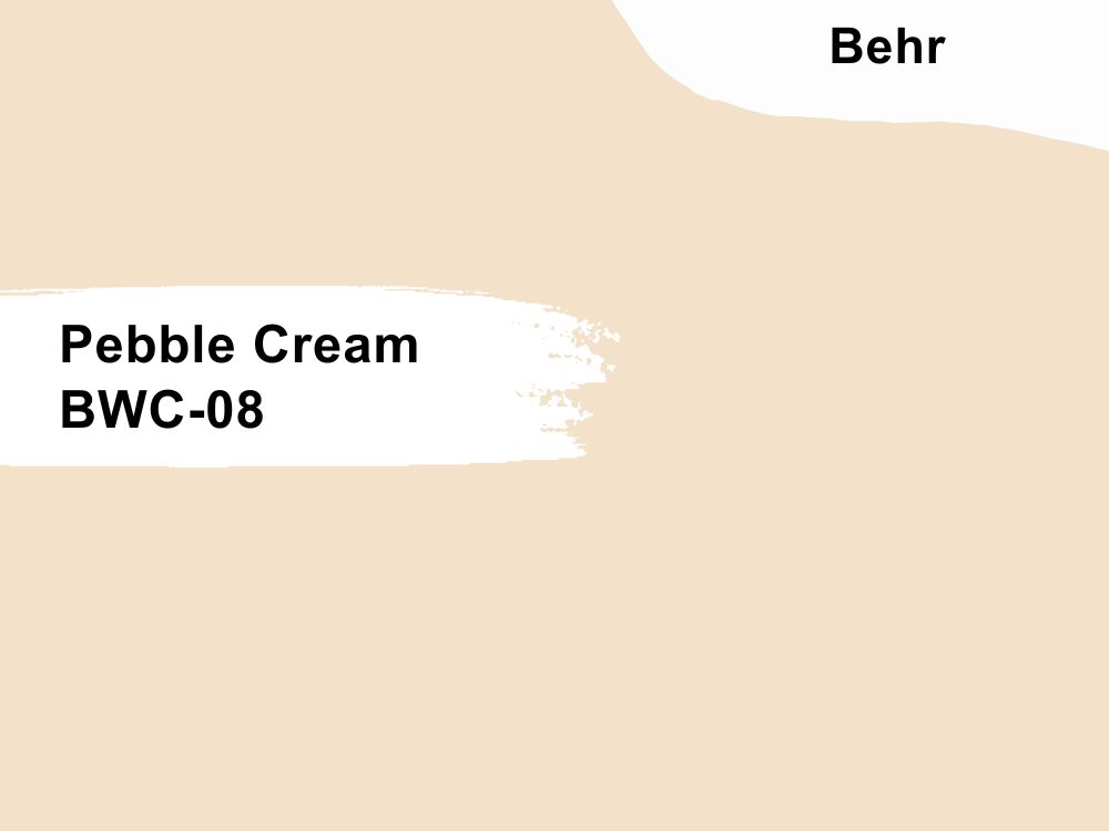
15. Pebble Cream (BWC-08)
Make your living room homely while embracing minimalism with Pebble Cream walls
Neutralize the mood in your home and exterior with Pebble Cream (BWC-08), a 77 LRV cream tone. It’s one of the few shades with a pink and yellow undertone giving the color a blush look underneath direct sunlight.
Use this color with red brick walls on your exterior, gray furniture, and drapery inside for a neutral theme, and bold pinks, peach, or red for a vibrant style in your living room and bedroom.
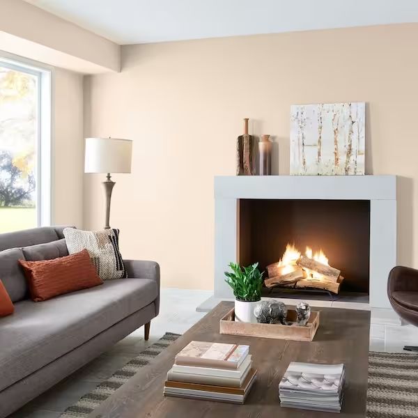
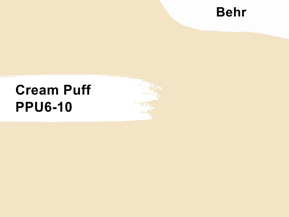
16. Cream Puff (PPU6-10)
Stick to tradition with Cream Puff’s muted cream presence and red woods
Use Cream Puff (PPU6-10) for a lively vintage neutral binder. Its red undertone blends seamlessly with the red wooden interior and exteriors. Use it with purple and blue interiors for a balanced cool/warm theme.
It’s a lighter alternative to Pebble Cream at 79 LRV. It maintains the eggshell look that keeps guests guessing about your decor. Cream Puff is best used as an adjoining wall paint or half-paint, as its color gets boring until it’s paired with brighter pastels to tease out its tints.
17. Navajo White (22)
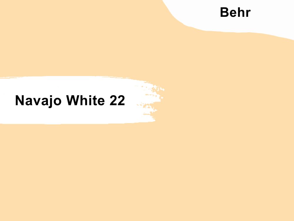
Navajo White gives your guest bedroom an impersonal clean look
Create a clean, warm aura with Navajo White (22)’s medium-light presence in your living rooms, bedrooms, and exteriors. It’s a neutral cream paint color with faint pink undertones, which only appear in dim to dark lighting.
Navajo White’s 74 LRV is an ideal backdrop for brighter colors, so don’t be scared to use it generously on your walls.
18. Pumpkin Cream (PPU3-09)
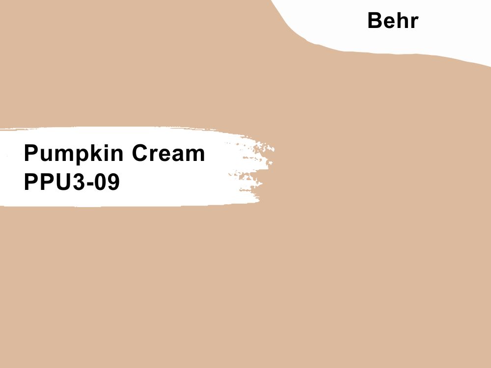
Pumpkin Cream appears softer in well-lit rooms
Keep your large spaces warm with the spicy orange-tinted cream tone of Pumpkin Cream (PPU3-09). Although its 55 LRV makes the color appear darker in dim rooms, well-lit spaces highlight its peach tone.
Paint your dining room walls Pumpkin Cream and enjoy your daily meals in the color’s soft caress. You can also use it to accentuate crisp white and dark orange walls for a modern take on vintage decor.
Farrow & Ball (F&B) Paint Brand
Use Farrow & Ball as a last resort brand because its poor coating is time-consuming, contrary to the company’s promises. Many of its customers remain because of the brand’s ethics and use of eco-friendly methods in paint production.
Unfortunately, Farrow & Ball doesn’t have color matches from other high-quality brands like BM and SW.
19. Farrow’s Cream No. 67
Feel the warmth in your kitchen with Farrow’s Cream walls against white cabinets and wooden floors
Brighten your home with the sunny presence of Farrow’s Cream (No. 67), a pastel yellow neutral guaranteed to keep you happy all day. Although its yellow note is muted under dim lighting, this classic cream remains chirpy.
Use Farrow’s Cream on your bathroom, living room, kitchen, and bedroom walls.
20. New White No. 59
Assimilate better with the lively New White on your bedroom/reading room walls
Lovers of nuanced white paints will love New White (No. 59) for its sweet, warm, fresh look tinged with yellow and purple undertones. Use crisp white trims to highlight its milky note in a modern theme but stick to wood for a traditional setting.
Use New White in your living room, bedroom (particularly on your reading table side), bathroom, hallways, and kitchen to wake up your senses daily.
21. Dorset Cream No. 68
Dorset Cream walls make your living room look sunny and cheerful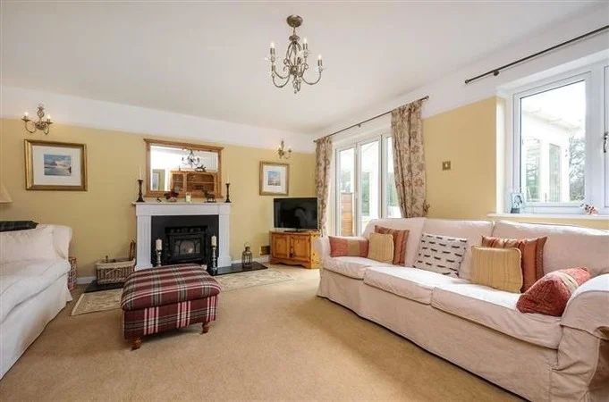
Happy-go-lucky personalities can’t go wrong with Dorset Cream No. 68 in their living rooms and hallways. It’s a bright cream color with a dominant yellow undertone that consumes the space and turns it into a sunny utopia.
F&B calls it a “darker and yellower version of its classic Farrow’s Cream.” The only design question you should have with Dorset Cream is, “how can I tone it down?” Use dark wood, brown leather, soft cream sofas, and tan decor to suck some of its vibrant energy.
22. Tallow No. 203
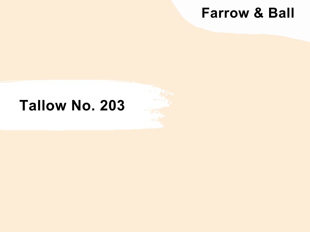
Tallow walls give this traditional kitchen a clean look
Tallow (No. 203) is another classic cream from F&B and is a light cream hue with a seamless blend of yellow and pink undertones. Using Tallow in your space keeps it fresh, breezy, and warm making it a best-seller for nurseries and children’s bedrooms.
You can also use Tallow to accentuate a neutral-themed kitchen and living room covered in gray furniture.
23. Hay (No. 37)
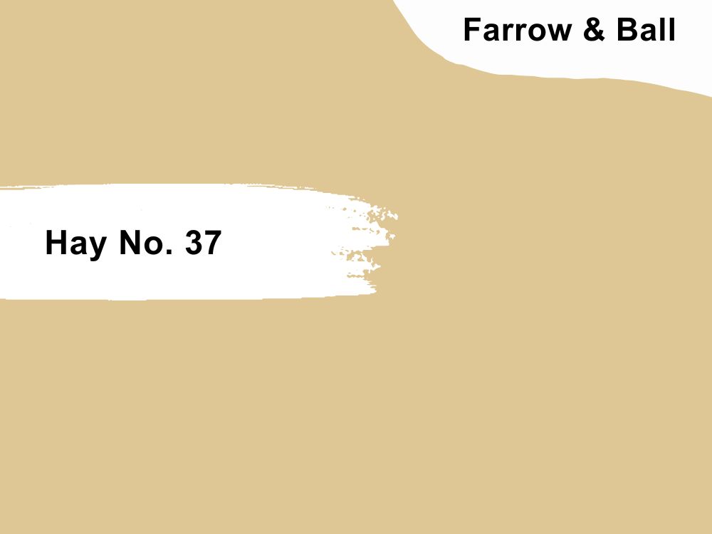
Hay walls appear more intense with mustard trims and keeps this toddler’s playroom bright
Under dim lighting, Hay (No. 37) doesn’t look like cream because of its dusty yellow tone. However, once warm – white light hits its surface, the color’s pastel yellow tone turns into a relaxing cream shade with sage green reflections.
Hence, Hay is an ideal wall paint for homes with greenery from external grasses and trees to indoor potted plants.
Conclusion
Warm cream is a beautiful homely color for all modern and traditional themes. Still, it’s only as good as the color coordinates. Investing in high-quality brands like Benjamin Moore and Sherwin-Williams is always best for the best-finished look and long-term value.
However, Behr is good enough for budget painting, while using F & B is based on moral preference. Remember to maximize your warm cream paint’s potential by choosing the perfect shade in the proper position.
 10 Best Sherwin Williams Off-White Paint Colors (Trend 2023)
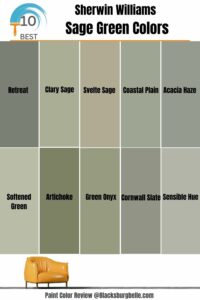 10 Best Sherwin Williams Sage Green Colors
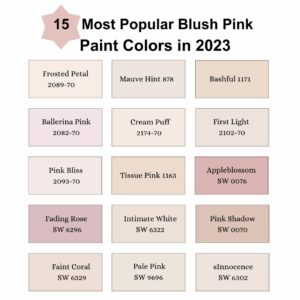 15 Most Popular Blush Pink Paint Colors in 2023
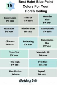 15 Best Haint Blue Paint Colors For Your Porch Ceiling (Trend 2023)
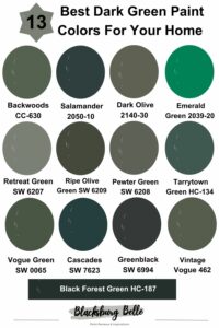 13 Best Dark Green Paint Colors For Your Home
 25 Most Popular Sherwin Williams Exterior Paint Colors
