For new homeowners and those looking to deliver a new look to their living space, picking up the right neutral paint color may be challenging.
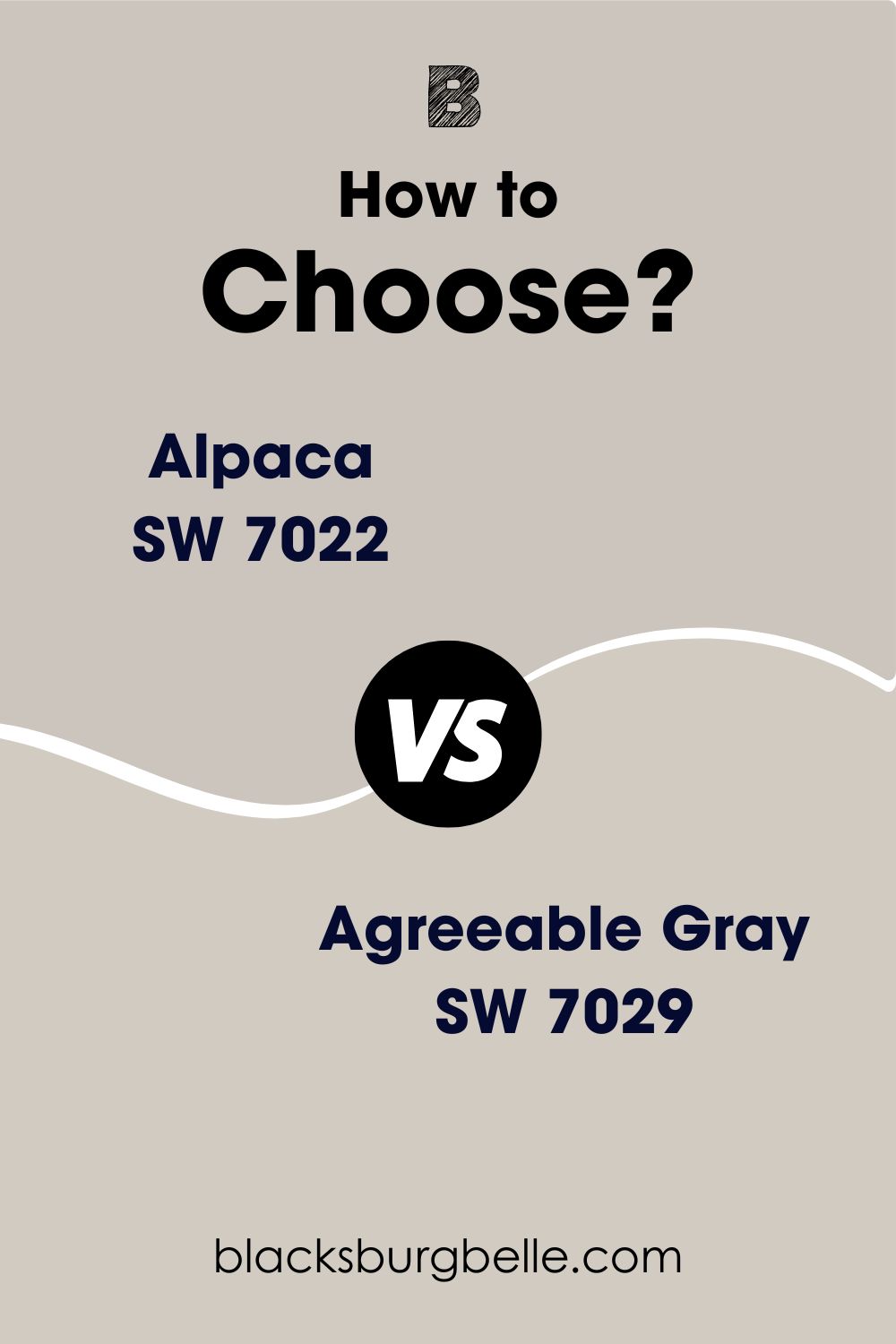
So, you’ve narrowed your choice down to these two lovely shades of gray, the Sherwin Williams Alpaca and Agreeable Gray. However, You can’t seem to settle on which will be right for you. If this sounds like you, welcome.
Alpaca and Agreeable Gray are popular neutral greige paint colors whose gray shade is quite similar. The only stark difference they share is their varying undertones, which ultimately affects the results you get.
In this detailed guide, I dish out knowledge about the composition of these colors and, most importantly, how they behave in certain spaces.
Table of Contents
When to Use Sherwin Williams Alpaca vs. Agreeable Gray
I believe there’s a purpose in mind when you settle for a paint color. You want it to make you feel a certain way; anything different just won’t cut it. In this section, I’ve highlighted some scenarios where Alpaca or Agreeable Gray can be useful in your home.
Use Alpaca if:
- You desire a warm gray color in your home
- You crave a soft purple/pink touch in your space
- You need a color with a bit more depth than the usual grays
- You want a warm gray that pairs well with dark and light accents.
Use Agreeable Gray if:
- You don’t mind those peeks of green in your space
- You want a color that works perfectly with a wide range of hues.
- You’re looking for a neutral color that also leans towards beige.
Both colors are perfect for use in any space, including outdoors. Alpaca is best suited for large, airy spaces to give it much-needed depth. Think of it as the perfect way to relax and calm your nerves after a long day.
As for Agreeable Gray, its fresh green undertones add a cool touch of nature to any space, and it is wonderful for small spaces, as it reflects a great deal of light, so it’ll open up your home to the bliss of incoming natural light.
Exploring Sherwin Williams Alpaca and Agreeable Gray: A Visual Perspective
What better way to understand the performance of both colors than using side-by-side images of them working their best in actual space? Seeing is really believing, and it’s all practical when painting colors.
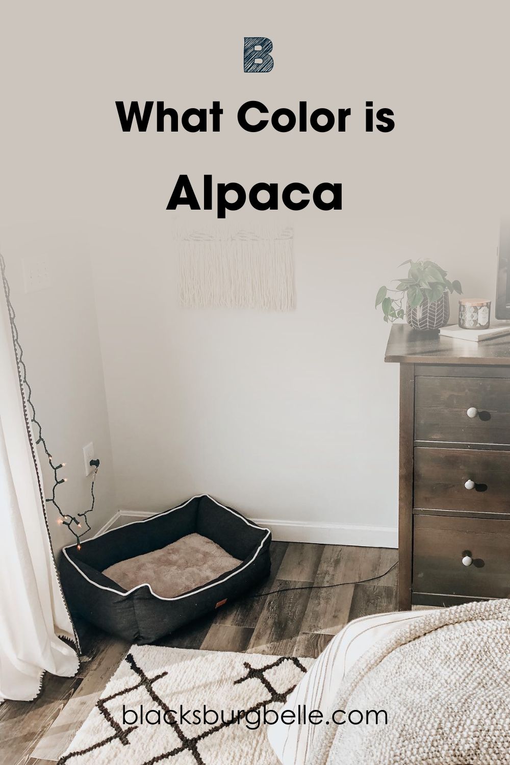
See Sherwin Williams Alpaca in a Bedroom
See Sherwin Williams Agreeable Gray in an Office
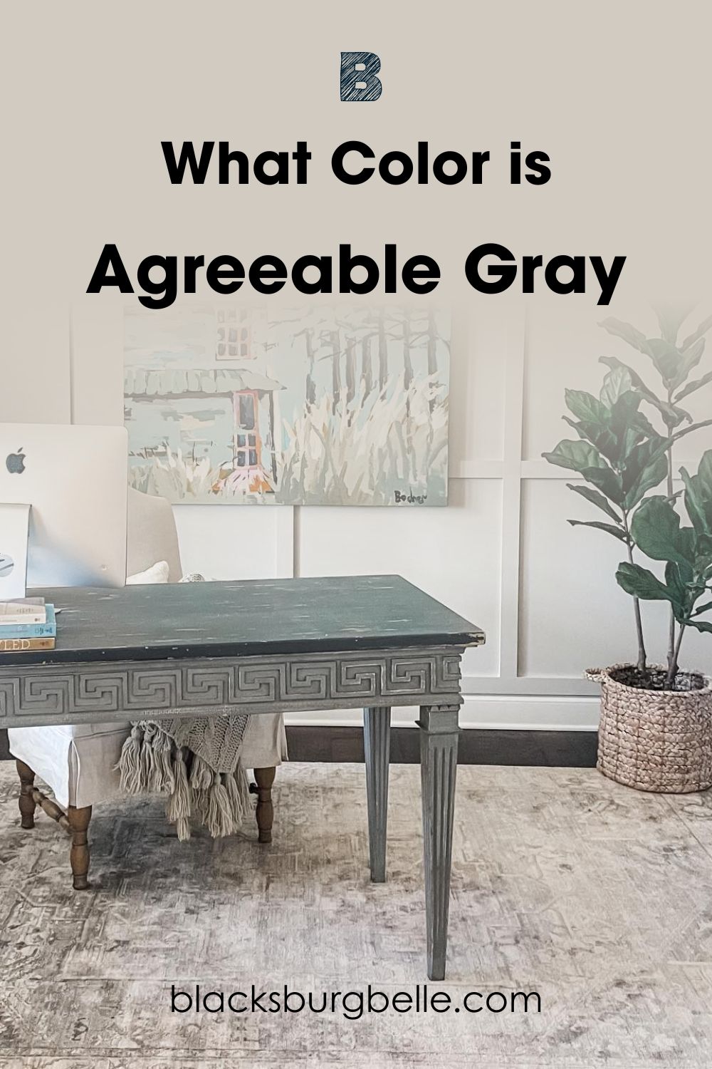
Two amazing greige colors, what to do? Well, I’ll analyze these images and break things down for you to understand. Things are muted in the first image, meaning Alpaca connects to its darker side and shows off a great deal of purple and beige.
The depth in the first image is undeniable, and the dark brown accessories bring things closer to the warm side. Agreeable Gray, on the other end, keeps things very neutral here, reading very beige with faint touches of purple.
The second image shows how comfortable the green in Agreeable Gray is. The beige in this color also tones things down and keeps things in a neutral state, giving it an opportunity to work well with the artwork on the wall and the faux plant in that space.
Alpaca and Agreeable Gray are commonly used in transitional and farmhouse-style homes, Basically an escape from the hustle and bustle of life.
Head-to-Head Alpaca vs. Agreeable Gray- A Quick Comparison
By studying the brief details in this table, you get the bigger picture I’ve been trying to paint from the beginning of this article to this point. From LRV to undertones and even the Hex Codes, you can learn about Alpaca and Agreeable Gray at a glance.
| Alpaca | Agreeable Gray | |
| LRV | 57 | 60 |
| RGB | 204,197,189 | 209,203,193 |
| Hex Code | #CCC5BD | #D1CBC1 |
| Undertones | Beige, pink/purple | Beige, purple, green |
Emotional Effects: Alpaca vs. Agreeable Gray
Colors are a powerful force in a home, whether on the walls or the ceiling. You can enter a home and instantly feel alive or the opposite; this isn’t an abnormal phenomenon; it’s just proof that our colors of choice directly influence our emotions.
For Sherwin Williams Alpaca, you’ll feel a soft angelic touch upon entering a space where it’s applied. Being neutral, Alpaca evokes balance in a room and calms those tense nerves. It also has a smooth and crispy texture, bringing an exciting feeling to your home.
Agreeable Gray creates a sense of elegance and sophistication. You know you’re in so much control and good hands with this color. The warm undertones in Agreeable Gray help create warmth and excitement in your space.
These colors also have cool undertones that help bring peace and serenity into your home. Basically, you’re in luck with these colors with how you get a mix of everything and how it works for different personalities.
If you want to create a solid statement across all boards, opt for Alpaca. If your vibe appeals to the soft and feminine side of things, go for Agreeable Gray.
LRV of Alpaca vs. Agreeable Gray: Which Reflects More Light?
I can’t possibly talk about these two adorable colors without carefully treating the issue of their light reflective value. Like every other means of measurement, the LRV scale measures how much a color can reflect or absorb when applied in a space.
This unique scale runs from 0-100, with 0 being the darkest and 100 being the lightest- there’s also the medium category, which involves numbers that spread between 40-60%. These are neither too light nor dark and would work in any space.
Sherwin Williams Alpaca has an LRV of 57, which means it’s a medium to a lighter-toned neutral color, and it’ll work excellently in any space adding a light and subtle touch to the ambiance.
Agreeable Gray is right in the sweet spot with an LRV of 60, which means it’s a perfect medium to light-toned neutral that reflects an insane amount of light and opens up a small space.
However, when both colors are placed side by side, Alpaca is surely the darker of the pair; hence you’d notice a sharp difference should you pair them together on a surface.
Undertones of Alpaca vs. Agreeable Gray: Are They The Same
Undertones for Alpaca and Agreeable Gray are on the complex side because both colors are neutrals and because they have such strong background colors, it may get dicey to pair them.
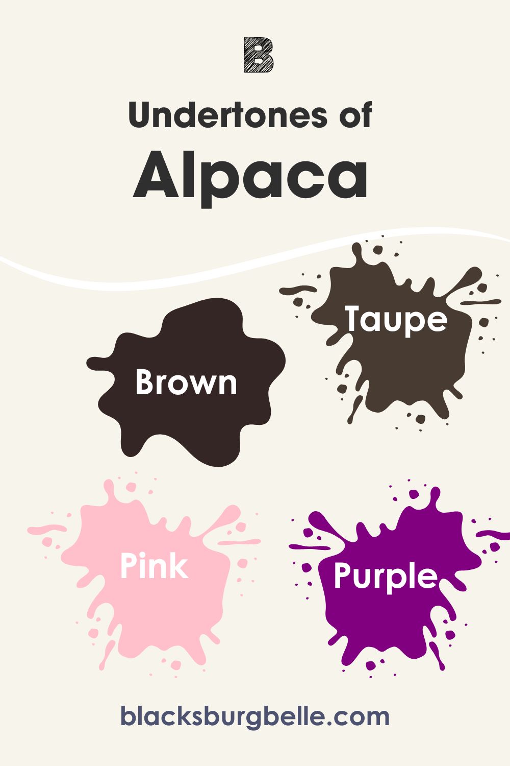
Sherwin Williams Alpaca contains hints of brown, taupe, pink, and even purple. Relax! I know these colors are a lot to work with or may seem so, but you shouldn’t forget that the lighting of your home’s direction impacts the overall appearance of Alpaca.
For south-facing rooms, you’ll discover that the beige side of this color makes a bold appearance, and in north-facing rooms, you get all the gray goodness.
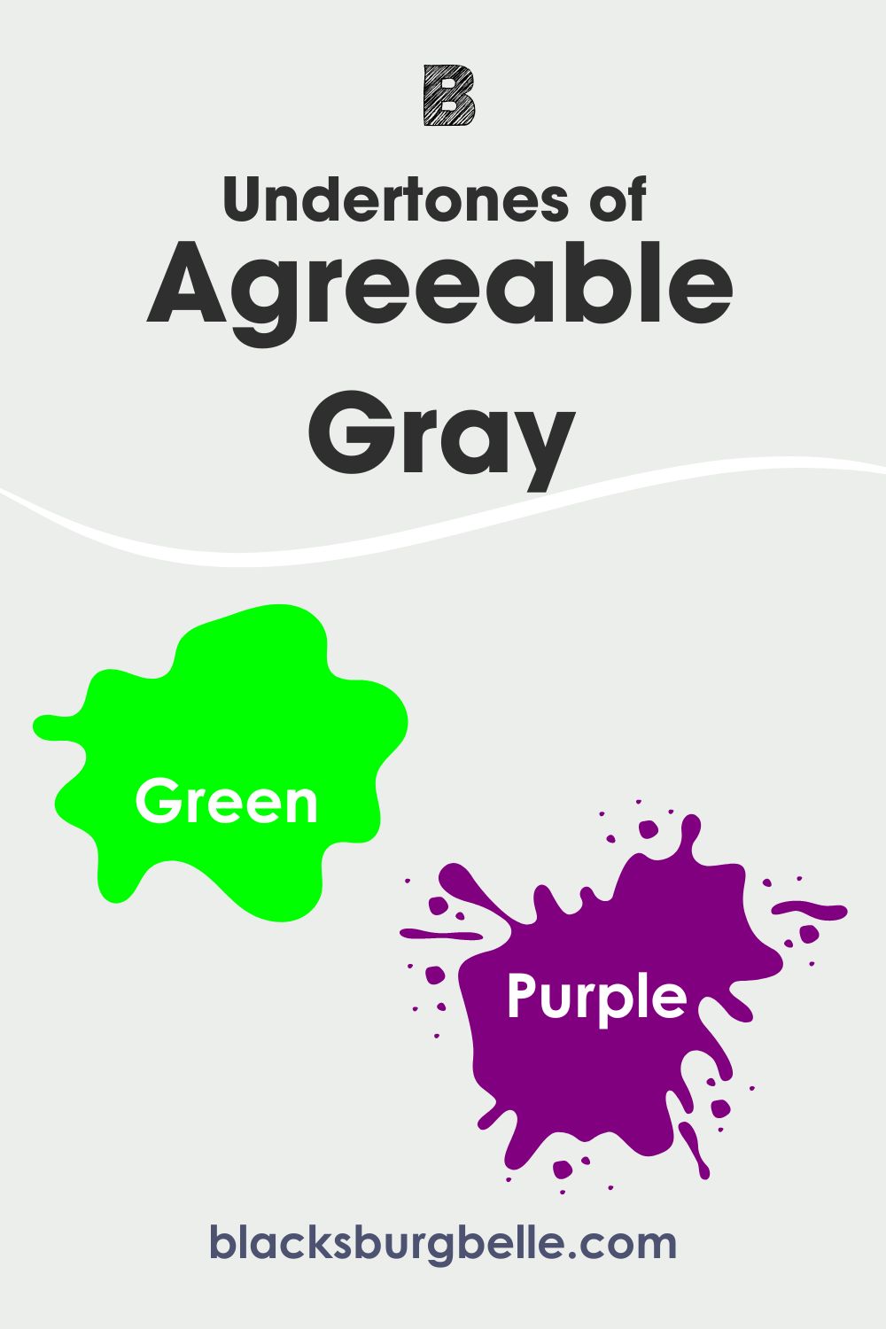
Agreeable Gray is a lot more complicated with its undertones and is also prone to changing under some lighting conditions. You can get green hints from this color when used with some elements of nature like greens. You can also get purple feedback when used in a room with cool lighting or a northern-facing room.
Southern-facing rooms pull out the beige side of AG with its warm lights, and that’s the same for west-facing rooms in the afternoons and east-facing rooms in the evenings.
A Closer Look at Alpaca’s Undertones
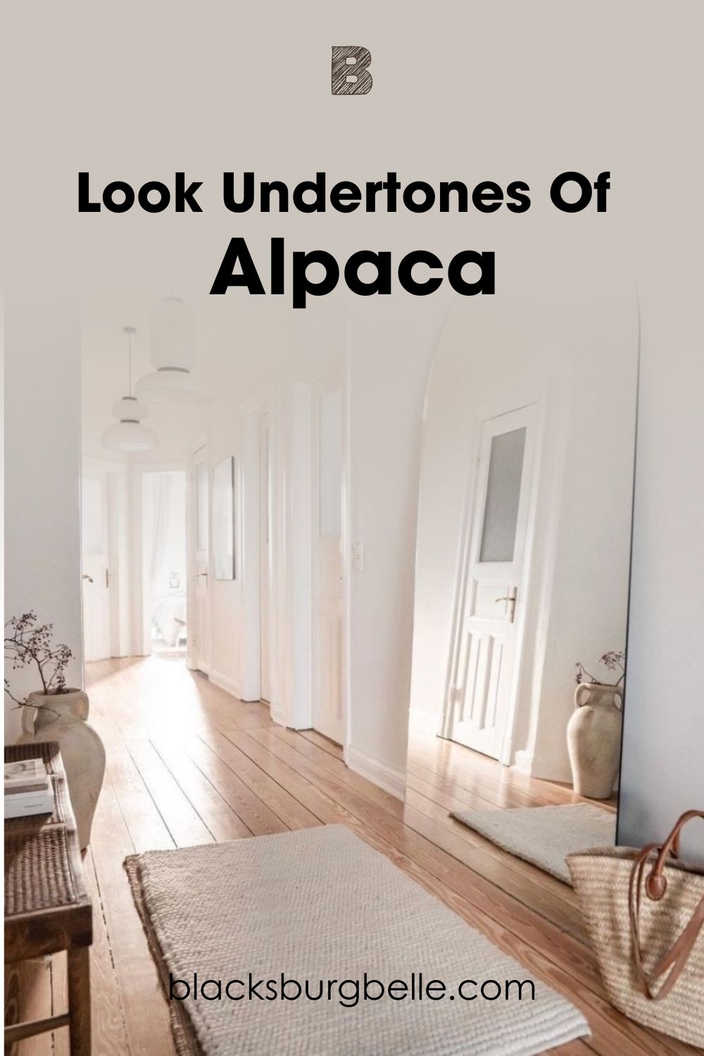
You’d agree with me it’s hard to ignore the obvious soft lilac/purple tones in this image. That’s what happens when you expose Sherwin Williams Alpaca to a great deal of northern lights; its coolness just appeals to the cool side of things.
The wooden floor and the brown beach bag also draw out the beige in this shade, meaning you get a multipurpose side to this shade with an impressive range.
A Closer Look at Agreeable Gray’s Undertones
Gray and green go so well together, and Agreeable Gray is proof. You can almost touch the coolness of this tone with the green in it, and when you look over to the right side of the wall, that soft beige pops out very sharply.
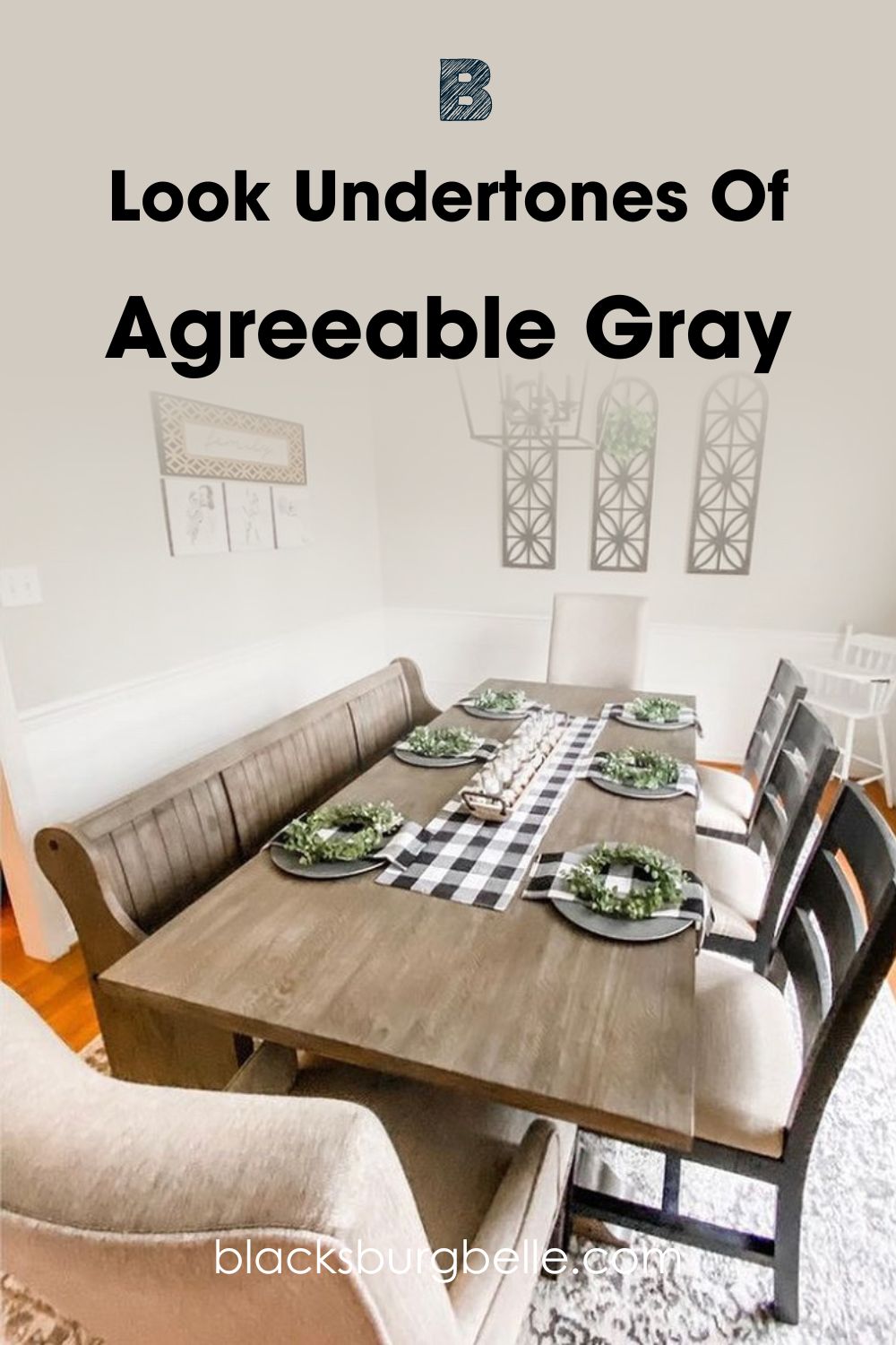
One thing I love about our focus images is how it perfectly encapsulates the very essence of undertones and how the surrounding textures and accessories help draw them out further. Another strong point is that these colors feel a touch of warm and cool lights simultaneously; hence you see all the hidden hues.
Interestingly, you can bet a dollar these colors aren’t gray if you were a greenhorn with no prior idea of where these colors primarily belong. On a parting note, it’s important now to consider these undertones when you’re accessorizing so you won’t create chaos.
As a way to ease into it, you may use these colors as trims or simply pair them with whites to get that monochromatic effect that keeps your space airy and bright all the time, like the second image.
Alpaca vs. Agreeable Gray- Are They Warm or Cool?
Alpaca and Agreeable Gray are warm greige paint colors; placing them with another paint color can still make them appear less warm. Ultimately, their undertones are a deciding factor in just how warm or cool they may likely appear.
The brown undertones in Agreeable Gray keep it warm and even out the greens’ coolness. As for Alpaca, its beige and purple undertones keep it warm, you may be shocked because purple is usually regarded as a cool hue, but in Alpaca’s case, it reads warm.
Alpaca vs. Agreeable Gray Complementary Colors
This read is incomplete without acknowledging that Alpaca and Agreeable Gray work excellently with some shades more than others. Most importantly, I mustn’t hide them from you.
Complementary colors are placed directly opposite each other on the color wheel, and using them together in real life creates a sharp contrast that looks so good. For blues, their complementary colors are orange, while yellow works better with blue, and red stays opposite green.
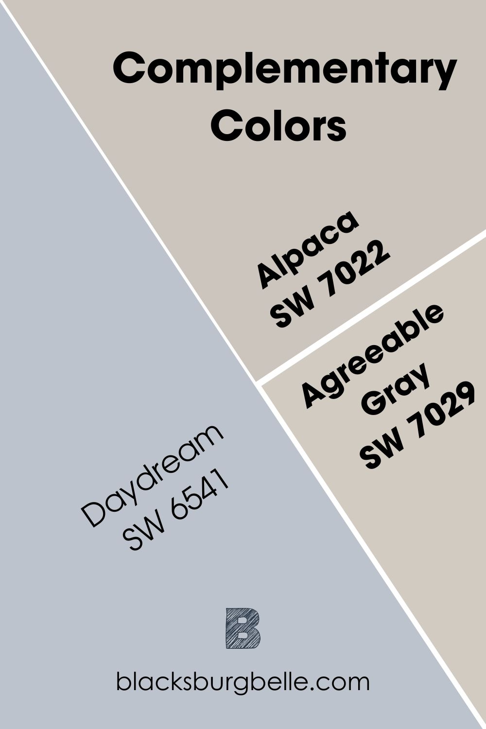
Sherwin Williams Daydream is my ultimate pick as complementary colors for Alpaca and Agreeable Gray. Of course, from the result above, you should be able to deduce that soft purple tones with blue and gray undertones will work with our two focus colors in any space.
It also works best with whites and grays to create an effortless look, but you can decide to be bold and daring by combining them with oranges, dark browns, and even reds.
Alpaca vs. Agreeable Gray Color Palette
Paint color palettes let you get a first-hand mental picture of a wide collection of colors at once, so you can eventually settle for the right color scheme for your home. There are two major types of color palettes that I’m examining today, and they include the monochromatic color palette that’s perfect for those who intend to play safe and keep things very minimal. This palette has the same hue but in varying shades, tones, and intensities.
There’s also the contrasting color palette curated to captivate the viewers’ attention by pairing colors that are different from one another and have high to low-intensity levels.
You’ll find this color scheme in most traditional houses and colder regions because the bright colors on the palette keep things warm and bright all day long. Ultimately, adopting a monochromatic or contrasting palette depends on the preference of the homeowner and the trendy aesthetics at that time.
Alpaca Color Palette
The colors listed here come in handy should you decide to go the monochromatic or contrasting way. Alpaca color is a warm color, which means you can do a warm palette or cool things down by opting for cool colors.
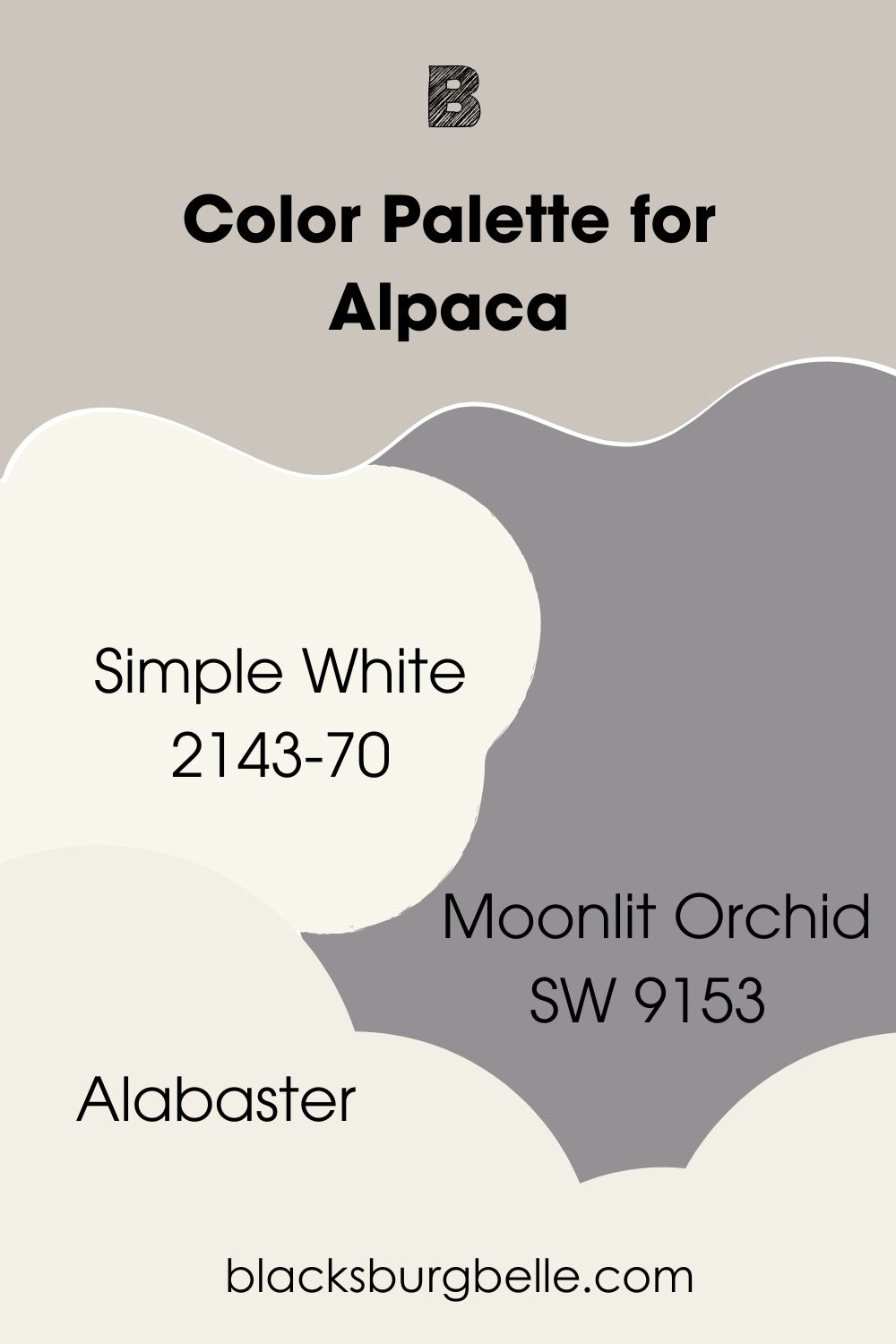
● Simple White: The cool violet undertones in this color work well with the purple undertones in Alpaca. There’re also yellow undertones in it that keep things warm, but they’re only visible under different lighting conditions.
Sherwin William Simple White has an LRV of 70 and will look perfect with Alpaca on a monochromatic color palette.
● Alabaster: Sherwin Williams Alabaster is a soft and creamy warm white color that feels bright when used indoors. It has rich beige undertones and an LRV of 82, making it a highly reflective neutral.
● Moonlit Orchid: Moonlit Orchid is a cool gray but with deep purple undertones that keep things calm and coordinated in a space. It’s quite darker than Alpaca, and when used side by side, it’ll leave a cool cast on our anchor color.
This color has an LRV of 29 and will work as a great accent wall alongside Sherwin Williams Alpaca.
Agreeable Gray Color Palette
Just like Alpaca, you’d find a mix of monochromatic and contrasting themes in this Agreeable Gray color palette. As always, you can go warm or cool with this one; rest assured, you’ll get the desired result.
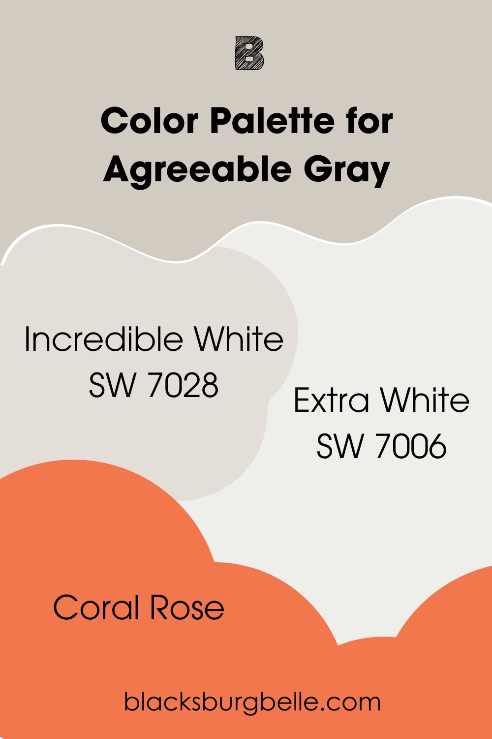
● Incredible White: This one is a very warm color that shows off its greige side in a north-facing room. Its taupe undertones and LRV of 74 make it a great match for Sherwin Williams Agreeable Gray.
● Extra White: Sherwin Williams Extra White is a clean, true white with zero traces of yellow or warm undertones. Instead, you’ll find touches of gray in it that keep it very grounded in the cool category.
However, when you use this color in south-facing rooms, you’ll get warm and balanced feedback but never a creamy one. This is because it reflects the warmth gotten from the sun back into your space.
● Coral Rose: This pretty coral color’s red undertones work amazingly with the green hints of Sherwin Williams Agreeable Gray. It also has an LRV of 28, which means they bounce off each other pretty well and can work as accent walls.
Alpaca Vs Agreeable Gray On Walls
Alpaca and Agreeable Gray are best suited for interior walls as they help open up your home to lots of light and also work well with white trims. The relationship between the undertones in these two colors and the lighting in your home gives a whole new experience each passing day.
Let’s look at just how well they perform in the images below.
Alpaca on Bedroom Walls
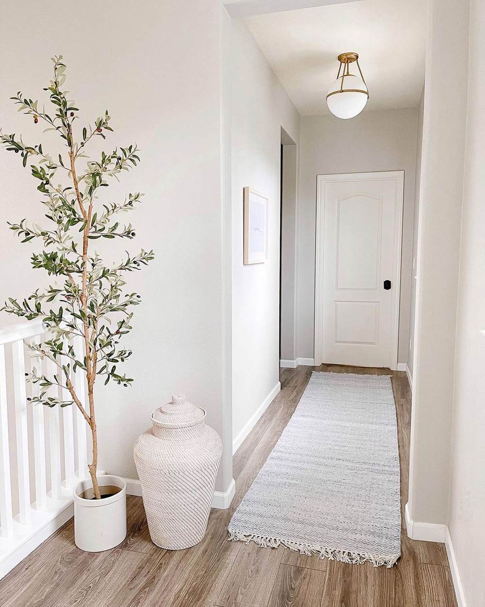
Bask in the sheer beauty of Sherwin Williams Alpaca in this hallway. I’d love to point out how bright a medium-light color like Alpaca looks even when used in a space that seemingly gets less light.
Another beautiful thing about this picture is how Alpaca retains its natural gray tone and then switches it up to beige at the same time in homage to that bright brown flooring.
Agreeable Gray on Interior Wall
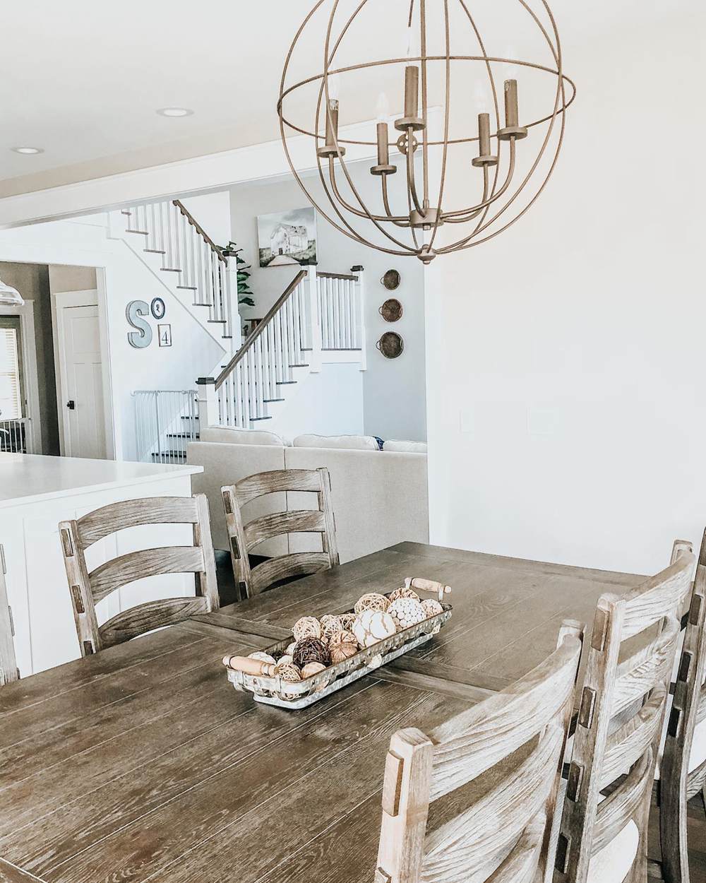
Agreeable Gray shows off two unique sides here due to the lighting situation in the respective images. The closest angle to us definitely appears warmer than the farther corner of this room, which reads green thanks to the cool northern light.
I’ll never fail to emphasize the place of accessories in the overall turnout of any paint job. It’s been established that Agreeable Gray has beige in it, but what would it do if there were no surrounding beige/brown tones to latch on to? You’d just get a plain, bland gray.
The lovely set of brown furniture saves the day for the beige, while the pretty cool white railings give the green a very soft landing.
Alpaca Vs Agreeable Gray on Furniture
Yes, you can totally beautify your home furniture with lovely shades of Alpaca and Agreeable Gray. Best believe you’ll get many wholesome undertones with these colors on the unlikeliest surfaces too. Let’s dive right into it.
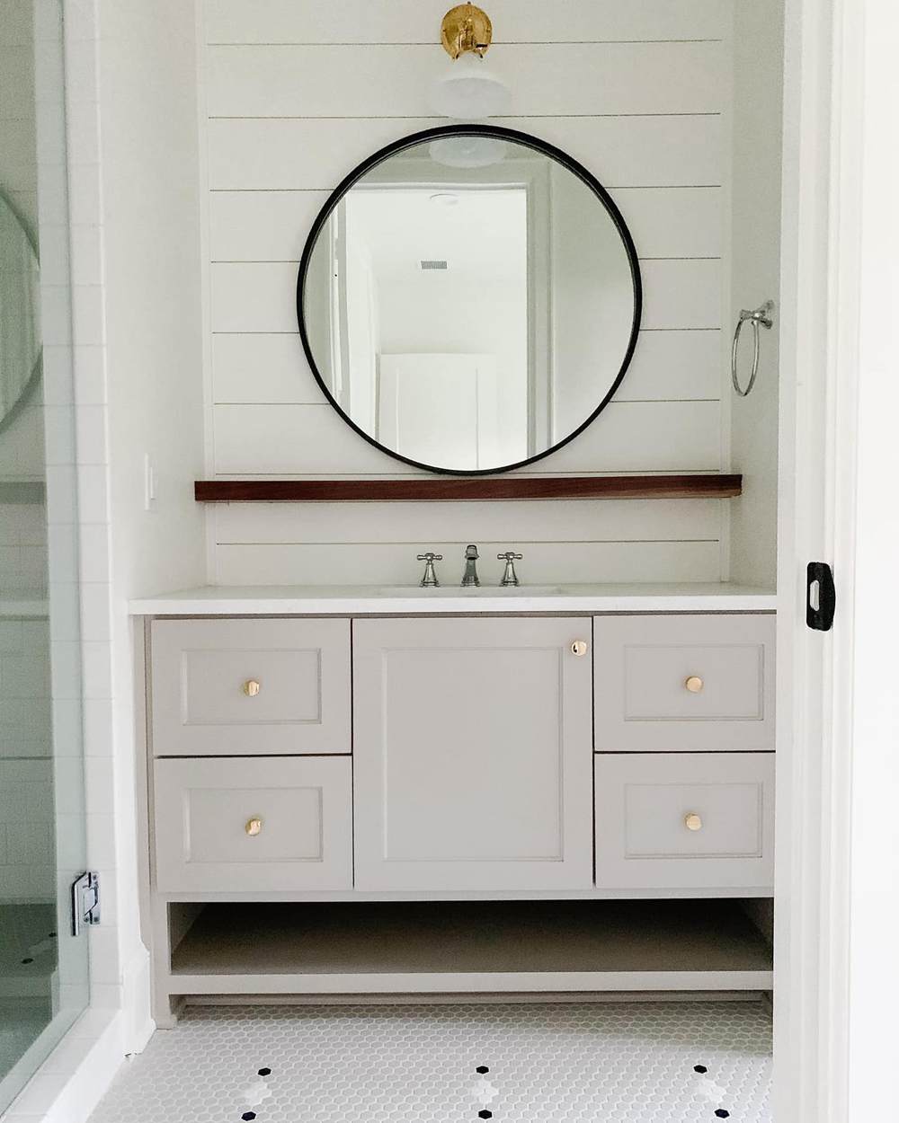
Sherwin Williams Alpaca is really that girl on this set of vanity drawers. I can CLEARLY see a soft lilac color with bright gold handles. I don’t think we’ve seen so much of the purple in Alpaca in this read until this image.
It also helps that other parts of the room come in different colors, allowing our focus paint to shine.
Agreeable Gray on Wooden Drawer
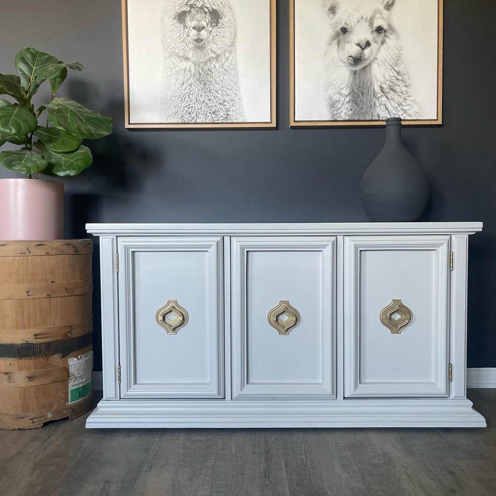
Agreeable Gray sticks to its gray roots here, all cool and icy. No beige in sight, and surely no one is complaining. Notice how the color also reflects on the floor surface. The black wall with its strong purple and blue undertones is absolutely in on the large dose of coolness we’re all getting from this image.
Keep things chic and modern with gold accents and other colorful textures. Don’t forget that AG is also neutral and absolutely gives room for more colors to hop on the bandwagon.
Alpaca Vs Agreeable Gray on Doors
Doors are a major part of home aesthetics. From prehistoric times till now, they’ve been objects of interest for various beautification processes, and now things have upgraded to a whole new level of beauty with paint colors.
Alpaca and Agreeable Gray produce some of the most gorgeous doors with their interesting undertones and depth.
Sherwin Williams Alpaca
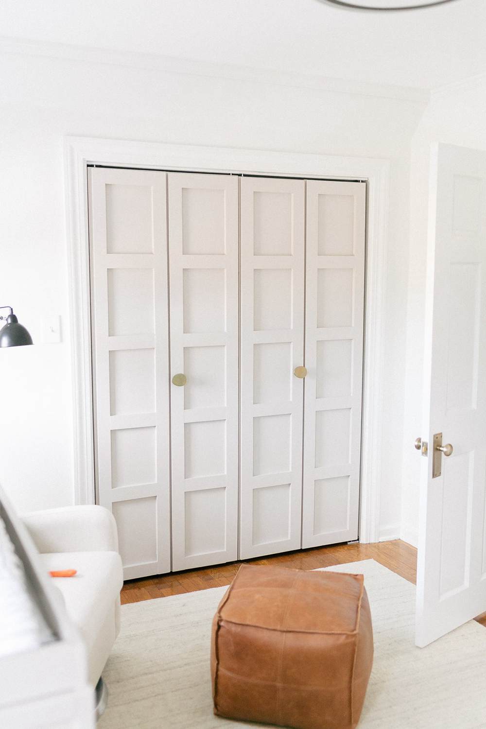
Like a golden fish, Sherwin Williams Alpaca has no hiding place in this space. The color stands boldly on the big door while showing off its cool purple undertones. You can also get a hint of beige with the wooden floor and pillow as accessories.
Sherwin Williams Agreeable Gray on Door
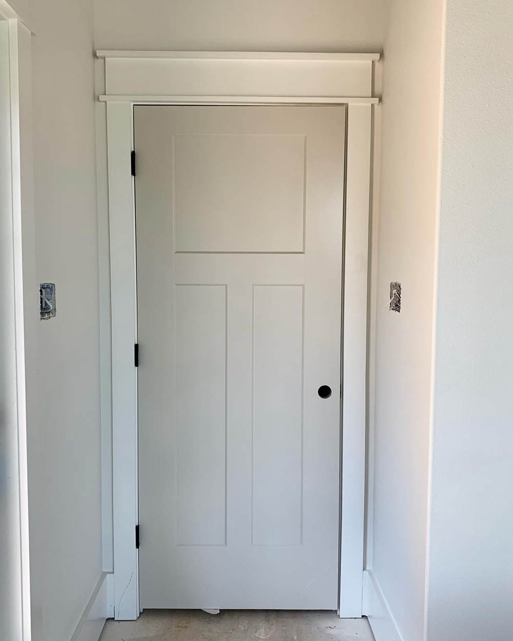
Agreeable Gray keeps things cool and gray on the door. I love the monochromatic theme going on with the surrounding walls in this space. You can also see a subtle touch of violet on this one.
Alpaca Vs Agreeable Gray On Exterior Walls
Both colors are great choices for home exteriors, but there are a few things that you must know.
The first is that all colors look washed out in the sun, and depending on the surrounding features in the environment, you may see undertones that you’ve never seen before.
Overall, colors applied outdoors show more forgiveness and are way more versatile, so you don’t have to worry about mixing and matching.
Alpaca on Home Exterior
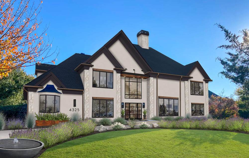
I absolutely adore the Alpaca on this outdoor wall. From the greenery to the bright blue sky and the matte black roof, you can tell they’ve all looked forward to this big moment. Alpaca slips right into its pink/purple and beige roots in this picture.
The deep brown trims complement the beige and the soft purple works with the rich blue undertones on the roof. While Alpaca may conventionally not be an outdoor color, I recommend it for use in cold areas so this warm tone can balance things out.
Agreeable Gray Outdoors
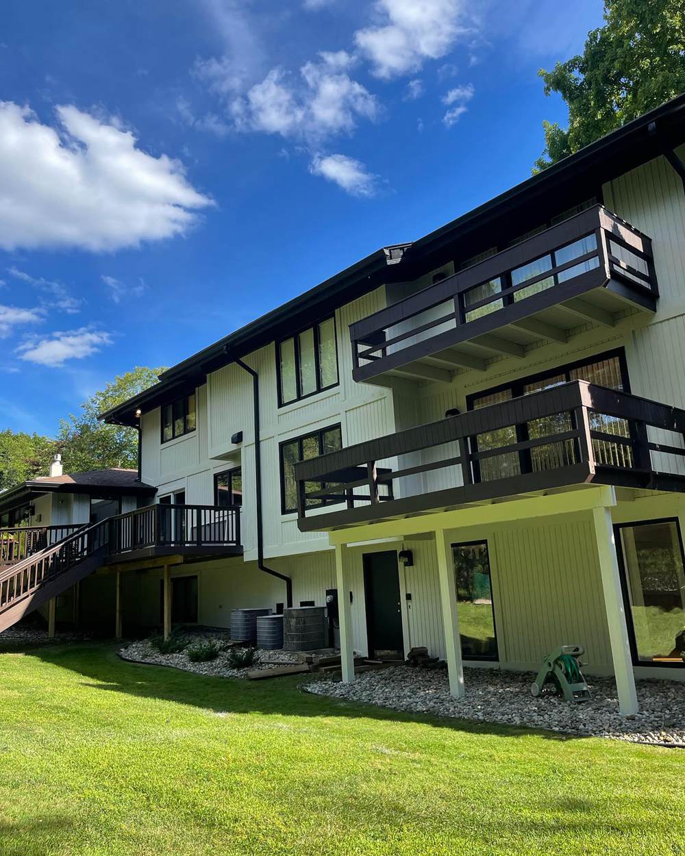
The green goodness of Agreeable Gray matches the luscious green lawn of this beautiful home. You’d almost think this color is translucent, especially how it reflects the green. Keep things edgy by incorporating black and brown trims, roofings, and accessories into the palette; this gives it an entirely different vibe and more range.
Alpaca Vs Agreeable Gray on Cabinets
Kitchen cabinets should never be left behind when turning things up in the space. Alpaca and Agreeable Gray look really good on cabinets, especially if you lean towards creating a modern, monochromatic space.
Sherwin Williams Alpaca on Cabinet
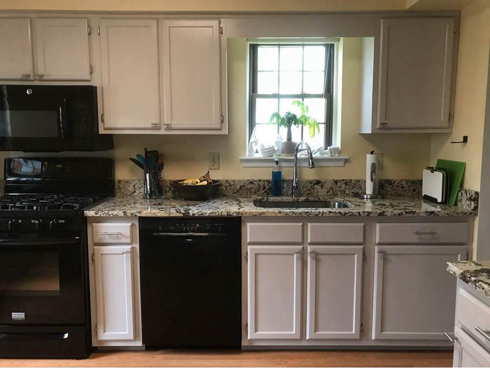
Kindly study this picture to notice how different this color’s undertones turn out. For the part that gets the most light, you see a heavy presence of beige, and the lower part that receives the least light keeps things cool with rich purple undertones.
Agreeable Gray on Kitchen Cabinets
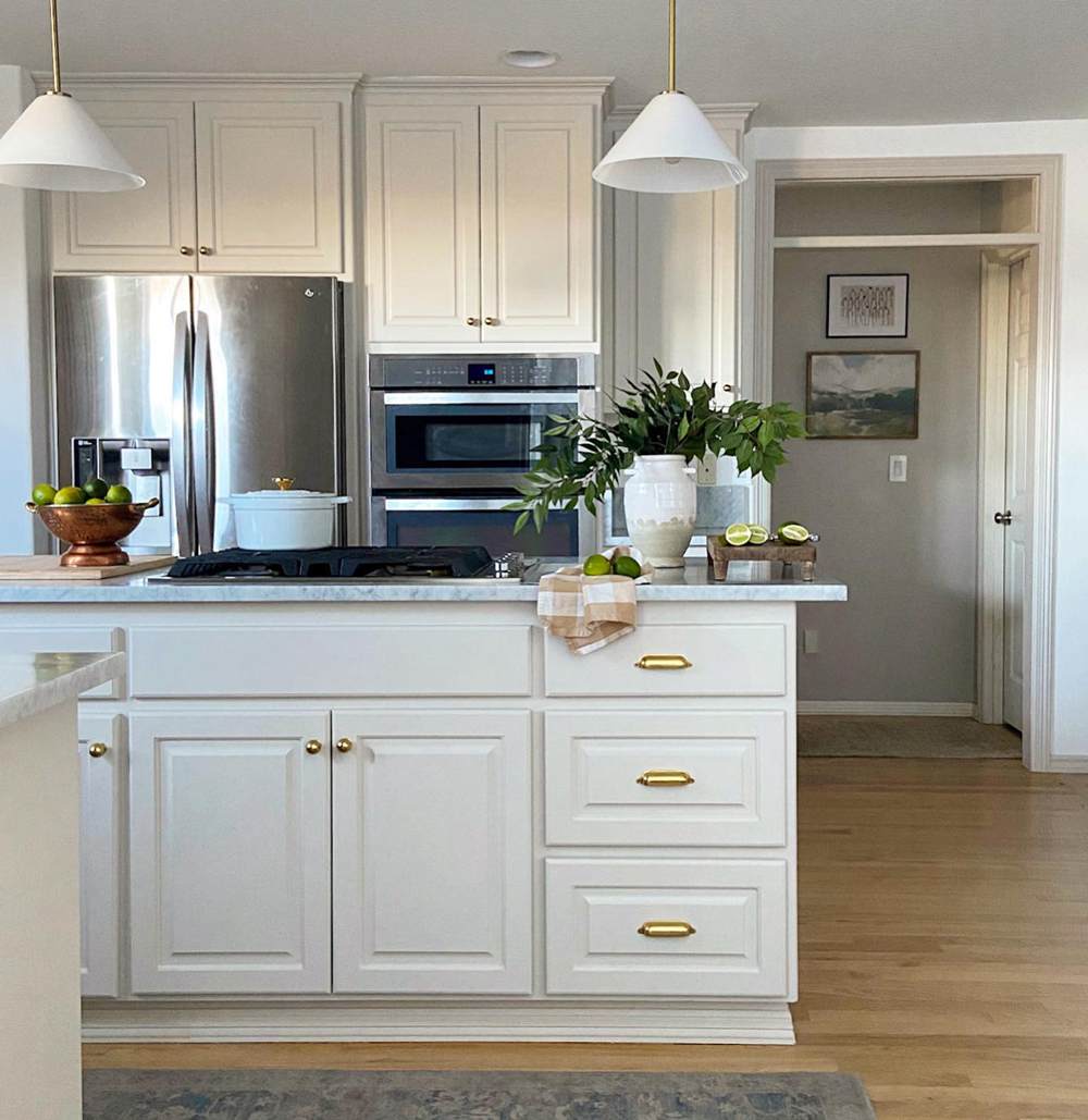
Sometimes, Agreeable Gray stays neutral in a space, and you can almost confuse it for the color white but understand that this is far from true. We’re getting very muted undertones on this set of kitchen cabinets.
While it’s not a bad idea, in fact, I think this allows you to pile more accessories without overwhelming your space. The warm gold handles put a gorgeous bow on the whole setup.
Lighting Conditions
All colors get altered by elements of lighting around them. This lovely phenomenon manifests in the form of the varying intensities you spot as soon as you walk into a space with Alpaca and Agreeable Gray.
Because they’re both warm colors and neutral at the same time, they can work in any space, providing that you pair them with the right lighting and accessories. Personally, I would pair both with cool lighting because I like the soft touch of purple it gives a room.
For people who prefer the beige side of things, go all in with those warm lighting, and if your room faces south, best believe you’ll get that golden touch all day.
Conclusion
You have come to the end of this enlightening and educational read, and I’m certain that whatever option you choose to work with, you have enough info on your hands to make it work and pair them with the right accessories.
However, there’re still more tips to help you achieve a stellar outcome.
- Study the size of your space and let that guide your color choice
- Always consider the existing decor in your space before settling for a color
- How’s the current lighting situation in your space?
- Are you going long-term or short-term with your decision?
- What finish is best for your home? Sheen, matte, satin, or gloss?
If you have any questions or suggestions, do not forget to leave a comment in the box below.

