How do you decide when to opt for one of either Sherwin-Williams IN THE NAVY and Naval? As the brand’s leading navy colors with similar LRVs, I understand why it is so easy for you to stall choosing between either of the two.
On the surface, Naval and IN THE NAVY give the same vibe, but a deeper analysis shows that both colors couldn’t be more different if Sherwin-Williams tried.
With Naval, you get a dusty blue navy paint color with a hint of gray while the Navy possesses a bold outlook with a green undertone.
In this article, I’ll use science and art to explain the difference between Naval and IN THE NAVY. It’ll help you identify them and choose without any more confusion.
Let’s start with the basics.
Table of Contents
When Should you Choose IN THE NAVY and Naval?
Knowing when to use Naval and IN THE NAVY comes from understanding the colors’ scientific and artistic qualities. First, check out this breakdown of scenarios befitting each navy shade.
Choose IN THE NAVY if:
- You want a dark paint with hidden warmth
- You’re painting a hangout spot, like a man cave or sport’s bar
- You lean towards white and gray accents and furniture
Choose Naval if:
- You prefer a dusky deep blue with pure coolness
- You’re painting a meditative space
- You’re decorating with tan and light blue accents
You’ll see visual examples of IN THE NAVY and Naval used around a house and office. Then, you can compare them to the scientific differences before choosing.
The Visual Distinctions: IN THE NAVY vs. Naval
Let’s start with visual representations of IN THE NAVY and Naval to prepare you for what’s coming.
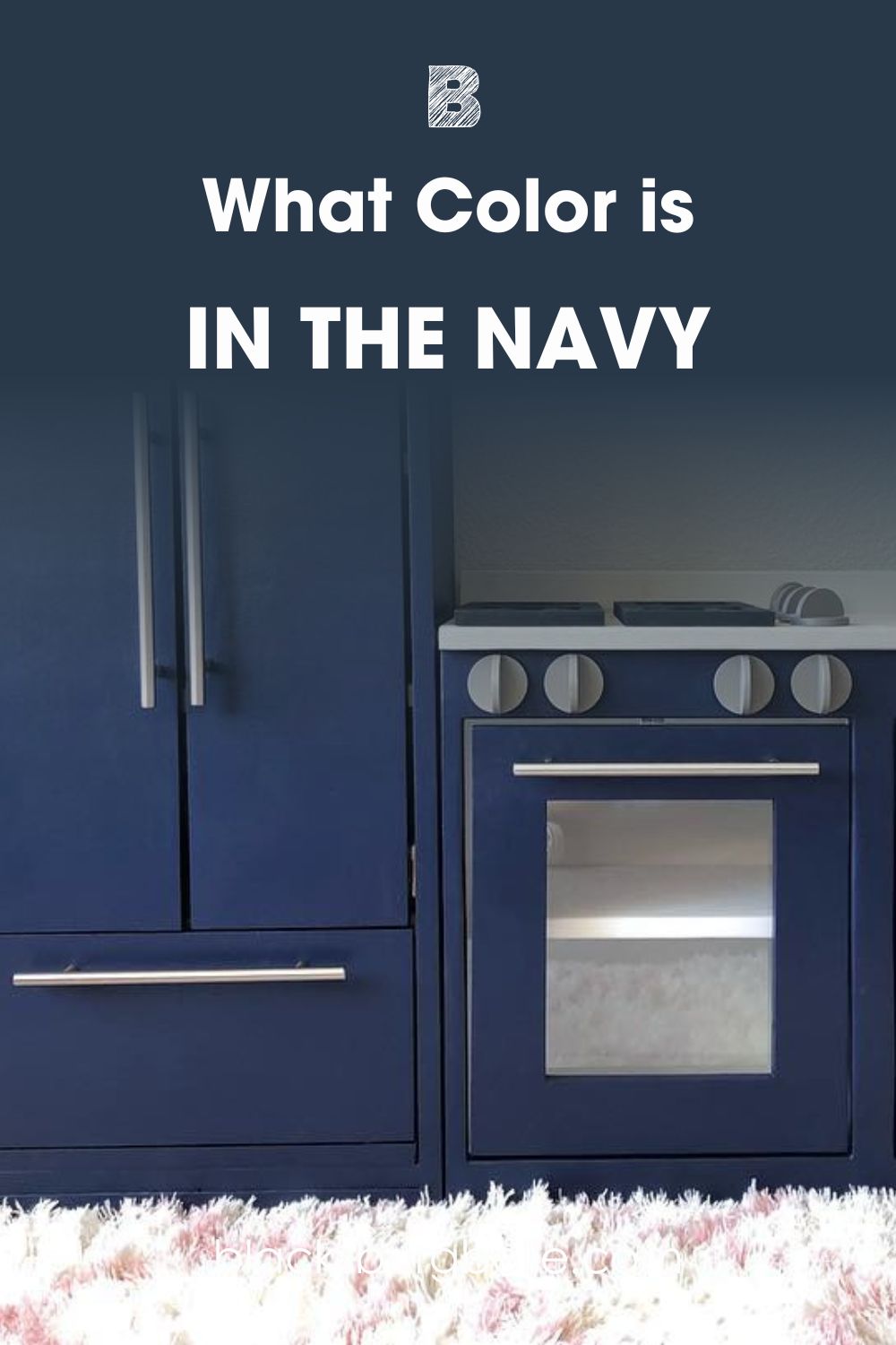
See IN THE NAVY on a kitchen cabinet including a white sink
See Naval on an accent wall against gray and black neutral walls
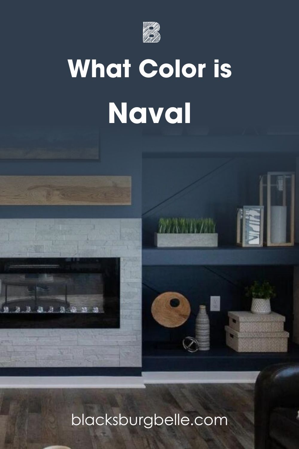
Sherwin-Williams IN THE NAVY looks bluer than Naval which has a dusky glow. When you see the paired colors, you’ll understand why both navy blues have different outlooks.
The first picture has a bright white sink over it while the mood in the second picture is muted with dull grays and tans. Keep reading to find out why two colors with the same LRV have different outlooks.
Choosing between IN THE NAVY and Naval: A Swift Comparison
Let’s dive into the science of these two navy blue paints:
| IN THE NAVY | Naval | |
| LRV | 4 | 4 |
| RGB | 40|56|73 | 47|61|76 |
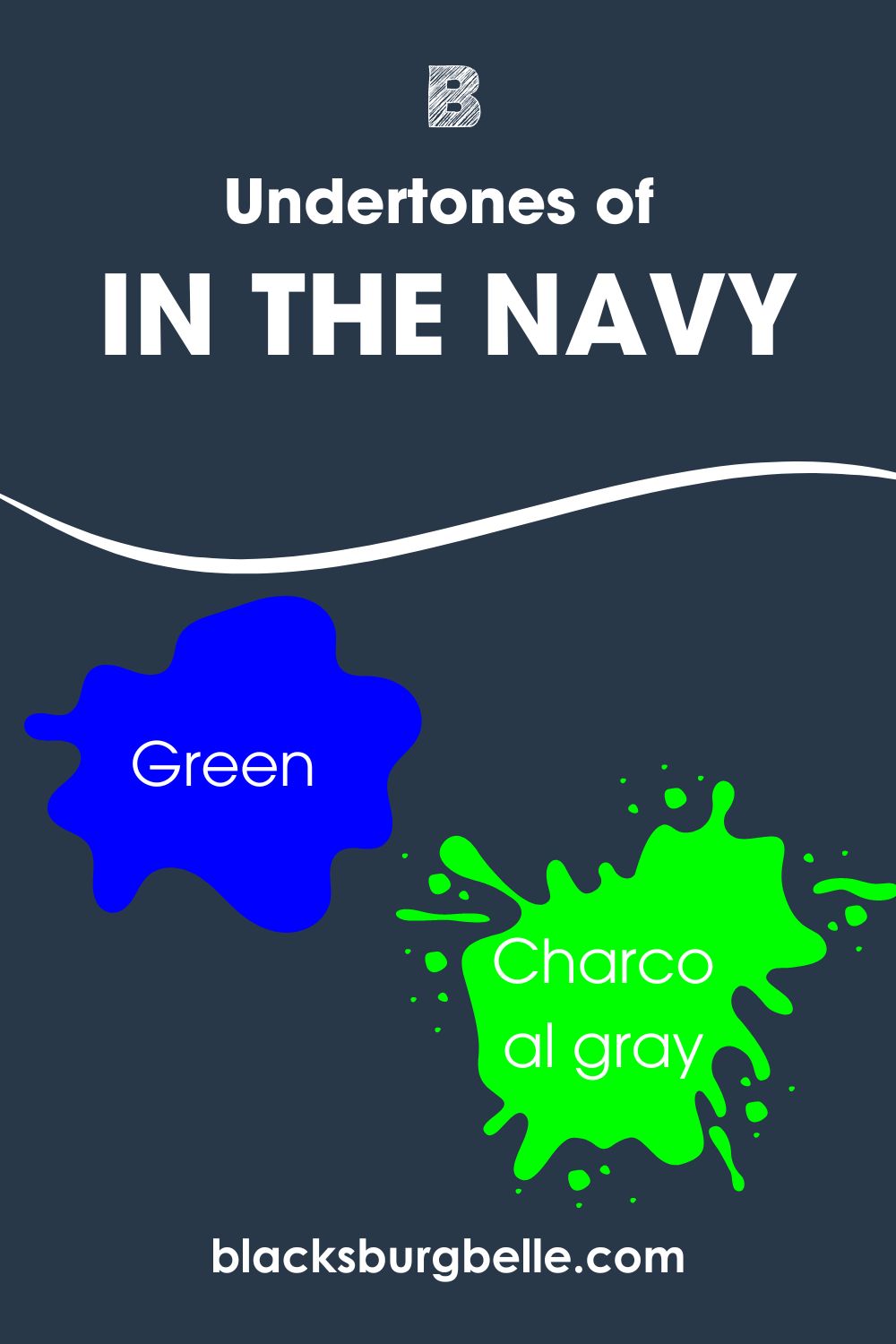
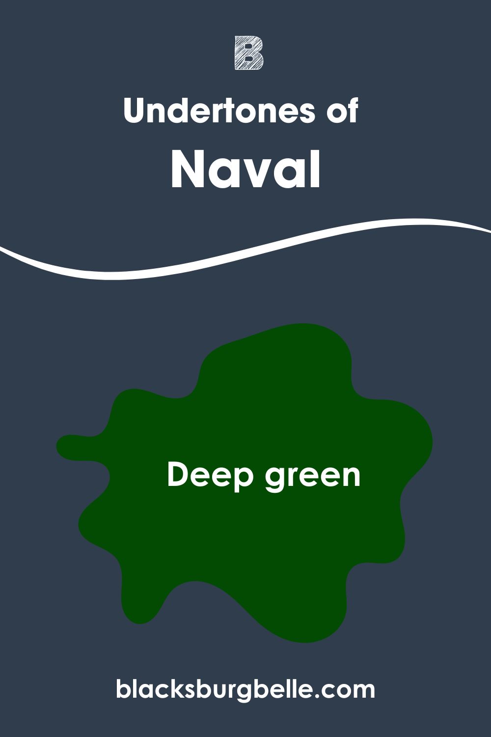
| Undertones | Green | Green, Charcoal Gray |
| Hex Value | #283849 | #2F3D4C |
Emotional Effects: IN THE NAVY vs. Naval
It’s time to analyze why Naval and IN THE NAVY give you different feelings despite their similarities.
Sherwin-Williams’ IN THE NAVY is an exquisite dark blue with a calming energy. Because it retains its blueness, this color appears bolder underneath bright light. You’ll understand this better when we discuss undertones.
Meanwhile, Sherwin-Williams Naval gives off a serene aura ideal for meditative spaces. When you use it in your office, brainstorming ideas for work doesn’t feel like a chore because its soothing aura keeps you zen.
I prefer using IN THE NAVY in dens, mancaves, and as accents in family rooms, while Naval works for business rooms like studies and boardrooms.
Light Reflectance Value (LRV) of IN THE NAVY Vs. Naval — Which Color Reflects More Light?
LRV is a scale of 3-97, which tells you how much light a paint will reflect, with 0 being absolute black and 100 being pure white. Paints cap at 3-97 because of undertones, so the lightest white color would be 97, while the darkest black is 3.
IN THE NAVY and Naval both have an LRV of 4 LRV. In addition to this they also possess the same reflective capacity, but designers consider the first one a truer blue than its counterpart. Despite that, more people use Naval instead of IN THE NAVY.
Although they have the same LRV on paper, IN THE NAVY is brighter than Naval, which has a dull, almost pastel look. Why’s that? Because of the undertones. Now, let’s see what the fuss is about.
Undertones of Paint IN THE NAVY vs. Naval: Are They The Same?
Sherwin-Williams IN THE NAVY has green and charcoal gray undertones, while Naval has a faint deep green tint. When you mix red, green, blue, and black (RGB) in measured quantities, you’ll get a unique paint color.
This unique color has an overtone, the hue you see on the surface, and undertones, the additional shades formed from the RGB mixture.
A Closer Look at the Undertones in IN THE NAVY
Look at the bottom right corner to see the deep green tone overcoming the color. Then gaze upward towards the bright light. See the gradient transform into a bright navy blue without tints.
A Closer Look at the Undertones in Naval
The white light and direct natural sunlight from the North-facing window give the Naval wall a dusty gray look. But the lack of lighting on the left side shows the color in its natural navy tone.
Because IN THE NAVY has 40 red, 56 green, and 73 blue, its blue tone is dominant while the green appears as a tint.
On the other hand, Naval has a high blue pigment of 76 while green follows closely at 61, leaving no room for red in its undertone. At best, you’ll get a soft charcoal gray tone which gives its blue overtone a dusty appearance.
Sherwin-Williams Naval is a bluer paint than IN THE NAVY because of its minimal green undertone.
Sherwin-Williams IN THE NAVY and Naval — Warm or Cool?
Naval and IN THE NAVY are both cool shades of navy blue. But Naval is duller and moodier than IN THE NAVY which has an energy boost to its overtone.
Since IN THE NAVY’s red measurement is close to its green, the color has the potential for warmth. But it’ll take a combo of brighter warm paints in the color palette to emphasize that.
With Naval, the blue and green pigments being 76 and 61 gives no room for warmth. So, if you want to liven up your space, use IN THE NAVY. Then choose Naval for a moody vibe.
Complementary Colors for Naval vs. IN THE NAVY
Every color has an opposite tone that contrasts when paired in one space. The color wheel pairs blue with orange but with neutral blue tones like Naval and IN THE NAVY, we need to dig deeper.
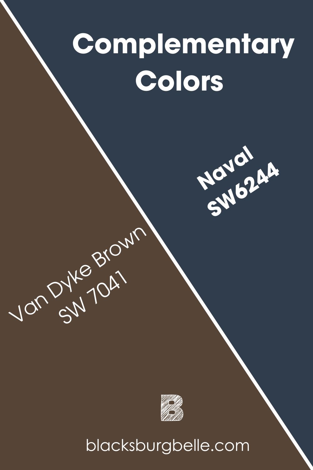
IN THE NAVY’s complementary color is Dark Clove (SW 9183), while Van Dyke Brown (SW 7041) complements the Naval.
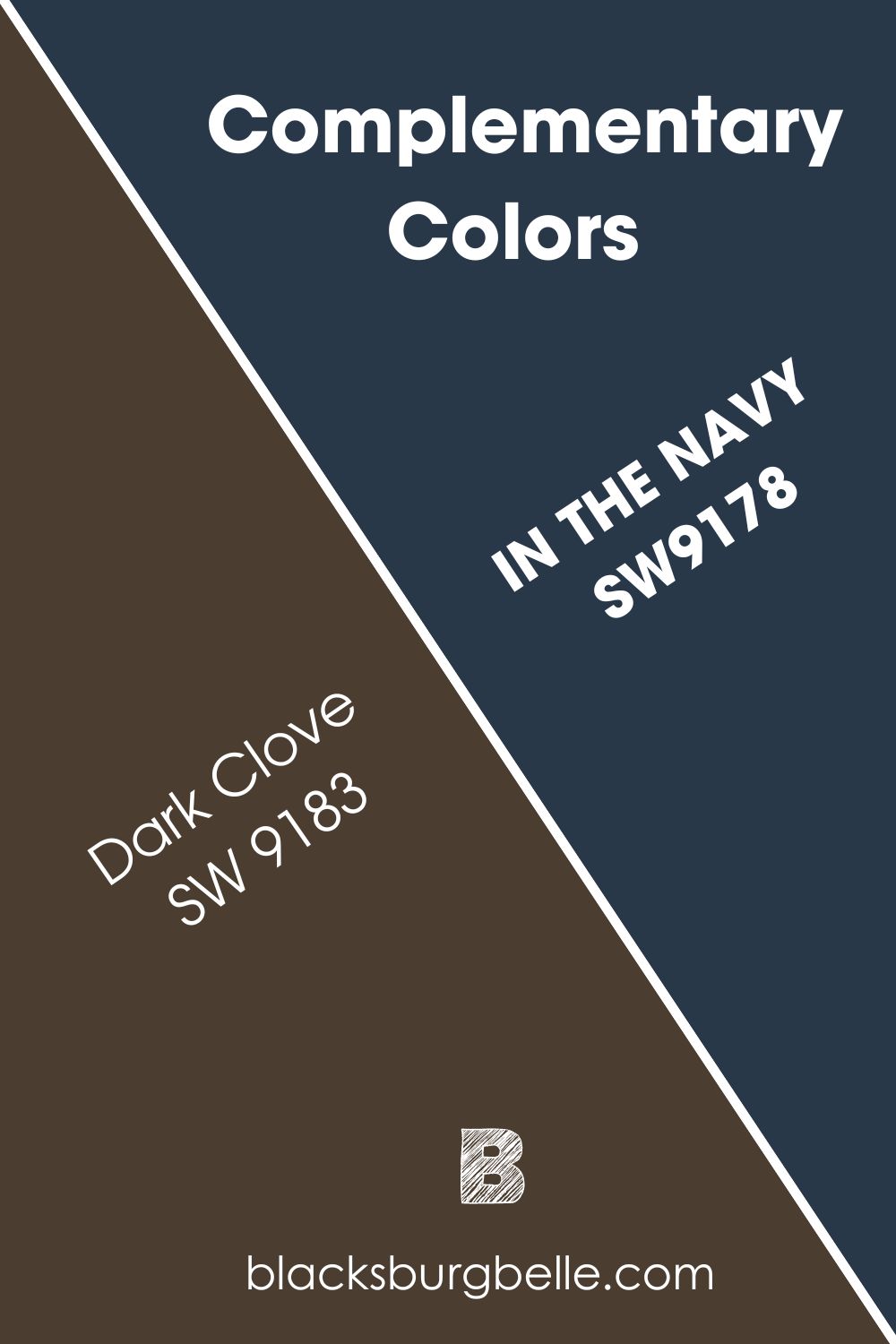
IN THE NAVY is a bold navy blue, so it makes sense that its complementary shade is a warm chocolate brown. As a business room wall paint, I noticed most people paired it with brown leather.
The exact hex code is #493928, but Sherwin-Williams doesn’t have that in stock.
For Naval’s dusty cool look, it takes a warm yet muted brown to match its energy while creating a new look. The exact hex code for its complementary color, #4C3E2F, is also unavailable at Sherwin-Williams.
Orange remains a primary factor in both complementary color undertones. So, if you want a brighter complementary color to highlight your navy blue paint, choose a mid-tone tan neutral like Ramie (SW 6156) for Naval and Dirty Martini (SW 9119) for IN THE NAVY.
Color Palette for Naval and IN THE NAVY
Color palettes combine two or more colors to create a unified theme by matching undertones and overtones. There are about six standard palettes but four popular ones. We’ve already discussed complementary styles, so let’s discuss the other three.
Firstly, we have the famous monochrome theme, which uses one base color and then builds the rest of the decor around it. The other colors come from mixing the base color with white and black to create tints and shades.
Next is the analog theme, which combines three colors based on proximity on the color wheel. It means you choose one color from the left and right of your base hue.
Finally, the triadic theme is fast becoming a favorite because of its daring combos. You pick three colors spaced evenly on the wheel to form a triangle. This theme often picks clashing tones, so it’s up to you to bind them with a neutral shade.
Let’s apply this theory to Naval and IN THE NAVY color palettes.
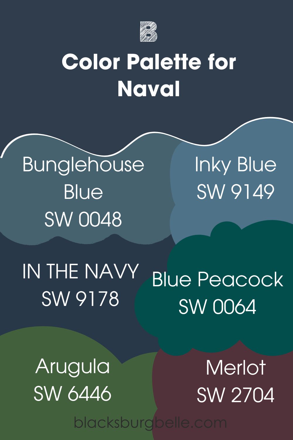
Naval Color Palette
I’ll start with colors from the monochrome palette and then move to analog and triadic combos.
- Bunglehouse Blue (SW 0048): This historic shade of blue is a progression towards the median of the LRV scale. It won’t brighten the space, but it’ll create a beautiful combo of coolness.
- Inky Blue (SW 9149): Create a warm aura to balance the moodiness of Naval with this 15 LRV color. Lighter blue shades for your monochrome palette includeSmoky Azurite (SW 9148), Favorite Jeans (SW 9147), and Moonmist (SW 9144).
- IN THE NAVY (SW 9178): Add this brighter navy shade into the mix foran analogous theme. Don’t expect much from this combo unless you have adequate lighting.
- Blue Peacock (SW 0064):The deep green tone of this color will highlight its undertone, although it’ll keep the space looking dark. Add a complementary color for some light in the middle of the darkness.
- Arugula (SW 6446): Use this earthy green to create a nature-inspired combo in your analog palette.
- Merlot (SW 2704): Complete your analog theme with the rich purple tone of Merlot. It’s warm with high red content and a hint of blue under the proper lighting.
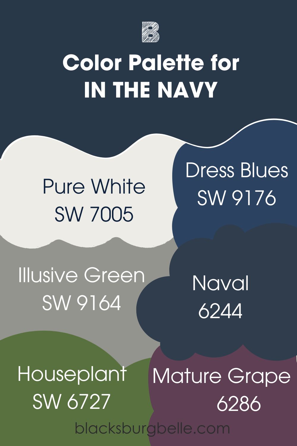
IN THE NAVY Color Palette
The options for IN THE NAVY are more exciting because it’s a bolder shade of navy.
You’ll notice that most of the colors used in the Naval palette apply to IN THE NAVY. When you look closer, you’ll see the difference in undertones, as IN THE NAVY has brighter tones in its palettes to match its bold look.
- Pure White (SW 7005): This bright white paint has no visible undertones to clash with the green or blue tones in IN THE NAVY. That makes it the perfect binder on trims and accents to tie in other colors.
- Dress Blues (SW 9176): Although this classic blue also has a low LRV of 5, you can use it in a monochrome theme to maintain elegance.
- Illusive Green (SW 9164):This monochrome palette has no such thing as too many neutrals. This green-gray paint has a cyan undertone that matches IN THE NAVY’s green-blue hue.
- Naval (6244): Use Naval to intensify the moodiness in the room by toning down the boldness of IN THE NAVY’s overtone. It’s an ideal choice for an analog theme.
- Houseplant (SW 6727): This medium-dark glowy green paint gives your navy walls an elegant accent.
- Mature Grape (SW 6286): Because this purple paint has a strong blue undertone, its warmth will blend with navy blue.
Even though the colors in the analog and triadic palettes are mostly dark shades to match Naval and IN THE NAVY, you can choose lighter tints to create a less saturated tone.
Replace the greens with mid-toned green grays and use lilac or lavender instead of deep purples.
Can you use Naval and IN THE NAVY Together?
Yes. Naval and IN THE NAVY work well together in analog themes. That way, you can maintain a navy color scheme while using the dustier tone, Naval, to highlight the deep blue IN THE NAVY.
This will only work when there are other colors to highlight the differences in both colors. So, add a bright white trim and adjacent colors green, purple, and gray (for neutral schemes) as the accents.
Naval vs. IN THE NAVY on Walls
Because navy blue is a dark shade, many homeowners avoid using it in family rooms. But if you lean into creativity, you’ll find that Naval and IN THE NAVY are exquisite navy shades. You can use them for entire or partial walls, whether inside or outside.
Firstly, let’s look at them on interior walls.
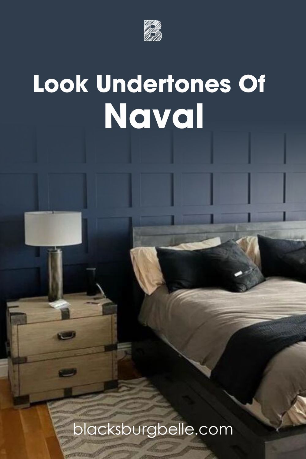
Naval on Walls
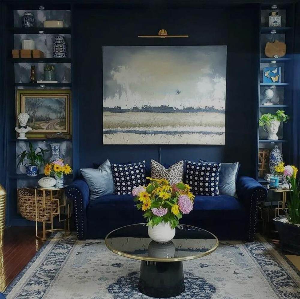
Naval blends into the background in this study, while the deeper navy shade used on the sofa stands out. The light from the windows, paired with the yellow flowers and gray decor, teases the gray undertone in the walls.
IN THE NAVY on Walls

This room’s deep brown wooden bed complements the IN THE NAVY wall. Pure White on the accent walls and door makes the room look less stuffy. So the occupant won’t feel like the walls are closing in on them.
Naval vs. IN THE NAVY on Cabinets
Painting your cabinet is a great way to accentuate wall paints, especially neutrals. Navy shades on lockets, wardrobes, and other types of cabinets make a space look ten times more elegant than plain tones.
See what we mean below.
Naval Cabinets
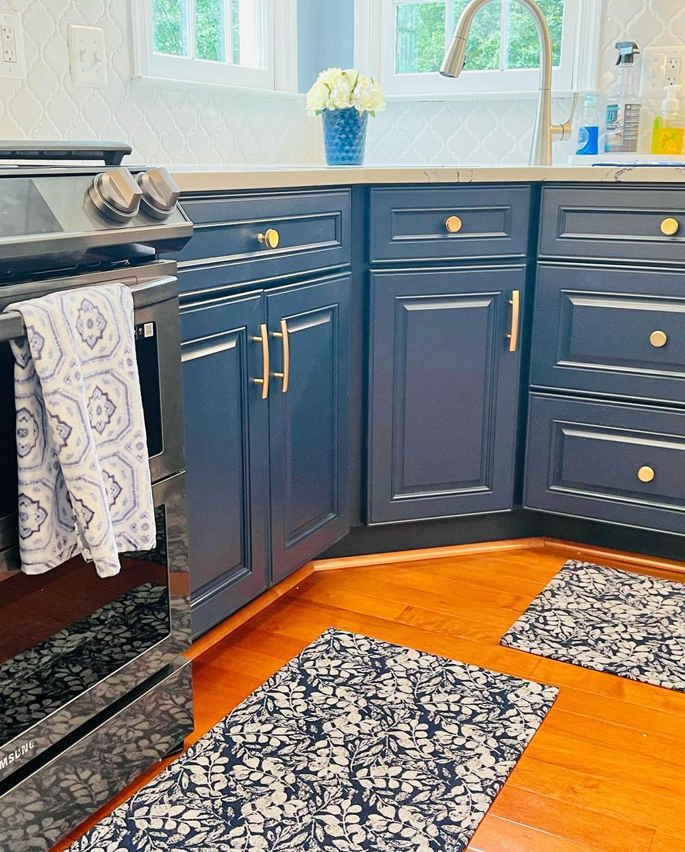
The dusty Naval cabinets complement the orange wooden floorboard. The white and navy rug matches the white tiled walls and mixes modern and traditional decor in this kitchen.
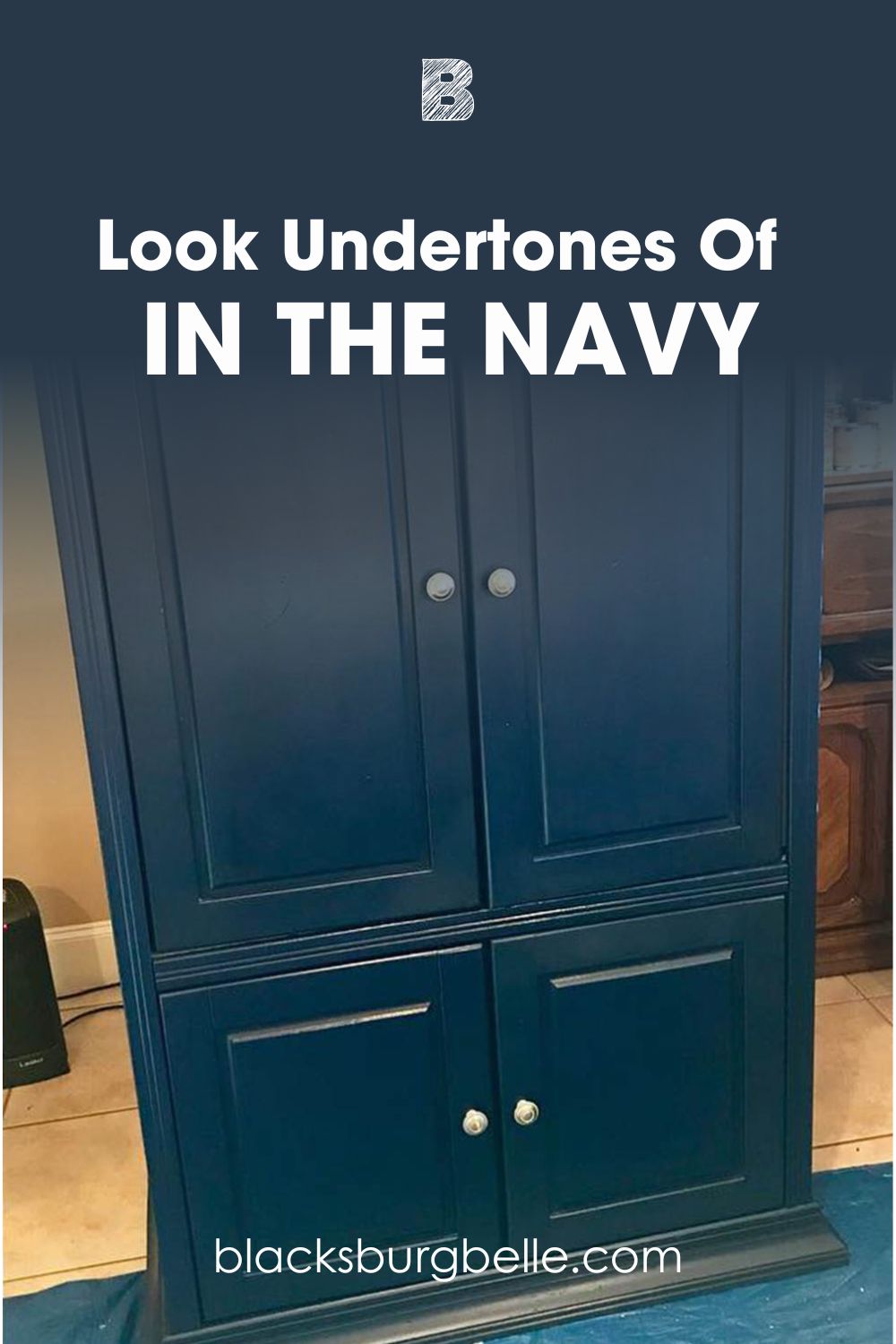
IN THE NAVY Cabinets
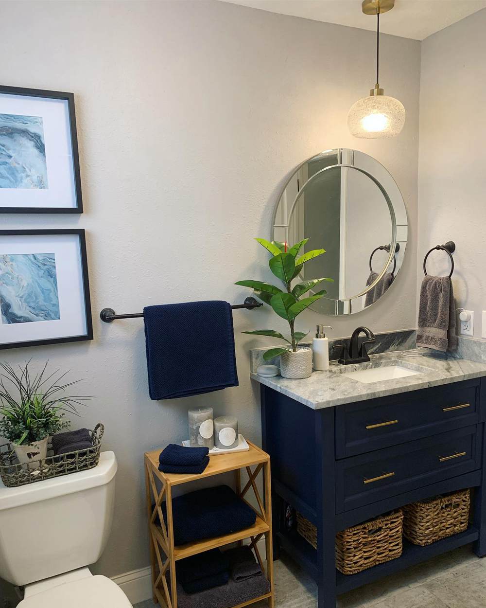
The clean slate gray walls and complementary IN THE NAVY cabinet make this bathroom look exquisite. The neutral white trim unites dark colors, while the raffia wooden accents highlight the navy features. You get a modern and minimalist vibe from this bathroom.
Naval vs. IN THE NAVY Exteriors
Is it overkill to paint your entire exterior wall navy? Or is it the new wave? See for yourself and decide.
Naval Exteriors
Keep your home traditional with orange-toned wooden front doors and roofing to match your Naval walls. See how the sun’s reflection gives the upper deck a brighter glow than its lower counterpart.
The white trims and potted plants complete the classy look without compromising the homeliness of this house.
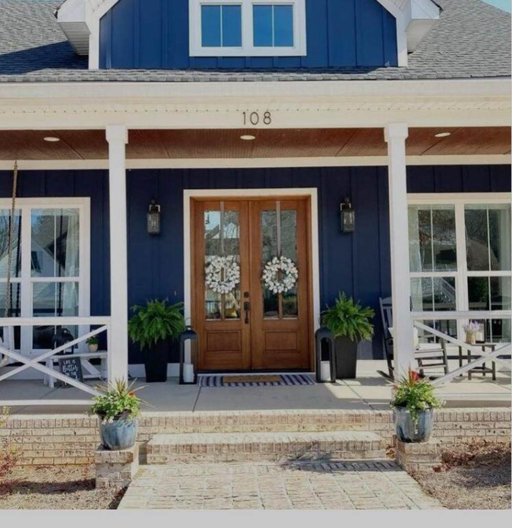
IN THE NAVY Exteriors
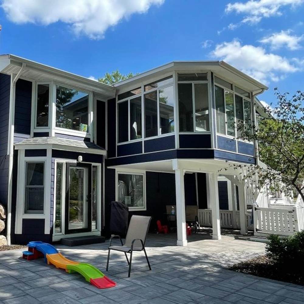
Bright white trims paired with IN THE NAVY sidings and walls give this house a techy look. beach. The toys around show children live there, so you know IN THE NAVY is ideal for family homes.
Naval vs. IN THE NAVY as Accents
Navy blue has a bold presence, whether it’s a bright shade like IN THE NAVY or a muted one like Naval. Using it as an accent creatively deviates from typical neutrals like black, white, or tan.
See different ways to use them below.
Naval Accents
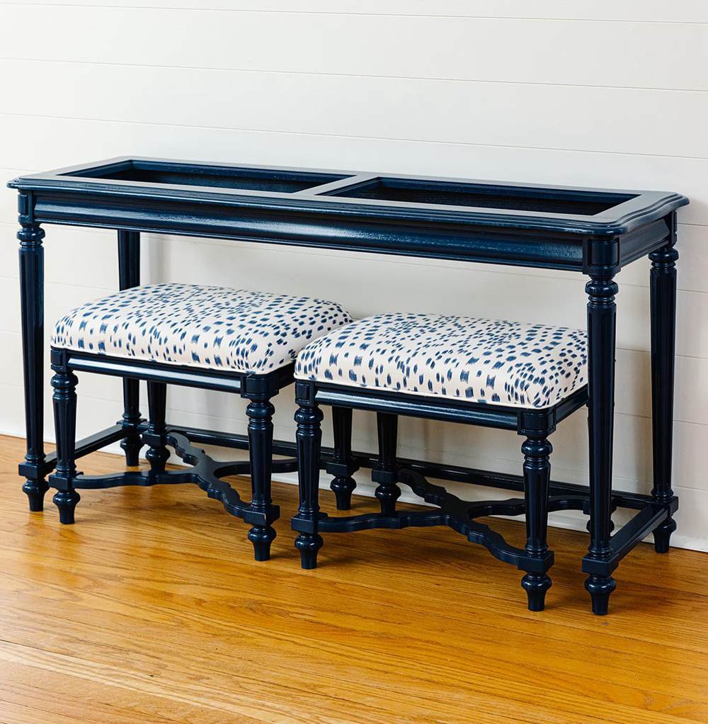
This mini furniture set painted in Naval adds a modern touch to a classic style. You can tell it’s vintage-inspired, but the paint choice elevates it from being something you find in the attic to pieces that can outlive generations.
IN THE NAVY Accents
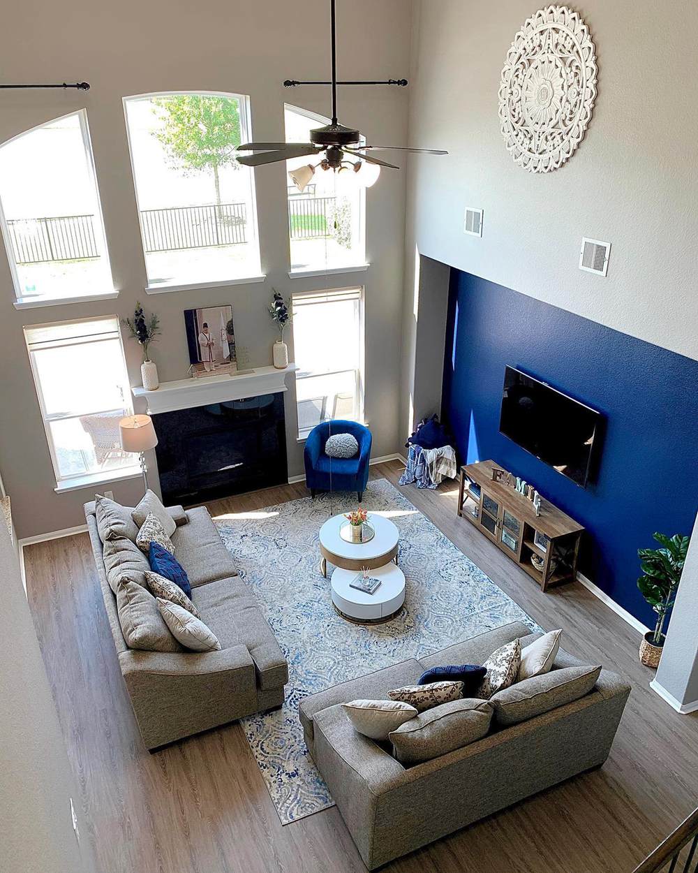
We recommend using IN THE NAVY accent walls with taupe and tan interiors like this living room. The color pop paired with a single side chair and matching throw pillows is all you need to relax your mind after a hectic work day.
Naval vs. IN THE NAVY for Trims
This is a tricky one because using dark colors on trims isn’t ideal. But if you’re feeling creative, let’s show you how to navigate the “impossible.”
Naval for Trims
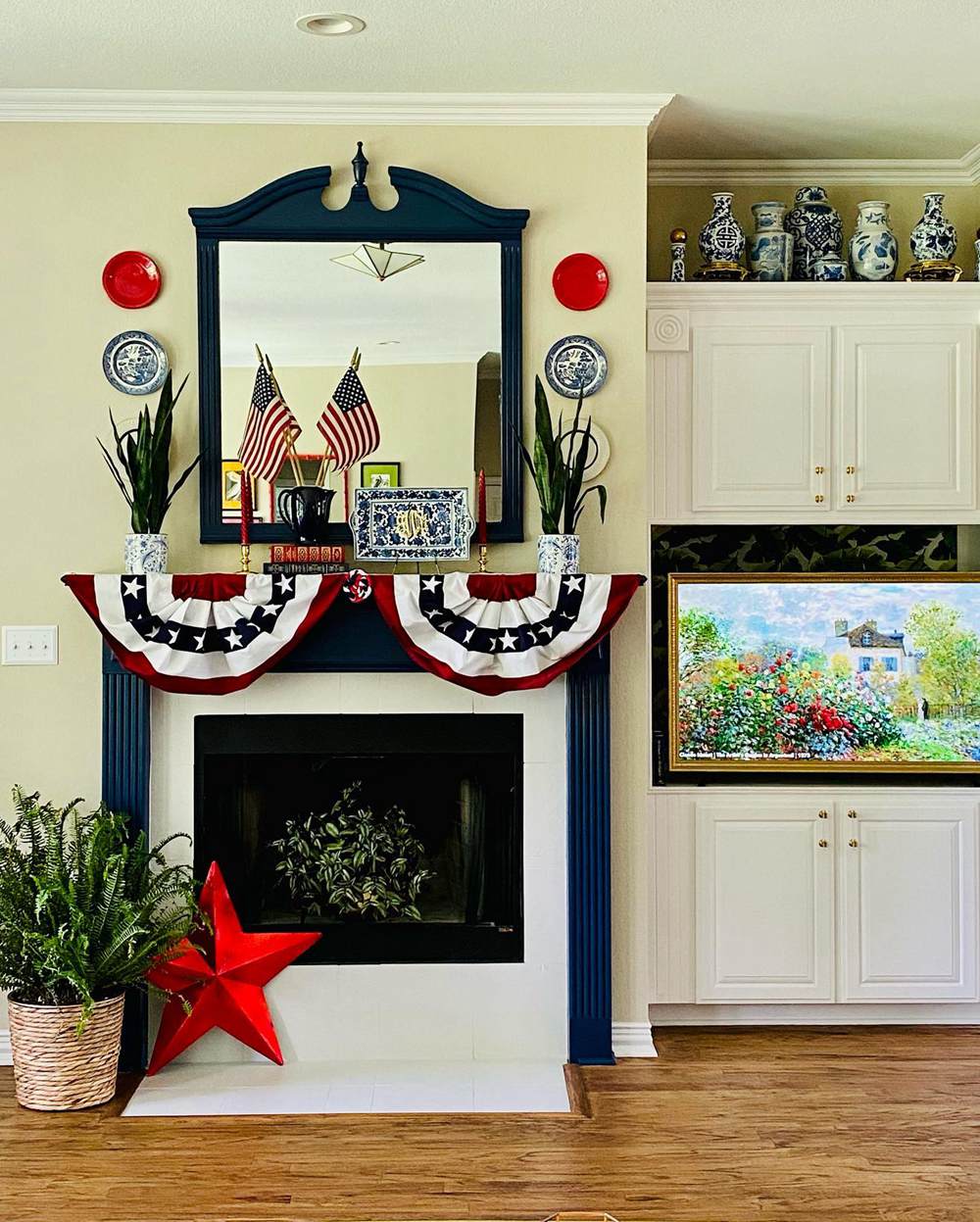
This homeowner used the right amount of Naval to highlight her mantel/fireplace and channel her inner patriot. See how the color pops against the creamy yellow walls and white accents. Also, notice how the trim frames the mirror in the living room.
What a way to beautify functionality.
IN THE NAVY for Trims
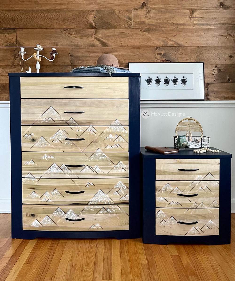
Image Credit: @mcnuttdesigns
When you use IN THE NAVY or any other navy blue as a trim, ensure it’s heralding a lighter color. That’s the only way to make it pop. There’s a deep orange-toned floorboard, a beige drawer, and matching wallboards. The navy trim ties these three shades together.
Naval vs. IN THE NAVY on Woodwork
Elevate your woodwork from a basic furniture piece to an artistic artifact by painting it.
Naval on Woodwork
The vintage-style bookshelf looks modern with the gray-toned Naval covering its wooden frame. It also matches the wooden floorboard.
IN THE NAVY on Woodwork
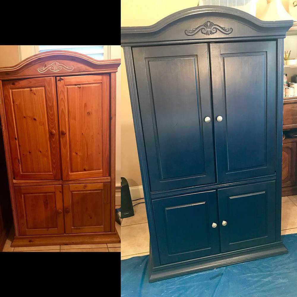
The difference is clear between these two pictures. Although the unpainted wardrobe looks sturdy and classic, its painted frame attracts modern designers. 2023 painting trends focus on bold colors, and IN THE NAVY is certainly one.
Naval vs. IN THE NAVY on Fences
Using bold colors like navy blue on fences isn’t typical so, you’ll rarely see examples. You can start the trend and share your designs with us.
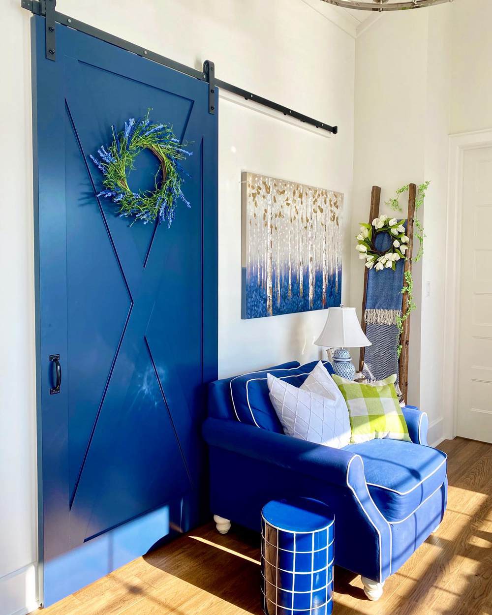
Naval vs. IN THE NAVY on Doors
Make your classic white and brick walls stand out with navy blue front doors. Then, when you walk inside, use Naval or IN THE NAVY doors as accents to lighter neutral walls and furniture.
Naval on Doors
This Naval door is ideal for the two-toned wall paint and additional art pieces. The navy door complements the dark brown wall turtles without clashing with the white trims.
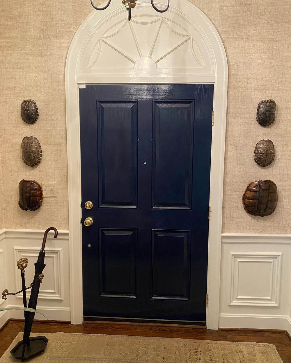
IN THE NAVY on Doors
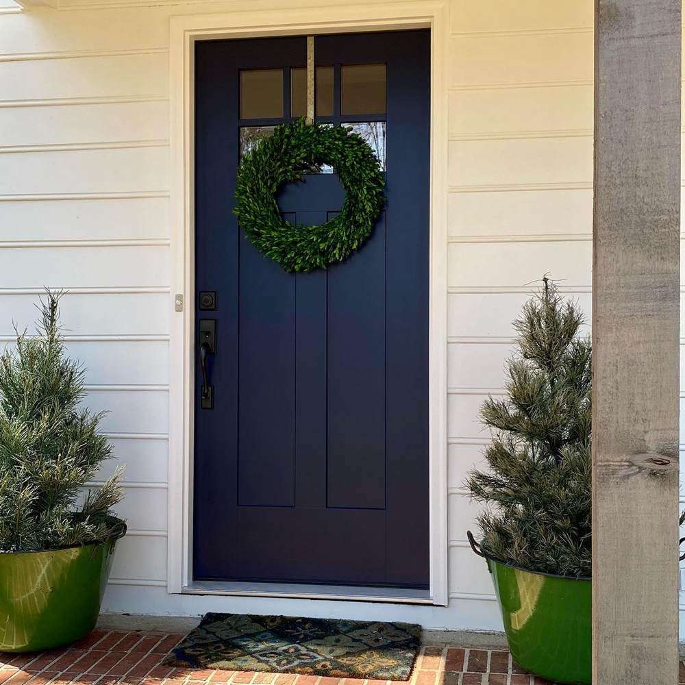
Color theory is at play on this front porch with an IN THE NAVY door and green potted plants. The green pots and matching plants highlight the undertone in the door paint.
Lighting Conditions for IN THE NAVY and Naval
This is IN THE NAVY paired with Sherwin-Williams Pure White and used outside by the beachside. The mix of the pool’s blue color, white paint, and natural sunlight created the brightest blue undertone in this navy paint.
Naval’s green-gray undertone is strong in this room because of the dim lighting and shuttered window.
Seeing how lighting affects both colors, we recommend using South-facing light to highlight the deepest undertones. White light creates a dim aura that deepens the paint’s tone while warm lighting like yellow and orange bulbs intensify the glow.
Using your navy blue paint outside will give you its deepest blue tone. But you can enjoy the dusky gray and green notes of Naval when you use it inside with an open window for natural light. For IN THE NAVY, ensure there’s a South-facing light to get its green tone.
If you use the colors in North-facing light, they’ll remain navy with faint hints of the undertones. Also, East-facing light shines bright at noon and West-facing light is hottest in the late afternoon.
Conclusion
If you’ve made it this far, congratulations. You’re ready to choose between Naval and IN THE NAVY. Before you leave, let’s recap what you’ve learned.
- Naval and IN THE NAVY reflect the same amount of light
- Naval is duller than IN THE NAVY because of its gray undertone
- You can’t use any of the two colors on fences
- IN THE NAVY is to family spaces as Naval is to business spaces
Please let us know in the comments if you have any questions. We’d also love to see what you do with your Sherwin-Williams navy paints. Have fun styling.