Although contemporary styles are common these days, there’s still something to be said about country and vintage designs. City slickers looking to bring a piece of home to the fast-paced life can use Antique White on their walls.
Due to the rich yellowish-orange undertone in this paint, Antique White could become difficult to style. That’s why you’re here, and I have the answers you seek. You’ll learn everything about Sherwin-Williams Antique White, from its formulation to its use.
Let’s start with the scientific dissection of the color before we get creative.
Table of Contents
What Color is Sherwin-Williams Antique White?
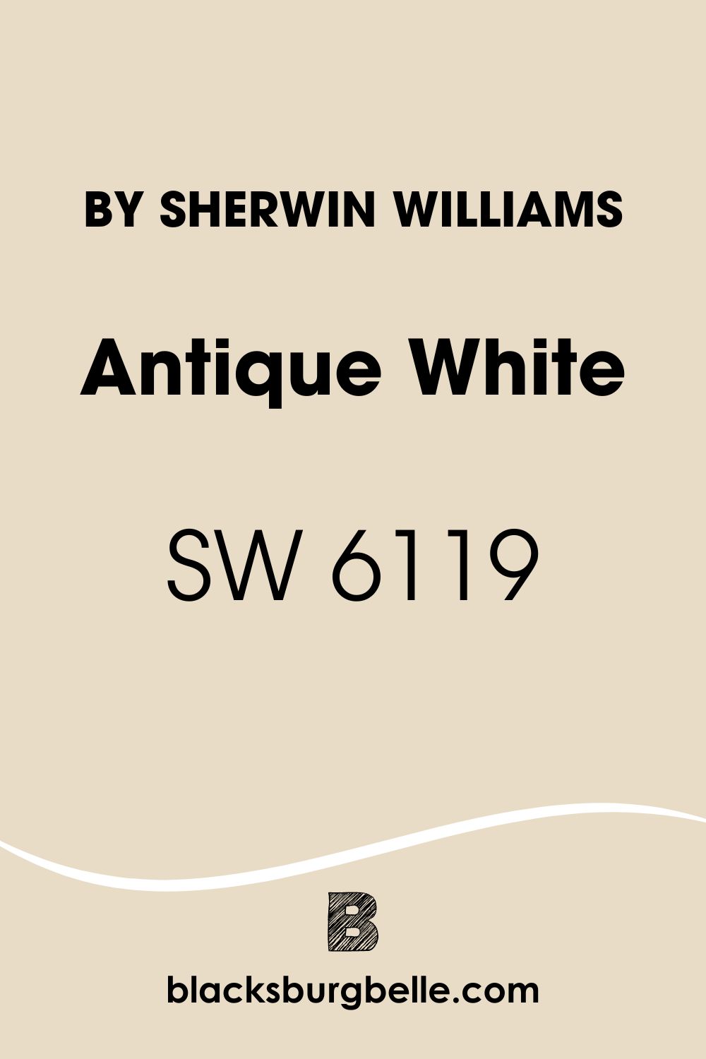
Sherwin-Williams Antique White is a medium-light paint with a sharp undertone that doesn’t shy away from light. Although it appears pastel white under natural light (mostly in the morning), the night turns it warm and gives it a creamy paste.
| Manufacturer | Sherwin Williams |
| LRV | 72 |
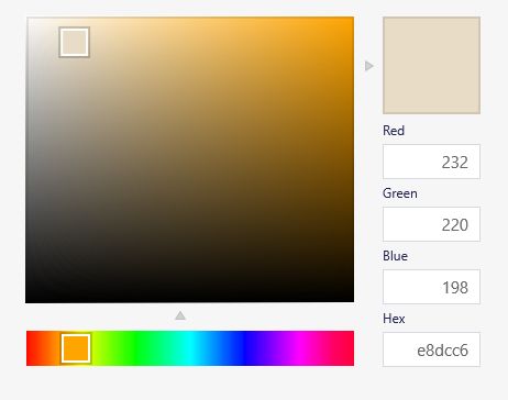
| RGB | Red 232 | Green 220 | Blue 198 |
| Hex Value | #E8DCC6 |
| Color Collections | Top 50 Colors, Finest Whites & Neutrals (Finest Whites) |
RGB of Sherwin-Williams Antique White
Antique White has the highest red content in its RGB value which is the amount of red, green, and blue mixed into absolutely black paint to create a hue. This color has 232 red, 220 green, and 198 blue.
The RGB content amounts to a signature hex value #E8DCC6. It becomes relevant when you want to recreate the color.
Light Reflective Value (LRV) Of Sherwin-Williams Antique White
Would Sherwin-Williams Antique White absorb light or reflect it? That’s the essence of knowing the Light Reflective Value of a paint. A color retains a light and stays true to its overlay when it’s on the 0 – 49 end of the LRV spectrum while it reflects light at 51 – 100.
Since most colors have undertones, a.k.a. secondary colors, there’s no pure white or absolute black paint. Hence, the LRV scale starts from 3 – 99.9, with the former being the darkest black and the latter being the lightest white.
Is Antique White a Warm or Cool Color?
This color exudes warmth due to its rich fiery orange undertone. You can categorize every paint into two broad groups – warm or cool – depending on their aura. Warm colors resemble fire, while cool hues mimic the ocean and sea.
Use the color wheel to distinguish between warm and cool colors if you can’t picture them mentally. As a paint with strong orange tints, Sherwin-Williams Antique White has no cool elements hence its position as a warm paint.
No matter where and when you use Sherwin-Williams Antique White, it shines brightly and lightens the space.
What are the Undertones in Antique White?
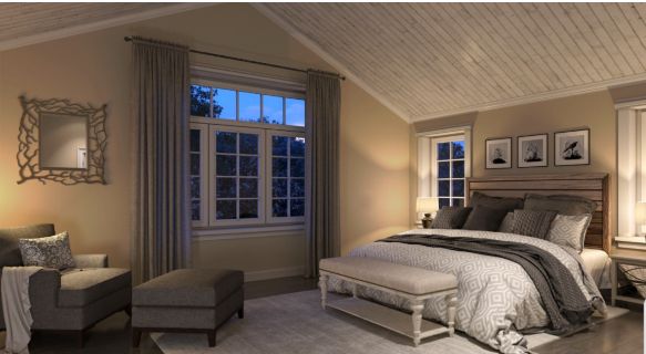
Sherwin-Williams Antique White is an off–white paint with a bright orange undertone that turns the color beige under dim lighting.
Undertones, Tinges, Nuances, or Tints, no matter what you call them, every paint has one or more. They’re secondary hues embedded in the color’s DNA that show based on the different lighting conditions.
Undertones are why first-time paint buyers get upset with their purchase hours after leaving the retail store. You can’t avoid them because every unique paint hue is a marriage of different colors, which leaves some residue in the end product.
You’ll notice that the color you chose from the sample isn’t the same as the real-life application. However, knowledge of the existing tints would save you such disappointment. With Antique White, get ready for a creamy orange nuance to shine any time.
If you’d rather have cool off-white paint, then this color isn’t for you. Check out its shade under different lighting conditions below.
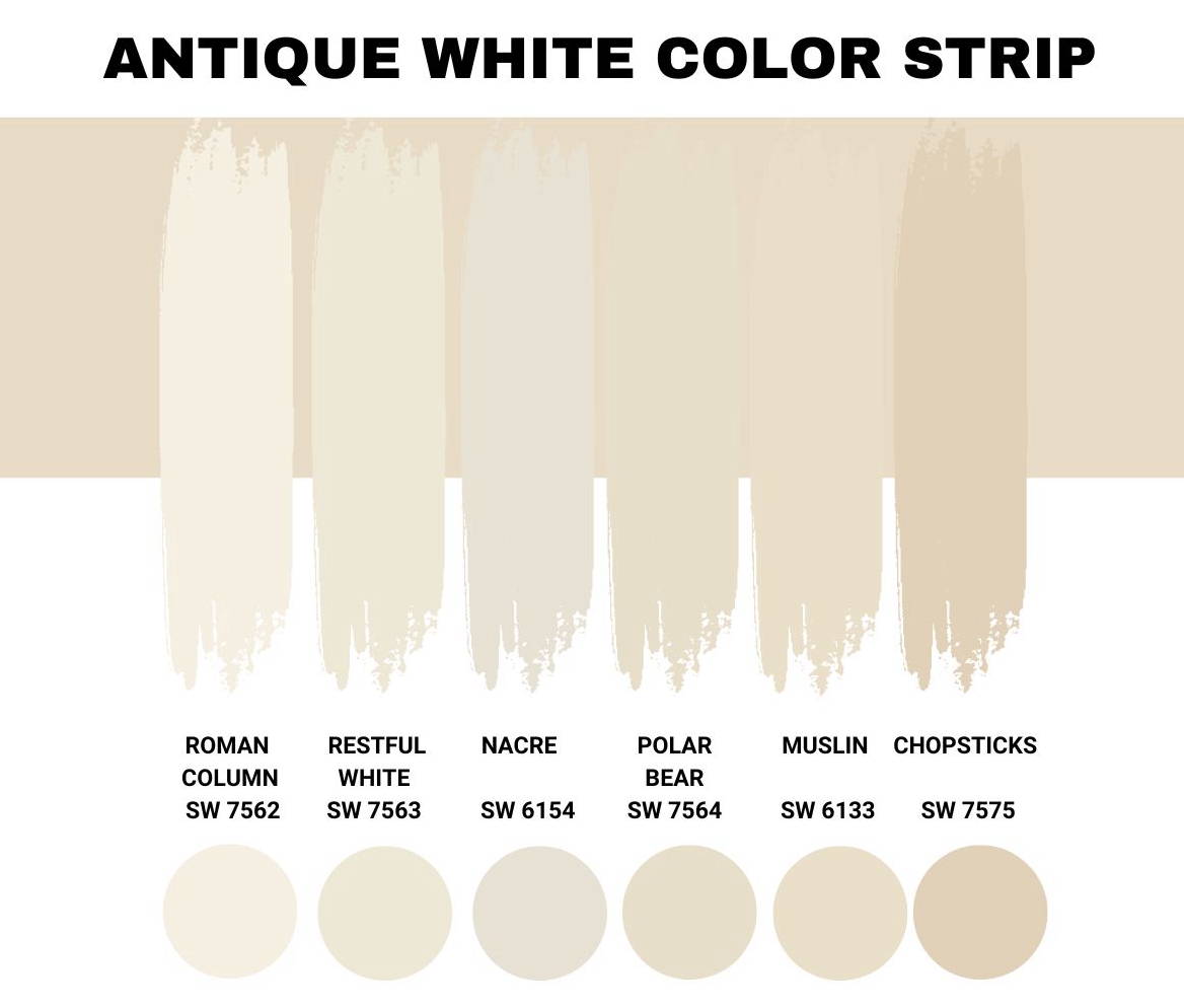
Sherwin-Williams Antique White Color Strip
When you have different shades with varying saturations and brightness on a single palette, they form a monochromatic strip. This color strip is handy when curating a single-color theme for your space.
Sherwin-Williams Antique White has only medium-light to light paints in its strip due to its high LRV. You can introduce darker tones for the overall design, but you’ll learn more about that in the color palette session.
| Color Code | Color Name | Location Number | LRV | Color Tone |
| SW 7562 | Roman Column | 263-C1 | 88 |  |
| SW 7563 | Restful White | 263-C3 | 81 |  |
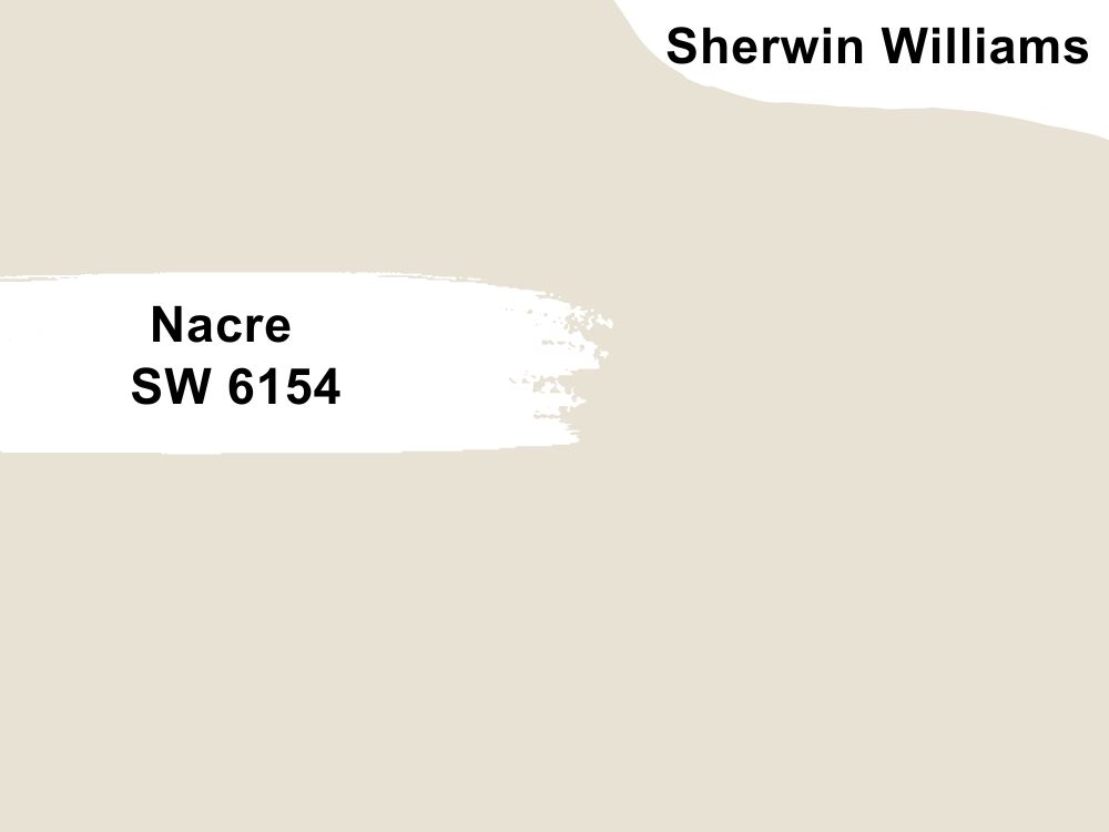
| SW 6154 | Nacre | 263-C2 | 76 |  |
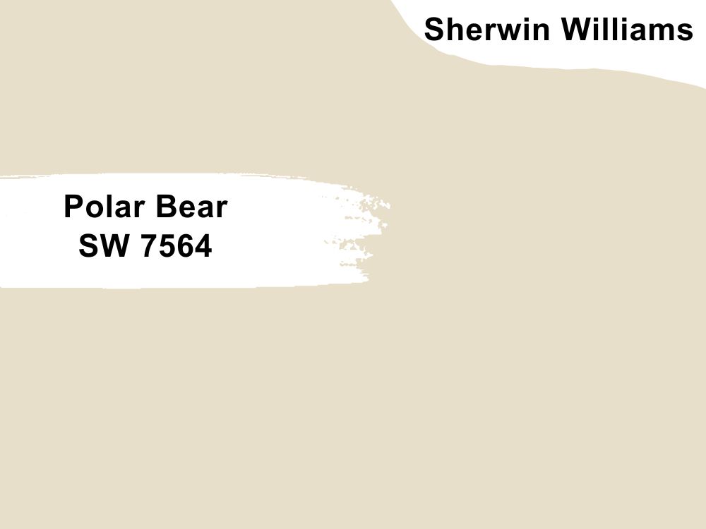
| SW 7564 | Polar Bear | 263-C4 | 74 |  |
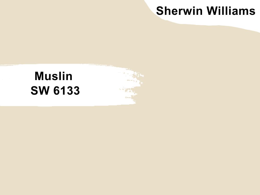
| SW 6133 | Muslin | 263-C5 | 74 |  |
| SW 6119 | Antique White | 263-C6 | 72 |  |
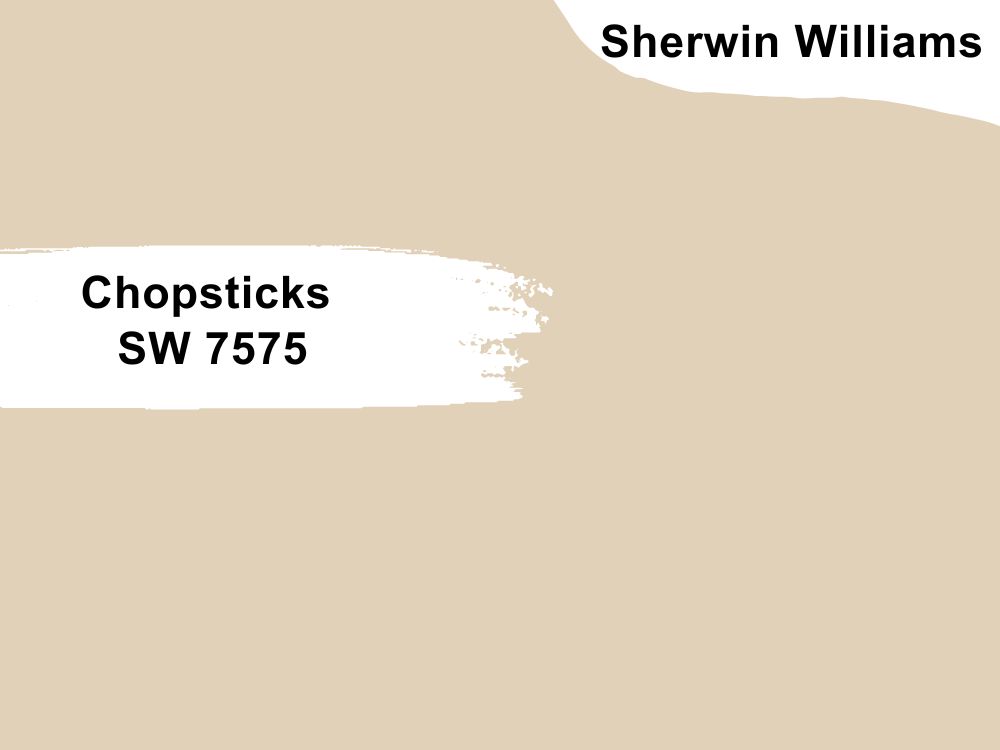
| SW 7575 | Chopsticks | 263-C7 | 65 |  |
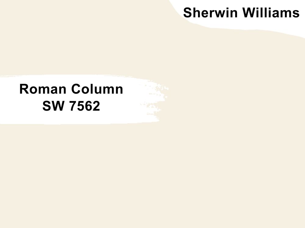
Sherwin-Williams Roman Column
At 88 LRV, Sherwin-Williams Roman Column is the lightest white paint in Antique White’s strip, such that its yellow undertone is faint. The color shows a pastel white overlay under the brightest light, but the right shadows and shades present an underlying warmth.
Unlike Antique White, Roman Columns tint isn’t overwhelming. It’s enough to dictate the rest of the interior decor but not so much that the space only exudes warmth. You can add texture to the color using a medium-toned tan trim or accent like Relaxed Khaki (SW 6149).
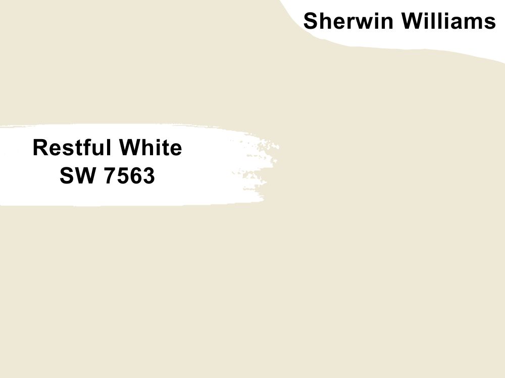
Sherwin-Williams Restful White
You’d expect a color called Restful White to be crisp, but that’s not the case here. This paint is a true pastel yellow, which makes it appear off-white and sometimes light beige. Its 81 LRV makes Restful White as warm (but brighter) as its counterpart, Antique White.
It’s not one of the popular neutrals from Sherwin-Williams, but if you give Restful White a chance, you won’t regret it. Pair this color with other tan tones like Sawgrass Basket (SW 9121), which is warm, or Verde Marron (SW 9124), which is a light chocolate tone.
Sherwin-Williams Nacre
Off-white neutral paints are traditionally cool colors, but Nacre’s sage green tint creates a warm outlook. It has a chalky overlay that makes you think it’s another greige paint upon first look until you inspect it further.
Unlike most of the other neutral colors in this strip, Nacre thrives best with complementary themes. Highlighting the sage green tint in Nacre is a sure way to create depth in your interior decor. It’s also one of the few beiges that’ll work well with crisp white trims.
Sherwin-Williams Polar Bear
Polar Bears are often crispy whites, but this paint named after the snow animals is not. Sherwin-Williams Polar Bear is a medium-light paint like Antique White and has a similar undertone.
It’s a versatile neutral paint that works either inside or outside as a trim, accent, or full wall.
You can go the traditional route by decorating it with dark neutrals for a vintage style, light neutrals for a modern touch, or go contemporary by complementing the paint with olive green or gray.
Sherwin-Williams Muslin
Many off-white paints are nuanced with one or more undertones making people wary of them, but hues like Sherwin-Williams Muslin remain breezy. It has only one undertone, a faint warm green that warms its surroundings.
Sherwin-Williams Muslin has a powdery look ideal for modern and contemporary decor. If your home’s theme is vintage, use Antique White, and relegate Muslin to the bedroom or bathroom.
It’s less bright and gives a relaxing aura for restful sleep and showers.
Sherwin-Williams Chopsticks
Medium-light white paints like Sherwin-Williams Chopsticks keep spaces warm without being intense. The color has a faint orange undertone similar to Antique White’s nuances, making it suitable for old-style homes.
Pairing Chopsticks with bright whites (Greek Villa SW 7551, Creamy SW 7012) or medium-dark neutrals like Universal Khaki.
Sherwin-Williams Antique White Color Palette
Decorating a space requires more than slapping paint on the wall and throwing furniture around. You need to choose pieces that fit to avoid clutter and disharmony. Your decor should make you happy regardless of the theme you choose, whether vibrant or relaxing.
That’s why you need a color palette. It helps you test different combinations until you find one which suits you best.
Coordinating Colors for Antique White
The default coordination for Antique White is complementary decoration using brown and tan tones to create a vintage style. However, if you open your creative eye, there are many more options to explore.
Keep the room fresh and crisp with a monochrome theme, embrace your inner child with triadic coloring, or cuddle your old soul with a vintage design. Scroll down to learn the difference between each theme and choose the most suitable one.
Monochrome Decoration with Antique White
There’s something calming about using a single color in one space as it creates synergy. The difference in shade and saturation prevents it from looking bland, which you get with monochrome themes.
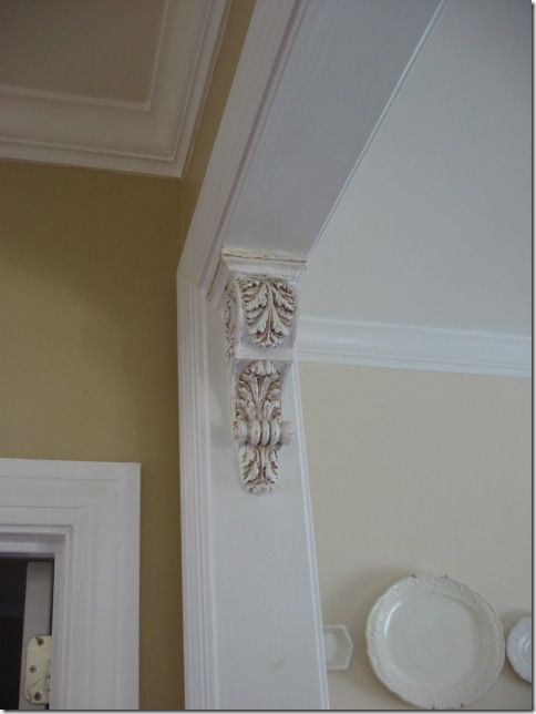
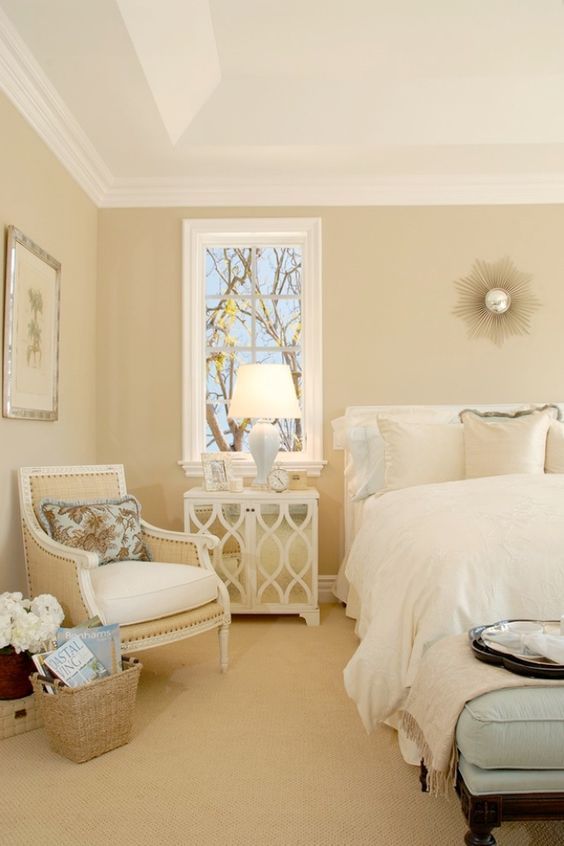
Multiple neutrals in one space create a mature look and work in any room, from the bedroom to the kitchen and living room. Use Antique White as the wall paint, then build the rest of your decor around it.
You can add texture and depth to the warm hue with accessories from bedding to tapestry and flooring. Pair Antique White with colors in the strip for a harmonious outlay.
Pair Antique White by Sherwin-Williams with brown paints like Whole Wheat (SW 6121) and Fallen Leaves (SW 9114) for a sharp contrast within the monochromatic theme.
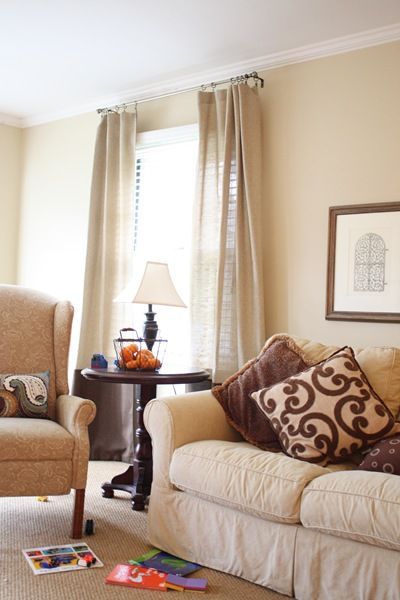
See some examples below.
Triadic Decoration for Antique White
A triadic theme combines three colors in one space, with the main paint as the anchor and the other two chosen based on their proximity. As a neutral paint, it’s hard to pick the coordinating triads for Antique White as a novice, but a trained eye can do it easily.
Don’t fret. I’ve got you covered. Here’s a breakdown of how to form a triad with Antique White. Use the undertones to decipher the other colors in the triad.
A color wheel with neutral tones includes Orange beige (Antique White), Yellow Beige, Pink Beige, Taupe, Violet Gray, Blue Gray, Green Gray, and Green Beige. The equally spaced hues based on this wheel are Taupe/Violet Gray and Green Grey/Green Beige.
Some taupe options from Sherwin-Williams include Taupe Tone (SW 7633), Poised Taupe (SW 6039), and Balanced Beige (SW 7037).
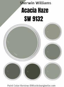
Green neutrals come in light – Oyster Bay (SW 6206), Acacia Haze (SW 9132), Evergreen Fog (SW 9130) – and dark tones – Pewter Green (SW 6208), Rock Bottom (SW 7062), and Retreat (SW 6207).
Alternatively, you can highlight the undertone orange by making it the focus of the triad. The two triadic hues for orange are purple and green (all secondary colors). See some examples below.
Contrasting Antique White with Complementary Colors
Although it’s not as colorful as a triadic theme, Contrasting with complementary colors is a tame way of introducing different hues into your space. Contrast means the opposite, and for orange (the dominant undertone in Antique White), that’s blue.
You can stick to neutrals such as creamy white paint by contrasting Antique White with blue-white or bluish-gray paints. Alternatively, you can add more color using shades of blue, provided its undertones are suitable for those in Sherwin-Williams Antique White.
Such contrasts work best in bubbly spaces like living rooms, children’s rooms, and lounges.
What Trim Colors Go With Sherwin-Williams Antique White?
Sherwin–Williams Antique White has multiple themes, but it’s best suited to neutrals. Hence, the best trims for this paint include tans, browns, and the right off-white.
Use golden brown wood like Teak and Oak for the flooring, furniture, and ceilings because the warmth would blend with Antique White’s undertones.
If the room is for serious business like a study or you want to tame the brightness in your LRV, use a darker brown like Chestnut or Walnut. Avoid Mahogany wood because of its red undertone, as they don’t blend.
Sherwin-Williams Antique White Color Comparisons
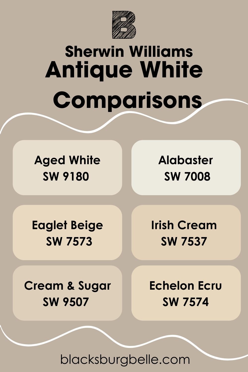
Sometimes you may not get Sherwin-Williams Antique White, and when you do, its features may be too much or too little for your taste. Don’t worry- there are other similar options from Sherwin-Williams and other high-quality paint brands.
Here are some comparisons to make your decision easy. Pictures are from Hextoral
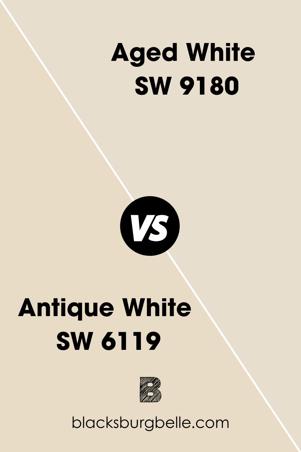
Sherwin-Williams Antique White vs. Sherwin-Williams Aged White (SW 9180)
When you want your new home to look lived-in despite having white walls, Sherwin-Williams Aged White provides the perfect compromise. It’s an off-white paint with a subtle yellow undertone that reflects a warm hue.
Sherwin-Williams Aged White has a 74 LRV meaning it’s a medium-light tone that brightens its surroundings yet retains its breezy outlook. Recreate this paint with #E8DECD.
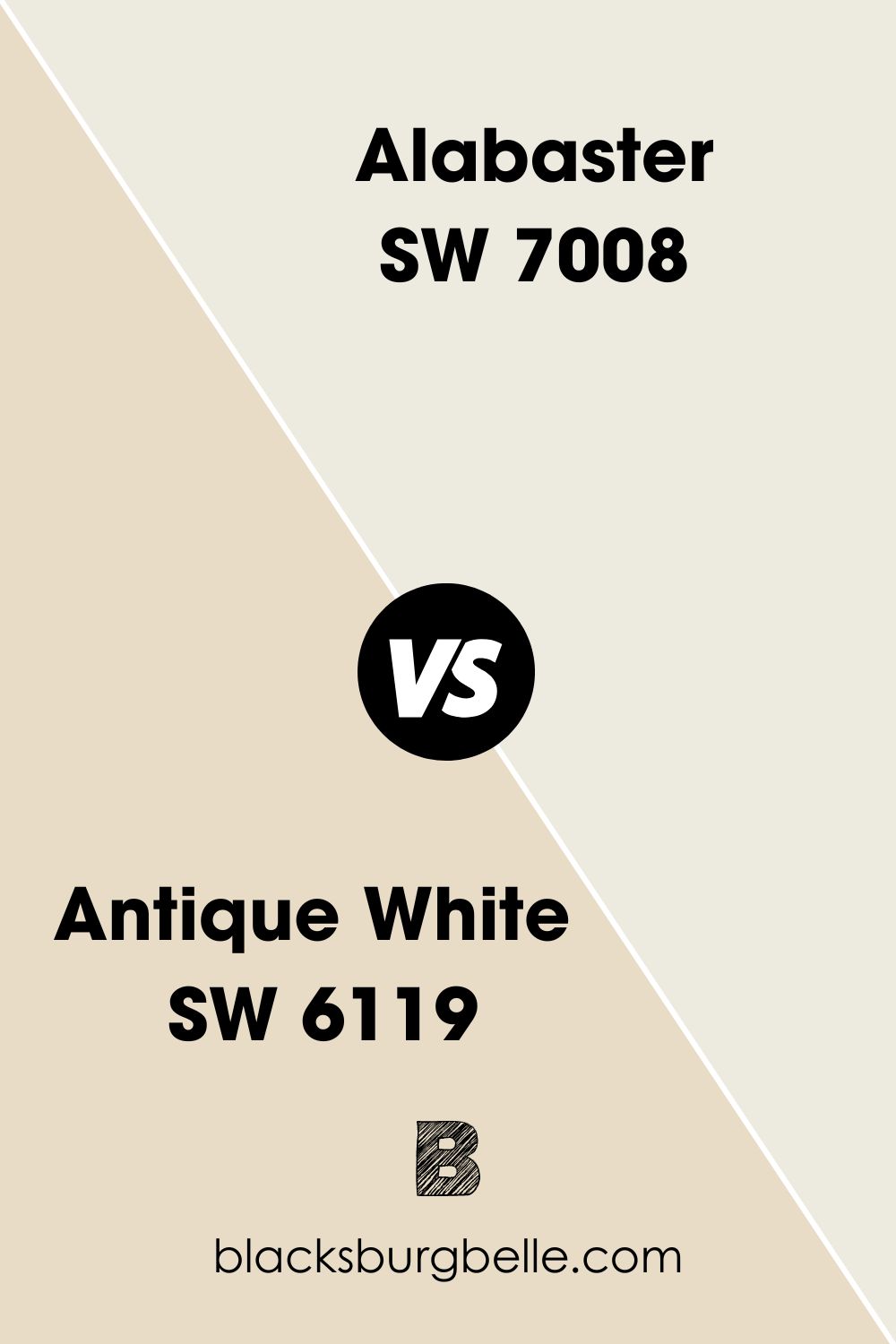
Sherwin-Williams Antique White vs. Sherwin-Williams Alabaster (SW 7008)
Light beige paints like Alabaster are in demand due to their ability to blend into any environment. It’s as neutral as you’ll get from white paint because it lacks the strong undertones of yellow or orange common with beige and cream paints.
Since it leans towards gray, Alabaster has cool and warm notes, although the warmth overshadows its coolness underneath bright light. You can use it as a trim or a full wall coloring, even on Sherwin-Williams Antique White.
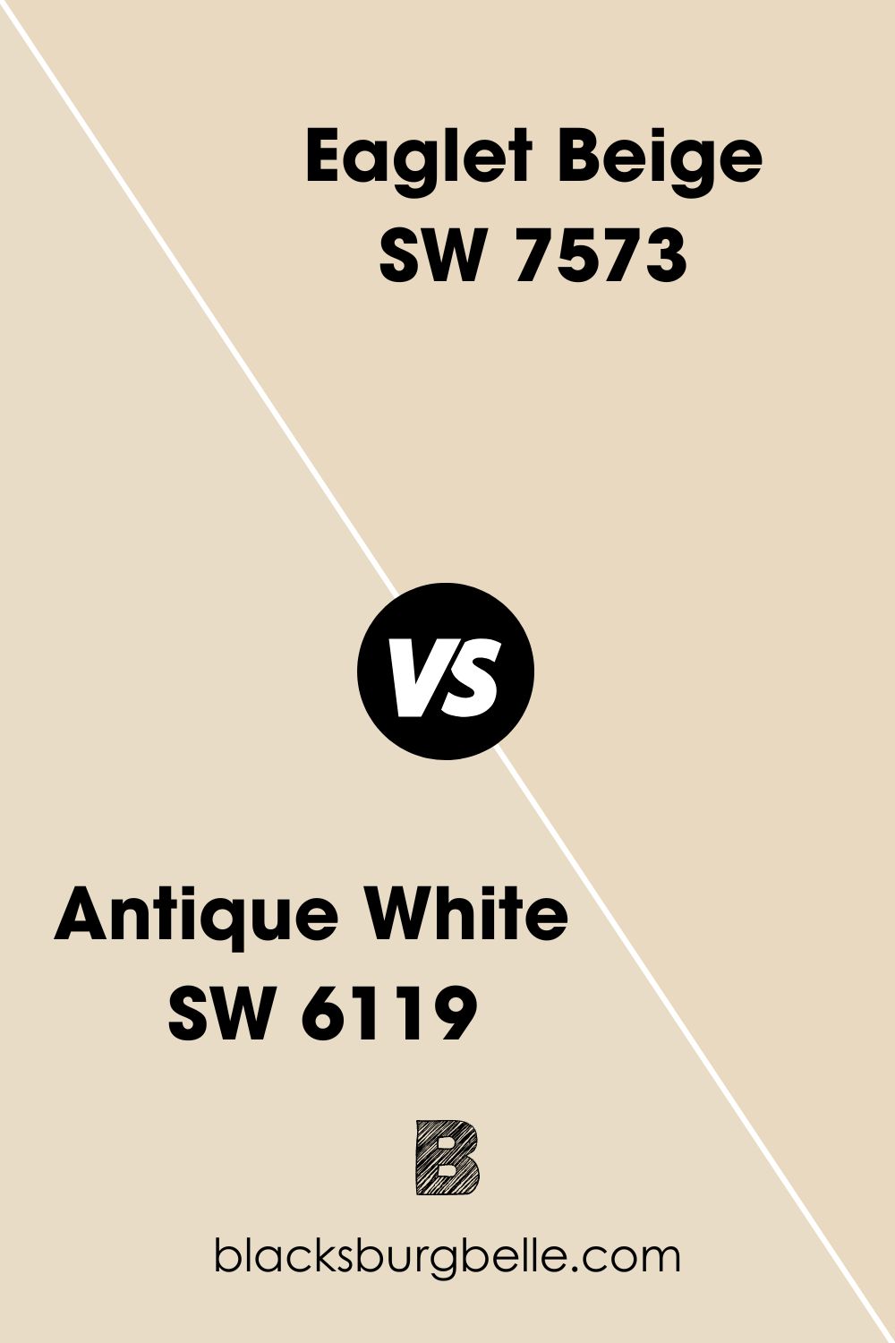
Sherwin-Williams Antique White vs. Sherwin-Williams Eaglet Beige (SW 7573)
Sherwin-Williams Eaglet Beige is a warm color like Antique White, but they differ in undertones. Where Antique White embeds an orange hue, Eaglet Beige gives off a faint yellow tinge. It’s a great alternative if you’d rather have muted warmth than strong heat notes.
At face value, Eaglet Beige is brighter than Antique White, but its LRV is lesser at 71, while the former’s LRV is 72.
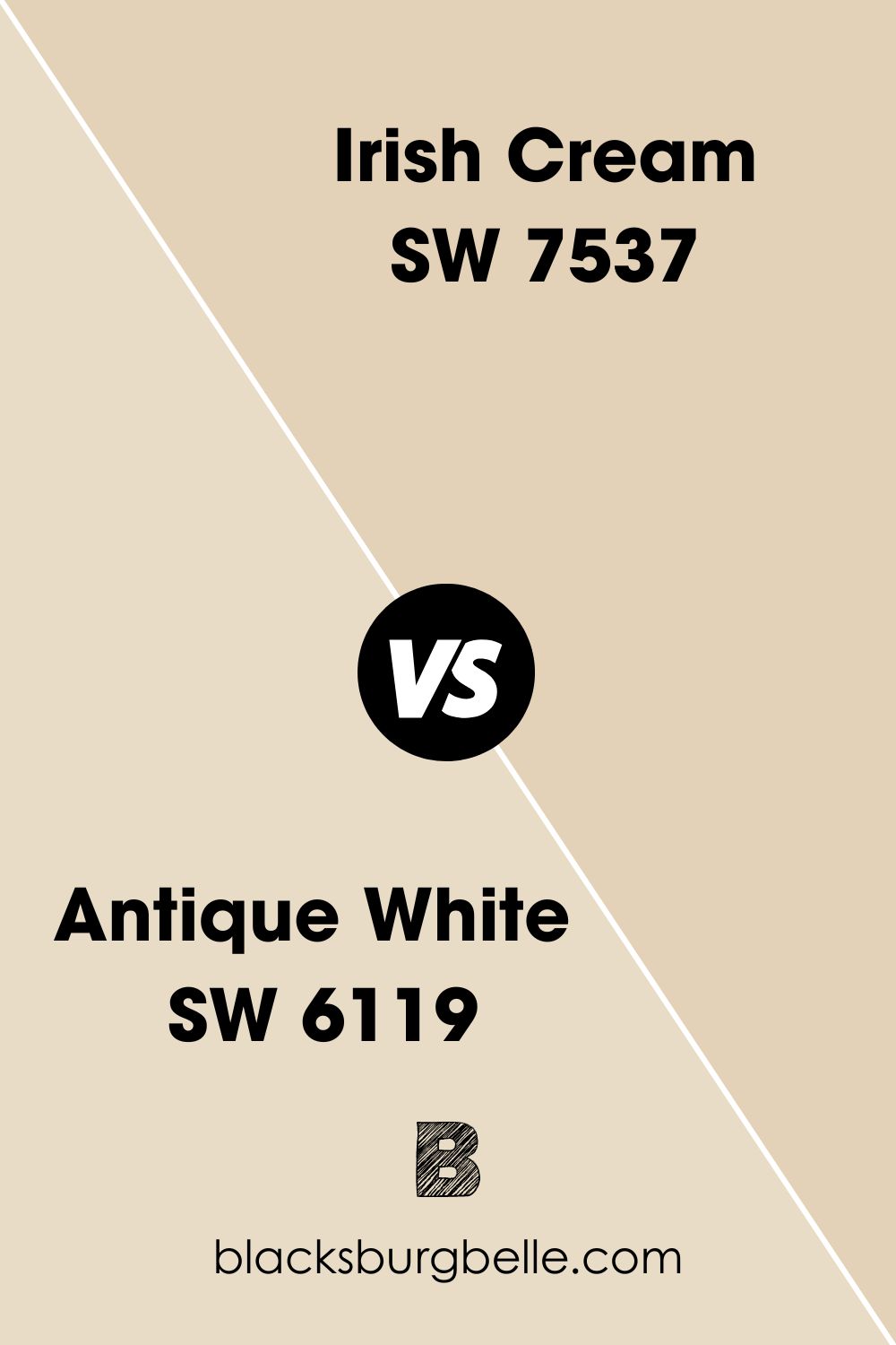
Sherwin-Williams Antique White vs. Sherwin-Williams Irish Cream (SW 7537)
Some colors arrest your attention when you step into a room, and that’s what Irish Cream by Sherwin-Williams gets you. It’s a rich cream paint with strong yellow and orange undertones that brighten your space without lighting.
This color is beautiful and feminine with a sandy sheen that goes well with Antique White trims. Pair Sherwin-Williams Irish Cream with reddish and orangish wood like Mahogany.
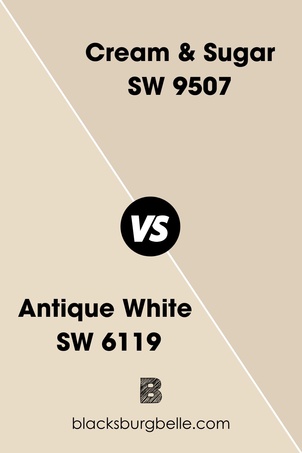
Sherwin-Williams Antique White vs. Sherwin-Williams Cream & Sugar (SW 9507)
Sherwin-Williams made Cream and Sugar as part of its Emerald Designer Edition paints, so you’ll only get it in a special order. This light nude shade is made primarily for interior coloring, although you can use it outside.
Cream and Sugar has a yellow undertone compared to Antique White, although its overlay is more sandy than creamy.
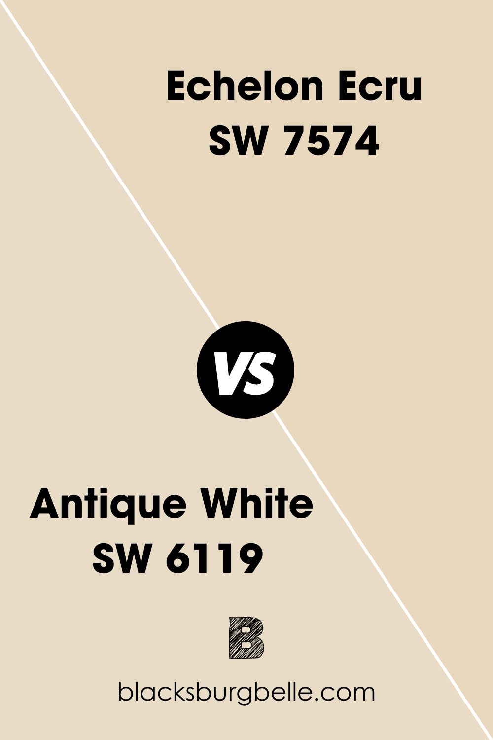
Sherwin-Williams Antique White vs. Sherwin-Williams Echelon Ecru (SW 7574)
Sherwin-Williams Echelon Ecru has a lesser LRV than Antique White, but it appears gold due to its strong undertones. The base note blends yellow and orange into a seamless fiery ember waiting to burst out at the hint of light.
In its natural state, Echelon Ecru appears airy and light.
Other Brands Antique White Comparison To Sherwin-Williams’ Version
Antique White as a concept is very appealing to people who love homely and vintage spaces; hence every top paint brand has a version of it. Below is a comparison in pictures to help you understand the difference.
| Brand | Sherwin-Williams (L) vs. Color (R) |
| Benjamin Moore | 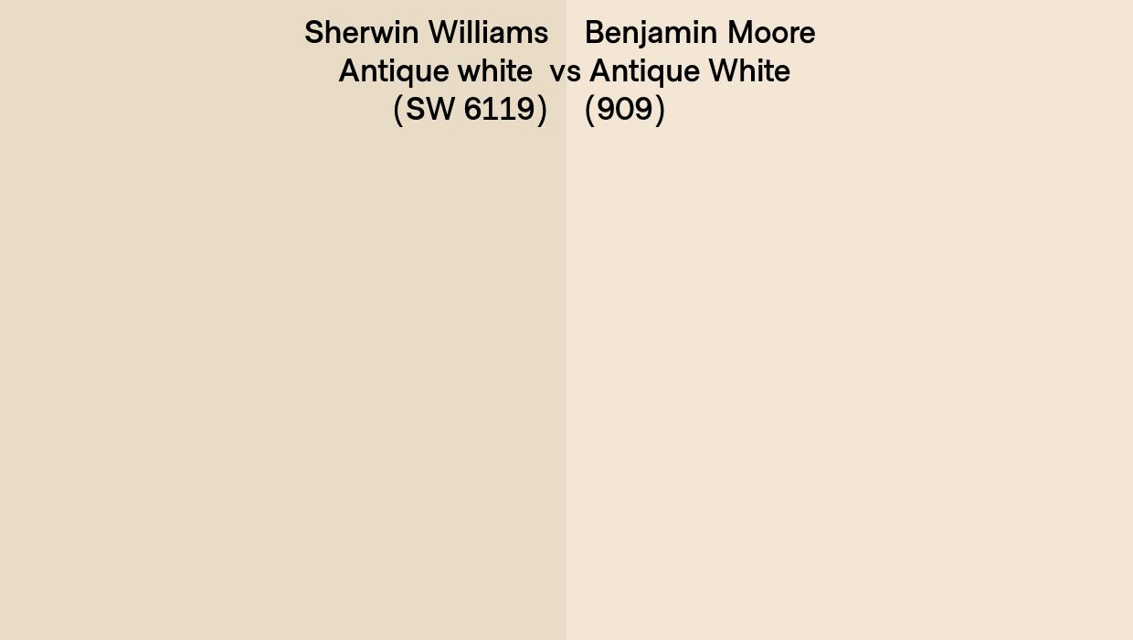 |
| Kelly Moore | 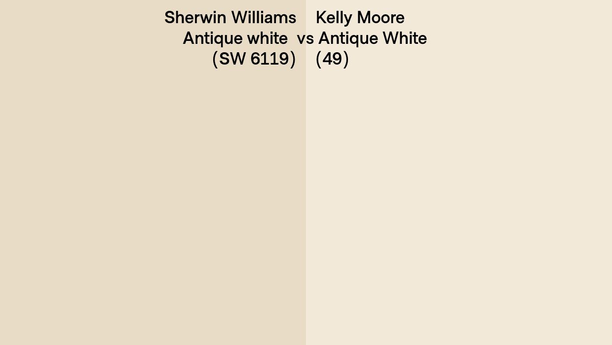 |
| PPG | 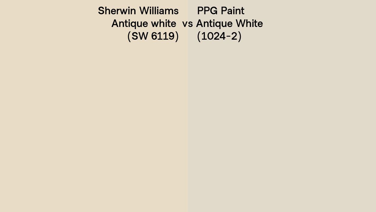 |
| Behr | 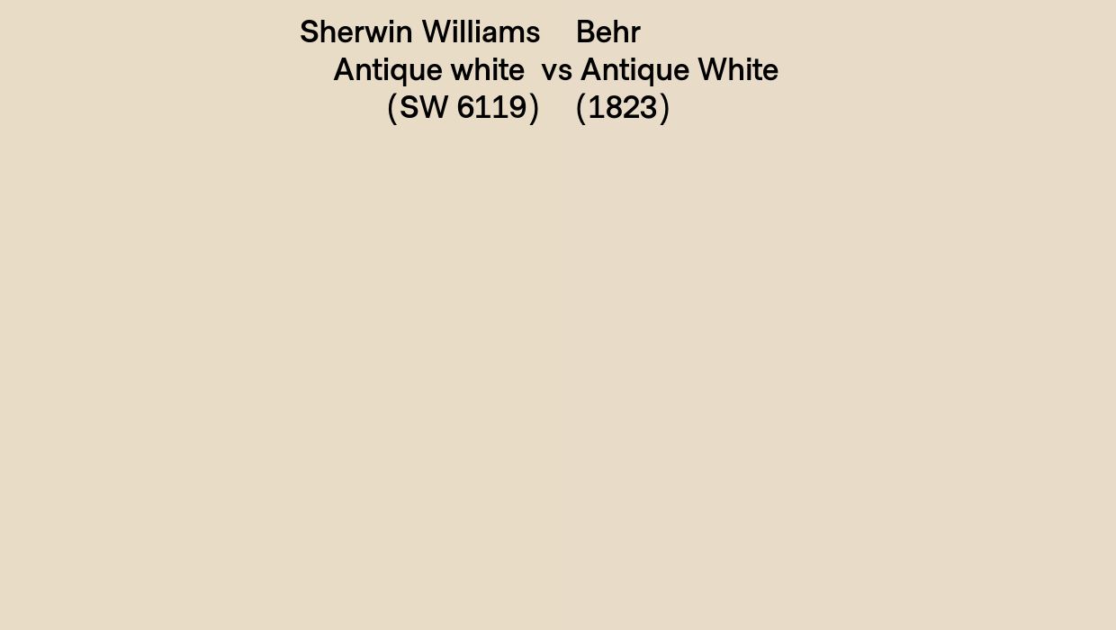 |
| Dutch Boy |  |
Notice that Dutch Boy and Behr have the most similar shades to Sherwin-Williams’ version. That’s a good alternative when you run out of the product.
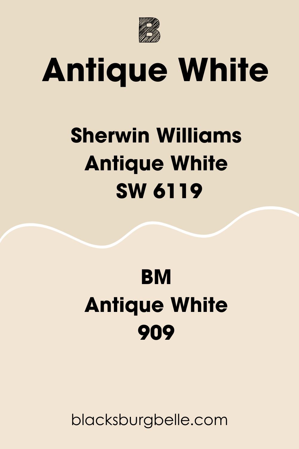
Benjamin Moore Version of Antique White (909 | OC-83)
Benjamin Moore’s Antique White and Sherwin-Williams’ version of the color are very similar yet different. The former is lighter than the latter version and has an LRV of 77.8.
Use the undertones to distinguish between both brands – Sherwin-Williams’ version has orange tints, while Benjamin Moore’s Antique White has yellow nuances.
How Does Light Affect the Color?
Do you want to maximize the warmth in Sherwin-Williams Antique White, or would you rather have the color toned down? Whichever style you decide would work based on your lighting choice and position.
North-facing windows bring in the most consistent light to keep your paint looking natural no matter the time of the day. Use the paint underneath a South-facing window or light to get the brightest possible reflection from Antique White.
Avoid East-facing windows unless you have enough artificial lighting to compensate for the lack of natural sunlight you’ll get from that angle. Also, remember that the colors you pair with your Antique White walls or furniture could amplify or reduce its LRV.
Use brighter hues with higher LRV values to highlight its warmth and stick to darker tones with lesser LRV to tame its brightness.
Best Rooms To Paint
How do you light your Antique White paint? As loud as possible or a mere highlight for a dim coloring? Knowing that this paint has a strong presence is enough evidence to show you it can work anywhere you use it.
The main issue is deciding how much you want in each room. Let’s get into it.
Antique White for the Interior
Sherwin-Williams Antique White is an interior paint by design as it has the LRV to illuminate your big or small space. From using the paint as an accent wall in the kitchen to making it the star of your home on all walls, here’s how to combine the color.
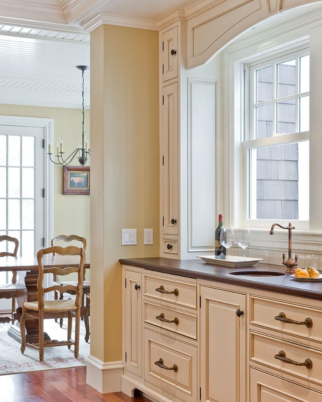
Antique White on Cabinets
Use Antique White as a cabinet painting in any room to create a pop of color for your space. It’s great for bathrooms, bedroom credenzas, fireplaces, kitchen islands, and shelves. It works well with Antique White walls or similar coloring in a monochrome theme.
You can also coordinate an Antique White cabinet with blue, orange, or brown walls.
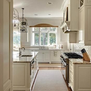
Antique White Bedroom
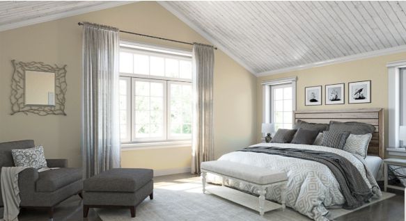
Use Antique White on the bedroom walls and pair it with a warmer shade for the upholstery to highlight its bright tinge. Blend both tones with bright wooden flooring and furniture for a cheerful aura, or tone it down with dark-toned wood.
Note that Antique White doesn’t have to be on the walls only, as it’ll also be a great cabinet paint against a bright wall. Try the following combinations –
Loyal Blue (SW 6510) wall with Antique White Cabinets
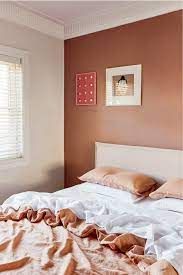
Rockwood Terra Cotta (Sw 2803) or Rose Tan (SW 0069) cabinet on Antique White Walls
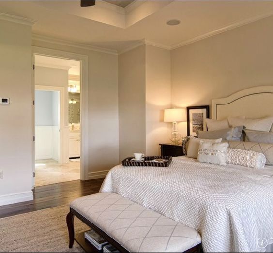
Antique White Bathrooms
Bathroom decor is often pristine and spa-like to give off a calming vibe, but with Antique White, you can switch it up. You can keep the vibe subtle and classic by leaning into neutral themes like monochrome for grown-up bathrooms.
However, if it’s for a child or an artsy person, feel free to get as creative as possible. Throw in some blues, yellows, and oranges to liven the space.
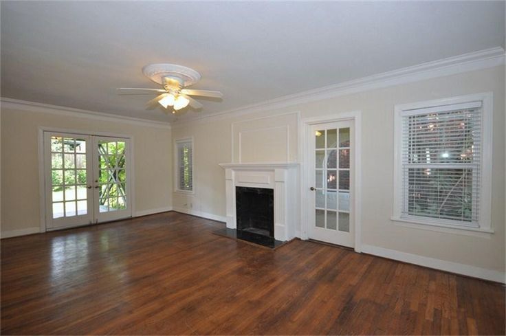
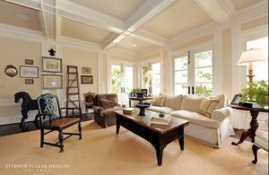
Antique White Living Room
Who wouldn’t like a lively living room with an inviting color like Antique White on the walls, cabinets, and furniture? Its versatility also works for any theme you settle on, be it the demure monochrome or a vibrant triad.
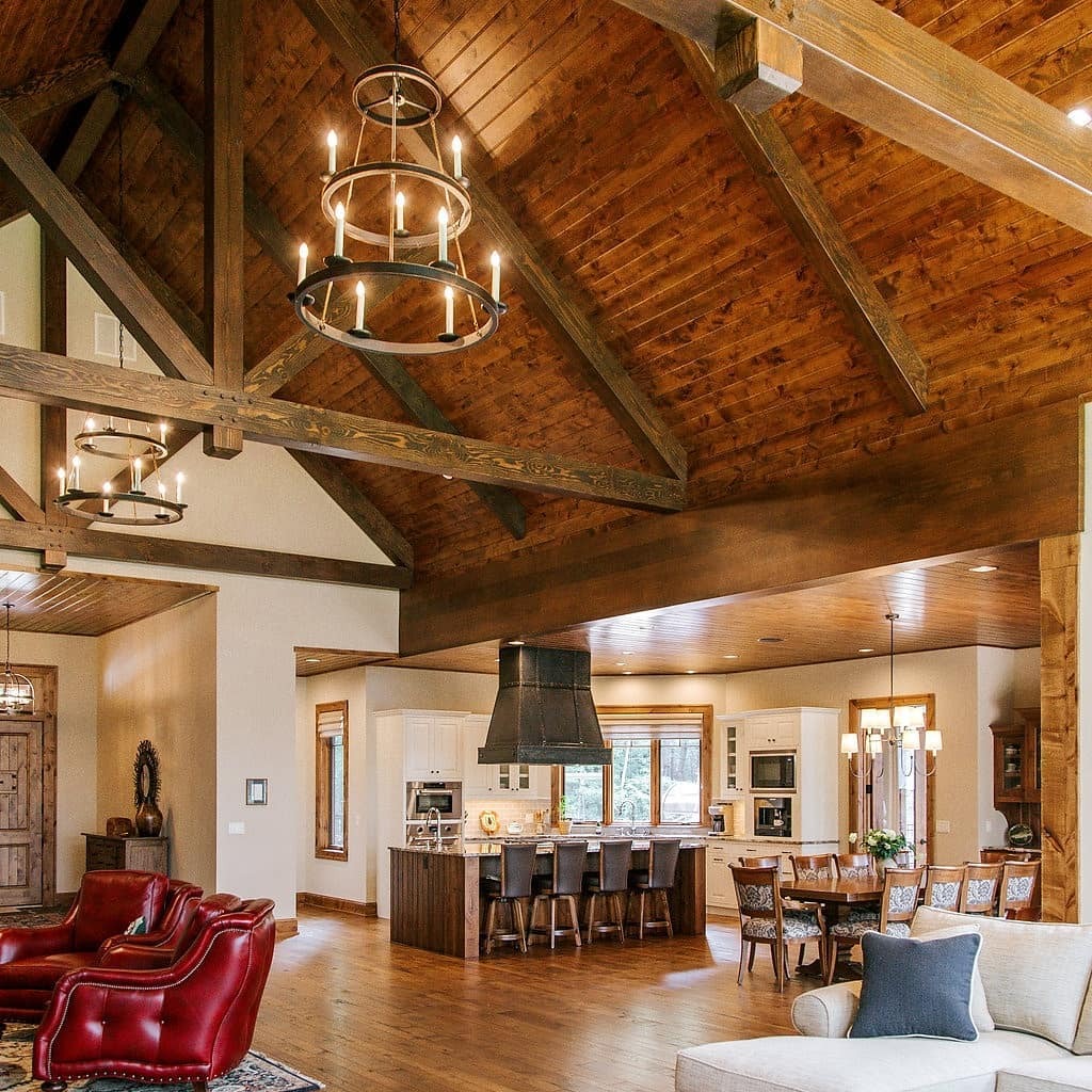
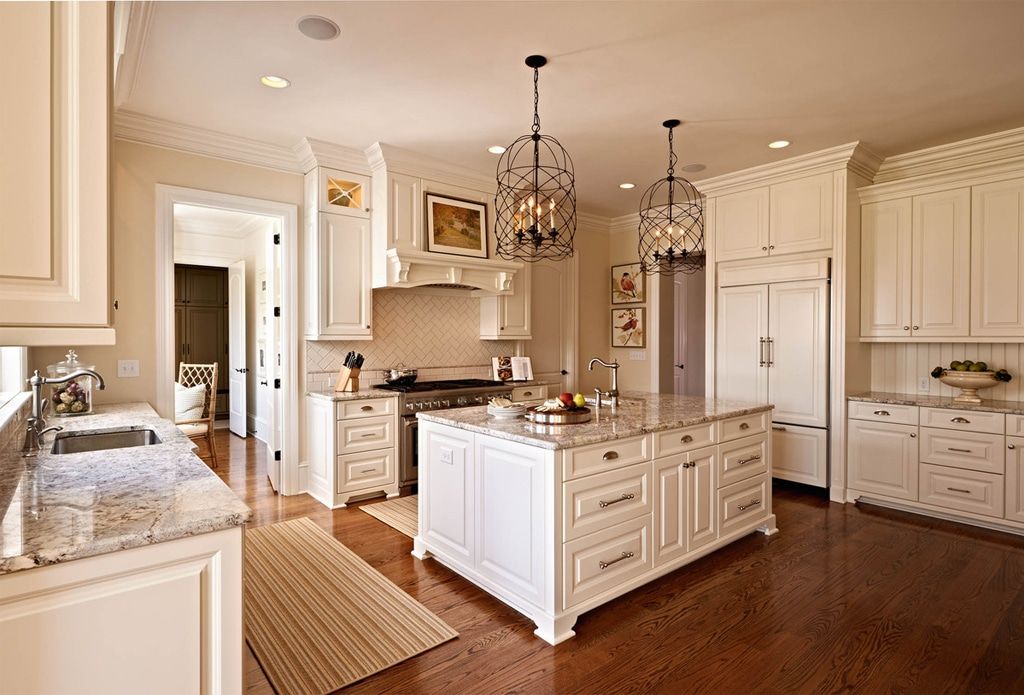
Antique White in the Kitchen
You can interpret a monochrome theme by blending Antique White walls with matching cabinets and islands in multiple ways. It’s great for contemporary and modern homes, especially with white trims.
Alternatively, make the kitchen into a homely vintage vibe using warm wooden trims.
Antique White Dining Room
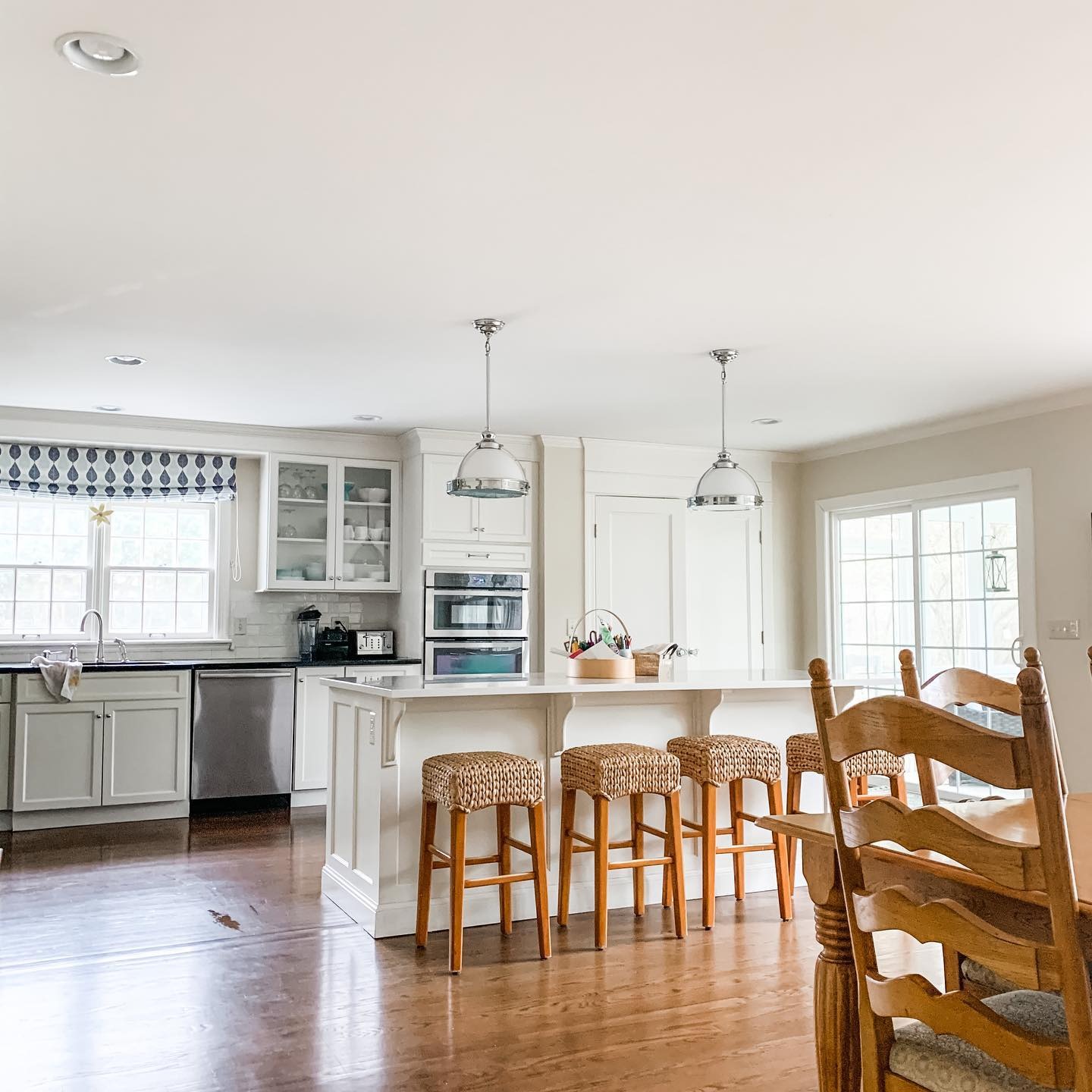
Use the coordination in your kitchen to inspire your dining room since both spaces are related. It creates a seamless transition and harmonious vibe rather than having both spaces look like standalone rooms.
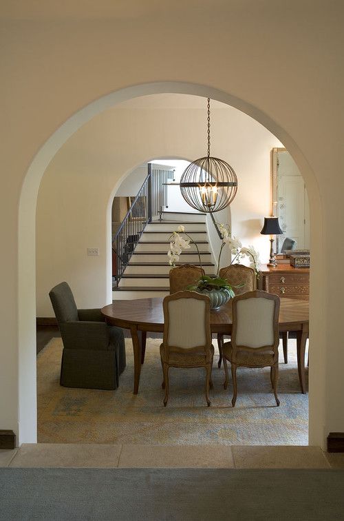
Antique White as an Accent Wall or Full Wall?
The beauty of Antique White by Sherwin-Williams is that it fits anywhere, whether as a highlighting color (accent) or full coloring. Use the paint as a full wall coloring in small rooms and with complementary accessories.
However, if your room is large, you can pair Antique White darker paints to give it the illusion of being medium-sized.
Antique White Exteriors
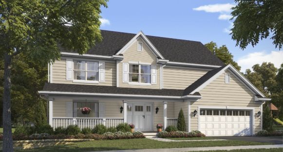
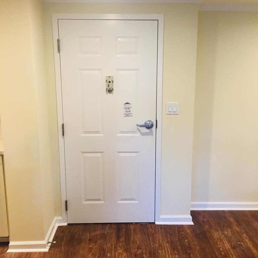
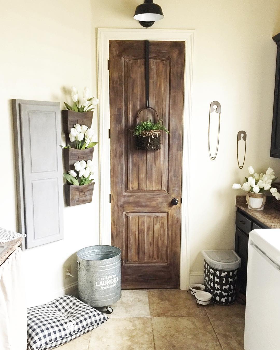
Sherwin-Williams Antique White is too bright for exterior painting, although you can use it if it suits your taste. It works best outside as an accent, like a door, porch wall shed, or trim. See the example below.
Sampling Antique Exteriors
Ensure you get samples from Sherwin-Williams or Samplize before you buy Antique White. That’ll help you test the outcome and confirm it’s your desired shade to avoid regrets. Samples come in strips, color-to-go paints, and color chips. Pick your preference.
Final Thoughts
You can’t go wrong with Sherwin-Williams Antique White paint, as it’ll certainly brighten your space and improve your mood in rain or sunshine. However, you’ll get the best from the color by styling it in a vintage theme.
Use the tips above and share your designs.

