
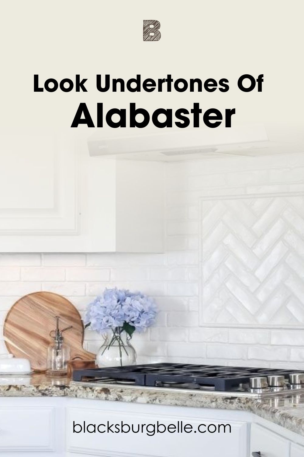
Sometimes, it isn’t enough to just use a white paint color. You want one that can add a cozy and creamy vibe to your home or space. However, you might be stuck at the Creamy vs Alabaster crossroad. Don’t worry, I’ve got you covered.
Sherwin Williams Creamy and Alabaster are both lovely white paint colors with soft yellow tones. However, Creamy has more…well, creamy tones, giving a stronger cozy vibe. It also makes Alabaster look cool by comparison.
On the other hand, Alabaster completely wins when it comes to beauty and sophistication. It also has a more balanced look and a higher versatility. Sherwin Williams Alabaster is one of the most popular white paint colors from the brand.
That is to give the short answer.
If you want the full comparison and answer, keep on reading this article. I have made a comprehensive examination of both paint colors. You will understand their specifications, color pairings, undertones, etc., at the end of this article.
Table of Contents
When to Choose Creamy or Alabaster?
Sherwin Williams Creamy and Alabaster have soft yellow tones and cozy vibes. However, knowing this might not be enough to pick correctly. You need to know the right choice for your space at any time.
So, how do you know when to choose Creamy or Alabaster? Check these tips for a quick way to pick wisely.
Pick Creamy (SW 7012) if:
- You desire the creamier option. Sherwin Williams Creamy has stronger yellow tones that give it an edge here.
- You want the warmer white of the two.
- Your space needs some extra color.
- You don’t mind the paint color leaning into yellow sometimes.
Pick Alabaster (SW 7008) if:
- You want the less warm option.
- You want some gray in the mix.
- Your space needs a beautiful white that doesn’t look crisp or stark.
- You want the more balanced white. Alabaster balances its yellow tones with some gray. This gives it a higher versatility and makes it an excellent choice for small spaces in particular.
Despite knowing all of the above, making a choice can still look tricky. The reason is that several other factors come together to determine the best option. So, how do we tackle all of these?
Let’s get started.
The Visual Distinctions: Sherwin Williams Creamy vs. Alabaster
We’ll start our comparison by examining pictures of both paint colors in real homes.
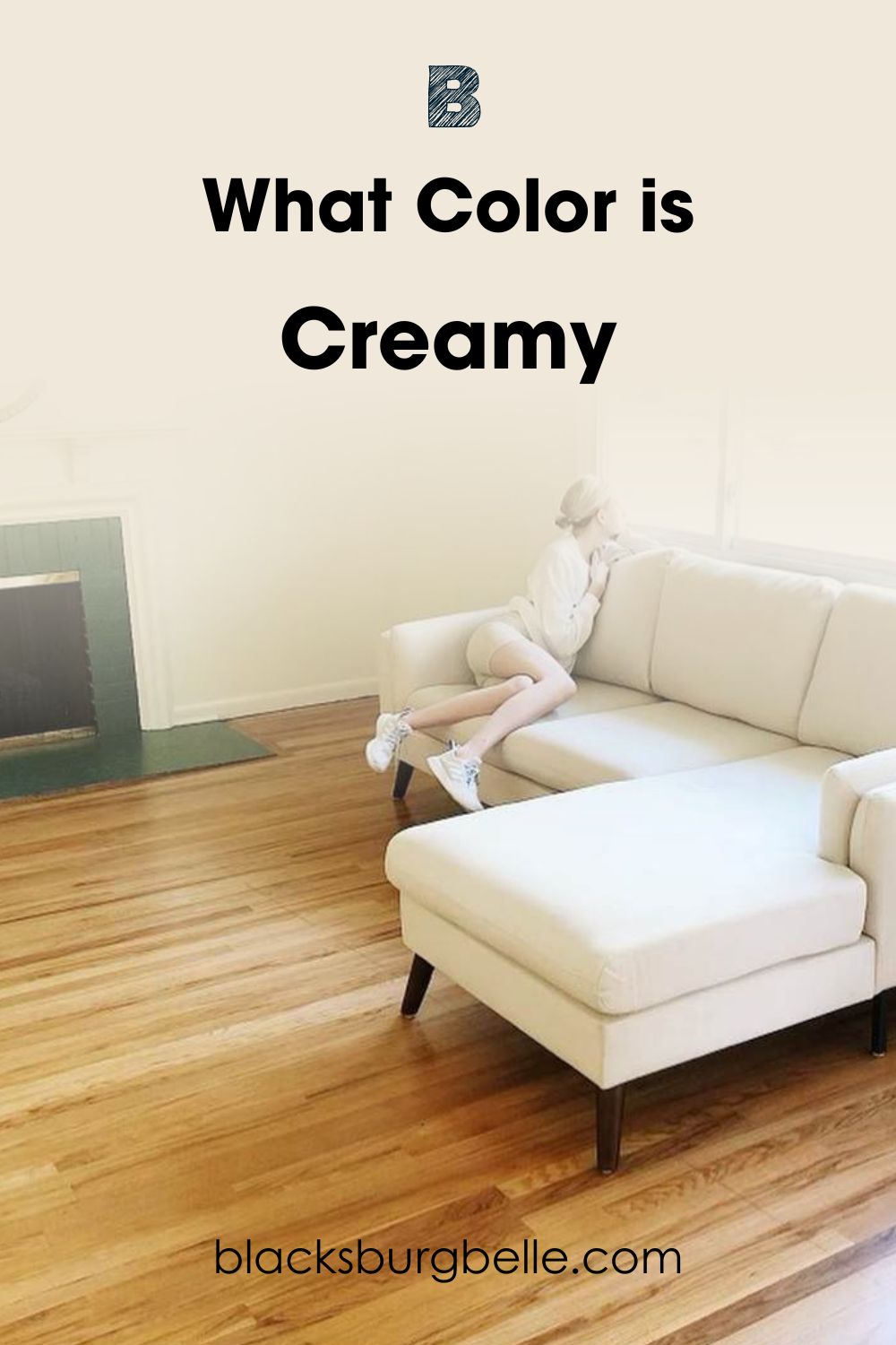
First, we’ve got Sherwin Williams Creamy on living room walls.
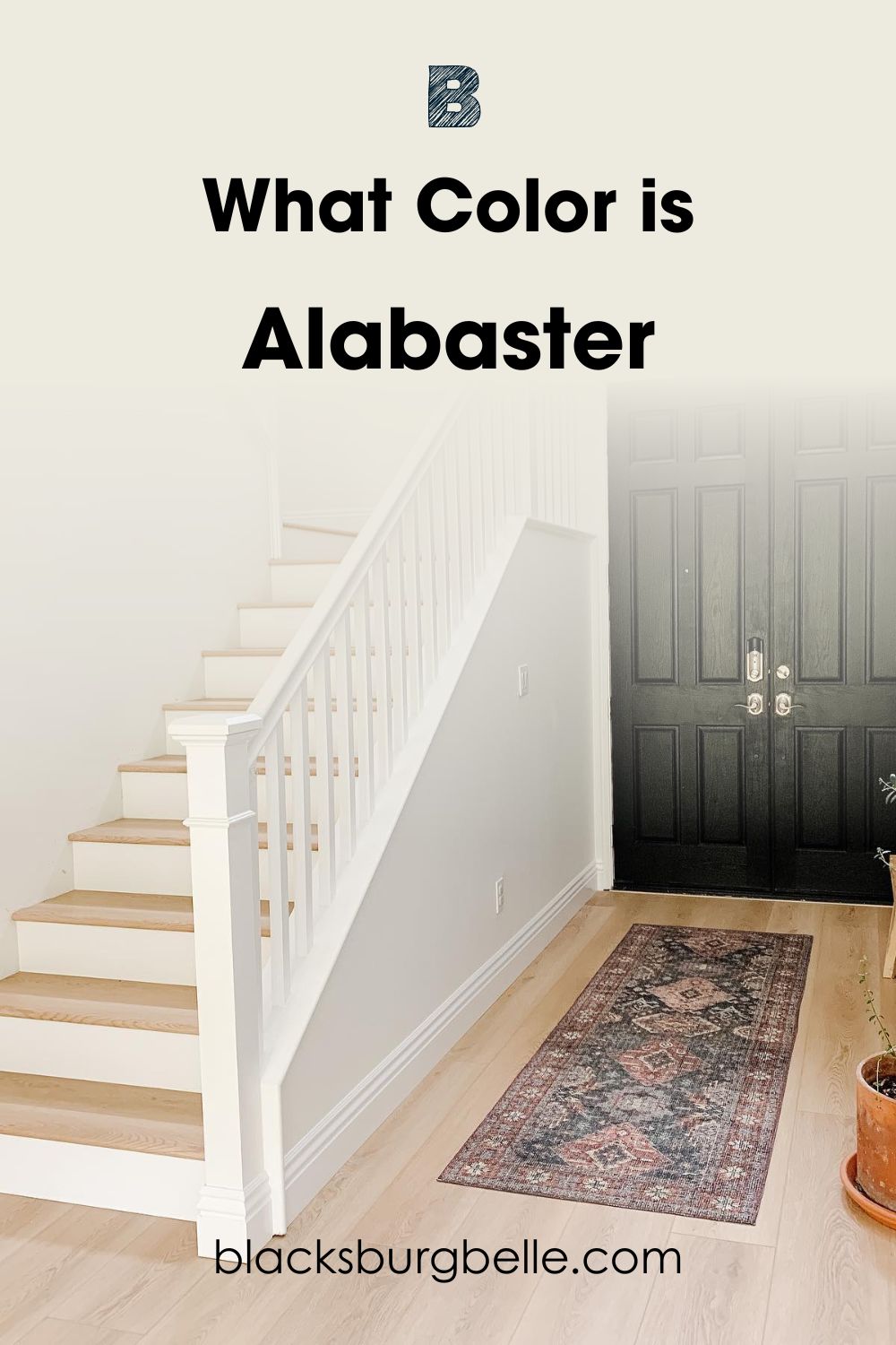
And Sherwin Williams Alabaster on the walls.
Just by looking at both pictures, you can immediately observe the difference in creaminess and coziness. Sherwin Williams Creamy lives up to its name with more warmth and stronger yellow tones.
Alabaster looks closer to true white on the walls. Areas like the wall closer to the front door show a bit of its warm tones. However, the area closer to the windows shows no trace of yellow because of the extra illumination.
Sherwin Williams Creamy vs Alabaster? – A Quick Comparison
These white paint colors don’t only differ in appearance. But they also have varying specifications. The table below compares their technical properties.
| Attributes | Creamy | Alabaster |
| RGB | 239 / 232 / 219 | 237 / 234 / 224 |
| LRV | 81 | 82 |
| Undertone(s) | Yellow | Gray and mild yellow |
| HEX Value | #EFE8DB | #EDEAE0 |
Emotional Effects: Sherwin Williams Creamy vs. Alabaster
White generally represents purity, peace, and cleanliness. The same can be said for Sherwin Williams Creamy and Alabaster, as they are both white colors too. However, there is more to their emotional effects and significance.
Using Sherwin Williams Creamy in a space gives a sense of warmth and welcome. Fortunately, this sort of vibe befits a home where anyone would want to feel comfy and accepted. The white paint color can also give a subtle feeling of energy and coziness.
For Sherwin Williams Alabaster, it looks closer to traditional white. This gives it a much more pure vibe. Also, the beautiful white has a sense of calm and elegance, as its name implies. Alabaster can easily make any space feel welcoming and attractive.
So, do you want a snug feel in your space? Go for Sherwin Williams Creamy. However, if you prefer tranquility and sheer beauty, Sherwin Williams Alabaster does it better.
LRV of Creamy vs. Alabaster – Which Reflects More Light?
The LRV of a color indicates on a scale of 0 – 100 how much light a color reflects (or doesn’t reflect). True black has an LRV of 0, indicating no reflection of light, while pure white has an LRV of 100, signifying full reflection of light.
Creamy has an LRV of 81.
Alabaster has an LRV of 82.
These LRVs indicated that both paint colors have similar reflectance. What does this mean? It means that their reflecting power is negligible in this comparison. However, I still give Alabaster a stronger reflectance because it has lesser yellow tones and is closer to true white in appearance.
While Creamy easily passes for an off-white, Alabaster sits right on the edge. It will look off-white when placed side-by-side with brighter white colors like SW High Reflective White.
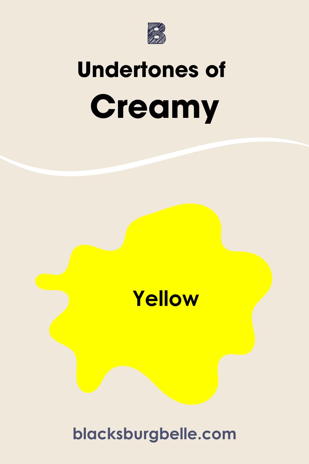
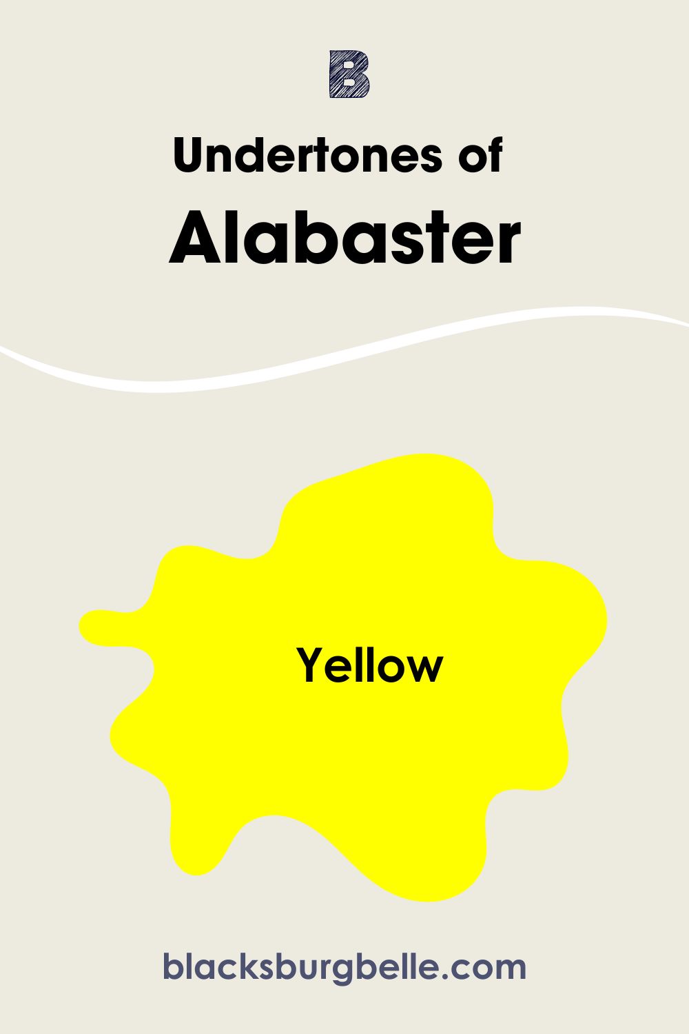
Undertones of Creamy vs. Alabaster: Are They the Same?
Another factor that contributes to this comparison is their undertones. Both white paint colors have similar tones. While this could look simple on paper, it’s different in practice. Unlike some other colors, their undertones remain vital to their overall appearance.
Sherwin Williams Creamy has strong yellow undertones that show up in every space you use it. This easily sets it apart from conventional white paint colors. It also contributes to its warmth.
On the other hand, while Sherwin Williams Alabaster has yellow undertones too, they aren’t as strong. Also, the beautiful white has some gray that helps tone down its yellow. This is why it is the more balanced white of the two.
A Closer Look at Creamy’s Undertones
It is important to note that while Sherwin Williams Creamy shows its yellow often, it can sometimes hide them in bright light. The picture below shows its yellow undertone.
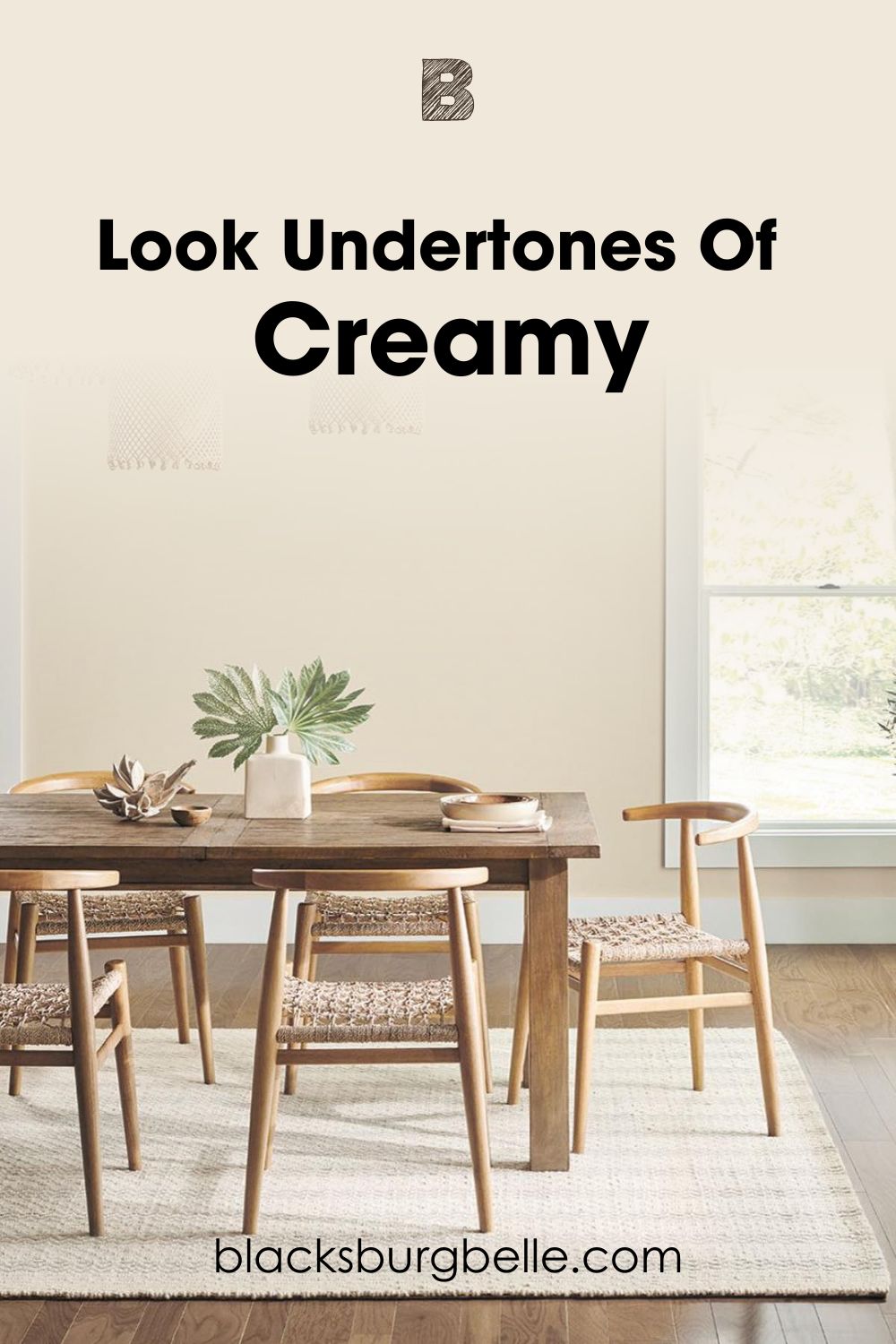
You can easily detect the creamy tones in the above picture. The surrounding colors also contribute to its warmth.
Now, notice how the paint color hides it in the picture below.
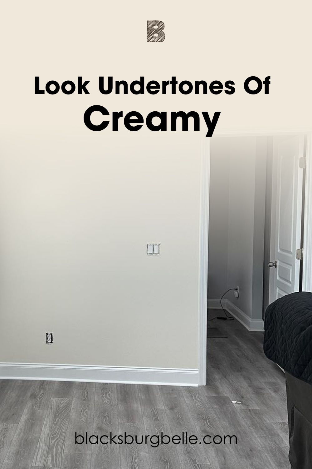
Here, you can see how Creamy look less warm because of the cool lighting and the black colors in the space.
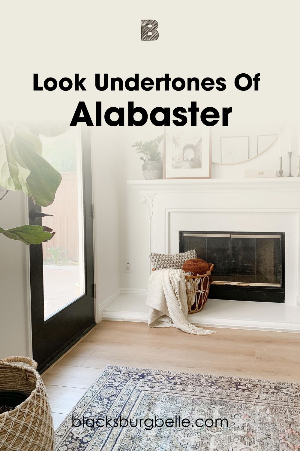
A Closer Look at Alabaster’s Undertones
While you can detect the creamy tones in this lovely white, you can also see how mild they are in the picture below.
However, the paint color can also look plain white like in the picture below.
Sherwin Williams Alabaster does a good job of hiding its yellow undertones as you can see above. However, you can still catch a hint of gray and cream if you look hard enough.
Creamy vs. Alabaster – Are They Warm or Cool?
Sherwin Williams Creamy and Alabaster are both warm white paint colors.
However, a side-by-side comparison of both whites reveals Creamy to be the warmer one of the two. Nevertheless, Alabaster still has some warmth to offer but in a more balanced way. This makes it less challenging to pick once you know this fact.
In rooms that receive more afternoon and early-evening sunlight, Creamy can look intense. These spaces include south-facing rooms. On the other hand, Alabaster will only look warmer but not too much.
North-facing rooms generally make colors appear cooler. Therefore, Creamy will look less yellow, and Alabaster will show more of its gray.
Finally, picking the less warm option for small spaces won’t hurt. This will help to prevent creating a stifling vibe or feel.
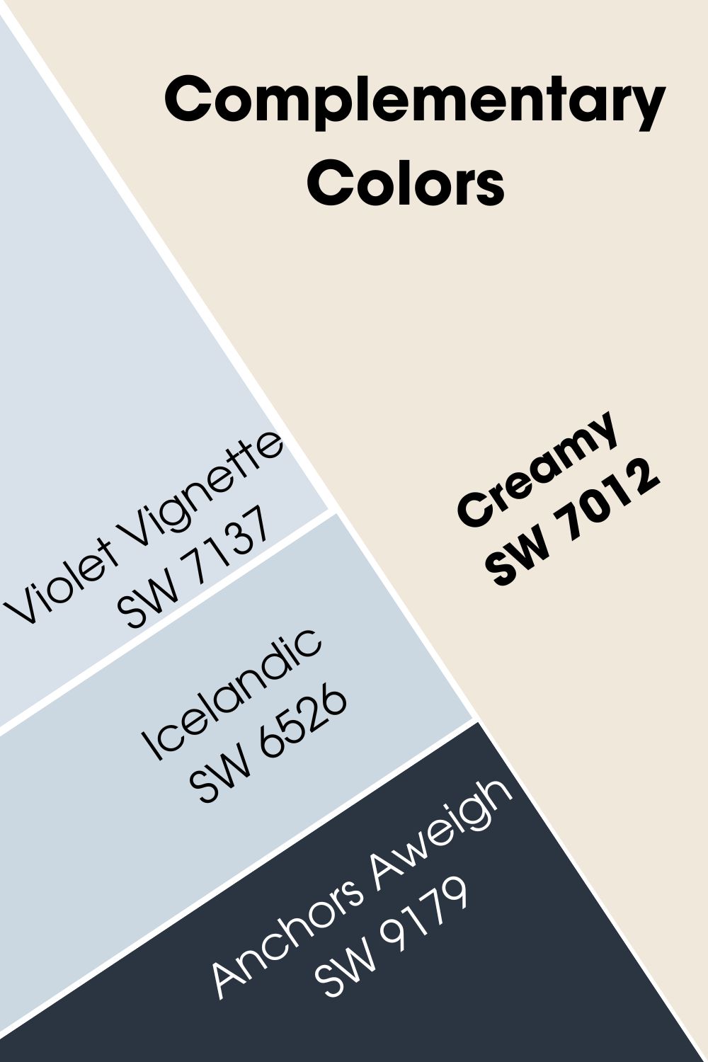
Creamy vs Alabaster Complementary Colors
Although these paint colors look amazing, they can look even better with the right pairings. These are called complementary colors; you can find them opposite your main color on the wheel.
As usual, I have checked it out for you. However, the exact complementary colors for Creamy and Alabaster have been archived. Fortunately, you can still get them in paint or Color to Go. Don’t worry, I added some honorable mentions too.
Creamy Complementary Color
The warm white picks its complementary color from the purple hue.
Sherwin Williams Violet Vignette (SW 7137)
Despite its name, Violet Vignette looks closer to blue than purple. It has an LRV of 74, which means that you can use it in any interior space, regardless of lighting.
In case you can’t get your hands on this cool, airy paint, let’s check some valid alternatives.
Sherwin Williams Icelandic (SW 6526)
This cool violet belongs to the Purple Color Family and has blue undertones. I see it as a direct alternative to Violet Vignette. SW Icelandic has an LRV of 67 and pairs exceptionally well with warm whites like Creamy.
Sherwin Williams Anchors Aweigh (SW 9179)
Anchors Aweigh is an excellent dark complementary color for SW Creamy. The cool, saturated blue has an LRV of 3 and looks amazing on exterior walls and woodwork.
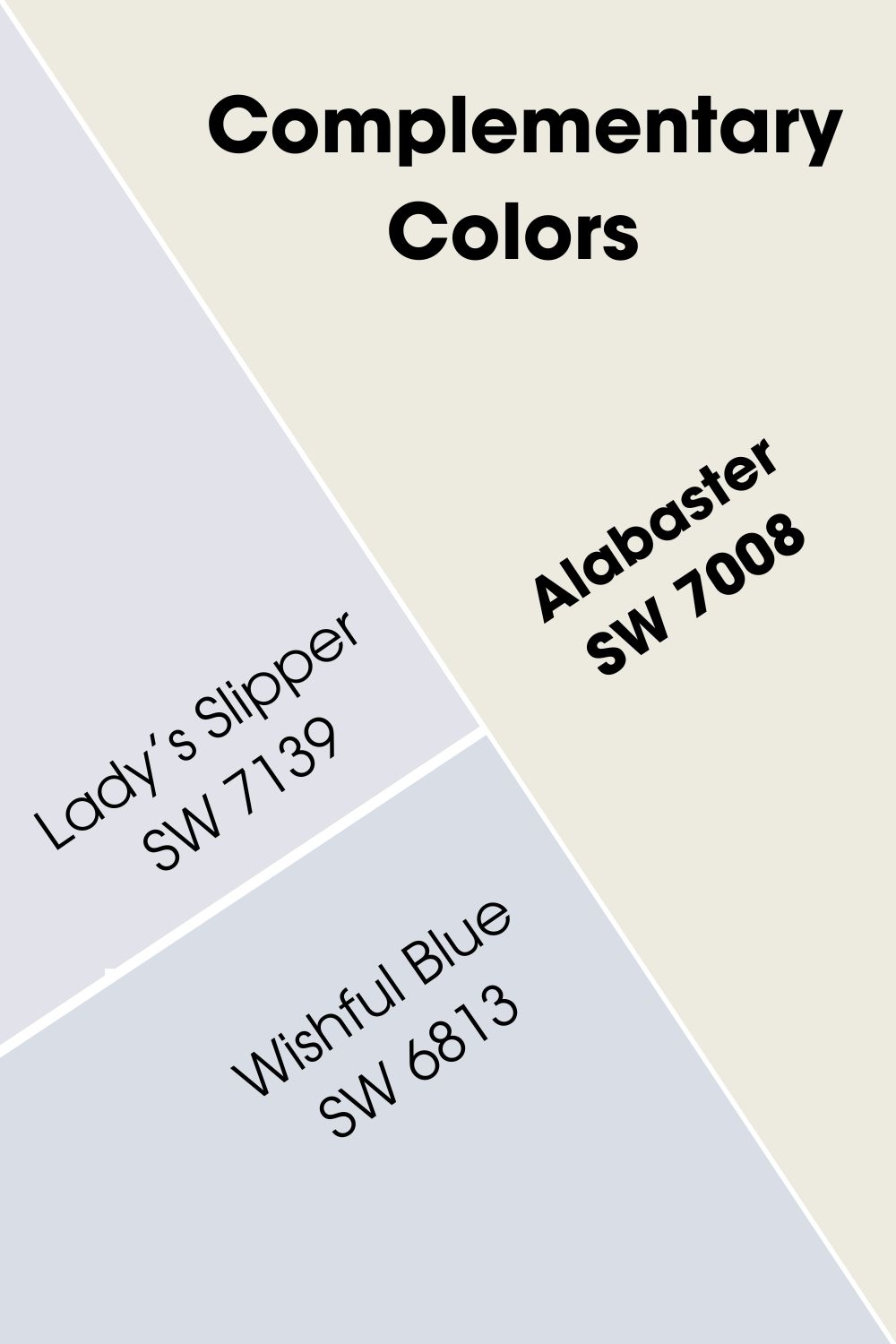
Alabaster Complementary Color
Just like Creamy, Alabaster’s complementary colors has a purple hue.
Sherwin Williams Lady’s Slipper (SW 7139)
Lady’s Slipper is a light, airy purple, with strong blue undertones. However, it can wash out in bright light because of its LRV of 76.
This paint color is archived and only available in paint and Color to Go. Fortunately, there’s a much more available and better alternative.
Sherwin Williams Wishful Blue (SW 6813)
Despite its name, SW Wishful Blue belongs to the Purple Color Family. However, it has strong blue tones that you can’t miss. The paint color has an LRV of 72 and complements Alabaster excellently.
You can use it in any space, thanks to its brightness. However, I don’t recommend it for exteriors. The reason is that Wishful Blue is bright enough to wash out in abundant sunlight.
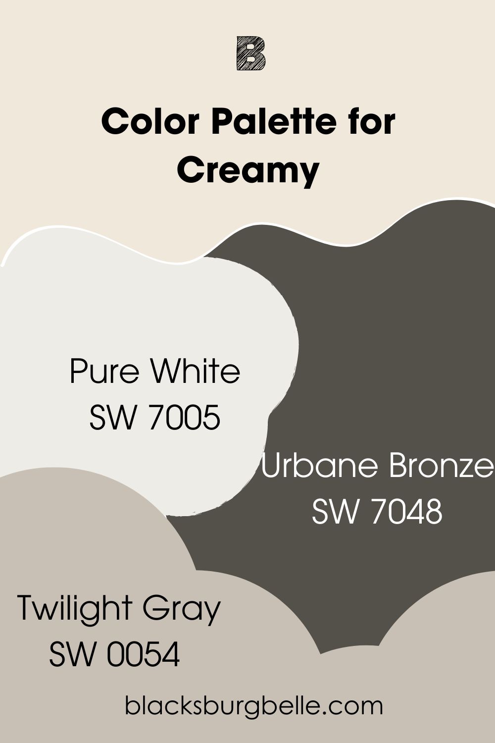
Creamy and Alabaster Color Palette
What’s next after exploring the differences between Creamy and Alabaster? Checking out a palette for each of them. Remember that no single paint color can look as good as pairing them up with relevant colors.
That said, I sure am excited to share these palettes with you!
Creamy Color Palette
This color palette takes a monochromatic route. It explores the paint colors warmth and creamy tones.
Sherwin Williams Creamy (SW 7012)
This warm, creamy white is our main color. It has an LRV of 81 and strong yellow tones. While it looks good on cabinets, I generally recommend it for walls.
Note that exterior spaces can sometimes hide Creamy’s yellow tones. This mostly happens in bright sunlight.
Sherwin Williams Pure White (SW 7005)
Pure White has some yellow tones but not as strong as SW Creamy. Also, it has a bit of black that prevents it from looking creamy. SW Pure White is highly versatile, going well in any space and with almost any color.
You can opt for using it as a trim color for Sherwin Williams Creamy.
Sherwin William Urbane Bronze (SW 7048)
Urbane Bronze is a lovely blend of brown and gray, with an LRV of 8. It brings subtle warmth and sophistication to any space. You can see it as an anchor of sort for this palette. With its earthy tones and vibe, it’s a perfect fit!
As a dark neutral, you can use it on cabinets or furniture.
Sherwin Williams Twilight Gray (SW 0054)
This medium shade of gray fits into this palette as a transition from Urbane Bronze to Creamy. It has an LRV of 53, making it suitable for both well-lit and dim spaces.
You can use it on cabinets for more versatility.
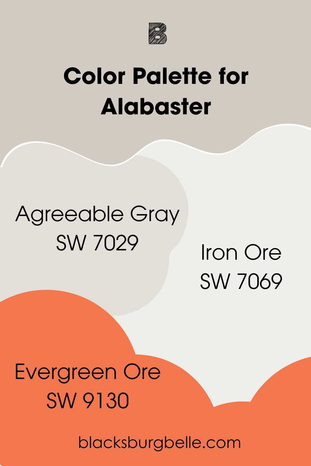
Alabaster Color Palette
This palette takes a nature-inspired route. It gives a relaxing and calm vibe in any space. At the same time, it exudes taste.
Sherwin Williams Alabaster (SW 7008)
Alabaster is a balanced white with good cozy vibes. It has soft yellow tones and some gray. The paint color looks amazing in any space. So far you use it with the right color pairings. Fortunatuely, it goes well with a wide range of colors.
Sherwin William Agreeable Gray (SW 7029)
Agreeable Gray is a mid-toned gray with lovely sense of coziness. It is the best-selling paint color from the brand and for good reason. The paint colors pairs well with almost any color out there and works in just about any space.
You can pair it with Alabaster on walls or flex it on cabinets.
Sherwin Williams Iron Ore (SW 7069)
This dark neutral has strong brown and gray tones. However, it can easily look black when you aren’t comparing it with a deeper black. Sherwin Williams Iron Ore also has subtle green undertones that make it the best fit for this palette.
It works best in an accent wall or furniture. The reason is that you want to use it sparingly in your space.
Sherwin Williams Evergreen Ore (SW 9130)
Here we have a medium to dark green with lovely gray tones. It cements the nature-inspired look we want from this palette. Sherwin Williams Evergreen Ore has refreshing and calm feel in any space.
Creamy vs Alabaster on Cabinets
Both Creamy and Alabaster look good on cabinets, especially in well-lit areas. The reason is that the illumination helps them look closer to true white.
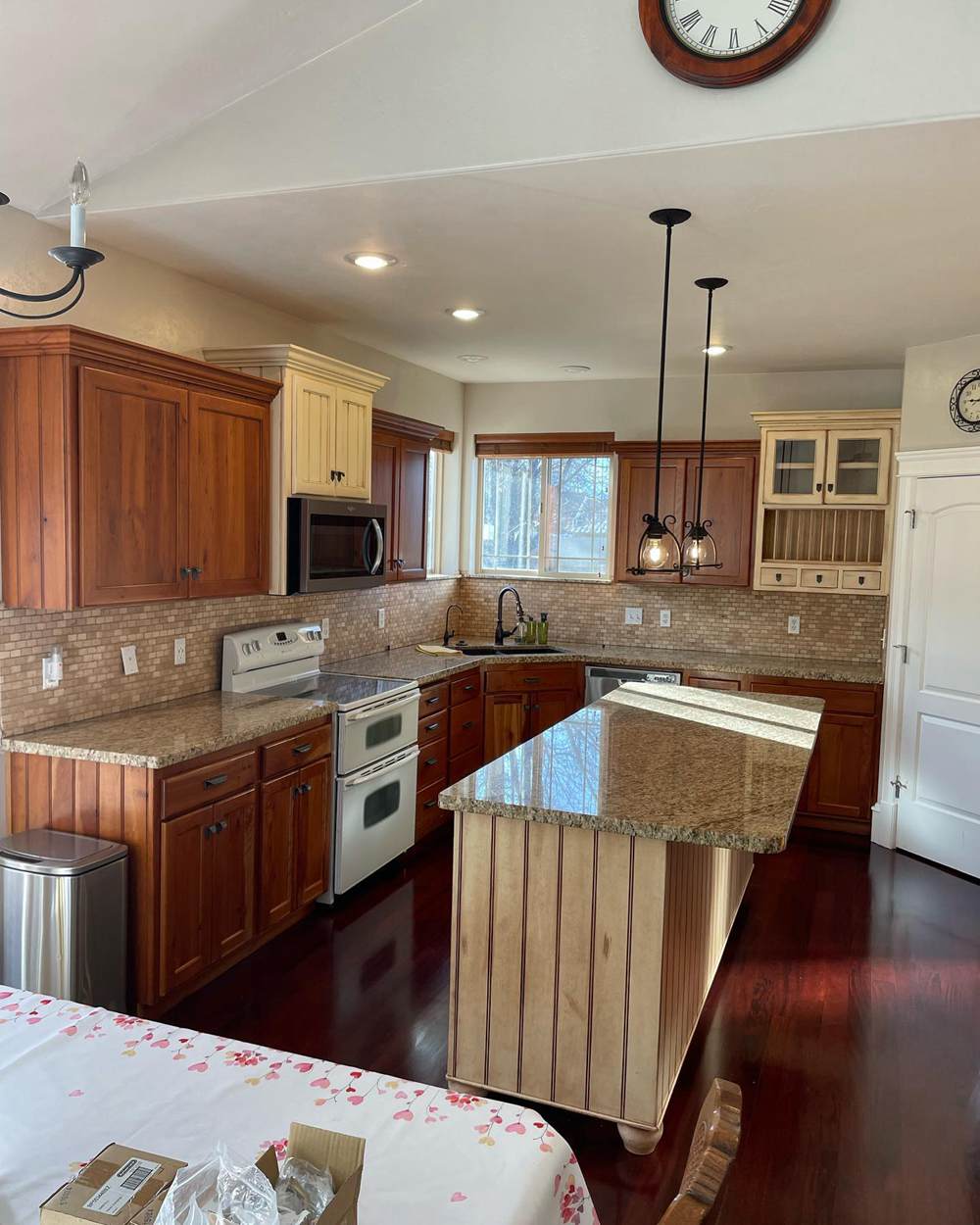
Sherwin Williams Creamy on Cabinets
Creamy looks cozy on the kitchen cabinets and fits right into the overall warmth in the space. Also, it adds a bit more color to the kitchen.
You can see a bit of its yellow tones on the cabinets too.
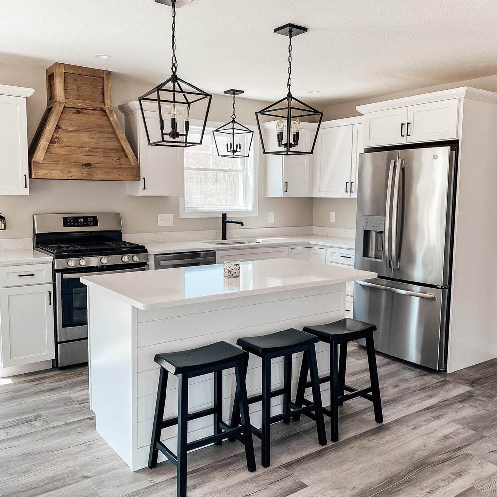
Sherwin Williams Alabaster on Cabinets
Although Alabaster looks less warm than the color on the walls, it shows subtle warmth. Its soft yellow undertones exude a mild coziness that fits into the space.
Creamy vs Alabaster on Exterior Walls
These paint colors look good on exterior walls. The abundance of light gives them a clearer appearance and extra sophistication.
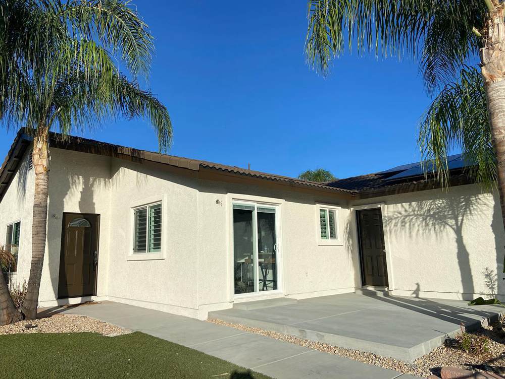
Sherwin Williams Creamy on Exterior Walls
Creamy gives a feel of relaxation and vacation on these exterior walls. Also, the surrounding green gives it an underlying hint of green and yellow.
You can immediately notices its coziness in the evening sunlight.
Sherwin Williams Alabaster on Exterior Walls
Alabaster pairs nicely with the warm tones of the lower portion of the walls. It also reveals some yellow in the shaded areas. Portions of the wall with more illumination show subtle gray-green tones.
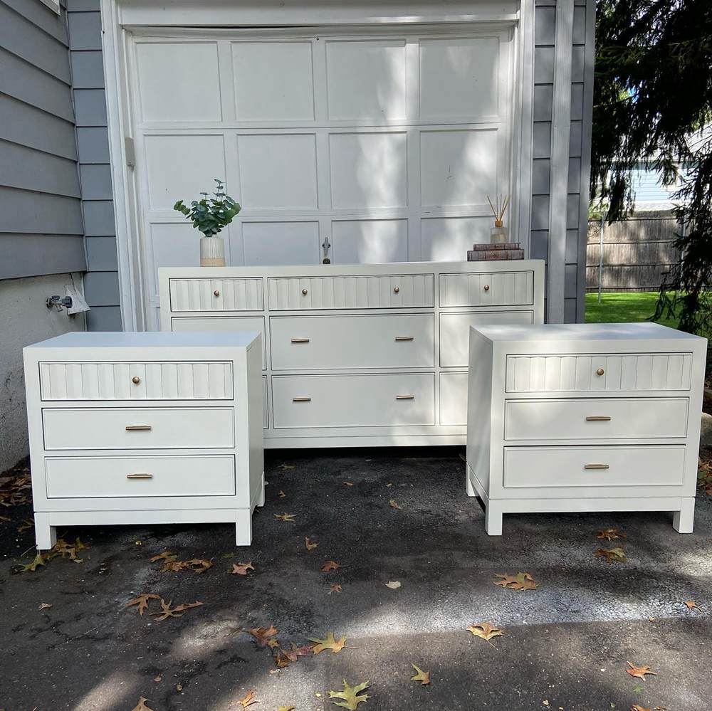
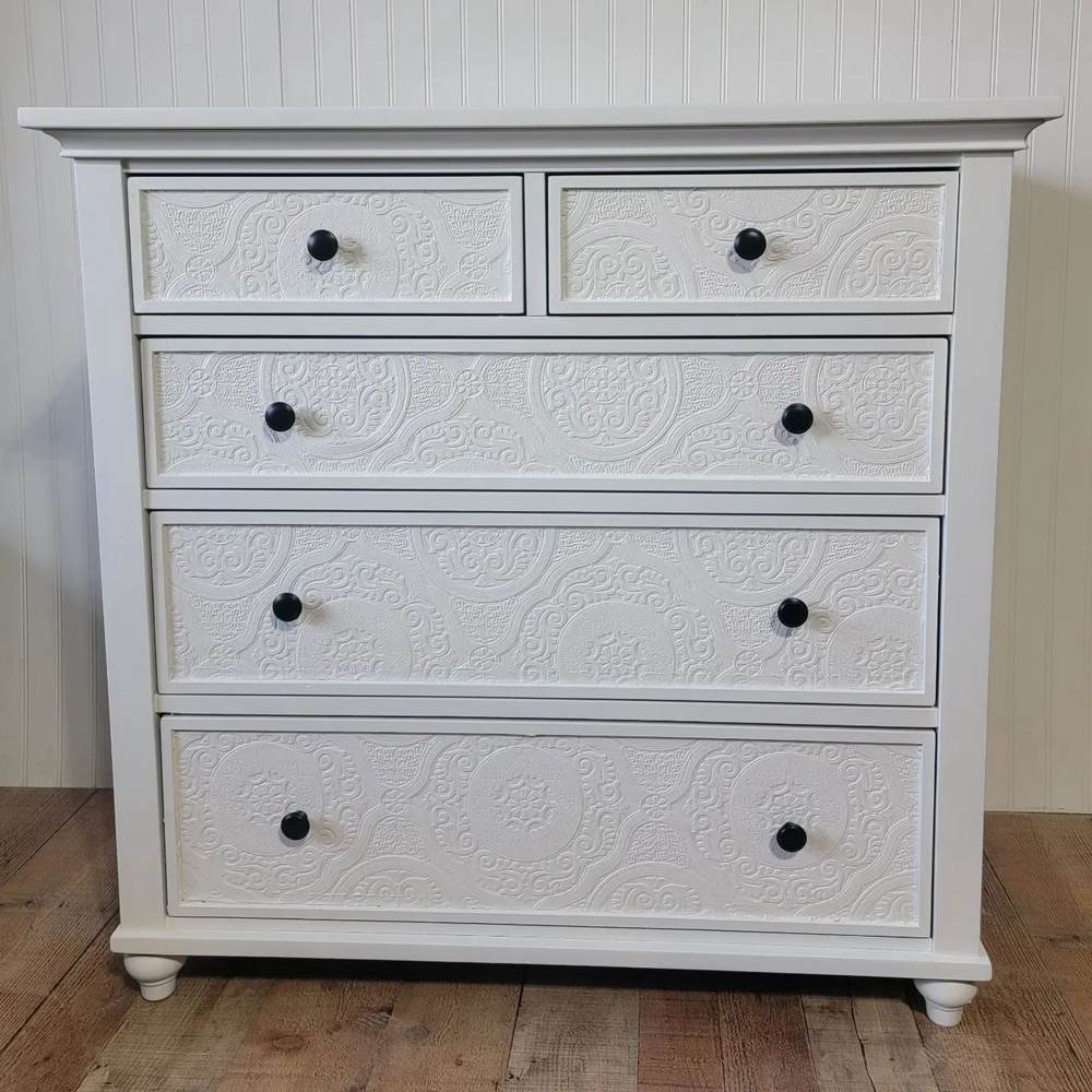
Creamy vs Alabaster on Furniture
Do these paint colors go well on furniture? Thanks to their brightness and warm tones, Creamy and Alabaster look good on furniture.
Sherwin Williams Creamy on Furniture
Creamy show just a bit of yellow on these nightstands. This gives it a soft, subtle warmth. You might not see it right away, but it’s there.
Note that the furniture might look warmer when moved indoors.
Sherwin Williams Alabaster on Furniture
Alabaster looks natural on this nightstand. Here, you will notice more of its gray tones. The yellow undertones look hidden.
Also, it looks soft, not harsh. This further confirms its creamy finish as a paint color.
Creamy vs Alabaster in Bedrooms
Bedrooms look awesome with the right vibe. Creamy and Alabaster give cozy, relaxing looks to bedrooms. This makes them an excellent choice for such spaces.
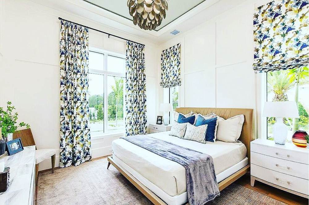
Sherwin Williams Creamy in a Bedroom
This bedroom looks perfectly cozy with Creamy on its walls and the warm color pairings. Also, the space exudes a promise of a snug, comfortable feel after a long day.
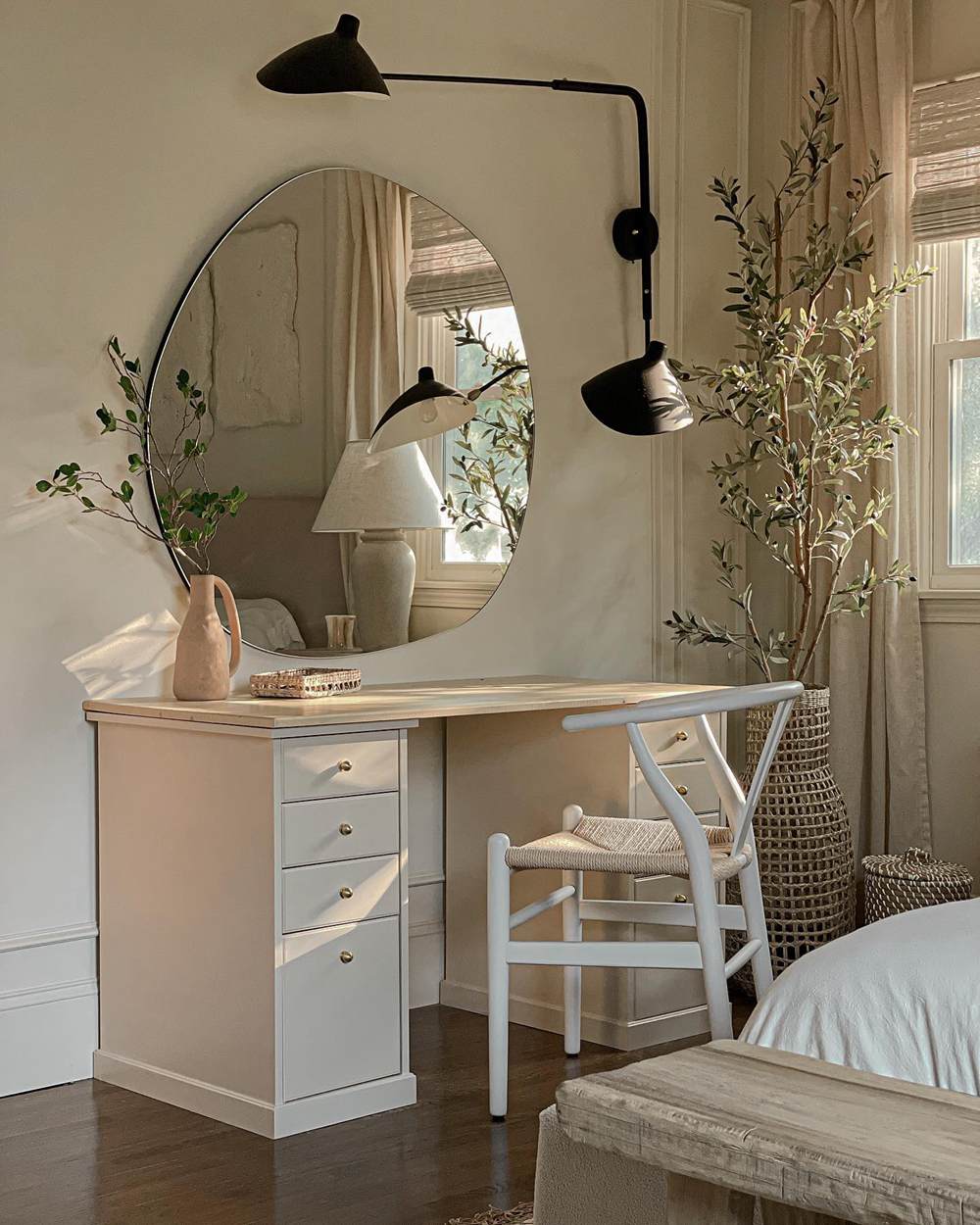
Sherwin Williams Alabaster in a Bedroom
Although it looks clean and soft on these walls, don’t think Alabaster isn’t exuding warmth too. If you look closely, you’ll notice the subtle yellow tones. This contributes to the room’s coziness.
Creamy vs Alabaster in Living Rooms
How do these paint colors look on living room walls? Let’s check out some pictures.
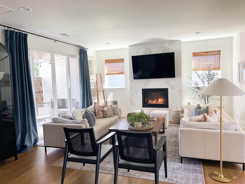
Sherwin Williams Creamy on Living Room Walls
The paint color looks warm and relaxing on the walls. The abundant lighting and space bring out more of its yellow tones and warmth.
However, the Creamy looks more like beige in this space.
Sherwin Williams Alabaster on Living Room Walls
Alabaster looks beautiful and natural on these walls. It pairs nicely with the other colors in the space to give a sophisticated and refreshing feel.
Conclusion
You now know the differences between Sherwin Williams Creamy and Alabaster. Choosing the right white color should be a breeze now. If everything we covered looks a bit overwhelming, here’s a quick rundown of how to choose between Creamy and Alabaster.
- Creamy is the warmer one of the two. It is an excellent choice if you want the cozier white.
- Alabaster is the more beautiful one of the two. Also, it has higher versatility.
- Both paint colors look wonderful in interior and exterior spaces.
- They both have similar LRVs. However, Alabaster reflects a bit more light because it has less yellow tones.
Don’t hesitate to drop your questions in the comments section. I look forward to answering them thoroughly.
 Mindful Gray Vs Repose Gray: How to Choose?
 Agreeable Gray Vs Repose Gray: What’s The Difference?
 Benjamin Moore Chantilly Lace vs Simply White: Which Is Better?
 Agreeable Gray vs Edgecomb Gray: Let’s Compare!
 Benjamin Moore Ballet White vs Swiss Coffee: Let’s Compare
 Benjamin Moore Simply White vs Decorator’s White: How to Choose?
