
Looking for the perfect gray for your space? Or are you stuck in the Passive vs Repose Gray debate? Yes, we’ve all had to make a choice between the two at one point. Fortunately, I’ve got you covered.
Passive and Repose Gray are some of the best gray paint colors from the brand. While they look equally good, both colors have a couple of differences.
Sherwin Williams Passive is a cool gray with mainly blue undertones. It works best for a relaxed and light-hearted vibe. Luckily, the paint color has enough depth to remain cool and not look icy or cold.
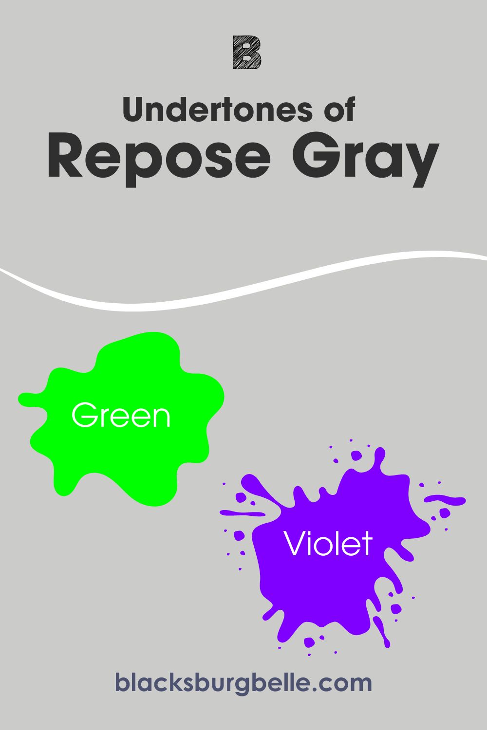
On the other hand, Sherwin Williams Repose Gray is a warm gray with mainly green undertones. It has a cozy look which makes it an excellent choice for spaces where you want warmth. Also, this paint color is the more popular one of the two.
However, I am not going to leave you with just that. Join me as I dive into the details of these paint colors. We will explore their undertones, specifications, complementary colors and much more.
Table of Contents
When to Choose Sherwin Williams Passive or Repose Gray
Sometimes, knowing the difference between paint colors makes it easy to make a choice. However, there are other times when it isn’t enough, and you have to understand what each color offers.
So, when do you choose Sherwin Williams Passive or Repose Gray?
Choose Passive (SW 7064) if:
- You want a gray that will look cool in your space. Passive maintains a cool appearance, even when showing a different undertone.
- You don’t mind blue undertones in a gray paint color.
- Your space has good, warm lighting. Passive can look flat in cool lighting sometimes.
- You want the less popular option.
Choose Repose Gray (SW 7015) if:
- You want a gray with warm vibes for your space. Repose Gray is a perfect fit for a snug feel.
- Your space has abundant light and needs more cozy vibes.
- You don’t mind green undertones and occasional hints of blue and violet. Repose Gray sometimes leans these other undertones, depending on color pairings and lighting.
- You don’t mind using the popular option.
The above rundown give you pretty much what you need to know about these colors. But how did I arrive at these conclusions? Well, you will find out as you go further in this article.
Let’s get started!
A Visual Comparison of Passive and Repose Salt
Take a look at these lovely gray paint colors in action in real spaces and homes.
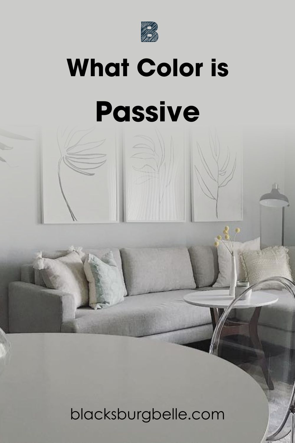
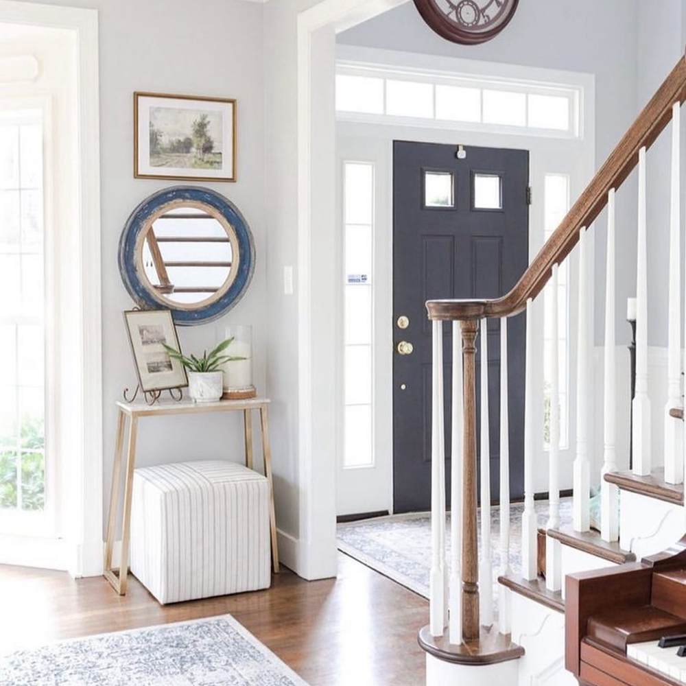
First, we’ve got a picture of Sherwin Williams Passive:
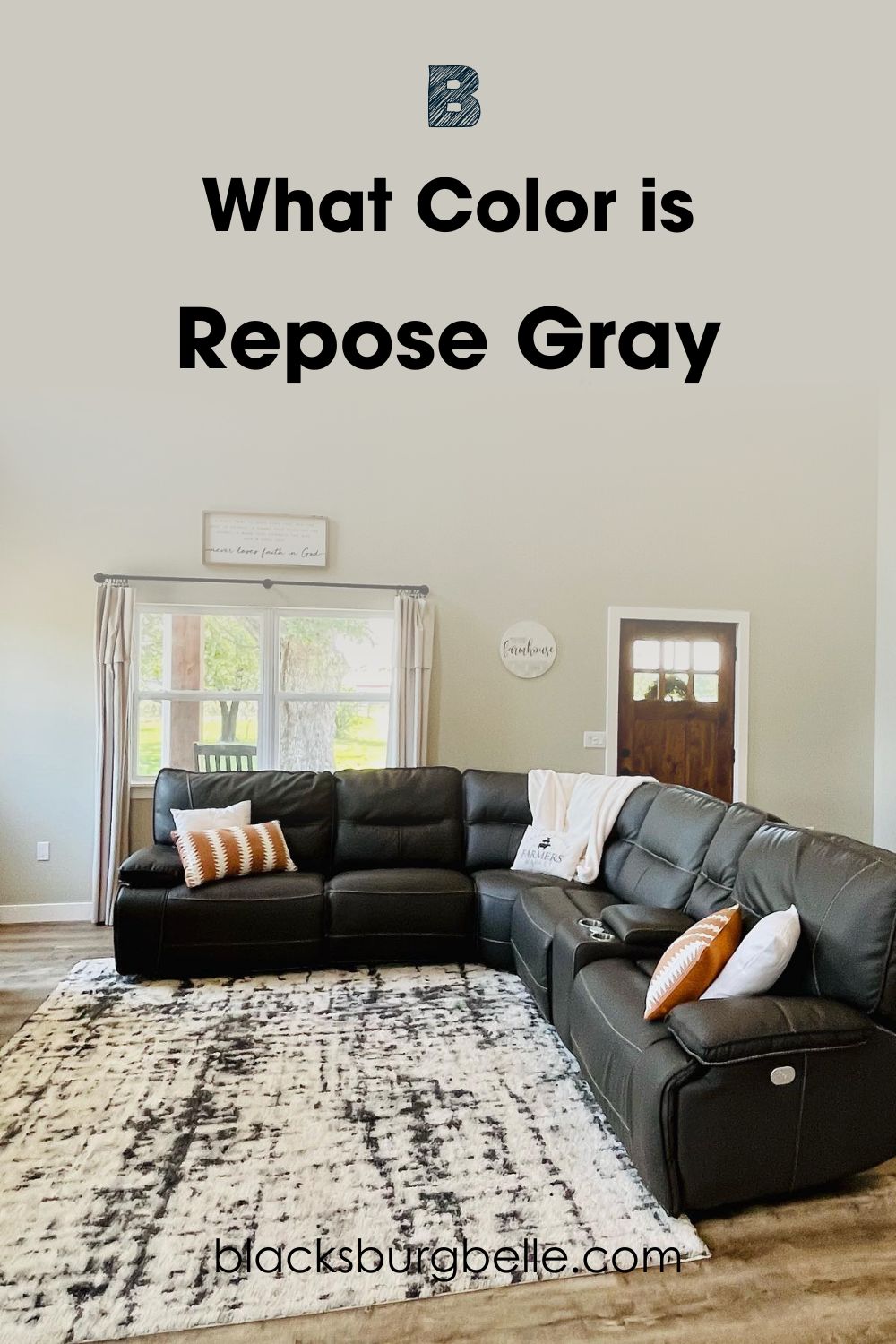
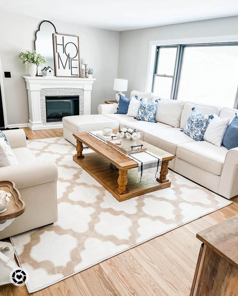
And Repose Gray:
The above pictures show the difference in tones and even vibes between the two gray colors. Sherwin Williams Passive looks cool on the walls in the first picture. You can also notice the its strong blue and gray tones.
Passive contributes to that living room’s overall feel of sophistication and taste.
The second picture shows Repose Gray’s warmth in that living room. You can spot its warm green undertones. At the same time, the lovely gray doesn’t stifle the other colors in the space. It also has strong gray tones to go well with the white trim.
Sherwin Williams Passive vs. Repose Gray? – A Quick Comparison
The table below shows the specifications of each of these gray colors. You will notice some of their differences just from observing the details.
| Attributes | Sherwin Williams Passive | Sherwin Williams Repose Gray |
| RGB | 203 / 204 / 201 | 204 / 201 / 192 |
| LRV | 60 | 58 |
| Undertones | Strong Green | Blue |
| HEX Value | #CBCCC9 | #CCC9C0 |
Emotional Effects: Sherwin Williams Passive vs. Repose Gray
Gray colors are the next best neutral after White and Black. They offer a sort of safe space to accommodate other colors. As such, gray can have a soothing and relaxing effect on us. But how do these specific ones affect us?
Sherwin Williams Passive is a cool gray with blue undertones. Passive gives a subtle feeling of welcome and the urge to unwind. Blue has been proven to be the color of stability and serenity. With such undertones, SW Passive can make a space exude comfort and acceptance.
On the other hand, Sherwin Williams Repose Gray is a warm gray with green undertones. This gives it a feeling of coziness and comfort in any space. Using Repose Gray in your home reinforces that feeling of comfort and welcome. This is one of the reasons why several homeowners love this color.
LRV of Passive vs. Repose Gray – Which Reflects More Light?
A paint color’s LRV represents its strength when it comes to reflecting light. It stands for Light Reflectance Value and is a crucial property of every paint color. The reason is that light is an important factor of how any color appears.
LRV runs on a scale of 0 – 100, with zero representing true black and 100 indicating true white.
Passive has an LRV of 60.
Repose Gray has an LRV of 58.
The above values puts both gray colors in the medium range. Although Passive has a slightly higer LRV, it doesn’t have a significantly stronger reflectance. However, its cool and light appearance can make it look a couple of shades brighter than Repose Gray.
Nevertheless, both paint colors will work fine in bright spaces, as well as dim ones. But you should always ensure abundant light for Repose Gray. This will help you take full advantage of its cozy tones.
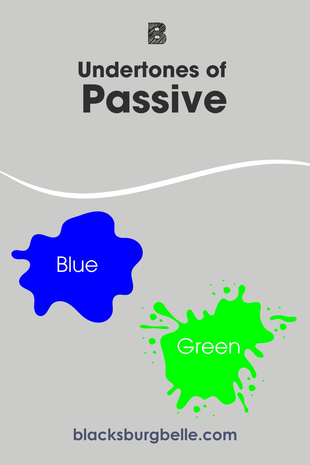
Undertones of Passive vs. Repose Gray: Are They the Same?
Even though they are both mid-toned gray paint colors, one would expect Passive and Repose Gray to have different undertones. Well, this is where things get tricky. They both display around the same undertones, but in different ways.
Sherwin Williams Passive mainly has blue undertones. However, it can sometimes display hints of green, like most other gray paint colors. Note that despite this, the paint color will maintain its cool look. Also, this mostly happens in warm lighting and south-facing rooms.
While the same goes for Repose Gray, there’s more to it. Sherwin Williams Repose Gray has strong green undertones. But it can sometimes lean into violet and some homeowners have reported it showing a little blue.
Placing both gray colors side-by-side makes you see the blue in Passive and green in Repose Gray.
A Closer Look at Passive Undertones
We’ve discussed Passive’s undertones in previous section. Now, let’s take a look at a picture that shows it in action.
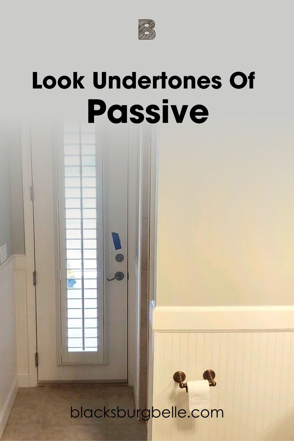
The picture shows Passive display both blue and green undertones. Look at the right side of the picture to see the paint color showing some green. That’s because of the warm lighting in that area. The left side of the picture has the blue undertones because it has more access to cool natural light.
A Closer Look at Repose Gray Undertones
Here, I’ve included a picture that captures Repose Gray showing green and another one that displays a bit of blue.
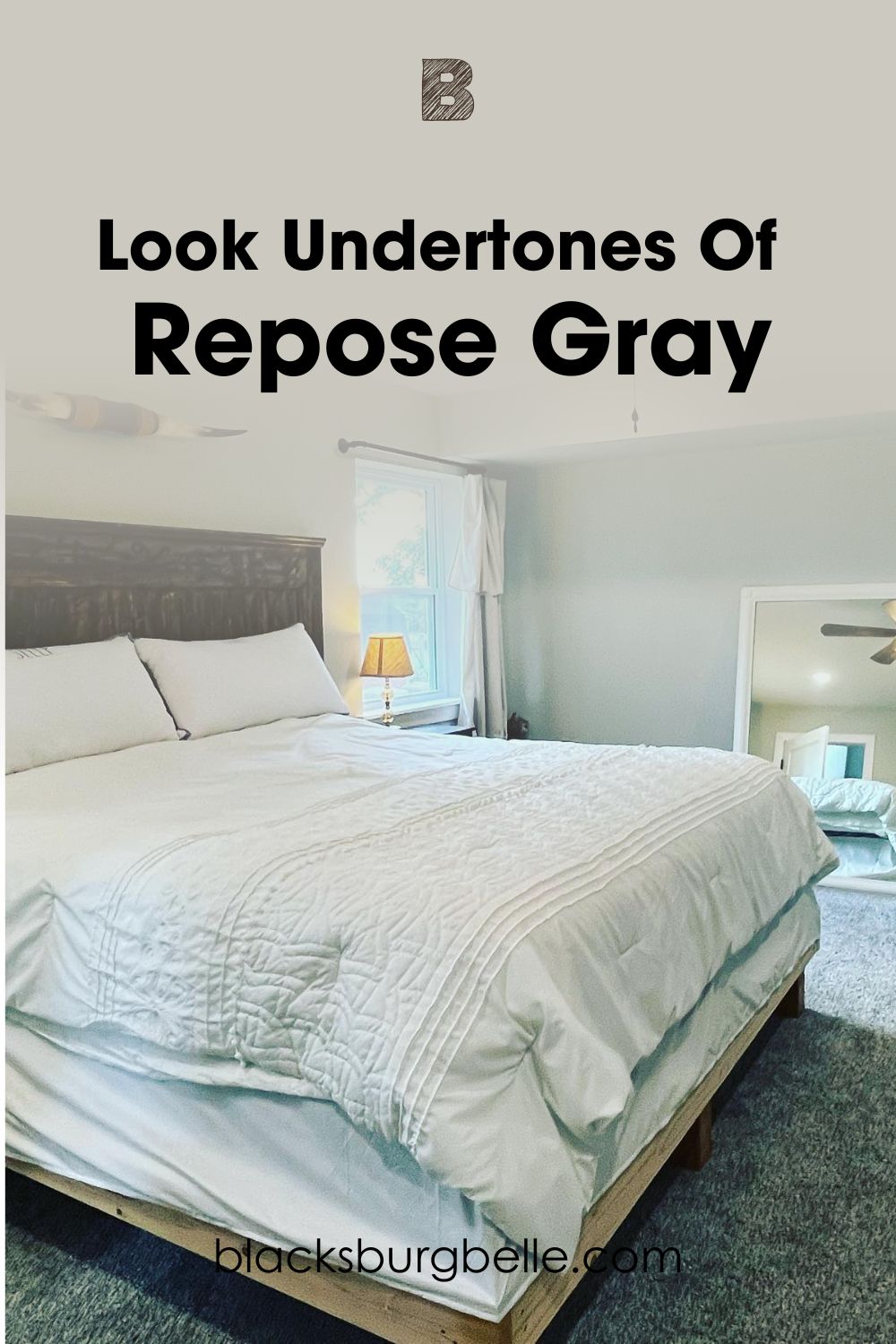
Repose Gray shows its strong green undertones in the above picture.
Because of the lighting in this space, you will see some hints of blue. However, the top left of the picture shows the paint color’s green undertones.
Passive vs. Repose Gray – Are They Warm or Cool?
Sherwin Williams Passive is a cool gray paint color.
SW Repose Gray is a warm gray paint color.
Although lighting can make it appear slightly warm, Passive will mostly maintain its cool vibes. The main reason for this is its blue undertones, which fall on the cool side. Natural light and north-facing room reinforce this look. However, the paint color will not look icy, thanks to its gray tones.
Sherwin Williams Repose Gray mostly appears warm. The reason is that its green undertones fall on the warm side. Yes, some green read warm because they are close to the yellow hue. North-facing rooms can sometimes allow the paint color appear a bit cool by making it lean slightly into blue.
South-facing rooms strengthen its green, make its cozy vibe more pronounced. Depending on the colors in areas, Repose Gray might also show a hint of violet. However, this is quite rare.
Passive vs. Repose Gray Complementary Colors
Just like you need extra ingredients to make a tantalizing dish, you need to pair your main color with others for the best results. Every paint color out there has another color that directly complements them. These are called complementary colors.
Your main color’s complementary hue sits opposite it on the color wheel. However, if you can’t find the exact paint color, you can work with something similar.
So, what are the complementary colors for Passive and Repose Gray?
Sherwin Williams Passive (SW 7064) Complementary Color
Passive’s complementary color comes from the purple hue.
Sherwin Williams Minute Mauve (SW 7078)
Minute Mauve is a medium to light-toned blend of purple and gray. Although it belongs to the Purple Color Family, you can easily call it gray. The reason is that Minute Mauve has strong gray tones.
It has an LRV of 59 and works fine in interior and exterior spaces. The paint color’s warmth goes well with Passive’s cool tones.
Sherwin Williams Green Onyx (SW 9128)
Green Onyx is a muted green with warm undertones. Its yellow and gray undertones pair nicely with Passive, especially in interior spaces.
This warm green has an LRV of 30, which gives it a good depth of color.
Sherwin Williams Shell White (SW 8917)
Shell White is a warm white paint color with an LRV of 83 and subtle peach undertones. While you can use it as a trim for Passive, you can also pair them up in other ways.
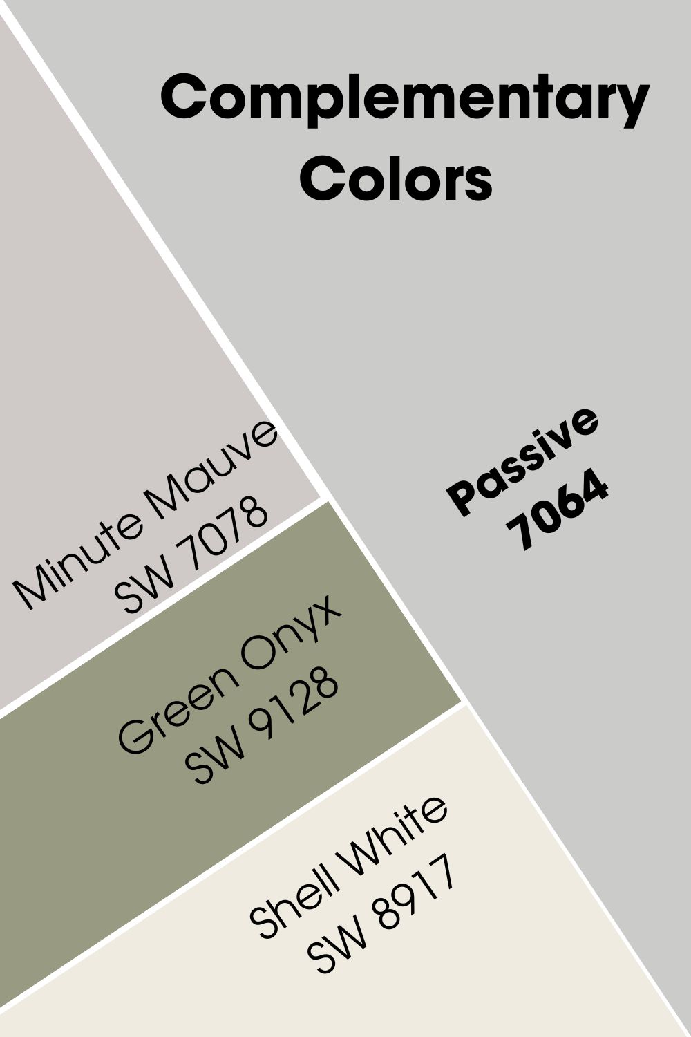
For example, Passive can go on the cabinets while Shell White goes on the walls or vice versa.
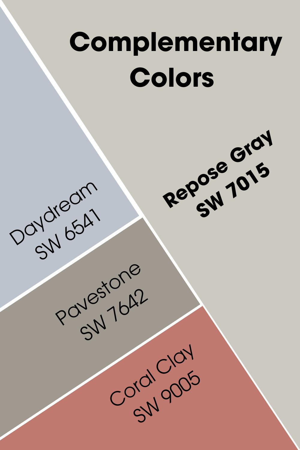
Sherwin Williams Repose Gray (SW 7015) Complementary Color
Repose Gray’s complementary color also comes from the purple color family.
Sherwin Williams Daydream (SW 6541)
Daydream is a medium to light-toned violet paint color with an LRV of 54. It adds a gentle and meditative touch to any space. The paint color complements Repose Gray in several spaces in a home or workspace.
However, it is more popular in bathrooms and bedrooms.
Sherwin Williams Pavestone (SW 7642)
Pavestone is a warm stone gray with an LRV of 32. It has a welcoming and cozy presence in any space. Together with Repose Gray, you can set a snug and comfy feel in your home.
Sherwin Williams Coral Clay (SW 9005)
This rich red infuses any space with energy. SW Coral Red has orange undertones and an LRV of 26. It is another paint color that pairs nicely with Repose Gray.
Passive and Repose Gray Color Palette
I have put together a lovely palette for these paint colors. Each palette explores a vibe that the color offers. What’s more? You can use it in homes and workspaces!
Let’s check them out.
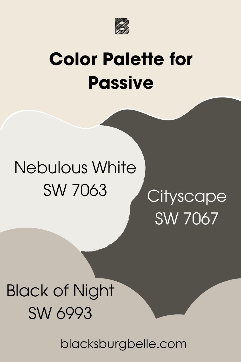
Passive Color Palette
This palette focuses on Passive’s refreshing look and its relaxing blue tones. You can also see as as a monochromatic palette of sorts.
Sherwin Williams Passive (SW 7064)
This is our main color for the palette. Sherwin Williams Passive is a medium to light-toned gray with cool vibes. The paint color brings a breath of fresh air to any space. It goes well on walls in interior and exterior spaces.
Sherwin Williams Nebulous White (SW 7063)
Nebulous White is a cool white paint color with soft blue undertones. The paint color pairs nicely with cool colors and adds a minty feel to your space. It has an LRV of 74 and can go on walls and cabinets alike.
Sherwin Williams Cityscape (SW 7067)
This dark gray has neutral undertones and enough depth to exude sophistication. It brings a sense of welcome and belonging to this palette. Cityscape has subtle green tones that pair well with Passive.
Sherwin Williams Black of Night (SW 6993)
Black of Night is a rich black paint color with an LRV of 4. Its cool green tones gives it a bit more color than the average black. It fits into this palette by acting as an anchor for other tones in your space.
This paint color will looks amazing on your furniture, doors, or window shutters.
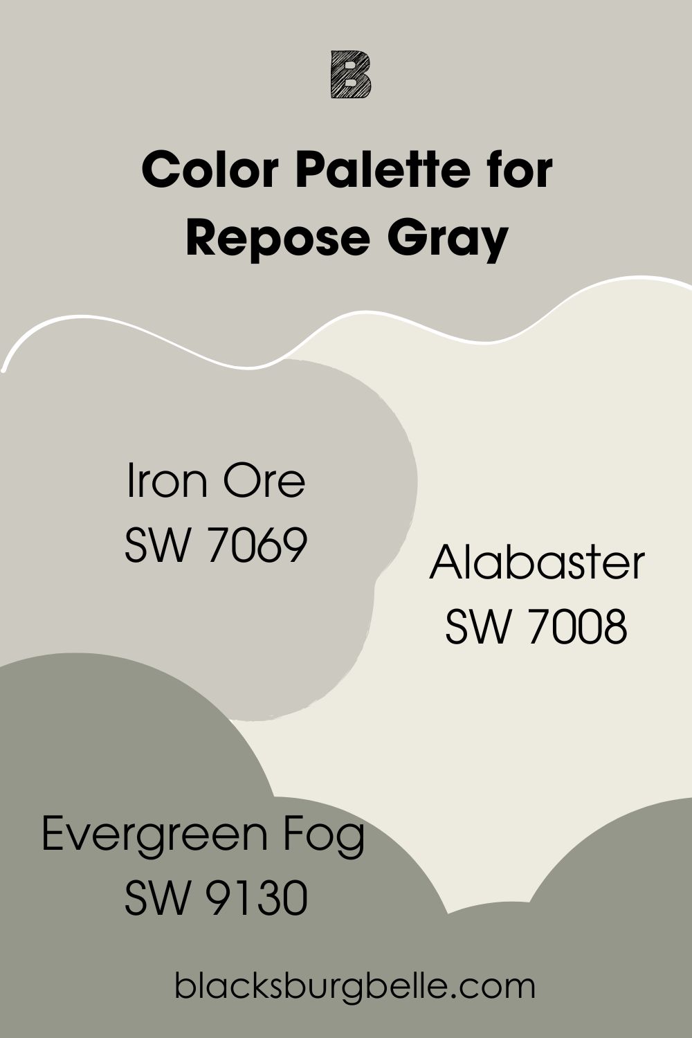
Repose Gray Color Palette
While checking out colors for Repose Gray, I found something interesting. It fits nicely into an exiting palette that I enjoyed using. I’ve decided to share that with you.
Sherwin Williams Repose Gray (SW 7015)
Repose Gray is the star of this show. The warm, cozy gray has green undertones and works in any space. While you can use it on cabinets too, I recommend using it on the walls for this palette.
Sherwin Williams Iron Ore (SW 7069)
Iron Ore is a sophisticated deep neutral with strong brown and gray tones. While it looks black, placing it beside a black color with show its charcoal nature. The paint color does wonders on woodwork in interior and exterior spaces.
Sherwin Williams Alabaster (SW 7008)
Alabaster is a beautiful white paint color with soft yellow undertones. However, it has gray tones that prevent it from looking too creamy. Regardless, it adds a touch of coziness to this palette.
You can use the bright white on cabinets and walls alike.
Sherwin Williams Evergreen Fog (SW 9130)
Evergreen Fog is a nice blend of green and gray with an LRV of 30. It has strong green tones that add some nature-inspired vibe to the palette. Fortunately, Evergreen Fog goes well in interior and exterior spaces. It also works wonders on furniture.
Passive vs Repose Gray on Cabinets
While both paint color look wonderful on cabinets, I am giving this one to Alabaster.
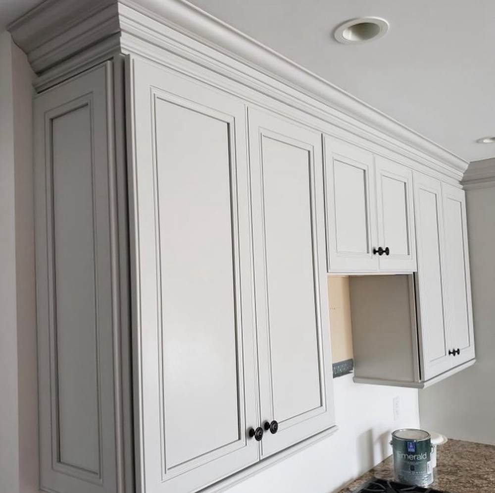
Passive on Cabinets
The paint color looks natural on the lower cabinets. Compared to the upper ones, it adds a bit of depth and comfort. Also, Passive shows a bit of green undertones, as opposed to its usual blue.
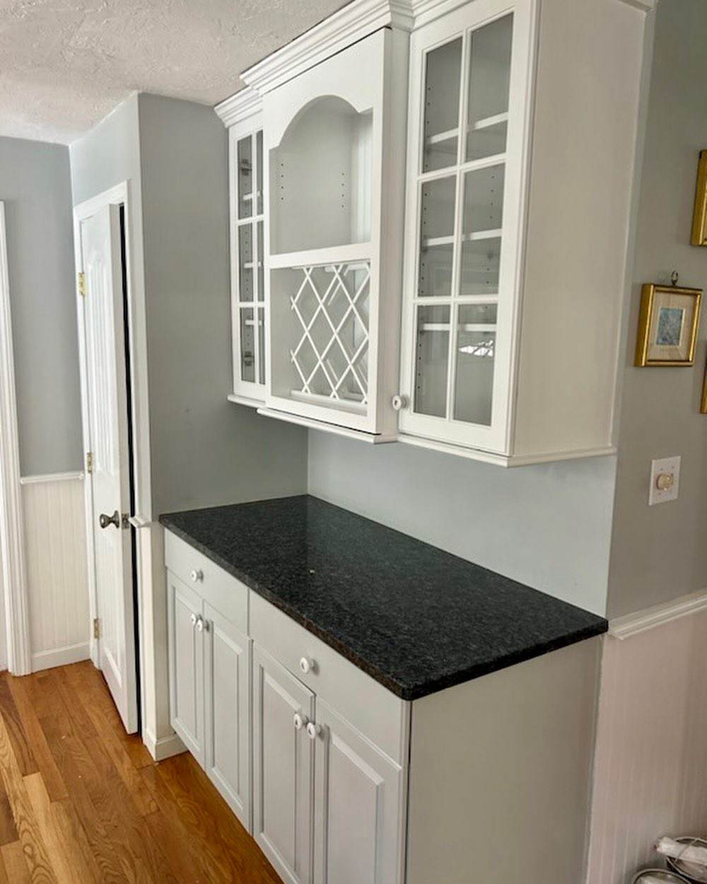
Repose Gray on Cabinets
The lovely gray looks mildly warm on the cabinets in this picture. What’s more important is that its warmth contributes to the overall cozy vibe in this kitchen.
Passive vs Repose Gray on Exterior
How do these gray paint colors look in exterior spaces? The following pictures show how they look on exterior walls.
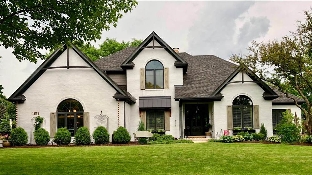
Passive on Exterior Walls
Interestingly, Sherwin Williams Passive looks a bit warm and cozy on these exterior walls. Factors like surrounding colors and time of day might have contributed to this look. Regardless, it looks wonderful on the walls.
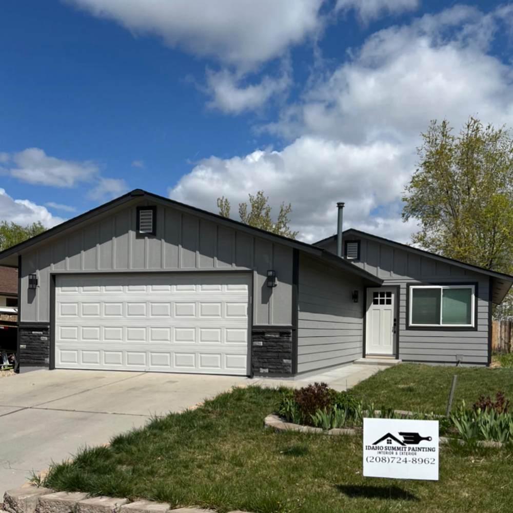
Repose Gray on Exterior Walls
At first glance, you might think that Repose Gray is on the walls. However, the paint color is on the garage and front doors. Repose Gray looks significantly brighter because of the pairing with Pewter (body) and Iron Ore (trim).
Passive vs Repose Gray in Living Room
Let’s take the comparison inside. The following pictures have Passive and Repose Gray on living room walls.
Passive on Living Room Walls
Sherwin Williams Passive fits right into the calm and refreshing vibe in this living room. It pairs nicely with the white trim for an airy but welcoming feel. The paint color shows a bit more gray in this space, thanks to the contrast with the white.
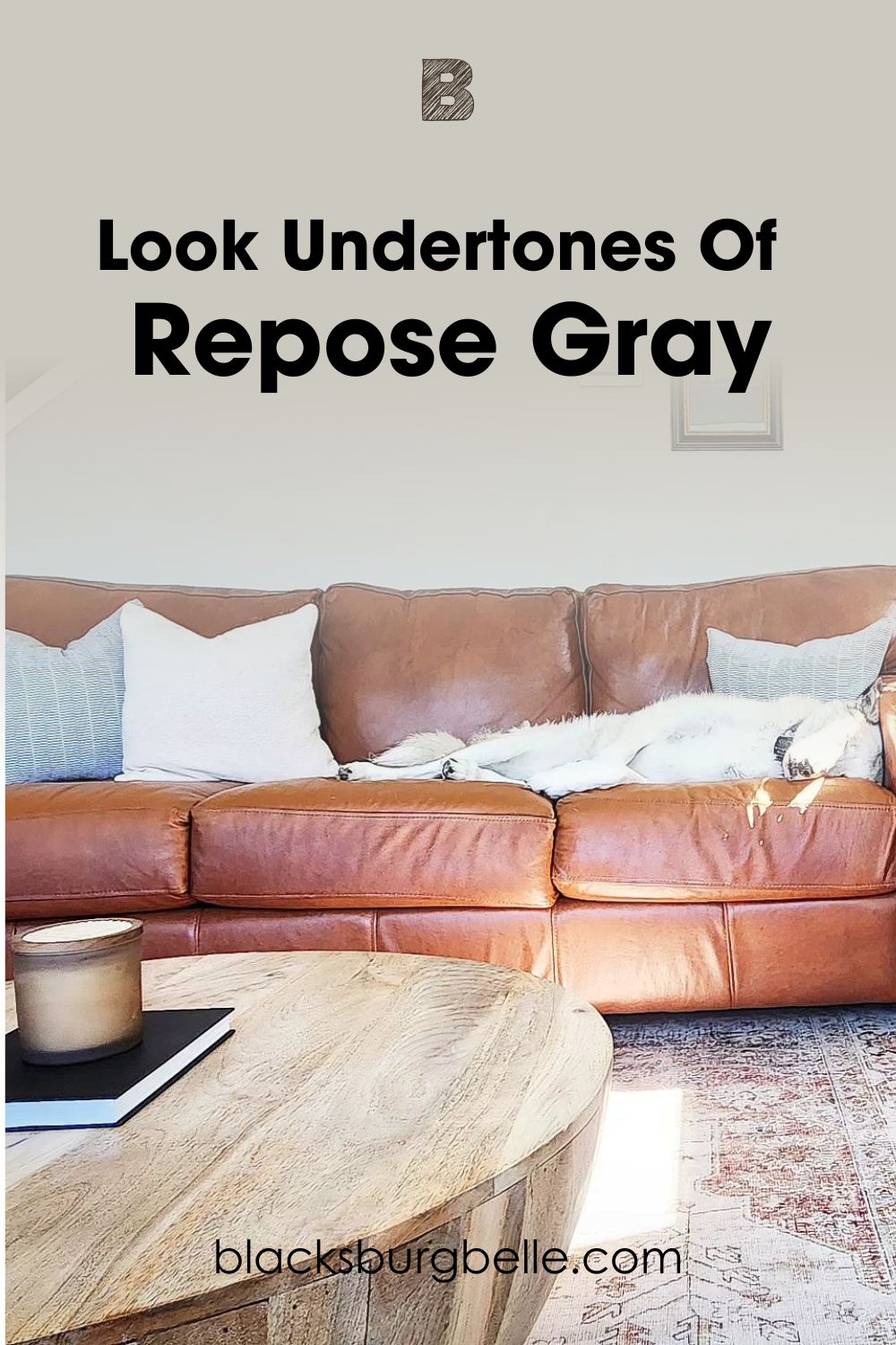
Repose Gray on Living Room Walls
Sherwin Williams Repose Gray looks appealing and attractive on the walls. The paint color pairs nicely with the white trim and the cozy vibe of the sofa. Together, they make this living room gorgeous and feel relaxing.
Passive vs Repose Gray in Bedroom
Do these gray colors look good in a space designated for relaxing? The pictures show them looking amazing!
Passive on Bedroom Walls
The paint color gives this bedroom a calm and soothing vibe. It makes it easy to unwind and relax in this space. Passive on the bedroom walls helps to set the right tone for the space.
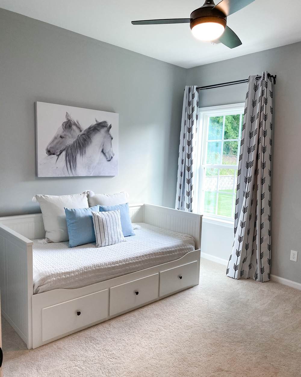
Repose Gray on Bedroom Walls
Notice how the paint color warms up this bedroom. It adds a much-needed cozy vibe to this space.

Conclusion
That wraps up our Passive vs Repose Gray comparison. Now you understand the differences between them. You will find it easy to not only make a choice but also to utilize these colors for your home.
Also, remember the following tips when working with these paint colors:
- Passive mainly has blue undertones. However, it can sometimes show a bit of green, depending on lighting and surrounding colors.
- Repose Gray mainly has warm green undertones. But it can flash a tiny bit of violet or blue sometimes.
- Both paint colors work well in interior and exterior spaces.
- Both paint colors pair nicely with warm and cool colors for a balanced look.
I will be happy to answer any other questions you might have concerning Passive and Repose Gray. Feel free to drop them in the comments section.
 Taupe Vs Beige: What are the Differences?
 Sherwin Williams Pure White vs Extra White: How to Choose?
 Mega Greige vs Perfect Greige: How to Choose?
 Sherwin Williams Snowbound vs Pure White: Which Is Better?
 Benjamin Moore Pale Oak vs Balboa Mist: How to Choose?
 Benjamin Moore Simply White vs White Dove: How to Choose?
