
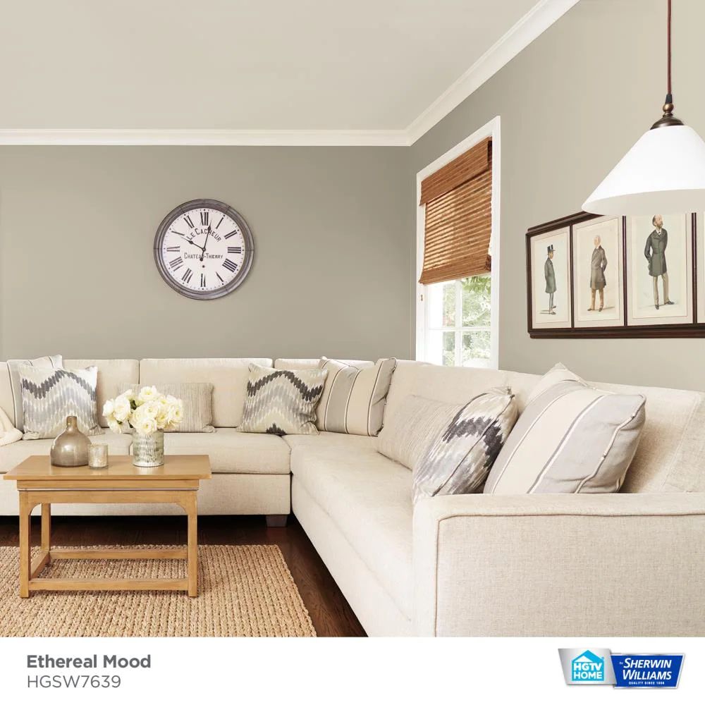
Want to paint your home with a color in the yellow hue family but can’t quite figure out what to use? I get where you are coming from: Sherwin-Williams has numerous yellow hue colors, so selecting one that will stand out without making your home too warm can be challenging.
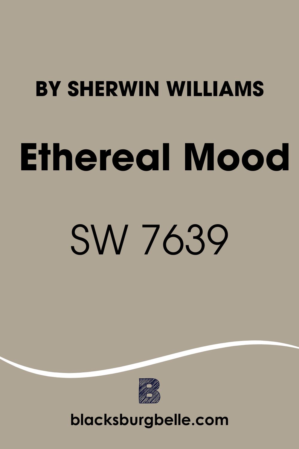
However, have you thought about trying Sherwin Williams Ethereal Mood (SW 7639)? One main thing I love about Ethereal Mood SW 7639 is that it sits in the middle of the yellow hue family. In my rooms, I do not have to worry that the light coming through will make the color too warm or less vibrant.
This guide aims to help you understand what you get with Sherwin Williams Ethereal Mood. I will answer all your questions about Ethereal Mood and even show you the paint colors to use for trims and pairing to create the best vibe.
So, Let’s get started.
Table of Contents
What Color is Sherwin Williams Ethereal Mood?
| Manufacturer | Sherwin Williams |
| LRV | 38 |
| RGB | R: 174 G: 165 B: 148 |
| Hex Value | #aea594 |
| Color Collections | Teen Space |
I would describe Ethereal Mood as a mid-tone “just gray.” The paint color, however, is slightly darker than the true mid-tone “just gray.”
The color’s appearance changes depending on the light—for this reason, while you will see a darker tone of “just gray” in some lights, Ethereal Mood may display some greenness in others.
As noted earlier, Sherwin Williams Ethereal Mood sits in the yellow hue family. The paint color features a hex value of #aea594. Belonging to the Teen Space collection, Ethereal Mood might be a perfect fit for homeowners planning to give their homes that youthful look.
RGB of Sherwin Williams Ethereal Mood
RGB abbreviation represents the red, green, and blue amount that makes a specific paint color. The RGB scale starts at 0 and runs to 255.
Ethereal Mood combines red: 174, green: 165, and blue: 148. Interestingly, for all the shades of red, blue, and green, the color seems to fall in the upper half on the RGB scale.
LRV of Sherwin Williams Ethereal Mood
When shopping for your paint colors, you will probably want to know the amount of light a specific color can reflect. A paint color’s reflective abilities could mean the difference between a dull and vibrance look as the lighting of your room changes.
The light reflectance value (LRV) is a scale running from 0 to 100 and pinpoints the amount of light a color can reflect. For example, pure black is at 0 because it reflects 0% light, while pure white is at 100 because it reflects 100% light.
Ethereal Mood has an LRV of 38, reflecting 38% of the light. This makes the paint color slightly darker than the mid-tone—the perfect mid-tone will have an LRV of 50%.
Is Sherwin Williams Ethereal Mood Warm or Cool?
Sitting in the yellow hue family, Ethereal Mood is warm. However, this does not necessarily mean that Ethereal Mood is the warmest color you can find in the market.
Ethereal Mood features some cool tones—for example, green and gray undertones. While gray shows more often, the green tone can bring out a bit of the coolness of the color in the right type of light.
What Are the Sherwin Williams Ethereal Mood Undertones?
Sherwin Williams Ethereal Mood combines gray and green undertones. However, the gray undertone seems more dominant and is visible in almost every type of light.
In some types of light—especially in cases where the lighting is not too bright—you should be able to view the green undertone. While the yellow tone makes Ethereal Mood warm, the gray-green colors balance it out, keeping it from bringing in so much warmth that it overwhelms your south-facing rooms.
Sherwin Williams Ethereal Mood Color Strip
As I noted earlier, Sherwin Williams Ethereal Mood boasts numerous shades of just gray. As a homeowner looking to give your home the perfect balanced look, you may want to know the other paint colors resembling Ethereal Mood. Below, we will take a deeper look at these colors:
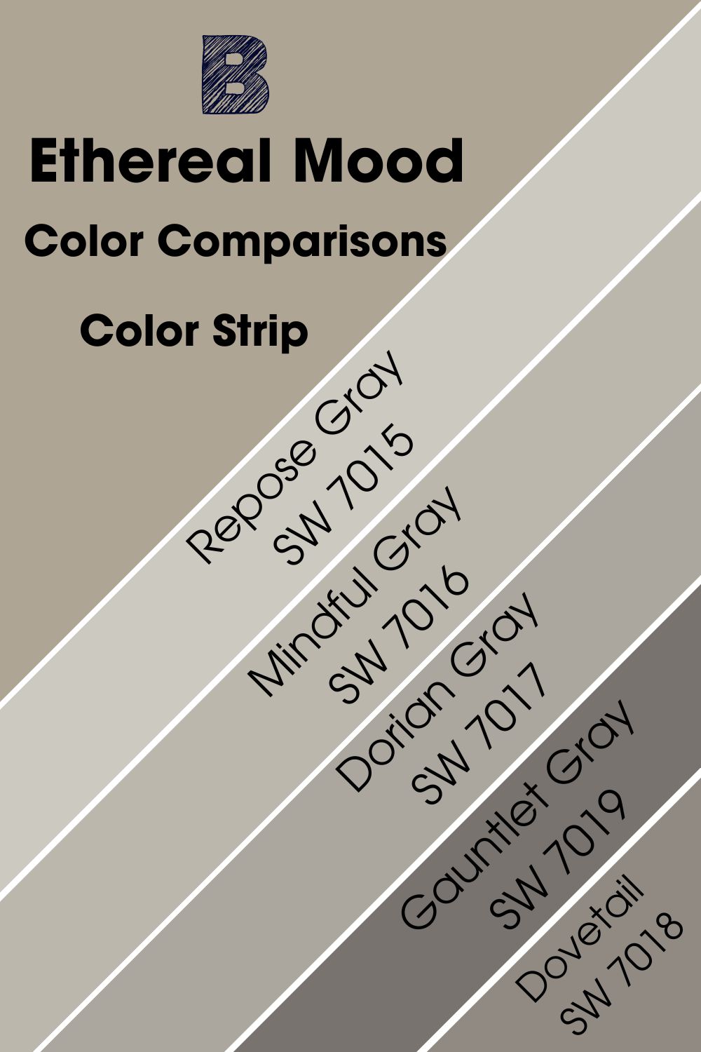
Sherwin Williams Ethereal Mood vs. Repose Gray (SW 7015)
Just like Ethereal Mood, Repose Gray will add warmth to your room. However, unlike SW 7639, which has gray and green undertones, Repose Gray SW 7015 features brown-taupe undertones. The undertones in Repose Gray tend to be unpredictable and depending on the lighting in the space; you may view purple or brown.
With an LRV of 58, you can be sure that Repose Gray can reflect 20% more light than Ethereal Mood. This makes Repose Gray light enough to be used in almost every space. Versatile like Ethereal Mood, Repose Gray works with virtually any décor style.

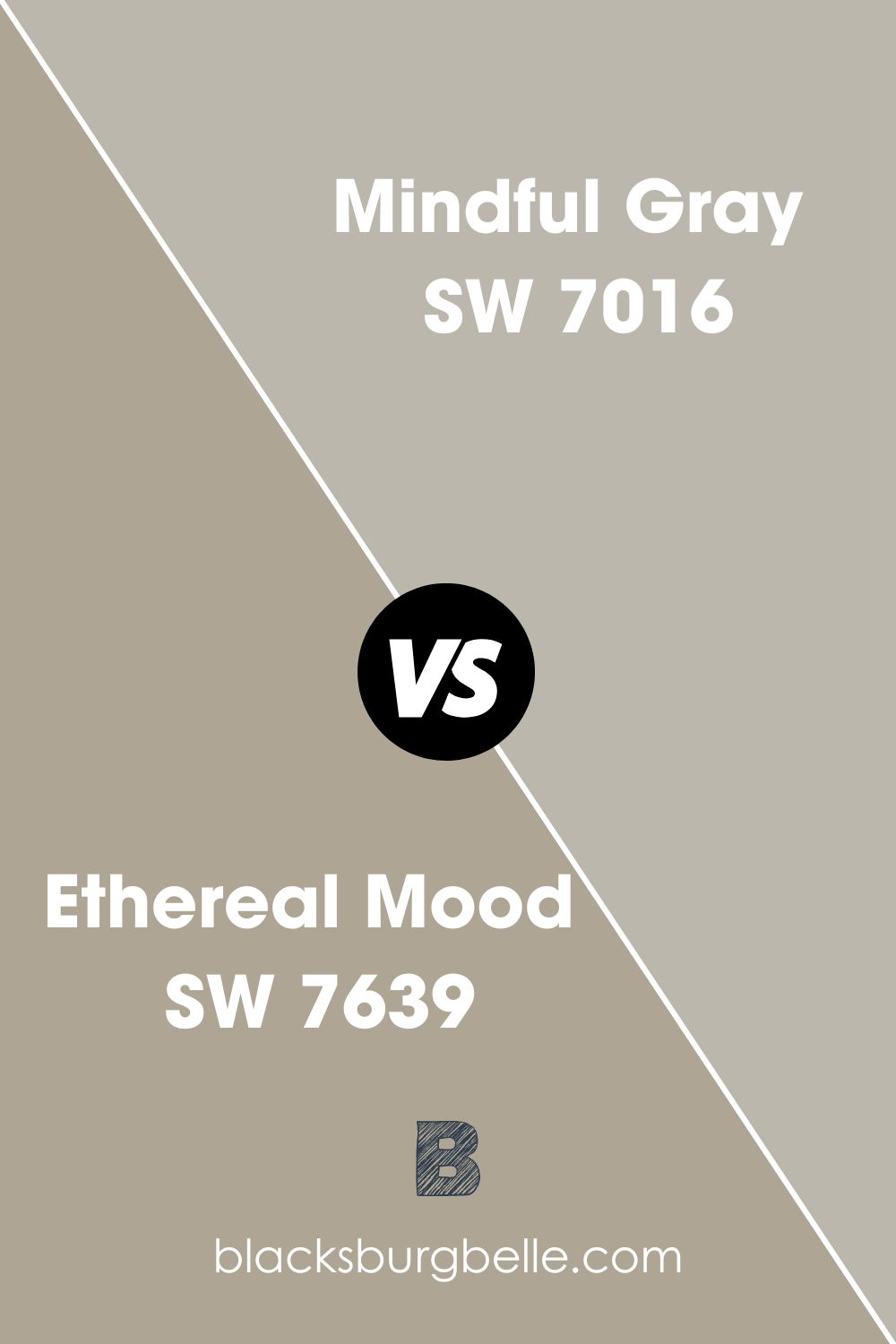
Sherwin Williams Ethereal Mood vs. Mindful Gray (SW 7016)
As you would expect, this is another warm gray paint color. Unlike Ethereal Mood, which displays some strong undertones, Mindful Gray does not have strong undertones, making it a perfect neutral color.
If you use this paint color in a room with northern light, morning western light, or flat eastern afternoon light, you will need a lot of the paint color. Otherwise, the paint color will appear dull.
With an LRV of 48, the color reflects less than half of the light; however, the paint color is still impressively bright compared to Ethereal Mood, which only reflects 38% of the illumination.
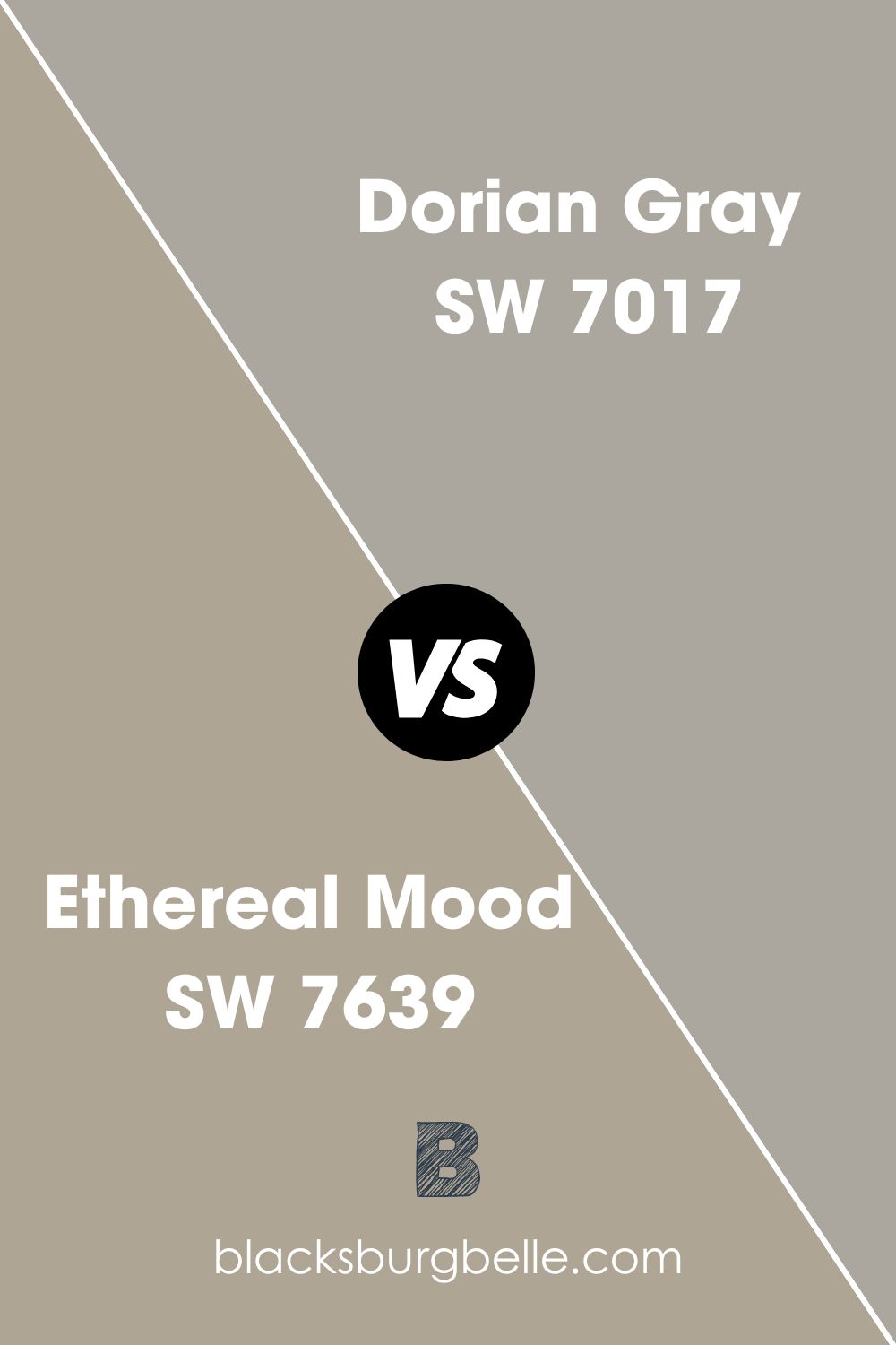
Sherwin Williams Ethereal Mood vs. Dorian Gray (SW 7017)
If you want to use a medium-tone color, you may love Dorian Gray. Unlike Ethereal Mood, which displays gray and green undertones, Dorian Gray features a bit of a greige undertone. However, like SW 7639, Dorian Gray is also a warm paint color.
Dorian Gray only reflects 1% more light than Ethereal Mood, with its LRV of 39%. Like Ethereal Mood SW 7639, the paint color may look a bit dark in some types of lighting—however, when you put your Dorian Gray in a room featuring a ton of natural lighting, the paint color is destined to stand out nicely.
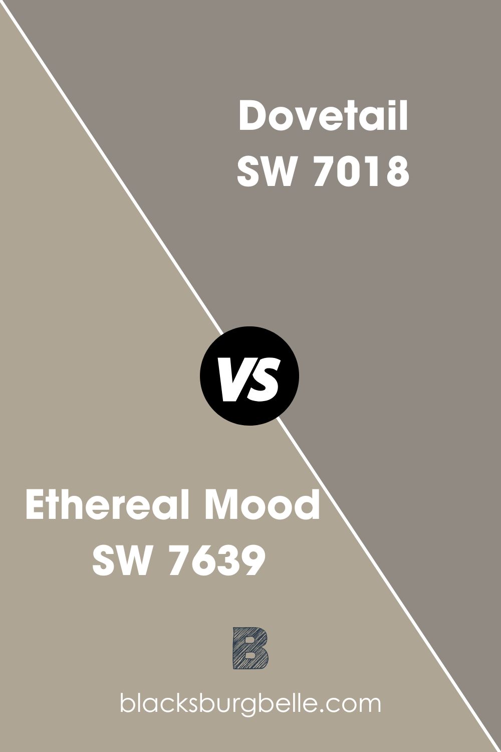
Sherwin Williams Ethereal Mood vs. Dovetail (SW 7018)
While Sherwin Williams Ethereal Mood is classified as a “just gray” color, Dovetail is one of the best “charcoal gray” colors. The two colors differ in terms of the undertones—while Essential Gray features gray-green undertones, Dovetail will display a blue undertone in some types of lighting.
This warm gray paint color holds passive warmth if you place it in north-facing light. However, the south-facing light brings out the warmth hiding inside Sherwin Williams Dovetail.
Dovetail has an LRV of 26, making it one of the darker gray tones that do not reflect much light, reflecting 12% less light than Ethereal Mood. Therefore, Dovetail will be an ideal fit for well-lit rooms, not darker ones, as it might feel bland.
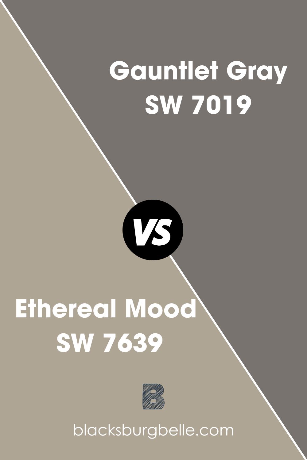
Sherwin Williams Ethereal Mood vs. Gauntlet Gray (SW 7019)
Gauntlet Gray differs from Ethereal Mood SW 7639 by its undertones. Gauntlet Gray will display brown-taupe undertones, while Ethereal Mood will display gray-green undertones.
Gauntlet Gray boasts an LRV of only 17—the paint color reflects 21% less light than Ethereal Mood. The fact that Gauntlet Gray reflects much less light means that you can leverage it for outdoor painting—even with maximum light shining on it, Gauntlet Gray won’t look washed out like Ethereal Mood might do in excessive light.
Gauntlet Gray is one of the warmest gray colors. For this reason, the color will remain warm even in north-facing rooms.
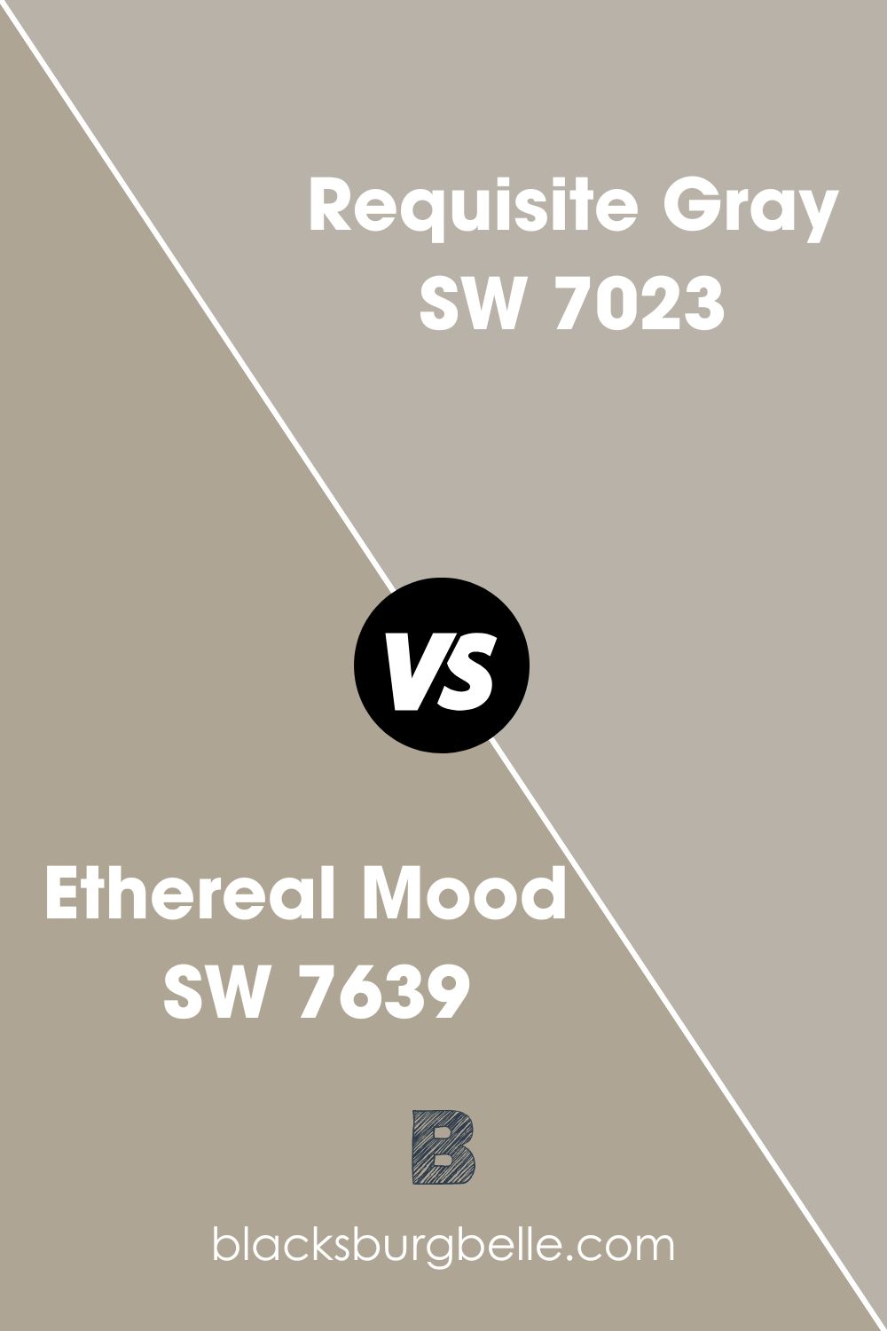
Sherwin Williams Ethereal Mood vs. Requisite Gray (SW 7023)
Requisite Gray SW 7023 is an attractive medium gray paint color. Just like Ethereal Mood, it is also a warm color. However, Requisite Gray does feature blends of cool and warm undertones to create that balanced feel—it is neither too purple nor too green.
The sophisticated Requisite gray looks clean and can reflect 45% of the light. Therefore, Requisite Gray is about 7% more reflective than Ethereal Mood. On the RGB scale, Requisite Gray combines red: 185, green: 178, and blue: 169.
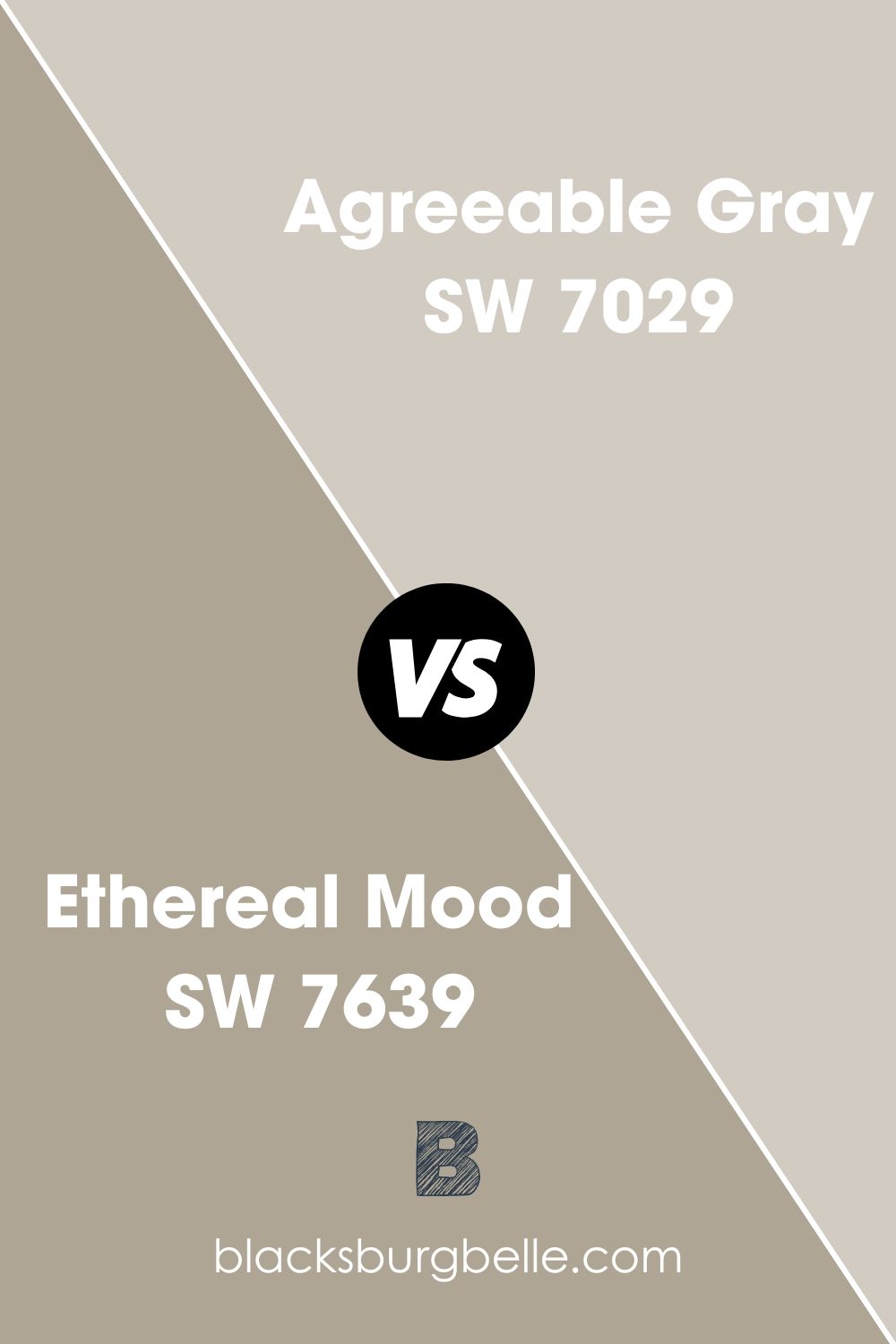
Sherwin Williams Ethereal Mood vs. Agreeable Gray (SW 7029)
Unlike Ethereal Mood, which features gray-green undertones, Agreeable Gray will show slight taupe or brown undertones when viewed under certain types of lighting. The brown undertone in Agreeable Gray gives it a warm appearance, keeping it from switching towards the cool side—this allows the paint color to match Ethereal Mood, which is also a warm color.
Agreeable Gray is my closest color on this list to perfect greige. For this reason, unlike Ethereal Mood, Agreeable Gray may display that effortless neutral that brightens your room and provides warmth while seamlessly blending with different palettes.
Agreeable Gray can reflect 60% of the light, about 22% more light than Ethereal Mood. For this reason, Agreeable Gray may be a better fit for slightly darker rooms that may not work with Ethereal Mood.
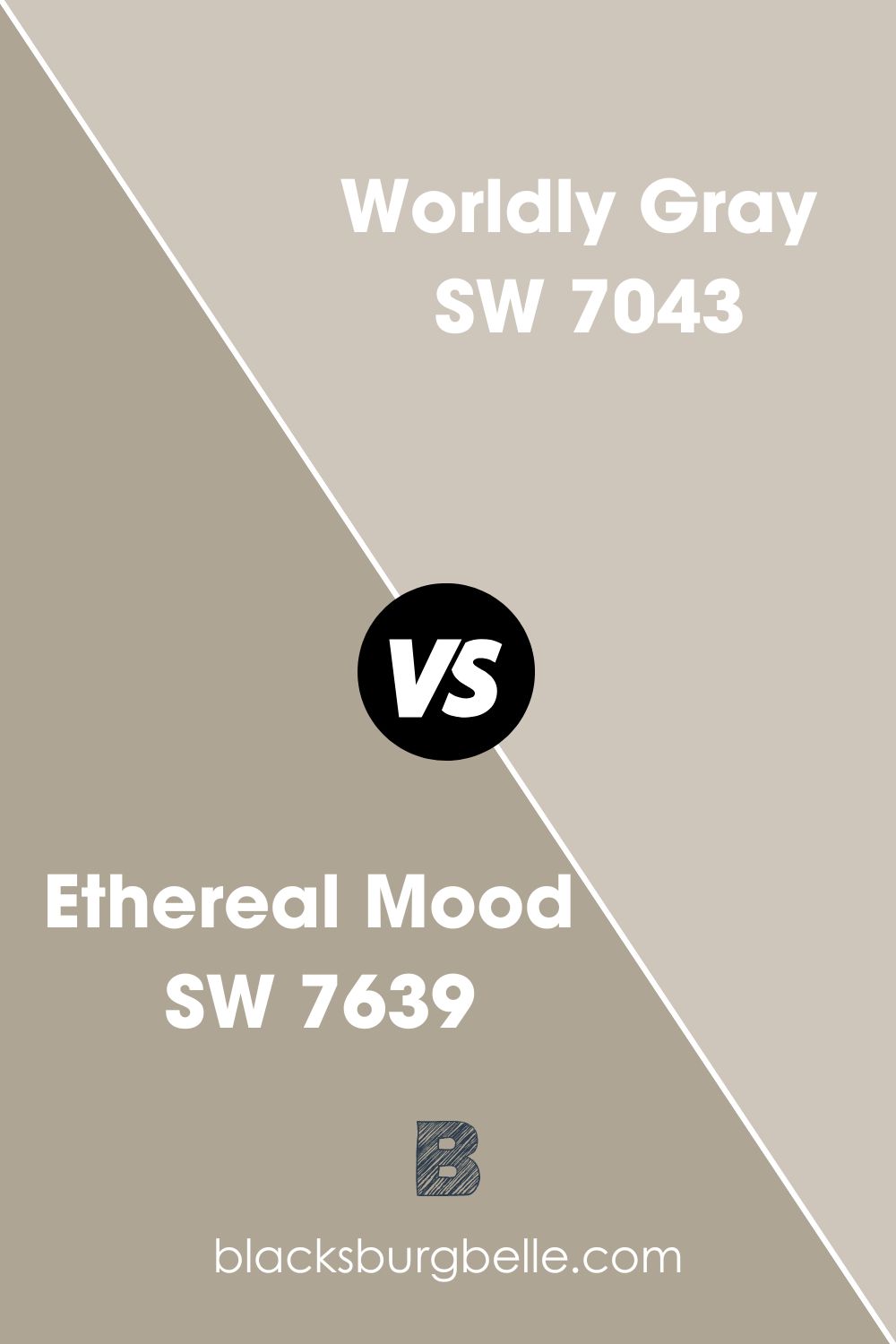
Sherwin Williams Ethereal Mood vs. Worldly Gray (SW 7043)
Sherwin Williams Worldly Gray is a softer paint color. However, some of its undertones do match those you will find on Ethereal Mood—Worldly Gray features green and brown undertones that offer a subtle greige feel.
Depending on what is going on in a room painted with Worldly Gray, the paint color can either look gray or greige, although it retains that warm feeling in both cases. The color reflects 19% more light than Ethereal Mood, boasting an LRV of 57%. On the RGB scale, Worldly Gray features a combination of red: 206, green: 198, and blue: 187—compared to Ethereal Mood; it is much higher on the RGB scale.
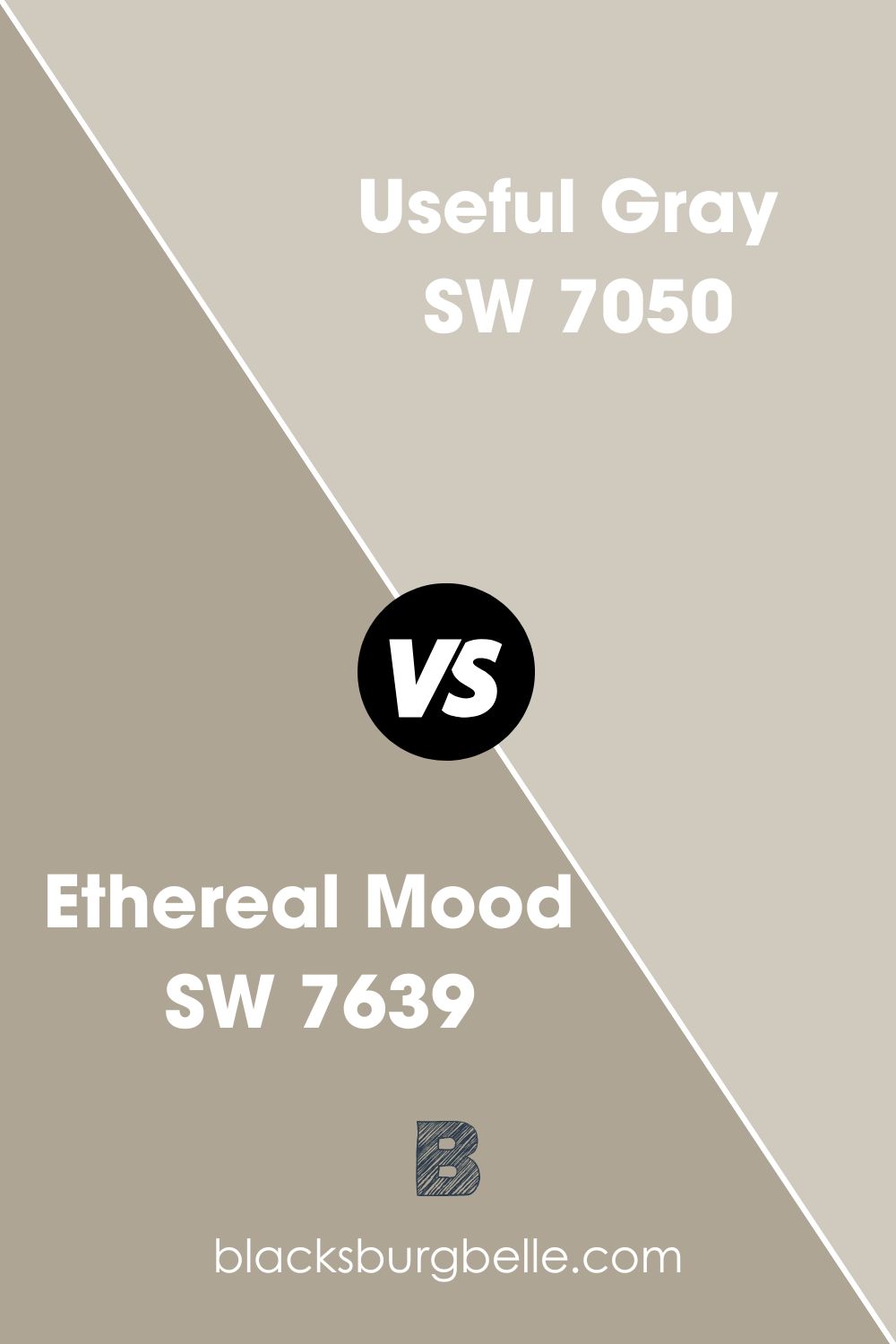
Sherwin Williams Ethereal Mood vs. Useful Gray (SW 7050)
Useful Gray doubles as a sophisticated and neutral color with a good amount of warmth. The paint color, however, differs from Ethereal Mood in that it carries beige undertones—Ethereal Mood SW 7639 has gray-green undertones.
A soft gray, Useful Gray promotes calm and relaxation—the shade of gray is both timeless and versatile. Like Ethereal Mood, Useful Gray is an easy color that works in almost all rooms, regardless of the elements in that room.
Unlike Ethereal Mood, which reflects only 38% of light, Useful Gray features an LRV of 58. Useful Gray, therefore, may work in darker rooms—Ethereal Mood tends to look dull when the room is not well-lit.
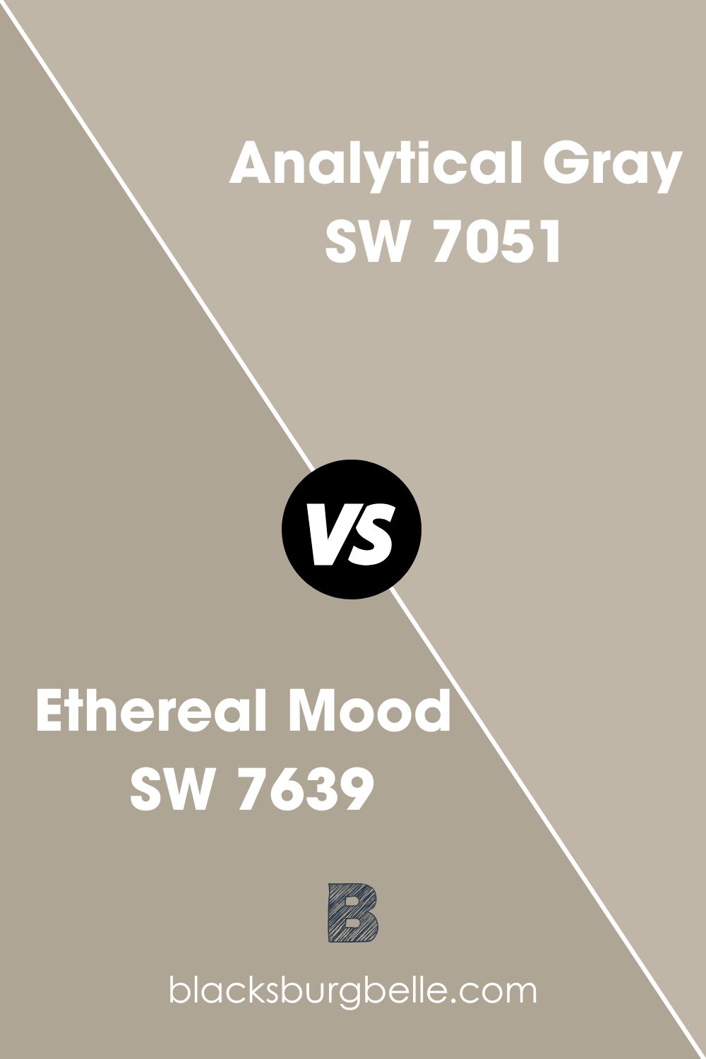
Sherwin Williams Ethereal Mood vs. Analytical Gray (SW 7051)
Analytical Gray is quite like Useful Gray—the only difference is Analytical Gray has some added depth to it. When comparing Analytical Gray to Ethereal Mood SW 7639, one feature that makes the two colors look similar is that they are warm.
However, regarding their undertones, Ethereal Mood has gray-green undertones, while Analytical Gray displays beige undertones. In some lighting, however, Analytical Gray may match Ethereal Mood, showing some green undertones.
Analytical Gray has an LRV of 47, reflecting approximately 9% more light than Ethereal Mood. For this reason, Analytical Gray may create more interest than Ethereal Mood in a dimly light room.
Coordinating Colors for Sherwin Williams Ethereal Mood
Ethereal Mood is one of the most versatile colors in pairing abilities. This color allows you to choose from a wide array of pair colors. My most popular choices, however, include the following:
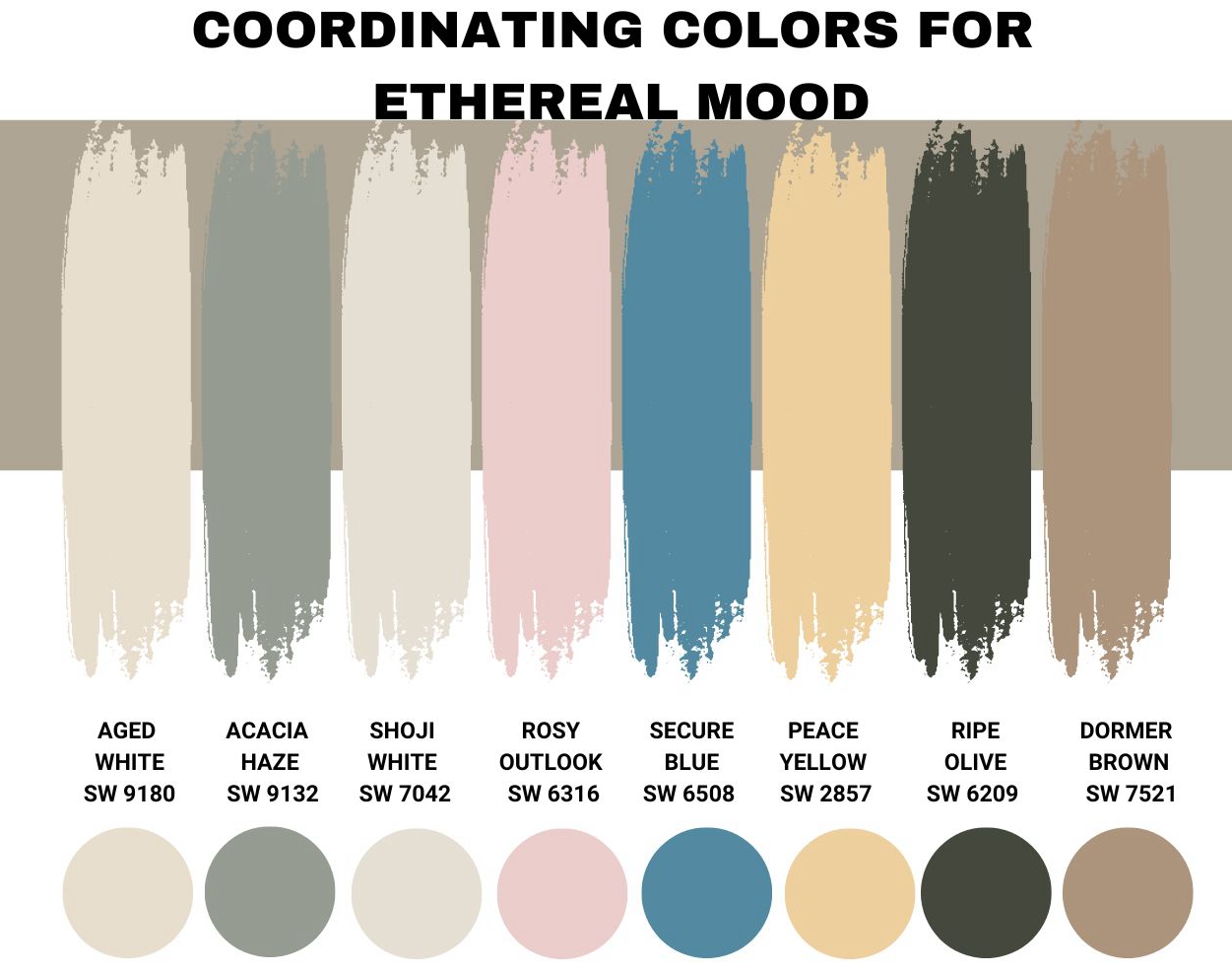
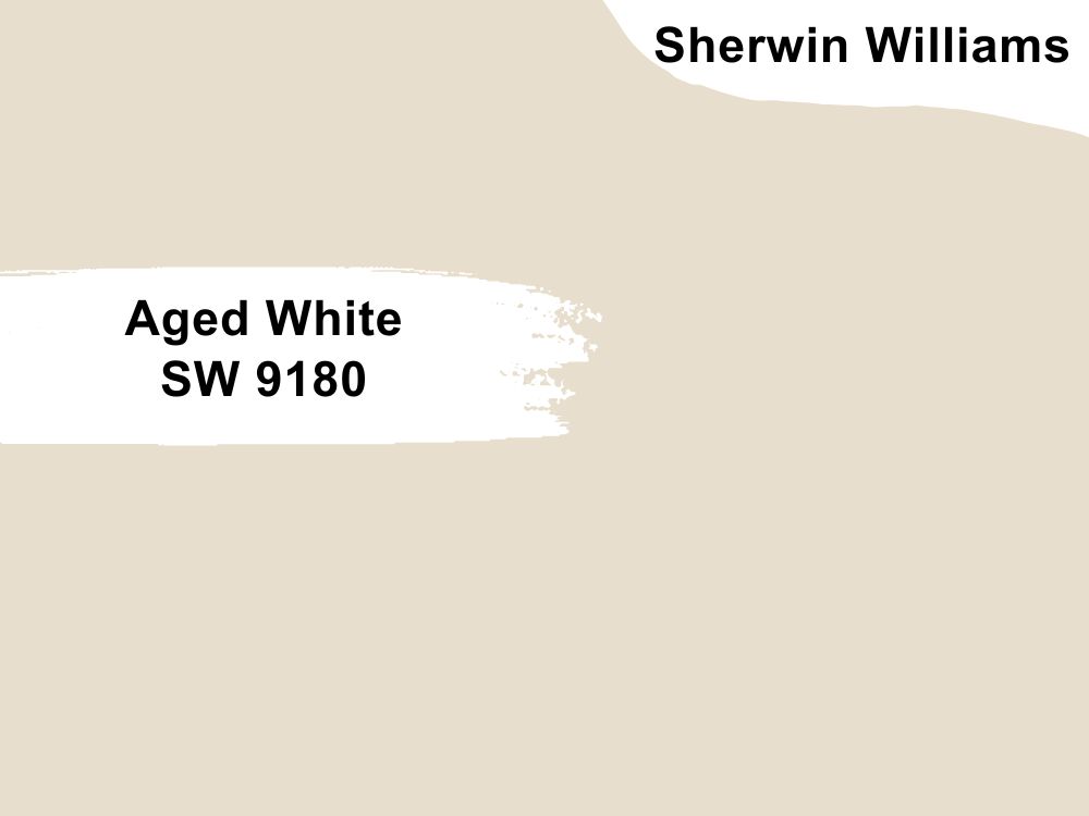
Sherwin Williams Aged White (SW 9180)
Since Ethereal Mood is a darker color—it reflects less than half of the light—pairing it with a more reflective color can help you create more interest. In this case, one of my popular high LRV colors is Aged White.
Aged White features an LRV of 74. Reflecting 74% of all light, Aged White can create interest in darker rooms when you use it together with Ethereal Mood SW 7639. Aged White combines red: 232, green: 222, and blue: 205.
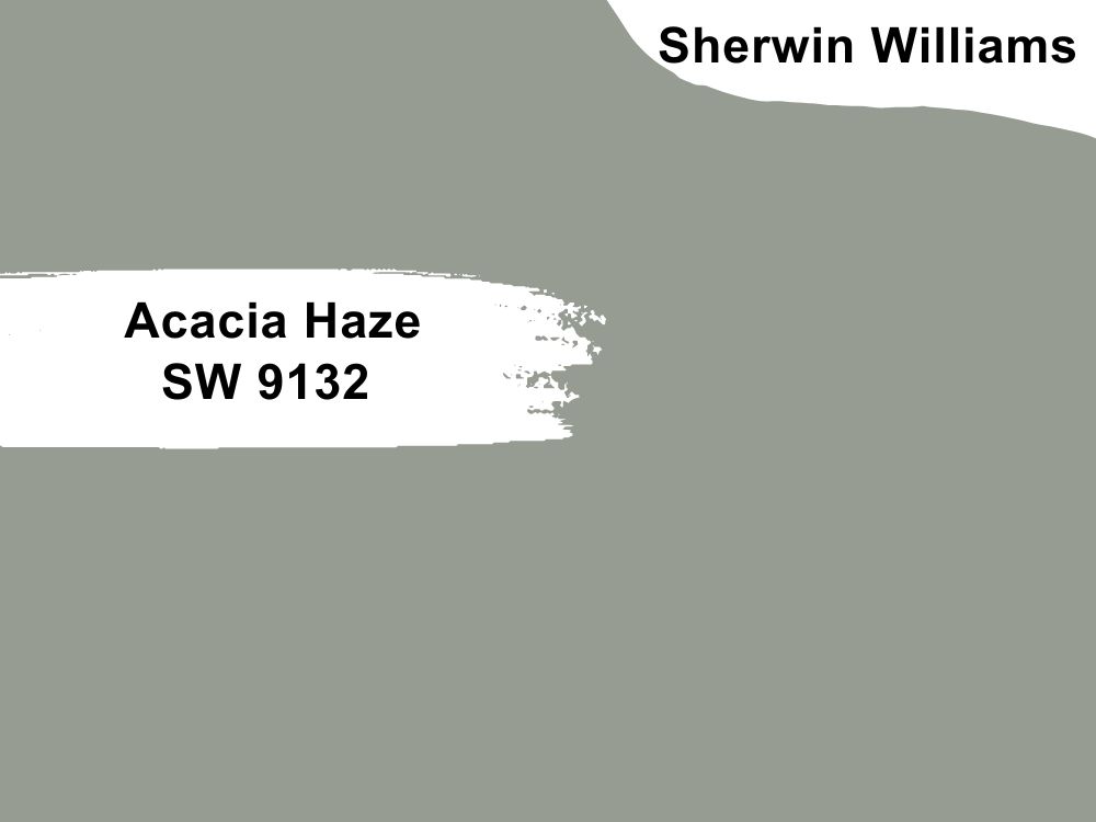
Sherwin Williams Acacia Haze (SW 9132)
Acacia Haze SW 9132 is a smoky gray-green that lets Ethereal Mood shine and still makes its statement in the room. Acacia Haze, however, features an LRV 6% lower than Ethereal Mood, with an LRV of 32. For this reason, you may want to avoid pairing the two colors in a dimly lit room—the colors, however, will perform exceptionally well in a well light room.
Acacia Haze features cool undertones that balance the warmth in an Ethereal Mood. The color sits on the warmer side of the green color. However, it carries a lot of gray, and the cooler green looks like a cool blueish shade.
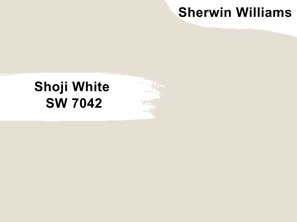
Sherwin Williams Shoji White (SW 7042)
Shoji White is a perfect pair color for Ethereal Mood for when you cannot decide whether you want a greige or cream—the color blends both colors. Much like Ethereal Mood, Shoji White also adds warmth to your room.
With an LRV of 74, this is another perfect color for using Ethereal Mood in a dim room. The undertones on Shoji White match those on Ethereal Mood—both colors have a subtle green undertone tucked in them. This makes the two colors perfect for creating some balance in your home.
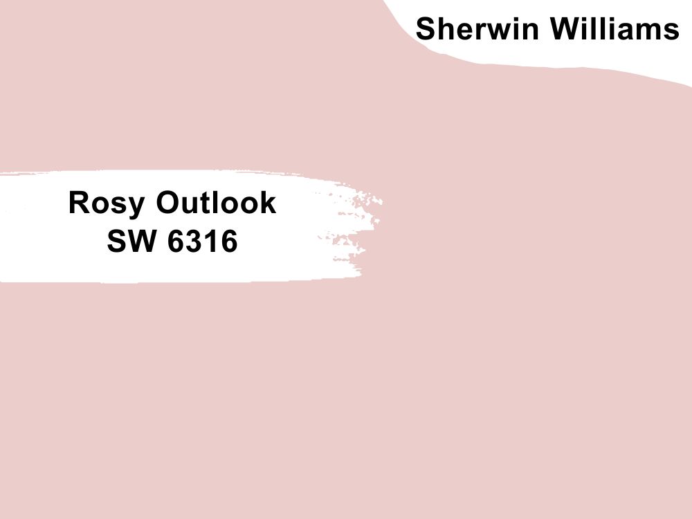
Sherwin Williams Rosy Outlook (SW 6316)
Rosy Outlook SW 6316 is a light-toned pink paint that gives off a kind and calm feeling. While this paint aligns with the reds (the warmer hues), it somehow features a crisp and relaxed feel. When you use it with Ethereal Mood, you do not have to worry about the pink color taking over and overwhelming your space.
Rosy Outlook boasts a light reflective value of 66, reflecting much more light than Ethereal Mood. This, however, is a good thing as it means the Rosy Outlook can brighten a dark room where Ethereal Mood may seem too dull, adding a bit of character.
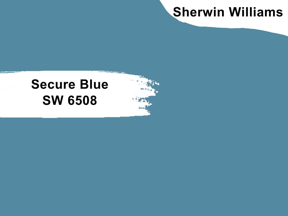
Sherwin Williams Secure Blue (SW 6508)
Blues and colors with gray tones have always been a traditional combination that generates standout combinations. Secure Blue is not so gray that it ends up overwhelming your room. However, it is blue enough to introduce a cold undertone into your room, helping you balance the warmth in an Ethereal Mood.
You may, however, want to avoid pairing these two colors in a room that does not feature enough light. Since Secure Blue features lower reflective ability, it may not perform as you want in a dimly lit room. In a dimly lit room, the two colors will look bland.
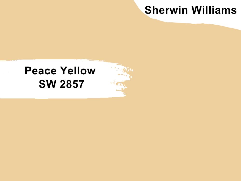
Sherwin Williams Peace Yellow (SW 2857)
While yellow and colors leaning on the gray side may seem unlikely, they create an attractive contrast that is highly appealing to the eye. In this case, however, I have selected a shade of yellow that does not show up too much.
Peace Yellow is well-balanced and not too vibrant. However, it shares a similarity with Ethereal Mood, which allows the two colors to blend perfectly—Peace Yellow and Ethereal Mood have a green undertone. Peace Yellow has an LRV of 65, making it an ideal color for pairing with Ethereal Mood in a dark room.
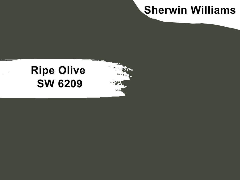
Sherwin Williams Ripe Olive (SW 6209)
The green color in a room creates that vibrancy and an air of relaxation. When you pair this color with a “just gray” color like Ethereal Mood, the green adds energy classically and freshly.
You may, however, not want to overwhelm your room with a deep green color that takes all the glory from Ethereal Mood. Therefore, I have chosen Ripe Olive as the ideal green shade for your room because it is not too loud.
Ripe Olive leans on the dark side of the LRV scale, only capable of reflecting 6% of the light. For this reason, it would be ideal for pairing it with Ethereal Mood in a room with enough southern light coming in. The two colors will balance the warmth in a south-facing room.
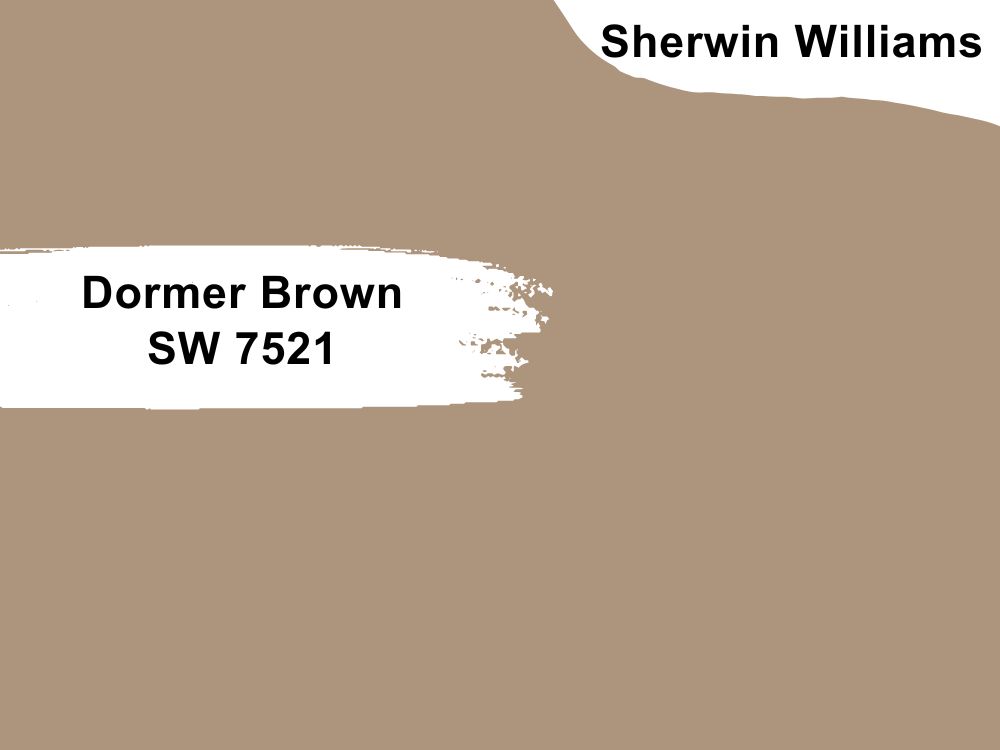
Sherwin Williams Dormer Brown (SW 7521)
Neutral colors create an appealing and soothing vibe when paired with an Ethereal Mood. Dormer Brown is one of the best neutrals.
Dormer Brown features an LRV of 32. The color reflects 6% less light compared to Ethereal Mood. For this reason, it would be ideal for pairing the two colors in a room with more light to avoid creating a bland appearance.
Since the two paint colors—Dormer Brown and Ethereal Mood—have a gray undertone, they tend to blend in well without creating a big contrast.
Sherwin Williams Ethereal Mood Complementary Color
Sometimes, you may create a contrasting appearance in your room. When using Ethereal Mood, you will want to go for a color that sits on the opposite side of the color wheel—in this case, the color you will be looking for has a hex value of #949dae. The closest name to this color is Rock Blue.
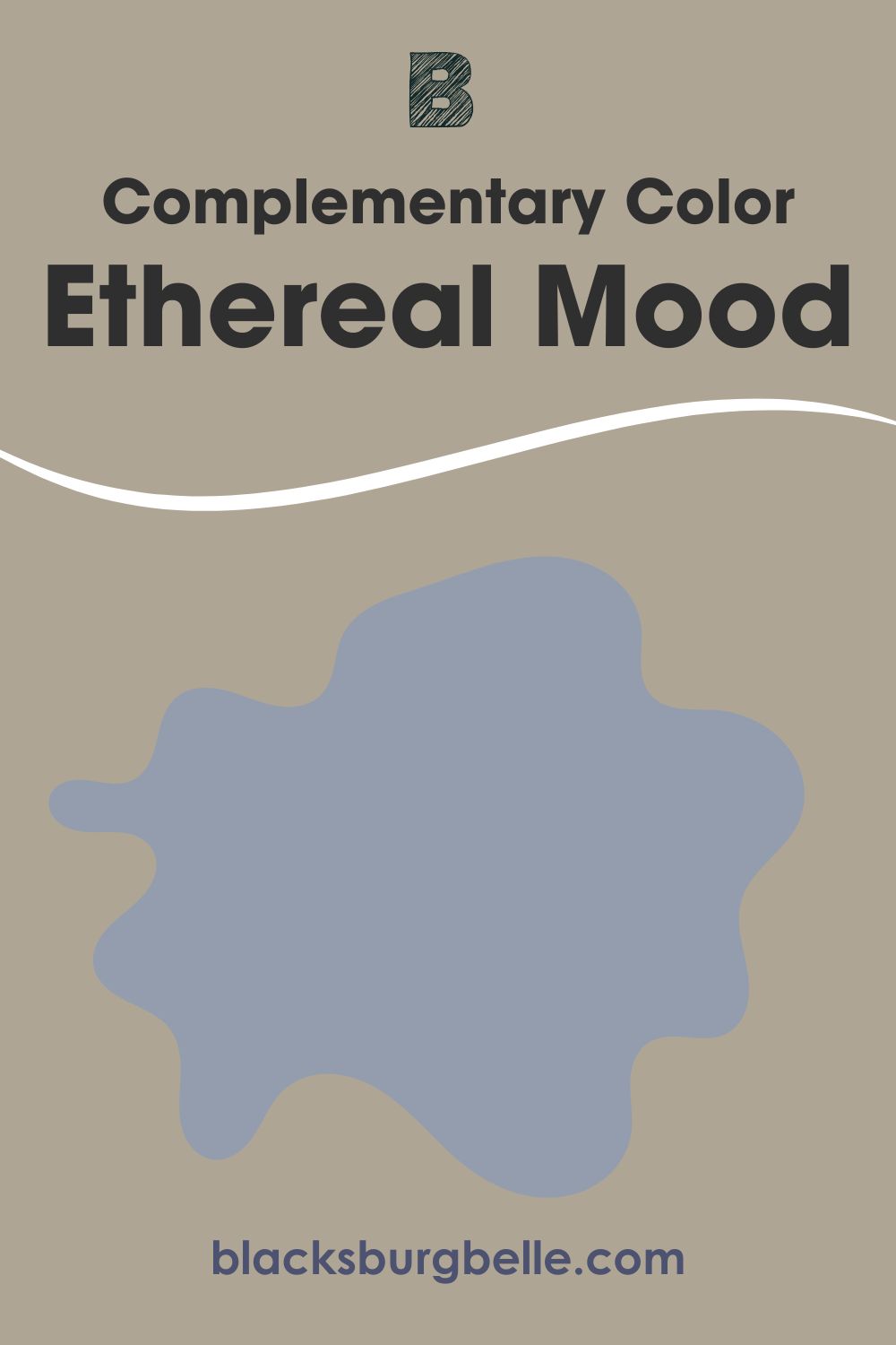
When you combine Rock Blue with an Ethereal Mood, the two colors will cancel each other out, losing their hue and displaying either black or white.
Rock Blue is a medium shade of cyan-blue that also carries hints of green. At 14%, Rock Blue features a low saturation. The color combines red: 148, green: 157, and blue: 174. This color reflects 15.4% of the light you shine on it, meaning it is slightly darker and may not work in a room with low light.
What Trim Colors Work with Sherwin Williams Ethereal Mood?
It is impossible to lack paint colors to use in trimming a room painted with an Ethereal Mood. Below are some options I have tried and loved:
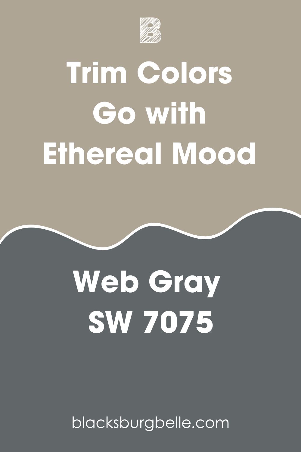
Sherwin Williams Web Gray (SW 7075)
You can never go wrong using a dark gray shade to trim your Ethereal Mood. Web Gray, in this case, is a good option.
Web Gray is one of the coolest gray colors you will come across. It is so cool that even if you put it in a south-facing room with a lot of warm light, it will still manage to tone down the warmth in the light. Using Web Gray with Ethereal Mood allows you to tone down the warmth in Ethereal Mood. With an LRV of just 13, Web Gray will perform exceptionally well outdoors or in a well-lit room.
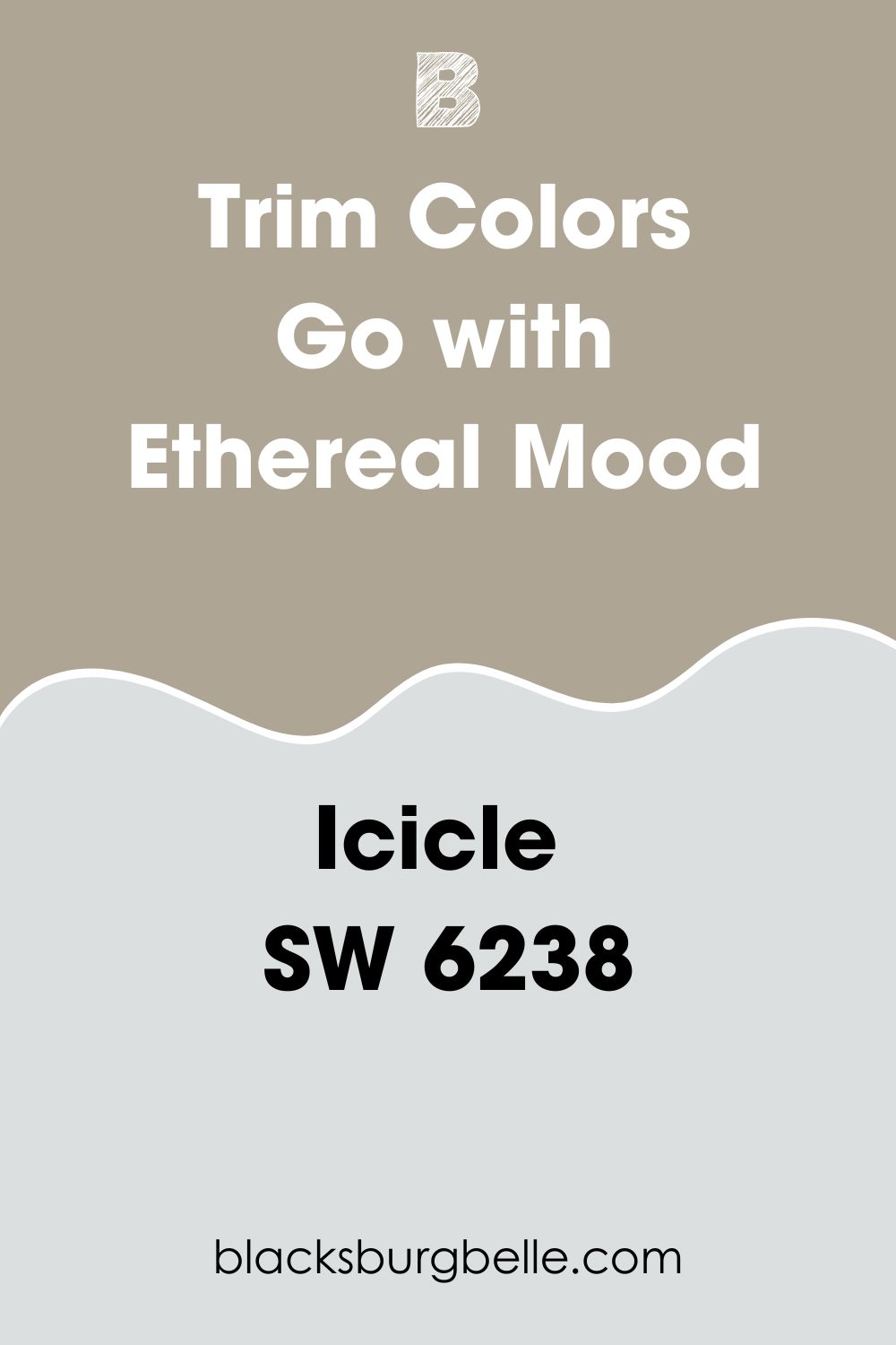
Sherwin Williams Icicle SW 6238
If you want a color that attracts attention in a dark-lit room where you have used Ethereal Mood, you may want to try Icicle SW 6238. Icicle boasts an LRV of 73, putting it in the off-white range and meaning that it can reflect up to 73% of the light.
Icicle SW 6238 adds a calm aura to your trims. The pastel paint color carries deep cool blue undertones that add a chilly vibe to your home. However, you do not have to worry about the room getting too cool as Ethereal Mood will provide warmth.
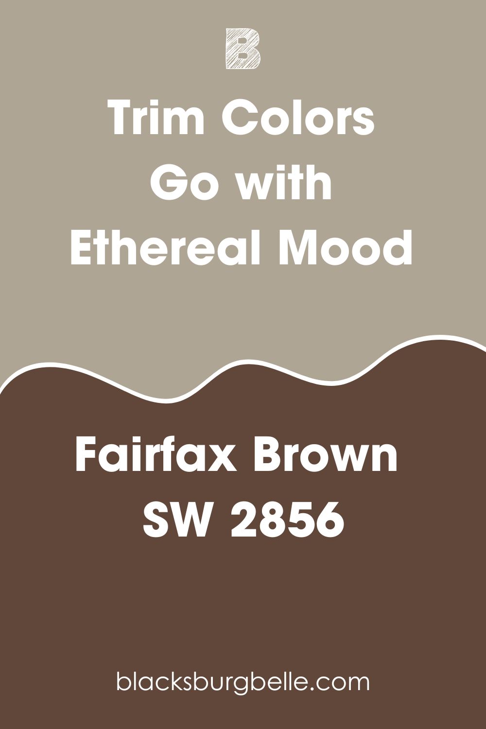
Sherwin Williams Fairfax Brown SW 2856
This dark-grayish orange color blends in well with the Ethereal Mood. While Fairfax Brown does make a statement in a room, it will not overwhelm or take all the attention.
Fairfax Brown features a hue value of approximately 18 degrees. This shows that it is warm—you can combine the two colors in a north-facing room to keep their warmth from overwhelming the space.
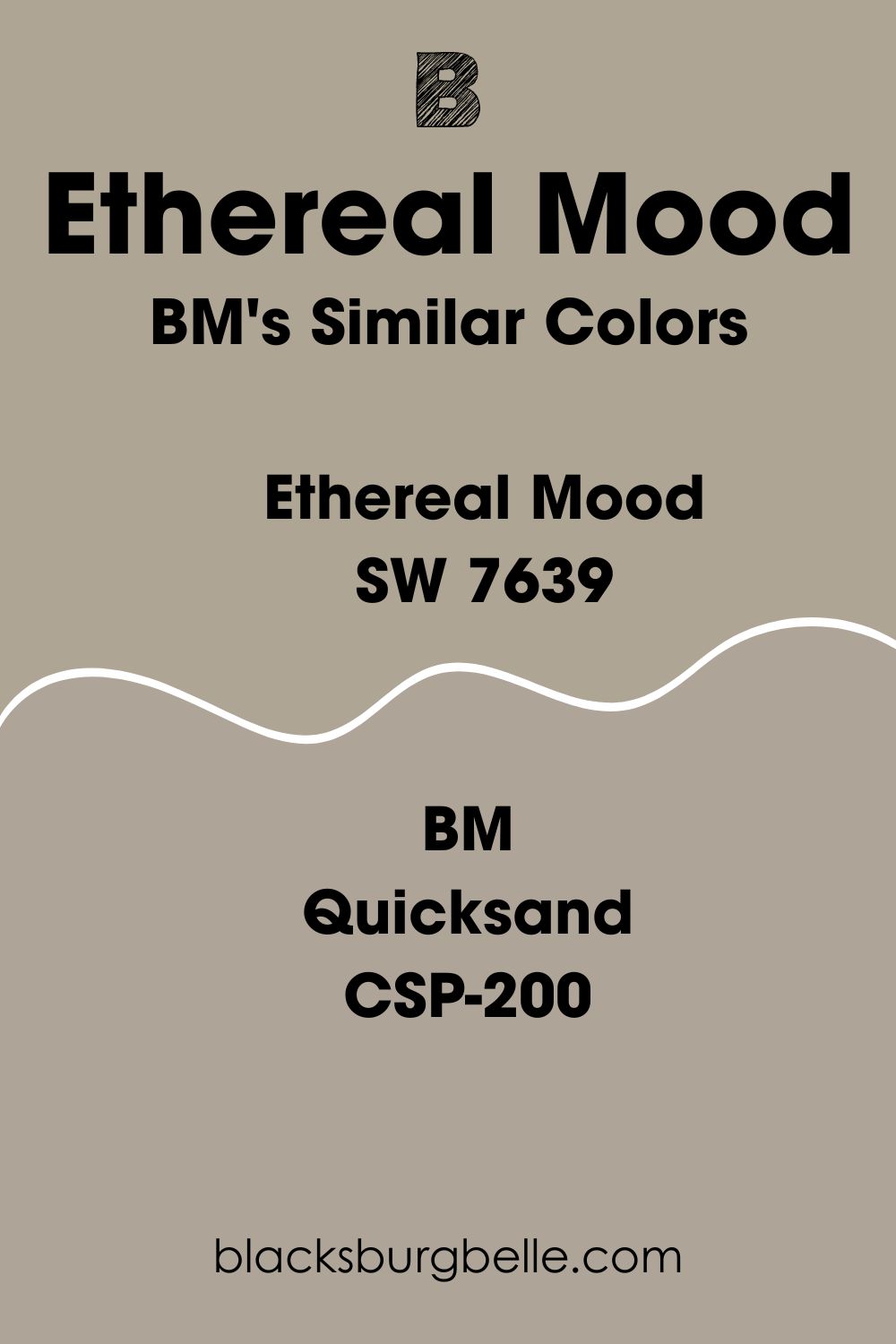
Sherwin Williams Ethereal Mood Benjamin Moore Version
The best match for Sherwin Williams Ethereal Mood, produced by Benjamin Moore, is Quicksand CSP-200. On the RGB scale, this color boasts red: 174, green: 164, and blue: 151.
On the LRV scale, the Benjamin Moore Quicksand CSP-200 features a similar reflectivity to Ethereal Mood. The color reflects 38% light, just like Sherwin Williams Ethereal Mood SW 7639.
How Does Light Affect Sherwin Williams Ethereal Mood?
If you paint Ethereal Mood in a northern-facing room, the light getting through will be cooler, making the Ethereal Mood seem duller. The gray undertone will shine much more in a north-facing room, making the color look slightly cooler; however, the color will retain its warmth due to the solid yellow hue.
In a south-facing room, Ethereal Mood will be hit by a lot of natural light throughout the day. This will bring out the warm undertones, making the paint color look brighter and warmer.
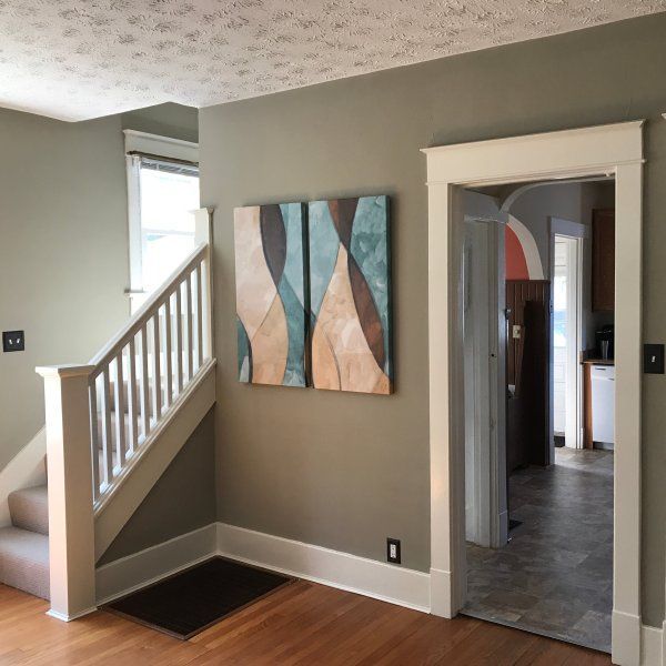
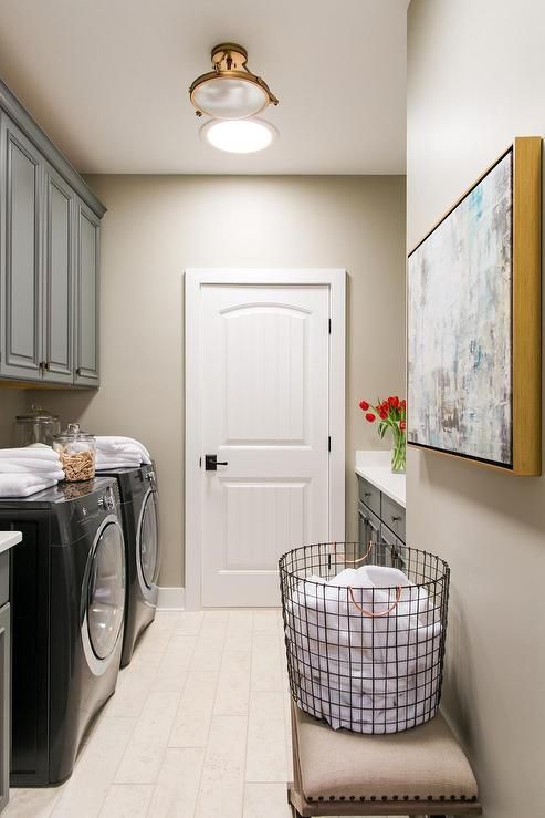
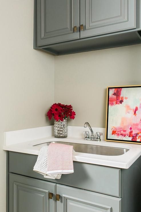
Best Rooms to Paint Sherwin Williams Ethereal Mood SW 7639
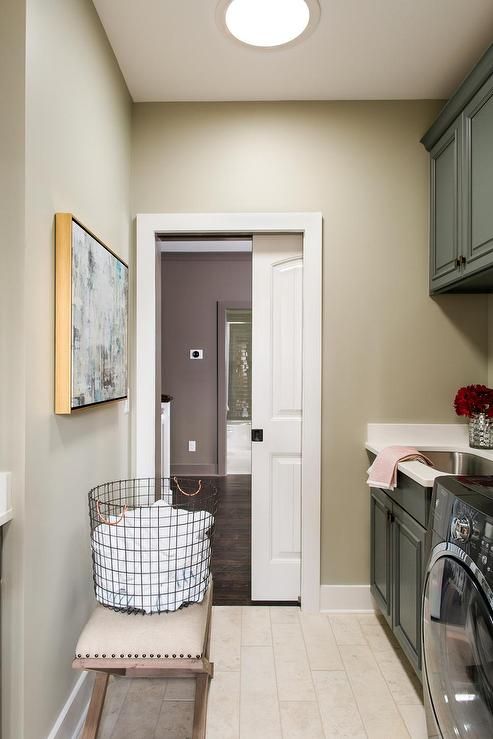
Sherwin Williams Ethereal Mood in Laundry Room
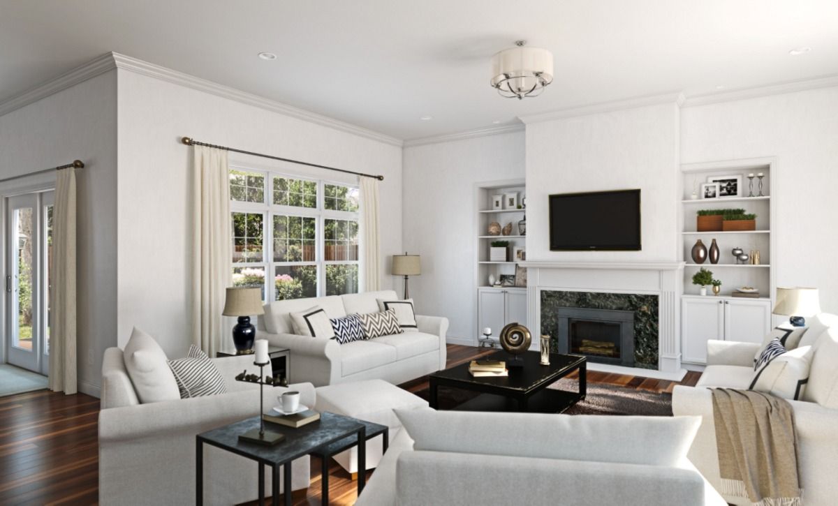
Sherwin Williams Ethereal Mood in Living Room
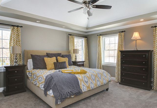
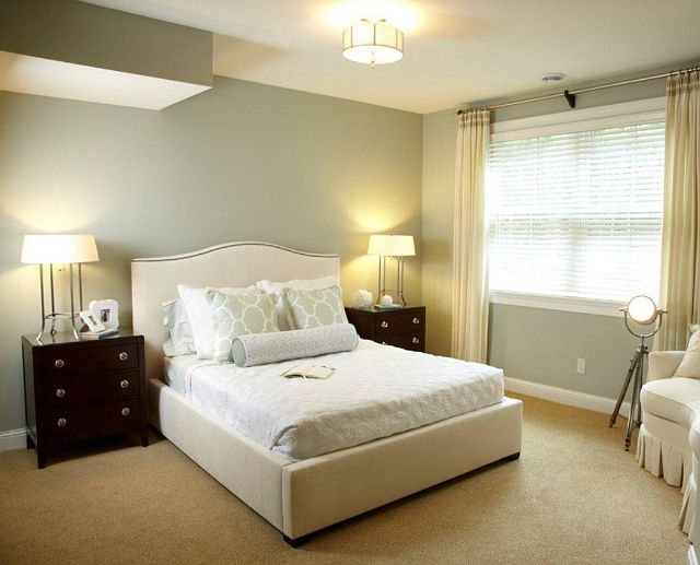
Sherwin Williams Ethereal Mood in Bedroom
Overview
Sherwin Williams Ethereal Mood SW 7639 is a warm color that combines blue and gray. This color may also display a green undertone in a south-facing room. With an LRV of 38, the color reflects only 38% of the light—while it is not too dark, the color may not perform so well if the room is dim.
Sherwin Williams Ethereal Mood is a versatile color. You won’t run out of color options to use for trimming or pairing when working with Ethereal Mood. Moreover, the color can work for almost every room—even in dark rooms; you can make the paint color work with artificial lighting.
We hope this article has answered all your questions about Ethereal Mood. If we missed a question, ask it in the comments. We will respond as soon as possible.
 Sherwin Williams North Star (Palette, Coordinating & Inspirations)
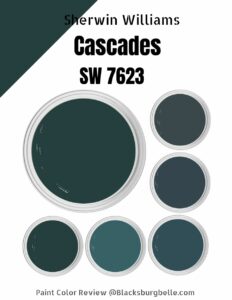 Sherwin Williams Cascades (Palette, Coordinating & Inspirations)
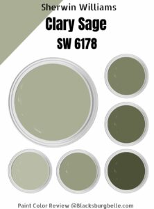 Sherwin Williams Clary Sage (Palette, Coordinating & Inspirations)
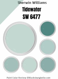 Sherwin-Williams Tidewater (Palette, Coordinating & Inspirations)
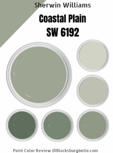 Sherwin Williams Coastal Plain (Palette, Coordinating & Inspirations)
 Sherwin Williams Alabaster SW 7008: Review & Inspiration
