
Have you ever thought of using a dark green-gray like Sherwin-Williams Felted Wool (SW 9171) for your full home makeover? It’s not a bad choice, but before you commit to this color, why not learn everything there is to know about it?
Felted Wool is part of the Colormix Forecast 2019 (Naturalist) and 2022 (Dreamland). I discovered during this review that it made the cut because of its earthy and snuggly vibe.
Because it’s a dark color, it’s best used with lighter tones. Let’s get into the details and inspirations on how to use Felted Wool.
Table of Contents
When to Choose Sherwin-Williams Felted Wool (SW 9171)?
Before we get in too deep, let’s see what you can get from Sherwin-Williams Felted Wool at a glance.
Want Some Comforting Vibes?
You’ll definitely feel warm, comfortable, and safe with Sherwin-Williams Felted Wool walls.
Looking for Light?
You won’t get any light from Felted Wool because it’s a dark color. The closest thing to brightness it has is its greige tone.
Playing with Greige Color?
The earthy green in this paint adds a nice twist to regular greige and makes it taupe.
Thinking of a Den Re-Do?
Men’s time would be fun with the coziness of Felted Wool walls.
Outdoor Makeover?
It gives your exterior a modern outlook, especially if it’s a traditional building.
What Color is Sherwin-Williams Felted Wool?
Have you ever seen a shrunken woven wool teddy? That’s real-life felted wool. The dusty gray color is the same as Sherwin-Williams Felted Wool, and that’s where it gets its name. See what it looks like below.
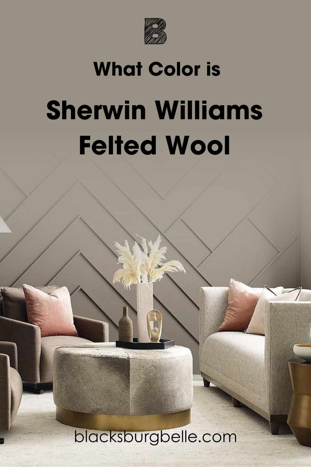
You can see that Felted Wool is a warm dark paint. Because it has a beige and green undertones, it appears as a comforting taupe. Even though it doesn’t reflect the most light, Sherwin-Williams Felted Wool isn’t suffocating.
If you’re a nature lover, you’ll love this color for its earthy, green, and grounding look. Let’s take a look at the specifications that make up Sherwin-Williams Felted Wool.
Snapshot of Sherwin-Williams Felted Wool Specification
This table shows you Sherwin-Williams Felted Wool in a nutshell, including its RGB, Hex Value, LRV, and Undertones. You can decide at first glance if you’re interested in this color or not.
| Name | Felted Wool (SW 9171) |
| RGB | Red 151 | Green 144 | Blue 131 |
| Hex Value | #979083 |
| LRV | 28 |
| Undertones | Green, Beige |
The LRV of Sherwin-Williams Felted Wool
You can tell the Light Reflectance Value of a paint on a scale of 3 – 97. It would’ve been 0 for pitch black and 100 for pure white but every paint has an undertone that prevents it from being “perfect”.
50 is the perfect median, 3 – 30 is dark, 31 – 45 is medium-dark, 46 – 55 is medium, 56 – 75 is medium-light, and 76 – 97 is light.
Sherwin-Williams Felted Wool’s LRV is 28.
So, Felted Wool is a dark paint. But because it has a beige and green undertone making it warm, it sometimes looks medium-dark. I’ll explain what that means now.
Undertones of Sherwin-Williams Felted Wool
Paints have two or more colors hidden but ready to reflect under different lighting conditions. From the RGB of Felted Wool, you can see that red and green are the highest pigments in its makeup. That results in green and beige undertones.
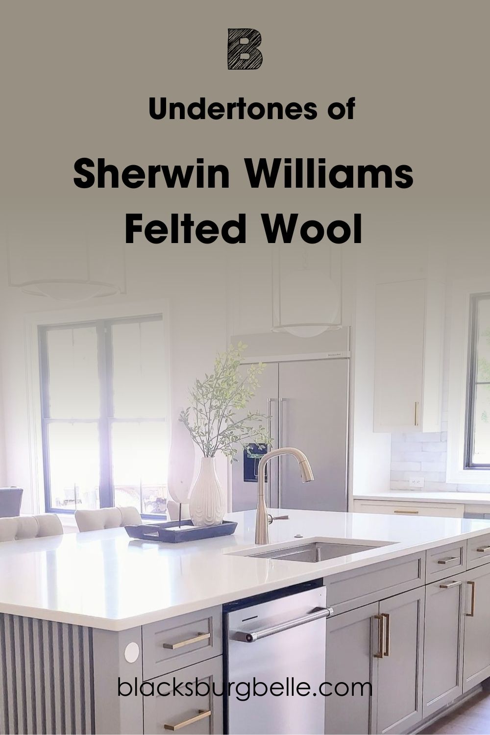
The beige undertone is a red by-product, so it looks light brown. If you see Sherwin-Williams Felted Wool in the morning and later at night, you’ll think it’s two different colors. See how lighting changes Felted Wool.
Lighting Effect on Sherwin-Williams Felted Wool
Lighting can be natural from the sun or artificial from bulbs, L.E.D., and fire. Every light source produces a different effect on Felted Wool based on intensity. I’ll start with using sunlight and then touch on artificial lighting.
Northern light reflects steadily throughout the day and is your best bet at maintaining Felted Wool’s mixed tone.
South-facing and East-facing light gives the brightest reflection for your paint, while West-facing and North-facing light is the closest glow you’ll get.
For artificial lighting, choose white light for a faint and cool reflection and yellow light for an intense and dark glow. See the undertones you can get from Sherwin-Williams Felted Wool.
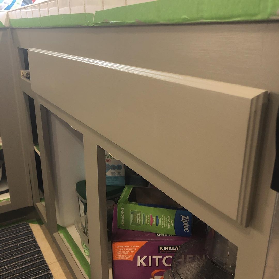
Does it look Beige?
Sherwin-Williams Felted Wool appears greige in the morning and early noon because of the sun’s position and brightness. Greige is a balanced mixture of beige and gray.
You’ll get the same light shade when you use cool, white lighting.
Use Felted Wool in South-facing and East-facing rooms to get this beige undertone. See how it looks on this cabinet.
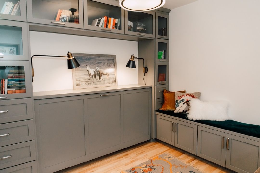
Does Sherwin-Williams Felted Wool look Green?
Felted Wool’s green undertone is more of an earthy sage rather than a leafy green. You’ll see it in West-facing and North-facing lights. Adding warm colors to the mix, like brown hardwood floors and Felted Wool, becomes a deep taupe tone.
Look at the bookshelf in the picture and its shade difference from the bench nook.
Is Sherwin-Williams Felted Wool a Warm or Cool Color?
Sherwin-Williams Felted Wool is a warm color that’ll give you a fuzzy and comfortable feeling. When a paint color feels like it’s moving towards you and has bold and fiery undertones, it’s warm. And Felted Wool qualifies.
It has a high red pigment that’s the base of its beige undertone, and its green tint is a toasty shade. So, use Felted Wool for cozy spaces but as an accent, not full coverage, so it won’t feel overwhelming.
Let’s explore different color palettes for Felted Wool before looking at inspirations.
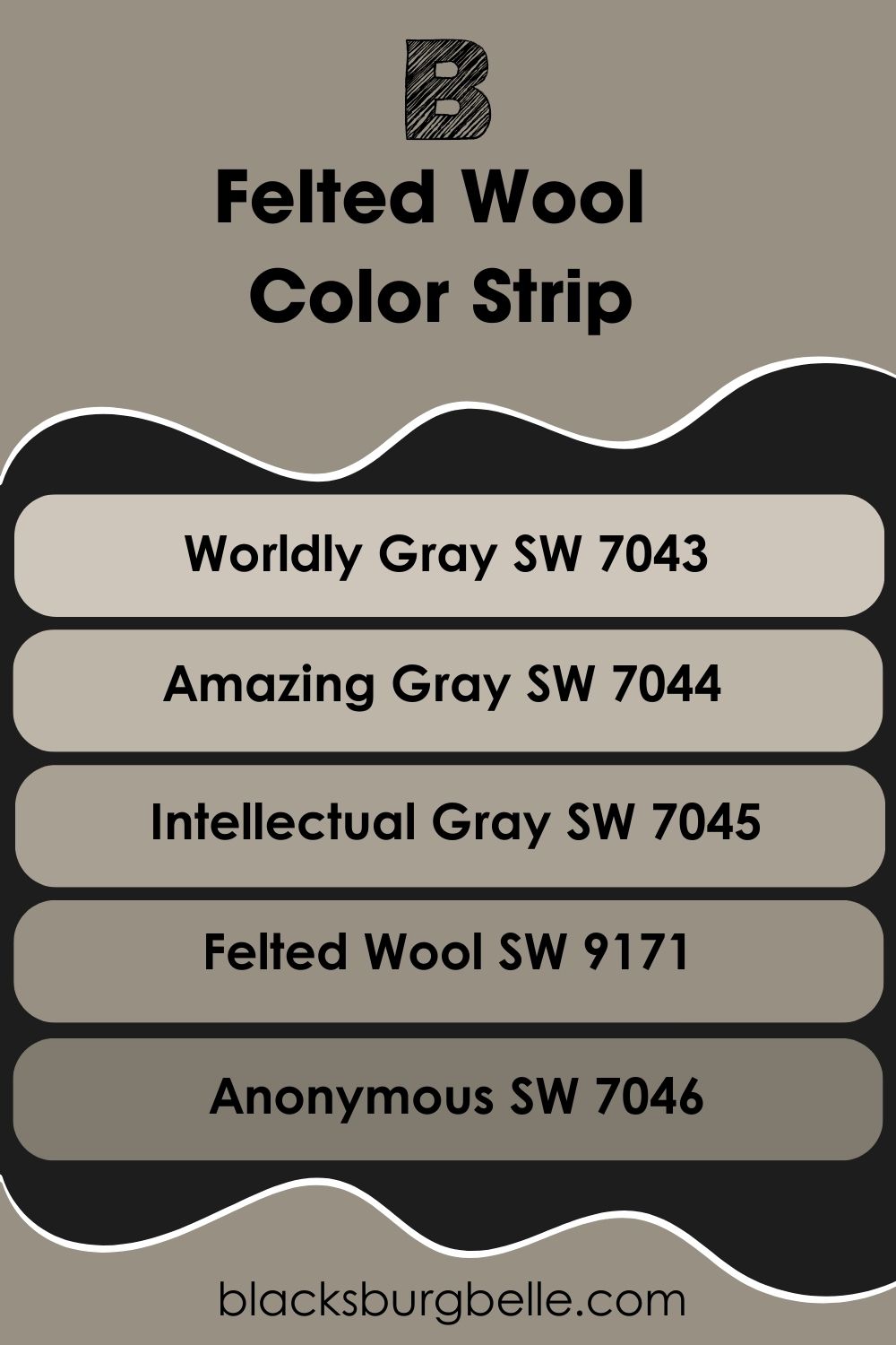
Sherwin-Williams Felted Wool Color Strip: Lighter or Darker Exploration
I won’t blame you if you feel Felted Wool is too toasty and dark. So here are some alternatives with the same base notes you can use.
- Sherwin-Williams Worldly Gray (SW 7043)
- Sherwin-Williams Amazing Gray (SW 7044)
- Sherwin-Williams Intellectual Gray (SW 7045)
- Sherwin-Williams Felted Wool (SW 9171)
- Sherwin-Williams Anonymous (SW 7046)
Worldly Gray is a medium light tone with a bolder gray overtone. But for a neutral greige, get Amazing Gray.
Use Intellectual Gray for a medium-dark greige neutral and Anonymous for a deeper, less taupe version of Felted Wool.
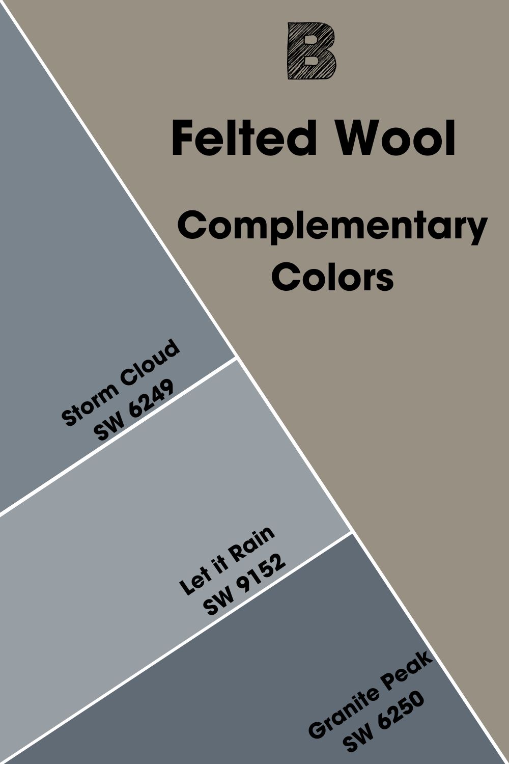
Complementary Colors for Sherwin-Williams Felted Wool
Complementary colors fit each other like gloves because of their contrasting auras. They’re two colors opposite each other on the color wheel, like red-green, yellow-purple, and blue-orange.
With Sherwin-Williams Felted Wool being three colors in one, finding the perfect contrast wasn’t easy. It’s complex because Felted Wool already has two contrasting colors (reddish-beige and green) in its undertone.
Using the color wheel, the complementary hex value is #838A97, which matches the discontinued Benjamin Moore Polynesian Blue. I found a similar Sherwin-Williams shade, though.
Sherwin-Williams Storm Cloud (SW 6249) is the complementary color for Felted Wool. It’s a dark, moody grayish-blue color that matches the gray in Felted Wool. Other blue grays you can use include:
- Sherwin-Williams Let it Rain (SW 9152):This slate gray-toned blue color has a medium-dark look that adds to the comfort of Felted Wool’s toasty look.
- Sherwin-Williams Granite Peak (SW 6250):A dark blue color with a warm granite gray undertone.
This combo is bold and daring, making it the best for branding.
Sherwin-Williams Felted Wool Coordinating Colors
A Complementary palette isn’t the only way to make a bold statement with colors. I’ve selected four more combinations you can use to express yourself through colors and decoration.
- Analogous Theme: Pick three colors placed side by side for a gradient vibe.
- Complementary Theme: Use two colors placed opposite each other on the wheel.
- Triadic Theme: Form a triangle of evenly spaced colors for a vibrant high-contrast vibe.
- Split Complementary Theme: Use adjacent colors of your complementary color. They’re always compound colors of one primary and two secondary hues or vice versa.
- Monochromatic Theme: Use one color as your anchor and add white or black to create a lighter and darker version.
For Felted Wool’s Split Complementary colors, use blue-gray as the base so that blue-green and blue-purple will make the split. A Monochrome palette will create a minimal and harmonious look.
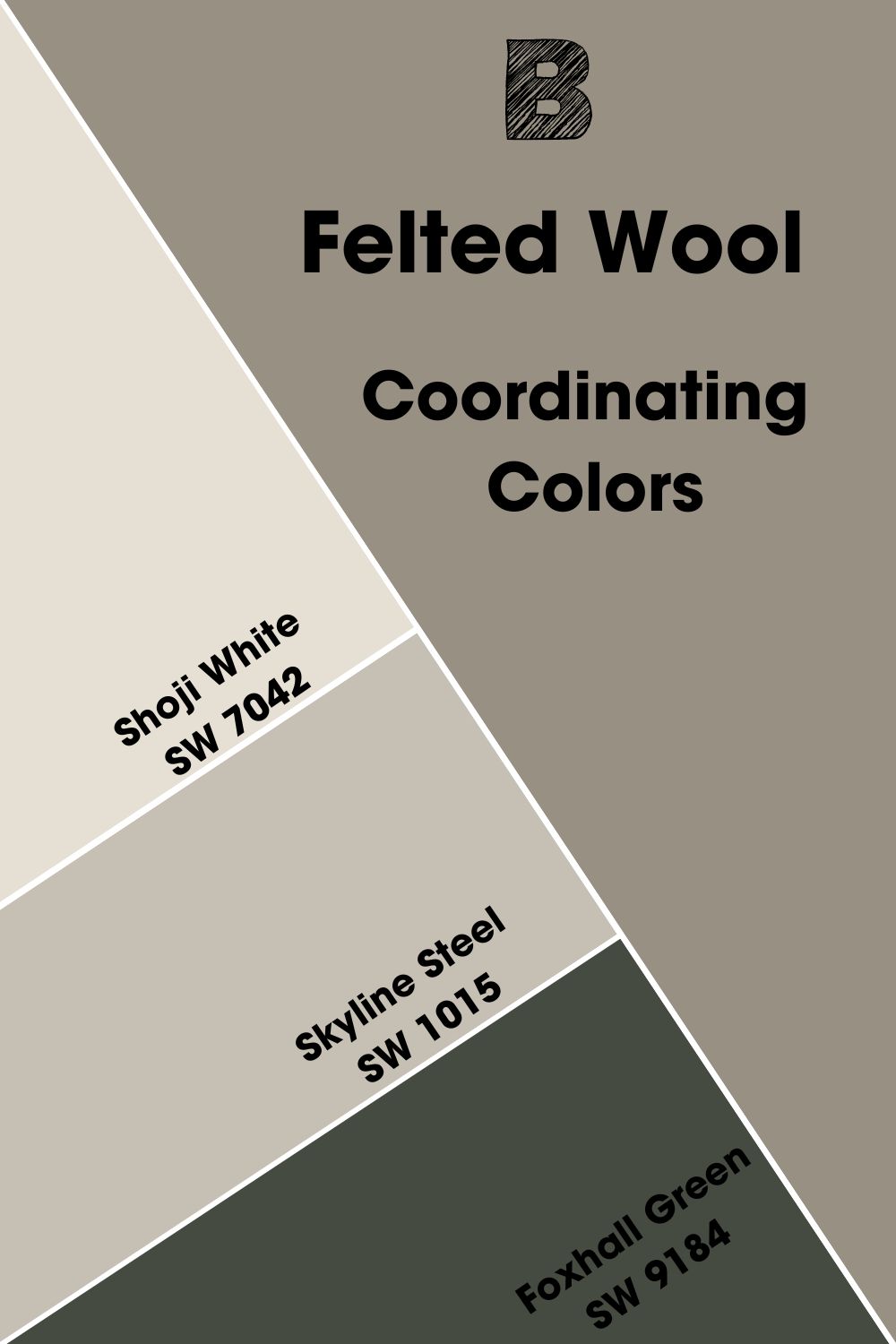
Coordinating Colors for Sherwin-Williams Felted Wool
- Sherwin-Williams Shoji White (SW 7042): A creamy white paint because of its beige undertone.
- Sherwin-Williams Skyline Steel (SW 1015): This warm stony gray neutralizes the shadowy depth of Felted Wool.
- Sherwin-Williams Foxhall Green (SW 9184):A deep earthy green with a cool vibe and warm yellow undertone to add complexity to your palette.
Use Shoji white as the trim, Foxhall green and felted wool as alternate walls and accents, and skyline steel as the main wall paint.
Sherwin-Williams Felted Wool Color Palette
Here’s how to use Sherwin-Williams Felted Wool in other color palettes:
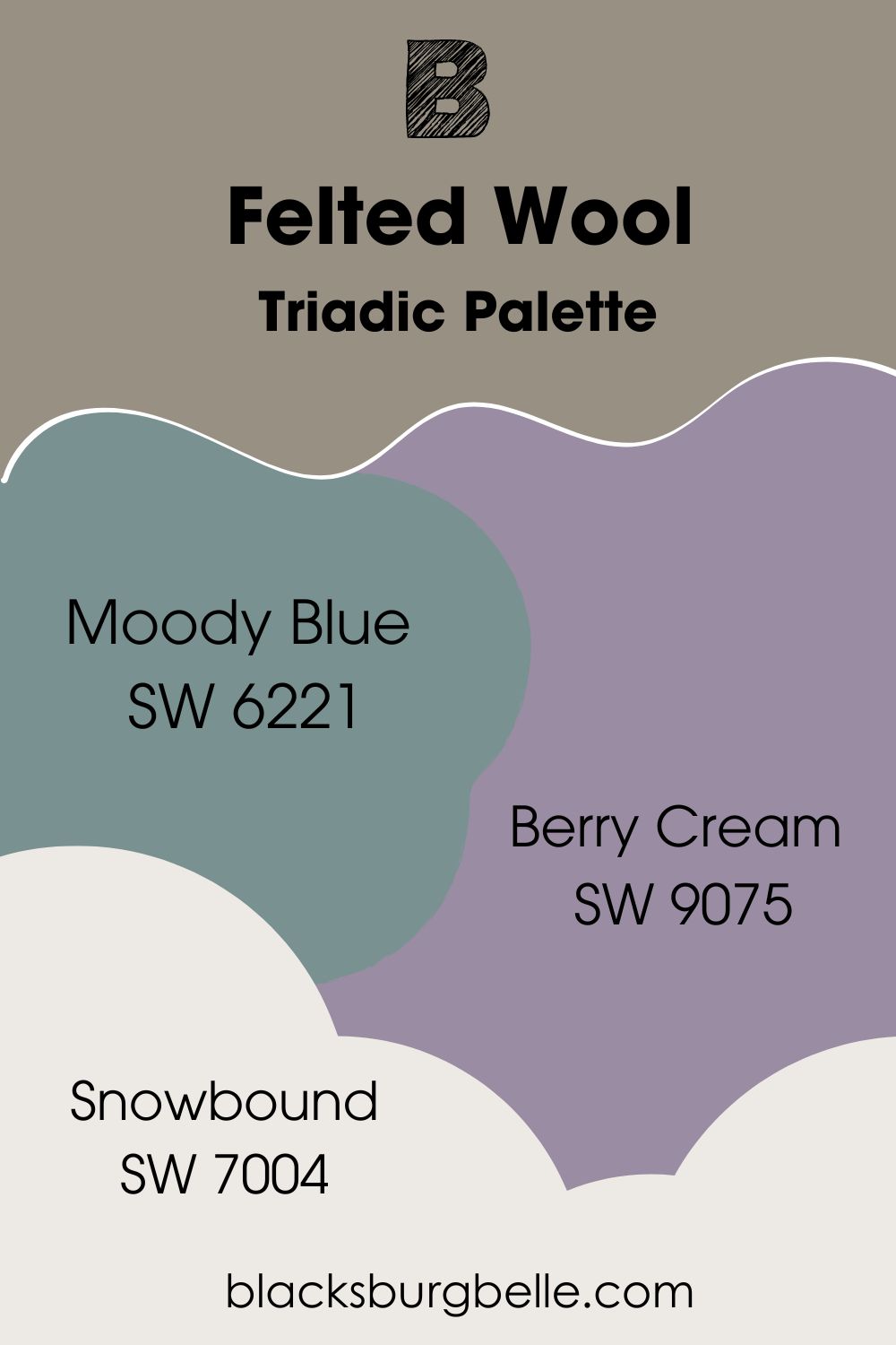
Triadic Palette
- Sherwin-Williams Moody Blue (SW 6221):A dark and dusty cyan blue with a green-gray undertone to stay on theme with Felted Wool.
- Sherwin-Williams Berry Cream (SW 9075):This grayish-purple dark paint is a tone switch-up for Felted Wool.
- Sherwin-Williams Snowbound (SW 7004): Tie the three colors in with this clean gray-tinted bright white paint.
Using a high reflective gray-toned white like Snowbound unifies the bolder overtones in Felted Wool, Berry Cream, and Moody Blue. Make Berry Cream and Felted Wool your accent against a Moody Blue wall.
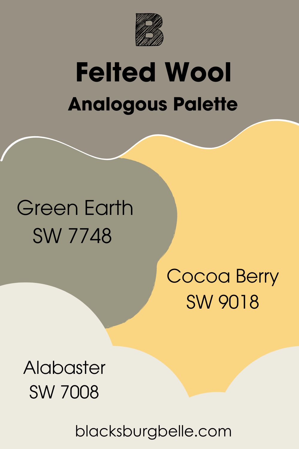
Analogous Palette
- Sherwin-Williams Green Earth (SW 7748): A yellow-tinted earthy green-gray with a warm aura.
- Sherwin-Williams Cocoa Berry (SW 9018): This reddish-gray hue with earthy warmth reminiscent of clay.
- Sherwin-Williams Alabaster (SW 7008):A bright but cozy creamy white.
Use Green Earth and Cocoa Berry furniture and accents to highlight Felted Wool walls. Then blend the three colors with this off-white.
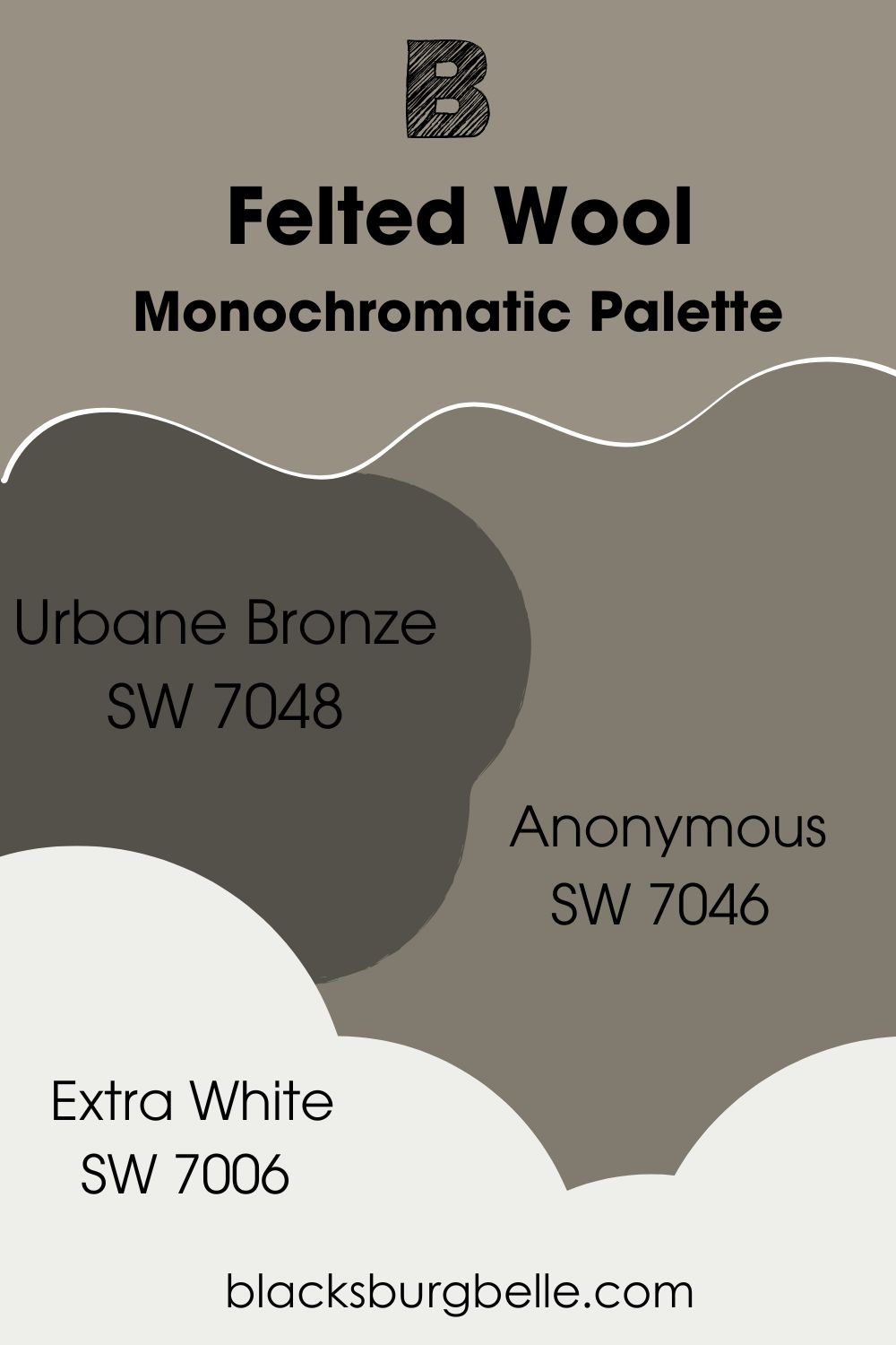
Monochromatic Palette
- Sherwin-Williams Urbane Bronze (SW 7048): A very dark brownish green-gray paint great for accents.
- Sherwin-Williams Anonymous (SW 7046): A warmer and darker gray paint with a faint green undertone than Felted Wool.
- Sherwin-Williams Extra White (SW 7006):This clean white sets a neutral backdrop for the varying shades of green-gray to become one.
Felted Wool walls and deep, Urbane Bronze accents would look good in an office or a den. Blend the shades with the clean Extra White on your trims, and you have a perfect monochrome theme.
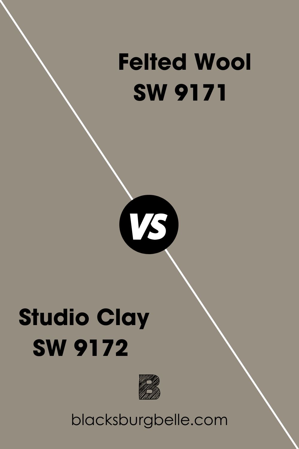
Sherwin-Williams Felted Wool vs. Studio Clay (SW 9172)
With Sherwin-Williams Studio Clay, a dominant green undertone is the difference.
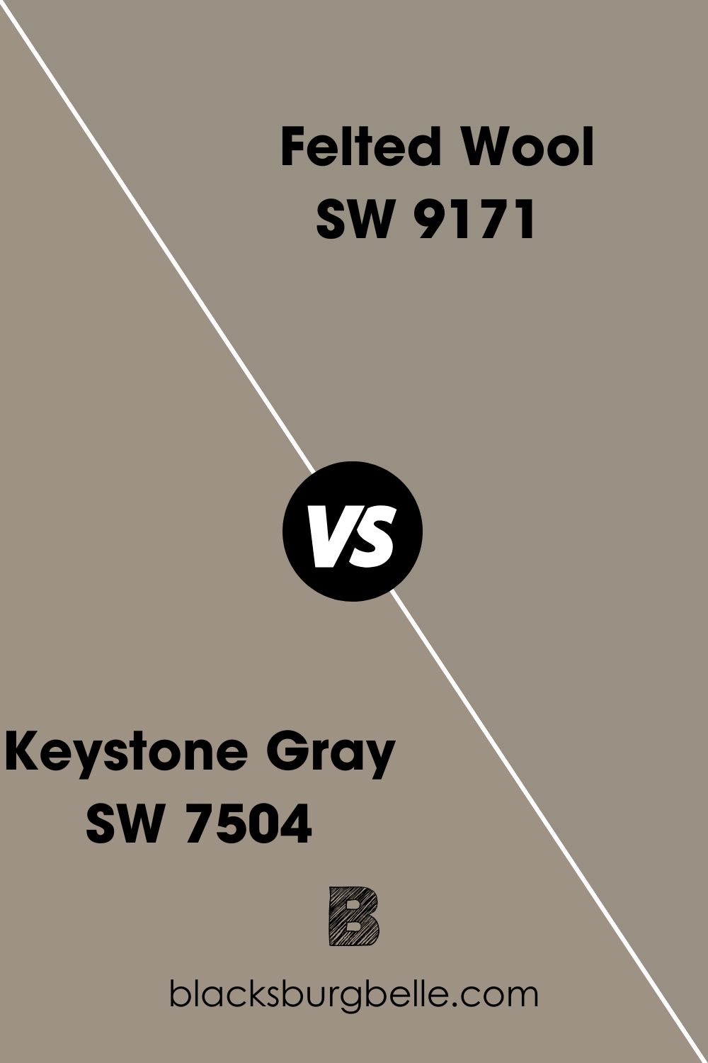
Sherwin-Williams Felted Wool vs. Keystone Gray (SW 7504)
Sherwin-Williams Keystone Gray is a warm, dark stony gray with a rich brown undertone deeper than Felted Wool’s earthy green tint.
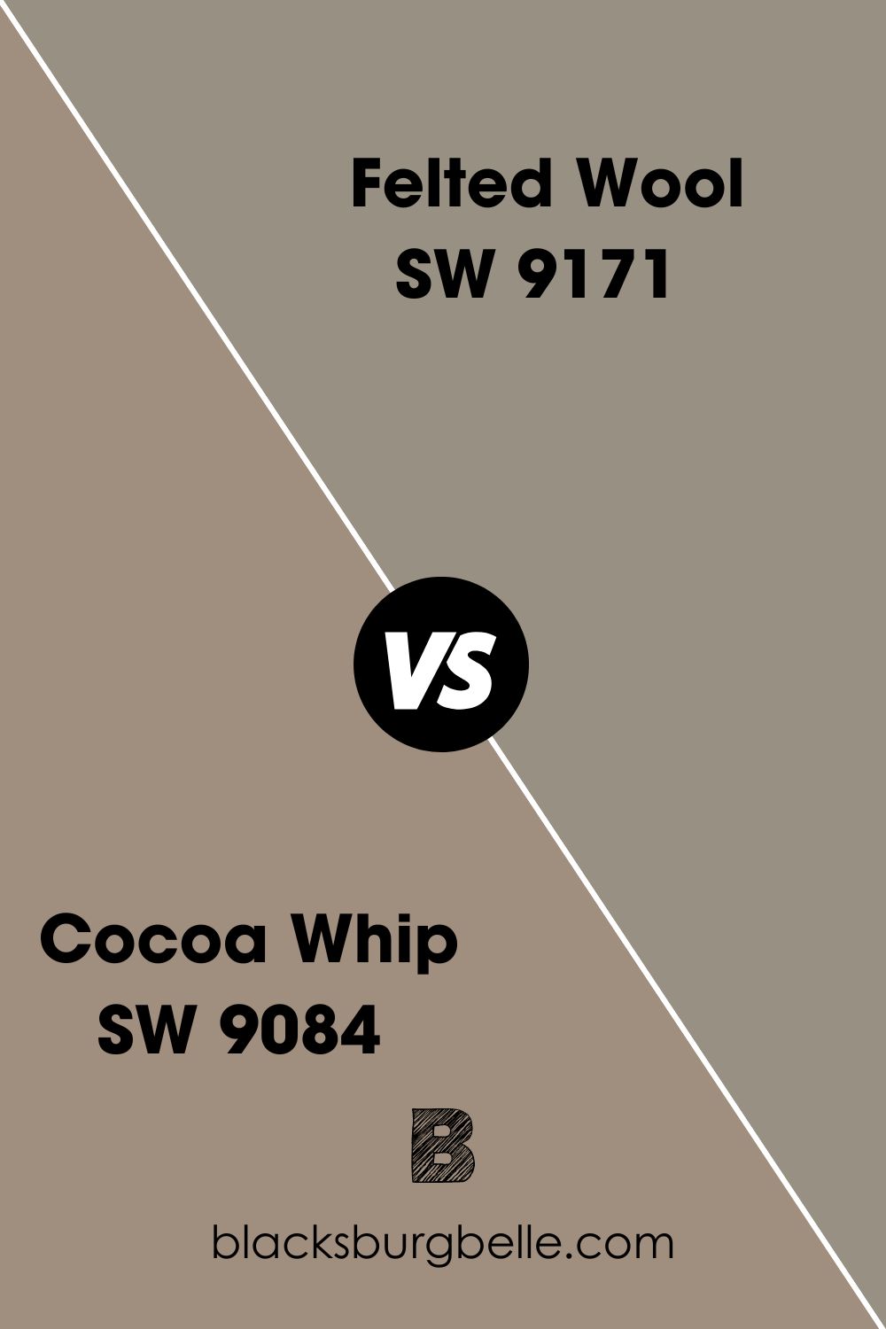
Sherwin-Williams Felted Wool vs. Cocoa Whip (SW 9084)
Unlike Felted Wool, Cocoa Whip is a dark gray color with an orange undertone that sometimes appears chocolaty taupe.
Sherwin-Williams Felted Wool Equivalent in PPG (PPG0997-2)
Felted Wool by PPG is a cool, soft gray color, unlike Sherwin-Williams warm version. It has an LRV of 55, making it a neutral tone, and an RGB of red 195, green 196, and blue 190.
Like the Sherwin-Williams’ version, PPG’s Felted Wool also works with blue accents and Honeywood.
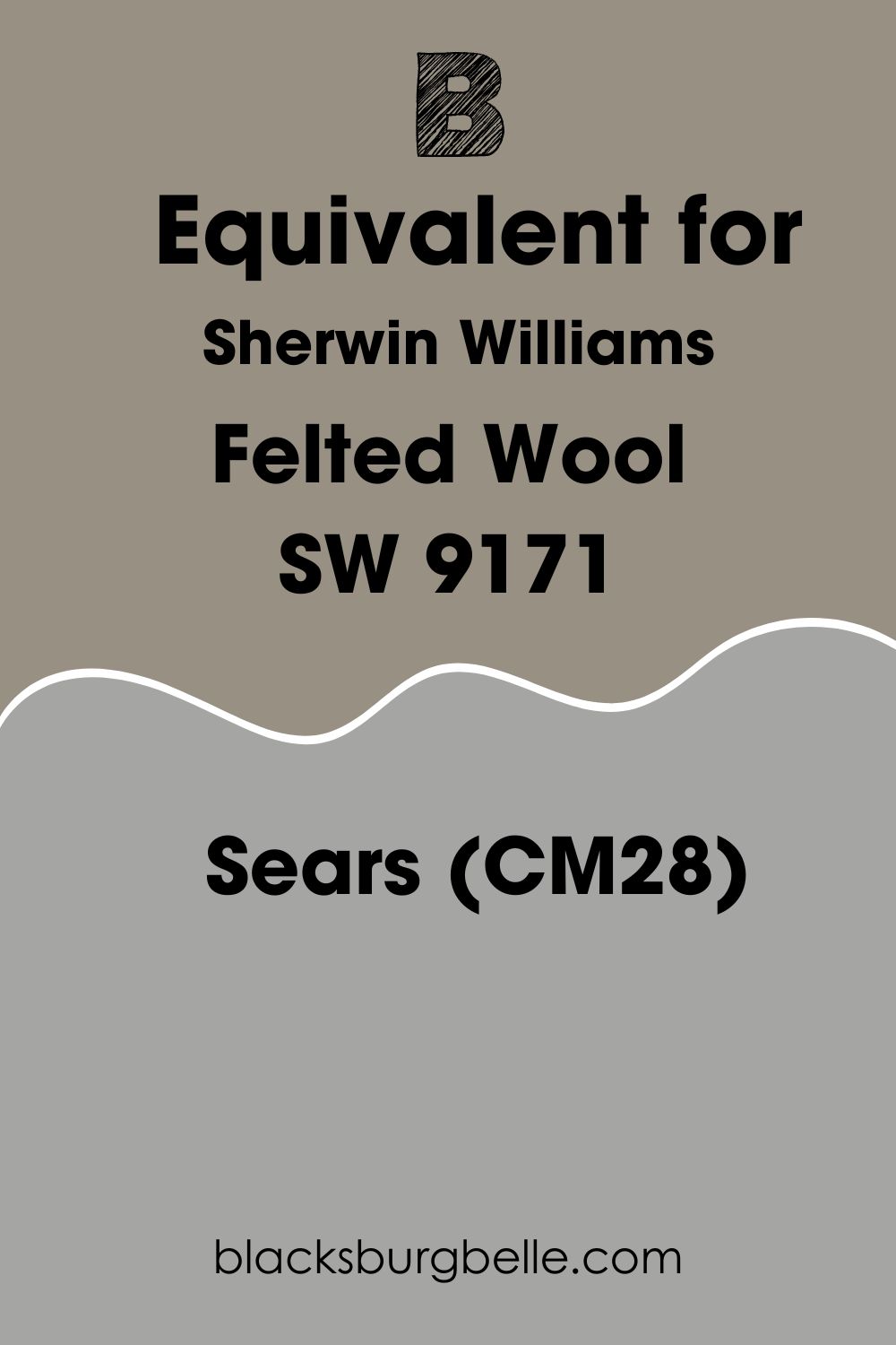
Sherwin-Williams Felted Wool Equivalent in Sears (CM28)
If you want medium-dark and cooler gray paint, get the Sears version. Unfortunately, I couldn’t find any pictures online, but you can recreate it with the hex value #A5A6A4 and RGB, red 165, green 166, and blue 164.
Sears version is the closest to the Sherwin-Williams one in LRv because it has 38.11.
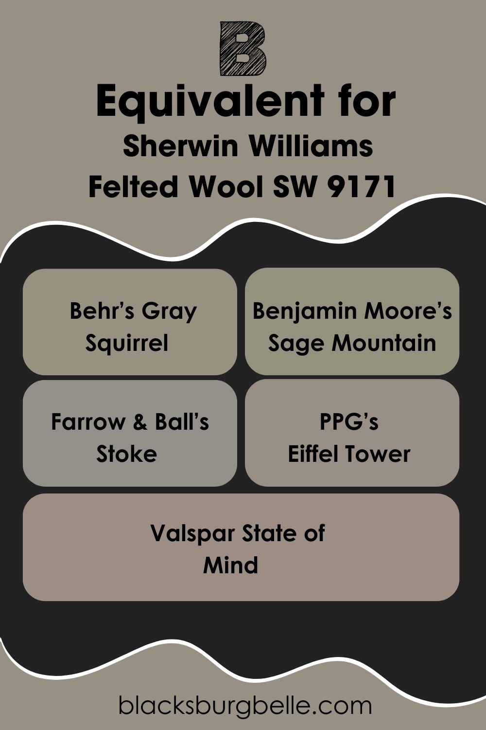
Sherwin-Williams Felted Wool Equivalent with Other Brands (Behr, Benjamin Moore, Farrow & Wool, PPG, and Valspar)
For a similar toasty green-gray paint from other top brands, check out Behr’s Gray Squirrel, Benjamin Moore’s Sage Mountain, Farrow & Ball’s Stoke (California Collection), PPG’s Eiffel Tower, and Valspar State of Mind.
Where can you use Sherwin-Williams Felted Wool?
Sherwin-Williams Felted Wool looks beautiful outdoors and indoors. I prefer it outside, where it can soak in the sunlight, but if you must use it inside, invest in good lighting.
Also, there’s such a thing as too much Felted Wool indoors unless it’s in a mancave, den, or masculine space. Here are a few inspirations I found and loved on the internet.
Sherwin-Williams Felted Wool on Walls
I don’t recommend using Felted Wool on entire walls because it’ll be overwhelming. But the bathroom is your best bet if you want to use it on walls. And when you do, ensure there’s a matching white paint as the trim and brighter colors as your decor and fixtures.
When you look at this bathroom wall, there’s a window to receive natural light and brighten the Felted Wool walls. Using the white trims, earthy brown mirror, and screen added warmth for the color’s undertone to shine. But I still think it’s too toasty.
So, it’s a no for me.
Sherwin-Williams Felted Wool in the Living Room
Sherwin-Williams Felted Wool in this living room appears greige because of the lighting and decor. The brick fireplace and taupe carpet add to the summery vibe of the wall paint. It’s also an excellent example of how to use Felted Wool as wall paint.
You can use the same logic for modern-themed living rooms and get a similar result. Positioning this Felted Wool accent wall beside a large window was a smart way to capture the morning light. Also, using a light beige carpet adds brightness to the room.
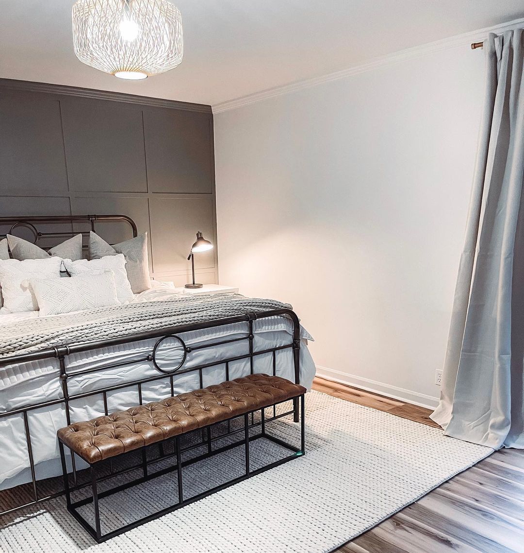
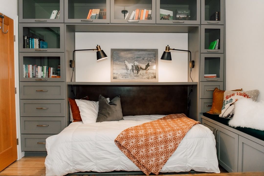
Sherwin-Williams Felted Wool in the Bedroom
A cozy bedroom is always a good idea, even though most people prefer cool and relaxed vibes for sleeping. But when you balance a Felted Wool accent wall with a bright white wall and white lighting, toasty becomes appealing.
Also, notice the light gray curtain peeking in the corner and how it adds a breezy aura to the bedroom. Explore Triadic and Analogous palettes in this space, or play it safe with monochrome and coordinating palettes.
Sherwin-Williams Felted Wool as an Accent
We’ve established that Felted Wool works best as an accent wall but what about other accents like furniture and cabinets? This double-shelf flanking a beige-painted wall adds a warm shadow to the living room.
You can use Felted Wool accents as the anchor for your other interior decor like settees, carpets, throw pillows, rugs, and curtains. That way, the darkness wouldn’t swallow the room. Go ahead and use your complementary, coordinating, or monochrome palette here.

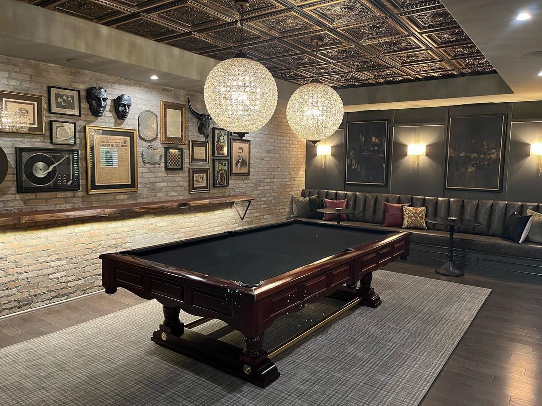
Sherwin-Williams Felted Wool in the Den
Felted Wool has the right masculine energy for a den. You can make it a traditional space by mixing it with brick walls like this room or modernizing it. At least in the den, you don’t have to worry about the room looking too toasty or moody; in fact, the darker, the better the vibe.
Notice that the yellow lighting makes the Felted Wool wall’s green undertone shine through, unlike other rooms so far. This is a nice space to explore daring palettes like Triadic and Analogous.
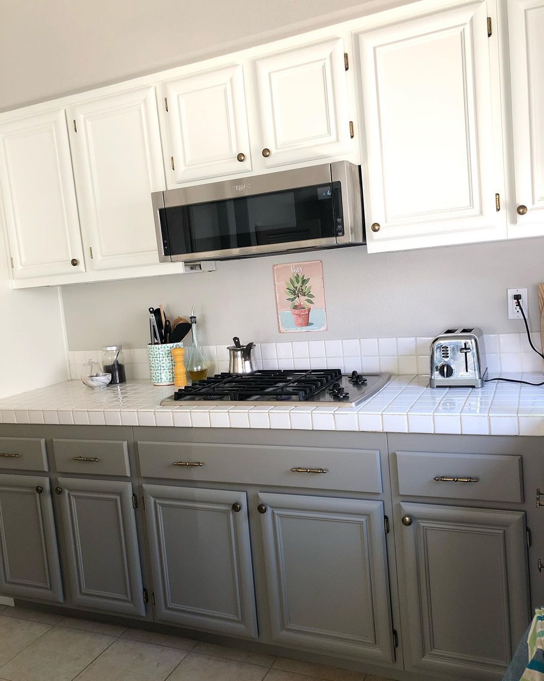
Sherwin-Williams Felted Wool on Cabinets
Whenever you use Felted Wool as an accent cabinet, ensure it’s on the bottom if you’re mixing it with a brighter color. That’s the best way to balance its deep tone without making the kitchen feel hotter than normal.
The lighting angle and white countertops also highlight the greige tone rather than the earthy green-gray. A coordinating or monochrome palette will fit this space.
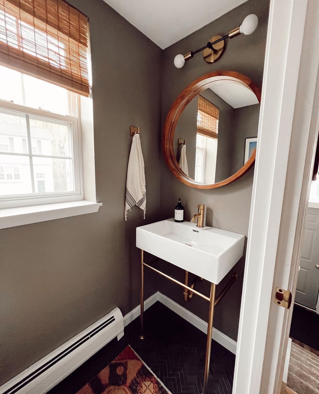
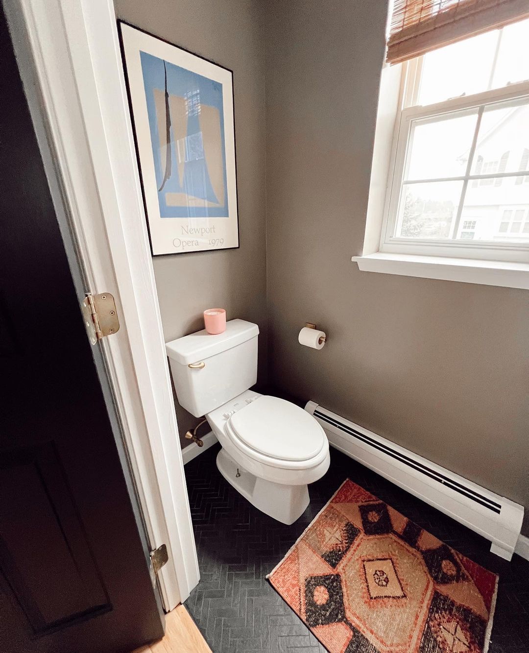
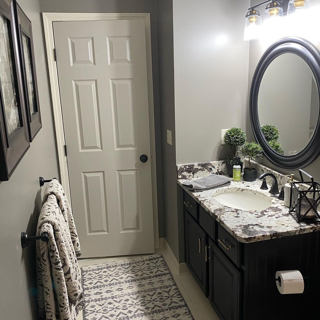
Sherwin-Williams Felted Wool in the Bathroom
I know I said Felted Wool as an entire wall paint in a small room is a no-no but walk with me here. If you don’t have any choice, you can make it work with interior decoration. Ensure there’s enough natural light through the window, and add bright colors wherever you can.
Use a coordinating or monochromatic palette for the best look in this space.
Sherwin-Williams Felted Wool on Doors
Dark doors make a bold statement whether it’s inside or outside, so yes, Felted Wool works on them. Using it inside will highlight its greige and green-gray tones depending on the time and lighting.
Get ready to see the greige tone in the morning and underneath white lights like this bathroom door. But once the light goes off, you’ll get the cozy, earthy green-gray tone.
Sherwin-Williams Felted Wool on Furniture
Furniture that doubles as accents are very modern and minimalist-coded. Use Felted Wool in a monochromatic or coordinated palette for a simple yet bold look. You can also use this toasty color on regular furniture like chairs, cabinets (as you’ve seen), and tables.
Sherwin-Williams Felted Wool on Exteriors
First look at this before and after picture.
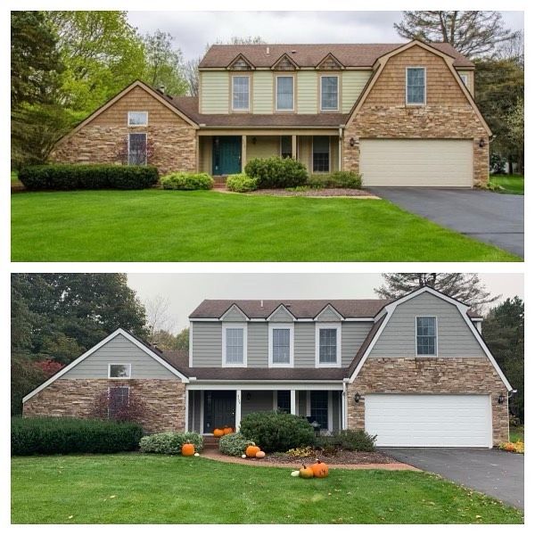
I love this picture because I can physically compare the difference between a boring beige exterior and using Sherwin-Williams Felted Wool. Felted Wool gave the building a modern look despite being a traditional design.
The pumpkins also show that this redo came in time for the Fall season. With Felted Wool walls, the house stands out, while the beige walls make the building fade into the background. The grass in the first picture steals your attention, but in the second picture, it’s an accessory.
Conclusion
You can see that Sherwin-Williams Felted Wool is a cozy dark paint best used in bits if you want to appreciate the color. I recommend using it on your exterior sidings and as an accent inside on your doors, furniture, and partial walls.
Brighten Felted Wool up with bolder colors and test it against your preferred surface with Sherwin-Williams samples:
- Peel & Stick strips
- Color-to-Go, and
- Color Chips.
It’s one thing to see the color combo on screen and another to see it in real-time. And it’s a wrap! Please share your thoughts in the comment box below.
 Sherwin Williams Iron Ore (Palette, Coordinating & Inspirations)
 Sherwin Williams Caviar (Palette, Coordinating & Inspirations)
 Sherwin Williams On The Rocks (Palette, Coordinating & Inspirations)
 Sherwin Williams Essential Gray SW 6002: Paint Color Review
 Sherwin Williams Cyberspace SW 7076: Review & Inspiration
 Sherwin Williams Grizzle Gray SW 7068: Paint Color Review
