
Gray paints have been the go-to paint color for many homeowners’ as the most preferred color for interiors.
So, if you’ve heard of or seen the Fleur de Sel from Sherwin Williams used in a space and wonder if it will deliver the results you desire, welcome to this Sherwin Williams Fleur de Sel SW 7666 paint color review.
This paint color is quite flexible, as it falls in the following Sherwin Williams paint color collection- Soft and sheer, Diaphanous, Dreamer, Living Well-Reflect, Cool White, and Finest Whites.
So, sit back and relax as I review and reveal all you need to know about Sherwin Williams Fleur de Sel’s LRV, undertones, and how to create a palette suitable for your personal space.
Table of Contents
When to Choose (Fleur de Sel SW 7666)?
Settling for a paint color requires considering your creative preference and emotional requirements. In this section, I’ll outline the perfect situations where Fleur de Sel comes in handy.
Love a Coastal Feel?
Fleur de Sel’s blue-green undertones remind you of the beach but in the most creative way.
Need a Versatile Neutral?
While your average neutral may be boring or too chaotic, Fleur de Sel comes to the rescue as it makes a beautiful background for you to layer color or use alone (thanks to its interesting undertones, again!)
Sophistication is the Motto
We choose colors for different reasons, and if yours is to add more sophistication to your space, Fleur de Sel is your guy.
Don’t Mind an Airy Space
Due to its relatively high LRV, Sherwin Williams Fleur de Sel helps create the illusion of a large and airy space because this color reflects more light than it absorbs.
If You Run Out of Trim Choices
Fleur de Sel can work as a trim color from interior to exterior. This barely there gray paint creates the right amount of contrast but doesn’t also do too much.
You Like a Minimalist Design
Less is more, at least with Fleur de Sel. If you’re into simple decor aesthetics, you can build a monochromatic palette with this color.
Switching Up Your Kitchen Game
Whether the wall or cabinetry, Sherwin Williams Fleur de Sel can take your kitchen game from boring to excellent. Being neutral gives you more opportunities to pair it with cute kitchen accessories.
What Color is Sherwin-Williams Fleur de Sel?
Fleur de Sel is a French word for flower of salt- a delicate crust that floats on seawater’s surface as it gradually evaporates. This salt comes in various colors depending on its surrounding properties but predominantly reads as gray on the sea’s surface.
SW Fleur de Sel emulates this as a light gray color that sometimes reads as off-white but never strays away from its neutral roots, and this is why it’s everyone’s favorite.
See Fleur de Sel in a space before I proceed.
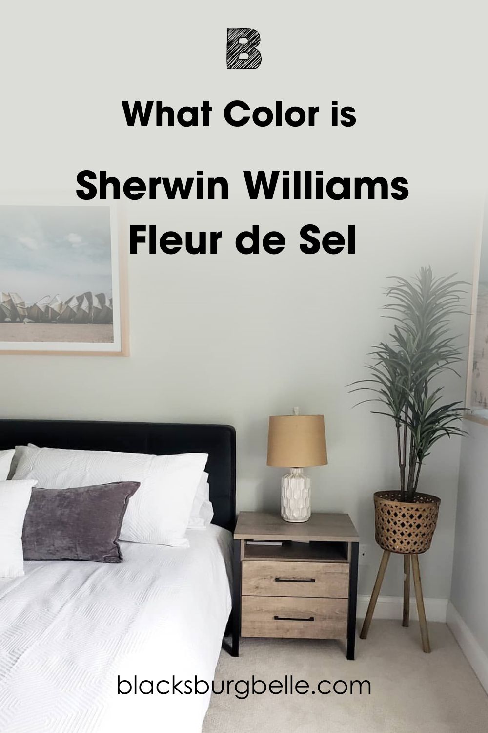
It’s not hard to confirm my claim that Sherwin Williams Fleur de Sel is a chilly cool-toned gray that reminds you of the waves crashing at the shore on a hazy morning. There’s still so much more to learn about this color; stay with me.
Snapshot of Comfort Gray Specification
As part of dotting the I’s and crossing the T’s, I must show you details of Fleur de Sel. Should you decide to add a personal touch to the color or even use it in your home, the following statistics will arm you with the basic information you need.
| Name | Fleur de Sel (SW 7666) |
| Hex Value | #DCDDD8 |
| LRV | 72 |
| RGB | 220/221/216 |
| Undertones | Green. Blue |
The LRV of Sherwin Williams Fleur de Sel
Knowing your color’s LRV brings you closer to achieving the space of your dreams. All colors fit into a number on the scale. This scale typically runs from 0-100, with 0 being the darkest and 100 being the lightest.
However, there’s also no true black or white, so we play it safe with 3-97, as it’s a lot more realistic due to the undertones in every color.
Fleur de Sel has an LRV of 72, which means it’s a pretty decent and light color. However, you may get a bit of depth with this in a small space, and when you pair it with a much lighter color (say LRV of 80+), you’ll see its deep tones.
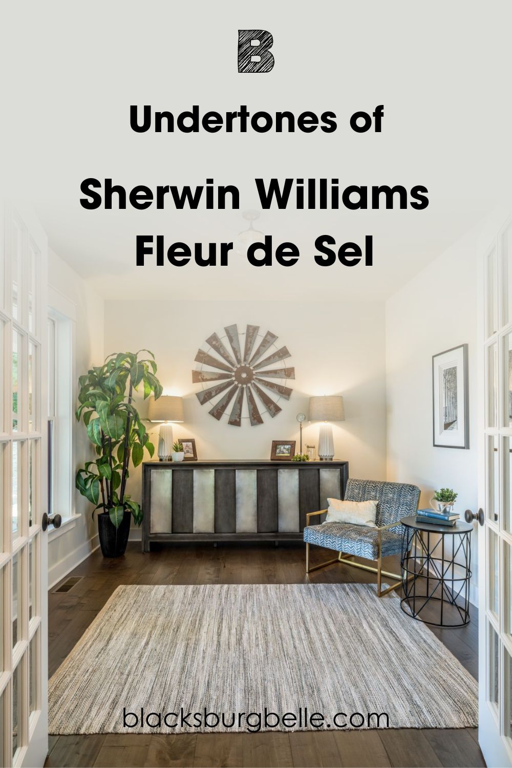
Undertones of Sherwin Williams Fleur de Sel
This review will be incomplete if we do not carefully examine the undertones of Fleur de Sel. Undertones emerge in colors due to the creative process of mixing two or more colors together.
Sherwin Williams Fleur de Sel has blue and green undertones, but you tend to see the green in most cases. For most gray colors, you’ll likely find green, purple, and blue undertones or a combination of two or more.
Blue-green undertones in gray colors give you an added advantage and the best of both worlds. So you get a cool gray paint color, but not too cool, as the green adds warmth to the blue undertone.
Let’s analyze this color further.
Does Lighting Condition Affect Fleur de Sel?
The straight answer to this question is a big yes, and it’s not far-fetched. Take a look around your immediate environment, and you’ll see how light alters the appearance of your colors from day to night.
Now let’s see how that affects Fleur de Sel.
North-facing light adds an icy touch to the already cool tone of Fleur de Sel. This means you’ll get more of the gray and green side. For South-facing rooms, morning is their peak time-thanks to the golden touch of the sun. This is also good for the blue in Fleur de Sel.
The green side of Fleur de Sel shows off more in the evening for West-facing rooms and less in the morning for East-facing rooms; instead, you get a bright blue peek.
If you’re into artificial lighting, you can brighten up Fleur de Sel and make the gray in it pop more by using yellow or orange light bulbs. They add extra warmth and intensity to your cool.
Keep things cool with white and blue bulbs, and this instantly causes the green undertones to float to the surface. Fleur de Sel, you’ll always be special.
Does Fleur de Sel Read Green?
You’ll surely see the green in Fleur de Sel in the nighttime. With less light around and no clear skies in sight, Fleur de Sel retires back into its cool shell, and you can almost forget all the other undertones in this color.
Furthermore, green holds the most percentage in the RGB ratio, which means it’s a constant partner in a Fleur de Sel space.
Can You Find Blue Undertones in Fleur de Sel
Mornings mean new beginnings for Fleur de Sel, affecting its undertones. The Green in our focus tone gives way to a fresh view of its blue undertones. The end result is a beautiful blue-gray finish.
The downside to this is that you only see this blue hint between 8-10 am; once the warm sun comes up, it washes out, leaving the gray undertones on display.
However, Finding complicated undertones in neutrals like Fleur de Sel and others is not strange. As I explained earlier, this phenomenon is due to mixing different colors to arrive at one entity.
Sherwin Williams Fleur de Sel: Is it a Warm or Cool Color?
All colors are either on the warm or cool side of the color wheel due to their general perception and how they appeal to emotions. Fleur de Sel is a cool color. Considering all its undertones, they nod to the cool side of things.
This color is so easy to look at and will always give off a chilly feeling the moment you step into a home. The green and blue undertones in it also remind you of a cold morning at sea, coupled with how all it does is open up your space while still maintaining gentleness.
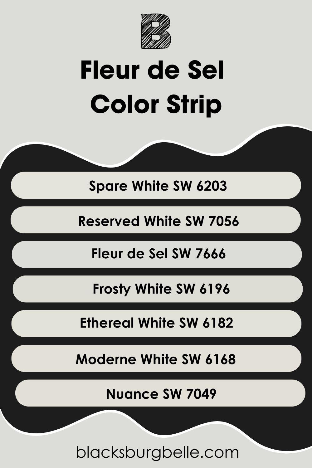
Sherwin Williams Fleur de Sel Color Strip: Lighter or Darker Exploration
Color strips are life savers. This arrangement gives your color journey meaning and directions, and if you’ve been wondering what colors are Fleur de Sel’s closest allies, you’ll find your answers here.
These colors carry different intensities so that you can see how adding touches of black and white to our anchor tone causes a beautiful gradation that can also translate to real-life usage.
- Sherwin Williams Spare White (SW 6203)
- Sherwin Williams Reserved White (SW 7056)
- Sherwin Williams Fleur de Sel (SW 7666)
- Sherwin Williams Frosty White (SW 6196)
- Sherwin Williams Ethereal White (SW 6182)
- Sherwin Williams Moderne White (SW 6168)
- Sherwin Williams Nuance (SW 7049)
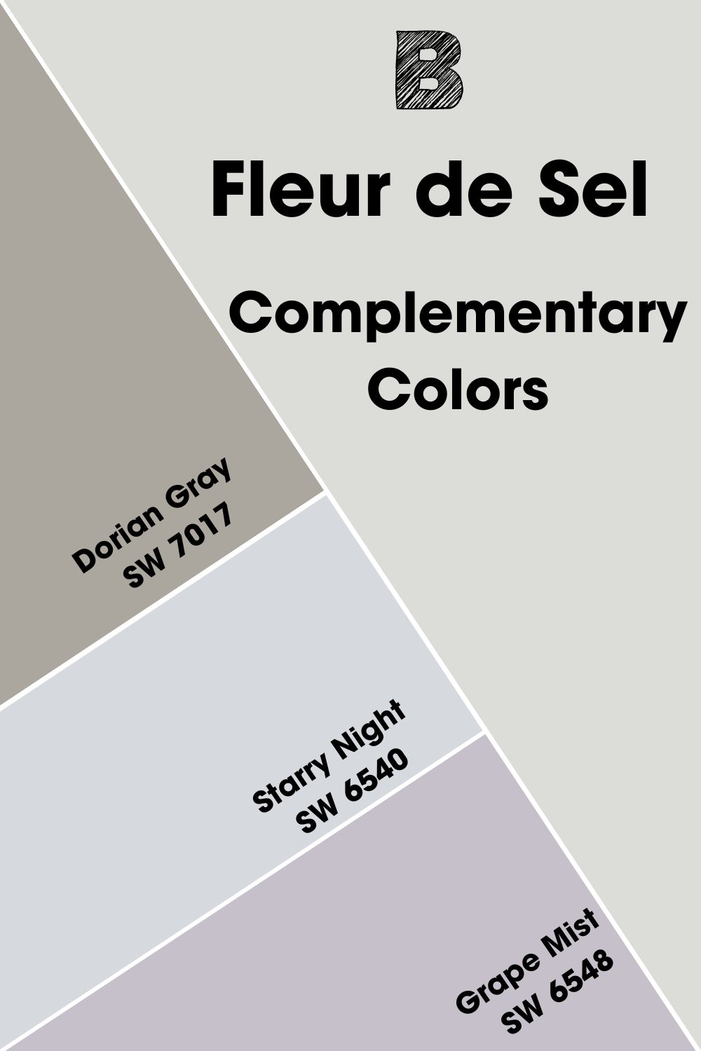
Complementary Colors for Sherwin Williams Fleur de Sel
Complementary colors are easy to understand- they are directly opposite each other on the color wheel and complement each other thanks to their contrasting colors. You should expect to see blue opposite orange, red opposite green and yellow opposite purple.
For this article and the fact that our focus color is multifaceted (thanks to the busy undertones), I’ll be fair to all by picking colors that appeal to each undertone.
You can draw out the beauty of the blue undertone by using an orange shade or find a red for the green undertone. Finding a reddish-orange color to balance undertones is also not bad.
Check out my pick below.
- Sherwin Williams Dorian Gray: This warm gray complements FDS with its mild purple and occasional green undertone. Use it as an accent wall alongside Fleur de Sel.
- Sherwin Williams Starry Night: This mid-toned violet with an LRV of 69 will add a relaxing and playful energy to the brightness of Fleur de Sel.
- Sherwin Williams Grape Mist: Grape Mist has an LRV of 54, which means it’s pretty dark and will contrast beautifully with the brightness of Fleur de Sel.
Sherwin Williams Fleur de Sel Coordinating Colors
While all this may seem cumbersome, it’s necessary to treat topics like this to help you prevent a serious paint flaw and also let you know things don’t end with just mixing two colors.
The coordinating colors are Siamese twins. They’re inseparable and perfectly blend when you pair them with their undertones.
Check out ways you can execute a coordinated color scheme.
- Analogous Theme: The triple threats. Analogous colors are the three shades you’d find side by side on the color wheel. Usually, primary, secondary and tertiary colors, which you’d have to mix for an excellent result.
- Complementary Theme: For this theme, you’ll find bold colors contrasting your chosen paint here.
- Triadic Theme: Pair three colors together to create a vibrant result. Triadic colors are equally spaced on the color wheel (producing a triangular pattern), so don’t worry about them clashing.
- Monochromatic Theme: A unique member of the squad and easy to create too. Simply throw in scoops of white for a tint and black for more shade. When you combine the ensuing result, you get a very balanced space.
- Split Complementary Theme: Use one complementary and two adjacent colors to produce a richer and more versatile color scheme. I.e., Green, Purple-Red.
Coordinating Colors for Sherwin Williams Fleur de Sel
Below are the three coordinating colors I’ve chosen to work with Sherwin Williams Fleur de Sel. Not only do they blend seamlessly with Fleur de Sel, but they also highlight its beauty one glance at a time.
Sherwin Williams Extra White (SW 7006)
This cool crispy white has blue undertones, blending finely with Fleur de Sel blue undertones. I recommend you use FDS as a trim with this one as Extra White.
Sherwin Williams March Wind (SW 7668)
March Wind is an excellent choice that appeals to the green undertones in FDS, thanks to its cool purple undertones. Use it as a trim color with FDS, as it’s dark with an LRV of 49.
Sherwin Williams Liveable Green (SW 6176)
A neutral cool green that pairs well with different accents and textures.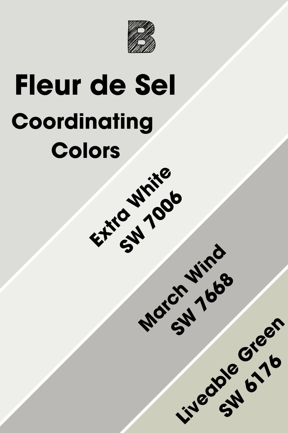
Sherwin Williams Fleur de Sel Color Palette
I’ll be working with three different types of palettes in this section. I intend to show you how Fleur de Sel performs on three of the most popular designs, whether as a neutral or the main character.
Check them out.
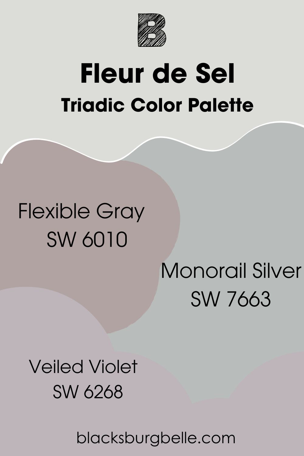
Triadic Color Palette
- Sherwin Williams Flexible Gray: Use this soft purple-gray as an accent wall for an FDS bedroom.
- Sherwin Williams Monorail Silver: Pair this blue-gray with FDS and get the coziest bathroom/bedroom ever.
- Sherwin Williams Veiled Violet: A muted violet color with gray undertones and an LRV of 47. Use as trims for an FDS exterior.
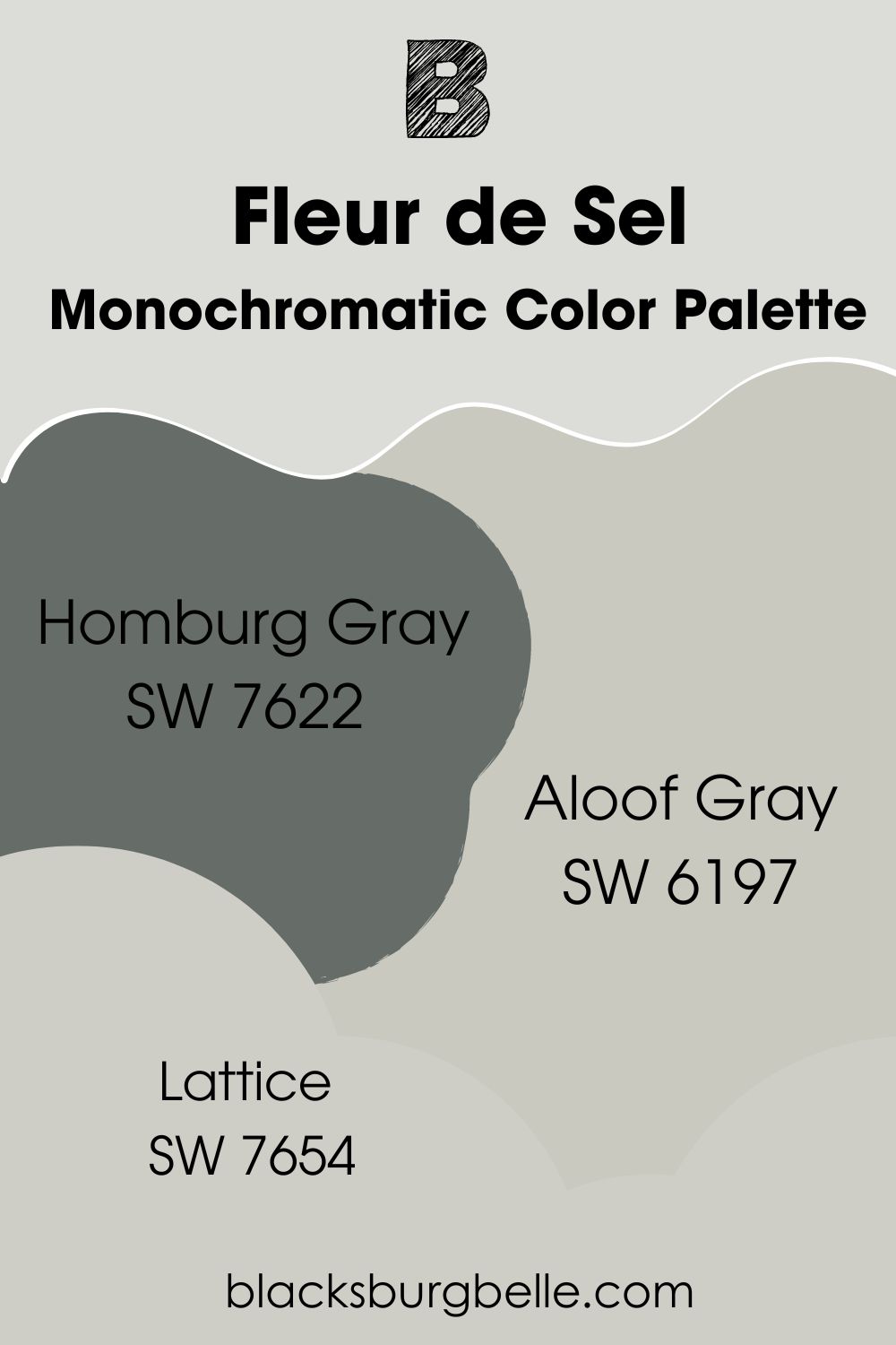
Monochromatic Color Palette
- Sherwin Williams Homburg Gray: A true dark gray paint with blue and green undertones for added drama to your FDS monochromatic scheme.
- Sherwin Williams Aloof Gray: A light gray with green and blue undertones and an LRV of 58. Pair with FDS for a cool bedroom/bathroom
- Sherwin Williams Lattice: Pair this light gray with blue undertones in an FDS living room or kitchen.
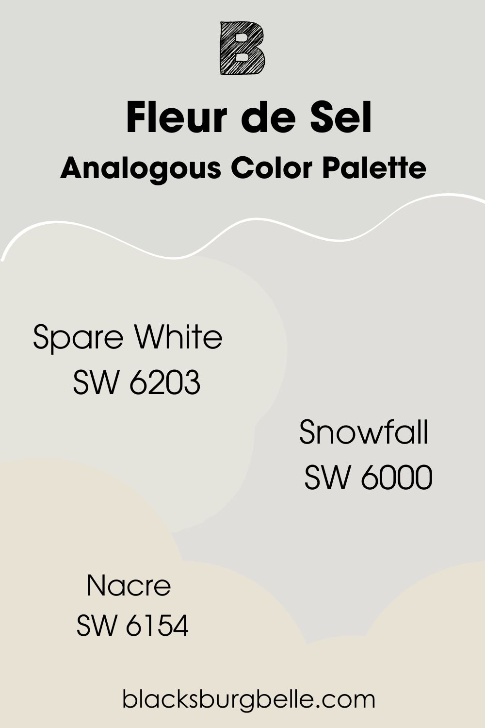
Analogous Color Palette
- Sherwin Williams Spare White: A bright white with subtle green undertones, and a perfect partner with FDS as a kitchen cabinetry color.
- Sherwin Williams Snowfall: Create a soothing bedroom with this light purple color with LRV 73. Its blue and violet undertones work with Fleur de Sel properties.
- Sherwin Williams Nacre: Embrace this classic neutral with green undertones to warm up your FDS analogous palette. You don’t get any blues with this one.
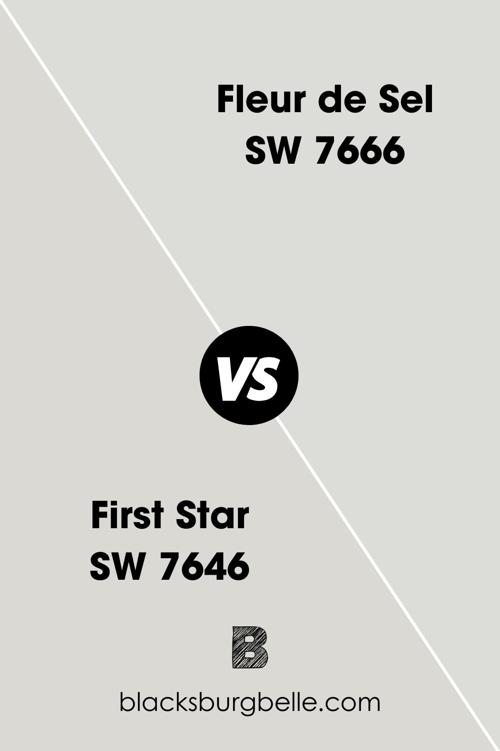
Sherwin Williams Fleur de Sel vs. First Star
Sherwin Williams First Star is slightly darker than Fleur de Sel, with an LRV of 69. Like Fleur de Sel, it also has quiet green undertones. However, this cool off-white and gray paint can work alongside Fleur de Sel as an accent wall or trim color.
Sherwin Williams Fleur de Sel vs. Frosty White
These colors have some things in common, like green undertones and almost similar LRV. Frosty White has an LRV of 72, which means it’s also a light color. It’s the perfect choice if you intend to introduce nature into your home.
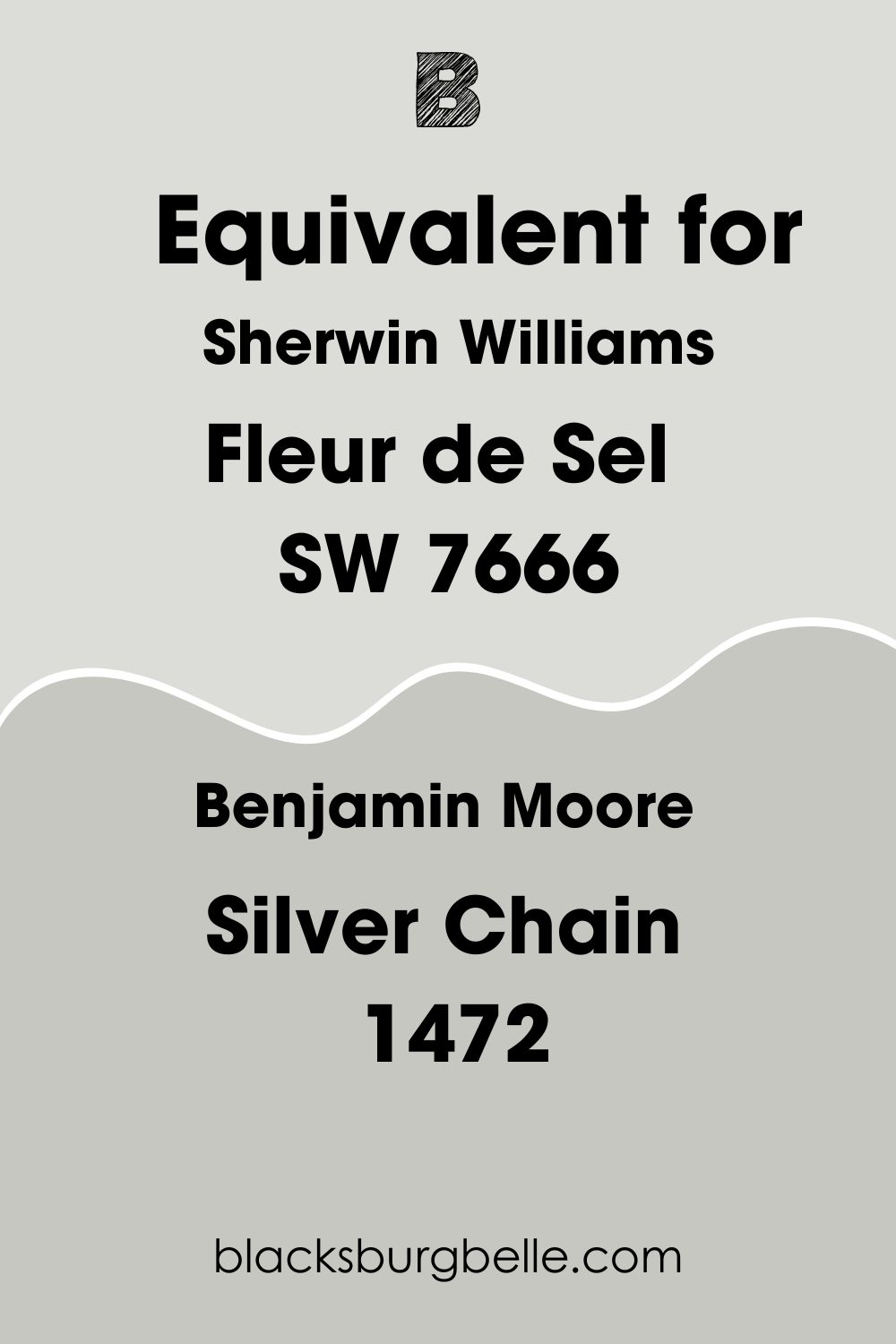
Sherwin Williams Fleur de Sel Equivalent in Benjamin Moore and Other Brands
Let’s check out colors from other brands you can use instead of Fleur de Sel, in case Sherwin Williams isn’t on the shelf. From Behr to Valspar to PPG, I’ve got you covered.
Benjamin Moore’s Silver Chain is an excellent alternative for Fleur de Sel, with an LRV of 56.79. PPG paint’s Gale Force is a mid-tone neutral in aqua green shade with blue and gray undertones. Woodsmoke, a pale gray with green undertones, is also a great option from Valspar.
Where can you use Fleur de Sel (SW 7666)?
Fleur de Sel can be used in cool spots at home like bedrooms, living rooms, bathrooms and even laundry rooms. This versatile color instantly leaves a relaxing vibe in any space.
Don’t believe me? Well, see for yourself.
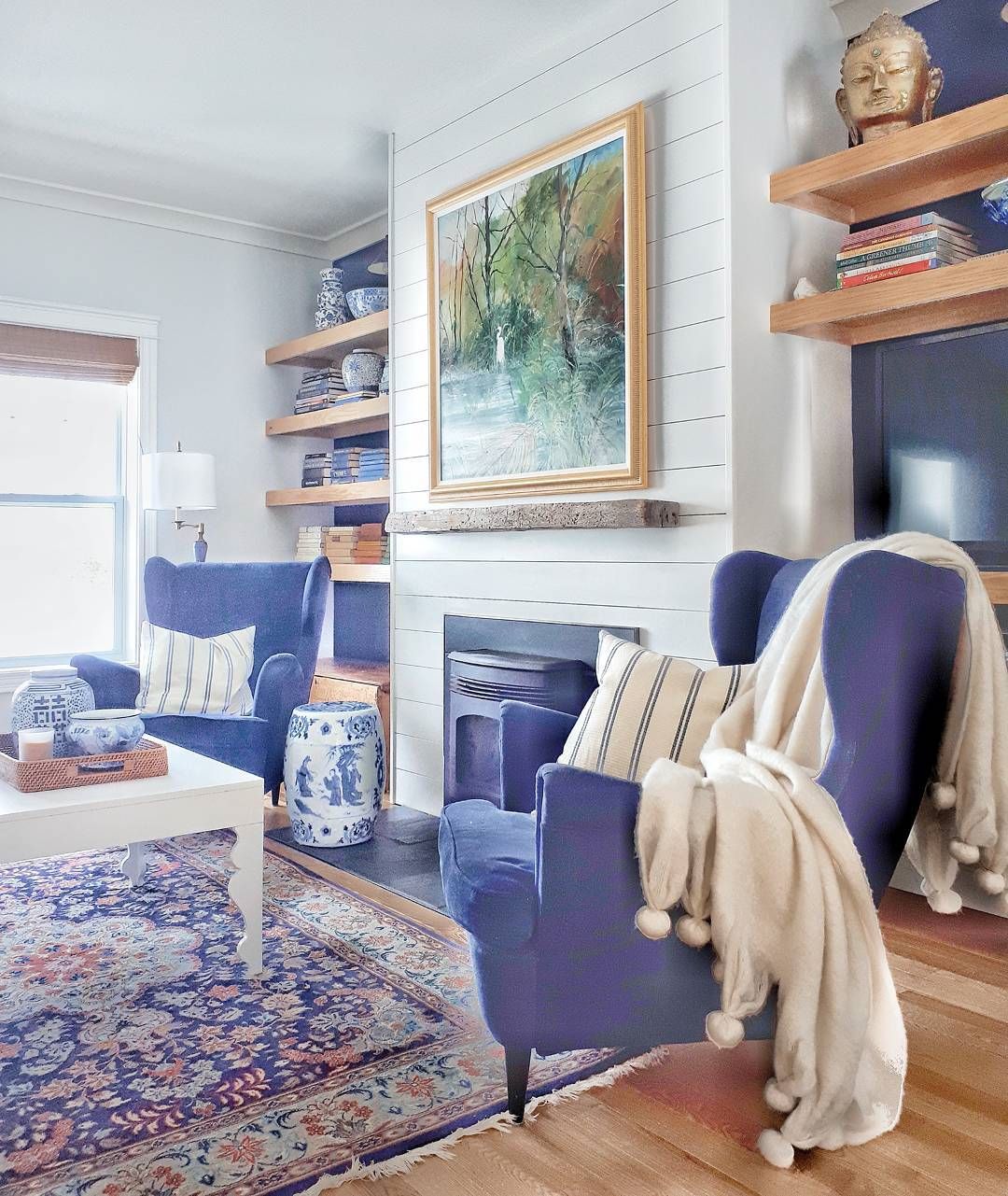
Fleur de Sel in Living Rooms
Be it a minimalist or traditional setting, Fleur de Sel can work as an excellent living room color, and it all depends on how you infuse other tones and textures into this great palette. Remember that our focus color has so many strong players (undertones).
Fleur de Sel leans blue here due to the high light it’s been exposed to, but not too much. You can also see gray influenced by that big gray couch in the corner. A nice tan wooden floor and couch can help add a bit of warmth, thereby creating a balanced space.

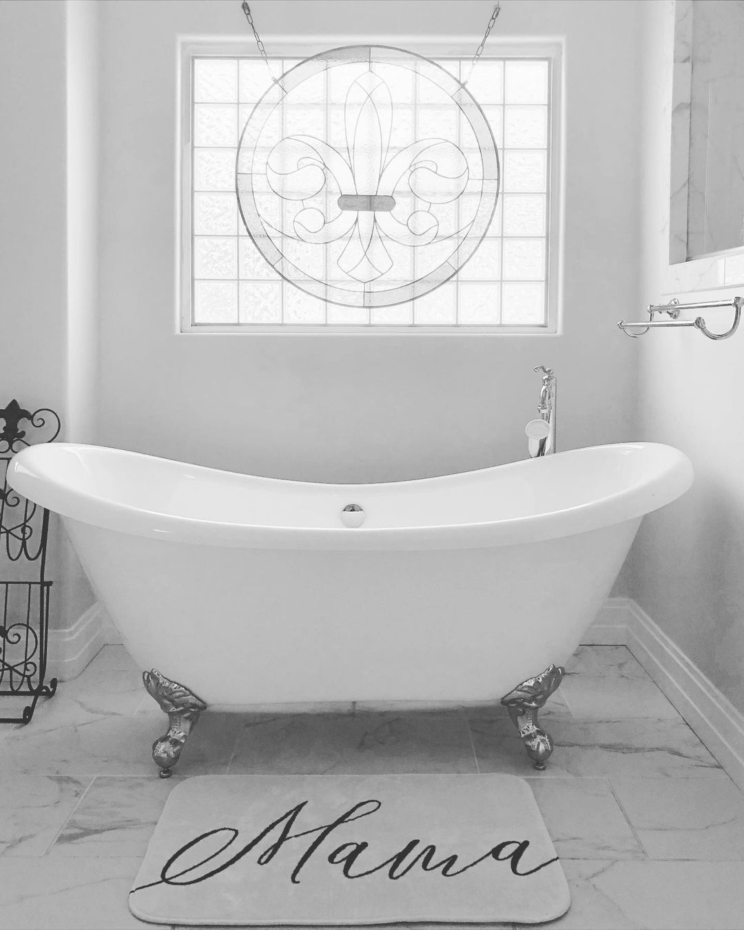
Fleur de Sel in Bathrooms
Want to create a serene and calm bathroom? Fleur de Sel is your guy. Its icy blue undertones remind you of the ocean and, most especially, ensure that you have a relaxing bath.
I love the relationship between all the tones in this minimalist bathroom. The gray walls gracefully match the gray veins on the marble, with the white tub tying everything up nicely.
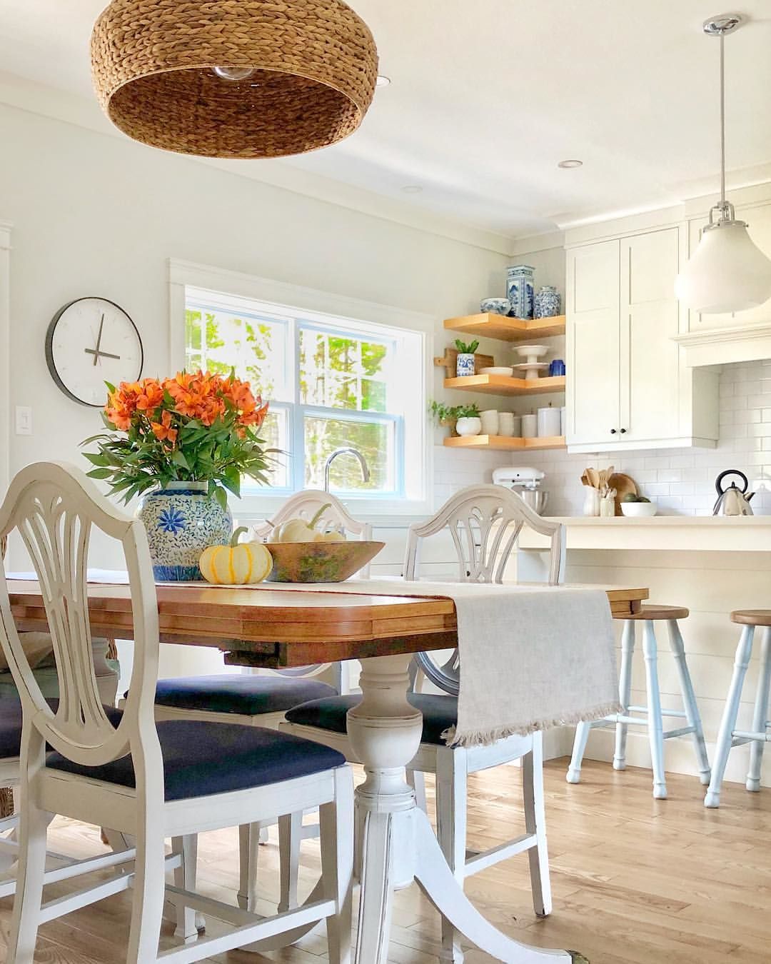
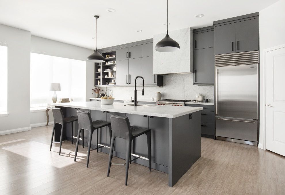
Fleur de Sel in Kitchens
One thing you discover in this picture is how airy this kitchen looks, especially when you observe that it’s not necessarily a large space. The large windows leave room for an influx of light that also bounces off Fleur de Sel beautifully.
The dark gray cabinetry works with the subtle gray side of Fleur de Sel. You should totally use this as an inspiration for your neutral-themed kitchen.
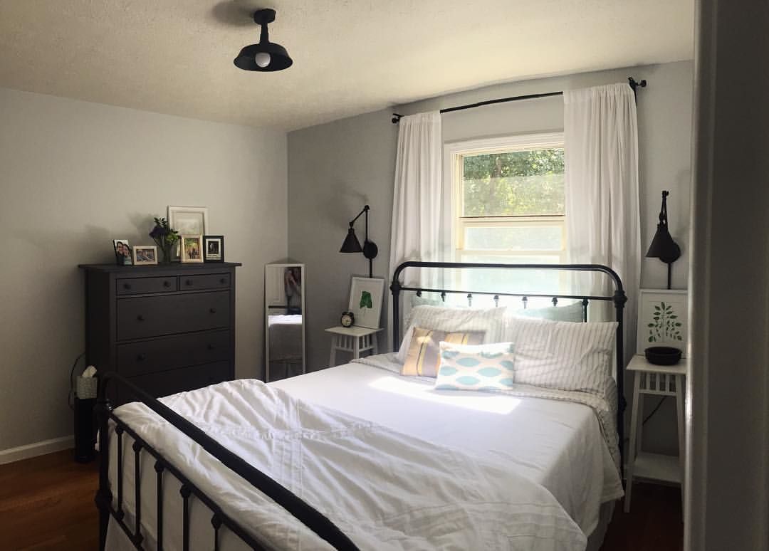
Fleur de Sel in Bedrooms
Want the coziest bedroom ever? Fleur de Sel is your guy. Colors greatly affect our emotions and can make or mar how you’ll feel for the rest of the day. The gray in Fleur de Sel is in full glare in this image, which is why you can hold a bit of warmth.
I love the surrounding black accessories and how they help add depth and a bit of personality.
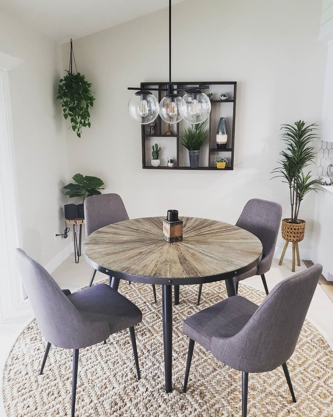
Fleur de Sel in Dining Rooms
Wining and dining can be fun too. Create a minimalist space to feast and catch up with friends, with Fleur de Sel smiling at you on the wall. It’s always extraordinary how accessories hold so much power of colors.
Fleur de Sel shows off its green undertones in the image below, thanks to the surrounding green accessories like the plants and the space’s location (it’s not getting that much light, giving it more depth).
Notice how the purple/gray chairs match the walls beautifully. That’s because, on the color wheel, purple and green have a great relationship.
Fleur de Sel on Exterior
The good thing about Fleur de Sel is its range. So whether you have a mid-century modern, Victorian, ranch, or contemporary-styled home, rest assured that it will add a much need stunning touch.
All colors appear washed out in the sun; chances are high that you’ll get the blue side of this paint more during the day and see the green/gray side pop out as the night settles in.
You can also use Fleur de Sel as trims instead of the main color. It’s a nice break away from the usual white we’re used to, and it helps your main color get more projection.

What Color Goes with Fleur de Sel
Just to refresh your memory, Fleur de Sel is a gorgeous neutral and would look great alongside bright blues and greens or blue-green colors. Be more daring by opting for sakura pinks, blacks, darker grays or even taupes.
These colors work with Fleur de Sel because they’re much brighter or darker, so a clear difference can be seen. They also match Fleur de Sel’s undertones, creating a seamless delivery.
Even things out and create further balance by opting for bright white trims with little or no undertones, and even if they do, ensure they work well with the blue greens in Fleur de Sel.
Conclusion
Can’t deny that the market is oversaturated with lots of grays, which makes your decision tedious and long. However, you must remember that if you’re ever in doubt about which to go for, this guide on Fleur de Sel is all the pointer you need.
Let me do a quick recap of some compelling points in this article.
- Fleur de Sel is a soothing color
- It has rich undertones of blue and green
- Fleur de Sel can work anywhere in the house, including outdoors.
Please don’t forget to drop your suggestions and comments in the box below, as it may even help me see a side of Fleur de Sel that I haven’t seen before.
 Sherwin Williams Mega Greige (Palette, Coordinating & Inspirations)
 Sherwin Williams Steamed Milk (Palette, Coordinating & Inspirations)
 Sherwin Williams Toque White (Palette, Coordinating & Inspirations)
 Sherwin Williams Anew Gray (Palette, Coordinating & Inspirations)
 Sherwin Williams White Heron (Palette, Coordinating & Inspirations)
 Sherwin Williams Repose Gray SW 7015: A Good Paint Choice?
